Transcripts
1. Intro Final: Hi and welcome to how to create Pinterest graphics that convert. My name is Kate and I'm a Pinterest manager and marketing strategist. And in this class, I want to walk you through everything you need to know to create beautiful high converting Pinterest graphics. Good Pinterest graphics are an essential to a solid Pinterest marketing strategy. Because your grandkids are what people see in their feed. And if you have a good graphic that you're going to be able to convert people from Pinterest to click through to your website to see your operands. So in this class we're going to walk through the six essential elements for creating a high converting Pinterest graphic. How to do market research and see which type of pins do best-case your niche. I'm going to share my favorite resources for finding beautiful stock photography to use for your Pinterest graphics. And then we're going to hop into Canada. And I'm going to show you step-by-step how to create your graphics. At the end, you'll feel fully competent to go forward and create your own high converting interests graphics. And at the end of the class, we'll have a homework session, or you can submit your own pin designs and ask any questions you have for me in the group. So if you're ready, let's jump into the class.
2. The 6 Essential Elements of a Good Pin Design: So before we jump into making the graphics themselves, I want to go through the six essential elements for a strong Pinterest graphic. So I'm going to go through them quickly and then we'll talk a little bit more in detail about them. And then we'll hop into, came out and I'll show you how these look in action. So the six essential elements are using proper pin dimensions, using your brand elements, using great imagery, having a catchy headline, using a strong call to action, and making sure that your pin graphic is super clear on what your audience is going to get when they click through to the pen. So the first one pin dimensions, the ideal pin dimension is a two to three ratio. So that's 100 by 1500 pixels. And this is your standard pin graphic. There are two other sizes that we'll talk about that more in Kanban. But the basic two to three ratio is going to be what you generally go with. Next is using our brand elements. And by this I mean using your brand colors, your brand font, either your logo or your URL, and having a consistent aesthetic. So when you're doing this, then you're helping to build brand awareness because after a while, people will start to recognize your pins by your font, your colors, your overall aesthetic. And Bill, Bill recognize the pin as yours. So this is going to be building brand awareness. And for example, when I'm scrolling through and I recognize someone's pen, if I know that I liked their content in the past, are more likely to click on mares. Next is using great imagery. Not all pins need images. You can do some specially for service-based providers with just text. But the majority of pins are going to use imagery. You can take your own if you are say a photographer or you are doing product imagery like if you're in e-commerce brand. But if you don't take your own photos, then it using stock, stock imagery is a great option. In another video, I'm gonna show you my favorite resources for really great high-quality stock photos. Next, you're going to want to use a catchy headline. So this is something that's going to grab your audience's attention. If you're a blogger, you're probably already familiar with the elements that make a good headline. And this is something like The Ultimate Guide to or seven essential steps to, or the must see spots in a location like Greece. So it's something that you're grabbing someone's attention and making them want to click through. Next is having a strong call to action. This isn't something I use on every single pen, but it's really great for prompting people to take the next action. For example, if you're promoting a freebie, you might see something like download now or grab your free copy. Or if you have a blog post, you might see something like Learn More or read now. If you are promoting products, you might have something like shop now or checkout the collection. So it's something to prompt people to take that next step. And finally, you just want to make sure overall that it's super clear what your pin is about. So if you're misleading with your pity or unclear, first of all, people might not want to click throw or if they do click through and find out the landing page is a lot darker than the pen. They're going to instantly click out of it and you're not going to get that conversion. So you really want to let people know right off the bat what they're going to be getting if they click through. So now that we've covered are six essentials, let's hop into Canvas and I'll show you how this looks on a couple of different pens. Okay, so now we're in Canva and I'm just going to show you how all of these elements come together. So over here, if I click on my colors here, because I have a Canva pro unable to save all of my brand colors right here. If you don't have Kim Pro, you can just go to document colors and putting your hex code and it'll pull your color up for you. So on this graphic, I have chosen my brand colors. I have my URL here in my font, and this is the other font that I use on my blog. So I've got my colors, I've got my font, I've got my URL. And this is the kind of imagery that I typically use on my pin graphics. So something bright, colorful minimalists and kind of like a millennial look. And then I've got my headline here. So I have how to create your pin graphics that convert. And like we talked about, that convert here is enticing it with a click through because they want graphics that actually convert and are going to be beneficial to them. Then for a call to action, what I've done here is on the blog. So this isn't a direct call to action, but it's letting people know that this is a blog post. So that's what they're going to be clicking. Over to C. And then all of this comes together to really accurately show people what they're going to be getting. So they know what they're going to be. If they click through, they are going to be going to cage socials. And they are going to see a blog post explaining how to create pin graphics that convert. Here we have another example that I pulled up. So we have the same elements. I've got my brand colors, my brand fonts. I've got my URL. And again, it's the kind of color palette that I typically use like neutrals, minimal, minimal images. And I did this was to show you that your image isn't always have to be exactly what it's a boat. So this one here should a woman at a computer, you know, maybe making Pinterest graphics here, I don't have that, but it's in kind of an aesthetic vibe that I think would catch the eye of people, my audience. So that's, you know, people in the wellness and lifestyle. Nietzsche's, it's quite typically work with or creative entrepreneurs. And then again, it's very clear what people are getting. So they're going to be going to Kate socials.com. And they are going to be learning how to create Pinterest graphics that convert. And they're going to, to read more about that. So that is one example of how all of these elements to cut can come together to create highly converting Pinterest graphics. Now next, I just wanted to take a look at the two other pins styles that I talked about. So here you can do a basic, a basic square pin. I find that this typically works best if you aren't writing texts. So this can work well if you are, say like a travel blogger and you're sharing photography. If you're a photographer and you want to share some of your work, or if you say or an eCommerce brand new want to show some product imagery. It's just an example that you can play around with. You could also add a little bit of texts like your URL here. And this is just something, maybe you add in a few square pins with just an image and maybe a simple URL or logo, and just see how they do. Sometimes I do find that square images tend to work really well. So it's just an option that you can play around with it. And the one other size here is a longer and longer shapes. So if you go to resize here, it shows you the dimension. So this one is 1, 0, 0, 0, 0, 0 by 2100. And I find that this can work well because it is bigger, it will stand out from the sea of other pins. And I find that this can work really well for things like listicles like here I have five ways to practice self-care at home. And then I have a few different self-care images. This doesn't need to be the style of your longer pen. It doesn't need to be like this collage of photos, but this is just an example that can work really well. So yeah, you can try playing around with a couple of these longer 1, 0, 0, 0, 100 images and see how they work. And again, yeah, if you're in Canva, you can double-check the size here by clicking on resize. And you can see this one here. Our standard pin is 11000 by 1500. So here are the three different sizes that I would recommend playing around with. Focusing primarily on the two by three.
3. Where to Find Images for Your Pin Graphics: So as I mentioned, good imagery is one of the essentials of a good Pin Graphic Design. Now, if you are say, a blogger, a photographer, or you have an e-commerce shop and have your own product photography, you likely already have all of your own images and you won't need to use stock images. But if you don't take your own photography, that is, stock sites can be really helpful for getting really beautiful, aesthetically pleasing, and on-brand images. Graphics. There are some exceptions, not all pin graphics need images. Some work really great with just having text overlay or maybe you're making an infographic. But, but a majority of pins imagery is a really key component. So there are some really amazing stock photography sites and there are some not-so-great ones. So I'm going to walk you through my favorite sites to use. Some are paid and some are free. So you can choose the option that's right for you. And one more thing I want to note is that you should be looking for imagery that suits your brand aesthetic. So if you are a really colorful and vibrant brand, look for images that match that. If you're more of a moody or neutral aesthetic, then look for images that suit that brand. Choosing images that are on-brand for you. It's going to help to build that brand awareness. Animal help to attract your ideal audience who matches your similar aesthetic and bide. All right, so let's take a look at my favorite stock photography sites. Okay, so I just pulled up a blog post here that I did see. You can reference back to this if you want for lengths. So on Page socials.com, I have a blog post on seven core to stock photo sites for creative entrepreneurs. See you can always go back to this if you want links. But I'm going to take you through them now. So Pexels is one of my favorite Pexels.com. They had tons and tons of beautiful, completely free imagery. And they also have videos, which is great if you want to play around with some video pin options. I can go and I like to go and especially when I got a new client, I'll go in and just see a bunch of images so you can save them here and save a bunch that I think might fit their brand. Next up is Unsplash. This is actually a bigger library and there is a lot of overlap between them and Pexels. And I really loved their imagery as well. And just like Pexels, you're able to save these to your own libraries so you can go back and get them. Next up is held stocks. So this is a paid membership site you pay monthly on, but they have really, really gorgeous imagery. This is probably my favorite of all the paid stock photography that I found. I was a member and I got a ton of the images from my website and for my marketing materials in my pin graphics. They also have some free stock photos you can download and tutorials and blog posts. Next up, another really popular stock photography site is Moyo studio. Rather than being a membership site, you combine photo packages. And they also have a lot of mock-up imagery, which is great if you are a graphic designer, brand designer, or anything that requires mockups. This is a great source for that. Next step is colored joy stock, and they haven't really beautiful imagery. They also focus on diverse stock imagery, which is really amazing. So this is another great source and they also not sure where it is on their site, but they also have like a little freebies. You can get a few free images. Next is Creative Market. I use Creative Market for everything you can find a font on here. We're going to talk about buying Pinterest graphic templates on you're after. But they also have a lot of photos. And they like Moyo sell more photo packs then membership. So it's a good option if you know a specific aesthetic that you want and you can just buy a one-off. Next up back to Canva to go home here. So back to Canva. They have a ton of free photos. So if you go into photos, you can search on tons of different topics. They have a ton of free options. You can see free here in the corner. And they also have other photography for if you're under Pro plan. And then I go through it anytime I see an image, I like, I see that. And then it goes into my favorite section, it's called starred. So they actually have a ton on here too. And if you use Canva, you can connect Pexels the first night we talked about. And you'll be able to access Pexels directly from Canva, which can be a big time-saver. And lastly, we have styled sock. I've used them as well. Again, they are a free membership program, are not free. So either a paid membership program, they do have a couple of freebies you can download. And this would be a membership where you get ongoing images. So this is a good option if you want. This in-home stock is a good option if you want really high-quality images and you know, you're going to be needing a lot on a regular basis. A membership program can be a good way to go. So those are my three replaces to find stock photography. And again, you can get a recap of this on my blog, cage socialist.com.
4. Determining Which Pin Styles Work for Your Niche: Okay, So we have one more topic to cover before we jump in direction designed. And that is doing market research on your InDesign. So this isn't about copying other creators graphic, but it's about understanding what type of graphics work in your niche. So there was really a pretty wide variety of Pin Graphic Styles that work depending on your niche. So you just want to hop in and see what kinda pins are ranking high, which means they're resonating with your ideal audience. So we're going to jump into Pinterest now and I'm going to show you how to search for pin graphics in different niches to understand what kind of styles you should be playing around. Okay, so here we are in my business Pinterest account, and I'm going to start off by doing a search for Instagram marketing. And we'll see SAP as any marketing people out here, which I'm sure there are. We'll see the kinda things that do well in marketing. So as you can see, almost every graphic here is some type of infographic or less. And these tend to do really, really well for marketing or any kind of educational type of pin. Here is one of my pins are here and you can see that it is a list. So this is something to keep in mind if you're doing any kind of marketing or educational type of pin graphic that actually listing things or creating like infographic listicles can do really well. On, as we scroll down here, you can see that this one is more like the standard pin graphic that we talked about before. So these can work as well. But you know, you can consider adding in a few more infographic Wiki type posts if that's your niche. Keep in mind too, if you see promoted by, these are not going to be pin takes. You want to really take into consideration because they are promoted. They are not organically showing up late. They're not an accurate representation. So next let's take a look at travels. So we'll do Greece travel as an example. And you can see that the style of the penis completely different. We have a lot of pins that are just imagery on, like we talked about how this can work well for travel, none of these are really square. There's a smaller one here, but just plain imagery can work really well for travel or certainly shows you just want to make sure that your caption is really clear on what people are clicking through. If you just say like Greece, travel here, people aren't going to know that they're actually going to get a blog post. So if you are testing out image only makes sure that your captions really strong. And other than that the general violence seeing is like really bright, beautiful travel photography with fairly simple headlines. Again, lots of photography, I think for travel, doing little collages can work really well. And yeah, just scrolling through. So it's a lot of the same. So bright, beautiful colors. Short clear headlines. Here we have the website which is good. Yeah, so that is another example. Now let's take a look at product photography. So I'm going to Google, or sorry, I'm going to search gold necklace. And you can see here this is the product. We're getting a lot more to still product imagery. Still notice some of the promoted Pins have the logo on num, which is to build brand awareness while they're promoting themselves. But a lot of them here are just static images. So a lot of the things that we're talking about in this course don't apply as much to product imagery. But this is still a, you know, it's good to check to see what works AND your niche. If you're doing product with their more digital imagery, then you will want them more standard graphics that we're talking about. And finally, let's take a look at an example of a recipe posts. So we'll do a Espresso Martini is because I'm loving those right now. And then here you can see that we're getting a nice product. Images are nice photography of the recipe itself. We have clear headlines of what it's about. So this one's a great example. So we have, we have a really pretty image. We have a headline, we have their URL. And I'm sure this is their brand font and colors. So this one actually I have made before because this image to me, as I scroll through, yes. So focus on the food itself with pretty clear headlines. So those are just a few examples of different, different niches. So you can do your market research, write on Pinterest to see what types of pins work well in your niche.
5. Tutorial: How to Create Pinterest Graphics in Canva: Okay, so now we're finally ready to go into Canvas and start making our graphics. One thing I want to mention before we get in is that there are two different ways to make your pens. The first is to completely start from scratch, and this gives you complete control over the design of your pen. But if this isn't of interest to you or you're not really like design inclined. Then you can start with the tablet. Canva offers a ton of template options, both with their free and paid upgrade options. And you can also use Creative Market, which we talked about before. They have tons of Pinterest graphics available there. Or you can go to FC. They also sell a lot of Pinterest graphics. So you can look for a style that brand, and that's more of a plug and play option. Both can be made in Canvas, where you can take your templates into Canvas, edit them, or you can start from scratch in Canvas. So everything is done in Canada. And one more thing I want to mention is that you want to make around seven to 10 Pinterest graphic templates, whether you're buying them from scratch. Because this gives you options to try different pin graphics and see what resonates best with your audience. And it also gives you options to create more pin content per piece of blog content or landing pages that you have. So now let's jump into Canvas and get started creating our InDesign. Okay, So here we are in Canvas and we're going to go to create a design. And you can see here there's a Pinterest pin. So you can just click on that to get started. If you want to try different dimensions, like one of the longer ones or the square we talked about. You can click here on custom size and type that in. But I'm gonna go with a regular Pinterest pin for now. And here we have our completely blank template. If you want to use one of Pinterest pin designs, you can click on Templates here. And they have a ton of different designs that you can use. So you can see here that there's some that I have recently used, so they're saved up here. And there's an FOR YOU section where they suggest South Bay think you'd like. There's video Pin Options. There's options for safe food bloggers, what a professionals, all kinds of different templates. So you can scroll through and see an option that you might like to use when there are some that are free or there are some you can see if it's pro, that means you have to have the paid upgrade. So if you want to use one, just click on it and then you can customize anything you want. So we could say how to create and craft that. Oh, let's argue. So you can say how to create graphics and you can customize anything you want. But for this example, I am going to start from scratch. So we'll start with this blank template here. First thing I'm gonna do is choose a background color. And again, I have all of my brain colors saved here. So maybe we'll start off with this color. And then I want to add an image so you can go into Canada and use any of their photos. Like I showed you before, all of my saved images that I like or in the start section. I've also saved pin templates that I like, Instagram templates that I like, different things like that. So let's use this image here of all mentioned that you can also upload your own images. So that's an option as well. But we are going to use this one here as an example. If you hover over, it's going to drop it to fill the whole space. Or you can click it like this. From here. You can use these to change the size of your image. But I kind of like the image that it showed up m. So next up I'm going to add my tax. So I'm going to go to the Text button here. And I have my different tax saved here. I generally use for my headlines. So I'm going to click this one, take this arrow and move it up. And then I'm going to make my headline. How to create pin graphics that convert. Now I want to make this quite a bit bigger. So I will play around with the text here and see how 64 looks. Looks pretty good. I'm going to drag this bar ends that it. It's nice because Canva kinda gives you these guidelines to help you see like if your text is sent her eyes where it falls. So. I think that looks pretty good. And instead of using this here, you can also toggle up or down. Then I kind of liked it at 64. So now we have our headline, we have our image, we have our brand elements. And now I'm going to add my URL. So I'm going to click my subheading here because this is my logo font. Make it a little bigger and I'll put in k-th dot com. I'm going to grab this, move it down here, make sure it's centralized. And then I'm going to add my kind of like pseudo call to action. So I'm clicking here and then here is where you can change all of your fonts. So I am looking for sands because that's what I like to use for this little subtext. And I'm gonna say on the blog, I'll make that a little smaller. Move it up here. And then you can do a lot of stuff with your font up here. So I could make this bold and italics. I can put it off to the side, kind of like anything you do in Word. You can change the color of it here. And then you can change the spacing. This can be a nice little touch. If you want to change your letter spacing, you drag this here. You can see how it stretches it. Oh, and then this one's only one line. So I won't show you on this one, but if you go here, you can change the line spacing. So that's just something you can play around with kind of a style choice. And now I'm going to go here into elements. So elements has a ton of different. You can do lines and shapes, you can do GraphX. It has a lot of different things that you can use in your pins. So I'm going to go to see all for lines and shapes. And I'm going to grab this line here. So I just clicked. I'm going to rotate it. Make sure it's straight. A little tricky to get it perfectly straight. We're now to say that Scott, but I'd play around with it if I was doing this on my own. And I want to bring it up to the top. And there we go. And now I'm going to shorten it. And I want it to be color. So you can just add little elements like this to your pin. You can add different shapes. So I like to use this one. Sometimes I'll drag a square here and drag a square. And then I will use it like this at the bottom. And then I have somewhere that I can kinda highlight my logo. So that's an option. There's lots of different things you can do with these elements. Another thing that you can use is these frames. So this is a frame for a photo to put in. So say if I want a square or a circular photo, I'll delete this one. And then I will drop this frame in here, center. And then I'm gonna go back to my photos. And I can drop this into the circle. So it just gives you some options for different image sought or image shapes. There's a ton of different things in elements. And if you want a good view of a certain aesthetic of mind, you can search for things like, let's look up bow. And then I will give you a cool little bow. Who elements to use? Maybe you want some dots. For example, just learned to cut tuples. I know there's lots of different things like that, but you can scroll around and find. And if you find when you really like, then you go here and you start it, and then it's going to go into your Start section. You can do this for templates, for images, for GraphX, pretty much any type of thing in here in Canvas that you can start and say bat and it's going to go into your Start folder. I also like it because it gives you some key wording that this is indexed under. So maybe you're like hmm. Okay, I now want to look through more palm trees. Student click on palm tree and it will show you all of the palm tree option. So that's something fun to play around with. Another thing that can be super-helpful is you click on an image and say if you want these dots, see behind this photo, you'll right-click and you'll click Send backward. And now it's behind this. You don't want to say Send to Back because then it's going to go behind all of your elements. This is the only element right now, so it's just going behind that, but it will set it to the very back of all the elements. Say, uh, things are layered together, so it's easier to go, send backwards and then keep doing it until it's in the place that you want. So that is a look at how to use Pinterest to create your graphics. There was a time that you can learn about pn by this is obviously just a very basic Canva has a, they have a lot of resources. So you can learn how to do more in-depth design. But this is your basic rundown on how to create your Pinterest pins when you are ready to download. I ignore this. Published a Pinterest because that's using Canvas schedule and I don't kanban schedule, I prefer tailwind or Pinterest itself. So you're gonna go in here. You're going to hit download. And then you're going to choose the file type you want for images, IOCs, PNG. If I am doing a video Pin, then I'm going to go to MP4 video, and then you're going to choose which pages you want. So right now we have two pages here. We have this template we use, and the one we just created, I only want the second ones. So I am going to click Page 2, done download, and then your pin is going to download. And now I just want to quickly show you my own Pinterest graphics. So like I mentioned, it's a good idea to have more than one graph that I recommend between seven to 10 for each piece of content. So I have all of these different styles that I've created. So when I create a blog post, I will make a bunch of different pin graphics to promote that one blog posts. So I went to have more than I'm going to use and then I can choose a few styles to use for each piece of content. And then over here you'll see I have a ton because I just like options, um, and then I have some that are specific for my freebies. So you can see my call to action download. Now, I'm using my brand colors. I have my catchy headline and letting people know that they're going to get three guide. And then I have a few different ways to promote that. So so yeah, just keep in mind that you want to, you definitely don't need as many as I have, but you want to create different options that you can play around with. So that is your canvas, pain graphic tutorial.
6. Measuring Your Pin Graphic Analytics: So before we wrap up, there's one more topic that I want to go over with you and that is measuring the results of your pin graphics. So as we talked about in the last video, you want to be making multiple pin graphics per piece of content. And this is going to allow you to measure how different pin graphics are resonating with your audience. So there are a few different factors that go into how your pin ranks. And these include your key wording, the topic that you're covering, and your pin graphics themselves. So after a few months of pinning, go into your Analytics and take a look and see if there's any patterns on which pin graphics seem to be getting the most attention. See, you might notice that there's a certain style that seems to really be resonating with your audience and it's getting more results than other styles. If you see a style that's working really well, make sure to continue using that. And see if you can create some variations to create other pin templates that you can create in a similar style. If there's a style that's consistently not ranking well, then maybe you can set are getting rid of that one or replacing it with a different pen template. So how you measure the health of your pin graphics is primarily looking at the staves and the ALP and clicks that they get. You don't want to so much focus on impressions because impressions are more likely due to solid keyword. So for example, if a pin graph it is getting a ton of impressions, but very little seeds are about plants. This could mean that you're doing great under key wording, Pinterest understands what the pins abode in showing it to people who are searching for your topic. But there just isn't something that's catching your audience's eye and making them want to save it or click through to your website. On the other hand, if you see pin a pin graphic silence consistently getting a lot of Cs and about NCLEX, there's a good chance that this pen, this pen style, is really resonating with your audience, eye-catching. And it's a style that you want to continue using moving forward. So you don't want to check this right away because Pinterest is a slower moving platform. Do you need a good, solid three months of consistent pinning to really start to see any patterns emerge. So give it some time and then a few months down the road, hop into your analytics and see if you can check any patterns that are emerging about your PID design.
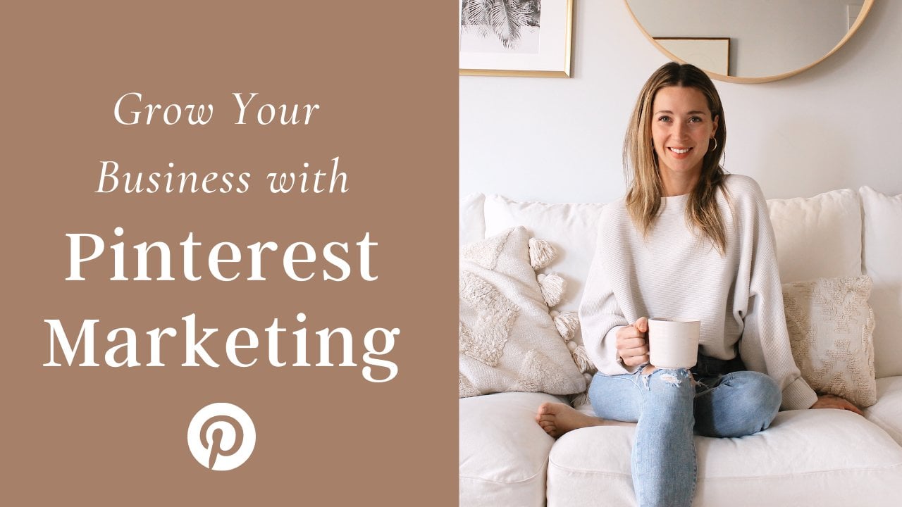
7. Conclusion: And that's our class. By now, you should be feeling ready and competent to get into Canva and start creating your own beautiful high converting Pinterest graphics. I do have a piece of homework for you. So I want you to make a Pinterest graphic for your own business. Or if you're not ready to make one for your business, you can make a mock-up of any kind of pin graphic of your choosing and pop it into the homework section. If you have any questions at all for me about creating Pinterest graphics, put it in the class notes and I will get back to you. And if you want to learn more about Pinterest marketing in general, you can check out my other Skillshare class, how to grow your business with Pinterest marketing. Thank you so much for watching and have been creating your pin graphics. It should be a fun, creative thing for you to do. And I hope you're feeling competent and ready to get started. Thank you again for watching and I'll see you in another video.
 Kate Horodyski, Pinterest Marketer and Strategist