Transcripts
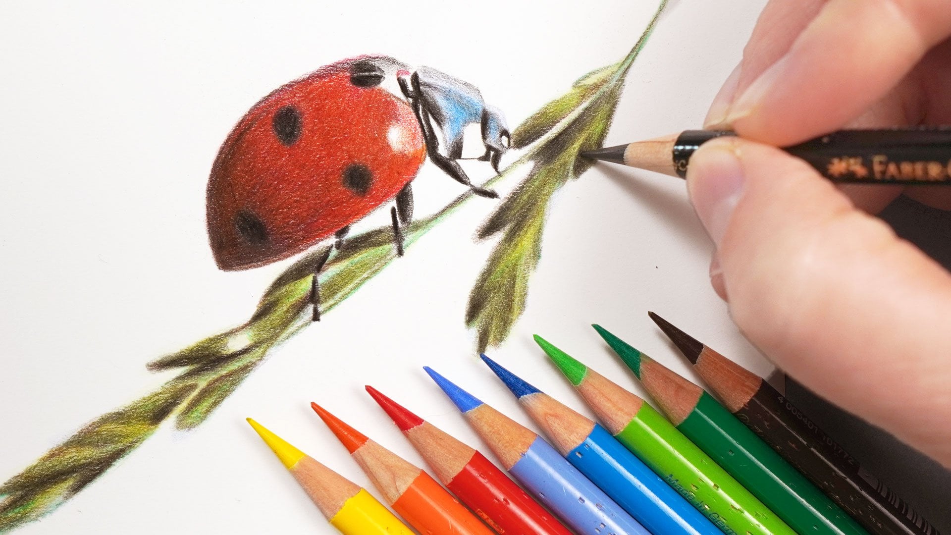
1. Introduction: Blending colors together is an absolutely crucial skill that I use in every colored pencil
drawing that I create. But you might be unsure
of where to start. I want to show you
today that, actually, it's always the same process that I use in every
one of my drawings, and the process is simpler
than you might expect. My name's Gemma Chambers, and I've been making online
art tutorials since 2020. I've helped tens of thousands of people improve their art
on my YouTube channel. But today, I want to
be quite specific. I want to cover one of the absolute core techniques for drawing with
colored pencils. Let's go through how to blend. Now, I will go through all the materials that you'll need, as well as going through
this core technique, and we can cover
this technique by drawing this fun and
bright gradient. From here, I want to show how this technique can be
applied to actual drawings. And we can do this by drawing
some colorful ice lollies. I'll show you the full process that I use to create these. So let's get blending.
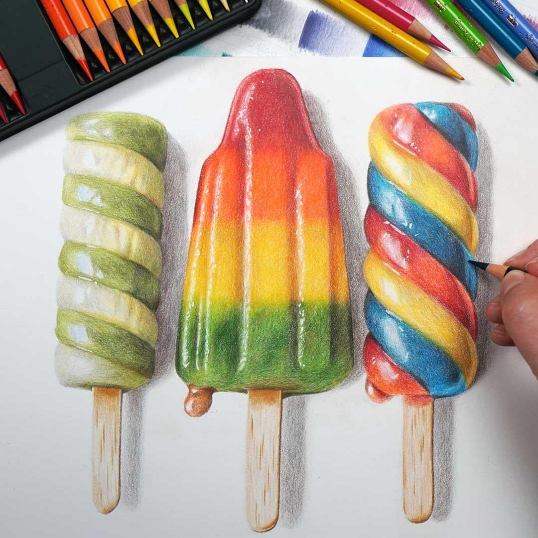
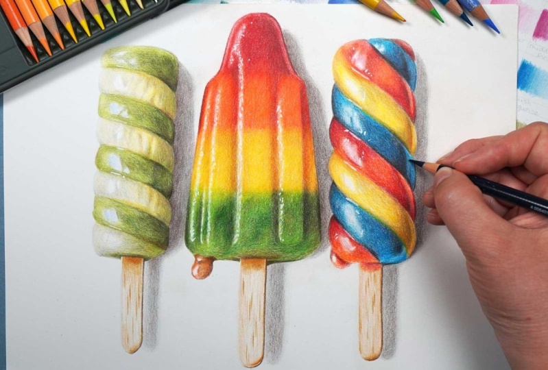
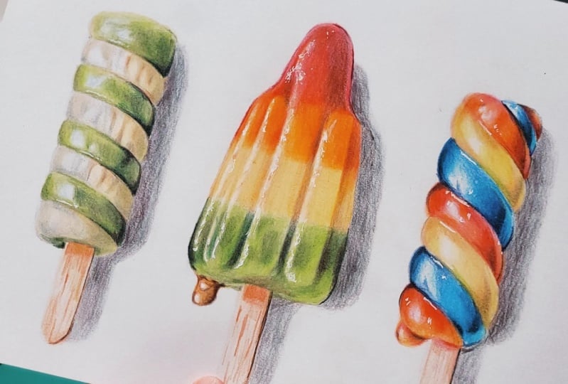
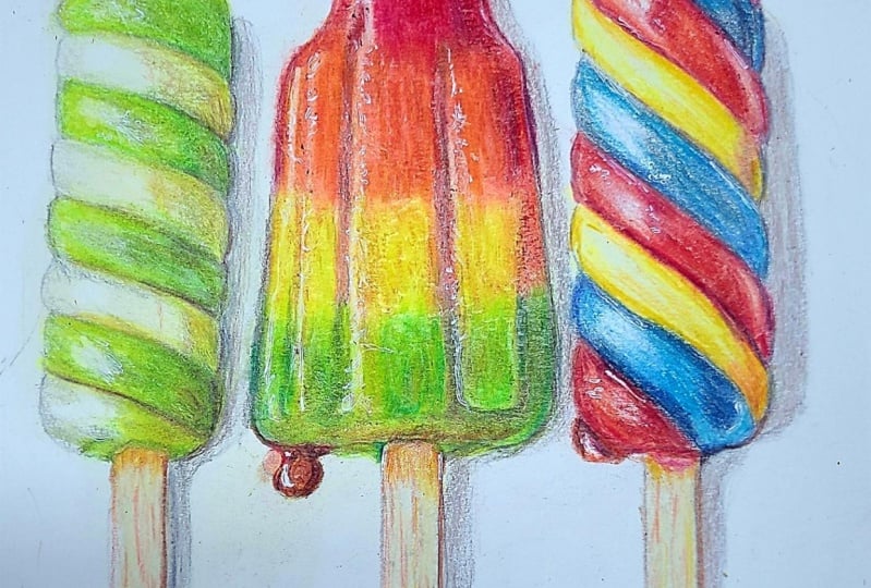
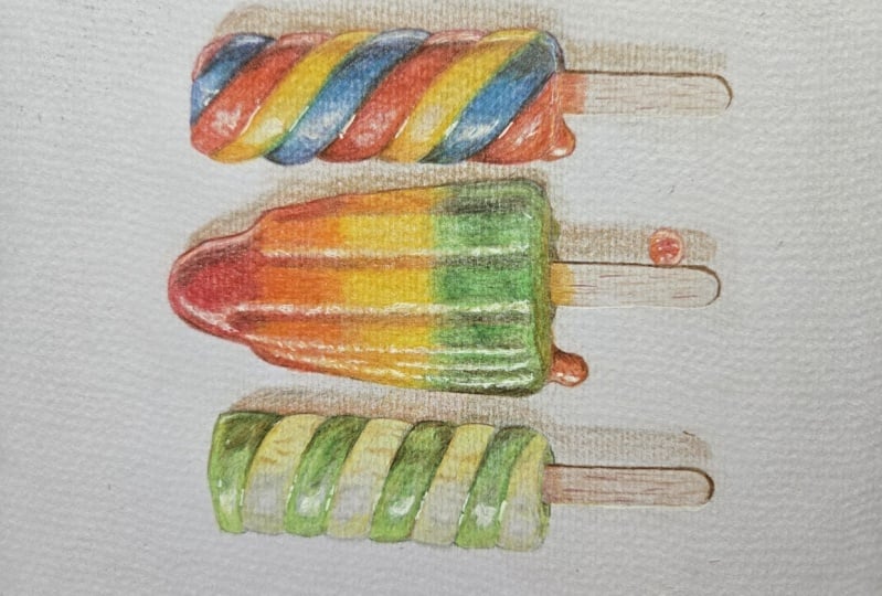
2. Class Project: Now today we have two
different class projects. There is the colorful
gradient and the ice lollies. The gradient is amazing for
practicing the techniques, really getting a feeling
on how this works. And then we can put that into practice with the ice lollies. Now, I've chosen, particularly
these ice lollies for a few reasons. First up, I really
like the colors, particularly the rocket lolly
is so lovely and vibrant and all of the colors blend really nicely from
one into another. Not the only place
colours are blended, though they are blended
throughout the drawing. Generally speaking, everything
here is very smooth. We don't really need to worry
too much about any texture, focusing on how to mix
these colors together. Now, I will show
you everything you need to create
these eyes lilies, including how to
make the sketch. But if you want
to use my sketch, I do have a light sketch line and a dark sketch line version. The light sketch line
is so that you could print the sketch directly
onto your drawing paper. And the darker sketch lines
are for if you want to trace. Also include details of all of the colors that I'm
using in this ice lolly. When you've finished either the gradient or the ice lollies, please do upload them
to the class projects. I would love to see
what you've done. Let's talk about the
materials that you'll need.
3. The Material You'll Need to Blend Colored Pencils: Let's think about the
materials that you need to blend colored
pencils together, and the most important
material is colored pencils. Now, I'm drawing both
the gradient and the ice lollies with
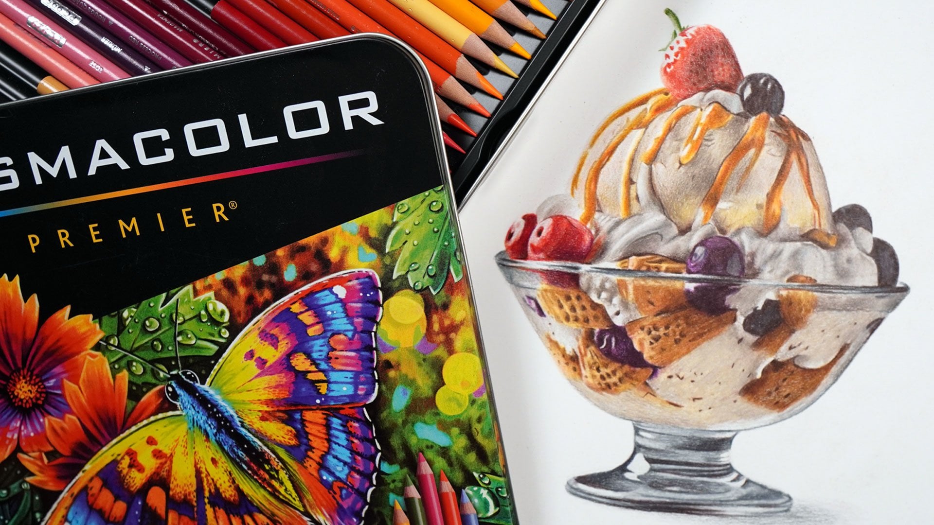
polychromos colored pencils. These are professional
colored pencils. But you don't need expensive
pencils like these. You can create
beautiful drawings with something like crayola. Now, I'm drawing
this with pencils from the set of 60 polychromos. Whatever you're using,
I would recommend getting a pencil
set of at least 36. It's just a bit easier if you've got more
colors to choose. What's actually
much more important than the pencils is the paper. We'll go through this in a
lot more detail in a second, but essentially the
backbone for blending colored pencils is to build up the colors in a series
of light layers. And what we need is a paper that's able to take all of
those layers of pencil. So we won't be able
to use something like printer paper
or sketch paper. It's just not going
to be possible to build up all of the colors. I like working on something
called bristle board. This is a very smooth paper, and it's almost
thick like a card. If you are only to
invest in one thing, definitely invest in the
paper over the pencil. Next up, the final thing
you need to create a soft blend is a
pencil sharpener. It is absolutely key to work
with a really sharp pencil. Now, I use this hand
crank pencil sharpener. I particularly like that I can change the blade
when it gets blunt, but you don't need a pencil
sharpener as fancy as this. Anything that creates
a lovely sharp point on the pencils is what you need. So those are the three tools that you need to
draw the gradient, but let's also talk about the extra materials we'll
need to draw the ice lollies. And the first item is actually an optional item,
a jelly roll pen. This is a white
gel pen that goes amazingly over the top
of colored pencils. It's really good for adding small white details in a way that we can't with
just colored pencils. This is a pen that I
use at the very end of the ice lollies to add in all
of the little light glints. I do think the
drawing still looks lovely without this
jelly roll pen. So if you don't have
one, don't worry. Next up, if you want to create your own sketch for
the ice lollies, you will need a pencil, eraser, and a ruler. And from here, the
next material you'll need is actually not
something you can buy. Is something you'll
need to make. This is a set of color swatches. So for every set of
pencils that I own, I make a set of swatches. What I do is draw out a grid
and go from as light as I can to as dark as I can with every color,
and then I label it. And this shows me what those colors actually
look like on the paper, the kind of paper that
I'm going to draw on. It stops me from relying on the barrel of the
pencil or the lead, which don't tend to
be very accurate. Hear me refer to
these swatches a lot. I am going to use them to
compare to my drawing and my reference photo
to see which color needs adding and generally find the most appropriate color. Now, the final thing
you'll need is some way of looking
at a reference photo. For every drawing I create, I always work from a reference. I find this is the best way to create a lovely
realistic drawing. Now, I like doing
this on my iPad. I particularly like that I can zoom in to see all
of the details. But you don't need
an iPad. You can always print out the
reference photo. Those are the
materials you'll need not only for the
initial gradient, but also to draw
the ice lollies. Let's talk about how to blend.
4. How to Blend: Let's think about how to blend, and the whole process of blending relies on
something called layering. I did talk about this very briefly in the material section. So layering is where you gradually and lightly
build the pencil up one color on top
of another rather than just pressing really
hard with the pencil. What this does is gradually
allows the colors to mix together and generally
makes a much softer color. So let's look at using this
and drawing the gradient. Generally going to
start here from the left and work my
way towards the right. And what I'm going to
do is just put down each color one at a time to
kind of map everything out. I want to work out
how big each section of color needs to be. So I'm starting here
with a very dark red, and as I mentioned, I want to be putting this down really
nice and lightly. So the first thing I'm doing
here to help me with that is holding the pencil much further back than
you might expect. Rather than holding the pencil
really close to the tip, I'm holding it about
halfway down the barrel, and that literally stops me from being able to
press too hard. I want to put down the pencil
as smoothly as possible, so you'll notice
that I'm working in some kind of circular motions or oval motions rather than just scribbling back and
forth with the pencil. And that combined with
pressing lightly creates a really lovely soft color that we're going to
be able to build on. Now, the final
thing is that it is so important to work
with a sharp pencil. The pencil is going
to go down much smoother and more consistently
with a sharp pencil. See that I'm just blocking
in the very left hand side, kind of fading it out towards
the right a little bit. It doesn't need to be perfect. I just want to be
getting something down, so I can kind of work out where all of these colors
are going to go. So once I'm happy with
this first dark red, I'm then going to
do exactly the same with a slightly more orange red. So you can see me fading it out towards where the edge of
this section is going to be, and I'm also going to use
this color to just slightly go over that darker red kind of overlap the
colors a little bit, so they begin mixing together. Let's work all the way along going through all of
the different colours, so I'm building up the
orange here, again, overlapping that
red a little bit and fading it out towards
the right hand side. And the same with
the yellow here, working in circular motions, holding the pencil
nice and far back, so I'm pressing lightly and going over the orange
color to the left. By the time that I've gone
over all of the colors, I'm left with a very, very faded and muted section
that looks like this. And then all we're going to
do is keep going over it. So I'm going to work
from the left to the right to the left to
the right and back and forth until what I have is a really lovely
and vibrant color. That's literally it.
And I want to keep doing that until it
looks nice and bright. Now, I will get to a point where the colors are
looking vibrant, but I can still see some little white spots of
the paper showing through. It's not a completely
solid, perfect blend. Generally speaking,
up until this point, I have been pressing really lovely and lightly throughout. But as I get to
the end and I want to get rid of those white spots, I can now start
pressing more firmly. So I want to finally blend
these colors together, applying a bit more pressure. I'm not applying full force, but I am applying more pressure than I have been up until now. Generally speaking, what I
want to be doing to apply this pressure is I
want to be using the lightest color
in each section. So right now,
you'll see that I'm using the orange pencil, and I'm using this to press firmly not only over the
bright orange section, but also over the red section. I don't want to use the dark
red pencil to try and blend the lighter red because
I'm just going to end up covering up that whole color. The orange section's going more towards the yellow, I just
want to smooth that out. I'll lighten up my
pressure here so that it's nice and soft
towards the edge. But where I'm going
over the red section, you can see I'm
pressing much firmer just to finally blend
these colors together. But I won't do this until
all of the color is looking very bright
and vibrant and it's pretty much
all been built up. Do note that I'm holding
the pencil closer to the tip here so that I
can apply that pressure. I can then do exactly
the same with the yellow pencil
blending out the edge of the orange section because this is the lightest
color that I've got here. What that leads to is
this really nice blend. Now, I think it's very
important to firstly note that the light pressure for the vast majority of
this is so important. It's going to look really harsh if you just press really hard. It isn't until right at
the very end where there's just the smallest white
spots showing that I want to be applying
any sort of pressure. Also remember that you
don't expect it to be completely perfect.
You're not a printer. So that's the
general method that I use for blending
colors together, particularly focusing
on layering. Let's now use this
same technique to build up the ice lollies. And what I want to do is work through the process that I
always do to draw a picture. So let's start off by looking
at the reference photo.
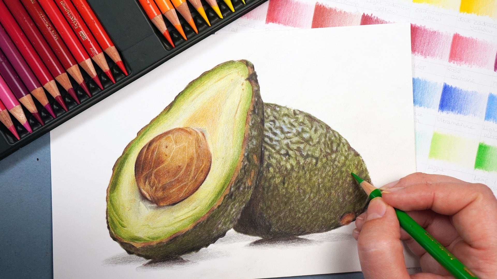
5. Studying the Reference Photo: No whenever I'm
drawing anything, I always work from a reference, as I mentioned earlier. But what I like to do
when I've selected my reference photo is just take a minute to have a
really good look at it. I want to think about
the main things I'm going to bear in mind. So let's look at the ice
lolly reference photo and you'll see a bit
more what I mean. Now, the first thing that's
particularly standing out to me is all of the
patches of light. There is light coming
from the left hand side, and then there's a bit more
of a shadow on the right. And there's all of
these light glints all along each of
the ice lollies. So here the light is in kind of strips going
down and on this Ill, it's in patches on this left hand side with
some lines in between, which is similar to this one. Now, it is worth noticing
that these patches of light aren't actually
white like you would imagine. This patch of light here, for example, is a light blue. This one's a light yellow,
this one's a pink. They don't so much look
to me like white patches, and adding those light
colors on here is going to give this an
extra little dimension. Also noticing how vibrant
all of the colors are. So looking at these
lollies one at a time, this lolly here. Even the kind of creamy
yellow sections, it's pretty bright, even on the right hand
side on the shadow. It's kind of a greeny
gray yellow here. This is quite a
dark, rich green. But on this lolly, look
how bright this red, orange, yellow and green are. There's some darker
shadowed areas, particularly around
the edge and on these dips along here. On the most part, we're
going to want to build up some pretty bright colors. I'm also noticing on this
lily here that weather, particularly blue
meets the yellow, for example, there's kind
of a slightly green line down here where those
colors are mixing, and you can see it here as well. It's a little bit orange here. So these colors do kind of
blend together a little bit. You assume that
they're just going to be standalone strips of color, but they're blending a bit more than maybe it might
appear at first. These ice lollies
are on a plate. I actually think it
will look better if we don't draw it on a plate. So I'm going to draw just
the ice lollies and kind of try and make up a light
shadow from underneath. I just think it's going
to end up looking odd if we draw it on the plate. So those are the
main things that I'm bearing in mind to begin with. Let's create our sketch.
6. Create the Sketch Outlines: Let's create our sketch. And to do this, I like to use something called
the grid method. This is where I draw a grid on my drawing paper and
on my reference photo, and I only draw what's in
each individual square. This stops me from
trying to draw an ice lolly and just focuses on
drawing a series of shapes. Instead, I create a much more
accurate sketch this way. I've created all of my sketch, I can then use an eraser
to erase the grid lines. Now, the most important
thing here is that you press really
nice and lightly. In my sketch lines here
I've pressed firmly. That's literally so you
can see it on the camera. Actually, you'll
see that my lines are a lot lighter than this. You can barely see them.
That's what we want to do or it'll end up showing
through at the end. Now remember, if
you don't want to create your own sketch lines, you can use mine in
the class resources. Let's now get started
with drawing.
7. Build up the Base Layers: Going to start this drawing
in the way I usually would, working from the lighter colors gradually towards
the darker colors. And I want to begin
by building up the lightest color that I
can see in each section. So let's start off by looking at the ice lolly on
the left hand side. And I'm looking at
the lighter strips, these kind of creamy strips. Want to compare this to my color swatches
that I've got from my set of colored
pencils and find the closest match to
this light color here. And I'd say it was close
between this being a cream, so a yellow or this color
that I'm actually using, this is the lighter warm gray. I don't think either
color is a perfect match for these light strips
on the ice lolly, but I think that the gray
is a slightly closer match. So what I'm going to do
is just block this color in and go along
all of the strips, putting down this color
really nice and light. As I say, the most
important thing is to get this
color down lightly, and you'll notice that I'm not holding the pencil
really close to the tip. If I hold the pencil a
little bit further back, it literally stops me from
being able to press too hard, and the pencil goes down much lighter and therefore
more consistently. Now, I also want to be putting this pencil down as
smoothly as possible, so I'm working in light
little circular motions rather than just scribbling back and forth with the pencil. Also put this color on
the stick of the lolly. Once again, I don't
think that this is a perfect match for this lolly. I think the lolly is going to be a series of colors
all mixed together. But I do think that
it's the closest, lightest color I
have right now and we'll be able to mix
together those other colors. So let's block in all of
the ice lolly sticks. You'll still see I'm holding the pencil not close to the tip. I'm not holding
it as far back as you sometimes see me do, because I do need
to be reasonably accurate about where
this pencil's going. I want to make sure
that I'm staying within my sketch lines of
this ice lolly. Let's just shade in
this last lolly. Once again, working in these circular or Oval motions to try and get it as
smooth as possible, pressing nice and lightly. It's also so important to
always have a sharp pencil. The pencil will go down much
more consistently if you do. And from here, I'm going to
move on to the next section. So I once again want
to be looking for the lightest color I can
see in the next area. So I'm looking at
these lightest patches on the lolly along here. This it doesn't so much look
like a light green to me, and it's certainly not a white. It looks like a very,
very light blue. So I'm going to use the light
ultramarine pencil to just put a little bit of this color down roughly where those patches of light
are going to be. I'm not going to worry
about blocking this in over the whole of
the green strips. I'm just going to put it where that little patch of light is, but I'm not mapping out
the shapes perfectly. I just want to put basically a very light blue blob where
each light patch will be. Also just put something
down a very light patch of blue where this blue drip
is down the bottom here. And I'm going to do the same on the blue strips on this ice
lolly on the right hand side. So you can see how lightly
I'm working along here. This is so important. And I am literally just on
those blue strips blocking in this color on generally the left hand
side of that strip. Worth bearing in
mind that there are so many different vibrant colors within these ice lollies. We are going to be working
through a whole host of different bright colors and kind of flitting a bit
between the colors. But I think it's going
to be easiest if we focus on filling
in all the blue, for example, and then all of the yellow and working
one color at a time. So now let's fill in
the lightest color on the red section. So as I mentioned, on the
patches of light on the red, I actually think that
they're more of pink. So I'm going to put this color. This is Rose carmine. I'm going to lightly
block this in again, on the left hand side of all of the red patches.
Nice and lightly. You can see I'm still holding
the pencil quite far back, and I'm still working
in circular motions. I have also made sure to keep
my pencil nice and sharp. And although it looks pretty obviously
pink at the moment, when we add the other
colors around this, it's actually going
to start looking a lot more muted and we'll probably have to add more of
this later. But that's okay. Once I filled in
the pink pencil, I now want to think about the next most obvious and
lightest color I need to add. So I'm actually going to
move on now to a yellow, partly because I am going
to need to add light yellow to the light strips
on the lolly on the right, but also looking at the light strips on
this lolly on the left. As I mentioned, I
think it's a mixture of gray and yellow and
some other colors. So I'm just going
to add a little bit of this light yellow. This is the cream pencil. That's the lightest yellow
that I have in my set. I'm just going to add that
along those light strips, and I'm also going to add
it on the rocket lolly. We don't have any colors on the rocket lolly
at this point yet. What I'm going to do
is start adding yellow to where roughly
those light strips are going to go on that lolly. So again, I don't think
that the strips of light on the rocket lolly
are very bright white. They're more like a
very light yellow. Maybe with a few subtle colors, but we can add those in later. For now, I'm just going
to block in where those light strips are going to go with this bright yellow, and then we can build
up other colors over the all of these colors
are very, very light. You can slightly see
where they're going. We need to build up
these lightest colors, and then we can start working on the mid tones in a second, and it's all going to be a lot
clearer and easier to see. But it is so important to
start with these light colors, and you can be quite rough really about where
the colors are going, but we need to get something
down on those lightest area. Start focusing on the lolly
on the left hand side, and I want to get something down on all of the green areas. So I once again want to compare the reference photo to my
color swatches and think about the most obvious color that I need to add on
the green sections. So I'm looking for this kind of lighter green around here, which is kind of the
next darkest color after the very light patches. It's, as I've said, much darker
on this right hand side. I think the earth green yellowish
is the closest green to this ice lolly and the closest green to that next
darkest color. So what I'm going to do
is very carefully start mapping in the shapes of each
of these green sections. So I find it easiest to start off by mapping in the outline so really work out where the edge is of the section
I want to mark in here. I'm just going to block
in the whole thing. So you can see I have mapped in the outline, particularly
around the top. I can now work in
circular motions, and even though this right
hand side is going to need to be so much
darker than this color, I can start off with this color, and then we can add darker
colors over the top, and it's going to add
a lot more richness and blend these colors
together much better. Also wants to be mapping
out the general shape of that patch of light because I don't want to just shade in
the whole thing, go over that patch of light, or then this blue
won't show through. So there's the main
patch along here. There's a little line
going through the middle, and there's also a little
light patch around here. Now, I would say
that it's probably patchier than what I'm going
to draw, but that's okay. We can always tweak this later. You see, I have drawn in
the outline of that patch, and then I'm applying light circular motions just
to shade around that patch. Now, I think the most
important thing to remember in this first section
is that we're not trying to create a
perfect ice lolly. What I'm trying to do is
just put something down so that I kind of have my bearings I know what's
going to need to go where. Let's move on to
the next section. Once again, you'll see that I have mapped out the outline. And then I can use circular motions to block in the color. So I'm once again
here marking out the edge of the patch of light, and then I can use
circular motions to shade this in as well. So looking at the
patch of light here, we've got kind of
one main section here and then a
smaller section here. And it's the same down here. We've got a main section here and a smaller section down here. And there's just one kind of circular with a little dip
in it, light patch here. Literally all I'm doing here, it's sort of reasonably
time consuming, but I'm just working
my way down carefully blocking in some of the green
on each of these sections. And this is helping make it much clearer to see how the
ice lollies built up, and again, what
needs to go where. Now, as I get to the end
of this bottom section and add all of the nice
soft shading down here, I don't want to forget about the very bottom
of the ice lolly. So down this bottom here, look at how we've got this
little extra bit of green. I don't want to forget
to add that in. It's kind of wrapping
around the lolly stick. It's mapping the shapes
for this as well, and just lightly block that in. Now, before I move
on with the green, I want to think about if there's any other section that this
green is a good match for. And I'm particularly looking at the very bottom of the rocket. So what I want to
be doing here is working around those
patches of light, and again, just getting
something marked in. So you'll see I am
once again drawing in an outline and then shading
in up to that outline. So drawing in the outline
of this patch of light. Now, I do have a little bit of a guide here because
I have marked in where I think these
patches of light are going to go with
that yellow pencil. Noting that down on the
bottom of this ice lolly, we've got a patch of light here, a much thinner patch of light
here, another one here. There's three on
this left hand side, and then there's two more. And although this patch here, for example, is quite sparse, I'm still drawing it in
as a solid line for now, and I can adjust
that a bit later. But I just want to
be getting an idea of where that patch
of light is going to be going and just getting some sort of color
down on the paper. Let's follow and map in the
line along the bottom of the lolly working around that
orange drip that's down here, and then I can work
in circular motions once again to block
in this area. And you can see
because we've got so many colors to build up, the base layers are going
to take a little while. It's going to take
a little while to get something down in each area. As I say, simply because
there's so many colors to add, we've obviously got yellow, orange and red to
add on the rest of this rocket then we
have all of the red, blue and yellow to add on the lolly on the
right hand side. So because it's so
lovely and colorful, it's just going to
take a little bit longer to build up
these initial colors. But that's literally all I need to do for
this bottom section. You can see it's not
looking amazing, but we've got something here that we can start
building off of. And then we'll be able
to think about adding in the base layers on the
top of the rocket lolly. Before we do that, I'm
actually going to add a bit more color onto the light sections on
the rocket lolly here. Now, as I mentioned,
the light strips here are kind of a mixture between yellow and gray and maybe some green
around here as well. I don't think I
have enough color on this right hand
side at this point, so I'm just going to add
some of this yellow. This is quite an
earthy kind of yellow. This is the naples yellow. Just going to block
in a little bit, particularly on the
right hand side, but also kind of where the green is meeting
this light strip, it looks quite yellow, so going along the edge here. But I want to make sure that I'm avoiding those patches of light. So you'll see I'm pressing much lighter as we get
towards the left, but I just want to try and make a nice smooth gradient going towards that
right hand side. We will build up a lot
more color over this, but for now, I just want it to be a little bit
more bright yellow. So you'll see kind
of I'm working from the lighter colors towards
the darker colors. But I am also thinking
about if I need to add any extra colors there's any colors that are missing
from what I've added in. And I can't stress enough. I don't expect
these patches to go straight to looking
amazingly perfect. We're just gradually
building them up. Now on a few areas
on this lolly, I am adding a little bit of
the yellow onto the green. If it kind of looks like
the green needs to be made a little bit
more yellowish green. And that's particularly over on generally the left hand side to the left of that
patch of light. So you can see I'm adding
a little bit along here, just a tiny bit. Really, I don't need
to add a lot of color, and it just tweaks the
green that we've got. Right hand side of the green,
we will be building that up with a much darker color
in the next section. Now, let's think
about where else we need to add this yellow color. And this, I would say, is
the lightest yellow that I can see on the yellow
section of the rocket lolly. So let's block in this area
with a block of yellow, once again, avoiding
those light strips. On the left hand side
here where there were three light strips on
the green section, actually, one of
those light strips kind of dissolves away. So we've only got two strips
of light on the left. There's then this very big prominent
one towards the middle, and there's one on
the right hand side. And you'll see with this color, I'm still pressing lightly. I'm still working in
circular motions. I'm ever so slightly
overlapping that green with the yellow to just very slowly begin blending
these colors together. To clarify, we don't want a perfectly smooth
blend at the moment. And actually, it's
quite a kind of fast blend between the
green and the yellow, for example, because the rocket
is sorted into sections. So although we need
to blend the colors together and make
a little gradient, I don't want to make a massive
and perfect gradient like you often try and make because that's not what we can
see on the ice lolly. Just marking down
this right hand side where the edge of the lolly is, and then I can shade
out from that line, making sure I also do the same with the light patch
on the left here. And then once again,
block all of this in. So it's not looking amazing at the moment, but that's okay. We're starting to get something down in each section.
So let's keep working. You'll notice, I keep generally working from the
left to the right. I just find it's
the easiest way to work to work in quite
a kind of methodical. Let's use this same yellow
to start filling in the yellow patches on this
lolly on the right hand side. So right now, all we
have on this lolly here is some very light yellows, pinks and blues for
the light patches. Let's just start
blocking in the whole of these shapes so that we're a bit clearer on
what's going well. Worth bearing in mind
that I can still very lightly see my
sketch lines here. So I'm just following
that sketch and working around that
patch of light to kind of, as I say, make it a bit clearer
what's going to go where. So you can very lightly
see the sketch lines. It's not easy, but I can see them a lot clearer in real life, and hopefully you can see your sketch lines reasonably clearly. So let's do the same for
this patch up the top, and then we can move
on to the next color. So still generally working from the left of the
drawing to the right, the next color that I need
to add on the left side of the drawing is we
need to fill in the orange patch on
the rocket lolly. Going to pick a reasonably
vibrant orange. This again, is the closest
color that I have in my set to the orange
on the rocket. And before we fill in the
area towards the top, let's start off by just going
over this drip down here. So that's this drip here. You'll see that it's quite a distinctive shape that I have marked in on my sketch, but it also has these
two patches of light, a little dot at
the top and a kind of strip and a dot
at the bottom. So let's mark the
outlines of those shapes before working in
circular motions to just block that in as well. So I'm just trying my best to get this as accurate as I can. It doesn't need to be perfect. I'm not spending
ages trying to make it absolutely exactly the same, but I do want it to
be reasonably close. So just trying to get
that dot mapped in. And then I can move on to
the top of the ice lolly up I'm still doing
exactly the same thing, avoiding those light strips, marking in nice and clearly
to the edge of the lolly, and I'm slightly
going over the yellow as well just to blend these
colors together a little bit. But I'm stopping with
this color just before the red section cause we'll add the red on the
top in a short while. The most important thing here is that we need to
be pressing really nice and lightly and trying to work as smoothly as possible. This ice lolly will need to
be very nice and smooth. So you'll see I'm working in the circular motions along here. And so once I've blocked
in the top orange section, let's also just map in some of the darker shadowed
strips coming down. So on this lolly,
it's got some dips, some grooves going down here. Some of these grooves
on the yellow section look very orange, particularly here and here
and a little bit along here. Let's use this orange pencil
to mark in those grooves and get a bit of an idea on where these shadowed
areas are going to be. Now, I do think that
these strips are orange. They look a bit much in just this bright
orange on its own. So later on, we'll be able to tone these down
with other colors. But for now, I just want to mark in where these
shadowed areas will be. And that's generally to the
left of the light patches. So you can see this is slowly starting to look a
bit like a lolly. It's obviously not
looking very realistic. And it's got a long way to go, but we're gradually
getting something that looks a bit
like an ice lolly. Also use this pencil
to go over a lot of the red sections on this
lolly on the right hand side. So when you look at
these red sections, I feel particularly
along the bottom. This here, for example, is much more of an
orange than a red. It's more of a red at
the top, but down here, because it's close to
the yellow, I guess, it's more orange and down
the bottom down here. And there's orange
down here and here. It's blocking a lot of these
shapes with this orange, and then in a second, we can
go over it with the red. You'll see I'm working
through this in the same way. I'm marking out the
light shape first, and then working in
circular motions to just generally block
orange in on this section. So this is exactly
the same process, so I'm going to go through
this a little bit faster. Do you notice that I've added orange onto the top
of this ice lolly. There's a very small sliver up here that we
don't want to miss. I really just want to
be blocking orange in and then we'll go over
the top of bit with the red. I also just going to
mark in this drip down the bottom in the
same way that we did for the lolly on
the left hand side. I can move on to the red pencil. This is quite a
nice and vibrant, slightly orangy
red, and I'm going to use this to go over
the top of the rocket. So going again, around
those patches of light, and then I'm going to block
this color in slightly going over the orange to try
and get a pretty nice blend. I'd say that the
orange and the red are the colors that are
blended together the most. I need to get the smoothest
color blend here. And actually, that red
is coming a little bit down the left
hand side as well. So I just want to add
that in before then blocking in the whole
of this top section. So I'm happy with
the rocket lolly, let's think about the lolly
on the right hand side. And here I want to be going over any areas that need
to be a darker red. So that is generally
along the top. Note that there is a dark
red line going around here, and then it's a lighter strip
on the right hand side. So I'm generally going to need to do that the
whole way down. Again, there's a lighter
strip along here. We're going to need to
add a line of red along here and then shade along
this section up the top. And similar in this section, we need to shade along
the top on here, but I don't need to add
as much down the bottom. I'll add a little bit of red
along this darker line here, but I really want to avoid
this lighter strip here. And that is very
slowly starting to add a little bit of shape into
each of these lolly sections. Just adding a light little
bit of the red over the top of what we've already got here and just beginning to
mark in the shapes. I can't stress enough, though, it doesn't
need to be perfect. We're going to tweak
and add to this a lot in the next few chapters. Once I'm happy with
the red sections, I'm generally happy with the
rocket lolly at this point. We've got something
down in each section. I now want to think
about focusing on the blue on this lolly
on the right hand side. So let's add in this turquoise
pencil do exactly the same as I did with the yellow
and the orange and red. Marking the outside
sections here, and then shading, avoiding
that patch of light. It's very much the same
that I need to do. Once again, we're
just marking things out and working out what
roughly is going to go. By going through all
of these sections and building up all of these
colors nice and lightly, it means in the next section, it's going to be so much easier to start building up
these colors a bit more and generally getting things marked in a bit darker
and a bit richer. But at least we'll
know roughly what's going where we kind
of have our bearings. Now, honestly, I can't
stress enough how important it is to be
having a sharp pencil. It's amazing what a
difference it makes shading in areas like this with a sharp pencil versus
a blunt pencil. So I've marked in
all of the sections, what I then want to do is
just add one other color to the blue areas in a
similar way to what we did with the orange and
the red on the red sections. Some of the darker
areas on the blue. I think just to map in
the shapes a bit clearer, I want to get them marked in. So I'm looking at how dark
blue it is along here, and there's once again a light strip down the right hand side, and it's darker along here and all the way up here where
the blue meets the red. The same along here, there's this dark blue line along
here and coming up. And there's a darker
patch up the top here and all along here and this
top sort of corner here. So let's use this pencil. This is the dark indigo. It's a very, very dark blue. I'm not going to
press hard with it. I'm going to build this
up nice and lightly. I just want to mark in where
those patches are going to be and generally work along all of those
darker sections. So you can see I'm just
lightly building up this color on top of that turquoise pencil
that we've already added. Starting to add a
very small amount of shape to these sections. Now, the last thing I want
to do in this chapter is just put a little something extra down on the lolly sticks. So as I mentioned, the color isn't looking right on
these lolly sticks. I think the gray was the
closest color to begin with, but it needs to be
more of a light brown, and it's got quite a dark shadow going around the
right hand side. So on all of the lolly sticks, they've got a shadow coming around this right
and down the bottom, and then down the bottom, it kind of fades up
into the lolly stick. There's a bit of a darker
kind of orangy brown here, but generally speaking, all of the lolly sticks
look pretty similar. Use this pencil to lightly
shade over the top of the gray to just begin to slightly
tweak that color. And then I'm also going
to use this pencil to add that darker line around
the edge in a second. Let's go along each of
these lolly sticks, just lightly shading
over the top. It's always amazing to me how just adding a small amount of color really changes
the whole look of this lolly
stick, for example. It's only a small amount that we need to
adjust that color. Once I've gone over all
of the lolly sticks, I'm just going to mark in that darker line on
the right hand side. So just nice and carefully
following my line of my sketch and blending a little bit down the bottom up into
the lolly stick. As I said, it's a
little bit kind of faded down that bottom. So let's do that on all
of the lolly sticks, building up a bit more
color towards the top. And then going around the edge, and I'll do it to the lolly
stick on the right hand side. So by the end of
this first section, what you'll see is you have
all of the lollies mapped in. We have all of the main
colors and shapes marked in. It's just obviously
not looking very realistic or very vibrant. But that's okay. We can build on that in the next few sections. But that is it for
this first section.
8. Brighten up the Colours: Now this chapter,
I want to focus on gradually starting
to brighten up these ice lollies and generally gradually working towards
the darker colors. So I'm going to
start off focusing on the lolly on the
left hand side, and I want to be thinking
about the next darkest color. Any other areas that
need to be made darker? So I'm particularly looking at the green strips to begin with. Some areas on these strips of
green are really very dark. But I don't have any dark colors built up
here at the moment. So I'm going to use this color. This is kind of
the darker version of that earth green yellow. I'm going to use this to mark in all of the shapes that I can see within this green section that does need to be darker. So, for example,
you'll see that it's pretty much all down
the right hand side, and then on this
top section here, it's got a kind of patch
of darker green here. It's also darker green in this
bottom right hand corner. And there's a darker patch here, admittedly not as
dark as down here. So let's with, again, a
nice and sharp pencil, start shading this in and just making some of these areas
a little bit darker. Now, I'm using exactly
the same process as I did in the last chapter. I want to be pressing
really nice and lightly. I am holding the pencil
closer to the tip here, literally because I want to be pretty accurate with
where this pencils going, and holding it closer to
the tip just gives me a bit more control over
where that pencils going. Also still working with
a nice and sharp pencil, and you can see I'm still
working in circular motions to try and get this down
as smoothly as possible. There's pretty much no texture in any of these ice lollies. So we're going to be working in circular motions throughout. So let's look at
this second section and see where the
darker areas are here. So on this strip, again, the darker areas more
on the right hand side. There's quite a defined
line down this side. Then there's a slightly
lighter patch here, and then it gets darker around here and all along
this middle strip. I will also add
just a small amount on this left hand side, just a light strip. You can see what huge difference that's making quite quickly. So I'm going to keep working down here one of these
strips at a time, just really looking at where those lighter
and darker areas are. Now, I'll mention before we look at the reference
photo again, that you'll see here I'm using something on the
end of my pencil. This is called a
pencil extender. Are so good for extending
the life of shorter pencils. So this pencil is quite small. And if I try to use it
without the pencil extender, it would be extremely
uncomfortable to hold. It would hurt my
hand very quickly. Getting a pencil
extender just means I can use this pencil
for a bit longer. I do highly recommend them. So let's look at
where we need to be adding shading on these
bottom two areas. So on this patch, it's got a dark kind of strip
coming down here. It's dark all around the
edge of this section, and it's dark along
here and along here. And up the middle, but
not as much along here. And the same on this
bottom section, it's generally darker
towards the top, up here and coming
all around here, a little bit darker
towards the middle, but not as dark as here. So let's just add
a little bit of extra shading along
the bottom, as well. And then I think already this ice lolly on the left
is looking much better. Now, let's keep using
this same color, but now on the rocket
lolly to start adding some extra
brightness in here. I just want to be
adding this pencil to again some of
the darker areas. Generally speaking, that is to the left of the light strips, along this edge here. Look how dark this line
is along the very edge. It's got a darker patch here, a little bit here, a lot darker on this dip that's
coming down here, and this dip and this dip that we have already
marked in a little bit, but also need to build up some more of the shading
along here and it's generally much darker on this
whole right hand side here. Sometimes easier
to see these areas if you just come a
little bit further out, if you look from further away. It's a bit easier to see
where the darker areas are. So just building
up a little bit of this and adding in some of
these colors is going to start brightening up and filling in some of the
patches on this rocket lolly. We're going to need it to be
really lovely and vibrant. Add a little bit
of shading curbing round as well around here. And then I'm going
to try and make the light strips in between
here a little bit darker. Now, you'll know from before I talked about
how I feel like the color on these
lighter strips of the ice lolly are a mixture
of gray, yellow and green. I don't think we have
any green on here yet. So let's use the same green
that I used before for the base layers on the green sections to just
tweak the color here, make it a little bit darker. Though you may think
of these strips between the ice lolly
being white color. When we actually look
at it, it's not white. On the right hand side, it
has a really deep shadow. So let's keep building that up. I'm also using this
pencil to just tweak the shape
around the edge here. I think that it actually
probably needs to stick out a little bit more than what I've
got at the moment. So I'm tweaking that line and then lightly adding
some shading, not a lot going
towards the middle. I do want to stress
that I'm not putting a huge amount of
this color on here. I want it to be a little
bit I don't want it to be drastically different from
what it is. At the moment. I don't want it to look like
the other green section. So it's very much a case
of what we do to the top we're going to keep
doing as we work down. I also want to be
making sure that I'm adding some of this color, particularly where
the green section is meeting the I'm going to
call it the white section, just to try and make this
line a little bit softer. I'm going to add some of
this color down the bottom. If we look in the bottom right
hand side of this lolly, look how green this
patch here actually is. I feel like it's much greener
than you might expect, so we want to be
building up that color. Now, whilst still looking
at these white patches, I'm also going to go back to the gray that we used before, the warm gray to just do exactly the same as I did
before, but we need more of it. So I have already built this color up on
the light sections. It clearly needs to be darker. The light patches aren't
standing out enough, and you generally can't clearly see where the
edge of the ice lolly. So let's build up some more of this color working around
those light patches. Until it's just looking
a little bit darker, it's just a bit clearer to see where the ice lolly actually is. So I am going to take a minute
to focus on this lolly, particularly for a short while. I feel like if we
can get the lolly on the left hand side
looking a little bit more accurate to
the reference photo, it will make the rest of
it feel a lot easier. For every color I add, I feel like it makes the next color that's
missing more obvious. So now that these light patches are looking a little
bit more obvious, I feel like now I'm
noticing some of the color that is missing
on the shadowed side. The shadowed side to start with is not looking dark enough. But also, it has a bit more of a kind of yellowy orange tone. You can really see it here, which is a reflection
from I also feel like it has that
same kind of orange, yellow on all of
these on the shadows. So let's start off by adding in some more of the burn ochre. And I'm going to
use this lightly, not only to adjust the color, but also to add in some
of the kind of ripples that you can see on
the light section. So you can see that there is a little orange gray patch here, kind of a zig zag here, and then it's also quite orange all on this
right hand side. There's an orange patch here, a darker line up here, and coming down here, and it's the same
on all of them. There's these lines on
each of these section. Going to lightly go
over this section, draw in those patches. You can see me working with circular motions, still
pressing lightly. I don't want to press
hard, particularly because this is actually
quite a bright color, and I don't want to
be applying too much. So if I just apply
it a little bit, it means it's all happening
nice and gradually. That's really helping to make this right hand side
shadow look much better. As I always say, for
every color that I add, I feel like it makes
the next color that's missing more obvious. So I now think that the green sections aren't looking bright and
vibrant enough. So I need a very bright and
vibrant green to add over the top of everything
I've got here to make it look much lighter. So this is the most vibrant
green that I have in my set. It is literally
called light green, and I'm just lightly putting this color over all of
the green sections, still making sure that I
avoid those light patches, and you can see me
just working in circular motions and
pressing nice and lightly. And then I'm going to work down these sections one at
a time once again. This eye oli on
the left hand side has actually changed
quite a lot, quite quickly throughout
this chapter. Now, whilst I've got this green, I'm also going to apply
it to anywhere else that I think needs brightening
up with this color. I'm particularly
wanting to apply it to the green section
on the rocket lllly. Once again, I think this
green here needs to be much brighter and more vibrant and at the moment is looking
a little bit dull. Let's again use
circular motions to just build up this green on
the whole of the rocket. Actual, whilst I've
got this pencil, I'm also going to use it
to just start mapping in some of the shapes along
the lighter section here. So at the moment, we've just got a solid white strip here. What I want to do is just mark in where some of these lighter
patches are going to go and shade around them to start filling in a
lot more of these areas. And I'm going to do that to
all of the light strips here. Now, I can't stress enough. It doesn't need to be perfect. And it will be a lot more visible as I start doing
this with a darker color. Just going to go along here and just mark in
some of those patches, change the shapes of some of these light areas
because they're actually much bigger
than they need to be. And generally just try and get things mapped out
a little bit clearer. We roughly marked everything
in in the last chapter, and I can start gradually refining things in this chapter. So let's now to the
same yellow that I used to map in this
yellow section before. But I'm going to build
up more of the color now to gradually make
this look a bit brighter. I generally want to brighten up all of the colors on all
of the different lollies. So again, notice
that I am going over the green a little bit
with the yellow just to try and blend these colors
together so that it's not just a harsh
stop with the green. Important thing to remember with colors like this is that if
we want it to be brighter, we need to go over it more times rather than pressing hard. You'll see that I'm
pressing lightly. I'm holding the pencil far back. And I'm building up
that vibrancy just by going back over the
area with this yellow. I'm also going to just slightly
start adjusting some of the shapes of some of
these light patches. I'm just marking in some
of the shapes that I can see on the
reference photo again. And I do think it will
become more apparent as I start adding in with some of the
dark colors as well. But I just want to
start marking out. As I mentioned, it's not all actually one solid
block of white. It's all different shapes and different bumps
along these patches, and I want to start
marking that in. Whilst I've got this yellow, I'm also going to add some more of it to the right
hand side of here. Now that I added in that orange
pencil a short while ago, I think it's not looking
yellow enough now. So I'm just going to
go back over this with the yellow to both brighten up and smooth
out what I've got. Let's go back to
the rocket lolly, and I want to be brightening
up the next section. So the rocket lolly
is really lovely in that it does
work in sections. So let's use that same orange that we did before,
and once again, I'm literally going
to make it more vibrant by going
over the area again, making sure that I am stopping where that
red section starts. I also want to slightly overlap and ease up
my pressure with the yellow section so that we have a lovely
gradient here as well. Once again, I'm marking
in the shapes I can see along the
light patch here. But I hope that you can see how kind of rough and ready this is. It really doesn't
need to be perfect. We're going to
tweak it as we go. And even at the end, we're going to add in the final details. So we might tweak it
right up until the end. So once I've shaded in the
orange all the way along here, and I've got quite a sharp line, really, I would say it is between the orange
and the yellow. I'm just going to once again, shade this orange
down onto that kind of groove the dip that comes
down this right hand side. I can't remember how
much I pointed it out, but look how dark
orange this area is. We need to build
up all of this to really add a lot of
shading into this area. I want to clarify that we don't expect it to be looking
good at this point, though. It's going to look
a little bit weird, at least until the
end of the chapter, I would say, when it's going
to start coming together. Let's also bring
this orange down on this dip here and go
right down to that green. We will slightly tone
this down a bit later. Also just going to smooth
out this line a little bit. I probably looks
a little bit too harsh where that yellow
is meeting the orange, so I can just add a little bit more shading on the yellow. Then let's move on to the same red that I used at the top
before and once again, go over this whole
section as well, and you can see
how much brighter this rocket lolly is
looking reasonably quickly. Once again gone over
that light patch, just toned it down a little bit. And I also want to be looking at the orange section
and seeing if there's any areas where I'm
going to want to put this red onto that orange. This red is so sort of bright. It almost looks like
a pinky orange. But I do think it is the
main overall base color of the top of this rocket. Here, I would say
that I can see a lot of red coming down
this right hand side, so it goes from red
here to orange here. There's also a red
strip coming down here and along here and particularly
on this left hand side. So let's build this color
up and bring it down into the orange section and
also build up some of this color down
this right hand side. As I've said before, I think for every color that I add in, it makes the next
color easier to see, and it's gradually
all coming together. So now I'm noticing that
the dark areas on this lolly on the right hand side are looking nowhere
near dark enough. So what I'm now
going to do is use the darkest green that
I have in my set, that is the pine green to go over a lot of the
areas where I put the green that I used
at the beginning of this chapter to make these
sections even darker. Generally speaking, I'm
going around the edges around pretty much exclusively
the right hand side, and I'm also adding in all of the shading with those patches
that I added in before. And once I've gone over
the whole of the lolly, I also want to go over the same darker
sections that I did a short while ago with
that darker green, but on the rocket lolly, too. So when we get to
this sort of point, we need to be both
brightening up the colors, but also I want to be starting to think about
adding in some contrast. Now what I always
think with any drawing is that the key is contrast. If we can get a really
good amount of lights, darks, and midtones, then it's
always going to look good. What we're missing
at this point is we don't have any of the darks. We really only have
the lightest colors and a bit of the midtones. Let's start working through and making these darker
areas darker. So going along this
dip along here. I also want to go over some
of these patterns that I mentioned before where we marked it in with
that lighter color, but I want it to look
a bit more obvious. So kind of toning down
that light strip, as well as making this right
hand side a lot darker. I want to have that really
good crisp lineup this side. And then I want to shade all of this so I'm happy with this, I once again want to
be thinking about the next most obvious
color that's missing. I want to think about where
I should be going from here. So I'm still working my way
kind of up for this rocket, thinking about adding
in more contrast. And what I'm
particularly noticing now is the yellow section in actually some places
needs to be made darker. If you look particularly along this left hand side
and along here, for example, isn't so much a bright yellow,
the same here. It's more like a kind of
orangey brown, I would say. So this is the same
color that we used on the lighter areas on the
green lolly to the left. I can use this to tone
down a lot of that yellow and generally add a
bit more contrast to this area as well. I need to add quite a lot. Some of these dips need to be more smooth out, I would say, with its surrounding areas, and the top section needs to be smoothed in a bit better
with this area underneath. I still think this section
looks bright yellow. It just looks kind of smoother, more blended bright yellow. So we just want to be going
over this area again, going over the orange,
going over the yellow, and a little bit
towards the bottom, going over the green to
blend all of these colors together and start making
this all a bit smoother. But once again,
I'm just building this up a little bit at a time, gradually allowing these
colors to become more vibrant. Just going to add
a little bit of shading onto this
drip at the bottom, particularly on the top right. It's just a lot darker. And then I'm going
to keep building up the contrast as we go up. So I'm going to go back to the red that we used
for the top section. Once again, make
this a bit more. So a lot of those areas
that I marked in, I want to add more of them. Before actually moving on to a much darker and richer red. So this is the
middle cadmium red. And I want to be
particularly adding this color down the
left hand side. As the same with the
green at the bottom, it has a really
defined edge here. Actually, I want
to use this color not only on the strips, where we use that
other color or a second ago to make them darker, but actually on a lot of the very top of
the rocket lolly. It's all just looking
a little bit too pale, and I generally want to
build up some more color. Now, do notice on the top
right on the area up here, there is a light strip going
down this right hand side. So it's got a line at the edge, which is much darker, and
it's much darker along here. But there is this lighter
strip around this edge. So you'll see that I am
leaving that lighter strip, and I'm just adding
in the darker part to the edge and generally
building up the shading along. It is absolutely amazing already how much vibrancy we've managed to build up
in this chapter, particularly, just by
adding more layers of, in many cases, the same color over the top of what
we've already got here. Now, let's carry on
using this same red on any area that needs to be made darker on this lolly on
the right hand side. So we haven't really
built up anything on this right hand
side in this chapter. But I do want to
try and build up the contrast a bit
here so that we're all looking kind of
similar amounts of brightness and contrast ready to go into the next section. Let's look at these red sections and really see the shapes here. And once again, you can
see the light strips on the right hand side
on not only the red, but actually all of the colors. I want to be building up some darker red going
around here, along here, up here, and this whole section and all along the top and here. So, see that it's much
darker around here and here, for example, and then round
and the same at the bottom, it's darker around here. So I'm just building
up these same colors. It's actually very
similar, I would say, to the green that I did
on the left hand side. We're just kind of building
up this patchiness in any area where I can
see that darker red. And once I'm happy
with the red sections, I can go back to the yellow. I again can use that burn ochre pencil to make the
yellow section a bit darker. At how dark all of this yellow all around here really is
generally around the outside. It's not really a
vibrant yellow. It's more like earthy,
darker yellow. And the same around here. All around the edge, it's more of this
darker orange yellow, making sure that I leave the brighter yellow on the
right hand side, though here. Often hard to see,
particularly with yellow. You just assume yellow is
just a really bright color. But actually, it needs
a lot more shading and contrast than you
might expect for it to match the rest
of the drawing. You see I'm going around
that light patch. I don't want to be going
over the bright area. I want to leave that
patch of light. And then I can do the same to
this part down the bottom. Already, this lolly on the right hand side is
looking so much better. It's really starting to
match the other two lollies. Let's just focus for a second on the blue
section as well. And actually, between
the blue and the yellow, I think I've mentioned
before there's quite a prominent green line. You can particularly
see along here, this very bright
green and along here. I'm going to use
this earth green, yellowish to just slightly
mark in that line. I do like where possible to try and use the colors that
I've already used. I think it makes
the whole drawing come together and
look more as one. Let's go back to the very
dark blue that I used in the last section to just once again refine the shading
on the blue areas. As I say, we have used
this color before, and I have built up all
of these patches before. I very much just want to go over what I've
already got here, but I want more of it. I want the darker shadows around here to look
more prominent. As always, the most important
thing is to be working in circular motions and to
be working nice and lightly. So by the end of
this second section, what you should have is some very nice bright
and vibrant ice lollies that have better
contrast than they did. They're still not
colorful enough. They're not bright enough,
and they need more contrast. But they're certainly now looking closer to
the reference photo. And I feel like everything is
now very clearly mapped in. I feel like I really know
what needs to go where. In the next section, I want to start thinking about building up that contrast further and really brightening things
up that extra level.
9. Build up the Contrast: So in this chapter,
let's get the shadows marked in and also the
contrast added in. So I'm going to start off
by focusing on the shadows. In the reference photo, it's got some very prominent shadows and we have nothing
here at the moment. So I'm going to start off with the lightest
color from the shadow. What I'm going to do is build up the shadow in three main colors, starting with a very light
cold gray this time. Generally speaking, I find that shadows tend to be
more of a cold gray. Although that's not necessarily
the case every dime. Let's start off with
this lightest color, and what I'm going to do
is use this to just map in the general shapes and where I'm going to want
the shadows to be. This is going to be a good way to kind of get my bearings, work out where these
shadows are going to go. Now, let's just take a minute to have a look at the
reference photo, both to see where the
shadows are going, but also to talk about any shadows that I think
need changing a little bit. This reference photo, these
ice lollies are on a plate. I haven't drawn, and I don't want to draw my ice
lollies on the plate, so some of the shadows will
need to change slightly. I'm going to keep this
shadow pretty much the same except I'm going to just do this straight down
until it's level, I think, with the lolly stick. Same with this
shadow, but all of this up here can
remain the same. Then here, I'm just going to
do the shadow curving around like this and around
down the bottom here. I don't want it to come in so abruptly here like it is on the plate because I think
it'll look a bit odd. And once again, I'll make the
shadow for the lolly stick go down to be level
with this here. So that's what I plan on doing. Hopefully, that will
make a lot more sense when you see me
start doing it here. So I want to map in where
these shadows are going to go. Now, once again, I want to be
pressing nice and lightly, and I want to be building up this as smoothly as possible. It's been very important
on the ice lolly. I would say it's even
more important on the shadow because
we do want them to be as smooth as possible. So still working in those circular motions and
with a nice and sharp pencil. And I just want to smooth
out the edges of the shadow. I don't want to have
any really harsh lines. Let's fill in all
along and between these ice lollies where
they're meeting each other. This will need to be very, very dark and work down the bottom where
that lolly stick is. And then let's just map in
where the shadow is going to go for this lolly on
the right hand side. So you can see I'm marking in where I think the edge
is going to go first. And then once I've got
that edge marked in, I can start shading. So once I've got all
of these shadows marked in with the
lightest color, and then start doing
exactly the same thing with this darker gray. So this is still a cold gray. This is the darker
cold gray in my set. And I'm just blocking
in this same area, which is made much easier
because I've already marked in where this is
going with the lighter gray. Now, what I also want
to do here is add a really nice and
crisp line along the edge of the lighter areas. So those cream strips
in this lolly, I want to really have a
good edge here and then shade out from this is quite
a time consuming process. I am going to go
through it reasonably quickly because it is very much just a case
of going over what I've already marked in
with the lighter pencil, looking at the shapes and just trying to make
it as smooth as possible. And the reason that this
is quite time consuming is just from taking the time to try and make this
as smooth as I can. So going over it really
lightly with this pencil. Can see how much better
that looks already, having a shadow around
it rather than kind of leaving some floating
ice lollies, it makes it look like they're on a surface rather than just, as I say, floating, which I
don't think looks as good. And let's go over this lolly on the right
hand side, as well. So I still think even though I'm focusing on trying to make
this as smooth as possible, I do still think it looks a little bit patchy,
but that's okay. It will smooth out as we keep
building up the next color. So I've built up this
darker cold gray. What I now want to do is
add another darker color. So another color that I think is missing from this
shadow is actually, I can see a certain
amount of brown. If you really look
at the shadows, particularly the shadows towards the top where it's a
bit more prominent, it really does look
like a kind of browny gray rather
than only a gray. So I'm going to use this pencil. This is the walnut brown pencil, and I want to use this
for a couple of reasons. First up, I'm going to use
it to go over the shadow, make it a little bit
more on the brown side, generally make it a bit rich. Will also in a second, use this same brown to add
in the darkest values, really try and get that
contrast looking a bit better. So I'm literally going over this the same as I did
a short while ago, just trying to really get
the shadows nice and dark. And I think adding
in the shadows with this darker color makes the ice lollies look a
little bit more washed out. That is where we're
going to need to increase the contrast
on the ice lollies. And then in the next chapter, we're going to need
to really increase the vibrancy of the color so that it doesn't look as washed out next
to the shadows. If we can get the
shadows correct and accurate to the reference photo, then we just need
to get the rest of the lollies brightened
up, really. So once I've gone
over the shadows, you can see adding
that extra color over the shadows just makes this
a little bit smoother. It looks much better. I now want to do is go over any area on the ice lollies
that need to be made darker. So for example, starting
at the top left, working towards
the bottom right, I'm beginning here on the green sections
of this ice lolly. I pretty much want
to go over any area where I put that pine
green in the last chapter. So building that up,
it doesn't matter that this is a brown
rather than a green. It's just going to make
what's there darker, and then I can always tweak the color and build other
colors over the top of this in the next section just to make it a little
bit more on the green side. Color. Now, let's
also add a really, really light layer of brown on the right hand side of this just to make it a
tiny bit darker. But you can see how
lightly I'm pressing. I don't just want to be
building up tons of this color. That's not my goal here. And I'm just going to work down building up this contrast. You'll notice that
I'm also going over the shadow a little bit more
on the right hand side, particularly around where those lighter
patches emting the shadow. I feel like the shadow
just looks a little bit darker around these
cream sections. So I can make it a
little bit darker here, as well as building up some of the brown on these
green sections, particularly on the
right hand side. And I feel like this is making a massive difference
to this lolly. It all of a sudden
looks so much more realistic because we've
got the contrast right. The colors now are not
looking quite right. We are going to need to
tweak them, but that's okay. Tweaking those colors
is nice and easy. What we want to do is get this contrast right so that we can easily see those colors and
tweak them as necessary. Just go over the shadow
a little bit more, smooth it out the whole way up. And then I want to start
building up some of the shading on
this rocket lolly. So particularly now on
the right hand side, at the top, I want
this to be darker. It does need to be more
of a red, but as I say, I can literally use this walnut brown to
make an area darker, and then in the next chapter, we can build a color
over the top of it, and it will make it a darker
version of that color. So I can go all around the edge. Here, this will need to be a
very dark outline, I guess. And then I can start
gradually building up some of the shading on
any area again, of the lolly that needs to be so I'm particularly looking
at this area here. And you can see, I'm not
building up tons of the color. I just want to build up a little bit to just
adjust that contrast. It's amazing how a small
amount of shading will make a massive difference and
generally make all of these areas kind of flow and blend together
a little bit better. So let's add some light shading
going the whole way along this dip here and really
refining the edge along here, which we did add in
with dark green, but I think it just
needs a little bit more. Also going to add
some shading on the other dips here as well. Just build this up. I think it does make a huge difference. It looks so much more
realistic already. And you can see, because
I'm pressing so lightly, it's not building up
tons of this dark brown. It is just adding a
small and subtle shadow. Let's also just fill in this line along the
left hand side, make this a little
bit more crisp. And I'll focus
briefly on this drip. This drip hasn't
got a huge amount of shading on it at the moment. It needs to be made darker. Particularly in the top right
hand corner around here. So you can see it's got
this dark shadow all around here and coming down here and
just under this dot here. And that looks far
better already. Let's now focus on this
lolly on the left hand side. And this lolly is
probably the lolly that needs the least of
this color building up. There's, particularly between
the blue and the red, some pretty thick
and dark lines. So I'm just adding that in. For the most part, I need to
be adding this over the top of where I added that
dark indigo pencil. I'm just going to
add a bit more down this side of the rocket before I carry on with this
lolly on the right. I feel like it's not got a deep enough shadow
down this side. So I really want to add to it, particularly along the
edge of the rocket. And then let's just
work up this lolly. So I'm literally
just looking at, again, if there's any areas
that need to be made darker. So, for example, on this red section down
the bottom here, this all needs to be made
much richer and crisper, more so than what I've
got at the moment. And going around the
edge with the shadow of the yellow section helps that yellow section
stand out a lot. Keep working up going over
the blue section where I added that dark blue
in the last chapter. It's amazing how even though we built up a lot
of that dark blue, and it was looking very dark, because we've now
added in the shadow, that blue isn't looking as dark, so we need to build up
more of this color. And that's why we need
to keep coming back to the same area and building
up more color over and over again so that it
does eventually and gradually build up to the
brightness that we need. So I'll go over this patch
at the top, as well. And the ice lollies
look so much better. They look so much more accurate to the reference literally
because of that contrast. Go around the right hand
side of the lolly sticks. There's a very deep shadow around here that I
did add in with, I think it was the burn ochre
pencil a little while ago, but it's not looking
dark enough. It looks a little
bit washed out. In fact, we haven't
added a lot to the lolly sticks at this point. We will need to
add that in later. And then I'm just
going to go back to the darker cold gray and go over all of the
shadows one more time. This is just to smooth out a bit more and blend together all of these colors so that we're
ending up with something that looks more like a shadow
than a patch of brown. Go over all of the shadows. It's much faster now that we get to the end here because I'm literally just wanting to
smooth anything out finally. And then we're left with a muted looking series
of ice lollies. They need brightening up, really having the
vibrancy increasing. But the core sort of structure that needs to be there
does now look really good. We literally just need to
build up the vibrancy.
10. Brighten the Colours Further: So now that I've got
the colors marked in, the contrast marked in, let's focus on brightening everything up a
little bit further. So I'm going to
once again focus to start with on the ice
lolly on the left. I once again want to be
thinking about kind of the most obvious color
that's missing at all times. So I'm starting
off by looking at the kind of creamy
white sections, and they're not
looking dark enough, particularly on that
right hand side to me. So let's once again
go over this. All I want to really do is
make it a little bit darker. Comparing my drawing to
the reference photo, I think the main color that's
missing is this cool gray. So I'm just going to lightly add some of this
color over the top, and it's very much the same as what we've been doing
up until this point. I'm going over a lot of
the kind of folds and marks that you can see on
this strip of ice lolly, particularly on the
right hand side, but also on the left want to go over anywhere here that
needs to be a bit darker. So the left is
generally lighter. But when you look at
the light patch that's on the left hand
side of the lolly, it really shows how dark the areas around that
light patch needs to be. So I am going to
add a little bit of shading on the left
hand side, as well. And then I can move down
to the next section. So again, building up some of the color on
the right hand side, going over all that yellow. It's just slightly kind of
toning down the yellow, making it a little
bit less vibrant. Also go over any area that needs to be a bit darker on
this left hand side. So you can see some
kind of subtle marks, some subtle darker patches
on this left hand side, particularly around
this patch of light. And that's what I'm adding
to with this pencil. You can see building up just a small amount
of this pencil is making a massive difference really to these light patches. All of a sudden, they look
so much more interesting. They've got that extra
bit of contrast. See I'm building up
a decent amount of the color on the
left hand side here. But still pressing lightly, it's so important to still press lightly to still work
in circular motions. And then I can do exactly the
same down the bottom hip. Building up a decent
amount of the color on the right hand side
where it is darker. But I do want to also
build this up on the left side just to make the light patch
stand out a little bit. Once I'm happy with this color and how I've built this up, I do feel like for every
color that I add in, it makes the next color more
obvious that's missing. Now that those white strips are marked in a
little bit darker, I now think the green section isn't looking green
or dark enough. I'm going to go back to
that slightly darker earthy green and I'm going to go over everything that I've
already marked. Ing up, particularly the green
over the right hand side, where it generally is darker. But I am also needing to add a little light amount of
the green on the left, as well, or I think
it just looks a bit too light on
the left hand side. So you'll see that we're
very much going back over a lot of the same
areas that we did before. What I particularly need to
do is to be adding in more. I can't stress enough how
lightly I'm going over this. Sometimes, especially as you get more towards the
end of a drawing, I think it can feel
tempting to press harder. But you want to try and resist doing that
because building up the color nice and
lightly is just going to create a much
softer and smoother color. And really pressing
lightly and adding a small amount of
this color over the top of what's already here, it is changing the color
quite a bit, really. It's making it a lot darker, adding in a little
bit of this color. Let's work down through these
sections one at a time. I'm going to add a little
bit of this same color onto the right hand side of the
light sections, as well. I feel like there's
a little hint of green there that we don't
really have at the moment, and it makes sense to
use the same green as on the green sections below that nicely ties
everything together. Do note that I am still
frequently sharpening my pencil. It's also so important to be working with a nice
and sharp pencil. And on this pencil because
it is such a small one, I'm once again using
a pencil extender, which just means I can hold
the pencil further back more comfortably than I
would be able to otherwise. So now I'm generally
happy with the green. Let's think about any other
colors that I want to be building up for now on this
lolly on the left hand side. Now I think the lighter area of the white or cream section isn't looking quite
yellow enough. I just want to brighten
it up a little bit. So I'm going to add
this cream pencil. This is that very,
very light yellow, literally over the whole of the left hand side of each
of these lighter strips, but working around
that light patch, you can see I'm doing
this reasonably quickly. I'm not adding a huge amount, but it is just lightening
and brightening the area up, making it more of a bright
yellow or a light yellow. I'm also going to focus on the light patches
on the green areas. So right at the very beginning, we did use this color. This is the light
ultramarine to add a tiny hint of blue onto
these light patches. But I feel like that color has
got a little bit lost now. It's not looking as
prominent as it was. So let's just lightly go
back over these patches. You can see it's just a tiny bit to add that hint of blue. And now I'm generally happy with the ice lolly on
the left hand side. Let's start focusing on
the rocket in the middle. I'm very much going
to go back over this in the same way
that I have done before. We need to be working generally from the darker colors towards the lighter colors, but also brightening
everything up. I've got the shapes
of the rocket lolly, the main kind of
sections marked in, but it's looking way too muted. I think that this rocket lolly needs a lot
more work than the lolly on the left hand side did because it's more
vibrant in color. Starting off with
the darker red. This is the middle cadmium red. Going over all of the areas in this top section that needs
to be a little bit darker. So that's generally the
same areas where we built up the brown in
the last section. And I'm just working
in circular motions, building up over and over
again on this section. Want to not only go over the very top of
the rocket lolly. But just like we
did before, I want to bring some of this red down a little bit to any of the
more shadowed areas down here. So, particularly this right
hand side along here, for example, this is really
quite rich red, I would say. And then you can
see I've built up quite a lot of that dark red. It's looking a lot
brighter up the top here. Now let's move on to the
slightly lighter red. This is the pale geranium lake. I'm once again going
to use that red over the top of the last red to brighten it up a
little bit further. So this is a lighter, kind of more orangy
red, I would say. So you can see
putting this color over the top of that darker red, it doesn't stop it
from looking dark red. It just kind of brightens it up and smooths it
out a little bit. So I'm going to
go all over here. I'm going to slightly fade out as we get to the
orange section because we do want to blend
these colors together and smooth the red
into the orange. And I'm going to go
over the red sections going down into
that orange area. Again, to smooth them out
and brighten them up. So you can see we
need to be building one color on top of another. To add to that vibrancy. But I already think the top of the lolly looks so much better. It looks so much brighter
than it did before. And it's all going to come
together even further as we start working our
way down the rocket, building up all of the colors. So I'm just going to
go over the patch of light a little
bit along here. It's actually
looking too bright, I would say, and I want it
to be toned down a bit. And then let's move on
to the orange pencil. This is the pencil that
we've used a lot on this section to once again go over this and brighten it up. I do keep saying it, but the most important thing here is that I'm still not
pressing hard. Where I want to build
up more of this color, I'm just going
over it more time. So going over it still
with circular motions, but building the color up on a section is
what's going to make it the brighter orange rather than just pressing
hard with the pencil. So working lightly, working
in circular motions is so, very important,
particularly on this Illy, for example, where we don't want it to be really scratchy, we want this to try and be as smooth as it possibly can be. Notice that I am going
over the red section a little bit to kind of smooth
these colors together. Because I don't want to
have a really abrupt edge where these colors are meeting, I do want it to blend
together as much as possible. And I can do that by literally just overlapping these colors. Particularly where I'm working
with a lighter color here, I can go over the red a bit. Once I've gone over the
whole of the orange section, I once again want to use
this orange to go over any of the more shadowed areas where I can see a
hint of this orange. So once again, down
this right hand side, down this shadow here. I'm also just going to
smooth out the lines along the bottom so that
it's not too harsh. So I'm happy with the
orange that I've added, but I actually
think that the line between the red and the
orange is looking too abrupt. I also think that the orange section is looking a little bit too light,
particularly at the top. Going to go back to
that brighter red that I used just a second ago and just blend out the top of this section
a little bit more. So I'm just going over
a lot of the orange, but particularly
focusing at the top, where the red and
the orange met. And you can see adding
more of this color both over the red at the
top and the orange section, so over this kind of gap is smoothing these colors
together much better. And because this is a
kind of reddy orange, it's not making the orange
section not look orange. And now let's move on
to the yellow section. So for the shadows on
the yellow section, I want to be using the
burn ochre pencil. I would say is the closest color that I have in my
set to the kind of earthy shadowed yellow that I can see within this ice lolly. So let's build this up anywhere on the lolly that needs to
be a bit more shadowed. And hopefully you'll notice from this that we're
very much doing the same as I had done previously. So I'm going over all of
the same shadowed areas. I'm really building this up in exactly the same way
as I did before. We're just adding more of it. So I want to be
going over the line where the orange
meats, the yellow. This is good for making
that a little bit darker. And generally smoothing out that shadow along
here a bit better. Build up a lot of this color on the right hand side where
that is that shadow. And then I think what's
the most obvious thing about this yellow section is it's not looking bright enough. So let's use this very bright yellow to go over this section, and a little bit goes a
long way with this color. You can see adding
a small amount of the yellow over all of the shading we've got here is massively brightening
this section. Over the orange
section a little bit, as well to try and blend
these two colors together. And I can go down and over
the green a little bit, and it's all looking
much more vibrant. So I am finding this easiest to work one section at a time, as you can see, working from
the top towards the bottom. I think that's making the
nicest and smoothest blend on this ice lolly. Once I'm happy that I've built up some more
of the yellow, let's focus on the
green section. So let's go back to
that same green that I used on the lolly on
the left hand side, build up all of the shadows. These are the same shadows
that I've built up before. So this is made far
easier because I can see pretty well
what needs to go where. But I think now that the rest of the ice lllly has been built up, it really shows how much shading is needed on this green section. Green section is looking way
too muted at the moment, so let's build up all of
these darker patches. So, particularly these lines, but also there's a
particular dark patch here, for example, and here. And generally down the sides, this whole section
here is very dark. And then once I'm happy with this very dark green section, when I'm happy that
the contrast is looking a bit closer to
that reference photo, use the closest green to
this green at the bottom, which I think now is quite
a bright and vibrant green. This is the leaf green.
I'm just going to go over this whole section and
brighten up down the bottom. See going over all of the
bottom of the ice lolly, using these circular motions
to brighten up this green. And it's still not
looking quite right. The green sections clearly
needing a little bit more tweaking than the colors
at the top of the rocket. I think it needs to
be a bit darker, but also a bit brighter. First, let's add a
bit more yellow, the same yellow I used a second ago to brighten
this up further. For every color that I add, I think it makes the next color that's missing a little
bit more obvious. So I'm literally
doing the same with the yellow as I
did a second ago. And then let's use
this very dark green. This is the pine green
to once again go over those darker sections that
we went over a second ago. But I think they're not
looking dark enough. So I want to build up
these same sections a little bit further, going over all of those darker sections with
this nice and light pressure. I'm going to brighten it up, go over it again with
this light green, particularly where the green and the yellow are meeting so the
top of the green section. And you can see how adding
this color over the top is really brightening
up this area. Let's keep working down
through the ice lily, and I'm going to focus at the very bottom
of the lolly now. So I'm looking at
building up some of this color This is kind of
healthy brown, I guess. To fill in a little bit of this color around the bottom
of the lolly and around the lolly stick and
also build up some of this color on the drip here. So you can see some
of that brown around the bottom of the
lolly stick here. So that's why I've built that up at the bottom of
the green section. I'm also going to
go over some of the shadows at the
bottom on here, make them a little
bit lighter brown. But this is very much the same as, again, what
we've done before. So much of what I'm doing in this chapter is just
brightening things up, but a lot of it isn't
kind of new, I guess. Actually also going to use
this same color to just make the shadows in the yellow section a
little bit darker. I think even with
the burnt ochre, they're not looking
quite dark enough. So let's just build
these up a bit more. So you can see I'm just
going over this area over and over again to build up
some extra of this shading, particularly focusing on where the yellows meeting the orange
because that's generally where I need this to
be a little bit darker or where I need this yellow
section to be a bit darker. Then let's once again go
over the orange sections, so still using
that orange pencil to brighten this up
a little bit more. It's looking a bit too patchy. I can smooth out those
patches a lot by just building up some
more of the color. Now finally, let's focus on brightening up the ice lolly
on the right hand side. I'm going to go back
to the red pencil. This is that same
red that I used a lot on the rocket lolly, and I want to be using this to go over any of the
darker sections. So once again, you
can see all of these darker sections have
already been filled in. They're just looking too
light and too muted. So I'm going to go over
those darker areas. Again, this is
making it not only darker but also a brighter red. Working through one
red section at a time. So this ice lolly, I would
say, is not complicated. It is time consuming
because there's so many colors built up on it. But I'm going to go through this a little bit faster because it is so similar to not only
what we've already done, but what we've been
doing for a lot in this chapter so far. So I'm working down one
at a time going over any area that needs
to be a brighter red, really focusing on going over the shadows that
I've already marked in. But obviously, still
pressing lightly, still working with that really
lovely and sharp pencil. And then I can move
on to the darker red. So the same darker red that I used on the lolly on the left, to once again, build up those darker patches
a little bit more. I think I have already
talked about it, but I think it's so
important where possible to try and use the same colors
throughout the drawing, even though this is obviously
a different red section. It is still red on an ice lolly, and if I can where possible, if it is reasonably similar, use the same red as I did
for the top of the rocket. I find that the whole drawing
looks a lot more cohesive. It just goes together
a lot better. Doing a very similar thing of going over the darker areas, making the shadowed areas
more of this deep rich red. And then I can use
the orange pencil to go over the lightest areas. So I would say that it's more orangy on the
lighter section, so towards the middle here. It's not just looking
orange, though, because we've already
built up a lot of red on the whole of
each of these strips. So we kind of get something
that's an orangy red rather than just an orange because we're building
the orange on top of red. I'm generally happy
with the red section. Let's take a minute to
focus on the yellow. And I want to brighten up
all of the yellow areas. So this is actually
not the bright yellow. This is the more earthy yellow. And I'm literally
just going to go over the whole yellow section
just to brighten it up. Nice and lightly. I
don't need to put a lot. Then want to move on to the burn ochre and go over any areas that need
to be more shadowed. So particularly at the top here where the yellow
is meeting the red, I want to add more of this
kind of earthy orange. And on the most part,
I'm going about this in a similar way to what I did
on the yellow section of the rocket lolly because this is a really good color
for adding in shadows on those
yellow sections. So I'm just going to build
up a little bit with this color going over
those more shadowed parts. And then we've got
a lot more depth already to the yellow areas. Let's now use the
raw umber pencil to really make the darker
areas on the yellow look a lot so you can see where
I'm just building up these shadows and just adding bit by bit to
what I've got here. But as I've said before,
none of this is new. It's very much what
we've already done. Let's now brighten up, particularly towards the
middle of the yellow section. So this is that slightly
brighter yellow. I only need to add a tiny
bit just to lighten this up, avoiding particularly
that light patch. Let's focus on the blue. So I'm just working through
this one color at a time, so I can go over all of the
red, then yellow, then blue. It's much easier than trying
to kind of switch between. So this is that
turquoise pencil, I can once again use
this to mark in all of those darker and
brighter sections, really get the main
color of the blue looking a bit closer to
that reference photo. This is once again the
blue that I used before. So this isn't a new color. We're just building up
more of the same color. I can move on to that
extremely dark blue. This is such a dark blue. It's almost like a dark gray. Just to go over all of these more shadow
sections of the blue, really give it that extra
contrast and that extra pop, which is the main thing
at the moment that I think is missing
on this ice lolly. And that's what helps
give it all its shape. And as I say, for every
color that I add in, I think it makes the next color that's missing more obvious. So now that I've built
up that darker blue, I'm actually going to add
some more of this more turquoisy blue to brighten
things up a little bit more, maybe tweak some sections like around this white
or light patch. Mostly happy now with the
ice lolly on the right. Let's just go back
through a few of the same colors
that I've already used to brighten it
up a bit further. So going back to
the orange to make the center of the red
sections a bit brighter, working around those
light patches. And I'm going to go back to
the pink that I used right towards the very beginning to add a bit more shading
on the light patches. They're looking a bit
too white at the moment, and I think I can
blend them a bit better into the
surrounding areas. If I go back over all of them with the same colors I
used at the beginning. Using that light ultramarine
on the blue, for example, just lightly adding a small
amount of this pencil, so it looks a little
bit less bright white. And then thinking
of a white pencil, let's also use the white
pencil to just blend on the right hand side on each
of these different colors. So you can see adding white
over the top of this pencil, it's just smoothing out this slightly scratchy
area on the right. I don't want to
make it any darker, but I do want to
blend what's here. And then let's just add a bit of extra shading on this
right hand side, particularly on the yellow
with this mid cool gray. Slightly smooth
out what I've got here and tone down the brown. Now, the last thing
I'm going to add in this chapter is
this green pencil. Where the yellow and the
blue are meeting together. You can see there is
a really prominent and bright green line. You can see it here and
you can see it here. Let's just add a thin
line of this green in. And then I'm pretty happy
with all of the ice lollies. They're all looking nice
and bright and vibrant. In the next chapter, let's
think about adding in the final details and really
finishing this drawing.
11. Add in the Final Details: In this last chapter,
I want to focus on building up the color
on the lolly sticks. We haven't really
got a lot here and generally adding in
the final details. So let's start off by looking
at these lolly sticks, and I want to be once again, thinking about the most
obvious color that's missing. So right now, we haven't
really got anything here. There's a very, very light color that we added in
towards the very beginning. I want to be comparing
my drawing to the color swatches and thinking about the most obvious
color that's missing here. So I think what I need to add
is the burn ochre pencil. Want to be adding in
some light shading, but also beginning to add in the lines of the pattern
on the lolly stick. I'm noticing that
there's a little bit of a kind of bent ochre
shadow at the top. There's also a little
bit around the bottom, and then there's
all of these lines, the more prominent
lines along here. On this lolly stick is a bit
more prominent at the top. It has a very dark
section up here. Also has some of this color
in a curve around here. And again, we've got
all of these lines, all of these very prominent
lines along here. I'm not going to worry about
all of the teeny tiny lines. I only wants to be adding
in these very obvious ones. This one here, it's got a
little bit of this burn ochre, maybe at the top, but it's
really more of a red. The main burn ochre sections
here is around the bottom. And again, these lines. So you can see I'm building
up a little bit of the color at the top
of this lolly stick. Then adding in those lines. I'm trying to get these
lines of the pattern of the wood reasonably similar
to the reference photo. It doesn't need to
be exactly the same. But I want to get
them roughly in the same place because I kind of want them to
look a bit random, and it's very difficult, as I always say to
get things in random. So if I copy the lines from the wood on the
reference photo, that's the best way
for it to look random. Build in some of this color on the right hand lolly
stick, as well. You can see I'm just
gently brushing my pencil against the paper to
make these light lines. So kind of like how I
would for building up fur, just gently brushing
the pencil against the paper to add in that
kind of wood texture. So once I'm happy with
this first color, let's just very briefly add
a bit of extra shading, particularly on
the left hand side of each of these lolly sticks. And then I'm going to move
on to the raw umber pencil. So I kind of think the
raw umber pencil is a darker version
of the burn ochre, and I'm going to do
exactly the same thing. So filling in the top of
the lolly stick and adding in the lines with this flicking back and forth
motion with the pencil. So the same lines that
I've already marked in with the last pencil. So going over these lolly
sticks one at a time, filling in the shadow
at the top and then filling in the kind
of wood lines. And already, I think
these lolly sticks are looking so much better. So let's just blend down the top a little bit better
so it doesn't look as abrupt and also blend the
sides of the lolly stick. And then I'm just
going to work through anything else that I
think needs improving. I want to be thinking about the most obvious colors
that I still think is missing from the reference
photo and from the drawing. But now I'm looking
at the drawing as a whole rather than just
focusing on one lolly at a time. So here I'm going over some
of the green sections. I think the green at the
bottom of the lolly here is the main area that is just not looking dark
enough or rich enough. Still going over this
in the same way that I did before with this kind
of earthy green pencil. But I'm just adding more. And what a difference it makes just building up
a small amount of this is just looking so
much darker and richer. I'm also going to
use the yellow to blend into the
green a bit better. So I'm just going to go over where the yellow is
meeting the green. And that's just smoothing
out this line a little bit, making it a bit softer
between these two sections. And I now want to just improve
the contrast a little bit. So I'm going to go back to
the walnut brown pencil, which is the darkest brown that I've got in my set and just make the particularly
green sections on this left hand eye lolly
a little bit darker. It's very much the same as
what we've already done. I just think it needs more. And you can see adding a
small amount of this color onto this left hand lolly and giving it
that extra contrast, it just looks so much better. It's also increase the contrast on the green section
at the bottom here. So let's also refine a lot of the darker areas down
the bottom on this drip, for example, make the shadow
on the right hand side more. I'm also going to
go over some of the shadows on this lolly on
the right hand side as well. So just small amounts
of this pencil, and it's just really helping improve the contrast
on these lollies. I'm really not adding a lot. And it's also not anything different to what
I've already been doing. I just want to be
making it a little bit darker so it stands out more in comparison
to the lighter area. Now I would say that I am
pretty happy with the color. What I want to be doing is adding in and improving
the lighter areas. So on all of the lollies, they've got some light patches. Some of them are very prominent. We've talked about
it quite a lot. Some are smaller light
patches, we haven't added in. So this line along here, for example, along here, all along up here, there's all of these thin
lines on this lilly. And there's all of these dots. We have talked about
them, but there's all of these dots along here as well, as well as the lines
along this li. The easiest way to
add these lines in is to use a pen
like this one. This is a jelly roll pen, and it is amazing for adding
small patches of light, so small bright white patches over the top of darker pencil. Now, you do need to be careful not to smudge this
as you're doing it. Obviously, it is a gel pen, so it can smudge. It takes a few minutes to dry. I'm literally just adding the lines on the
left hand ice lolly, and then I'm going to go over
all of the light patches on this rocket lolly and
add in kind of dots. So the light patches are along all of these lines
that we've added in, but we've also toned down. They're not really
solid patches of light. They're dots, in a way. So I'm going to go over all
of these light patches, adding in dots,
trying to make it reasonably close to
the reference photo. So I'm looking at where
the light patches are in each section and trying where I can to copy
those sections, it doesn't need to be perfect. More than anything
I'm saying that I'm using it as kind
of an inspiration. You can see it's just
adding that little bit of kind of texture in a way. So I'm almost kind of
dabbing the pencil against the paper to make all
of these little dotty, kind of spotty sections. Now you'll notice
that I'm working from the left hand side
towards the right, that is literally
so that I am less likely to smudge the
pen with my hand. As I say, it takes a
few minutes to dry, and I could very easily ruin the whole picture by
smudging white all over it. So I've gone over
the rocket lolly, I can then start looking at the white
sections along here. As I mentioned, there's a white line kind of between
each section. So let's add this in. And I'd say it's
reasonably subtle, but I do think it
makes a difference. If you don't have a
jelly roll pen, though, it is absolutely fine to
leave it without this. I don't think it's necessary, and I think it's
a lovely drawing even without the white here. And so I'm happy with
those white sections and it's completely dried. Let's carry on building up just a few final tweaks with
a couple of last pencils. So I'm going back to the light ultramarine just to fill in
some of the blue sections. It's just looking
a little bit kind of blotchy and patchy. So I'm just going to smoothly
add a bit of this color. I think this is the
most obvious color that's missing in this section. So just add a little
bit over the lolly. I'm just going to
use a putty eraser. This is again, optional,
but a lot of along the bottom here is looking a
little bit of smudged to me. It's not looking as clean
as I would like it to. So I'm just going to
use this pencil to just lift any of those
smudged patches. Again, I think it
looked fine without it, but if you do have an eraser and yours looks as
smudged as mine does, I do recommend just lifting
some of that smudged pencil. But then that is the
end of the drawing. I hope you've enjoyed
this tutorial and I look forward to
seeing you in the next.
12. Summary: That is the end of the drawing. I hope that this
makes the process of blending colors together feel
a lot less overwhelming. Essentially, the key is to build this up in a
series of light layers. We want to gradually build
and mix those colors together so that it looks as nice and soft and
blended as possible. Now, I do hope you've
enjoyed this class. Please do leave a
review if you have, and don't forget to upload your drawings into
the class projects. Happy drawing, guys, and I'll
see you in the next class.
 Gemma Chambers, Pencil Artist