Transcripts
1. Class Introduction: [MUSIC] I've read a lot
staring at a blank page. On the flip side, do you
ever feel like you see so much beauty around you
it's almost overwhelming? Your imagination
is just bursting with ideas and you
need an outlet? What if you could grasp all
this visual inspiration and combine it with your
imagination and channel it into creative work
original and meaningful to you in a fund low-pressure way? My work has been
called whimsical, minimal, and
mid-century-inspired. Let me show you the process
I use to hone my style. I'll demonstrate how you
can develop your very own sketching short-hand
using shapes, lines, and forms that
you can use to make beautiful illustrations and
surface pattern designs. All of your spirit
and character. We're going to practice this technique
studying responsibly sourced references of vases
and vessel-like objects. I chose this vesicle
subject as it has many applications and
facets to play around it. There are great
vessel to explain this process that you can
use with any subject. Hi, I'm Erika Catan Nickels. an illustrator, surface pattern designer, decorator,
and teacher. My art work has been
featured commercially on various products and
published in print. It's my goal to encourage
others to surround themselves with art and designs
that foster creativity, innovation, and a sense of
wonder and make belief. While my last class
Decorate Like An Artist help you do
this off the Canvas, this class can help you on
your proverbial Canvas. When I started
practicing illustration, I was seeing a disconnect
between the work I wanted to make and
what I was making. I was in all beautiful
inspiration around me. It wasn't feeling this
resonate in my work. Through trial and
error, I developed a sketching shorthand
of sorts that helps me process and express
visual information and gain a greater
connection to my art. I now rely less on references
and more in my imagination, my inherent style as I create. I made this class to
save you a few steps. I want to help you get curious about both the beautiful things that surround you and the
ideas living in your head. Then focus on exactly
what lights you up. I want to help you follow your creative intuition on purpose. I'll also help you objectively analyze what you're
drawn to draw. You can incorporate these
shapes and symbols for a better understanding
of your style and build a language with
which to experiment and create new work using
your fresh perspective. I'll share some real-time
decisions I make and why, like how to own
your imperfections right down to different
ways to hold a pencil. This class isn't how to
draw a vase one-on-one, a rigid step-by-step how to, like you'd imagine an art class. Instead of pulling inspiration
into a literal mold, drawing what you
see true to life, this sketching process
should feel as if you're sculpting a one-of-a-kind
work at a fresh clay. When you finish you walk away with a working collection of Sketchbook assets
and motifs to pull from and to add to overtime, as well as the
option of creating a finished piece in
your medium of choice. This class is for
all skill levels, whether you're new to
art or experienced, do it professionally
or as a hobby, this class can help you
improve your sketching and observational skills
and refine your style. Ready for a ton of
inspiration to spark your imagination and to
create something unique? Pick up your pencil.
I'll see you in class.
2. Your Class Project: We're going to jump into our
class project in a second. But first I wanted to offer some words of inspiration
and encouragement. When you've completed
this class project, you'll have a stockpile
of your own sketches to pull from when drawing
vessels and vessels. But more importantly,
you're going to learn observational and drawing techniques to help
you develop what I call a sketching shorthand. This will enhance how you
process visual information and ultimately how you express
yourself in your work. On a deeper level,
in addition to training your eyes and hand, you'll check in with
your mind's eye. You will learn how
to analyze and group symbols and patterns
in your sketches, internalizing them for
a better understanding of your style moving forward. You can then start
to lean less on references and more
on your imagination. I'm going to read you a brief
quote that I read years ago before I was an illustrator and was heavily into
interior design. It really resonated
with me at that time. I tracked it down recently
and it's weirdly perfect for this class.It's
my pattern designer, Allegro Hicks from the intro
to a book An Eye for Design. I realized that this time
that something crucial was missing from my
life, my own language, I've been drawing
all day long for hours at a time always patterns, but I had no idea how
they should be applied. An almond shape I drew became
my starting point my A. I turn this over and with a dot added above
it, it was my B. Eventually I had to complete alphabet of shapes I loved that I tentatively started to use
to speak my own language. Two-dimensional design can take you into the
dimension of dreams, not just the third,
but also the fourth, fifth, and sixth dimensions. I love to investigate
the illusion of depth on a flat surface. There are so many
stories that can be told with motif and patterns, embroidered and woven,
printed or in combination. It's an endless tail. A color or a texture or a
pattern can become very personal like a Proustian key
to a place in one's memory. I love that. She found her language,
let's find ours. Here's an overview
of what I'll be walking you through
during the class. You'll pick your own brain
on the subject of vesses, breaking down your understanding of them and their components. You'll compile visual
references for inspiration in a
responsible way. You'll develop a
sketching shorthand for processing your
visuals by studying, deconstructing, subverting, and sketching your
favorite elements. You'll start to look for patterns you love
and what you've sketched and arrange them in
a way that works for you. You can use your own
system or two templates I built called the Maya
pottery wheel and the paint, my own pottery motif builders
in the resources section. Then you'll play
around illustrating and embellishing
your unique vessels. We'll talk about
shape, perspective, negative space, and other
design considerations. You can even consider creating a finished piece in a
medium of your choice, which I'll be doing with
pen on watercolor paper. Finally, we'll wrap up
posting your project to the class project page and
Instagram if you'd like. I wanted the class
project to feel fun and low pressure
so all you need to do is post a picture or pictures of your
sketchbook highlights, either some sketched assets you made or one or both of
your motif builders. No need to post
the finished piece unless you made one and
would like little feedback. If that's the case,
that's okay too. When the time comes, here's how you'll post your class project. Give your project a title
and a brief description. Write whenever you'd like,
like the story or thought process behind the
inspiration for your vessels. Or any discoveries are happy accidents you
made along the way. Posting your class project
is a great way to get helpful feedback and get
motivated by your community. You don't have to
do it alone and I can't wait to see
what you create. Consider sharing it and your process on
Instagram as well. Tag me at Erica
Catherine design and use the hashtag hone your
illustration style. It's a great way to
connect with your friends and family over what
you've been working on. I love sharing your work and chatting art and inspiration. Just to give you some
practical benefits to this class process. On top of what I
already mentioned, you can use this
technique to help you study any new
subject matter, find inspiration to
use in fresh ways. Streamline your workflow,
focusing on your sketches. And then jumping
off point to avoid the dreaded blank page
when working solo or faced with a creative
brief or commission, develop motifs and
unique unexpected ways for building a pattern
or a collection. Interior work easily online. Pair low pressure videos of you sketching with final and
detail shots of your work to give your friends a
well-rounded story of your process and a window
into your creative world. How long should
this project take? Ultimately, the process
should take about an hour. Initially, you could take
an hour and a half or so depending on how many
sources of inspiration you pull from and
how in-depth you go both of your sketches and
with organizing them. This is the process
I use when I start illustrating a new subject
and it's quite quick. I've polish it up a
little for this class, for the purposes of teaching
it in a comprehensive way. It may at first appear more
complicated than it is. Once you get the hang of it, it'll become second
nature and should ideally save you
time in the future. The key is not to fast or be too precious about your sketches
or your illustrations. It's best to play around, put some music on, keep things light and experiment as you go. Remember no need
to get it right. Each time you do this,
you'll have more fun and be more naturally efficient
than the last time around. To help you on your way, visit the projects and
resources section below this class for the following downloads
and resources, which I'll refer
to you as we go. In the next lesson, we'll review the materials you'll
need for this class.
3. Gather Your Materials: [MUSIC] Let's get
into materials. To sketch, I use three things, which you can likely guess; paper, a pencil, and an eraser. Don't
overthink this. Use whatever ones you're
comfortable with, that's really the
most important thing. I'm going to get into my
specifics though because I know that's often something
we're curious about. You can use any pencil. I use a mechanical one. This one in particular is a BIC brand number
2 mechanical pencil with 0.7 millimeter lead. I think I got it
from a pack that my mum lend me a long time ago from an office supply store. You can likely get
them online as well. I'm not telling you to go out
and buy this specific one. I'm sure you could find some with a cushy or grip for
your hand or whatever. But really, the
main takeaway is, I just like having a mechanical
pencil because I like knowing I'll always have a crisp line without
having to sharpen it. I use a white eraser. As pretty and nostalgic
as the pink ones are, I'm sure you've
noticed the white ones seemed to work a
little bit better. I've heard they
actually don't pull the tooth off of your paper. I don't know if that's true, but I really like this one. It's a Staedtler brand, Mars plastic, latex-free eraser. I used to have a
little blue package on it but my son picked off. Honestly, any eraser you're
comfortable with will do. Then, I use a sketchbook. You can also use
regular printer paper. Printer paper might be nice. You could put holes in it if you want to contain it in a binder, or you could just as easily
put them in a labeled folder. Whatever your system is. I haven't really gotten specific on a sketchbook that I draw on. I've collected a
few over the years. These are just from MyKia. I really liked the look
of them, to be honest. Then, this one is a beautifully
illustrated sketchbook by Arie is her name,
of Atelier Mave. It's so pretty. I love the
illustrations on the back. It's totally up to you. I just gravitate to ones that look lovely on the
outside because I find I know it's just for me and I'm just going to be doing
all my sketches in them. Maybe someday I'll spring
for fancy more skin journal. Someday. The other thing
is, for this class, I'm going to actually use a bigger sketchbook
that I don't normally use just so that you can
see a little better. I'm going to be filling this up. It was actually gifted to me by my late grand
father-in-law, a talented pastel
artists by the name of Jack Nichols and he
did this by hobby. He had a number of these, which I was lucky
enough to be gifted. I'm going to use this one. It's a little bit bigger. It's a 9 inch by 12
inch Canson brand, bright, white, acid-free paper with a medium
tooth surface. In case you were curious, it definitely does the trick
for our purposes today. As you can guess, the
main takeaway is, use what's comfortable,
easily available. You can always evolve
things over time. This process is for
you and for you alone, so don't get too hung
up on your materials. We're going to be analyzing
and grouping our sketches. For this, you can use
your own system or two templates I build called
the my pottery wheel, and the paint my own
pottery motif builders. These can be downloaded in the resources section and
printed in color or black and white on standard 8.5 by 11 inch letter
size printer paper. Also, I'm going to create some final of these illustrations
and draw them. I'm going to be using
this Micron pen. It's a Sakura brand, Micron pen with a 0.5 millimeter tip and then I'm
going to be drawing on this Canson brand, cold press watercolor paper. It doesn't have to
be watercolor paper, you can use your
medium of choice. If you don't have a
medium of choice, you're welcome to use these. I chose these because
they were literally the only supplies
in my house that I could see framing
a picture with. This Micron pen, it's Archival Ink, so it doesn't fade over time
and I found this paper, it wasn't too bright of a white, so I liked the color of it. The only other thing
you're going to need in this class is some
visual references, and we're going to cover
those in the next lesson. I'm going to also provide
a list of all of these in the resources section so
you can refer back to it. The action item for this lesson is to
gather your materials. In the next lesson,
we're going to do a few brief sketches
about what we know so far about our subject.
4. Mine Your Mind's Eye: [MUSIC] So let's check
in with what we know intuitively about our
subject of vases. So here's a quick exercise. Without giving it much thought, we're going to draw how
we picture a vase without looking at anything first,
a quintessential vase. So go ahead and pause me
here before you spend a minute sketching it and
then I'll take a crack at it. So don't worry, I'll wait. If you're like me you think, I'm just going to do it later. Let's just keep this moving. But trust me, this
will be a fun and very important sketch I promise. Think of this as your
baseline illustration. A window into your
mind's eye before you start your sketches
based on any references. Back? How did it go? I wish it could be
a little fly on the wall and see what you drew. So feel free to rate me in the discussion
section if you want. Now, it's always called
a check-in with what our subjective judgments
of a subject are. It tells us something
about how we observe the world and what symbols, scale and line types
we gravitate to. How light and heavier
hand pressure is all stuff like that. It's really interesting and
there's no wrong answers. You might end up
loving what you did or not liking certain parts and decide to lean in or lean away from them as you move on. Just remember to give yourself
grace in this process. Don't be hard on yourself
with this at any stage. Try to appreciate the
beauty of progress. Now, I'm going to give it a try. When I think of a vase, I think of that drawing
with the two faces on it, like a little optical illusion. Maybe you remember doing
this in elementary school. This should be dark
and then that's light. I think when I looked
at this later in life, I learned it's called
the Rubens Vase, and it's showing how we
see both the figure and ground and how these can reverse depending on your
perception so it's fun. This maybe tells me something about the illustrations
I'm drawn to. I know I love playing
with negative space in my drawings to
highlight certain objects, so that's something interesting
that I learned today. It's funny this is the first
thing that comes to mind. Now, let's see if any other
experiences or memories with vases or vessels come to mind and we'll spend a
minute to sketch those out. So go ahead and pause me
and do this quick exercise. Great. Now for me I'm thinking of my grandma's vintage
glass had a straw bowl. I call it a vase. Even though I think
it's actually was a fruit bowl or
something like that. This is how I remember it. I had some shapes on it and then a nice little
swoopy pedestal base. So now that we know how
our minds symbolizes a vase and past experiences with them or subjective
opinions of them, let's spend another few
minutes and move on to our objective
knowledge of a vase. Because our only
constraint here is what defines our subject in
its most basic form. So what is a vase? Well, a vase, it's a vessel. It's a container. It holds something in it. Well, or it has the
potential to any weight, to hold anything really. In this we might already have our idea of a vessel or vase. But we see this is actually a pretty open-ended
definition when we really break it down. This could mean it's any shape. It could be really any scale, could be thinner or shorter and it's likely
bound by gravity. But you know what, it
actually doesn't have to be. Shadow here. My husband actually pointed out that when he
thinks a vessel, he thinks of a UFO, which completely throws
everything I had planned my imagination for
what I would draw for vessels. But we'll move on, and it just goes to show your perspective
can be so different. Now, the main thing is that if we break it
down to its essence, they really all have
an opening and a base. I'm going to write that down. A base and at least
a small section to contain whatever
it's holding. So having an awareness of
how our subject exists in our mind based on symbols we see or emotional
connections we've made, as well as how it
exists in the world in its most basic form
lets us see where our boundaries lie and
push beyond these, opening up more possibilities. Now it's your time to be open
and receptive to anything. Be a vessel, so I'm going to draw some ideas. An obvious vessel would be, we'll say pottery
in our own home. Any jar or plant pot
that we might have. Now, what else in
your home could be shaped like a vessel? For me for some reason, vintage ash trays come to mind. Interesting, candlesticks. Another thing would
be cool lamp bases, they almost look like a vase. Let's see. Not so
obvious vessels could be items
outside your window, so you could think about nature or architecture
as inspiration for this. Think of containers or vessels
built are found outside, so the architecture
of fountains. Outside architecture wise,
something that's man-made, I would say bird baths, little bird here, so I remember what I was trying to convey. You then you could
think about things that aren't man-made that
you might find outside. I like things to
do with the sea. So Coral, I'm finding, I'm noticing that
I like symmetry in my bases of vessels but you might not you might
want more of an asymmetric. Look, shells would be another. Anyway, something
like that and plants. So you could have
sky's the limit. Do like the level. That's the base. Pretend it's. Shade the back-end as if
this is the other side here. Then what about people? Personified vessel. Maybe this is where my
Rubens Vase comes in, and something like even
animals could be vessels, a little fish, a fish vase. Lots of ideas going on here, and I could keep going and
going but I'm sure you get the idea. A little side note. You could also list
your ideas out first and then sketch them after if you work
better that way. But a hot tip to keep in mind, something I've started to
learn about myself that when I make lists of things in my sketchbook without
any attached imagery, with the best of intentions
to come back and draw them. Instead of drawing them later, my brain bypasses these lists as clutter in my sketchbook. Unless I do the list and
the drawing in real-time, and also I lose the visual
image of what I had in mind. It's almost as if
these left-brain, linear language centered lists are too constraining
for my right holistic, intuitive brain that presents
itself in my sketchbook. So I find a quick
sketch no matter how rudimentary is often
better when making a list, but accompanying it with
sketches and real-time works. I have so many
abandoned lists in my sketchbook that I've
just stopped making them. You may find this as well. So I'm mentioning this here in case this is helpful
for you to consider. So now that we've fully picked
our brain on this subject, mining some metaphorical
clay from our imaginations, we can move on from
this and start to amass more clay in the form of
our visual references. Your action item for
this lesson is to polish off your
preliminary vase sketches and keep them handy. Did you learn anything
about yourself? Write it in the
discussion section. In the next lesson,
we're going to hunt down some pretty pictures and review how to reference
them respectfully.
5. Collect Metaphorical Clay: [MUSIC] In the last
lesson we emptied what was in our
heads about vases. Now we'll expand our view of the subject by looking around. We'll get inspired
by pretty visuals and references that relate and resonate and get excited to make our own vase and
vessel illustrations. First, some things to keep in mind when sourcing references. We want to find a number of visual references
from a range of sources to build a
well-rounded set of sketches to pull from. We'll review this in more
detail in the next lesson. But keep in mind when
looking for visual imagery, we won't be drawing line for line replicas of
our references but illustrating isolated
elements that personally appeal to us
in an individualized, stylized shorthand of sorts. Sources for inspiration could be straight from our
imagination or inside our mind's eye
like the exercises we did in the last
lesson around our home, outside our window, reference images we've taken, reference images free to the public which
we're about to cover, and reference images we find
in books and elsewhere. Let's review some
important notes about using references in a way that's responsible and respectful to other creatives to contribute
to our final sketches. What's fair in referencing
and what's not? You've likely heard no
thought is original. Well, we're definitely
swayed by our surroundings. Shared consciousness
and groupthink are real for better or worse,
it's unavoidable. Ideas and trends
circulate for a reason. But where do we draw the
line between building on our inspiration
and well, copying? Let's talk scenarios. First, a disclaimer. I'm not a copyright
lawyer nor an expert, I've just done this research for myself and wanted to share. First, that space
between your mind, eyes, and hand expressing on a blank page the
exercises we just did, this is obviously fair game. These are your thoughts
in your unique sketches. You can use them towards
your final drawing. Nature and your own photos
are also fair to use as is. What about photography of
nature taken by others? The only photography
you can feel comfortable referencing
directly line for line, in our case we're
not referencing line for line but
just to clarify. Other than your own
are images that are free to the public
domain for such a use. Public domain refers to works
that belong to the public. There are different
types of images that fit this description. Let's review, royalty free images and copyright
free images. Royalty-free does not
mean copyright-free. It generally means
a one-time fee is paid for the rights
to use the work. Specially agreed-upon terms are set out on how to use the work. These are called royalty-free
images because we only pay an initial fee or the service licensing them to
the public does, then we don't have to pay additional royalties to the
creator for additional uses. How can we find
royalty-free images? You can find them a few ways. You can search for
your royalty-free stock photo websites online. Versions I like are Pexels and Unsplash because they have
a ton of available images, they're high-quality, and they're free without
any subscription. I found other paid sites
with a higher number of images and other free sites
with lower-quality images. I find these are the ideal
option right in the middle. For finding artists
credit is optional although it's the
considerate thing to do, you're also free to
use their content as a visual reference line for
line and then sell that work. Each website has more
details on all this. You can find royalty-free
images elsewhere on the web. I've linked helpful
article by Emma Roth via The Verge online magazine in the references section
to this class. She provides ways
to actually filter your Google images to images available to the public domain under what's called
a creative commons license which is handy but I
won't go into depth on this. You should really read
the fine print for these images before using them and I didn't want
to overwhelm you. She also suggests a number of other great resources
and databases for legit, library, and museum
references you can search. Copyright-free means the term of copyright protection for the
image is ended or expired. The work falls in
the public domain, meaning it's free
to the public to use without permission
or payment. The date of copyright expiry varies from country to country. There's no universal way to calculate this period although governments have signed certain
international agreements to try to standardize this. But generally, in
some countries it's calculated as so many
years after the work is created and in others it's calculated as so many years
after the creator's death. I haven't provided in-depth estimates or
recommendations for this. If you'd like you can do some digging for how to calculate the copyright expiry for older artwork in the specific
country that interests you. What if you love a photo
you find somewhere else and want to reference it
line for line in your work? You could always reach out to its photographer and ask them. Tell them you're inspired, exactly what you plan on doing, and that
you'll credit them. If you do this respectfully
you never know, they might be super
flattered. It's worth a shot. All this to say, unfortunately, it's just not okay to
illustrate something as is and say reference image found on
Pinterest, source unknown. Well, good art is not objects and vases we own in our homes. We can absolutely draw
what's around us. We should still aim to give
credit where possible. It's not always a parent
who made these objects, especially if it
was licensed and manufactured for
mass distribution. But I like to give a
shout-out where I can. I like to check for
an artist's name on the surface or the
bottom of the item. Side note, for patterns
that inspire you, stick to simple
quintessential ones like marble dots, stripes,
checks, etc. Putting your own spin on
it rather than pulling specific ones from
another pattern designer or invent your own. What about art and
illustrations made by others or photos you've captured with
others' artwork in them? Same deal, when looking
at paintings, prints, patterns, or illustrations
that aren't your own, even if you've taken your
own pictures of them, we don't want to trace or make
a replica of what we see. It's their original work, it's copyright infringement
and illegal, no. Please don't let all
this red tape deter you. Stick with me, I have a couple of helpful blanket suggestions. Put the pencil down.
If you're looking at anything in your
specific industry, the industry or medium
you're making your work in, in this case, art illustration
or surface pattern design. If I'm looking at
another artist's work, I'm doing it to enjoy
it and appreciate it. I'm not looking to
sketch elements line for line. What if
you're still learning? There's absolutely nothing wrong with studying other's work, especially if you're new. The issue with doing this with a pencil in hand is
you could sketch something and not
remember that it's another's work when you
go back to it later. You might think about having a separate practice page
clearly designated for this so you know it's
not work you're going to make into something and
then put on the market. But you really have to be
careful and be mindful not to risk unintentional
copyright infringement. A much better solution in this case would be to write down descriptive words about
their work like clean lines, expressive brush strokes, heavy use of contrasting colors, things you want to lean
into in your own way. I find it's more
fun and you'll get more interesting
results to create from your imagination or by finding inspiration from nature or
other industries out there. In this class, we'll be looking at visual inspiration from other industries in
areas like ceramics, fashion silhouettes, and nature. You could look to these or any other discipline
that inspires you. Like music, theater,
or architecture, the technique we'll review in the next lesson will
teach us to isolate singular shapes or
elements that we enjoy from our sources
of inspiration, then alter and
embellish on them for a new application or context. This process will activate
your personal tastes and creative instincts
to help you make unique work while respecting
those that inspire you. This was a lot to cover, back to compiling references. As we touched on, multiple references from
various contexts, industries, and
even time periods are key to achieve
a rich result. Let's review our list again. Here's some sources
of inspiration so you can go off and
hunt some down. We can dwell deep
into our mind's eye, look around our home, outside our window, and reference
images we've taken, and reference images free
to the public domain. We can find those
on royalty-free or stock image websites, reference images we find
in books, and elsewhere. Remember to consider
creative industries outside your own like ceramics, fashion, music,
architecture, etc. Now, we only want to spend a half hour or so
on this research. It can be a lot of fun but
be aware of wormholes. I know it can be
easy to get lost in beautiful imagery and to
just start sketching. Hold off until the
following lesson and set a timer if it
helps you focus. The action item for this
lesson is to collect and compile all your visual
references nearby for easy reach. I'm excited to see what
you'll come up with. In the next lesson
we're going to start breaking out
what we love from our visual references
and experimenting with stylized shorthand
sketches unique to us.
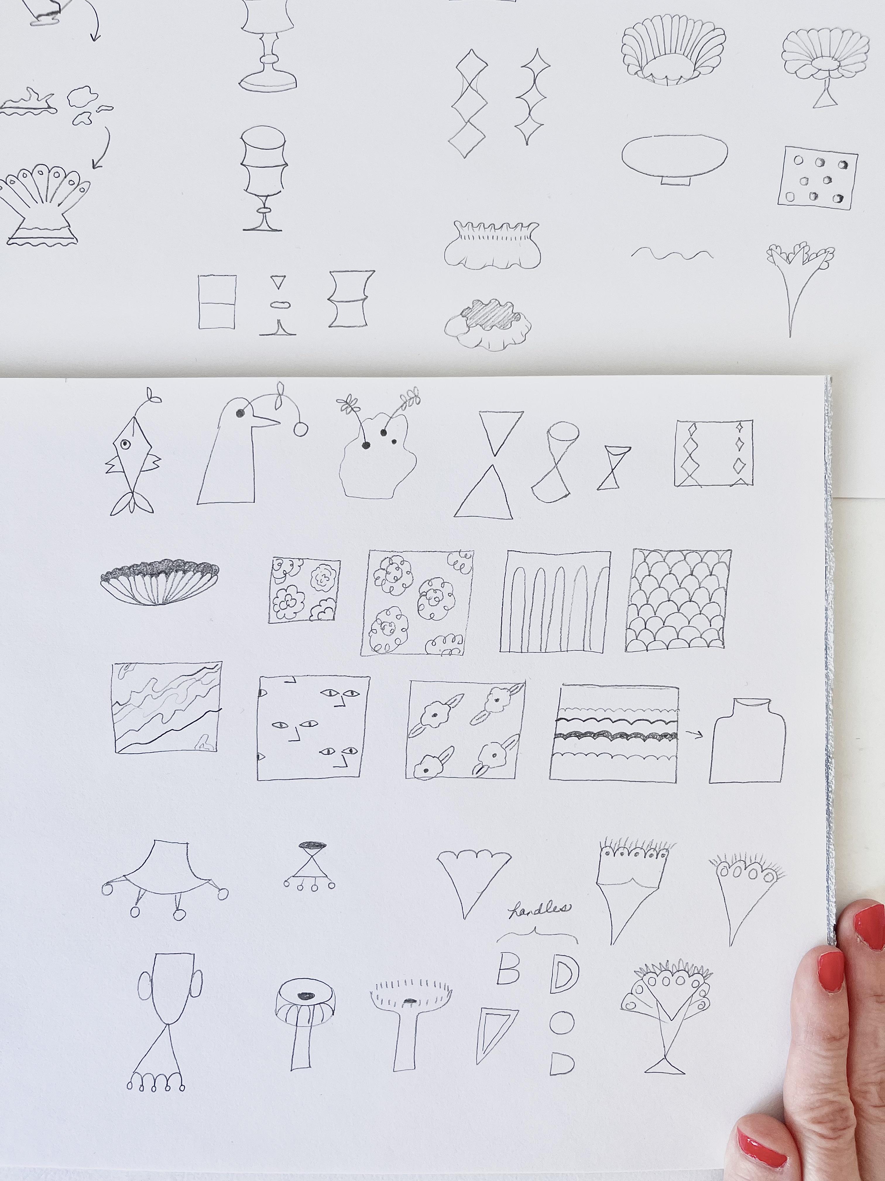
6. Shatter Your Matter: [MUSIC] Now that we
have our references, we're going to start to build on our preliminary sketches, those we collected
from our mind's eye. We're going to take
a spin through all the visual references we've compiled sketching as we go. I'm going to start
with vases in my home. I've collected quite
a few over the years. Made from wood, milk glass, colored glass, and
other materials. I'll move on to some books
I have related to ceramics, fashion, and home decor. Then we'll follow this up with some images from
royalty-free websites portraying more ceramics,
coral, and shells. I want you to think of
this sketching process as if we're metaphorically smashing existing
vessels into pieces. Then we're going to pick
up the parts we love, altered in our own hand, then build them back together in new ways with our
own embellishments, reshaped, recast, and
reglazed, unique to us. Before we move through
all our references, I want to show you
a little background on how the sketching process developed with the vase
pictured second from the left. Now what I've learned
is that we can approach sketching our
subject a few ways. When I started out, I thought
the only option was to draw things by narrowing
in to every detail, shading every little
crevice and shadow our eyes objectively
observe true to life. I would shade rather
than draw lines, hold my pencil sideways with my hand loose
towards the top. Then I started drawing them, looking at the item as a
whole, still objectively, but as more of a fun contour
drawing using clean lines, holding my pencil
towards the bottom, how you'd write still loose. Drawing how I see the
outside of the object. Letting the imperfections or expressions of my
own hand creep in, but still staying
true to the subject. Then maybe adding
lines in as I go. I developed a little more
confidence and stared at it enough objects that I later realized by studying
them a little longer. First, I could let
my focus zoom both in and out at the
details and the whole, which allowed me to subjectively
break them down into my own rough 2D shapes or 3D forms. Then play with these shapes on paper to recreate
them in my own way. Letting my sure, albeit a little
wonky hand takeover. I wanted to have more control illustrating them to
fit my own narrative, exaggerating some parts
and omitting others, rather than being bound to how they exist in the real world. Almost my own shorthand for processing all the beautiful
inspiration out there. There's no wrong or right way. But I'm going to show
you this last process. I think it has a
lot of benefits for sketching to then build
your illustrations on. You can always go back and embellish them later
in a more true to life form using the former observational
processes I mentioned. But by deconstructing
your subject into loose shapes and lines, it allows you to get an
understanding of your subject and its possible permutations
in different perspectives. You can analyze each element, take what you love
out of the object and organize what you
see in your own way. This gives you creative control to create something fresh. It also helps you
internalize things. It commits it to your memory
so it's easier to pull your understanding
of this subject out of your imagination
at a later time. Developing what I call
your sketching shorthand for jotting down new ideas
from your mind's eye. The Merriam-Webster online
dictionary definition for the term shorthand is that it's a method
for writing rapidly, substituting characters,
abbreviations or symbols, usually in the case of letters, sounds, words, or phrases. More fitting for us, it's second definition is something
likened to shorthand like our shorthand sketching
process in providing rapid or abbreviated
communication or representation. In our case, expressing or
processing visual ideas. Let's try following this
illustrative process with each of our
visual references. What you're going to do is
pick the detail or segment that stands out to you most
on what you're looking at. Is it one shape, a
color, a texture, a basic pattern like
marble checkers or dots? For patterns that inspire you, I want to highlight
stick to the simple, quintessential ones
or invent your own based on nature
or colors you enjoy rather than pulling specific stylized ones you see by another pattern designer. Then you're going to break
down whatever this element is into basic shapes
or details you see. I say you see
because we all have a different perspective and what you see might be
different than me, which makes this pretty cool. Try drawing it from
multiple perspectives. In a flat 2D shape of 3D form with depth or
your own quirky hybrid. I'll show you some
examples a bit later. Try to exaggerate what you like or omit what
you don't need. Consider giving it
a new application than the original
contexts you saw it in. If you like the top of the vase, consider it as the
bottom of another. Also don't worry about the placement or look
of your sketches. This is a forgiving process. My usual sketching process
is quick, loose, and messy. I polish this up to better explain it sequentially
for this class. In the following lesson, we will have the chance to organize our sketches
in a way that makes sense for us to turn
them into future motifs. Let's start sketching the
remainder of our assets. I'm going to take a spin through
these visual references, picking out parts
and patterns I love. I'm going to work
left to right for any visuals that have
more than one item. I found three of these vases
through vintage sellers. I just love teak and amber tones paired with a nice warm white. For the amber glass
vase on the left, I'm going to draw the bottom. I notice it has a
hexagonal shape on the bottom with triangles
coming up off of that and I like how it's pointy and graceful
at the same time. For this next one, I
like the upper part. A rectangle that darts in with these curves we could use it as a middle of a vase instead
of a top, or even sideways. Now, I'm actually going to use the pattern on the
side of this next one. This vase was from target, which we sadly no
longer have in Canada. I love the diamond shapes. Anytime I want to remember
a pattern or a finish, I draw it in a little square. This tall one is actually a
turned wood candlestick by John Ward from Lanark,
Ontario near me. I'm going to draw these
three square shapes stacked on top of each other. I really like their repetition. I looked up quadrilaterals
recently and relearned that these diamond shapes
are also called a rhombus, which sounds like a dance. This artist has actually
a cool analogy comparing the lyrical shapes of turned and handmade wood
forms to musical scales, which I thought was
super interesting. Though this isn't a vase, the shape and the process that this candlestick was made
is actually similar. It was made on a
machine called a lathe that turns it similar
to a pottery wheel. For this last one, I like how
the bottom is a triangle. But I also like how the top almost looks
like a shower cap, organic, almost like fabric. I'm going to draw
a frilly vase top in a couple orientations. These milk glass vases were
either passed down from my grandma or my mom or
found in secondhand stores. I really enjoy how many
shapes they come in and how versatile they are to mix with other
objects in your home. I love filling these with
lilacs in the spring from a tree that lives
outside our front porch. I like the dots
on the first one, but I want to put my
own spin on them. They remind me of little
buds with leaves. Here's my first attempt. I think I need to workshop
this a little bit. I might make these
shapes more angular. The second one reminds me of the Michelin Man. I'm
going to draw that. I feel I crossed over into drawing this one
pretty literally. I like the cushion square
pattern on this side. I'm going to try
deconstructing it even more, little squares. For fun, I'm going to try adding some lines to the first one
I drew to give it depth. I really enjoy the feet
on the one beside it. I'm thinking we could do all kinds of feet for
our vases actually, different types of shapes. I love the petal-like shapes around the top of this next one. I'm going to try this
in a couple of angles. Really liking this flower vase. For this next one, I'm
thinking it looks squat, like a little mushroom. I think I'm going to do
that. Hobnail ceramics always have my heart,
especially white ones. I think because of
their fun graphic nature and all the little circles and then their subtle gray scale when you
look at their shadows. I'm going to try to
highlight that here. On the far right I
like this fan shape. I enjoy the little
frill at the top too, but I think I'm going
to highlight that there's these little triangles on top of the fan and
then give those frills. It just helps me isolate
it a little better. I found these colored
vases from all over. This playful cat jug is by K. [inaudible] via anthropology. I enjoy how angular it is and the fact that
it's an animal shape. I'm going to do my
own interpretation of an angular animal. We'll draw it from
a flat perspective and we'll try a little
bird out as well. This gray one reminds me of the main arteries
of the heart. It was a good home sense gem, I think it might be one of the two asymmetrical
vases I own. What you own can
tell you a bit about the drawing style
you gravitate to. If you can remember one of my observations sketching earlier, was how I tend to draw
symmetrical vases to. Earlier we looked at
how a rudimentary vase has an opening, but in this case we have three. I'm going to play on
this drawing something asymmetrical and organic
with multiple openings. I'm going to make one smaller, so it's not too
bowling ball like. The min vase is from
a thrift store, and I really see the
two triangles here. We can choose to draw them
from a flat 2D perspective, a 3D perspective, or
what I call a hybrid. The yellow and purple
vases were our grandmas'. For the yellow, I'm
going to narrow in on this diamond pattern. It gets small to big as
it moves down the vessel. We'll try it a
couple of ways here. The purple is the
one I drew from memory in our first
sketching lesson. For it, I'm going to
draw the pretty top, that reminds me of
a scallop shell. Now, these are my pattern vases, I wanted to show you how you can narrow in on pattern options, which we've already
done a few times. We're going to draw these
little square swatches to put the patterns in. The white floral vase is from home science and these
are actually shells. We could draw these
in a few ways in varying levels of abstraction
so let's try that. I think I like this last one. I accidentally skipped this lovely thrifted blue dish here. For it, I would draw this rigid half oval or arch pattern. That you see on what
I'm going to call the three pedal sections
on the side of it. Or maybe let's try
a scallop pattern. Now the marble; another
home science find. To depict this, I hold my pencil loosely up a little
higher towards the top, this makes it so that I have a little less control
and I can let the striations or scribbles in this natural stone
fall where they may. I also vary the
pressure a little bit, so you have darker
variations of your lines. Now the blue pattern
vase is from a thrift store and it looks like it's been sponge
or block painted. It makes me think of reward
shock or inkblot test. What I'm seeing is little faces with prominent noses
for some reason. This process is actually a
lot like an inkblot test, and that it's so subjective. For all of these, you
might see something totally different than
what I'm pointing out. This brass one is from an old Moroccan tea set of my grandmas that I used
to play with as a kid; I rarely actually never really studied the etchings
on the side. I notice it's a floro and I'm going to put
my own spin on it. There we go. I pick
this book up in Barcelona when I traveled with a dear friend on a work trip. I read it home on
the plane and it really deepen my
love for ceramics. This work is by Jessilla Rogers. I love her playful shapes and her philosophy on creativity. I also really loved
these round novens that she has on top of this one. I'm going to re-purpose
them as a vase base. I should mention you could study some work by classic potters. The ones I like are
Josiah Wedgwood or Picasso or you could look up contemporary potters
like Sophie Alda or Jonathan Adler; just
to name a couple. I bought this lovely
Kate Spade book at a bookstore near me. I want to show you
how other industries can inspire your work. In this case, dress silhouettes. I love the gentle but graphic
scallop on her sleeve hem. Notice the triangle
shape of the sleeve. Let's try flipping it
over and sketching it as a vase. Why not? The quality of this photo
isn't great; the photos great. Anyways, because the
lace is blurred, it almost implies a pattern
that was there on her bodice. I'm going to take my own
liberties with this pattern and guess at it for my sketch. We're going to do something similar we did
with the last one. We're going to flip it around and turn it into a vase top. The outside of this book by Domino magazine is as
pretty as its insides. I could have run with so
much inspiration from this book but I decided
to narrow in on an oddly shaped umbrella
stand to show you how you can look for inspiration in spots you wouldn't expect. Let's try flipping it over. I like the brass
detail repeated on the top and the handle
of the umbrella stand. I'm going to try to
repeat something on my base and I'm going to repeat these oval shapes to mirror these half
ovals on the bottom. Here we have some coral. I'm going to pull
a few shapes from the bottom right hand corner and re-imagine them into a vase. Just to mix it up a little bit. Now I wanted to show you some possible patterns from nature. I like this almost frilly
stripe pattern on these shells. The stripes are
different thicknesses so I'm going to draw that here. I think that that
would actually look lovely on the side of a super square base almost juxtaposing the pretty frills
with a really angular vase. Now let's whirl through
these last few more vases. I really enjoy their handles. I like the idea of using
graphic shapes for handles either filled
in or outlined, maybe in a bright color. Illustration is a
constant dance, moving back and forth between
drawing what you observe objectively and what you perceive subjectively
to be there. A push and pull between your reference and
your imagination, between realism and abstraction. Once you own the
skill to recognize and channel either mode, you can do some really
interesting things. Also, it's a good practice
I find to learn to be forgiving of little mistakes
and quirks in your hand, it all adds to the
character of the piece. I used to study a little
quirks in artist's work, mid-century artists especially, like Saul Steinberg
just to name one. I would think, why did they
choose to do it that way? I slowly realized the secret. That perfectly
imperfect look comes from letting your hand
do what it wants, rather than any intentional
decision made by the artist. The action item for
this lesson is to create pages of rough
sketches of shapes and finishes to use for building vessels from all your
reference imagery. In the next lesson, we're
going to discuss ways to organize our various
sketches together.
7. Pick Up Your Pieces: [MUSIC] In this lesson, we're going to arrange
all the sketches, "broken pieces we isolated" in a way that makes sense to us. Analyzing your sketches
or assets is helpful. It allows us to notice
patterns and what we like. The mere act of objectively
observing and grouping things together helps us gain
perspective on our style. We can look at our subjective
tastes, objectively. Organizing your assets
is helpful too, it let's us put them
in a new context, which helps us remove biases for how we might
have thrown them together without
spending time to notice other cool options. This way we can visualize
possible arrangements, we may not have noticed. We can also see a range
of options at a glance. It gives us a go-to set
of building blocks for making new polish work
streamlining or workflow, it helps us evolve
or motifs and style. You can more easily
build on what you have rather than
reinventing the wheel, you can objectively grow
your body of work over time. Another nice benefit is you
can make a large number of similar motifs based off of
a similar shape or style, varying minor elements, ideal for cohesive
pattern building. To review and arrange assets, let's experiment here
with templates I've developed which I'm
calling motif builders. As mentioned, I've linked these
in the resources section. I made them based off of much less organized groupings
I had in my sketchbook, any excuse to tell a story and because our subject
is vases and vessels, I've made some narrative
illustrations around that theme. I don't expect you to
make a narrative theme every time you make
sketches about a subject, I just couldn't resist
making these for this class. One is called My
Pottery Wheel for organizing your
vase assets, your, "bits of clay, " and the
other is called Paint My Own Pottery for organizing your
pattern and finishing assets. Your metaphorical
paints or glazes, you can use these templates
or create your own. The main idea is to find a
system that works for you. Now let's start
looking for patterns among our sketches and assets, we were subjective in illustrating
what we loved our way. Now it's time to be
objective and look at all these assets from an
outsider's perspective. In mind, I notice
a lot of frills, diamonds, and triangles, I also tend to draw things
in a smaller scale. You might notice a
lot of circles in yours and maybe you tend to draw a larger scaled
pieces, everyone's unique. It can be surprising
to see what you gravitate to all in one spot. Let's start plugging
our items into our different anatomical
parts of a vase. I set it up this way based on the basic elements we outlined in our first
sketching lesson. How vessels have a top, a bottom, and a middle. I added optional handles and
a catch-all other section. I also added some prompts in a box on the lower right corner, which we'll review
in the next lesson. Remember to look at your
first baseline illustration of a base that you made. Do we want to include that or something you
learned from that. I think I'll include
it in other to remind me that I like to play
with negative space. Over time as you internalize
these observations, you'll be able to rely less
on visual references and can experiment more with
ideas from your imagination. There'll be able to rely on certain symbols or motifs
that you're drawn to. Let's keep moving
sequentially through them. You can also add at this point any new sketches
that this sparks. I'm going to add a trapezoid
shape because I want to remember the option of having a more graphic angular vase. Notice how I don't enter all of them into the motif builder, but ideas that stand out, this further turns our
inspiration on its head, putting our ideas
into a new context. Let's do the same for your
patterns and embellishments. As with my last motif builder, I notice a lot of frills
and diamond shapes, as well as some flowers. Sometimes I'll take an
old pattern I've made and shrink it down into an
object in an illustration, let's try that here. Another option to work with. Think of looking
back through any patterns you've made and consider trying them out
in this new context. I really like these little faces so I'm going to add
a bigger single one. I figured it might be something nice to put on the
side of a vase. Some diamonds and
some hub nails, I'm going to
workshop this floral to make it more graphic. That's not quite right,
let's try again. Yeah, that works. I also noticed I
don't have a ton of graphic,
high-contrast patterns, more organic, flowy ones and I know we like a mix,
at least in my home. I'm going to color in a graphic harlequin
pattern into this one. I like to try building
this pattern two ways, shaped by shape versus doing
it with crisscross lines. You can give two very
different effects, I like the almost wonky
handmade version a little more. I'm going to color that one in, I want to mention it can be
tempting here to want to analyze and categorize for a long time before
moving on to actually making any of your own work
and we want to avoid this. Think of this as a living, breathing palette of
ideas that you can always come back to an ad to over time. This is just your
place to experiment. Please don't get too caught up on using your motif builders. They're meant to be a
help not a hindrance. While having things
in one spot is nice for all the
reasons we discussed, it's not required for some
of your best creative work. I don't want you to think
you have to track down these subject-specific
templates before you can draw or sketch new ideas or new experiences
around your subject. Neil Gaiman, famous
author of stardust and other literary gems,
does a masterclass. In it he talks about how he catalogs inspiration
for his books in a notebook that he carries with him in his lovely
British accent, which I'm about to butcher. He says, "Throw it on
the compost heap." I often hear that his
lovely voice in my head. I just love thinking about this analogy for
my sketch books. You might not know when
you'll use an idea, but you can always
documented as you go, then let all of your
ideas percolate and fertilize each other until you're ready to go back to them. I guess what I'm
trying to say is, I think it's good to
maintain this open, spongy state without
too many right angles. This space is where the
peculiar ideas tend to pop in. Sometimes they're fully formed, sometimes needing a
bit of refinement, sometimes paired with something on the opposite end
of your sketchbook. Other times, something in your mind that you're
barely able to pin down. I know that there are
seasons for things and my compost heap often
looks a lot more like my scrappy analyzing
notes and not always like my organized categorized notes that I've cooked
up for this class. Consider this process and nice addition to your
evolving practice. Let's keep going with it before we move on to our next lesson, don't forget to
take a picture of either your sketchbook
assets or you're finished motif builders
for your class project. The action item for this
lesson is to create your own motif builder or builders in a way that
helps you make future work. In the next lesson, we'll
create a finished vessel motif.
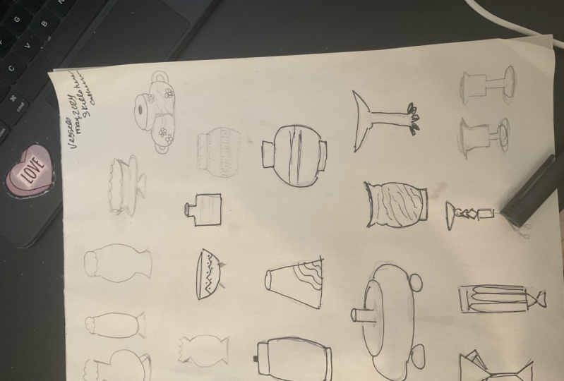
8. Sculpt Your Vessel: In this lesson
we're going to take our completed motif builders
or similar templates and use them to play and
experiment with ways we can illustrate vessels
and our sketchbook. Andy J Miller AKA Andy J Pizza, Illustrator and creator of the Creative Pep Talk podcast, says in order to make
creative gems it's important to mine,
refine, and shine. I think we've done that in
a sense with this process. We've mined our imaginations and personal tastes to
inspire our sketches. We've refined our style, analyzing what we love from
an objective perspective in our motif builders and now it's time to create
work that will shine. We know others might see more of the shiny work you put out, but we know proportionally
there's a lot more mining and more or less refining
going on behind the scenes. Hopefully this process
helps you dig deeper. We're going to make a page of vessel combinations
picking elements from each category of the my
pottery wheel motif builder. We'll then embellish as many as we'd like with a pattern or line work from the paint my
own pottery motif builder. You can add some flowers
or other elements, interacting with them,
whatever you'd like. Then you have the option of
choosing one or several and making a final piece in
your medium of choice. If you want more tips on style, you can even watch
my last class, decorate like an artist to work your piece into your decor. Let's play, and illustrate
different combinations. We're going to
experiment what these prompts on the bottom
right hand corner. I'm just going to
go ahead and pick the first options from the
top, middle, and bottom. We'll play with different
scales for the top and middle. Let's try a tall version, a wide version, and from different perspectives we'll try a flat 2D version from the side, a formed 3D version
from the top. What I call a wonky hybrid where it's
drawn as a flat shape, but our lines suggests form. Depending what
you're going for or what context you're
putting your basin, you can pick and choose. I'm going to go triangle
crazy; [LAUGHTER] just crazy, and pick the shape from each
box for the whole vase. Let's see what we come up with. Let's try something
more angular. I'm getting ahead of myself, but let's even add a pointy
pattern to this one. Cool. I could see this as
a vintage etched glass, maybe in a collection of
other colored glasses. Let's actually try softening
it up a little with some different handles very [inaudible] like
this one [LAUGHTER]. Let's keep playing with shapes. Let's try mixing a triangle,
circle and square. In some combination. I just realized I don't have
a typical square up here. Just to add that in, let's try it one way
and another way. We use a half circle
here instead. Let's do one with feet, maybe quadrilateral, or middle
or another half circle. Cute. Let's try that
one a different way. We'll throw a frill detail on the bottom just to be
a little different. Notice I'm drawing
these mostly in a flat perspective to
get the shapes down, but we always have
the option to draw them at other
perspectives later. Let me show you some
other examples. I'm going to draw this
square vessel then I'll show you how you can use
this perspective prompt with any shape. I'll put this little cube
here then we're going to draw this phase in a whole
new vantage point. Give them some
little handles here. Varying perspective when
drawing multiple phases together is an elegant
way to convey depth. Another thing we can think about which we've already been doing, it's just stacking shapes. You can add as many as you'd
like to your middle really. Here's an example. There, it looks like a smart
looking candlestick. Let's try one of our
knob end bottoms on this one. Too far? To make these work,
we could go back and vary their perspective
and scale. Maybe make the
middle part bigger and the bottom a little
nub and stained here. Anyway, let's experiment with some quirky items from
our other section. Let's try a personified vase. I'm drawing mine from the side. You could try this or head-on. Let's embellish
with some frills. Now, is this her shirt or
are they scallops on a vase? I like moments when your eye can take something multiple ways. We'll give her an earring
or is this a handle? Let's play with an organic
asymmetrical shape now. I'm going to push myself out of my comfort zone of symmetry. We'll keep it organic
and misshapen. This time, less nebulous
and more angular. We'll add our opening
to give it a purpose and some lines to
define it a little. Let's draw some herbs
to give it a purpose. Our girl is getting
in the way here. I like how these motifs
are interacting now. Maybe I'll pretend she's
smelling the herbs. [LAUGHTER] This can grow into a whole pattern of
herbs-smelling ladies. Maybe she's not a
vase after all. Here we have rosemary. I'll make a note
to remind myself. I may or may not
come back to this, but I love how playing
around makes for happy accidents and
unexpected stories. Now, let's do some more playing around with negative space and try a figure-ground
reversal illustration. I'll pick a random
combination of shapes to show you then I'm going to
color around the vase. We can pretend it's
on a tablecloth or another cool surface. Normally positive space
refers to the subject and negative space refers to the
area around the subject, but by reversing the tones
it draws your eye to the shapes around the vase
enhancing its silhouette. I like using pretty painterly
textures in this area then the empty negative space becomes the positive space and it's a
fun way to treat your eyes. Now, let's paint our pottery and do some experiments
with our patterns. Let's start with marble. Just like our last
couple of lessons, we'll hold your pencil
nice and loose. Hold it sideways. Mimic natural marble
whose lines aren't perfectly lined up to the
object it's made into, will vary our pressure. I'm going to stop there. Sometimes less is more. Don't forget negative
space speaks loudly too. Now, let's try out these arches. We'll give a little structure
to the vase top here. Now, let's do some
florals somewhere. I'm going to show you
another perspective I didn't expand on yet. We talked about what I
called my wonky hybrid of 2D shapes with 3D lines. Another way of saying this
is forced perspective. It's a way of manipulating
visual perception by varying scale with the
viewers' vantage point. I like using this trick to
show both the top and side of a table especially if they're
pretty details I like. Or in this case, both the
delicate dainty silhouette of a vase along with
the contents inside it. Employing forced
perspective along with figure-ground
reversal might just be two of my
favorite techniques. On top of this, since we're showing off pretty
sides of things, let me use this to
show you two ways you could apply your
pattern on this vessel. We could draw flowers as if they're a pattern
on the vessel. Adding depth to our subject
to cement them into it. In this case, you could add something on top if you wanted, like ice cream or some
food, or who knows? Or leave them floating inside the vessel to show they're
separate from the vessel. Another way of stacking
shapes on top of each other. In this case, from an aerial
perspective versus flat. Maybe they're potpourri. Sometimes it's nice to play double duty and have things
work a little bit harder. I'm going to add this
new pattern that this exercise sparked
into my motif builder. What else? Remember, I said I liked
the idea of adding this frilly pattern on the
side of this angular vase. I'm going to do that now, it's nice to juxtapose these things. Mix hard with soft, circular with angular.
You get the idea. At any point really, you
can also go back and add any patterns you might have overlooked for your
pattern builder. I forgot to add this square
cushion pattern here, which now reminds me of
gemstones, almost like emeralds. Would that be cool, an
emerald studded vessel? You can see how it's easy to get shiny object syndrome with
this playful process, figuratively and
literally in this case. Now let's add some
hobnails on this one, which we could color in later. I'm going to add a few
more vessels here that I think would complement
some patterns I have. Working backwards, I guess. It's good to add some
darker contrasting elements to show value and give
interest as well. Let's add another.
As you can see, I only scratched the surface of all the endless
base combinations and perspectives you
could illustrate. Even without using
our motif builders, we came up with some fun vases
in our previous sketches. I should say, for this
floral and these patterns, another way to show
it's been applied to the piece versus
floating on top is to draw it cut off by
the edges and into the corners of the piece
versus floating inside it. Now I'm going to choose vases to illustrate for our final piece. I picked three as threes
are odd numbers are pleasing grouping and I couldn't really
settle on just one. I like how this check floral and marble
compliment each other. They're all rounded and flowy
but have varied patterns. Now I'm going to do
a thumbnail sketch, a little mini sketch to see how they work best laid out
in either direction. I'm going to be stacking them
in a portrait orientation. Let me add in the darker values
here so I get an idea of their visual weight. Let's see. This way, or this way. I like the second option with the darker value
as a foundation. Next, I'm going to mark
lightly where they go. Then we'll sketch them out. Now, there's wonky and then
there's a visual imbalance. I'd like to embrace
the hand quirks. Then a final piece,
you still have to keep your overall
composition in mind. You want the negative
spaces to be as visually pleasing as the positive
spaces where your subject is. This was initially a
little too off-centered. We're not going for perfection, just balance, which can be applied in all
areas of life really. Let's make this
official, shall we? I know one of these
has less ink, so don't mind me just
testing them out here. I'll be using my micron pen
on my watercolor paper. Deep breath, big circle. I find moving your arm rather than just your hand
helps with those. Same applies to straight lines. Now we'll use the
same principles we covered to recreate our marble. On a whim, I'm going to
add a darker opening to this vessel to add in a
little more value contrast. Now, I held off on embellishing this piece
beyond the lines and patterns as I wanted this class
to be more about process. We'll save color and everything
else for another class. As I'm making this, I realized I added a line
on top that I didn't want. I prefer to imply
edges with my pattern. This is a gestalt
principle called closure, where you imply lines with
pattern or a change of color. As you can see,
it's nice to take a minimal approach and
do less with more. Instead, we're going
to turn the top into checkered scallops. I also realized as I
was making this in pen, I didn't give their
perspective much thought in relation to each other. I was more concerned
about value. Had I put them in the
opposite direction that I'd considered with the floral on the bottom and then
checkered on the top, they would've looked more as though the bottom was on a table and the other two on
stacked shelves beyond it. It doesn't bother
me much either way, I like things a bit off. They're abstract anyway. But if I wanted it
more true to life, I could look at bringing
these into photo-shop or procreate and
repositioning them, or playing around with
them a little further. Let's add some lines to these top white pieces to mirror the dark
ones next to them. It's necessary in this
case because there's no value contrast
here to imply them. If we had alternated
each frill in a different color then we
wouldn't have to add them. I'm going to put a
photo of this in a frame dark vignette mock-up
I made to see how it looks. You can feel free to frame
yours or do the same. If you want to develop
your interior decor style, frame your piece
and photograph it. The first half of my last class, decorate like an artist,
will help you with this. Then if you want to
enter your work in the frame digitally instead, you can watch the second part to learn to turn this
photo into a mock-up. As you can imagine, you
can now use this process, studying just about any
subject via your sketches. Let's take the process
we learned and use the same steps on a
random example of dogs. Empty what's in
your head about it. Find its basic form
or definition. Decide the basic parts
needed to make your own. Find additional inspiration that speaks to you in some way
from various sources. Keeping in mind how to
reference sources respectfully. Pick the part or
parts you love most. Break that down into shapes, drawn in your hand and the perspective and scale you want. You can consider subverting it by giving it a new application. Objectively observe and group your sketches to help you notice patterns and symbols that you like to gain perspective
on your style. Embellish it further
with patterns, shading, colors, finishes,
all that good stuff. Your action item
for this lesson is to experiment with motifs. Your optional action
items include creating a finished piece and a medium of your choice and styling
it in your home. In the next lesson,
we'll wrap up.
9. Congrats & Thank You!: [MUSIC] Congratulations,
you're done. Thank you for coming along
with me on this journey, learning this new process. I hope you took away plenty of inspiration to spark
your imagination, hone your stylistic shorthand
and design vessel assets. Maybe even a final
vessel or two, as well as the
technical knowledge to observe and sketch what
you love in your own way. When building your
assets more than anything remember to have fun. That's the main thing. You know what you like and
what makes you happy. Follow that. Give yourself
the space to experiment and let something take
shape with your shapes. That's where the magic happens. Remember to also post
your class project, photograph either
your sketchbook assets, your motif builders, or if you'd like,
a finished piece of one or more of
your vessels and a medium of your choice and upload it to the class
project section. Give it a title and
a brief description. Write whatever you'd like
if you're feeling up to it, share the story of some
of the inspiration behind your vessels or any discoveries or7 happy accidents you
made along the way. I'd love to hear more
about you and your story. If you have a question, there's someone else in our community who likely has a similar one
so please leave it here. I'm sure we'll all
learn from each other. Share pictures of your process
on Instagram and tag me @ericacatherindesign
with the hashtag hone your illustration style. I love cheering you on and connecting over art
and inspiration. I can't wait to
see what you make. If you enjoyed this class
and want to stay in touch, sign up for my lipstick
love letter newsletter. It includes free printables, a free PSD mock-up, and some other freebies. I'd also really appreciate
it if you could take a moment to leave a written
review of this class. I'd like to make more classes
that provide you with the most value possible and this will help
me do just that. If you want to be
one of the first to hear about future classes, please give me a
follow on Skillshare. Until next time friends
don't be a stranger.[MUSIC].
 Erica Catherine, Say hello at erica@ericacatherine.ca