Transcripts
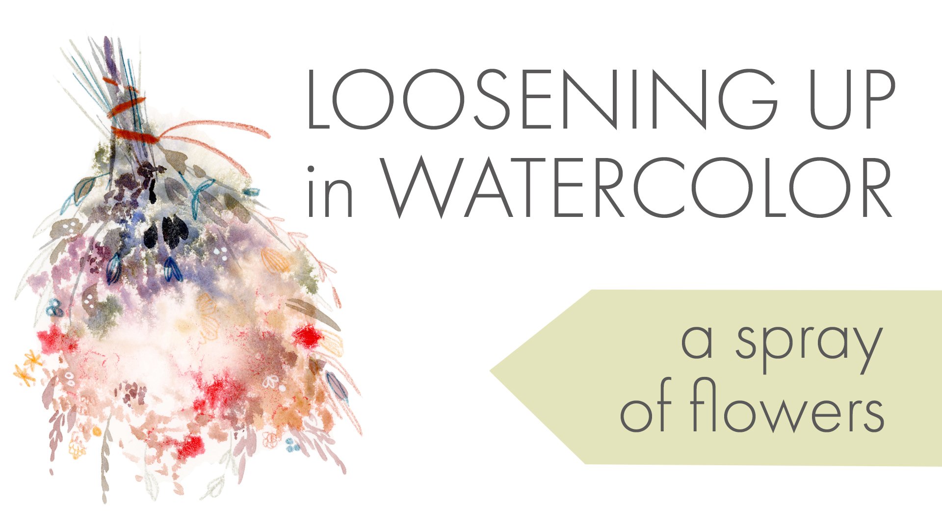
1. Introduction: Hello. My name is Dina and Adams. I'm an artist and illustrator in Minneapolis, Minnesota. Let's get into the changing season with a graphic twist on our loose watercolor florals in this project will explore the drama of high contrast. Mixed media flourishes with wash and ink and, most importantly, the versatility of black. Today you'll learn to paint peonies, dahlias, dark roses, black coleus and Queen Anne's lace. You'll also learn to embrace the void in your soul and use your black paint to its greatest effect, both as a high contrast background possibility in conjunction with light and airy flowers but also as a great creator of shades and subtlety within a colorful composition. In the end, you'll come away with a romantic bouquet arrangement fit for a Halloween romance. This class is suitable for intermediate painters with basic color knowledge and a little bit of water color. Experience, however, will keep things slow and steady, so you get lots of confidence and a great project
2. Materials: Let's briefly talk paper. To complete this project, you'll need two types of paper. Thes might be rolled in tow. One. It really depends how you like toe work. You will need a safe space to practice. For a lot of us, this is going to be a sketchbook. This is a sketchbook that can consist of watercolor paper, but it can also be any mixed media paper such as this Strathmore Mixed Media, which will hold up to watercolor and other wet media. It really doesn't matter what type of paper it is, so long as you feel comfortable and confident practicing on it, because it fits into your budget. If you decide to work in your sketchbook, make sure that your sketchbook is of a size that allows you to work within a comfortable scale. Don't work in a book that's so simple that you feel a little bit squished by your format choice. Another option is to use a larger, inexpensive student watercolor paper sheet as your practice space, and this is something that I do all the time making frequent use of these. Ken's an Excel watercolor pads. They are very useful. They're a great workhorse and one of the advantages of this paper is that it is slightly textured and therefore it's skins very nicely. If you do work for scanning, this is often a really good choice of paper in spite of the fact that it's made out of wood pulp and it's very inexpensive and plentiful. Finally, this is an option that you might choose to take advantage of, but it's not necessary. Do not feel compelled to run out and buy cotton watercolor paper expressly for this purpose . However, you may choose to do your final version of the project on what I call prestige paper, So this would be paper that's 100% cotton, Whether it is a hot, pressed, lightly textured surface or a cold press more deeply traditionally textured surface, either one is fine and acceptable and will work great for this project. Personally, I do like these Blick hot and cold pressed watercolor blocks there, a couple of bucks less than arches and the paper is comparable, if not slightly thinner. So this is something that I use within my own practice when I'm producing a piece with the intent to sell the original. If I have no intent to sell an original artwork. I find that a wood pulp papers such as the Cancer Excel or Mont Ball or the Strathmore 400 all of those are perfectly adequate for most of the illustration work that I do. Okay, let's talk paint So it's completely possible and totally find to complete this project with a scholastic pan watercolor set such as this set by Angora. The advantage is that you will have pretty much the entire spectrum of color at your disposal, so you don't need to worry about whether you have a red that favors blue or red that favors orange. You know that you will have those colors covered. The disadvantage is that your work might be a little less vibrant and a little less saturated than it would be if you used artist pigments. But this is totally fine and a great place to start. So if this is what you have not feel free to use it, I'll be using artist grade pigments and in terms of what color coverage you need to complete this project, I recommend both a red that favors orange and a red that favors blue. So I have scarlet pira land quinacrine own magenta. You'll notice that I jumped brands between M. Graham, Daniel Smith and some Windsor and Newton, as well as Ph Martin's hydrates liquid watercolor. I'm not brand loyal hugely, but I do really love em. Graham as my sort of anchoring central basic color set up. They're a little bit messy, too open and too palette sometimes, but I like the color so much that I feel that the trade off is adequate. Normally, I don't use what are called convenience mixtures. Very often I stick to single pigment paints, but in this case I'm going to be using some of this Rose Door, Rabei, Windsor and Newton. It is a slightly pricey color for what it is, but it is a very beautiful, transparent pink red that will fit in beautifully with some of our lighter offset colors. We're also going to make liberal use of our black watercolor. Finally, if you're like me, you have gotten the advice from various instructors to throw the black out of your sets or toe bypass using it and never touch it. This is really bad advice, because Black is incredibly versatile, both in terms of making shades out of our clearer, more bright and saturated pigments and also on its own merits. I have a two black, and I also have the fluid hydrates black. If you happen to have some paint like this or a black ink, this might be something that will help you complete this project and be interesting and very valuable ad in. In addition to those paints, it's helpful to have some white wash or this Ph Martin's penlight, which is a great way to add opacity to water color paint. For some added fun, it's a good idea toe have some really bright, intense pink on hand in a watch format, so this is optional, but it is nice toe have. So if you have that really bright, intense opera pink, whether it's an acrylic wash such as this turner or in a cry leg wash, or whether it's a traditional goulash such as this are Teza, or perhaps a Windsor and Newton, or hold mind designers squash. Those are a nice add in to complete this project as well. Finally, for some details, I often like to have one of these pen tell brush pigment, ink pens their pre filled brushes with black ink or one of thes unit ball signal white gel pens. I love these. I use this all the time to add a little bit of white detail over some darker areas within my work. I'm not sure that I'll be using these, but they're really nice to have. So if you have something like this incorporated now into your kit for finishing the project , let's talk brushes. Today we're going to keep it pretty cheap and pretty simple. These are literally a $5 set of creative mark brushes from Jerry's Argha Rama. As long as you're bristles, are soft and hold some reasonable amount of water, you'll be able to use your brushes for this purpose. Make sure that you have 1/2 inch flat or wash brush with a squared off edge. I'll be using a couple of medium sized rounds. Things like eighths, tens, sixes, even twelves are handy and include a couple of detail brushes. It's nice to have a short, small round brush such as this, as well as a liner or rigor, which has a little bit of a longer bristle. They don't have to be fancy they just have to hold together and be soft enough to hold some water. Let's talk extras. You'll need plenty of clean water to rinse your brush and to add to your paint in orderto lighten it and cause it to bleed and travel across your page. Likewise, I really like to have some paper towel or sponge something where I can dab up excess water and control the flow of my pain by removing some water from my brush when necessary. It's just a good idea to have some paper towel or some blotter and to paint with that habitually. Additionally, you'll need some kind of palette if you are not using pans or cakes. Lastly, we may not need these tools today because we'll be painting so loose. But I do like to have a few options for sketching my work. One option is to use a very hard pencil, such as a to H. I have a to H lead in this lead holder and in kneaded eraser so that I can lighten my lines even more or eliminate them completely. Another option is to use something like this neutral light color off water soluble colored pencil I can sketch lightly in this color. And then, as I work watercolor over the lying, it will blend into my work and disappear somewhat. This is a nice alternative for sketching in graphite, and you don't need to be is concerned about avoiding her pencil marks or erasing them after the work is completed.
3. Peonies pt 1: so to paint are peonies. It's very simple, and I'm going to start by making sure that you can see my whole set up and move on to zoom in and really get a close look at some of the detail. But for now, I really want to focus on paint and water control. And what what admixture of paint and water will result in the right kind of consistency and management of water and paint. So to start with, I'm going to use a lot of water. Just really dump some water into my palate. Well, get a lot of water on my brush. Everything is very, very wet and saturated with water, and I'm adding just a little bit of color to this to create a light wash. I'm soaking my brush with this light wash, picking up a much of it as I can. And then this is the simple part. Thinking about my favorite Joy Division baseline. I'm just going to take the edge of this brush and let it dance across my paper. I'm making choppy little strokes, moving my brush in the opposite direction of how it was intended, right? This is a brush that's supposed to put down a wide wash, and I'm using using it on the vertical to make these little squared off pedals that radiate outward from that central point. So just very choppy, very abrupt. And sometimes they touch, and sometimes they meet up, and sometimes they don't meet up. So we have this really nice fluffy pet aly shape. When I've made a shape that I'm satisfied with, I'm going to pick up more water, pick up a saturated, more saturated color of pain. It's still awash. This is still we're just dealing with light pinks and sort of goldie peach colors mixed from my reds and my yellows, and I'm just going to touch that to the center of the flower and let that flow outwards. Lots of water, lots of pain, intentional blooms just dropping some of that color in selectively across that shape, and that's the first layer. So again, it's a simple as convey be I can change and modulate my color a little bit by adding some other colors to this wash. So a more gold tinted uhm pink base for this one you'll see that I spin my brush around as I paint, so it changes the directions of the strokes a little bit very abstract, very loose, very noncommittal. And then I can pick up some color and just plop that into the center, creating a little bit of variation from one to the next to the next. So at this point, I'm just going Teoh, fill my page with examples of these P A's, and we consume in and get a closer look. Now these are going to read as white, even though they're pink. Part of the reason for that is context, depending on what else I put around them. The other part of the reason that that's going to happen is because watercolor favors drying light, so these tend to dry later than they appear when they're wet on the page. So as long as I am pretty conservative with my paint within this water wash, I should get shapes that will read as white In the context of my larger arrangement, I can cool down my color by adding a tiny bit of black to it and getting this pinkish gray color, and this could be used to modulate these colors a little bit, gives a nice soft appearance while still having some of these pink and gold tones in it. It also shows a little bit of that black and just drifts towards a cooler color without getting muddy. I can move between colors within the wash, so switching from one color of wash to another color of wash is another way to handle these shapes. But I usually drop the most pigment within the center area of each of these. It gives it a little bit of a volume. Another thing I can dio is just drop pure water or close to clean water on my page, and then I get sort of a mystery shape. I don't really know what's going to happen, but I can really puddle that on my page quite a bit. And then very saturated. Deep color forms the center and just encouraging that to bleed out as much as possible from the centers. Another way, Teoh add some volume to these. It's just another way to create that shape. I could coax my pain outward if I feel that it's not taking up space adequately, really. These air just the first layer so you can play an experiment. But using this square brush, you're able to create this shape in a very rapid amount of time with a lot of spontaneity and a lot of texture. So this is the first layer, and we're going to come back and add a second layer to these that gives them a little bit more definition.
4. Peonies pt 2: so the's are dry now. They're nice and dry there, warm to the touch. So I know that my paint is going to layer on top of these properly. It's not going. Teoh bleed together with my under layer, and now I want to add just a little bit more detail to these. So what I might do is just use some of this yellow Oakar at very strong, almost full strength, little bit of water, mostly pigment. And I might add just a few dots of this to the center of some of these. Maybe not all of them, just to give a little bit of that idea of the center of the flower. And I like them, but I feel like they could use a little more of a volume to them. So what I'm going to use for my volume color is a bit of black on my brush, and I'm going to try enter, mixing that black with the various colors on my palette. Just a little bit of it. So this red the rose door A. With just a touch of this black and my yellow Oakar with just a little bit of black to it just until this color cools down a bit and changes. Trying not to get too much black on my brush just a little bit and you'll see that just changes. Thedc Wahl ity of that color a little bit makes it a little more cool and a little more neutral, so these colors can be a really nice neutral shadow color. And maybe I want to add it to some of this lemon yellow, this bismuth yellow so I would get this very. This neutralized sort of greenish color is a really nice shadow color for some of these becomes a sort of greenish brown. Now I can use my round brush somewhat wet, pick up a little bit of these shade tones and what I like to do to just keep my line really scrolling really fluid and pretty. I will touch the very tip of the brush to my page and just create some back and forth strokes, really making a strong effort to contact as little of my pages possible with my brush. So when I know that this is just touching, I can start moving this back and forth, and it gives a little sense of this sort of ragged quality, these very loose, ragged, scraggly pedals. So that's one way that I can describe that shape, and I probably wouldn't do that same amount of texture to all of the flowers on my page, so I would approach this texture a little differently. Pick up a little shade color and maybe just add some loose strokes to one edge. That gives it the feeling of having a little bit of directional light. I can add more water as I go unjust experiment with the flow and the texture of that paint . But what you'll notice is I don't put those shade marks everywhere. I just put them on certain parts of my painting, and that helps the shade describe the shape rather than just lay on top of the shape. And it's easy to kind of overwhelm the lightness of these if I just keep working that color in and I used too much of it. So in this case again, I'm going to do that sort of scrolling texture and approach. So I'm touching this to my page and just really quickly whipping that around the amount of contact that my brush has with the paper is what influences the thickness and thinness of this stroke. So very little contact gives me that very feathery quality. Lots of contact gives me a choppier, thicker line, and it's nice to vary that amount of pressure as I work the paint. So I don't have to be 100% consistent with where my shadow marks are when I've just have a bunch of these on a page without context. So I'm going to start in the middle of this one and work that shade color from the inside to the outside of the flower. It's really just a scribbled, doodled, kind of line quality. Another thing I could dio is ignore this sort of neutral shade. Gonna wash my brush So I've got a clean brush now, but it's a wet brush, and I've noticed that these center points of color are still a bit wet so I can take this damp brush and I could just drag these outward, And that's another way to add some information to these flowers. These air just practiced, so it's OK. I can just get what I get, and I don't have to love everyone of them part of it is just seeing different ways that I can handle the information. If I don't like something, I couldn't go back into it, change it, alter it. This one I really like. I hardly want to do anything to this, just adding a little bit more of that sort of choppy, thick shaped line and giving it a little bit of a center. So the's look really abstract and really loose and really somewhat vague. And that's fine, because everything else that we dio is going to be more defined. So it really it starts to become a little overwhelming If you keep dropping detailed, layered and sort of tightly drawn information into your piece, it's really nice. I find tohave, those kind of tightly drawn elements combined with less tightly drawn elements like thes. So this is basically going to be a filler. It's going to fill up space. It's going to give the the I a place to rest in the arrangement. So this is It seems really simple and really open and really blotchy, but it's really pretty important, and I advise you to try as many of these as you want until you feel comfortable with it until you start getting some motifs that you like, and you may wind up with a page of motifs that you like so much that you put them into a pattern. So there's a lot of there's a lot of versatility to this motif and a lot of range to it. And if nothing else, I hope you enjoy painting these. So go ahead and do some practice pages of these and then we're going, Teoh, come back, and now it's time to really tackle some of those deep, velvety red Gothic roses.
5. Roses: now, In order to do this, you can really just pick your poison. So if you want to stick to tube paint, then colors like quinacrine own magenta quinacrine on red, ivory, black thes air, the colors that you'll be using. I am going to switch gears just a touch, and I'm going to switch it up and use my Ph Martin's high shirt Hydra as fluid colors. So as you probably know, if you've used the's a little goes a long way, I'm going to start with a few drops of black, a few drops of the quinacrine own magenta. Their version is really lovely and saturated. It's just a good, dark red rose color and likewise, their deep red roses, a great, intense red. It will not let you down, so these are lovely. So as you probably also know, if you've used the's a little ghost such a very long way, we're going to start these flowers by creating a red base layer. So these were going to be abstract roses, abstract dahlias, flowers like that. I'm starting them by putting a reasonable and controlled amount of water down on my page. It's just enough so that the paper appears slightly shiny. It's not a ton of water and then going to pick up one of my straight red colors. You'll see. I'm just using the tiniest touch of this color on my page, and I'm just going to work that into this area. It will bleed outward and have soft edges, and I want a very intense, saturated red shape. This is going to be our base layer for thes flowers and just going to continue painting those shapes those base layer shapes. It doesn't have to be a soft edged round. It can be sort of a irregularly shaped blob. These do not have to be precise. They just have to be read, and I highly recommend doing some different versions of your shape. Vary the scale vary the texture vary the intensity of the read this one. I'm going to use the quinacrine own magenta more and combine it with the scarlet red. You don't want that sort of, um, in this case, I don't want what would be considered good water color, so I don't want those beautiful washes with very subtle gradation of color. In this case, I want these to go to a fierce, strong red. If I I think that something is looking anything short of fully saturated, I'm can add more color and really just want these to be as thickly and opaquely painted as possible. So once more, fill your page with your first layer of color on all of these. Make some of them round, makes some of them irregular and just have fun with all the variations you can come up with , maybe some with an almost dry edge. For some texture. Just change it up and have some fun with it. So this layer is now dry, and this red represents the lightest color and the lightest value of the the paint that I'm about to apply. So I want my darkest dark to be a ST inky black. Whether that's to paint or liquid paint as this is, it really doesn't matter. And I want to create a mid tone that is primarily red mixed with a little bit of black. So about 2/3 to 1/3 when this color is combined, it should look like a deep, almost black, brown black on the palate. However, this color will be lighter when it is applied to my work simply because of the nature of water color and its transparency. So if you're using to paint, try using a purplish red, a red that favors the blue mixed with a small amount of black. And keep that paint as fluid as possible while still being as saturated as possible. So very little water. If you only have reds that favor the orange, you can still use them. It will be a more orange, um, more orange brown, but you'll see that this is very close to this in terms of how the value looks, how dark it is on the page. I'm going to pick up my darkest color now for now, with my brush, and I will just want this black to be as close to Incas possible as close to the just straight paint out of the tube. And to start my roses, I'm going to make two parallel little hatch marks in a V shape they could touch. They don't have to touch. It really doesn't matter very much, and I'm going to work a serious of hatch marks, starting by crossing the two of them and then angling around in a tight little spiral, and this is how I work the folds of the roses just by working thes hatch marks in a spiraling shape around each other, and I can start with straight black, then clean my brush and instead pick up this reddish black. And now I can widen those hatch marks as they expand suggests that these pedals appear wider and the flower appears more open. As I worked my way toward the outer edges of it, and I can saturate this color or Aiken, add some water, dial it down a bit. So I moved to those outer edges, and that's how I would form one of these black roses. So as before, repeat this process across your page and experiment with little variations that you can dio . The variations can be very subtle. What if I grip my brush way towards the back and lose a lot of that control? What does that do for or to my work? So just picking one or two variables and changing those as you move around your page and just try different strategies. Maybe I want one of these two really darken at the center so I can briefly add on a whole other layer of color and really knock that magenta deeper into the maroon. I can let that dry and pick another one of these to work on. They could start with a very concentrated amount of black paint, then clean my brush. He was a very dilute formulation of my paint and then see if I can get some bleeds toe happen, causing those bleeds across my paper. That gives a really nice sort of subtle, more abstract effects. So that's something I can do when I find strategies that I like, I tend to try to repeat, Um, see if it's possible to keep them going again. Not maybe that when I want to take a little darker. So now that this is pretty much dried, I can work my black paint into it, and you'll see that that black goes to a darker value as the light value within this pace. So it appears darker overall, that's another factor that I can play with. Maybe I want to change the shape or the placement of my darks. So if I sort of favor one side with my mark making, it gives the idea that one side of this flowers and shadow and another's more lit up. So that's something that can be played with a bit. I don't have to overlay and overlap my colors perfectly. That's another factor that can be tweaked so I can start this, dilute my paint and sort of superimpose the shape of thes pedals on top of that sort of schematic as to where I think the pedals will fall. And that's always very interesting to me when things don't register exactly. I think that's a very nice and dynamic way to paint these abstract florals. - So really, just allow yourself to play around a bit. But you get the general idea, and what this does is it lays down a layer of deeply saturated color so that you're not in the position of building slowly toward your full value. You can lay in your value quickly, and what this does is it keeps things very fresh and spontaneous and satisfying. Even though the colors are very dark, this is a great way to avoid, um, muddied or overworked appearance. I think so. Complete your page of black red roses and then we're going to move on and we're going Teoh paint some more subtle Black Dahlia's and we're going to paint some black coleus as well as some neutral queen and lace to fill an offset our arrangements. Then we're going to put everything all together.
6. Various Filler: quickly demonstrate a black dahlia, and this is just another two layer simplified shame. And the black, in this case is sort of a neutralized red black. I really want things to be almost toward the maroon in this. Maybe add a little red. I'm still using my fluid water color. If you are using pans or cakes, feel free to use a dark brown. And if you're using regular two colors again, you can mix your black with your red for a dark brown, neutralized red again, very dark, very saturated, very close to full paint concentration. I'm going to start my dahlia by just creating a circle. As you know, these are very circular flowers. There's not a lot of variation to the edge, and they will read correctly. If you start them with just a simple circular shape like this, I'll put down two of these. I'm going to move on and demonstrate some black coleus. Lee was. These were going to be one of our fillers. So for coleus, it's a very simple leaf shape, and this can be articulated with thick brushstrokes that get thinner as you go. And they're just very simple, smooth regular leaf shapes like these not going to include a lot of these in the arrangement because I feel like it could get overwhelming pretty easily to have a lot of these. But my brush starts in the most possible contact of the page. I drag it across the page and lift at the end, and I do that twice so that my marks meet each other. You'll notice that I don't go back and clean up the irregularities in these edges. I don't mind those open spaces. I want it to be just one and done. If I go back and I start fixing and tweaking these a lot, they lose some of that spontaneous character. And I don't want to lose that. I want to keep that. So I conduce you one stroke or two. It doesn't matter just depends on what kind of think this I want. These were just these very simple plant leaves, so that's the first layer of one of our fillers, and you can do these with fluid water color. You could do these with tube watercolor either way. Once again, you're using that black red combination and you if I compare that with the roses, you'll see that the color has a lot more. It's much more dull down. That's much more neutralized. And I want that. I want this really intense red to be an outlier in my arrangement. I want it to be something that is sort of a treat for your eyes. You grab it once or twice in the arrangement. It's not a really strong color in it. Where is this? And the This in combination with my light neutral will be the more common variation of color that you'll get in the piece. So I'm just This is this is the first layer of these and you can practice these as much as you want, creating my stem and then letting these just happen. Very organic, very casual. Lot of pressure, little pressure, a lot of pressure, a little pressure. They're just a nice medium sized filler, and they can have a nice sense of direction. You can use the flow of these to lead a person's eye around the page in a nice way. A lot of pressure, little pressure. I like to do fancy things like here's this is bad practice because I picked up my brush and put it down. But I like to do fancy things like give my brush a little twist. Let things kind of hook be a regular, those interesting gestures. It's a really nice place to play with that and to practice those really spontaneous pretty gestures and mark making techniques so you can practice more of these, and I'm going to go back to my tube paints and demonstrate some Queen Anne's lace is our final filler flower. Okay, as I wait for the Collis and these dahlias to dry completely, I can change out my water. It's looking a bit Swann B and I want to demonstrate some Queen Anne's lace really quickly . This a flower that's normally white but also comes in a really intriguing and pretty range of neutrals. So I'm going back to my yellow plus peach plus black palette, and I'm going to mix some of my most orange ilo's with my black a little bit. Just making, um, making kind of a nice, dulled, hand brown color sort of yellowish grey. Maybe pick up a little bit of red pushes a little redder. That's kind of nice. So I'm just looking for a very mid range brown kind of color, and I'm using my liner brush now. This is the longer bristles of my detail brush and a little bit of black just to create a gray stem, and my other brush on hand is my regular medium round brush. So with the liner, I'm going to use the liner to describe the shape of the stem. And Queen Anne's lace consists of a number of curved mini stems or sort of sub stems that work together in a U shape like this. So they all come together to form this U shape at a central point, and there's lots of them. So it's a very lacy, even at the human in the stems at the top of the stems. And then this is a thicker central stem like this. So that's the shape of the stem, and I'm quickly. While this is still semi moist going, Teoh, catch some of this 10 brown neutral mid range pigment on my brush and then just create a Siris of joined dots, sort of a fuzzy, dotted line of information up here and these air these fan out wide. They're sort of fan, brush shaped might think in the line a little bit above and below. Put some irregular ready into that. Then there there might be some leaves there, kind of scraggly little side leaves like this. They're very thin and small, and they tend to point down and away from the stock. But that is pretty much the shape of my Queen Anne's lace. I can layer this and darken some of it or change some of the colors within this so that more than one color is described. But you get the general idea so these neutrals will play together with my black with my red with my maroon, and you could just practice a couple more of these across our practice page. You start with the central stem. Start with little substance aims. It doesn't really matter when I drawn lines with my brush. Best practice is to hold the brush, contact the paper and move your hand to the point. The brush doesn't need to move in your grip at all. It's all about moving your hand and maintaining that level of contact with the paper. You'll find that making that shift I don't have the greatest brush control, but making that shift has helped what little skill I have in that department, a great deal. So again mixing some black and some red or some yellow just using the colors I've got on my palette to create these neutrals. And I could go back and use some of my reds or my blacks if I want a more purple kind of color, which these also come in. Just describing that shape I can add, stem my ad leaves or leave them. It's really not important. It's very easy to make something that will read as Queen Anne's Lace. Let's say that within the arrangement, I've gotten one of these, and it's kind of poking out of the arrangement and facing me, right. I don't need to describe the stems at all. I could I might just have sections where you just see this. So my section might just have some of this in it, and I know through context that this is this. So a lot of this mark making is not hard to do, and it's not complicated, and you don't need to worry too much about your shapes and let giving people little bit of information and then leaving out the rest is totally fine now for the coleus. Now that these air dry, I'm going to show how I like to finish these up a bit. Um, just because black coleus and these were sort of a neutral, there's sort of a mid tone coleus, right? I could do this leaf in a deep, straight black ink as well, So feel free. Teoh. Change it up as you paint within the arrangement. Feel free to change it up is your practice, but I like to add a really bright pop off hot, hot pink if I've got it. So this is the time to play with that beautiful whole buying offer a pink or a cry l A opera pink. It's really a nice color. I have the budget version, which is the Artie's A. But as you can see, it's just a beautiful fluorescent pink quash. I can use my little spotter brush for this, or I can use the liner. Either one will work, and with quash, I add some water to it. I want my gosh to be a very spread herbal, but thick enough melted ice cream texture really just want this sort of the perfect enamel type texture so that it's my liner brush carries it in a nice straight line, and I'm just covering my bristles with it, but just covering them. So it's not my brushes not soaking in my paint. My paint is not gloved on my brush. It's just covering it very nicely. And now I'm just going Teoh ad some very simple line work along these edges. If you look at coleus, a lot of them have these very beautiful bright fluorescent edges and shapes. So sometimes you'll find that intense pop of color as it is here, just along the edge and in other examples, he'll find it right down the middle so I can add it there if I want it. Another good color as the sort of highlight augment color is a bright green. You don't have to do the pink, but that's just one of those things that I think it's not. I'm not painting this in a really botanically accurate way, obviously, but little details like this do reflect botanical accuracy, so they sort of its these little tiny things within the abstract that say No, I know much. I've got my chops. I know what goes here. I know that that I'm able to I'm including that little bit of detail that tells you what this is. And I think some of those things work in a sort of almost a subconscious away. They're not really obvious or really conscious. So just throwing in those little details, I think is really just adds a lot to the proceedings. So we still have these black dahlias sitting here waiting for something to tell you what they are and I could use Some might actually just drop my go back to my fluorescent and just at a couple of dots of pink at the very center of these, Just so I can keep track of my center and sort of describe that center a little bit now rents my brush again. But as you know, dollies have lots and lots and lots of little curled petals and tons of detail, and you could just really lose yourself in it. Or you can abbreviate it so that everybody kind of knows what they're looking at. But you don't have to spend hours and hours and hours on it, so I don't know, given those two options In this kind of painting, I will choose the ladder just about every time. So how do I describe all of those pedals? Here is where my friend, the unit ball signal pen comes into play. I knew you were probably wondering where that would show up. Here's where I like to employ it. So I have a dark background item and I have a lot of little details I want to introduce to that. I can just draw them in white. It's not something that will appear that way in nature, but it doesn't matter. We just need to understand what's in front of us. So those pedals have sort of a tapering shape like this, and it could start them with sort of the classic kind of five or seven point we'll do. Six. It doesn't really matter. It's not that important. And then toe work my way outward. I just work that tapered shape in between. Wherever I drew that information, it's not going to be perfectly symmetrical, and it doesn't have to be. So the pedals just continue bridging that distance between the ones I already drew. That first layer establishes the rest of the information. Just add these until I have closed up the space all the way at the edge so I can add little folds in each of these, starting from the far end to the close end. That little division makes it even more satisfying. Toe look at it just gives the right feel. It's not the most literal version of this, but you know what you're looking at from the context your hind brain tells you what you're looking at. You might not even think, Oh, this is a dahlia, but it works in the larger context of everything else that's going on. So tapering shape ad concentric grows by bridging your pedals and just keep that going. It doesn't have to be perfectly even or symmetrical. Nothing in nature really appears perfectly, even are perfectly symmetrical. It's always in motion and influx. So the wonky er it is to me, the more satisfying the better. That's just personal preference, but I like things wonky and weird. I like to be surprised, and when things were crooked, they kind of surprised me when things were cricketing. I'm less liable to be bored by what I'm looking at and you know, the way you detail this is optional. You can put that little division into these. You can do it as many times or as few times as you want to do it. But it gives that idea. And I love using this rather than fine liar and wash. It just creates a different line quality to even a detail brush and watercolor. It doesn't fan out the same way the Incas thicker, so we have a really nice range of different shapes, different values, different ideas. And now I want to put them together into a quintessential e Gothic romantic arrangement. So we'll get together and we will talk about exactly what that means in just a moment.
7. Project Sketch and Plan: I say to you, the phrase vase full of flowers. What does that look like in your in your brain? Right? Like what is that appear to look like? So I don't know. We've got our little arrangement. We've got some fillers, We've got some foliage, We have some stuff going on. And then, you know, you've got some kind of vase and you know, some sort of verticals, and this is probably what you're visualizing something like this. Maybe it's, you know, maybe it's Grandma's picture, but you get the idea. This is this is sort of what comes to mind. It's what comes to my mind anyway. But for that romantic Gothic quality, I think that the better option is you've got your large flowers. You have some folk ALS. You have some fillers, you have more large, profuse flowers, More folk ALS, four fillers. Everything is very, very corazon, and arrangement sits in some very morose looking beautiful urn. And you get shapes like this. You get Queen Anne's lace, you get a little bit of verticality, but not much. And it's all about this very extended forms of control. So this is this feels to me like the much more quintessential romantic arrangement that if you look back, I mean, this is this is what, um, what has shown up on the pre Raphaelites tables on Kate's table on Shelley's table? Not this, but this. So this horizontal urn shaped arrangement is what I'm going to focus on, even though my flowers have a sort of mid century looseness, this arrangement is going to trigger the right associations in our minds and push us into that more Gothic mindset.
8. Putting it together pt1: so for putting it all together. I don't like to do a really a big preliminary sketch with this kind of thing. I really don't like toe lock myself in too much, because if I paint my vessel, inevitably I've got flowers that dip below the line of the lip of that vessel and then I have to paint around them, and it just gets really messy. So I really just want to give myself a very vague idea of where the horizontal limits of my space might sit. So this is what I'm focused on. And then, you know, this will come down. However that comes down, that's erase herbal or, you know something? I get just a lot of work into a wash. But this, you know, here I know that there's gonna be some information here and here. Here. Maybe so. I really just want to keep this open as much as I can. That's the extent of the planning I'm going to dio. I have my plan. I kind of know what I'm doing and where to start with. My peonies will go back to that and I want to work from light to dark that makes life a lot easier. So I'm going to do that by starting with my peonies. My biggest and latest value flowers will start because I can always overlap them really easily. Let's do one of our beautiful black red roses and I'm actually going Teoh, knock this initial color. Even not gonna knock it back to even a little darker than that Straight red. So it will be so fiery. This kind of grayed out magenta is going to be the lightest value, so this will appear very velvety. Now I want to add one of my dahlias. So now we're going is close to black, Really brownish. Just a little water to that. That's a really good color. It's the base layer of those. Put another one up here. I'm going to let that dry, putting a lot of water on my brush for some coleus leaves so that this is that color about much more transparent. If you remember, it's a lot of pressure, little pressure, a lot of pressure, a little bit of pressure, interesting, that kind of weird wisdom of how my hand moves when it seems when it feels out of control. When it's slightly out of control, knowing that it's still gonna work. Going to sketch in a little my Queen Anne's lace. - Here I can work some of my brownish colors together with a little bit of that purple on my brush . They really like the results they get from doing that, so I have a little more. A little more latitude could be a little more playful than on the practice page, because I've got, you know, some staining on my brush already. - So something like this is missing a green. You'll notice that I don't have any green in this, technically, and I like it that way. Green can get a little overwhelming and green can get a little predictable. And so what? I like to dio when I have a bunch of colors like this instead of green. I will mix my lemon yellow pretty aggressively with a touch of black, and I get a really nice green and pro tip when you buy olive green convenience mixtures. This is often very often this is how they're made. So it's my lemon yellow together with a little black. I think I'm gonna go a little black heavy. I don't want it to be so yellow, but you'll see I get this really nice, um, neutralized olive green. So the's peonies, right? They'll have some leaves, will get little glimpses of leaves and stems and things, and I want it to be just literally tidy little glimpses. I don't want a lot of green leaves in here. I think that's too cheerful. So this is kind of our first layer of information, and I like what I have. I think maybe it's a little bit of that green coming up across the top peak of some kind of leaf here. It was really quick shapes, right? A little pressure, a lot of pressure, a lot of pressure, a little pressure, just letting that brush kind of dance across, skim across their let it do its thing. So my vessel needs to be a color. But I don't know that I have to decide that quite yet. E think instead what I will focus on is these need their second layer information, especially these. They're looking very vague. They don't have a lot of presence. So I'm going to add some information to the poppies. Um, the pne sorry. Poppies would be good in this. So you remember from the practice that now I can add sort of a deepened layer of got sort of a muted pink, and I'm just going to quickly give this some texture along its edge. Define one of those edges a bit. It's kind of an enthusiastic shape for a Gothic arrangement, but I feel like, um, this needs toe have that sort of, you know, those little moments of enthusiasm even within the within the dark quality of it. Drag some of that pigment from the middle outside the middle. Here we go. I've got my roses and those, I think need to be pretty intense and graphic. So we're starting with that little center mark and swivelling those little hatch marks outward to create the sense of pedals. Now I can make sort of informed decisions. Is this value deep enough to I want to go toe or like a really strong black instead? E think I want to get very close to that black convert. Red Black, See what happens. There we go. That is super velvety and nice. If I do say so. So here. Remember how on some of my practice roses. I really kept the shading more toe one side. I think I'm gonna adopt that strategy here. This is red and black. - Once again, something like this is so graphically powerful. And I feel like these edges need just a little more management.
9. Putting it together pt2: so I'm going to a darker brown fur, some of those edges. With those light colors, you can always get darker. You can always build that you can't back off a Z easily once you've built, so I like to go slow. And the color that I'm using is just a very neutral combination of all of the colors that I've been using. Some of the yellow kind of based on that olive green mixed with my, um, my pinkish color. Yeah, I think more texture in that area will help. I want to get to that peach pink again. I want some type of neutral for this. There's so much information and movement, and I want this to really be solid. So a way to do that is to add Gua, sh or pen white to my watercolors. And in this case, what I'll probably do is use up what's on this pallet mixed with this, and it sounds almost simplistic, but it's a really nice way to almost ensure that whatever neutral I come up with, it's going to make sense with what's established on my palette already. So some black. Some of these leftover colors the's yellows, a very yellowish grey is what I want as my base color for this, and it will automatically relate to all of these because it's got the same information contained with it as a gray. So I'm basically just mixing a neutral that I like based on all the colors on my palette, and I will use that as the basis for those vessel. This is going to be very flat. Go wash painted, um, color. It's not going to be transparent the way everything else is, and I may work more than one layer over it so that I don't have a lot of texture information there. So it's a very flat application now. I'm leaving a little white space around there, and what's nice about this decision is that I can roll with it and leave the white space they're all together, or I can close that up. Tighten up that edge, clean that up if I want this shadow Color is a combination of my neutral with some black and some of the yellow on my palette. So it stays in that kind of warm gray family gonna give the idea of some of these shadows from all the plants above nothing to, um, uptight, just a little glimpse of it while I have all this nice white space. And while that is kind of nice to look at, I think the best background for this is actually flat black. So there's lots of ways to do that. You can use black wash you can you use black ink, whatever works and what I'm going to do just to make sure that I like my edges and the relationship of my edges and so that my painting doesn't start Teoh interfere with my drawing as I'm going. Teoh, use my black ink pen to add black to some of the tight spots where I might get into trouble because this pen brush is really nice and precise so I can decide how much white space I want to leave. And if I want some textured, dry brush edge to that black as it encroaches, this brush will give that to me. It's just quite beautiful at things like that, so I can lay in some of those edges with this brush. You squeeze the barrel of these just Teoh released thing cause you go and I might decide to tighten up that edge and get rid of some of that white space? I'm not sure yet, but this gives me a nice safe start area. Then I could sit down and lay in my black. Now grab a larger brush for this purpose. Yeah. - Yes , no.
10. Project: Okay, Bat wings. It's been a long slog of it, but now it's your turn. You've got what it takes to plan your own composition. You know how to paint contrast with dark and light goodies from the Gothic garden. Now go ahead and post anything you can think of from the class, whether it's your loose watercolor floral practice sheets or ah, Halloween wreath of your own design or a bouquet or arrangement such as the one that I've demonstrated, I'd love to see the twists and turns at variations in what you've got. It's been a wicked delight painting with you today, and I look forward to doing it again. You can follow me on skill share for new classes as they happen. Thank you so much until next time, take care
 Dena Adams