Transcripts
1. Introduction: Hello, everyone. My name is Aisha in Saudi. I'm a watercolor and handling artist. If you have always wanted a hand letter courts using watercolors. But you have felt discouraged to do it because of the number of elements that go into it. Then this class is for you. Because in today's class, I'm going to go step by step over how to lay out your court and painted using watercolors. You are going to see the whole process from composition to the final piece. In watercolors, you will learn letting composition, how to place words to create visual interest. We're going to discuss different forms. Styles were also going to choose a color palette that goes with our court, and we're gonna paint every word using different watercolor techniques. I will also go over how to paint some blues, florals and leaves and other supporting elements. I've covered this topic in great detail in a previous class, but I'm going to show you some basic ones that I use here and then using these were going to decorate our peace. In the end, I'm also going to share with you what I did with this artwork. So your project today It's a big accord that you love and using the steps that you learn create your own beautiful hand lettered watercolor piece. So let's get started.
2. Project Description: I would like to take a minute and explain the project for today's class. You will be creating a court using watercolors. You can pick a court off your choice or choose one from the list. Of course, that I have provided. Take a few minutes to figure out a good composition for your court. You can keep this simple and choose accord with fewer words For the color palette. You can get inspiration from anywhere around you. Maybe some photographs that you have or you can. Google couplers are more board on Pinterest Whatever reflects your court, don't be or bound. Just enjoy the process as artist therapeutic, and it should relax you to get your creative juices flowing. Watercolor is such a medium, which is truly magical and letting those colors flowing. Bleed is the beauty of this medium. You can finish your piece with some loose florals and leaves. You are free to emerge this step altogether. If flowers are not your thing, I want to share some more of my watercolor pieces for inspiration. I have used different color palettes and layout Please. You upload your final piece as well as your progress shorts. Under the project gallery. I would love to see them. And if you need any help, please send me a message and I will get back to you as soon as I can see you in class.
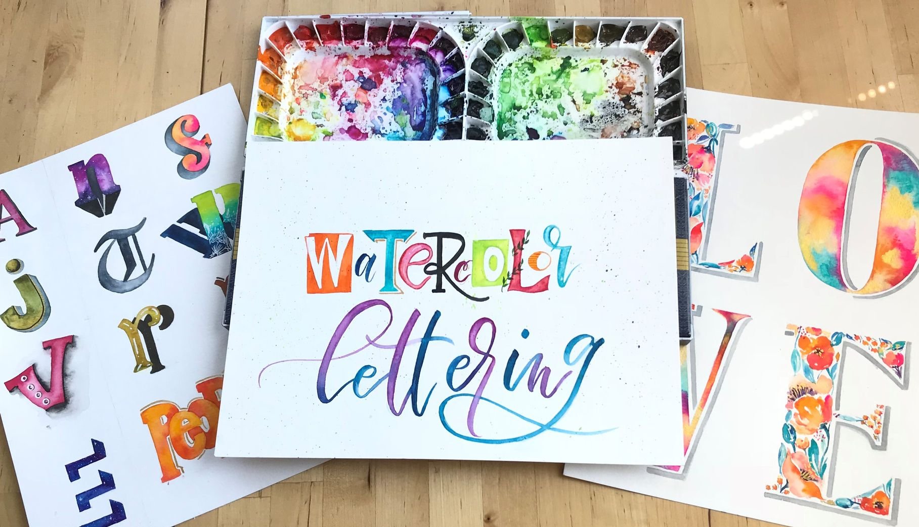
3. Supplies: for the supplies. You will be needing watercolor pains. Um, you can use anywhere colors that you have. This is the one that you would be seen me use. This is my Jane Davenport Ballard in brights, I will be mostly using the pink. Um, I would also have this. My gentle mission. Water clapping to the one that I usually use Commonly tube that you can then squeeze in. Tow the pilots around it. This was an empty ballot. And I use this to squeeze out pains that are sold separately in tubes like these. These are the whole buying and I guess a few Windsor Newton. I always like to add a touch off gold or some metallic colors. So abusing this pilot by pure dark a gunsight ambi This these air called the story colors. You will also need round brushes inside. 0246 I use the size you're into for detailing on and final work. Whereas the thicker Once for flowers for watercolor paper, you can use any heavyweight watercolor paper. But you will be seeing me use the cancer and excel. This is my favorite watercolor paper to use so far. Um, it's heavyweight. It's inexpensive and the breed proof white for details and for also fixing those little mistakes I would also be using these. Big Mama Grown spends the ink pens for details, a pencil and new razor and a jar off water, and we're all set to start a class.
4. Composition and Layout: Our first step is to pick a court. You can do an Internet search to get some really cool courts, or you can check the resource section. But I'm using the court led the beauty of what you love, what you do. It's a slightly longer court, but you're afraid to choose something that a shorter So first thing that I'm doing here now is I'm going to choose the I mean words here. For me, it is beauty, and I feel like it's love because the other one that I want emphasis on and eso and these are gonna be sketched slightly larger than the rest of the words. Um, so I also see what other supporting words are there. And I see that what you is repeated. So probably it can go on either side. That's what, like I mentally picture, we don't want our court in a single sentence. So what I'm doing is dividing it into three. This is because I wanted to be due to be in a standard rectangle, but you are free to go ahead and put it in a circle or any other shape that you want. But I'm going to stick with the rectangle. So do everything to let the beauty and then off what you love be what you do. This is not the final ah way. But I'm just like tryingto go ahead and see what I can do now with beauty and love. Probably put them in the center. Now, I also noticed that the word do is, um, probably going to be part of my main words just because it looks right. So I don't on my mean words first. And then I put in my supporting words I'm not really focusing on foreign at the moment. I'm just trying to figure out a good composition by composition. I mean the ways in which the words are laid out so that they look well balanced. I'm using some nails, and some nails are perfect because you can sketch are different layouts in a short amount of time. So you can decide how you want your court to look. I'm gonna make a couple of them. Ah, maybe three. But you can make as many meals as you want. These are rough drafts so we can make as many changes as we warned. Can move the words around Ah, One tip is to make sure that we don't get a lot of words. Crowder on one side. And also, we don't leave a lot of gap between the words. So there's not a lot of space which looks empty to the I when you look at it. So step back, take a look and ah, play a round, Figure out what you like. I'm going forward this a little bit until I can come up with a good composition for my court. I really like the composition in my third some nail, which is in the bottom left corner. I really like how watch you falls on either side of love and be so I refined it a little bit in my fourth some nail and I'm going to stick with this, um, composition Now that I have Ah, my rough draft A sketch of my rough draft. I'm going to try and come up with some different forms styles. As you can see, I'm using a dot Bad. This is to keep my letters a certain size. You can use a dark part of the great bad anything. Um, I'm also trying Teoh reflect the meaning off the world in my lettering style. So I'm trying to make beauty more flowy and generally more beautiful, like in a script style. Now the same goes with the word love. Um, you can experiment with all different kinds of forms styles, but don't get too many foreign cells in your lettering, as it wouldn't be than very cohesive. You want to come, you know, toe finalize like a few foreign styles and then work your court around only those. Since I really like birth lettering I tried incorporated into my courts. On the other hand, lettered pieces. If you would like to try your hand at watercolor lettering, then I have a class called watercolor delivering, and it also covers brush lettering and it. So I'm just going to keep trying toe play around and work out different form cells for each of my words, and then go back to my thumbnail and try to make one with these finalized foreign styles. So until then, I've just forwarded a little bit and then show you the final piece. Now I'm ready to draw my last come near and this I'm going to put together the court in the forms that I have decided and I'm going to see if they go together. I can just redraw them if I feel that they're not going together, for example, And for my last word, that is do I'm not really sure if that phone is going to go, So I just ah, play around a little bit and see And I think I like the brush lettering style for the last word. So, yeah, I'm pretty happy with the way that has turned out. Now the next step is to sketch our final composition, um, under a copy river. Now, this is still our rough draft, and we can still refine as we go, as you can see at drawn a line down the middle of my page. And that is because I, um I really want to keep the spacing, Um, between the letters equal, I've learned that's actually the hard way because many times earlier what it did waas I were just eyeballed the letters and place my words like free hand them. But then, after all the hard work, I would notice that the spacing was an equal and the court didn't look as need or as well space as I would have liked. So now I actually like, count the number off letters and put like equal number on either side off my middle line. I usually just keep 1/4 inch distance between the lines. And as for the words themselves, two lines are enough to ensure the height of the words remain constant. On this job. I'm also going to mention the author of my court. This court is by Rumi. So I'm going to try and write this in a skinny phone at the bottom, keeping a little bit more distance between the court and the auto. So this doesn't look like it's a part of the court. Finally, it's time to sketch our core onto our watercolor paper. I'm going to follow the same steps off measuring and spacing, and that is why I'm going to fast forward this part. - As you can see, our court has some pretty dark a pencil outlines, so I'm going to use the flat side off my Raisa too lightly. Raise it on and remove any hard edges. I know your father artists use different kind of pencils, but this just works for me, and you can see, my razor has bean well used, so I usually just raise it. And so I get the I removed the heart outlines, and I still have a little markoff where my words are
5. Color palette and fonts: Our next step is to choose a color palette that goes with our court. You can browse through Pinterest for a lot of inspiration. I want the court that I chose to have some pinks and purples. So Ambrose ing for Pink Palace to see where colors would go with pinks. When I do smaller projects using watercolor paper, I keep the leftover cutouts for testing are different color palettes? No for future paintings. So here I have one small piece on using my spray water spray toe. Activate my watercolor pains. My first color is being. This is from the Jane Davenport bright palette. It's a opera rose I am going to pick meant India's My Next colors. I wondered my ballot to look ah, bit more bright and cheerful. I feel like, ah, to keep your pilot more consistent, you can choose different shades of the same color, self chosen, a base to purple and her dark purple. And since I like both, I think I'm gonna keep both. I'm also choosing a bluish green Andi Ah, Gord for that extra shimmer. Next, I am assigning the colors for my words on the rough draft. Again, I'm going to be choosing the colors to reflect the words. So, for example, the word love will be in pink. I I think I want to make it in pink. And, uh, my next word, my mean word is beauty. So I might put it in the different purples that I chose. The pace will purple and the dark purple. I don't want a lot of repetitions. So I'm thinking off choosing the government for the word be. And I still have a lot of words. So I warned the dark blue or dark green for the words. Let the and I might choose the same thing for off for what you I still haven't decided so I might add a color to as I go. Sometimes I start painting and then take a step back and feel like I should have done another color. And then there's nothing I can do about it. So to award that, I pull out these small watercolor pieces for her trial and see if I'm happy with the way the words will look. I'm starting with the word beauty, and I want to use more than one color in this. So for this when using two or more colors. In the same letter, go for analog a scullers, those which are on the same side of the color wheel. Example. I'm using purples like light and dark ripples. Um, you don't want to go for complementary colors, which are the ones that fall opposite to each other on the color wheel. Like I wouldn't do a purple and yellow because thes colors when mix, they will just cancel each other and become a dirty brown color. And you want Really? It won't be all that pleasing. No, For this word beauty, I had decided to go for a Nombre. I don't select a light and a dark purple. Now I invited another shoot in the middle. I'm using the word on red watercolor technique in which I'm adding the darker shade while the lighter one is still wet. Um, so watercolor has this beautiful property off bleeding. So my colors bleed into each other and give this beautiful ombre effect for my next mean word. That is love. I had thought off pinks. I'm trying a few styles here. All of them are using the word on red watercolor technique. So first I'm dropping some purple color into a wet pink. So when I wear a pink is still wet, I am dropping some dark purple in it. Next, I am going to use clean water to paint uh and then dropping my pink as I go on the outlines and also some purple. After that, I'm going to try. Ah, better pink and gold. I think I like how the pink and gold looks. I'm going to refine it a bit and make the gold stand out a bit more. Also going to try a few styles with the word be in the next lesson. We will put all of this on our final watercolor sheet. See you in the next class.
6. Fill with Watercolor: We're now ready to add color to our peace. So starting with the word beauty, I'm adding the hombre purple that we decided and pink and gold toe the word love. I will fast forward until I finish the word beauty and love. Andi, I also think I will cover the word be No, no, no, no, no, no, no, no, no, no, no, no. I'm done with these three words. And now I'm in a better position to decide. Ah, the rest of my words. So starting with my last word that is due, uh, I will see what I can, um, come up waits for this word. Some starting with purples. But I think I can use some purple and pink for this work. For this, I'm using a size two round brush. This is the birth that I usually use for breath lettering. The combination off the two colors, pink and purple looks good. As I've used them separately for two words, um, and the colors look more balanced this way. So I'm gonna do Ah, the combination off the purple and pink on my watercolor ship. No, no, I didn't want to add any more colors. so I chose a black brush. Spent two letter the words Ah, watch you this brush, Ben is by Brendel. ARBs on it is perfect for small lettering. No, no, no, no. Now I'm using the pig. Mom. My crone Ben in size 05 to outline the word, weren't you? These bends are waterproof and that's why I really like to use them on pieces because then they won't bleed if you drop water on them or make any mistakes. So I think this is going to give it a repeat of definition. Andi, I would also do the same thing for the other. Ah, work you on the other side of B. No, no, no. I want to use one last color for the rest of our words on. That is a blue that I hadn't added to the ballot earlier. But I feel since the last remaining letters are not as big as the rest of the words, I do not want them to be lost or blend with the rest of the words Eso I've chosen this blue , which is not really a very dark blue, but it has just the right amount of brightness. No No, no. Once our pieces completely dry, we can erase the rest of the pencil markings and get ready to our cherished were words.
7. Shadows & Outlines: in this lesson, We're going to learn about shadows. The first thing to keep in mind. Eyes, the light source now have drawn a letter B. I'm placing the source off light on the top left, so any shadow will fall on the right off the letter B. I am going to use a pencil to draw out first to make sure I cover all the right side edges off the letter B. One thing to keep in mind when adding the shadows to all the words of the court is that the shadows for all of them will fall on the same side. So we won't make some shadows on the right for some words and on the left Prism, no will keep a common life source for all the words and then make it like you're making on the right side would make sure that all the outlines, all the shadows full on the right before I started painting um, the letter I make sure that it is completely dry. We know that two colors will mix into each other if they are both. Well, now that you got the mean idea, I'll show you a few ways in which you can add a shadow in the 1st 1 I'm going to free hand the shadow. I feel that the result is slightly different from when you outline and fill it in. This one comes with a bit of practice. Since I almost always are shadows on the right, I can easily freehand them for the second letter. I am leaving a bit of a gap between the letter and the shadow, the actually many different types of shadows and many different ways in which you can add them. But I'm going to keep her simple for this particular court. No. And for the last one, I'm using an ink pen. I'm just going to make a shadow outline. This is perfect for thin letters on when you just want to give a little outline to your letters. Now I have my desk card out. Um, and I'm going to try out the colors of the shadows before I directly do it on the watercolor sheet, some force trying out a little bit of gray, and I dont like it very much. So now I thought of trying another shade of purple. I'm using a size zero round brush for this. Um, I think I really like the way this purple goes with the rest of the letter. So I'm going to stick with this purple now you can freehand or outline before painting, and that's totally up to you. But I feel like I will be needing to outline before I fill in just because this is a big word and it's all in cursive, so I don't want to miss any spots. So I'm going to go ahead and outline everything first. Remember to erase any pencil marks as you won't be ableto once you paint over them. Now, I just fast forward until I finish this word. No, no, no. I'm going to use the Gold War color for the letter B. Andi, I'll do the second shadow that I showed you, which was leaving a little gap between the letter and the shadow. I'm using my thin round brush for this. It's a size zero. No. Now, when I look at the word beauty, I feel like the shadow isn't popping and you can't really tell the difference. Ah, between the letter and the shadow. So what I'm gonna do is I'm going to use the outline, shadow with the ink pen and make a clear edge for the letters. And this way the shadow will be seen better. No, no, no. I did this step when I did the outline for the words, but I wondered, added in this lesson, because I wanted to show how you can add dimension. Ah, using the same brush, Ben by just taken ing the right side of the curbs. No, no, no. For the rest of the mean words, I'm doing the Outland shadow. This is usually my pick when I don't want to overdo the words, but I want to give it that little depth. Just remember to take it step by step. Take it slow and don't be afraid to make mistakes. Enjoy the process. We are almost done with the lettering park. In our next lesson, we will be working on some decorative elements. My favorite are loose florals, and I'm going to show you some simple ways off painting them. See you in the next class
8. Loose watercolor florals: in this class, I'm going to show you some simple ways off painting, lose watercolor florals and leaves. One thing I always tell my students is that these are loose morals. Eso don't be afraid. Just let loose and relax. Don't have a controller too much and you're going to get amazing results. So for my first flower, what I'm doing is using C and you strokes and just pulling the paint towards the center. I'm washing the brush a little bit in the middle because I don't want it to look flat. And I'm also using a slightly lighter shade of pink. While our paint is still wet, I'm going to add a darker color, which is purple to the center. Adding a little pigment gives the impression that the flower is dense in the center. This is the word on red technique as you're painting on a wet surface, and while the petals are still red, I'm adding some water down purple paint to add some contrast and shadows for the second flower Lord your size. Zero brush with some purple paint, then pain thing strokes all meeting at one end. Now about your size six round brush and make see strokes, starting the tip off the dark purple strokes. This is a side view of the flower, and so the base is going to be darker. The water will pull the pigment into the shape you paint, and it will give their soft look to the flower. I am also using the tip off my brush to add a little pink on some edges. Finish off your flower with a green stem. Now we're going to start painting birds. Dip your size for round brush in some light pink paint, then laid flat. Onda, uh, pull ending with the tip of the brush to create a shallow sea stroke. Now bigger, slightly darker pink and repeat on the other side to complete the bird. Using the same steps, create a few birds with wearing values off the two colors. Then, using the size zero, brush our stems and then joined to the stem of the centerboard for the leaves. For start with the tip off your round brush dipped in green paint, then apply slight pressure and pulled to create the street leaves. Then add a little stem, Stewart and repeat the process to create more leaves on either side. For the second type off leaves, we will be applying slightly more pressure on Ben Pain to strokes, living a little negative space to create a leave them in the tip of the brush, pull down to Curtis them on. Repeat the steps to create more lives around. For the third type of leaves, I'm using a size zero brush. First, make a line for the stem and then with the tip off the brush, draw a small loop on filled with green paint. Add more looked on either side of the stem. I find leaves really fun to paint. You don't have to paint them. Green leaves can be off any color and even any shape. You can go through photographs and find a lot of different types of leaves and get a lot of inspiration from them. The fourth type of leaf is really simple. Using your size zero brush, draw a straight line, then draw the shape off a leaf on. Add more lines inside to our detail. These are my favorite kind of leaves, and I like to add them to a painting as they're not really dense and thick, and they're perfect for adding in Ah, those empty spaces. Next we will paint some supporting elements are fillers. So I'm gonna start with the straight line in the center and add branches around it and then , ah, paint little pink circles on the top like tiny buds. I had to wash my brush just so that I can get different hues of the same color. After that, I'm going to paint what I like to think off as wild Berries, so pain, small light and dark pink circles and joined them using stems. It's very easy, but make for great fillers. My feelers. I mean, you know, when you have, like, empty gaps or you weren't like something small and delicate tefillin between your flowers. These are perfect At last. Fuller is a little dandy, lion inspired filler. So playing the straight line and then pain thin, slightly curved lines on one end and double off with little bring circles. Don't worry too much if the pain runs into each other. This is the beauty off this medium. We are now ready to add these around our court, and we will do this in our next lesson.
9. Decorate your quote: Hello, everyone. In this lesson, we will add what we learned in the previous lesson around our court. I have made a small car with the elements I chose on in the colors off our ballot. So I made the leaves and man and deal and some in purple. I will not bring them around the court. I'm starting with the flowers first, as I feel it's easier to paint a flour and then add leaves around as you go. But what you can another way that you can do it, is Ah, you can draw all your flowers at once wherever you find a good sport and you want to place them so you place them there and then you add the leaves in between. But here I am just going to draw my flowers and leaves. As I go. I'm also going to paint flowers in different sizes. Not in just one size that I showed you in the previous lesson. We can just make them smaller, big around each other. I wanted to remember, um, when adding any accents to any lettering, peas is that do not make them too close to the lettering because then the words won't be clear, and that's not how we wanted to be. We want the court to stand out nice and clear. I am placing my elements instinctively. I do not have any specific pattern our way of doing this. I just one toe. Make sure that it looks like a big read. So I'm going to intertwine, Um, the different flowers and birds and leaves and Nargis placed them very separate. No, if the colors are red and they bleed into each other, that's perfectly fine, because these are watercolors and there were than they might mix. But if you want toe, um, place one over the other, then you have to make sure that the bottom layer is completely dry before you add, uh, the leaves or whatever on top so that you can tell them apart. Otherwise, you won't be able to tell their shapes and don't look very need. Now I'll be disbarred up a little bit. No, no. After a few minutes, step back, take a look, see if need anything. So for me, I feel like the elements are all very pistol, and it needs a darker color. So I chose this bluish green steam leaves. I'm just going to add them over my lighter leaves, but I'm just going to add them when I know for sure that the ones on the bottom a completely dry. So this is the wet on dry technique off the watercolor medium? No, no, no. We're almost done, adding our watercolor florals. Andi! In the next class, we're just going toe. Add little gold elements on a few inked deals. See you in the next lesson.
10. Gold n ink details: in this lesson, we're going to add some finishing touches in golden ink tor peas. I'm using a size zero brush for this. I'm flying to add some wild Berries and gold, using the same card worker card that I used to test that the flowers. I'm going to see where the bodies will look like first, before I put them onto the piece. I love adding some shimmer to my watercolor pieces and the cure jacket. Gunsight Ambi story colors are by far my favorite eso for the Berries. Paint a straight line are tiny stems and topped with circles all in gold. The reason this piece, I feel need thes goal accents is because the world love in the court is in gold, and so the florals around needed a hint of gold in some form. Now I will speed this up and then show you the details in ink. No, no, no. I'm using the same ink pen I used for the outline shadow, and I'm making very tiny hearts in black and some with black and white bands. The ink is waterproof, and it's my first speak for anything to do with ink on a watercolor piece. So if I decided to paint something around this, I know it will not smudge Andi. Ah, bleeding to my watercolors? No, we are done with our water color code and florals, and it's time to admire our work. But also look for anything that needs to be fixed. So in the next lesson, I'll show you how you can fix the more color mystics.
11. Fix those mistakes: this quick lesson is about fixing small watercolor mystics. So I noticed that the D off the word Let does not have a straight line. And also, if you see, there are these little sports which aren't very neat, which I made with my Ben some edges that need to be fixed. So I'm going to use the Ph. Martin bleed proof white. Um, as you can see, it's really old, but it's still good if it gets dry, just pray some water and you're good to go using a thin brush. I'm going to straighten the line off the tee. So this is my first court. Andi. You'll still see some blue as this is going to make the blue paint wet, and so some of it might bleed. I'm also going to fix the Inc Ben mistakes. This one bleed as these are water for proof colors, waterproof pens. So what I'm doing is after I finish with my first court, I'm going to go in with the second court. They can see this paint can be thick, so what you can do is brings your brush. Andi, just soft in the edge and blended into the white off the paper. That's it. Doi did this step before adding flora details. You can do this as your final step. Now Just put your finish artwork under heavy stack of books to smoothing out the watercolor paper, and I'll show you what I did with it in the next lesson.
12. Bonus & wrap up: as a bonus. I wanted to share with you guys what I did with this. I made them into stickers. First I scan my artwork, um, using a scanner and then I digitized this piece. You can learn how to digitize your artwork by taking this amazing skill share class by one of my favorite ah, watercolor artists. Her name is Anna Victoria. Then the last step is to go to www dot sticker mule dot com on click on custom stickers and get them printed. I am extremely happy with how the use stickers have turned out. We have come to the end of our class. Thank you so much for taking it. I hope you learned something new today. I hope you are inspired to clear something awesome. Please applaud your project of the president ality and also your progress sharks Because I can't wait to see them. If you do posted on Instagram, please use the hashtag watercolors with Aisha. I'll see you in the next last then. Bye bye
 Ayesha Ansari, Artist