Transcripts
1. Hand Lettering for Inspiration & Encouragement: A Beginner's Guide: Hi, everybody. I'm Anna. I'm a former high school teacher turned stand home, Mom. About a year and 1/2 ago, I stumbled into the world of hand lettering. I've always loved letters and words and making things with them. I never thought that I could make anything as beautiful as the posters, cards and signs I had seen in stores. However, over the past year, I've taught myself had a hand letter in this class. I'm gonna teach you everything I wish I had known when I first got started. I'll walk you step by step through the process of picking out supplies, forming letters, creating compositions from start to finish and completing several pieces in class with me. I hope you quickly, with the tools and skills necessary to get you started on your lettering journey of inspiration and encouragement. So let's jump into class
2. Not Your Average Supply List: Alright, guys. So let's get started with supplies. Probably one of the most exciting and interesting aspects of getting started in hand. Lettering are all those pretty fancy tools that we see everybody used. But believe it or not, all you really need to get started in hand. Lettering is a pencil. The great thing about a pencil is it allows you to experiment. That allows you to gain an understanding of how calligraphy and lettering work. Um, and it gives you the opportunity to erase what you don't like something. So it's great for sketching, for experimenting and even creating really cool pieces. Next thing it would be, um, pens, especially waterproof pens. Thes air. Great for thinking in your designs, especially if you did draw them in pencil first. I like this one by Le Pen. Thes air Really affordable. You can find them in craft stores. Um, pretty cheap. I liked this one, Um, a lot. This is what I used my first got started. However, I have moved on to preferring the micron pens simply because they do come in a variety of waits for thicknesses and get some really, really beautifully thin lines. And some nice thick wins. The nice thing about these air, they are archival. So you can literally draw whatever it is you want and go over it with paint and water and they will bleed or run. So these a really nice they are a little bit more expensive. But the awesome thing about craft stores is that they offer lots and lots of coupons. Another cool element would be a general kind of pen. This is a gel pen, thes air, Great to create really cool hand letter designs on black paper on card stock. So these air optional. Uh, but they are definitely fun to have an essential for me. Are these Tom Bo small brush pens? They're called the Tom Bo Feud and Nesky Thes air. The best to get started with They are these beautiful small tips. They give you a lot of control. It's easy to create your letter forms in a more controlled small space rather than some of the larger brush friends will be talking about our markers. I kind of use the terms interchangeably. They're the same thing. Uh, but this particular one is by Tom Bo Is Tom both udesky and this is the hard tip. This is my personal favorite. Um, the next one, uh, is there Tom, both udesky, but in the soft tip and it is softer, which means it's more flexible. It's also a little bit more difficult to control. So that's why again, I do prefer the blue, the hard tape, which is blue. If you could look closely. It is a blue shade, if that's how you can tell the difference without having to actually to use them. And the soft tip is a dark green. Next one is it is a different kind of small brush pin. This is the pen. Tell a sign if you want other colors. This is a great win because they do offer lots of different colors in the small brush pen format. These air Really nice. I like them a lot Thistles, a water based ink so it can kind of act like water color if you play with it that way. So where these Tom Bowen's? These air? Not permanent, Um, But again, this one is a little bit more like the soft tip. It's nice to use. It comes in a variety of colors. It's ah, nice Step two. I prefer to start with the Tom Bo hard tip, but this one is the great one of for a large brush lettering. We have the Tom Bo dual brush pens. You have this great brush tip that gives you these nice broad strokes. Um, and on the other side, you have a like a bullet tipped marker, which is great for creating you shadows, drop shadows or monoline and all those things we'll talk about later. This is my personal favorite for large brush lettering. They come in a variety of colors that think there's over like 96 of them, and they come in kits. You can buy them individually online in stores, and they're just really great to use their durable. They give a really beautiful, greedy int. And again, these are water based, so they do react toe water when you use them. But this is a great one if you want to get started with large brush lettering. And last but not least, this is kind of an extra. But something that really adds a lot of pizazz to your lettering is a white gel pen. This is the universal signal broad white gel pen. Um, a jelly roll company also makes a white one. That's really great. I use both of them kind of interchangeably, but this is great to use on Kraft paper. It's also beautiful to use for highlights, and that's usually what I use it for primarily is for creating highlights on my designs. Another important, um, supply is some kind of ruler. I like to keep small rulers because they're easily packable in your pen bag. Um, I have this small six inch ruler that I keep handy. You can also use a protractor if you have a leftover from your days in school or if you're actually currently in school. This is nice to have, because you can create curves if you want to create kind of arches in your designs later on , and you also have that straight edge. So I used them both interchangeably are really like having them around. It's fantastic and creating your practice pages for guidelines, Um, and it helps to keep things straight. I still struggle with keeping my lines straight, so I use this a lot, and Eraser is fantastic to have, especially because these erasers on pencils tend to wear down pretty quickly and honestly, in my opinion, they don't work. All right, so let's talk about paper
3. What About Paper?: a commonly asked question is, What kind of paper do I use? There are lots of paper options, but there are a few things to keep in mind. The first thing you can do is use a general sketchbook. This gives you a place to sketch designs and get your ideas on paper before committing to a full layout. However, it is important to understand that this kind of paper is not good for your brush markers. It will ruin the brush tip, so make sure that you keep your sketchbook paper and any copy paper specifically for pencil use. Another benefit of having a sketchbook is that you keep all of your ideas in one place and you see your progress over time. One option that is good for your brush pins is this. No pad by Rhodia. This particular notebook has a doctorate, which is fantastic for practice and keeping your letters consistent. It's smooth paper, so it doesn't hurt your brush tips. This option is by Kelly creates its specifically made for large brush pens, but you can totally use it with smaller brush pens as well. This one is nice because it is made for markers so it's smooth, and it also comes with guidelines already drawn in. Next, we have a mixed media option. It is important to note, however, that it's not just any mixed media paper. It needs to be the vellum surface. This one is really nice because it allows for versatility. You can that create watercolors and do hand letter designs on the same paper without having to switch notebooks. This is also a suitable option for sketching. Another great aspect about this choice is that it comes in a variety of sizes. Lots of brands sell these kinds of notebooks, and you can buy them in all kinds of places. Lastly, we have an option that's great for finished pieces. This one's also fantastic for practice because it's so very smooth. It's also bright white and makes a lovely finished piece. Now that we have our tools, let's get started
4. Finding Inspiration: often times when we sit down to a letter. Inspiration doesn't always immediately strike to help you. I've included a bonus hand out with lots of embellishments. Layout, ideas and bond pairings have also included a bonus quote list. In case you can't think of anything to write. An excellent place to start when you're looking for inspiration is Instagram. Instagram is a fantastic community for hand letters. There's lots of inspiration, lots of challenges and prompts to give you ideas of what to write. It's hard to come away from Instagram without being inspired. Feel free to follow me at Anna Luisa designs. I would love to see you there When you post your project from this class, Be sure to tag me. It makes me so excited to see the things that you guys have come up with. Don't be afraid to post your work, even if you think it may not be perfect. Other people will be encouraging, and you'll continue to grow in your skills as well as develop community. Here you can see my instagram feed. I follow a variety of hand letters with different skills, styles and ideas. You can look up individual accounts or simply follow Hashtags Instagram is definitely one of my favorite places to find inspiration. Another excellent resource is, of course, books. Books are, of course, helpful because you have a tangible item in your hand that you can keep going back to for reference. I like this particular book because it gives you lots of examples ideas, instructional material and fault lettering styles. Another great place to look for inspiration is Pinterest. You can create boards for specific aspects of hand lettering or put them all together in one place. Either way, it's up to you. I really like to look at Pinterest for ideas. For layout designs like you see here different font styles, color schemes and project ideas. Blog's air. Another fantastic resource. This particular Blawg is by Don Nicole designs. She offers her readers and subscribers a multitude of free worksheets, tutorials and much more. Next we have you tube. This is a great platform because you can find lots of free tutorials, tips and tricks by a lot of great hand lettering artists. And last but certainly not least, we have skill share. Of course, my favorite thing about skill share is the opportunity to learn from a wide variety of skilled lettering artists, You get to learn from some of the top people in our field without ever having to leave the comfort of your own home.
5. Terms & Guidelines: all right, so there are a few things we need to understand about calligraphy. Before we could get started, one of the best things you could do it help yourself. To develop your skills further is to create guidelines for practice. This involves drawing lines about the same distance from each other and labeling them if you need it with these terms will discuss the first term you'll need to understand is baseline, and that is simply the straight line on which all of your letters will rest. Theo X Height is the dotted line between the baseline and the Ascender that allows you to keep all of your letters consistent. The X highest simply the space that in lower Case X would take up and a Stender is any letter that goes above your X height. So these letters we're looking at here like H B, K and F de senders are simply letters that extend below your baseline. So letters like why G. J and a few others will look at here. Creating guidelines for yourself is a really great weight. Teoh. Continue to further your skills, create Mosul memory and make sure that all of your letters are nice and consistent
6. Fake Calligraphy??: one of the easiest ways to get started with lettering is with faux calligraphy. Foes simply means fake. That being said, you do need a basic understanding of how calligraphy, pens and brush pens work in order to create realistic looking calligraphy, calligraphy, pens and brush pens. Both create thin up strokes and thick down strokes. Once you understand that you can mimic the strokes with a pen or pencil, all you have to do is add more weight to your down strokes. After you've created your letters, this is called the Skeleton Method. All this means is you draw the bones of your letter or word and go back to add the weight or bulk of your down strokes. This is also a great time to focus on spacing and keeping your letter sizes consistent. Now that we've created the skeleton of our word, we can go in and add the weight toe are down strokes. This gives our lettering the look of having been completed with some type of calligraphy tool when in reality, all we've used is a pencil. The beauty of this method is that it allows us to create hand lettered looks on a multitude of surfaces. You can use this technique to create letter designs on chalkboard card stock with gel pens , paint brushes on canvas and a multitude of other types of surfaces. Be sure to follow along in practice. Remember, you can always pause and rewind these videos to get a better look. When you first get started with lettering, it's very easy to get discouraged when you think your letters don't look like everybody else is. However, the key is to keep practicing purpose to practice a little bit every day and you'll see major improvement again. This is a great reason to keep a notebook because you'll see your improvement over time, okay?
7. Spacing & Consistency: spacing can be a major struggle, especially when you're first starting out. The key to everything with hand lettering is practice. The focal. A graffiti method is really helpful with practicing your spacing and consistency because it allows you to focus on your strokes and building a solid structure for your letters again, this is where guidelines can really help you. Areas to focus on would be your exit strokes or the end of your letter. The's exit strokes provide the beginning for your next letter. This allows your spacing to be consistent and allows enough room for each of your letters to shine. Remember to go slow. You're actually drawing letters, not writing them. This perspective is really helpful when you're learning lettering.
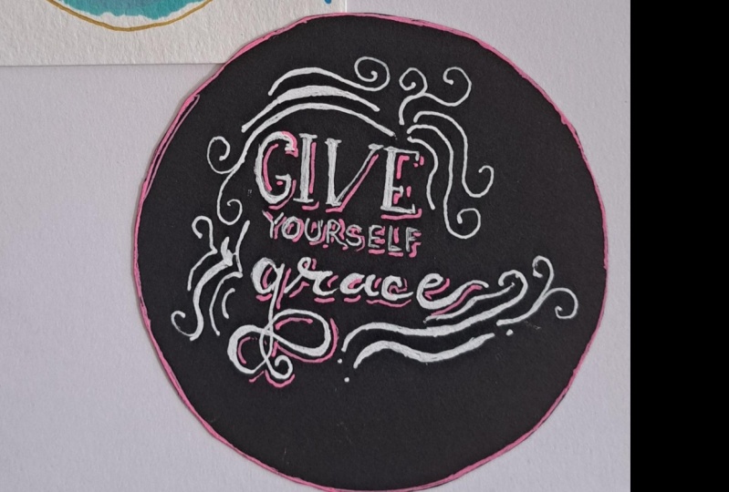
8. "Give Yourself Grace" Faux Calligraphy Demo: Now that we've practiced our foe calligraphy, let's have some fun creating a design. We're going to recreate this design on black card stock using a white gel pen. Feel free to sketch in your design first with a pencil. If that makes you feel more comfortable, keep in mind that I have sped up this video to twice the normal speed. Take your time and enjoy the process. Remember, we're lettering for encouragement and inspiration. Take the time to think about the words you are drawing and let them sink in. Helpful tip, which using gel pins is to actually use less pressure. This allows the ink to flow more freely and you'll get a more opaque stroke with less streaks thin. This design I've put together three different styles. Most professional artists recommend limiting yourself toe 123 font styles per design. This allows your message to shine through without confusing the I. The word gave is Heathen Sarah Font. If you're not sure what a serif is, it's basically the feet at the end of each stroke. The word yourself is simply a sand Sarah font Sands simply means without serious. This is a really versatile style that can be paired with pretty much anything else. I use it a lot in my designs. Lastly, the word grace is written in a brush style script. This again mimics that focal a Griffey technique we discussed before. For fun. I've added a flourish to my G. I'm really pleased with the way this design looks overall, but I think I want to add some flourishes for fun. Feel free to keep it simple. If that's your preference, I like to add flourishes to create balance and interest for more ideas on embellishments and flourishes you can use in your own designs. Feel free to check out the bonus handout I've included. I really like how this looks, but I think I'd like to add a pop of color with a drop shadow. I'm going to use this great hot pink gel pen that looks fantastic on black paper on their you've done it. Congratulations. You've now completed your very first so calligraphy piece
9. Using a Small Brush Pen: All right, let's get into some fun techniques will be using a small brush pen first because, like I mentioned before, it gives you the most control. I'll be using both the pen tell sign and the Tom both udesky, so you can see the different options that you have. This is the perfect opportunity to use your guidelines. They will ensure that you keep your strokes consistent and the same length. The first exercise I want you to try is to do very thin up strokes and thick down strokes. Remember, don't be afraid to put pressure on your pen after you've done a row of those move onto a closed, rounded shape. This will be the basis for lots of letters like Are those A's D's and bees? An important thing to keep in mind is the position that you're holding your pen in. You should not be holding your brush pin in the same way you would hold a ballpoint pen. Make sure that you're holding it at a 45 degree angle. This will ensure that you get those nice, thick down strokes and thin up strokes. Our next exercise is to create kind of a wavy pattern. This is a great way to practice your exit strokes and other letter transitions that you'll use a lot like in the letter M. Again. Remember to take your time and go slowly. You can always lift your pen between strokes to readjust. Remember, these exercises are fantastic. To create muscle memory developing, practice your technique and a warm up your hand again. Don't get discouraged if you don't feel your strokes are looking very nice. You need to practice. I promise you. If you keep practicing, you will see a significant improvement over time. One of my favorite ways to warm up my hand before I start lettering is to write out the word minimum. It's a fantastic way to practice a variety of strokes and connecting letters here. I'm using the Tom both udesky hard tip again. This is one of my favorite pens to use when you're first getting started. Another great way to practice writing all of your letters and practice connecting them is to actually write out the alphabet. Something I like to do to make sure I get these nice than up strokes is to actually flick my pen up. This really allows me to get the thinnest obstruct possible. Remember, you can always go back in and fixed strokes. Remember, we're doing this for fun. Breeze adjust your paper. Focus on your technique. Relax some of my favorite things to do. While lettering are to listen to music, drink a nice cup of tea and light a candle. I'm going to speed up the rest of this section to twice the speed. Remember to take your time. You can always pause and rewind the video. Putting words together involves the same techniques we just practiced and writing her alphabet again. Just focus on your strokes. Make sure that you're up. Strokes are nice and light on your down strokes. Have a lot of pressure. Keep your exit strokes consistent so that your spacing will look even. And there you have it. You now know the basics of using a brush pin
10. Using a Large Brush Pen: the techniques for using a large brush pin are the same as the ones for using a small brush pen. That being said, it is a little bit more difficult to use. That is why I suggest starting with a small brush tip. The great thing about large brush pens is that you can get really dramatic differences between your up strokes and down strokes. He exercises for large brush pens are exactly the same as the ones for small brush pens. This is always great to do whenever you use a new pen, because it allows you to get a feel for that particular pen. Again. The exercises air the same, so be sure to practice your up strokes down strokes, curved closed shapes and the wavy pattern we discussed before. In case you're wondering, I'm using the Tom Bo dual brush pen. I love these because they create a natural water color looking Grady in with the pressure of your down strokes again, one of my favorite exercises, especially when switching between pens is to write the word minimum. It really gives you a feel for that pen and allows your hand to get used to it. Here you can really see me using that flick technique. It's especially helpful with large brush pens. Make sure you follow along and practice yourself again. The process for creating words is the same as we discussed before, focused on keeping your exits jokes consistent and the same length. This will really help your spacing. Oh!
11. Love Never Fails Demo: now this use our newly developed brush lettering techniques to make something pretty. I love this verse from first Corinthians 13. Love never fails, so we're going to make a design using that. First of all, I'm sketching in with a pencil to make sure that my lines day straight. I've also already sketched my design, so I know where I'm going. Feel free to draw your design in pencil first and then go over in your brush pin. If you feel more comfortable doing that, I do it all the time. I'm writing the word love with my brush pen. I'm making sure that my elder isn't tip too far down into the border I've created. Remember to focus on your exit strokes and keeping your baseline consistent using my micron pen, I'm writing in The words Never fails. I'm using a thin san third font Helpful tip for space thing that I learned after doing this design several times is to start your N right below the lower loop of the L. This really ensures that the word love stands out. However, I'm making sure that never fails doesn't just fade into the background by giving it this nice border. Now that my words are all in place, I can think in my border I'm making sure that I'm breaking the line where the L dips in. This gives the interest and added dimension for fun. I'm adding in highlights with my white gel pin. I'm simply drawing a line following the curve of the stroke with two dots following after it. And there you have it, a beautiful brush lettered piece. You could use this designed to create really nice Valentine Day cards or even write it in different mediums like water color.
12. Composition Making Your Designs Look Good: When I first got started with the lettering, one of my biggest struggles was taking the words that I had put together and making them into actual designs. I'll walk you step by step through the process of creating a layout. I like to limit each design to 123 font styles maximum. I have decided that the most important word will be in this bold Sarah thought. The second most important words will be in a script font. The remaining words will be in this thin san serif font style. This allows the most important words to shine through. After several sketches, I've decided to go with this basic block design. I recommend drawing rough sketches of different layout designs before committing to one. The peace will be lettering. Today is from the Book of Hebrews in the Bible, Hope anchors the soul. I decided to keep my hierarchy or most important words to anchor the second most important words, Hope and Soul and the third level are the rest of the words. A great tip when you know that your letters will intersect because of D senders and a sender's is to actually drop part of the stroke and leave the rest blank. As you fill in the rest of your design, you'll know where you can most likely fit in the rest of that stroke and fill it in afterward. I have decided to make an actual break in the stroke to provide interest. I'll speed up this next section a little bit to get this nice, thick stare of style font. I'm just applying equal pressure on both my down strokes and up strokes. Rather than adding a lot of flourishes and embellishments, I decided to keep this particular design simple. I think adding a drop shadow will be a subtle way to make my letters pot more. In case you aren't familiar with how drop shadows work, all you have to do is think about where your light source is coming from and do the opposite of that. For example, here I'm showing you that the light source is coming from the upper left hand side. Therefore, I look at each of my strokes and put my shadow on the right hand side and below. The more time you spend practicing this technique, the better you'll get at it. Have fun with your drop shadows. You can do them in different colors and with for different looks. The last step is to add her highlights. Congratulations. You now have the tools to make your very own layouts.
13. Project: I hope you guys have had as much fun taking this class as I have had teaching it for your project. I'd like for you to pick a quote. If you can't think of anything, check the bonus quote list I've included in the bonus materials. Once you've decided on your quote letter using some of the techniques we've talked about in class, you can always post your favorite design from class as your project. Make sure that you take a photo of your project and upload it to the project section for feedback from myself and other students. If you posted on social media, tag me so I can see it. Follow me for upcoming classes about the advanced techniques, floral frames and much more.
 Ana Baker, Lettering & Calligraphy Techniques