Transcripts
1. Introduction: One thing that I love most about embroidery is picking out my colors and building those layers with different contrast and shade and seeing it all come together in this really cool embroidery project. My name is Floor Giebels and I'm embroidery artist and teacher. In my own work, I always love to experiment with colors. I really love to create a lot of shading, a lot of depths, contrast. In this class, I'm going to show you two ways of getting your design on the fabric and picking out your colors. One piece we are really doing some complex coloring with going back and forth from the illustrations to embroidery piece and creating those colors that you see in the illustration. For second piece, it's all about the blending and the contrast. We already have the colors on our fabric because we've printed the fabric, but how do you pick those colors? This class is great for people who just want to take it a little bit further with their embroidery. We don't want to buy patterns or buy embroidery kits, but instead, choose your own design or make your own design and put it on fabric, and start stitching with your own color palette. If you're feeling inspired then come join me and we can create some embroideries and you will learn some tips and tricks to create your own beautiful embroidery pieces.
2. Class Project: For the class project, I want you to embroider something that you really want to embroider, but that is difficult for you because the colors are complicated and you don't really know how to put them together. I really want you to try and do this. Please upload it in the Project Gallery so we can all see how you did that. I would love to just see all the things that you-all create because it is always so amazing. I love to see all your work in the Project Gallery, it is so inspiring to see. I cannot wait to see what creations you are all going to make. In this class, we will go over the following subjects, all the materials you need for getting your design on the fabric and tools to get the right color palette. With those materials in mind, I'm going to show you two ways of getting a design on the fabric. After we have our design on the fabric, I want to show you my method of choosing my palette for the designs. Then we will do some embroidery and put those color palettes in action. I wanted to use a vintage illustration because they are such great reference for embroidery. If you ever need inspiration about what's your embroider then I highly recommend looking at this website. In the class materials, you can download a PDF. In that PDF you can find this website and also some illustrations where I remove the background and place them on an A4, if you want to use the method of tracing where I use my printer. I'm going to use these two images. These are not images they're illustrations, they're copyright for your vintage illustrations, and they are so cool. I think I love those vintage illustrations. The palm is all about the gradients, and the shape, and the contrast. With a pencil, I want to show you more like, how do we get from this illustration and getting those colors on the fabric? How do you do that? How is that process? Now that you know our class project and what we are going to do in this class, let's go to the materials.
3. Materials: For the materials, I'm really not going to cover all the basics. I'm going to cover what you need to trace the image and what do you need for your color palette. Now, this thing is actually the best thing that there is when it comes to embroidery. This saves me so much time, so much hustle. This is an A4 shipping label. You have shipping labels that are A4 and you have six labels or eight labels, but you also have ones that are just one label for huge shipments and that is this. You can just buy them on Amazon. What you can do with this, you can stick this off and you can put your fabric on here. Stick it on, put it to the printer and you have printed fabric. I'm going to show you in the next lesson how we're going to do that. But this is a really handy thing to have. They come in a pack for 100. Not expensive and really nice to have. If you do want to print your design on fabric, then it is important to also have a printer. My printer was very cheap. Inkjet printers are very cheap these days. You need an inkjet printer so no laser printer. My advice is to just get a secondhand inkjet printer that is very basic. If you just want to have it for line work, or just like the outlines and you're not really concerned with the colors inside, then get a black and white one. The second thing that you need, especially if you want to print on fabric with a printer, a hoop that fits on an A4. This is an 17 centimeter hoop. But just make sure that it will fit on an A4 because we are going to work with colors. We're going to talk about colors and I'm going to show you a lot of different colors. I want to also show you something else. When it comes to threads, you have options. We all know DMC. Now, DMC is of course very pretty. It makes very pretty thread, but it's also expensive. It's expensive thread. If you want to get all the colors, then this is going to be expensive. You can do that. There's nothing wrong with that. But if you are just trying out, if you just want to figure out how it works, what thread you want, what colors you want, and you really just want to experiment then I would advise to get the ones from Amazon. They come in a big pack, and it doesn't cost so much, and it's just a good way to just figure out what colors you want. Now, I want to give you this comparison. This is an Amazon one, and this is a DMC one. The color difference almost not visible. The handy thing of these things are, is that it's also the same color codes. Just so you can get on Amazon have the same color codes as the DMC one. That is just a tip if you are on a budget and you don't want to spend that much money. Now, if you want to trace your image, then you will just need a basic pencil. Nothing special. For tracing your pattern with a computer I would advise you to use a laptop. For the fabric, I like to use a very thick cotton. Cotton that has no stretch. The no stretch thing is very important because you don't want it to pucker. Now that you know what materials to use, the materials to trace your image, and also the threads you can use and where to find them, we are going to trace our image. I'm going to show you two ways to trace your image.
4. Transfer Design on Fabric: I think tracing was definitely one of the things that I was like, how do I do this? How do I get this image on my fabric? It was always a real thing for me in the beginning. I'm going to show you my two ways that I really like. One is a quick one, that when I'm just in a mood for embroidery and I just want to create something, then I do this method with my computer. But when I really want to be very correct about the shape, and it's also a difficult shape that is difficult for me to trace on my computer, then I like to print my fabric. This has been such embroidery hack, but it helps me so much. Let's go over these two methods of tracing. The first vintage illustration that we are going to trace, and for this one, I am going to use my screen to trace it. I want to use that middle one that really pops out to me. What I'm going to do? I'm going to make sure that the hoop is a little bit to the outside. I just hangover my computer and I make sure that, its the brightest that I can have it and I just go over it with my pencil. I make sure that I first have the shape, and after I have the shape, I leave it like this, because I will add more details with my pencil as you proceed with the embroidery design. Now that I've done the pansy, I want to show you another method of getting your design on a fabric, and I'm going to do that with the palm tree. I'm going to first peel this off, I don't have much fabric left, but the ones that I have left, I'm going to place it over here. Then I'm going to use my hands and make it really smooth. When it is smooth enough, I'm going to cut it. This label will make sure that the fabric will simulate as paper, so the printer will think this is paper, and it will print on it normally. Now make sure you cut all the fabric off and that you are left with the A4. Now that we have our label or fabric on this, we are going to print it and we're going to use an inkjet printer for that. When you are printing, make sure that the fabric side is facing down, and here we have our design on a fabric. All we have to do now is peel it off from the label and put it in the hoop. My personal pain is that printing your fabric is the best way to make your embroidery design, and it will get the best results. The downside of this matters is that you can quickly start your project. You do have to put it on the label and cut the fabric etc. It is not good for the environment. When you trace your image, you can quickly start your project and adjust whatever you want any process of doing embroidery and you are not throwing away plastic sheet. However, you do have to look back and forth at your reference picture. Now that is all trace and done, let's go over the color palettes and how do you choose that? How do you do that?
5. Color Palette: Picking other colors is just so much fun. I love doing it. I love to just get in there, get all my colors, and just go nuts. Everybody does this different, I think. This is really personal because I think a lot of people have this organized way of doing it where you have all the treads really nicely packed and color-coded. I wish I was like that. I'm just not. I'm going to show you my method. This is not the best method, it's not the method, this is my method. It's how I do it. I'm going to show you how we pick the colors for the palm tree. For the pansy, we are going to pick the colors as we are making the embroidery piece. I will show you that any process of doing the embroidery because it has so many colors that we need to do that step by step while doing the embroidery project. This is my thread box. That's how I call it. Here, I have all my different treads in. I have some DMC that you see right here. But basically, here, I have just all the threads that I collected and it is super messy. That's just how I am. I am very messy when it comes to my treads because I like to grab them really fast and I end up putting them back. They are a little bit organized in color because I've put them back a little bit, but actually, no, it's not organized. This is just how I work. I just pick my colors and then when I'm done, I try to put them together a little bit. Here you see, I have all my browns. This is mainly for when I'm embroidering hair hair to have them all together. Here, I will have a lot of shades of brown and really light brown so that I can make brown and blonde hair. But let's look at our piece. What I do is I go to this box, I look at my piece, and I just start collecting colors. I like to go from dark to light. I already see some in my corner that I see this really dark, dark brown. I put it next to it. You see like, okay, this works. This really dark brown, that really works. Now I know I have my dark brown. Sometimes I am not sure about two colors or three colors, and I will take all the colors that I think will be suitable. For the green, when I look at this piece, I see, first of all, very dark green. I go into my box, but what I'm now doing is I'm looking at my piece also and I'm not only looking for those dark colors, I'm looking at every color and then I'm like, here, you have this color that is really this different, this yellowish-green, and that's this. I'm going to grab on to that. Every green that I think will be suitable, I will just grab. Here, I see another green. I'm going to take that with me. For instance, I see also here in the middle that we have a piece that is almost a grayish brownish, and I really see this thread here. What I'm also doing is I'm just getting a piece of thread, because I know that for the part that I just showed you, I just need this little piece. This will be actually enough. I'm going to grab this. Again, this is not really a preferable method I'm using here. But hey, I'm just showing you how I do this. Well, there you have it. It's like harvesting vegetables, but not really. Let me check. I'm grabbing a little bit more different shades of brown. This is really a different shade of brown, but you never know. You can also get the book from DMC where you have all the colors listed, and this way you can plan ahead of what colors you need to buy. I'll show you how I picked out the colors for the palm tree, and in the next lesson, we are going to make a pansy. I'm choosing the colors for this project as I go, because there are so many colors in this piece that we really need to go step by step. This is my method of doing it and it works for me. That's the most important thing; it should work for you. I can imagine that how I do it will not work for a lot of people, but this is just how I like to do it. This is just very personal. Look, find out what works for you. Because that's the most important thing, it should work for you. Finally, it is time to go over our embroidery projects and I'm going to start with the pansy. The most difficult one, in my opinion.
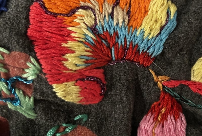
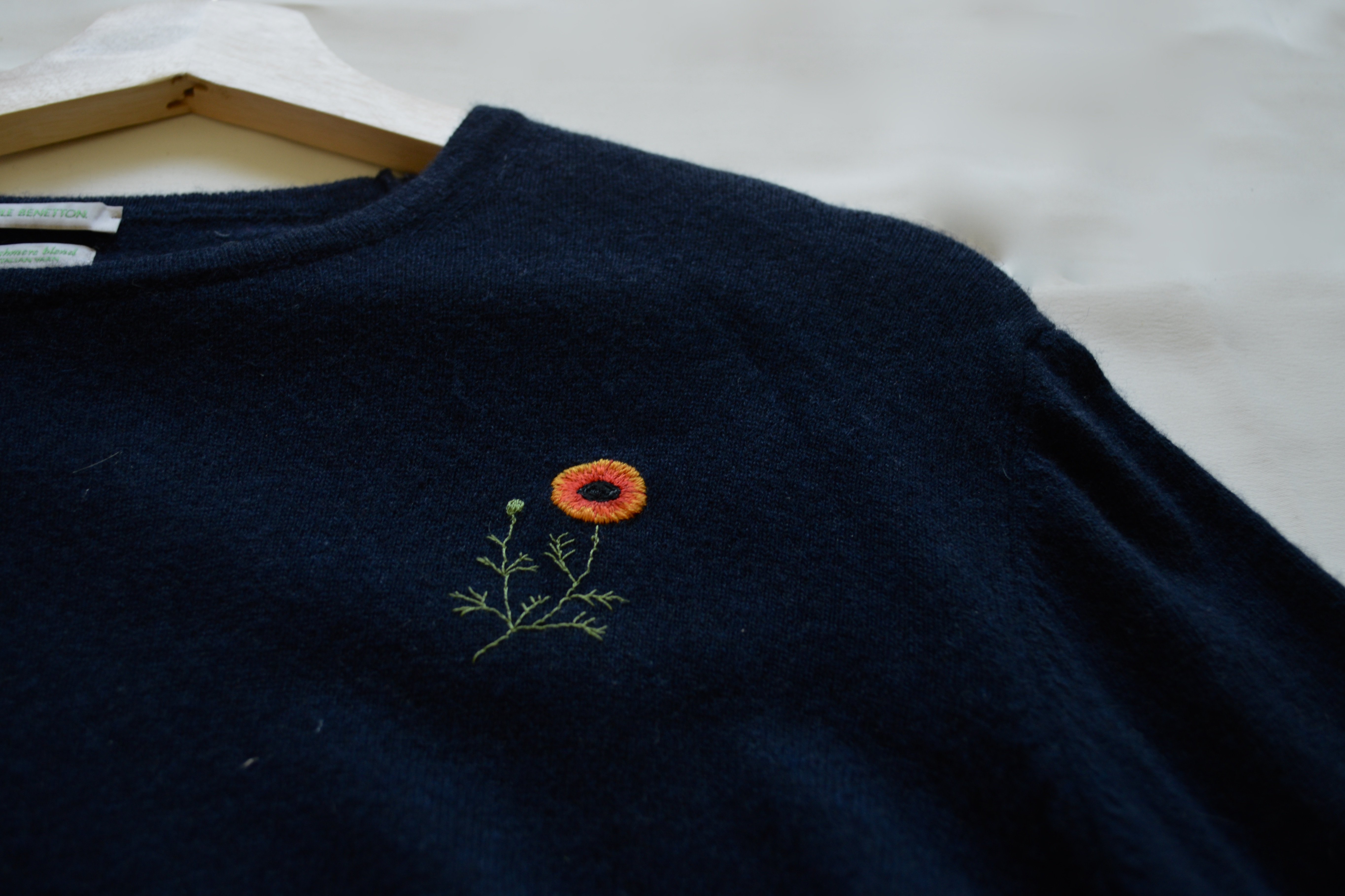
6. Pansie: We are going to start with the Pansie. Also the most difficult one in my opinion, but here you can really see how do we go from embroidery illustration. How do you get the same shades? How do you create contrast? The first color for the middle of the flower is a color that I could find straight away because it is orange, yellow and it is very distinctive. Now going back to the flower, and I see that we have a mixture of dark and slightly orange. I'm going to get my darkest purple. Now when I see that picture, I see a really dark purple or a really dark color. Now I can use something like this that is really dark, but I do want to keep that purple in it. What I do is I'm not only looking at what is exactly like the picture, but also what will look good. I think this will just look better. First I'm going to part them in a way because here I feel like in the middle it is parted, and then here it's also parted so I'm just going to make four parts of it. Now I'm just going to make stitches which are dark purple to the inside and close, next to each other. Put that same look as we see on the picture. Not too much because in the picture we also see that there's not that much. I'm also going to do that here at the bottom and then I'm just going to look at how does it look like? What can we change? How much is it going to look like the picture? You have to look very close, but you see this orange red and it is more to the red side than the orange side. Just as you see in the illustration, we are going to put that between those purple lines. Just here and there. Make it a bit more dramatic than on the picture, but doesn't that look good. I'm going to take my pencil and let me think. I'm just going to mark out where I'm going to put the dark. Here I see some purples. I'm just now marking out where the purple is. I'm just making a rough sketch here. That is my first thing that I'm going to do. I'm going to make these all dark purple. I'm using one strand for this. All those colors that you now see that I sketched in, I'm going to make purple. You can see that I did only the purple parts. Now I'm going petal by petal, and I'm just going to look what the biggest color blocks are. In some of the petals you will see a light hinge of blue or a little light hinge of whatever color. I'm going to do that. That's the last but for the majority of the colors, when I see a big section with a certain color, I'm just going to add that. I'm starting with this petal and here I see that lights. Let me see. I see it's a lighter purple, it's the biggest color, but I have two purples. One is not really purple, the other one is maybe too purple. See, what I do is I just put that color next to it and I can see how it will look together because this is just not even close to it, way too dark. I'm just going over this one or this one. I think I'm going to go with this one because I also see some parts that are more purple, difficult. I think I'm going to go with this one because I feel when I look at the color, it goes more towards pink than purple. It's just imagining. It's also a matter of just putting it down, see what looks right. I think this gives more of a more intense color combination than this. You can see in the picture that there are other hues in this same piece, but we're going to do that later. All these small details I'm going to really take it out for later. Here I'm just going to go in the other threads. Before I'm putting the light pink everywhere, I'm going to use a very light yellow beige in that petal above this one. It is all about the shade. Look, if it is more towards the brown side of a shade or more towards a yellow side of a shade. You can see now that I just filled in everything with that lighter pinkish, purple color. What I like to do, I like to create a base with the main colors that I'm going to use. Now for here, the main color is this orangey color. I'm using this. I think this will look nice with the slightly darker, reddish orangey that we're going to use. But keep in mind this is just the first layer that I'm doing. I'm going to create layers over there, really zoom in more and see what we can do. I feel like it's always a puzzle to me. Here I'm first going in with this orange. Just going to fill this whole space up till here with the orange. Then here we're going to use also some yellow. I'm first going to finish this off and then we go back to this part. Again, this is the first layer, so we're going to do that afterwards and do another layer on top of it. But first, I want to do my yellow because there we also see some yellow. It's such a nice pattern. I'm going to make my stitches go down. Don't beat yourself up if you come across a project like this, because these are just very difficult and it is a big puzzle. As much as I want to have it the same as the picture, I know that it will not be exactly like the picture in this method of how I'm tracing. You see it already, have some difficulties that I'm not going to do it exactly like on the picture because I run out of space to do that. Should have made some more space for that. This is also a trial and error thing. Now the rest I want to use that colors. Because I was thinking about using this color but then I'm like no, it's a more of this color. I think it is. It's sometimes also difficult. No, it's not. It's actually more lighter purple. See, you just have to put it next to it. I'm looking at the picture right now, putting it next to it and I think this is actually more appropriate. I can always go over it again to make more of a change with a light. I think this is good as a background for this whole thread. Then afterwards I'm going to do some streaks in it with a different color and we can just look around it and see what we like. Because at this point, I think it's better to not have it all completely in this color. Do this as our base and then afterwards you go back and use some strands of a lighter purple. We have the illusion that we're using a lighter shade of purple. I'm going to fill this all in with this shade of purple and then we're going to go back and go again around our entire flower and see what we can put where and well. Now that I filled it all up, I'm not happy with it yet. I'm going to put some streaks in of this one. I thought it was too light to do it all the way with this. I want to create an illusion more of light, so I'm just going to use a lighter color to achieve that. I'm just going to put some streaks in, so you can see how that looks. You can really see that it creates a movement within that area of color. You can also choose to do a little bit of more color in one space. I'm also more looking at my embroidery work than looking at the picture. I know this class is about to recreate the picture, but I'm also at this point looking at what looks good with the embroidery that I have in front of me. I always do that because it always is a bit different. You can never get really exactly how it is on a picture, on a drawing, because we're working with threads. After I've done this, I'm now going to move my way up to this part, and there I see a line. I'm going to use the same color as I did here. You have that definition going from another petal. I want to make that line and we are going to a different petal. Now, we have that nice definition going on from going to another petal. Keep it thicker. Actually I should really stop here, otherwise it becomes more a line and not a transition. I'm going to my next petal, this one. My next step is that I see there, that we have the streaks of reddish pink. What I then do is, I go to my thread box, I can't believe I call it a thread box. But I call it a thread box. I'm in my head, I'm like, okay, I need a reddish pink. I get a reddish pink and then I have the picture next to me. I'm like, okay, a reddish pink. This a nice reddish pink. I have different reddish pinks. Then I look at the combination that I already have. I think this one is the best. It has that reddish hue in it and it is pink. I'm just going to try it, and if it doesn't look good, then I can always change it. Here I go. I see here in the middle, I see that hue. This is such a fun part. I like this part. This is my favorite part. Let me see. Here we have a little bit more of that hue, and then I see that hue here going more downwards. Here, I do one. Actually I'm going to do two next to each other. I don't really see one that's really clear, but why not? I feel like here, when we look at the image, it looks black. I'm also going to go in and make it black. We don't want do that all the way to the end because you really see that ruffled there, the edge of the flower. I don't want to ruin that and go in there. Now we really have that darkness going in there, because there is a lot of darkness. I'm already going to the next petal because I see also there here, blue. There is definitely also some lighter, I don't know what to call this color, lighter pink going on. Here we have this color actually covering almost this entire piece side. It's starting to look really good. I just want to make that distinction, that this is a different petal. Here we see that all the way down, we have this really light pink. I hope you can see it. Maybe this pink is too light. That happens sometimes, I pick a color that is too light. Although we're not being that true to the picture, I do think this looks really good. I only see one spot where we're really going to use this and I think it's mainly here. I'm already going to go in here and put that in. I see we have so many different colors going in that little petal there. I think I'm just going to use the blue and that we have enough color in that petal. What I always do is, at the end, I still look at it as a whole, where does it needs some work? Where is it really done? I do think that blue is very pretty, although it doesn't quite fit with our drawing. I think it looks really cool. Now I'm getting this orangey, darker color for the [inaudible] orange. You see that there's a bit of a pattern in there, but I do want to fill this up more. I'm not really making a pattern, just going to make this lines because I'm not feeling this lights. I see in the outside, there's also purple. I'm just going to use the dark purple for that, the one that we already used here. In the end, I added borders of purple at the bottom of the pansy, and I used some light threads and made that part not so dark. With the pansy, that was a lot of going back to the illustration, going back to the embroidery. But then you see in the process of how that works, how you can recreate a complex image or illustration, and how do you get those colors for that. For a less complex way, we are now going over to our palm.
7. Palm tree: For the palm, we have a whole different method because with our pansy, it was really just going back and forth, back and forth to the illustration and then the embroidery. But now we don't have that. Now we just have a printed fabric and we only have to look at our printed fabric. We also go back to our illustration a bit for the true colors because it's always different a bit when it is printed. But how do you pick your colors when it is printed on the image and how you create those contrasts? How much contrast do you want? I'm creating quite a bit of contrast. Let's get into it. I'm going to show you all the threads that I picked out now. We have a lot. This is what I do. I just pick out a lot of thread and then I will just look at what do I actually need. But this is also what I do. I like to start always with the darkest color. I'm not going to now pick out which one I'm going to use. I'm first going to start with my darkest color. Along as we go, I will look at the colors and see which one we're going to pick. This is how I always start with the darkest color, it's the best way to start. I want to keep reminding myself that I see here light spots, the same as I see here. I want to go over them again. This is just such an easy way to get your colors because you just go over the lines that you already see. Everywhere I see dark brown, I'm just going to use this. I have now done all the really dark spots. What I'm going to do is I'm going to take all the lighter browns that I took from the thread box, and we're just going to see which one we're going to use. Here I have this one. I just take all that I picked out and I'm just going to look if they fit. You first go over with this one. This is already difficult because this looks good in here, but maybe it's a bit too yellow. This is maybe a bit too gray. This one is good because this one is a bit more brownish than the other one. I think this one looks really good next to this color. If I don't like it, I'm just going to do it again or use another color. Now I'm going to put these ones on, and start at the bottom. It does give a lot of contrast, but I want that, so I do love this color. At this point what I'm going to do is I'm just going to use this color all over the place, so everywhere actually. Then I'm going to go over it with this one and then put this at spots where I think it will look better with this. First, we're going to make all these things that you see that are still brown. Now that everything is filled up, I do want to have a transition color. You always hear me talking about that in my classes because now the contrast is so big and I just want to make some lines in between to have that transition a bit more softer. I'm just taking a light brown. I take a color like this. I cannot really see it really good, but it's a color that's really brown, and it's a cool color brown. Because here we have all these warmed and I like to make it a bit more cooler. As we know from the starts we sow here some streaks, so I want to get those in. For instance, here. Make the transition a bit smoother from the dark to light. I feel like now it looks better. I do want to also do that here. I'm not yet sure what I think about these. Maybe they're a little bit too light but I do like what we have going on right now. Now we are going over to the green. These are all the dark threads that I picked out from all my threads. I'm already seeing that this one, it's a different kind of green, so we really talk about this and this. Then I'm choosing for this because it is darker. We don't have that much, we don't need that much. I'm going to use this. My advice is also to go a shade darker than you think you should have, and a shade lighter than you think you should have. The reason is because it is always different when it's on the fabric, it always comes off darker or lighter than you would think. You never know how it really is going to look on the fabric until you really just put a stitch in there. Because my thread is definitely not as dark as it is on the illustration. Because it's not as dark as the illustration, that also is different for the threads that we're going to use the other threads. Because our darker thread is not as dark as it is on the fabric, for a lighter thread then we need probably something lighter. That's how you build it up, how you make your decisions. The darkest thread is not as dark as I suspected and then you need to re-evaluate. Here we have all that darkness going on. Again, I'm going to fill everything up where I see all those dark lines. It's mainly lines that are dark. I'm just going to fill them all up. Now that we've done all the really dark parts, we're going to go in and go to our middle dark parts. For the ends I want to use this color, it's more like yellow greenish. Then for the middle, I want to go in with a more lighter color. I do have different tones of middle greenish, so let's see which one we have. This is actually pretty dark, but it is a little bit of a middle tone. I also had this one. Here we have all these colors. Now, let me go with this one first. This does make a nice contrast with the other colors. I didn't know if it will be too much, but I do like this color because it does make for a nice big contrast. This may be a bit too dull because it goes a bit more towards the brown, it's brownish green. Actually, this is also brownish green. At this point I'm really looking at what will make a good amount of contrast because I'm afraid that if I put this one in, you will not see that difference in shading. I'm going to go for this one because I see that this will give the most contrast. For the outside, I'm going to use that yellowish greenish. We're not going to go there, we're just going to go in on the outer parts. You can see that this makes for a nice contrast effect that we couldn't have gotten with all the other ones. I'm going to continue filling this all up with the lighter green, not the ends though because we're going to use that yellowish green and then we're going to see how it will look with that yellowish green. First, I'm going to do this one and then we're going to continue with that yellowish green. Now, all the really light part is done. You can see that it's not really nice how you can see that contrast. Always think about your contrast as really big. We want big contrasts. Now, I'm going in with that yellow greenish. It's more to the yellow. It has a yellow undertone in it and we're going to do that at the outer ends. I have to be honest, this embroidery thread, this color, in my head, I'm thinking it will look nice. Who knows if it will, but if it doesn't, then we can always change it. I'm going to go over all these endpoints and just make them. Here it is done. You can see at the ends the contrast is not that big, but I think that's also good because we already have so much contrast in the space that we don't want that much maybe on the outside. This is just the way how you can also do your embroidery. Print it on fabric and then go over the lines and don't forget contrast. You really see that with the palm tree, this was also a lot of work, but in a different way because we do want to have that contrast. With our pansy, it was clear that there were a lot of contrast, but with the palm, it wasn't that clear in the illustration itself that we printed. We really had to go and make that contrast ourselves and pick out the colors accordingly to that. Now that we have both embroideries done, I want to go over to my final thoughts.
8. Final Thoughts: In a download section of this class, you have some illustrations that I made for you. Well, no, I didn't made them for you, they are copyright free images that I add to the background off. It's on A4 so you can print it if you want. You can also trace it. But I wanted you to have these images on an A4 format so you can print it out if you want. If you do, please upload it in the project section. I hope you learned something about colors today. If you like this class and please leave a review, and until next time.
 Floor Giebels, Embroidery Artist