Transcripts
1. Introduction : Making a pet portrais is
such a special project. It's a great gift to give and it can be
cherished forever. Sleep. My name is Flo, and I'm an embroider artist
from the Netherlands. I have been doing embroidery
for about eight years now, and I love to use different
mediums in my work. And I also teach embroidery
here on skill share. And in this class, I'm going to show
you how to make your own pet portrait without
using any drawing skills. We are going to print our
portrait on the fabric, and this can be done with an online service or
with your own printer. You will learn how to
pick colors and how to make those realistic
looking stitches. I'm not going to say
this is an easy project. This is a big project
that will be a challenge, but I will show you
how you can correct any mistake and make it
as easy as possible. This class is for
people who have some experience in embroidery. But if you are a
confident beginner, then please join me because I really feel
that anyone can do this. Let's get stitching and see
you in the next lesson.
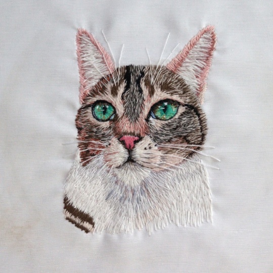
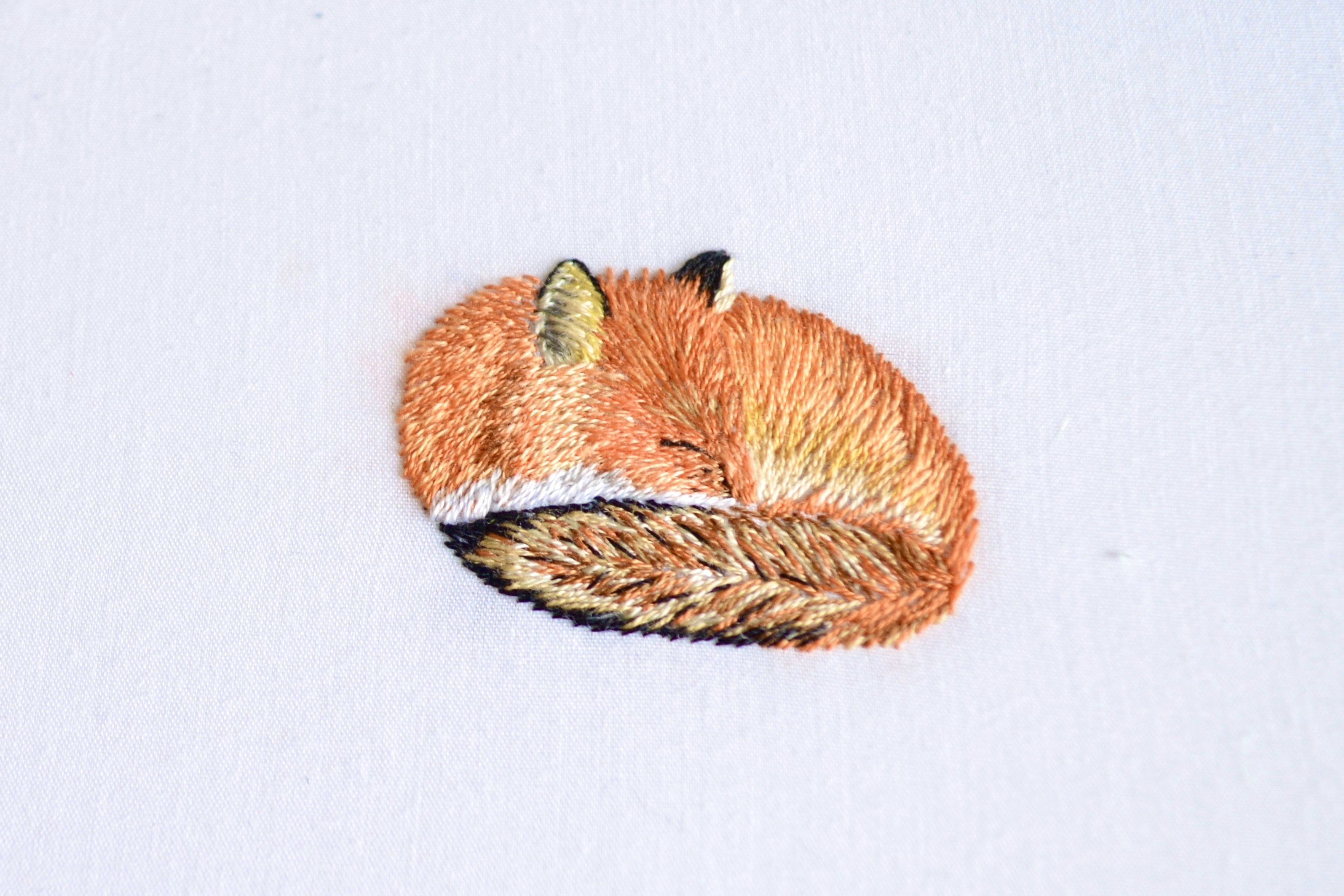
2. Archie : I want to tell a little bit about the portrait that
we're going to stage. The picture I'm using
is of dear Archie. I did a giveaway in
November 2024 for this lesson because I
really wanted someone to have this pet portrait that I'm going to
stage for this lesson. And I got an email from
the owner of Archie, and it immediately
caught my heart because her profile
picture was with her cat, and I don't know, it was so sad
because after, like, two days or three days
after this giveaway, he needs to be put
asleep and I don't know. I immediately felt like
this class has to be like an ode memorial and
something for Archie. And I love for his owner to have this embroidery piece when I'm done with
making this lesson. So I hope it's getting a
special place in your house, and I hope that a lot
of people will learn so much from Archie and I hope you will
enjoy your pet portrait. Let's go to the next lesson. I'm going to show you
the class project.
3. Class Project: I want to start by saying in the process of
making this project, you will become insecure about how it's
going to turn out. This happens with me
all the time that I lose that confidence in the
piece, and this is normal. When it's a big
and very detailed, you sometimes just lose that
connection you have with it, and you will feel bored with it, and it feels like a lot,
and that's all part of it. Whenever that happens, just walk away and come back another day. Don't force yourself
to keep going. For me, that is a clear sign that it was enough for today. I need to have a fresh
look on it another day. With these tips in mind,
I want you to take some decisions on
what you want to do. Like, do you have a printer and want to print
it on yourself? Then watch my lesson on how
to print with your printer. If you don't have a printer, you can use my lesson on how to print your fabric
with spoonflower. There are also choices to be
made with your materials. Do you want to buy your
color schemes based on the picture or get all the
colors and choose in that way? Those two are the biggest
decisions you have to make. Once you have your
materials and fabric, it is time to start stitching. The cat you are stitching is going to be
different than mine, but this does not
mean that you can't follow along with my lesson
with your different cat. Every lesson, I'm going
to show you how I mark the fabric and
decide what color to use. In this class, I'm
not going to show you color numbers, et cetera. I really want you
to be able to make those decisions for
your own project. And I'm confident that you
will be able to do that. When you're on board,
your piece is done, I'm going to show you
how to frame the hoop, and you have the ability to make the best
Christmas gift ever. Trust me. Don't forget to share your project in the
project section because I love seeing that, and you can always share your
pap portrait and ask for feedback on the pictures itself or share your
embroidery piece. Let's start by going over our materials in
the next lesson.
4. Materials: In this lesson, you will know all the materials you need
to complete this project. All the links to the products, it can be found in the download
section of this class. If for a printing label, if you want to use the
printing on the fabric method, fabric, I would use
plain cotton because any other fabric is going to
be to take for your printer. This is only if you
have a printer. If you don't have a printer, you can order your
printed fabrics online. Embroidery tread. I'm going to do a deeper dive on this in the lesson,
picking colors. Needle, I would recommend
a needle that is small, has a small eyelid, very important, and
it has a sharp point. We want to make small
holes in the fabric. Next is the mpicker and that is a great tool if you want to get
your stitches out. Very careful. It's a
great tool for that. Embroidery because we
are printing on A four, you don't want to have any
embroidery hoop bigger than 18 centimeter because the
fabric will not fit in it. Scissors, any kind
of scissors is fine. A pen for making your
stage directions, you can use any kind of pen, but I wouldn't use a fine liner because that might
stain the fabric, a pret stick for finishing your project and gluing
it down in your hoop. With all of our materials ready, we can start with the project. First, I want you to know
what the best picture is you can use for your pet
portrait in the next lesson.
5. Choosing Your Picture : Choosing your
picture, I'm going to show you the pictures that the owner of Archie sent me and why I choose this
specific picture. The first picture is, of
course, on a blanket, and that would be cute if we would make the blanket, as well. Don't forget that you can
totally use things like blankets to make it more unique and add it
in the portrait. I really wanted to focus
on the pet portrait, so I decided to not
use this picture. With the second picture, I feel like the colors are more dull than in
the other pictures. And then it already does
not feel like it's as vibrant as the colors of
Art would normally be. The third one is actually
a really good picture, but it is not as good as the four picture that
I ended up using. Also because this picture
is just really sharp. Like, the picture
that I'm using, you can really zoom in. And that's great for
printing on fabric or for printing serve because
it's so sharp and we can really focus
in on everything. So I ended up using
this picture because it's the sharpest and
the most vibrant, so I ended up using that. In our next lesson, I'm going
to show you how you can use your iPad to make it
ready for printing on fabric.
6. Remove Background: Remove the background.
And this last time we are going to make the
portrait pins ready. I'm going to use
my iPad for this. And I also want
to point out that if you asked it on, like, any Facebook read it, like, everybody
will be willing to help you remove a
certain background. So you can also ask it in an
embroidery Facebook group. You know, everybody
will always be helpful and because it's
not that much work, if you cannot do it, don't be afraid to ask someone for help, even if it's a stranger
on the Internet. Here's Archie. I make
sure my canvas is A four, and I remove the background
with the eraser tool. This does not have
to be perfect. We are going to stage
over it anyway. Make sure it's not too big for the A four canvas because
the hoop has to fit over it. When you are done, you
can export it as a JPG. The portrait is already
for the printer, or if you want to
order it online, if you don't have a printer, I suggest you skip the next lesson and go
to the one after this.
7. Print on Fabric : For printing on fabric, you will need a four, a shipping label for printing. You will also need your fabric
and a printer, of course. Then you roughly cut your
fabric to fit on the label. After that, you remove the
fabric and peel off the back, and you are left
with a sticky label. You take your fabric and
gently put it on the label. Make sure your hands
are nice and clean, and rub the fabric as long as possible so all the
creases are gone. Now you can cut away the
remaining fabric from the sides. When you put it in the
paper tray of your printer, make sure the fabric
side is facing down. So what we are basically
doing is falling the printer into thinking that it is
going to print on paper. When it's done printing, you peel the sticky part of
the bag from the fabric, and it's ready to
be put in the hoop. I do want to point
out that this is not the most environment
friendly option because you do throw away
the label in the ends. If you don't want
to use a printer, you can join me in the
next lesson where I show you how you can
order your fabric online.
8. Print on Fabric Without Printer: What if you want to make this project without
printer? That is no problem. You can have your
picture printed on fabric and have
it sent to you. I have to warn you because
this is very addictive, and before you know it, you will be printing
everything on fabric. I want to make it clear that this is not an
affiliate product. I don't get any money for it. I'm not affiliate with
this brand whatsoever. I just really like this service. And I have to say
I'm a little bit addicted to putting
stuff on fabric now. I it's a thing. What are you going to do is you go to the website Spoonflower. This is a website
where you can buy fabric or wallpaper
and many more items that are being sold by artists, and Spoonflower
prints the design. You can also put
your own design, for instance, on fabric, and that is what we
are going to do. To be able to do
that, I'm going to get my account and
upload a design. I'm going to choose the
file for the cat portrait. Now you can see that I have a pattern of cats on the fabric. Oh, my God, how cute is that sheet set with
the cat pattern. Okay. But we don't need that. We need to go to the fabrics. When you click on the Bats, you can still see the
patterns of catads. We are going to change that by editing the fabric
and click on center. This means that our design will be in the center of the fabric. You can see that our design is way too small for the fabric. We are going to
change that by making the fabric a 20 by 20
centimeter swatch. Now I'm going to scale it a bit and make it a
little bit smaller, just enough to cover
that swatch area. You can choose from
various different fabrics. My advice is to stay
with linen or cotton. You can also choose more
than one type of fabric. Unfortunately, the shipping
is quite expensive. I don't know how much
the shipping is for the US and other
countries outside Europe, but for Europe, it is like $15. You can also just do the entirely picture without
deleting the background. You can make a wonderful
piece like I made here. So here you have. Like
it's a little bit dirty. That's why I don't know
what happened to it. I have a toddler, you know. That's what happens. Um, but
here you can see that it is, you know, I use this
picture to embroider, and then the rest I just
left it the way it is. This is called Crepe Dhen. I hope I hope I'm
saying this, right? I mean, this is a crepe de chine Crepe DSineKrep dechin
is it, I think. This is a little bit
stretchy, but not really. You have to make sure
that it's drum tie, but this gives,
like, a really nice, like, photo sheer, nice effect. So if you go to the website, you can also see, like, little mock ups, like
that they kind of, like, show you what
kind of fabric it is. So just play around with
that. Again, addictive. I mean, you have no idea how many of the
I have laying around. It's just the amount of joy I get from making
these and then having them shipped to me and then just opening that little
packet and taking all these printed fabrics
out is just it's my joy. It's my joy in life. It's, it's my joy. I love it. I love it. So it's fun to leave the
background as it is. In the next lesson, I'm
going to show you how to match your colors with
the picture on fabric.
9. Picking Colors: Picking colors. When I
started out with embroidery, I planned my design and went to the craft store and got all
the colors that I might need. This became expensive very fast, and I feel like when you
do embroidery like this, it is kind of like painting. You need all your
colors to work with. And you have to work with
whatever is in your budget, but make sure that you have enough threads to choose from. For this project, I'm
not going to show you what numbers I'm using because every pet
portrait is different. And what I want you to learn
from this lesson is that you understand how to pick
colors for your own project. So what I do, I just
get them all out and I really just look
at all the colors that might slightly even might
be good for the sparred. And then, so I make the first
initial choice of colors, and then I go back and say,
Okay, does this really work? Because here already
see like, Oh, yeah, this is maybe good, but it
can also be too orange. So I'm going to this one
I also see in there. Also look at your
reference image is also a really good idea.
Keep that in mind. And I really make this
first initial choice based also on every
color that I see. No, this is not really green. I do see dark green in here. And all the colors that
I might be worth it. Just put them in a p here. There are two colors that
you always will need, and that is white and black
that will always be in there. Yeah, different shades of green. Try to get a little bit of that. I also see like
really light green, so I'm also really underneath. And I really look
at, like, the tone, for instance, this is really
yellow. We don't need that. I like to keep a lot of these flesh colours because
I see a lot of those in it. Always a good color to have, like, a gray, dark gray. All the pinks, I feel
like we have a lot of these undertone pinks in it. I just get them all out. Not
a good gray, get it out. All these lights, this is
more to the yellow side, and this is more to the cream
side, getting it out there. And I think now this for
the initial phase is good. What I recommend is that
you have a little bag, you can put all of
this in so you like this little sandwich
bag that you know, like, Okay, this is
where I'm going to put all the stuff
for this project. What I think is
important to add is that it will take time to
know your colors because I have used different shades
of brown so much over the years that I know how to contrast between
those colors will be. And you will see
that in this class, because I'm way less confident
in choosing my pink, for instance, and that is because I don't
use them as much. So it takes me longer to know
what shade will work best. And things to remember
is take all your shades out that you think would
be good for your portrait. It's the first
selection of colors, and don't think too much. Just go with whatever you
think will be a good fit. Don't forget the small specs in the eyes and the eye color. Those all need different shades. Before we are going to
actually do some embroidery, I want to show you the plan. Before we're actually going
to do some embroidery, I want to show you before we're going to do some
action embroidery, I'm going to show you
how you make your stitch direction in the next lesson. M.
10. Stitch Direction: In this lesson, you will
plan out your stitches. This is something you don't
really have to do on paper. You can also do it
directly on your fabric. You will see that
in every new lesson of the cat portrait, I also make a little bit of a stitch direction
on the fabric. And here it is printed
on just paper. Now, what we're going to
do is something that we're going to do on our fabric. But if you've never
done this before, I might suggest that you first practice this just on paper. So what you want to do
is you want to make a plan for the stitches. What direction do you
want your stitches to go? So first, we focus on, you know, those big points
that really make the face. So the eyes, the nose. And with the nose, you really want to have
those definitions. So, for instance, here, I
see you really want to have those nostrils made so we're
going to make those dark. And if we look good, we can see that here is kind
of like a line. And then we also
need to think about, Okay, how are we going
to do our stitches? So here, we're just going
to make our stitches filling in these nostrils. And then we have the
nose and with the nose, it's just going to go like this. You know, upwards. And I want to make a line here. Because here I see that it morphous into this other color. And then we're going to go up again using this lyre color, and I see here that it's
a different color again. And then when you
really look good, you can see here is like a line of different color fur
around the nose. So I really want to make
that difference and here. I'm going to make this up,
but I see here a very slight. Is that Sometimes my English is a bit off. I'm
sorry for that. Uh I say that slight slant.
I think both work, right? Pink. So till here, and then you make the
stitch pattern again. So that is really
what you want to do. You want to make
those patterns like, Okay, what am I going to do? Need to have some kind of plan. Where are the stitches
going to go to roughly? And then we have here. Here, I feel like it's
really one color. And I already see that I make how much stitches are going to go
because you see here, we're morphing into more
straight and we're going down. Also. And here is really yeah, where the lip meets. That little Do you really want to draw that
out and make for yourself, like, Okay, this is
a stitch direction that I need to take. And then here you see that here is a line where it
goes a bit darker. Here is where it stops. And here it becomes
darker overall. So you just want to make a line about there that
you know, like, Okay, so here it needs to
be a different color, and it's good to practice it on just an A four so you
know what you're doing. And then you can also do that actually on your
actual pet portrait. And on your pep portrait, here when it comes to
the printed version, you have a slightly better
view of it than here. So it's always good to
just start here with, you know, drawing it out,
see what you're going to do. So if you draw too much on
your actual pep portrait, it's, you know, you can just come back here and look
at this one and be like, Okay, this is what
I wanted to do. Then we have the eyes. In the eyes, you just
have to, you know, you want to make that V where
it goes into dark here, and here here will be a stitch, and here it will be a light. Here we're going to
do a line because I see that that really is a line. You see also here is really, like, a line around it. So I'm basically going
to have two stitches and then I'm basically going to do or to make the fur or it's going to be a solid line or
fill in like here. And when you look at the eyes, you can see that we are
going to use a lot. And when you're
looking at these eyes, you can see that we're
going to use a lot of different color gray. It's like mapping it out. And here you can really
make those lines of, like, Okay, here is going
to be a different color. Here is going to be
a line here it's darker here You know, you want to do longer treads. And here you want to stop it. I'm just doing it really
rough now because we're not actually on the
pet portrait itself. And what I also like to do
when I look at these things is that I can see where my
difficulties is going to be. I already see it happening. Like, for instance, I see
it happening right here. That is the difficult
part for me, I think, because you don't want to have that too wide or
too narrow here. You want to make sure
that this is really separated because this
is gonna be a mouth, but you don't want
to have it too much. Let's see here. Oh it's a bit exaggerated, but then I know, like,
Okay, here is that I color. It looks a bit looks a bit much. But it's just for you to
look back and like, Okay, this is where I really
need to pay attention. I think this is also going to be a difficult part because
these are long hairs, and you want to show that
these are long hairs. So then you're going to have You work with the shade
around those long hairs to really emphasize that
these are long hairs, which is also very difficult, but this is a really nice
sport because we have lots of different things that you will
see with cats in general. And you will look
back at this one, but you're also going to look
back at the actual picture. Zoom in Zoom out. I
think this is good. I think this is
what I need to do. You're also going to have
your reference picture. You're going to also look
at your picture itself. What I recommend is
looking at it on an iPad or your phone that
you can really zoom that in. Again, you can do this also
directly on your fabric, but it might give you some more confidence
to it this way. In the next lesson, we
are finally getting our needle out and start
making some practice stitches. See you in the next lesson. In this lesson, you will see all the stitches we are going
to use in the cap portrait. You have everything ready
to start your project. Let's start with the
eyes of the cat. When I start with my
embroidery piece, especially when it's printed
on fabric like this, I like to start with
the eyes because you want the eyes to
really look realistic. And from there on out, you can build your piece
in this and from down out, you will build your piece. In this lesson, you
will understand what kind of colors
to use for the eyes and how to blend your colors afterwards. The eyes are done. The eyes are done,
things to remember, start with a shade that
you like for the eyes and then take two shades in
the same color scheme. Don't be afraid of some big
contrast because you can always take a darker shade and blend it in
between, like I did. It is time for the nose. See you in the next lesson. I'm going to be honest and
tell you that I made a nose, and then I did not like it, and I took it all
out. This happens. What happened is that I went with the colors in the
reference picture. And when I was done, I just felt the pink and when I was done, I just think, like, the pink and the verticalplasance was not
how it envisioned to look. So I just took it all
out and I started again. I also want to be honest and say that this was the most
difficult part for me. Animal noses, human noses are very difficult
to embroider for me.
11. Practice Stitches : In this lesson, you will see all the stitches we are going
to use in the cat portrait. For these stitches, we're
starting with the basics. I'm going to make a line here. So here we have a piece
of embroidery thread, and for everything that
we're going to do, we're going to use one strand. So in this floss, you
have six little strands, six treads, and we're
going to use one. So what I like to do is
I like to hold one on. So I'd like to hold
on one and then just slide all the other
ones off like this. So then I have one strength. Everything is going to
be with one strength. A beginner's mistake
is faking that year, they're like, Oh, but if
I do use two strands, then it will go quicker. Yes, it will go quicker,
but you will see it if you use it for a big part and just to fill it in quicker,
you will see it. It's a choice. You can do it, but you will see it. So this is our
basic split stitch. I'm going to show
you from here how it's looking at the back
so you see it really good. So this is going to be,
for instance, the back. What I do, and this is
absolutely something that I do. This is not how
you should do it. This is just how I do it. Looking from the back,
I just let it dangle. Because here, you know, if I pull You know, it still is like, you
know, I can pull it out. But as soon as I hit,
like, this tree, stitches, this stitch
is not going anywhere. And again, I'm also
going to cover this up. But if I now pull it and
I'm pulling it really well, I have to pull
really, really hard to get any movement in. But I just let it
dangle like this because I just like to
have speed in my work. I don't want to stop and then, you know, make a
nod out of this. If you are, like, I don't trust it. I
want to have it neat. I'm not a very neat stitcher. I have to say, especially
when it comes to the back. I'm not a neat stitcher. But what you could do,
let me take this out. If you are someone who is a very neat stitcher
and you want everything to look really
nice from the back, also, wait, I have to show it how I would
show from the back. Then so this would
be the back then. What do we have here a
couple of stitches in. You could also, of course, make the choice of
weaving this in. So for instance, I'm
done with this color, I want to use a different
color and bring my stitch bring my
needle up and I can weave this long and
my stitch like this. And, you know, you
have it all secured. You can also even do a
double knot, if you want. You can knot it up like here. Make sure that this
actually is in the knot. You can tell that I don't do
this often because I really don't make all these knots. But you can definitely
make it really secure, and then you cut this tread off. You can also just
put it in here, go in here, and then, you know, let it just
dangle from there. And then you go on with
your other stitches, you go on with another color, and then you just bring this one out whenever you
want to use this color again. You don't cut off a
thread for a new color, let it dangle there, and then you pick it up when
you need to use it again. The basic of the
stitches, for instance, when you're making a line is you call it the split stitch. So you only when you're making a line or
you're falling a line, don't make it too
long because then, you know, it gets very choppy. Trying to, you know, not use that much
space in between. And then what I like to do it's not go in the
same hole because, you know, you can go
into the same hole. Go to bring you a little
bit closer so you can see. So not going in the same hole, but really going in the
middle of that stitch. Because then you get really
this nice even line. So you bring it up, And this is really the base the base for everything that you do. And when you do it this way, you can easily,
like make a circle. Because you make
really small stitch, especially when you're making a circle because you have
so many curves in there. You just go back in the
middle of that other stitch. You're making small stitches because we want to
make that curve go in the middle of the
other stitch, go down. This is, yeah, what I said,
the base for everything. I go to make the whole circle. And then next to this, we have our long
and short stitches. And the long and
short stitches is really the word itself
says it already. Long and short. And that's how you
create for next to it, And it doesn't have
to be super straight. I know that there are
people who really, like, you know, have, like, two lines that they're
really like, Oh, here's the shorts and
here's the long Um, I think that takes away
a bit the magic of it because fur is not you know, it doesn't have to be that
precise, in my opinion. Everything I say is really
about is my opinion. Everything that I do here is just from doing
it myself and just, you know, doing it
a lot of times. So you see here now that there's still a lot
of room whites. So then I go back here, I fill in And maybe make it
here a little bit longer. So it's like long, short, short, long, long, short. Doesn't have to be exactly I just want to have all
that space filled up. So here might go a little bit. Here might go a
little bit longer. I think people are
too concerned about, like, Oh, it needs
to be precise. That's not what
makes or breaks it. Then here again, go back into that in the
middle, here in the middle. I don't even really
look where I'm going. I'm just going somewhere in those stitches. That's
how you build it up. Y. I got tread. And then, for instance, we have another I'm going
to use another color. I have another color here. So let's go going in
with another color. Then just going in again, depends, sometimes it
depends if I want to go really far in, not far. It depends how much
you want to show off the other color, how
much you want to. So here I'm going to go into
the same stage of the other. So like what we did
here, the split stage. This is when we're
doing another color. Then I do like to go in here in that out
stitch and then here, not so much. But you can do. That's how you create gradients. I want to show you an
example of, for instance, I've done this piece, and I'm like, I like it. Not loving it. It's too much contrast. I want to have it
not so contrasty. And that is actually
always good. Whenever you have two
colors that you're using in your portrait
or how many it's always good to get
a couple shades of that color and so when
you're doing this, actually it's too much
gradients over there. I want to soften this up. Then you can also go afterwards in with a different color. And I actually
prefer doing this. I can really see how it looks. So I can it's also fun to do to just afterwards
go in and just look at what color would really
blend well within this. So that's something I
really like to do just afterwards blend it in. Something that also sometimes happens is that I have to layer stitches
because I have, like, for instance in my embroidery, that it goes like this and that it goes like this and the stitch pattern of the
first going like this, and then you have to
make little shapes. And then you're like, Well,
what do I do in the middle? And then you just layer it. So you make all these
Vs over each other. On top of the head,
when you have a tabby, when you have something
that has different colors, I like to make little vis
in the middle to overlap. I was looking at something
that I see people doing wrong, not wrong with pet porches. It's not wrong.
Nothing is wrong. I want to emphasize on that. But what I see a lot is, for instance, so
here is the nose. And here is, you know,
next to the nose, the little nose area, then your stitches have to be like this. Right? For instance, your sich
pattern is like this. Now what I see a lot
of people do is this. Or they do, like this. And that is not how you
should do it because it ends up being very choppy
and it will not look pretty. If there's a curve going on, you go along with the curve. So for instance, here, you make what we learned
here, the split stitch. You make that curve. If there's a curve, you just
go along with the curve. And then it will all look
prettier because it's all curved. Now, here two. So make sure that you go along with the curve
and you don't make, like, it really choppy because then what you see is that here, you have to change direction, and then you get this
really choppiness of, like, Oh, here we need to go this way, so we're going to go that way. And it ends up not being
a nice stitch pattern. So whenever you have a curve, go along with the
curve and make it into this split stitch and don't
make it really choppy. So things to remember
is that you can always go afterwards and add detail, add shade, add
whatever you want. You have everything ready
to start your project. Let's start with the
eyes of the cat.
12. Eyes: When I start with my
embroidery piece, especially when it's a
printed on fabric like this, I like to start with
the eyes because you want the eyes to
really look realistic. And from down out, you will, like, build your piece. And in this lesson, you will understand what
kind of colors to use for the eyes and how to
blend your colors afterwards. Now, here we have
our embroidery piece with the printed fabric, and we're going to start. What I'm going to start
with is the eyes. I'm going to start with
the eyes and nose because there we can really
build it up from there. And I'm going to use
my friction pen. It is you actually
don't need to use a friction pen because this is all going
to be covered up. But I do want to make some
lines of where I see. Okay, here is it important
that I use a different color? And you see that here, is a different color gray
or different color green. Here you see really a
dark edge around the eye. And if I look closely, I see that here is a fold I see that till here there is also
a different color green. And yeah. So what I'm doing is I'm
really mapping this eye out. Keep in mind that I'm
also going to look at the reference picture
or color I want to use. But here I really see
that it's darker. So what I'm going to do is I'm going to use a really dark, it's a darkish, bluish,
dark color for that. Notice that this is a different color so
that we have contrast. And also, the eyes are
like a thing on their own, like the real inside of
the eye, same as the nose. So you don't really have a
stitch direction for that. I go here's my anchor point. And here I had this
line that I created, so I'm going to go till there. And it is the easiest
to start with the eye because it kind of makes
it, really, doesn't it? What I'm first going to
do is make the pupil. So make that black
in the middle. I'm going to put a lot of
detail in the eye because yeah, the eye is just very important. To really look at your
eye. What does it need? What colors are in there. And you can always change it. And here I can really go in and change and do multiple colors, but I think here it's
best to just use black to really have that big strong
contrast that we want. Okay, so here you see this
spec that is still open. That's where we're
gonna put our white. I love adding this. It always makes it pop so much. It doesn't matter how
small it is or how big your portrait is or what you're
stitching, what animal. Until you put that
little.in there, that's when you know it
will look realistic. Just gonna put that
vertically in. I filled in the iris, and what I'm now going to do is play around with different
colors of green. I'm first going to
take my darkest green. That is this color. And I'm going to go
ahead and do that here. As you can see on the picture, it's slightly darker
around the iris. And that is also the
shading of the actual eye. So we're going to
mimic that a bit. You can see that it is also
the way the light falls. I'm going to continue this
dark green around the iras. Okay. Yeah, a lot of these things are also you just have to
look at what looks good. Don't always be too
much obsessed with the actual image because it's also good to just think
like, Okay, what looks good? I think here it's just
good to do that around the iris to use that
green is good, I think. And then I'm going
to play around with some lighter colors. Now, I have three
lighter colors, and I'm afraid that this color is a bit too that
will pop too much. I think this is a
good about these two. Maybe I'm actually
going to try this first because I really like that color against
that other green. That's why it's good to just get a couple of greens, and
then you can really, like, put it against each other and kind of
feel what will work. And that is also the advantages of printing your fabric is that you can
literally you can put it on the color itself. It might be a bit
too much contrast. We can always change that. Now, you really get
that glassiness of the eye with these contrast. You can see that the
color difference is pretty intense from
that other green. So what I'm going to do
is I'm going to look in my back and see a green
that has some sort of a transition color
for those other colors. And I think I find one here. You see that it's just
darker than this color. And it's, like, a
nice middle color. So then you see that you really have those three colors in one color scheme like kind of like the
same kind of greens. What I'm going to show
you is that even if this is after so I'm now going
to go over the eye, it's really easy to
just do it once this already is filled
in. So don't worry. You're just going to go
in between two stitches. You have two stitches in between the other
stitch and go a little bit up go a little bit down, you just blend it in. Because it's not fat. We
cannot really blend it. But we can sort of blend it. Just go over it a little bit. I can really see how nice it
goes together. It's subtle. It's a subtle difference, but it's big enough
to make a difference. Just to soften up that
really color blend it in. I'm not only going in between. I'm I'm just putting sitches
wherever a little bit. Maybe going back
here a little bit. Maybe want to soften
it a little bit more. I think this is a
really nice color now. What I'm going to now
is I'm going to take a slightly lighter
grade than this and put a line around the eye to really make that eye pop
out, like, this is an eye. So I'm just going to
put a line around it. I'm first going to do eye the
other eye exact the same. And then I'm going
to do the nose, and then we work on
a different feature. So we're really, like, building
up and going towards each other and looking at all the different
aspects of the cat. It's also good to when
you're working on it, to just take a step back, like I'm doing now showing you to look for it from a distance,
like, how is it looking? Does it look realistic?
Am I happy with it? Because if you're looking too
close on it all the time, you will have no idea
what you're doing. Going back on the e, I'm just going to
do the same thing. Now I'm going to
take the other green that we use here to blend, and I'm going to use
that for the entire eye. And then I'm going
to make highlights with maybe the lighter tread. I'm just going to see if
it works at two colors. And because we put
a line around it, you can really make
everything horizontal. You see now the
difference between them, but I feel like there is a little bit too much
of a difference. So now we're gonna take
that really light color. Not really light, but
the light is green. I'm just going to do a bit
of them on the outside. So you see how that's, like, really subtle? I think this is an amount
of contrast I want. And don't worry. You
can always change it. That's what we love
about our treads. And what I also love about this method is that
Because it's printed, you can literally see
it coming to life because you're trying to make it as realistic as possible. And I love that. See,
it's still part of the whole printed
fabric. It's, you know. So if I now zoom out,
it's not like, Oh, that those eyes really
seem out of place, you know, you really see that it still looks like
part of the printed fabric. Now, let's leave the
eyes for what it is. And we're going to
go to the nose. The eyes are done.
Things to remember, start with a shade that
you like for the eyes and then take two shades in
the same color scheme. Don't be afraid of some big
contrast because you can always take a darker shade and blend it in
between, like I did. It is time for the nose. See you in the next lesson.
13. Nose: I'm going to be honest and
tell you that I made a nose, and then I did not like it, and I took it all
out. This happens. What happened is that I went with the colors in the
reference picture. And when I was done,
I just think, like, the pink and the
verticalplasance was not how it
envisioned to look. So I just took it all
out and I started again. I also want to be honest and say that this was the most
difficult part for me. So I'm going to draw a
little bit to make it more visible for me. I'm going to really look at that reference picture
what I want to do. So here we see these nostrils. First have those really there. Here, we also see that nostril
and we see a little bit going upwards. Here sideways. Look, you can see that here, it's already difficult
to really see it. But here I have it, maybe it's a little bit more rounder here. Yeah. I can see that
it goes then all the way here and here is a line. You can really see that
it goes till here. Maybe even a little bit lower. And it doesn't matter because
this pen we will not see. We're going to go
over it, of course. But it's good to make really that to make those good to make those lines to
really see what you're doing. And we see that till here, it's a bit of a darker color. So I'm really going
to try to make it as much as the picture, and I see then that
there is, like, this dark brownish color here. And the nose is such a delicate
little feature on a cat. It's not like a dog's nose
that it's really big, but it has so much
impact on the portrait. No you just slowly
filling this in. Now I'm going to
take a pink colour. Gonna take a new
dish. Not too pink. You can see in the picture
that it's very pinky, pinky. But this is one of those
times that I'm going to make an artistic choice and not make it as pink
as on the picture. The reason why is I think it will make it too big contrast. Actually gonna make it sideways. And I'm not going
to go all the way from this side to that side, but I'm doing the trap painting
from one side to another, so in reverse a little
bit, that makes sense? I think this stitch going
sideways will make it, like, more distinguished from the other stitches that we're
going to make around it. And I can imagine that
you're like, Well, you just make this line,
why are you covering it up. I now know exactly
where that line is because I've seen it now so
many times on the fabric, so I know where I'm
going to place that back in I'm gonna blend a little bit of
darker tre in there. Now, what I'm going
to do is I'm going to take a really, like, lighter pink just to give
it a little bit more depth, a little bit more shadow, a little bit more we're going
for in here in the top. Just a little bit. Okay, so
a little bit more stitches of this in that is
similar to this. You see how much colors you uses just over that because it
is maybe a bit too light. Breaks up a catch. I think this is good. It's
not too dark, not too light. What I am gonna do is now is take that same
dark color here and make that line gonna split it in two and make
that line here. See how that already
makes it more realistic. That line just also
works wonders. The one thing, and this is really how it goes when
you're doing a board, you just want to add more. You just looking you're
making, you're looking back. What more can it have
to make it look better? And I'm thinking more contrast. It's a brown, and I'm
going to do that with just a black tread in
the inner nostrils. Just outline it. It's just gonna
be really subtle. It's not gonna make
a huge difference, but a little more depth. I think the main takeaway
of this lesson is that you can just take it out and start again if you
don't like it. You can prepare your
stitches all you like, and in the end, just not
liking the stitch direction. Sometimes colors can be tricky and you just have
it wrong sometimes. Sometimes it
happens. I also have it wrong sometimes,
a lot of times. So things to remember is, like, stay neutral with your colors and I realize that horizontal is just better for cat noses. No when you're doing dark noses, but with cat nose,
better to be horizontal. And don't feel bad when you have to take
your stitches out. Don't feel like it's the
end. It's not the end. It happens to a lot of us. You will not see it on Instagram or on TikTok that
people take it out, start again. It happens. And don't feel discouraged
because we all do it. And it is frustrating,
but we all have this. We all
have these moments. Now that we did the nose, let's go upwards
towards the ears. See you in the next lesson. Mm. Mm.
14. Nose Upwards: I'm going to stitch above the nose upwards,
just like the eyes. I'm going to draw on the
fabric for stitch direction. I want to make sure that I know which way I'm going
to embroider. If you're looking at
the picture of the cat, then you can see that here. So here are little
marks next to the nose, and it goes all up here. That's a little different color. So I'm going to mark that because we want
to have you know, we want to know which
way we are going to use our stitches. It's more here to the side. It goes here also
a little bit into a shape that you can
see from the nose up. Here. There we have a little
bit of this pink going on. It's more in a triangle. Then I'm already marking this, but here, going up here, I also see a different color. And then what I really think
is important always is to just for yourself, have these little
stitching direction. Like, Okay, this is where I
want to go with my stitching. And don't worry. Of course,
nobody's going to see this. And in this section,
I'm going to use, like, a very light light pink because you can
see in the picture, it is a very, very light pink. You know, almost that you
don't really see it as a pink, and that's what we're
also going to do. So we're going to stitch it now, you will see that it is, you know, you'll be like,
Oh, that doesn't look pink. It doesn't look that pink. But when you put it in contrast with other colors that
we're going to use, it will have a slight
pinkish hue onto it. I'm just making long
and short stitches. I'm doing this until
the line that we made. So till here. And it has a little
bit of that coloring, you can see that
the nose goes up, and I think that I'm going to use very light gray for this. So with gray, you
have the choice of very cool undertone or
a more green undertone, and I'm going to do this
undertone because I think that will look better with white. I can always change it. This is more like a
green warm undertone. I don't want to
have it too cool. So I'm going to see how
this is going to look. I'm going to first stitch the outside for the shading and then I'm going
to do the inside. I can always decide later
to make the shading darker. I was gonna go here and a side. And this is something that
almost all cats have. It's like, shading
above the nose. Now I'm going to take
a very white like, not a white, but a
very, very Light cream. Maybe a little bit
lighter than this. Maybe I should just do white. I think I'm going for the white. In my mind, I'm thinking, Okay, should I take a really
a really light beige, like I have here, for instance. But then we don't create
that much contrast. So I think I'm gonna
go for really white, make it really stand out. Now, what you're going to do
and something that is not easy is to really connect
those treads with each other. I'm first going to make all
the stitches around here, and then slowly, we're going to connect them with the outside. Go to bit in, so it really, like so it really
gets buried in there. You see that I really go in with my tread and
the other stitches. But as I see it now, we
have a decent amount of shadow that I think will look good in between
the other stitches. And now it's really
coming together. And I think if I look at it
that we have enough shadow. Not sure yet. But when everything
comes together, you have a more clear
view of what you've done. And you can really say, like, Okay, how does it look? Does it need more shadow? Here, I see that we have
the same color as here. And I have to say
this is also very personal because I don't know. If you think about it,
should you really do this? Um, but it's such a
minor little thing in the picture of the portrait. But maybe it's a very
distinctive thing of this particular cat, and then you really want to incorporate it because
it's important to the owner that it is there
because it reminds them of, you know, that's their cat who has this color next to the eyes. I think that's what really makes a pet portrait that it has all these little all these
little things in there. Okay. Also something that I really find with these pet port is
that it is quite addictive. You started and you cannot get your needle down
because it's just very addictive to keep going and to keep bringing
this face to life. It's not that you
want to have it done, but it's like, Oh, I just want to add this
and see how that looks. And if we then look the way in my head,
I will think it looks. So it's always a very
surprising thing, and I'd say very addictive
to just keep going. Now that this is also filled, I'm going to fill the rest of this in
with just plain white. I like to do my
stitches pretty high. Okay, now, this is done. Here is gonna be another color, so don't worry about that. What I am going to do is here
is a little bit of white. S on the side? So I do want to put a little
bit of white this way. I still have a little
bit of white over, and I'm just going
to finish that off and put that here because
here we also need some white. You can see here
that the direction of the hairs are going. So what I'm typically doing, you can also draw this out, but that I already curve my tread I curve it because the stitch
direction is going this way. So I just make a line that I'm gradually curving
towards here. That is enough because
my tread is done. If you want a reminder on how
to do the stage directions, you can always go back to
the lesson about practicing your statges and give yourself a refresher
on how to do them. Now, let's make those ears and see you in the next lesson.
15. Ears: The ears are pretty much
the same with cats. So if you know how
to do one ear, you know how to do a carrier. With this ear, you are going to use the split stitch a lot. So if you forgot how to do that, I suggest you go back to the practicing of the
stitchens and get a refresher. Again, of course, I'm
also going to show you a shorter version in this
lesson, so don't worry. We're now going to
go on to the ears. I'm going to use
the darkest color. And I initially was
thinking about this one, but I think that's too warm, and then I landed on this one I will look good
at the reference pictures, I think this is just a
more not too orange brown. So I'm going to use this one. This is a DMC one. So what I'm going to
do with these ears, I want to make here a line. So here I'm going to
start with my stitches. Then I see here that we have those stitches
coming up from here, and we're not going
to do them yet. We are really going
to look at here. This is all going to be whites. Probably mix in with a
different off white color. So here I'm going to
put a line around it. Then that is already drawn out. I'm going to start
stitching here. I'm just going to fill
this up with this color. And here you just
have to do a line. You don't really have to
make a long short stitch. But here I'm just going
to stay in this one color Well, I'm now going to
do so I'm going to take this color and do it
a little bit here so we can blend it
in with the whites. Because you can see in
the reference picture that it goes a little
bit like here in here. We're also going
to do some strands of some lighter hair in there, and we're also going to do a bit of the color from the nose. Now going to take my white, and I'm going to
follow these lines. What that means is
I'm going to connect, for instance, here and here, making long stitches towards that. All those laws that I'm joining, I'm just going to connect
those with the white. Now that I filled
it with the white, I'm going to use a little
shade darker than here, but we used for the nose, and I'm going to put
that in between. And this is one of those choices that I'm not really looking at
the reference picture. Yeah, I'm not looking at the
reference picture for this, but I'm more
thinking about like, okay, if I only do
a lot of white, then it's just such
a white space. So I want to break it up with a different color
that is not too much, but does give a little bit of contrast between that white. Because here we want to have a little bit of the flesh color. So I just want to
break that white up a little bit with a different
color that you can, that it looks a bit more
like an other color of fur. And this is also one of
these things that I'm just randomly put in here and there. Because we do have to, you know, we want to fill up
this whole space. The question is,
how do we do that? And with this, we
keep that lightness, but it's not completely just a white space,
especially also here. I'm going to put that in between these stitches
just to blend it in a bit. This is very similar to
the color you see here. I might use this
color for there, so that's also a little
bit in my decision. Also going to put a
little bit of here. So you're filling it up a little bit. A bit of a change. I'm going to use the
same color as the nose. Then here I'm going to make it lighter in the middle
and towards the outside, we're going to make it darker. But I'm starting
with the light color and just connecting that with all the other threads
and then in between. So I'm also going in
between. What's that color? And here, you can just go in because you can see
that I marked it here, so it means that I'm going
to go up and it's going to go over that layer of the ear. So that doesn't matter. Sometimes you also have to
make decisions based on, Oh, I'm going to go over here. You're not going to see that. So now I'm going to
use a dark thread, actually almost the same. I think this is
just a tattoo dark. But we can try it
because why not? Here's the one that is
a little bit lighter. I think I'm going
to use that one. I'm not going to finish
the rest of the ear. I'm just going to fill it
in with the darker stage, the ends of here, and then I'm going to
do this here, that ear, I'm just going to do the
exact same as I did here. So nothing new. I'm
just going to follow the same lines as I see here. Both ears are now done. You are now an expert in
making those split stitches. We have lots of difficult
stitching behind us, and now we are going to continue making that area around
the eyes and ears. See you in the next lesson.
16. Top of the Head: In this lesson, we are making
the top of the head and connect the ears with the nose and that
area between them. This lesson is really
about how to fit colors together and show
the stitch direction. Now I'm going to
continue with the head. And here we can see those patches on the front where you have these
different colors. Now what I'm going to
do is I'm going to make some lines where I
want those stitches to go. So here I want it to
go till here and here. Till here and here. Here. Here we have those stitches. That's where I definitely know that I'm going to
use this color. After I've done this, we're going to
look at what color we're going to do with the ears. But first, I'm
going to fill this in with this color
that we use here. And I love how you can see
it, like, building up. And because this is the
top of where it's printed, I'm going to go a little bit
over it just so I know for sure that the Well, that you don't see
the printed image. So this is the
color that I used. And now I think about
what color am I gonna use for here around the eyes, next to it, I was thinking
actually first about this one because that makes
it a little bit warmer. In the picture, it
looks a bit warmer. But then I see this one, and I think this fits
better with this. Now, so this is a dilemma. If I look at it on camera, I think this is actually better when I look at the picture. I actually I'm gonna
try this because I feel like it looks better
with the picture. And if I'm really
hesitant about a color, if I'm really not sure what I will do, I'm
just going to try. And in the worst case,
I just remove it. That's what I do.
Or I go over it, or I blend it in. As you see that we
did with the eye, we blended it in a bit
with a different color. It's not a really
cut and dry process. It's not that I know
immediately like, Oh, yes. This is absolutely this color. I'm just going to try
it here because here we have a lot of that
brownish gold color. I'm just going to see
how that matches in. I'm gonna zoom in a little
bit more and show you. I do think this is good
when it comes to contras. It's not too much,
not too little. But typically, you also don't
really see it until yeah, a big portion is done. Then you can really,
really judge it. And sometimes that really
sucks because that means you have to get in again
and do it over. Just making some V shapes. On towards the top. So here I'm making, like, these
V shapes over each other. 'Cause here we have this
awkward little place where, yeah, we don't really have
what we can do short and long. And the same goes
for this place. Always remind yourselves
to keep the fabric tight. So what I'm seeing
here when I look at the picture of the cat, is that here the
stitches go like this. Because again, as I said, you need to have a plan
with your stitches. Here we see different color. So we know what direction
our stitches is going to be and here it's just
going to blend in here. Here we have the
different colors. So when I make really
a block like here, it means we really have a
different color going on. So it's going to be darker. Then I will be looking
at the picture, what we're actually
going to do, what color. I know what my plan is. 'cause here we're going
to have that awkward spot a bit where it's like, mm, where do we go? What do we do? And
you can already anticipate it to curve your stitches to words
where you want them to go. I think this is where a lot
of people have problems with You start and then you're like,
Yeah, this looks good. But then it's like, m. What do I do with
all those stitches? And here we're going straight
in next to that white. You're just coming
together a little bit. Oh, you see it out here. I'm also getting a little bit. In trouble with my stitches. I'm just going to fze a bit on top of each other
so you get that fur effect. Here are putting
a bit of stitches on top of each other
because we have that awkward spot where
everything comes together. I'm just going to leave
that for now that spot and go to this side because here it's
very straightforward. So here's just straightforward
gonna go all the way to the ear a
little bit over it. So I'm gonna show you, like, I'm gonna go in the ear
a little bit like this. I'm gonna do that
all the way here. I'm going back with
the dark color that we used before and add it around the eyes where I see it needs that dark color. I do feel like it
is a bit too dark, and I'm going to take a shade lighter for around the eyes. I don't want that much contrast
between all those colors, so I'm going to blend
it with the dark color. I do this with long
and short stitches, but I make sure you still
see the color underneath. This is not an official
embroidery technique. This is just something that
I do and it works for me. You see that I make the long and short stitches pretty long. Well, this is because
this cat has longer hair. If I did not have a
cat with long hair, I would make the
stitches shorter. You can see now that I use this light tread all over here, and it just makes it I
don't know, it just works. So there's always something that works really
good to just layer your tread because it makes it here just a
bit more interesting. I'm going to look
here at the eyes, and I see that we just have the lightness
coming back here. Make sure to keep
your fabric straight. Then when I look more, I can see that we're slowly to the side is where we're gonna
get that dark tread again. So I'm going you
do it till here. Something that I also see what is not so clear
with us anymore, is that there is a real line a real clear line
of where the eye begins. You see that here?
We kind of did that better with
the dark thread. So I'm going to add
some dark thread also in here and put a line
around it because now we don't have a really good
definition of the eye. You see here, I
did it with, like, the dark thread, and
it kind of works. I'm going to pull it a bit
more it's not super visible. But let's also do that
on the other side. We're gonna do that dark tread
here because it does work. Something that we also
see is that there's a really clear dark line
around it. Don't worry. We're gonna add that because it really needs that sharp line. I see that there's gonna be a really dark line
going this way. I'm going to make sure that
this is more crisp and that there's a clear
line like we have here. I think what I'm going
to do is I'm going to mark everywhere where it's dark. So here we have
indeed that darkness. Here we have a line. With some darkness, we
have here around it. Here it's going like this. And then aside. And then here, it actually goes a
little bit even darker. I have to see how we're
going to deal with that. But first, like,
make this first, I'm gonna make this light, and then we can follow
along with this. It really is, like,
a big puzzle. So I'm going to start here
actually with that dark we start going here. And then also under the eye, I see that darkness. And then all the way,
actually, I'm going to do. Okay, now we have that
darkness around it. I'm going to proceed
with the lighter color. So making these
stitches connect them here so we can go down. Okay. Now I'm going to go
back here with that light. And don't worry, you
can always change it or you can stitch over it. But as you can see, it's quite a puzzle. And I'm first going to embroider here those
light stitches. I want to remind you that when
we practice the stitches, we made those V shapes that
I made in the beginning. So you can always have a look back if you want to
know how to make them. Experiment with blending
colors together just to do it. In the worst case,
you just remove them, but get that confidence to
add and remove and blend. Don't follow rules,
make your own rules. We still have lots of
more stitching to do. So come with me to the
next lesson where we are stitching under the
eyes and feel the cheeks.
17. Under Eyes and Cheecks: So I want to point out that yes, sometimes it can
be a bit boring. Like the lessons are pretty long and it can be repetitive. Sometimes it's difficult
for me to have that. Like, how do you know,
that border between, when is it like repetitive or, you know, do people really want to see this?
Is this important. So that line is sometimes
a bit blurred for me. So know that you
can always speed up the video if you're like,
Okay, here we go again. Here she goes again.
Just speed it up or not. I hope you don't speed it up, but you can if you want to. So here we really going to
make that pattern. Ooh. Of the fur. And then we're, you know, just gonna continue long, short, long, short in between. I'm gonna fill this hole
up where I colored it in. I'm going to fill that
up with this brown. Here I'm only going to do this line and not the
lines underneath it, because I'm not sure if this is going to work with this color, because here we're going
to have the whisker. So it's like the ink caping
or how do you really call that the beginning of
where the whiskers are. So there you see a
little bit of a shading. I don't know if I want to have that brown or I want to have that gray so that
it's actual shading. Here I am going to
make that line. I think it's good to only make this line and then leave
the bottom for what it is. And first fill the rest
of it in with light. It's really a brown color. I'm going to fill that
in with only this color. So here we really did a
little bit of shading, but now I'm just going
to focus on doing that only with this light color. Here we have, of course,
that it morphs into this, how do you say, this other
transition of the face. So here I'm also going to
do it all the way down. What I'm doing with my stitches, I'm going more cross eyed. So that we have the same
direction going in here. Now, we still need
to do this and here. But I'm going to fill it in till here with the lighter thread, the thread that we used here. I'm just going to see
how that looks and what I think about it
and I filled it in. The one thing you
can really see is that it's pretty harsh. If we look at the picture, then this is quite a harsh Look. And we're going to soften
this up, so don't worry. I'm just going to fill
it up where I think it needs to have those
darker and light, and then I'm going to
soften it up a little bit. We're going to use
a transition color. So a color that is a little
bit lighter than this, and we're going to soften it up because now it is very harsh. Don't worry, we're going to
going to make it much softer. Now I'm going to
see how this works because this is not something
that I want to soften up. That is something that I hope will look like
a good shadow. You can see that it's
really that it's harsh. These colors are not blending in that nicely because if
we look at the picture, yeah, it's a little bit more blended in. That's what
we're going to do. So I'm going to take
a darker shade. This is what we use. This is
the shade that I use here. And now I'm going to go in with a darker shade
just to go over it. See how that looks.
It's difficult with cats because they have so many different colors sometimes that you just don't really know
how to navigate it. I'm just going to blend this color everywhere
a little bit in. I'm now doing really
the dark edges of it, really the shadows that I
see with the dark tread and really with
this brown tread. And later, we can
just go ahead and use some other colors
and blend it more in because here it is really dark. And what I now really
do is that I'm looking really closely at my
reference picture. There we really see the
shadow coming through. Make sure that we heard
that shadow also here. And the more we go down, you can see that the
shadow turns into a little bit grayish because we're going to go ahead and
go more into that. Here, you can see that
we're going more. We're gonna draw it out. Here we have a course this right. This. And actually, I
think I'm did it a bit too far because here it
go bit like this. And here we have to
have those shadows. And I think till here, because here we have
that line going. I'm going to make the shadow
with this dark brown. And here we have the
shadow going sideways. And then we're also going to do really small stitches
here for the whiskers. I'm not going to make
them really close together because I
do think if I look at the pictures that
it is a little bit like little little tiny
space between them always. So I'm also going to do that. So I'm now really
focusing only on two colors that I'm using. And later, we're just
going to add more color. This I'm also going to pull
all the way till here. To really have a definition of that line that there
is that cheek.
18. Around Nose: In this lesson, we are just adding the last things before going towards the neck. You see here how to
make small shadings for the whiskers that we will add when we will do the details. So I'm going to
use the same color as I use here for the
shading on the nose. I think that will look pretty. Here for those whiskers, I don't know how I
call it in lining. It's like the shadow of
where the whiskers meet. So just like before,
I'm just going to put little stitches next to each other and then fill it in
with just plain whites. I'm not following exactly
the lines that I drawn. It's just a ballpark. I'm actually going to draw
something out because I see here there's also a little bit of a shadow. I don't know if I'm actually
going to make that, but maybe I'm going
to use this thread also for that
shadow right there. What I'm going to do what
I think I'm going to do is I'm just going
to make that shadow. And then if I see
that it is too much, I'm just going to
blend it in with a different color or I'm just going to go over
it with the white. Here, I'm going in closer. You can see that it's
just little stitches, so it's really what it is. I'm going to fill this
up with this color. We'll see how it looks. It's the same color
as I'm using here. I'm going to use that in here. I'm going to leave it to here. I'm not going to do it all the way to this line because I'm not sure if I'm really happy
with this shadow yet, and I want it to be
very minimal there. Now I'm just going to
fill in the rest of where the whiskers are
just like we did here. So you see that now we've
filled in all the whites. I first really want
to do this bit. Gonna drat it out. It's a little bit
curved slightly. None we have here, this. This goes maybe here. See how far we're
going to make that. But first, we're going
to focus on this here and we're going to use the same colors as we did here. We're going to have this
little thing in the middle, go all the way down, but we're going to do that as the last. Well, we're going to put
that till here, down. Because it's such a small area. I'm first going to fill it all with the same pink that
we use for the nose. Could put that in
the other stitches. So small. You can
see that I'm doing really short stitches
here because it's such a small little area. To be honest, when I now
look at it, it is too far. I went too far down. So I'm going to
remove some threads. I think that looks way better. We're going to take
a really light pink. And I'm going to make a line. Just because when I
look at the picture, I can see that
it's quite a very, like, tight line because
it's, like, a mouse. I think that will look
good if we also do that. And then it goes a bit
to the side I see on the picture in the middle it's
a bit darker, bit fuller. Visual things that I
then observe that I see. And then I'm like, Okay, I'm
going to do that like this. And then, of course, we have
that line in the middle. Put that a little
bit more downwards. Maybe put another little
stitch next to it. I think that is good to put a bit more emphasis
on the darker part. It's always a good way to
look at it from a distance. So now you can see,
Okay, that looks good. Now I can go on with
the rest of it. So here I draw it out. You can see that I made, like, really tiny hairs because I can see that on the
reference picture that is also very small hairs. And I'm going to take
a shade lighter. You can see, and I'm just going to do that underneath there. Ing I now realize that I really don't
like the line I made, which is so funny
because I was so confident about doing this
and that it would look good. I keep looking at it, and I think it's better to put some little light
stitches in it instead. It looks so much better now when I look at
it from a distance, adding some last stitches in from the area
under the mouth, and we are moving on to the next lesson where we move on to the last part before
adding the details, and that is the fluffy
neck. See the next lesson.
19. Neck: I'm starting with drawing
out the lines of the hairs, even though I'm
just using white, I am going to follow
those lines just so our stitches will go in
the right direction. This entire neck is going
to be filled in with white. You can see that I'm making
these lines quite long, when it's long hair. You also want to have that
illusion that it's long hair. That's why we make
it into one line. I am going to make
this all the way down. I think that's just
gonna look really good. And what I first want
to do is when I look at a picture of the actual cat, you can see that with the white, it goes on and here to here, it also goes on. And I actually want to go all
the way down and here also, all the way down with the
white because that's just part of what it is that I like to look at it and be like, Okay, I actually want to
I really want to do more because I think if we just do this
that I don't know, it doesn't really
come to its right. So I'm actually going to take
my my reference picture, and I'm going to go
and use a shade here. And so that's a
little bit darker. And until, what do we say? It's actually here,
I'm going to go and bring that all the way down because I think
it's nice if it, like, goes all the way down then it goes all the way
down into the hoop and I really think that
will look really nice. I'm going to take a
slightly darker color here and I'm going to
blend that in right here. I'm going to do it all
the way till the end, so that really flows
into the fabric. And this is not
something that I already at the beginning, decide. That is something
that, you know, when I go further and further, then I'm like, Yeah, I
want to go to the end of the hoop with this because I think that will
look more pretty. I'm gonna do that actually,
all the way till here. I'm gonna fill this all the way in with long and short stitches. You can see that it's done
with what I needed to fill in. So what I'm gonna
do now is I'm going to make it the way I want because it's
obviously not done yet. I made everything all
the way to the bottom. I think that just
looks really good. It is finally time for my favorite part of
this embroidery, and that is going to
be adding the details.
20. Details: My absolute favorite part of the embroidery process is to
add all the small details. And I like to do that at the end because it makes it
all come together. And now I just want to
go over all these things that I think need
some improvement. And here, what I think needs some improvement is that I want to have a little bit more
grayness in the pupil. So this is how I usually
go about a portrait. I make my initial portrait, and then I go back and I like, Hey, these are things that I want to change that
I don't like about it? And then I do that
actually when I'm done. So you can always think like, Oh, while you're
stitching it, like, Okay, I'm going to leave that
for when I'm done, I think this gives
a more open look. I'm happy with that. One thing that I also noticed
when I looked at the picture is that the hair from the ear
is, like, much longer. It goes like, over the
ear because here I can really see that it goes
really over the ear. Make sure your
fabric stays tight. So that's what I also
want to do here. Really get that over the ear. A couple of stitches so
that it's clear that those hairs go over
it a little bit. I'm also going to do
that on the other side. Here, I'm going to
go also over it. I think this looks better. Now I want to go ahead and look at this because I'm
not happy about that, how that lays on there. It's not really a mistake
in a way, but more like, don't really like
the way that looks, how that is on the fabric. So it's come with
the same color. But just make this way more
apparent that it's here. Because now it's really small, but I want to make that
really dare truly see it. Don't worry. You can
just do this afterwards. If you look back
and you're like, maybe this should
have been better. And this is actually one of
my favorite things to do. I love going over it in the end because it's really
like the finishing touch. I can really change
things right now. And I really like that. But I don't have to
fill things in anymore. And it's a shade lighter
than this what I'm now using because I don't want
to have it quite that harsh. In this late stage, it's
important that you keep your fabric tight because
this is where it can really work against you. I love tweaking my work. I love doing this over it again. What can I do more? Then here I see here that
it more flows a bit. Also, see that here are quite some hairs
that are lighter. Here, I'm going to flow
a bit more to the side. So it's starting to look
way better, in my opinion. So first, I don't know,
because I'm just, like, looking at it all the
time, and I'm like, I really need to address it. This part, it's bothering me. So here I want to
take this color. A little bit, a little
bit more golden. Let me just zoom really
good in that picture. So here we have it
more white, actually. I'm going to start with
adding more white in here. I feel there's more white and more lighter color,
even also here. Like it goes more
back. Needs more blending with a softer color. I'm going to get this. This is really a light
beige look at it good. It goes pretty far back
that, um, lighter color. Also here. So if I look at all the
pictures that here, it's just a bit more blended in. I'm going to use this color. You see, I'm just trying
out different colors to see what will work to
blend this in a bit more. I think this is a good color. I think that really
helps with making this transition a
little less harder. As good to see it up from
a distance as you're like, Okay, this really needed that. I want to have it as
much as the original, but it also needs to work. Pull this a little
bit more here. Alright. Just so you have some of
this going back there. And this is just so that we have a little bit of that
shadow coming in here. Otherwise, it's too much of a
one, there's no transition. So we do want to bring back a little bit of that
transition here. I'm now going to tackle
the white bit here. And what I'm going to do, I'm going to take a light brown, and I'm just going to
make some swirls in it. Not really swirls, like
some lines here I see. I just go a little bit with how I stitch the white
light so you can see I can see where the lines go that I stitch
them in what direction. I kind of just follow
those directions. I just take a
really light brown. I look at the picture, I do see a little bit of light
brown in there. I'm just going to add a
lot of lines of brown And I'm going to make, like, going to put it
into smaller hoops. I think we're going
to go till here. So here I'm just gonna
continue with that brown. This is really important that I wanted to show you how that looks if you just use one color. You can see that not all
white is the same white, but just so you get
the feeling of, Okay, how does it look when you put
a color over it afterwards. You see that I added
all the brown lines. I'm going to make it here a little bit more
the same as here. I think I'm going to start here because here I want to have it that's separation at. Make sidelines so that
not just this brown blob. See that we have
going down till here. And here you see it go a bit, like, more to the cheek. It's better to just
first do it with this color that we already use. I just want to blend it in a
bit with a different color. So I'm doing long
and short stitches, just not covering everything. It gives a really subtle effect. I'm first going to finish this, see how I like the end result, and then we're going
to go to the side and see So it's starting to look more how I
want it to look, and I think I'm almost getting
to a point where I'm done. I do want to take more
of this lighter color and put a bit more here and make it go a little
bit smoother in here. Play a little bit around
with different colours. So we also have a little bit of that other color
peeking through. So this is really just the
last things I'm doing. And this is my favorite part. Eyes and stuff are
also my favorite part, but I also really like to put those last finish in touches because it does make
a difference, in my opinion. I do really see now such a huge difference with just these little
things that I do. I think it's done. The only thing that I'm
a little bit, like, maybe want to put
a little bit of some difference in is here. I'm going to take a light
yellow, really light yellow. So it's, like,
against the white. And I'm going to do
the bottom here. Because if I look
at the picture, the bottom is also
pretty white ish. And I want to have a
little bit more of a color difference now. Because now you can see
that we put the brown here, and now we don't have that
much color difference. So I'm trying to bring
that back a little bit. You immediately
see the contrast, and that's what I love
about doing it afterwards. Now that I'm really, really, really done, we are going
to make the whiskers. So what we're gonna do is
we're going to go from here. So these are these
little dark dots where the whiskers go. In the picture
itself, you can see, like, a lot of whiskers. We're going to see how
much will look good. And I'm just gonna
make one line. So for instance, I want
to have this going here. Going back to the
side. A bit longer. Because we want it as
straight as possible, so I like to just
yeah, do it like this. Just one stitch. Now our piece is done, and I'm going to put
it in a smaller hoop, and I'm going to do that
in the next lesson.
21. Framing Embroidery Piece: Now we are done. Yay, it's time to frame it. I'm just going to glue it
in a tiny bit smaller hoop, just so it will fit better. I'm not going to
wash it or anything. You know, you can wash it, but I just like to leave it this way. So the hoop that I use to
stitch it in is 18 centimeter, and I'm going to use
a 60 centimeter hoop. I like it a little
bit more smaller. Here I have the piece, and you
can see that we don't have that much fabric to glue
down around the hoop. So I want to make sure that
it will be tied in there, and I'm going to do that by
putting it in a smaller hoop. This hoop is F prime, and it's just a nice hoop
for framing, in my opinion. I have it in the PDF that you can download so you
know where to get it. First, I'm going to cut
all the loose strats off so we don't have all
these loose strats, like going everywhere. Next, I'm going to
take my smaller hoop and put a piece of fabric in it. It does not matter
what kind of fabric. You can also even use a different kind of
color or a pattern. I'm cutting it so it
roughly fits over the hoop, and then I'm taking
my embroider piece and lay it over the
piece of fabric. And then I put the
outer hoop over it and pull on the fabric so it's
night and tight in the hoop. When I'm happy
with how it looks, I cut off the edges and I start with the first fabric
grease we put in. I take my prittick and put it on the fabric and press
it down on the hoop, and I do this all around. And the same goes
for the other layer, and our piece is done. Archie is done, and
it is now time for this piece to make the
long journey overseas. In our final lesson, I'm going to share
my final thoughts.
22. Final Thoughts: Thank you so much for watching, and I hope you feel encouraged and inspired to
make your own cat portrait. Please leave a review. It helps me a lot and see you next time in another
embroidery adventure. See you in the next
class. Bye bye.