Transcripts
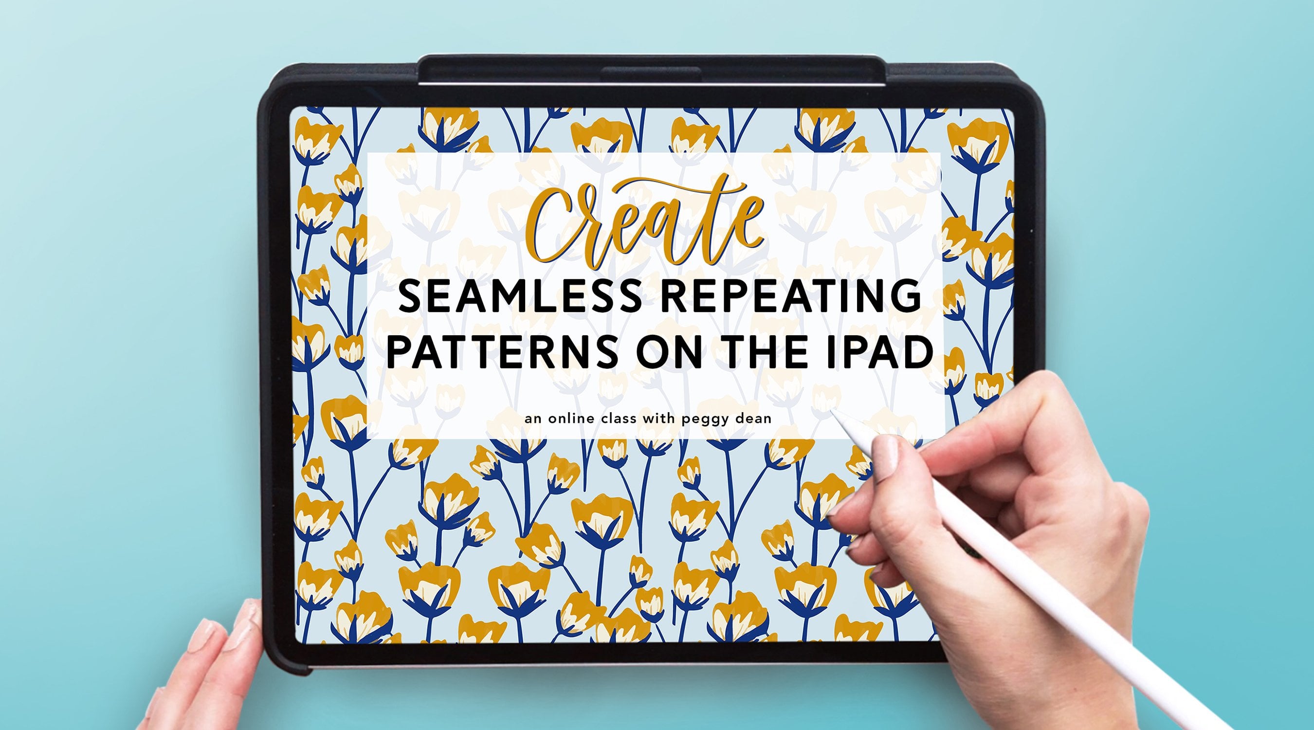
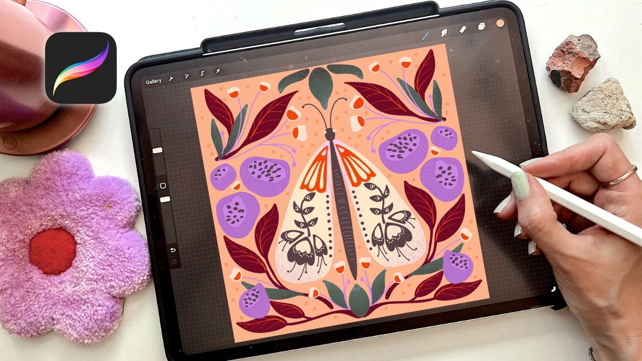
1. Intro to Half Drop Repeats in Procreate: Paintbrush microphone is
making another appearance. Half drop pattern instead
of stacking the repeats directly on top of each
other in these neat rows, it actually shifts every
other column down by half. And this is a simple change, but it makes a huge
difference because it breaks up the repetition. It adds a sense of movement, and it gives your pattern a more professional
and polished field. This is a common and one of my favorite go to pattern layouts. And while you'll see them used a lot in fabric, wallpapers, other surface designs,
it really tricks the eye to make it feel more
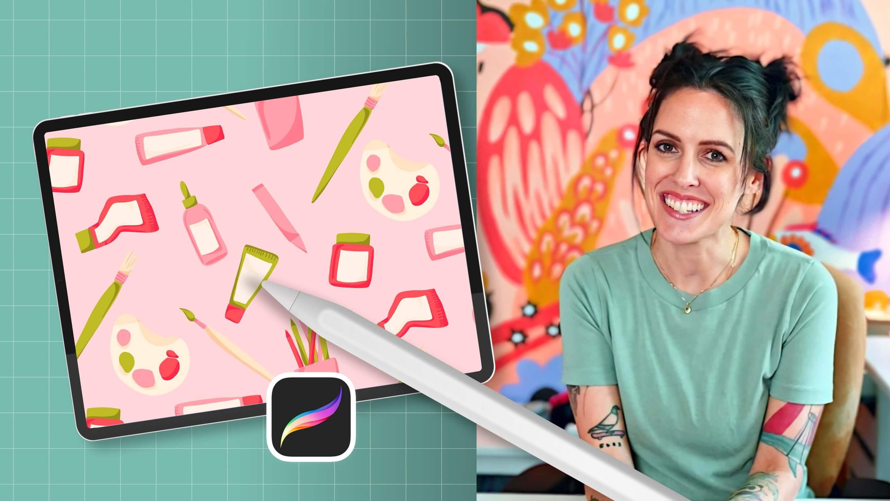
organic and less stiff. I'm Peggy Dean, I am an artist, a bestselling author,
but first and foremost, my true love is education. I'll be walking you
through building a half drop pattern
from start to finish, which will include planning and sketching and
finalizing your motifs. But we're also going to create a template for these half
drop patterns that you can reuse every single time
that you want to build one so that you can focus on what you
actually want to do, which is creating your artwork. You are going to gain
so much clarity and confidence as you apply what you are learning to
your own designs, and by the end of
our time together, you will have professional, unique, polished patterns that are ready for the
world. Let's jump in.
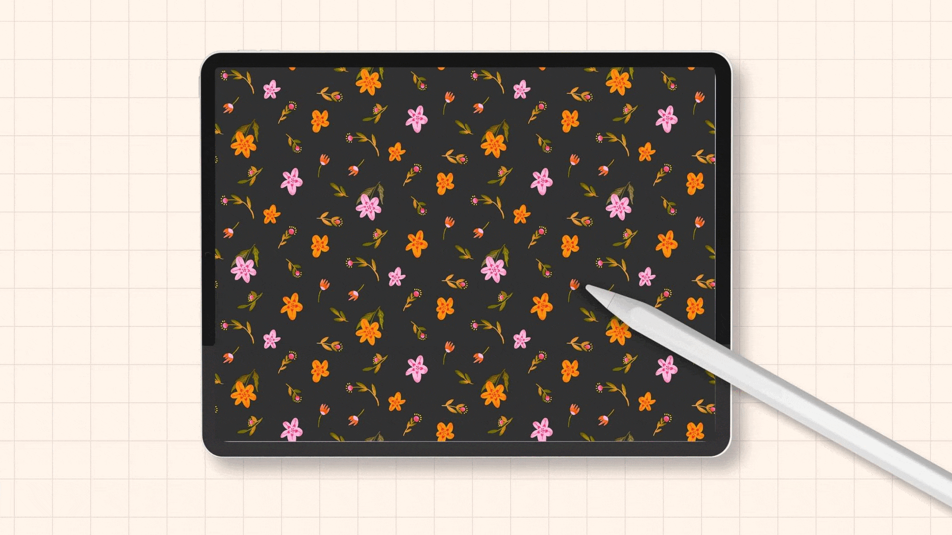
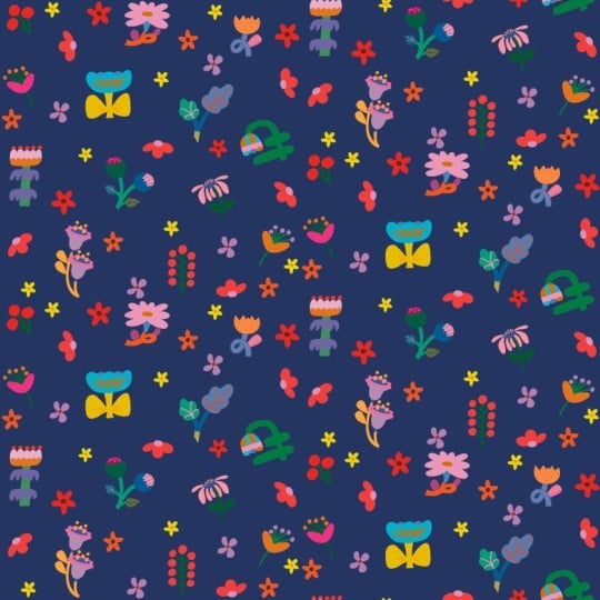
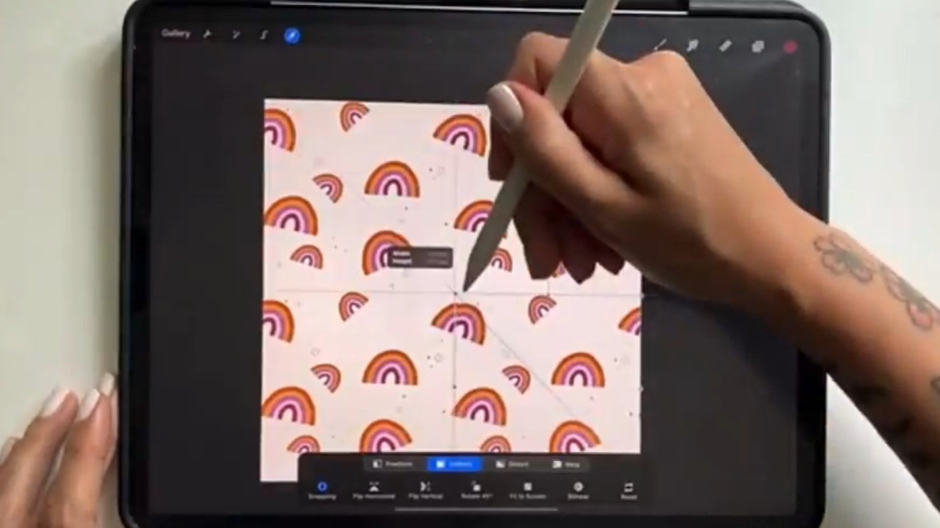
2. Half Drop Patterns vs. Basic Tile Patterns: As you know, in a regular
repeat pattern that is tiled, we have our elements
that are matching up exactly on the other
edge of any given side. So the left side is going to match up
with the right side. The top side will line up with the bottom so that
when you lay them out, it will be repeating, no matter where it is directly
on top or on bottom. So it will end up
looking like repeat, right here, repeating down here, so you can see the
main elements. These four are in a quadrant. Now, the difference with
a half drop pattern is that it staggers
it a little bit. You're going to get
some more variety because unlike a
basic square repeat, which can sometimes look
rigid or predictable, a half drop repeat
staggers elements in a way that creates a more dynamic
and organic composition. So let me show you what I mean. If I open up one of
these strawberries, you will see it's
a little hard with this one because the elements
are essentially the same. But if I identify one of these, so this one's on
its side, right? I'm over here and it's
not directly across. It's actually across and down. So I see it right here. So what the layout
looks like is you have your canvas you have your square here, it
repeats right here. But rather than repeating
directly over here, it's going to come
down at a half stop. Let's make this more
accurate there. And then this tile
will repeat here, but cut off and then
match up down here. So then any elements in the main area here
are going to be here. And then also here,
here and here. So you can see how it's going to basically zig zag through. So opening this up again,
we have our zigzag. If I look at this
strawberry here, zig zag down, zigzag down. So that's what we're
going to create today. And we'll set this up
using a template first. You can see I have one that's
half drop pattern template. This is going to help you
work smarter, not harder. You will not have to set up your canvas selections every single time that you
want to make a repeat. So let's set that up first. It may not make 100%
sense just yet, but it's essentially just we are blocking out the areas
that we need to grab.
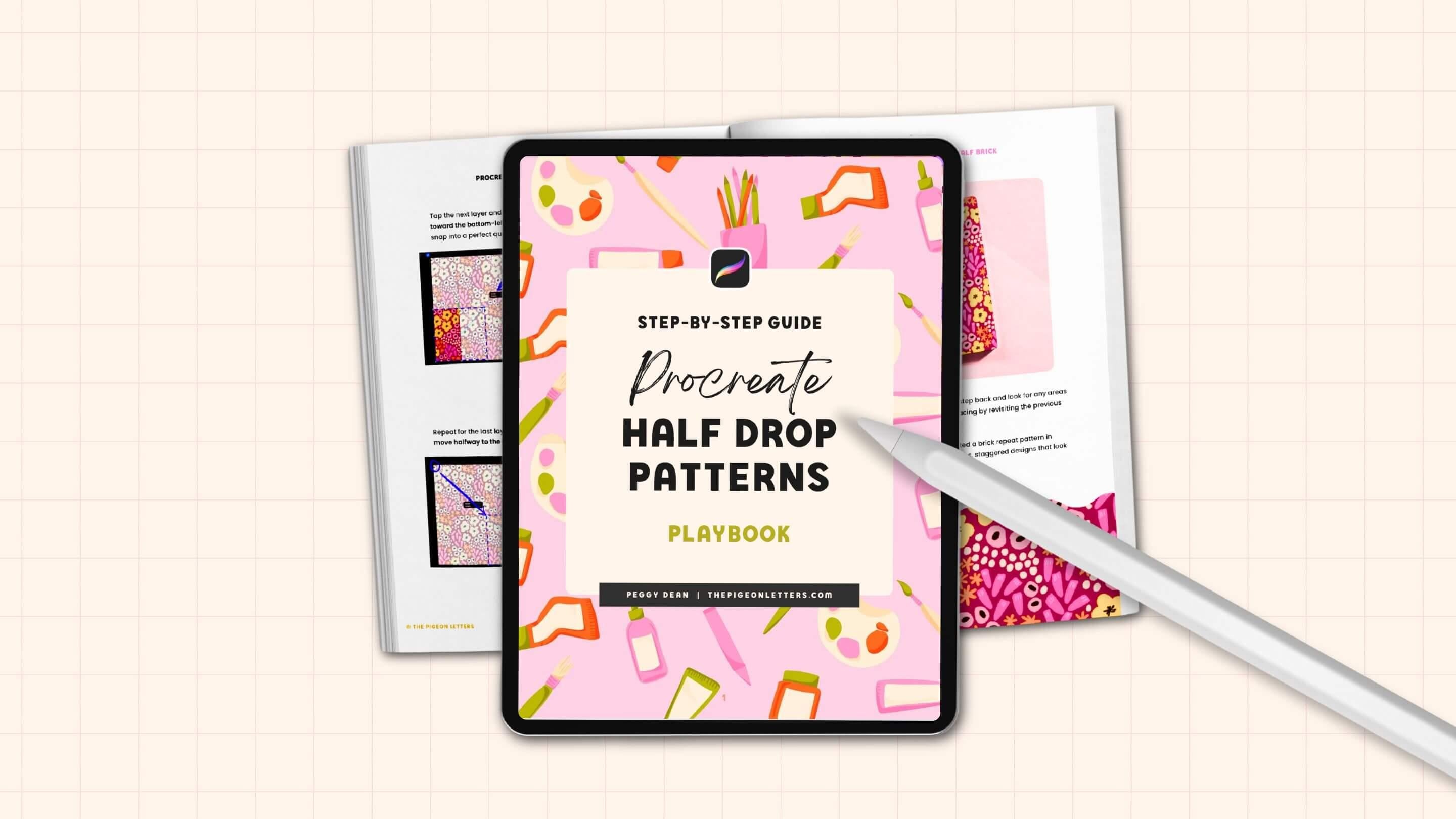
3. Download Your Playbook: I've got a download for you. Your playbook, or the course. This is printable for
reference when you need a quick refresher
and you don't want to scrub through all
of the video lessons. Let's say it's a month
after you take the class, and you're like, What
was that one step in the repeat? I got you. It's all in print for
you with visuals, your best practices Guide
does in there as well, along with organization tips and must follow rules
so that you don't end up doing a bunch of
work and then finding that your pattern does
not repeat seamlessly, 'cause there's nothing
more frustrating. I'm not gonna let
that happen to you. So this guy does
in the download, but make sure to grab it. It is an invaluable resource.
4. Canvas Set Up: File Size + Color Profiles: Going to open a new canvas, and you'll want to
make your canvas size as large as you're able. There are plenty of iPads that don't have a
ton of storage. So the amount of layers that I get might be different
than what you get, but just know that
if you have like ten to 20 layers available to you, you
should be just fine. So I'll show you
how to see that. You're going to go
to your Canvas. Create a new Canvas plus sign, create a new Canvas plus sign with the folder
right underneath that, and then you're going to have
width and height and DPI. If you don't work in inches, and you work in pixels. If you want to ten by
ten, you're going to go 3,000 pixels by 3,000 pixels and always make sure that your
DPI is set to 300 or higher. I stick to 300, and it works great for me. This is going to help if you want to print
anything at all ever because it'll make sure that you don't
have any pixelation. Now, if you want to go
larger than that, you can. I say, 6,000 by 6,000. It's going to make that
quite a bit larger. You can see my maximum
layers changed to 48. This is a giant size
iPad for storage. So yours will
probably not be that. It's unnecessary, but I use
this thing every single day, and I keep all my work on
it. So for me, it works. But, yeah, you do not have to have this many layers available. If you are at 3,000 by 3,000 and you have
48, that's fine, too. Just make sure you have in
10-20, then you'll be good. This has 48. I'm going to go with it. You can also rename. I like to do I know that
it says it on the side, but I still just like to give myself a visual,
like, that's larger. I know it's kind of silly,
but also one of the reasons I do this is so that I
can add the DPI in there. Even though I always
set it up 300 DPI, this is kind of giving me
reassurance that I know that it is exact canvas
size that I want and need. You can name that whatever
you want. You could name it Pattern, if you want. The other one is color profile. If you work in RGB, that is a digital color space. A lot of printers do
accept RGB and print it quite well because they have digital printing
technologies. However, there are
plenty of manufacturers, whether it be print on
demand or what have you, that work in CMYK, which stands for cyan, magenta, yellow, and key, and
key meaning black. This is your
traditional printing with these three colors, and it gives you the range depending on those ink pigments. So I would say this
is going to be your closest color
accuracy if you want to go across the board for
any manufacturer ever. I typically work in RGB
and it's just fine. Maybe the colors are
off just slightly, but for the most part,
they do pretty well. What I will say that's super
important about this is that display P three is
the default on your iPad. You do not want to use
display P three ever, ever. Always go down. Just go down one to
the first RGB option because Display P three was
created for Apple devices. Even if you were to switch
over to your MacBook, let's say, it might come up differently if you're using a different monitor
or something. And then if it's on a different monitor, it'll look different. I've had people tell
me that they've sent some really vibrant artwork
over to their laptop, and it comes out a
lot duller in color. So if you use RGB, you're going to be
good to go, okay? So do that. Those
are the only things. So as a recap, we want, I would say 3,000 by
3,000 pixels, larger, if you can, 300
DPI, color profile. You can choose
either RGB or CMYK. I wish that there was a
straightforward answer for you. These three swatches
were created in RGB, and they turned out just fine. I printed these
with spoon flour. So it just really depends
on the printer themselves. You can always convert
a piece into CMYK. We'll get into that later. But for now, I would just say, do what you feel most
comfortable with. I'm just going to go with
my normal my normal, usual routine of RGB,
'cause I like color. I like to have the options, and I never know where
I'm going to put this. So okay, create the canvas. That opens our canvas, and we are good to start.
5. Template Setup (Work Smarter Not Harder): Have your canvas set
up and ready to go, we are going to begin with
a template so that we can save that and work off of that and work
smarter, not harder. It's going to look similar to the diagram
that I showed you. I'll show you the
selections we're going to create and then we'll
walk through it together. So we have a square
here, square here, and then we're going
to grab a rectangle, and then we're going
to do opposites, where we have rectangle on
this side, square and square. Okay? So here's how
we need to do this. It doesn't matter if we
have a new layer, anything. This is a temporary layer. We're only doing it
to fill the canvas, and then we're
going to resize it and grab the pixels according to how it is resized so that we can save those selections.
So here's how to do that. We have this whole thing filled. So what we need to
do is resize it to those sections
that I showed you. So we'll go ahead and
tap the transform tool, which is the arrow
on the top left. We will then keep it on uniform. If it's on uniform down here, it means that anything
when we resize it, it will keep the ratios so it won't distort
it in any way. And then we want to
turn on snapping. It's at the bottom left, and we'll turn on magnetics
and we'll turn on snapping. This is going to help
us with ensuring that it snaps into place exactly
into the quadrant we want. I turn my distance up to Max and velocity just
somewhere in the middle. So velocity is about the speed that it's
going to do that, and then distance is going
to be that nice tight fit. So once that's on, we're going to grab the
bottom corner here and pull it down until
it snaps into place. You see that snap
right in the center. You'll know it's perfectly
centered because there's this gold line horizontally
and vertically. You'll also know what I always
do as soon as I release, just to make absolutely
triple Sure. I tap the node right here
and you'll see dimensions, 3,000 by 3,000 pixels. Yours might say 1,500 by 1,500. This is going to
be half the size of your canvas, essentially. So as long as that is aligned, and if it's off by
even one pixel, your pattern will be messed up. So we want to make sure
that this is correct. Once we have that,
where we want it, we can deselect it and go
over to our Layers panel. We're going to then
tap the layer, tap Select, that's selecting exactly what is on that layer. And right now, it's
only the square, and then we're going
to use the Save and load menu under select. So you'll see select
is now highlighted. Save and load is on the bottom. It's in the selection menu. Right now there
are no selections. We're going to tap
the plus symbol, and that's going to give
us that first selection. It looks just like a box. If I had some artwork
on here and I did the same process where I grabbed a layer selected
and saved and load, you would you would see the artwork outlines right
here, but it's just a square. So just so you know that's what it's selecting and
that's what it's saving. Okay? Now we're going
to deselect it, and we're going to have
a square on the bottom. I don't want you
to move this down. And the reason why is, again, because if it goes off
by even one pixel. So if I was to select it
and drag it down here, snap into place and
double check it, this is okay, but
sometimes if it even gets a nudged over one pixel. Remember, you don't
want to do it. So just to be safe, you can
take three fingers and scrub the canvas clear and then
drag and drop again, Transform tool, drag this down, snap into place, and then
just double check it. Okay, we're good.
Deselect, transform. But then we'll go to the
layer, top the layer, select, and then
we will go to save and load and save
this selection. Okay. I know that this is going to kind of go fast
because there's a lot of things to tap, so feel free to pause and go back and forth with
whatever speed you need. This actually took me a while to conceptualize when I was
learning how to set this up. But once I got it, it was a lot easier and
made complete sense, and it became much faster. But again, it's going to be much faster the fact that
you have a template. Okay, we're going to fill this again. I've scrubbed it clean. There's nothing on layer.
I filled it again, and this time,
instead of resizing, we're just going
to move it over. Select the transform tool. I shouldn't say select
because Select is an option. Tap the transform tool. You'll see it's on Uniform. We have the magnetics on
under the snapping menu. And we're going to drag it on over to snap into
place horizontally. What you'll notice is wherever
I put my Apple pencil, there's going to be a blue line. That's because it's telling
me keeping it aligned. And then the gold
that we were seeing, this gold is showing me that we're perfectly
centered horizontally, and then this gold one here at the top, you see, vertically. So what I will mention is the double checking for
this is not going to be accurate because this square
is still fully selected. So if I bring that back
onto my canvas, it's still. But if I deselect
it and then tap the transform tool again and then tap one of these
nodes to check, it should be dimensions half
of what the full size was. So exactly 3,000 by 6,000, yours might say 1,500 by
3,000, which works great. Make sure we're
good. We are good. So I'll go ahead and
go to my Layers panel, tap the layer, select it. And then I will go
to Save and load, and that's my selection three. Now, I'm doing it in
this order on purpose. So make sure you're going
with selection one, two, three, and now
we'll go ahead and do the other side,
large rectangle, scrub your layer clean, drag and drop that color, select the transform tool, slide it on over, make
sure it snaps into place. I'll deselect it, tap the transform tool again just to double check
that my pixels are the correct size because
once we drag it off and then tap to deselect
it, it will crop. And so that's how I know, if it cropped off
by even one pixel, I just do that part again. Go ahead and go to the
layer panel, tap the layer, select it, go to save and load and save
this new selection. We're going to do this two
more times, scrub that clean, new fill, go ahead and
grab that transform tool, and from the bottom left, we'll drag that up to the top right and
then double check it, make sure that they
are good to go, and then we'll go to the
layers tap the layer, select it, save and load. New selection, and then the
last one. Fill with color. Transform tool we'll
grab the top left, bring that down to
the bottom right. It snaps into place. Check the dimensions.
They are good. Go ahead and go to Layers panel, tap, select Save and load. Last selection is in place. That is it. From here, what I like to do is I'll add text or you
can write it in. If you want to add text,
just go to the wrench icon, go to AD, add text, and I will write in here, half drop pattern template. Template. And that's
going to tell me if I put this just in the middle
because I'm not going to use this particular canvas. I want us to use
this as a template. So now if I go back
to my gallery, you can say I have them on here. But I'll have this here, and then I can drag this wherever I want
within this stack. And then when I want to use this template
for any artwork, I can just swipe to the
left and say duplicate. It's going to duplicate
it, and then I can use this as my art canvas, I can get rid of that
layer and begin anew. So that's what we're
going to do next.
6. Sketch Your Pattern Artwork: Now that we have our
half drop template, we are going to
duplicate this for every half drop pattern
that we create. Even if you have artwork
on another canvas, you can bring it into the half
drop pattern template that you just created and
still create a half drop. So what we're going to do
now is just create some art. So I'll go ahead and
duplicate this canvas, swipe to the left and say
duplicate for that new version. I'll go ahead and go
to the layers panel and delete that text
layer and start anew. So the way that I like to do this is I like to set
up a sketch first, so I'll go ahead
and grab a pencil. If you don't have my brush sets, I use pigeon pencil
for my sketching, but if you want to,
you can go down to sketching and
use six B pencil. It's a great option as well. You can use any color for this. I'll go ahead and use red. And I'm feeling like drawing some art supplies
because I think that that would
be a fun pattern. So I will just begin here, and nothing needs to
look pretty at first because this is going to help us get a rough draft for adding in the actual artwork
that we create. So here's like a dropper bottle, go ahead and add a label to it, and then maybe a paint tube. And I'm okay with
these looking a little wonky and
hand drawn because I think that that would
add some character, so they don't have to be
perfectly proportionate. The other reason I
like to sketch first is because if I want
to resize something, it will not matter if it pixelates a little bit Procreate
is prone to pixelation. It won't matter because the sketch layer is
going away anyway. So we're not gonna ruin the
actual artwork that way. Okay, so paint tube, and then I'll add some little notches
right here on the draft, so I don't forget to add this because I think
it'll be cute. Again, does not have to
look at all realistic. Bring this up a little bit. And maybe I'll do a paint too
that's a little more bent. So for now, I'll just put it right
here and I can move it. And so this has clearly had
some use, and I'll have it. There we go. Little bends. Okay. Okay. And there. And I can move that somewhere. And another thing we had snapping on when we
created our canvas. I'm going to turn snapping off
so I can move this freely, and it's not snapping
into place in any way, because that's going to help
my illustration process. I don't want any snapping. Maybe right here for now. And then let's do a crayon. I want this to be
playful and fun. And then round the top here, Crans have kind
of a unique shape at the top, where they taper. And then wrapper.
Okay, got a cran. I'll resize that.
And paintbrush. Do a tapered handle. Bring that down a little bit. And for the bristles,
I like to curve them an S curve and then a C curve underneath
that is pretty fun. Of course, you can create
a pattern of any kind, which is why I'm going
over this sketch more quickly because this is
not about sketching. Although I like to go through the whole process with everyone because you just never know. I think I want this here,
but I can't drop it right there because I have
this shape in the way. I'll first bring this one over so that it'll bring room for this and then I can
reposition the other one. You could do these all
on their own layer so that you could overlap
if you wanted to, like, as you're
moving stuff around. But for me, it's a draft layer. I don't care if
there's a little bit of a little bit of a
disaster here and there. No, if there's overlap
or some lines or wonky, I'm fine with it because I know that I'm just gonna draw over it and then
it's going away. Okay, I'll do another paint
brush since I paint a lot, and it's a big part
of my process. And I'm gonna make this
more of a flat wash brush. Okay, and then I'll resize that. If you want to change
the ratios and, like, transform the actual
object, like, I want to make this a
little thinner so you can change your
selection to free form. And you can squish it like this, but something that isn't as well known is that there's
two nodes here. So you can use the
green to rotate. But if you grab the yellow, it's going to change the
dimensions of the box itself, which means that now if
I use the side node, it will do it in proportion to how I want it to get smaller. So that's a helpful tip. This is one of the reasons
why I keep this part in our class so that you can get these little
tips in case that's an aha. Okay, and then I think
it would be fun to have a, like, pen jar. We'll see. It might be too much, but I'm not gonna draw
these pins out just yet. I just want to see what
this is gonna look like. I think it could work. Let's resize it and see. Maybe like colored pencils. And I'll do a small palette. Ideally, it would be larger
because these are larger, but not everything needs
to be so proportionate. I just want to have
that color in here. I'll make that a little smaller. We'll see. Yeah, I think
that'll work fine. I want there to be some balance. So we have a big
shape right here and a big shape right here. So I think I want
to bring this shape over about right here. So I'll move this here
so I can get this crayon out of the way. There we go. Okay, so that creates a
little bit better balance so that we don't have this
which, you know, honestly, doesn't really matter for this because our balance is
going to be a little different than what
we're seeing anyway because of how we're
creating a half drop, but it's still a good
habit to have as, you know, having that
balance in composition. I think I'll do also
a little ink jar. Okay, I'll have label, label that kind of
follows the bend. I think that's pretty good. We can see if we want to add
something as we get into actually building this because
we'll have spots to fill. But for now, I think
this is good to start rendering the actual
art on top of this draft. So that is what we will do next.
7. Color Your Pattern Motifs: When your sketch is in place and you're happy with
where your elements are, we will go ahead,
finalize these objects. So what I like to do is I keep my draft layer on top so
I can see any details. Like, if I was to do a
color fill on top of this, I would lose the label,
which isn't a big deal. I know I want to
put a label there, but just so I know the details
that I want to include, this is just my workflow. You can keep it on the
bottom if you want to. But I'll go ahead and
go to the draft layer, tap this little N and
turn the opacity down to, like, 30 ish percent. And that just makes
it a little more transparent and less
of a distraction. I'll tap a new layer, and right now it's on top
of that draft layer. Personally, I like to drag
it underneath so that I can, like I said, still see this. Okay, I don't want you to be too finicky about color right now because we are going to be able to
change color easily. So I'll go ahead and
just start filling. In fact, I'll just
use this red for now, and I'll change the brush, so I like to make sure
to use an opaque brush. Can use pressure
sensitivity if you want to. But if we're just color filling, the best one that I
would say is to go to the calligraphy and
go to monoline. Monoline doesn't have
any pressure variety. It's curved on the edges. It's just an easy, kind of
forgiving brush to use. And then we will just start tracing around these elements
and then filling them in. The reason I can't see my draft is because I used
the same color. So note to self. Let's change that just for now. Okay, so see you
can see that color, and it makes things easier. And then I'll just smooth
out connecting points like this so that they have
a nice seamless shape. And then you can always toggle
your draft layer off by tapping the check mark here so that you can see
what that looks like, and then we can go from here. Now, what I do is pick
three to four colors, and I will create new
layers for those colors. Rather than this being a
liquid dropper bottle, I'm going to rename it purple, or you can rename it color one because you know you're going to
change the color. Then I'll rename my
draft layer to draft, so that doesn't confuse me. Then I can grab that
same purple and carry it over into certain
areas, other areas. And then when I change the
color in those other areas, it will be consistent
across the board, and I don't have to go into individual objects
to make that happen. I just want to sharpen this since it's a little
colored pencil, and then you can work smarter
not harder by going ahead. And I can duplicate this shape. I'll tap the select tool, go around that shape, and then at the bottom here, I see copy paste,
and then I can tap transform and flip it horizontally and maybe
drag it down a little bit. It's on a new layer now. Anytime that you copy and
paste a new selection, it'll be on a new layer. But that works for me
because I'm actually going to change
this color to red. And then I don't worry about down here because I'm
going to cover that up. If you want to clean it up, you can if that helps. But then I have color, too. So that's a great
way to be able to repeat elements without having to draw
each and every one. However, I do like to
draw quite a few of them because I like them to
all look a bit different. So I'll just grab yellow for now and I'll create
another layer. Oops, I named that color one. We want color two. I'll
name this one color three. Doesn't matter the
order. I'm going to probably end up changing that anyway to reflect the
color I end up choosing. And this is about the same
angle as the other one, but I think it's
going to be okay. Make sure that's closed
to do my color fill. I'm not really going
along the draft layer, which is okay, really, it was more just placement. So the placement helps you
determine what you want to do. And of course, you can get
more detailed with it, but I don't because I actually never used
to do draft layers. And then I realized,
Oh, my gosh, this saves me so much grief when I am trying to resize
or rotate something and then losing all of the edges because of the pixelation
when that happens, because every time that
you tap something, rotate it, deselect it, or tap something, resize it, deselect it, it's going
to get more pixelated. So the difference is extreme. So if I do that
with a draft layer, it's going to help
me in the long run. Okay, so I'm on yellow. I'll go ahead and grab so make
sure, yes, on that yellow, and I will bring that
over to this handle. Again, I like these to
look a little wonky. So on purpose, I
will go a little bit faster because I am notorious
for coming in close. Even if I've drafted
something kind of messy, I'll come in real close
and try to perfect it and make it look nice and
clean instead of wobbly. Like, I'll change an area or I'll fix a corner
or something, and then it just looks
too symmetrical, and I do want this
to feel playful. So I kind of have to remind myself of that
and then come in here and create more
of a wonky line. So if I turn my draft layer off, see how this is more
of a wonky line now, and that's really the
vibe that I'm going for. And it's something I have to
constantly remind myself. And of course, this
is totally up to you. But, you know, just lean into the personality
that you're trying to put into your work that you're
trying to portray because it really does make a difference
in the final piece. Like, I really perfected that, and in hindsight, I want it
to be a little bit wonky, and I'm glad I'm catching it now because I don't think
I would be happy with the final result if I didn't didn't lean into
that more like wonky, not shaky necessarily, but just wonky just how
it's bent right here versus being so straight on because I'm not trying to do a literal illustration that's supposed to look just like it. I want it to have
some quirkiness. Alright. I'll I'll turn
my draft layer back on and I'll bring the purple
over to this crayon here. Again, I am not
worried about again, I'm not worried about Okay. And really, again, this is
not about the color purple. It's just about differentiating the color blocking
we can change this. So now that you know
the process here, just keep your layers separate. If you need to put
the same color on a layer above and below another one to have something peekaboo from
behind, that's totally fine. But overall, I'm just
going to continue this process until I have
all of my colors blocked in. So I'm going to speed this
up because otherwise, you're just going to hear me
ramble about color, my cat. We don't know. So go ahead and fill in the rest of
your color blocks. When you have all of your
color blocks in place, we're going to
want to enhance it with shadows and highlights. And so that's what we're
gonna be doing next. Go ahead and get all
of that color in there because this is where
it's going to come to life.
8. Add Shadows & Details to Your Motifs: You have color blocked in. We can easily create shadows that bring this
to life a lot more. And the way that
I like to do this often is to create clipping
masks on each one. You may or may not have
enough layers to do that. If you don't, you
can create one layer above and apply the same effect just drawing a little
more carefully. So let me show you if you were to do this
with a clipping mask, I'll start with color
four because that's the bottom layer of the
color shapes I have in. I'll create a new layer on top. And then let me just show you
how this works real quick. If I draw anything here, see how it's underneath everything else except
for the cream layer. If I tap the layer and select
clipping mask, it clips. It has a little arrow here that clips to the pixels underneath, so it only affects
what is underneath it. So that's what
we're going to do. Again, if you don't
have enough layers, and let's say your iPad is like, No, I can only do
ten on this canvas. I'll delete this real quick. If I did create a
new layer on top, I would just need to draw
in a little more carefully, let's say that's my shadow area to where nothing's coming off of the shapes so that
you can make sure that you don't have
that spillover. So I'm going to do it where I go to the layer I want, tap, new layer, tap the
layer clipping mask. You'll see the little arrow. And that means that I can
then come off the layer. I'm going to go ahead and bring
it the whole way through, so I even drew on this side
so that it connected to the endpoint because
if I fill with color, if I don't connect, so let's
say I just do this part and not connect it to the other side, it
will fill everything. Like, essentially everything on the canvas if the clipping
mask was not in place. So we don't want to
do that. So just make sure that
everything is connected. So then underneath here, I'm just going to create little
shadows under the wells, and I'll do this all at once, and then I can fill
them all at once. I'll show you how to do that. So I've connected them all. If I drag and drop this color, you see on the top here, it
says Color Drop. I'll tap it. I'll release, and then
tap continue filling. And now color drop is on. So if I just tap, tap, tap, it will fill in those shapes, and then I just tap the
check mark and then done. This looks weird
right now, I know, but we're going to apply a blend mode so that
it is a lot softer, but black is going to be the best for the blend
modes that we're using. So that is how we're
going to start. So bear with me if
it looks real weird. I still want the shapes
to be a little wonky, and I'm going to go to all
of the layers that are or all of the cream colors
that are on the bottom layer. Then I think I want
this to taper a little more. Oh, see, I did the thing. I need to connect
it. There we go. What else is down here? Just this bristle area. So I'll go ahead and
make the brush a little smaller and
come in and create a little separation in between these bristles just to have a little more interest, and it can be choppy. It could have some more depth, but I usually go
down pretty far, and then I'll go to the eraser and I'll just make
those a little piecier by tapering off and then clean up
anything that you need. And I will also add some shading just to the
part that it connects here. Alright, so here's
what's going to happen. We're going to go to that
clipping mask layer. And there's in right now that stands for
normal blend mode. You can see it says
normal, and we'll change this to either overlay or
soft light are my favorites. So you're going to scroll
down till you get to overlay. And see when I went
to overlay now, what it's doing is taking the color that was underneath it and using that to blend and just create a
darker version of it. You can adjust the
intensity with the opacity slider of the clipping mask so it
can get lighter or darker. Soft Light is also great.
It's a little softer. Right now, for this example, it's not super different. I don't even know if
it's really showing up, but I usually use soft
light or overlay. So this is good to me, and then I'll do that
to all of the layers. So I'm going to speed this up so that we're not just
watching all these shadows, but I will say before
I get going, though, is that as I'm doing this, I'm not necessarily
thinking, Okay, there's a light
source coming from here and I need to do all
the shadows on this side. All I'm trying to do is just define areas to make this
have a little more depth. So do not overthink this part. Alright, at this stage, what we've done is
created blend modes for these shadows that
will respond to if you decide you need
to change any colors. So no matter what
color we get to, the blend modes are going
to be reactive to this. So it's really helpful when you can use shading that comes
from just regular black, and then you can
highlight with regular white and do a similar thing where you use a blend mode like ten or, you know,
you play with them, 'cause really if you
just scroll along, you'll see how it's responding and then you can choose
whichever works best for you, whichever one that you like the most, like
the look of most. So at this point,
tweakiny colors, tweaky details that
you want to add. But from here, we
are going to build out the pattern itself.
This is the fun part.
9. Build Your Half Drop Pattern: You are ready and you have all of your
illustrations in place, you don't have anything
touching the edges at all. We can now use the
selections that we set up in the beginning to
create our repeat. There are a few steps to
this, do not work ahead, even though it seems like you can complete all the steps
because they are repetitive. We have to stop in the
middle of the process. There's a few steps here. The
first thing we want to do. Is group everything that
we have going on here. We don't have to worry
about our draft layer. We can get rid of that and
then just select everything. You have anything selected
and just swipe to the right to select
everything else. You can see it's just
turning blue here, even the background
color that we put in. Then you're going
to at the top of the layer panel, say group. Then you want the group
to be what's selected, no individual layers, so you
don't want to have a layer, you want the group selected. If you use this little arrow and close the group so that they
are compressed in there, you have group selected.
That's what we want, okay? Now, I recommend just so you can preserve the artwork that you have to either
duplicate this group. If you don't have enough layers, you can duplicate the canvas. If you go to your
gallery and duplicate your canvas and then you have your original
artwork preserved. Either way, you can
duplicate the group, and then what I would do
is turn this group off so it's not being affected and
you can lock this layer, so nothing happens to it, you're only doing something
to this group, or if you like to be
better safe than sorry, or you don't have
enough layers, swipe to the left and say duplicate. And then you can just,
you can say art. Then that's the art layer. This is the one we're
going to create a pattern. I'll go ahead and unlock this and get rid of
that second group. I have the group selected. Here is where we start to transform into building
our half drop. What we'll do is go to
the selection icon here, the little ribbon
icon on the top left, and then it brings up
our selection menu. Now, see how before we saved selections and now we're
going to load selections. We're going to tap
Save and load, go down to our first selection
that we created here. It may or may not show on the screen that the
selection is grabbed, if you will, selection
is selected, but it is, make sure
you tap selection one. As soon as you tap transform, you'll see that that
box has been selected. Something else to note, for
some reason, with Procreate, when you select
something, it can make it look like the
clipping mask went away, so you can see the
shadows are all gone. They're not actually gone.
Don't worry about it. It looks like that at least with this Procreate version. Don't
worry about it. It's there. What we're going to do now with the selection is flip it horizontally and
flip it vertically. Flip horizontally,
flip vertically. That is on the bottom
of the screen when your transform menu is
selected. Let's do that again. With the next selection.
I de selected it. We still have the
full group selected, so we're just going to
open the selection menu, go to save and Load, and we're going to
load selection two. Tap the transform icon, you can see that
this is the box, the second selection
that we created, and then with the
transform menu right here, flip horizontally,
flip vertically. Deselect. Now we're going
to open selection again, save and load, and this
time selection three. Top transform, it's
this rectangle. Flip horizontally, flip
vertically, Deselect. Stop right here. This is where we are going to see how
things are filling. I notice that I have a little
bit of a blank space right here and then I could fill this area or
move elements around. With that said, you
want to make sure you want to make sure
that you don't touch anything that is
going off the edge, nothing that's
touching the edge. But these ones are free to move or readjust
however you want. For example, I'll pull this, make sure I have the layers. Groups not selected,
backgrounds not selected, I'll grab this one and move it here and maybe flip it to see if I like
any other orientation. When you flip, it's
not going to mess anything up with the pixel, so you can flip and move
as much as you want. I think I'll put that
here and then I'll move this one over to the
right a little bit, and then I can add
something in here. What I think I'll
do is actually move the paint brush because
I'm looking at balance now and the balance is going
to look different than the initial composition that we put into place because of
the nature of half drops. I don't want it to
go the same angle. This is going that angle and
it would feel too much like a it would feel too much
like a directional thing. I'm going to just
push this right here and then you can see
it'll be coming this way and this one will
be underneath it. Maybe I want to space that
out just a little bit more. You're just basically moving
these around until you're happy with the spacing
in between objects. Remember, do not bring
anything off the edge. You can get close to the edge, but make sure that nothing
is coming off the edge. Space it out, draw in any additional
elements if you want to. You could draw a
new object in here. I could even take the same paint tube and
copy it over here. I will say that because
it's in layers, you would have to do
each individual layer, so I'll probably
just draw it in. I'll move this and
then I'll use purple, go to the purple layer and just do the same
format that we did at first just for
this one object. All right that is better and
it seems much more even now. Now we'll finish the
transform for the selections and we'll do that one more time where we fill in any empty gaps. Make sure the group
is the only thing selected to collapse the group, and then we will go
to selection menu, save and load, selection four, and then we will transform, flip horizontal flip vertical, Deselect, go to select
again, Save and load. We're going to load
selection five. Tap and flip horizontally, flip vertically,
deselect, selection menu, save and load, last
selection six, tap transform horizontal,
vertical flip, deselect. Now we have our tile. This is where we're
going to make any fine tuned last
minute adjustments. I see that I could move
these two objects over. They're not touching any edges, so I'll go ahead and
open this up and do the same thing Ry Crab
All of these just so I can make sure I'm not
getting the background color in I'll grab both
of those and just move them over and see
if I like that better. As long as you're not touching
anything on the edges, you are good to move the free floaters and then also to draw any additions into this. But other than
that, your pattern is done. This is your tile. You don't see any repeats right now because this
is the main tile. This is what will
repeat and let me show you how to test
your pattern now.
10. Test Your Half Drop Pattern: Pattern tile is complete, you have all the filler finished and all of your motifs are positioned where
you want them, it's time to test your pattern. And I'm going to do
this as a flat piece of art to start out with. So what we're going to do is copy everything on this layer. So instead of having to export this file and bring
it into new canvas, I can just use three fingers and pull down and then say copy all. And that's going to
copy everything that is visible on this
canvas right now. And then when it pastes it, it will paste it as one layer. Let's do that on a
different canvas just so that we can
keep this preserved. I'll title this art
Pattern, repeat. And then I can open
a square canvas. It doesn't matter
the size as long as it's square because
we're just testing it. And then three fingers
down and paste. That's going to paste
what we've created. Okay. Now, we don't have
to create any guides. We don't need a template,
anything like that. We do, though, want to create five layers of the same art. So we're going to swipe to
the left and say duplicate, and we're going to do that
until we have five, okay? So the first layer is the one that we're
going to see on top. So we'll keep that one
selected. Top transform. We're going to turn snapping
and magnetics back on. I have the distance set to max and velocities
in the middle, and we're going to create the half drop where we
have a tile a tile, and then one in the middle,
half and half, okay? So with transform, we will grab the bottom left corner and pull it up until
it snaps into place. We'll tap that just to make sure that our
dimensions are right. This canvas is a different
size than my first one, so it was 3,000 by 3,000, so then my pixels
are half of that. Perfect. So I will deselect it. Okay. Now I'll go
to the next layer. Grab the top right corner and bring that down until
it snaps into place. Tap this just to make sure
that we are correct with our dimensions and we
are and deselect it. Now you can already see that we have a seamless
pattern happening. It's so much fun. We'll
continue this now. So instead of the
regular pattern setup where it's tiled right here, this tile is going to show
up in the middle over here. So we'll go to the third here, tap the transform, and then
instead of using a corner, we're going to grab
the leftmost node. And because we have
uniform selected, it's going to drag
that down and keep the dimensions,
snap it into place. I'll tap that just to make
sure, indeed, deselect. You'll see this
perfect repeat. Okay? So the next layer we're
going to select it. We're going to go to
the top right corner. So from the bottom left. Whoops. From the bottom left, we're going to resize it
down to the top right, and then we're going to drag
it halfway off the canvas. So no more resizing,
we're just moving. So move that up,
snaps into place. Okay and then deselect it. You can see that that
is a perfect repeat, and then we're going to do
that with the final layer where we resize it, drag it down, so it
snaps into place. Tap to make sure
dimensions are right. Great. We're going to
move it halfway down. It's going to snap deselect, and we have our perfect
repeating pattern. You see the elements
instead of being this instead of creating a
square of the paint brush, where it's tiled, it's
more of a zigzag. And we have a much more
interesting pattern because the placements
are more sporadic.
11. Bonus Video: Converting Color Profiles: You want to convert color
profiles from RGB into CMYK. Sometimes this is necessary
to do for printing. They're printing companies
depending on who it is, some will work great with RGB
and some do require CMYK. However, if you submit an RGB, you will find that
the manufacturer sometimes will get to the
closest CMYK that they can. I'm going to show you how you can do this so that you
can make sure that you do like the colors
that are going into your printing process. You're not able to
convert a document from a profile from whatever
it's on to a new one. You can check which one it's
on by going to your actions, menu, going to your Canvas
and Canvas information. Then from there, you'll
see color profile here, and I have this is the RGB. Available Color Profiles, yeah, you can change it
to different RGB, but you cannot change
it from RGB to CMYK. So I'm going to show you a
workaround, but before I do, I do want to tell
you that the CMYK in Procreate is not
100% accurate CMYK. It is missing some
channels there. You're not getting the
full spectrum of CMYK. If you've ever
wondered why is it so dull and you've worked with other programs before,
that's probably why. So let's look at
how this will work. When we do this, if we want
to keep things layered, we can't duplicate the canvas
because that's going to duplicate the same statistics,
the same color profile. We have to create a
new Canvas in CMYK. This is 6,000 by 6,000. Whatever your canvas size is, just do that exact same thing. We'll go to the plus symbol for New Canvas from our gallery. Tap the plus symbol
for new Canvas, same dimensions as whatever
you're working on. I have 300 DPI. Then before we say go,
before we press Create, we're going to go to
Color profile and we're going to tap CMYK. Right now it's probably on RGB. We'll go to CMYK. I just use generic CMYK profile
and tap Create. I want to show you
the difference here. We're going to go back
to that original art. You can grab all
of these layers. You can also. If it's in a
group, you can grab the group. Just know when we move it over, there will no longer be a group. Additionally, if you have clipping masks or
anything like that, those layers will
come over with you, but they will unclip, so
you'll need to re clip them. In this case, I don't have any, but you can select
everything like this. And then you can tap and hold it or you can just select the
group. Same thing will happen. You're going to go to gallery right here while
you're holding it, and then you're going to go to the new artwork and you're
not going to drop it in. You can drop it in, but what
happens when you drop it in, at least in this
version, is it will reverse the order of all of your layers, which
is so frustrating. Go to your layers panel, actually go in here
and drop them here. Then they will load, and you can see it's in
the correct order, not a group anymore,
no big deal. Then the only thing that I would need to add is
the background color. So I'll just do this for now. These colors actually
look pretty good, but they're vastly different than the vibrancy from
the RGB color profile. I want to reiterate, a lot of companies will print RGB and they
do a great job. But just in case if you need to know this, this is
the method here. You can see the
pinks are duller. The violet is duller. We have some areas here that
the contrast has decreased, and so we'll need to brighten that up and see what we can do. That's where we can go
in to this pink here. I can use my recolor tool
and come on over and then play with some lighter
or brighter versions. It's not going to be
as bright as your RGB. I'm not worried
about the contrast here because I can
change that color. I just want to find the
pink that will work. I'll go a little warmer, see now that brightened
it up quite a bit, and then I'll go
to this one here, recolor, and get that to be more of the
ochre that I want. So probably a little bit
deeper. There we go. Then this went total blue and
it was a periwinkle violet, if I like the blue,
I don't mind it, but let's just say we really
want that to be purple. We're going to go
and recolor it. We're going to go on over, drag the hue over to purple. We'll add some vibrancy in here, but it is a lot duller, especially in Procreate
because it's not set up for this true CMYK color. Profile. Essentially, that's
all the differences, and it will be duller.
Just know that. But this is going to
help you tweak it so that you don't send
work off like this to any printing situation
that specifies that they need CMYK and then you
get what you saw this load as as your final result and then
be totally disappointed. Just always check where you're printing, the
specs that they need. But I would say work
in RGB and then convert if you need to because otherwise you're working
in a dull situation. That's converting profiles.
12. Class Project + Bonuses: Great job. You have nailed the
half drop repeat, and this layout adds a
whole new level of flow to your designs and breaks up
the grid of the full drop. So next step I want you
to do is try creating two or three different half
drop patterns with motifs that you've already designed
and pay attention to how the shift changes the overall
rhythm within the pattern. If you haven't downloaded
your class workbook already, be sure to do that because not only are you going to get
that, but in a couple of days, I'm going to send you some
more pattern goodness, different troubleshooting tips, different resources that you can use to continue your
pattern journey. I cannot wait for you. I'm so excited. I will see you soon.
 Peggy Dean, Top Teacher | The Pigeon Letters