Transcripts
1. Introduction: [MUSIC] I love Procreate. It's such a game-changer
ever since I discovered it. So much of my work
actually migrated that direction because of how user-friendly it is and
how many capabilities it has. Hello, I am Peggy Dean. I am an artist, educator, author, really whatever
they let me do. You may know my
Skillshare classes on fine art or creative
entrepreneurship. I'm a bit of a dabbler
also on Procreate. I'm very excited to
continue that with you. Today we are going
to be going over some very fun repeating
patterns that are so simple in Procreate and super excited to
dive in with you. You will walk away
from this class with an adorable repeat
pattern that you will be able to put onto a
notebook or a shirt, or just a beautiful
piece of artwork. This class was originally
filmed live with the participation of
Skillshare's community and it was lovely. So I'm really excited to bring
that back around so that you guys can also participate
in case you missed it. Thank you so much for
jumping into this class. I am so excited to see what you make and see how you
interpret this lesson. So be sure to share
it in the projects. I can't wait to see what
it is that you do. [MUSIC]
2. Importing Colors to Procreate: Hello, I'm really excited
to be here today. My name is Dylan Morrison. I am a writer and editor
in Cleveland, Ohio. I will be your host today for this amazing class about illustrating bright
fun patterns in Procreate with Peggy Dean. Peggy, I'd love to turn
it over to you and hear a little bit about you and what we're going
to be doing today. Hi, everybody. Thanks for joining. I'm Peggy. But if you don't know who I am, my name is Peggy Dean, I have a terrible
elevator pitch. I am a proud queer
artist in the community. I have a wonderful wife
who I love so very much. Those who know me for a
long, long, long time you know Laura,
you know that when I talk about her it's great. I am very proud to have this space and thank you for facilitating
this to Skillshare. They're just so awesome,
you guys know this. Without further ado,
we're going to dive in. I do a whole bunch of stuff. Today we're going
to be playing on Procreate because,
why wouldn't we? We're going to be doing
a pattern of sorts. I'm not going to lie to you, I have no idea what's
about to come out, and on my side, it might be flowers, it might be rainbows. Whatever the case may be, feel free to follow along with me or create something
of your very own. We're not going to get
too crazy in-depth here, mostly for time reasons. But I will say that you can get as crazy in-depth
as you want to because the principles
of what we're learning will be
across the board. It's very straightforward,
especially with all the new updates that Procreate has
done over the years. Listen, as a queer person
for literally decades, how did I not know
that there were flag colors that weren't
just the gay pride flag? Excuse me, I had no idea.
I felt like a fraud. But there's trans flag, there's a lesbian flag, there's bi, there's pansexual, all these beautiful
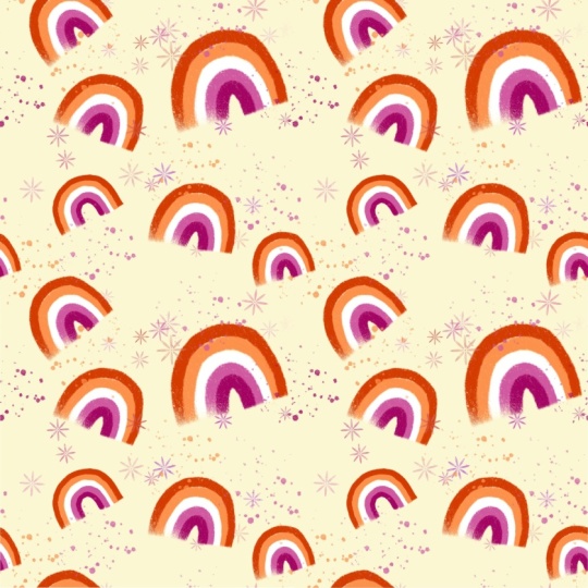
colors of flags. I'll just do rainbows, like little cutie pie rainbows
that can be repeating. If you look up gay flag colors. Here we go. We're
getting into it. I think that this one is the lesbian one,
just look it up. I'm going to take
these colors and I'm actually going to put
them into Procreate. See, I told you I'd
bring it around. To do this, you have
a few different ways to import color palettes
that make it super easy. You can multitask if you
have Procreate open. By the way, iOS 15
that's coming out, maybe by the time some of you
are watching the encore of this class will have a different way to multitask that makes
it a little easier. But for now, we just
pull up slightly. We hover over Procreate and
then go into split screen. I usually pull it so that
this is only a third. But then you can open
your new canvas. Here's where we start. You like how that
segued into starting? You're going to create a new canvas and just
make sure it's square. You can do whatever
size canvas you want. Know that if you do intend on making a pattern for
fabric or something, you're going to want
your DPI to be higher. It doesn't really matter the
size of the canvas though, because we're going
to make it repeat. It's probably not going to
be on the same one anyway. But for the sake of this, I'm just going to
choose square that is just in Procreate already. We're going to go to
our color palette. We're going to go to Palettes. We're going to create a new palette with
the plus sign here, and then all you need to do
is pull this image over. Don't create a new palette because it's going
to do it on its own. Pull the image over and then it auto-generates those colors. That's a pretty
cool way to import a color palette in
case you did not know. What I will say is that there's obviously variations
of tones in here. The reason why you see that
versus the 1, 2, 3, 4, 5 colors that are
here is because this is not a vector-based image. All that means is when
it's vector-based, it can isolate certain colors. You can't do that in Procreate because it's
a raster-based system. If you zoom way, way,
way in on that image, it's going to have little pixels that are connecting those two. It's going to pull
everything in between. I know that that's the case, so for this example, it's not necessarily
pull the exact colors. If I wanted to do that, I could easily just
import this image. Then when you import an image, if you didn't know this, you can hold your finger down on it and it has a color picker, and then you can go into
your color palettes and actually drop just
that color in. Little tricks around
creating color palettes. I'm a big color palette fan, so I had to share it. Basically, I'm going to be
lazy and not import those. I'm just going to eyeball the general colors
that are in here. Select them, tap them into
the new one and call it good. That looks right. I am
going to put them in order. If you didn't know, you can always press and hold
a color and just move it so that
they are arranged the way that you want them to be arranged, it's really helpful. Now, I don't need this anymore, so I'm going to swipe
to get it out of there. I've got my color palette, I can set it as my
default so that when I'm not in my colors
and I'm on my desk, it'll show up right here. Another thing about
Procreate is you can actually take the colors out from where they are
and then just have your palette up so that
it's over off to the side, so you don't have to keep
clicking on your color wheel. That's a new one that
I'll be doing today, which I've actually
never done before.
3. Choosing & Organizing Brushes: Now is the fun
part when we draw. I'm not going to go
crazy with a bunch of unique brushes that
you need to worry about because we want
to play right now. You don't need to
download anything. I actually have things organized in a different way and I'm
going to explain it only because this is one thing
that people have been pulling from workshops lately that has nothing to
do with workshops, but it was the most
valuable thing and I get so many DMs after,
asking how I did it. I'm just going to
explain this setup. I know that brush organization
is so annoying sometimes. As you can see,
I've got folders. Then beneath the folders, I have the brushes that would
belong in those groupings. These aren't actually folders. They are technically brush sets. If I click on it,
it's a brush set that has no brushes
inside of it. Lisa Bardot, texture, big shaders, tool pick,
copycat, whatever. Those are all her brushes. The brush sets, all I do is I just create a new brush set. I go and find the
little folder emoji, then I type that
in and I just drag all of the brush sets
underneath those folders. It's the best because it makes everything exactly where
you want it to be. I got my brushes and
then I have Lisa Bardot, Trailhead, if you have
anything like that, and then I have
Miscellaneous, Watercolor and then I have Procreate. The reason why I
have Procreate at the bottom is because
I use them the least. However, I duplicated some brushes and moved them into a new folder called
Procreate OG. Original Procreate brushes favs. I go in there and these
are the Procreate brushes that come
with that I love. I did that just as a
cheat sheet for me. I think that will help
a lot of you guys. You guys refocusing, it's clear on my side, it's probably just
because it's via Zoom. I will show you closer
because Zoom sometimes can make it look a
little bit grainy. See how I have
watercolor brushes are all underneath here. You can do that
however you want to, but it makes it a lot cleaner when you're looking for brushes, especially
of this type. That is so smart. I wish I could take
credit for it. It was Jimbo of ShoutBAM. He's the one I learned it from. Either way, it's awesome. I want to use Nikko
Rull, so I'm using that. The reason I love
this brush is because it just has the coolest texture and it stays like a mono weight the whole time you use it and
follows your brush. The only thing that's annoying
is that it's so sensitive to the direction
you're going that it can do this in
the very beginning. Honestly, in that case, I'll just go in and just straighten it up like
this and call it good. But it's one of my favorite
brushes for the texture. If you don't like texture, just grab the monoline brush
that's under Calligraphy. It looks like
Calligraphy, Monoline. You might have to make it pretty big for it to do what
you want it to do. Otherwise, you have to fill it. This is such an easy
tutorial, you guys. That's why we're going over some Procreate tips and tricks. It's just one of the things
I love including so much, is because there's so much
to know about the platform. For that reason, I'm
going to show you how to enlarge the brush
real fast in case you do want it to be
larger when you're doing this instead of having
to fill everything in. Whenever you alter a brush, my recommendation is
to always duplicate it first so that
you do not affect the original settings
because it's going to drive you crazy to have to reset it to its standard settings and then
lose the one that you had. Then you'll see any brushes that were imported or
duplicated are going to have this little Procreate
symbol on the top right of that brush so that you know
that's the edited one. Then you can click on the brush. Here are the brush settings
and all you need to do is go to Properties. Yes, Properties of the brush. Then you'll change
the maximum size. That's it. That's the maximum
size that it can go to. You still have all
that it was before. It's just that you
are now changing your abilities of how
large you can get with it, and then say Done. Now when I go back, you can see that the size is all the way up and
it's humongous, which I probably don't
need it to be that big, but now you have more control. It's really, really
simple to change that. If you ever buy a brush
and you're like, well, this is not rendering
the way I want it to, check the size. Like those watercolor
stamps you might buy, they show up this big but you
want it to show up larger. That's also going to vary
depending on your canvas size. Sometimes if you have
a brush that's set all the way to high
and it's perfect. Then you do a canvas, it's like triple the size. It's not going to be that big because it has to
take up more space.
4. Creating Your Illustration: I'm going to just go
in the order that is here and you are going to see my very terrible skills of making spacing
correctly because I guarantee you some of
these are going to overlap in the way I don't
want them to, but that's okay. Oh, here's a pro tip, start with the smallest color. That way you're not going to make it so that you create a rainbow and then
you don't have enough room for what
you're trying to do. I'm not worried about
my placement on where I'm putting this because you
can obviously move them. Something I do recommend not so much because of color change
or anything like that. But just until you
have your structure down and the spacing
down that you want is to do each
color on a new layer. I realized that this is not
always possible when you have a large file size and a small or gig
option on your iPad, so if I'm doing a
whole bunch of layers, I'm going to try really hard not to because this
tripped people up before when I was going over this stuff
and I felt really bad, and people are like, I don't
have that many layers, I'm like what a rudy I am, rude head. What I want do
real quick though, this white is a
little too light, so I'm going to make
it a little grayer by just coming in, dragging it down a little
bit going back and sometimes this is what I'll do when I want
variations of colors. I'll grab a new color and I'll just put it directly
underneath the other one, because depending on
what I'm working on, I might want both of those
to represent what I'm doing. I do the same thing
in branding colors, just having something
that's slightly off will pop differently, so anyway new layer. This is where I'm going to struggle because I want to
make sure it's lining up-ish, well that's not so bad. I want it to look
hand drawn anyway. My point is if you overlap
too much like this, then it takes away from the effect so spacing is cool. Next one, and I'm going
to pick this pinky color, pink there we go and I'm just
going to hopefully do this. I'm a little off, so I'm
going to go a little bit in on this side
and then the reason why I like to do it in
layers is because I can select that layer
and just bounce it over. I'm going to do the
same thing here, hopefully it turns
out cute and good. Remember handmade
quality, it's always cute and the darkest. I was just going to say,
my husband always says that whatever you make, if it has character
that's actually the best possible version of it, so that's what I
tried to step up. Exactly, I fully
agree with that. I'm going to move this over-ish.
5. Adjusting Color & Cleaning Up: Now I have the option to
do a couple of things. I can go to those layers
and then if I see any weird overlap or
like any empty areas, I can just select that color
again and just fill it. That's one of the reasons
why I'm okay with whitespace because I
can just clean it up, go to the next layer
that I want to clean up, select that color,
cleaning up there. The other reason that I
like to do layers is, let's say I have this done and I pulled colors that I
thought that I wanted, but maybe the middle and
the between is too dark, you guys, you're going
to love me for this. [MUSIC] Rather than going
to my color palette and moving these around and
continuing to change it, if any of you were super upset that the re-color
tool disappeared, and what that means is you
can change the color of an element in live
time so that you don't have to keep
dragging and dropping. I thought it disappeared, but it did not. It
is still there. Here's my hack around it, which I'm sure by
the time you guys some of you watch this, it's going to be totally
fixed and you are like, but it's right here. Listen, [LAUGHTER] in
this update, it is not. What you do is you have to
activate your quick menu. There's a few different
ways to do that. I've actually changed my
settings so that when I tap on the middle and
between my two brackets, my quick menu comes up. You have to activate that. You can change how yours is activated under
Preferences. [LAUGHTER] You go to your wrench icon, you would have Preferences, you go to Gesture Controls, as I'm guessing walking through. [LAUGHTER] It's
fine. Quick menu, but I'm right. I'm
right the whole time. That's what matters, right? Exactly. And then you can toggle on how you want that
to be activated. The reason why I chose
the middle one here is because before it activated, something else also activated. I think it's the color select. That's why I got rid of
that option so that when I press it now my
quick menu comes up. Here's why I'm bringing this up. If you hold down on one of the quick menu items
and you scroll down, you're going to find re-color. Wow. It's there. It's way buried now, but it probably
won't be forever. But it was one of the most
frustrating things for those of us who used
re-color all the time. That's how to find re-color. Now, once re-color is selected, you can't really see it, but in the middle
of your screen, you're going to have
this cross friend. That's the technical
term for it. It's like a cursor
icon. Two things. One, this is when I can
go into my color palette. It was this color. But check it out,
when I move this around now, it's live. I can see exactly what things are looking like
and I don't have to keep dragging and dropping
as I'm selecting new colors. Some of you know this already, it's my absolute favorite
tool that Procreate offers. It's so simple, I realize, but it makes a huge difference because now I can
save that new color. You can see how different it is, but it gives off the same vibe, but it's more balanced. I still have re-color on and I can pull it down and what
happens with the floods, let's say that's what happened
when I dropped the color in and it's not covering
everything, it's your flood. Sometimes also, let's say everything was
on the same layer, if I did a re-color, it's like the same
as a color drop. When you color drop and
before you release, if you pull it up and down, it's going to adjust the
flood where the color goes. I'm just going to
show you what I mean once all of this is merged. Because I'm happy
with my colors, I'm not going to
change them so now I can merge these layers together. If you miss that, it is a simple pinch all the layers
together with your fingers. Now, if I wanted to
re-color something, so I'll just go to
that dark color. Let's say I want to
re-color this one and the flood was
all the way up, do you see how
that tint changed? It grabbed everything that's on that layer and affected it all. It's not going to
change to that color because all the
colors are different, but it will change the hue. Let's say you did all of this on the same layer and
you're like crap, now I can't adjust this one
part, check your flood. If your flood's too
high like this, when you do your colored up, I haven't lifted my pen yet, so I'm actually just
going to while it's still on there, pull. It looks like this is pretty
high up. There we go. You'll see the color
drop threshold and you just want to pull it
down to where it only affects the spot
that you want it to. The same thing
applies for re-color. It's just that you
don't have to hold your stylist because
it'll be at the bottom. Those are essentially the exact same thing and
I just wanted to share that with you in case you get a little tripped up by it. Now that everything
is merged together, I can clean up the bottom. Because I like the texture, I want to clean up with texture. Just a quick tip if
you didn't know, I'm on this Nikko rull brush. Let's say I want
the same brush on my eraser for when
I do erase this, instead of having to
look for it again, if I'm on my brush already, you have to be on your brush of the one that you're using. If I just take my finger
and hold down on my eraser, a little pop-up came down and said erase with
current brush. Now when I go to my eraser, I see that I have the same
exact brush selected as I did. [LAUGHTER] Delaine
your mind is blown. You are truly blowing
my mind right now. This program is so
amazing because it's like somebody sat
down and was like, I want to do
absolutely everything. Wow. I had no idea
you could do that. I know. You thought you
were coming to play with patterns today and
all of a sudden. What I'll do here is I'll make this a little
bit bigger and I'll draw a straight line so you see how
it's keeping that texture. Actually I think I'm
going to do it this way. I don't know how I want
to do it. Who cares? This one actually
doesn't have texture on the edge so it's really
just texture in the center. But if you had a brush that
did have texture on the edge, that shortcut would
come in really handy. It's a moot point for what
I'm doing, but that's okay. You learned the tip.
6. Designing Your Pattern: When it comes to patterns, that's where we're
going to go here. Since this is like
a simple rainbow, I could keep drawing these
over and over and over. But for the sake of time, I want to get through
this part so that you know exactly how
to set things up. I'm going to take advantage of duplicating and duplicating
and duplicating my own drawing. To do that, I'm just going
to move this one over here. Here's the biggest thing
to remember when you're planning and setting up
a pattern is that, yes, you can go super
close to the edges, but do not, under any
circumstance whatsoever. Go off of the edge. I don't care if you make this so close and you get so close, do not go off the edge. Rule. Now, something fun is you can select
it with the arrow, selecting everything
on that layer. Remember I've merged
mind together, so everything's on one. Then I can take this green
friend and I can rotate it. I like to rotate mine. I think it's fun and cute. I wish I had drawn
this a little bit longer, but it's fine. Then of course,
you can resize it. Let's say I grab
it, I resize it, let's resize it, and then I pushed it over
here and then I deselect it. This is the part you have to commit to because Procreate is a raster based program
and it doesn't save the raster of the original
thing that you draw. Every single time
that you resize it, it's going to get more
and more pixelated, even if you're going smaller. If you resize, I
keep it to a maximum of two and then I
just commit to it. It's just something that
helps me so that I don't lose quality in my
actual drawing. It's annoying, but
it is what it is. Maybe they'll fix it eventually. Now I'm going to my layer panel. I'm going to swipe to the
left and say Duplicate. That's going to give me
exactly the same thing, exactly in the same spot. I can select it
and then move it. I didn't know it also
does it on rotation. Emily is saying that
it also does it on rotation. Of course it does. This theory to me, but I recently watched Liz Kohler Brown who has
some awesome classes also. She uses Procreate a ton. She was saying that when you duplicate a
whole bunch of layers, I've literally never done this, but she said that every
time you duplicate, it can also change quality. When you duplicate, if
it's the same item, always duplicate from the
original bottom layer. News to me. Look like copy machine
back in the day,. Right. It make sense. I don't know how true
it is, but I mean, if Liz is saying it,
she's pretty smart. It seems like she knows what she's
talking about for sure. I'm just going to bring these
in a few places, rotate a few, make sure
I don't go off the edge. This is just a fun cute project. Then we'll see where
it goes. If you have a blank space like
this, that's okay. If you have a lot of blank
spaces and you're like, but one would look really good right here because that's
going to space it out, well, fret not my friends, we will get there. I don't find a space
that I really want to put another one yet and so
I'm going to go with this. This is so so simple and you can get as elaborate
as you want with it. You can do layers of beautiful florals or
whatever you want to do, the same rules will apply. I just wanted to give you
something fun, that's easy, that will be consumable when it comes to
building patterns. The one thing before you
start to pattern build, you must, must
create a new layer, pull it down to the very bottom, and fill it with color. If you want a white background, totally fine, fill
it with white. Do not change the
background color, create an actual layer. It's fine if you end up making this a JPEG and then
pulling that in and that's fine because
it will retain, but it's a good practice if
you do this on Procreate. If you go to Photoshop,
if you go to Illustrator, it's just a good practice to
have the actual square B, its own layer of color. I'm going to just pull
and drop a color. I'm a beige fan. I love
backgrounds that are beige. It's just my jam. For the sake of interest, if this is bothering you so
much like it's bothering me, I'm just really, really
quickly going to just add a little bit of gray to it. But when you do that, know that if you do
the whole thing, you will see edges. All I'm going to do is create a new layer in-between
the background and my objects and I'm
just going to pick a texture brush of some kind. I know that there are some,
but for the sake of time, I'm just going to go into my own because I just want
to quick splatter. I want to do stardust. Look at me having so much fun. Basically I'm just going to stamp this and then I'm going to pull some of these
elements around. But notice that none of
them are coming off of, see like this one. I know that this is simple, but that tiny one at the edge, I'm getting rid of it. Basically, I don't want
anything going off of the edge because it will show up
broken on your pattern. I'm just going to move
a bit of the stamp around so that it's all over
and so cute and so fun. Of course you can
do this by drawing, but I am saving time. That's darling.
Just so you know, those aren't blobs,
they are tiny stars. No judgment from you,
I won't hear it.
7. Creating Your Master Swatch: Now, we're going to
make this repeat. Even if we don't collapse
everything in this one, I'm still happy that
all of these are on individual layers.
That's what I want. I'm probably going to smash them all together
eventually and you're like, why did I keep those on layers? Listen guys, work in layers, just do it because you don't know when you're going
to want to return to this for whatever reason
and move it around. A question from Lisa is, do I ever take Procreate
files and put them in Adobe? Absolutely, and I
will also render them into vectors usually with image trace because
I'm very lazy. Not lazy, impatient,
impatient and lazy. So once you have
your main swatch, is like your first
illustration part of it. I'm going to go
back to my gallery, exit out of there,
and now I'm going to duplicate the actual Canvas. So I'm going to swipe to
the left and say duplicate. Now I'm going to open
that new Canvas. From here, we need to
fill in this space. How do I do that? You might be asking yourself, allowed to your cat. I will tell you. You'll go
into your Layers panel. Now, no judgment from you. You could group these. Yes, you could
select them all and group them and collapse them so that they're
their own thing. I'm going to go ahead
and be a rebel and commit to my process
and make it one layer. I know wildly out of control. From here, I'm going to create four layers that look
exactly like this, duplicate, duplicate, duplicate. Now I have four. Now what I want to do is
I'm going to drag each of these squares to the opposite. So basically, I want
one of these in the first quadrant and then the second, and
third, and fourth. Think of them as quadrants. What will help you is turning
on your drawing guide. So you can go to
your wrench icon, you can go to Canvas, and then toggle
on drawing guide. You're going to have
a grid come up, say edit drawing guide, grid size at the bottom,
and all the way up. All the way up will give you a perfect quadrant
section thing. If you're distracted by color, if you're one
of those people, it also has the ability
to change the color of those lines, and change the
opacity, and the thickness. It just lets you do
everything which is fun. So I'm going to say done,
I've got my quadrants. Now, I have four
of these layers. I like to keep
track of my layers, I also like to see
what I'm working on. So I choose the
top layer first so that I know it's there
if that makes sense. Because if I was
to grab this one and move it around, I'm
not going to see it. So I start with the top layer, and I always do the same order. I pulled up the top-left, then the top-right, then the bottom left
and the bottom right. When I select the
layer with the arrow, I turn snapping on
and magnetics on. This is going to
help your layer, it will help it
obey the quadrants. Mind the quadrants. So once that's selected,
you can see how it snaps. You're going to move it to the center and
see how it snapped. It had those beautiful lightening looking,
whatever they're called. Yeah, it is a godsend because if you've watched
my previous class before it was polished, you had to zoom
all super far in, and just drag it just over the line and it
was so frustrating. So this makes things
so much easier. Yeah, that would
drive me insane. Oh, it was so annoying and
then it's so sad because so many student projects
came in and it's like why is this weird
white line here? It's because it was clunky but now it's
not, which is great. I go to the next layer and
I'm just going to pull that so that its bottom
corner meets the top here. One of the things I'm
going to say is if you happen to have it
where it's not even for whatever reason,
which does happen, and you de-select
it, just go back. It doesn't matter how far
you've come, go back, restart this process
if you have too, because if it's not perfect, it will not line up. It's not a super tedious
process once you get it going so just commit to the process,
it will make you happier. So we're just basically
doing a basic repeat. We're not doing half-drop, we're not doing anything like that. It's a basic repeat. My shapes are really simple, so it's not going
to be like anything spectacular. Here's
a good example. I actually did what I said I didn't want to do and
there's a white spot, so I'm going to just press
two fingers to go back to that where I was at, and
then do that part again. That's because I was
talking too much, and I wasn't really paying
attention to the snap. I think that happens
to the best of us. Oh, yeah. So I just want it to snap and sometimes
zooming in will help it snap exactly where you want it because
it's also easy to move your pen just slightly
as you're releasing, and then it will come off of that snap,
which is annoying. Just be aware that that can
happen and now we're good. My dog, I don't
know if you see it. I know she's trying
to get out and she doesn't realize the doors open because she's blind poor thing, but she's on this side. Just like pushing into it
is having the hardest time. Now you hear her tip toppies, which is what everybody wanted. Yes. We have been
delivered the tip taps. You're welcome. Now we
can see the empty spots. So once we've done this,
what we've done is we've spread it out to where this spot that I was
talking about before, it's just now connected
with the other side. You can see the edge of this, if it was put right here, it would line up with
the edge of that. So you have a repeat
tile based off of this, but now's the time
where you can fill in. I'm just going to add
one of these right here. Now, one of the things
that's frustrating is that these rainbows are not
on their own layers anymore. That's why I say you can group them if you want
to so that you can duplicate like individual
parts and move those around if you don't want to have to go through this
process again, but I'm the queen of workarounds
for my own workflow. So I'm just going
to collapse those, I'm happy with this repeat tile. Then I'm just going to
come close to this one, and the reason why
I'm coming close is because it's also grabbing
that background color. So if for some reason I was going to duplicate this section and I grabbed
a whole big chunk, since it grabs the
background color, it could overlap one of
these other elements, which is just annoying at that point getting
close to it is good. Real quick, just for
those who don't know. This s ribbon looking guy icon, if you select that, it's going to allow
you to select certain areas in
your illustration. Then to actually close that
selection and grab it, you can either
select the arrow or you can tap the dot
that you started with. Both of those things will close that selection and then from
there you can move stuff. I actually don't
want to do that, I just wanted to share. So what I'm actually
going to do is have this selection and then
before I even close it, actually, you could do this when it's closed, it doesn't matter. Sorry, I made that confusing, but I'm just going
to say copy paste. What that does is, if I
open up my layer panel, it's going to have this new
rainbow from my selection. So if I made this large
and I turn this off, you can see the outline there. That's the reason
why I'm keeping it close is so that when
I drag it over here, the color of the
outline isn't going to overlap some things, see how that would
happen so it just helps me be more intentional
with placement. Then I'm just going
to drag this, maybe put it sideways, I don't want it to clash
too much with what's going on and I could make it
smaller, that might be fun. Yeah, I'll just do a smaller
one up toward the top. Notice how I resize that a lot, but it's okay because I never actually released the selection. So I can play all day long until I release the selection
and that's when it starts to get nasty. I'm going to make another one of those tiny ones just so I have a little bit of
balance with size. Know this, if I put this down here because I think
that's a good spot for it. When it repeats, these two are going
to be super close together because this
is what matches this. So just know that, you might want to put
it somewhere else, like right here
or maybe up high. I'll do three of them so
that one can live here, and then one can
live in-between. Who knows, this is going to be an interesting one,
isn't it everybody? I think it looks awesome as
somebody else who I didn't know about the
various queer flags until I realized I was
trans and it's like, oh, there's a whole flag, I have to figure all this
stuff out. I think it's great. Yeah. You're doing good work here. Here for the job. Okay.
8. Making the Pattern Repeat: All right. This point, this is your acting
master swatch; not the first one, but this one. This is your repeat tile. Everything that you put on here, same rule applied by the way, I didn't go to the edge, but everything that I put
here is going to repeat. One of the reasons why I
stayed away from the bottom is because these ones are so close to the top which are
going to show up here. That's something you
learn as you go, as you create patterns, is like how that's
going to look. Now comes actually
testing the pattern. When we test the pattern, we have the opportunity
to then return here and move things
and shift things, and that's why I
say like working in layers is great because it
just makes your job easier, especially if you're doing a really complicated
layer upon layer, upon layer like beautiful
botanicals and whatnot. But again, same
principles apply. We're going to go
back to gallery. One of the things that
I do at this point, is I name this canvas. If you guys know me,
I'm really quick with my workflow and very
bad at organization. But what I will always do
is name my master tile. I name it master tile
or master swatch, but that just lets me
know this is the repeat. This is what I'm going to put
into designs or whatever. I'm going to duplicate that. Maybe duplicate before you name it because it just renamed it Master Tile again,
which I don't want. Go in here. I'm going to
do the same thing now. I have this flattened layer
and I'm going to duplicate it so that I have
four of those layers. Similar to what we just did, but different in the sense of, we're going to turn
the Drawing Guide on, we're actually going
to shrink these now. Instead of just moving
them, we're shrinking them. The top layer, the top left corner will
stay where it's at. I'm going to select it, instead of moving it, I'm taking this bottom corner, same thing with the snapping
magnetics everything's on, and I'm going to take
it and I'm going to resize it and let it
snap to the middle. Go to the next layer, select it, and then I'm going to pull this one up
to the top-right. Pull it up, let it snap
into place, release. One of the ways before I
release it, to test it, is to zoom in and see, is this lining up? It totally is, so I can deselect it. My Drawing Guide
is on. I was like, what's that purple line? [LAUGHTER] It's your
Drawing Guide guys. Don't be freaked out. I recommend changing
that color to something that's not on
your pattern at all, because otherwise
you're like, how did this happen? Next layer. Now I go up here and I
push that to the middle. Then I'm going to do that to the final one and bring
that down like this. There, now I turn my
Drawing Guide off and I have my repeating pattern. This one is very, very basic. There's not a lot of
magic happening here. But let's just
say, for instance, that this part bothered you
because maybe you'd want that to be more
centered in this space. That's where you can identify
exactly where it's at, go to your previous canvas
and just adjust it, move it over, and then
just repeat this process. Another thing that
I'll say is when this is done like
this, this actually, because we didn't resize
the actual tiles after, this also serves as a master swatch because you
can see it repeats here. Let's say I put
this design on like a notebook and I
printed as an artist. What I would actually want
to do is the next one, so go back to Gallery, you can say master on
this one if you want to. I just use the word master so I know that it's
a repeating swatch. You can say Repeat Tile. You can name things
whatever you want. This is just my process. What I'll do from
here, actually, is I could create a new
canvas and do it this way, or I could just export a JPEG. I'm just going to duplicate the canvas because
it's already in here. What I'll do is,
I'll merge these, and then I like to make this smaller and just
increase it in size a little bit and move it so that everything has a
falling off point. Then that's my test. It doesn't look as much
like a repeating pattern. Does that make sense? You're not seeing this, this, this? You're seeing it
more as a whole. Then I can be lazy because I'm not actually
using the swatch right now. You would not do this
by the way, you guys. It's just bugging me so
I'm doing it right now. Then I can go in and
fill that empty space. Cheats. That is then
what I could submit to a design of a scarf I'm printing or doing a drop
ship type of thing. But that was basically a 15-minute-ish,
20-minute pattern. When you do this on your own, you're going to do
this in 10 minutes. No joke. That's including
drawing simple design. If you do more intricate stuff, of course, it's going to take
longer the drawing part. But the pattern build in
Procreate, like 3 minutes. It's really just
dragging it to match up, filling the spots that
you want to fill, and then moving it
to your test tile, and then that's it. This is how all of my
patterns always look. They're always my
initial illustration, my master tile, the master tile that's
actually a test, and then the one that's
actually design. I usually say example or test or whatever of how it's going to look so I know
it's not a repeat.
9. Q&A + Final Tips: There we go. I made it on time. I know we have Q
and A, [LAUGHTER] but is there a way to lock
the pattern in to the guides so we're not off by a fraction of a millimeter when I drag elements in place? Yeah. When you select something, that's where you would go to
snapping and turn that on, snapping, magnetics and you can change the distance to
make it even more fine. I didn't know that until
right this second. That's the thing about
Procreate, learn all the time. But one of the ways
that I do it is just by zooming in before I release and actually visually
seeing the connection. I'll show you one thing that I didn't go over
that I did want to cover and I think that this is a question
that comes up a lot. I'm just going to go back
to my illustration layer It comes up a lot because people don't
know how to use masks. I just want to bring this up. Let's say you didn't
want to erase the bottom there and instead you oh, this just reminded me, when you exit a canvas and
you come back into it, you can no longer press
Undo, just so you know. There's no undoing.
Just as an FYI. It made me think of it
because I was like, so if we go back
and don't erase, this is what you
could do instead. Anyways, I promise
everything is relative. [LAUGHTER] But let's say instead of maybe you're not sure that you want to commit
to it erasing something, you can erase without actually
taking away those pixels. Oh, another trick, two tricks in one. You know how sometimes
you're like, oh, well, this is the rainbow
I want to work on. What layer is it on
and you turn them off and on until you find it. Here's a cute trick. I had to set this up
in gesture controls. It's called layer select. I set this up so you have to
set it up however you want. But I set it up to where
if I hold this down and then tap with my stylus, you see Layer 1, you see Layer 5, you can see Layer 6. When I release, [LAUGHTER] it will
select that layer. I know for some
reason a lot of this, it's because of my duplication. They're all going to
be named Layer 5, that be Layer 1. But basically, it's
going to select the layer that you're on. Then you can make those
edits to that layer, which is just a quick
way to not have to go through and turn
things on and off. You have changed my life. [LAUGHTER] I can't tell you
how much time I've spent, frantically flipping through
layers, when did I do this? I know. Really quickly, masks. I'm just going to give this
to you straightforward. We're not going to get into it. I'm going to be straightforward. Let's say I want to get
rid of something here, but I'm not committed to
getting rid of it yet. That's a good way to put it. I'm going to select that layer. I'm going to select
mask, not clipping mask. You guys know what
clipping mask is. Mask something
totally different. I know that's confusing. I do. But right now, we're talking about
masks. We mask it. I don't know if you noticed, but my color changed
to grayscale, so it's going to be
white and black. Masks work in white and black. Black takes away white reveals. I know that that seems
also counter-intuitive. It seems it should
be the other way round, but when in doubt, just toggle to black or white, you're going
to figure it out. Black, working on the layer
mask, it's connected. You can see both of
these are highlighted. You'll know which one you're
working on because the brighter one will
be the selection. If I select here, yes, this is connected. Notice, my color went
back to a color. But then when I go to mask, it changes because it
works in black and white. If you're on gray at all, it's going to make
the opacity change. Just know that black, I can do whatever I want here. It looks like I'm erasing it, but in reality,
it's a layer mask. Let's say I erased
what I wanted to erase and then I switch to white
because white reveals. I can bring those pixels
back by coloring in white. It's a really handy trick if you want to work
in destructively, which I totally recommend doing. Now, if I wanted
that to go away, I could erase the
layer mask or I could just toggle it off and on if I'm not committed to my non commitment
of having a mask. Just little tricks like that. For those who don't know what a clipping mask is, by the way, it's basically, you
create a new layer. It's not something
that's connected to the layer like a mask is, it's a fully new layer. I'm going to do this opposite. Instead of applying a
clipping mask, right now, it's just a layer on
top of another layer. I'm just going to do this. If I look at my layers panel, you can see that the only pixels that show up on the layer below it are these
rainbow pixels. When you apply a clipping mask, what that means is
anything that's on the layer above a layer of a clipping mask will
clip everything from that layer to only the pixels
for the layer below it. You'll see that in
your layers panel with this tiny arrow that is
indicating a clipping mask. There you go.
10. Final Thoughts: [MUSIC] I hope you guys
enjoyed this class. I know that there's just so much that you can do with this. I would love to see your patterns as you
worked along with me, and I'd also love to see the patterns that you
create afterward. Be sure, visit the
project gallery, upload your work, and selfishly I just
want to see it. Thanks again so much, and I will see you
next time. [MUSIC]
 Peggy Dean, Top Teacher | The Pigeon Letters