Transcripts
1. Color Theory course Introduction: Are you afraid or confused when it comes to choosing the right colors for your design projects. If yes, you want to be after this course. Hello everyone. My name is Adam, I'm a professional graphic designer, an animator from because of Lancome, Morocco. And this caused the ball color theory and application. You will learn everything from the basics of colors to fully understand and how colors work. So you will learn about color combinations, about creating your own color palettes. We'll see how colors interact with one another. You will learn about working with colors and images, colors and types, and how to create beautiful infographics using color theory basics. So basically everything that has to do with colors as a graphic designer and not just that you. We will also go ahead and apply everything we've learned about common theory to real world projects using Adobe Illustrator and Photoshop, and therefore also mastering the colored tools inside both of these software. So for this course are going to need Adobe Illustrator and Photoshop. And in case you don't have them, you just interested about the color theory itself, then you only going to need the course. So that was pretty much for the introduction and CDO inside the course.
2. Color Theory Basic Terms: So first we have a hue and you can think off you as another term for color, so you basically is just the place off the color. Within the spectrum, intensity intensity refers to how much brights or dull a color is. So you make a color brights by adding whites, and you make a color dull by adding black. And if you add gray, you lowered saturation shades are pretty much the variation off. A Hubei adding black tense are the same thing as shades, but at in white instead of black saturation, also called chroma and is the purity off a color as its neutralizes toward gray? And then we have value. You can also call it luminous or brightness. Its refers to how much a specific you is bright or dark. Graphic designers actually use value as a tool and their composition to add emphasis and established visual hierarchy. We are going to see examples on how to do that in the moments, but it's important to note that's color is stronger and independence from value, and this example we have multiple shapes with the same gray tones, and it's blending perfectly if I go ahead and change a great tone to a color. Notice how which really stands out from the West. Your eyes are automatically drawn to this color. The effects of value in the composition is affected by the elements and background around. It's, the greater the difference is in value between these compositional elements, the more the contrast will be a parent's. Therefore, this is an amazing way to achieve contrast and contrast is very important if you are into products designed and this other example, if we take this image or any other image, turn into black and whites, you will lose its you. But you maintain AIDS so old relationships. So these examples show you how much color is independence from value. Now. The next question is how intense a value can be. Scientifically speaking, these are the maximum variations to the human eyes. Since the viewer's perception to color is relative, a designer can make colors seems brighter by putting them against dollar challenged. Next step, well designed using just value
3. Download Exercise Files : Okay, So what you want to do here is download the files from here. So you go to Project Resources download files, and these files will be used to work on the exercises. Don't load anywhere. There was no virus in my file. And there, once we have the copy to look like something like this. Click here on, then unzip the file extractor. She was a location and just extract the file.
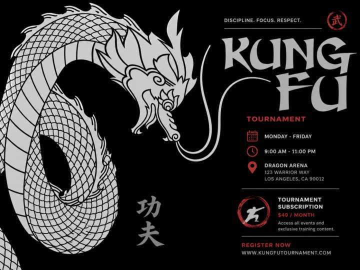
4. Use Value to Establish Hierarchy: in this exercise. I want you to take this black and white poster and apply value to it so you can establish Cherokee in contrast. Okay, So I'm gonna do the first exercise with you. Then you can go ahead and try different things together. So, for example, let's say I want to the dragon to recede into the background. I wants the type to really pop outs from the background from the composition. And I want these come for guys to recede to the background, but not as much as a dragon. So go to your swatches. If you can't find your swatches panel, we can look for It's here under the search bar. Just types watches hidden. I'm here it is. And once your swatches panel is open, you wanna look for gray scale and you want to use these grayscale colors on this composition to establish hurricane. So I'm gonna start by adding a solid color to the background. So click on the background, then click here at solid color. No, not this one. I think this one is good. Don't at this one something. Water? Yeah, this one is good. Then I'm gonna select my dragon and make it to recede to the background by selecting a lighter value. So if I click on my drug and some earlier and then select the color, it's wants work because it says a rest arise layer. So I need to cholera. It's a difference way. So double click here and then look for color overlay click on the field color and then just way we can see the track and have to move this bit. Here, click on the field color and then just through the color from here. Okay, Now this one is I'm receiving the drug in too much into the background. Maybe I'll just bring it. Bring its Ah, a little bits to the foreground More. Okay, I think this is fine. And now we can see that the dragon and the type r contrasting It wasn't earlier. Click OK, once you happy click. Ok, here on do the same thing for my come for guys down here practice in their stuff. So same thing double click on layer not thumbnail delayer color overlay. And then I want to add more contrast to them than the dragon apps. Click here on the field and then just add more contrast like this, Okay, for the type, I think I'm gonna leave. It's, um, black as it is. So click here on the first type, then dragged down hold shifts and click on the last one. And then you can just choose the color from here so I can maybe reduce this black color, but it doesn't look good enough, so I think I'm gonna leave. It's black. One pro tip I want to share with you is that if you want to see how the pros uses value, you can choose any beautiful, well known pence in, open it inside, off for shop, and then come over here to image mode and then grayscale. Yeah, click. OK, a clicker. Discard. And now we can see how value is used by the pros. Or see here we have a dark color here. This one here, their color. We have some lights. Colors here. He's so dark against lights. Works very well, then. We have some lights here. This will just give you ideas on how to work with value to establish contracts than your projects, you know? And then we have this thing here against the whites Clouds insight behind him behind it. Sorry. Yeah, very. Ah, very nice years of the value
5. Class Project : Value: just like this. Okay, so now we did the first things that sites together. I want you to go ahead and try different things. For example, try to make the dragon up outs from the composition. Okay? Like it's the big elements in the composition. Try to make the type recede into the background the bits and do whatever you want with these guys. Once you're finished, you may upload your work so I can see how you did with the value.
6. Explaining The Color Wheel: in this lecture, I'm going to be explaining the famous color wheel. So we have artists and designers and scientists. All have developed humorous models to visually compare colors and how the interact with one another. These models and diagrams are commonly used to show the relationship between difference colors on the color wheel. Designers and other visual artists often used the sub true active color model when mixing colors because it's most closely mimics. When pigment is put on a reflective surface, we will talk more about different color systems and how to use them in later lectures. But for now, I'm going to be using the classic red, yellow blue color spectrum, as discovered by Sir Isaac Newton in 16 65. This is pretty much how he organized colors around a wheel. Slits explore the relationship between colors by understanding how colors are mixed and combined Andy Color wheel. So with mixing the colors first, we have primary colors. These are pure colors, like red, yellow and blue. They can't be mixed from other colors. All the other colors on wheels are created by mixing primary colors, secondary colors, our purple, green, orange. Each consists off two primaries mixed together in equal amounts. Tertiary colors. These are located between primary and secondary Hughes on the color wheel and have more fun primary color than the other. How a tertiary color appears will depend on which primary color is dominance and mixture like yellow Green, for example, has more dominant yellow van green and the mixture that it's for how colors are mixed and now let's move on to the universal basic color combinations.
7. Color Cobinations Rules: first, we have analogous colors refer to a primary Hugh like orange right dream and to a Jason Hughes next to each other on the color wheel. Analogous combinations tend to be more harmonious. Why? Because they reflect similar wavelengths off lights. Monochromatic. These refers to variations off a single Hugh that include tense like the color plus fights and shades like the color plus black like analogous colors. Monochromatic color combinations are considered to be harmonious. This may be the reason that's one color. Palettes are often so successful in design solutions, try and harmonies. These are any three Hughes spaced equidistant lee around the color wheel. Because primary and secondary colors are equal distance from each other on the color wheel , they combined to create Try attic color combinations. It's always a good idea to draw a triangle inside the color wheel to find Try it colors, and how you do that is that you find primary colors red, yellow and blue, and then you draw your triangle. Once you have it to, you can rotate its for different tried combinations. Complementary hues. These are any two colors, located directly opposite from each other on the color wheel There are a total of six pairs off complementary colors. Complementarities have like a contradictory relationship with each other, so we color is both attracted and repelled by its compliments. So I guess that's this potion. Police effects of the complementary is can be used as a way to attract a viewer's attention . Split complementary hues refers to a primary colors and to secondary colors that allocated a Jason to the Hughes compliments. Like here, For example, Instead of going directly to the green color, we're going to take a lefts and rights hand turn to the Jason colors off green Ted track combinations. These are made up off four Hughes, which are sets off compliments or splits. Compliments. So we drove like the sort, awful line between all the complementary colors, indica wheel or displace complementary. If you want to, you'll end up with something like this Now. Then you can choose from here like maybe yellow with violets and then green with bread. Okay, so these are the basic rules off color relationships. Next, I want to introduce you to Johannes Eaton's color wheel. But first, who is Johannes Eaten? Johannes Eaten is considered like the Jude I or you can call him maybe, like the super saying got off colors. He was a master at the Bauhaus in Weimar, Germany, in the nineties twenties. His theory was, since color, relationships and outcomes are somehow predictable, much off how artists and designers used on audiences. Perceive color is subjective and determined by context for eaten. Studying. Relationship between colors and how they work in context will allow designers and artists to hone their understanding of colors and therefore make more meaningful color choices. In his book, The Elements Off Color, he suggested that anyone can achieve successful color solutions and three different ways. The first is visually, which he called impression. The second is emotionally, which he called expression, and the third is symbolically, which he called instruction. Eaton's color wheel includes primaries in the middle as an indicator of how colors can be mixed to produce you Hughes, and it's also shows the interaction between colors on the outside. Next, we're going to be designing using the color wheel and color combinations and Adobe Illustrator
8. Color Modes in Adobe Illustrator : So the goal of this exercise is how you can create color combinations that we've talked about's, like monochromatic, complimentary in try it colors and Set Off Illustrator and also how you can leverage the difference. Color tools available inside off Adobe Illustrator So the first thing you want to do when you open this file is to come over here to this empty color palette. It just a bunch off rectangles, and you can come over here to file on documents color mode, and you can see that we're working on RGB. If you want to change, you can click on see him like a Not a problem, but I prefer to keep it on RGB because this is going on Instagram. You can also choose the color motive before open in the illustrator file. So, for example, if I go to new, I can choose my dimensions. So 1000 Chargers pixels by 1200 is the perfect ah dimension for instagram Post. And here there's advanced options. You can click and choose what smoked. What's color more do you want to be working on? Okay, then creates. But for now we have our file. We have to create a new
9. Working With Existing Colors: so the first thing you need to understand is that you can work with existing colors and illustrator by default. So, for example, if I go to my swatches panel right here, you can see that we have a lot of colors available here by default. You can also find available color combinations in the system. If I come over here to this library icon, I can click. And then if I go to Scientific, you confined the defaults combinations available inside off Adobe Illustrator. So let's say I want applied an analogous pallets or an analogous color combination to my palace. I can click on Analogous. I'll have this window open, it's gonna extend it to bits. And then you can see right here that we have defaults analogous combination inside of the program. So if I liked this combination, for example, I can just click here on the folder and it will be added to my swatches. And then I can just click here under example shape and then click on the color. Oops. Now you can see that I have one empty colors. Watch here, and what I can do is customize one of these colors to be my fourth color
10. Customizing Colors: so I can, for example, click here and then choose a this yellow. And then to customize this color, you can go to your color panel, so head over to window and look for color. Okay, here it is. Or you can just click if six on your keyboard. Once this panel is open, you can see that we have many options. Here we have seem like a If I click on the panels menu right here, those three lines I can choose from our options Grayscale, rgb you saturation and brightness in verse, compliments, whatever. So I just I'm just going to use, um to use evisceration. Then just adjust this color down here we have the color spectrum so you can choose any color from here. If you want, I can even extend it. But the thing here is that it's very hard to pick a color from here, even even though if it extended, it's going to be quite a challenge to pick a specific color. So I would rather just work with this Landers. I could just raise a saturation of it. Do the brightness. Andi. Okay, I'll leave this color
11. Save color Swatches: I will open my swatches panel again, and the next thing I want to do is to save this color inside my folder that I've just created right here my analogous folder. So click to select the folder and then over over this plus icon, where it says new speech, make sure global is checked. But I'm going to talk about Global in a second and then click. OK, and now it is. Add it to my analogous color palettes inside the swatches panel.
12. Global Colors: so global means. That's if you it It's this watch everywhere where it's applied regardless off the artwork. If it's selected doughnuts, it will be updated. You can see right here that we have this whites triangle. That's a sign that this color is global. And what you want to do is go ahead and change all your color swatches to global, because it would be very helpful in a large composition when you're using a lot off colors . So global is when you have a swatch with deaths white rectangle right here. That's means the color is global. So, for example, if I select all of these Rick singles I click on my global swatch I d select everything. And then I decide to double play here and then change this color Change my global swatch click OK, and see how the old changed color Okay, so I'm gonna undo this. Okay,
13. Duplicate Global Colors: So you may be asking yourself, What if I want to change this global color without affecting any of the other composition? And also, I want to keep the same color because I like it. So why you can do is you can click come over here to the panel's menu and duplicates this watch. Okay, but first I have to de select everything. Then click here. New duplicates. Watch. Now it's duplicated here. If I double click and change that color click, OK, it's once affect anything. And then I get to keep my, uh, first global swatch.
14. Color Guide: the next thing that you can use to help you in your coloring journey Is the color guide available inside off Adobe Illustrator. So if we go the window, I could look for color guide and this will help you with tents and shades off the colors that you have. So if I click on this rectangle and I apply a color to its any given color no, this color maybe now you can see that it will give me a palace from this color. Okay, a eHarmony rule and I can choose from here. So I want to compliment to respect complementary high contrast. And then down here I have the shades intense off these specific colors in my palace. So I just I'm just going to keep one color and then apply It's shades and sense. Okay, if I like this color group, I could just click here on this icon. It says safe color group to Swatch panel again. It's here inside my swatches panel, and I congestion everything into global colors.
15. Recolor Artwork: The next thing I want to talk about is the re color artwork. So, for example, I don't like the first color palette. This one, it looks too much. My defaults. I can click on this icon right here. It says re color artwork and then head over to edits make sure everything is linked together by clicking this icon. Because if I don't like this icon, I can't move everything together. I could just move one by one. But I want everything to be moving together for a harmony. So I'm gonna click on this one, and then you can just select move. It's until you find another selection that you like. Maybe a I want to move this one a little bits down here. This? Yeah, Then click again. You can also remove a color swatch from here by clicking this icon with the miners and then click on the color that you want to remove. You See, now we have three circles. If I click again, we have two circles or you can add Click here on the one with the plus icon and just add colors. Okay. You can adjust here from the slathers. It can choose even from here, or you can come over here to this month, it says. Limits the killer group two colors in a swatch library, click and then choose any colors that wants. Well, maybe some pencil colors. But we're going to talk about Pantone's in spots collars. When we talk about Carlos and Brandon eso, you can choose anything from here. I actually never choose anything from here, so no need to bother with this one. And this land right here will adjust the brightness off your colors. Okay, so if I bring it down, you can see that's the colors are getting darker, but we are coloring this doodle line artwork, and we want the color to sort off pop outs and be lights and Bryce and Vivid. The last thing you can do is adjust your colors flown down here from the hue, saturation and brightness ladders. Okay, if you want to, these will just give you different type off color wheel, so this will display segments color wheel, and this will display like color bars. Once you're happy with your color combination, click OK, and now we are ready to color our line work
16. Coloring The Line Art: we can start coloring our artwork finally, so select everything. Click on K for your life being bucket tool. Now, just to keep in mind, you can color this in a difference in many difference where you can use the brush tool. We can use the pencil, but this is quite a complicated month, and it will take you a lot of time if use the brush or the depends to color this composition. So the easiest, fastest way to color this one would be to use the life paint buckets. It's the once I select everything again, everything. Click A for the lifetime bucket tool, and I can just start color and using my swatches right here that I've just created or from here from inside the swatches panel. So I'm gonna go with a monochromatic one, because monochromatic color combination is the trend this year, que and then you can start coloring your composition. Now, as you can see here when I click, I have this message. It says complex visual appearance, blah blah, blah blah. Now what this means is that's when I applied the life pain bucket tool. It didn't recognize some shape. Now illustrator is a victor based program that means it's only works with shapes. And now, when I'm applying life being bucket tool it telling me that you have some stuff inside your composition that you need to convert to shapes before you can start using the life pain bucket to, because this tool Onley recognizes shapes. So if I ignore this mission, this message or this one in click OK and then keep coloring, you can see that I'm going to be losing some details. Okay, you can see that's a lot of details here are gone so you can click. Commander controls its undo. And before starting the coloring process with the left brain bucket tool, I can come over here to objects and click on expand appearance, and that's well, just turn everything or transform everything into shapes. So now when I'm coloring this, I don't get the warning so I can just keep coloring. Click I too simple a color, and then just keep cholerae in your composition.
17. Save As Template: at the new art sport by clicking here on this article tool and then collect this plus icon . Select this and you can duplicate it by holding Alton Dragon and then apply another color palette to it. Ah, should have duplicated the line work before, but I didn't. So that's okay. I can still work on this one. Okay, so select a color. Okay. Select the life paint bucket tool. Hold control drag. Apply the first color, hold control, click away and then keep cholera. Okay, that's why this way you have a clear visual off what you're doing. So once you finish, you can go ahead and save this so file save as shoes. This cup. Choose your folder. Who created folder Creative Cloud folder. Give it a name. Whatever you want to name its and safe. Okay. Next. Let's say that's for any X y reason you went ahead and turned all these colors into global swatches. So what you want to do is maybe you saying this is too much. I can't keep doing this each time. Every time I open a new composition and I have to in all my colors into swatches, it's getting bored I can do it. So one thing you can do is that's you can delete everything. Okay? Really, It's everything. Don't worry about saving now. Even these are supports. You can delete them just like this on what you want to do is go to file and this time, save as templates against uses the same folder Creative Cloud Where is it's? Where are you? British club? It's here. So leave the same name and then make sure you have illustrator sampler. It's safe. Click Save. I'm gonna close everything now. So if I go to my creative folder If I click on do the line work I have my work saved right here. And then if I click on do the line work which is saved as in ah, illustrator templates. I have all my swatches that I've turned into a global colors. Okay, so this is a great way. If you know that you're gonna be working and the same documents, I can save my symbols. My color swatches everything here and then just save it as templates. We doubts, you know, having to do everything all over again because it takes a lot of time and it's very tiring
18. Cmyk Color System: C M Y K C M Y Que is a four color subtracted process, which includes the colors cyan, magenta, yellow and black ink. The process is considered to be subtracted because the inks that are used for printing subtract or mask the background, which is usually known as whites off a paper using a health tone. Doubts pattern colors are produced by combining C m y que in colors and partially or fully print in them on a white background. C M y que is used an offset lithography. And for those of you who don't know what lithography is, lithography is a printing process, just like engraving woodcuts and digital prints in nowadays, it's based on a simple principle that's grease and water resist each other. In most cases, if you work will be printed, you will be required to change old graphics and imagery to see him like a before sending files to a printer. Standardized swoop guides are used in the United States, Europe and Asia. They showed the percentage off seem like a values that are needed to create a particular huge to ensure that the colors specified well match the finish and Prince products If you send an RGB file to a printer and he prints the RGB files, the colors that will appear on paper, I promise you that they will have nothing to do with what you had in mind. So how colors appears on Prince Media will also be determined by the papers DOC, whether it's coated uncoated or mats and whether a varnish or Equus coating has been applied over the ink.
19. Pantone Color System: Pantone. Pantone is a color system that allows printers and designers to accurately communicates and produce specific color choices. The Pantone matching system allows the designer to select and specify a particular Pantone color that will be matched exactly by the ink used by a commercial printer. So why designers use Pantone? Designers and printers? Use Pantone when we need to ensure color consistency. The most used Pantone system is thes solid system. We have other systems like seem like a Pantone's metallic strange and a bunch off other system that you confined If you go to color swatches, color book and Adobe Illustrator or Photoshopped. The Pants on Formula Guy comes in two formats printed on coated or uncoated stock. I highly recommend you use Pantone colors if you are designing for brands like logos, products, designed business cards, excess your exits because it will allow the color to show the same every time it's printed and not be affected by the type of paper
20. RGB Color System: RGB RGB is an additive color system that uses the base colors red, green and blue to produce a wide variety off colors and the RGB pallets. Whites is the additive combination off all primary colors, and black is produced by the absence of lights, screen and display based design uses the RGB color system and even some large formats. Printers use RGB based color interpretation systems or profiles. That's well, then prints. We'd see him like a Inc Examples Society six. If you want to upload your work, they will ask you to upload. It's an RGB color system. TV's video screens, monitors, mobile devices and cameras all uses the RGB system.
21. Different Techniques To Create Amazing Color Palettes:
22. The Subordinate Dominant and Accent Technique: the 1st 1 is the dominant subordinates. An accent technique. This technique requires that you pick one color that's will act like the dominance, then one or two subordinates colors and lastly, one ax and color that's will add harmony and combination to the pallets. This method is great because you have freedom to try difference combinations. And I would suggests to try different things to see if your colors are parent effectively, like changing one off the original Hughes, maybe replacing its with the neutral, or even alter the saturation to see if it will create a more beautiful or attractive combination. Small changes can make a huge difference, so it's important to make multiple combinations for projects before making the final decision.
23. Meaning Based Technique For Harmonizing Colors: then we have the meaning based technique for harmonizing colors. This technique is used when a client requires a specific color, or when a project requires you to choose a specific color to convey to D clients message so you will create a pallet based on that specific color. Okay, let's say the color I need is blue. Then I'll add a compliment off the same value in intensity. I'll take those two colors in transformed them to their opposites in value and intensity. This process is easy when working, and a software program that has a color picker or by using an online application. So let's open photo shop and see how we can use this technique.
24. How to Create a Meaning Based Color Palette in Adobe Photoshop CC: this technique is great because it allows you to creative palace from any given color. So the first thing I want to do is just to draw my rectangle, hold shift while dragon for a proportional scaling. And now, let's say for any X Y reason that the color I need to work with is this science. The next time you want to do is to duplicate this and then add a compliments color off the same value and intensity. So open your layers panel. If you can't find anything, you can just come over here through this search icon, click and then search for anything that you can find. For example, if I want layers, I can type player. They're layers. Yeah, or Aiken types. Watches or anything? Okay, remember to use the search icon to find stuff inside for a shop. The book. Click on the thumbnail and then I don't want to touch anything inside the color field. I just want to move these lighters of the color spectrum bar. Okay, so now the only thing that is changing here is the hue, the huge value saturation and brightness. As you can see here, it's remains the same once. You happy with the color click? OK, an element of duplicates. Both of them again. Entrance formed these two to their opposites in value and intensity. So click in the 1st 1 that look like here. I'm gonna make it darker and click this one here. Double click, and I'm gonna make its letter. Okay, so this time we only change inside the color field. Don't change the color spectrum bar. Look, OK. Wants to happy. And just like that, we have our beautiful color palettes. Now, the next thing you want to do is add the's colors to your swatches so you can work with them again and again and again in new documents are on a new composition. So open your swatches panel, click on folder. Give it a name, my blue based color and then with the Fuller selects it. You want to select your eyedropper tool? Simple the color. And then just at this plus icon, so you can add it's inside your folder. You can give it a name or just leave it like this. And if you check this box, you can add it to your library. I don't want to add it to my library. Similarly, leave this box on check like OK, and then just do the same thing for the other colors until you have them all inside your swatches panel, okay? And then selects everything and delitos Toto's. So this is how you, uh, creates a palace from a specific color using this technique. Now, I want you to go ahead and trying to the same thing with a difference color.
25. One Color Palette Technique: one cholera Palley technique. In this technique, the designer star with a pure Hugh, then a tense and shades can have like accent colors or supporting its colors. So this is a great way to reduce the costs off Princeton if the client's demands so so basically here we talking monochromatic combination rule. It's also possible to choose Onley one color and lead. The paper creates variation within the composition. Cholera it or the texture paper can give the feeling off more than one color, one color Palettes is also a great solution if the final design will exist and it busy visual environments like a supermarket, for example. So here we talking products designed one color palette is also a great way to draw attention to a specific area or elements off the design.
26. Two Color Palette Technique: to color palettes. Technique to color combination allows the designer to choose between two colors, which have a well known relationship like complementary and analogous. For example, you can rely on one you to be the dominance in the other one to act like it's accents or subordinates. You can also choose unusual combination. But if you do, it's the purpose should be to attract attention and not to achieve tele harmony. The two color palette technique is a great way to produce effective and low cause graphic design while still allowing more creative free them down the one color palettes.
27. Progressive Color Technique: progressive color technique. This technique refers to a sequence in which a color or colors change in progressive steps , either from dark delights or light to dark. So it's results in the appearance off continual progression. This technique is more beneficial if you use it's in data visualization or if you are illustrating a horizon like a sunset, sunshine or the ocean, for example.
28. Color Progression and Repetition Exercises: and this exercise. I want you to practice your color progression technique and your color repetition technique . But first I want to show you how you can recreate this design right here so you can practice your techniques and also to learn something. You So select the lobster. You can either click el on the keyboard or just over over here and select a relapsed or it's l. Then you want to try and find the center off your art board. OK, make sure you go to view and have Smaltz Kite selected cameras looking for the sensor. This should be okay, so click hold shifts on altar shifts and option and drag and then you want to snap it to the outboard. And this is not the centre, but it is okay and we can just go to the line, then choose a line our port and then center it hold shifts and optional shifts and old and then snap it to the art sport. So fell should be always none. Stroke should be, Ah, black weights around one do the same thing. Okay, Now we can see sensor, so click old option or shifts and old or shifts and option and drag Now select. Both goes to the line panel, switch to selection, make sure they align. And now I'm gonna go to objects. Blend, blend, option for spacing. You wanna have specified steps, I'm gonna choose 10. OK, and then click on control Goldsby or command option B to apply the bland. Now go and select your direct selection tool by person A on a keyboard or selection it from here. Double click the center off the smallest circle in the middle and drug. It's uphold shifts while you're dragging up. And just like that, we have our shape. We can always adjust the size off this small circle, so double click on its click on V for the normal selection tool. This one right here shifts and also shifts an option and track. Sorry about that. So a double click see old optional chiefs. What is going on here holds OK now Click on a to get back to your direct selection, said a. That's eso. I think I just switch at the keyboard language by mistake. It's fresh. Should be English. Yeah, shifts from okay and now we have our shape. The next thing you want to do is select everything. Go to objects. Expanse. Click OK, The next time you want to do is to color this composition. So I'm looking for my swatches panel. I can goto window and then look for swatters and maybe I'll go to library and then pick a color. Let's say I want to use this one. Can you use this blue right here? Click a and now click control and select everything. I'm on the color of the 1st 1 had control and click away case when I won't have my color I want to open my color panel so you can either go from dark delights or go from light to dark. So you can either choose RGB or human saturation and then work on this composition. So you can either start from dark to light or from lights too dark. So we started here from Dr Lights. Now here I want to start. Were the lights color to a dark one like here. Then move This leather abets Kia like here like here and then just keep doing it. So now I can just select everything now you can see once I select everything the stroke weight is gone. I can just click up here and then the crease. Everything okay? And now we have our beautiful composition. Next thing I wanted to do is to practice color repetition, so select everything also duplicates. And next thing I want to do is open the pope art color swatches and then choose a pallets with three colors like this one right here and added to my swatches panel. Close this and then just select the color Click A for the lifetime bucket tool and paints. Now we can see like there was some sort off a color swatch on top off my life pain bucket tool. Now, because I have my folder selected, I can just click on the left and right arrow on my keyboard, and it's well, tuggle the colors inside my color swatches folder. Okay, there's no need to click each time here. I can just click rights and lefts on my keyboard, and it will struggle the colors inside the specific folder. So I did the yellow next as red and black, and I can just keep going. Yellow, red and black, yellow tops, Red and black block yellow, red black. Okay, just like that. We have created some beautiful designs using couple off the techniques we've just talked about. If you want, you can go ahead and post this on your instagram. I am going to post this on my instagram accounts and you can even upload it so I can see what you come up with.
29. Repetition and Reoccurrence Technique: repetition, recurrence or Grady in technique. This process consists basically off, taking one or more Hughes or one hue and its shades intense and repeat it over and over again along the composition. Repeated colors is a great way to unify composition and show similarities and difference elements. It's also can reference motion or depth and creates obstacle, illusion and real worth projects. Repeated color sequences are mostly effective when they are vary it or used to create a pattern. This method is compatible with any color combination, but mostly noticeable if use a limited color palettes.
30. Black and White Color Technique: black and white technique choose in black and white solution. Maybe the results off low budget or specific design decision. This combination, however, is very effective as visually communicating information to the audience. Black and white logos are the trend this year, so that says a lot about black and whites combination. One thing to keep in mind is that if you are using this technique for Prince in, and let's say there is large amounts of black and the composition and this case, a printer may ask you to use a specific combination off C m Y que to produce a rich black, this combination is 60% science, 40 per cent magenta, 40% yellow and 100% black ink. Why? Because this combination is prince friendly and should only be used on a large areas off black. Qatar's black body text should be specified as 100 percents black or K. There is no yellow, so 0% yellow, 0% science, 3% magenta. It's also very helpful to create swatches off text black and rich cm like a black so that it's easier to tuggle between the two. These values can be easily achieved using a color picker and a design software
31. Color Overlap Technique: Basically, when we talk about overlapping colors in graphic design, we talk about applying a blamed mode to the overlapping colors. So, for example, I have this sticks. I have to text right here. Color and theory. I could just bring this color type down here, select everything and go to my appearance panel and then just apply a plane mode. This will allow your composition to look more dynamic and also will allow you to creates new Hughes within the composition.
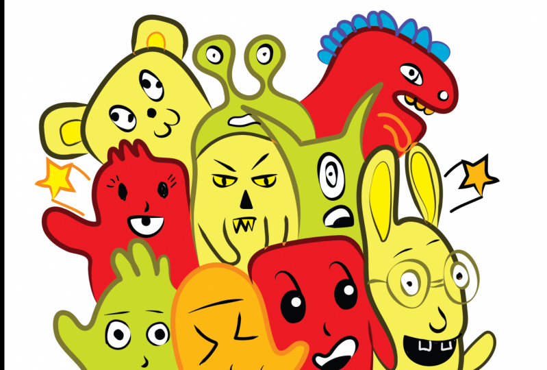
32. Excessive Color Solutions: excessive color solutions if there is one rule to retain from color relationship is that you should not have a pallets full of colors with the same value. But in some cases, and depending on the context, you may use a fully bright saturated palette. The solution provides a visual punch that can be surprising and sometimes even this turbine . The key to use this solution would be context. So ask whether the contents being communicated can handle such dramatic Hughes. And if such color relationship are appropriate to the audience is being targeted. And my personal experience. I would only use such solution when designing a caricature or when designing a wine signed . Because I know that the outputs will be seen by itself or against a music or neutral background, it won't be competing against other designs. My tip for working with contrasting colors issues lights on dark combination, something like black and neon yellow use colors that are complementary or opposites on the color wheel like brights blue against bright red or orange contrast can beep articular Lee , useful with certain elements, need to stand out within the composition, so using a contrasting color as an accent within a palates can be especially effective. But in this case not necessary
33. Color as Provocateur: color as provocative. In some cases, a designer may need to provoke a response for search and causes like child abuse, human rights, climate change, Exeter accessory. In this case, when the imagery and message are this powerful, the use off color should be minimal so as not to get in the way off the meaning.
34. What Do We Mean by Colors Interaction: interaction off colors. She better pick a color palettes. It's very important to understand how colors interacts between each others. Using vivid colors is a great way to attractive viewer's attention. But again, this combination can't be used all the time. Designers should seek balance and color palettes. For example, color palettes that include lights on dark use have optimum contrast and are easiest to see . Fuse that reflect lights should be used alongside those that absorb its rarely can two or more colors that reflect lights be used together successfully. For example, a pallets that includes only bright orange and yellow tones is likely to seem overwhelming and even garish. On the other hand, using only Hughes that absorb color can lead to situations where there isn't enough contrast. And this section we will study what's are vivid colors, lights, colors, neutral and much more, and how lights can affect colors. Understanding these will certainly help you create a better color palettes for your designs .
35. Different Color Types: dark colors. These contain lots of black in them. They can add drama and creates mood. Dark colors can sometimes be used as neutrals within a composition. And just like light colors. Colors with dark values have less contrast as they get darker. So in order to achieve balance, it's often best to include a lighter or more saturated accent, color and pallets that is dominated by dark colors. Bright colors. These are created using pure pigments. They are the purest form off a color without the addition off grey or black. Bright colors are excellence at attracting attention and are often used to advertise or highlights products. You should only pay attention to not use many bright colors in a single composition, as it can be irritating to the eye and can actually decrease a viewer's ability to weed or understand information. Pale colors are used that are made up off more than 65% whites. They are often cold pass ALS and may have specific cultural connotations related to them. They are often associated with new bars and weddings. They also are generally considered to be feminine or childish. However, past holes can make excellence. Accent colors or even be used to highlight subtle color relationships. And then we have light colors, and these are based on pale shades. They may almost seem transparent sometimes, but they not. So the thing here is that as color get lighter, the contrast between Hughes decreases so a full pallets off lights colors is a bad idea. If you want to grab attention, you can use lights, colors as accents and background colors, or you can use them to balance brighter and more saturates. It shades within a composition. Heart colors. These are based on warm tones that's have red and them When a color as defined as hot, it's usually both warm and brights. Examples include bright orange scarlets and magenta hard colors. Make statements. They can live in up a composition and are useful when promoting products. Cold colors. These are cool tones that are most often based on a primary color. Blue examples includes green blue violets, an indigo. They are an excellent choice when one needs color to recede into the background. Two. Highlights a subtle message or to communicate trust and conservative nous neutrals. These are used that's have a large percentage of brown or grey, and they are one of the most overlooked and under utilised categories of color neutral tones. Maybe most appropriates when designing for coffee bar, for example, or when working with packaging that should showcase the products rather than its wrapping. Neutral tones are also highly effective as secondary colors or background. Chun's within a palette that includes a brighter or more intense use.
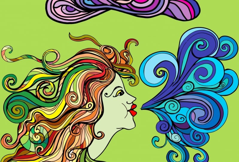
36. Class Project: Colors Interaction: and this exercise. I want you to use all the type of colors that I have discussed it earlier in a previous lecture. So if you go swatches, you confined everything that we've talked about. All the colors are here, and I want you to use all of these to color this composition. So first thing you need to do is go to layers, duplicates this layer and then hide the duplicated one. Select your pain bucket tool, Select a color and install coloring. Okay. And just a simple as this. Just make sure you don't heads. You don't color the stroke because if you had the stroke, its will color the stroke. And unless you're going for this look, you can just click on command or control Z to undo. If you click by mistake, I'm going to use some of the life colors and parasols I wanna called face like this. Now, the difference between RGB colors and pure colors is that RGB colors are fully saturated colors, so I can use them as accents, colors like me before the lips and maybe this area on the top of the I on again. What I want to do is apply pure colors as well. Now pure colors are just colors as they are on the color wheel, which mean nothing is applied to those No lightness, no darkness, no nothing. It just pure pigments. Okay, so you keep coloring the whole composition and one trick I want to show you. Once you finish the coloration, you can make the duplicated layer visible again. Selected, go to filter, blur and applied. The coup Schindler Mixture Radius is 26 27 like okay, and as you can see here what it does to the composition, that's it's add a little bit off depth and realism to it, and the final product should look something like this. So, as you can see here, I have used lights, colors on the foreground and a dark red on the background. And thats helps a lot with the contrast lights and dark contrasts. Very well. So once you finished, I want you to upload your work so I can see your creativity and what you can come up with.
37. How Light Affect Your Colors : So you want to keep in mind here. That's lights does affect your composition. Now if we talk digitally, if I go to adjustments and then I go for curves and then just play with the curve, a little bits, you can see how when I take it up, it does affects my composition in my colors. Now you see that the colors are even brighter on the opposite side. If I take it down, you can see that D colors look darker and deeper. You have that deeper feeling to the composition, so this is a good tip to keep in mind while using lights digitally. Maybe you are looking for a specific look, and you can achieve is by combining colors. Maybe you can achieve its values and lights. OK, now this is how lights affect your colors digitally. Now, when you have a physical product, you may want to consider where that's physical products will be shown to your audience. It is going to be Indo as it's going outside is going to be a day or at night. OK, all these things you should keep in mind while presenting your physical product to the audience
38. Interaction And Proximity: interaction and proximity. A viewers perception off color will always be determined by what colors are present. Elsewhere in the composition, a white square on a black background will appear to be larger than the same size black square placed on a white background. Similarly, a lights gray will look lighter on a dark background than it's well on a white background. In situations off simultaneous contrast, how a color is perceived is altered by what other colors it comes in contact with. For instance, red on green can produce a ghost in effects, while combination like yellow and red visually vibrates against each other, and each color makes the other one more noticeable before placing two colors next to or on top of each other. The designer should always consider whether the colors will be subject to simultaneous contrast, and whether that's interaction may change the way that accountant is perceived.
39. Class Project : Colors Interaction and Proximity: this grid design is the perfect example off how colors and proximity works. So as you can see here, this is the same composition. But see how applying colors differently each time and the composition makes it look completely different. So just by placing colors differently each town we gets different looks and feeling so in this exercise, what I wanted to do is use this empty design that I created for you and then just try applying colors differently so you can create different shapes within this composition so you can create your own color palettes. Or we can come over here to win, though, and select color themes. Select any palate that you want, like here, and then you can. After your swatches, go to color swatches. Make sure you turn all of these colors global okay, and then select the entire composition. Click K for your life paint bucket tool. Select your color and then just store painting, Click control and click away so you can de selected the composition, and what you can do is instead off click in one grid at a time. You can just really cold and drag to select multiple grids and paint them
40. Class Project : How to Make That Geometric Grid Design to Practice Your Colors: next, I will show you how you can create this beautiful composition. And if you're not interested, you can just go ahead and skip to the next lecture. So two creates this geometric grid design. You want to go ahead and click on creates new once you click on creates new makes you have thes dimensions. So 1200 pixels with and heights click on, creates. And then what you want to do is come over here and select your rectangle. Great tool Double click wants your selected on this icon and make sure you have these values. So horizontal dividers. 11 vertical dividers. 11 like Okay, go to view. Make sure you have show edges selected and small guides selected. Come over here to the corner off the houseboat with your rectangle. Great tool selected. And make sure you see intersects. Click and drag. Hold control or command and click away from the composition and the next. You want to select your polar grid tool double click limits again and make sure you have these values. So concentric dividers. Five radial dividers. Zero like Okay, find the center. So once you find the center, it will be highlighted in blue like this, you will have highlighted cross click hold shifts and auto shifts an option and drag until you snap the polar grid to the art port like this. Then click V for your selection tool and move this polar bread through the corner of the outboard like this. Zoom in because you want to make sure it's intersects with this edge right hair. And so you hold the poor from here and just follow the guide until it says, intersects, duplicates and do the same thing here in the year. Sorry, but that's and here. Then select your line tool and just draw a cross on your on sport. So we drove from edge to edge and make sure that the smart guide says anchor before clicking and dragon. So you really want to snap everything to the edges in this composition. Next, I want to go and select small rectangle to so clique em on the keyboard. You have your ex angle tool selected, and then just click right here in the middle and enter these values 400 and 400 like Okay, I should've click on this link icon, but it's okay now, I have my a rectangle here again. I want toe klik and drug. It's and snap. It's right here in the center. Now select the Ellipse will by clicking L on a keyboard under the same thing. Click and drag hold shifts and older shifts an option and snap it to the rectangle. Now we almost done. We just have to draw our triangles. So to do that So we're gonna use the line segment tools, So click right here and select your land segments on now just full. What's I do? So click on the corner right here. Drag down here at the interaction of the two polar grits and hold control and click away and just keep doing the same thing like this. Keep your eyes on the smarts. Kites. Okay, now we just connecting thoughts. If you think this is just through difficulty, it's OK. You can just work with the one I give you. But in case you want to learn how I did this, you can just want just this very own try to do the same. Okay, Now we're pretty much done. We just have to the elites, everything that is coming out from the art support. So these extra shapes, I don't need them. So go to the direct selection tool by clicking a on the keyboard. I said not s a I'm just gonna click here and then just select everything. Okay? Make sure you select all the extra shape that you don't need like this. And elites. Okay, Something here. So, like everything, President, It's on your keyboard, slicked everything like this. Where is the leads? And finally this one, the last one, then the us. Now I want to draw Eric tango all over my art sport. So clique em again for my rectangle to I think there's something going on with Okay, I have French table. Would here be English? Oh, my God. Click here and drag. Make sure Phil is none. Okay. And now I want you to select everything. Now, when you select everything, this bounding box should really snap to the outboard. If it not snapping to the art board, that means there's something here that we need to deletes and that we haven't seen. So click on the directions, electoral and just drug like this to select everything that is there. That's what does. We're not seeing. And just the elites. Same thing here. Deletes. Now, if I select everything, it should snap. Sooty Ausubel, go to the Pathfinder. If you can't find your pathfinder here, just look for its own window, okay? When their When they look for about the Pathfinder, it's over here. Shift control F night. I have it right here. So no need to look for its on the window. You can select everything and just outlined. Okay, Once we outlined, we're pretty much done. But once I click here, everything is gone. So no worries again. Just elect everything and increased stroke weight to one. Okay, Now we have our beautiful composition, and we already to paint this one.
41. Color and Imagery: color and image. Combining imagery and colors and graphic design is a great way to immediately revoke an emotional response where projects or tell a story, it can also be used as a way to quickly convey information. Images or illustrations may take the place off a background or add emphasis toe. One area off a composition, sometimes a tonal value, often image may recede. So that's other elements, like type and shapes and stand out. One basic question, though, when working with imagery is whether or not to use black and whites or use monotone, do atone, try tone or Qahtan. Now this should entirely the pants on the specification of the projects. In some cases, black and whites will have more impacts. Venues in a full color. On the other hand, a small amount of color can revoke meanings, reveal visual hierarchy and have emphasis. Images can be intense, intriguing, humorous or surprising. Certain subjects are sure to draw a viewer's attention
42. Applying Color to The Full Image: So you want to click on open, then under your exist isis file, look for images and color and select woman image. If you're working with images that will be printed, the resolution of the image should be a two least 300 pixels. Paresh. So you can check this in photo shop by going to image and then image size. And then right here we have the resolution off the image. So in my case, I have 72 pixels per arrange, and that's below the normal off image resolution for printing. So I can go ahead and just change this to 300. I can also changed with and the heights because they increase the lots. So here are just I could just put 1000 and 300. Okay, so we want to have these values or these details and then click. OK, The next thing I want to do is to duplicates my layer when working on photo shop. I always duplicates my layers. Hi, This one I'm just give this one a name. So I'm gonna name it's women. The next thing you want to do is to make sure that you are working on an RGB color mode. No, by default. If you open an image, it's always gonna open in an RGB mode. But just for safe chicken, you can goto image moat and check here. If RGB is selected RCM like a now you may be thinking that's a fun prints and this I should be working. See him like a. But if I click on see him y que, for example, don't merge, okay? And let's say I want to change my amours Two black and whites. You can see that I can't say the words here. It's great house. So working on RGB mode allows for more options and more color range. Now, if I go back here to image most and selects RGB, don't merge. If I click here again to make it black and white, you can see that the option is available. If I click, it's black and whites. Andi. I can adjust how it looks by a dragon up and down or left and wise of these sliders. Okay, great. So now how do we apply monotone? Do it on or try to our image first. What is monitor Monotone means that the image will be only displaying one color instead off the many colors. That's it. Displace So supply monotone. You want to select your image, come over here and click and add a solid color to your image. Now the golden question. How do I choose the rights colors to apply to my image? You can just go ahead and add any color unless you are working for brand. And the brand asks you to work with certain colors or to add certain colors to that image. Like Spotify, for example. They always have these green and blue collar greedy in that they after their images. So in my case, if I'm not working well for Brandt, I would just sample the colors from the image. So right here, if I go to my swatches, you can see that I already simply the colors from the image. No, not this one. But this one images color, and here we go. So just by your eyedropper tool, you can sample the colors from the image and add them to your swatches like we did in previous exercises. So now I can just click. Here are the solid color, and I can choose anything from here the reason I used this technique because it's makes the composition always feel unified. Someone a click, OK, and vain. Just apply a blamed moat, someone ahead over here. But it says normal and add color. Okay, you can see how it looks. You can even try difference colors if you don't like this one and see which one you prefer . Okay. Now, to add duo charms or do terms, I hope I'm spilling its right. I hope I'm pronouncing its right such at do atones You can add, for example ingredients. So click here again and look for greedy unmapped Click here and when I import anything and then you can just click on these color stops Then click on the fell and choose a color so black OK, and then I'm gonna choose this bluish to gray color. Okay, okay. Of you can see how it looks Very beautiful and very natural. You can also, for example, click here in the middle. It will add another color stop. And of course, we can add a try turn like another color. So again, click on the color stop and then click on the Fell Avengers Eddie Color. Now we have three colors in our image. Or we can say Try tone colors. I'm just gonna click council. I want to keep two colors. One other way you can add 1/3 color is by adding a shape so I can just tell X my lips, too. Hold shift on track for a proportional scaling and again just apply a blend mode.
43. Images as Element of The Composition: In some cases, you will just need to work with the image as parts off the composition. So let's say, for example, I need my image to be here. Then I need to add a solid color to the background and instant text. So the first thing I'm gonna do is hide this layer, go to my friend tool kids, and then just draw a rectangle that will act like a placeholder for my image. Then just adjust. The image selects the move to unadjusted. Okay, here. Now how do I add a solid color that will make everything looks harmonised and unified? Now the thing you can do here is to simple colors from image. That's my secrets for working with color and images together. So click on the background I've been click here solid color. Then with the eyedropper tool, I can just go ahead and sample colors from the composition, so I actually don't like this car right here. So we can, for example, simple the black color off the piano or the orangey dark sort of color from the piano or from the background from here. And you can see how much these colors look much better then the one we had earlier. So I'm gonna go with the orange. You can, of course, always just saturation and the value of the color right here and the color field. Once you happy with the calorie click, OK, and now I can add my text and then same thing for the text. You can use a rich black or we can against simple a color from the image opening of properties panel and then just simply color. You see now how simple and color from an image can really make your composition standouts and make it look more harmonized and unified. Also, in some cases, you may be working with such colorful brights images like this, and the problem with these image is that they are so brights and colorful. That's when you apply any other element to them. The elements wants contrast. So, for example, I have my six here, and as you can see, we can barely read the text because of the image in the background. So a couple of things you can do here, the 1st 1 would be to add a monotone, as we did earlier to the image. The 2nd 1 and one that's I prefer would be to click on your image, duplicated first click and then got adjustment. You saturation click here first only affects the image, having just lower the saturation of bits and lightness until you can read the text.
44. Proofing Colors For Almost Accurate Printing in Photoshop: So once you finish your composition, you wanna prove your colors just to see how they're gonna look, want sprinted and see em like a printer. Because we all know that's when we prints colors. They don't look the same as our screen. So you may be thinking that I'm ages. Go ahead to image mode and then changed to see him like a color. I mean, you could do this, but you have to ask the printer first. Some printers prefer to work on the original file, which mean the RGB mode. So the first way to do this is if you go to view proof set up, make sure you have working cm like a checked and then you can click on proof colors. The shortcuts is control. Why now? I don't know if he can see it all nuts, but if I under the proof color, then I click again on control. Why? To prove the image or the colors in the image. You can see that there was a slight change and the colors okay, it looks like the colors or the image is a bit wash doubts and that totally normal. Of course, The second thing that you can do is if you go to a view again, you can check gametes warning. Okay. And what's gametes wanting does it? It will find old the colors that will have problem print in and see him like a Now, in my case, in this image, it looks like it will prints perfectly. I won't have any problem prints in this one. But if I go to my other composition, this one, this is just a personal composition. That's I did just for this course. I'm not saying this to any to any customer or any clients. Now you can see here. If I go to view and click on gametes one in you can see that there are some great colors on top off his shirt. I mean, that's means that the red will prints, but it will not prince correctly. So there is one way to fix this. I mean, there is one correct way to fix this in photo shop. We have many ways of doing one thing, so I can just click here on my layers, click on my image, then go to select color range, and then here, where it says select Seiken, Go and check for I mean, look for out off Gammas colors. Click OK, and now you can see that the gametes one and it's selected. I can have to Ah, adjustments. Here it is. And then look for hue and saturation. And then what I want to do is just play with the saturation on the likeness until I fixed the gray on my color. Okay, so you don't want to waste a lot of time adjusting the saturation and the likeness because no matter how hard you try, it won't look perfect. No, If I go to view on on, check the game, it's one in. You can see here that we did a pretty decent job. Now, if you have the name of the printer that you're going to be using, like the name of the machine that you will be using for prince and or you printer may give you the name off the machine to use in you can use. That's to have a closer preview on how the final products will look like or how the final image will look like once it's Prince it. So if you have the name of the machine. You can again come over here to view proof set up on this. And this time you go to custom and right here, where it says device to stimulates, you wanna click, and then just look for the machine that's will be used to pray this image. So, for example, if I click on this one, I can get a pretty close preview. Okay? If this is the machine, that's you will be or he will be using, you can just click. OK, that is same thing here. I can go toe, if you proof set up custom and they look for a machine. Now this image will prints correctly because you have colors like blue science. The prints well, by colors like red, I guess. And hearts, colors, they always have some problems printing. I mean, they're just my guest. I don't know. I could be wrong.
45. Best Settings Save for Printing in Photoshop: Okay, So the next thing is, after we finish this, you want to check with your printer? How do they want this file sense to them? Do they want it as PSD. S, PDF or as E. P. S? So to send it as PDF or PSP, it's almost the same thing. You just come over here to file, look for safe as save on computer, of course. And here where it says save as you can choose a PS is over here or PDF or is this is over here, click and then check used proof Set up click save. Okay, just make sure that you have high quality prints and then save as pdf as E. P. S. It would be the same thing. So file save as seven computer AP s, Where are you now? You may be thinking, what details should I put when I when I save as pdf or as GPS? Anything here is you have to check with your printer. You have to check with them. What details they want you to add to your formats and all that kind of stuff. Now I'm just showing you like a guide on how to save those images. But for the small details like this, you have to check with the printer. Click. OK, And now you have your GPS file and you're pdf file under your Creative Cloud folder that you consent.
46. How Color Work With Texture: So you want to open a new documents in for a shop? Make sure you have thes dimensions and sittings. Give it a name if he wants. Well, it creates, okay? And now what you want to do is she's a gun. Go file and place and embedded. No. So under exists. Isis files lannisters. Still the clients page click. Ok, aunt, select this. Okay, so I'm gonna open my layers on hopes I'm gonna open my layers and then hide this image for now. Then what I want to do is just dispatch a little bits like this just the size of this patch . So and this exercise, I want to show you how we can use textures because image can also be used as six chur. The other thing about texture and color is that it's can enhance a layout achieved, greets visual interest. An aide in communicates in a mood or feeling. So what I want to do with this poster is give it a handmade look. I want to make it feel like it's from the game of throne era. And so the only thing I can achieve this is by Adama Texture. I can just do it by image. Even if I go on ad history colors to it, it wants, it won't work. And this extra so I can make the unnamed layer visible. And I just want to adjust this texture to my posters. Just click and drag. Once it snaps horizontally to the poster. Hold shifts, click here and drug up on same thing. Hold shifts and dragged down from here. Then apply. Okay, Now, what I want to do is just merge these two layers, hold olds and click here. Okay? So I can clip the texture through the poster, come over here to blamed and go for multiply hopes. Not here, Not this one. This one should be normal. A click on a texture. Go to the blamed mode and look for multiply. Okay, now we can see that it really looks like it was made by the lannisters and they want to go for brightness and contrast. Okay, so I can just maybe increased the brightness like this. Decrease the contrast, maybe more. Okay, So that looks don't
47. How Color Work With Illustration: colors and illustration. In some cases, you will have to use illustration rather than photographs. Illustration is a great way to visually represents an idea. Objects, person or place. Packaging motion graphics and scientific texts often use illustrations. It's congee as simple as line arts or drawing. When choosing an illustration, It's important to identify a visual style that's complements the message package or design piece. You can either drove illustration. If you have the skills or pay someone to the which for you, it's also possible to buy ready made or stock illustration and alter it. So it's may seem unique to the projects, and this is a great way to achieve illustration with a small budget, the type of illustration that is being used, the context and the intense off the finish, it products should determine how color is applied. Color should be considered from the start of the illustration process, since its can change the entire mood off a project. So if you are hiring a freelancer, it's important to discuss colors in the initial projects meeting or brief. So why would you use illustrations in the first place? The first reason 1 may use an illustration is because it's such a powerful expression tool . It can be so powerful that it can stand on its own in the composition. Using illustration is also a great way to give consistency to a Siri's using a unified style with difference color schemes.
48. How to Use Colors and Type: type in color. Designers combined color and type to produce successful visual design combination. Whether you are using hand drawn type and expressive phones or one of the tried to standers . How these letter forms will be perceived is determined by application or absence off color . The combination off type and color can produce successful visual design solutions, but it's also comes with challenges. How one uses color should differ depending on whether one is working with body text. A poster or a large scale project using color with body text can be tricky, and designers have to be careful not to apply Jones with cultural specific associations to type heavy design.
49. Color And Hierarchy: Keller and hierarchy. The clarity of form and proper hierarchy are key to the viewers. Understanding of contents. Color can be a primary factor in communicating relative importance alongside with scale and placements, the he used that one chooses to apply the type will allow certain words or phrases to stand out at the same time. Dollar or docker Hughes will make others. Receipt color is made more effective by context. So when working with type and is vital to choose use that's complemented chose prisons within imagery and other compositional components. A color palette should be able to accommodates all the typographic expressions that occur within a composition. If it doesn't do so, it should be revised.
50. How To Use Color With Display Text: display text. This Playtex is type that is larger than text type and used to grab attention. This plate type usually conveys the mood or feeling and is not intended to be read in a large body of text. They are mostly used for single or group of words, such as local types, headlines or phrases. This play type is able to accommodate a greater of writer or visual expression than body text. Because of its size. Having color to large text can make it stand out even more color combined with scale. Act like a visual exclamation points. When type is big, it's possible to apply a wide range of Chung's textures, an unusual color relationships we doubt detracting from legibility. On the other hand, some projects are better suited to a limited color palettes, regardless of the size of the text. Using less color can be particularly effective for signage or when type this part off away . Finding system, sometimes less, is more little forms are such a strong visual elements that it's possible to create a highly effective, type based design using limited color palettes. In some cases, a designer may only use black and whites and incorporates color elements elsewhere in the composition. In other instances, it's possible to create simple and arresting typography by using values off only one color . The shapes and negative space suggested by typographic forms can be just as successful in black and whites as they are in full color. And since printing one or two colors result in significant cost savings, this is a good option for low budget drops.
51. How To Use Color with Body Text: body text. Since a client's message will most often be communicated through text, it is imperative that D colors apply to the text. Don't get in the way off legibility. Body text is most readable when it is on a white background, so everything you do should be in the service afraid ability. You need to make sure here that the background and the text really contrast. I personally don't advice using a colored background behind the text. But in certain instances, using color behind type can help to create unity and multiple page projects, or helps to differentiate columns off information and makes it easier to compare data using a unified pallets. So when using color as a background, make sure it's very lights or brights. Also don't apply colored background to the full page applied to health or quarter off the page, for example. Now, when it comes to body text, the use off color should be as accents and not through the entire page or block, as it's maybe very irritating to the I also don't apply. Rich black instead used black body text, which is 0% science is your percent magenta, 0% yellow and 100% black
52. How To Use Color With Specific Type of Fonts: specific fonts and color use. Certain fonts may lend themselves to difference, color palettes or relationships. Bold or geometric letter forms can easily take subtle chose or intense colors. However, light phones that have less visual weights may require greater tonal contrast with the background and other typographic elements within the composition.
53. Class Project- Magazine Mock-Up: in this exercise. I want to go ahead and apply everything that we have learned about using colors with type and colors with images and illustrations. So let me break down for you the layers that I have here. So this is an empty mow cop magazine. As you can see, we have a shadow. Clear. We have a magazine layer, and we have these two layers that's are converted to smart objects. And that's have a mask applied to them. So the first thing you want to do is double click on one of those. So the 1st 1 is the rights page, and the 2nd 1 is the left page. So double click on the thumbnail. Okay, you will have this window or this Countess open for you in here, you can start the editing. So, for example, I'm just going to select the brush to you can just start by sketching where everything will be. For example, I wants an image here. Here is gonna be the number off the page, then a big display text here and then body text here. OK, down here. All have couple off body texts, so go to file place embedded and choose any image from you that you have available on your computer. I'm not. I'm gonna choose this one. For example. Place it here and then just a justice size. Next, I can apply my body text. So if I click tea, I'll have my type to select it. So the body text will be here. So click and drag. Choose a phones and decrease the size of the text. 36 is about rights with you. Remove selections will select it. Hold olds and track two duplicates. Select everything and you can align using the alignment schools. Next step would be to add a display text so type or click T on your keyboard. Select a display funds. I'll go in old English. Just click once on your canvas and then I'm gonna increase the size through 136. You can always open your character panels to work with the ticks. If you want, it's better. Just make sure that this thing it's centered in the canvas like this. Oops. Here we go now selects the body text and make sure you're not use in which black. Okay, use the combination that we've talked about earlier. So 0% science. The room is n zero magenta, zero yellow and 100% of black like Okay, now, if I double click here again, you'll see that the combination is not available. We have different values. That's okay, because we are working on RGB. The important thing is that we not use in rich black for our body text. But this one I want to make sure it's rich black. So you can either hold the circle here inside the color field and just drag it down until you have a lot of zeros in here. Or you can just answer the combination here. 60% science, 50% margins office ever since yellow hands percent black and click OK, Once you're done, you can click on control and command and safe. Now, if I go back through my moke up, you can see that this thing is applied. Okay, on the next page, if, for example, you want to use solid colors, make sure your sample colors from the image as we've talked about earlier and for the background we're gonna do the same thing. So at a solid color, just click OK, for now. bring this one down here to the bottom. You can see that's it. Doesn't look good with shadows. Or just remove the shadows and then double click on the thumbnail and select a color from the image you can. Simple any color from here. Anything that you want. You can try difference colors before the final one. I mean, before the before the final choice. I think I'm going to go with this darkish blue. This one look OK, and we're good to go. So once you finish, you want to upload you work so I can see what you come up with and then just shares with me and the students so they can see your creativity and what's you can do?
54. Colors in Data Visualization: color in data visualization. When working on information graphics, it is important to balance between using color too attractive, yours attention and using it to differentiates and communicates information When used sparingly, Color is one of the most powerful tools you have for drawing your audiences attention. Resist the urge off using color for the sake of being colorful. Instead, leverage color selectively as a strategic tool to highlight the imposing parts off. Your visual views of color should always be intentional, and not just because you want to use it. Tips to use colors successfully and data visualization. The 1st 1 would be to use colors, apparently for color. To be effective, it's must be used sparingly. Too much variety prevents anything from standing outs. There need to be sufficient contrast to make something. Draw your audiences attention. Let's take a look at this case study. For example, I have here two tables, one with rainbow colors, the other one with one color, and it tends and shades off course. Your eyes are drawn to this one with the list colors, so if you are dealing with too much information instead, off using window colors, try to use one color and play with it tends values and saturation. It makes us feel very sophisticated and professional. The second tip is to use color consistently when working on the projects. If you are showing similar information that can be graphed the same way, it's better to keep the same graph type and colors. No need to use multiple graph types and colors to display the same information for the audience as its may result in mental fatigue. What you want to do here is training your audience to read the information, using consistency in your work and by using graphs that are easy to eat. Since the objective here and the goal is to communicate information, keep in mind that your audience will take time to familiarise themselves, which what's color mean Once they know that's, they will assume that the same details applied throughout the entire process of communication. For example, if you are using red and green to communicates profits and loss off the company, be sure to preserve the same schematic throughout division Jewel's and rest off your presentation or reports, and avoid using same colors for other purposes. If possible. A change in color signals just a changing color. However, if you want to signal a clear change in topic, for example, we know more talking about how much money this company made. We're talking about webs and performances. Shifts in color is one way to visually reinforced this so change color for a reason, and not just for the sake, off changing or novelty.
55. Colors in Brand Identity Basics: So in this example, you can see that I already did this kitchen, the victory izing. So I went through all the creative brainstorming process, and now it's time to apply colors. So when it comes to using colors for branding, we have two scenarios. The first scenario is easy. It's when the clients already has a color in mind or a color that he already has for his brand. So in this case, you did the creative process for the logo you to supply the colors. That decline will give you the second scenario, as when decline. Ask you to do the full Brandon process, which mean you have to choose the right colors that will represents the Brandt. So in this case, he are some basic tips when choose in color for a Brandt. So the first question you need to ask yourself is why we use color for brand, so use color to facilitate recognition and build brand equity. The second tip that you should be aware off is that colors have difference conversations and difference cultural associations, so I have created this file. If you go to your exist, Isis finally confined color, meanings and cultural connotations. So this is a documents that I have created using adobe in design. If you open it, you'll find something like this. So is the design is not fancy, But you can give you the and design file so you can open it and adjusted to your liking if you have some and design skills. And as you can see here, I have included everything about colors. We have color association and we have positive and negative associations. And we also have cultural associations. Okay, so, for example, wet. We can see here that it's means we can see here that it's associated with fire, blood and sex positive associations. It's passion, a lot of blood energy cetera. And here you can see the cultural association. So we have, For example, in Ivory Coast, dark red indicates death. And in the Ides soldier symbol. So South Africa eyes color off morning except your exit. Okay, so you want to go through these documents before starting the process off using colors for a brand? Okay. You don't want people to miss interprets information. The third tip is to get inspiration from others. So we have the adobe color website this one. If you have a creative cloud subscription, you can access to this website, even if you don't have So, for example, I can go to explore and mike logos for a company that it's cold motion and designs. So they do graphic design and animation so I can type, for example, here or design, and you can see it's given me difference pallets that I can trust from. So let's say, for example, like this one, I can just add it to my library and then I can work with it. I can also go to Google Site Design Company's logo and see what's color is being used by other companies. So as I'm seeing, I see that's a lot off color RB and repeats it. That's means they work, so we have orange and blue. We have black, black and again orange black, black orange shred. So this will give you an idea off Ford's colors to choose so in my head. In my mind, I'm already thinking that I'm going with blue lights red, maybe in some black color. The fourth tip is that you should use spots colors because color is affected by difference printing process or difference or production process. So you have to choose spots. Collars, bath colors, mean Pantone colors. So if I need to strew spots, colors, I can go to my swatches panel right here. I could go to swatches library, color books on vein, Pantone plus salad coaches. Okay, You can see her that we have a difference. Pantone mention systems, but these are nuts used all the time. Unless you're disgusting with your printer. And he asked you to use a specific Pantone matching system. Let's say you design in a beer can. He may ask you to use the meat, the metallic coated pencil system. But beside that, if you design a logo, you want to go with the salads. Pantone plus salad culture. Once you click, you have your Pantone swatches here, and then you can just start developing your pallets or creating your palates. So, as I said, I want some blue through this blow and then I want some. I think I'm gonna change the disputes of this warm. This one is better. Okay. And then I want some reds. So look for some reds. Maybe some lights red. Yeah, this one looks good and then finally a black color. Okay, some choosing this red for some excitement's choosing this color right here because, as we've seen earlier and Color Association 1,000,000 documents that is associated with protective productivity. Onda And it's a corporate's color. And that's what I'm looking for on black because it's adds elegance to the logo and also add that sophisticated look to the logo. That's why I'm choosing these colors. So one is going to be dominant, the other subordinates and the other as accent. I'm gonna add these to a folder, so click click on the folder and then at you can see here that we have Pantone, the name of the color. We have spots color Okay, color mode here. Lab doesn't it doesn't matter what you have. Rgb hue saturation seem like a lab. So lab is another color mode, just like RGB and seem like a. The difference is lab color mode allows form or color range even more than RGB, so it mostly used by photographers to enhance their images because, as I said, it's allows for more color ranges. Has the image is more enhanced? Click OK, and I have my color here so do the same thing for the other. You can change the name off your swatch bottle. I just I'll just leave it like this. No need to change is. And if you want to customize your Pantone swatches that you already have here just duplicated first click and open your color panel and then just adjust the tense ladder. OK? Don't come over here to the menu, changes RGB and then start adjusting this letters. It not going to be a spot color anymore is going to be a glow, a process color. So stay on tents and just adjust the tense later. Okay? And if you want to add a combination from the adobe color theme website, you can click on the color palette that's you like Okay. And then look for converts to Pantone. Where is it? So it's right here. Pantone matches. And here you have already made spots Color palace that you can just add to your library and then start applying to your design. For example, I can add to library s Pantone If I come back to my adobe illustrator, I can go to library right here or go to a window and look for libraries. Click. And then here I have my color palettes Okay, which is already at a desk pants on, so I could just at its to my Congress watches. So click here and then click here. Click on the rectangle and click on the color, like on a rectangle, and click on the color at its to your swatches. Simple stuff. Just click. Click on the folder like here and then at.
56. Colors in Brand Identity Basics 2: the fifth tip. I can't even remember I went forth. Or the fifth tip. But anyway, the next step is you want to add multiple color choices, Okay? Because it's all about experimenting. And the one thing about colors that you never know enough about color, you know stuff. But it's always not enough. So you always want to keep experimenting. And you want to use difference when you use multiple color palettes for a specific local. So I could just for example, choose this blue. Here you come over here. This 1 may be the red. Maybe this morn the black I'm gonna leave. It's the same. No need to change black Know what they say? The black is the absence off color. Same thing here. It's at this mother blue here, okay? Because after that, you're gonna have to explain yourself. Explains safe to decline. Why did you choose this colors And why do you think these colors our best for him and will help his company. Okay, Why? These colors will help him reach new customers or attracts customers. So you may be wondering why I have my color wheel right here. I just always keep my color wheel right here when I'm choosing colors because I want to see if the combinations choose in, makes sense on the color wheel, or I'm just doing whatever the next step is that you should know that 60% of decision to buy your products are based on color. So during the brief in you want to know couple of things, for example. But as the target audience is, it's kids. So if it's kids, I'm gonna be using colorful colors for your products and services and stuff. If it just for girls, I'm going to use specific girly colors. Okay, so these things are important to this car's during the debrief in, and also you want to keep in mind what we just learned. So everything about color and contrast saturation lights called it color versus heart colors and all these basic color theory stuff. Okay, so now that we have our color palettes, weaken star the color and process, So I'm going to start in on that This one I'm in the years up. Somebody used this logo right here. I like this one, this one on this one. So, dear customer, I've been working hard on this logo even made three concepts. Outs off one logo. Okay, so it's star with coloring to sir Coal. Maybe with this threat hopes Boom, it was 16 here. When the close this just put these guys here, we can even take. It's one step further on the ingredients for this local, for example. So I can just click here and come over here to greedy in and click. OK, just don't click here. Click over here. Make sure you have the stroke as in France, Not the Bennett, the Phil. And then just click on ingredients here to make sure have the stroke on. Then select the ingredient type. I'm gonna go with linear. And now I can choose me Colors double click Here you're saturation. Selects the pick. Ah, I wanna add blue. Andi read. There's on stays black. Okay, work. I can try different things. So instead off, um maybe I'll put here a red. Okay. Here a block and down here a blue that at this address. Okay, so you can just keep experiments and different stuff until you find something that you like , so just duplicates and then apply different color combinations
57. Final Class project- Apply The Right Colors To This Logo: for this class project. You want to go to exercise files logo and open this file right here. Cough. Bellavista have this black and white logo. And I want you to use the rights colors for this logo to convey the clients message. So this is basically a coffee logo, and then what you want to do here is use colors, death, screams, coffee.
58. Congratulations : if you made it to the end. Congratulations to you, sir. I'm sure you learn the lots. So what I want you to do next is to again practice everything I've talked about. And if you want to see my work and everything, make sure you follow me on Instagram or beings. Thank you so much and see on an expose.
 Adam Chraibi, Designer and animator