Transcripts
1. Class Intro: Hello everyone. My
name is Adam and professional graphic
designer and animator based in
Casablanca, Morocco. This class, I'll show
you guys how you can design beautiful logos
using unfilled shapes. So I've been designing
logos now for quite some time,
around 67 years. And I've done work for some big clients like Wonder share, flex, clip, and a maker. I've also done work for
some big music channels. I really like designing logos. And when I first started, I thought that was my jam. I'll only be designing logos, but then I said we don't
want to, I want to try animating them as well. So yeah, don't want
learn about me. I love logos and I
love animating them. A logo of course, is the
face of the company. And this class will be designing for a real clients from Upwork. We're going to take a look
at the brief for a second. So here's what you're going
to learn from this class. First, you'll learn how to
generate ideas from images. Then we're going to start
with sketching process. Then we're going to move
to adding the base line, adding the base color. And of course make the
logo more interesting. We'll add shadows
and highlights. And finally, we'll
work on the type and see how we can
present the logo to the clients by using mockups. For this class, you will
need Adobe Illustrator. Of course, the latest
version the better. And you will need
a scratch paper and a pencil for sketching. And of course just a mouse, you know, for the pen tool. Or if you have a pencil, digital pencil, that
will be good as well. By the end of this class, you will have the necessary
techniques to apply them to your own personal logos and
creates even more beautiful, creative, better looking logos. It happened to me before in my logo animation class
when I see students posting logos better
than I teach. So with that being said, See
you in the next lecture.
2. Class Project : Okay, so for this class project, we are going to be
designing a wool logo against what the client
wants, a wolf band, but we're going to be designing a wolf logo on its face and it's gonna be a symmetrical logo K, symmetrical or asymmetrical war. So first thing first you need to do is download these files
that you have right here. Right here we have the
general steps that you can follow in case or you want
to read them just in case. Before we take a look last to understand better what
we're gonna be doing. And of course, once
you finish the class, I want you to go ahead
and upload your projects. Or you can also upload
to your Instagram and tag me if you want. A plugin projects is really, is really necessary because
you learn by doing okay. And you have, I know
sometimes you feel like natural comfortable uploads into projects you will get criticized
and judge and whatnot. But this is why you hear because while you
were in Skillshare, because you want to learn and you want to get to
criticize to get better, okay, this is the only place where
it's okay to get criticised. I get with the size
everybody gets criticized. Also. You can go ahead
and follow me right here. Okay. If you want to
get them on vacation when I upload the class. And of course, if the class looks too
complicated for you, just take it step-by-step. Okay? I went ahead and divided the lectures to be as easy
to follow as possible. Okay, So you can do
like the first step, then rest are having a coffee and then you can come back
and do the other step. Okay, so now go
ahead and now gets your pencil and
scratch paper ready. Because in the next
class we are going to be brainstorming, looking at the final debrief
and trying to find ideas. So see you in the next class.
3. The Briefing and Brainstorming: Okay, so in this
part of the class, we have to read the
brief of the clients. As I said before, this
client is from Upwork, so it's a real-world
projects will work. But anyway, the thing is you have to understand
the client's brief because this one is from Upwork. And when it's on Upwork, you don't have that
privilege of asking the clients questions
and all that stuff you have to understand debris
from the beginning. And also this part will help
us to understand what we're looking for and start
sketching our ideas on paper. So it's a very
important parts of the logo design that you
understand the client's brief, which means understanding what you're gonna be searching for. An hour before we
started searching process on the Internet, we have to read
declines briefers. Okay, So this is a real
example, clients from Upwork. And let's go ahead and see what the client here is asking for. So the brief says we have
five-minute in rooms at work and I'm going to
get some logos, names, slash names board to
put indoors the rooms, our mission control,
wolf than snake pits, Bermuda triangle
fan going forward. So he must be a Lord
of the Rings fan. There isn't an overall theme for the whole office as these names were chosen from a competition. So I'm just looking for
some cool, fun designs. Would the room names. The client is paying $50
and he's also looking for the cheapest rates for
freelancers possible. Glad to say it's me. First thing first, we have to
find the keywords in here. So we know that he's now
looking for an overall theme. And we know that he
wants some fun designs. And he wants logos plus names, which means a logo and a name, not just a word type logo. Now we have five designs, is asking for five designs and we're just going
to choose one. Atreus, wolf Dan. Now, if you don't understand
what fun designs means, we can just go and google e.g. and we can type in fun
wolf logo designs. And we can have an idea here. So if I click, you can see
the examples that we have. So basically, fun
means something like this with the cool
type like this. So I guess this is what we are going to be creating
for this class. And you can see
these logos are just made from filled shapes. Now we probably think and
it says here, wolf Dan. But why are you
looking for a picture of a wolf now, if
I type in Wolff, then adjust a whole
underground and it's better to design a wolf
phase than a wolf Dan. Now remember that the logo
doesn't need to show or to represents exactly the name
of the brand of the company. E.g. the most known example,
of course, is apples. Apples have nothing to do
with computers and logo. Starbucks has nothing
to do with coffees. So same thing here. We're just going to design a
wolf phase instead of ten. It's much better
and it's much fun. So now that we know all of this, Let's go ahead now and
gather our information. So as I said earlier,
we want illustrations, we want pictures, humans, videos, anything
with the wolves. We wanted it to look, of course, on Google, you can look on
Pinterest, Dribble, Behance, all those websites. Maybe you know, more websites where you can find inspiration. That's, I don't know of
anywhere where you can find a picture of
a luteal phase. And let's say e.g.
you don't know how to draw something
like you want to draw the mouth or the teeth off
12, but you don't know. You can just type it on
Google, wolf teeth drawing. This is how you get an idea. You know, you get an
idea of the shapes and how we can draw the wolf teeth. So once you have all you need, you want to go ahead now
and open Adobe Illustrator, open it's NADP
documents and then just put the
pictures altogether. And this documents
Okay. Puts all of them. The drawings, the picture
of the wolf, all of them. You put them here
on this documents. Okay. So now what we've
done with the brief, we got a doubt pictures, we know what we want up next, we're going to be
sketching our logo.
4. The Sketching Process: Now in this lecture
we're gonna be doing the scheduling process. Here, of course, after we
looked into different pictures, we looked at the competition. We have a basic or a general understanding of
what we're going to sketch. The sketching part
is really important because I found it like
it's helps logo to be unique because your hands are different from anyone else. So we can draw the
same thing we knew. But if you sketch it
and I sketches is gonna come out difference because
we don't have the same style. Just something that
it's within you. But let's go ahead
and start sketching. I always get asked
that question is, why do we get our
images like this and only have to create a
mood board and all of that. And the reason is because in this part right here I
want to do is that we want to take a look to
all these pictures and then try to combine everything together
so we can create our own personal original. Now, also, there is something
that you guys had known that I know that most
people won't agree with me, but unfortunately there is no
such thing as originality. Because you think it's original because you don't
know the source of it, but everything is pretty
much already exists. Okay. And to backup
what I'm saying, I highly recommend that
you read that book. It's called How to
see like an artist. No, I forgot the
name of the author, but I will add it
in post-production. Now you may get you a
logo with one sketch, or you may have to try. Different sketches
are several speeches many times before you get
a nice look a little bit. I've heard this before
now I didn't record everything because the
sake of this class, let us sketch pretty much a lot of logos until I was
happy with this one. So now that we're done with
this sketch in process, the sketch doesn't
have to look perfect and you don't have to
show it to the clients. But the sketch is more
like a blueprints. So up next we're going to
go ahead and be adding the basic Victor lines
of our Louisville.
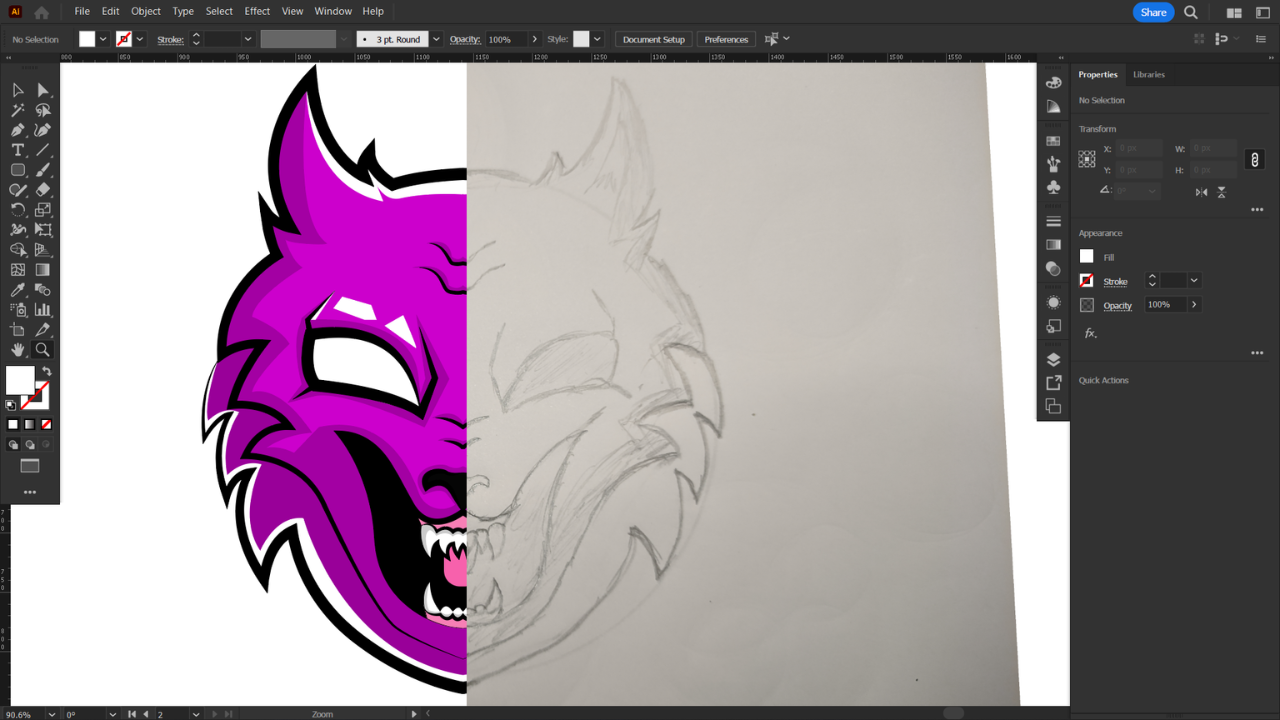
5. The Line Work: We can start with this logo. We're going to
vectorize step-by-step. So in this lecture, we'll go ahead now and use
the pencil or the shape tool. But I prefer depends
on of course, to add lines, to add
the basic line work. Okay, you may be asking
yourself why not using the brush stroke? Bear the thing is with
the brush stroke, you don't have enough control on the strokes afterwards when
you want to adjust them. Whereas with the pen tool is very helpful if
want to adjust them afterwards or if you want to animate the logo
and after effects. Okay, So the first thing first, I'm gonna go ahead and
open creates new file and I'll be working
with 1,020.10 ADP. Okay, this makes for a better presentation
for the clients. Now I'm gonna go to File Place, and here's our sketch. So I just took an image and I did import it to my computer. Place it here, rotated, hold Shift while rotating. The next step would
be to click on Control Command R. And
then for the guide, I will try and place it on
top of the image like this. Then we can adjust our image by rotating
it's accordingly. Okay, this is cool. So
once we do that, F7, double-click on this layer and then check template
is gonna go ahead and lock this layer and then
reduce the opacity. Just like this. Now creates a new
layer double-click. And then I'm gonna give
it a new name, line work. I usually don't name my layers. I leave them layer
one, layer two bonds. In this case, it's better to rename your layers because you're going to need
this absolutes. Now with the line were selected, go and select the
Pen tool, okay, because now we have to do our basic line work
and it's better to do it with the pen tool than to
do it with the brush stroke. Because with the
pen tool we have much more options like e.g. you can adjust the
width of the stroke. It's easier to animate
on after effects. Whereas if you use
a brush stroke, It's gonna be very difficult
to adjust the width of the stroke and very
difficult to animate as well. Now with the Pen tool selected, I don't want any fill
the stroke width is one. That's good. Now just make
sure you click on the Guide. Click here and then curve. Remember that even the sketch
as just a reference again, so we don't have to
really follow the sketch. You can be as
creative as you want. Okay, like this. Now when I take this handle, click on Alt and
put it back here, it will allow me to continue
to the next shape like this. Okay? If I leave the handle like this and I try to go like this, you can see that it's going
to give me some troubles. So Alt or Option and
then put it back on top of the anchor points.
Same thing here. Click and drag, and you have this beautiful
shape and do this. Then there's no probably thinking that's why I'm not
using the transform effects. What I can trace here and it will appear
at the same time here. I just don't like to use
that effects works fine, but in most, in most cases it doesn't
work as I want it to. Effects are more something
that you use in Photoshop, nuts in Adobe Illustrator. That just my opinion, you guys. Okay, like this. Here we go. So I'm just going to go ahead and trace those. And of course we
can always control Command Z to undo something. And remember, the
more lines you can get with less anchor
points, the better. And also you guys make sure
that you have smart guides. Selected. This one,
very important. Now I'm just gonna
go ahead and trace my sketch like you
would normally do, and handle the handles. Now you see right here e.g. I'm not going to remove
the handle because it does help with the
path of the stroke. In this case, I
can leave it here too and make sure you
finish within the guide. Same thing here.
Here we have it. Let's go ahead and do the nose. Okay, now with the teeth, this area is going to be
the gum area because if you notice rules when they
open their mouth, they have the gum showing. I'm just making sure that
I have those sharp edges. Now we have a round shape, but sharp edges are a must because it has
to look dangerous. So good, just make sure that this point is aligned
with this one. It doesn't have to be
perfectly aligned, but it has to look
the same area. Knowledge. Check here. Now what I'm gonna do is just
select this, duplicate it. Always leave the
original design. Add a new artboard. Bring this one. Here you go. I'm going to increase the
width stroke like this. And now I want to
select all the strokes. But the one of the teeth, because the T is supposed to
be smaller than the rest. Also use line right here. I'm going to leave them small. I don't need to
increase them anymore. Here I double-clicked,
so let's go back. Just click here, go there, the key increase a
little bit like this. Looks good. Let's include
this area as well. Now that we did that, the next step is gonna
be to fix the edges. Now you can see that
we're going for sharp edges or pointy
edges like this. Sometimes because we
were working with the pen tool and we didn't
get them correctly. So now let's go ahead and get the handles of the
anchor points. To get the sharp edges. With the direct selection tool, just select the anchor points and you will have two handles. And usually it's the smaller
one that you have to move a little bit to get those sharp pointy
edges here too, e.g. K here to here to there, we have it. Okay? So now we did increase
the width of the stroke. We adjusted the sharp edges. The next one will be to
stylize the strokes. So what does selection
tool selected? Click here. Then right here
on the stroke profile, I'm going to switch to
width profile number one. Something like this. I'll do the same thing here. And here. Sometimes when
the eyes looks good. Let's click on this.
Choose profile number one. Does it look good? So we can click again. Try this one, e.g.
now it looks better. Same thing here. Profile number four. Okay, Looks good. Same thing here. Same thing here. Same thing for the nose. Soon. Good. Try this one and then
if you don't like it, you can always switch. And of course for
the teeth as well. So select them. Then switch to this skirt. Same thing here. Switch, this. Looks good but this one doesn't. Try another width profile. Okay, let's rotate. It. Looks good in here, but we can adjust the
width of this area a little bit because
we need to mix it or blended with the
stroke beneath it. So what I'm gonna do here
is select the width tool. Let's hear, Okay, it's this one. Then click here in the middle. I'm going to just adjust
the width a little bit. Once you're done,
select everything, select the reflection tool, and then you're going
to find this anchor points right here. The cyan one. You
want to hold Alt, click and drag and put it right here on top of these
anchor points right here. Release and then copy. And here we have our
beautiful line work. Next step, This is gonna be to select the direct
selection tool and then just join two
anchor points together, Control Command J to
join. Same thing here. Select these two
extreme anchor points. Control Command J. Now we can see that the
stroke style will change. If it's good, you can
leave it like this. This one looks good. If we don't like it, you can
always select switch back. Okay, same thing here with
the direct selection tool. Select here Control comma j. Okay, Does it look good? Let's go ahead and
switch to this. Then we're going to do this. The reflected areas. Now here, e.g. we
have a problem again. So again with the width tool, click here and then
just adjust this area. Okay? And same thing here. Carrying this area, e.g. I want to decrease the
width a little bit. I don't like it. So
what I can do is again, select the anchor points. Click on S for the scale tool. And I can just
bring these handles a little bit together like this. Okay, and I think we have
a beautiful artwork. And of course, whatever
you don't like something, you can just go ahead and adjust that using the
direct selection tool. Now remember you
guys, very important. I'm just showing you the
creative process, okay, your logo may not come up
looking exactly like mine. That's absolutely fine. You don't have to
worry about it. Now after adding the lines, this is our main
basic line work. On the next class we're gonna be adding colors using
the pen tool. We're going to be
editing our base color.
6. Adding The Base Color to The Logo: In this part of the class, we're gonna be adding our
base color to the logo. So the base color
can be either given to you by the clients
if it has one, or it's up to you to find something that's going
to make it a logo look beautiful and makes the client
like, Wow, that's good. Okay. So now what I'm gonna
do is just increase the size or the width of the
strokes a little bit more. Because with this type of logos, better to have a thick stroke. Something like this, around ten. And of course I'm
just increasing the outside strokes and
the strokes of the eyes. Some of these like
the nose and teeth, we don't have to
increase the stroke of it because it's not going to look good
because it's very small compared to the
rest of the drawing. The next step would be
to add a new layer. Luck the linework. This one, I'm going to
call it solid color. Because now that's
all we're gonna do. We're just going to
add a solid color. Now it's very important that you put the solid color beneath the layer because we're gonna be color when would
the pen tool? And we will trace
over these strokes. Now there are of course,
other ways to add colors, like the paint bucket tool. But this has the most
non-destructive, easiest, and best
way to add colors. Okay, so now I'm going
to select my color. Something purplish, something like this.
So one tip is dance. I always make sure
that saturation is 100% when I apply
colors to my drawings. And reason being
is that I believe the most saturated colors are the brightest colors
always attracted viewers. And it happens to me as well, like when I'm scrolling down and up on
Pinterest or dribble, I always end up clicking on the designs or joins with
the most saturated colors. And I always use that. And my artists, well, I always go for the
most saturated colors. So we'll try this one. And if nothing, if
you don't like it, we can always adjust it later. Okay, So 100 like this. Okay. Now with the Pen tool, we're gonna do one area
and then just reflect it. Because of course this is
a symmetrical drawing. So in case of handles like this, you can either hold Alt
or Option and click here, or you can just click here. Okay? I'll just hold Alt or Option because
that's how I used to do it in the older versions
of Adobe Illustrator. So it's sort of like
became a habits. Even though I don't
need to do it. Sometimes I can't help it. So I know that using
the pen tool to add colors and Illustrator
is not the easier way, but it definitely the most
healthier way to add colors. Here we have some problems. Okay, so I'm gonna select this and we forgot to
remove the stroke. So just remove the stroke
and only keep the fill. Here we have it. Then
we're going to close here. Select this Reflect tool, find this anchor points, hold Alt or option. But it's right here
in the middle on top. Copy and here you have is. Okay. Once you're finished,
you can click on both fills and open
the pathfinder. Or you can come over here to Window and look for Pathfinder. Then unites. Okay. Now I'm gonna do the
same process for this area. The pen tool. Make sure
we have no stroke. And we'll let the trees. I'm going to close here
and retrace back here. Okay, It's very
important that you do that because you want to have a fill color or a shape
color that you can adjust afterwards. There we have it. This one. Same thing reflects. Bring this anchor points. Right here in the middle.
Make sure you're holding Alt or option and copy. And then select both and unites. All right, Here we go. Now this has a solid color. Now let's go for the eyes. Layer of the eyes
is going to be on top of the solid color. If you put it beneath, we won't be able to
see it's on top. Select the pencil again. I want to have white eyes. Only do the same, okay? Duplicates, copy, click V, hold Shifts, drag, drag, and then hold shift. So it stays aligned
with the other one. Now for the nose, we're going to use
a black color. So this one is not
duplicates and probably because we
didn't close the shape. So let's close this
here. Here we go. Try again now. All
spring this one here. Now for the teeth.
Add a new layer. And notice how I'm lacking
layers as I add new layers. Sometimes if you don't do it
as accidents may happen and you may end up working on a layer that you don't
want to be using. So always make
sure that you lock a layer when you finish with it and you want
to add another layer. I'm going to call it teeth. And the color has
to be your whites. Of course. Sometimes this happens as well. So when you duplicate,
you still have a little bit of separation
between the two shapes. So just click on the pencil
and just fill that out. Okay, Direct Selection tool, select all of them, and then unite them together
like a happy family. Okay. Now let's go back here. Okay. Now for the gum. No, because if you look at
the picture of the world, you can notice that they have constrain the open
their mouth like this. I'm guessing it's going to
be a reddish color like this one I'm going to
call it, it's gone. Key, same thing. Legs hold all stragglers here. You get it. It's a very
reparative process, time-consuming process. But it's much easier and it's much better
to work like this. Then applying the paint
bucket tool. So here e.g. teeth. See we have
some problem here. We can just select the Direct
Selection Tool and boom, just adjust the shape. Now finally, I'm going
to add one more layer. I think we're gonna be done with the floods or base color. I'm going to add
one more portraits beneath the teeth and gum. This one's going to be mouth. Usually. It's black. Inside a wolf mouth. It does look dark there. So we're just going
to add black color. I'm going to add a choose
another color right now. So I see what I'm doing and then I'm going to
switch it to black. Now remember you
guys, if you want to change the color of the path, you just double-click on this layer and you switch to
something that you can see. Here you have it. I'm going
to switch this natural black. Same thing. Reflects alter
option, but it's here. Rp direct selection tool. You can see that we have again, a little bit of separation. Adjusted the position of
this area a little bit. It looks good. It looks both. Your knives. Now we added our base colors. Can you guys so that
was a heads up. Next, we're going to
be adding shadows.
7. Adding The Shadows: In this part, we could start with the base
color if we want to have a flat logo bars adding shadows and highlights can
really help elevate the logo. In this part of the lecture, we're going to be
adding shadows. And all we have to
do here and just imagine where the
light is coming from. If it's coming from here, we're going to have
shadows on the side. We're going to have
highlights on the forehead and maybe highlights here, okay, if it's coming from
here, we're going to have lights here
and shadows here. So it's up to you to imagine. You can, of course, look into references on
Google to better understand where the shadows and
highlights will be. The thing is right
here with this logo, we have a creative
freedom because it's not a realistic drawing. So it's okay to make mistakes, not gonna be a huge
problem as if you were to win realistic drawing. So now we guys, same thing, we're gonna be
adding the shadows. Okay, So what we'll
do here is add a new layer, call it shadows. And of course it
has to be beneath the line work layer and
on top of the base color. Now again, we're going
to need the pen tool, and now I'm going to switch
to no stroke and black color. Now it's gonna be
difficult to work with black color now because
we have black strokes. So just for now, I'm going
to choose a lighter value. Just so I don't get
confused with the strokes. Click here and then
trace my shadows. So basically what we wanna
do here is that we want the shadows to follow the
curvatures of the strokes. Okay? It's kinda works
like Scratch, scratch. And if you've done so before. So that's what we're
trying to do right here. I'm just going to
change the color of the bounding box real quick. It looks better. Now we will go back and
trace the strokes. Will do the eyes as well. So same thing. Click
here on track. So as you can see right here, basically what I'm doing
is just tracing the eyes. Taking this shadow right here. Right here, we have this points that I need to
curve a little bit. So just click on it with
the direct selection tool. You will have this anchor
points and you can just carry this a
little bit like this. Okay, and then I'm going to just complete this area right here. Now. I'm going to
select everything here. And then just unites
and then select this. And maybe you guessed it. So we're gonna go ahead
and reflects this one now. Double-click copy. And then just move it
to the other side. V. Click, hold Shift, click drag and hold shifts. Okay, in here we have it. So down here we can still see a little bit of separation
between the two. So again, we're going to
fix this with the pencil. Whenever you have this
problem, just fix it. With the pen tool. Close the shape.
Looks, both are all. Unite them together like
a sweet happy family. Let's go ahead now and do
the same thing for the eyes. Reflects, copy. Then move this to the other. I like this. Here we go and I
think we have it. So if you want to align, you just select both shadows. And then you can make sure
that they're aligned by using the align objects and
you distribute objects. Okay. So I have questions
about this area. I'm not sure if I should fill it with shadows. We'll
leave it like this. So I'm just going
to leave it like this for now and we'll see how it's going to turn
this out at the end. Same thing here. We're
going to add shadows for these babies as
well, these trays. And we need to do the
same thing for the teeth. Okay, so we're gonna be
adding shadows like this. So I know this one, you can see it, but that's fine. Because we are in a
layer underneath teeth. Now select this
control command X. Okay, fan ti. Go on top. Then I'm just going
to name this t, t, shadow, F, Control Command
F. And do you go, my friend. Okay, select this again. Same thing reflected
the other side. That's one of the
perks of working with symmetrical
designs. It does. You can always reflects instead
of doing the job twice. Okay, it looks good.
Do we have here? Okay, so in this case, of course, we can
separate them nicely. Select both unites. We have to add shadows. The edges as well. It's something like this. Then close here. Now grab this control element x, loving the shadows
layer for now, and go to T shadows control
command F. So now we're just going to play
with the handles to adjust the shadows. Again, just reflect this can't be drug called shifts
and put us here. Alright, same thing
for this one. It looks all unites. Reflects copy, and
here we have it. You guys. Now, same thing here. What do we have? We
have a little bit of separation. Let's see. We can fix this with
the anchor points. Okay, it looks good now unites. There we go. Let's go ahead now and
change the color to black. Selected the first
shadows layer, click on the circle
so you can select everything and switch to black. You can see that
it's still black. It looks again. And now let's
play with transparency. Looks good, looks better
for the percentage, good. 22%, okay. Do the same thing for the teeth. Of course, you can adjust
this to your liking. I'm not sure if I should
leave it like this or maybe increase just a
little bit here to, to 20%, 20% maybe like this. Anyways, next step, of course, is because we adding shadows
and we imagining that the light is coming from the top directly
to the subjects, this area down here
needs to be darker. This parts down here. So now I'm going to
lock my shadows and my teeth shadows go to the
solid color, unlucky nuts. And I want to target this area.
So I'll just click on it. Then. I want to make it look
as dark as the shadows. On the top. Here's
something like this. Okay. Okay. So that was it
for adding shadows. As you can see, there wasn't
too much, hard to imagine. Now, up next we're going to
be at in our highlights.
8. Adding The Highlights : So now what the highlights same principle as I said
before with shadows, you just have to imagine
where the highlights will be. The lightest coming from up. And had interface are probably going to
have highlights here. And maybe something
here on the glasses. You know, you have
to work on that. It's something that you
learn with practice. Now for the next thing we're
gonna be adding highlights. That will be our final touch. So same thing. I'm going
to add a new layer here. And Nimitz highlights. Again, grab the pen tool. And this time we
want white color. So I'm going to add
the highlights from here on this area because the light is
coming from the top. So it's going to
affect this area. Same thing, click here. Click here and drag
and make sure it's not overlapping with the shadows. Here. Here and drag
and then here. Okay, something like this. Again, just make
sure that you close the shape and duplicate this. So okay, whereas the
anchor point it's here, also put it here. Copy your nights. I'm going to add another one here, like this. And then I'm going to
add some shapes in here as well,
something like this. Select all of them, copy, and then move it to here. So just this old shifts go. Then of course, I'm going to add my
highlights in this area. Something like this. And of course reflects. Okay. And I think
here we have it, You guys. Okay guys. So that was just about
adding highlights as you can see whether the same
thing with the pen tool, we just have to imagine where the highlights will be custard. Now up next we're gonna
be having our fonts.
9. Fixing the type: Okay, so after finishing
with the lower design, now, we have to add a type. So in this lecture we
are going to be choosing a font that will
go with our logo. And of course, I
want to go ahead and not just find a beautiful
phone will of course, go ahead and adjust it. We get a little bit to make
it look more interesting. Okay, so now we're gonna go
ahead and create our fonts. So I'm gonna go ahead
and add a new artboard. Select the Type tool. Then I'm going to type in
Wolfe done with no space. So that the name of our logo. And then for the font,
I want to choose a nice display fonts. And then for the font,
I want to choose a nice Sans-serif display
fonts where it belongs terms. Now, here's the
thing you can use, the fonts to find the beautiful fonts or
you can use Adobe Fonts. But the most and fastest, easiest way to find a
beautiful fonts for your logo is to find a
similar looking logo. And then you try to match
that font to use in any fonts match and software could be Adobe
Photoshop or anything else. Ok, So in my case, after some research, I found that this font as best suited. Okay, move ten. So now I'm gonna go ahead and switch from black to
the color of the logo. Here we go. So let's just create our palettes in here as we're going
to use for the fonts. This one is gonna be
the color of the logo. And right here we have to
find a matching color, okay, because we're
going to go ahead and adjust this one's a little bit. We don't want to keep it as a default fonts because
we're going to go ahead and adjust this
fonts a little bit. I need to find a matching
color that I can use with my base
color, the logo. In order to do that, I
found a beautiful websites. So it's called my
color that space. And the way it work is that
you're going to go ahead e.g. and then copy the
hex code from here. And you paste it here. Then you click generates. And I will give you a
lot of beautiful colors. As if e.g. I. Like this one. I can just copy the hex
code and then put it here. And this will be our color
palettes for the fonts. Let's go ahead and make this font a little
bit more interesting. We don't want to keep
as a default fonts. So first thing first, go ahead and outline the fonts in short Command
plus Shift plus 0. And then we're gonna go to
Object Envelope Distort and then Make with Warp. You can try different
styles from here. But I think I'm gonna
go with the Arc Lower. Just a little bit from here, we can adjust the band. Adjust the vertical sits
in a birds like this. And then click Okay.
Once you do that, you want to go to
Object and then Expand Object again. And
here's what we're gonna do. We're gonna go to Path offset and we want to
duplicate this font. So retro minus seven. Minus seven looks good.
Let's see, minus x. X loves, but as well
as 57 minus three. I think I'm going to
keep it at minus six. Okay? Now we can switch
click to select this color. You can see that we have a
beautiful color combination. Now, same thing. Now, make sure that you don't de-select the offsets
as you just create it. Okay? If you deselect the
offset is, let's say e.g. you click like this and it deselects the
offsets by mistake. Just click on Control Command Z, and then control
plus shift plus z. And it will select it again. Now again with this new
offset that we created selected go to
Object Path Offset. And this time we want to
increase the number like this, ten, it does look good. Luck, okay. Make it black. And then for the woods
behind everything, so Control or
Command plus shift, plus left brackets,
it's going to throw that new offsets
all the way to the back. And it's going to look
something like this. Okay. So you can either keep it like this or we can adjust it down like
this a little bit. Both are good. I'm gonna go ahead now
and just duplicate this. Double-click on the
block offset that we created is going to go
ahead and isolate it. Sure you select them all. Then maybe bring it down
a little bit like this. You can be creative with this, as creative as runs. Or you can e.g. take
this, put it here. Then e.g. select the pen tool. And just, I'm gonna to
click here. Then here. Then here. This reflects copy. We'll try again, not know what the copies so reflects copy. Unknown products all the way. Here. We go. The pencil again. And we can just close
this like this. Go selects both window, open the pathfinder,
and then unites and then throw it to the back
like this control command. Plus shift plus left brackets. I'm going to keep the
shortcuts on the screen. It does look beautiful as well. Okay, now one thing I wanna
do before we wrap this up is select the
direct selection tool and then just adjust
a little bit. You know, these areas right
here. Just like this. Make them sharp and
pointy, like the fonts. This area here. Same thing here. The direct selection tool, you just click on
the anchor points. Anchor points. Just like this. And this. Here. It looks good. I think I'm going
to use this one. So of course, once
you're finished, you have to select everything
and make sure you expand. Have to expand you guys expense. So when you scale
it up and down, we don't lose anything. Okay. I'm going to Control Command R to hide
the guides Avenue artboard. Just click on Control Command Z. Okay, so we found our phones, we adjusted our
fonts a little bit, added some beautiful
color combinations. Now for the next part, at this time for presentation.
10. Making The Logo Ready for Presentation: Finally, in this class, we're gonna go ahead and do
a beautiful presentation. You know, play with the logo a little bit to make
it looks beautiful. Find beautiful mock-ups. I'm gonna be using a free
mockup for this class. But if I wasn't in the
logo to a real clients, if I got that clients, I will
be using premium mockups. You can of course, find
beautiful mock-ups on Envato elements are invented
com, something like that. So yeah, this is a very important parts of
the logo design. So I know that
people don't give it too much attention
because they say, okay, I've done the hard work now we'll just mockups Lola. But you have to pay attention. Same way as you create a logo. It's as important as
creating the logo. So right now what
we're gonna do is fix our logo for presentation. Okay, so first things first, let's go ahead and
add a new artboard. Then I'm gonna take this logo, select it all, and then just
duplicate it right here. Okay, First thing
first is that we want to fix our
logo at the type. So same thing if I duplicate it, you just hold Alt or Option and drag. So here's the thing. We want to align the logo
with the type, okay? And the logo has many shapes
and shadows and highlights. So do we have to group everything if you want to
move everything together? Because if I leave the logo like this and keep moving
everything around, I might accidentally
mess something up. So it's a good idea now to go
ahead and group everything. So make sure you have everything selected and then your group. Now this will happen when
you're going to group, you'll all go together because these black things are shadows. And since we grouped everything, we did move shadows from
one layer to another, okay, which means we
lost the transparency or the transparency effects
that we applied earlier. No problem, we can always
go back, select them, the direct selection tool and just double-click and reduce
the opacity like this. Okay, and here we have it. Okay, so same thing
for the eyes. 28 here for the aids protease. How much was this one or 18? 18 is too much debt is too much to solids adjusted manually and see
which one I like best. Let's put a 30. Same
time for this one. Let's go back. Same
thing here for this one. Let's just decrease
it more a little bit. Here we go. Let's not forget about these
areas right here. Augustine is this one. Here. I know it's
double the trouble, but, you know, this
type of logos, they're a little bit,
you know, I'm not, I don't wanna say complicated, but they do require a little bit more work
in making process. Because we have to
add a lot of stuff. You have to add the
shadows, highlights, shapes, colors. This
is the wrong one. This one. I'm going to leave
everything like this. And now if I move the logo, I can move freely without having to worry
about anything else. So let's go ahead and this, like this, well, maybe
a little bit less. Just the logo here. Bomb. K selects both a line, a line, a line, a line. Just want to make sure
that this thing has expanded so we can scale it. This one I'm sure they'd
expanded earlier. Expand its try and make the
logo a little bit bigger. This one a little
bit bigger as well. Okay, So it looks good. Let's do another
variation. You go. Okay, bring this logo
here, duplicate it. And this time I want to try
another type. This one. Okay, so we have two variations. Now for the presentation, you just need to create an art board and put
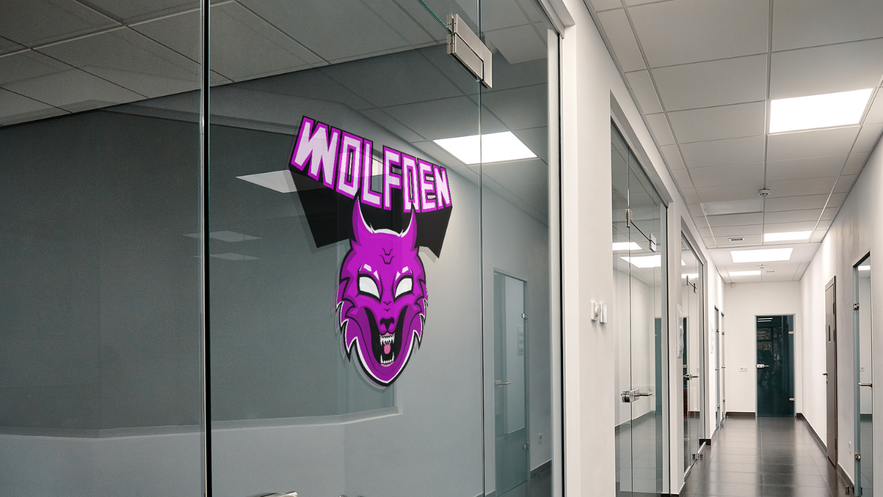
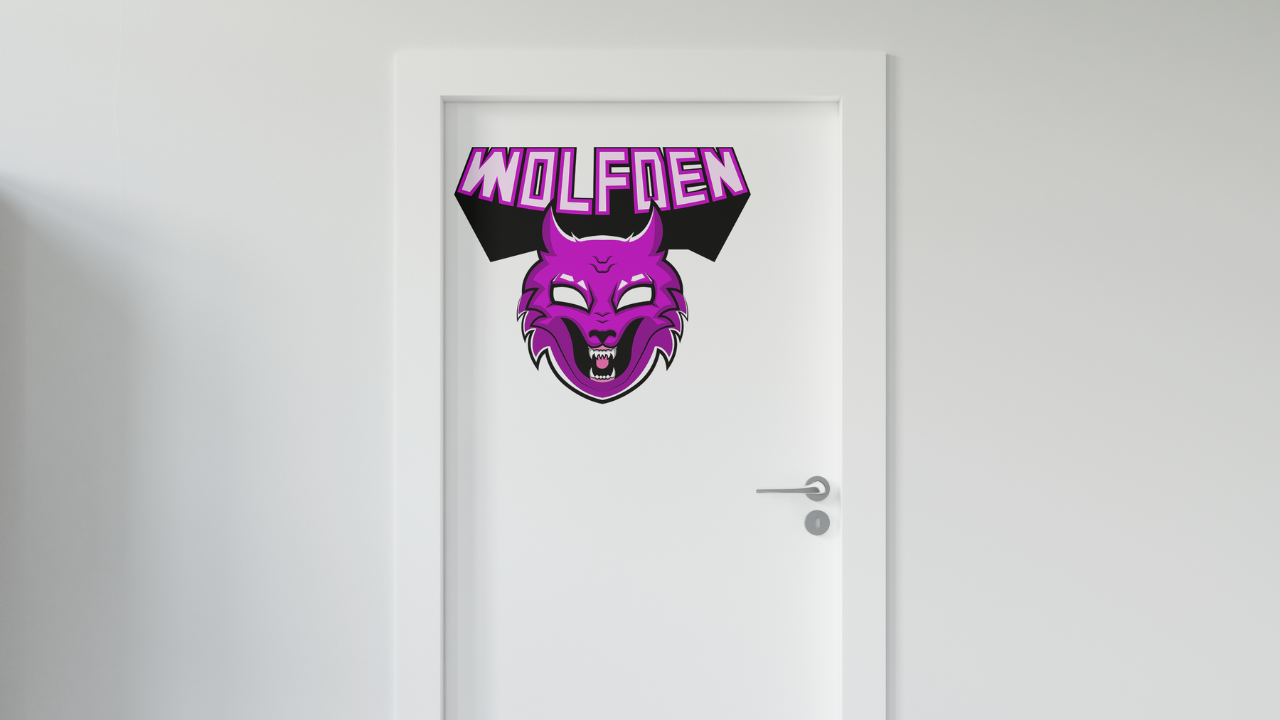
the name of the fonts, the colors that you use, and the logo, NMO cup. If you remember the
client's brief, the client was asking. Are the clients wanted to
have the logo printed on a door or an office and under
Window found two mock-ups. One is the office door and
yet one is the office window. And let's go now and mockup these logos to see how it's
going to look in the office, okay, because mock-up
is very important. Now one thing I wanna
do before we go to Adobe Photoshop is let's
go ahead and exports. Okay, right here
I'm going to use artboard range and I want to
export Artboard number four. Number five, exports. We go transparent, okay? Because actually
I'm just going to be working with this one. Now let's go ahead and open
Adobe Photoshop new file. And then of course we
want this 1928 80. The default representation. We have our layers right here. Now, let's go ahead
and place our logo. So place this is our
logo. Here we go. First In First I want
to try something like something I want to do
before creating the mockups. You know, like a nice
logo presentation. E.g. I'm going to leave this one here and then duplicate it. Control Command J to
duplicate that layer, make sure you have
Layer selected. The second bond and Control
Command T to transform. And I put it here. Okay, and then add a new
layer right in the middle. And this time I want
to add the gradients. Double-click on ingredients. A key double-click here,
sample this color. Here, I'm going to
make it a little bit. Click. Okay, Try. This. Is the other logo. Okay,
She does this better. Now this one behind, little bit transparent,
like this. Control elements C. Let's just adjust it further. Okay, this one on the
top and from command. Just align this one on
the top, like this. So we just have to
follow the guides. Just expanded a little bit. Here we go. Now I'm gonna go
ahead and open the mock-ups. Okay, So this is our mockup
number one, woke up. Number two. You can
see it from somewhere. I don't know the dam
that's just free mockups. So I'll just eyeball on and
off to see which one is one. I don't want to read all of us. Okay, So door, here we go. This is its hide. All of these File
Place Embedded, place my logo and extend
to local elites. Okay? Control Command S to save. Let's take a look.
Okay, it looks good. Maybe just a line
is a little bit. Decrease the size of it. Just a little bit like this. Control Command S. I don't
like it's in the middle. So I'm going to decrease
the size and just put it like this on top here. Think this looks better. Okay, and now this one with the window
and just when you can close it, double-click here. No. High dose. Go to
File Place Embedded. Logo here. Increase the size
a little bit. Align it. Control Command S to save. And Nia, good, looks
good. It looks good. This is what the clients asked for or do you want
the logo to be printed on doors and
windows of the office? And these mockups do show
how is it going to look. So now that we have all of this, we can go back to
Adobe Illustrator. Of course, after
exporting the images. And then we can just,
and then we can open a new documents
or keep working in the same documents and take all these pictures and
everything and just align and organize everything so you can present
this any way you want. It just has to look beautiful, organized, and it has to show
that you care, Of course. Okay, So now we're done
with the presentation. We did some beautiful
manipulation with a logo. We added more cops. So now the logo is ready to
present us with a client. And that's pretty much
as for this class.
11. Congratulations: Okay, you guys.
So if you've made it up till here,
congratulations. So we covered everything from brainstorming sketch
and coming up with ideas with resin logo, adding colors,
shadows, highlights, and finally more carbs. So now I want you to go ahead
and upload your projects. Again. You can do it
here on Skillshare, or you can do it on
your own social media and tag me if you wants. Also, I want you
guys to follow me. If you want to get
to an application for when I upload a class. And thank you all for watching and see you
on the next one.
 Adam Chraibi, Designer and animator