Transcripts
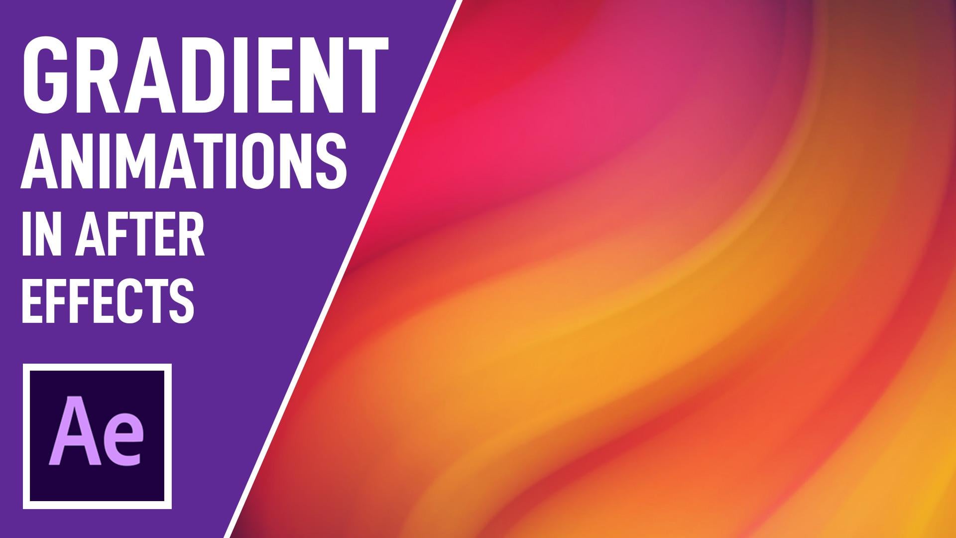
1. Intro - Create Animated Gradients: Welcome to house creates animates It's great design in Adobe After Fix. Hi, my name is Jonathan Lamb and I'm a game artist from London. In this class will learn how to create these cool animated radiance to use in your projects , Starting with how to choose your own complementary colors, I'll take you through a lot the tools and skills necessary for the projects, including creating radiance and using shapes and how to animate them. By the end of the training, you'll be able to create your own ingredients. These are flexible and fully customizable, allowing you to choose different colors and designs. This class is perfect for designers, illustrators on anyone else that can have some fun creating some animated radiance. So sign up and let's get started.
2. Part 01 - After Effects Introduction: however you want and welcome to a course on how to create animated grading backgrounds in aftereffects. In this course will learn step by step, the basics of how to create this type of animation and all the necessary skills along the way. So for those of you who are just starting your after fix journey, keep watching this video to learn the initial set up off the program on, familiarize Yourselves with the tools will be using throughout the course. If you already and aftereffects expert on would like to jump straight into the meat off the course, feel free to skip to the next video to get started on the animated ingredient background. So let's get started by taking a look at how to load the workspace. To do this, go to window workspace and then select standard, and this will hopefully make it so that you are seeing the same layout on options on screen as what I'm showing you in this video on throughout the other lessons. Otherwise, we can edit the way your workspace can look like. You'll also notice that there are some other works based options available, So if we go back to work space, you'll see that we have things such as animation, color effects and so on. These will usually be named after the task that they're most suited to. But for now we'll just stick to the standard layout, especially if you're just starting out as this will have all the tools we need to use for the course. So now that we have our workspace loaded, let's go into a quick introduction off what we're looking at here. The workspace in after effects is made up off panels and frames. So if we take a look at the tabs around the workspace here, such as project effects, controls, composition and someone, we'll have these names. Tabs here These are called panels. Each panel is placed within, usually a rectangular space called a frame. So if you have a look over here, the effects and controls panel is inside this blue rectangular frame frame here. And if we slept the composition panel, you'll see that this frame is a lot larger, like so now we can easily adjust the size of the frame by moving your mouse over the edge of the frame, like so until it's the mouse cursor changes. And then if we click and drag the mouse, we can make it smaller or larger now. This could be useful if you want to see more options within your panel. So if you want to see more options inside the preview panel, for instance, just click and drag the bottom here to see them. We can also move panels to different areas off the workspace Now. To do this, simply grab one of the names panels using the mouse. So let's go ahead and use the info panel, for example. Then we want to just click and drag. It's over a different area and straight away. You'll notice now that different drop zones are now highlighted in this sort of dark blue color. Now all we have to do from here is release the mouse button once were hovering over a place that we want to place it and you'll have a new placement for your panel. So now you can see that we've got the info in this panel here, like so in this frame. Now, the placement off the panel it depends entirely on the drop zone area. So, for example, if we place the panel in the outer edges off the frame like so it will appear it beside the frame. We can do this on either sides or also at the bottom, all at the top. Like so. However, if you wanted to put the tab within the frame, you'll have to click and drag it within the center drop zone area of the frame. So now you can see we've got two taps composition on info. Another trick that you might find useful is to make a panel float. Now this is mainly useful for those of you with two or more monitors. So say, if you wanted this info panel on your second monitor. To do this we have to do is click and drag as you would normally. And then what's holding the mouse button down? Press and hold the control p the control key on the keyboard or the commands key. If you're using a Mac, and then this would change the look of the panel like so and then simply release the mouse and keyboard key to creating your new floating panel. Excellent Now, to reset the workspace to whether was originally let's go back to the workspace menu here and then select Reset standard. And there you go. Alternatively, if you wanted to save your new workspace or you have to do is go to windows workspace on, then save as new workspace. Save the workspace. Now, in the standard layout, you're mainly be focused on four different areas. The left area here will be where your project panel is, and this is where you'll find all the resource is off. Your project saw, such as import logos and compositions you've created in this course, will be using this area to access our composition files, such as our backgrounds and our colors. The bottom area will be where or your layers are kept on the timeline off. Your composition is just next to it on the rights. Now this is going to take up most of the space as will be needing it to time are key frames off our animations on various other effects. The center off the area here will be how you can preview your animation video and over to the right is where you'll find all our effects on presets on. These are what we're going to use for our animation on over at the top here is our preview panel, which is where we can click Teoh, preview our animation, feel free to experiment with different workspace layouts and caught with something that you like. Remember, you can always reset the layer to its original form. If you don't like it. Great. So that's it for this lesson. In the next video, we'll learn how to set up and pick our color palettes. See you all there.
3. Part 02 - Color Schemes with Adobe Color: Hey, everyone, and welcome back to how to create animated Grady and backgrounds in after effects. In this lesson, we're going to learn how to choose our colors for the great in background, and then how we can create a color palette for project. Sometimes choosing the right color scheme for your projects can be excruciatingly difficult . Whether you using color to convey emotional states, trigger actions or set the mood, the choice of color can be especially difficult to pick for a beginner. Luckily for us, adobe color helps us with this and has made it very easy to find and create cohesive color palettes for your projects or you need to do is open up your browser and then enter color dot adobe dot com. And you will be greeted to a cool looking color wheel like this with five color selectors that you can move around like this, and they also correspond to the color squares below. So if you move one off the color selectors that will change the color squares accordingly, like so now the color selected or depend on which colored rule you have selected on the left side of the screen over here now, over here, you can choose from six different color harmony rules or create a custom one at the bottom . Feel free to experiment with each of these to come up with a color scheme that you like. So the base color that you choose, which is always represented by the middle here the middle square here will determine what the other four colors are going to be. So if we go ahead on drag this color selector, you'll see that the color that we've selected determines what these other colors are going to be on. This will be the same for all the other rules as well that we select like so, so feel free to experiment. We're just going to use the first color role here. Awesome. So once you've chosen your color scheme, all we have to do is either take a note off alone, five off these color codes at the bottom here, or use the snipping tool on windows. So simply open up the snipping tool like so select new snip Andi. Then we're just going to suit select our color scheme here on. Then, once that's been selected, just simply hit the save Snip button to save it, and you can save it as an image fall if you don't have the stepping tool available. Simply creating a screenshot is also going to have the same effect. You can also create a color scheme from an image or you have to do is click on extract from image on the top left of the screen here, and then just drag and drop your file into the middle. Like so on. The adobe color will pick the color scheme for you so you can see we've got a cool color scheme at the bottom here, which has been picked from our image. Like So you can edit these colors using different color moods on the left, exactly the same way that we use the color harmony rules in the color wheel. So you can see as we select each of these, it selects different colors for our color scheme at the bottom here, and all we have to do to save this is again print screen or use the sniffing tour. Excellent. So there we have it, how to choose and create a color scheme for upgrading background. In the next lesson, we'll learn how to use these colors in aftereffects. See you all there
4. Part 03 - Using Color Schemes: everyone and welcome back to how to create animates grating backgrounds in after effects. In this lesson, we're going to learn how to use our color schemes in our aftereffects project. So in aftereffects, let's start by creating a new composition by going to the top of the menu here and then that clicking on the composition on a new composition in the composition settings window. Let's change the name up here, too. Main Kump. And then we wanted to make sure that dimensions here are sets to 1920 by 10 80 pixels. We want the frame rates at 30 FPs, and then we want to set the time duration to 10 seconds. Let's go ahead and do that. Cool. Then, once you're happy with your initial settings, click on the OK button to create unmade composition. Excellent. Now we want to create a composition to store our grading design. So again, let's go to the top menu here selects composition, new composition on Let's rename this one Grady Int design, and from here we want to make sure that all the settings are exactly same as our previous comp and then click OK to create that. So now you can see at the bottom. You've got to compositions one, which is named Main Camp on one, which is named Grady in design. And if we click on our project panel here, you can see them over here as well. Excellent. Now let's go ahead and import our color scheme into the projects. Now this should be a This should have been saved as an image file, So all we need to do is click and drag that into our comp, so that's click and drag this into our complex. Excellent. Alternatively, let's go ahead and delete this. Another way that we can import our color scheme is by going to file import file, find where your color scheme is located on your hard drive, select it and then click imports. And here you can see it in our project. Fast or we have to do is click and drag it from here into our comp like so cool. Let's go ahead on use the selection tool at the top here, so make sure that the selection tool selected or by pressing V on the keyboard on we want to go ahead and resize this here to make it a little bit smaller, so it's click on these little squares here. Click and drag using your mouse to make it smaller, like so on. Then just moving it. Teoh the top right corner here, where we can use it as a reference awesome now to start creating the shapes that will use our color scheme. To do this. Go to the top menu bar again, and we wanted to select the Ellipse Tool. Now if the Ellipse store isn't showing at the top here, so it's at the moment. This shape is a square we want to click on hold the left mouse button where the shape is, and then select the lips. Tour from the menu like so awesome. Now make sure that we haven't got any layers selected in our comp at the bottom here. Otherwise, we'll start making masks like this so you'll see. We've made the mask here. I'm just going to press control. Z Teoh. Undo that. Make sure that our color scheme J pic is unsuspected. And now, using our lips tal, let's go ahead on create a circle shape here. Now, if you want to create a perfect circle, just click on press and hold the shift key on the keyboard. And then you'll see all the proportions are constrained like this to make a perfect circle . Awesome. Now the shape might have some default color settings that we want to change. To do this, go to the Top Menu bar here and click on the Phil Square from here. We want to select the eyedropper tool here and then using our mouths. We can move over to our color scheme at the top, and you can see straightaway how every time we hover over when the colors, the color off our circle is also changing. Let's go ahead on select the yellow here and then click OK to confirm that. We also want to make sure that we don't have any stroke colors selected here as well. So click on the stroke options. So click on the word stroke up here and we want to make sure that no stroke is selected. So none on. Then click. OK, awesome. Now, another way that we can change the color off. Our shape is going into affects and presets panel over on the right here, and we want to type in Phil and then find the fill option here, select it on, then that Make sure our shape their selected and then double click on that to apply a fill onto our shape, awesome and then over to the left. Here, you'll see that we have an eye drop. It'll next to our color option here as well. So we can easily just click on the ID rebuttal and then exactly the same way as what we did before. Just select the color from my color scheme to change the color off our shape. Now setting up our shape like this might be a little bit easier in this case, as we might want to change the color off our shape. And we want to have the options to do that easily without having to keep opening up a new window to change the color. Awesome. Now let's create a drop shadow by typing into our fix and presets such by here drop shudder on double click on Drop shadow to apply it onto our shape. You can see over in the effects controls panel that we can also change the shadow color off our shadow here using the eyedropper tool. So that's used this eyedropper tool here on slicked a shadow for our shape here, like so we can't see it here. So let's increase the distance. I like that about 100 should be fine on. We can also play about with the direction off our shadow as well. It's just facing hit on now. Once we've created a shape, we can now go ahead on select our shape layer on, then press control and D to duplicate it. So it wants to use our direct selection tool here and moved to duplicates around and then just moving around randomly at this statement, not worrying too much about the placement of some of these shapes a zoo. We just want to randomly place them around and then creates different sizes off them. Like so, it's just using direct selection tool to make this one smaller, to bring the distance back in here like so and then press control de for this layer. In fact, press control is it, as we were in this effects control panel wants to duplicate the shape it's and make sure that you're in your camp panel here, press control de to duplicate it and then placing another shape here like So now you'll notice how the middle off our shape YSL the way over here. So he wants to change that by clicking on pan behind anchor points like so? And then Then we want Teoh. Move now, uh, point here into the middle of our shape, and this should make it so that it's easier to resize our shape like that. We can do the same for our other shapes. Go ahead and move that into the middle. On the same for this one. Let's move that into the middle here and now. From now on, any shape that we duplicate should have its anchor point in the middle like so cool. Let's make this one a little bits bigger like that, just overlapping some of these shapes to create a interesting composition. And now we can go ahead and change the color of some of these. So just selecting the color off these shapes using the eyedropper tool, and then here we can easily select the colors that we want. Let's go ahead and do the same over here, selecting another color on. We want Teoh Select another color for the shadow and in fact, you can even adjust our color scheme little bit by making this one a little bit talker and then doing the same with this one. So that's select this color and then making this one a little bit Reitze like so awesome. Now we will eventually be using these to control the color and composition off our animation. But the most important thing at this stage is just creating the shapes and using the colors . Excellent. Now that we've learned how to create shapes on used the color scheme in the next video, we'll learn how to adjust our shapes to create the great in effect, See you all there.
5. Part 04 - Using Shapes to Create Gradients: hi of your one on Welcome Back to create animated Grady and backgrounds in after effects. In this lesson, we're going to learn how to adjust our shapes that we've created on Create a Grady in effect for our animation. So now that we've got some color set up in our grading design comp, let's go ahead and place them into our main comp to see how effects the look off our animation. So click on the main camp tab here to bring it back up or double click on the main camp in our project tab. And then we're just going to drag and drop the Grady in design into the main camp like So next we're going to wants to create a background layer for our main comp. So to do this, simply go to layer you on solid and now, in the solid window, we can rename the sordid background. So let's go ahead and rename this solid BG for background, and we can also assign a color for it. So let's go ahead and put a color code in here. So let's select this year on. We want to put a color code of 3 to 3 F six to like So this will be a sort of dark, grayish blue color like that. I think that Okay, once you've done that, of course, you can also select your own color for this. Then once you're happy with the color, go ahead and click. OK to confirm. Now we also want to make sure that the solid background there is at the bottom off our layers. So just click and drag that so that our grading design appears on top. Awesome. Now on the gray. Didn't design comp want to start adding some effects? Teoh, create a nice grading effect for our animation, so select the grating design. Compare. So the first effect we want to add is called turbulent Displace on. We can find that in the top menu bar here, go to effect and then find distorts and then find turbulent displace in the menu here. Then once you click on that, you'll see straightaway that source of distorted our shapes inside our great design, like so on. Next we want Teoh go to the effects and controls panel here so automatically, This has been selected for us up here and we want to start to adjust some of these settings . So from him, make sure that the displacement is set to turbulence. And then we want to set the amount to around 20 and then for the complexity over here. Let's go ahead on set the complexity to about two cents. Increase it to two here. So next one wants to add some directional blur. So again, making sure that our grading design compass selected Go Teoh effect go to blur and shopping . And then we want to find directional blur like so. So once again, clicking on this will automatically affect our grading design comp and will add the directional blur to out effects and control panel here. So once we've got that, we don't want to go ahead and change some of these settings. So let's go ahead and put the blood length from zero to around 600. Like so and straight away, you'll see now how are shapes are starting to blend together? All right. Next, let's go ahead and add a 12 effect. So again, to do this, make sure graph grading design is selected. Go to effect, go to distort on next. He wants to go to 12. Like so and here we can really start to adjust the look of our great in comp by adjusting some of these valleys. So for now, let's go ahead and set the angle here to 250. And let's set a radius off 100 like so and then finally will add a little bit more blur to the grading by going to effect, going to blur on. Now we want to go ahead and find fast box blood or faster, depending on what, what version of after fix you're using. And then when we have to do from here is set the blurriness Teoh a number that you want, say about 20 just to make it a little bit blurrier so you can increase or decrease the amount of blood that you want, depending on what sort of look you want. Your animation tohave. So if you want a little bit more of a sharper edge to your radiant or we have to do is decrease the blur radius. Let's decrease. It's about five. Or if you want a blurrier edge to your Grady int, increase it to something like 30 like so. So I like to have a little bit more of an edge to it, so I just can't without five. And then, of course, later on, we can change these values. If we decide to as well awesome. Now we're all set to create the rest of our great in composition, which I'll show you how to do in the next video. See you all there.
6. Part 05 - Create a Gradient Composition: hi of your one, and welcome back to how to create animated great and backgrounds in after effects. In this lesson, we're going to learn how to complete the look off arg Radiant composition. So now that we have all of our effects here ready in our main camp, let's go ahead and fill up the rest of our grating comp with colors. So to do this, we need Teoh lock the viewer. So let's go ahead and look at this view here by clicking on the lock icon at the top. And now let's go to view and new viewer. And this will create another viewer, frost on the rights and then, by clicking on our grade into compare our grading design. It will now change the view here to reflect that awesome. So now we can have both compositions open at once, which means we can now create more colors in our Grady into design, comp and see how one composition affects the other in real time without having to constantly switch between the two. So now let's go ahead and start building our grading design here by selecting our colored circles. Let's go ahead and select all of these here and then pressing it control de to duplicate them. And once you've done that, we can now move them around our composition here and you'll see straightaway how this effects our main comp design here. Like So now we don't want our color swatches here anymore. So let's go ahead and slips the color scheme j pig layer and hide that. And now we can continue Teoh. Build up our composition in the great design by clicking on these shapes, pressing control de to duplicate and then just sort of moving them around and perhaps reshaping them, re sizing them like so and even changing colors. So let's go ahead and bring this back up, just going to change the colors here. So the color of the shutter and the color off that was circle just had a little bit more variety just going to do face this straight pair, like so on again, just giving it a little bit more color. Do you think this one? It's all about just building our shapes all the rounds, the composition whilst looking at how it affects our look off the design. So let's go ahead and select three of these circles just to build up our composition a little bit quicker. We want to rearrange some of these a little bit more randomly, like so and again using our eyedropper tool to re color. Do that one again. Just make sure you're selecting the layer press control D to do OK, make this a little bit bigger. You see, I've duplicated some of these Phil's. Let's go ahead, then delete The's feels here like so now we can continue using the our job. It'll like that. Awesome. So let's go ahead and do pay some of these smaller circles just tossing them around like so , filling up the rest of the space. Here you can recover some of these. Some of these circles just have a little bit more balance to the composition since recovered this one. Also, let's move more pink circles over to this side. I just found out of it like so great. And then once you're happy with the way that your competition looks, we can then go ahead and select all the shapes inside our layer here, like so and then right click and selects pre composed to recompose them. Let's go ahead and name this color circles. Make sure you move or attributes into the new composition and then press OK, just double click on colored circles if you want to continue to change the look of it. So I'm just going Teoh, select all of these circles here. Let's go ahead and enlarge them a little bit more, just a little bit like so just to fill up the space a little bit more. And just to add a little bit more contrast into our radiant design, she's going to select the solid background. I'm going to add a feel to it. So effect generates and then select Phil. And here we can now experiment with the type of background that we want for our Grady in design. I just want a little bit more off a contrast between our bright colors and the background. Like so just playing about with any color that you want until you're happy with it. Okay, lets go back Teoh, a more bluish purple color. So that's it for this video. In the next video, we'll learn how toe animate. Argh! Radiance! See you all there
7. Part 06 - Animate Gradient Design: Hey, everyone, and welcome back to how to create animated grating backgrounds in after effects. In this lesson, we're going to learn how to animate our radiant design. Now, to get started with our animation, we need to make sure that we are in the grading design composition. So make sure you've clicked on that. The grading design, that composition tab here or if you go to project on double click on grading design competition, this should come up Excellent. Now what we want to do is we want to select the shapes layer, which is color circles. We want to go ahead and press P on our keyboard to reveal the position and then make sure our timeline is all the way at the very beginning on then press the stopwatch here to add a key frame. Now he wants to move our timeline to about 10 seconds. Let's go all the way down to the very end of our composition, and then we want to click on the move. Our shapes layer over to left helps. Let's say half way like this. And then what? She released the mouse. It will create another key frame like so and you'll see automatically. This has created an animation for for our Grady in layer. Let's add an effect to tile are great design so that we don't have any empty spaces, so you can see over on the left. We've got this large, open space here, which is a result off the large open space over there right here. So let's go ahead and add the effects, so make sure you've got the color circles layers selected. We want to go to effect, then go to style eyes and then select CC reptile. Once that's been applied to the layer, we can now expand its to the right. So let's go ahead and expand this to the right here. So go to the effects and controls, and that's bring this ALS the way it's the right, like so. So for me, this ends up being a value of around 1000 like that, and then we want to change the tiling from repeat to unfold just to make it a little bit neater, like so awesome. Now we can go ahead and close this view on the right here, unlock our main composition, and now we can reset our viewers so that we can see them normally again. Let's go ahead on Go to the main Camp Onda. We want to preview our animation, so to do this, if it's not in the panels here, let's go ahead and go to window, click on preview to bring up the preview panel and then scroll all the way to the very beginning of our time line and then press play. Now the preview might take a while to get started, but once it's done, you'll have this nice looking animation in the viewer. Awesome. Now, the next thing that we want to make sure is if you right click over here or go to composition and composition settings, We want to make sure that the duration off our animation is set. Teoh the exact time that you wanted to be. So I've set this to 10 seconds, but you can extend this or make it shorter if you want. I think I think OK, and then that when you go to your grating design composition, you want to make sure that the key frames off your animation are set to the time that you wanted to be as well, awesome. So now that we have finished our animation from here, feel free to adjust any off the previous settings, such as the time. Or if you go to great in design, you can adjust things like the Blur or the oil effects on things like that. We can even save our current file and then change the color schemes off our animation Using adobe color. This effect has many uses and works great as an animated background or intra video. Excellent. So that's it for this tutorial. Have fun creating your own animated radiant backgrounds, and I'll see next time.
 Jonathan Lam, Graphic Designer | Game Artist