Transcripts
1. A grab bag of fun text effects in Photoshop Introduction: Hello. I'm Helen Bradley. Welcome to this graphic design for lunch class, a grab bag of fun text effects in Adobe Photoshop. Graphic design for lunch is a series of classes that teach a range of tips and techniques for creating designs and for working in applications such as Illustrator, Photoshop, and Procreate. Today we're looking at some quick and easy text effects in Photoshop. We're going to start by coloring around a spindly font. We'll fill a font and make an action to help us do that, we'll add a cutout effect around the hand-drawn font, we'll make a cutout letter effect and look at a few fun quick effects as well. As you're working through these videos, you will see a prompt which lets you recommend this class to others. Please, if you're enjoying the class, give it a thumbs up. These recommendations are essential to me. They help me get my classes in front of more people who just like you want to learn more about Photoshop. If you'd like to leave a comment, please do so. I read and respond to all of your comments and I'll look at and respond to all of your class projects. If you're ready now, let's get started making some quick and easy font effects in Photoshop.
2. A Grab Bag of Fun Text Effects - Part 1: Our first text effect is going to be a colored text effect. I'm going to choose File, New set, my document to 1200 by 600. It's going to be a white background. I'm going to select my Text tool and the font I am using is called Belta Light. This is free for personal use. If you want to use it for commercial use, you're going to need to pay for it. But it's this light version that I want because it is a really spindly font. I'm going to give you the download link for that. I have my type size set to about 450 and I want to be working with black type so I'll just click OK. I've got left justified selective, so I'm going to click here and I'm just going to type my word. Now this font types exactly the same in lower and uppercase, and that's why I chose this font. The letters are a little far apart, so I'm going to select either all of them and click here on this icon because I want to get access to the character panel and I want to use this option here, which will allow me to reduce the spacing between the characters and I'm setting it to about minus 60 and I'm going to click the check mark. What I want is my characters to be practically sitting on top of each other and it doesn't matter if they overlap like it does down here. Now I'm going to the last pallet picks. What I want to do is to rasterize this layer. This is going to help me paint in a minute. I'm going to right-click and choose rasterize type, you can move the type into a better position. Now, I'm going to add a layer between the type and the background and this is where I'm going to paint, but it's going to be easier for me to paint if I select the areas as I go. So I'm going to select on the word Dreamer, the rasterized layer and select this area. I'm going back to my painting layer. I'm going to select a Paintbrush to use and what I've chosen is a brush that is fairly hard. In fact, I've set its hardness to 100 percent, doesn't really matter too much about its size because we can adjust that on the go. I'm going to the swatches panel and I'm going to select a color to use. I'm going to use just slightly darker then pastel colors. Probably this color's a good start. I am going to use only a small number of colors. Doesn't matter that my paintbrush is much bigger than it really should be because I have the area that I want to paint already selected. Let's just open up the Layers palette and keep that where we can say it to. Going back to the word dreamer, this time I'm going to select in here in this spot, I'm going to change my colors, I'm actually going to click on this blue color. Press B to get to my brush, makes sure I'm painting on my paint layer and just paint in that area. Next up, I want to select this area in here. I'm going to de-select my current selection by pressing Control or Command D. I'm going to select over this entire area here, but I want to make sure that I'm on the Text layer up here. Now I'm going to the magic wand tool. I'm going to make sure I have selected this option here, which is the intersect with selection option and what I can do now is to select over this white area and what I get then is this white area it would be difficult for me to select it any other way. Let's go back to our layer. Let's go back to our brush by pressing B, let's pick up a color to paint with. I'm just going to color in here and I'm going to continue to do that all across this font. Pick up the word dreamer. This time I want to color this area here, so I'm going to select first with the rectangular marquee tool. Then this setting is maintaining itself. It's sticky, if you like, of the magic wand tool I'm just clicking in here to isolate this area. Going back to the Paint layer, I'm going to pick up some paint to use. I think I'll choose a bright yellow here. Press the letter B for my brush and just color in here. For each of these open letters, I'm going to have to do the exact same thing. I'm going to have to come in here with the rectangular marquee tool. Select an area which encompasses the bit that I want. Go back to the text layer, go back to the magic wand tool click in the area that I actually want to select so that I can now work on it. I'm going to select my fifth color and I'm only going to use five colors. In fact, I think I've gone a little bit bright here, so let me just select something a little bit less bright and press the letter B to get to my brush, making sure that I'm painting on my brush layer. I'm going to continue to do this across the entire piece of text. I'm going to speed up the video as I do it. Now if anytime you need to readjust your marquee, you can do so by choosing Select and then transform selection and this will allow you to transform the selection. Here I'm holding down the Control or Command K to just adjust the corner of this selection. When you're done, you should end up with this multicolored text effect. It looks almost as if it's been hand-drawn because of the font that we've used. Now, because we've kept the painting to a separate layer, we can adjust the painting layer if we wish. I'll choose Layer, New Adjustment Layer, Hue Saturation and just click OK. By adjusting the hue in the hue saturation layer, we're able to get a different color effect on our text. If you're looking at perhaps changing the colors after you've created this effect, you can easily do so. When you're done, just close up the panel. There's the first of our text effects.
3. A Grab Bag of Fun Text Effects - Part 2: For our next text effect we are again going to create a new file 1200 by 600 RGB color white background. I'll click OK. The font that we're going to use this time is called rabanera. I'm going to give you the download link for that, It's also available for personal use. So I'm coming back into photoshopping, I'm going to click on the text tool here. I'm going to set to my colors to the defaults by pressing the letter D and that will just set them as defaults. That will ensure that I'm working with black type. I'm just going to click here and type my text. I'm still using the font from the previous lesson, so I'm going to come up here and select my rabanera font which I've already installed. It's called rabanera regular. It also inherited the spacing from the previous piece of text so I'm going to open up the character palette here. I'm going to set the spacing just to zero and then click the check mark. Now I can just move it into position. I'm going to open up the last palette so that we can say where we're working. Again, I'm going to rasterize this last so you'll want to rasterize and after you've made sure that everything is looking the way you want it to look. I'm just going to right-click and choose rasterize type. I'm going to add a layer between the top layer and the background that we're going to work on. I'm going to select the rasterize taught first-off because I need to make a selection of the inside of this letter. On of the reasons why I chose this font was that every letter was a sort of box so it's going to be easy for us to select the inside part of the letters. Not only that, but the inside of the letters is safe through so this is really sort of an outline font if you like. That's going to give us the ability to color these letters very easily. I'm going to start by selecting the inside of this letter here, and I'm going to select a color to use. So again, I'm going to work in this sort of just slightly darker than pastel colors. Because we've got a lot of letters to work with, I'm going to show you how you can create an action that's going to do most of the work for you. We're going to start by choosing window and then actions. In the actions panel, you're going to come down to the bottom here and you'll probably want to create a new set of actions. I'm just going to click here to create a new set. I'm going to call this Helen's, and click ok. I'm going to click here for a new action so that's going to be the one we're going to create. This is going to be called offset color fill and I'll click record. Everything I do right now is being recorded, so I want to be a little bit careful that I'm doing the right things. The first thing I'm going to do is expand this selection just a little bit. I'm going to choose, select, and then modify, and then expand. I'm going to expand this by three pixels and click OK. So the selection just got a bit bigger. Now my color that I want to use is the foreground color. To fill this shape with the foreground color on a paste, I will press Alt backspace. On a Mac, I will press option delayed so I'm going to do that. Next up, I want to warp this shape here, so I'm going to the move tool. We're just going to click once, and I'm going to start to slightly deform this shape. I could do things such as just rotate it or make it a little bit smaller, or I could press the control or command key and just drag out some corner handles just to make it a little bit offset. When I'm done, I'm going to click the check mark here. I want to move this color to a new layer because I don't want it stuck on the layer it's on at the moment. I'm going to choose layer, new, layer via cut. This element is on its own layer and I'm ready to stop the recording. I'm just going to click here on stop recording. All the things that I just did are recorded as a action in photoshop. I'm just going to come here, I'm just going to move my colored paste underneath the main text and you can see this is the effect that I'm looking for. So let's go and do the next pastel. But we're going to do it using our actions. I'm going to select on the word charpy, and I'm just going to select the next letter I want to work with. I'm also going to make sure that I have a foreground colors selected, that is the color that I want to use. Let's just choose a sort of green color. I'm going to my actions, here is my actions palette here but I could also get to it by choosing window and then actions. I'm going to click on my offset color fill action and just press the play button. Photoshop goes ahead and fills and warps that text. I'm just going to move it behind. Let's go up to charpy, let's go and select these two paces that make the letter I. So I clicked on one and shift clicked on the other. I'm going to go and get a color to use. Going back to my actions and I am just going to click to play my action. Now I can just move it underneath my text. I'm going to continue across the artwork filling each letter with a different color. There's another fun and very easy to achieve text effect. Because the action did most of the work for us and we got it to put each of these colors on a separate layer, it's going to be very easy just to tweak these individual letters if you want to. Never far away finish this effect, you'll recall that we kept a layer spare at the bottom here, or we could use this to fill in with the background color. I'm just going to select a background color with this empty last letter, I'm going to press alt backspace option delayed to just fill the background with color.
4. A Grab Bag of Fun Text Effects - Part 3: For our next text effect, we're using the same size document as what I've been working on with a white background. I have a blue colors selected as my foreground color, because my text is going to be typed in blue. The font we're going to use is called, Honey Scripts semi bold, and it's free for commercial as well as private use. We're going to use this one here, but you may also download both of them and install them. I've already selected honey scripts semi bold here now so I'm going to text so, I'm just going to click on my document. I'm typing about 250 points. Probably that's going to be sufficient. I'm just typing the word, Happy Days. Notice select back over this spice here, because it's a pretty big space. I'm going to the Character panel here. I'm just going to decrease the spacing amount there so that the two words are much closer together and I'll click the check mark. You can probably get away with that where you have a capital letter on the second word, because we tend to read that as two separate words, even if they're very close together. I'm just going to move the text into the middle of the document and let's display the layers panel so we can see what's going on. We have a text layer and we have our background layer. Well, I'm going to add a layer in above the background layer. I'm going to select the text layer and we're actually going to "Control" or "Command" click depending on whether you're on a Mac or a PC on the layer thumbnail here, because I want the marching ends around the actual pieces of text, because I want to expand this selection. I'm going to choose, "Select", "Modify", and then "Expand". I want to expand it quite a bit now I've already done some experimentation with this and I know 15 is going to be a good amount. I'm just going to show you what that looks like. This is the sort of marching end selection around this text that I'm looking for, you may want to adjust it a little bit more or less. I'm now going to with my marching ends turned on select on my empty layer, and I already have a different color selected as my background color. That's important. You want to use a color that's not blue and it's not white. I've got a really dark red, doesn't matter what color it is, because we're not going to see it later on, because that's my background color, I can feel my layer with it by pressing "Control" "Backspace" on the PC. That would be "Command", "Delete" on the Mac. I'm going to press "Control" or "Command D" to deselect the selection, and could also choose, "Select Deselect". I'm going to focus on this layer here, which only has the red elements on it. I'm going to the brush tool, I'm going to select a fairly hard round brush. I've got my brush set to a 100 percent hardness, so it's nice and hard and it's round and I'm just testing it as I go, and what I want to do is fill in with red paint, any of these sort of small areas, the kind of areas you would not have if you were to cut these letters out with a pair of scissors, for example. You're not going to have this space in here. You probably also not going to have this piece either, and because I want to join these two words together, I'm just going to color in over here too. I'm looking for sort of the look of a cut out so I don't want a lot of round corners. I want sort of things that look a little bit more like they would be cut out with a pair of scissors. Once I've done that, I'm going to bring in my paper texture and Photoshop's ships with a series of paper textures that you can use. Let's see how to do that. I'm going to choose "Layer", "New fill layer", "Pattern", and I'm going to click "OK". Now I've already loaded the paper textures, but this is how you would do it if you haven't got them loaded, you'll click the down pointing arrow here to open up this panel and you'll click on the gear icon, and what you want is the gray scale paper texture. You're going to click on this and you're going to select to append them to the end of your patterns panel. Now I don't need to do that, because I've already done it. The one I'm looking for is the third to last one, and it's called Pebbled, and it just has a slightly pebbled texture on it. Now, you can scale it up once you've added it, I'm going to leave it at the scale that it shipped with, but you can scale it up or down as you wish. Now you probably won't see a huge difference at this point, because the paper texture is fairly subtle and right now it's filling the entire document. Well, what we want to do is to clip it to the red area that we have already created as a sort of clipping mask for it. With this patent lasts selected, let's choose "Layer", "Create clipping mask". That just clips it to the red shapes, so if I turn off the background, you can see that we've got this sort of paper texture with our text on it. Now I am going to select on the red element the thing that we can't see, but which is providing us with this sort of cut out effect. I'm going to do a couple of things. I'm going to add a drop shadow so I'm going to select "Drop shadow". I'm going to settle for a sort of mid gray here. I'm looking at something that's around about 128, 130, 140, in the R, G, and B channels, because that's a nice neutral gray. I've got my angle set to about a 120, but you can adjust that to suit. I've got my distance set to about nine pixels, but you can choose as large or a small values you like the larger values, give you the impression that the paper is further off the page. Smaller values bring it very close to the page. I'm just using a small value here. Spread, is how dark the shadow edges are, and size is a sort of blur so I've got a fairly small blur here. My blur is actually five, my spread is eight, and my distance is eight too. I'm also going to add a stroke, so I'm going to click here on "Stroke" and just click to make my stroke settings. What I'm doing with my stroke is I'm making the color here the same color as my text. I'm just opening up the color picker and I'm just going to click on the text to make sure that the stroke is the exact same color and I'll click "Okay". Now you can set it to outside, inside or center, whichever you like. I'm thinking I might do it to the inside and you can size it to suit. Now I've got mine at five, four probably four is what I'm going to use, but again, you can choose whatever you like and you're going to want the blend mode to be normal and the opacity to be a 100 percent. Now you can experiment, you don't have to use the drop shadow, if you don't want to, and you don't have to use the stroke if you don't want to. So you can use them in combination with each other or just one or the other, I'm going to click "Okay". This next text effect, it's a cutout text effect with a bit of a paper pattern, and a stroke and a drop shadow.
5. A Grab Bag of Fun Text Effects - Part 4: These next text effects, I've already pre-prepared my document. I just want to show you some quick and easy effects. I've got a background layer that is filled with color and my type. I've used a font called Pup cat, and it's free to download. Again, I'm going to give you the download link for it. Really like this font because every single letter in the font is the same height, so it looks really pretty. Now, the first effect we're going to look at is how we can turn a font that is essentially a black font into an outline font. I'm going to make a duplicate of this text. I just want to come back to that in a minute. I'm just going to turn the original off. I'm going to right-click this text and I'm going to choose "Convert to Shape", and what that does is it converts the text to a shape. If I click on a shape tool, it's essential that I use a shape tool to get access to the shape characteristics. Now, this is for Photoshop CS6, and later if you're using CS5 and earlier, you won't have these tools. We're going to come back to that in just a minute. But you can see here that I can turn off my fill. I no longer have a fill on that text, and I can apply a stroke to it. I can just make a black stroke and let's just increase the stroke weight a little bit. Well, probably not that much. I'm just going to click out of the way. That's a way of making outline type out of something that was of itself a black font. Now, I'm just going to tuck that away and let's talk to the CS5 and earlier people. Again, going to make a duplicate of this type. But what I'm going to do this time is I'm just going to rasterize it. Now once I've rasterize it, I'm going to turn off my original so all we're looking at is this one piece of rasterized type. I'm going to adjust the fill down to zero because that allows me to get rid of the fill, but still have something to stroke. I'm going to the Fx icon, I'm going to click on "Stroke". Well, I've got blue set here, I can easily change the color to black so let's go and pick up black. I've got a four point stroke. I can decrease that if I liked to a three point stroke or a two point stroke and click "Okay". There is in Photoshop CS5 and earlier how you can convert type to outlines rather than fill. That's one of the techniques that we're going to be looking at here. For the next effect, I'm going back to my original type layer. I've got the magic wand tool selected. I'm just going to click on the letter S because that's the one I want to effect. Now, something else you can do with your type is you can fill it with a pattern. I'm going to choose "Layer", "New Fill Layer" "Pattern". I'm going to click "Okay". Now, I have lots of patterns here, many of which I've created in classes here at Skillshare. I'm just going to select one of my stripe patterns, but you probably have some patterns there that you can use or you can go and visit my pattern-making class to discover how you can create patterns in Photoshop, and I'll put a link to that pattern-making class in the class project area. You can see here that we're able to use the shape of the text to create a pattern fill. Next up, I'm going to select the space in the middle of this shape. Again, back to the magic wand tool, back to my type layer, I'm just going to click here to select this area here. Now, I can fill it with something that I'm actually creating live. I'm going to the pencil tool here, and I'm just going to select some sort of a brush now. Have a five pixel brush here select. I've absolutely no idea how it's going to paint. I'm just going to have a look in the brush panel at what it's going to do. Well, it's not probably the world's best choice of brushes, so let's go and find a better brush and let's turn everything off on it and see if we can get it to behave a bit better. Well, let's take down the size. I want to reduce the spacing too, and I'm going to make it really hard. Think that's going to be a pretty good brush. Let's go back to our last panel. We can't actually paint on this layer that's got the type on it because it's a type layer. I'm going to add a new layer here. With my pencil tool, I'm just going to start scribbling in this area here because my scribbles are isolated to the selected area, so I'm only able to paint inside that letter. We've got another interesting effect here where we've got a character with a scribble effect inside the character. Of course, we can do the same to the letter itself. Going back to my type tool here, and let's go and select the letter M. Let's go back to this layer here and back to our pencil and just see how we could do something with our letter M here. We could draw lines across it with the pencil tool. You can click ''Shift'', click to draw straight lines if you wish, and so we could quite easily create a crosshatch effect across our text that has this hand-drawn quality to it by selecting the piece that we want to effect and then going and doing something with it. When you're finished, just click on the rectangular Marquee Tool or some other tool. To turn the handles off, press Control or Command day-to-day select the selection. Now in some cases when you're done, you'll actually want to turn the text layer of course you'll want this character like this letter S. In other cases, you may want the type to remain in the document.
6. A grab bag of fun text effects - Part 5: For our final text effect, I've again gone and created one of the 1,200 by 600 pixel-wide documents as we've been using. I've also gone and downloaded two elements we're going to use. This is a vector landscape, I'm going to give you the link to download that. It comes down as an APS file, so you just do a file open inside Photoshop, and load it into Photoshop. This is iFont and I'm not even going to begin to try and pronounce it because my French accent is appalling, but just click on "Download" and download it. It's just an awesome font. You're just going to love it and love the effect we're going to create with it. I'm going back to my document, ''Text'' tool. I've got my font selected. Possibly, it's going to be too small or too big, but let's just try it. I've just typed out the word skedaddle, and I'm going to increase the font size because I want it to be fairly big. When you go to type this fonts, if you find that they're all squashed up or separated too far apart, chances are that you've left something in the character palette from last time. So you just need to come back in here and look for what is obviously a very large value or something that you wouldn't want and just remove it. Now, this one's pretty good, although I think that I could separate the letters a little bit further from each other, so I'm going to do just that. One of the really nice things about this font is that it looks like it's being cut out of a sheet of paper. We're actually going to harness that look in the effect that we're going to create. Now, I've already opened up my APS file here, so I'm going to the last palette. I'm going to right-click and choose "Duplicate Layer." I'm going to duplicate it onto the document I've just created, so I'll click ''Okay.'' It's in here, and it is huge, and my document is really, really small in comparison. I'm going to press ''Control'' or ''Command T'' to get my transform handles. Then ''Control'' or ''Command 0'' just to zoom out so I can see my handles. Now, we're only using this image for its colors, so it doesn't matter if you skew it out of proportion. I'm just going to bring it in over here, and I'm going to actually make it quite a bit smaller. I'm going to try and make the edge between two letters. I'm going to click the check mark here. I'm going to go and make a duplicate of this layer, and I'm going to move the duplicate across to here. I'm getting some nice stripes across my document. Now, I'm going to the last palette. I'm just going to merge those top two layers so I have just a large colored piece over the top of my text. I'm going to create a clipping mask, so I'm going to choose "Layer," and then create clipping mask. I've just clipped the image to the text. Let's go and have a look and see what we've got. We've got text that looks like it's been cut out of a sheet of paper. We can add a drop shadow to it which will help separate it from the background by selecting on the text layer, and just adding a small drop shadow. Now, the one one used last time is probably a little bit on the big side, so we can probably just decrease the spread on it a little bit and perhaps decrease the distance. We may want to increase the opacity on that and click ''Okay.'' Now, you could put a piece of textured paper behind it or you could just leave it as it is, but that's a really nice quick text effect, and thanks to that font which is just an awesome font to use. Your project for this class is going to be to create one or more of these effects yourself and to post the text effects that you've created in the class project area. I hope that you've enjoyed this class, and that you've learned a range of fun, and easy text effects that you can create for your own projects. As you work through these videos, you will have seen a prompt to give the class a thumbs up if you would recommend it to others. Please, if you're enjoying the class, give it a thumbs up. These recommendations help me get my classes in front of other people who also want to learn more about Photoshop. Now, if you'd like to leave a comment, please do so. I read and respond to all of your comments and I look at and respond to all of your class projects. My name's Helen Bradley. Thank you so much for joining me for this episode of graphic design for lunch. I look forward to seeing you in an upcoming episode soon.
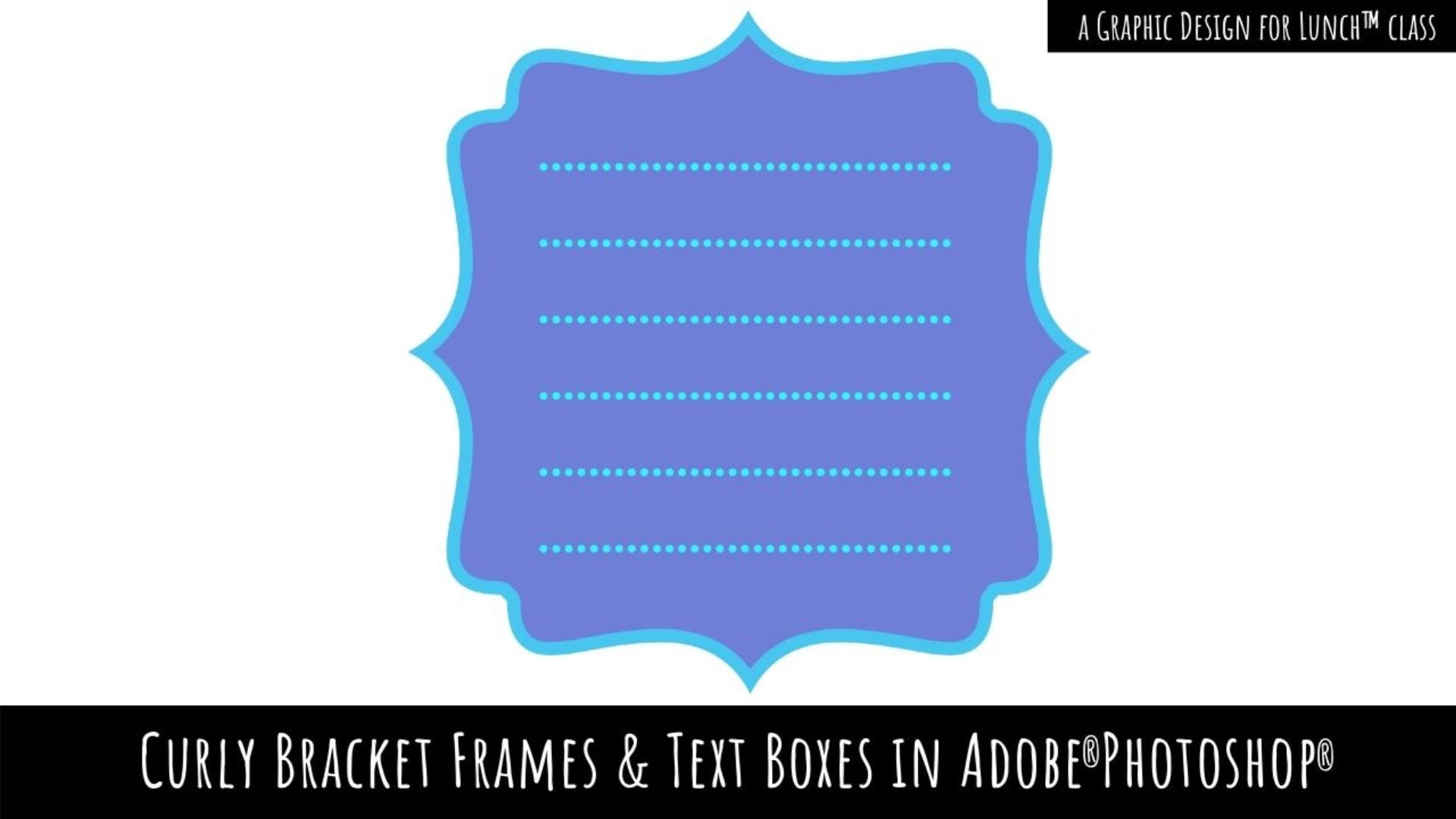
7. A Grab Bag of Fun Text Effects - Extra Video: This is an add on video to the texts class, and it comes as a result or somebody asking me how, instead of having a solid line around this text, you could do it with a dotted line or a dashed line. Now, the process isn't as easy as you might think. I'm going to show you how you can do it. I'm going to turn off all the elements that we had, and I'm just going to concentrate on the text as it was when we created it. I'm going to control click on the text layer because that selects the text. I'm going back to my select option, I'm going to choose modify and I'm going to expand this. We've expanded by however much we wanted to expand it. I'm going to expand it by 20 pixels. Now I'm also going to smooth this because there is an uneven edge to this line, and it's going to bite us a little bit later on if we don't smooth it a bit. I'll choose select and then modify, and then smooth. I'm going to smooth it ten pixels and just click "okay". Smoothing the outline is going to help us with the effect that we're going to create, but we still have some of these areas that we want to fill in. What we're going to click here in the bottom of the tools palette on the quick mask icon. Then we're going to go and pick up the paintbrush with a solid white filled brush. I'm going for a circular brush, its hardness is 100 percent. I can adjust its size as I paint and I want to make sure that white is my foreground color. I'm just going to paint out these areas because these are the areas that we want to add into our effect. As soon as I've done that, I'm going to click again on the quick mask icon to just turn that off. Right now we have a selection around our type. We're going to the past palette, and you can get to that by choosing window and then pause. You're going to click on this icon here, which is going to turn your selection into a work pass, we're just going to do that. Now, these are all the anchor points along the path that looks a bit scary at this point, but don't worry. Now we're going back to our document we're going to add a new empty layer that's really important to do at this point. With the past still visible, you'll choose layer, new fill layer, solid color. At this point you'll just click "okay". We're going to fill our path here with the white color. This is the white color that we were using as the background around our text, so we're just making sure we have white here, and I'll click "okay". Now the result of doing that, quite interestingly, when you use that particular command land, you fill layer solid color when you have a work path selected is you create a shape. We've created a shape layer and the shape layer is the only easy, reliable way of adding a dashed line to our path. Let's go back here to the color fill layer. Now, I'm going to control click on the thumbnail for this last so I get my marching answer. I'm going to click on a shape tool, it doesn't matter what's showing at this toolbar position. It just has to be a shaped tool, because this gives you access to the shape properties. Now I'm going to go and select a blue color for my line, and I am going to increase the weight of my line, so I'm getting quite a thick line. That's pretty much the point at which we were at earlier, but there are options with the shape here that you can use for your strokes. I'm just opening up this panel here, and here is where I get my dashed lines and even my dotted lines. You can make a choice as to what you use at this point. Now, I've got a dashed line and just think my stroke weight is a little bit thick, so I'm just going to wine that down to about four. Then I'm going to click away from my shape here. I'm going to press control or command D to deselect my selection, and underneath here, I still have my type, so I'm just going to bring my type up over the top of my field layer. Now selecting the color fill layer actually is a color fill layer with a shape, we could go ahead and add a drop shadow to it. I'm just going to do that really quickly not worry too much about the drop shadow, but just the principle of how you would go ahead, and add a drop shadow to it. There in answer to the question is how you would create a dashed line around your shape rather than the solid line. It's far from perfect, Photoshop is not really good at vector shapes. This would obviously be a whole lot easier to do in illustrator, but there is a method for doing it here in Photoshop.
 Helen Bradley, Graphic Design for Lunch™