Transcripts
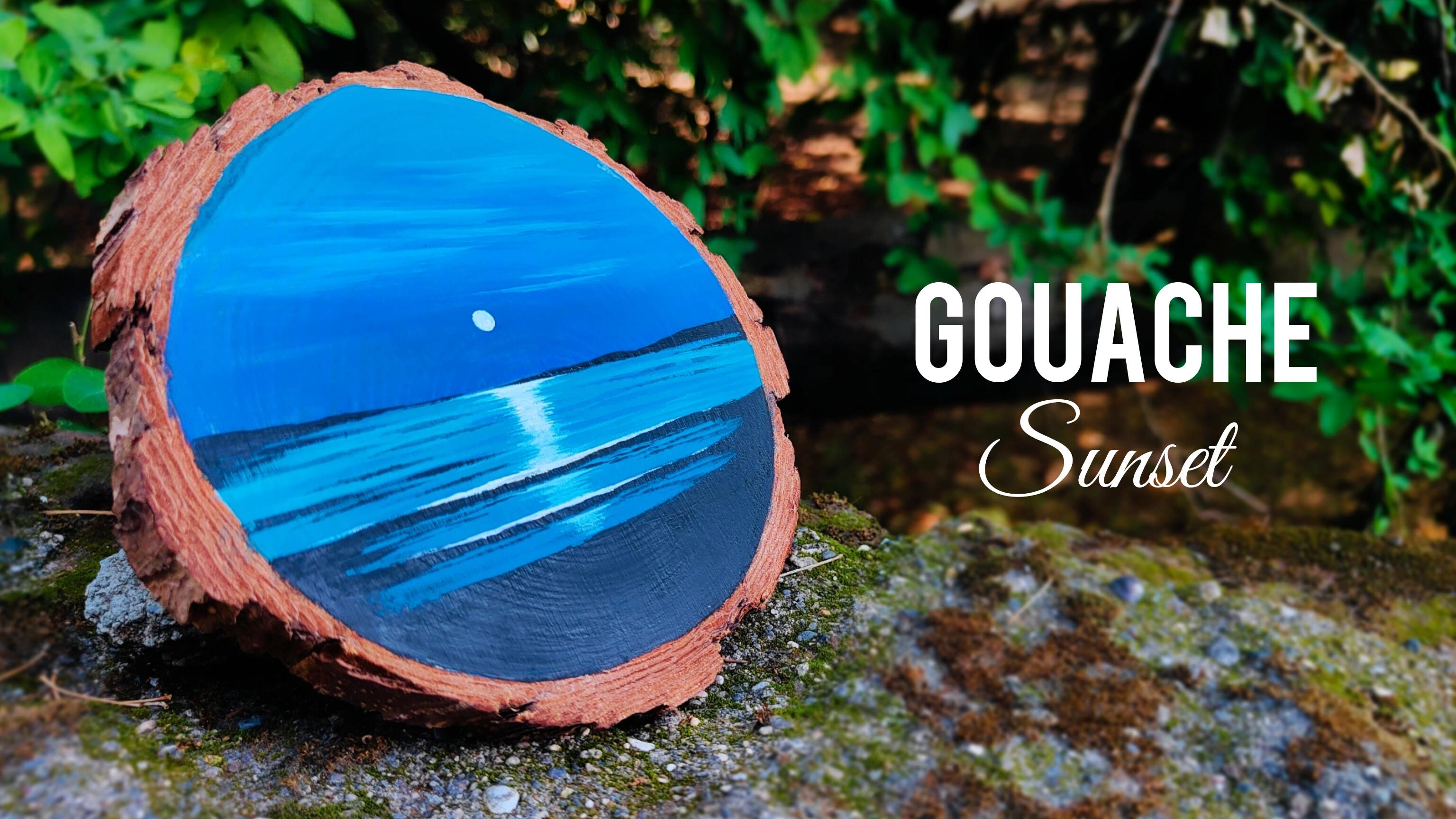
1. Welcome to the Class: When we talk about beach sunset, I personally love the
color combinations that we find in the sky
and the water area. Wash is an amazing art medium
that you can explore if you want a beautiful
matte finish on the surface that
you're painting. In this class, we are going
to paint a beautiful, vibrant beach sunset
on a wooden coaster. Hey, everybody.
Myself RudwikPatel. I'm a self taught, independent artist and an interior
designer by profession. I personally love to explore different art forms and styles and not stick to
one particular thing. So if you are joining
me, you'll find a variety of classes
that I create. You're going to start
by understanding all the art supplies that you will need for
the entire class. No need to worry at all. For the entire class, you'll need some basic art supplies, and in case you want to take up the entire project on a paper, that is absolutely okay. You're going to talk
about the gauche colors that you will need
for the entire class. You're going to start by
creating a beautiful sky area, which includes a lot
of blue color in it. You're going to
paint some beautiful abstract clouds in the sky area. Then we are going to
paint the water body having a beautiful
gradient effect in it, followed by some beautiful waves that we are going
to paint in detail. For completing the
entire painting, we are going to use some
basic painting techniques that you will definitely enjoy. It will definitely increase your hand movement
and painting skills. At the end, we are going
to paint a beautiful sun and its reflection effect
onto the water body. By the end of the
class, you'll have a beautiful sunset painting on a coaster using the
medium of gouache colors. It's a very short class that will be completed in 30 minutes. I'm very excited to share
this class with all of you. So without any delay, grab your art supplies and join
me on this creative journey.
2. Art Supplies: Hey, everybody. So before
we start with the class, let us talk about all the art
supplies that you will need for the entire class. No
need to worry at all. In case you are missing out
on any particular art supply, you'll find it very easily in
any nearby local art store, or you can go for any other
good alternative as well. So let us start by talking about the brushes
that you will need. So for the entire class, you'll
need three basic brushes. Let us talk about
two of them first. So the first one is a
flat brush of size seven. The second one is a round
brush of size four. Then we have the last brush, which is a detailing brush, which is a round brush
basically of size zero. Then next up, I have
a simple pencil that we are going to use to draw
a basic reference line. Then next up, we have
a simple tissue paper that is very important to keep side by when
you are painting. It will help you to remove excess amount of water and
color while you're painting. Then next up, I have a simple color palette
that you can observe. Always try to have
a color palette, which is having enough
space to take out multiple colors in it
and mix the colors well. It's a simple fiber
color palette. You can go for any other
good alternative as well. Then next up, I have a
simple glass container in which I have kept
some clear water, which we will use to clean the brushes and mix
the colors well. Then the next art supply is the main art supply
for the entire class, which is the wooden coaster. You can find this
wooden coaster very easily in any nearby
local art store. Its diameter is
approximately 5 ". And if you want to
paint the sunset on a watercolor paper,
that is completely fine. Now let us talk about the gouache color
that you will need. So the first one is white. The second one is ultramarine. Then we have Coval blue, serleine blue,
turquoise, and black. These are six basic wash colors that you will need
for the entire class. In case you are missing
out on these shades, you can go for any other
good alternative, as well. So these are all the art
supplies that you will need. Now let us move
towards the next part.
3. Painting the Sky: Everybody. So now let us
start with the first step, which is painting the sky. So you can observe
that I have placed my coaster on the desk surface. I'll be using a simple pencil to draw a simple
horizontal line. It basically divides the sky
area and the water body. You can observe the way I
have placed some clear water, or tissue paper, and the
color palette nearby. Let us start with
the first color. So the first shade of blue
that I'm using is ultramarine. I have taken some color
in the color palette. I'll be using my
flat brush of size seven and take a
little bit of water, mix it well with the color. No need to hurry at all. Try to get a nice thick composition. Try to have less
amount of water and more color so that you can get
a nice thick, solid color. Now, use the brush
in the way I'm using right now and simply apply
it above the horizon line. No need to hurry at all,
and make sure that you do not move your brush
below the horizon line. If you find that your color is getting finished from the brush, you can definitely
take some more color from the color palette. Since it's a wooden surface, it will absorb some
of your color, and that's why you have to take some color again from
the color palette. In case you find
that the saturation of the color is a
little bit less, try to have less amount
of water in your brush. Simply dab your brush
onto the tissue paper. The best part is that you
can rotate the coaster in case you want to get a comfortable position
while painting. So you can observe
that we have applied a beautiful patch of ultramarine just above the horizon line. I'll be just cleaning my brush, tab it onto the tissue paper. Let us take another color
which is going to be bal blue. So I've taken some bal
blue in the color palette. Again, we'll mix it
well with water. Try to have less amount
of water and more color. Now simply apply the bal blue on the upper portion of ultramarine so that we can get a beautiful
variation in the color. We are basically going to
create a nice gradient effect. That's why we are using
different shades of blue. You can observe the difference between both the
colors right now. Now, in order to blend
both the colors, it's a very simple
and easy step. You just have to clean
your flat brush in water, dab it onto the tissue paper, and simply apply
the brush between both the colors. No
need to hurry at all. The more horizontal
strokes you'll apply, the better blend of both
the colors you'll get. The best part about
gouache colors is that you can regenerate the color if you want to by adding a little bit
of water on the surface. So right now you can
observe that we have got a beautiful gradient
effect between cobal blue and ultramarine
in the bottom portion. Now we have some
topmost portion left where we are going to take
a lighter shade of blue. I hope that you
got an exact idea of how to create a
beautiful gradient effect. Now, if you find that there
is any certain portion where you find the color
is not applied properly, you can take some
more color from the color palette and apply
it on that particular area. Now I'll be taking some serlein blue in the color palette. Take a little bit of color
in the color palette and let us add it with a
little bit of turquoise. So we're going to combine
both the colors together. And we are going to apply
it on the topmost portion. So mix the colors well, add a little bit of water, not in an axis amount. Try to have a thick coat of
water on the topmost portion. Be a little bit careful near
the outline of the coaster, and just use the tip
of your flat brush. Now, simply, we
are going to apply the color patch on
the topmost portion, and we are going to blend
it with the cobalt blue. No need to hurry at all, take your time and paint it slowly. Now simply clean
your brush in water, now dab it onto the tissue paper and make
it a little bit dry. Now, you have to apply
these horizontal strokes in the similar way that we did with bal blue and ultramarine, and you'll observe
a beautiful blend of all the three shades. So it basically creates a nice gradient effect
in the entire sky area. The more horizontal strokes you'll apply between the colors, the better blend you'll get. Just make sure that you clean
your brush well in water, nab it onto the tissue paper
to make it a little bit dry, and then you can reapply
the horizontal strokes. So this is how we have created a beautiful background
for the entire sky area. Now let us paint some beautiful
abstract clouds as well. I'll be taking some white
color in the color palette. And you're definitely
going to enjoy the entire process of
painting the clouds. Take a little bit of
water in your flat brush, and you can add a little bit of turquoise and serlein blue
in white color to get a light shade of blue color because we don't
want the clouds to be in a very contrast manner. That's why I've added
this little color. In case you want to
paint the clouds directly using a white color,
it is completely fine. You're free to explore
and experiment. Now using my flat brush
in this particular angle, I'm getting these thin strokes, and you just have to randomly apply these horizontal lines, combining together to form an abstract cloud
in the sky area. No need to worry about
the sharp white lines. We are going to make them a
little bit blur and dull. So once we have applied
the white lines, just dab your brush
onto the tissue paper, clean it well in water, and reapply it on the strokes that we
have applied initially. You'll observe that
the saturation of these strokes will
decrease a little bit, and the clouds will also get a little bit of blend with
the background color. One thing that you
have to take care of is that no need to apply
a lot of pressure. If you'll apply a
lot of pressure, your clouds will completely blend and it will not
be that much visible. So you can observe
a lighter shade of some cloud effect that
we have created right now. Now in certain portions, you can apply some dark shadow
effect as well by taking a little bit of ultramarine
from the color palette, and you can apply it
on the bottom portion of the clouds that
we have painted. No need to worry about the solid white patches
that we have created. We are also going to
add few more strokes to make the clouds
look a little bit more attractive and aesthetic. Right now, I'm just creating this little shadow
effect by adding these darker shades in
the bottom portion. You can observe
the way I'm using my flat brush in an angle
to get these thin strokes. Trust me, you'll be
definitely able to get a beautiful blend between the gauche colors once you
start working with it. So no need to worry
about getting a beautiful gradient effect
or painting the clouds. You just have to
use your brush in a careful manner and observe the capacity of
water that you are taking. So now, I'll be taking
a few more strokes of solid white color, which we have added with a little bit of turquoise
and Kobal blue. You can reapply
these thin strokes randomly in the sky area. And basically applying
these strokes in the topmost portion, you can also add few strokes in the bottom part near
the horizon line. So we are done
with the sky area. Let us move towards
the next part.
4. Painting the Water: Hey, everybody. So we are
done with the sky area. Now let us paint the water body. So now we are going
to paint the water in the bottom portion
below the horizon line. So I'll be taking a little
bit of turquoise in the color palette since the color is finished
from the color palette. Take a little bit of
cobal blue as well. We're going to mix them well, and we're going to
start by applying the first color just
below the horizon line. Now it's a mix and match of
all the shades together, so it is not at
all compulsory for you to get an exact shade. There can be a little
bit of difference, and it is absolutely fine. So I'll be taking a
little bit of water, get a nice thick consistency. Try to have less amount
of water, of course, so that you can get a
beautiful thick coat of color. Now, use the tip of your
flat brush carefully. You can use the flat
brush in an angle to paint below the horizon
line in a careful manner. No need to hurry at
all and make sure that your brush do not move
above the horizon line. It will spoil your sky area. Now I'll be applying
a little patch of this particular shade
below the horizon line. And similarly, we
are going to create a gradient effect in this particular water
body area as well. You can be a little bit careful near the outline of
the entire coaster, as you can observe, it's
looking really nice once you paint near the circumference
of the entire circle. In case you find that your brush is having excess
amount of water in it, just simply dab it
onto the tissue paper. Now we are already
having a little bit of serlein blue in
the color palette. Take it from the color palette, add a little bit of water, and apply it just
below the turquoise and cobal blue that we have applied below the horizon line. You can right now observe a difference between
both the colors, but we are going to blend them together to create a
nice gradient effect. You can observe that
I'm being a little bit careful near the circumference
of the entire coaster. That's because I do not want to paint on the dark brown
color of the coaster. So no need to hurry at all. Take your time and paint in a very slow and
steady manner. Now, once we are done applying
this particular color, we are going to blend both
the colors together as well. So just simply clean
your flat brush, dab it onto the tissue paper, make it a little bit dry, and apply these horizontal strokes between both the colors. The more horizontal
strokes you'll apply, the better blend you'll get. So now you can observe
that we have created a beautiful gradient effect
in the water area as well. Now, to create some
nice wavy texture and to add some depth
in the water body, you're going to take a
little bit of white. I'm adding a little bit of
turquoise and cobalblue in it. And I'm going to use my
round brrush of size four. No need to hurry at all. I'm going to apply these
little horizontal strokes just below the horizon line in a very random
and natural way. There is no specific way of applying these
horizontal strokes. So're free to explore
and experiment and add these strokes
randomly according to your convenience. It
is completely fine. Right now, if you
observe carefully, these strokes are
looking really sharp. You're going to make
them a little bit blur by just adding a
little bit of water. You can reapply these strokes
on that particular area, and you'll observe
that these strokes will get a little
bit less saturated, and it will get a nice blend with the background
color as well. It's a very simple
and easy step. You just have to
take a little bit of water in your brush, simply dab it onto the tissue paper and reapply
the horizontal strokes. You can apply these strokes in the bottom portion as well.
It is completely fine. Since we have a beautiful plain gradient water
body in the background, you can take a little
bit of white color from the color palette and just add these little horizontal
strokes in the bottom area. While you're working with a
round brush of size four, try to be a little bit careful. Use the tip of your
round brush to get thin strokes and try to apply
very less pressure on it. If you observe carefully by adding these
horizontal strokes, we create some nice details
in the water body as well. Let me tell you once again that no need to
worry about adding the horizontal strokes in the exact same way I'm
painting right now, it's a very random
and natural step. So it is absolutely fine if you observe carefully
the movement of the brush that I'm doing right now and don't worry
about these strokes. You can just add them
according to your convenience. I'll be taking a little bit of ultramarine in the color
palette which is basically a little bit darker shade of blue to create some
nice shadow effect, I'll be taking my round
brush of size four again. Take a little bit of water to lose the color up
and simply I'll be adding it below the
first horizontal strokes that we applied in
the water body. To create a nice
shadow effect and it will also enhance the
white strokes as well. So I'm just using the
tip of my round brush and apply very less pressure on it to get a nice thin stroke. In case you find that your brush is having excess
amount of water in it, just simply dab your brush onto the tissue paper so that axis amount of
water will be removed. Now to create some more depth, I'll be taking a little bit of black color in
the color palette, mix it with ultramarine to make the saturation of black
color a little bit less, and we are going to apply
it below the horizon line. By doing this, we create
some more shadow effect and it creates some nice depth
near the horizon line. These steps are absolutely same. You just have to create these
horizontal lines randomly. If you apply it below
the white strokes, it will look even more nice. So we are done with
the water body. Now let us move
towards the next step.
5. Painting the Waves: Hey, everybody. So we are
done painting the water body. Now let us paint the
waves in detail. So using the same round
brush of size four, I have taken some solid black
color in the color palette, mix it well with water and try to have less
amount of water and more color so that you get a highly saturated
solid black color. So we are starting by creating
a simple horizontal line, which is a little bit tilted. So you can observe that
I have started from the left hand portion slowly moving towards
the right hand side. So this is basically a
nice shadow of a big wave. Similarly, we have to create another horizontal line
just below the first one. Try to have a little bit of
space between both the lines. You can make the line
a little bit thicker by applying multiple
horizontal strokes. Now simply, I'll be creating another horizontal line
by leaving some space, and below that, we are going
to paint it completely solid black since it's the landscape area in the bottom portion. No need to hurry at all, take some good amount of solid
black color in your brush, make a good composition of
water and color together. Try to have less amount
of water and more color. Now slowly start applying the color patch in the
entire bottom portion. If you find that your brush is having excess amount
of water in it, just simply dab it onto the tissue paper so that excess amount of water
will be removed, and you'll be able
to get a nice, highly saturated black color. You have to be a
little bit careful near the circumference
of the entire circle. So paint a little
bit slowly near that particular area so that you get a perfect
circular shape. So as you can observe,
we have applied a nice solid black color in
the entire bottom portion, which is the landscape area. Now, in order to
make the waves look a little bit more in
depth and detail, what we are going to do is using the same round
brush of size four, take some solid
black color in it, and simply start applying these horizontal strokes
in the right hand side. Similarly, we are going to apply these little horizontal strokes on the left hand
portion as well. No need to complete
the entire stroke. You just have to keep it incomplete and just
leave the stroke. So you can observe a beautiful
depth on both the sides. Whenever you want
to create a nice, natural horizontal
random stroke, there is a simple technique
that you can follow. Try to use the tip of
your brush and apply very less pressure so that you get a nice thin
horizontal stroke. No need to worry about getting a perfect horizontal stroke. It comes with practice, so no need to worry
about perfection. Now as you can observe,
I have applied few horizontal strokes on the topmost right
hanside portion. Similarly, you can
randomly apply these strokes just
below the waves. So you just have to
simply use the tip of your round brush to create these random horizontal strokes. In case you find that your color is getting finished
from the brush, you just have to
take some more color from the color palette and in case you find that there is excess amount of
water in your brush, just simply dab it
onto the tissue paper. I'll be creating a little bit of landscape just above
the horizon line, starting from the
left hand portion. You just have to create this
little solid black patch. Similarly, we'll be adding this landscape area in the
right hand side as well, just above the horizon line. You can improvise the
topmost portion of the landscape area by adding a nice outline on
the topmost portion. So we are almost done painting the landscape area just
above the horizon line. Now I'll be using my
round brush of size zero, and we are going
to take some solid white color in the
color palette. So we want to make
a beautiful sun, take some good amount
of white colour, mix it well with water, try to have less amount
of water and more color. Now using the brush, we are going to create
a simple circular shape in the sky area. No
need to hurry at all. You have to do this
particular step with a lot of patience and
try to paint it slowly. You just have to create
a simple circular shape. In case you want to experiment, you can decide the
position of the sun according to your convenience.
It is completely fine. So I've taken a little bit of space from the horizon line, and I have painted
this beautiful sun, having a simple circular shape. You have to use the tip
of your round brush and try to apply very less
pressure on your brush. So now using the same brush, we are going to create a
nice reflection effect of the sun onto the water body. So you just have to take
some more white color, apply a nice thin stroke just above the solid black line of the wave that
we have created. We are just going to vanish the entire line once we
come towards the ends, and we are going
to keep the line a little bit thick on
the center portion. That is because the
reflection is going to be maximum on the center
portion of the entire wave. So in order to get a thick line, you just have to apply a
little bit more pressure. You can reapply some
horizontal strokes in that particular area as well. And once you come towards the ends on the right
and left hand side, you just have to apply very
less pressure on your brush. Use the tip of your
round brush and get a beautiful
thin white stroke. Now, you can observe
that the waves get a little bit more enhanced. You can reapply white
colour on the sun to get a nice vibrant
solid white color as well. Now to enhance the entire
water body a little bit more, I'm going to mix a little bit of turquoise and cobal
blue in white color. And now we are going to add a beautiful reflection effect, and it's a very simple
and easy technique. So we are going to start
just below the horizon line. You just have to use the
tip of your round brush and create these little
horizontal strokes in a very random
and natural way. Try to attach all the
horizontal strokes together, and slowly, we are going to
move towards the bottom area. You can observe the
way I'm decreasing and increasing the size of the horizontal strokes
that I'm making. If you find that your color is getting finished
from the bra, feel free to take some more
color from the color palette. Slowly, we are going to move
towards the bottom area, connecting it with the
waves that we have painted. But make sure that
you do not apply these solid white strokes
on the solid black color. So I have left the solid
black line, and again, we are going to apply the same reflection effect
on the bottom part. The more horizontal
strokes you'll apply, the better your reflection
effect is going to look. So you can observe
carefully the way I'm using the tip
of my round brush. I'll be adding a little bit of reflection effect on the
bottom area as well. So if you observe carefully, I have added the entire
reflection effect just below the sun
that we have painted, and it looks really aesthetic. You're free to experiment and explore and decide the
position of the sun. Wherever you paint the sun, just make sure that you paint the reflection effect
just below that. Now in order to create
the reflection effect, a little bit more vibrant, I'll be taking a little bit of solid white color in
the color palette Now, this time we are
not going to add cobal blue and turquoise in it. It is completely white. Add a little bit of water and try to have less
amount of water in it. Now, similarly, I'm
going to just add solid white strokes just below the sun onto the
reflection effect. But this time the
horizontal strokes are a little bit smaller
than the first one, and we are just going to
repeat the same steps. So we are done with
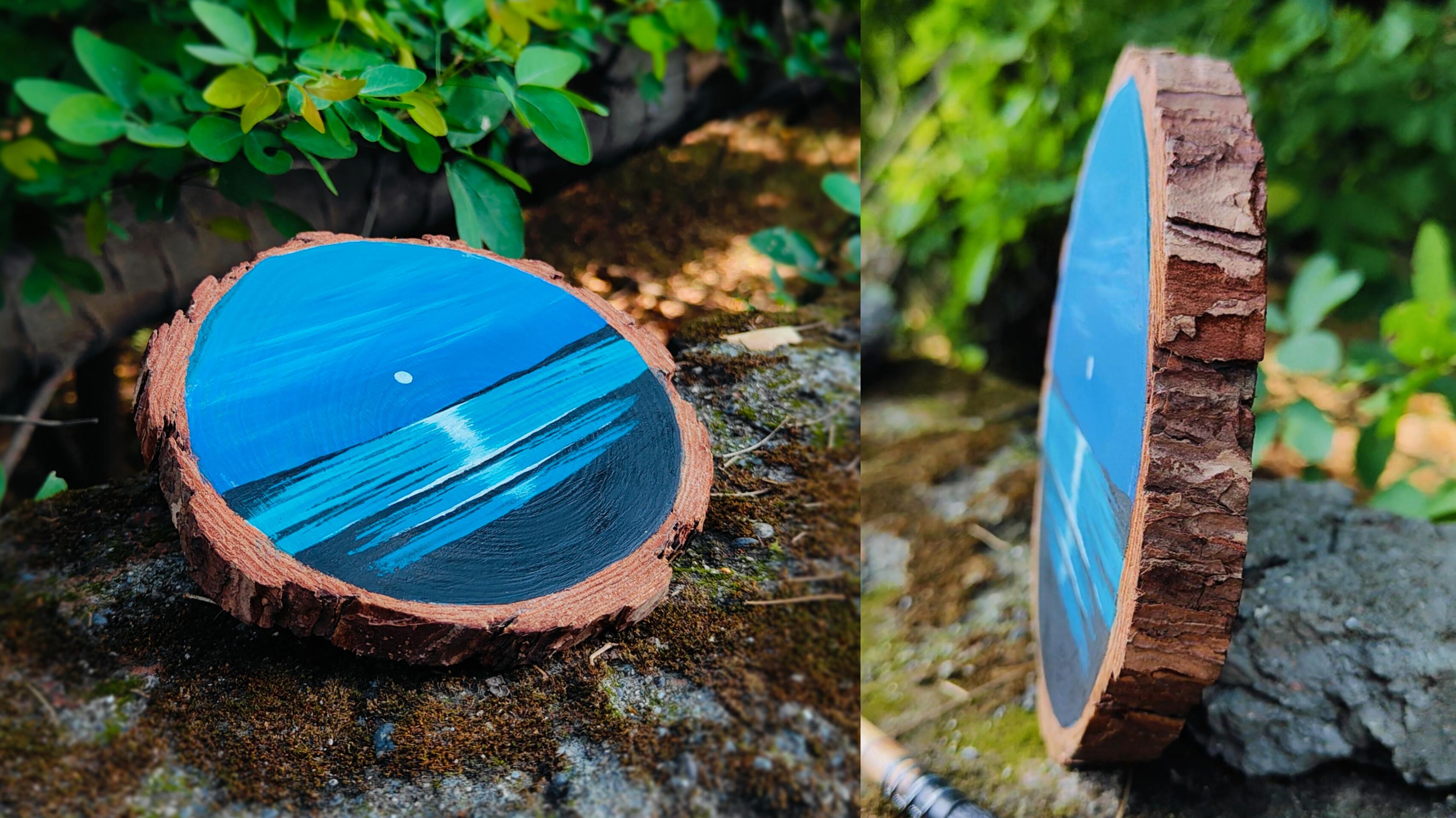
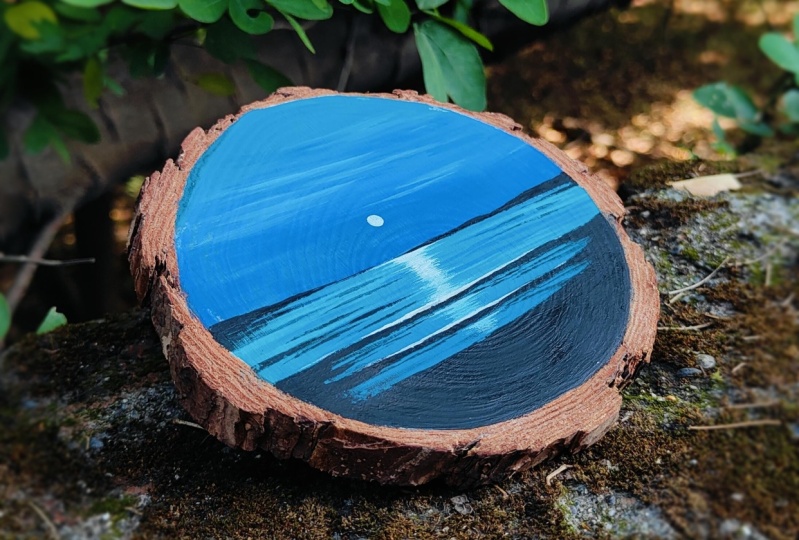
the entire painting. Now let me take you
a little bit closer so that you can observe
all the details carefully. You can see the way
we have combined minimal elements together to form a beautiful beach sunset. The painting is not
at all complicated. It takes basic
painting techniques and a minimal colour palette. I hope that you enjoyed creating this particular gouache
painting on a coaster. You're free to explore and experiment with
the entire scene, and you can also create it on
a watercolor paper as well. I'm very happy to share
this class with all of you. You can also experiment with
the entire color palette. So now let us move
towards the next part.
6. Class Conclusion: Hello and welcome to
the class conclusion. I hope that you enjoyed
the entire class. You are free to explore and experiment with
the entire class. In case you do not want to create the beach
sunset on a coaster, you are free to do it on a
watercolor paper as well. Just enjoy the
process of creating. It would be really great
if you leave a review for the class as it
encourages me a lot, and my class can reach many
more students like you. Feel free to ask any
questions or doubts related to the class in
the discussion section, and do not forget to add
your class projects. At the end, I would like to say, keep learning, keep practicing. Thank you so much for joining the class and happy painting.
 Rutvik Patel, Artist and Instructor