Transcripts
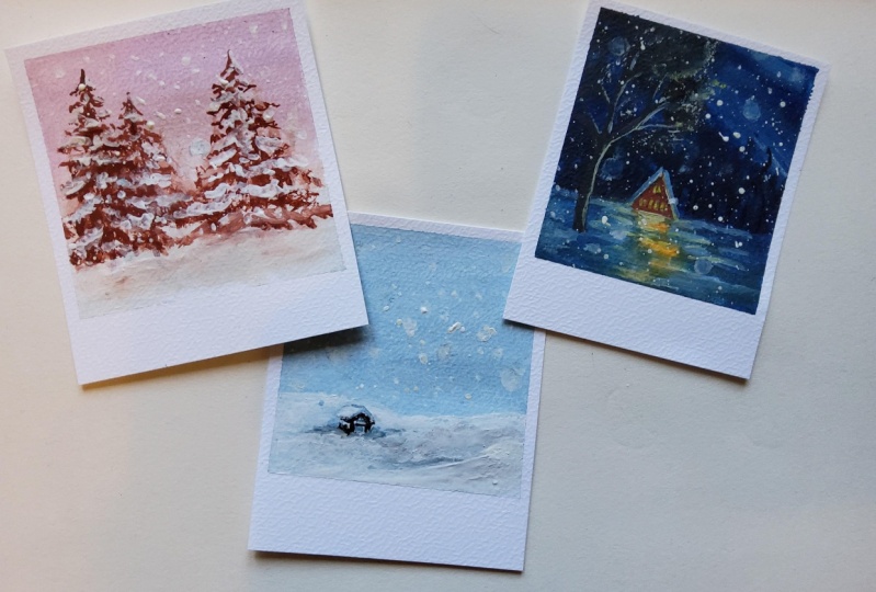
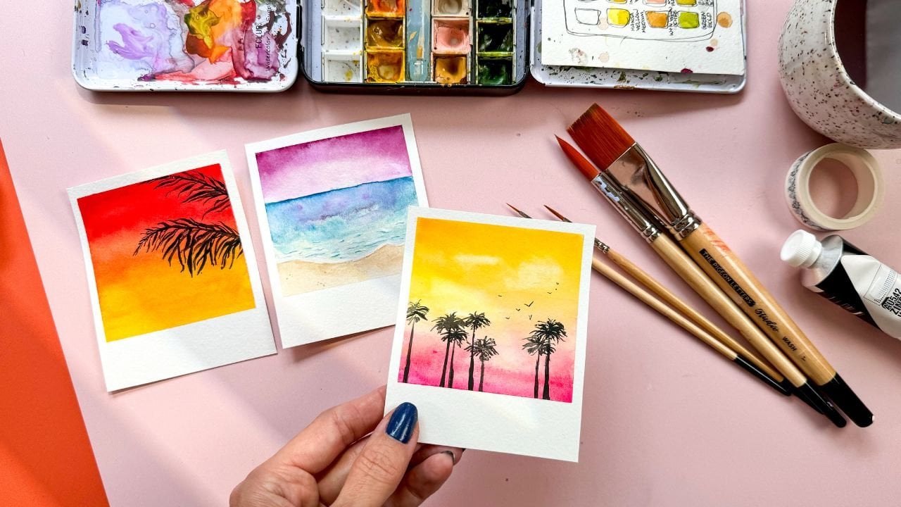
1. Welcome to Winter Snowscape Polaroids!: Winter has this special kind
of magic, don't you think? It's peaceful, cozy, and
perfect for inspiration. And in this class,
we're going to capture that inspiration and that magic and small
polroid style paintings that are as nostalgic
as they are beautiful. And I have designed an
easy to follow class to help you create a darling
finished project, even if you've never
worked with quash before. I am Peggy Dean, and I am an artist, author, and educator. My favorite thing in
the whole world is to bring you resources that
are easy to implement. And in this class, you are going to get
a couple of things. I'm going to guide you through
everything step by step, including how to layer colors, how to add details, and use brushes in ways
that feel natural and fun. And by the end of
this course, you will have a collection of mini winter scape
artworks framed in the timeless charm of polroids and you'll
also walk away with gouache painting skills that you can carry into
your next projects. So whether it's experimenting
with new color palettes, creating atmosphere
in your paintings or mastering that cozy
nostalgic detail, these are techniques that will weave into your go to tools for any future artwork because it's about learning
in a way that feels stress free with
results that you will love. So let's dive in and create
something beautiful together.
2. Supplies: Supplies we will be using. So we need watercolor paper. You can use mixed media paper, but if you tend to be
heavy with water use, I would say it will be in your best interest for
something heavier. Either way, we'll work. This is a nine by 12 piece of paper. You can use any size as long
as you remember that you're dividing into threes because that's what we're
gonna do together. And then we can cut
our paper from there. So we're going to go
over that, but just make sure you have at
least an eight by ten, um piece of paper so that you can work with cute
little polaroids. We're also going to be
using a main large brush. So this is a wash brush. Anything that creates like
a wash over a larger area, and then a small round brush. This is a number four.
Even finer is great, too. You'll get a little more
coverage with four or six, but I'm going to
stick with a four. You'll need a ruler.
You'll need some tape. This is washy tape. You
can use painter's tape. Anything that's not going
to ruin your paper, but still creates
a nice crisp line as a guide. You'll need guash. The colors I'm using a blue. I'm going to end up mixing this blue quite a
bit with white. So it doesn't have to be any
particular shade of blue. Of course, you can mix
colors if you want to, but I wanted to limit
these colors in order to basically make it
easier for everybody else. You'll also need a
black or a dark color. So I'm going to grab
Prussian blue here. I'll also be mixing my blue
with the darker tones, and I'll also be using this
straight out of the tube. So if you want to use
black, you can do that. You can also use
really deep color, like that won't
neutralize the blue tune. Well, neutralizing
would be fine, actually, as long as it's
dark and creates contrast. And then I'll also want
a grounding color. So this is burnt sienna.
You could use a brown. You can even use a red or an orange because
when you mix colors, you can create something
that's more neutral. And lastly, I would say a red or a pink for
one of the scenes, and I'm going to be
using coral red. It's really pretty
out of the tube, but chances are you
probably I mean, you may or may not have
this, but you could go with a regular red as well
and mix it with white. But I'm obsessed with these
colors right out of the tube. This is acrylic guash, so it's acrylic based guash. You can use regular guash. You can also use acrylic paint. The reason why I like
acrylic guash is because a lot of acrylic has that sheen
to it when it's finished. It doesn't have
that matte finish when you're done,
and this one does. So I would go, if you have acrylic
based squash, it is so fun to use. So I would do that. And
then let's see what else? A palette, a mixing pallet. I use the stay wet palette. I'll link all this stuff, too, if you like if you
end up liking what I am using so that you
have quick access. But you can also
make something like this an airtight container. So this is palette paper, and you can get this. Like if you use any
sort of acrylic or oil, look for that kind
of palette paper. But underneath this,
it's real messy because I paint like
splattered everywhere. But this is just a moist, like, very thin sponge, and it holds the moisture in the paint so that it extends
the life of the paint. So rather than putting
something like acrylic on it mixing palette
and then having it dry in, you know, 20 minutes, this will last a couple
of weeks for your paint, so it extends the life,
which is really great. And then, lastly,
your jar of water, two jars of water are ideal. That way you have, like,
your warm and cool tone, or you can use, like, a dirty and then
a sort of dirty, but we're rinsing
the rest of it off. So however you like to
use your water jars, but that's all you need. So let us start. Let's get our frames
put in place.
3. Set Up Your Polaroid Frames: Alright, let's get
our frames palace. Now, I forgot to mention
optional is a pencil. It will be more
helpful to use one, so I would grab one of those. And this is just to get
our frames situated. Now, you can go according to legitimate polroid sizes or you can take your paper
and divide it in threes. If you're using an eight by
ten or something smaller, I would actually work this
way because you can get one, two, three, four
polroids out of that. I just like to work
left to right. It's just easier for me, and then I can use this as
a scrap for anything else. But what I'll do first is I actually start
to frame right away. So if I think about the
outer edge of a polaroid, I want you know about
this much space. So I know to tape off
right away in that space. So when you take
your washi tape, you don't want to lay it down over the edge of
the paper thinking like, Okay, well, I'm going to get it to the edge and call it good. And the reason why
is because then that's keeping this
much of a gap. And we actually only want
to keep about this much. So in this instance, you could mark it
off with pencil, but what I'm going to do
is just kind of eyeball that strip and make sure that it is approximately
where I need it. I don't usually get
too precious with these as long as it's
seemingly straight. And so I'll just tape
this down to my surface. Now, if you're using
stickier tape, I would be careful with how much you press it to the paper. The main part that
matters is that the seam that's
connecting to the paper, like, the very edge, that
that is nice and firm. The rest of it doesn't really as long as it has a nice grip, but the seam is what matters. And the reason why is
because as we paint, we're going to be
going over, I mean, I guess not air quotes, but we're going
over that line and we want that to be
a nice crisp edge. Okay, so from here, I actually start
with the middle, and I go about
three inch inches. So if I want a square, and I know I'm going 3 ", by the way, if I divide 12
by three, it's getting four. So as long as it's a
number that's higher than three when I'm dividing
the length of my page, that's good because
I'm going to need that breathing room because the interior is the square
is going to be 3 ". So if I want it to be a square, then I'm going to
want to measure from the edge here down
to the bottom, so I know that that is
where my square is going to be at the base. So I'll measure I'll just
do a little mark on each of the three inch spaces. And then after that, I can measure from
the actual inside. If you care about measurements
and being really specific, you can always go in and
find the middle point. So this is six. So
the middle point would be approximately here, which means that 3 ", I mean, if you want to get
real specific, it'd be 1.5. Right here. And then I've
got my zero and three. But honestly, that does not matter because we're
gonna cut this anyway. But if you want to
make sure you have enough room and you know you always mess up
your measurements, I say that because I'm one of those people. This is
going to be helpful. So before we measure
the rest of it, I will go ahead and lay
down this washy here, so I'm going to go
just underneath the mark I made because that will leave that
three inch space inside, which is what we want. So again, just making sure that that's nice
and firm at the edge. And then here and here, we want to add some
tape, as well. If you don't know, if you have an issue,
making sure it's even, you can also mark it down here. I feel like 3 " I can eyeball enough to where
I'm not going to be upset if it's not perfectly straight because it's going to look pretty straight. And I'll just lay
this down right here. Now, this is going to leave
just about the amount of space on either side when after we're done
with these blocks, if you cut it right in the middle to keep about
the same amount of edge, you can This is a little skinnier than
what this will make. So I'll end up trimming
that slightly, but just as an FYI. Now, the other side here, I want to make sure
on this side on this side that we're leaving
those marks on the inside. So the 3 " is what we're
leaving with space. So what I usually do, I don't even Well,
sometimes I mark it, but sometimes I'll also
just hold the ruler. So I have, let's say,
one, two, three. Okay, so it looks like I went over, which I don't even know. Oh, no, I didn't. Here we go. So I have the
beginning right here, and then I have the 3 ". So it's approximately
3 ". That'll work. And then it doesn't
matter what comes down underneath because we're just going to be working
inside of these squares. Now, this tape that's in
the middle does have to be secure on both sides because we're working
inside of these. So same thing here now. I'll go ahead and measure. About 3 " to about here. And then let's
just line this up, seven, eight, nine, ten,
about 3 " right here. So I will go on the
other side of the mark I made so that I can make sure
that 3 " on the inside. And the reason why I care so much about measurements
is because it ensures that they're
all consistent. All the polroids that are done
will all be the same size, and that's just cute to
have that collection. Okay, so that's framing it. And then it allows
you to make sure you have room underneath so that when you cut
your polarids out, you still have that little
um space that you can write, a little note like a polaroid, and then you'll have
this scrap piece of paper to do whatever
you want with. So framing, done. Let us move into
adding our washes.
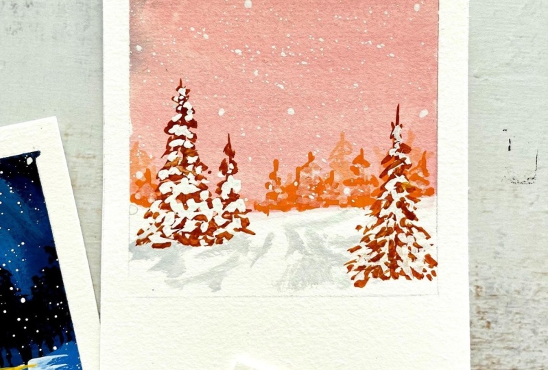
4. Paint Gouache Background Washes: When we set up our washes now, this is the same for
watercolor or guash. We are going to mix the color and then
just make sure we have a nice smooth surface coverage. And this is actually,
believe it or not, easier to do with guash
because we're not worried about getting such
specific water control. So I am going to take a blue and white and put that on my
palette and mix them together, and I want to get a
pretty light blue. I am using an acrylic
white because I I ran out of white guash, so I'm gonna have to have a little sheen and
be okay with it. But that is okay. For now. One of the things I
will recommend doing, if you have a big
brush like this, I don't love mixing color with these big brushes just because it soaks up so
much of the paint. So if you have a palette knife, I know that it's,
like, not a big, big deal, but that'll
be helpful or just grab a smaller brush
for now when you mix. And I always add water, so I just get my brush wet, and then I usually
start from the side. So I don't go right in
and goop it all up. I'll pull some of this out, and I'll mix next to it, 'cause I'll probably
end up using this more. I mean, I know I will end up needing to use more
of this color, but I'm going to that is
how I'm going to mix. And so, see that creates
a pretty light blue. That's what I'm looking for. And then I will grab
my larger brush, get that wet because
the water actually helps both acrylic and
guash spread really well. So it looks like I'm going to have to mix a lot
more of this, actually. So I'm going to use
this brush after all. But overall, that's what
I would say as a tip. But I was just noticing I didn't have quite enough on my brush. And we're going to
want this to be a pretty creamy consistency. So it's like melted
butter, essentially. So it's not too watery,
it's not chunky, and we're just going to cover the entire area of
one of these blocks. And it doesn't have to
be any specific way. If you have any areas that aren't solid or they look
like they have streaks, that's actually I would leave that because it's
going to be kind of part of the sky, and it
looks really pretty. But if you don't have
that, that's fine, too. But just don't try to
you don't need to make it like perfect coverage is
what I'm getting at here. Alright, so once that is down, we're gonna let that dry. If you want to, before it dries, you can grab some white, and you can create a
few streaks with that, and it's going to create
some of the streaks of, like, what I was talking
about to add some depth. It's really subtle, but it
does make a difference. You can also tap it in. Okay, so I'm going
to let that dry, and I'll move on to
the next one here, and I think that
it'll be fun to do these in three different tones. So let's go ahead and go
darker for this next one. And we will do a real deep blue. So I will go ahead and
grab Prussian blue. You could grab black to
mix with your other blue. I might actually end up pulling in some of the burnt sienna, so it's not super, super I don't want
it to be so vibrant. Well, it might work out well. No, see, I want mine to
be a little more muted. It will just a little bit, just to kind of neutralize it, and make it a little
bit more of that, like, deep, deep color. So I'll go ahead and do. Let's do about three
fourths of the way down. So we'll just cover this block. So when I get these edges, I'm not necessarily
going into them. I'm going out from them, and that's going to ensure I'm not accidentally
lifting the tape up. Or you can go side to side, but I wouldn't go into them, especially if your tape
isn't, like, wildly sticky. It's going to save you. Okay, when that deep,
deep color is in, what I want to do is bring in a little bit
of a lighter tone. So I will just go right
into this blue that I had, pick it up and put it over here, and then just to make sure I
know what the color is and then come through and just
do a few swipes in the sky. And these don't have to look
like anything in particular. So don't think it has to be
this streak to the left. It looks like I accidentally
got white in there, so I will. There we go. Just anything to create
some interest in the sky. And I wouldn't do
too many of those, so I'll smooth out some of the ones I just
made. There we go. And then that looks about good. Okay, so for the next one, let's do something with a
little bit of a different hue. So that's where I'll
bring in my coral. I'm going to really
rinse my brush, making sure that is
completely clean of the blue. So sometimes I'll
squeeze on the side, kind of tap it so that
excess blue comes off. And that's where your next
water jar comes in handy, just as, like, a second dip. And I want this to be
pretty light, as well. So I'll grab some of the white
to mix in with this coral. And again, if you
have red or pink or anything like that
that you want to use. The idea is just to have
a fun, different hue. Kind of like, you know,
right after dusk. So I'll grab mostly
white mix this up. Okay, so that's about
what I'm looking for. Just something really soft. And I'll take this one about
two thirds of the way down. So about here. And it doesn't have
to be perfect at all. Like your horizon line
where the sky meets the ground can be sloppy and messy because we're going to be
going over that. Okay. Once all of this dries
or when it's closer to dry, that's when we can start
adding the additional colors. So we'll put the basin and
start carving that out. So when we think about
scenes like this, especially with little
plaides with paintings, I think it's really
fun to think about it where the sky or the ground
takes up most of the space. So in this case, we
haven't done this one yet, but in this case,
it'll be the sky is really taking up
space. Same thing. Sky's really taking up space. I think that that'll
be a fun series, but it's also fun to
think about cropping. So if we went really, really
close, where we have, like, tree branches, and that's
all that you're seeing, you know, something like
that is really fun. So think about framing and how
you might want to do that. But for now, we'll go
ahead and put in some simple maybe a fourth or a
third of the way ground. And you can do this with a light version of
what we're using. Now, one of the things that I notice a lot is when
it's time to paint snow, we think that we need to go for pure white and
pure white only. But if you look at snow, it's got so many
hues in it, like, from pinks to purples to
blues, all sorts of things. So and then when we think about reflections on top
of that, you know, for using the sky and then that's reflected,
there's that to think about. So don't think you have to
get this bright bright white. In this case, I want
to grab some of this blue but have mostly white
because in this one, we have this nice day, scene. So from here, I'm
just going to create just an imperfect line
and then smooth that out. I do have some pink
still on my brush. So I'll go ahead and cover that once I have
this base in place. Okay. Now, I do
like some streaks. I'm actually I think
I'm going to leave the pink because I
kind of like it. Typically, what I'll do
once this layer dries is add in a little bit of,
like, a grayish tone. So you can do that by adding
a little bit of, like, if you were to mix the
burnt sienna with the blue, and then with a lot of white,
you can get that gray. Like, this is pretty gray,
so I'll probably add bright white to it if I can get
this pink off my brush. So we'll add depth to that. But while that is
that layer is drying, you can clean up
the Horizon line. I'm going to do it kind of with imperfect line because that way, it looks more like this is snow, so you could use
the white of your paper to your advantage. And then I'll switch
to my small brush. And I'm going to
use almost white. I'll bring a little bit. I'm going to bring
this over here, and I'll get a little bit of this pink just to kind of make it neutralized so it's
not super, super blue. It's kind of gray.
And then I'll add a smidge more white,
so it's even lighter. And this is going to be
really, really subtle. And you don't have to put
a lot of thought into it. We are just going to
make some texture, and I'm not really thinking about what these
lines look like, and I'm not putting a ton in. It's just enough
to add some depth. Like, I'll do it along the
edges and bring that in. And then not all the edges. You don't have to.
But it's like, at the very base, and it's
going to kind of fade up. And then come through. And that's going to
be our snow texture, and it's that simple. So essentially, this is
going to be the same idea, but we're just waiting
for this to dry and we'll use white on top of it. And this is the other
way you can do that. And if you add that to the very top of
some of these just underneath that white line or, excuse me, the separation, it will end up being
even more defined, even though it's a
really subtle addition. Okay. And then let your
backgrounds dry and we'll start adding the next step. T
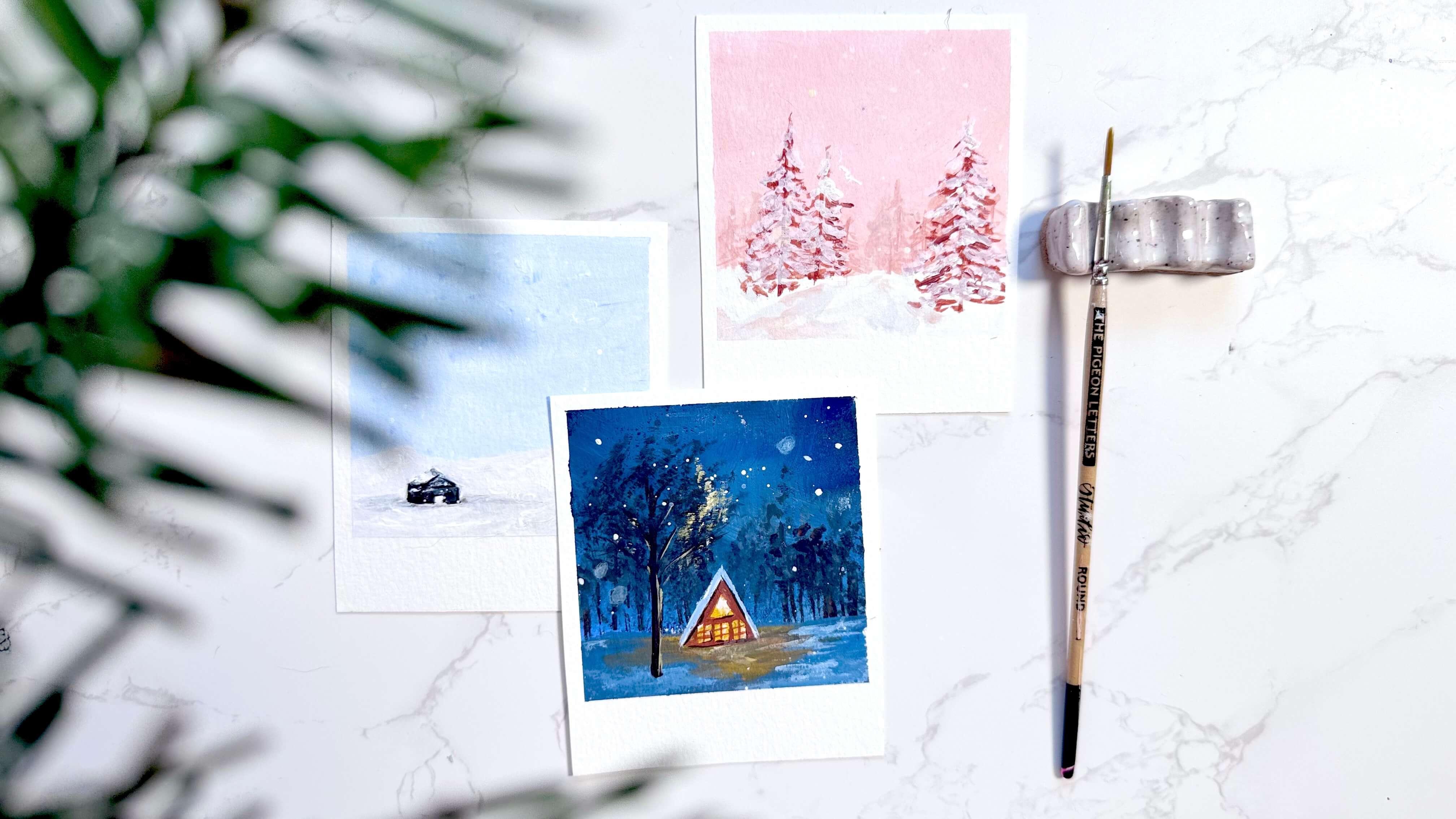
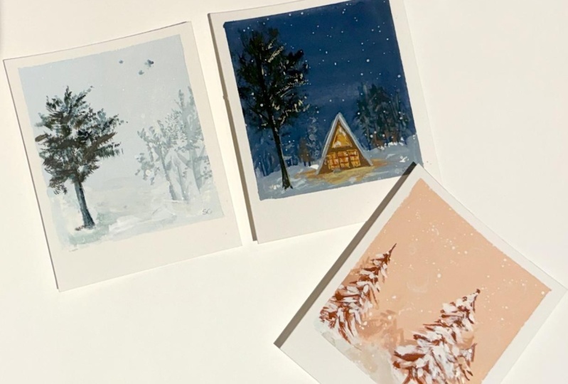
5. Paint the Foundations of Your Scenes: All right. I'm going to start
in the middle here because I want to show you
these silhouettes and how they come to
life. It's very fun. You can do this with either your flat brush and the tip of it, or you can do it with a
round brush either way. But we're going to add in
basically just texture. You can take I'm going to
mix some of the burnt sienna with the Prussian blue to make pretty much it's going to be pretty neutral
where it looks black. I'm not putting it all over. I'm just getting it to
the tip of the brush, which means I'll have
to dip into it more, but it's going to give me more control to not be
loaded up with paint. Then I'm just going
to set this down. If you're using more
of a round brush, then you can do real fine lines. Then what we're
going to do is we want more paint than water
on the brush at this point. I usually just dab this
out over on my palette. I'll get enough paint on here, but I'll get most of the
moisture off and then you'll see that your brush
is starting to separate. It's less water, more paint. Then I'll just go in
and just spin this and tap it through to
add some texture. I'm not really
worried so much about placement because this is
just in the background. I'm doing this
mostly at the tops. Of the lines that I made, but you can definitely
fill them more. I'm not going to bring them
up super high because, again, I want the sky to be the focus, and I'm not going to
do a ton of coverage. It's just enough to add
that subtle detail. We'll bring a few up just
so it's staggered more. But again, it's so subtle that you don't really
notice too much. We'll let that part dry. While we're letting that dry, we can start to look at this ground and we're
going to cover this area. So I'm going to bring in some lighter blue on
both of these sides. So I'll rinse my
brush a little bit. Grab the blue color, and I want it to be
a little lighter, so I'll put a little
white into this and just bring that
toward the middle, and it's fine if it goes
over the lines we made. We're just going to In
fact, we want it to. So I'll smooth that
line out at the top. And then we will have some
of that at the bottom. But what we're going
to do here now is bring in a lighter tone. You know, I didn't mention,
we're going to need a yellow. I forgot about that. So a yellow or an orange. If you have red,
you can mix it with yellow and get a little
bit of an orange hue. This is just deep yellow. So I just need a
little bit of that. And I want to get some
yellow over this blue. I don't really want it to mix because it's going to get green. So I'm going to wait for
it to dry most of the way. You don't have to worry
about the middle part. We're going to be painting
over this area anyway. So I'll let that dry
a little bit more, and then we'll
come back to that. So I'll go over to this
one that we started with, and this one is going
to be pretty simple. I think you'll be pleasantly surprised at how simple this is. So what we want to do is
just create the teensy, tiniest, cutest little cabin. It's going to be kind
of fully submerged in the snow in the sense that
we have a big, big scene. And so I'll grab a darker color just to
kind of give the illusion. You can make this any color, but if you go pretty
neutral dark with it, then it will pull the
interest into the full scene. Rather than, like, stand
I mean, it's up to you, however you want to do
it, but we'll do a very, very thin line for the roof. So really thin, really thin. And if you want to
make this an Aframe, you definitely could, but we're just focusing on
these basic shapes. Now, we want to keep
some white space because it's going to look
like it's covered in snow. I'll go ahead and extend
the roof just a little bit. But for the most part, I'll put a little bit of see how I'm just
adding a little texture, but overall, it's just allowing
the roof to be covered. So I'm not really doing
much. It's just assumed. And then underneath that, we can add the base shape, and I want it to be real
thin because again, I want this to be fully
submerged in snow. I'm just going to do
this little box here. I also have my
paint is still wet, so I'm working with that
too, but that's okay. Then I'll do the top of the door and then
I'm going to leave some leave some of the white
space in between as well. And then I'll just have a
little sliver on the side. So that's going to be
this little cabin. I'm going to wait for it to dry more and I can go
over that again. But the part that's really fun
is to grab that gray tone. Whoops grab that gray
tone that we had or mix a new gray tone because you made a
mess out of yours. And then I'll grab some
of this and then grab a little bit of this pink to
create more of that neutral. And I'm going to go just on the edge on the bottom,
maybe a little darker. And and create a base shading so that you can see it
is actually submerged. Again, this is still wet, so it's not quite doing
what I want it to, so I'm going to
wait a minute and come back to it when it's drier. While that's happening,
we'll move over to this guy. For this one, let's
add some trees. And if we want to add trees in the distance during the day, we're going to make them lighter than what the
foreground will show. For this one, I'll
go ahead and take that burnt sienna and
I'll mix it with white. And that's going to give
me this nice smooth, kind of like a light almost
like a pastel terracotta. If we're gonna call it a name, it's really pretty, though. And then for these trees, we want to make sure our brush isn't loaded up with water, we have a nice creamy
consistency so that we have our nice fine
tip on the brush. And when we have that, we can start to add
background trees. So I'm going to see
how this color looks. Okay. That's basically
what I'm after. So it's real light, and I think even lighter
would be good, too. But here's where you can stagger some lines
that are real fine, and oftentimes I
will kind of float my brush until I make contact, and that way, my
lines can remain thin and it just gives
me more control. And then we can
just for funzies, let's add some white
so we're even lighter, we can tuck some
even lighter tones in the back back they're
going to be really subtle. You almost don't see them,
but it adds to the depth. It's kind of like when you
use transparent watercolor, like if you lay your
leaves in that way, it creates that similar impact. So I think it's really pretty. And it's just kind
of that shaded area. So with the lighter area, you can go ahead and just
kind of do some mark making around the lines that you made because we're going
to end up covering them. So this is just
adding that depth in. And then we will go in with the midtone
and do the same thing. This time, I want to create
with the tips of our brush, just back and forth, very tips. It is so light, this pressure because we
don't want big blobs. We just want some back and forth teensy tiny
little details. It's okay if some areas
are more covered. I mean, it just makes it
seem like the areas denser, which is pretty, but
basically just a big not like a blob over here
is what I'm getting at. So once that is in and we're going to
let it dry some more, we will end up adding some
more trees in the foreground. I'll make a couple of
these a little bit taller and then a
little bit wider. Okay, let's let that part
dry. Checking over here. The reason why this is taking
longer to dry is because I have a lot of the
white acrylic on here. We can come here to
the middle one and I will grab this dark tone, and I'm just going to add a little more depth to the
trees that are on the sides, little marks, real subtle, not as big as the marks that I already made and you may or
may not even see what I'm doing because it's so subtle. But for me, I don't know why. I just like to. I like to add
one more layer of contrast. Okay. Now that that is done, we will take that
yellow tone that we added and maybe add some
burnt sienna to it. I'll bring that color over here and then grab a
little bit of this yellow. And so I have this
real deep tone. Now, we're going to add this
in a very, very subtle way. It's just going to spread at the bottom and then maybe
out just a little bit. I have more water on my brush, I can tell than the
consistency I'm looking for. So that's why it's a
little transparent. I can go in and get
a little more paint. And layer. Now, this area here that
I just added that to, I know it seems weird, but
we're going to do something. Since it's the
night, we're adding a cabin and it's going to glow out onto the base here. As we get further
away from the center, we're going to get darker and darker and even more neutral. I'll just grab some of that
deeper tone and bring it over or the dark dark blue, and I'll just spread this
out on the edges and I'll do that even again a little darker and spread that
out even further. We're just allowing
it to fade away, essentially. It's
going to look cool. We want to wait for
now these layers to dry and then we will
go onto our next step.
6. Paint an A-Frame Cabin & Snowy Trees: Okay, let's head over
to this guy here, and we are going to grab
the brown color we have. If you don't have a brown
color again, you know, you can mix that color. So I'm using this burnt sienna, and I'm going to use
this straight out of the tube because I
want this midtone. And the value is going to break away from the dark color, but
it's not going to get too. So I don't want too much
contrast because I still want to use that dark
scene that I have. So that's why I'm not
going to go crazy light. And I want to do an A frame. So I'll go ahead and just
come up into this A shape. And then I can fill that, and I'll come down a
little bit because I want to cover that background here. And then fill in that area. And now we'll add a roof to it, but rather than doing
something darker, we're going to go a lot lighter. We're not going to do white because that would be
that bright white, and at night snow is
not bright white. And so I'll go
ahead and grab this white and mix it with blue. And I'm going for a
mid tone value again, so not something
that is super light, not quite like this, but
right in the middle. And I'm just going to
line the top roof area. With a real with a thinner
line on each side. And that gives it
that illusion that it's got the snow
in the nighttime. We're also going to add a
little bit of that color to out the ground
in a few areas. So that sets that
scene a little better. Let that dry a little
bit and come back to it. Let's go over to this side. And for this one, we can go into our foreground for trees. So let's use a neutral color. You can bring green
in if you wanted to, but I really like to keep things more analogous
on my color palette, meaning colors that are next to each other
on the color wheel, especially when I'm
doing hues like this. I'm making sure that I still
have that nice fine point. And I'll go ahead and paint
a line upward, real thin. But it's going to be a lot taller than the rest
of these trees. So maybe about two
thirds of the way up, and I'll do another one
right next to that. It's a little shorter, and it's a little higher up than the one on the left
and then a little lower. So it's kind of
creating that depth and then I will come in with the tip of my brush and down and just create those same
lines that we did. But I'm kind of tapping
them in as I go, so they create more
like marks in texture rather than straight
lines or blobs. I love referring to
things as blobs. You'll notice your paint
as it starts to lift, you start to press harder, and that's going to soften
things up quite a bit. So make sure that you have a consistency on your
brush that you like. You can use more of a dry brush, but this is just
going to give you more control over what these actually end
up looking like. I like to mix the soft
with the more saturated because it gives it it
gives it more depth, even being, you
know, a flat color. Even just the marks
we make can do that. So this is a lot more like I don't have a lot
of paint on my brush now, so I can just tap
that through toward the edges and see how it just creates a
little more texture. But I wait for that part until I have my base
shapes in and that way, I have just like added fun. It's all added at that point. Now I'll do one more
of these maybe right here and have that come up even higher because it's technically closer to us if
it's down further. So I'll grab more paint
and just start to. I want to make sure my
tip is nice and fine. That's going to be the
consistency of paint to water and then I'll
just start to add. With light marks, it looks
like I need a little more. These light marks just back and forth softly because we
can always add more, but we can't take any away. Both sides, and then we can start to fill in any areas that we
want to add more to. Sometimes I'll even
skip around just doing dotting and like light
strokes here and there, just to add some fill. Like, right here,
we're pretty even. So if I just tap through
a few of these areas, then it starts to fill those without making it so
that the whole thing is not too intense, because the white space is important when we do these
trees to create that texture. So we'll let this
part dry and then we'll add snow to these trees. So while we're waiting for
that, we can move over here. And for this one, again, it's so, so simple. So I just want to better
define this cabin. So I'm going to mix these
two colors together, the blue the deep Prussian blue, and then this fern sienna. So I have that nice deep color. And then I'm going
to come in, and I'm actually moving quite close on my brush
because I want to make sure that I can
define this better. So it's almost like drawing at this point versus painting. And I'm just going
around the edges. I'm not really
paying attention to the the fill or anything because I actually like the way that it's coming across. So see how it just crisp I just that crisp edge
cleaned it up and made it more digestible. But it's like subtle. It's kind of an
afterthought. It's in the background, which
is kind of fun. So that's about
it with that one. The last thing that
I want to do with it is grab some of this white, bring it over here
because I'm going to use a lot of water and only a little bit of white
because we want this to be basically
dripping off the brush, 'cause we're going to
come over and hold it gently and then just
tap about 6 " away. It's going to create
a little bit of a splatter that looks like snow. If you want to protect your other sides and
not get snow on those, you can always put
something over it, but see how it just makes this It just makes for this
really pretty light dusting. And then what you can do that's really fun if you want to create some more depth here is go in
with the tip of your brush, get some more defined
round circles coming down just a few places. This one, we want
to come back to the interior windows on. So we're going to
grab the yellow. And I'm just grabbing
outside of the center of it, so dragging it to the edge, making sure I have the
consistency that I want. And then I can add
in the windows. Now, don't worry about the
details of the windows. We can go back over it
with the fine lines. So for now, we'll go ahead and just do a
smaller block inside, and you could do these
any shape that you want. Because that's all we
need to care about. We don't need to
care about making sure we're using negative space. We can go over it again
with that darker color. You'll see it really come to
life when we do that part. And then I'll do a little door this particular yellow is more transparent than some of
the other gouache pigments, so you kind of have
to layer it on. Another way to make
this pop would be to use an orange color and
then do the yellow on top. Or you can do the orange color or the
yellow like we're doing, and then go in and mix
some white with yellow. Once this part dries and just
add a little mark of it, Again, don't worry about
making crisp lines right now. We just want to get
the color down. I'll do two windows on
the sides of the doors, too, so just do something here. I'll do it floor
length. That's fun. Floor to ceiling windows. So yeah, don't worry
about those lines. We're going to
clean up the outer lines with the darker color. But once that starts to dry, if you were to take
some of your white and bring it over to that
lighter tone to that yellow, See how those two
values are different. So if I was to just drop a
little bit of that inside, it just adds a
little more depth. It just makes it look like it's glowing a little bit more. You could even do that
just at the base. I'm going to actually move that around a little
more with some water. See how it just kind of adds
a little more dimension. So let's go and add some
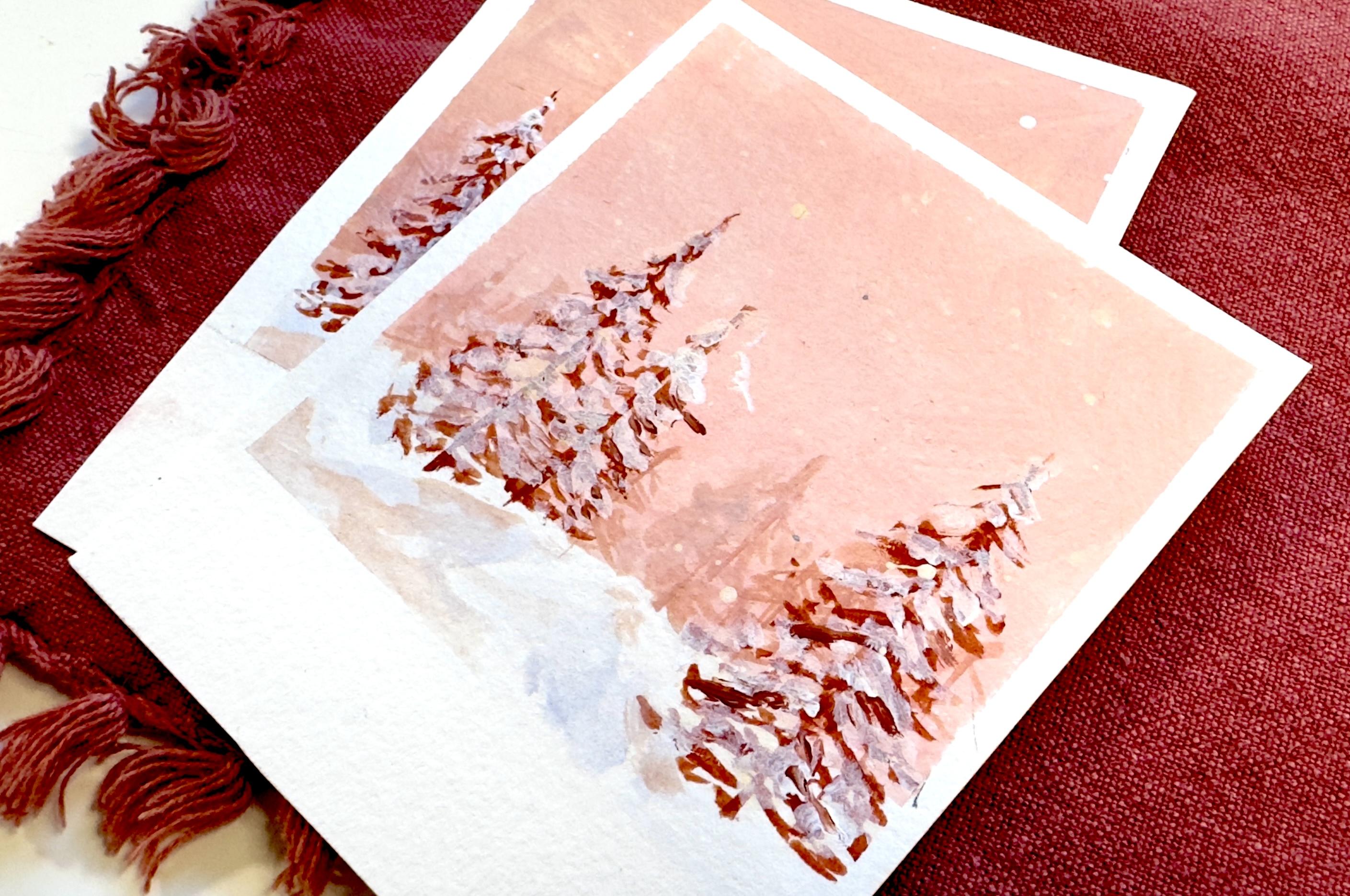
snow to these trees, and you can do this with white. You can also go slightly tinted. So if I pull the
white from the pink, it'll just have that slight tint in it, which can be pretty. And then for here, I'm just going to go toward
the top of some of these branches and just
tap in some white. It's not as, you know, involved as you might think. It's really just tapping
that in here and there. And covering the tops. I mean, you can cover
some areas more. But as long as you have the peekaboo areas as
long as you have the peekaboo branches so that you know that
we're looking at trees, then you can just
slap on the snow. But I would do the same thing where you're really looking to make sure that you
have separation. You still have white space. You're really using the
depth to your advantage, so you're not painting
directly over the branches, you're going right above them. And, you know, overlap is great because we want to have
the snow covering, but we also want to still show that there are
branches indeed underneath and go to the edges because
having branches sticking out from all the snow areas
is just kind of weird. Also, be sure to cover up
the center in certain areas. So it doesn't look
like it's just coming off of the sides. Then you can come in
and do the same thing. I would just rinse your
brush real quick so you don't have such intent. Like if you use a little
more water ratio, if you have some of
that in the background. See, this is too, too light. So I'm going to rinse my
brush all the way and then just dab the paint off and I'll just
lift some of that up. You can also use
the paper towel, but you don't want it
to be super opaque. You just want to have,
like, a main hue, like a mist, if you
will, in the background. So I'll grab water, just a teensy bit of the
white and tap that in. And then I can bring some
of that up into the sky. It's just real subtle. And then kind of swirl that. And then once that is placed, you can go back in and just define some lines just within. I use the tip of my brush and pull the very
tip of my brush, and I'll pull in some texture just kind of
throughout the white. To add some contrast back
in, but real subtle. So it's like you can go a little more enthusiastically
when you lay the white down, but then we're going
to come in and add a few defining
lines after the fact. And then if you want, you
can always go back in with that deeper gray tone
and just define like, I'm using some of the pinkish, just to add a little bit
more interest to the ground, but not too much because you want you're just adding
a smidge of depth. So it's kind of like
layering contrast. Okay, now is going
to come the fun part where this one really
starts to come to life. We're going to make that
glow really stand out.
7. Add Glow & Bokeh to Your Snow Forest: Alright, we're going to
make this stand out now. The first part that
we're going to do is actually another tree, which is going to be in
the foreground more. So we're gonna grab the
deepest color we have. If you have black, great. If you want to mix a tone, I'm going to do the Prussian
blue with the burnt sienna, mix that to get
it nice and deep. And then we're going to pull
this up in front of it. I'll go on this side. And it's going to be thicker, the bases because I'll
bring some branches off just a few that
are outstretched. And then we'll take
a dryer brush. So our wash brush, I'm going to make sure
it's nice and dry. So I'm going to get all that
excess water off of it, kind of squeeze that out, and then I'll grab that
same color and create the same kind of texture that
we did in the beginning. But I want to make sure
that we are nice and dry so that we have this
opening with the bristles. And I'll very lightly
tap through here. So I'm not applying
a lot of pressure. I'm going to fill up that area. So it's a lot closer. Now, to bring this to life
more because right now, we're looking very
Blairwich project. We're going to let that dry, and then I'll show
you how to make this glow come
even more to life. But for now, we
will go ahead and clean up those windows while
we're waiting for the tree. We'll grab the color, the same color that we
used for the cabin. So in my case, I have
this burnt sienna. I'm going to make sure I have that nice creamy consistency, fine tip that I can use. And first, I will actually
clean up the windows by using real fine lines just around them around their shape to
make them nice and crisp. So see how already
that cleans them up, and I'll do the same thing
to the top to clean that up. And then from there, I
am going to just add some window boards, panes. No, not panes. Lines through I'll
add some lines in the centers of the windows
just to add some interest. So I could come just
directly in the center. I'm going with the very tip of my brush to see I'm hovering, hovering and making sure
that it's nice and thin. And then I could add two
more of those across. So the smaller these are, the more defined it looks. And then on the top one, I think I'll just keep open. Op of color kind of coming from. I'm not going to do
it to all of them, but it does add a little more emphasis on the light coming
from the inside. And then it also makes it
so that the blue colour on the roof looks more like it is like that nighttime snow. But that being said, we can also take that
bright white and line. I know we thought we were
doing a fine line before, but now we're really going to do a fine line because
we're going to just line next to that line in a
few places, not all of them. I'm not really picking
any particular places. I just want to have
a little bit of contrast in the roof snow. Not throughout, but just enough
to where it has that pop. And then I'll mix a
little bit of the yellow and white
together again and just pull that into the snow right in front
of it one more time. So like, right here,
just a little bit. And then with that
same color, like, pretty yellow, but
pretty, pretty light. With the very tip of my brush, I am going to line the
right side of the tree, which is on the side
of the cabin glow. When I line this, it's
going to be really thin. And then I'll line a few of
the branches that are just closest to it barely, right? So we're going to do that also with some of the texture
that we created. See how it was so subtle that it creates
such a huge impact. So it's so much fun to add
these glowing elements. And I'll just put a little
bit on the underneath of the left side, but mostly we're going
to focus on the right. Okay? So we'll take
that same color. You can use your wash brush, and you're gonna dry it a lot. Basically, squeeze
that water out. I'm coming into the white and tapping into the white more. And then very lightly
I want to see, make sure it's the right
consistency first. Okay, so see very, very lightly. I'm going to want more yellow. I'm tapping this in to the branches just on the
right and underneath. And that is going to create that glow. Barely. That was it. Maybe just a teensy bit here just because we
know that light travels. And that's it. I know it seems like you're
gonna want to do more, but you don't want to. You want it to be so subtle. And then if you want to make the cabin pop more just
underneath the overhang, you can add your deepest tones. I got to grab a little
more of this dark blue. And then with the very
tip of your brush, come in and just line in between your snow line and
the cabin itself. You can also do this
next to the windows. See how that just
adds a little depth. You can do this right under the window and on the
sides if you wanted to. I'm not doing it
the whole way up. I'm just adding a smeg then I'll do it to
the bottom part, and then you can do the
same thing that you did over here where you
rinse the brush, but you have more of a just
right around the base, you have this shadow. You don't want to
do that too much though because you
want the glow. And then you have this
really quaint cabin in the woods in the
night a snowy night. Now, this is where
I want to play with the depth
more for the snow. So we're going to do
the same thing where we take more water on our brush, grab some of that white. Looks like I have still some
dark colors on my brush, so I'm going to make
sure that that is indeed cleaned off
and grab some of this white cover and tap, maybe a little more water. So you have that
depth even just doing that because you have the smaller areas and
then the larger areas. Now, if you have mostly a
dry brush in this case, So it's barely anything. And then if you just kind of
smudge it out in the circle, I'm getting all the paint off. So it's just a dry brush. It makes it look like
it's closer to us, like a lens blur, like a depth boca. And it just creates
some more interest. So I'll do a few, like, a couple of those, maybe three. Just blur it out. Here we go. So let's go ahead and do our final touches on this one and just add some snow to it. If you want to, you
definitely don't have to. You can keep it where we're not having a
snowy day right now. If you want more control, again, you can always go in and
tap these in and use different pressure so that
you have some that are smaller and some
that are larger. Okay. So let's go ahead and reveal our polaroids and get them cut 'cause this
is the funneest part.
8. Cut Into Polaroid Mini Paintings: Alright, this is the part
that is the most fun. You want to make sure
that everything is fully dry because as you
lift the tape up, if the paper is
still wet, it warps. Honestly, when you're
doing this with polaroids, it's not Or like the polroid
size, these mini pictures. It's not that big of a
deal because they don't warp as much since
they're so small, but just it's a good rule of
thumb, generally speaking. So I'm going to
pull the tape away, and when I pull this off, I don't ever pull up. I always pull against the
paper as closely as possible. So I typically take the tape and pull flat and kind of
at a slight angle. And that is to prevent
our paper from ripping. But this part is so
satisfying because you get these nice clean edges, and you get to start to see
how this is coming to life. And it's even cuter when
you get it all cut down. So let's just carefully
remove these. So you can see on this edge, I did come into the tape a
little bit. That's okay. But kind of that's one of the reasons why I really like to focus for a minute on getting
the tape nice and secured. The other thing when you're
removing this is to make sure that you do it nice and slow because even if the
tape is not wildly sticky, it's still really easy to tear your paper if
you're not going slowly. And I also make sure that my
grip is closer to the paper. I have more control
over it that way. So anytime it's a long piece, I don't just continue
continue continue. I'll come back in here,
grab from the base, grab from the base. And
continue doing that. So when we cut this out, you can use scissors
or you can use a cutting surface with an exacto knife, however
you want to do this. This is pretty simple to cut because it's
not a huge space. So you can use a ruler, if you want to mark these. What I want to do is mark
the same amount of space. I usually just eyeball this. You can mark it or
you can just cut it. I typically just
go in and cut it. But if you wanted to mark it, I'm going to come
slightly to the left because I know the pencil
will be inset, so about here. And then I think down
here is about the space that I want for the bottom cut. About here. So I'll
go ahead and draw that line that line I do
want to have nice and even. But the rest of it,
I usually eyeball. So today, I usually use a
cutting board, cutting board. I usually use, you know, what are they
called self healing cutting mats, cutting mat. But I will go ahead and go
with scissors today because my cutting mat is being utilized in the other
room for another project. I don't need to say any of that. So I'm just slow and careful
to be along that edge. And if it's not perfect, it's okay we're about to cut
these down even more, and then you're not
going to have to worry about consistent long
lines that are perfect. And then I'll just go about
the same distance that I did at the top for all of these. So trimming this down a
little bit, not too much. You could cut these in half, or cut them away from each
other to do this part. But, oh, my gosh, like how
cute already I'm obsessed. It's like that moment of having that adorable little
mini painting that's in the form
of a polroid that's, like, so worth all of it. Because even the most
simple like this one, I went simple on it on
purpose because I know it's going to be impactful
because this type, I'm going to go
skinnier right here. This type of project really
does demand simplicity. I wanted to give you some
more interesting ones as well, because why not? But I also wanted you
guys to be able to play with doing something
really, really simple. And see the impact
that it makes. Each of these tells its own
story in a really unique way. I really can't wait
to see your pieces. And I encourage you to continue because this is so
addicting and you end up creating some of
the most fun little playful collections
of paintings.
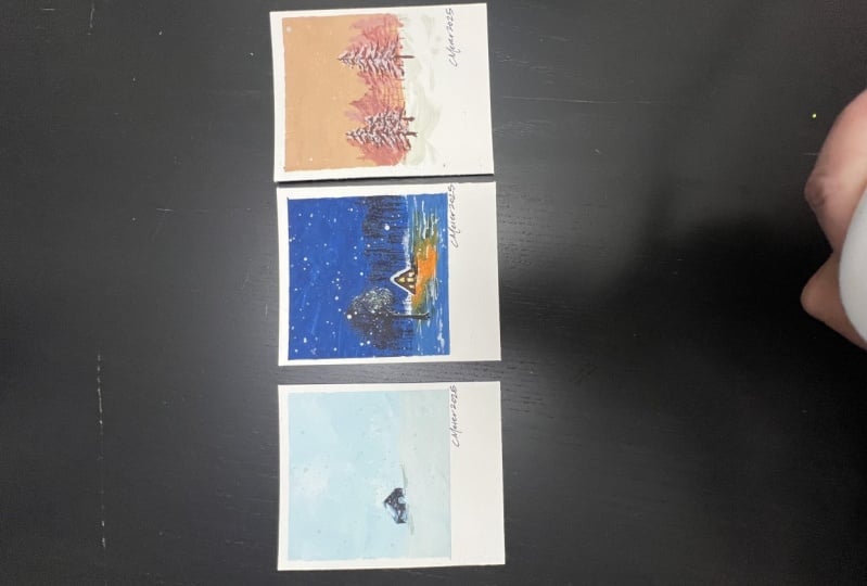
9. 500 More Polaroids!: Congratulations. You did it. You created your own
little collection of winter snowsapes each one framed in the nostalgic
charm of polroids. I hope that you're feeling proud of what you have accomplished. But most importantly, I hope
that you are excited about the new skills that
you have gained and how you can carry them
in future projects. And I hope that
you make a ton of these because painting is all about experimenting and having fun and finding
what works for you. So you've learned techniques
about creating depth and playing with color and
adding little details. Your work truly stand out. So don't stop here. Keep creating, keep
experimenting and let your new skills
inspire your next pieces. And if you ever need a little extra inspiration or guidance, you know
where to find me. Thank you so much for joining
me in this B size class. I cannot wait to see
what you create next.