Transcripts
1. Introduction to the class: Gosh, is an often overlooked painting medium that blends the worlds of translucent watercolor painting and opec painting mediums such as acrylics and oils. So one of the best ways to experiment with this medium does paint a landscape. So grab your tolls and start experimenting. Hello, my name is last mini watercolor artist based in California. My subject of expertise is Landscapes. And I work with different mediums, watercolors, acrylic, squash. You can check out more about me on my Skillshare profile. And in these glass where we see a detailed step-by-step process of painting this beautiful landscape. So before that, we will see the column mixins and also a brief about the medium wash. And this class is beginner friendly. Anyone who wants to sit back, relax and have fun painting, enjoying this class. And even beginners can join this class, as I said. So let's get started.
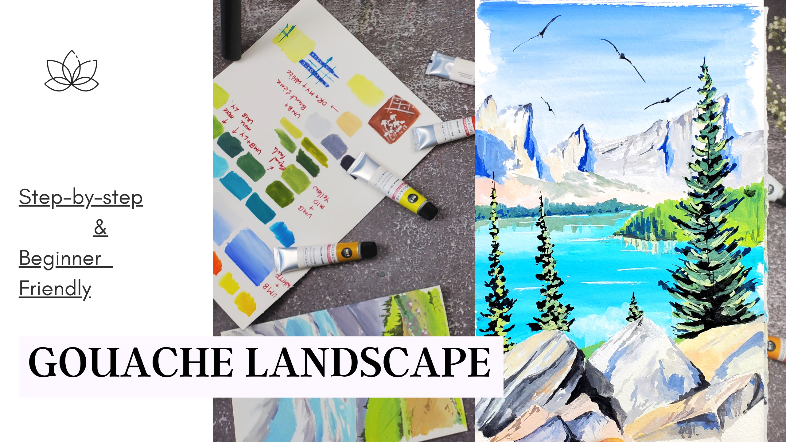
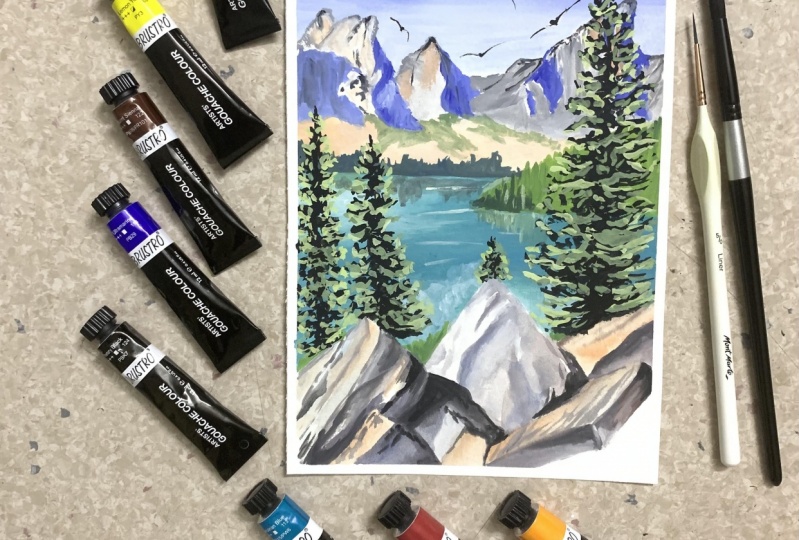
2. Supplies : So guys, let's take our disappears before getting started with our glands. So first times that paper as always. So in this class I'm using arches. And while working with wash. You can use any kind of paper like mixed media paper or cold pressed paper on hard-pressed paper, anything. But make sure that the paper is at least 200 or 300 GSM so that it is taken off to absorb that water that we use wide banding as gosh, he's also a water-based medium. And, but for this class, especially I'm using the arches that are glued watercolor paper and cold pressed in January as a man. So this is an eight by 10 pepper and I'm going to cut that into half to do our landscape today. And then next is pains. So in this class I'll be using this OD philosophy, gosh, set. So the set has 18 colors in them. So I'm not going to use all the 1850 time. I'll be using like six to seven shades. And we'll see that in the next lesson. Let's pick colors. So you can also use any brand gouache, lack of insight, a new ten, or he may guage are any brand that you have. And yeah, and the next one, the next important thing is valid. So make sure you have a big enough palette to mix all the colors, since there'll be a lot of colored mixins in this class, make sure your ballot is begin up to do all mixins. So the next one are the brushes. So and for garage, you can use all the brushes that you use for watercolor. And especially for this class. I'm using silver black velvet round number eight brush mode. And it's been stand-alone round brush for some detailing work. So these two are the brushes that I use, but you can also use any brushes that you have at your home and any brushes that you use for your watercolor painting. And yeah, this is the wish that I'll be using more in this class. And pencil, an eraser, a sketching, and two jars of water. Obviously, since the guage is similar medium to watercolor and this applies are also similar to report we need for watercolor painting. And then X1 is paper napkin. So that's it. This up please. So with all these athletes will be produced this final output of this beautiful landscape. So I can't wait to get started. So let's meet in the next lesson.
3. Let's Talk Gouache..!: You might have already known about gosh, but let me bring up some important points about this medium. Gosh is often described as opaque watercolor. So article as a transparent medium and go wash is opec. And it is also a water-based paint similar to watercolor, but has higher density and higher levels of pigment combat to watercolors. And this medium can be layered and creates bright and vibrant colors. So gouache can be used to create by vibrant and bright colors similar to acrylics. And it can be thin down using water and can be used as a transparent medium similar to water colors. So gosh has flexibility to use as acrylics and watercolors. It shared both the properties of watercolors and acrylics that makes this medium most popular one. And the pain has a lovely matte finish and has a quicker diet drying time compared to water color. So this medium is February for those who have less patients. And this pain can be reactivated by adding water, which is handy for reworking a painting that has already dried are reactivating dried paints on your palette. And you can also add varying amounts of water to Gosh, as you're painting to achieve different levels of opacity and offer a bit of practice with this medium, you will know how much water to use with it. Generally is seen as creamy consistency to get the matte finish that we see in paintings. And gosh, can be layered heavily water down to your watercolor consistency. And it can be used in so many ways. You see it's fun to work with. Even the lightest color can be layered on the darkest color. For example, you can paint white on black is indeed fun. Yeah, you can layer lighter colors on the top of darker, darker colors, which is what we don't see in watercolors generally. So let's paint a beautiful gosh landscape to explore more about this medium. See you in the next lesson.
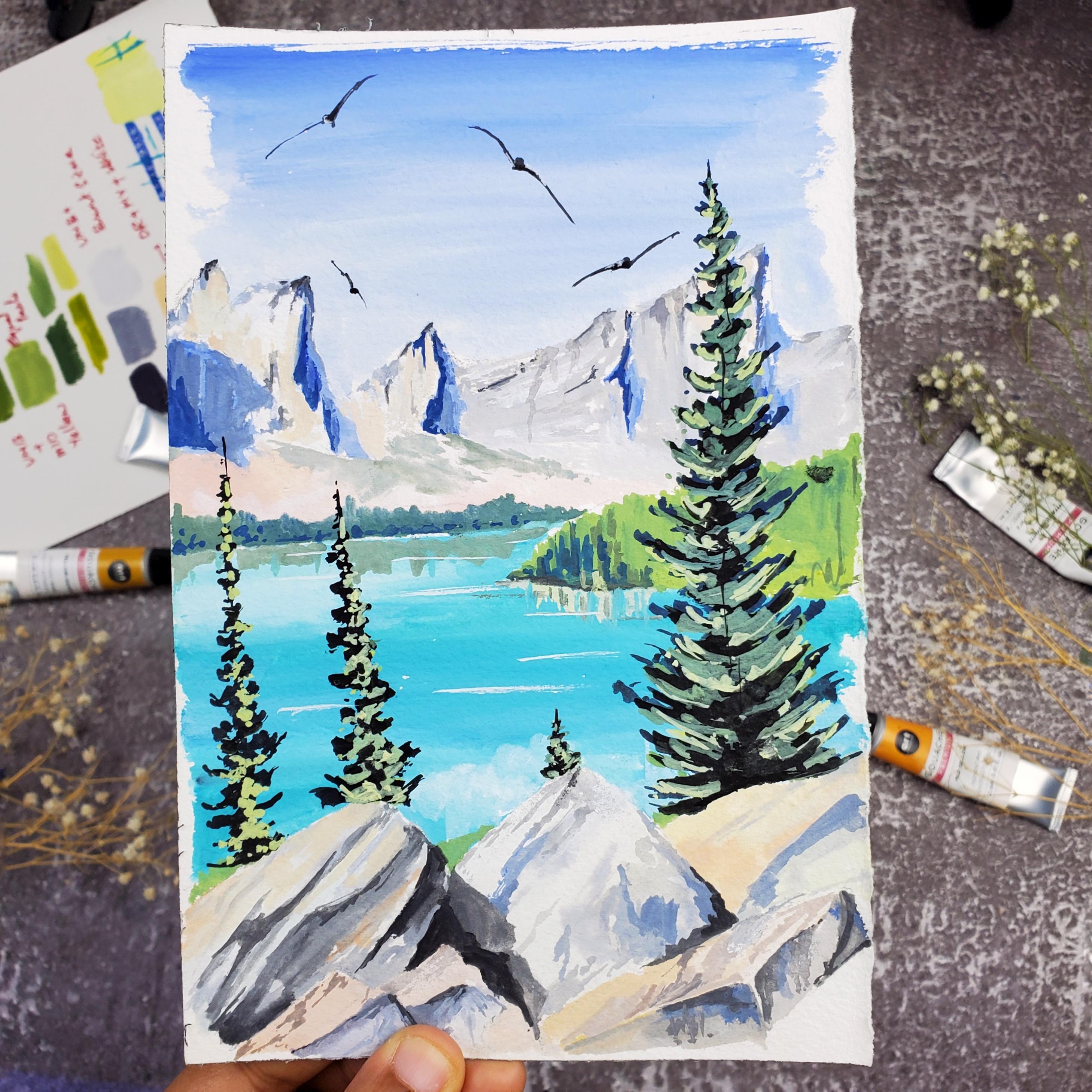
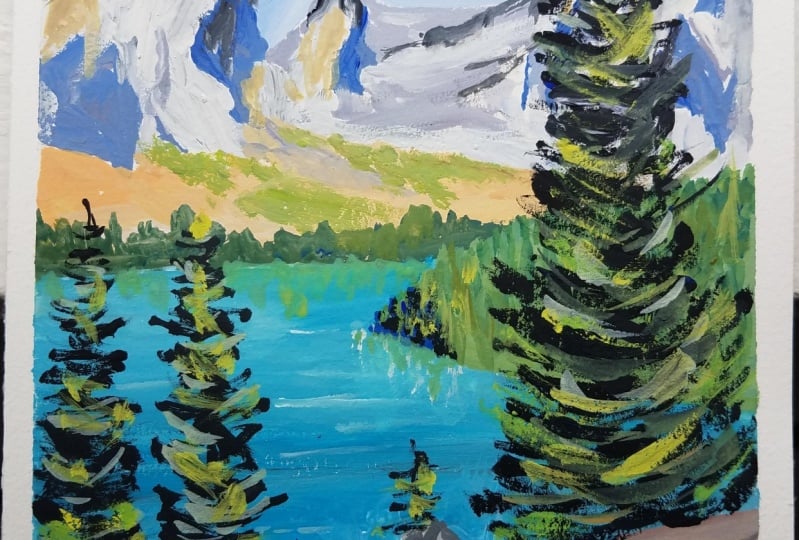
4. Picking the colors: So in this class is all about picking the colors that we'll be using fired our final class project. So this is the photograph that we are going to paint as our final class project. So really use this picture as their friends for sketching and also for picking up the colors that we use, like the bright blue for the sky. And the colors that, that are present here for the mountains like divides and the shadow areas with some blues and some greens. And you see the shadows are matching with the sky color. So this is ultramarine blue and this has some grain it. And dark greens like and some bright green. So there are some due to three different shades of greens here. So some light endosome DAG. And also you can see the beautiful tall pine tree, which is having some beautiful bright greens and some shadow parts having black. And that beautiful lake with bluish green don't. So some pine trees again. And it rocks. So these rocks are having some bright orange dawn. And I'm great owns and black tones. So really see all of that. And some greens here and there. So based on this picture, let's pick the colors from the set that we have. And also, let's see how to pick the colors. So here is my gosh set that I have. And always remember to use limited color palette to finish your paintings. So this will give a lot of knowledge why you like this will make you understand the column mixins and all. So from this palette, Let's choose the colors. So the first is this guy. So this guy is obviously blue in shared with dissimilar to ultra marine. If you don't know how the color looks, always fetch the colors in some rough sheet and then you will understand which colors to pick. And also for the shadows will be using this ultramarine. And for the lake, this is another kind of blue which will not get using ultramarine. So I'm using here certainly and blue. So this is some sky blue tone. So in order to get some bluish green, Don't we have to make some L0 onto it. So I'm using head, lemon, yellow to greenish blue dawn. So this low-end Sara Lee and blue together will make this beautiful lake color. And next comes the trees. So, and also for the greens. I'm not using any green in this painting. I'll be using blues and yellows to their degree. As usual, I don't use greens in my painting. I just use my blues and yellows to create some beautiful greens. So we have already lemon yellow in our palette and ultramarine and our palette. So let's pick one more yellow. So I'm using this alkylate. So then the combination of this for the two blues and yellows, we can get an unlimited number of green shirts and also about the rocks here. So I'm picking some burnt sienna to get this brownish tone and also black to get the shadow areas like this. And I'm also picking some orange to get that bright dawn on the mountains and on the rocks. So this one is oriented, right? Yeah. And the last, but most important in the gouache painting is right? So any gouache painting is not at all complete without using right? So make sure you buy a legit, you ferrite, because it's modular and will not be shuffled the shunt. It will finish in this three to four paintings. So make sure you buy a lodgement. So these are the, these are the colors that we have picked. So let's count them. So excluding white and black, we have like 456 colors and all these colors that we have selected or row colors. So in order to get the bones that are present in the picture, we have to mix the stones to get the shades that are present in the picture. So let's check out our color mixes in the next lesson. So it will be, it will be a bit lengthy, but it will definitely help you check out.
5. Color Study : So let's get started with color mixing. So I'm using the palette that I use for my watercolor paintings as this, How large events so that I can get more space for column exists. So I'm squeezing out pain from my tubes. And the thing in Gosh is a freshly squeezed gouache paint. We always look brighter. And also you can use bands like bandage, like HE me for what, a gosh. But if you feel gosh gets dried, you have to apply water to reactivate it, but it will not look as vibrant and as opec, as a freshly squeezed band. So make sure and try to use more freshly squeezed to paint, then reactivating the old bands it. So I'm squeezing my band. Yeah. Next is the brand sienna. Have my orange L0 blues. And last, and the final one is white. I'm almost out of mature. I have to order a new one. Yeah, but I managed to get for this class. So let's get started. So I'm fresh scratching all the colors that we picked, like the raw sheets without any color mixing. So this is the main color. This is how the axial skeleton looks. And the next one is lemon yellow. So these are all the originals factors of the colors that we have picked. And we'll see how to mix differentiates to get the color tones that we need for the painting. So this one is orange, orange red. And the next one is ultramarine. So this is my favorite of all local Newton watercolors and gosh and acrylics and everything. And the next one is certainly in blue. If you see I'm a plane more order. So the paint is behaving just like watercolors. So it wash is also a water-based medium. You can use it as watercolors or you can use it as gosh, if you apply more water, then it will behave as watercolors. If you apply less water than it will behave as gosh, opec medium. So the brand sienna and the black. So these are all shares and white of course. So now let's took art different color mixes. So this ultramarine is the true draw, ultramarine, but this is the sky that we have a picture. So the originals gouache is, swatch is more bright compared to the in the picture. So what do we have to do is we have to add some white to the ultramarine to make it less bright. So what we do in watercolors is just add more water to reduce the brightness. But in gosh, we have to add white to make it less vibrant, ought to make it lighter. So that is a difference. One more difference between watercolor and gosh. So here I am mixing ultra meeting. And in order to make it lighter, I'll be adding some white quash and make sure to wash your brush by using white as it will contaminate the color with blue. And if you see by adding gosh, immediately, the paint had become chalky and very lighter in tone. And you can see the matte finish that we've got, the adding white. So that is the beautiful property of the Ghosh. See, this is the shape that regard by mixing white. And if you want a lighter tone of blue, then add more white. And blending is another big task in gosh. So always blend from bottom to top in order to get even blending. Yeah. And this is how it will look in watercolors. So I added more water to make it look like watercolor. This, that's input. And here I added water to blend that. But in Gosh, I used Revit to blend up. I have to make it lighter. So that is the difference. So I'll write down all the colors that I'm using here so that it will be useful for your reference by practicing. So this is ultramarine blue plus white. And also you can make it dark. Adding some pure ultramarine on the top. And this blending is good when the paper is still wet. And if you don't want this effect, then you're going to always use some white and blend back into the original equation. So gouache is very, very easy medium. We can do whatever we want. It is very good for beginners. And yeah. So the next color will be mixing these, the lake color. So for the lake will be using Sara Lee and blue and lemon yellow. So this is how the original Sara Lee and blue is looking. And here I'm mixing zillion blue and a little bit of lemon yellow. So the combination is like two parts of Sierra Leone to one part of lemon yellow are three parts of Sierra Leon, blue to one part of lemon yellow. Only a tiny bit of lemon yellow is enough to get this beautiful greenish tone. So this is what we got, this beautiful greenish emerald color. And in order to make it lighter, just add, right? So this is the important principle in Gosh, to make anything lighter. Mix white, and more white, to make it more lighter. So that's it. So let me write down this. So this is US, Italy and blue, lemon, yellow. So we've got two shirts. We got our shape at the sky and we've got our shape for the lake. Now check out the column mixes for greens. So obviously gleans will be mixed using blues and yellows. So green is a secondary color. So we will get deck secondary color using primary colors. So blue and yellow are two primary colors. So by mixing these two primary colors, we get the secondary color green. And by varying the color tones of blue and yellow, well, that differentiates of green. So here I mixed blue and yellow, blue and lemon yellow, ultramarine blue and lemon yellow. And I'm using more ultramarine and the SEM and a load to get this darker green is shared. And if you want this Ganesha to look lighter, just add more lemon yellow. You can vary the amount of blue and green you are adding to the mixture to get the brighter and the lighter tones. And you can always add white to make it more lighter and magically looking. And if you want to make a brighter green mix right into lemon yellow, necessarily look amazing green, this will make an amazing green. So this is one green tone that we'll be using in the class. Ultra marine plus lemon yellow. And this is equal parts of blue and yellow. And this one is more ultramarine to get a darker tone. And this one is more lemon yellow to get a lighter tone. And the next greens, set of greens that will be mixing our ultimate in a and we did LOW. So ultimate aim, and now I'm taking with a low. So I am mixing equal parts of ultramarine. And so by mixing equal parts, we get the shade which is similar to sap green, that is readily available in a pan or in any tube. So in order to make it more lighter, I'm mixing some white. And then also vary the amount of a low-end blue that you mix into to get more darker and lighter tones. See now I'm mixing more ultramarine, less Morello to get this dark green and yellow to get some lighter green. And always prepared a chart of greens by using different laws and different blues. Like you can use ultramarine serially and Prussian blue. You can use all these blues and yellows like medulla, lemon, yellow, and Aurelian, you can use all the shades of blues and yellows to get different tones of green. So always make sure to prepare a chart and keep it aside so that you can match the colors of greens that you need for the painting and then meets those colors readily available for the next painting that you do. So the next color that we'll be mixing is gray. So the grade that is present in the mountains and the rocks, so great and we mixed in two ways. One way is black and white. Just take a little black and more white to get a grade on. And another way of getting more interesting grey is mixing a blue and browns. So mixing blues and browns will give us beautiful different grade own. So here I'm using ultramarine, blue and brown sienna to get this beautiful, great on. So makes equal parts of brands sienna and ultramarine. So we got this beautiful gray dawn and I just make some bite to make it more brighter and lighter. And I'm mixing more white to get this mod lighter tone of gray. So the next shared that we're going to use this beautiful orange, a stone which is present when the sun directly shines onto the objects. So for this, I'm using audience red and yellow. Since this audience rate is very, very Brighton dielectric reduce the brightness. I am adding some yellow to it. And to make it more lighter, I'm adding white to it. So this is the shade that record this beautiful, subtle or in stone. So this will be using in our painting in our final class. So many really asked me how to understand what colors to mix to get the class that we burn. So my answer is to have more practice and to have more knowledge about the colors. So on this, learn the color wheel, which have primary colors and secondary colors and territory colors. And we'll understand what to mix to get the secondary colors from the primary ones. And also practice a lot. And also using a limited color palette. Change your color mixing game.
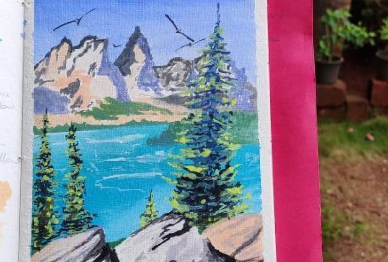
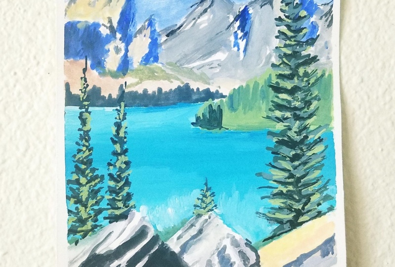
6. Class Project - Part-1: So by far not the class project include sketching and bending the mountane spot. So let's transfer this picture onto our paper in that form of sketching. So I'm using, as I said, half of the eight by ten cheat. And with my benzyl, I started sketching. So as you always know, alway start sketching from the horizon line. So I sketch star is in line and then add all the remaining elements. So the mountains. And I will attach the reference image in the resources section so that you can also check out that bacteria while sketching and speeding up this process a bit as getting can be really boring. So while sketching, I'm only adding the important elements that I want to include in my painting. And I don't want to add any unnecessary details to my final painting. So I'm just adding this, getting the high level design, as you can see. And you also must remember distinct while sketching don't include unnecessary tiny, tiny details. So it will make your painting very confusing and it will confuse you also by painting that thing. So now let's get started to pain. So this guy, as we discussed, I'm using ultramarine and white. And which consistency of your paint to start to work with squash. So my answer is your paint, my slope creamy. Your paint will, should be in the creamy consistency to make it look like gratia, to make it look in the matte finish. So I'm using white mode. Don't make it a variegated wash. So a beta graded wash is a wash. The bell button will be brighter in the bottom will be lighter. So to make it looked like that, am using a bright at dawn on the top and I'm continuously adding more white to make it more lighter. And gosh, is such a beautiful medium where you can go from darker to lighter and lighter to darker. So even if you make a mistake, then you can always go back and rectify that. So this is such a beautiful medium to work with, especially for beginners. And now for the mountains. So for the mountains I'm preparing green. So as we discussed, we get gray by mixing blue and brand number burnt sienna. So I'm mixing ultramarine, white and brown sienna to get this gray. So I'm starting with the shadows first. So I'm bending the shadows first and then we'll paint the remaining area later. So if you see in the bacteria the shadow areas I looking in blue dots. So I'm using ultra marine. So I mixed ultramarine and right to be in this shadow areas first. So I'm making some larger shapes, which is similar to that in the picture. And now I'm using black. So we will add the orange tone in the final but of the binding. So firstly finished the basic shadow parts of the mountain and then maybe add a layer of orange on top of it. So I'm using black and white to get a gray here. Now, I am feeling that middle areas using white goulash. And it can also lead the space light without bending anything. But I'm using a white gouache to fill the area so that if we look blended into the picture in the paper. So one thing that is difficult with quash and easy with the color is blending in water quality, in watercolors, it is very easy to get to different blending, as it is a lot of ways complete water-based medium. So it will be easy to get different color mixing and different color blending into each other. But in Bush, you have to make an extra effort to make the blending work. So a little bit of practice will make it easy or easy to. So if we have touch with acrylics and then it will be easy value. So washes onto some lead to economics in some ways. And it is similar to watercolor in some ways. So if you are in that to a Daimyo of these two mediums, watercolors or acrylics, then SHE will not look new to you. So tomorrow, but this will remind you of acrylics enzyme properties. We need to remind you of what the color. As you can see, I'm not getting much into the details. I'm just blocking the colored tones, like light grays and blues. I'm blending everything together using whitewash. So now I'm mixing the orange tone over the montane then for the heels down these mountain chains. So I'm mixed brands and I invite to get this beautiful tone and medulla. And I'm using mode right now, I'm mixing a green. In the next slides add some green trees. If I'm mixing ultra meeting. And we can write as a mixed mode 2 then this darker tone. So that's it that this layer is made in B2.
7. Class Project - Part-2: Now coming to the part two of the glass rhotic. So in the part two, we'll paint on the foreground elements like the bottom part. We'll finish the bottom part. And in the third part we'll do the detailing that, go over that. So now I am mixing color for the lake steadily and blue and a tiny bit of lemon yellow. So I'm mixing a lighter tone of the same shared by mixing some bite. And instead of painting the lake with a whole even tone, I'm using different tones of the same shared to get to make the lake look more interesting. So that's it. I'm using Docker daunted some places and lighter tones at some places to give it some interesting thing to look at. And if you see, I'm not blending using water and this using white and Bain to make it blend. And one thing you observe by using gosh, gosh requires more paint on bed or the colons. In order to kill us with a tiny bit of paint, you can finish the underpainting, but in wash, it required more quantity combat watercolors as they have to blend using white. So we obviously a lot of pain but in water colors will blend our real spread the paint using water. So a little amount of paint a sufficient. And you'll get to know all these properties on squash. Ones who started working, we did. This is too easy, medium. And I'm adding white quash to make it looked that as the deflection of the Cloud. I had not painted the Cloud on the top in the sky part, but additional ended to do it in the lake to make it look interesting. And if you decided not Dave, down the paper, because gosh doesn't require much water to the paper, don't easily call up. So if it is watercolor, I would definitely use a use that. If you want. You can also use a tape to tape down your paper to board so that it won't move. So now I'm mixing my green, a lot of lemon yellow and it, I mean, we don't want formatting. If you see my lemon yellow here got dry. So it is difficult for me to get the creamy consistency. It is taking a lot of time for me to make the paint. So if you use freshly squeezed paint, then it will be a lot easier. And with this lighter tone of green, I'm filling that green area here. And I'm painting the middle even sofas like I'm using the edges on the top to make it look like it's a bunch of pine trees present there from distant. And I'm using some darker tones in between. Make it look interesting or to create depth. And I'm using the same green for Linda, greenbacks here. In between these rocks. The rocks. Now I'm mixing color for bending the rock. So here I am attaching the picture of their friends. So it will be easy for you to follow while painting the dogs, since there are many things to consider while bending the rocks, like the shadows, the lines on those rocks and everything like that. So it will be easy for you to understand if I attach a picture inside by. So I'm mixing the grid by using ultramarine and brand sienna and white. Here again, I'm starting using, starting by binding the shadow ADS watched as I did in the mountains. And that emitting black and building with a lighter tone of gray and white. By bending these rocks. To add a daka, daka, daka don't present in the bacterial at dad. Add-ons. I'm using my black directly. So that is the darkest tone possible. And mixed everything with a white. And adding some movie don't in-between. I'm using the orange tone mixing. And we'd L0 and termite to get a light orange tone, which I'm using when this rock here, because you can see in the picture, disrupt is doing design light. So I'm using this on a niche. And older and go ding this class stone by stroke with the same don't. Covering the top. Using this quarter. I'm missing brands. As I painted the darker dawns, the ADA shadows vest and then filling the remaining area heavy to light up tones and then do the highlights. So you can directly observe that a navy Rob that I am painting. As this is clause, you can go from lighter to darker and darker to lighter and whatever you want. So this makes flexible to luck. In whatever baby bond on day we HUD result. Hello, good. So binding in this is a very slow process. But once you start painting that, then we will immerse into their subject. So by watching, it may look boring, but while painting it will be very interesting as we are getting results. We wanted to do more when we see the results. That's the magic of painting. Okay? Okay. What's up? Good. So rocks has finally gotten a shape and it's almost getting done. Except finally, adding final shadows and final digest to the rocks. This is the boring part of the painting, but this makes the painting look more interesting and more beautiful. So beautiful things always take time and has this one, this proves that run again. I'm adding final shadows using a black. And if you see I'm using a brush from the beginning of the painting. Now. I'm using the black velvet size number eight round brush. And I use this brush for 90 percent of my painting. And you can use whatever brush you feel comfortable binding this piece, but I suggest using it on one. So see you in the butt 3.
8. Class Project - Part-3: So welcome to bought 3 and the final part of the class project. So in this part of the pain the binaries and give the final digit. So pine trees sit on the top most layer of this painting. Like the meaning, everything moves into the background and the pine trees are the elements that come in the foreground. So the foreground elements will always come last in the paintings. So binaries. So before starting to paint the bindings, let's do finite. That's to the moon Danes by binding some odd in stone to the top. So I'm mixing brand sienna and a low mid yellow and orange, red and white. And I'm playing that at the top of the mountain chains. As this is gosh, it just sits on the top of that what we have already painted. So if it is watercolor, then it's a marriage into the bottom layer and it will make an edit color. But as this is squash, the color that we are painting now stands out. Now. I am taking ultramarine handout, could end up bending trees here with the Docker, ultramarine and light lemon yellow and lemon yellow. Here I am mixing ultramarine and black, almost making it darker stone. And you can also use totally black, excluding the ultramarine. Now, I'm starting to paint the pine tree. So here I'm painting the pine tree and they live it. The black tone. So highlighting but all the green part comes on the foreground layer up this binary, on the top layer of this binary. So if it is in watercolor, we'll start off with the lighter tone and add the shadows to the pine tree with the darker tones later. But this is squash in wash the paint from darker to lighter mostly. So we'll paint the shadows first and then the top layer. So the shadows in the Bindi or in black color. So I'm starting off with the black. You can always refer the reference image. You can see the shadows in the pine trees look black in color. So I'm shutting off the painting with black. And then we go from darker to lighter tones in it. Like that. I do the same with the remaining two. Bind the stoke, I bend them using black first. So if you don't know how to paint a pine tree, you can always refer to my previous classes. So my glass water colored green forest landscapes and describes neatly up to paint a pine tree. And I have so many glasses on painting landscapes. You can go check out if you are a landscape fan or if you'd like to improve your subject in landscapes. And one more with black. Now, I tried that. I have waited for that to dry. So now I'm going on the top of this black and with some greens. So ultramarine and lemon, yellow and white. And I'm going on the top of that. I'm not covering the entire blackboard with this green that we have mixed. Now, I lead the black gaps in the places where they should be shadow and got the remaining ADS but this green door. And then it'll be one more lipid layer on the top of this, covering mostly the edge of the pine tree and leaving blank spaces towards the middle of the binary. As you can see, some more shadow VB towards the middle. So I'm leaving mode malarious in black color and all the edges I'm doing with green. And now I'm taking more lemon yellow and more white to get more light at dawn and maintaining these in these binders on. So I'm not covering the entire area with the lighter tone that we have makes. Now, I'm leaving the black shadow areas. And with the slide that don't, this is the top layer. We have come from Dhaka tone, midtone and now the lighter stone. The stone more towards the edges. Because more shadow will be towards the center. The lighter tone will be towards the edges. In coming to the other tree. And do these tiny tree. Now I'm using black to increase the shadow areas. And the middle part of the tree. And the bottom part there will be more darker obviously. And also if you absorb, I have taken only the important elements from the picture, like the Mondelez, rocks, binaries, and the lake. So my focus is mainly on these elements in the Pro, the difference bacteria. And I excluded all the other details. So sometimes adding so many details although I will ruin your painting. So this is my take on the reference picture. And I'm adding some white lines here in the late to make it look as water. So that's it. Our bending is almost done. And the last thing that we do is adding birds, my signature stay birds. And you can also refer to my previous classes to know how to paint these birds. I'm using here Cilla Black, I'm in Princeton long round a pressure. So this is the only time I used this longer on British and for all the remaining painting I use ever black velvet round a fresh, such a flexible brushed syllable at a similar Blackwell, who it is. So that's it. I'll painting is almost done. And writings of light I lead to these birds need to do that. You can skip that thing. I just dried if I can do something different. So that's it guys. We just finished a landscape. So hope you enjoyed painting along with me. See you in the conclusion section.
9. Conclusion: So let's recap the things that I've learned in this class. So we have learned how to layer different things and have to blend pain together in goulash using light. And also we have learned how to paint rocks using a difference bacteria and how to create that dimension and depth and dogs. And we'll also learn how to lay it different in a hub to use gosh, special quality of layering paint from dark to light and light to dark. We have learned how to do that. Yeah. And we'd have learned how to paint this beautiful pine trees and type to create depth in them, like cough to clear shadows. And also the painted this molecule Edinburgh's and we have learned a lot about color mixing. It seems very, very important, not only to this class in every painting. So guys, if you dry the class project, please post in the class projects section. So it gives me immense pleasure to me when I see my students works. So please post them. Thank you guys for joining. See you in the next class. Thank you.
 Suhasini Badam, Watercolor Artist