Transcripts
1. Gouache For Beginners Course Intro: Do you think animals are
better than humans? Me too. Let's paint them together
in our sketchbooks while I introduce you to my very
favorite medium Guash. Woah. Now, painting animals used to really
intimidate me with all their varying shapes and proportions and having
faces and such. But together, we're going to
take references and break them down into simple shapes,
details and textures. This is a beginner friendly
process that can be done in 145 minute session or broken down into a few smaller ones if
you're short on time. My name is Dylan
Mierzwinski and while some may know me for my
professional illustration work, my very favorite part of being an artist is working
in my sketchbook, especially with Guash. Wash. Guash is an opaque
watercolor paint that's brightly pigmented, flat and matt when it dries, easy to use and fun to layer. By the end of this course, you'll have a firm grasp of wet-on-dry layering with guash. A foundational technique, and an easy approach to simplifying all of your
sweet animal friends. All animal references
are provided along with the materials list
and all that good stuff. Ready? Let's get Guash. Gulch.
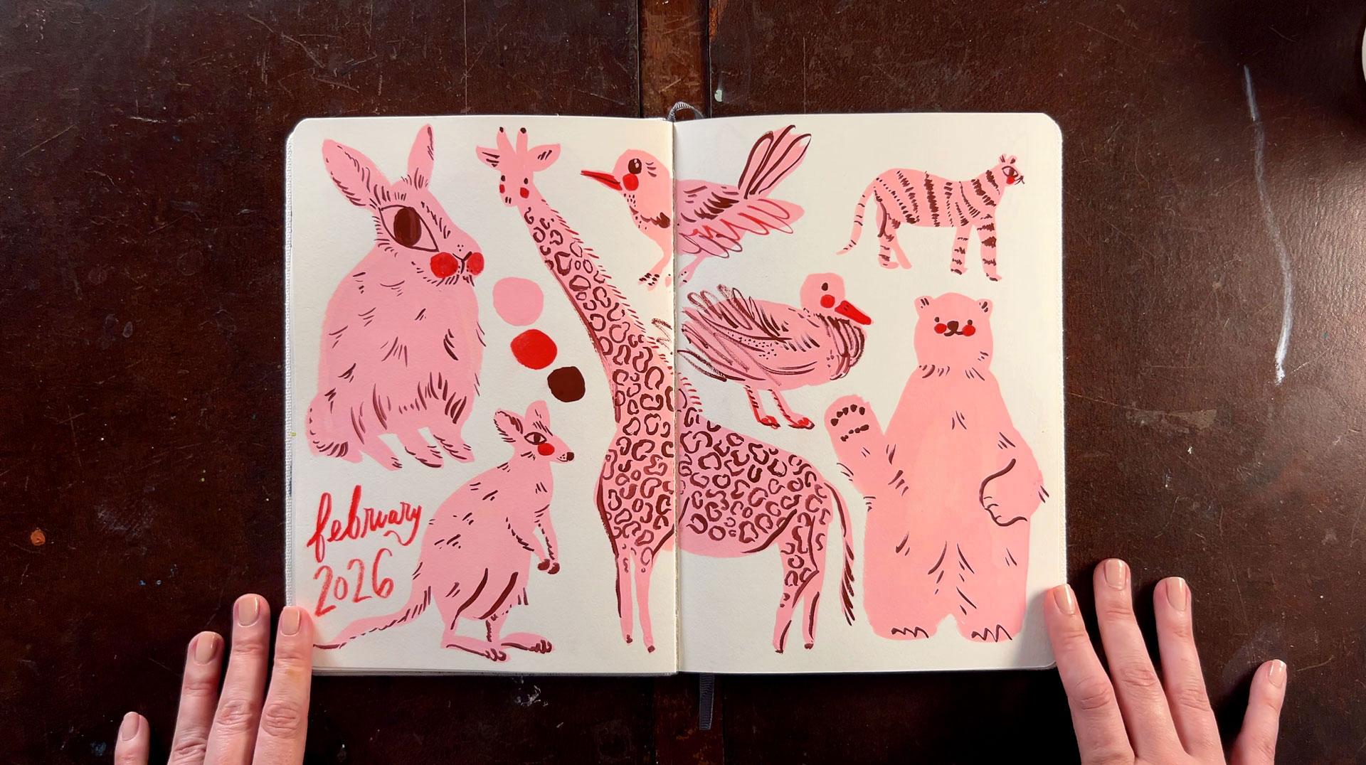
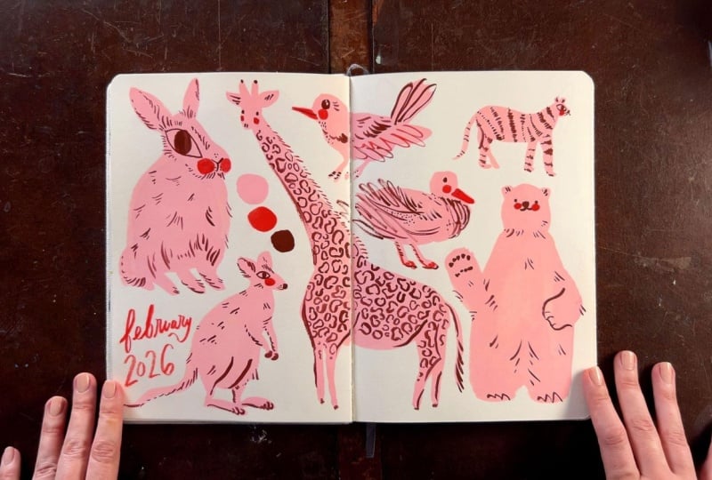
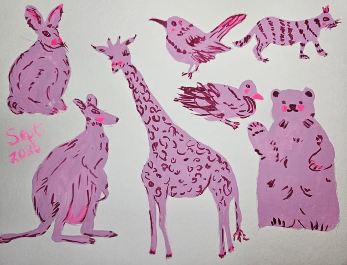
2. Your Project!: Project for this course is designed to be beginner friendly while also exploring the foundational technique
of layering with guash. I want you to follow along and paint some animals with me. You're encouraged
to do a full spread of multiple animals
like I'm doing, but you can absolutely modify the project to
fit your capacity, even if that means
painting a single animal. Either way, you'll still get in some solid gouache practice. The entire project
can be done in a single 45 ish minute session, or it can be broken up into
multiple quicker sessions, thanks to gouache being
able to be re animated with water even after
it dries on the pallet. The animals I'm
painting are from reference photos I
collected from Unsplash. I've supplied them
as a resource, both as separate
images and laid out in the same composition
I'll be using in the demo. If you've taken my course, the sketchbook fillers Club, then I would consider
this entire project to be like a single
sketchbook exercise. I would consider it to be
the subject matter doorway completed in a floated spread. In the next lesson, we'll go over the materials
that we'll be using.
3. Materials + Intro to Gouache: Let's go over the materials
we're going to be using. I've gone ahead and
supplied this list as a downloadable class
resource PDF for you. First up are our animal
reference photos. I have supplied all
seven reference photos from Unsplash for you. If you're a beginner, I do recommend following
along with me, at least at first before branching out into your
own reference photos. But you do what you
want to, cowgirl. For this technique, it's
easiest to work from photos of animals in profile or
with distinct shapes. So imagine seeing
only the silhouette of the animal in the photo. If you can tell what
it is from that, it's a great reference
photo for this class. Like I mentioned, as
you get more confident, you can definitely
work on animals in any position or angle and
in more layers of color. Can even use this method to paint various
figures and objects. But start with the
animal references I'm demonstrating here just to get all the techniques
I'll cover. Then use your skills to apply it to whatever
you want to paint. Next up is gouache, my very favorite
medium to work with. Gouache is opaque watercolor, meaning you can get up and running with it with
a little bit of water and can rework the paint
even after it has dried. Unlike watercolor, it's got
a lot more pigment in it, making the paint
coverage more opaque, while watercolor is more
naturally transparent. One of the things I love
about gouache, though, is it can be watered
down and used in a similar blendy
way to watercolor, which to me is the
best of both worlds. Not only can the
paint be opaque, but after it dries, it has a flat map finish, which is great for
illustrators who scan their paintings
or for people who just like that
texture, which I do. I find it delicious. The opacity of the paint also means
unlike watercolor, you can work both light to dark and dark to
light in tandem, making the paint highly
layerable and forgiving. Guash is also quite dynamic, changing from wet
and washy to thick and textured depending on
how much water is used. I like to think of the paint
itself as pigment, drag, and texture, and water as
glide, flow, and softness. If you want the paint
to be blendy and movable and have soft
edges, you need more water. If you want the paint
to have more texture and to spread less and
to have clearer edges, you need more paint
and less water. Or you can land somewhere
in the middle with a blend of flowy and
opaque coverage. There are two main types of
gouache, regular and acrylic. Regular gouache is often
just called gouache, artist's squash or
designer's gouache, while acrylic is always
listed as acrylic gouache. With acrylic gouache,
you get the same matt, flat and opaque
coverage of gouache, but unlike regular
guash and watercolor, once acrylic gouache dries, it cares all the way and cannot
be reanimated with water. Due to its acrylic binder, it also can feel a tad more
plasticky than regular guash. When I was first painting, I really relied on acrylic
gouache because I didn't know how to layer without making
mud with regular guash. And so the layers caring all the way was
really helpful for me. I eventually learned
all of those tricks for successful layering
with regular guash, and that's what I want to
share with you today so that your first goes with it
can be more enjoyable. And they are to let your
previous layers dry all the way, like bone dry before layering
on top and to try to not scrub the brush too much to avoid reactivating
previous layers. Instead, try laying
the paint down in fewer strokes and to use either thicker paint or multiple thin layers with dry
time in between each layer, sort of like
painting your nails. Sometimes you'll want
your layers to blend or you'll want to pick up paint
from the previous layers. But as a beginner, it's really helpful to
know this so that you can avoid it for when you don't want that
to be happening. Now that I'm better at layering
than I was as a beginner, I really prefer the ease of squeezing out regular guash onto my palette and knowing
that if I don't use all of it at once
three days later. I can just add a little more
water and get going again, which also happens to make
starting easier for me. For this course, either
type of gouache will work, but if you're using acrylic, you'll want to make sure you're
rinsing your brush often, squeezing out less
paint at a time, and being mindful of how quickly the paint is
drying on your palette. You're just starting out and you don't know which one to buy, I would recommend starting
with regular guash. If you get curious about
acrylic gouache at any point, you can always add it in, and you can even use it at the same time as regular guash. So you're not backing
yourself into a corner by choosing
one or the other. I love both Holbein and Windsor and Newton
brands of gouache, but feel free to try out any artist grade brand
within your reach. Student grade tends to
not be worth the cost, as it's much less
pigmented and more chalky, and it's likely not going to give you the result
you're hoping for. Luckily, for this class
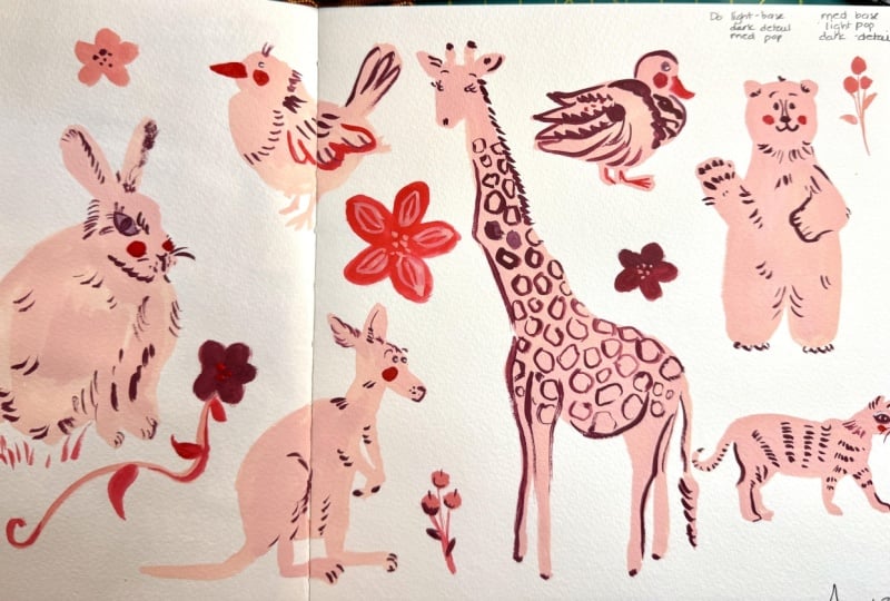
in class project, you only need three colors, a light, medium and dark, so you don't need to buy a
ton of tubes to get started. You can either do a light
color for the base shape, a dark color for the details, and a medium color for the pop or swap the
medium and light, doing a medium color
for the base shape, a light color for the pop, and keeping the dark
value for the details. I'll be using pink,
made of red and white for my base shapes,
a deep violet, made of red and blue
for my details, and a hot, warm red straight from the tube
for my pop of color. In the class resources, I've supplied color recipes
for the palette I'm using, as well as a few extra
palettes to choose from in case you don't like pink
animals, you monster. Also be using two watercolor
brushes in this course. Both of them round, one larger, a size 12 for the base shapes, and one smaller, a size
four for the details. I really love my friend
Peggy's brand of brushes. They're the Pigeon
Letters studio rounds, and they are wonderfully snappy and they hold
up for a long time. I also like Princeton
heritage and also these beautiful
gouache specific brushes from Emma Block in Pro Arte. Don't worry about having
these exact ones. You'll just want to look for watercolor brushes and to get a larger round brush and
a smaller round brush. I'll be working in my
sketchbook for this project, and right now I am using an etcher portrait
sketchbook with 100% cotton, 220 grams/meter squared paper. This is a pretty fancy and
very high quality sketchbook that I just happen to be
trying out right now. Again, you can do whatever
the heck you want. If you want to run out and
get this sketchbook, you can, but you do not need a
fancy sketchbook to have a good time and to have
success painting with Guash. I had to choose my
favorite sketchbook is actually a moleskin art sketchbook with 165 grams/meter squared, not cotton paper, but I've also had a lot of luck with Strathmore 500 series, soft cover journals with 190
grams/meter squared paper, as well as separate sheets of 300 grams/meter squared Canson
Excel watercolor paper, which are very economical. Just want a thicker paper
that's made for watercolor or mixed media paper that can handle a little
bit of wet media. If you do end up working
in a sketchbook like me, I do recommend using binder clips to help hold
the pages tightly in place. To mix my paint,
I'm going to use a basic plastic six well tray, but you can also use
ceramic palettes, palette paper, or
even an old dish that won't be eaten on anymore. I also have a water
cup and a paper towel, which can be used
for many sessions. I've been using these same
paper towels for over a year. Two totally optional supplies that you'll see me use
that are kind of cool and kind of helpful are a
small water bottle dropper, No, a small water dropper bottle to add clean water
to my paint mixes. But you could also use a little dropper thingy of pipette. And secondly, this color shaper, which is essentially a tiny
silicone spatula that I like to use for mixing up my colors without losing a bunch
of paint to my brush. Both of these tools can be easily replaced by
your paint brush. So if you're just starting
out and don't want to buy a bunch of supplies,
don't worry about it. That's why they're optional. But you're going to
see me using them, so I wanted to mention it. All of this has been shared in the downloadable
class resource PDF. Now it's time to get
started on our project. Let's start by mixing
up some paint.
4. Mixing The Base Paint Color: Get started, I'm going to clip
down my sketchbook pages. This keeps the
pages from warping and helps hold them
still while I'm working. I'm going to mix up my paint now in a six well plastic tray. My first color is a pink made
from white and flame red. So I'll squeeze out some of the white into one of the wells. But I'm going to squeeze
the red on the side of the palette because it's
a very strong pigment, and I want control over how much I add to the white
to make my pink. I'm then using my
paint pusher to well, push around the paint to
help mix up the color. You can absolutely do
this with a brush. The reason I'm using these
is I've noticed I can lose a lot of paint in the brush during
the mix up process, and this tool helps
me keep as much of it as I can in
the palette and also allows me to mix the hue correctly before having
to add any water. If you're using a brush, you'll want to wet
the bristles and mix. Be sure to rub the
brush along the edge of the palette to get as much
paint out as possible. With my pink hue to my liking, I can add some water to
get the consistency right. I'm using my little
dropper bottle to help control how
much water is added. But if you don't have
it, just go ahead and use your brush to
add water and mix. This first layer
of paint should be the consistency of heavy cream, melted ice cream or
thinner like whole milk, as we want the paint to
be able to move around the page as we create
big base shapes. Remember what we
chatted about in the materials lesson with water and paint
being on a spectrum, we'll be starting out
here for our base shape. And then as we mix paint
for additional layers, we'll use a little less water, making a thicker paint. This is one of the most basic and powerful
elements of gouache. The textural differences based on how much water
you're adding and practicing and combining
different gouache textures is where the paint
really comes alive. This project we're
doing together, these gouache animals are really gentle way to begin exploring, combining wetter, glideer, flowier layers
with slightly thicker, bolder and more textured layers. With our paint all mixed up, we're ready to paint the
base shapes of our animals.
5. Painting Base Shapes: I've got my reference sheet
pulled up out of screen, and with my larger
size 12 round brush, I'm going to start in the right corner with my polar bear. I load some paint onto my brush by swirling and pressing
it into the paint, and then running it
along the edge of the palette to get
off the excess. I start with a
circle for the head, two little circles for the ears, and then a long
ovctangle for the body. Ending with adding in the arms. And. For the giraffe, I'm actually going to start with his butt because
that's where he'll, kind of cozy up
next to the bear, and it'll help me
get the placement right if I use a known point. Like, instead of trying
to get the head in the right place and hoping the body lands in
the right spot. From there, I can add the neck and paint
the rest of the body. I am disregarding the
spine of my sketchbook, and I'm just painting
right over it. S To make his horns and ears, I just stamp the
brush down and then fill the rest in with a
triangle shape for his face. I load more paint into
my brush and place the duck in the groove between
my two painted animals. At first, I have painted
his head too low, so I rework the overall shape to bring the head up
a little bit higher. For the cat, I start
with his face so that I can place it right in this
upper right hand corner. I then fill the remaining
spot with my bird, placing the beak, belly, and tail feathers before filling him in and
adding his little feet. O. For the kangaroo, I
start with his head. Followed by his little
bean shaped body. And a tail that goes nicely
to the corner of the page. His big feet which remind
me of my dog's feet. And finally, his little paws. I can then use my
remaining space for my bun. I place his head first. Then add in his ears in
the available space. If you didn't leave enough room, just make the ears
really tiny or if you left too much room,
make the ears larger. I promise it'll still
look like a little bun. I draw in the
bounds of his body, make four simple marks for little feet and fill in
the shape with paint. I also add a little tale. I have a bit of an
awkward gap here, so I'm going to use that
space to swatch my colors, starting with the
pink I'm using. With my first layer done, I can fully rinse my brush
and let the paint dry. I like to roll and
press my brush into the side of the water glass to really get all that
paint out of there. Then I leave it on a paper
towel to dry. Quick tip. Don't leave your
brushes drowning in your water cup as it can
damage them pretty quickly. Allow them to dry on their side, and they'll be just fine. And the next lesson,
I'll show you how to adjust and fix minor mistakes.
6. Fixing Mistakes: I'm noticing the draft body and leg could connect a
little bit more smoothly, so I add to the shape
with a little paint. You'll notice the wet paint is a little lighter
than the dried, but as it dries, it comes to
match the other dried paint. This is a totally normal
gouache attribute. Lighter colors dry
a little darker and darker colors dry
a little lighter. You'll get used to it as
you paint with it more. I also accidentally smeared
some paint on my draft leg, so I'm going to lift that paint out by wetting
a clean brush, scrubbing at that area to be removed and wiping away
with a paper towel. More intense mistakes can
be covered by letting the paint dry and going over it with another
layer of paint. And the next lesson, we'll mix up the paint
for our details.
7. Mixing The Detail Paint Color: My darker color for the
animal details is going to be a deep violet made from
flame red and cyan. So I'm squeezing some
red into the pale, but squeezing the
blue on the side. Again, so I can control how
much I'm adding and mixing. I pick up some blue with my paint pusher and mix
it in with the red. Then I add a few drops of
water and get ready to paint. I want to add a
little less water to this paint than
I did the pink, as I want these layers
to be thicker and bolder and in some
spots more textured. My third pop of color
will be the red itself, which is already on my palette. So now I've got all my
colors ready to go. If your pop of color isn't a straight tube
color like mine, now is a good time to
go ahead and mix it up. And the next lesson,
we'll finish off painting our animals
by adding details.
8. Finishing with Details Pt 1: To add my details,
I'm going to grab my smaller size four brush and load up some of my
darker color to begin the bear's face and
prominent details, which is as simple
as a little nose, two eyes, and half
circles for the mouth. A few ticks for ear fur
help break up the face. The next prominent detail
I see are his little paws, which are just little
easy dabs with the brush. Next, I'm going to
add a form line, which helps separate his
arm and paw from his body. And little squiggles
for his feet. All that's left is to add some flicks of fur to
give him some texture. I then clean my brush
and grab my pop of color to give my
bear some rosy cheeks. For my kitty, I follow the same process first with the face in
prominent details, which is a little dot
for the nose and an eye, which I exaggerate
a bit just for something different than the
dot we did with the bear. Then just a few flicks
of ear fur and whiskers. The cat doesn't have
many form lines that need accentuated since
he's in full profile, so I move right into
the texture marks, which sort of create
form themselves. With a red cheek,
my kitty is done. The pop of red doesn't only have to be used
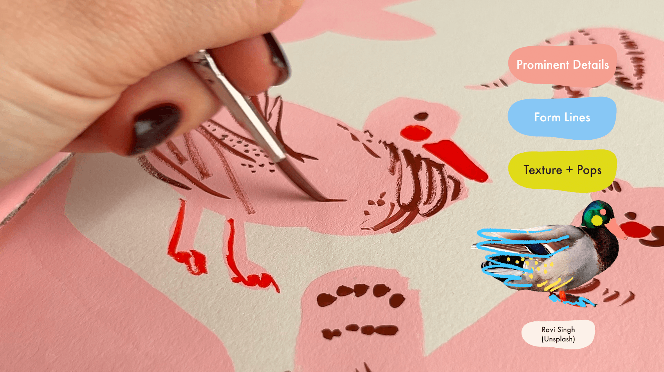
for cheeks, though. For the duck, I'll use it
to add the duck's bill. Followed by a cheek. Then a few squiggles
under for his feet. Then I switch back
to my darker color to add in his eyeballs. His main form lines
are his wings, which I add as I start to add in scribbles and dots
for the texture. I think if I had followed
my own advice and put the form line in
for the wing first, I could have held
back on some of those texture details,
but that's okay. He's really cute anyway. For my bird, I'm using
my pop of red to add a beak and cheek. And learning my
lesson from the duck, I'm going to add a form
line in for the wing. I then grab my
darker color to add a pupil and a form line for the back tail feathers before adding in some
texture dots on his feet. So swish flicks of the brush for tiny feathers
and a few dots. I add a few expression lines to his eyes, which, you know, combined with the flat
line of his mouth does accidentally make him look a little worried, but that's okay. No toxic positivity here. Little worried bird is welcome
to the party as he is.
9. Finishing with Details Pt 2: For my big old draft, I begin with the horns and face. Those are kind of the
prominent details here, and I'm keeping the
marks quite simple. I use my brush to
add some form lines, and where my size four
brush ran out of paint, I get some really nice
dry brush texture. I like this order of face prominent Details
first, then form lines, and then texture because the first two lift so much weight to get
the picture across, as you can see with the draft, which although he doesn't
have any texture added yet, you can still tell it's a draft. Unlike my previous animals
which have fur and feathers, my draft has a really
beautiful pattern that I can reproduce with tiny
organic semi open circles. While the marks are
simple to make, there's no rushing
the time it takes to apply them all over
the draft's body. These moments can feel
really meditative, so try to sink
into it and enjoy. A I'm going to then
grab my red to add some cheeks and we'll add some flicks of fur
going down his neck. Since I'm passing
over the swatch area and have red on my brush, I'll go ahead and add it
to my color swatches. For my bunny, I begin with
a little Y for his nose, then paint in a nice
big folksy eye. This bunny is very fluffy, so I'm using flicks of fur to create the form
line of his head, eye, and ear instead
of a solid line. From there, I add
little flicks of fur all over his body
to fill out texture. I use my pop of red to add some big cheeks and
letting it dry a little, I top it with a
few darker spots. I return to my bird to add little pink reflections
to his eye, which only makes him look
more worried, still okay. With my dark colour on my brush, I add my final swatch and get ready to add details
to my kangaroo. Just like the other animals, I begin with his face and move down his body adding
form lines and texture. And a red cheek finishes
him off nicely. And the next lesson,
we'll finish our page with a very
important detail.
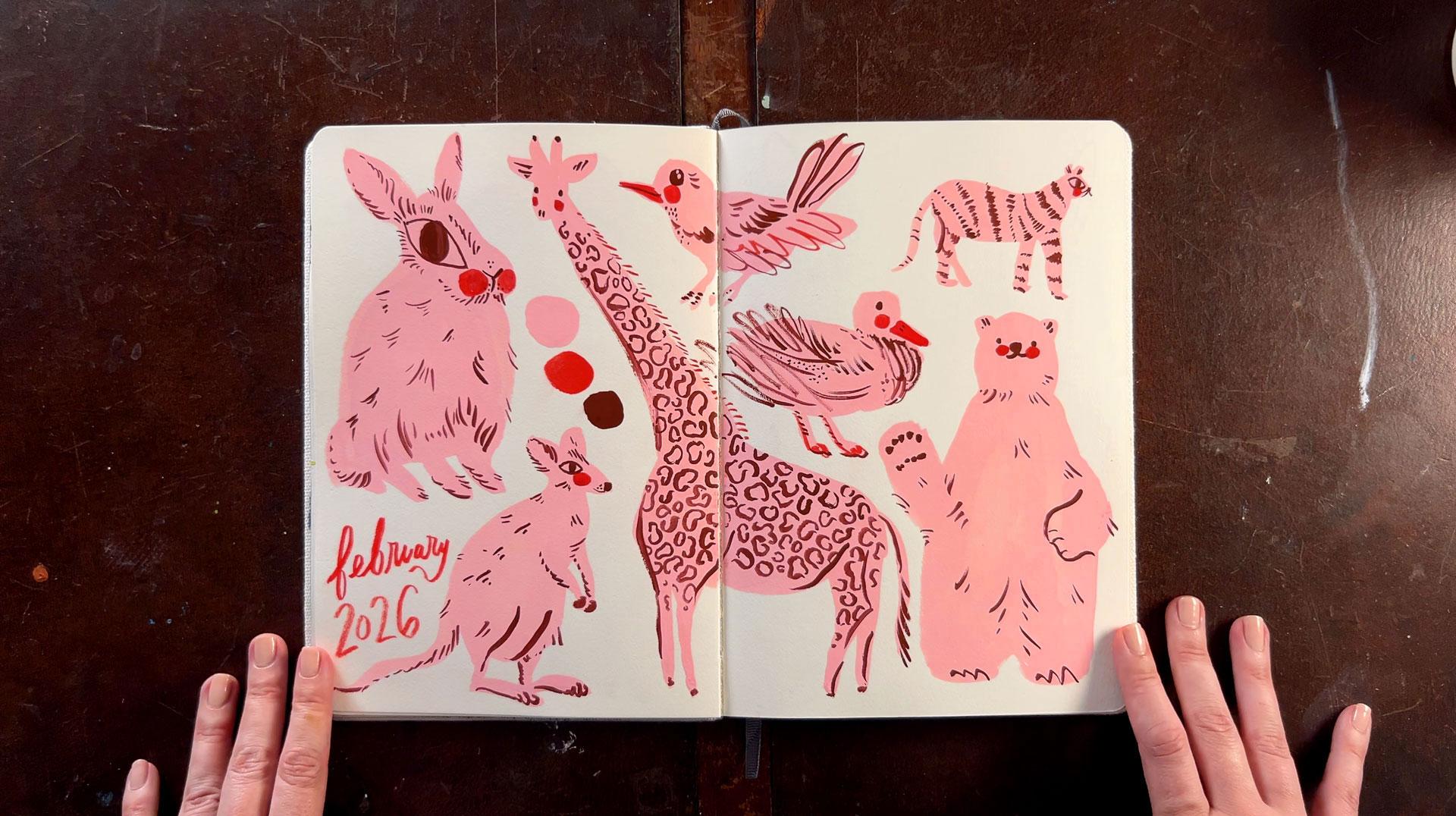
10. Dating the Page: The last step is small
but so important, and that's to date the page. I'm going to paint
mine with my pop of red and smaller size four brush. If you can believe
it, throughout all the years I've
been painting, when I look back
through my artwork, it isn't the ugly
stuff that sucks. It's the undated stuff. Whether you hate, like, or love what you made,
don't forget to date it. There will come a
time in the future where being able to place the time you created this piece will be meaningful to you. And the next lesson, we'll do a quick review of the process
we just covered together.
11. Quick + Handy Review: To recap what we just did, we started by gathering
reference photos of animals. Well, I did that part for you,
but that's the first step. Welcome. Followed by choosing a limited color palette
of a base color, detail color, and pop of color. We began by mixing
up our base color and painting the base shaped
silhouettes of the animals, and then we let the paint dry. Then we mixed up our
detail color and pop of color and set
out to add details. To keep things
simple and focused, we started with the face of the animal and any
prominent details, followed by form lines, followed by texture marks. We used our pop of
color for cheeks and small details that helped keep things feeling
fresh and exciting. And finally, we dated the page. Project showcases the foundational wet-on-dry
gouache layering technique for painting not just animals, but simple figures
and objects as well. And the next lesson,
we'll talk about where you can take
these skills next.
12. What Next?: With your animals all
painted and looking so cute, let's talk about where you can
go next with these skills. Firstly, you can use this same method to
paint other animals, but you can also use
it to paint objects, people, and simple places. Snap a picture and begin discerning what will
make your base shape, what prominent
details are first, what form lines are needed, and finally, what details
and textures to render. Secondly, you can begin
experimenting with blendier base shapes by utilizing
a wet on wet technique. In this course, we
utilize wet-on-dry, meaning we let each
layer of paint dry all the way before
applying more paint. This keeps the marks
and shapes sharp. If instead we apply varying
color and amounts of water, they spend their drying time mingling and creating
beautiful blends. You can then apply sharper
wet-on-dry details on top after the wet
on wet layer dries. These blends can be subtle
like this watery blend. Or quite dramatic like
this pigmented blend. And thirdly, is to begin experimenting with
additional layers of color. In this course, we focused on three simple layers
to keep things easy, but you can also build
more color and values in to create more detailed
and textured forms. To do this, you'll want to
work from bigger to smaller, like with these rabbits, which started as a bigger
dark background layer, then smaller white
base head shapes, and then looser layers of blue and peach to
add in for form, and finally topped
with finer flicks of fur and sharper
marks for the eye, alternating light and dark. These more complex animals simply have more layers
of paint added in, but it's the same
process we did here. I encourage you to share your
work literally anywhere, post it online, show
your friends and family, definitely show your dog, and give yourself a high
five for spending time being creative and practicing
your gouache skills. If you want some
additional support in between my
publishing classes, you may be interested
in checking out my fellow artist
PatrionGroup, where we have monthly art dates, art reviews, Q&As,
and art demos. It costs $10 a month, but there's also a $5
financial assistance tier available with access
to everything, too. It's a warm, wise, and safe space for
artists of all levels. Happy painting and
see you next time.