Transcripts
1. Introduction: My name is Karina, and I'm an artist and illustrator. I like using many different mediums for my arts, but guage holds a special place in my heart. It combines the unpredictability of watercolor and the opaqueness of acrylic. It's also great for layering other mediums on top of it. I love creating funny whimsical characters, and I'm a little obsessed with cats. And this class, I'll be teaching you how to create your own unique cat characters and paint them in goulash. If you're a beginner artists or Illustrator, you don't know where to start and creating your own characters. This class is for you. I'll show you all the steps in creating unique characters, starting with finding inspiration for interesting poses, choosing a color palettes, making sketches, and painting the final artwork will find inspiration by looking at different photos online and using them to create characters in our own style. I'll show you how to find that gesture line in the photo and apply it to your characters. Choosing colors is difficult for beginners and artists who are used to drawing in black and white. I'll show you two easy to use color palette options, the analogous color palettes and split complementary color palette will make several thumbnail sketches and choose to for our final project, one ballerina cat and one astronaut cats. Then we'll use a scanner and a light box to enlarge the sketches to retain their loose gestural quality. If you don't have a scanner or a lightbox available, you can use your phone or your camera to take a picture and then trace it using a window. Finally, I'll show you how to mix the colors and paint the characters and go wash. I'll give some tips and tricks to keeping the layers flat and colors consistent. Go wash is a great medium to layer with colored pencils, crayons, Inc. and more. I'll be outlining my characters with colored pencils. And you're free to use your favorite medium to outline with. If you need extra help. I have several resources available in the download section, including my references and sketches. You can also post questions in the discussion section. Okay, let's get started.
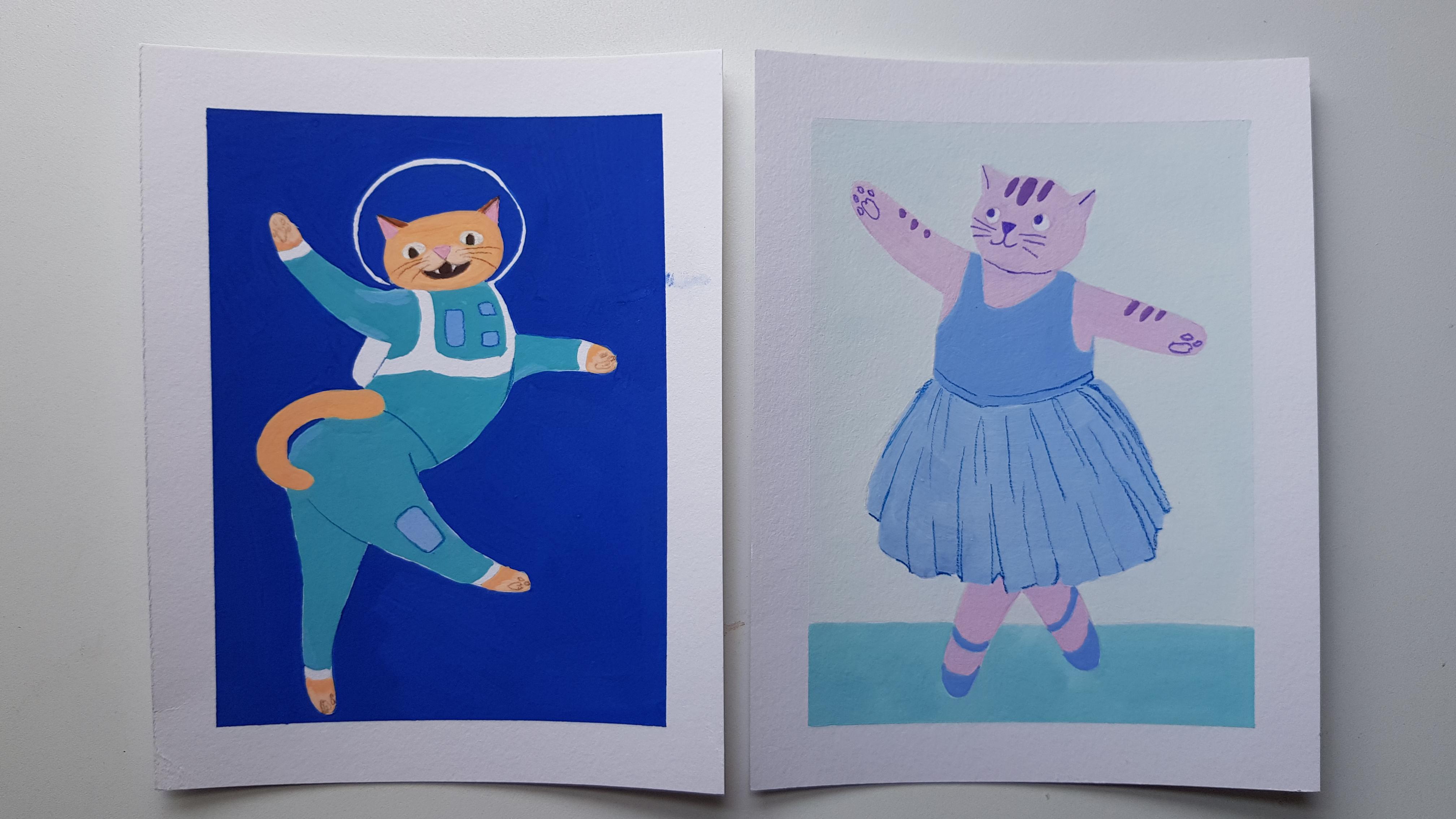
2. Class Project: In this class, we'll be creating to go wash paintings of cats. First we'll create a ballerina character. Then we'll create an astronaut character. For both of these paintings. Guides you through four easy steps. One, finding reference photos and drawing gesture lines, to choosing a color palette. Three, making thumbnail sketches and for painting the final artwork. The most important thing about creating characters is having fun. I encourage you to use the process that I teach you in this class to find your own inspiration and draw characters that make you laugh. I can't wait to see what you make. Let's get started by talking about materials.
3. Materials: Go watch is pretty versatile. So you have a lot of options in terms of the paper you use. You can start off with a cheap mixed media sketchbook or pad. For example, this is a Canson mixed media sketchbook. And the paper has a nice medium texture. It's not too smooth and not too rough. You can paint with guage, watercolor, and even acrylic inside. You can also choose watercolor paper for goulash. There are two basic kinds of watercolor paper. Here is an example of cold press paper. It's rough and thick. It's great for watercolor effects like this, blinding in the shadow. The other kind of watercolor paper is hot press, hard press paper has a smooth texture and it's great for getting flat colors. In this class, I will be using 100% cellulose paper. That's actually for acrylic, but it's smooth, just like hot press watercolor paper. It's fantastic for very flat layers like these. I'll leave links down below to my favorite materials. For sketching. All you need is a pencil and eraser and some printer paper. When we enlarge and trace our sketches, I recommend that you use a light pencil like 2h or 4H because it won't leave dark marks that will be hard to cover with paint. If you don't have a 2H pencil handy, don't worry, you can just use a regular number two pencil. If you draw very lightly. When you're starting out, you can buy a pack of synthetic brushes like these. It's good to have a big flat brush for washes, a smaller flat brush for shading and areas, and a couple of rounds. I also really like having an angled brush to get into tricky areas. In this class, I'll mostly be using these three watercolor brushes to keep things simple. We will also be using some masking tape to tape off our edges for nice clean borders. If you have a light box, you can use it when we are enlarging our sketches. If you don't have one, you can use a window or redraw your sketch bigger freehand. For paint, you have a couple of options. If you're starting out, you can buy a good quality primary mixing set, which usually includes white, yellow, red, blue, and black. The Winsor Newton brand also includes green. But you don't need it because it's really easy to make screen. Another way to go is to buy a student grade sets when many colors so that you can experiment without worrying about wasting paint. I've used this jelly go wash palette for a lot of practice paintings in my sketch books. My preference is to paint with a double primary palette, which has two kinds of each color, cool and warm. This makes it very easy to mix almost any colour you can imagine. So if you don't mind spending a little extra, I recommend these eight colors which you can buy in a set or individually. I'll link some paints that's below. For a line work, you can use a simple black or blue color pen or colored pencils. You can get a basic 12 color set of colored pencils or you can buy individual ones. I like to manage my line mark to the color palette of the artwork. So if you want to use the same color palette as in my demos, you will need dark purple, blue, green, and brown pencils. For your mixing surface. You can get a plastic or ceramic palette. I'll be using this plastic pallets and align it with a moist paper towel and parchment paper. Go wash, dries very fast. So this helps my paint stay wet longer. It's also easy to clean up because I can throw away the parchment paper and start over fresh. You will also need some paper towels to wipe your brushes. And of course, a couple of containers of water. That's it. We're ready to get started.
4. Inspiration: To inspire our characters will use various reference photos for a ballerina. Characters will use photos of ballerinas and for our astronauts, characters will use photos of jumping cats. I like to use Pinterest to collect references and different projects in one place. I just searched for ballerinas or whatever I'm interested in. And then I pin the photos I like to my project board. One thing to be careful of is that some images on Pinterest or copyrighted, so you can't use them for commercial work for free. I made sure to find images that are free to use for this class. I selected these four references for our ballerinas, and I selected these four references for astronauts. You can find the references in the download section if you want to use them. I like to print out my references so that I can draw all over them while I'm sketching. I suggest that you print out your references so you can follow along in the next lesson.
5. Sketching: Ballerina: Usually when I sketch, I use an HB pencil like this. It's a regular number two pencil that you would use at school. But for this video, I want you to see what I'm doing. So I'll be using a very dark pencil and a red colored pencil to sketch. First, we're going to draw what's called a gestural line. If you've ever taken a life drawing class before, you know what I'm talking about? And if you haven't, don't worry, you'll learn about it today. It's basically a line or a few lines that show the pose or movement in the figure. Let's start from this lady and the top-left and draw a line from her head all the way down to her toes. It's a nice arc. Let's also draw the arms and her other leg as well. Now, I will draw the gesture lines on my paper. Then I will draw my cat character. Based on these gestural lines. I'll draw a round face for this cat. I want the cat to be looking that way. So I'll put the nose off center. The ears will be right above the eyes. Then I will draw the arms following the gestural line. Some cats are very fluffy. Some good to make the arms and legs pretty thick. This may be a little too thick, but I can fix that when I trace my sketch. Now, I'll draw the outfit. Okay, that's it. That's our first character. Now let's take a look at this dancer. Let's draw the gesture line on the reference first. Now I'll redraw the gestural lines on my paper. I'll draw an oval head for this cat's. I'll make this cat face forward. But look to the side. Here are the arms, her body in her legs. Then I'll draw the outfit. You can draw any outfit. It doesn't have to be from the same photo. And that's our second cat. Now, let's draw our third ballerina. Let's draw the gestural lines. Again. Her spine is like an S-shape. I'll draw this cat with a square head. I'll make the CAS expression a little more serious. I'm not sure if the cat legs are this long, but we can imagine they are. You can draw a skirt for her if you want. But I'll leave her like this. Here is our cat and number three, let's move onto our last sketch. This is another as shape. Let's go back to an overhead. This cat will be looking that way. I'm going to draw the nose off-center again. Here are the arms, the legs, and the outfit. Okay, that's it for all of our sketches. It's time to decide what sketch you will use for your project. I really like these two. I think I'll choose this one for my project. Now, it's time to enlarge the sketch. I scanned, and that enlarge my sketch using Microsoft Word. But you can also take a picture and enlarge it using any word processor or image editing program. As you can see, I made some adjustments to my sketch. I decided to make her more pear shaped and also change her skirt. Here is the reference I looked at for her skirts. When you make your sketches, feel free to combine different reference photos and use your imagination to make your characters your own. By the way, if you're having trouble with the sketching stage, I include cleaned up versions of my cat sketches and the download section. Feel free to use any of them for your class project.
6. Color Palette: Analogous: And analogous color palette is a color palette where the colors are next to each other on the color wheel. For our first painting, we will be using a cool color palettes. The colors on this half of the color wheel will mostly be using these colors. Greenish blue, blue, purplish blue, and purple. For a bright green, I like to use this cool blue and cool yellow. This is two yellow. So I will add more blue and a little water to make it easier to mix. If you are used to watercolour, be careful about how much water you use with goulash. When you use a lot of water, it will become more like watercolor than opaque goulash. I like to mix a couple tenths and tones. So first, let's make a tent by adding white. It's like a pastel color. I also like to see what it looks like if I make it the color duller. So I will add a complimentary color to make it less bright. Since this is green, I will add some red, which is opposite of green on the color wheel. Next, let's make a darker version. I'm going to add a little black. Black is very strong, so I don't need a lot. Now let's make some bloopers for this blue. Let's use this sky blue color. It's very, very bright. So let's add the compliment, which is orange. I will add a little yellow and red paint. This looks much better. Let's make a lite version by adding some white. I'm going to mix the blue again and see if I can make it just a little lighter so it's easier to see. Let's see how the blue from a tube will look. If I don't add any orange to it. This is a little too bright for my taste, so I probably won't use it. If you prefer bright graphic colors, you can use more colors directly from the tube because they are the brightest. Next, let's make a purplish blue. For this color, I'll use the ultramarine paint, which is already kind of purple. Let's make a tent by adding some white. Now, let's make it a bit doll by adding yellow and red. Let's also make a darker version by adding a little black. I think this will be good for an outline color. Now, let's make some purple. The easiest way to mix purple. To use this cool read and magenta color together with the ultramarine color. This is a very red purple, but that's okay. I like it. Let's make a tent by adding white. Next, let's make it a more bluish purple. I'll add more ultra Marine to this mix. Now, let's make a tent by adding white. Okay, let's mix Just a couple more color variations. Let's add a little yellow to this purple. This is a nice mulberry color. Let's do the same thing to this reddish mix. Now, we have a big range of colors we can choose from. I think I'll mostly be using these colors. If you want to make your own color palette, feel free to use any cars that are next to each other on the color wheel. For outlines, I'm going to use colored pencils. You can also use a very thin brush with dark awash colors. That's it. Now that we have chosen our colors, we can move on to our next lesson, which is painting.
7. Painting: Ballerina: Now that we have enlarged our sketch and picked our colors, is time to paint. I've transferred my enlarge sketch to my paper using a light box and drew an a very light 2h pencil. Before we start, I just wanted to say that a move very slow sketcher and painter. So everything is sped up. Don't be discouraged if you are a beginner or if you are slowly Me and it takes you longer than the demo time. It doesn't matter how long it takes you to complete your artwork, as long as you're enjoying the process. First, I'm going to tape down my painting so that I get clean edges at the end. It also prevents the paper from curling. I'm going to start by painting the body of the cat a reddish purple color. If the paint and streaky or not the exact shade you want, don't worry, you can always put down another layer. I usually end up doing two to three layers to get a consistent matte finish. Goulash varies by brand, but a usually dries either the same as the wet color or darker. I'm using Windsor and Newton brand paints, and I find that the dark colors dry darker and the light colors dry lighter. When I add water, the colors look very light by dry, much darker. This is all to say that you'd need to experiment with your brand of paint to see what happens when it dries and when you layer your colors. Next, I'm going to pay her top and skirts and needed blue color. I'm not really happy with the way the colors are right now because they kind of blend into each other. But it's okay because I can fix it in my next layer. I'm going to paint the floor a bluish green color. I like to paint the bottom of my illustrations dark so that it give some weight to the peace. When you paint in layers, make sure you wait for the previous layer to dry first. You could also use a hairdryer to speed up the process. I think the purple dry too dark. So I am going to layer a much lighter color on top. I used a little strip of paper on the side to test my colors and see how they look next to each other. In this next layer, I'm going to paint in a darker, more saturated, purplish blue color for her top, for her skirts. I'm going to use the same color, but a little lighter. Now, I'm painting the background, a very light version of the floor color. I decided to keep it almost white to have an eerie feeling. And the artwork. I'm going to start outlining the facial details in a dark purple pencil. I'm excited to also outline the little beans and her paws. I think she needs something extra. So I'm giving her some purple stripes on her head. I'm going to go back with a dark blue pencil and draw the folds in her skirt. I like to match the color of the pencil to the paint. So that's why I didn't use the purple pencil here. Let's take off the tape and take a look at the finished artwork. That looks pretty good. I think the little details and the skirt and pause made a big difference. Now it's your turn. You can use the same references as I did, or invite your own ballerina. Don't forget to post your progress in the project section. In the next lesson, we'll start the process again for an astronaut cat.
8. Sketching: Astronaut: For our next character, will use photos of jumping cats as inspiration. You can find your own photos or you can use my references which are available in the download section. As always, the first thing I do is draw the gestural line and top other reference photo. Then I redraw the lines on my paper. I'm drawing a rectangle ahead for this cat. It's looking off to the side. So on drawing the eyes and nose slightly off-center, I drew the cat a little too close to the edge of the paper. So his left arm is a little too short. But if I choose this sketch for my painting, I can always fix it when I enlarge my sketch. For this next Cat, I also true that gesture lines. I chose a round head this time. These photos are really funny. It kinda looks like he's doing karate in the air. I darken the top part of his eyelids to make him have a mischievous expression. And now I'm drawing his space suit and his little air tank. Harris, the third cat. I'm trying the gesture lines first. This is a very interesting pose. It looks like he's saying hello to us. It's getting a little messy, but no worries. Everything will be cleaned up when I scan and enlarge my sketch. Now, our final cat, I drew that gesture aligns his flying off to the side so a may be hard to draw. I decided that I will rotate the paper so that it's easier to draw. This paws are difficult to draw. I had to try a few times before getting it right. Now I'm drawing his air tank and space suits. Right around this time, I realized that I completely forgot to draw the helmets, some drawing the helmets for the rest of the cats. Here are my four sketches. I like the third sketch, some going to use it for my painting in the next lesson. Next, you should scan or take a photo of your sketch and enlarge it and transfer it to your painting paper. And the next lesson, I'll show you my painting process for this character.
9. Color Palette: Complementary : In our last painting, we used an analogous color palettes. And in this painting we'll use what's called a split complimentary color palette. First, let's review what are complimentary colors. They are colors that are opposite each other on the color wheel. For example, green, red, yellow, and purple, and so on. For split complementary color palette, you would choose one color and then to similar colors that are opposite on the colour wheel. For a second painting, we'll be using these colors, orange, bluish-green, and purplish blow. Now we're ready to make some colors. First, I'm going to mix a nice orange. I'm using my warm yellow and mixing it with my warm red paint. Let's see how it looks on the paper. It looks very bright. Let's add some white to get a tint of the color. Next, I'm going to make a dollar mix. I'm adding a little bit of blue to tone down the color. This new color is much less bright. I also want to get a tint of the new color by adding weight. I'll probably use the immediate orange, since there will already be a lot of contrast with the complimentary colors. Next, I'll make a teal color by using a cool blue And the cool yellow together. This makes is very yellow. Some going to add a lot more blue and see how it looks. Now, I'm going to make a tent by adding white. I'm also going to make my background color, which I want to be a purplish blue. I'm going to mostly use ultra marine, a touch of the sky blue and a little yellow and red to tone it down. I'm also going to make a tent by adding white. I think I'm going to use this color for some details in the painting. Let's see what colors I will use for the outline. I'm testing out my colored pencils to see what looks good. I think I will probably use the brown and the dark blue for my outlines. I'm going to use mostly these colors in my work. In the next lesson, we're going to start painting our astronauts cat.
10. Painting: Astronaut: I've already taped on my paper. And now I'm painting the fur of the cat with a yellowish orange color. I may adjust this color later depending on how it looks with my background and the other colors in the painting. Now I'm painting the suit of the cat with a light teal color. You will see that this teal color actually dries very dark, but that's fine because it works well in this piece. You're mixing colors. Make sure you mix enough paint to paint the entire layer. Because it's very hard to mix the same color again, due to the difference of the color of what and dry paint. And fortunately, I have this problem all the time. So sometimes when I'm continuing to paint the layer, my colors may change and I have to adjust them later. I'm using traditional goulash paint so I can reactivate my colors with water if I have any leftovers. If you're using acrylic guage, the paint can't be reactivated. There are advantages and disadvantages to both. Now I'm painting a second layer of color for the suit to make the layer appear more flat and smooth. I've painted the color for the background, which is mostly ultramarine, will the touch of the sky blue color and a little orange to tone down the brightness. I'm painting the first layer and it's looking a little patchy. I haven't mixed enough of the background color and also I'm using some water to help the paints spread out easier. It's okay because in the next layer, I can smooth everything out and it will come out velvety and consistent. I use a flat brush to block in the bigger areas and the small brush to fill in any details that I can't cover what the big brush, I don't like to see a lot of brush stroke texture in my layers. So that's why I tried to use the flat brush as much as I can. Now I'm filling in the astronaut helmet with the background color. I decided to leave the outline, the white of the paper. You can also choose to draw it with something like a passcode marker or a white pencil, but it will not be as white as the paper. While I was painting the insight of the helmets, the rest of the background dried song Going back in and adding another layer to it. For the second layer, I usually use a thinner paint, almost like a glaze, unless I can see a lot of the papers showing through. Be careful though, if you're using a watery paint, it will mix together with the layer underneath. And now I'm using a dark blue pencil to add the lines that define the leg and the details in the CIT. I've also painted the little rectangular details, a light blue, which is basically the background color with a lot of white mixed in. I'm using a green colored pencil to draw the eyes for the cats. But you will see that. I will adjust that later. I think it's really cute when that cats have their little things sticking out. So I decided to have them visible in the mouth. I also drew the little toe beans. After you have finished this painting session, I felt like I wasn't totally happy with the project. So I left it for a few days and came back to it. If you ever don't feel happy with your painting, you can set it aside for a day or two and see how you feel about it afterwards. I use this method whenever I feel like there's something wrong with my work, sometimes I come back to it and decide that I actually really like it. And other times I have to make adjustments or even restart the painting. In this case, I decided that I needed to make some changes. The first thing I wanted to change was the color of the cat. It was a very yellow, orange, and I wanted it to be more red. So I painted a light layer of reddish orange all over the cats. That means that I had to cover up some of the outlines that I drew earlier, but that's okay because I can just draw them again. I also wanted to make the face and eyes a little bigger. Animals with big heads and big eyes look cute because they remind us of baby animals. I also decided to give him a little moustache as well because I think it looks cute. Now comes the tricky part of making the eyes burger. First, I tested out the pasa marker on top of my scrap paper. But then when I added it to my painting, it wasn't quite opaque enough. So I just went over it with white paint straight from the tube using my brush. I also decided to change the eye color to Brown to make the eyes stand out more. After drying everything with a hairdryer and making sure the paint wasn't tacky. Going back in with my brown pencil to add the whiskers and tow beans. Now, it's time to finally take off the tape. After looking at it for a little bit more, I decided to make one final adjustment is the eyes. He's looking down right now. But I wanted him to make eye contact with the viewer so that he looks more friendly. I drew the pupils bigger so they look like they're more in the center of the eyeball. That's it. This is the astronaut cat. I think they adjustments really help the character look more Qts and friendly. Now it's your turn. Don't forget to post your astronaut cat in the project section.
11. Final Thoughts: Congratulations, you've made it to the end of the class. We have learned how to create to unique characters from scratch, including how to find references. She was a color palette, make sketches, and paint the final artwork. One thing that I hope you will take away from this class by creating characters is fun and exciting. So choose some funny reference photos. Take the pressure off and enjoy the process. Don't forget to upload your projects. So the projects Gallery on the class page so that we can all take a look at your work. I really value your feedback. So if you have a minutes, I would appreciate if you left a review for this class, and if you enjoy this class, you can follow my profile so that you'll be notified when I publish future classes. Thank you so much for joining me. See you in the next class.
 Karyna Mangusheva, Artist / Illustrator