Transcripts
1. Welcome to Class!: There's this weird
place where many of us end up wanting to
learn something new. The place where you're
already pass beginner stage, but instead of feeling
hopeful and inspired, your motivation drops.
Sounds familiar. Learning plateaus are natural. When you first start learning
something, you're excited. There are lots of
inspiration and resources and it's easy
to see improvement. But at some point, the rapid growth
naturally slows down, which often results in a lack of motivation and desire
to move forward. Or as Socrates said, the more I learn, the less I realize I know. With watercolor, there
are many things to consider and you can
quickly get lost, but I am here to help you. Hello, great friends. My name is Elina, and I'm a full-time watercolor
artist and teacher. I created this
class after getting many requests for
intermediate classes, and my goal is to help you
move forward on your journey. This year is my
five-year anniversary since I started painting
with watercolor. During that time,
I never stopped improving my skills by trying
many different things, taking lots of classes, pushing myself out
of my comfort zone. In general, I always strive
to get better at what I do. I know it sounds like topic
intense and it probably is, but I'm so happy and
proud of where I am right now in my
creative journey. I've gathered a
lot of experience, and today I want to help you overcome the challenges
you are facing. In this class, I
want to give you a closer look at my creative
process, decision-making, and general approach,
things I do to refine my artworks and take
them it to another level. We'll start by practicing
some intermediate technique that can help you to enrich
and polish your paintings, then we'll go step-by-step
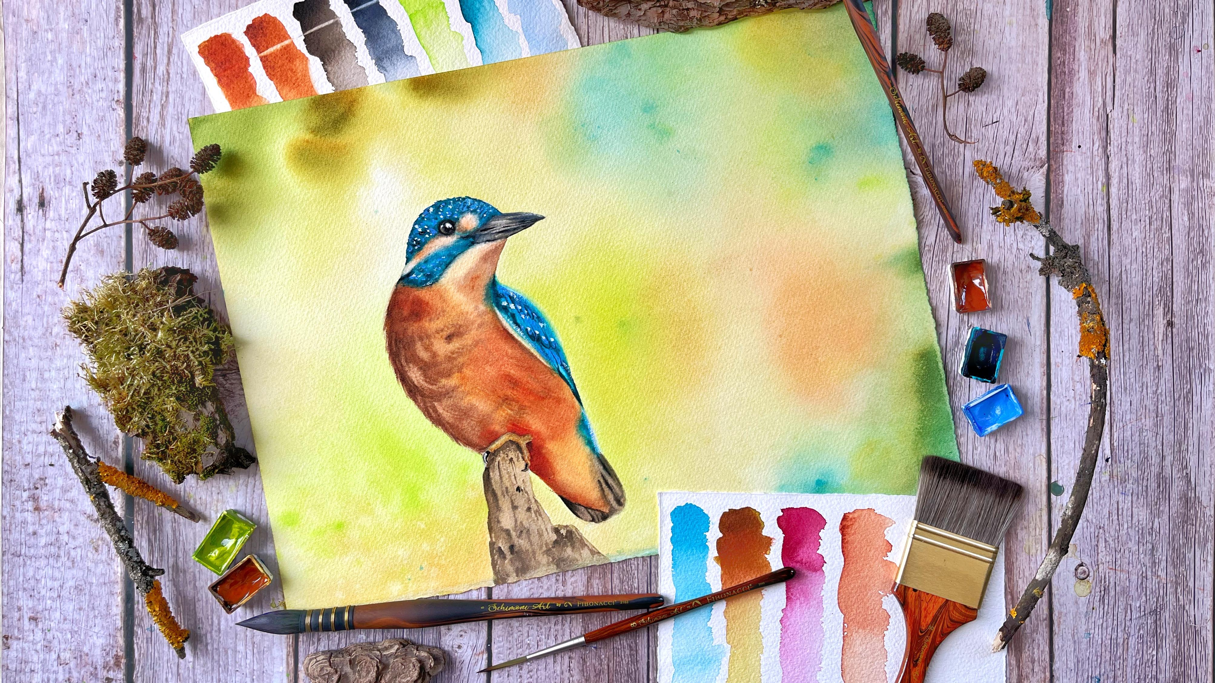
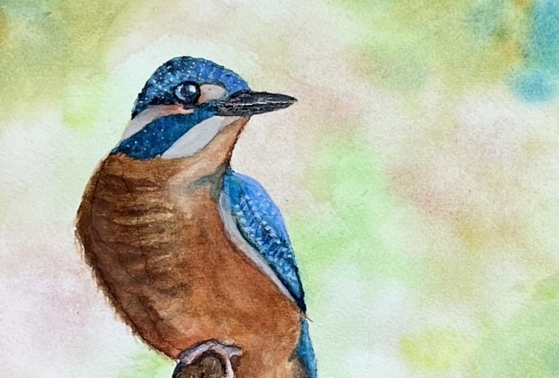
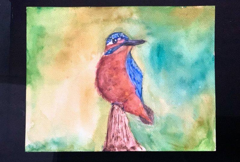
to my routine of painting this kingfisher
against the soft background. I haven't practiced
painting it before, so you'll witness all my
mistakes, the way I fix them, the way I plan and
decide my next move, how I choose the colors, our bird's overall look
of the painting and everything else that is part
of my creative process. I believe things
like this can bring a lot of clarity in your ideas, and will help you
continue on with more confidence on
your creative journey. This class is for those who consider themselves
intermediate, and you feel comfortable with the basic watercolor
techniques: wet and wet, wet and dry, dry brush
and water control. If you love watercolor and you're passionate to learn more, then you're at the right place. Let's get started.
In the next video, I will give you more
detailed overview of the class in
the final project.
2. Class + Project Overview: [MUSIC] Welcome
back. In this video there will be more about how the class is structured and
what your project will be. After going over the materials
you'll need for the class, we'll start right right with the techniques that I
consider intermediate. It's not that these
techniques are complicated or beginners don't know about
them or don't use them, it's more about when and how you can use them to
level up your paintings. It was when I started using these techniques in a
similar manner that I saw a significant improvement in my work and I was happier
with the finished pieces. It's true that this may be
directly related to my style, and for some of
you there might be different things that
will help you grow, we're all different, but still, those are essential
watercolor techniques and you can only benefit by practicing them and seeing the different ways
you can apply them. I'm talking about dry lifting, wet lifting and glazing. We'll have a
separate video where I'll demonstrate
these techniques. I'll be using them throughout the class in many
different situations, so if you can follow along, you'll get to
practice them a lot. Then we'll jump right in by
painting the background. I will show you my favorite
technique for wetting the paper that will help us
keep it wet for a longer, which means more time
for working wet-on-wet. I will show you how I
paint some backgrounds, a very valuable skill to
have under your belt. Then we'll start to slowly
build a bird layer by layer, starting from the lightest parts and finishing with the
brightest details. Finally, I'll show
you how I transform the finished piece from dull and flat to vivid
and eye-catching. Your final project in
this class will be either following
along with me and painting your version
of the king fisher or finding an old painting
of yours that you think can use a little
revamping and use techniques you have
learned in the class to try and give it an upgrade. Once you complete your project, don't forget to upload it in the project section
of the class. Go and have a look at your
classmates' projects too. Giving them a little
like or leaving the a truthful comment may be the reason they smile today. Are you ready to get started? Let's have a look at the
materials you'll need for this class. See
you in the next video.
3. Materials: Let's go through the materials I'll be using in this class. As always, you don't need to use exactly the same materials. I'll use my favorite
paper in this class, Saunders Waterford
in high white. It's cold pressed 300 GSM
and 100% cotton paper. The size is about A3 but I suggest you use the size
you feel comfortable with. I highly recommend that
you use cotton paper for this class since we're focusing on techniques
and multiple layers. If you don't have
cotton paper you can still try and follow along, just keep in mind that you'll
get different results. I will use this plastic board. If you can find a board that is made from non-absorbent
material, that will be perfect. You'll see why in the
following lessons. [MUSIC] I will use
my big ting palette filled with lots of colors but don't worry
we won't be using that many colors
in today's class. I have a separate
video about the colors where I will give
you some options, is the video right
after this one. [MUSIC] These are the brushes that I will use in this class. All except the one
on the left are synthetic brushes
by Schimoni Art. First I will use this big
one to water my paper. It is very soft and it
can hold a lot of water, so it's quite convenient. You can use your
biggest brush for that. Next for the larger areas I will use this soft quill size 5. It's synthetics quill. [MUSIC] This is the same
brush but in a smaller size, it's synthetic quill size 1. I will use this flat
brush for one of the techniques we'll be
using in this class. If you don't have something similar you can use
a brush that has stiffer bristles but still allows some amount of precision. It can also be round. These small round brush size 4, I will use for details. Finally, this rigger
size 8 which you can substitute with a
small round brush if you don't have a liner brush. I just love it because
it has a very sharp tip and I can make some very
fine lines with it. [MUSIC] Finally, these very
soft brush from goat hair, I will use to blend the
colors in the background. It's optional but the
effect is really nice. I got this for a few dollars and it's shading as you can see, but I've had it for years
and I use it a lot. You will need paper towels and
a cotton or a linen towel. Two jars of water, one has to stay clean take leave for when we need clean water. A pencil and an eraser
for the sketch, a pallet to mix the paints. You can use a plastic
palette or dinner plate, and for the details
some white gouache. In the next video we'll discuss the colors and color
mixes and I will give you some options if you
don't have some of the colors I'll be
using. See you there.
4. Colors: [MUSIC] Hello again.
In this video, I'll show you the colors I'll be using and some of
the color mixes. I will also give you
options for each color in case you don't have
one. Let's start. For the background and for
the highlights of the bird, I will use raw sienna. [MUSIC] If you don't have it,
you can use yellow ocher, burnt sienna, or naples yellow. [MUSIC] Next is red ocher. If you don't have
it, you can use Indian red or venetian red, or you can mix yellow
ocher with a bit of red. If you don't have any
of these options, you can use burnt sienna. [MUSIC] Next is sepia. [MUSIC] If you don't have it, you can use burnt umber mixed
with some Payne's gray, black, or neutral tint, or you can even skip
the burnt umber and use directly any of the
other colors I mentioned. [MUSIC] For details, I will use Payne's gray. Mine is slightly bluish, so you may have an indigo that will give you
similar results. If you don't have it,
you can use black, neutral tint, or sepia. [MUSIC] Next is a very special
color, may green. It's a very beautiful
bright green. [MUSIC] It is made
from phthalo green, yellowish, and Hansa yellow
so you can try and mix it using different greens and yellows that
you have available. [MUSIC] You can have a look at this lesson
from my greener class if you need more help
with mixing green colors. The next color is
turquoise green. You can easily make this
color with cobalt or ultramarine blue and
phthalo green or viridian. When concentrated,
it is very dark. [MUSIC] I will be mostly using it with
this next color, which is royal blue. I will show you
the mix in a bit. [MUSIC] You can get
royal blue by adding some white gouache
to your ultramarine. [MUSIC] Here I'll show you the mix. [MUSIC] You can actually have something similar ready to use and won't be
bothered with mixing. In fact, if you
look at my palette, you can see that I
have similar colors, but they have too
much white pigment, so the color is pretty opaque. It's why I decided to experiment
using this mix instead, and I'm happy with the result. [MUSIC] The next
color is Indian gold. It's one of my favorite colors. [MUSIC] If you don't have it, you can use quinacridone
gold or azo yellow. Burnt sienna by AmiGO also
has similar properties. Another option is to use a transparent orange
if you have it. [MUSIC] Finally, this rose
color by White Night, you can use magenta
or even opera rose. You can even use orange, but it's important
that it's transparent. [MUSIC] Actually, I'll use this rose color only in the mix with Indian yellow. Let me show you how it looks. Maybe you have something
similar already. [MUSIC] Here it is an orange-red that is very
bright but also transparent. [MUSIC] These are the colors that we'll use today. I know there are some
very particular ones, but don't worry if
you don't have them. Just use whatever
you have available. Even if you don't get
the desired result, you will learn something new. In the next video,
we'll delve into the techniques that we'll
be using in this class.
5. Techniques: In this video, I'll go over
some of the techniques that I'll be using a
lot in this class. Since this is an
intermediate class, I won't be explaining the very basic techniques like
wet on wet or wet on dry. But here are a few techniques
that are essential and will help you bring your
paintings to the next level. The first technique
is dry lifting. We apply it whenever we
want to erase dry paint. I'm taking my flat brush. It has a firm shape and bristles that are
more stiff than soft, they quickly bounce back to the original shape of the brush. I'll use the color
swatches to demonstrate. [MUSIC] I'm wetting my
brush with clean water, I dab it on my paper towel and I start to move my brush
across the paper surface. I blot immediately with the paper towel and
here's the result. We can use this technique
when we want to create a highlight or when we have painted over an area that
was supposed to be light. This can look different
with different colors. Some pigments are easily
lifted and others are not. They're called staining
because they have very fine particles and they quickly seep into the
fibers of the paper, making it hard to
leave the color. Although lifting is very easy on cellulose paper because there
the paint sits on top but it also means it's hard
to layer colors because you can disturb the previous
layer with your brush. Keep in mind also that if you use the same brush
for dry lifting, the constant scrubbing will damage it's shape more or less. [MUSIC] Apparently,
this technique is used to retrieve backs on highlights but it
can also be used to small hard edges.
Let me show you. I'm rubbing my brush across this hard edge and now it is softer. Let me demonstrate again. This is a powerful technique because it allows us to create a soft edge even if we couldn't get it right while
painting wet on wet, we will use it a lot
in today's class so you'll get the
opportunity to practice. This was dry lifting but
also there is wet lifting. It is basically
the same but it's performed while the
paint is still wet. [MUSIC] The difference is that the edges that we
get are software, this can be used to
create softer highlights. It can also be used to
create a softer texture, for example, when
painting the king fisher, we can use a very
fine brush to create very thin highlights that will help us emphasize the
feathering of the bird. In this case, we'll leave
a bit more water on the brush so that it pushes
some of the pigment away. In this case, you
don't necessarily need this default brush because the pigment hasn't settled yet and it's easier to lift it. Third technique that I will
show you today is glazing. Glazing means that we
add a thin layer of color on top of an
already dried paint. This way we achieve that
and we can slightly change the color but because
the previous color is still seen through
the thin paint, we create a luminous effect. I take some of that
mix here and I will glaze it over this
swatch over here. If I want to blaze it
only over the upper part, I wash my brush and
with some clean water, I soften the edge, blending it with the
rest of the swatch. It's why I said that some of the colors that you'll need
should be transparent. This way you'll get the
most out of this technique, I'll repeat that again here. I covered the part
that I have in mind. Then I wash my brush. I take out the excess water from it and I gently blend
it with the rest. This is easier then
with a softer brush and especially with a brush
made from natural hair. [MUSIC] Now, the
choice is yours. You can practice
these techniques on a scrap piece of paper. Or if you have some mold masks, this is for paintings
laying around. Or you can directly jump to the next video and start
the final project with me. You'll get plenty
of opportunities to practice all the
techniques in the process. Whatever you decide,
I will see you in the next video where we'll
finally start painting.
6. Preparation: [MUSIC] Hello and welcome back. In this video, we'll
prepare the paper. I have traced the
bird because I don't want to lose time trying to
get the proportions right. If you feel like drawing today, you are more than welcome
to give it a try. You can find the reference in the resources section
of the class. You can pause the
video here and come back when you are
ready with the sketch. Are you ready?
Let's get started. I flip the paper and I will
wet the backside of it first. If you're not familiar with this method of
wetting the paper, don't worry, I'll
explain it in detail. I generously wet the entire
backside of my paper, I make sure it is evenly moist and there are no dry
patches or corners. I leave it to dry
for awhile to absorb some water and then
I add some more. [MUSIC] Then I flip the paper and start wetting this side as well. Since the paper is wet, it sticks flat to
the board and it will stay like this
for a long time. This will allow us to work without taping it
with paper tape. While the water seeps
into the paper, I will prepare some
of the colors. I take some main green and
mix it with raw sienna. [MUSIC] Again, some main green and to this puddle I will
add some red docker. Again, don't worry if you
don't have some of the colors. You see that the
difference is very small. I add more water to the paper. Now, I will cover
it with my towel, and now we'll press it even
more firmly to the board, getting rid of all
remaining air rolls. Now this side of the
paper is dry and we can start painting
as we normally would. Quickly head over
to the next video.
7. Background: Let's start painting
the background. We want a smooth background. Of course we'll paint
it wet and wet. [MUSIC] I wet the paper again, only this time I will
leave the bird untouched. Since we wet the backside
of the paper too, it has a lot of moisture inside and this will
keep it with for longer so that we can work confidently on the
background without rushing. If you have some
water on your bird, you can blot it with a napkin. Now I will take my quill size 5, and I will go carefully
around the bird, make sure that your brush
has enough water on it. Otherwise, this part will dry more quickly than the
rest of the background. [MUSIC] Make sure everything is evenly moist and have a
nice even coat of water. [MUSIC] I soak up some of the drops that
went to the bird. I wipe the water that has
gathered on the bird as well. Otherwise, it will go back to the painting and may
spoil your background. [MUSIC] To make sure the coat of water is even, you can tilt your board in different directions for awhile. [MUSIC] Let's start painting. I take some May green, red, ocher mix and I added here
and there in a random spot. Now I repeat the same
with the other mix. [MUSIC] Make sure to have more or less
the same colors on both sides of the bird. Otherwise, it will look strange, especially here around the tail and here. I started to take
my green directly from the pan and I add
it to the background. [MUSIC] Now some pure red ocher. I start to overlap
the different colors. Sorry about that. I needed
to see it from up-close. This is raw sienna. [MUSIC] Now I go back and forth between different colors
overlapping what I already have in trying to achieve interesting but
also natural blend. [MUSIC] Now with
some clean water, I will blend the colors her. Some splatters with
May green. [MUSIC] I brought the droplets
that got over the bird. [MUSIC] Some splatters with
clean water now. Now we want to bring all these together in a solid background. So I will tilt my board. I soak [inaudible] liquid
that gathers on the sides. You can see that
the colors start to flow and you can help
them with a clean brush. [MUSIC] Now, this looks a lot better. You can also blend
the colors with a very soft brush like this one. It is dry and with
very light pressure, I can move the pigment a bit. I'm going around
the places where the colors aren't
blended very smoothly. [MUSIC] Now I will add more
splatters with clean water. If you want, you can lift
some of the colors to create light round areas imitating
the bokeh effect. Just drop some water, move it around with your brush, and then lift the color, wiping your brush and repeating the process as many
times as needed. [MUSIC] I will make another one here. I add some water in
a circling motion. I start to lift the color, wiping it on my paper towel. [MUSIC] One more here, you can add as many as you want. [MUSIC] Some more splatters
with main green. [MUSIC] Some spots here. I will tilt it again. [MUSIC] A lot of liquid
has gathered here, so I wipe it. Some splatters with clean water again and now I'll
leave it like that. We put a lot of liquid and remember that we wet
the backside too. So this will need a
lot of time to dry. I suggest that you leave
it to dry like that. Don't use a hairdryer. Keep an eye on it for
the first 30 minutes or so in case some weird
things start to happen. Remember that while it's wet, you can still fix
a lot of things. It has been about two hours since I left my painting to dry. You can see that the
corners started to lift. The surface feels more or less dry so now's a good time
to tape it to the board. Otherwise, it buckles
while it's drying. Another option is to leave it a bit more like that
and then place something heavy on
top of it to keep it flattened like some
books, for example. [MUSIC] We'll come back to it
after it's completely dry.
8. First Wash: [MUSIC] In this
video, we'll paint the first wash for the bird. This means that
we're going to cover only the lightest parts of
the bird. Let's get started. I take my quill Size 5 and I
wet almost the entire bird. I don't go near the edges. I'll do that once I have
some color on my brush. [MUSIC] I switch to the smaller brush and I take some raw sienna and
lots of water on it, [MUSIC] and I start to place it wherever I see a similar light beige tone
in my photo reference. Even if there's white
on the photo reference, we don't leave the
paper completely white. If you look carefully, you'll see that it's
most likely not white, but more likely a very
pale beige or gray. [MUSIC] Now I take red ocher and I'll start to
add it to the bird. [MUSIC] It's very hot today, so my paper started to
dry very quickly. I will try to make
the most of it, but I'll probably
need to come back again after it's completely dry. [MUSIC] I add more color on the left side of the bird. This is where I see it is the darkest and a little
bit next to the wing. [MUSIC] I paint with short
and quick brushstrokes and I try to follow the
direction of the feathering. [MUSIC] Now here on its chest
I see small dark feathers, so I'll try to emphasize them with even shorter brushstrokes. [MUSIC] I take some raw sienna and I will place it here. [MUSIC] Back to
the red ocher now. [MUSIC] I add more
and more dark spots. [MUSIC] I realize now that I need darker color
to show the contrast, so I take more red ocher, some rose and some sepia. [MUSIC] We'll call this the dark brown mix and with that I will emphasize this part here, the one that I think is the
darkest of the bird's body. [MUSIC] Some feathers here and there and here next
to the wing again. [MUSIC] Here in the upper chest where those darker spots are, don't worry if you
don't get it right because we are going
to have a second wash. I'm certain about
it at this point. I just don't like how dull
and textured this looks. [MUSIC] I add more dark tones here and I try to
make it look natural, but my paper has dried and the color is not flowing
the way I want it to. These leaves dark color
sitting like an outline there and I will definitely need to fix it with the
second wash. [MUSIC] I add some short strokes
to show some feathers. This is an important
steps because otherwise the bird
will look cut out. [MUSIC] Now with my liner, I will add those small
and very thin lines with just a little bit of
clean water on the brush. It is almost dry. [MUSIC] With my napkin, I can lift some of the color [MUSIC] and
with my fluffy brush, I can smooth some
of the harsh lines. [MUSIC] I continue adding
those final lines, though at this point
it's almost pointless. I'm definitely going
to have a second wash, but I can't help myself
trying to salvage this one. [MUSIC] Now with the round
brush, I'm trying to fix this hard line here by
moving the pigment a bit. [MUSIC] I blot it with my napkin and
it somewhat works, but as I said I better leave it to dry and
come back after that with a fresh eye and see what I can do with
the second wash. [MUSIC]
9. Second Wash: [MUSIC] My bird is
now completely dry, and I'll try to fix it because I don't like how flat it looks, the texture is too
harsh and that dark spot on the left seems
like it's outlining the bird. Let's see what we can do. I would enter area again. This alone will reactivate
the paint underneath. It will start to flow a bit and it will fix some
of that harsh texture. Before I start
adding new colors, I will try to leave some of the previous layer and
create some highlight. I'm using my flat
brush for that. I tried to bold this
dark color to the right, so that it's not like
an outline anymore. I'm being mindful
of the edges of this wet spot because they
can dry with the hard edge, so I'll keep an eye on that too. [MUSIC] Now I think I can start adding
some new colors. I didn't like how flat it looked with raw
sienna and red ocher, so this time I will
add some Indian gold. I love how luminous
this color is and I think it will make the
bird look more alive. I take some with my quill size 5 and now we'll start to
add it here and there. I now wash my brush
and I will spread it, leaving a very thin layer on the places where
the highlights are. [MUSIC] If it's too much, I can lift it. Remember that we don't want
an even coat of paint, we want to show some
highlights and shadows, so that the bird looks real
and three-dimensional. More dark color here. I use the same mix
from the first wash, and of course, here. I added from the edge
towards the middle so that it shows the curve
of the bird's chest. Here I add smaller
spots in a kind of semicircle again to show
the roundness here. I list some of the colors here. More dark color here. I follow the same principle. [MUSIC] I need more sepia. I try to create a very smooth
and natural transition from the outline to the middle. Now it's time for some
highlights again. I will leave some of the colors here imitating lighter feathers. Finally, the trick
with the final lines again to add some
extra fluffiness. Sometimes they work out well
and sometimes they don't. Sometimes they're visible and sometimes they're more subtle. I think this is
more than enough. Let's leave it to dry
and we can come back after that for some
fine lifting work.
10. Fixing the Hard Edge: In this video, we'll fix the
hair digits that we got, and we will make
some fine lifting to polish whatever
we've done so far. I take my flat brush,
and I'll start scrubbing around
these hard edge here. The color is easily lifted. I wipe my brush each time
I pick up some color. Here I added too much color, so I'll try to retrieve
some highlights. Here I have some smudges,
I will fix them. Now, here I will try to break
that continuous line of the bird's tummy and chest
by lifting very fine lines. This way, I'll create the
illusion of separate feathers. I'll fix the hard edge here. Some highlights in darkest part. I think this is enough. In the next video, we'll add some bright blue to
this pretty bird.
11. Painting the Bird's Head: [MUSIC] Let's paint
the bird's head. I want this area
here near the beak. I add more red ocher to it. Same with this
lighter part here, it needs more color. I soften the edge
with the damp brush. Same thing here. I make some shadows with light
sepia and red ocher mix. Add some pure red
ocher here below. I'm increasing the
shadow beneath the beak. It's looking so much better
now, don't you think? I want the areas that
I'll be painting blue. I prepare my mix of darkest
green and royal blue. It's a saturated mix. [MUSIC] I will start
adding that color. Now, I wash my brush and I will dilute the color here
on the top of the head. I'm going around the eye
and this lighter area here. Adding some spots. In here, I will add some
concentrated turquoise. If you use a red
color you can drop some Payne's gray or
indigo to make it darker. Some spots here. More shadow around the eye. I'm watching the photo
reference and I'm trying to repeat the pattern
of these spots. Now, I will add
some roughness to the outline same as we did
with the chest and tummy, but this time the lines
are even shorter, almost like a jagged edge. I will smooth this edge
here with the damp brush. This one too. Be careful not to drag too much blue into
the lightest parts, a little bit is okay. It has some blue over here too, so I add that. Here there is a shadow, I just take whatever is left
on my palette here for that. Here I got too much blue, so I wipe it. Some shadow below the eye. Let's paint this spot here too. I take some pure turquoise
green for the spots again. Some very fine lines. Let's move this edge, [MUSIC] and this one too. I switch to my flat brush
because it lifts better. We're done. In the next video, we'll paint the
wings and the tail.
12. Painting the Wings and the Tail: [MUSIC] It's starting
to look more like a bird lunch think. I'm thinking the same mix
I used to paint the head. I added to the wing. Here, I take just
pure royal blue. It's a very subtle difference. There is a dark spot, so I painted with
turquoise green. Some spots here too and
near the tip of the wing. I'll soften this edge. I try to make this part
here look natural. Mark dark color here. Some more short strokes
imitating feathers. I'll switch to my
flat brush now. It will be easier to
soften the edge with it. Here I want to smudge some of that paint and glaze it
over the bird's neck. This edge I will soften too. Another highlight here. We're getting close to the tail. I add some of the blue mix. I will soften it
with a clean brush. Some dark spots with
turquoise green. Smudging them with a dambrush. Softening the outside edge
too with the flat brush. Sometimes you have to go over it multiple times to get
the desired result. I add some royal blue to it. Finally the tail.
I take some sepia. I add red ocher to it
and lots of water. I will fill in the entire
shape on the left. With some concentrated sepia, I add some shadows. This way I create the impression
of separate feathers. On the other side, first some diluted sepia red ocher mix. Softening the edge and some shadows. I will soften this
edge too so it doesn't look like a cut out. We're done. I love how
it's coming together. In the next video, we'll
paint the eye and the beak.
13. Painting the Eyes and the Beak: [MUSIC] Welcome
back, my friends. Our bird is almost ready. Let's give it some
facial features. In this video, we'll paint
the eye and the beak. I'll use my round
Size 4 for that and I'll reactivate the diluted
sepia that I have over here. [MUSIC] I paint a
little half-moon shape here on the left
side of the eye. [MUSIC] I'm taking some Payne's gray and I
will fill the rest, leaving the highlight untouched. [MUSIC] l'll add some very
thick Payne's gray here [MUSIC] and around
the whole eye. [MUSIC] I'm washing my brush and now I will blur the edge. [MUSIC] I will clean these
whiter part a bit. [MUSIC] Here it needs more darkness. [MUSIC] Here this
part is not so round. It's barely visible, but
I'm covering just a bit of the highlight as if the
bird is frowning a bit. I'm lifting some of
the Payne's gray here and I'm adding more below. [MUSIC] I go back and forth
between lifting color and adding some more until
I feel I got it right. [MUSIC] I think it
looks good now. Let's move on to the beak. First, I will soften
this edge here. [MUSIC] I will cover the bottom part of it with
the same diluted sepia. [MUSIC] I'm taking some Payne's gray and now
we'll add some shadows. [MUSIC] I'm washing my brush and I will blend the two colors. Here, I will try to
create a highlight. [MUSIC] More shadows here. [MUSIC] Smoothing this edge over here. [MUSIC] We're almost ready. Same process for the upper part. First some light sepia, [MUSIC] and then some
shadows with Payne's gray. [MUSIC] I'm washing my brush and I will blend everything. [MUSIC] Now, I will try to lift some of the color to
create highlights. [MUSIC] I think it
looks pretty good. In the next video, we'll
paint the bird's feet and the piece of wood it
is standing on. [MUSIC]
14. Painting the Feet: [MUSIC] Let's finish the bird. Actually, before
painting the feet, I want to add some highlights to the blue parts of the bird. I'm taking concentrated royal
blue on my round Size 4. I'm wiping the
excess on my napkin, and now I'll just add some
small spots for highlights. The royal blue is opaque color, so it will be visible on
top of the blue layer. Make sure to paint
very small spots. Don't overdo it. [MUSIC] Some here on the wings as well. Here I want to add
more dark elements so I take concentrated
turquoise green. [MUSIC] That's the
bird's feathers. That's enough. Now I'll paint a piece of wood the
kingfisher is standing on. I mix whatever I have here on my palette with
some rose here. [MUSIC] I will cover the entire shape
with this color. I have to remove the
masking tape now. [MUSIC] Now I will add some dark brown
mix for the shadows. Just some random spots. [MUSIC] Some dry brush texture,
[MUSIC] and lines. [MUSIC] Some very dark spots with sepia. [MUSIC] This should be enough. I don't want to spend
too much time on it. [MUSIC] Now, let's move to the hardest
part for me, the bird's feet. I start with some raw sienna. [MUSIC] I'm washing my brush and I lift some of the colors. I need to lift even more so
I switch to my flat brush. [MUSIC] A shadow here, here too, some lines like that. Here, I'll add some of
the dark brown mix. Add as much of this here. I will leave some more
paint here [MUSIC] and I'll define the gouache
with some sepia. [MUSIC] Our bird is ready. Can you believe it? Let's add some highlights with gouache.
15. Details with White Gouache: It's time to add some
details with whitewash. [MUSIC] I take some from my jar with
my round Size 4. I'm not adding water
to it and I will add some tiny dots and spots
on the blue sections. [MUSIC] Here on the feet as
well, very lightly. [MUSIC] We'll smudge it a bit with the damp brush. [MUSIC] Lastly, for the eye. [MUSIC] I add
another bleak here. [MUSIC] Here I will smudge it a bit. If it travels too far, I can always go back with some Payne's gray
and redefine it. [MUSIC] This looks nice. I will remove the paper tape and our painting is complete. I think it looks pretty good. But if you're curious about
how we can make it great, head over to the next
video. See you there.
16. From Good to Great!: [MUSIC] Why I'm saying that
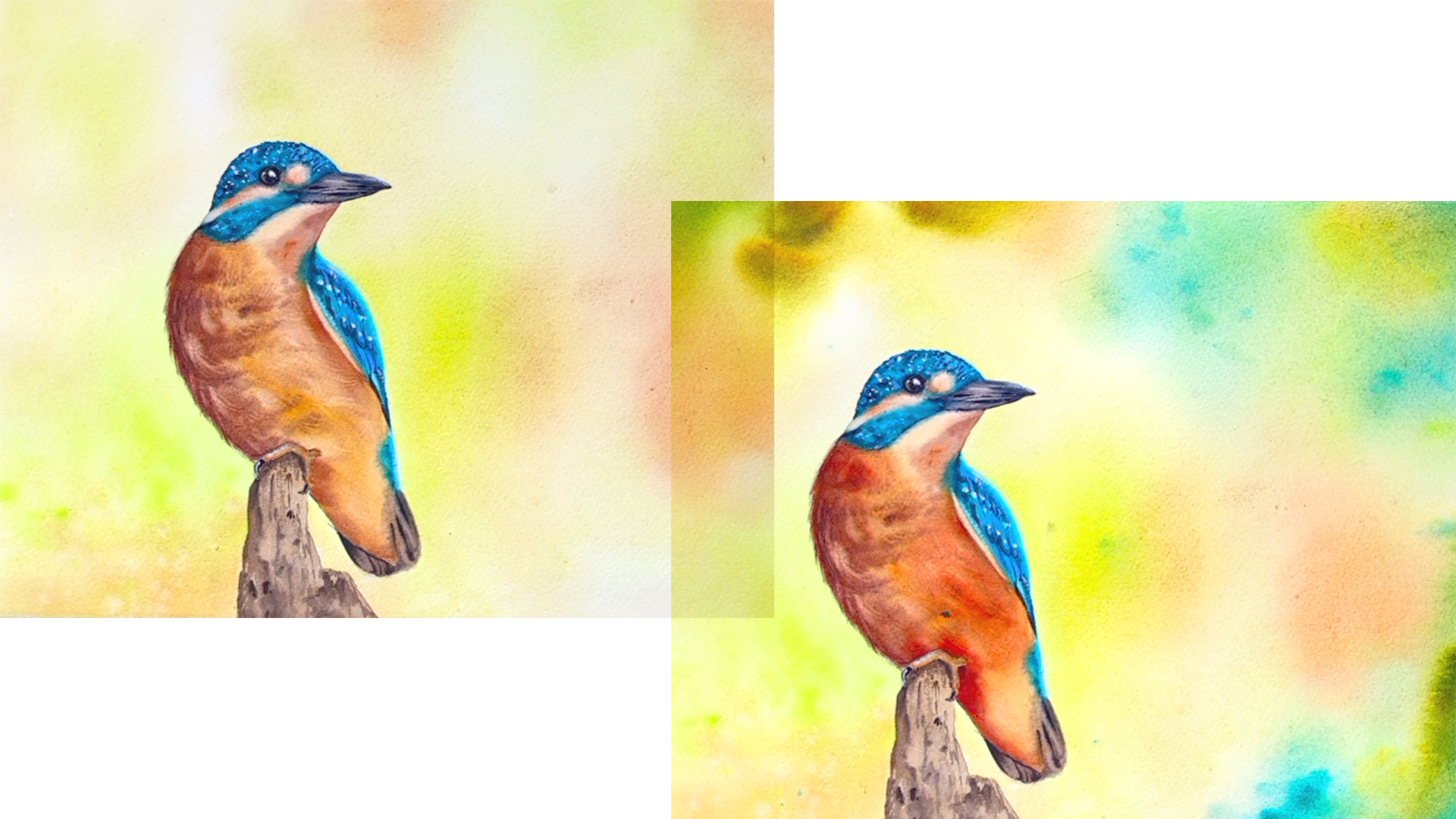
it's good and not great? Well, looking at this painting, I feel like the background
is too soft and pale compared to the bird so
the bird sits in a vacuum. Another thing that
I would love to improve is the color
of the bird's belly, which we already improved ones by adding some Indian gold, but I think I can
make it even better. I suggest that you first
watch this video and later decide if you want to repeat the same process
for your painting. Something I like to do and
I'm not sure is first taking a lot of picture of my paintings so that
even if I mess it up, I still have documented
how gold it was. I'll start with the bird first and then I'll move
to the background. I'm taking some Indian yellow
first and they're out of my palette now exactly because I use them for my
flat lay photos, which I snapped in case I
ruined the painting now. I'm taking Indian yellow and
I'm adding some rows to it. [MUSIC] I will add this to
the bird's belly and chest. I add some spots on dry. I glance at the photo
reference in order to decide where to
put those spots. Now, I wash my brush and I will blend those colors with
the previous layer, so we're doing some glazing. You can already see how interesting and eye-catching
this start to look. The combination of
those two colors is really gorgeous and rich, but also transparent, which
makes it perfect for glazing. As we said, transparent orange
could also do the work. I just don't have it right now. [MUSIC] I left some of this color here to
create a highlight. I'll add more here. With an almost dry
brush I blend it with the right in the direction
of the feathering. [MUSIC] Here I need to add some shadows so I'll meet the turquoise green
to my luminous mix. Some shadows here. My favorite trick
with the liner brush. I really like how it turned out. Now, for the background. As I said, it looks
too pale and light compared to our beautiful
and bright bird so I want to upgrade it. I will wait most of it, I won't touch the bird and because this brush is very soft, I can do that without disturbing
the color underneath. Now, I'll add to it
some saturated colors starting with the turquoise. Then some Indian yellow. I overlapped it to
some this corner. Some splatters. Now, I will use the spray
bottle to help me make this blend
naturally with the rest. I spray the whole thing. Now, thinking it was
a good idea to wait the backside of the paper too so that I can stick
it to the board, but it's too late for that
so I tilt the paper itself. It's amazing process, so be careful not to mess
up your painting. I wipe the board and I continue. [MUSIC] I'll spray some more water. I'll add more colors. Some more clean water
so the colors can flow. Here I'll suck this up
with a clean napkin. Here I have a hard edge
so I'll try to fix it. You can fix almost everything
with the spray bottle. I'll make sure some puddles
of water are taken care of because they're pretty
close to my bird. Here I have a lot of liquid, I will let it flow. [MUSIC] I'm wiping my board. If you have a watermark
like this one, you can fix it with soft brush. This hard edge
doesn't want to go so I'll add more dark
color to conceal it. This corner here
I purposely left lighter so it looks
less predictable, but also it would
have looked like to bird's frame
like closed inside, oh my gosh, look at my hands. I'll leave it like that, I'm pretty happy with it. It needs to dry now and
I'll show you the result in the next video and
we'll wrap up the class.
17. Wrapping Up the Class!: [MUSIC] Congratulations
on completing the class. I hope you had fun painting
with me and you learned new things that you'll take
with you on your journey. Keep exploring what works
best for you and be bold. You'll definitely see
the results coming soon. Don't forget to put
your project in the project section
of the class. Let me know how this
went for you and if you would like more
intermediate classes from me. Leave me a review for the class, helps me a lot and makes the class more visible
to other students. If you have a question for me, just post it in the
discussion section on the class and I'll get back
to you as soon as I can. Give me a follow up here
if you haven't already and you will be notified
when I release new classes. If you post your
project on Instagram, don't forget to tag me so
that I won't miss your work. You can now also
find me on YouTube. I started my account
there recently, and I'm slowly recording more real-time tutorials and process videos from
which you can learn. Thank you for joining me and
for painting along with me. See you in the next
class. [MUSIC]
 Elina Zhelyazkova, Watercolor Artist