Transcripts
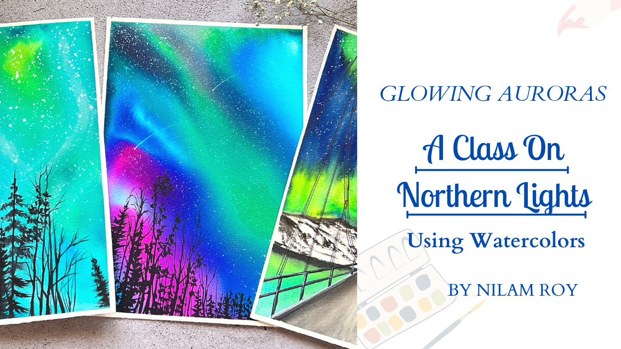
1. About the Class: Hey guys, welcome back to
my 11th Skillshare class. I'm an artist and an art educator based
out of Bangalore, India. You could find me on Instagram under the handle
name at the rate of Neil's RC underscore posts where all my artworks
are displayed. Could also find me on
Facebook, Pinterest, and YouTube, the
link to which is given on my Skillshare profile. In this class, we are going
to paint Northern lights. We will be using watercolor
inks for a main project, but do not worry if you do
not, and watercolor ink, I'll be taking you step-by-step process of how you
can do him using traditional watercolor
beams such as your nominal paint tubes
are your pan sets. Our main class project
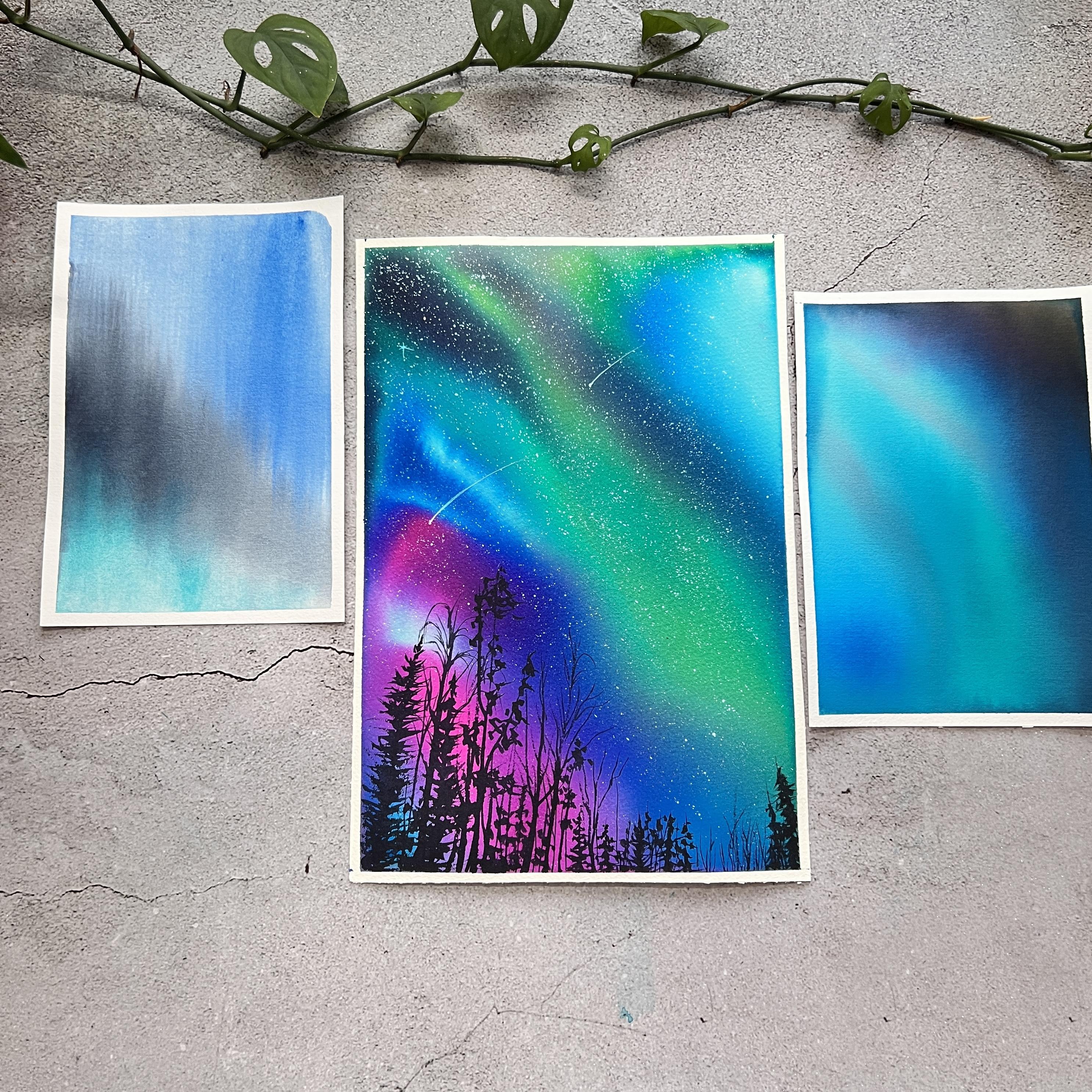
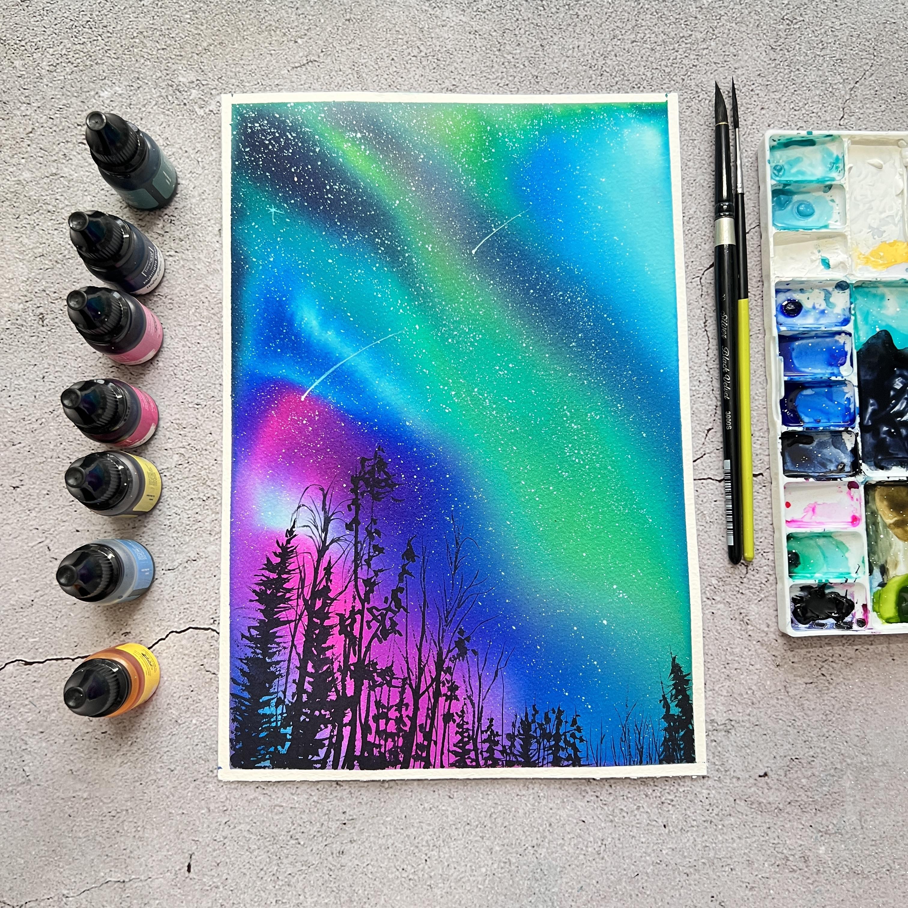
is going to be this simple blowing night
sky with northern lights. You can see there is a
different array of colors that we are going to use for
painting this beautiful sky. I'll be taking you step-by-step. Do not worry if you do
not have watercolor inks, as I said earlier, you could do the same using your traditional
watercolor paints as well. I have included a section
where I have explained about all the basic
watercolor techniques which we will be
using in our class. So that even a big nerd who is just starting out with
watercolors can join in and can easily
get started with our class projects and the other subsequent exercises that we will be looking into. As we progress further
into the class, we will be going ahead
and looking into some sharp blending
exercises that you'll get started with the
real project in no time. Achieving soft, well blended northern lights with watercolors is sometimes very frustrating and tricky if not done properly. If you do have faced this challenge of
achieving this mood, bleeds of blends for
your northern night sky. Do not worry, this class is
going to cover all of that. I would suggest or recommend you not to skip this
practice exercises because they will lay
your foundation when we start on our project in a
bigger piece of people. Without any further ado. Let's get started
with our main class.
2. Materials Required : In this section, I'll be
talking about the list of materials that we are going to use for our class projects. First, you would be needing a
flat surface or flat board. You would, you can
use a wooden board or an acrylic board to
tape down your paper. Next coming to our very important
supply that is a paper. So you're, I'm showing
you the paper which I mostly use for all my
watercolor practices. This is my Fabriano artistic, 100% cotton cold pressed
watercolor paper. This is a huge size of
paper which I generally portion it out and use
based on my requirements. So this is from Fabriano. As you can see, this is artist grade or a professional grade
watercolor paper. And this, the thickness
of this paper is 300 GSM. I will be portioning my
paper into an A4 size ships. So the size of my
paper is somewhere roughly around 28
into 19 centimeter? Yes, To be exact, it is the size 2018
to 19 centimeter. Feel free to use any size that
you are comfortable with. If you're not
confident going with the larger size of paper, you can go ahead and use
smaller sizes like A6, A5. Now let's take a
look at the brushes. Let me arrange the
brushes improperly so that it's easier for me
to explain and show you. Okay, so I'll talk about
those two more brushes later. First coming to this this wash brush we are going to use
for laying flat washes. The other ones are the two round brushes from
silver black velvet CDs. These are natural hair brushes. And the other two round brushes that we would be
requiring are synthetic. This is Iceland before and size number 21 is a liner brush. Size number two is a
liner brush that you can see the long and the pointy tip. So that's all about the brushes. Now coming through
the mop brushes. For northern lights,
it is always preferable that you
have a headache or a mop brush handy
with you because Hake brush is a broader kind of flat brush made up of gold hair. So this mop brush,
as you can see, is made up of gold hair
and it's very soft, so it is very easier for you to create those soft
smooth strokes. Creating our blending the
colors of the sky together. Let's talk about
watercolor paints. So this is the traditional
watercolor paint which comes in the form of tubes
as well as in the pants. And we will also be talking
about watercolor ink. Now in our project, we are going to use
our watercolor inks. But if you do not have
inks, do not worry, you can use your traditional
watercolor paints wages, quizzing them out
from the tubes and diluting them in water, and using that diluted version, just like inks, you can go ahead and do your main project. Let's talk about the
difference between watercolor inks and you are traditional
watercolor paints. The basic difference is that watercolor layer inks are
just liquid watercolors. It is suspended in dilute water. Unlike your traditional
watercolor paints, which is creamy and battery, it is not liquid. It is in the form of tubes
or pans or cakes rate, so you have to dilute
it using water. Moving on next will be
our two jars of water. Grab some tissue doubles
or tissue papers. We are going to need them
during our class project. Next would be our masking
tapes are washi tape I would recommend you
for particularly when you are using watercolor
inks are flowing. Watercolors always go with this normal or strong
blue masking tapes. Because when you
use washi tapes, the glue is not that
strong and flowy pain sometimes leaks through
this washi tapes and ruins, yard edges. That's all for this section. I'll meet you at the next.
3. Basic Watercolour Techniques : Let's quickly take a look at the basic watercolor
techniques that we are going to use for creating
our mean class project. This techniques that I will
be explaining you will be with the help of our
traditional watercolor paints. This is so because
many of you might not be having watercolor inks, but if you want to know more
about the watercolor inks, I have explained all
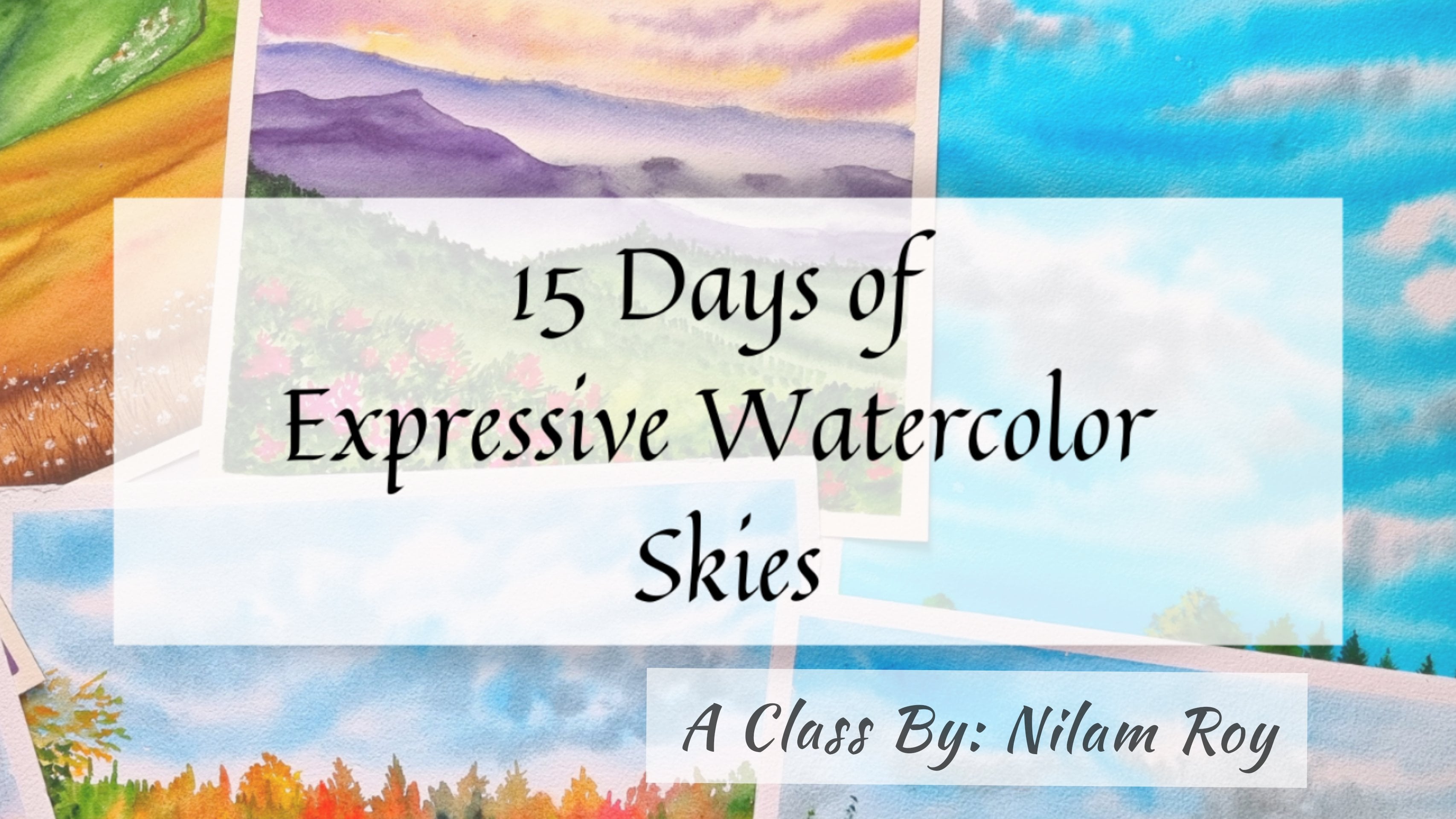
about it in my class, 15 days of expressive
watercolor skies. You could go check
out this class and you will be able
to understand more thoroughly about the
difference between our traditional watercolor paint as well as our watercolor inks. But in this class
I will be going ahead and explaining all the
basic watercolor techniques using our traditional
watercolor paints so that any big nerd
who is just joining in is not confused and can go ahead and start out with
the project easily. The first technique
that we are going to look at is the
wet-on-dry technique. This is a very common
watercolor technique, especially used for creating details on watercolor paintings. Wet on dry means applying your wet paint on your dry
surface or the papers. So I'm going to
reactivate my paint using little amount of
water as you can see. Now using the same watery mix, I'm going to apply it
on my dry surface, which is my paper. Cure. In this technique, you have much more better
control on the amount of water that you have in your paint as well
as in your brush. And hence, it is more of a controlled strokes that
you would get on the paper. More of the control you
will have on your strokes, the more sharper and
crisp edges would look. I'm going to show you another
example of this wet-on-dry technique where we are having much more
controlled strokes. Here I'm going to create a botanical pattern
that is this leaf. You can see, right? My strokes are much
controlled and I have got those sharp edges of the
leaves as well as these lines. You can see how sharp this is. This is how you can
go on and create fine details on your paintings
using this technique. Now let's take a look at the most important technique that is the
wet-on-wet technique, which is my most favorite
technique in watercolors. In this technique we
are going to apply wet paint on my
wet paper surface. One wet, the first wet
means your wet paint and the other wet means
you're wet surface, that is your paper. On this. Your wet paint will smoothly spread on the wet
background or the surface, hence giving you that smooth
finish to a background. I'm going to show you
the exact same process using our watercolor
inks as well. So I'm going ahead
and layering my paper with the coat of water
as my first wash. This is an example
of how we can create a smooth background
using watercolor inks. To achieve best results
using watercolor inks, you need to make sure that
your paper background is sufficiently wet enough for
the colors to work its magic. You can see how beautifully the inks are spreading
on the wet background. This is the beauty of using
liquid watercolors, you know, and also the reason
that they are very vibrant and even after
you thin down and use, they remain quite vibrant, but they are not light fast. So the longevity
of this vibrancy depends on the conditions that you are exposing
the painting too. Here I, I'll show you
another technique for when we use wet-on-wet, using one or more
of the pigment, the I have my
background already wet, so I'm going ahead and dropping another color pigment
which is also wet. And you can see this
beautiful blooms that we are getting on
the wet background. So this is another kind
of wet on wet technique. Next coming to the
lifting technique. Lifting technique is nothing but when you try to lift out. Up paint from the background
are the wet surface. So lifting technique works only when your
surface is still wet. The paint or the surface
area has dried out already, this technique
won't be possible. Now, I'm going to
go ahead and use my damp brush, damp clean brush. I'll dab it on a
tissue paper towel and just make it damp. And I'm going to go and remove some of the paint
from the surface. Each time that you go ahead
and lift out the colors, go ahead and dab
your brush or no, tissue towel or tissue paper, expose the whites of your paper. So this is how the lifting technique
plays an important part. This technique is also dependent whether the
color pigment that you are using is staining pigment
or a non-shedding pigment. Non standing pigment
will give you the better whites of your paper, whereas the staining
pigment will not give you that much of whites
of your paper. Now next technique is
the leading technique. In this technique, basically you try to apply your wet paint on the wet background and see the colors or the paint pigments
move across the papers. So this is a very
beautiful technique in watercolor paintings, especially florist
or illustrators who just work with botanicals
really love this technique. Even the landscape
artists tried to make floral blooms
using this technique. You can try even experimenting
with different colors. Now, the amount of
colors that it will move across your paper also depends on the type
of pigment it is, whether it is an opaque pigment, semitransparent, or a
transparent pigment. As my observations, I
have seen that pigment, which is more opaque, generally doesn't have that
much of flowing capability when it comes to this technique. Whereas the transparent or
semi-transparent pigment, you know, tries to
spread out much faster. You couldn't have seen already, you would have observed that
the lighter blue shade that I had used was more
of an opaque color. It did not spread around
the paper that much. Whereas this sap green
color, you know, instantly started spreading as soon as I touched it
on the wet surface. Now coming to the next
technique that is a Textures. Now, textures can be created
in your watercolor paintings through a number of
variety of ways. One of them is by using salt, it gives a very beautiful
bloom kind of effect. The same kind of effect
you can get by just sprinkling some water droplets
on the wet background. This kind of textures I have
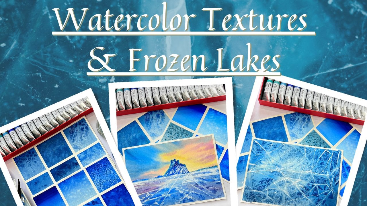
explained in my other class, which is watercolor
textures and frozen lake. So in case you have
not checked it out, you could go check it
out and know about the watercolor textures and how you can use them
creating a landscape. Now always remember
for any kind of texture effect that you
want in your painting. Always make sure that
you do this kind of texturally effects when your
background is still wet. You could see I have sprinkled
some of my salt onto this wet background and
I will wait for it to dry to notice the effects
that it produces. So this is the effect
that I was talking about and also the blooms
that you have got. The next technique is
the layering technique. Coming to the next technique, which is the layering technique. In this technique,
we gradually build layers from one lighter
shade to a darker shade, and letting the
in-between layers dry out completely before
we go on and apply. Again a second layer. This mostly works on
wet-on-dry technique. That is, you go and start letting the colors
on the dry surface. Now this layering
technique to has been explained in great detail
in my other class, watercolor icebox
class learned to paint for beautiful
icebergs using watercolors. You could go check out
that class and learn more about this layering
technique in details. I hope you are now clear with all these basic
watercolor techniques. Now from these techniques
we will be using just wet-on-wet and wet-on-dry for
creating a class projects.
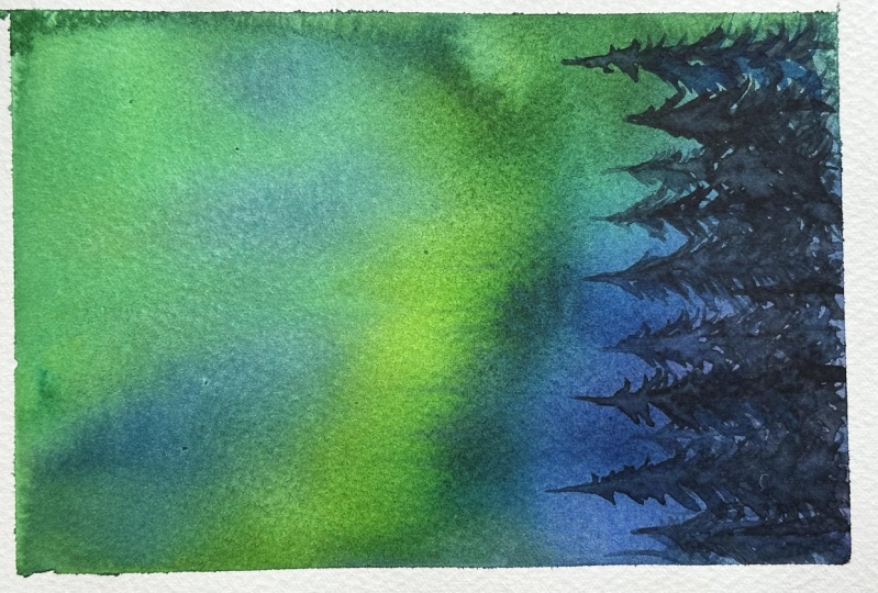
4. Exercise 1: Background With Traditional Paints: In this section, we're
going to take a look how we can create this beautiful
soft backgrounds. The very first step
is to tape down your paper on all four
sides if you want to have clean edges to your painting or the background that
you are creating. And we will be going
with wet-on-wet. Makes sure that you have
evenly coated your paper with water and the paper
that you are going to use, please make sure
that you are using a 100% watercolor paper of at least 300 GSM
as this thickness. Here I'll be demonstrating you how you can create
this beautiful glowing now the light sky using your traditional
watercolor paints. So keep watching
the process cure. The main trick is the
witness of your people. When your paper is wet and you apply your wet paint
on your wet surface, your colors will automatically start blending and
flowing on the paper. So it is very
essential that you use a 100% cotton watercolor paper. Yes, I'm stressing this
fact over and over again because the key to
achieving a beautiful, glowing and soft blended, not the light sky
is your paper and the amount of water that
you have on your paper. As you can see, I have
blocked two layers of colors. One is the darker and
the other is a lighter. Now using my mop brush, which is made up of
goats hair and is dry, I'm going to pull down the darker shade into
the lighter shade, thereby mixing it
or blending it. You know, the strokes of this will be long
vertical strokes. You can observe I'm gently
pulling down the colors using the tip of my mop brush now my mop brushes absolutely dry. Another substitute of
mop brushes, hake brush. You can either use this kind of mob brush or a Hake brush
to do this process. Repeat the same steps from
downwards, the colors upwards. So in this way you will have
this kind of smooth even gradient where the colors are blending and mixing
with one another. But this long vertical strokes, the key is do not go and
dump your brush in water. You just dab the excess
color that is coming off in the dry tissue
paper and just use the dry tip of the brush
to create the same. Now, you can go ahead and add n number of
colors to your sky. The processes is
going to be the same, but make sure during this
process your paper is still wet because if your
paper starts drying out, you will not be able to blend
out the colors smoothly. In my case, the
paper is still wet, but not too wet. It's almost drying up, but I'm using a
very watery paint so I'm able to, you know, create this kind of strokes and I'll just pull
the colors down so the wetness of the
paper will do for now. But if you feel that your paper has dried
out, absolutely. Go ahead and misty your
paper using a spray bottle, but do not miss too much
because then there will be pools of water all around
and it will be a mess. Now, I'm going to repeat
the same step over again. I'm just pulling down the
colors into the darker areas. You can see I am not going
fully into the darker area. Every time that I go
into the darker area, I'm going and rubbing my brush on my dry tissue,
towel or paper. This step is very
important in order to have a clean edge or the clean
colors that you want to mix, there will be remnants
of the darker shades on the other fellow that
you are pulling down. Okay, so just use
a very light hand, fed the movement of your hand and just try
to blend the colors. The colors will blend automatically when your
paper is still wet. We're done with our
background one. Now in the next exercise, we will be looking
at how we can create a background similarly
using a watercolor inks. I'll see you in the
next section where we will be creating a
background using a inks.
5. Exercise 2: Background Blending With Watercolor Inks: In this exercise, we
are mainly going to focus on painting a similar sky, which will be soft blended, but only differences
that we are going to try it out with our
watercolor ink. I have taped down my
paper on all four sides. So now let's get started. For this exercise. We are going to go with wet-on-wet technique
to create that even and smooth glowing sky
for our northern lights. That is why it makes
sure that you are using a 100% cotton watercolor paper, which is at least
300 GSM thickness. And you are letting your coat of water evenly throughout
the surface of the paper. This is very important for your colors to flow
smoothly because if the paper surfaces dry
in some areas or it has not got coated
with water evenly, there might be chances
that your colors will not flow smoothly as it should be if you are not satisfied and if you feel
that your paper is drying out way too sooner
because summers have hit in already some
parts of the world. So if you are located
in such areas, I would recommend you to go
ahead and lay on their coat of water to your paper so that your paper is wet for
a longer period of time. And you can clearly
see the sheen that you will have when the paper is
evenly coated with water. Now, I am going to play
around with the inks. I'll drop the ink directly. But if we are not
confident doing so, you can use a ceramic palette or any palette to
dilute your paint. And then you can go ahead and drop the colors with the help of a dropper or your paint
brushes also would do, but the paint mix
should be really, really watery for
the paint to flow. Now if you are going
ahead and using your traditional
watercolor paint and you are diluting them, make sure that you squeeze out quite a good amount of
your watercolor paint. That is your traditional
watercolor paint in the tubes. Because, you know, when you
dilute them with water, the paint will
tend to go lighter and lighter as you
make them a solution. If you dilute them to have a watery mix or a
watery consistency. When it comes to experimenting or playing
around with inks, you must always
remember that ink stain your paper is
really very fast. So when you are using them, use with caution and test it out before you go ahead
with your projects. Just out, swatch out the ink and see if it is staining
your paper very badly. In that case, I would always recommend you to dilute
your inks little bit with water before you start putting them on
the wet background. As you start pouring the inks, start tilting your paper
from left to right are upwards or downwards direction wherever you want
the colors to float. I have your selected
are diagnosed. Flow of the colors. I want my colors to
your flow diagonally. So that is how I want the northern lights to
emerge out in the sky. Hence, I have chosen this
swinging from left to right. I'm tilting my paper
from left to right, sometimes tilting
upwards and downwards. That's the trick. I am not using your
paint brushes. I'm just in aiding the colors to help spread on the paper. When using just the
tip of the brush, the rest of the job is just
done by the water which is present on the paper
and my liquid inks. Now there will come a
point when you will feel that your colors are not moving around on the paper that much. So it's the indication that your paper has started
to dry already. In that case, what you can do
is you can miss your paper. You can miss using
your spray bottle. I would recommend
you in this kind of cases where you can
paint holds guy, you can use, you're
not spraying bottle to spray or missed your paper
surface now spray it. Little inclined way, do
not spread directly on those surfaces because it
will create some blooms. Remember the watercolor blooms that we have seen spray very gently and lightly on the areas that you want
the colors to move around. So based on that, start tilting your paper once you've spread and that's it. You can guide the colors to the areas where you
want them to move with the help of your brush and maybe add some darker
strokes in-between. Wherever you want. You do have some darker
strokes are darker colors. Our main class project is
solely based on this kind of free hand movement
of the colors, allowing the colors to
flow freely on the paper. So this creates a
different beauty the way the color blends
with one another. It's really beautiful to watch. As you can see,
I'm trying to miss certain areas because my
paper was starting to get dry and it would have led the colors to have formed some hard edges
which I didn't want. So I'm trying to tilt and sway the colors in the direction
that I want them to move. This process can be quite messy. As you can see, the paint
is flowing and it is dripping on my table
tops that way I have placed this
board underneath my paper surface so that it can get accumulated over there
and not ruin my tabletop. But in this case, you can also go ahead and place a tissue on beneath
this paper or, you know, hold the
tissue at the areas where the colors are dropping
so that it gets absorbed. My BIBO was almost dry, but do you know the second time that I missed in my paper, you can see how beautifully the colors ran
together with each other and created this
beautiful soft blended sky. And I have that street, Gough blue in-between where, you know, the whitespace
is being shown. So it is creating a different kind of
glue in the painting. If you want, you can spray
it a little bit more. Where do you want the
darker shades to move? A little bit more upwards? You can tilt the
paper a little bit more upwards and
then accordingly, let the colors flow and drip. In this way, the colors will
form harmony in their own. You can see how the colors
are flowing across the paper. This is indeed a very,
very therapeutic process. Once you are happy with how your sky is looking in overall, you can let it rest
and let it dry. Once it dries out, you can peel out the masking
tape from all its sides. Now see the comparison using our traditional paints
because we used it, diluted it so the
paint has faded. But look at the vibrancy
of the watercolor inks. It looks and vibrant initially, but it is not light fast. It will fade out
with time, you know, six months down the line
or maybe after one year, it won't be so vibrant
as it feels now. So this is the only drawback
of watercolor inks.
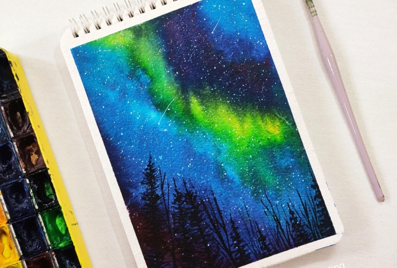
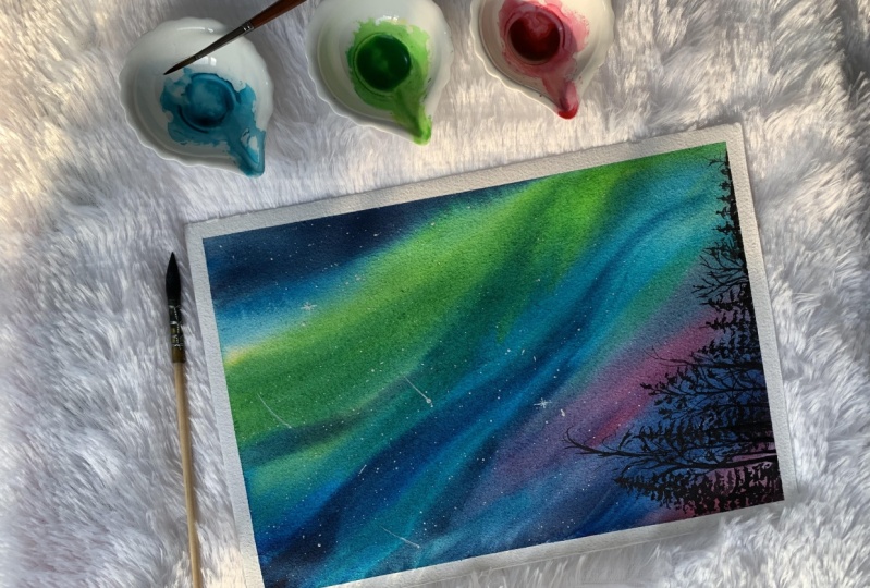
6. Class Project- Glowing Aurora Part 1: Let's get started with the main project as
a very first step, I'm keeping down my paper onto this board or a surface
in this regard, I would recommend you to go for the paper sheet like this
and tape it down on a board. Now next, let's take a
look at the color palette. So these are the colors
that we are going to be using for creating our
northern lights sky. But feel free to use any
colors of your choice. So this is another example of the colors that you can use. Either you can go for a one which we had done in
the blending exercise, or you could also choose
something similar to what I have done with
pinks and purples. Once you have tape down
your paper firmly on all four sides now it's
time to wet your paper, grab a couple of tissue
towels or tissue paper and keep them handy when
you start painting it. Do this step very
thoroughly wet your paper to retain the wetness of the paper for a longer
period of time. Because once your paper
starts drying out, it will become very, very difficult to achieve those flowing colors
on the paper. Now I will also Mr. it
using my spray bottle. If you do not have spray bottle, I would recommend you to
use a broader flat brush, preferably a Hake brush
size number ten or 20 would do the job or even a
flat brush of an inch or 1.5 inch will be fine
for you to spread your water onto this paper
surface very evenly. Not be in a rush and hardy down to start using the colors, ensure that your paper
is thoroughly wet. I'm stressing on this fact again and again because
this is the key to achieve that of flowing
colors on your paper, even though your
paint me have water, but if your paper
have started drying out or if your paper starts drying out right in the
middle of the painting, it becomes little difficult
even with misting. Be patient and uniformly
coat your paper with water. Make sure that your water paper is uniformly coated with water. You can see a
reflective sheen on your paper once the paper
use uniformly coated. Now it's time to
start using colors. I'll be using my colors
straight out of the bottle. My bottle already has this inbuilt dropper nozzle
thing attached to it. So I'll directly squeeze
out the color and I'll do it in this
diagonal direction. You can go ahead and use any direction that you
want your colors to flow. It is not necessary
to do it in this way. One more recommendation that I would like to give is that you collect pictures
of northern lights from Unsplash pixabay. Observe how the Northern
Lights generally in the sky. So based on those patterns, you can decide on your a direction where you
want these colors to flow. Now the colors
that I have chosen in this regard are
all complimentary. Colors. Are complimentary in the sense that when they
mixed with one another, they form a tertiary color. They do not form a muddy
or gray mix colors. So it is very important
for you to remember this. For your sky to look very
beautiful and colorful times, you can use complimentary
color, for example, yellow. You can go with purple
because that will give you, when they're mixed together, that will give you
a kind of dark, grayish kind of color mix. In that way, you will
be able to create a sky with both light and
dark contrast as well. My paper is still wet and
hence I'm able to let the colors flow and sway in the direction that I want
by just tilting the paper. Now if you feel that you want to make the colors flow
in certain direction, and what you can do
is just like me, you can guide the colors with the help of your
brush, round brush. And you can just
touch the tip of your damp round brush and
make the colors flow. You can also use
your spray bottle, missed out certain area that the colors are again
flowing into one another, creating this beautiful blend. You can already see how beautiful the colors are
blending with one another. Now, I'm going ahead and dropping in some of
my fuchsia pink. So this can be also substituted with Oprah pink if you're going with
traditional watercolors. Because the brand names. Verdi, brand to brand, but the pigment information
is basically the same. So based on the shapes
that I'm using, please do select your colors or go with the colors
of your choice. It's totally up to you. Keep tilting and spraying
your paper until you are satisfied with the mixes
that you are obtaining. So make the colors flow
along with one gradient. If you have chosen for
one particular gradient, I would suggest you to stick to one gradient
flow of the color. Let the colors run to gravity
at one direction only. If the colors start running
into many directions, the sky may appear little messy and you may not
like it at the end. So just like how I have, I'm tilting the paper
diagonally and sideways. So you can do the
same either you know, the upward direction or
the bottom direction. Like remember the first
blending it says that I showed you guys are demonstrated you using our brush the same. You can try and do it with this watercolor
ink method also. You could try that out and keep doing this until you are
satisfied with the color mix. I feel the yellow over there
is a bit too strong for me. I'll try to mute it down little bit by adding
in some more of that blue over it so that
it forms kind of turquoise, blue kind of shade with
the green mix of blue. Grab your tissue paper. If you know, dab off
the excess paint that is running out from the
sides that you are tilting. Okay, so always try to keep the edges kings
so that you do not have any chance of them running back
into your painting. Okay, so for now
this feels good, but I can see that my
paper is drying out, so I'll try to miss it out and I'll tilt my
board in such a way that the colors run in
one direction only. You can see I'm tilting
it sideways and I'm tilting towards the bottom
so that the colors flow, it bleeds in this direction. You can see how the color from the top has bled
through the yellow and it came down in a very beautiful pattern because I was tilting
it diagonally. And also because I
had sprayed along that diagonal direction just
at the corner of my paper, the top section of the paper. So based on your spraying or missing technique
also the colors will try to run down at
certain areas at an angle C, I'm always tilting the
board at an angle so that, you know, all the colors, streaks are towards one end. That's how I want
my sky to look. So this is how it feels. Now you can see this
thread-like structures are formations that you
are getting because your colors are flowing down. So use a very damp or a watery brush and
just gently slide the colors down
over there so that the paint mixed flows in
through that direction. Towards the bottom,
you will get that one. Very nice light kind
of shade over there and it will create a very
beautiful effect at the end. I'm happy with my sky
and I let it dry. So after drying, this
is how it looks. Either you can go for this color combination or
you can go for this purples, blues and damper
shade of purple mix. And you can go ahead with that. Now it's time to splatter
some stars for that, I'm using my white gouache. I'll dilute my white gouache and I'll use my synthetic
size number for long round brush so that I have a better control of
water in the paint. Hence, resulting in
smaller dots are smaller sparkles that
I want my sky to have. Keep adding the stars
until you are satisfied. Once you are done
adding the stars, if you want, you can add
some shooting stars as well. I'm going to add
some shooting stars. Shooting stars, I'm going to
add using my liner brush. So you can either use a liner brush or a
rigger brush that is totally up to you or do you can also go ahead and use
your Jelly Roll pen, whichever you are
comfortable with. Post this, let this
area gets right, then we will be starting
out with our trees.
7. Class Project- Glowing Aurora Part 2: Let's continue with our
next part of the painting. That is after your paper
has dried completely, it's time to add your trees. For adding these trees, I'm going to go ahead
with this liner brush. You can choose to use a
liner brush or rigger brush, or a brush which has
a fine pointed tip. Anything with a fine point to do would do the job of
adding these trees. I'm going to go ahead and
create some pine trees. You can see how I'm using some
smaller, shorter strokes. So this would be in the
shape of a triangle. It will be narrower
towards the tip of the tree and it would be broader around the
base of the tree. So that's the direction
that I am going to follow and all my strokes
are facing upwards. You can see by entries come in various
forms, shapes, and sizes. So feel free to check out some
of the references that you can collect from
Unsplash pixabay or any copy free right size. Or you can check this out in vector stock majors
even on Pinterest. And you can go ahead and use any shape of the pine trees
that you want to create. Similarly, I'm going to add
in another shapes of trees, some bad entries without
leaves to include, but make sure that you are
not adding any thick branch. Our trees with thicker branches. Use your liner brushes. I've sized number two or for anything which you
are comfortable with, or any round brush which has a very fine or
sharp point to do. You could also go ahead and
use your detailing brushes such as the tailors
also do this. It's absolutely not necessary to own a liner
brush, rigger brush. Feel free to go with any brush that you
are comfortable with. I'm going to go on adding these trees are varying
shapes and sizes. Always remember to add some different shapes and
sizes of the tree when you are creating such kind of
landscapes because trees in nature are never
symmetrical in chip. Now if you don't feel
like adding this trees, you can also go ahead
and add mountains. Mountains are
always easily made. Instead of the trees, which requires little
detailing and little patience, you can go ahead and use any other subjects
are the elements of your choices such as you
can sketch out a house, Moscow, the house using
masking fluid or cut out the masking tapes
in the shape of the house and marks those areas. And then you can
paint the rest of the sky using the
inks are liquid. Any traditional watercolors
in the form of liquid. So feel free to Jews and
take element of your choice. I'm going to add in some
more pine trees now this will be in some varying
shapes on sizes. Now, this is, you
could say a kind of descending order
that we are following, you know, bigger trees we
painted at first and now we are decreasing the
size of the trees. Once I'm happy and
satisfied with the trees, I'll stop it out. You're and let the area dry out completely and then take
off the masking tapes. Always remember to be loved
to your masking tape at an angle only when your paper
has dried out completely, and especially when you have worked with liquidy watercolors, I would recommend you not to
peel out your masking tape until and unless you are very short and your paper is Flat, do not peel off
the masking tapes because the paper will tend to come from the sides, buckled from the sides if you allowed them asking them
before the test dried out. Always peel off the
masking tapes at an angle. So the heart you there is no chance that you
report your paper. And I'll do this step very cautiously and slowly
do not be in a hardy, but that's all for the project. I hope you have loved it. I cannot wait to
see your creations. Please do upload them in the
projects gallery section. If you have loved this class and the way the class
progression was, please do leave a review for me. This would help make glass
reach our greater audience. Until next time, stay
safe and happy painting.
 Nilam Roy, Art Instructor