Transcripts
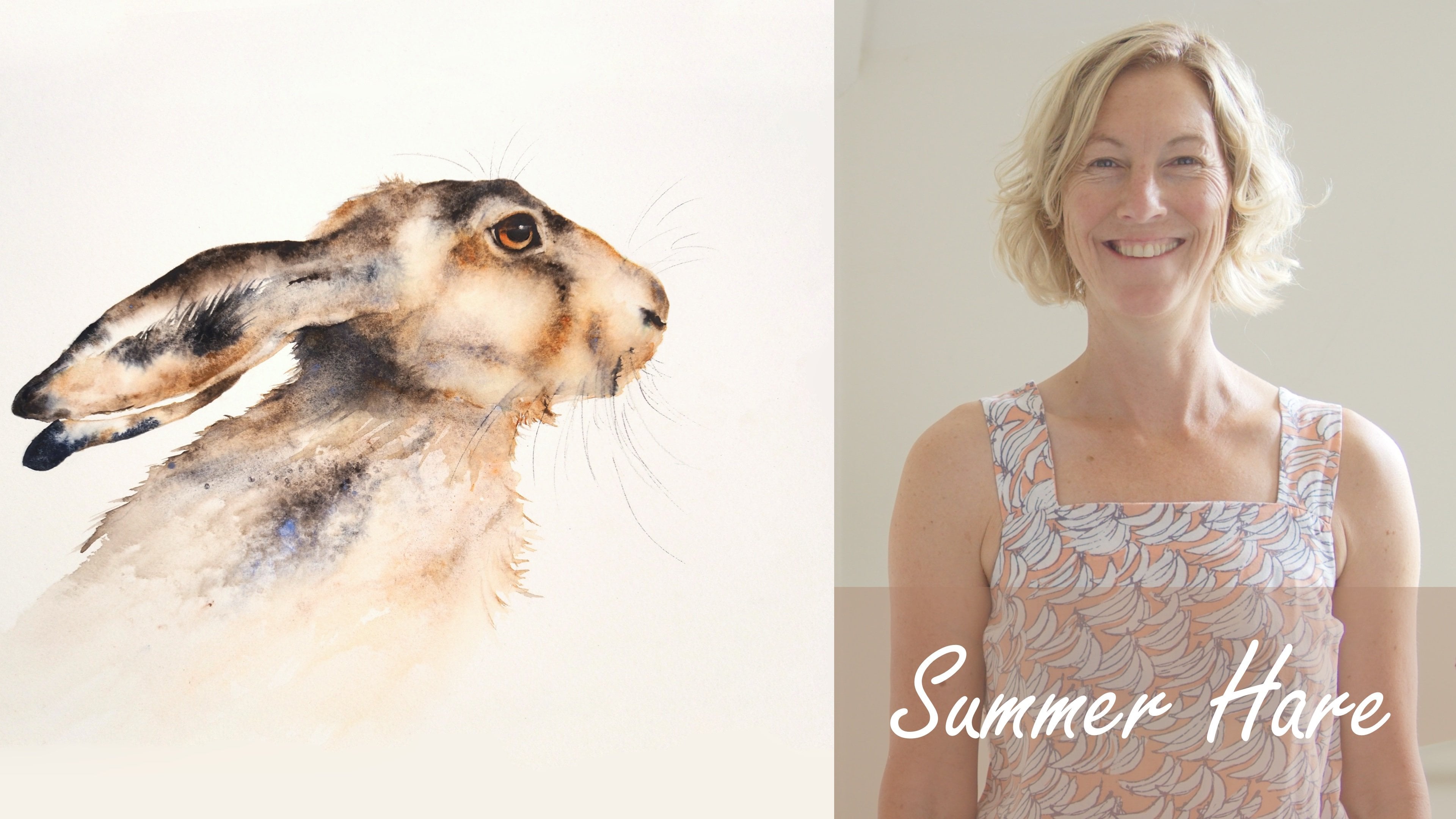
1. Quick Intro!: Hi, everyone. My name
is Lara Pezza but I'm also known as the Quiet
Place Art on social media. I'm a watercolor artist from Italy and I'm
passionate about giving a new life to objects that would otherwise go to waste
or be forgotten. I also love using alternative
mediums for my art, which is why I decided to design a class about one of my
favorite creative outlets, how to turn a book page into
a beautiful vintage artwork, which you can frame and hang on your walls or give as a present. Few years ago, I was living
in Berlin and I picked up an old book from a pile of
free stuff at a flea market. As it was all in German, there was not really a
chance I could read it. So I decided to use the pages as a medium
for my artworks. I love the results so much that I created a whole
series about it, and it's been so successful
on my website and art markets that I
have now decided to share this craft with more
people through skill share. Through the class project, you'll get to create your own vintage artwork on a book page, simply using an old book, some watercolor
supplies, a fine liner, a pencil, and some white ink. So join me on this short
but practical course. I look forward to
getting started.
2. Project: All right. The project of
this class is very simple. I ask you to follow
my steps to select a book page and paint a
vintage illustration on it. Then you can post it
in your project space, and I'll make sure
to leave a comment.
3. Materials needed: So now let's talk about
the materials needed. Obviously, we need an old book, and the older it is, the better, it will
have a vintage look. I usually go on the hunt for books like this
at flea markets. They usually just cost
$1 or they're free. And the things that I usually
look out for in books like this are the
color of the pages. Ideally, you want kind of
like yellowish badge pages, which is a sign that the book is at least ten to 20-years-old,
if not even older. The pages texture, the film. You don't want coated pages because those will
not absorb ink. To avoid coated pages. You just don't want to buy
books that have a glossy feel. The good news is that most books are suitable for this purpose. Most book pages are not coated. Just make sure that they
don't look translucent. Then the language of the
book it was published in. This is optional,
but when I travel, I usually buy some of these books abroad
because I quite like the idea that the language that these books are
published in is foreign. It gives it a mysterious look and I'm also translating
by profession. This is something
that I look out for. But as I said, it's
completely optional. Then the fourth and
last thing that I look out for is the
subject of the book. Again, this is optional, but I sometimes like to match the subject of the artwork with what's described
in that book. For example, here,
we have a book about animals and I love drawing
animals, as you can see. I sometimes like to
match those two. You could also look out for just some words on that book page and then recreate the artwork based on those. But more on the subject
in the next chapter. Other materials that you need are some watercolor supplies. I use mine, obviously some water for
the watercolor paints, some white ink, a fine liner, I use micron 01 pens, a brush, a pencil, an eraser, if you
need, and lastly, a box cutter and some scissors to cut the
page out of the book.
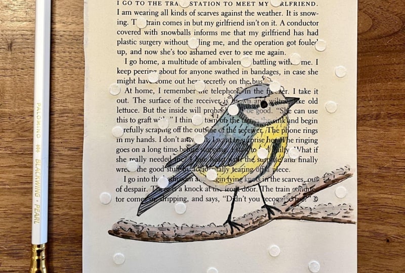
4. Choose your subject: So the first step in the process is to
decide on your subject. Some subjects that I think work quite well for
this type of artwork are botanical subjects
like plants or flowers, animals, old objects
like vintage cameras, music instruments, fantasy subjects like
elves, dragons, fairies. But ultimately, it's really up to you and your creativity. As I mentioned, I
sometimes like to match the subject of the
artwork with the book itself. For example, I once found
some old musical sheets, and I used that to create some musical
instruments on them. For this class, I will
paint a robin because I love painting animals and it's quite subject for the
purpose of this class. But you can really decide on your own subject for the
project of the class.
5. Get your page ready: Once you choose the
subject of your book, it's time to get
your page ready. The binding of a book is
usually made with a thread. Find a point where that
thread is visible and cut it using a sharp
knife or a box cutter. This will make it much easier to extract the page
from the book. Be very careful not
to cut yourself. If you don't feel comfortable, you may just tear
the page and use some scissors later
to straighten it. If the content of your book is any relevant
with your subject, then you may now find that
page and gently pull it. You may then use scissors
to cut it in the middle, and you can use the binding in the middle as your reference. And there you go. You now have your page ready.
6. Draw the subject: It's now time to draw your
subject using a pencil. I'm using a HB
pencil by Derwent. It's a brand that I really like. I find it HB graphite
is easier to erase, and it looks much lighter than
anything softer than that. You want your line
to just barely be seen once your
painting is finished. But at the same time, you want it as a reference
while you paint. Here, I'm speeding up, as I'm usually quite
slow at drawing. A book page is much more delicate than your
usual watercolor paper. So you want to be very gentle. I've learned this the hard way. Having poked through book
pages many times before. Also, using an eraser might
end up destroying the page. So make sure to use it
as your last resort. We are almost done. If you don't feel comfortable
just drawing, you may also trace the
painting if you print it out. And we are done.
7. First layer: Once we have an outline
of the subject, it's time to paint our first
layer using watercors. So we're going to
keep our initial wash very light because
we're going to come back to this area
with multiple layers. With watercolor, this is more of a general rule because
it's so transparent, you need to go from
light to dark. Usually, you start by applying
layers of light toned diluted paint and
gradually darken the painting with
subsequent layers of color. Once you go dark, you
can't really go back. So you need to play with multiple layers and
go darker each time. So as you can see,
I started by mixing a very light wash of sepia brown so that it is
no darker than dirty water. I applied this wash to the
upper feathers of the robin. For the lower part of the robin, I'm using paints gray. Note that if this was
regular watercolor paper, I would apply a
different technique. I probably start with the
wet on wet technique, which means making
your paper wet with water first and
then apply the wash. However, we're dealing with a different type of paper here. Therefore, I'm applying
the wet on dry technique, which means applying wash
on the dry paper directly. This is because book paper does not absorb water that well. Therefore, you should not be too generous with the amount of water you apply
to this paper, or you risk causing damage. So proceed with
the syn technique for the rest of your subject. For the chest of my robin, I now just mixed some orange
with light yellow lemon. While I wait for this to dry, I'm going to apply
some more paint directly from my watercolor
set onto my wet layer. This is really going
to make the color pop. And now, it's just time to be patient and wait
for this to dry. It would take a bit longer than your usual watercour
paper. So be patient.
8. Second layer: I'm now going back to the
painting with a second layer. Here I'm painting the branch of the tree over which
the robin is sitting. This is technically
the first layer, so, but I'll be using the same color for the tail of our robin. Layering watercour washes
is also known as glazing. The technique of glazing
may sound complicated, but it's actually really simple. It essentially means that multiple layers of paint are applied on top
of each other. Each layer of paint is left to dry before applying the next. So in essence, glazing is a wet on dry
technique as opposed to a wet on wet technique where paint is applied
to a wet surface. As I mentioned earlier, we can't really afford
to use the wet on wet technique on book
paper because it's so thin that it just would not be able
to take so much water. The second layer is
an opportunity to add more details
and to start adding mid darker tones as I'm doing here with the tail of
the robin and its peak. You can use this technique
to give a sharp, crisp appearance to
areas of your work. I just takes longer because you have to wait
for layers to dry. This is why a lot of
watercolor artists keep a hair dryer handy to speed
up the drying process. In the case of our vintage
illustrations on book paper, it will take twice as long because as I
mentioned earlier, this paper doesn't really
absorb water as well, so it might take a bit
longer for it to dry, but don't lose your patience. It is completely normal
and part of the process. I always keep some
watercolor paper next to my watercour set to sort of test the cor before applying it to my paper,
as I'm doing here. When adding darker colors, you also want to think
of negative space. So the areas where
you don't apply a second layer will be
your lightest ones, because as I said earlier, the first layer should
be your lightest one. So make sure to leave
some areas with only one layer if the
image requires it, obviously, because those
will be the lightest ones, and this will create
some contrast. And we're done with
the second layer. Now, as earlier, you just need to be patient and
wait for it to dry.
9. White Layer: This type of illustration, I usually add a third
layer of white ink. Personally I like the
brand Windsor and Newton. Gasser acrylic work too. What matters is that
the paint is opaque. On regular watercolor paper, color white usually comes from the areas you
don't paint on. This is not the case for
these book artworks. The color of the page usually
is beige or yellowish. Therefore, we need something opaque in order to bring
white color to the page. As you can see, I'm
applying white ink directly on the page and
using it for the branch, the white feathers of my robin, some highlights on its body. And also I'm adding a
little moon at the top, just out of my imagination. Note how the white color really
pops on such background. This happens not only because the color of
the page is yellowish, but also because this white
wash is not see through. The rest of the robin is in watercolor, which
is transparent. So you can still read the
text of the book underneath. But ink wash and a critics
are not transparent, so they will bring
some interesting contrast to our artwork.
10. Black Ink: After adding watercolor
and ink to our painting, we are ready for the
next step, details. I'll be using a micron 0.1, but you're welcome to use any black permanent fine
liner of a similar size. To proceed with this step, it is vital that the
artwork is completely dry. You could even use a hair
dryer to speed up the process. If the artwork is still
wet or even humid, we risk causing some
serious damage to it. So definitely wait until
it's dry and crisp. This will take longer than with your usual
watercolor paper. As you can see, I'm
speeding up the video. But you can see what I'm doing. I'm doing the outline
of the robin, adding details to it, the feathers, the texture. This is really going to
bring the artwork to life. I don't have much else to add, so I'm going to step back and
let you enjoy the process. Mm hmm.
11. Finishing touches: Are getting closer to
the end of the artwork. It's time for some
final touches. We'll start by adding
some further light to the artwork using the
white ink from earlier. I find that the eyes of our
robin look pretty dull, but a simple white dot will do its magic and
give it more life. I'm also adding some light to the beak and the little legs. The goal of this last
phase is really to look at the image as a whole and make sure that everything
works well together. We use an unusually high number of mediums, water cutters, white ink, a black marker, and we want to take
a step back and ensure that the final
look is cohesive. It's also time for
our critical eye to identify what could be improved and what
could be fixed. Like here, for
example, I'm adding some more shadows to the
feathers of our robin. So I'm adding a third layer of waterctor focusing on some
meat and darker tones. And I'm pretty satisfied now. Here is the final image. What do you think? I hope
you like this video. See you in the last chapter.
12. Final thoughts: And that's a rap. I hope
you enjoyed this class. Feel free to leave a
comment, a review. It really helps my
account to grow. Feel free to also follow
me on social media. I'm the Quiet Place art. And if you have any questions or feedback,
please let me know. I really look forward to seeing your creations.
Thanks for watching.
 Laura Pezza, Italian Teacher & Pet Portrait Artist