Transcripts
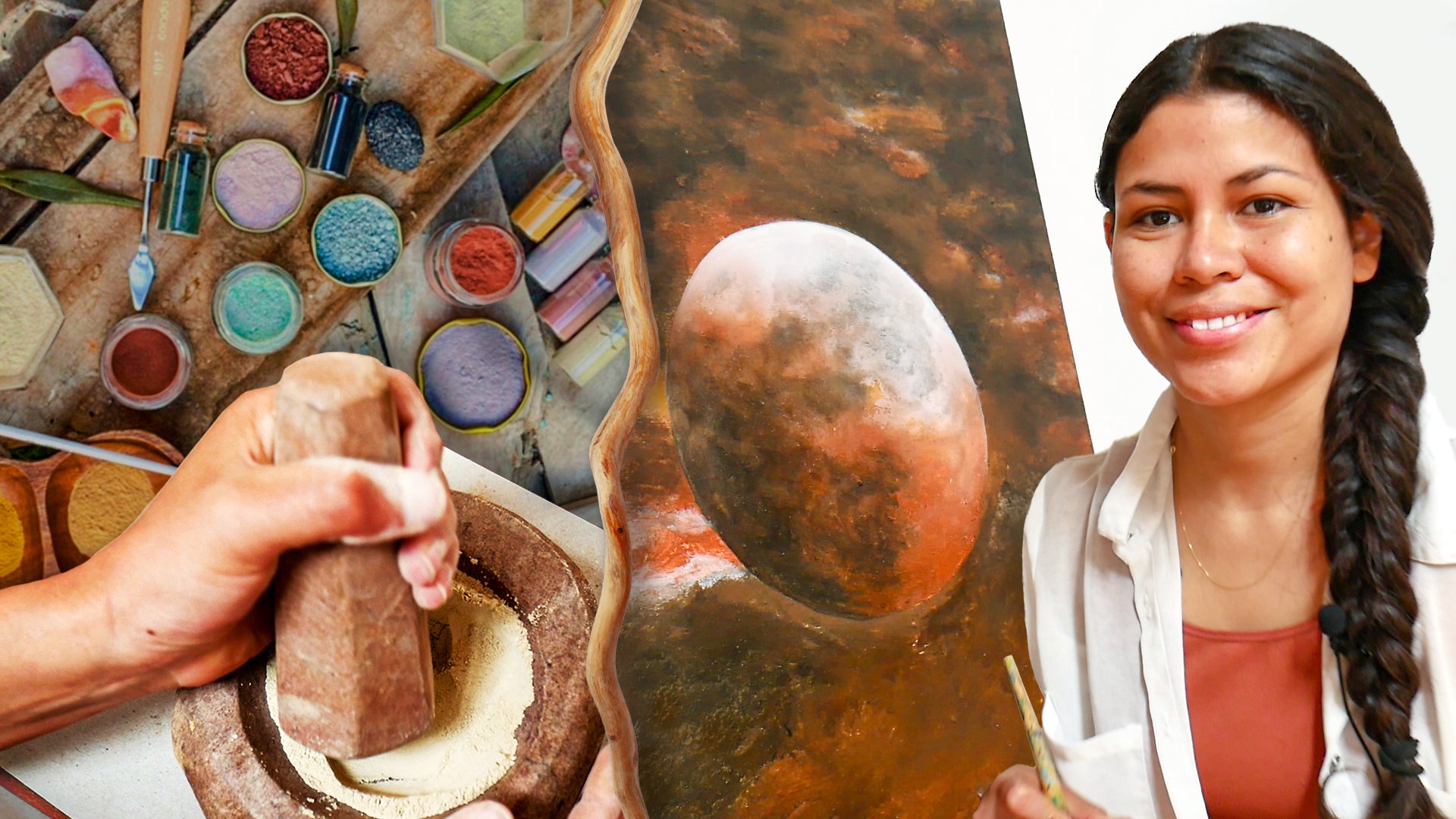
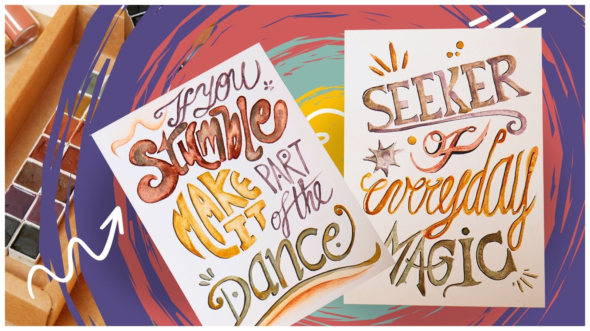
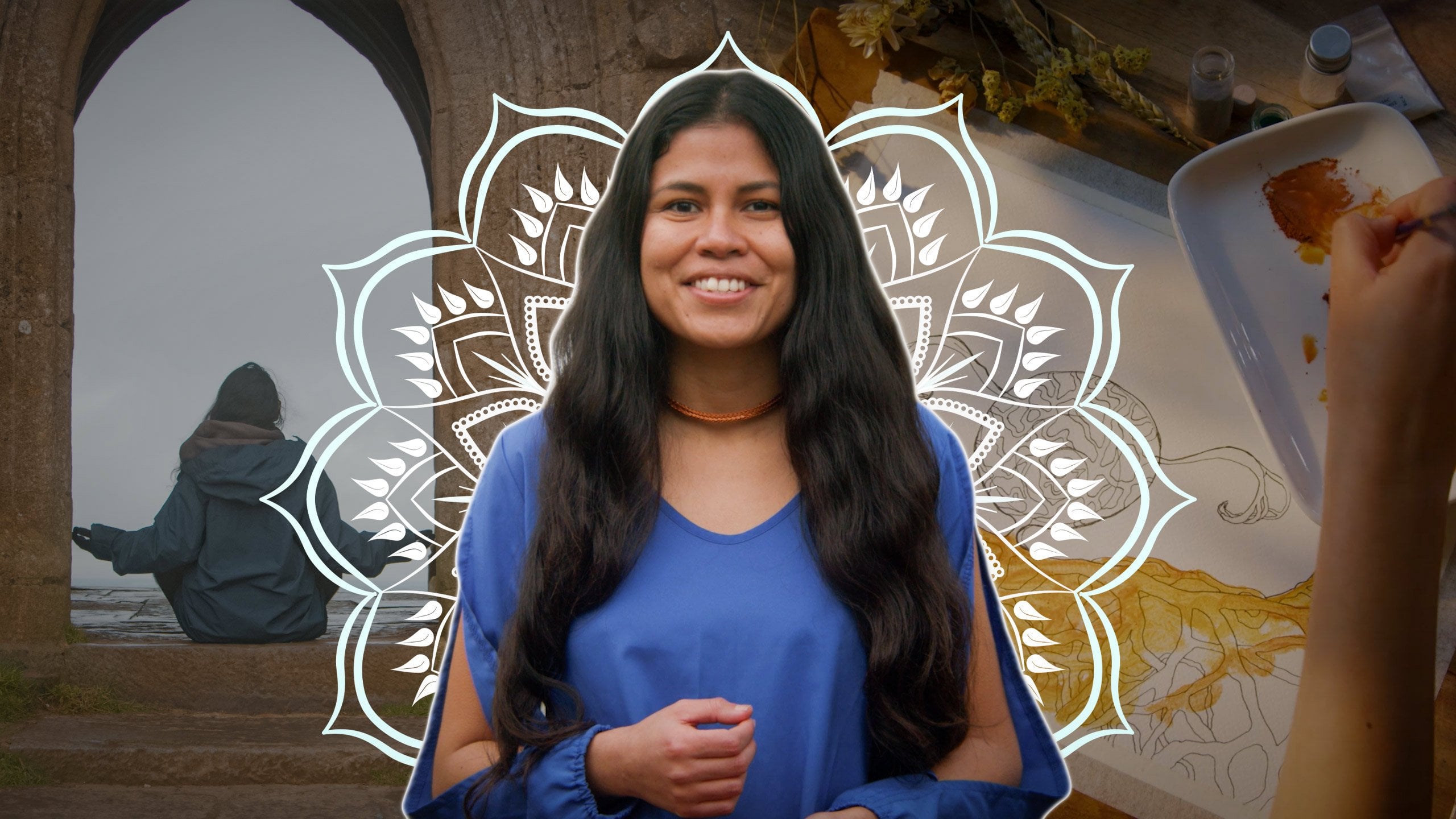
1. Introduction: Welcome to this class. My name is Karelia, and I'm a Peruvian
artist specializing in collecting and preparing
mineral pigments for painting. This class is very
special to me because we are going to explore
the textile arch of the cero communities
of Peru and create a beautiful geometric
collage inspired by some of the symbols and woven forms found in their
textile traditions. This class is about creating
geometric shapes and abstract watercolour
gradients while exploring ideas of
duality and balance. If you would like to
create a meaningful piece of art for a special
place in your home, just as I did here
with my altar, then I think you would
really enjoy this class. One of the cool aspects of this project is that
the collage is made of individual sections that can also stand beautifully
on their own. This means that you can choose the size and complexity
of your project. I hope is for everyone to
create at least a few pieces, so I will provide templates and guidance that allow you to create either the full collage
or smaller variations. Along the way, you will
gain experience painting two and three watercolour
gradients while exploring a different way of communicating with symbols and geometric foam. I can't wait to create this together with you.
See you in class.
2. Start Here: Okay, so in this class, we're going to create a big
collage made of triangles and trapezoids inspired by
the symbolism of duality, Peruvian native art, the
textile art of the keros. But before we get into
the full process, I would like you to begin
with something very small. And this quick painting
exercise is to enter into the flow of duality
without any context yet. Just to warm up and
see what comes up. Take a minute to choose a duality that feels
present for you right now. It could be something
like calm and chaos, light and shadow, strength and softness or anything
personal to you. If you don't feel like
choosing, that's also okay. The purpose of this
exercise is to express your creativity and get into the flow of
creating duality. I want you to get a sheet
of watercolor paper and we're going to draw two
lines cross together. What we are going
to need is a ruler. And you don't have to measure. This is completely free form. I'm just crossing one line here, all over here, and then
another one, just like this. If you want, you
can make your lines reach the edge of the paper, just like I'm doing right now. From here, what
we're going to do is join the dots to
create a rambus. So we're going to create
a big rambus here. It's going to look a little bit irregular because we're not
taking any measurements. It's just a really quick way
to create two triangles. Great. So we have
basically two triangles, one facing up and
another one facing down. The next step is to
choose two colors. There are no rules
here. You can use each color separately
or mix them together. It's up to your creativity. I'm just going to go ahead and erase the lines in the
middle, just like that. So here are the watercolors
I have available. So I'm going to randomly choose. I'm going to choose this one, which is yellow, and I'm
going to choose this one. So the duality I have chosen
is calm versus chaos. And I think these two
colors sort of call me to create a piece that they can represent
these two energies. So I'm going to go
ahead and start. So as I said before, there are no rules here, so I'm just going to get
into the feeling of what calmness feels to me and just enjoy the
process of creating. For me, calmness is a feeling of warm and whole
feeling whole as well. And then I'm going to take
another one, my second color. And this still feels
like calmness, even though I'm using
the other color. So this is what I mean. There is no rule like
one color symbolizes one and the other one
symbolizes the opposite. Usually the golden hour is the time of the
day that makes me feel more calm than any other
feeling during the day. Even the sunrise, I think the sunset it's even
more suiting for me. So I think these colors might represent a little
bit of that feeling. I'm going to let it dry and I don't know how you're
doing and take your time. This can take a lot of time. This can be super quick. Whatever feels right to
you, that's the way. So I'm going to go ahead and continue with
the one on top. For some reason, I feel
like working in the middle is giving me a sense of
chaos. I don't know why. But, um, I'm gonna go ahead
now and add lots of water. Just like that. I don't know. It feels chaotic to me. For some reason. Um, a little bit more of water
here. Just like that. I'm going to let it dry and then see if I can do something to it later
if I feel like to. But so far, it's looking how I think it feels right to me. So I hope you are enjoying
yourselves as well and explore and
see which colors, what type of forms, the order of the colors, how often you
change your colors, how messy you can be,
how neat and detail. All of these energies,
just let them pour through your hands and your brushes and the
color and the process. And this is what duality actually means
for me is going through the whole spectrum of feeling
a certain way and then go and see how it feels and what it feels like
to be in the other side. So so this is how
it's looking now. I'm going to add a
little bit of orange on top to make it a little
bit more chaotic, I guess. I feel like if I add some ripples of color
here and there. I like this, same with the
other with the yellow. I'm going to leave
it to dry because now it looks in the camera, it looks a little
bit like a petal of light because of the water. But once it's dry, I'm going
to show you how it looks. Once you have finished
your artwork, like I'm finished here, please take a picture of your piece and share it
either in the project section or in the discussion section of this class and let me know
which duality you chose, the colors, how the
process was for you, everything that you
feel free to share, I would love to see and
read your messages. This class, I wanted
to make it a little bit different because it
is a really big project. But this initial step is the base of what
this class is about. I do encourage you to paint it, to do this exercise
if you haven't yet and post it for everyone to be encouraged and
be inspired and be motivated to begin
with a bigger collage.
3. Exploring Peruvian Art: Q’ero Textiles: Before we begin
creating our collage, I would love to share
a little bit about the inspiration
behind this class. I have always admired the
textile art from my country. And four years ago,
I got this chu pa, which is a traditional
cross barry woven bag from a weaver belonging to the
Caro communities in Peru. This Jus pa has traveled
with me everywhere, and it's the only bag
I have, actually. So over time, it has almost become an
extension of myself. And this personal connection has brought me to this project. The Ciro communities in
Cuzco preserve one of the oldest textile traditions in Peru whose origins date
back to prehipanic times. But who are the Kero? Kero is not a single village, but a group of communities that share cultural traditions, agricultural practices,
language, rituals, and textile knowledge passed
down through generations. I became deeply inspired by the way their geometric
forms, colors, and woven patterns can become
a form of communication, not only something decorative, but something deeply
personal and symbolic. The Kero motifs. Let's explore the most
relevant symbols for the Kero communities and how they relate to ideas of nature, cycles, connection, and duality. And the first one is
the triangles, Bacuna. Many triangular forms found in kerotextiles are connected
to mountains and landscape. But these are specifically sacred and
recognizable mountains surrounding the communities. And they relate to
place, orientation, cycles, observation, and
relationship with the land. And the second one
is the sun inti. The kerotextle tradition
distinguishes between the sunrise and the sunset,
daylight and nighttime. The sun rise and sunset
are woven together. Like we see here, they're complimentary part
of the same cycle, not opposites in conflict, but opposites
completing one another. Here, we can observe what
is called int Luximchkan, which means rising sun and the light rays are represented
by the white color here. They are symbol for the morning
for emergence beginning, and they're usually represented with white or light tones. And the other one is
inti China Puchkan, which means setting sun, which is represented by darker
rays, as we can see here, and it symbolizes the evening, the closure, inward movement. And the weavers often use darker tones to create
this darker rays. The next one is water Kucha. Kucha means lagoon
lake is represented by a rambus or diamond shape and is often placed at the
center of the pieces. The Kucha is fundamental for agriculture and for
the flourish of life, mainly because it
symbolizes water. It's the concentration
of energy, the source from
which life expands. And the sun surrounds it. These are the sun
rays around here, around this rambus here. So water and sun become
complementary forces. The next one is about
pathways and fields. And another beautiful
aspect of Kero textiles is the way space and movement are represented
through pathways, which are lines and open
fields, known as pampas. So the stripes or pathways
that we observe over here are distributed along the sides of the central motif and extend across the
entire textile piece. Usually, the first
pathway is black, followed by brown, and
green and red and so on. And they symbolize
movement, connection, and the paths that link
communities and the landscapes. And the pampas over
here represent the open fields dedicated to agriculture and grazing lands. So they're usually
woven as plain areas in gray or brown tones using a single thread color,
like we see over here. And the last motif I want to talk about is duality,
left and right. Duality is also present in the spinning and
weaving techniques of kerotextiles through the
concepts of Luke and Pana. So basically, these opposite directions
of twisting threads are woven together to create strength and balance
within the textile. We can see here. These
are the woven threads, and they are very difficult. It's a very difficult
technique to achieve because it takes lots of strength and
lots of precision. And finally, I want to talk about a little bit
about the and duality, which is not particular
to the Karo. And it's about how
duality is conceived. It's about the left
representing the night, the sacred time and is often associated with
the feminine world. While the right is associated
with the masculine, the dawn, light, daytime, and the ordinary world. Geometry as a language. Through repetition, color,
contrast, and shape, geometry can become a way
of expressing memory, emotion, connection,
and personal meaning. And these are the values
that I can feel and observe in the textiles of the keto and the
work that they do, and I really admire their work. And this is only the surface of the textile art of
these traditions. For me, creating this
collage is a way to honor is not the same as
weaving every single thread, but I wanted to experience and take the time to work with these symbols
through paper. So that is something
really meaningful as well. And throughout this process, I invite you to explore
your own sense of duality of connection
and personal meaning. So this is an
opportunity to tap into your own personal way of creating with geometry
and expressing your creativity and art
through the geometric shapes.
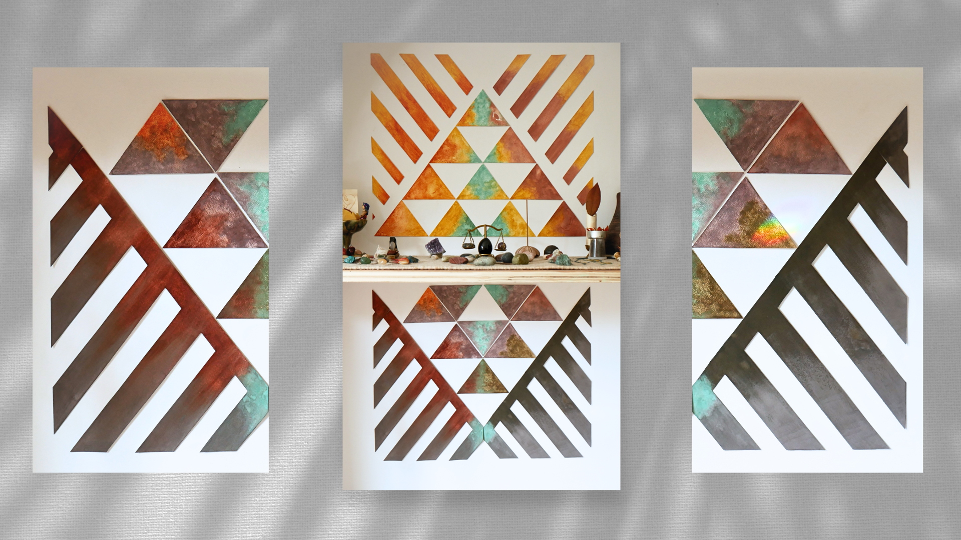
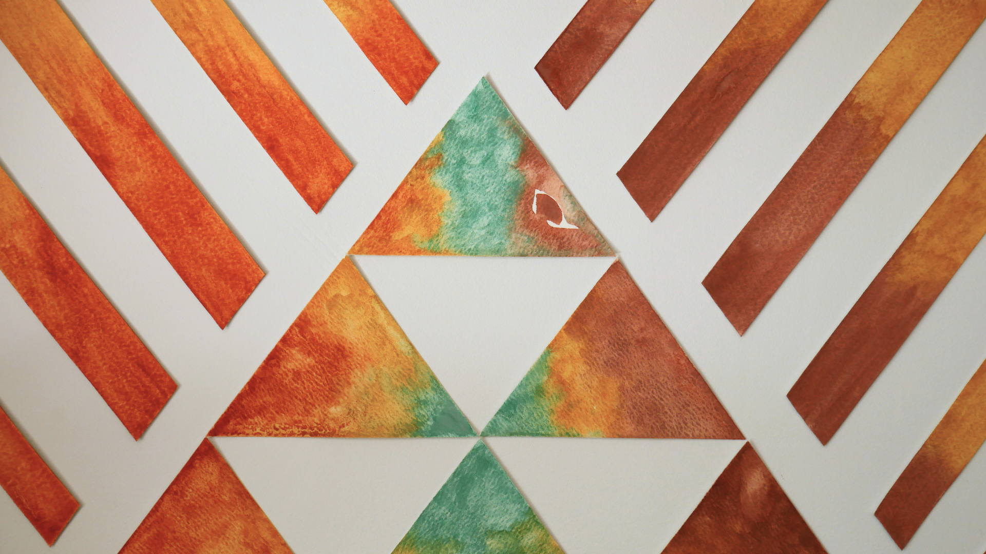
4. Designing the Collage Composition: The design we will
be creating is composed of two main sections. The upper area is made of ten triangles and
seven sun ray shapes. While the lower area
includes eight triangles and two larger shapes that mirror the negative space of
the sun rays above. As the composition
comes together, the triangles begin
forming a rhombus shape. And you can also notice
two larger triangles, one facing upward and
another one facing downward, reinforcing the idea of duality and balance
throughout the piece. Even though the design is
quite simple geometrically, it also carries a strong
symbolic feeling. Or the upper section, we will work with colors
that evoke daytime, light, and radiating energy, while the lower section will explore deeper tones
inspired by night, shadow, and inward movement. In the resources section, you will find a templates
for this composition. You can bring them and recreate the same design
we'll be working on in class or explore some of the alternative variations
I have included there. And, of course,
feel free to adapt the individual pieces and create your own unique
composition if you would like.
5. Project Lesson: Your project includes
one, your starting point, the two triangles we
painted before, two, your progress, and three
your final composition. Step one, post immediately. After you have painted
your first two triangles, I invite you to post it
on the project section. And if you haven't done it yet, please go to the lesson
that's called start here. Step two, midway check in. Halfway through your project or whenever you feel
is a good time, take a moment to pause
and share your progress. Open a discussion,
start a conversation, or ask a question in
the discussion section. And I would like to know what
is changing as you paint, What colors have you chosen? Anything that you
would like to share. This step is to break the ice and start gaining confidence while progressing
with your project. Step three, final piece. You can complete
all the 18 shapes or as many as feels right. Remember, even six, three or one shape is
a complete project. I want you to understand that starting with one piece
is already a lot. And finally, if you feel
unsure at any point, please share your doubts
in the discussion section, and I can suggest directions
for your composition, colors, or anything else. Also, when you're done, give your piece a name
based on your experience painting it or the feelings that emerge during the process. We're going to call it
the name in ritual.
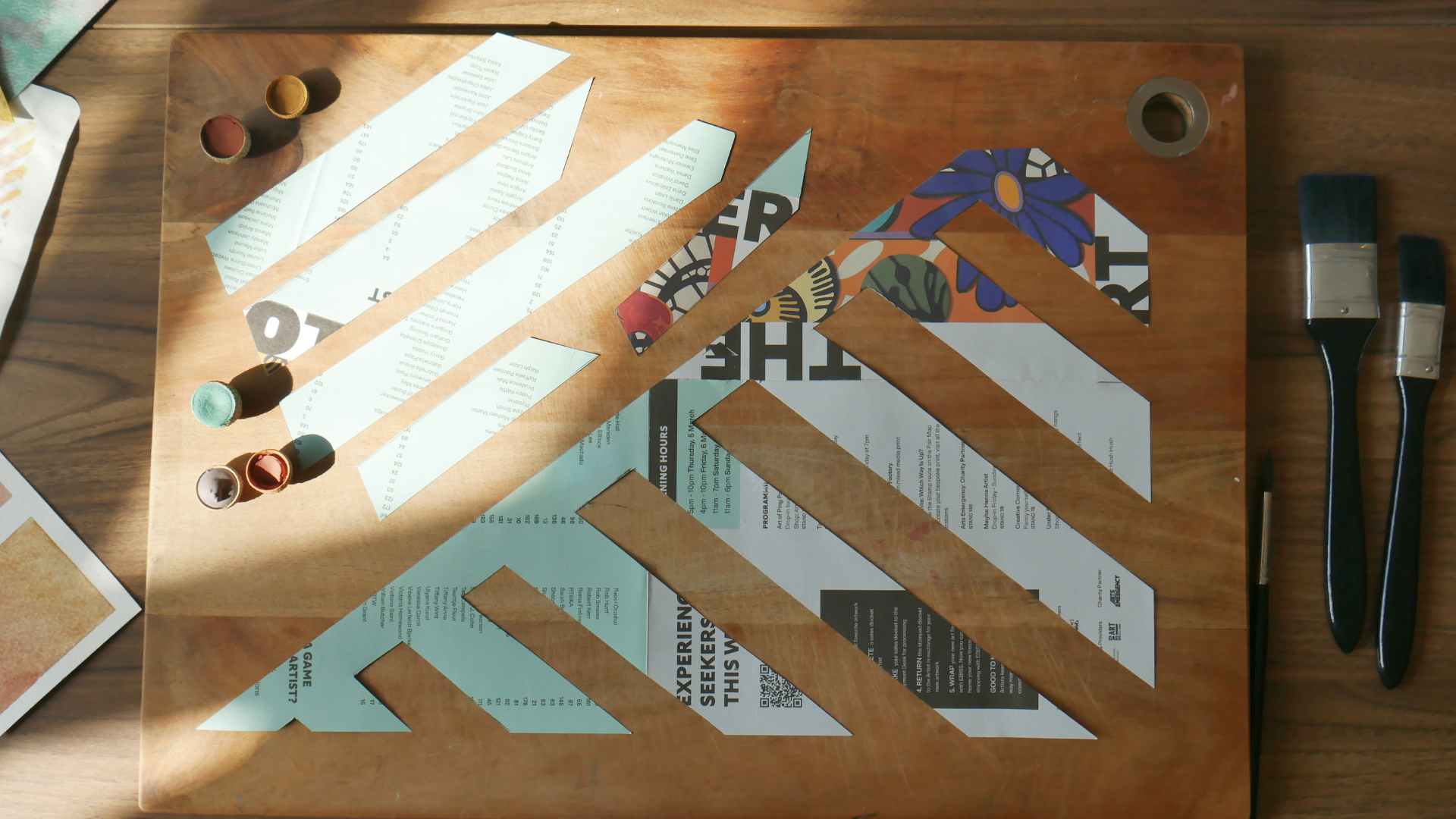
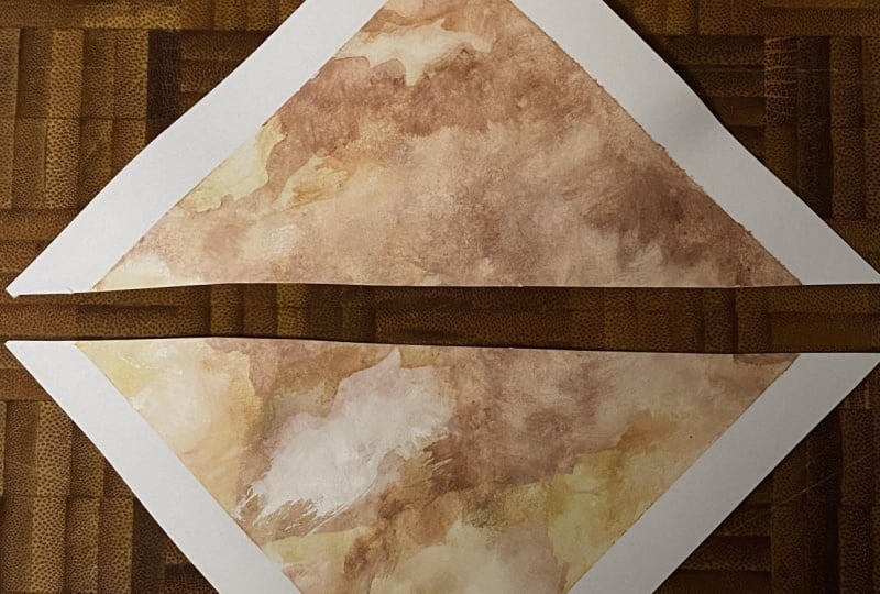
6. Measuring & Cutting the Geometric Shapes: Okay, so this is the design
we're going to create. And what we can see here
is a composition that is made from 18 triangles, isosys triangles, and a
series of trapezoids. The length of the whole
composition is 80 centimeters, and the width is 48 centimeters. So what we are going to do, and I found a really
efficient way to save paper and to make the process enjoyable
while cutting your pieces, of course, is that
we are going to begin with the triangles and
then move to the trapezoids. So I do have this A
five watercolor paper. Since I have lots
of these cuttings, I wanted to cut less
and save more paper. And the way that I found the most efficient way I found for this was to
create these two, one, two, three, four
triangles joined together in this
sort of shape here. So with this, I trace in
the back of the paper, I trace these rumbuses and
and I started cutting. So we are going to cut this. So based on the size of
paper that you have at home, you can decide whether to use this way or any other
that you prefer is best. And remember that these
are isosceles strangles, so they don't have a 90
degree angle in them. So that's why I decided
to do this shape here. This is 300 grams
watercolor paper. That's why it's a little
bit rough to cut. But I think it will do great as a collage because
we're doing a collage. So this is going to hold his shape in the
best way possible. And that's why we're
choosing this type of paper. So here, I already have two. So this is actually what I found the
most efficient way to cut your triangles, and it took me just a little
bit of time to do this. And I recommend you
follow the same way. But if you have a
different size of paper and you can create a different pattern
that suits you better. So now, I'm going to show you a really fun and
beautiful way to explore how this symbol takes shape when we talk
about the trapezoids. So I'm going to ask you
to imagine the seven, this one, two, three,
four, five, six, seven trapezoids folding
on top of these, like you are taking them
and then fold them folding them on top of this shape here and it's going
to fit perfectly. Because this is like, you
know, teeth and dentures. So the negative of
this figure here are these set of trapezoids and
it's easier to show you. I'm going to show
you now an example of a template that I cut with a thinner paper, so you understand what
I'm talking about. So this shape here
is going to fit exactly in the half
of a sheet of paper. So I'm just catching straight, having this 90
degree angle here. And I'm going to provide all the template and the
measurements for this. So you are able to replicate this shape into any paper
that you have at home. I just race I trace
these shapes and the dentures and the
trapezoids and I cut them. So I cut them and
separate them carefully. So this is ultimately
the shape that I'm going to be using here, and these are the other ones. It's really easy. Once you
have the measurements, you just have to cut both pieces and create
your composition. We're going to do this process together in our
watercolor paper. So let's do it. So
this is my paper, and I thought initially this
was a tree, but it is not. It's actually a
little bit shorter on both ends, both sides. So I'm not sure what
I'm going to do because this was meant to
fit perfectly here. Like this. And now the tip I'm missing a little tip
here that I cannot fix, even if I try rotating
the design a little bit. I still have this
little bit left. But if you do have the proper
size of paper, like I said, a tree, you should not be having these problems and you should
be working right with this. I will try to find a
little trick perhaps here, perhaps creating a
separation here, or just create a little
union down here. The fact is that you
don't want to be cutting this structure too much because since you're
going to be painting on it, and you want the painting
to be cohesive and take all the space together
and it looks nice rather than little pieces
of different styles. But again, it's up to
your creativity as well. That could be also an option. Since this is a collage, it might be up to anyone's creativity to
decide how to do this. Okay, now I have
my template ready, so I can transfer this
design right here. I decided that I'm going to just cut here since I don't
have the proper paper. So this process might look
a little bit tedious. But actually, what
I think it does, it can really help you
bring some patience and presents into this
symbol because you are, in other words, tracing
the rays of the sun. So this is a process of connecting with the really
masculine energy of the sun. It's just like straight lines. Structure and more structure. So I'm having a great time tracing these lines because
I do work with lots of circles and not very much
linear structures like this. So this is a good
exercise for me. So I'm going to take this out. And I'm going to
take the ruler back. Then I'm going to got
this father shape perhaps here so I can take some
good use of the paper. Awesome. I'm going to
tuck cutting my paper. I recommend to use
bigger scissors. With thick paper, it's definitely more difficult
to cut with small scissors. I think this could be definitely
easier with a cutter, with a blade and in a surface
where we can just, like, you know, help ourselves
with a proper tool. Okay. This definitely
takes some dedication. But I promise you it's
gonna be really worth it. Now, this is gonna
be a little bit more difficult because the
paper is very thick. So I'm going to try
to do my best here. By putting the
scissors in an angle, I can do this exactly like this. One more time here. And the last one. This is a piece, so
I want to show you. This is the top
side of the paper, the site where we are
going to paint on. And this is a little
little triangle. Don't forget that
you have a tiny one. You might think that it's
trash, but it's not. It's part of the piece as well. So it is going to be a
little tiny y sun ray, and this is the other one that's the negative of this one. So now let's do the other one, and we are going to
be ready to paint. So for the next one, I
just need to clarify that. Of course, it's the same shape,
exact same measurements. So I want to show you like, we're going to have
these two pieces, and they're going to be
joined together like this before we traced the
shape in this side. So now I'm going to flip
it and trace it like this. Okay. I recommend to start with the parallel lines. This is a very meditative
part of the process as well. During the painting,
it's more creative. You know, there's more
freedom to to take decisions, choose the colors, to add
more water, less water. But here we don't have any other choice rather
than catching straight, and that sometimes can
be really difficult. Depends on how we are feeling, but it is a really
good exercise. If we want to exercise on resilience and patience
and and commitment, I guess, to the process sometimes every process in life has a mix of
the creative side, the creative ideas, but also a good bunch of logistics,
planning, structure, all the not very fun
parts of it that are also necessary for any project to come alive or any idea to
manifest in the real world. So that is the that is a
contrast that we have. I still can't believe my paper wasn't big enough for this. I was completely sure that I
had the right sized paper. But, you know, that's life. Sometimes we plan on things. And the reality of our
resources are different. And we have to we have to change our approaches
to make it happen. Here we have our final
piece well cut it and ready to be used and ready to be painted into a fantastic piece.
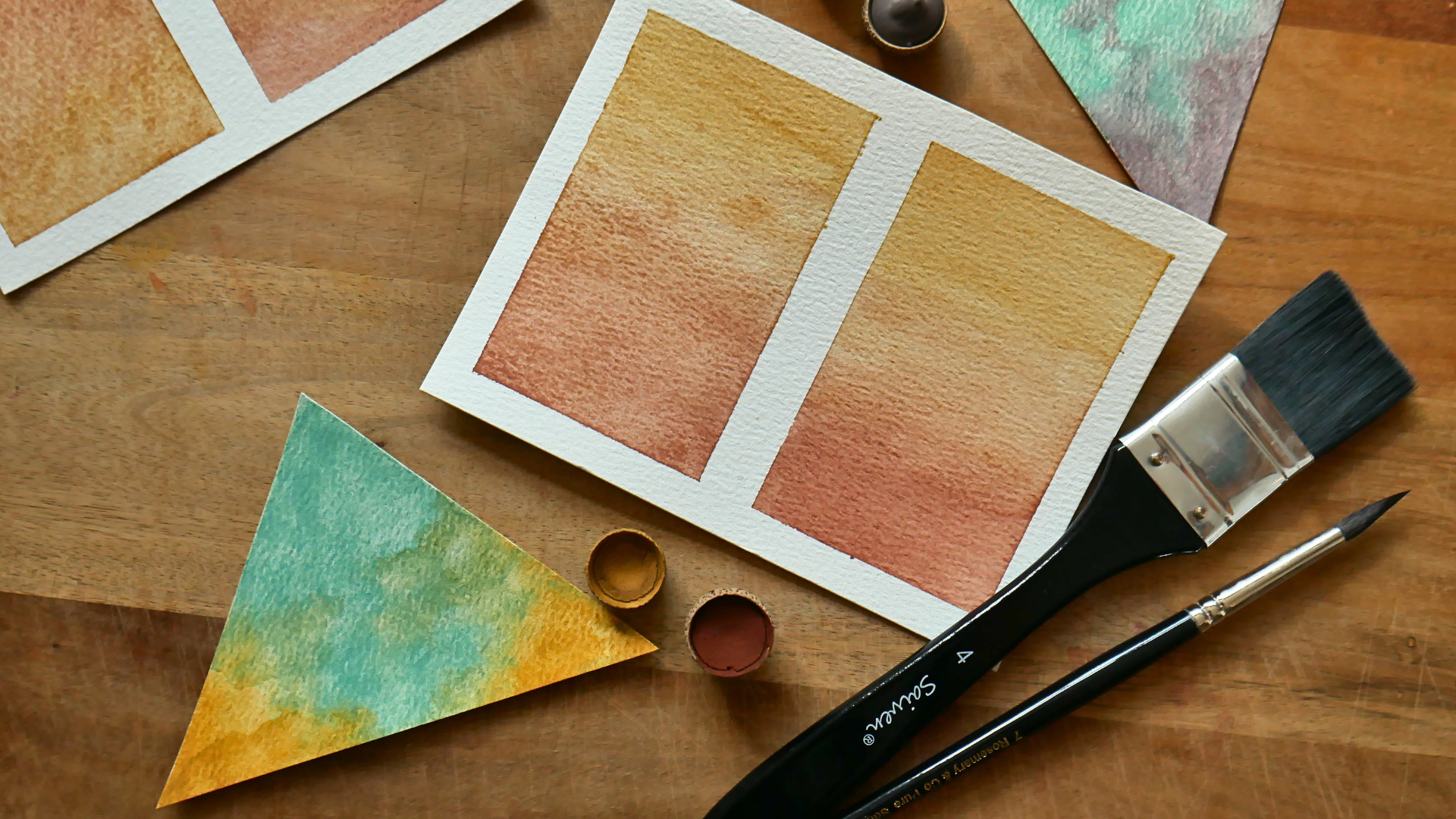
7. Intro to Watercolour Gradients: Okay, so the materials
that we're going to use for this project
are watercolor paper, and I recommend that you use
300 grams watercolor paper. And for painting ingredients, you can use flat brushes like this because this
size is over here, which is four and two depending on how
comfortable you feel. With each one, but also you can use round brushes like this. Actually, these are going
to be the brushes that I'm going to use to create the gradients on the
triangles and the trapezoids, mainly because I want
a more abstract look. But let's take a quick look and run some tests to see how a gradient might look
using flat brushes, and then we're going to run another test using
these round brushes. Since I make my own
watercolors from scratch. What I'm going to
do is basically just put a little bit
of pigment there, and then I'm going to add
my binder that I make using gamarabc powder and basically just going to add some
binder and then later, I'm going to add a little
bit more of water. Right. So I have created a separation here
because I would like to show you how it's like
to create a gradient. When first, I take my brush and damp the paper with water. Just a little bit. I don't want the paper to
get really soaking. Wet, just a little bit damp. And then we're going to create another gradient where
we basically don't add any water and just apply
the watercolor directly. Okay, so this on the left, I have damp the
paper a little bit, and I'm going to begin with the lightest color in this case, which is this yellow here. Going to add a little bit
more water like that. There you go. Perfect, a little bit
more over here. Mm hmm. And then I'm going to use the same brush to
apply the other color. So I take some more water here. And then and then
apply the color. Just like that. I'm going to create a little mix of
the colors in the middle. It's a little bit
to create here, like a a sort of blend. It's like that. A little
bit more of jello, perhaps. Mm Mm hmm. Be careful not to
add too much water. You don't want your paper to be soaking in water
that's really important. So be careful with that. Right. So I'm going to
leave it like that. Now we're going to test on
the right what it's like to create a gradient without adding any water on the paper at first. So let's see what happens. So I have my brush ready, and I'm going to take a little water and
take some watercolor. Then I'm going to apply it. Just like that. Lovely. Go to wash my brush a little bit and
then apply the next color. You can see the paper
doesn't have any water. And actually, it
feels quite nice. I'm going to wash the brush and kind of dilute the
metal a little bit. This set it to water? There we have it. I'm going to leave
this paper to dry, and then I will later
show you the results. Now let's take a look
how we can create a gradient using a round
brush. This is number seven. So I recommend
that you don't buy any specific materials
for this or brushes. What I recommend is that you take what you have
at home and start experimenting how
your paint brushes work while painting gradients and see if you can use
them for this project. So for example, here, I'm applying the
gradient without adding any water on the paper before. And now I'm just gonna Go ahead. And painted like this. And as you can see, it's
not um it's not super, super perfect in the middle, like a fusion of colors rather than a
gradient, I might say. And then now I want
to show you a bit a version of a gradient
that I think it's even a bit more abstract
for my preference. So, for example, if I add a little bit of color here
and I only in this corner, for example, like this and
just leave it like that. And now I add the remaining
yellow on the other side. It's like this. Actually,
I run out of yellow. And then I can if I add a little bit of yellow
in this area over here, it might look a
little bit chaotic. But actually, it's
it's how I like it to be. It's like that. And as you can see, this is more like
a cloudy effect, in a sense that the color
is everywhere and you have little specks of yellow
over here and over here. Meanwhile, in this other area, it's more like 50% of one
color and the other 50%. Oh, of the other This is what I mean when I say that there are so many ways that
you can paint gradients. You can make them more
abstract, less abstract, more symmetrical if
you want. Or not. For this project, I'm going
to lean towards this sort of style here where I'll be creating and
painting my gradients, not in the usual way, but rather than playing
with the colors and letting letting
the brush sort of play around in the different corners of the different areas of the
shape that I'm painting. For example, with the triangles, sometimes I will add the color on the top of the triangle. Sometimes I will work
on the left or right, depending on how my
creativity feels like. So these gradients are dry, and as you can see, are looking really nice, really lovely. And now I would like to show you the other ones that we
did first with a flat brush. These ones are a bit bigger. As you can see, I had to
remove them from the board. The paper is a bit
curl, but that's okay. So here on the left, we
dump the paper before. And as you can see,
the difference is not very noticeable
in my opinion, and honestly, I
prefer it like this. I prefer not to add
water. At first. I mean, I might be becoming a bit controversial here
with what I'm saying. But as you can see, I like this gradient a bit more. And the ones that we
painted with a flat brush, these gradients also were painted without adding
water to the paper before. I do suggest that
you go ahead and run some tests with a
watercolor paper that you have available at home and the paint brushes that you have and the ones
that you feel more comfortable with and
see how the results turn out with only two colors yellow and red or brown or red or Sienna,
wherever you prefer. Based on these results, you go ahead and start
painting your triangles and the rest of the shapes that we are going to
create for this collage. So I'm going to leave this here and now we're ready to
start painting our triangles.
8. Creating our Colour Palette: Okay, so now I haven't
decided my color palette yet, so this is a process also to connect with your
intuition and connect, you know, with the
colors itself. I have here lots
of my watercolors, my homemade and
handmade watercolors. So I'm going to choose
from what I have here and start playing
with some swatches. Okay, let's begin. So I suggest you take some
of your watercolors or acrylics of any paint that you have at home that you're going to use
for this project. And the process here, again, is just trying to do some exercises and see which colors might feel
natural with this design. And this is a process
of actually, you know, having the time
and the moment to really look at how they
combine with each other. This is an orange. So let me see how
it's going to look here. A little bit here. And again, the lines
in the middle, I suggest you choose a really bright color
with lots of highlights. So I'm thinking I'm going to
use the the charcois here. I'm going with a really bold mix here just to see how it looks. And I'm going to put
a little bit here. Just like that.
Just like a hint. I'm going for something
abstract here because the triangles already
are very very linear. Okay, so doesn't look
doesn't look bad. Let me see. Let me
lip on choosing. Probably have to
go with this one. Choosing now like
a earthy purple, very dark, close to brown, purple that perhaps can can combine well here. I'm not sure. Let me try
with something else. Perhaps with this one
here, which is, like, um, dark sienna
brownish, very similar. I mean, similar to
the to the orange, just a little bit darker. But I don't think. No. Not really.
It's too similar. I don't have any
blue at the moment. That could go well if you
are also interested in that. But perhaps let me
choose this one here. This is also some darky. Sickly brownish. Hmm. Hmm. What does it
look with a turquoise? Let me see. I like it. I. This one's up here. But I'm not fully convinced. Or I could just apply some jello to create some
a bit of contrast here. I have this other one here. This is a little bit on
the edge of brownish, but with a hint of red. So let me see how it looks here. Ooh. Actually. This one was really well
with the turquoise. I really like it. I'm gonna try doing it here to see how it looks if this color
is on this side. Now I'm going to put the
torquoise in here in the middle, like I said first, like that. And the the orange. How does it look there? This versus this, versus
that versus here. The other one I wanted to try is let me just create
another triangle here. Like this. Over I want to try it was the
with jello With this. And I'm gonna put
jalo on the opposite. Ooh. Like this. And And the turquoise, I don't think I will go there. Mm. Perhaps I can use
this green over here. It's slightly desaturated and see how it looks. There you go. No, it's too light. I'm gonna try and see how it
looks with with a turquoise. J that in the space. Okay. So I'm going to
let these colors dry. And after dry I think
I'm going to have a clear picture on my decision. But so far, these
are the combinations that I feel really strong about. And I suggest you do the same. You take the colors that
you feel can combine, take the time to do
some tests here, see how they look
inside the triangle. Oh, I I haven't done
any tests here. These four colors, they work really good
together, I might say. This is the other one
I really like as well. Hmm. Oh, I can even
play this color, with the ello. Let me see. That looks really
nice, actually. With the rays, I'm going
to go with jello and this one over here like a
reddish, brownish ocher. I will continue the decision
after they they fully dry so we can talk about how are we choosing the
colors on the triangles? These are our results. So I've been looking
and observing how the colors play
along, and I really, really like this mix over here and also
this gradient here. I think it brings a
really beautiful energy. The dark purple is also a really good color
for the darker areas. I'm not gonna lie.
And I think I'm going to use pretty much
all these colors. I'm just going to rearrange
them in a way that it looks very cohesive
and before that, I am going to run some tests
here on this little model. In the resources section, I'm going to leave
a small template of this design so you can print
and also do some tests, run some tests, figure out
what you are happy with. So now I would like to
explain how I'm going to use these colors for
the upper triangle here in all this area down here, which is the sunny bright
energy that we want to evoke. So the only thing that
is not changing, though, and it's going to be present in the whole design
is the turquoise, which is going to
be in the middle. So I'm just going
to start with that. And I recommend that
you choose also a color that it is a little bright, but also light in a sense
that's not going to wash off, but rather just
keep its presence. It needs to be a color that
it can stand out by itself. I want this color to
go all the way here, and then in this triangle, it's going to be also
predominant like this. There you go. And the last one also like this very similar
to the one up here. And also, I think I'm going to introduce it a little
bit in this tip. Okay, so now let's go back to the upper
area of our design. So here, I'm going to
introduce orange on the left, and on the right, I'm
going to use this reddish, brownish color on the right. And in the middle to create this gradient and
connection to the middle, I'm going to use some jello. So let me show you what I mean. So it's clear for you. I'm going to start with
the jello because I think it might be a little easier for you to
see what I mean by that. And here, I'm going to use just jello here
because there you go. And it's going to be right
next to the turquoise, as you can see here, like that. And also on the right,
a little bit like this. So now, on the left, I'm going to like I said, I'm going to create a
gradient with the orange. So the orange is
going to appear in the second row of the triangles because I think here it will be too crowded. And here it's just
going to stand out even more as we go down. And why not? We can even, add a
little something there. And here on the right, we
are going to use this one, the reddish, brownish aca. So I'm just going to
introduce it here like that. And there you go. Uh huh. Get a little here. And he's going to be very
predominant like this. And here you can
choose whether to put more yellow or perhaps
use some orange, to create some integration, perhaps of the colors. Let me see how it looks with
orange, 'cause I'm curious. Ooh. Actually, I think I put too much water there.
What about here? Yeah, I think they blend
really well, to be honest. So I'm going to go with that. Again, this is not perfect. It's not like a
rule or anything. It's just see how
it looks for you and see how it feels
for you. That's it. I'm really happy how these
colors look together up here. Now we're going to move to the trapezoids up here that
simulate sun rays coming out. For that, I would
like the jello to be predominant on the
edges in both sides. I'm going to paint that
yellow first, really quick. So I can show you. Now, we are going to use
the orange, of course, right here to simulate them like an extension
of the design, right? And it's going to be like that. Here we're going to use the reddish brownish, this one here. So, oh, this is obviously a little bit more. And then this. I think it looks
really beautiful. It combines really, really
well with each other. And it's not like a um it's not like a rule that is gonna be just
exactly like this. I'm sure in the
moment of painting, perhaps there are
going to be a few tweaks, a few changes. But I feel confident, I feel more comfortable doing this little sample here before going into
the final triangles. And for the opposite side, what we are going
to do is choose the predominant color in the shapes down here and down here and that's going
to be the dark purple. I think this color can bring
that feeling that we're looking that is the complete
opposite from the one above. So I'm going to begin with
painting this purple here, and I think also this color
can be a really good one to go on the edges of
the shapes down here because that's
the extension, like the opposite of yellow
that we're talking about. Now, we're going to use the colors from above
here just one time, and that's going to
be like to create a little connection just
on the upper triangles, this and this over here. So this is going to be
I think orange, no? Yes. And I think I
can I would like the turquoisbT blend here
with purple, like this. A really nice opposition from the yellow
yellow and purple, yellow and purple
turquoise, right? So now, I'm going
to use this color, which is like a ribbon,
really oxidated Oca. And this color I'm
going to use here. On the left. It does connect in a way with
the orange from above. I love it. Then over
here, I have chosen. This color is like bronze. It does look like this, and it's really, really shiny. So when the sun is going to hit, this area is going to
look really beautiful. So if you have some metallic paint or something like that, that also can be a good
addition for your artwork. So now I'm just
going to finish with this bronze color like this
and just painted along here. And that's gonna
be it. And here, perhaps I can just put a
little bit of this edge, a little bit of purple, like that. There you go. So that's it. Let me
show you a little closer so we can see
exactly how it looks. And now that we have the
time to play and explore how these colors merge together
and see how they look how the whole composition is
going to look from the top, from outside, it's
time to paint. Since we have this sort
of guidance, like I said, we are going to be free to do some changes if
we feel while painting. But having this is
going to make us, um keep record of how
many we have left. For example, I painted this
one and just a little check, and then I know
where I'm going and which ones are the ones missing. These are easier because most of them are just gradients
of two colors, so it's going to be
really easy to know. But trust me, on the lower part, you also want to keep
record on how many you have and work one by one
triangle by triangle. Working, for example, these
triangles are upside down. So make sure to yeah, not lose focus of the
direction of your triangles, especially for the lower
arb because we have three downward pointing
downwards, triangles here. And for this, it's going
to be also quite easy, like I said, here on the tip, we are going to remember
to use the turquoise. So that would be
it. So let's do it.
9. Painting Triangles - Light Colours: Alright, so we are going to
start painting the triangles. And the top triangle
has three colors. So I'm going to
suggest starting with a two color gradient just
to warm up a little bit before jumping into a
three color triangle. So in terms of the paper, what I'm going to do is tape just the back
so it doesn't move, and it doesn't bend too
much with the water. So I'm going to add
a little bit here on the top and another
one or perhaps two on the sides like
this. There you go. And then I'm going to tape it on my surface in a way
that is comfortable for me at a distance
that is comfortable. So we're going to begin
with this triangle here which is a mix of orange
and yellow, pretty simple. So some artists recommend to begin with the lightest color. In this case, it is a little more comfortable for
me to start with the orange. I'm just going to do that
first and see how it goes, but it's up to you. I'm going to take some
water with my paintbrush, as much water as I can take. And then I'm going to take
some of the the pigment. I'm going to take
just a little bit, but try and make sure
that the watcher is carrying more
pigment than usual. I'm going to begin
on the left corner here and then work my way
through this first half. I'm going to add very
little and allow also my paper to
absorb the pigment. Don't be afraid of the
water color drying out because we are going to be adding more and
more water later. So here in the beginning, we just want the pigment to really forever along the paper. Just like that, you
want to avoid any, any any white spots on the
edges of your triangle. Take your time to really apply the color evenly in your paper. And as we approach
to the middle, just then gently
push it to the left. Okay. So now we're going
to wash our paintbrush, take only a little bit of
water in the middle like this to create a little little
blur with the same water. Allow yourself to play alone and it doesn't have to be
fully perfect gradient. I think the magic
of this design also is going to be the
abstract aspect of it. You might even create some spots that are darkened than
the others, right. Now I'm going to apply the
jello in the same way. I'm just going to take lots of pigment and just a little
bit of water at first and work my way through the paper starting on
the edges like this. And then create this beautiful
corner just like that. Yeah. And I think I'm going to add some more
orange here on the left. So I'm thinking some
more pigment here. And don't be afraid
to explore how these colors might
join together. Okay, so I'm going
to let it dry. I really like how it's
looking right now. So after it's dry, I'm going to see if it's necessary to add
additional layers on top to create some more contrast on the sides on the
corners, perhaps. But so far, I really like
how it's looking right now. Now, instead of going
through this row, I think I'm going to
continue with this one. So I still warming up
on these same colors, and I get to experiment
a little bit more and get more confidence on how I'm going to do the rest. So let's do this one. So I'm trying to bring attention to this part of
the triangle here. And these corners around here, I think I really liked how the contrast is creating
some dimension, some depth. So I'm not going to
do anything else, and I'm going to let it dry. So this is our triangles, the first two that we painted. This is how they look after
they had some time to dry. It's not like a super
well defined gradient, but I like the fact that it is both really different
and they have a different vibe and it's
going to go like I think this one was supposed to go on top of the
other like this. But the only thing is our paper because of
the water has curled. So what we are going to do is place lots of weight
on top of the paper, perhaps with books
or something heavier and allow the paper to
flatten back again. And if you are using
300 grams or 250 grams, watercolor paper, it's going
to be completely okay, and we're going to continue painting the rest
of the triangles. I just wanted to show
you how they look after we have completed
our first two samples. Okay, so far, we have painted this one and this
one right here. So now we're going to
do the opposite, too, which is use these two colors yellow and the
reddish, brownish aca. So again, we are going
to tape our paper. Like this so it doesn't move. And now we are going to use
this This color and jello. Okay, so we're going to begin with the lightest
color this time, which is our jello. And what I'm doing
here is taking as much pigment as possible with a controlled
amount of water. I'm not going to overcharge the paper with water to create a more deeper el over
here in the corner. And this time, what
I'm going to do is is create not like an even middle
or half and half gradient. This time, I'm going to create just a little corner of
color like this with yellow, and the rest, I'm going to
paint it with the other color. But if you decide to do
it more symmetrical, that's truly acceptable as
well. Then I'm going to paint. Over. I'm going to focus on the edges
rather than the middle. I'm going to do that at last. And then first, I'm just
going to make sure that all the paper has the right
colors that I want and applying more layers after so if the first layer
is a little bit, you know, clear for you, you can still let it dry and then apply the rest
of the color later. I'm going to clean
my brush now and focus on the middle on
dist union of colors, and I'm going to add
some water there. Like creating a river in
the middle, just like that. I'm just gently
brushing both sides. Now my triangle
is not fully dry, but I think I can still
work on the darkest color. I'm going to go ahead and
apply a second layer. This is completely
after your creativity. You can enhance the borders. You can enhance and create
certain aspects of color. It is completely after you. I'm just choosing to
add more color over here and enhance this area
right here, just like that. And I'm going to keep
this highlight over here, but I'm going to blend the rest with a
little bit of water. Just like that. As you can see, it only needed a
little bit of retouch. I'm not going to
do anything else, and I'm just going to
leave it dry again. Okay, so now we're going
to work on this one, which is also yellow
and reddish brownish. I'm going to this
time begin with the brownish ocher on the right
side, as I said before. Because I want my triangles
to look very unique, I am painting some
specks of yellow inside the other color so they can resemble the natural
look of the mountains. Now, I would like to continue. We're going to use
yellow and turquoise, and we're going to start
with this one right here, which is mostly yellow
on the left and a little bit of
turquoise right here. Just like that. And here I'm just gonna
leave it like this. Here I'm going to
add the turquoise on the tip and add a little
bit of water down here. It's a great a nice blend. Just like that. So I can
accentuate the color. We're going to replicate the same process on
the other triangle, but just in the opposite way. Now I'm going to do
this one right here. I'm going to begin painting turquoise on the left
and yellow on the right. Here I'm going to speed up
this process so we can move forward to the next pieces and take the best
out of our time. Now we're going to paint
this one in the middle, which has lots of
turquoise on the top of the triangle and a little bit of yellow on the left and a little bit of
yellow on the right. So I think I'm going to begin
with the turquoise on top. A lovely. Okay. Let's little dry and
continue with the other one. Next, we're going to paint
this triangle right here, which is also a
tricolor gradient, orange, yellow, and
a tip of turquoise. So I have found a way to remove this paper without
touching it and ran it. So I'm carefully going to place
it somewhere else to dry. The next triangle
we're going to paint, it's going to be this
one, which is Oca yellow, and a little bit of turquoise. It is time for us to finally
paint the one on the top. It kind of has the
same amount of ochre, the same amount of turquoise, and the same amount of yellow. Okay, so this time, I'm going to begin with a
turquoise in the middle. And it will be easier for me to balance the
colors on the side. Yeah, it's gonna
live that like that. I just I don't feel like painting the whole
thing, actually. And now I'm going to
go with the yellow. Here I'm doing some
final retouches on the other triangles that I
felt needed a second coaching, a second layer of color, but this is totally optional. In the next lesson,
we're going to continue painting the triangles
of the darker area.
10. Painting Triangles - Dark Colours: So now it's time to continue
with the triangles below. And I do want to
start with this, which are two gradient colors, and they're upside
down triangles. So most of the triangle
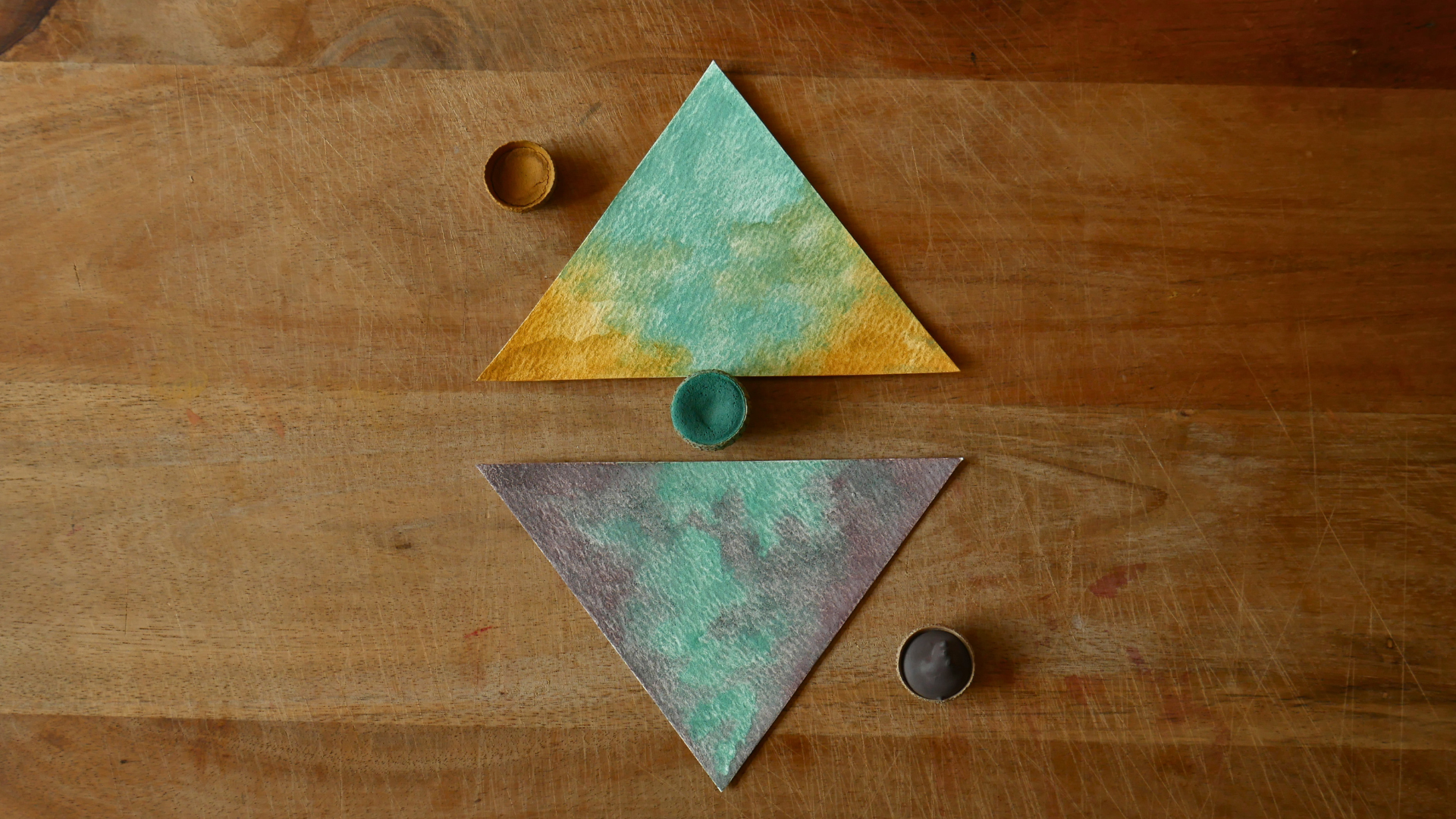
is going to be purple, but it's dark purple. So based on what we
have seen before in the other composition from
the triangles on top, this time I'm going
to make more space for gradients that are a little bit even more
fluid with each other, they merge and they create this more natural look and then do go ahead and paint
the opposite figure, same gradient,
turquoise and purple, but on the opposite direction. This is a great opportunity for you to explore these colors, these dark tones into
something that evokes this energy that's also really
important in our lives. Just a reminder that but also taking the inspiration
from the Kero culture, which is this admiration
for the sacred time, which is represented
by the darkness, by the shadow, the night. Now both of these
triangles have dry now, and I really like
how they're looking. The purple is not as dark as I thought it would
be, that's great. On the other side, the turquoise is looking a little faded
on this corner here. So what I'm going to do is
add a second layer to both of the strangles and see if I can make it pop
a little bit more. And perhaps here I can add a little bit of purple and
correct the turquoise as well. Let's do it. A Let's see what we have now. We have done this
one and this one, and now we're going
to move to the ones. Both of these triangles
here on the opposite sides, and this is going to
be orange and purple, and this is going to be a little bit of the
Oca with the purple. The reason we're using
still the colors from the top is because
we're trying to give a little sense that these colors are also
connected to the ones below. A don't be afraid to intervene and to enter the
space of the other color. Remember the water can help
you navigate those areas. I'm going to leave it dry and continue with the other one, which is the exact same concept, but with the oka, the
reddish ochre on top. Because there are no
rules for gradients here, what we're doing is basically exploring how we
can come up with different ways of creating
abstract combinations. I think that's good
enough for me. I'm going to let it dry now. And now we're going to
continue with an extra angle. Now we're going to work with
this one in the middle, which is facing down, and it's basically purple
turquoise, purple. With with extra
turquoise on the middle. It's like this. So now we're going to
paint the triangle has the most predominant
area of turquoise. So I want to make sure
that it does have a really a really
nice feeling because the turquoise is like a river that travels from
the triangles on top, all the way to the
trangles below. So I do want this
color to shine up. Perfect. Then I'm going
to move to the purple. I'm going to start with the
edges with the edges now, I'm sorry, with a gradient. I do want these areas
to look a little bit less intense and less saturated. So I'm adding just a little
bit of pigment here just so I can make sure that these
are looking very light. What I'm trying to do here is reserve these
areas around here on the on the edge of the triangle to make them
look a little bit more dark. So I'm going to add
extra pigment there. A really well coated brush
of pigment of watercolor. So what I'm going to do now is forget about the
purple for a second, and I'm going to take
the turquoise back. I'm going to try and
blend a little bit better with the turquoise
instead of the purple. My advice is simply just take
every single triangle as an opportunity to
create something unique and to enjoy
creating this uniqueness. And in that process, I'm sure you're going to find so many good creative
ways to blend your colors together and make them look as part of each other and
as part of the whole. I am achieving something
beautiful here, so I'm just going to let it dry. Oh, wow, it does
look really nice. I love it. I think I'm going
to review the other ones in case I need to add a second layer because
I think they're mostly dry. So I do want to add a little
bit more of purple here. And then let's check
on the other one here that is partially
dry already. I'm going to take a
little bit of ochre here and try and
blent a little bit more because I think
it is looking a little a little too flat. Okay, leaving it to dry too, and then we're going to continue with the rest of the triangles. We have three left,
which is great. And then we will move
to the trapezoids. I'm very excited to finally
finish this set of triangles. So let's move to the next one. I'm going to begin
with this one, which is this color right here and the purple.
We're ready now. Now we're going to start
with this color on the left. It reminds me a little
bit of this oxide, the iron oxide from
the earth and it does represent really
well the darkness and the shadow and use
the purple on the right. Lovely. I'm going to let it dry. I'm going to take
the next triangle. And this is going to be a mix of the bronze color
and the purple. I recommend if you have a metallic watercolor or
metallic acrylic or any paint, I think it would be
a great addition to make your piece to stand out. Okay, and now I'm ready
to add my purple. And I think, yes, that's good. I'm going to leave
this triangle to dry. Okay, now we're going to paint the last one,
the last triangle. So we have the brown,
which is this one. We have turquoise in the middle, and then we have the
bronze on the right. So the idea for this gradient, it is to create third
of this color and the second third
of turquoise and the last one with the bronze. Make sure that the color connects the tip of the triangle and goes all
the way to the bottom. So for me, it works
like a bridge between the duality that
we are representing. On the right, we're going
to paint with bronze. Don't be afraid to use a little
bit of extra dark colors, darker tones because
what are we looking for essentially in this piece
to represent the night. I think this is good. I'm going to add a little
bit of extra brown here. This is good. Now I'm going to let it dry. Here doing some second layers on this triangle because I just wanted to show you every
step of the process. Once I finish retouching
these two other triangles, I'm going to be done with all the 18 triangles that
we have in the collage, and then we will continue
with the trapezoids around. We still have a lot
of painting to do, but I'm really excited to
have finished this part. And as I said in
the project lesson, then please don't consider the whole piece to
be finished once you have all the
trapezoids ready. If you feel like you have done enough at this
point, it is great. Even if you just did the first ten triangles on
top or just the ones or just the three of them or
just one they still encapsulate the whole feeling of the collage and
that's the beauty of it. So go ahead, post your project, your paintings, whatever
you have done so far. I would love to see it. I appreciate what
you're doing and the effort put in this
project in this class.
11. Painting Trapezoids: Now it's time to paint
the rest of our collage. So let's take a look
at our design again. What we see here is
this piece over here, this segment right here. And the and the others, if I remove this and I remove
the big piece right here, what I'm left with are the sun rays that
belong to this part. Remember, if we flip it, it's going to be the
opposite because we are painted on the right side of
the paper on the front side. So if I rotate my
board, just like this, just to show you what we have now are
the sun rays over here, the set of these trapezoids. So what we're going to do
now is to paint all of these pieces with orange and yellow to color
gradient, and that's all. So let's do it. So what I'm
going to recommend now is to, and I think that since I do have very thin pieces of paper, I think it would be
easier if we just work all of them at once. So I'm going to begin painting on the left
because I'm right handed. So this will allow
for me to not step on the others as I would if I start on the right,
for example, right? So I'm going to begin with this little tiny one
which is orange. So essentially, what I'm
going to do is going orange, mostly orange, just a
tiny bit of yellow, and so on with the rest
of the trapezoids. It doesn't have to be perfect. As you can see here,
I have more or less 50 and 50 of the same
color of 60 and 40. It just depends on your liking and how you feel on each piece. So I'm going to begin with a little bit of dip of
orange right there. And here it is mostly
orange, as I said before. What we want to evoke with
these trapezoids is sunlight. So we want this to
look like sun rays. I'm just going to go ahead
and step on this one too and then jump on
the yellow right after. I already feel that
this is going to be a much faster process. And I'm going to add a little bit more of orange over here, actually. Just like that. Perfect. And I'm going to
continue here with more orange. But this time I'm going to work one by one because these are really large pieces of paper. So I'm going to go and
add the jello now. And add a little bit more
of orange. Less like that. I was looking really
nice. Really happy. Right. And here, I'm going to go and start with orange again. This orange pigment
is from Brazil. In the countryside, there
are so many patches of orange clay and soil
and everywhere you go. So this is a really strong
and intense pigment. That was a gift from a friend, like a big chunk of clay, and we turn it into and I
turn it into watercolor. Nice. Another a little bit of orange to add a
little bit of contrast. Over here to reinforce the
gradient on the metal. Beautiful. Now let's
move to the other one. In this one, I'm going to leave
more space for the jello. I think this was a really
good idea to take all this together and to work alongside rather than
going one by one. Because it definitely takes less time than working
with the triangles. Then add a little
bit more orange here to intensify the color. And let's move to yellow again. Oops. Nice. And then we move to orange and
we finish with orange. They blend so well together. So different from
the other colors that you see me work with. So this is really,
really pleasant. Um, I think this is it. I'm going to leave them
to try and they will see. Now they had some time to dry. So I'm going to take them
out of the tape and place them under a heavy book or something to finish the drying, but flattening the
paper at the same time. And now we're going to move
forward with the next step, which is painting the other
sun rays on the other side. So now we're going to paint
these ones over here. So I'm going to get the
paper ready for that, and then we will
continue painting. Okay, have the layout
of the paper ready. And we're going to
begin with this one. So Ochre, like the
reddish, brownish, ochre, and yellow on the
tips of the trapezoids. Lovely. SlendingR nice. So I'm working one by one
because these are quite large. Add the yellow like this, adding a little bit
more of this color, kind of, like that. So it is merging alongside. This one is the main one, so it's going to be
kind of half and half. Switch again to this one. Same process. Yellow. I'm really enjoying doing this, actually. It's really relaxing. Painting gradients
is always one, and this is going to be
more yellow than any other. So I'm just going to put
a little bit of ochre. Oh, perhaps a little
bit too much, but that's okay. Mm hmm. Just like that.
Nice. Back to oak. Well, the paper's
still semi dry, I'm going to add a little
bit more of yellow here. Same here on the other side. And I'm going to let this to dry and we'll take a
look a little bit later. Okay, so this is our
next piece of paper. So it is all this
piece over here, which is a gradient of the
steep sienna and the purple. And on the little tip, we have a little bit of turquoise here, which
is in the middle. So what I'm going to do is actually start here
with the purple. And then move my way
to the right slowly. Then I'm going to
have a little bit of turquoise on the edge. Then just now, I need
to add this one. I'm going to stop here
because I need to add some purple right there. So it's a matter
of knowing when to switch because it is
a whole united piece, so it's going to
require to work a little faster than the others, but just a little bit.
Don't rush yourself. And purple again. This piece, of course, is going to
take a little bit longer. So I do recommend that you have enough time to finish this
whole piece in one sitting. Sadly, for me, I have
to take a pause now because I have other urgent
things to do right now. So I'm just going
to finish it later. But I do wish that I had a little bit more
time to finish this one. What I'm going to do is like, I'm going to finish here. That's for sure. But then the rest I'm gonna have
to do the later. So hopefully I can
later try and make it look as uniform as possible
once I resume the painting. Lovely. I'm going to
leave it like that, and I'm going to continue later. Okay. I'm resuming
my painting now. And as you can see, the purple is not
working very well. So I'm going to
apply another layer. Hopefully, this can
intensify the color. And also I'm going to do
some corrections over here. At this point, all this process is pretty much self explanatory. So what I'm going to do is fast forward what I'm doing
right now and then show you later how it's going to look the whole
piece together. Was I'm going to do some corrections over
here with a turquoise? I think this area needs a
little bit more contrast, and it needs to be blended,
a little bit better. A Okay, so I have my other paper ready. It might be better to
actually work it like that. Let's try it a different way. And this little bit of
paper that goes like this. Great. Now we're going to it's a little reminder
that we're going to paint this piece over here. I do have a little
bit of turquoise here on the corner,
purple, purple, purple, purple, purple
on these edges, and the other side,
we have bronze. I'm going to begin
painting the turquoise. Meanwhile, I'm going to start here on the other
side with the purple. I'm going to start
on the edges here. It is a really big piece of paper and it is a
little bit irregular, so it does require a little
bit of tricks, I would say. If you have any
other suggestions to make this process a
little bit more fluid, please open topic a new topic on the discussion section of this class and we
can talk about it. I think that's one
of the benefits that we should exploit
a little bit more here on the platform and be open to share a little
bit more about art. Our doubts or challenges, the things that we learn
and might benefit others. All of it. All of it. The whole spectrum of
making art. There you go. So from here, I'm going
to go and switch, like I said, for the bronze. So far, I think I'm
enjoying a little bit more working from the
edges of the shape. It feels a little bit
more pleasant for me. But perhaps it might
be due to my way of painting and doing things rather than a more
technical approach. So I do suggest that you try both and see how
you feel about it. If you need to rotate your
piece in order to obtain more control and
flexibility, go for it. I think there's really plenty of space for us to learn here. So my paper has dry, but it is not very uniform. That's why I'm applying
this second layer, hoping that I can create
a more uniform surface. So we're going to wait
and see what comes out. Painting with ar pigments, it might be difficult
at times and I'm noticing here that
certain colors are not cooperating
with each other. Hopefully you're having
better luck than I do, and perhaps using a flat
brush could be more appropriate for this
shape in a specific. I would have definitely gotten better results
if I was using it. I'm really happy with
how this is turning out. I'm going to leave it to dry. And then we will see how it's looking after after a while. Hopefully, the colors integrate a little better than
before, but we shall see. Okay, so this piece
is fully dry, and as we can see, we have lots of
backgrounds here. So this is a common
mistake that happens when we work with watercolors
and we add lots of layers. So what happened here is that the wetness of the paper
was at a certain level, and I kept adding
the next layer. Without waiting for the
paper to fully dry, I fresh myself a little bit
with this one specifically. And the layers that
I kept adding had more water and we dripping
a little bit more. So once the paper and the color and the watercolor
had enough time to dry, it started creating
these backgrounds here, these edges over
here, as you can see. So once this happened, we might just ditch
it and start over. But I'm going to take
a risky measure here, which is at, like this, like a brush of water. But very, very little water, damp my brush in the least
way possible and then pass it over the paper to see if I can create a more
uniform texture. So I'm going to take my brush. And allow the bristles to
get really wet uniformly. It's going to go
ahead and do this, and I can fit it in
my hand that is damp, but it's not dripping. So this is basically
what we want now. I'm going to go ahead
and take the excess of water just like this. Great. And then I'm going to begin
here, see what happens. Somewhere to go ahead and
repeat this process here. God knows what's gonna
happen once it's dry. We don't know. Did
a bit more butter. There you go. Nice. Okay. This is good
enough for me. Um, let's wait until
it's fully fully dry, and then we'll take
the next decision according to the result that
we're getting from here. So this is how the
shape is looking like. I did got rid of
the backgrounds. I still have a little
bit around here, but that's okay. I
can live with that. And the only thing I added and I didn't
I didn't show you. It was another layer of
purple on this other side, but I didn't touch any
of this color over here. And somehow, I think it's
looking pretty okay. It's not looking super great, but I'm happy with the result. And also, I would
like to show you the other piece that I had to do the same the
same thing, pretty much. This one is looking
a little more damaged than the other in
terms of this area over here. I do have to say that I added lots of layers on this side, on this color, and also
on the other one as well. And the reason for that is that even though I let the
paper dry and everything, I kept coming and encountering these blank
spots here and over here. So that's why I had to add. And somehow I managed to not create backgrounds again
and not create this, you know, cauliflower effect while applying
these other layers. But even though it's not looking pretty neat in this
area over here, I think I'm pretty
I'm pretty happy, and I'm just going to
live it like that. And if you do encounter
the same problem, my suggestion is to leave
your piece to dry and let the paper dry for
at least two days. So all the water is
completely gone, and then you can apply
another layer on top if you're not
happy with the result. So now we are ready. We have all our trapezoids
and triangles ready. So now we are ready to assemble our collage and put
it on the wall.
12. Assembling the Collage: And this is what I got. They are gradients,
but at the same time, they have a little abstract
aspect because they're not very well faded
or merged together. As you can see, it's more like a cloudy effect,
which I really like. And there are a few ones here that could look
a little better, but in general, I think this is definitely
good enough for me. Let's take a look
at our sun rays. They have a different a
completely different feeling, a nice contrast. And let me just give you a quick glance of the
other two pieces. So now we're ready to
put some blue tag, so that's going to help me flatten the paper
on the wall and also make sure that every
single corner and every single tip is going to
be well taped and over time, I will prevent the curling of the paper that's going
to happen naturally. I like to flatten the
blue tag as much as possible so I don't have bumps. Even if you're putting
it here in this edge, also make sure to put
it in the other corner. This is going to
take a little while because obviously we're
trying to make sure that the blue tag is going along the surface of your piece rather than just
sticking random dots. Okay, I will do the
rest and I'm going to show you also the area where I'm planning to display my
collage. So let's go for it. So this is my altar, and I have lots of
special items here. So my idea was to
create an illusion of the world on top of the shelf
and underneath the shelf. I'm not sure. How
white this is 107. Okay. Then half 10,753.5. Right, that's the half. So now by half this over here. There you go. I think
that's exactly half. I'm wrong. Cause here, I'm missing the
little tip like that. It's like that. Let me
see it from far away. Yeah, I think that's
good. That's good. I'm gonna I'm gonna go ahead
and put the other one. This will have to
be just like this. Yes. That closer, of course. Let me see it from far away. I'm missing this
piece over here. Just like that. I think it's great. Now I'm going to
put the triangles. Okay, I have my design here. I'm going to begin
with the last 11 at the end. Which is this one. I don't have to measure the
triangles because this one, it will fit exactly here. Just like that. And then I will do this one like this. Perfect. Just like
that. Just like this. You go. Now I have this one
which goes exactly here. Just right there. In
the middle right. That one was there. I'm gonna put the
other ones so I can guide myself a
little bit better. It's over here. This is located here. So it connects with
the cars above. This one goes over here. Just think this. Great. So here we have the
first half for design, and I'm going to do the
other half on top of the altar because this one
represents the underworld. And this is the above area represents the light and the daylight and the
energy going out. So that's where I want
the sun rays to go. And yeah, it doesn't display perfectly because
this is in the middle. But for me, it's
really important, really powerful that
this whole symbol is placed right here in the most
sacred place of the house. So now I'm going to do the rest. Okay, now we are ready to assemble the upper
area of our design. And as you can see, I have
set four different strings, and I just tape them with
blue tag on the wall. And I use the two
to make sure that every single string is
completely wrecked and straight. We know that this
is 48 centimeters, and this is 40. So based on that, I I have
measured the wall and be able to assemble the square where all the pieces are
going to fit perfectly. So let's do it. I'm going to begin with the triangles
there at the bottom, because I just have to set them right there on top
of the string. These triangles are literally
next to each other, and they have to be right
on top of the string. So this is very easy to
to do because I just have to make sure that
they're following the string and they're
right next to each other. Also, I want you to mark the
exact half of the square, which is here because
this is where we want the triangles in
the middle to meet. So for example, I have
to change it here because it's
slightly uncentered. So I just got to go. Now there in the middle. So just like that, we have the first set of
triangles ready. And now I'm going
to place the ones that are on top of this. This should be pretty
straightforward. Say that. And then
we have this one. I'm not going to stick
them too much in case I have to
adjust them later. Just right there,
and then follow with the last three triangles. Is right there. And the one on top is going
to fit perfectly. I think I'm going to go far away to see how they
look from a distance. That is absolutely beautiful. Right now, I'm going to start with the sun rays, that's soids. So I'm going to
begin with the one, the biggest one,
which is this one that's going to be exactly
at a 90 degree angle here. Since I have this
template over here, what I'm going to do
is help me use it to guide myself into setting
the trapezoids in place. Is that? Same with
this ones over here. Is going to be
this one. Perfect. Now I'm going to repeat the
process with the other half. A I'm going to reinforce the blue dot because I think I'm happy
on how they look. And there we have
it. Let me show you the whole composition so we
can appreciate it altogether.
13. Outro: Thank you so much for watching
this class, everyone. If you haven't started yet, I invite you to begin with
a lesson called Start here. I did my best to design
this class in a way that feels approachable
and not overwhelming, allowing everyone to take small and progressive
steps at their own pace. So the start here lesson is a wonderful way to connect
with the essence of the class. It is short, simple, and a great warm up exercise. So I encourage you to do
it and share your work in the project section or join the conversation in the
discussion section. Also, remember that there is no pressure to paint
the entire design. You can focus on just one
section of the collage, and that would be
absolutely wonderful. Perhaps you're only interested in designing the upper
part of the collage or just a pyramid of three triangles or
just one triangle with a couple sun rays around. It is totally up to you. If at any stage of the process, you feel unsure about
what to do next, please revisit the project
lesson for guidance. And finally, it makes
me very happy to share a little bit about the marvelous textile
art of the keros. These traditions are still
deeply alive in my country, and I just wanted to
explore their symbols through my art and the
magic of Earth Pehments. Most of the colors that I
used in this project are made from clay samples I
collected in the Andes of Peru, along with others I
gathered here in England. That makes this artwork
especially meaningful to me. So thank you again
for being here. If you're interested in learning how to make
watercolors using clay, dirt, and other minerals, please check out my
class alchemy of color. And if you would like
to explore more classes that bring together
art and mindfulness, you're very welcome
to take a look at my other classes as
well. See you soon.
 Karelia Blum, Artist | Mindfulness Facilitator