Transcripts
1. Welcome: Welcome to my Skillshare class. In this tutorial, we'll explore
the intricate process of creating a stunning floral
painting step by step. I'm Chris, a watercolor artist, and online teacher here to guide you through the
Skillshare tutorial. Today, our focus is on painting beautiful sturtiums capturing
their unique shapes, simple leaf forms,
intricate veining, and serene color composition. Whether you're a beginner
or an experienced artist, this tutorial will
equip you with the techniques needed to bring these flowers
to life on paper. Throughout the class, I
will walk you through each step of painting
these beautiful flowers, providing helpful resources
and guidance along the way. The tutorial is thoughtfully divided into
manageable segments. Each part will zoom in on a specific aspect
of the painting, gradually piecing it together
like a jigsaw puzzle. Join me on this creative
journey, and let's dive in.
2. Project and Resources: Thank you for choosing to be a part of this artistic
journey with me. I've prepared some helpful
resources for your project, which you can access in the projects and
resources section. There you will find a
few helpful PDF files. One of them contains a list of the supplies I used for
this particular painting, and you'll also find there my finished
painting to guide you. Line drawings are available
in different sizes that you can print and transfer onto your
watercolor paper, allowing you to choose the size that suits
your preferences. I painted this on
a 12 by nine size. Feel free to explore
these resources and use them to create your own unique and
beautiful painting. It would be great to
see your results. Please don't hesitate to
share your progress shots and the final painting
with the class in the projects and
resources section. I also strongly recommend
that you take a look at each other's work in the
student's project gallery. It's always inspiring
to see others work and extremely comforting to get the support of
your fellow students. Don't forget to like and
comment on each other's work. Lastly, I highly
recommend watching each lesson before you
start your painting. This will help you get a better understanding of what to expect in each
part of the tutorial. If you find this class helpful, I would greatly appreciate it if you could leave
an honest review. Your feedback will
help me create better content and assist other students in
deciding whether to take this class.
Thank you in advance.
3. My Art Supplies: In this video, I'd
like to share with you a general overview of my art supplies that
I regularly use. I think I should mention first that I'm not the
type of person who constantly buys new art supplies and experiments with them. I use the same
supplies all the time. They work well for me and I've learned how to make
the most out of them, which also helps me save
money instead of buying five new colors
that I might only use one for creating
a color swatch, I prefer investing in
books, for example. Don't get me wrong.
Experimenting with new art supplies and regularly buying new materials can offer many
benefits to artists. Let's take a look
at some pros and cons of trying out
new art materials. It can spark fresh
ideas and inspiration. Different mediums colors
and textures may lead to unique artistic expressions and help break through
creative blocks. Exploring new art supplies often involves learning new
techniques and approaches. This continual learning
process contributes to the development of
artistic skills and broadens on artists toolkit. Having a diverse range
of art supplies allows for greater versatility
in artistic expression. A rtists can switch between
different mediums and tools based on the specific
requirements of a project, leading to more dynamic
and varied artwork. Experimenting with new materials can push an artist out
of their comfort zone, the willingness to
explore and take risks, fosters personal growth, and encourages
artistic development. The art world is continually evolving with new technologies
and new materials, staying up to date with the
latest art supplies ensures that an artist remains relevant in the
contemporary art scene. Trying out new art supplies often involves problem solving. A rtists may need to
figure out how to manipulate a new medium or
adapt their techniques, enhancing their problem solving skills and creative thinking. The excitement of using a new
art supply or discovering a new technique can reignite motivation and
passion for creating art. This enthusiasm is essential for maintaining a consistent and fulfilling
artistic practice. As technology advances, so do the quality and capabilities
of art supplies. Trying out new products
allows artists to explore improved formulations leading to potentially better
results in their work. Different art supplies offer unique ways to convey
emotions and messages, and Experimenting
with a variety of materials allows artists to find the ones that best suit their personal style and enable them to express themselves
more authentically. The least goes on.
On the flip side, here are some
potential reasons why some may argue that
it's not always good. Art supplies can be expensive
and constantly buying new materials without a plan or purpose may
strain your budget. It's good to be mindful
of your spending, especially if you're not using all the supplies
you've accumulated. Relying on new and varied
art supplies might distract from the development of fundamental artistic skills. A proficient artist can create impressive works
with basic tools. The emphasis should
be on mastering techniques rather than
relying on specific supplies. Accumulating a vast
array of art supplies can lead to clatter and
storage challenges. Too many supplies can make it difficult to
find what you need. Constantly buying new art
supplies contributes to waste, especially if the materials
are not fully used. It's essential to consider
the environmental impact of your artistic practices and try to minimize
unnecessary consumption. Some artists argue that
working with limitations such as a restricted set of materials can actually
enhance creativity. Constraints can force
you to think outside the box and find innovative solutions within
your existing toolkit. To much emphasis on trying out new supplies may distract from the core of artistic expression. The concept or message you want to convey through your art. Focusing on the meaning
behind your work is crucial regardless of
the materials used. Constantly seeking and buying
new supplies may foster a consumerist mentality
where the joy comes from acquiring new items rather than the creation
process itself. This can lead to a
cycle of chasing after the next trendy material rather than honing
your artistic voice. May also create
unrealistic expectations about the transformative
power of materials. While quality supplies
can enhance your work, the key to artistic success
lies in your skills, techniques, and creative vision. Relying too heavily on the
belief that new supplies will drastically improve your art may lead to disappointment
and frustration. Constantly exploring
and adapting new art supplies may lead to an unintentional shift towards popular trends rather than developing a unique
personal style. As you can see, there are many elements that I believe
are worth considering, and ultimately, it's
a personal choice. I used to want to buy every
art supplies I could afford. However, upon realizing that
I didn't need them all, and having found supplies that
I'm genuinely happy with, I stopped buying
unnecessary items. Instead, I focused on the ones
I have and I actually use. So now let's take a
look at what I have. Let's begin with paper. Among brushes, paints and paper, I consider paper to be the
most crucial art supply. The quality of the
paper significantly influences your painting
experience and results. Use arches paper, which
is made of 100% cotton. Cotton paper is often considered the top
choice among artists. It has excellent
absorbency, strength, and durability, making it suitable for various
watercolor techniques. It provides the best
results because paint behaves much better on it than on cheaper
cellulose papers. The high quality paper
is also more forgiving, making it easier to
correct mistakes. Moving on to paints, I use Windsor and Newton
Professional Grade paints. Professional grade
paints, no matter what brand you use offer
excellent quality. They have more pigment, richer colors, and
a longer lifespan than student grade paints. While professional
grade paints are more expensive than
student grade ones, they are truly worth
the investment. It took me some time to collect
all the colors I needed. I gradually bought
one or two tubes at a time until I had
a complete set. Now I rarely need
to buy new tubes. They last a long time. I buy one or two colors
maybe once or twice a year. Currently, I have 17
colors on my palette, although some are for
testing purposes. In the class materials, you'll find PDF files with additional information
about my colors, why I selected them, and how I arranged
them on my palette. There's also a helpful
conversion chart if you would like similar colors
from different brands. Let me very briefly explain how I choose colors
to my palette. I do this in four main steps. My starting point in choosing colors is always a
split primary palette, a worm and a cool yellow, a warm and a cool red, and a warm and a cool blue. And here, I think it's
a good time to mention that the ultramarine blue
I use is the green shade. It's not French ultramarine. There are four main differences
between ultramarine blue, the green shade and
French ultramarine. However, they are really small. Ultramarine blue, the green shade has
a greener undertone. It is cooler in appearance. It creates cooler shades
of purple and gray, and it's less granulating. Both panes share the same
pigment coat, P B 29. Use ultramarine blue, the green shade
mainly out of habit, as it's what I've always used
and grown accustomed to. Additionally, I find it less granulating than
French ultramarine, a quality that I value. However, again, the differences between the two
are really subtle. In the second step, I
look for colors from the same color family
with specific properties, such as being made
with a single pigment, having good light fastness, not granulating, with
some exceptions, I prefer using non
granulating paints. And being transparent
or semi transparent. I primarily use single pigmented paints
with one exception, which is paints gray. Colors in this group must noticeably differ
from the first group. If they are too similar,
I eliminate them. I don't see a good
reason for keeping, let's say seven very similar
yellows on the palette. I choose the ones that are the most unique and I can
mix other shades. The third step, I add
colors that I just like, or I know I will use frequently. Burnt Sienna is a must have on my palette because it's
a versatile basic brown. It creates beautiful
neutrals with blues, mutes down some greens, creates various
shades of yellows. It's a very versatile color. Additionally, since green
is my favorite color, I like to have two
ready made ones that serve as a good base
for mixing other shades. The step four is optional. There are three remaining
spots on my palette, which are reserved for new colors or colors that
I'm currently testing, which may change over time. In addition to watercolor paint, I also have a tube
of white guash. I often use it for tiny
details or highlights. I keep my paints in a
porcelain palette with 17 wells and two
large mixing areas. Porcelain palettes are
excellent because they are easy to clean and don't stain
like plastic ones. Before using this palette, I used a plastic one with
33 wells for a long time, I switched when I realized I didn't use half
of those colors. I always fill the
entire well with paint, and I refill it when I run
out of the specific color. I usually buy five
milllire tubes because I can squeeze the
entire tube into the well. Let's move on to brushes. My primary brushes are round silver black
velvet in various sizes. I found they work
exceptionally well for the wet on wet technique
which I often use. They also come to
a perfect point. A brush I always have on hand, which I fondly call
my secret weapon is Windsor and Newton's
Galleria brush size four. It's my scrubber brush, and I use it in almost
every painting. I also have a smaller Princeton
snapshaderh size four, which I use for lifting off very small details such
as tiny veins on leaves. I also have spotter brushes
from Rosemary and Co specifically from the 307
series. They are small. They don't hold a lot of water, so they are not good for
wet on wet painting, but they are excellent
for painting small areas, wet on dry, and for
adding tiny details. I always use them for creating visual texture with the
stipling technique. Occasionally, I use
designers brushes, rigger brushes or
script brushes. They go by different names
and are very similar. These brushes have thin, long bristles and are
useful for painting long thin lines or more natural
lines like tree branches. Finally, I have a big flat
brush for applying water to large areas or sometimes
even for painting big areas. I also have to mention about
two additional brushes. One of them is a cheap old brush that I use only for applying
masking fluid. Applying masking fluid
with a brush can damage your brushes so avoid using your good brushes
for that purpose. The other one is a
cheap flat brush which I use for preparing
colors on my palette. If I have to prepare
larger amounts of paint, this brush is great for
that because it allows for transferring larger amounts of paint from the well
to the mixing area. The downside of
this particular one is that it is losing bristles, so I will have to buy
something a bit better. Gator board, I always attach my watercolor paper to a gator board using
staples and masking tape. This board is
lightweight waterproof and allows me to move and
tilt my painting as needed, crucial for me,
especially when painting smooth backgrounds with
the wet on wet technique. I always use an
office stapler to attach my paper to
the gator board. After stapling, I secured
the paper on all four sides with tape to create a clean border around
the finished painting. I prefer using
lavender scotch tape designed for delicate surfaces. I've noticed that it adheres
well during painting, and if it ever comes off, it's likely because of my
excessive use of a hair dryer. This tape has not caused
any damage to my paper. I like its surface. It's slightly sleek,
which is very convenient for easily
cleaning off paint drops. My only wish is that
it came in white. Here are other supplies I
use more or less frequently. Light pad, I use it actually
for every painting. This one is the cheapest
one I've found on Amazon. I use it to transfer an image
to my watercolor paper. Masking fluid from
Windsor Newton. This is an essential medium
for many of my paintings, Tools for applying masking
fluid like an old brush, ruling pen, embossing
tools and a deep pen. Those tools may be apart from
that old brush can also be used to apply paint and
create specific effects. A piece of soap and an old cap
from an old masking fluid. When using masking fluid, I dip the brushing water, rub it on a bar of soap, creating a protective
coat on the bristles, and then I dip it into
the masking fluid. This prevents the masking from sticking the
bristles together. Always pour a bit of masking
into an old cup and quickly close the bottle to avoid
dried clumps in the bottle. Rubber masking pickup tool
for removing masking fluid, a very handy tool, hair dryer, useful for speeding up drying
time spray bottle with clean water for
wetting the paper gently or forcing
the paint to flow. I also spray paints in my palette before
I start painting. Regular HB pencil eraser
and needed eraser. I use a regular HB pencil for
my sketch and I often use a needed eraser to remove the excess graphite and make
the pencil lines lighter. Water container I must
have during painting. I often have two,
one for clean water, and one for dirty water. Paper towel, always
good to have it. Finally, a white towel that
it's not so white anymore. Speaking of towels,
a large one is spread across my desk
beneath my gator board. I do this to prevent the
gator board from sliding, moving or rotating
while I paint. This not only ensures stability, but also protects my desk and adds a nice field
to my workspace. The second smaller
towel is always positioned next to my
palette and water container, serving as a dedicated space
for cleaning my brushes. I let my brushes
rest on this towel. In the past, when I placed
my brushes on my desk, magic seemed to happen. They transformed into living
beings hiding from me, jumping off the desk and moving around so that
I couldn't find them. Now I always place them on the towel and they stay in
place, always here with me. So these are my
current art supplies. Although there may be
changes in the future, this is what I'm using for now.
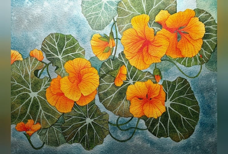
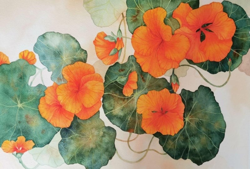
4. Inspiration: Hello, and welcome to this wonderful Tutorial
painting Nosturtiums. This painting draws
inspiration from two artists. One of them is one of my favorite Polish
artists, Stansva Vespinki. Vespinski was born in
18 69 in raco Poland. He was a student of an Mateo at the School
of Fine Arts in raco. His work was versatile. As a painter, he
specialized in creating art va paintings using
the pastel technique. As an architect, he also became famous for creating
among other things, polys for the church of St.
Francis of ACC in Craco. He also gained fame as
the creator of dramas about the history and prospects of Polish society
under the partitions. Many years ago, I tried to reproduce his pastel
painting motherhood. I painted this with oil paints. Among his notable
achievements is the design of the exquisite
stained glass window in the St. Francis of
Assisi Church in Craco, a testament to his skill in merging artistry with
spiritual symbolism. That particular church in
Craco is very, very special. Every time I'm there, I visited. The reason for that
is because the walls inside that church are
painted by Vespinski. He adorned the walls with
beautiful polychrom or murals, if you like, depicting floral and geometric
motives, but not only. One of those murals depicts beautiful sturtiu flowers which served as my initial
inspiration for our painting. Art Nouveau is generally
one of my favorite styles. It always fascinates me how simple shapes painted
with what we could call flat washes in
watercolor painting can create such beautiful
patterns. I love patterns. Notice that the leaves are painted with one
base green color, and then only veins are
painted with white paint. There are no details, lights, shadows, just simple
shapes filled with color. Also, in the flowers, we can see very subtle shades of orange and a few
veins, nothing more. In his other flowers that we can admire on the
walls in the church, he sometimes used a
bit more shading. For example, these roses have
some shading on the petals, but the leaves have simple
flat layers of paint. And yet they are so beautiful. The strength of these
designs lies in the composition and the pattern that all those shapes
create. They are amazing. Vespanski sturtium reminded me of an artist from
Japan Conan Tangami. He was born in the
Hyogo prefecture and is celebrated in Japan
as a prominent painter. He gained recognition
for creating five volumes of picture albums
depicting Western plans. These albums were
notably published as woodblock prints by the renowned on Sodo
publisher in Kyoto. Copies of these albums are preserved in the
esteemed collection of the British library. His use of color is
subtle yet impactful, employing soft pastel tones and vibrant hues to create a dreamlike quality
in his compositions. Similarly to Vespanski's work. In Tani Game's paintings, we see clear edges of the shapes that are
filled with color. There are some tonal variations, but still if we look at these paintings through the
lens of watercolor painting, we could say that
they were painted in one or maximum two layers without going too
much into details. More importantly, in his
works is the composition. One of Tan Gami's works
depicts sturtium. Although the plants are Western, the artistic treatment is
distinctly Japanese with a wonderful sense of asymmetrical balance
and a fine contrast between flowers and leaves. These two works from spanki and Tani Gami were my
inspiration for my painting.
5. Preparing Sketch: First, I began by
creating a composition. I applied the rule of thirds dividing my paper into
three equal parts, both horizontally
and vertically. The points where these lines intersect serve as focal points, which is where I intended
to place the main flowers. Sturtiums grow in
various directions. I envisioned decomposition
as if the flowers were cascading in an arc shape from the upper right to
the lower left side. I sketched large shapes to
represent the flowers and leaves using orange
and green colors to establish the
main composition. This allowed me to test
different color combinations. On satisfied with
the overall layout, I focused on detailing
the flowers. Initially, I created rough
shapes, not overly detailed. Once I had a solid foundation, I refined the line drawing, paying close attention
to the shapes. While I referred to
some reference photos to understand the structure
of the flowers and leaves, I didn't directly copy any. These interpretations
are my own. At this stage, my line
drawing was complete. Knowing in advance that
I would be working on a 12 by nine size paper, I set the dimensions
accordingly in procreate. Next, I transferred the drawing to an app called
Affinity Publisher, which I use for designing PDFs. Here I added a
black frame around the drawing by
creating a rectangle, removing the feel, and
leaving a thin border. Once completed, I
saved the file. There's a significant
reason behind this process. Here is why. I have two
versions of the drawing, one with the frame
and one without. When I open the version without the border in an app
like split print, it becomes apparent
that the drawing lacks a clear indication
of its boundaries. This makes it challenging to determine where to trim
and necessary margins. That's precisely why I
included the border. When I open the file
with the border, everything becomes clear, making the trimming process much
more straightforward. Now within this app, I convert the
measurements to inches, revealing that my drawing
precisely measures 12 by 9 " fitting
neatly on two pages. However, I have
the flexibility in this app to adjust
the size as needed. For example, if I
decide to paint it on a 16 by 12 size paper, I can effortlessly
make this change. As a result, the drawing splits across additional
sheets of paper. Can arrange them
however I prefer, even altering the
orientation of the pages, which might reduce
the total number required for printing
at this size. By accessing the page setup and switching to landscape
orientation, I can now see that my
drawing spans four pages. However, since I
intend to paint it on 12 by nine size paper, I come back to portrait orientation because now my
drawing is on two pages, and now my drawing is
back on two pages. I typically position the drawing so that any intricate
shapes near the center are
shifted to one side ensuring they don't
span across two pages. Now I can print out my line
drawing and in the next part, you will see how I
will transfer it onto my watercolor paper. Okay.
6. Transferring the Image: After completing my line
drawing, I printed it out. Now I will refine it by trimming off any
unnecessary parts. Since the image spans
two sheets of paper, I need to tape them together. Okay. I'll be painting on arches paper at 12 by 9 ". The block that I'm using
measures ten by 14 ". This additional space
around the painting allows room for staples
and masking tape. To transfer the
image onto my paper, I will use a light pod. First, I'll attach the image to the back of my
watercolor paper. Then placing everything
on the light pad, the light from below
will allow me to see the image through the
watercolor paper clearly. With a regular HB pencil, I'll begin tracing starting
by marking the four corners. These reference points
are crucial as they guide me in applying
masking tape accurately. With the corners marked, I'll slowly transfer the
image onto the paper. I can clearly see the
lines from below, so I can easily
trace those lines. Once this step is completed, I'll remove the printed image
from the back of the paper, and then I can attach the
paper to my gator board. I'm positioning the paper
more or less in the center. It's worth noting that I'm opting not to wet the
paper beforehand. I believe it's
unnecessary because the staples will securely
hold the paper in place. As I paint, the paper will
naturally stretch and shrink. However, the key
here is the staples. Masking tape alone
might not provide sufficient strength to
hold the paper in place. That's why I always use staples. I'm carefully
stapling the paper to my gator board on
all four sides, ensuring that each staple is spaced no more than 1 " apart. Okay. Following that, I apply masking tape
along all four sides. The marks in the corners are useful for
precise positioning, ensuring that the
finished painting will measure exactly 12 by nine. Additionally, at this stage, I frequently use
a needed eraser. This versatile eraser can
be shaped as desired. I prefer to roll it over my sketch to remove
any excess graphite, making the sketch
slightly lighter and. With the sketch prepared, we are ready to begin
painting the background. Okay.
7. Background: Before we delve into painting, let me share my approach
and vision for this piece. After some thought, I've decided to aim for a
watercolor like look. After all, we're painting
with watercolors. But this time, I'm
going to paint in a looser style than
my usual style. Embracing intentionally
created blooms and random hard edges, resulting from a less
precise technique. This time, I'm adopting a more relaxed and
simplified approach. My goal is to achieve beautiful
watercolor textures on the leaves while focusing a bit more on painting the
flowers with precision. I aim to strike a
balance between loose painting and
precision where necessary. In my process, I draw
inspiration from the simplicity of spanskis
and Tanigams works. We'll begin our painting journey by starting from the background, gradually building up the
layers as we progress. Initially, we'll
paint the background, followed by faint leaves
in the background, then adding stems,
main leaves and finally focusing on the flowers
which are closest to us. As a final touch, we will delicately add veins
to the flowers and leaves. To paint the background, I will use a brush size ten. I've opted not to
use masking fluid to preserve the white
spaces for the flowers. Instead, I'll paint a background that's very light in tone. Even if I go over
the pencil lines, it's not an issue as the flowers and leaves are
darker than the background. The darker paint will
seamlessly cover any overlaps, creating a harmonious
composition. I believe using a muted
version of orange, that would be brown
because brown is actually a muted
version of orange. For the background
would be ideal. This color choice should complement the
overall composition, creating a soft muted backdrop that mirrors the flower colors. Adding touches of green will further tie the
background to the leaves. Repeating colors from
the main subject in the background is an
excellent approach, fostering cohesion. While exact matches
aren't necessary, variations in hue or intensity can enhance
the unity of the piece. The goal is for the
background to echo hues from the main subject,
ensuring visual harmony. Let's begin by
preparing burnt sienna with just a tiny touch of
winds are yellow deep. Add plenty of water to achieve
a very light consistency. Almost like a t wash
with a hint of brown. This diluted mixture will
serve as an excellent base. Start applying it in
the upper left corner. The water inconsistency will help in creating a smooth wash, but don't worry if you encounter any blooms
or hard edges. We can embrace them as
part of the process. Additionally, if
you accidentally go over the pencil lines,
it's not an issue. The darker tones of the main subject will
easily cover any overlaps. After applying this
initial light wash, I'm adding a bit more brown in some areas to introduce
variation in tonal values. I'm even allowing the color to flow over the edges
of the leaf slightly, creating a seamless connection between the leaf
and the background. Moving to the upper
right corner, let's paint the background
in a clockwise direction. Once again, start with
a very light tone of brown and then add a slightly darker tone
in specific areas. Near the leaves, I'm considering incorporating a touch of
green to reflect the foliage. Mixing burn with green gold initially didn't achieve
the desired shade. I'm introducing Windsor
green yellow shade for a stronger green hue. Green blended with brown creates a natural
harmonious stone. It's crucial to keep all colors. I want the background
to serve as a soft subtle complement
to the flowers. Especially near the leaves, I'm adding more green
than brown to maintain a cohesive color palette and to reflect some
greens from the leaves. In the bottom left corner, I'm opting for more
brown to create a suitable background for the flower that will
be in the foreground. Taking a final look
at the background. I'm considering whether to
add more color in any areas. For instance, I've
decided to drop in slightly more brown
in certain spots. It's important to remember
that as the paint dries, it will become lighter. Additionally, I'm adding
a simple green silhouette of a leaf shape here. Once you've satisfied
with your background, we can proceed to dry
everything using a hair dryer. Lately, I found myself using a hair dryer
more frequently, except in instances where I'm painting larger
backgrounds using the wet on wet technique. In such cases where
I aim to achieve smooth color transitions
and soft plans, I prefer to let the
paint dry naturally. Tilting the painting
until the paint settles allows for a seamless
drying process without the risk of disturbing
steel wet paint and creating unwanted marks
or uneven of finishes. However, when painting smaller elements
with a less paint, like in this case, I prefer to speed up the drying
time using a hair dryer. Once the background is dry, we can move on to the next step, painting faint leaves
in the background.
8. Background Leaves: Okay. In this short part, we'll paint just a few delicate
leaves in the background. I find that the contrast in tonal values between the light
leaves in the background and the darker green leaves in the foreground creates a
captivating illusion of depth, enhancing the overall visual
interest of the composition. To paint these leaves, we'll need more of
our natural green. I'm preparing a mix of windsor
green and burnt sienna, creating a very diluted mixture that yields a light green tone. In the upper part of this mix, I'm adding a touch of
pains gray to introduce a slightly darker shade of
green for added variation. Now, with a calm
and steady hand, we'll slowly paint this leaf using the wet on dry technique. Aim to stay within
the pencil lines, drawing inspiration from
Tanigams meticulous execution of nosturtiums where colors were kept precisely within the lines. From now until we
add final details, think of it as filling
shapes with color. Our goal is simply to fill
these shapes with green. This green layer doesn't
need to be perfectly smooth. In fact, we're aiming
for a watercolor look, especially on the leaves. Embrace any blooms or
irregularities that occur. As they add to the organic
feel of the painting. The primary concern is to
stay within the pencil lines. Notice how the green interacts
harmoniously with the brown applied during the
background painting process. This interplay adds an additional
layer of color variety, enhancing the visual
interest of the composition. For added intrigue, use a slightly darker tone of
the green in selected areas. This serves as an additional
point of interest, adding depth and dimension
to the painting. It's important to
note that I'm not considering a specific
light source here. These sturtiums are stylized
and this isn't intended to be a perfectly realistic
representation of the flowers. Similar to Vespanskis polychromy
and Tani igam's work, the colors are relatively flat. However, because we are
working with watercolors, we have the freedom
to incorporate that characteristic
watercolor touch. My approach is to introduce
more color variations within the leaves and incorporate blooms which are quintessential
to watercolor painting. This will be
particularly evident in the darker main leaves
because these light leaves in the background are essentially light silhouettes. A. In the bottom right corner, I'm using a mix of burned Ciena with a touch of
pins gray to create texture. Using the side of my brush, I'm applying random
brush strokes to introduce variety in tones. Additionally, you'll notice some deliberate gaps
that create edges. I find this effect adds interest and dimension
to the corner. I didn't want to leave
it entirely flat. Here, I'm adding a touch more green to enhance
the vibrancy. Regarding the
bottom left corner, I thought about adding another leaf silhouette
in the background. However, upon reflection, I
decided that the leaf tat behind the two foreground leaves is enough as our
background leaf. So I'm painting it using our light tones of
green and brown. Yeah. After painting these leaves, we can quickly dry them with a hair dryer before moving
on to paint the main leaves.
9. Main Leaves: Now we're transitioning to another simple yet
enjoyable step where perfection
isn't the focus, painting the main leaves. Let's begin by preparing
a variety of colors. On the left, I've mixed burnt Ciena with
Windsor yellow deep. I will use this mixture just a little bit
across the leaves. On the right, I've
prepared my primary green using windsor green yellow
shade mixed with burnt sienna. In the upper part of my palette, I've added paints gray
to the green mixture, resulting in a darker
shade of green. Using a size ten brush, let's begin painting from the left hand side and gradually move towards
the right side. If you're left handed, it will be easier for
you to start from the right side of the painting
and move towards the left. Now with our green
and brown mixes, our task is to simply feel the leaf shapes
with these colors. This step is straightforward. The key is to stay within the pencil lines within the
boundaries of the leaf shape. Your interpretation
here is entirely yours. Feel free to experiment
with different colors. Your layer will likely
look distinct from mine, and that's perfectly fine. Aim for a very watery
paint consistency and slowly fill the
entire shape with colors. We could opt for a wet on
wet technique here as well. I'll paint the last leaf using this method just
to demonstrate it. However, with the wet on dry technique that
we're using now, we have more control over the paint and the edges of
the shape we're painting. Additionally, painting
wet and dry results in a darker tone initially, as there isn't an
additional water layer beneath the paint
to disperse it. This allows us to achieve
a darker tone more easily. Moreover, the natural
variation in wetness across the paper may lead
to the formation of blooms, the effect that we actually want to achieve
in this painting. A. After applying the green, let's enhance the interest by dropping in some of our browns. These brown spots
will add variety to the colors and nicely
complement the orange flowers. Moving on to the next leaf, I will repeat the process. Here I've started with a lighter green tone to
introduce some tonal variations. This variation can also suggest that the light source is
coming from the left, making this leaf
slightly lighter. As we approach the flowers, I'm incorporating more brown
to add depth and dimension. As the first leave
begins to dry, I notice that the surface
is still slightly dump. I want to take this
opportunity to spatter some water droplets
intentionally to create more
texture and blooms. Now to the leaf
below the flowers, here I'm aiming to introduce
more variety in color. I'm additional brown and
a slightly darker green, particularly beneath
the flowers. A. To further enhance the texture and create intentional blooms, I can load my brush with water and gently
squeeze the bristles, allowing water droplets
to fall onto the surface. Again, as you can
see, I'm not striving for perfect execution
of these washes. Typically, I aim for
careful painting to achieve smooth washes and
flawless color transitions. However, in this painting, I embrace all those
watercolor imperfections. This approach grants
me more freedom and less stress as I view these imperfections as
intentional and desirable. My primary focus remains
on staying within the pencil lines and ensuring clear distinctions
between shapes. Oh. Returning to the previous leaf, I continue to spatter
more water droplets. I'm keen to avoid flat
uninteresting washes and instead, aim for captivating
watercolor textures. I'm very curious if
you like this approach and this effect or
not. Let me know. Switching to a smaller
brush as size four, I paint the tiny areas
between the petals with a dark green signifying the leave
behind the flowers. Switching back to
a size ten brush. I then proceed to paint the leaf behind this
particular flower. I've added a tiny bad here
in front of the leaf, so I need to carefully
paint around it. Towards the end, I'm dropping
in some water droplets, hoping they will create
some blooms or textures. For the final leaf, I've chosen to paint wet on wet. There's no particular
reason for this choice. I simply want to demonstrate that it's also a technique
that we can use here. After applying a layer of water, I start dropping in my colors. The end result will be similar
to painting wet on dry, so it doesn't really matter
which technique you choose. However, I find that wet on dry is easier and it allows
for more imperfections, which we want to
achieve in this case. Additionally, you don't have to manage excessive
amounts of water. Now, allow everything to dry. You can use a her
dryer if you like, but first let it dry naturally
for about 10 minutes. Once the sheen disappears
from the wet paint, indicating that it
has settled down, you can use a dryer to
complete the drying process.
10. Stems and Sepals: Since we still have the
green paint on the palette, let's finish all the green parts before moving on to
painting the flowers. In this step, I'll demonstrate
how to paint the stems and sepals of the flowers
using a size for brush. Beginning with the stems, I start by applying an
extremely light green tone, taking great care to be precise and stay within
the pencil lines. Once this initial
layer is applied, I switch to a darker town of
green and add it sparingly, focusing on areas near the
leaves and at the joints. Now, let's focus on the
bottom left corner. Here I want to begin with
a warmer shade of green, so I add a touch of
green gold to the mix. I start by feeling the shapes of the sepals and then move
on to painting the stem. To add depth, I
include a shadow under the flower and on the stem
using a darker shade of green. Continuing with the
stems and sepals, I use various shades of green and brown to
fill the shapes. At this stage, I'm
focusing on applying flat washes without
adding details. Later on, I may incorporate
some additional details, but for now, I'm concentrating on laying
down the basic colors. M. After painting one stem, I noticed it seemed
quite solitary, so I decided to introduce
two companions. Using an HB pencil, I drew simple lines to indicate
the sides of the stems. I only drew one
line to represent one side of the stem as
the stems are quite thin. These pencil lines serves as guides for the shape
and With the brush, I can paint the
desired thickness of the stems following the
shape of the lines. Finally, I proceed to paint the last stems and sepals
on the right side. At this stage, here's
how the painting looks. In the next part, we will
apply the base layer to the petals of the flowers. Okay.
11. Flowers - Initial Layer: Now let's begin painting those
stunning orange flowers. Since we're transitioning
to different colors, it's best to clean the
palette at least on one side. We'll keep the green
for later use, so I'm leaving that untouched. However, I'm cleaning
the left side of my mixing area where I will
yellow orange and red. This is also a good moment
to change the water. First, I will prepare the
lovely, transparent orange, a beautiful color that will be perfect for the
sturtium flowers. Additionally, I will mix
Windsor yellow deep, which will more warmth
into the petals. Lastly, we'll need
a warm red and I've chosen windsor
red for this purpose. We'll use this red in the
centers of the flowers. Let's begin with
the smaller flower in the bottom left corner, using a size four brush. First, pick up Windsor yellow deep and fill the
petals with this color. This yellow will
serve as our base upon which we will build
more color variations. With the flat yellow
wash in place, now pick up the
transparent orange and apply it to the petals, starting from the center. The idea here is to make
the center of the flower orange or than the other
parts of the flower. Apply the same
colors to the petals that are visible behind
the leaves above. Start with the yellow base, and then add some orange to
create depth and dimension. Now let's move on to
the larger flowers. The main principle
remains the same. Apply a layer of yellow first, and then add orange
to the petals, focusing primarily on the
center of the flower, which will eventually be darker. Don't worry about individual
petals at this stage. Our goal is to fill the flowers
with yellows and oranges. We'll focus on refining individual petals
in the next part. So for now, apply the paint
to the entire flower at once. After painting this flower, let's move on elsewhere. We should avoid painting
the flower right next to it as the lighter
color may flow into the darker orange of this first flower and
disrupt our intended effect. We'll return to this flower
later when it's dry. Now onto the next
two smaller flowers, there's nothing
particularly new here. I'm simply painting them with yellow and adding more
orange close to the sepals. For the larger flowers, I've switched to a
bigger brush size ten. This will make it easier to cover larger areas more quickly. A. After applying the yellow
to the flower on the left, I'm dropping in the orange in the center and at the bottom. It's crucial for the center to be to convey the
dimensionality of the flower. Now let's move on to the bottom right flower
and repeat the process. I've decided to play around
with the tonal values here, so this flower will
have a lighter tone on the petals compared
to the other flowers. Why not? This is a
stylized painting so I can change anything as we. Apply the basic yellow to the
three small bats as well. Now, let's allow everything
to dry completely. Once dry, we can proceed to paint the two remaining flowers. Let's begin with the
flower on the left. There's nothing very
surprising here. After applying the yellow, I will in the orange. I will repeat the same
process for the flower. Here's the result at this stage. We have a solid base for both the green and
orange elements. Now we can proceed
to add some details.
12. Flowers - Deepening Colors: All right, let's focus
on refining the flowers. While we have a beautiful base, there is currently
no distinction between individual petals. In this part, we'll spend a bit more time on each petal to deepen their colors and create differentiation
between them. At this stage, we can use either the wet wet
or wet on dry. I'll begin with wet on wet
just to show you and later, I will switch to wet on dry and discuss the pros
and cons of both. Starting with wet on wet, apply a water layer to
the one of the petals. Then pick up an orange mix
and apply it near the center and along the edges of the neighboring petals to create distinction between them. Additionally, we can
add windsor red in the center of the flower to
create an even darker tone. It's important to note that
to create a darker tone, I'm using an analogous color. In this case, since we're
painting orange flowers, I'm using an analogous color with a wider tonal value range, which is Windsor red. This approach allows me to
maintain the vibrancy of the color while achieving
a slightly darker tone. If the windsor red isn't dark enough as will happen later, I will use another method
for creating a shadow color, such as adding a complimentary
color or using panes gray. Adding windsor red
to the center of the petal creates vibrancy and the darker center
provides depth to the flower. Now I will move from
one petal to another, spending a bit more
time to carefully introduce those
orange and red tones. I'm painting petals that
aren't touching each other to prevent the wet paint from flowing into adjacent petals. Once I've painted the
petals that I could paint, I will use a hair dryer to dry them all and continue painting. The purpose of this stage is to add more depth to the petals, create distinct
separations between them and intensify the colors. The second layer should enhance the richness and
vibrancy of the colors. Rather than applying a darker
tone only near the center, we can also apply it in
various areas of the petals. A darker tone indicates
either a shadow visible between the petals or an indentation on the petal. Therefore, depending on
where we apply the tone, we can alter the
form of the petal. Since we're not using
any reference photos, this gives us the freedom
to create the impression of a flower in a way that
we find most appealing. Now, I will switch to a
smaller brush as it is four and paint the tower
in the bottom left corner. I'll also transition to using
the wet on dry technique. Let's load our brush with some orange paint and
apply it to the petal. Okay rains and blood the brush
and with a clean do brush, gently soften the edges
of the applied paint. Repeat this process
on the second petal. It's important to note
that with this technique, we first create hard edges, and then we have the flexibility
to decide whether to soften all of them or retain
some for added effect. In contrast to the wet on wet technique used
previously where hard edges are
impossible to achieve due to paint dissolving
in the wet layer. Here we have more
control over the edges. We can opt for sharp lines or choose to soften them
to create a variety of effects such as additional
distinction between petals or stronger cast
shadows with sharp edges. For example, on this pot, using hard lines allows us to delineate the folds of
the petals effectively. Achieving this level of detail wouldn't be
feasible with a wet on wet technique where creating such defined edges is more challenging or just impossible. Continue refining the petals
using the same technique, referring to my
finished painting for guidance on achieving
a similar result. Imagine that there are
no veins on the petals. Everything beneath the veins is the result of
this painting stage. Stick to the three colors, Windsor yellow deep, transparent orange,
and winds are red. Use darker tones, especially
more red in the center of the flowers to create
the impression of depth and a trumpet
shape of the flower. Once you've completed the
second layer on the flowers, consider adding shadows and details to the sepals
to finish them off. Since there isn't much
left to do on the sepals, you can complete the
step relatively quickly. Use a darker green tone to paint the shadows on the sepals, focusing on creating a distinction between
individual sepals. Imagine the light source
is coming from the left, shadows should fall on the
right side of each sepal, leaving the left side lighter. Keep it simple and effective
avoiding too much detail and just suggesting shadows
with the darker green tone. With that, this
stage is complete. The next step will involve painting the veins on
the petals and leaves. Let's move on to the next, where we'll tackle painting
the veins on the petals.
13. Veins - Flowers: In the final two segments
of the tutorial, our focus will be on painting the veins of the
flowers and leaves. This stage is particularly
enjoyable as it's relatively straightforward and
the added details will fill our painting
with more character. For this desk, I'll be using a size zero designer's brush. This brush is
exceptionally thin. This idea for precise work. While it resembles
a rigger brush, its shorter bristles offer
even more precision. However, if you don't have this bruh, this
particular brush, don't worry, a
regular round brush with a fine point
will do the work. The key is to have a tool that allows for
intricate detailing. Let's begin with an orange hue and this small petal
situated behind the leaf. This area serves as a perfect testing
ground for our lines. As you can see, the lines created with this
brush are very thin. The direction of these
lines is super important. They don't just make the
petals more interesting. They also show us the
shape of the petals. Depending on how we paint them, we can make the petals
look different. They can curl, bend and twist. At this point, we need to use a bit more of
our imagination. I like to imagine how
the petal is curved and paint the lines as if I'm painting on the
surface of the petal. Straight lines aren't enough. They need to curve a bit, following the shape
of the petals. These lines or
veins help us turn a flat looking petal into
a cool three D shape. If I need a darker shade of red because the winds are
red isn't dark enough, then I will add a
bit of dark green. Green when mixed with red makes a more muted red or brown. It's just right
perfect color for us. I will use this darker
reddish brown to paint the veins in the
center of the petals. This darker color also makes
the center of the flower. We don't need to
paint too many veins. Just a few scattered here
and there will do the trick. But in this case, I
think having veins on both the petals and leaves will create a nice
overall design. Now, take your time
and paint the veins on all the petals slowly
and carefully. Will demonstrate the
step on a few petals, but you can follow along with my finished painting if you want to replicate
these lines precisely. One important thing
to note is that you shouldn't paint
the veins too thick. They need to be very thin to show the delicate nature
of these flowers. Use a brush with a
sharp point and try to paint with just a tip or use
a similar brush to mine. This process may require
some focus in time, but the result will be
a beautiful painting. At this stage, you can also
add some shadows if needed. Perhaps you would like to slightly darken the
centers of the flowers. This is a good moment to do so. It's truly amazing how such simple lines can bring
so much life to these petals. A. This is how my painting looks after adding the
veins to the petals. Now we can move on
to the last step, which is painting the
veins on the leaves.
14. Veins - Leaves: Okay, now we've reached
the exciting part, adding veins to the leaves. Our painting is almost ready. For this part, I'll be
using white acrylic ink. This is just one option. Normally, I would
use white guash, but I know that many
of you have trouble finding the right consistency
with white guash. That's why I want to show you this acrylic ink because it has a perfect consistency
straight from the bottle. Acrylic ink is an acrylic paint, that is thinned down to a
nice fluid consistency. It is light fast, opaque,
dries very quickly. It doesn't fade and will
work great for our purpose. Here, I've painted two
similar leaves for testing. If you're not familiar
with acrylic ink, I highly suggest testing it before using it in
your actual painting. Okay. Let me show
you how it works. You can also experiment
with white pencils, but from my experience, none of them gave me the
result I was looking for because they aren't intense and opaque enough for my needs. However, you can use a white pencil to mark
some places if you like. For example, you
can lightly draw lines where you are going
to paint the veins. Now, let's get back
to the acrylic ink. I have a small plate here, and I'm going to use
it as my palette. Acrylic ink comes in
an eye dropper bottle, so it's very easy to transfer a small
amount to the palette. As you can see, the
consistency is already fluid and perfect
for immediate use. Unlike with guash,
you don't have to worry about how
much water to use. However, keep in mind that
acrylic ink dries pretty fast. At some point, we
may need to add a bit of water to make
it more fluid again. We can also add some watercolor paint
to change its color. It works well with water
colors, but ideally, it would be great to
have various colors of acrylic ink so that we can mix
them to create new colors. Here I added some green, and as you can see, we can slightly change the
color to green. Of course, when we
add watercolor paint, the resulting color
will always have a pastel look because
the ink is white. If you want to achieve
strong vibrant colors, you would just have to use
other colors of acrylic ink. However, for our purposes, white ink is enough. As you can see, this
paint covers very well. It's very opaque and its consistency is very
nice to work with. I deep my brush in water more frequently if
the consistency becomes too thick or the
ink starts to dry out. Now, I will move
on to my painting. I thought I would add some
Windsor yellow deep here and some green to make a
nice warm green color. And we can start
painting the veins here. I'm not looking at
any reference photo. There's no need to. I just have to decide
where the veins meet. Starting from that place, I'm painting the lines
up to the edges. The lines get and. I think that purely white color is too bright to cool for this. That's why I added some
green and yellow to it and I use pure
white very sparingly. After some time, you may
notice that there are some small clumps
on your palette, and that's just dry ink. Now, very slowly, build
the vein on each leaf. Start from the center and paint the veins outwards. Don't hurry. Use a designer's brush or a brush or any brush that
has a very sharp point. My veins are very prominent, very visible, and
they draw attention. That's just how I
wanted to paint it. I wanted to highlight
those veins because I think they
look really interesting. That's just my idea
for this design. However, you don't
have to follow me. If you think that those
veins are too prominent, You may want to
water down the ink or guash depending
on what you use. Much more to make it much more transparent and paint the veins that are much less visible. You can paint them
thinner if you like. Feel free to do
whatever you like. It's your painting and I'm
just showing you an idea. I think these veins look
particularly beautiful, and I love the strong
contrast between them and the dark green
color of the leaves. Because this ink
dries really fast, we can also come back to some areas and reapply
the paint if we need to. One thing that I like to do is to round the angles
in the centers. When we paint a few main veins coming out from the center, these lines in the center
create sharp angles. I like to round those angles. That's just a tiny detail. Now continue working
on each leaf. Y. You may decide whether you want to add any veins to the lighter
leaves in the background. I decided to add very
light thin veins there, but I left some silhouettes
without the veins. The leaves in the back
don't have to have as much details as
the leaves in front. With those veins, we can
finish the painting. Now you can sign it, remove it from the gator board, and proudly hang it on your
wall or share it online. Congratulations on
finishing this project. In the next part, we will
summarize what we've learned.
15. Summary: Let's summarize what we've
covered in this tutorial. The main lessons that
we've learned are drawing inspiration from
Stanisva Vespinskis and an Tanigams works. Balancing loose painting with precise details following
a layered approach from background
to foreground and embracing intentional
blooms and overlaps. Preparing color mixes
for leaves and flowers. Filling shapes with watery
paint and incorporating intentional texture
and variation for a watercolor effect. Using wet and dry and wet on wet techniques for
control and variation, switching brush sizes for
detailed and larger areas, and using a hair dryer for
drying between layers, Applying base layers to flowers with a focus
on center darkening, separating petals
with darker tones and deepening the colors with
the second layer and using thin brushes for precise
vein painting and experimenting with
white acrylic ink or guash for leaf veins. Thank you very much for joining me on this
creative journey. I appreciate the time
you've spent with me. I encourage you to give
this painting a try It was enjoyable to paint, and I'm pleased with the result. If you've already completed your painting,
congratulations, well done. I hope you are proud
with your result. Thank you very much for
watching and happy painting by