Transcripts
1. Introduction: Hi everybody. Hi. It's Wera. Nice to see you here. I'm back with my second Skill share class, and I'm really excited about the topic. I thought it would be a fun project to paint something unusual, take daily day objects, and turn them into something magical. We will paint together two beautiful mixed media illustrations. One of them simpler or more basic, and the other one bigger and more detailed. Each of those two exercises will consist of three main blocks; sketching, painting, and adding the final details to the picture. I will also discuss all the tools you need and where to get the inspiration from. This class is suitable for both beginners and also for advance artists. I include some links to other Skills hare classes by fellow Skillshare teachers, if you would like, for example, to catch up with any watercolor basics, but any skills will be useful to paint your galaxy drink with me. I hope you'll join me in this project and paint with me some magical galaxy drinks illustrations. I'm very much looking forward to seeing what you come up with in the project gallery. The sky is the limit, you can really use your imagination in here, and surprise me. You can also make sure that you tag me, I provide the hashtags in the description below, and I will definitely feature you on my social media. So let's get started with our project. Then the next video, I will give you some tips about the materials that we're going to use.
2. Materials: Here are the materials that I recommend to use for this project. To start with, you will need a watercolor paper. Since we will be working with quite a big amount of water, I recommend a paper that is much thicker. The one that I am using has at least 300 gram. It is up to you if you'd like to use a rougher type of paper cold press, or a smoother type of watercolor paper hot press. However, for rougher surfaces, I think the granulation and the texture of the galaxy can look a little bit nicer. You may want to choose to work on the watercolor paper block that is already taped from all the sides. So you don't have to read the tape your paper onto a new surface. But in case you would like to work in individual sheets, you may want to tape them. For this purpose I'm using a board from Ikea photo frames. So maybe you have a board that you could use for that purpose and then use a masking tape and the big flat brush. For the sketching part, you need some pencils. For example, HB pencils, I really like to work with colored pencils at this stage and some lighter color, it's usually pink. You need some erasers and I also recommend to work with a sketch book. The one that I have is a bigger one. It's an A4 format. For the final touches on the planets and on the galaxy, you need some colored pencils and your favorite vibrant colors. Maybe you want to use some fine liners, set some details to the planets. I also like to work with some metallic pins. The brushes that I'm using to paint are all synthetic brushes and it's really a matter of your personal preference. I have sizes zero sometimes I switch it with one or two and then four and eight for a little bit bigger surfaces. On top of that, I recommend that you get some older, more bristle brush so that you can produce some splatter on your work that imitates the stars and then apart from that you need some pellet or maybe just want to use a kitchen plate to mix your colors, to mix your paint. You need enough water containers and maybe some paper towels or I like this more echo version, just a cloth that you can use instead of the paper towels. In this project, I focus mainly on painting with watercolor paint because for me it was the easiest. Should you prefer some other paint like acrylic paint or gouache paint, you can try to do this project with a different medium as well. Some of my most favorite brands are Schmincke, Marcelo, Daniel Smith, and White Knights. Now especially for the galaxy part, there are a few color recommendations in case you're wondering which paints to buy or which paints to use. I'm not sure if I would be able to paint a nice galaxy without my indigo colors. So I really recommend that you get some indigo. I also use Payne's gray, maybe you have another dark blue or gray of your choice. It's important to have something that is a little bit darker in order to create the contrasts between the sky and the nebula. Then I think what is really useful to create a nice nebula and galaxy effect is a brighter pink or a brighter purple. I'm using some Oprah pink, maybe you have some fluorescent pink. For the edges of the galaxy, I also use some light blue, some cerulean and turquoise color. It's completely optional, but it might look pretty if you have some golden watercolors, some golden they ink to have some accents and then especially for the part where you would like to add some planets, I'm also using masking fluids for this project. Then I also really recommend even if you don't have Gouache to at least buy a tube of white gouache where you can improve your galaxy by adding some cloud-like formations to the nebula and since white gouache is an opaque watercolor, you can layer it. You can also use it to add some extra stars to create the splatter with the stars effect, as well as even add some extra planets. So now that you know what materials you can use for this project, in the next video, I would briefly like to talk about the inspiration and the reference photos for your illustrations.
3. Inspiration: In this video, let's talk about inspiration and reference photos. One way to look for the shapes of the containers that you'd like to use for this project is either to use the real objects that you have in your kitchen and to use your own reference photos, or you can browse for some inspiration online. With your own reference photos that you take, you don't really have any problems with the copyright. If you're taking photos of your own, you can also choose a composition that you really have in your mind and you're not limited by what you find on the Internet. When I was looking for some inspiration for this project, there were basically a few ways to find the photos. One of them is definitely Pinterest. I think it's the ultimate inspiration source. I'm also leaving a link in the description of this class to a special board on my Pinterest profile that I created that is labeled galaxy drinks. So if you want to just take a look and see if you get inspired by any shapes and any compositions that you see there. Then alternatively, since teapots, cups, they're part of the kitchen and every household, maybe you have a website that resonates with your style. You can even go to the Ikea websites just to look for simple shapes to see what the kettles, teapots, or cups they have, or any other favorite shop of your choice that sells cups and mugs and has a nice style then he can use them as reference photos too and making sure that you give your stories. We start right away with the next video with the first illustration, which is a coffee mug. The next video will exactly do that, will give you tips about how to sketch your coffee mug by using props.
4. Coffee SKETCH: Using Props: The first exercise of this tutorial is to start off with a simple illustration as a warm-up exercise. I invite you to start with me with a simple sketch. Basically, I wanted to show you that with very few resources, you can create your own Galaxy coffee illustration in no time, it's very easy. For the sketch I'm using a smaller sheet of paper, A5, doesn't really matter. You can also go bigger with your paper. As always, I like to use my pink colored pencils for the sketch and then you may have your own reference photo. You can even take a photo of your own or you can, again browse on Pinterest, and for this warm-up exercise, I want to keep it simple and easy. I chose this shot of coffee or a cup from above, but this will just be my reference for the composition. All the other details, they're going to be changed. It's really easy. I suggest that you look around you're flat. You maybe go to the kitchen and you find some shapes that are around of the actual saucer, from cups, some plastic elements, some lids actually from jars. Then you choose the size that you want, so I thought for my saucer, I will choose this shape. This is actually a jar that I'm using for water to keep water for my watercolor paintings. Yeah, I think this one looks pretty well, think it fits. What do you want to do? Just like in this composition, you want to trace the shapes, I do it very lightly. They don't really have to be perfect because they will be painted over. One is done, then I'm placing my cup or my mug in the middle. Again, that doesn't really have to be perfect. It's just about the shape and here I'm using also the lightest color of the colored pencil. The rest is about adding some details freehand. Just like that, in a matter of seconds, our first sketch is done, and practically speaking, we are ready to paint.
5. Coffee PAINT: 1st Layer: In this video, we start painting. We proceed with putting the first layer of our watercolor paints. Before, I would like to invite you to figure out what colors you would like to use. I have my color swatches cut out here, so for me it's easier. You can just do it in your head or you can do it in your sketch book, maybe you have your own system that works for you best. You want to decide and put the pens aside that you're going to be using for the galaxy inside of the mug or the cup. Then for the actual mug or a cup and for the background. For me it's just a warm-up exercise. I want to keep it simple. For the background, I chose some muted colors that are a little bit more calm. I think it's always nice for the mug to go with a little bit more color, and for the galaxy eight shows a classic. The indigo and the very bright pink, this is the opera rose pink. I will most probably add some golden accents and pretty much by default I will also use white gouache to make the details in the middle. The first step that I recommend is that you actually start with the background. With that element of your composition, that is the most underneath. I like to wet the entire background first. I will be using the wet on wet technique for the background. I would advise that you keep all the edges, especially where the paint in a way ends you keep it wet because once it dries, you might get some smudges on your paper which I don't think they look too aesthetically. You might actually also dub in the paper to create this of bubbles, little bit of texture. We're going to use my Potter's pink a little bit more. In this way, the background is painted with muted colors but it's not entirely flat. I think this way is a little bit more interesting. The stage is up to you but already here you can add a little bit of shade or shadow that could be cast by your container. To create a nice shadow, I like to use some violet color. I do it only on one side of the saucepan of my little plate. I would also like to add a little bit of splatter. I will also use this opportunity that the background is still wet. I will cover the insides. I will mix a little bit more of that Potter's pink and then you can use the other brush if you want to, if you're not sure, you can also use some scrap paper to test if it's going to work, and you can put in some splatter. You can also wait till the surface dry. If you want more of a prominent points on your background like this part, for example, dry it, it's a little bit more visible. If you want us to blur into the background like here, then you got to do it when the surface of the paper is still wet. I will wait a little bit now so that everything dries nicely and then I will paint the pot. Otherwise, the colors, they will blend, they will blur and then some of the turquoise that I'm planning to use here will leak into the background and I would like to prevent that. Fantastic. I'm done with laying down the base colors for my illustration. I have the background and I will keep moving more out of the background into the foregrounds. That's why I started with this surface around my cup then I went on to do the cup. I already added some texture because I wanted to use the wet on wet technique, the same for this platters around to create a little bit more interest. Yeah. This is what I actually call the ugly stage. Do not be discouraged that it looks the way it looks. This is the foundations of our illustration and every next step you take will make your illustration prettier and more perfect. In the next video, I would like to show you how I do the galaxy inside of the cup.
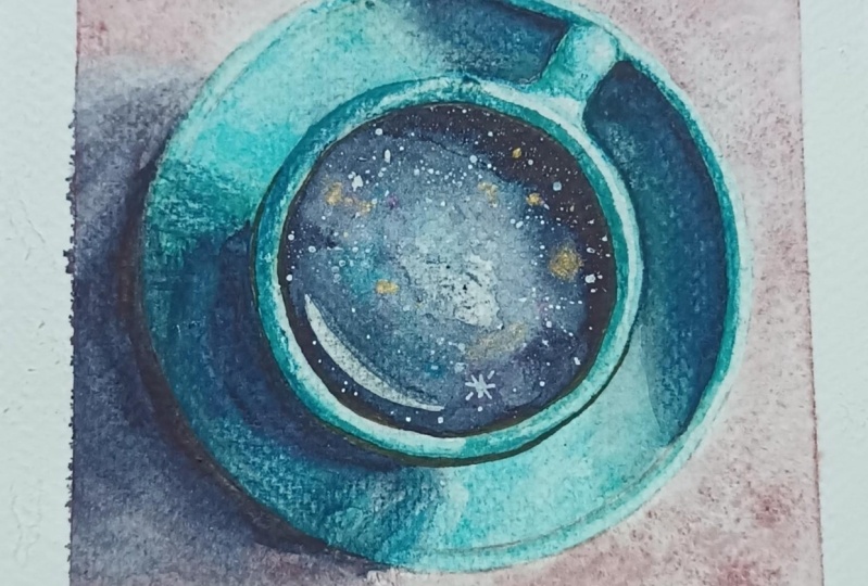
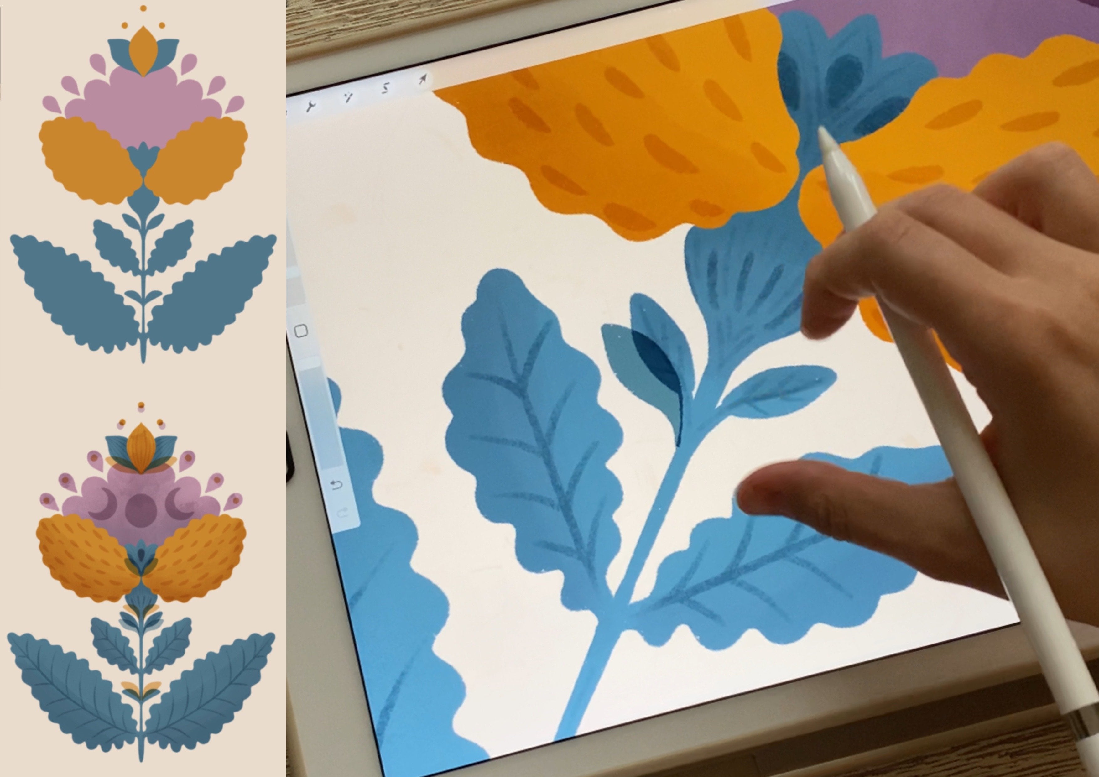
6. Coffee PAINT: The Galaxy: Now it's time to paint the insights of the cup with our galaxy. The colors that I recommend for that is the indigo, some very bright pink like Oprah pink. Maybe you want to add some accents with some turquoise or Cerulean, some searches Blue. Perhaps he really fond of golden accents. You can also put some golden pintos side, and to create nebula effect, it would also be useful to have white gouache. The indigo will go around, it will be the darkest part of our galaxy. Then the accents will be done with the remaining colors. The very center, I will leave it white or just a translucent layer of pink. If it's not white enough, I can always use my white gouache. I start by wetting the middle with enough water, and this will be like usually I paint my galaxies with one layer. The trick is to use enough pigment, then you will not have to go with multiple layers. You can do it at one takes, so to say. As I was saying, the white here, the there will be some nebula I will leave it as it is. Then I will use my bright pink to form the edges of the nebula like that. At first I go a little bit lighter than I intend. Just to establish the shapes of my nebula. Nebula like the way I get it, it's like cloud-like formation. That's how I see it. Then my indigo will go all the way around. The way I want to do it now is to get a nice round shape to start with, and to have my most saturated color, the darkest color on the edges. I think that's okay every now and then to leave some white specks because that it will be easier to put there, some golden exons, for example. Depends on the paints that you're using. You might also want to do this project with gouache, actually gouache is more opaque than watercolor and then you can layer it. See how it goes. The edges are nicely dark, and right in the middle I left something like a path. Now I will also add a little bit of turquoise, while it's still wet, if it's not wet enough, I'm adding a little bit more water, see, and I actually really like to use those paints that granulate in a nice way. Again, I'm wetting some of the edges, and I will go in with my brightest pink. You see I'm working with quite a lot of water, you see the reflection of it. Now, I will add a little bit more of exons, and gouache, and then the last stage will be to still some white gouache till it's still wet. Before I add any further details, I would like this galaxy surface to dry out a little bit. Once the paint dries a little bit more, it might be that the colors are going to fade a little bit. That's why it's important for this first layer of the galaxy to really dab that brush in a lot of pigment so that you don't have to repeat layering. Ideally, you want to do it in one layer because that's when you create the best effects was the first layer. However, if you think you would like to reinforce the colors a bit, the way I for example, decided here in the middle that I would like to have a little bit more decisive pinkish colors, then you can do that too. I'm taking my pink, and making sure I'm using enough water, and I'm spreading the water and adding some dabs of paint. Little lakes of pigment. It's not fully dry yet. For instance here in that spot, I can just put more pigment, put pigment in there, the water is still there and it will work for me, and that's also not wet yet, and the same with the indigo with the darks. If you believe that your darks are not dark enough, you can always go in again and make this parts a little bit darker, especially on the edges. Now, one of the last steps in finishing our galaxy is to create the effect that imitate stars. I will create some splatter brush that is a little bit more bristle. I mixed it up with a little bit of water and to white gouache. This will be my base for the stars. I don't want too much of this white paint to land on this saucer. Right this way, you can protect it with some paper, and I decided to improvise and to protect it with this class and then I'm going to shift it. First you take a little bit of gouache and I contest it somewhere, and then you create splatters that will look like stars. To create more visible effects, if you would like that, you take your brush with some sharp ending, and you use whatever you have left of gouache, and you put in your stars on your own. The painting of the galaxy is complete, and in the next video we will be adding the final details of watercolor paints, like shadows and the edges of the cup.
7. Coffee PAINT: 2nd Layer: At this stage, I add the very last, final details with watercolor paint. You can still add a little bit more dimension with other media like with colored pencils or with fine liners or even markers. But if you feel okay, there's still some finishing touches. If you need to do anything with water color, this is the time to do that. I would like to yes, to fix here or the shape of the cup because right now it's not very visible at any time. You can also look at your reference photo and see where your highlights are when the shadows are, probably I'm going to add a little bit of reflection on the saucer. Of course the ear of the cup, it's also not very visible. I will use some paint so that it stands out and it doesn't get too blurred and not visible at all. For shadows, I usually recommend you can have a gray. Does your favorite gray you can use violence normally I'd use violet or purple. However, here I used some violet to decorate the saucer so it will not be as effective. I think I'm going to use gray for this reason. It may be as well that at this stage, you're already very happy with your Illustration, then you can keep us simply in watercolor, even have to do anything else with it, move any other media. However, in the next video, I would like to show you how I make it more in an illustrative style, by tracing the outlines a little bit more and adding some extra stars. If you're interested in adding those extra details, then hop on to the next video.
8. Coffee: Draw & Outline: At this stage, you might decide that you're happy with this simple illustration the way at this, so you didn't really want to add any extra details, you want to leave with just in watercolor. In this video, however, I would show you a few of my tips and tricks and techniques of how to add a little bit more detail to this illustration using colored pencils, some gel pens, and fine liners. If you want to take a look, then you can use some of the techniques with me. Creating with mixed media is by far my most favorite technique. After so many paintings, I was able to develop some strategy that gave me the best, or the nicest results in my opinion. I figured it with time that for me the best way to proceed is to start first with the colored pencils, to add some shading in a little bit of texture, then to add the highlights with some wet gel pens, or some white markers, and then to look at it from the distance and see if this is it, or if I would rather add some more decisive outlines with define liners. In the very same way, I will proceed with this illustration. In the meantime, I also look at my reference photo, and I look for any extra shadows or highlights that are missing that they would like to add to my illustration. This is also the stage where I make the outlines, or the general shape that I have here, for example, of the cup, of the saucer, a bit more decisive, less blurred. If you haven't added any detail to your saucer, for instance, or to your mug, you can also add some declarations to your ceramic with colored pencils here. I think colored pencils with disrespect they're a little bit easier to handle. In general, I have, let's say two techniques of using colored pencils on watercolor. The one that I'm using right here is to use those colored pencils that are still similar to the color that I'm decorating with the colored pencils. I have here an indigo color, I have some turquoise, and cobalt green, colors that are very very similar. Another strategy would be to take colors that are completely different. For example, making the outline, if we have turquoise here, then maybe with some vibrant red, or some orange. I decided that this contrasts strategy, the second technique, I will not use it here because it would stand too much in a position with the galaxy. I want the galaxy to be literally in the focus. What I focus on, what I want to emphasize here are more, the shadows, and that the outlines are more prominent, because watercolor tends to be a little bit more blurry. I'm just helping my watercolor layers to pop a little bit more using colored pencils. Then also depending on the type of paper that you're using, this one is not smooth, it's actually called presser. You can still see some texture, you can create very nice effects. If you like texture at all, if you're a fun of smooth surfaces, then it's not a technique for you. But I personally really like this effect where here, for instance, this is pretty much nearly the same color, but it just added a little bit of texture because the colored pencils I went into the ridges of the paper, so to say. I just think it's more interesting. I warmly invite you to try it out and to see if you like this technique. Some people like very smooth surfaces. For instance, they wouldn't like here those effects that we create by adding some extra water. I personally like them a lot. I think this is one of the best properties of water color that you can get those bubbles, those little flakes of paint. In this project, however, in this particular exercise, you can use the techniques that you learned before, or any techniques that you would say are part of your style, of your artistic identity. You can make this illustration entirely yours in your style. The very last minute, I decided to use a little bit of purple on that shadow so that there is a little bit more of a contrast, and it really does look like a shadow that's cast by this cup. Maybe you'll have noticed that my color palette in here is actually quite limited. I think it's a good idea just to stick to two, especially here at the watercolor stage two, three, maximum four colors, and then the rest is just an accident that blending them. I think it looks a little bit more cohesive when our color palette is a little bit more limited. To me personally, it looks more aesthetic rather than if we used everything at the same time. Also, above my technique of using the colored pencil here, it's probably not that visible in the video, but I'm using very gentle strokes, I'm not pressing too hard on to paper. I put a little bit of thickness and I move along, and then a little bit more, and I come back. Because if you make a mistake, or if you change your minds, maybe you added a little bit too much of this colored pencil, it's very hard to go back and to fix your mistakes. Luckily, this is an illustrative style of creating a painting, so it's very safe. Whatever you think mistake you have done, it's fine. Illustrations, they're not photo-realistic paintings that can look a little bit different or even a little bit messy. I believe I will leave it as it is. Yet again, this stage could already be your final illustration. You can stop at that, they can stop at the previous stage, you can stick on this one. Again, in the next video, we'll show you some extra details with some white pigment. I invite you to watch the next video and to decide for yourself if you would like to add this extra dimension in your illustration.
9. Coffee: Final Touches: We're going to the next level. In this video, I will be adding some extra stars and highlights in details with my favorite white pens. For starters, I would like to add some more decisive stars. So if you don't have enough after the splatter exercise or if they're a little bit too blend, then you can very easily fix that with your white pen. Still looking at my reference photo, those are really good to add the highlights that you are missing. For instance, here on the ear. You can also go along the edge, defining a little bit more the brim of your cap and you can even add your own stars and this shape that you like most. It can look like a normal star like in a cartoon or what also looks very nice started as more like a cross, like this one. That looks so nice. If you feel you would like to add a little bit more of an outline, you can still use some fine liners. Some people like to use black. Here I have some violet and some brown so that the contrast is not too big. I don't think I will outline is that's strong. This is an example of another illustration where those lines are much more visible. I like it the way it is. I will add just a little bit of definition with those darker fine liners. This is my final illustration and this is my final pic on this reference photo. I'm very happy with the result. I think it was a good warm up and a very rewarding small illustration in itself to start our project.
10. Tea SKETCH: The Sketchbook: Cool. Welcome back. Now that we discussed the basics, so the fundamentals of sketching, painting, and decorating your Galaxy drinks, I think you're ready for a second project. I didn't want to make it just for coffee lovers, I also wanted to include fans of other drinks. I'm a really big fan of tea. I thought for this second exercise we can draw and paint a teapot with planets and galaxy inside. I hope you had fun drawing the last illustration, the first exercise. You can even make a series out of it. You can stick to the same color palette, yeah, maybe background. Feel free to put it somewhere in front of you and treated as your inspiration, may be you have an inspiration board on your wall. In this lesson, I wanted to present to you a few very easy freehand drawing exercises that will be very handy for you to draw; your tea pot, as well as show you my technique that I developed, I don't know if anyone is using a similar technique, of preparing your sketch, planning, adding the items, practicing basically the lines that you then transfer onto watercolor paper. Because watercolor paper guys that can be really expensive, it's quiet, I would say, sensitive, so you don't want to mess up with your watercolor paper. You would probably want to plan first. I know many people make a thumbnail. I take it to the next level, let's say, I make it much bigger. I wanted to show you a few examples. I have a sketchbook that is much bigger. Its an A_4 format. This is where I practice my drawing skills and also plan some paintings. I wanted to show you two examples. This is for instance an idea that I had for interior illustration. I started with an ordinary pencil and then I even tested some color. This is actually watercolor paint when the sketch was ready. In a rough way, it looks like that. You can start with a pencil or you can start in color. Then the more the side that you are on the items that you would like to include, then you use something thicker to thicken up your lines. Planning it here help me to create this illustration later on watercolor paper. Example number one. Then the second example of drawing people; drawing people can be also quite complicated, as this lady here. Again, I was able at the same time to test colors. It helped me to create this illustration. I even took a plate from my kitchen for this moon. You can still see the outline of the circle to plan my moon, to see what shape of the moon I want. Instead of doing my trial and error here, I first did it in a safe environment in my sketchbook and this where I was able to create something nicely planed and even the colors matched my expectations in the end. Going on I would like us to develop our sketch for drawing and then painting our teapot. This will be the next lesson about.
11. Tea SKETCH: Freehand Sketching & Tracing: For starters, let's draw a few cups and a few teapots. The technique I want to show is as follows. It's good to have a middle line, I've both here to see if the two sides are of equal size. Next, you maybe would like to work with ellipses, one ellipse for the bottom and one for the top. Then you can join both with two straight lines, to check if they're equal and if you'd like to shape. I think I would like this one to be a little bit lower and wider. That one I like better. Those are your guiding lines. This is your grid to help you with the general shape. Once you're happy with it, you can take your normal pencil and make it a little bit more fat. The bottom of the cup or your teapot is also a little bit rounder and then I'm also rounding up the sides of this cup. Let's add the ear. It will be also behind the body of the cup. Then for tracing purposes, you want to take something a little bit thicker like a marker in some dark color. Then make the lines even more fat, so that it's easier for you to trace them onto your Watercolor paper later on. In your sketchbook, you're both preparing the lines, but you can also test the colors here by putting the paint directly. You can test some design and see if you like it. A little bit of planning. I think it will help to improve the quality of your painting. Now we'd like to prepare the kettle that I would use for my painting. I found this glass teapot here on Pinterest. I would like to analyze it a little bit and then divide it into very simple shapes. In this way, build the kettle that I would like to paint. I'm using, for this exercise, a watercolor sheet that is a little bit bigger. So I would also like to check what size I need. It's going to be more or less like that. So I'm marking that. Then putting my middle line. You can also use a ruler so you can really measure it. It's going to be more or less like that. Then I was thinking that this tea pot, there will be some planets inside, a galaxy, and from this element here, from the mouth of the teapot, there might be some steam coming out with the planets. So maybe I don't want it to cover the whole entirety of the page. Maybe later on when they trace it, it will be more to the side, so it's going to be okay. This size, the steam will be coming out, and there will be planets coming out of it. Now after the basic shapes, I see this as a rectangle, but the top is a little bit shorter and the bottom a little bit wider. I recommend you draw a tea pot that is a little bit wider because he wants to fit the galaxy inside. So this shape, then another rectangle on top of it. It's a little bit like playing around with Lego blocks. So I'm modifying the shapes a little bit. This is just a reference photo for me to see if the proportions are okay, and if I've got all the items that I want to include. So I think I'm happy with this. I'll put this aside. I think it served its purpose very well here, but now I'll try to use my imagination a little bit more and maybe round this up. So I'll go with straight lines. Then in the next stage, I make them a little bit more round. The last stage is to take the thicker marker and basically to make the lines thicker, so that when you want to trace it the lines will be shining through. So the thicker the better. So again, just to sum it up, that was like our first sketch with some color. Then stage two was with an ordinary pencil and stage three will be with some thicker marker. Then when we trace it onto watercolor paper, it will be our fourth sketch. So I want you to see that it's like four sketches in one, and every stage will be a refinement. So even when I want to trace it onto watercolor paper, I might still not methodically follow the lines that I sketched here. Maybe I changed my mind and I go a little bit different. The next stage would be to trace the shape that you have just created onto watercolor paper. There are two ways to do that. The first, you take this sheet of paper, it's a sunny day and put it on your window. Then put your watercolor paper on top, and then the light from the window shines through and you're able again, using preferably your colored pencil, graphite can smudge, you trace it onto your Watercolor paper. This is option number one. Option number two, the one that I like most, is that I take my tablet. Before I had a tablet, I was just used the screen of my laptop. I choose something with a white screen. I make sure that the brightness is top and then I put my source of light behind my sketch. And then put my water colors paper on top. I can already see it here. I think I'm going to go to a more dark room to show you what it looks like in the dark. Hi guys, it's me again. Low-light conditions, I went to the very deepest corner of my room where there's no light. I'm using the light of my iPad. Now you see what I mean. This is just the watercolor paper on top of my sketchbook. Now it's very easy for me to trace. I think I'm going to get out now. In the meantime, I invite you to make your own sketch using one of the techniques that I just presented to you. I'll see in the next video when we were ready start painting.
12. Tea: Masking Fluid: In this lesson, I wanted to show you how I use the masking fluids to block some free space for our planets. In the meantime, I transferred with my sketchbook technique the sketch of the teapot onto watercolor paper. I think this design, this composition is a little bit more intricate compared with the first one. In order not to get lost in the details in case I put a lot of paint, indigo and so on, I decided to lightly trace the most important outlines with my fine liner. Nothing in black, just some gentle purple lines and then I also added some extra elements. In my brainstorming session, I thought it would be a really nice idea to have the galaxy with it's nebula in the middle of the pot, and then I also wanted to add some planets and I thought some of those planets will be coming out with this vapor up. That's why the kettle is a little bit not entirely in the center, a little bit to the side, and as you can see here, there's also some room for destine. Normally, I use the pink color for my sketches but if I want to introduce some more levels of detail to my sketch, then I use some different colors. For example, in that turquoise color, I already gently marked where my nebula is going to be. I also wanted to check if I would like the shape of it, it's going to be here. That means the outer edges will be more darker in indigo and then in the purple, I also drew the planets that I would like to have in here in this pot. I think I'll add a few more and basically, there are two ways to keep this area clean. To keep it white so that we can draw those planets later or draw the details on them. The first one, the one that I will use maybe later on but not right now is to use white gouache. After your entire illustration is ready and then you want to add your planets, then you can use an opaque paint like a gouache and paints the planets directly onto your painting. I will use this white gouache for that purpose to add some small planets later on, but for now I decided to use masking fluid. I have this masking fluid here in the jar, I used to have it in a pen like that but I don't think it's working anymore. I think it dried out, I prefer gyries anyway. I will put the masking fluids onto my planets so that I can paint them right at the end where everything else is done. In the meantime, I want to be free with my washes when I paint the back ground, when I paint the galaxy into nebula inside, I want to save this space as white a paper and to do it manually. By trying to avoid those planets, it would be quite close to impossible, that's why I decided to use the masking fluid. If you're using this medium, I recommend that you get those brushes that are a little bit used up, because the masking fluid can be quite hard on your brushes and might damage them a little bit further. I will go ahead, take some masking fluids, and the cover those spots that I would like to keep completely out of the paint. Now, we have to wait till the masking fluid dries completely before you put any water or any paint to it. I wait just a little bit and I will see you in the next video where we start to paint the first layer and the background.
13. Tea PAINT: 1st Layer: Okay, so my masking fluid is completely dried. It takes just a few minutes and now I'm ready to proceed with the first layer of the paint. Just like in the previous exercise, we start with the whole background and we will be moving towards the foreground. I also planned here some steam. I will use the negative painting technique where I paint the entire wall behind the kettle, let it to dry, and then put the second layer but avoiding the area of this steam. So that eventually this will be lighter and it will really look like a steam. One other tip that I gave to you before was also about the limited color palette. For my background, I will stick to the beige color just like in this picture, and then some lighter violet. I have lavender here. I will also add a bit of a darker violet. Again violet and maybe add some specs of teal but I will not add any further colors. I think limited color palette is always much better. It looks more aesthetic. Make sure you're not using a lot of colors for coloring the your background. I think we can wait for this layer to dry for a moment and come back with a second layer for some final refinements on the background.
14. Tea PAINT: 2nd Layer: The first layer is dry, and now I can just reinforce some colors with my second layer. The purpose of the second layer is either to reinforce the colors again, because watercolor tends to get a little bit lighter once it dries, and re-establishing the shapes in case they were lost, for example, here, the outline of the table or of the surface on which the kettle is standing, as well as reinforcing pretty much any shadows that are out there. Again, we're repeating the steps from the last exercise. Because it's still part of the background, the vapor over here, I will use this opportunity that the surface is very wet and I will also go in there with my white gouache to reinforce the feeling that there's the smoke in there. I've got my white gouache prepared, I dilute it with sufficient water, and I use the wet on wet technique so that everything blurs nicely together with the entire surface of the background. Let's allow this layer to dry as well before we proceed to painting the galaxy. After it dries and you feel it's still not the colors that you want, you want to go a little bit darker, you can repeat this step pretty much as many times as necessary, especially with good-quality watercolor paper which can hold a lot of water. In the next video, we go to the fun part, which is painting the galaxy inside of the teapot.
15. Tea PAINT: The Galaxy: Do you remember how we painted the first galaxy? As a reminder, leave the middle of your nebula empty with white, establish the shape of the nebula with perhaps your pink. Then put also the shadows in the darkest parts of your galaxy and the indigo all around. Let me briefly sum up what has been done at this stage. I painted the entire galaxy with the nebula inside of the pot. I might still add a few more layers if I think that my colors are bright enough. But for that, since I used a lot of water, I really have to wait till everything comes down and dries out. At the same time, my concept involved that vapor here, the steam. I made sure that some of it went through this mouth of the kettle. That's why I already included it in here too. I also painted the lid. My idea was that the kettle is predominantly glass. I will be able to still add, once it dries of course, the white axis for example, with the white gouache just like for the nebula or with my white pens just like for the previous illustration. However, sometimes it's easier to go ahead and anticipate and leave a little bit of white that could imitate possibly the reflection from the coming out of the glass. I recently also read a book about how glass behaves and one of its property is that it can also reflect some colors in other places, so not just here around the pink area of the nebula, but I also added it to the bottom of the teapot as well as here you will see to the top. It's as if those two elements of the pot, the top one and the bottom one, reflected the pink of the galaxy that is inside. Now I will wait till it dries and since this one is a little bit more complex, I will split it into two parts and in the next video, we will do the last refinements of our galaxy and on the kettle.
16. Tea PAINT: Masking Fluid & Gouache: The layer with the Galaxy has dried completely, so we're ready to go to the next stage. We need to finish some elements on the teapot and we need to do something about those planets. That's the best part probably about this picture. The very first step is to get rid of the masking fluid. You got to be careful with this medium, if you leave it a little bit too long on your paper, you might damage the paper much more. I think the advice that I found most common on the Internet was not to leave the masking fluid on the paper for more than one day, so let's say from the time you put it on, you have about 24 hours to get rid of it. I'm going to do that now. It dissolves and this is the effect that you get by using the masking fluid, I think it's very handy. Now, I suggest we take our white wash and we produce this platter, so we produce our stars. Now we can also take a smaller brush and maybe you want to fix some of the stars still using the whitewash by hand. As you can see, you can still use whitewash to fix your planets, to add some extra stars. The difference and the reason why I insisted that I use the masking fluid is that the masking fluids is much more precise. Maybe you can see that. Here, this spot is, for example, done by gouache. It's still quite translucent and I would need multiple layers to get the full coverage and full whites, so to say. Gouache, just like watercolor is also water-based medium, so there's a risk that while I do the stars and the planets with gouache, I can reactivate and lift some of the paint that is underneath. This is why if you wanted to cleanest result, then I recommend that you use the masking fluid.
17. Tea PAINT: Planets & Stars: When it comes to the colors of our planet's, I see a few solutions here. We already have quite a lot of indigo, some dark blues and pink and turquoise. Theoretically, we would have to use some more contrasty colors so that the planets inside of the pot do not simply gets lost in the sea of similar colors. The solutions I see here, we either use very, very vibrant colors that differ much more for example, very bright yellow. We already used some turquoise here, it might work in the spots, where this turquoise will not touch this one, maybe outside. I think I will still use the oprah pink, the one that I used here, just in some spots on the inside as well as on the outside. So that there's more cohesion in the colors both inside and outside. The second solution would be to leave the majority of them white. I think they look very nice like that in itself. That will be solution number two. Solution number three, in the later stage, is when we used other media to decorate our painting. We could use colored pencils. We observed while painting the last illustration that colored pencils leave a very nice texture. We might choose not to watercolor them, but to add other media so that they stand out because maybe they have this rough texture of a colored pencil or perhaps, we even use our markers and cross hatch them, something that will not be in the style of this watercolor. That's what makes them stand out. I leave this to you. Right now, I will put a little bit of water color before I move to the colored pencils and the decoration stage. This is the level of detail I decided to go for concerning the watercolor part. In the next video, we'll be refining our painting and adding some elements with mixed media, with colored pencils, with fine liners and with the white gel pens to fix those outlines a little bit.
18. Tea: Final Details: Last but not least time for the last refinement. Just like with the previous exercise, I will start off with the colored pencils adding some shadows and some texture, and probably also working on those planets. Then I will use quite a lot of those white pens also to establish again, nicely the outline of the teapot. Because this time it's perfect. This time it's dark against a dark background. This white will really stand out and will create a very nice effect. Then finally, when I'm done with all that, I will see if I would like to make any edges a little bit sharper with my fine liners, either in brown or in violet. I would like to wrap it up for you what was in Princeton at that stage. For one thing, re-establishing the shadows, adding a little bit more texture with colored pencils, in my opinion, makes it more interesting. Then I think a game changer was when we added the white elements, we were able to contour the outline of the teapots much better, as well as add some reflection provided that we assume that this teapot is made of glass. Last but not least, we were also able to add a little bit more detail into the planets and at the stars. This is the best illustration, the more complicated one, the more complex one, let's say more detailed. I hope you like your in effect, I'm looking forward to seeing your projects.
19. Final Thoughts: Okay, so our project has come to an end and now just a few closing points to the task and the project itself. So I should review all my tips and tricks and techniques that I have developed and used for creating various illustrations that have worked for me best. First point is I focused a lot on water color. The thing is, if you'd like to try out a different medium, a different paint, brush, maybe acrylic inks or even acrylic paint, then you don't have to stick to the materials that I am using. It would be really interesting to see some projects using a completely different medium. Yeah that will be really great. Then the second point is, I offered those two basic exercises with two different composition, one simpler from above, and then the teapot, which is supposed to be a little bit more detailed. However, if you would like to create the composition of your own, a completely different drink even. Then you're more than welcome to try out something new and to also show it in the project gallery to show some different ideas. I remembered that when I was designing this class, for example, suddenly the class got a little bit too long, so I wasn't able to include that. But I was about to include a third drink, which was this bubble tea or like this plastic container of like ice tea from Starbucks type of container and then the galaxy inside of it. So if you have an idea how to turn a completely different drink or a container into something magical that would be really cool to see also and I hope that you upload it also to the gallery. Then last but not least, I hope that we stay in touch on other social media platforms. They're all included in the description and I also included the special hashtag that you could use so that I can see your work and I can also feature it on my social media, for example, on Instagram, that would be really nice. If you like this class. I hope that you leave a review and that you also rate how you liked it and I think that would be it. Other resources. This is not an introduction, to anything so its not an Introduction to watercolor or composition and illustrations. So even though I still believe that it's great for beginners, I would like to include some of my most favorite videos. That in my opinion could be kind of complimentary to this class. So there's a beautiful one on granulation where watercolor paints granulate. I think it can create absolutely amazing effects for the nebular for the galaxy. So I will include that class in my recommendations down below and also a few introductions to taming watercolors and medium in general, the basic techniques, I will also make sure that I include it so you can have a look in case you think that you would like to go back to basics first before you take my class with this illustration. That would be all for the final thoughts. So till then, I'm happy to answer any of your questions. If you come to any difficulties in completing the project, then make sure you leave a question on our community board. I'll be more than happy to help you out and to answer all your questions. Until then I wish you a lot of fun. Happy painting, and see you in the next class.
 Weronika Salach, Art with MAGIC