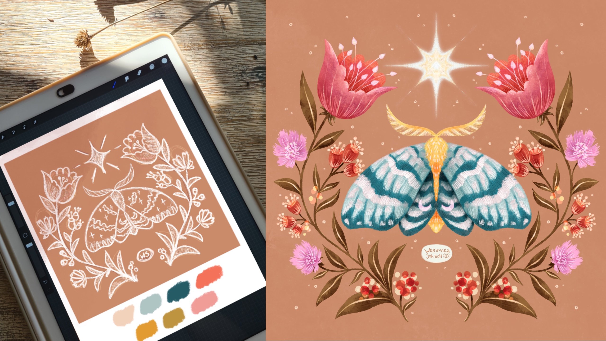
Transcripts
1. Welcome!: Hi everyone. My name is Weronica. I'm an artist and teacher, and I'm here to help you take your digital
illustration skills to the next level so that you can illustrate in
Procreate like a pro. Welcome to Beginners
Procreate series. We will have a look at tons
of tips and tricks for using basic Procreate tools and
we will talk about ways to add even more depth and detail to your
digital illustration. This class specifically
introduces using blend modes in Procreate. Today, we focus on
learning about multiply, to add variation and contrast that makes your work
really stand out. This series of classes is great for both ambitious beginners, as well as for intermediate
students who would wish to solidify their knowledge in using Procreate as their tool. First, we will create a
botanical flat color base, and then we will look
at three easy ways to add more interest to it
using Multiply blend mode, adding shadows, adding textures, and adding extra details. All of those techniques
will allow us to stay within a consistent
color palette. We'll be turning a
flat color drawing into a bold illustration
with lots of variation. Grab your pencils and
let's start learning.
2. Getting Started: Let me briefly tell you how you can
prepare to take this class. Actually, all you really need is your iPad and your stylus. This is your project. You will draw a simple
flower of your choice, stylize it and add more depth
using multiply blend mode. If you don't want
to draw a flower, you can draw anything
else but the focus of this class is to
utilize multiply. To make things easier for you, I prepared a few resources
which you can find under Projects and Resources either on your laptop or the
tablet in the browser. It doesn't work in the app. I prepared transparent
PNG flower templates that you can use and a ready-made folder with
some Procreate brushes. The use of the flower templates
is completely optional, as well as you can be using
any brushes you like. But as usual, I like to give some personal recommendations
in my classes and draw your attention to
the fact that there are some super awesome brushes that are already
native to Procreate. There will be two more brushes that will be coming
directly from me. There's a liner brush
in the folder and some extra paper texture if
you would like to use it. As always, feel free to reach out to me either through email or write your question in the discussion section
here on Skillshare, so that all the other
students can see your questions and maybe find the same answers. Let's get started and learn
more about blend modes.
3. What Are Blend Modes: [MUSIC] As an introduction
to the topic, let's answer the question, what are blend modes? Most graphics editing programs, such as Procreate
or Adobe Photoshop, allow users to modify
the basic blend modes. To put it in simple words, it is the way two layers
blend or interact together. It works in the way that the upper layer affects
the layer underneath. Let's have a look
together directly at an example from
Procreate interface. I want to quickly show
you how I created those interesting
color variations on this flat color for the flower that you
see to the right side. I used different
blend modes that affect this flat color layer in order to create the
decorations that you see in the two corners of my slide. Don't forget when you're
using blend modes, it's the upper layer, so the layer above, that affects anything
that is underneath it. Here's the first example. Here you can see this
flat color flower on one layer and by default, any layer that you create, any new layer is set to normal. You can see that by this little N symbol
next to the layer, it means it's a normal layer without any special blend mode. The layer right above it is set to a different
blend mode, namely the screen
mode in this example. The little S that you
see stands for screen, the name of the blend mode. I painted the left side
of the flower with an additional yellow color and when you set it
into screen mode, this is the result. I use this color in the
upper-right corner of my slide. Here's one more example. The exact same
flat color flower. This time we used above it another blend mode
called vivid light. The process was
exactly the same. We painted the
entire left side of the flower with the
very same yellow color. It's just that the blend
mode is different. On this example you can see very well that by using
different blend modes, you can get quite unexpected
color combinations, very interesting. I used that flower variation in the lower left
corner of this slide. Can you guess what all those
flowers have in common? Yes, that's right. The base of all those
flowers is the variation that you see on
the leftmost side. Then the left side of those
flowers was painted over in the very same yellow color on a separate layer using
a different blend mode. Where can you find and adjust
blend modes in Procreate? Let's have a look together
directly in the interface. First, you have to open the
Layers panel by tapping the double rectangles symbol in the top right of
Procreate's interface. On the right-hand
side of each layer, you will see one
or more letters. This will tell you
which blend mode is active on your layer. Remember by default you
will have the letter N, which stands for normal mode. When you tap that letter, the name of the blend mode, you will see a whole
scrolling list of different blend modes, names that you can choose from. As you scroll, each blend mode
will apply to your layer, so you can preview the results. I warmly encourage
you to experiment and to check out the different
blend modes in Procreate. Here's a small visual
cheat sheet where to find this scrolling lists of
blend modes in Procreate. Remember that by default, normal mode is active and
it's shown by the letter N. The second part of the
menu is the opacity slider. Opacity is a setting that controls how transparent
your layer is. To illustrate how opacity works, I created that extra layer above my flower and I
set it to multiply. Next, I painted over just a very random blob of paint that partially
covers our flower. Multiply is the name of one of the blend modes that
you can choose from and you can see it by the
letter M next to our layer. When you tap on that letter M, you will open the
menu and you will see right below the
opacity slider. By default, every layer
has full opacity, but you can change
this opacity by manipulating the slider to
the left and to the right, you will see that the
percentage changes up and down. In this way, you can
set the level of transparency of the
layer affected. What can you achieve by using
blend modes in Procreate? What are they for? I'm a big fan of
using blend modes in my illustration
creation process. For starters, using
blend modes can help you add more depth into
your illustration. Instead of just using colors
from the color wheel, you can very effectively
create shadows, highlights, manipulate
the contrast of your illustration, add in some
interesting saturation or luminosity to
your illustration. I hope that you could see you on our previous flower example
that by using blend modes, you can create really
interesting visual effects because you can come up with color combinations that you
wouldn't use otherwise. The blend modes help you to experiment more
with your colors. Last but not least, I firmly believe that knowing blend modes can help you speed
up your drawing process, particularly with regard to creating highlights and shadows, but also adding in
some extra texture to your illustrations. Now it's time to summarize
what we learned so far. The first thing that
we learned was what the blend modes are
and what they do. Now we know that they
are really handy. It's the way two layers blend
or interact together to create a new color combination
or a new visual effect. Now we also know
which layers get affected when we
use blend modes. It's always the layer above that affects the
layer underneath. We also got to know the default blend
mode layer settings. We know that every time
we create a new layer, it will be set to N, which stands for normal, and it will be at
its full opacity. You also know where to find the menu for blend
modes in the interface. You know that you have to go to the Layers panel and each
of the layers will have a small letter and then
you have to tap on it to see the further menu to choose or to change
your blend mode. We also touched upon
the opacity slider. We know that by default
we have a full opacity, but we can always minimize the effect by reducing the opacity of the layer
with the blend mode. Finally, we briefly discussed, very briefly, [LAUGHTER] the advantages of
using blend modes. Like I said, I'm a very big
fan because once you get to know them and you choose some of your favorites
blend modes, they can really speed up your illustration
creation process. Pew, we learned quite a lot so far [MUSIC] and this
is just the beginning, because what is theory
without some practice? I hope that you'll follow me to the next lessons
where I teach you more about the specific
types of blend modes, the ones that I like to use most whenever I create
my illustrations. Let's learn some more.
4. About Multiply: If you are into digital drawing, you are bound to hear about
the multiply blend mode. I think it's the most commonly used blend mode of them all, and I use it 100
percent of the time. The main property of multiply
blend mode is that it makes the layer underneath it
darker and more intense. With disregard, it's
perfect for creating shadows and adding some texture. Let me show you a few examples
on my own illustrations. I selected those two
illustrations for you. Let's first have a look at
the portrait on the left. You see by looking at the arrows that all those
highlighted areas, the forehead,
underneath the eyes, underneath the nose, and around the
nose and the lips, and also the neck area were darkened using the
multiply blend mode. Likewise, multiply has been used on the illustration
to the right where you see a bit of a zoomed-in piece of
a moth illustration. I created some darker areas on the leaves, on the flowers, the body of the moth that
you see around the head, and also where the wings
collapse at the bottom. Let me demonstrate what a difference multiply
blend mode makes. Let's go to the
portrait illustration that I just shown to you, and let's look more
closely at the layers. I have a folder where I
painted the head and the neck, and you will see that for
each of those elements, I used one extra blend mode
layer for the shadows. Now, let's see the
difference under the neck. This is without multiply, and this is with. Now the shadows on the face, this is without, and with. There's a huge difference. To create the
shadows on the face that stay within the face area, I use the clipping mask, but I will tell you more
about it in another lesson. For a bit more intermediate
artists out there, I demonstrated how I'm
using multiply blend mode quite extensively
in another class of mine here on Skillshare, magical moths and
botanical illustration. You can have a look at
it too if you want to. Enough with the theory,
let's get practicing. In the next lessons, I will show you how to use multiply blend modes
to create shadows, texture, and darker details. Let's practice together.
5. Clipping Masks: [MUSIC] I want to
quickly tell you what a clipping mask is because we will be using it quite a lot. Clipping masks are super handy. They are layers that
can be added to the top of your art
so that you can keep adding the details to it without ruining the base layer.
Let's have a look here. I added an extra layer
with some zigzags, and I want to add them onto the yellow petals of the flower. On the left side, you have the elements without
a clipping mask and on the right side you have added the texture or the details
with a clipping mask. You see that when
using a clipping mask, those details are contained within the shape on the layer. Let me show you how
it's done in the app. Let's take our flower. I created that extra
layer for the details, and you can see by the letter M that it is set to multiply. Having selected that layer, I draw on it; I draw this texture, and right now you
see that the texture goes outside of
the yellow shape. Please note that this extra
layer is right on top of the yellow elements
layer that I would like to manipulate with
that extra texture. In order to switch
the Clipping Mask on I have to select
that Extra layer, and then you will
open the menu on the left side and you have
to select the Clipping Mask. It will be ticked, that's how you know
that it's selected. Let's go back to the layer
and let's again unclick it. That's how you get rid
of a clipping mask. Again, the texture is now
outside of our shape, and let's click it
back again so that the clipping mask
is applied again. For each of the elements if you have them on separate layers, you have to do it one by one. You always place that
extra layer right above the layer that you
would like to change. Let's have a look
at the green one. Again, I created an extra layer, I turned it into
a clipping mask; there's this arrow to the left, and I'm drawing the
yellow elements onto it. If I unclick it you will see again they're not
contained anymore, so let's click it back. For the purple element,
it's the same. An extra layer, I turn
it into a clipping mask, select it from the menu, and then I can draw within the shape and it
will be contained. The advantage is that
you are not affecting the layer underneath so you
can always change your mind, and go back, and do the
changes more easily. That's it. That's
all you need to know about clipping masks.
6. Flat Colors: We start our project by drawing our flower and filling
in all the flat colors. I will also show you how I separate everything into layers. Tip number 1, always start with a
background color. I created a dedicated layer
for my background and then I go to the colors in the upper-right corner
to my color palette. I choose my background
color and then I drag it onto the canvas so that it
fills the entire space. The next step is to make
a sketch of your flower. You can either draw it
on your own freehand or you can use one of my
four flower templates. I will be choosing the template. Let me show you how I
import it into Procreate. Once you downloaded
the transparent PNGs from the Resources section, you can download them
onto your canvas. We go to the Wrench tool in
the upper-left corner and we select the first option on
the menu Add, Insert photo. Here are my templates. I have saved them
into my device. I choose the template
that I liked the most, and I'm using the Move tool, the arrow, to position it in
a good way on the canvas. Next, I go to the
layer with the flower. I rename it to sketch
and I lower its opacity. For filling in the color, I like using either dry ink or the liner brush that I made available to you or
the monoline brush. They are all parts from the liner one native
to Procreate, and it's actually up to you which brushes you're
going to use. You can find marvelous native to Procreate brushes
already within the app. They are mostly in the
sketching and drawing section, or you can use the
brushes that I am using that I compiled for you in this handy little folder
that you can find in the Resources section
here on Skillshare. To speed up my drawing process, I will be using a
drawing guide symmetry. I make sure that the
drawing guide is on. I can click on Edit Drawing
Guide to choose symmetry. There's a vertical line in
the middle of the canvas, and it will help me to draw on both sides of the
flower simultaneously, which will really speed
up this whole process. The layer that I will be drawing
on is on Drawing Assist. It's outside of the scope of this class about
the blend modes. But if you want to find
out more about using symmetry tools to draw
better illustration, then you can check
out my other class, magical moths and
botanical illustration, where I talk a lot about
the symmetry tool. I'm teaching you
there pretty much all the types of symmetry guides that you can find in Procreate. My big tip here is that
we split the colors. So I created a new layer. I renamed it to green, and this later will contain
only the green color. I go ahead, I take
the monoline brush, and I fill in the color. I just trace very roughly
the shape of the flower and sometimes I
have a closer look to refine the entire shape, and then I repeat
the process again. I create a new layer, I rename it to the next
color that I will be using. It's going to be purple. I will make sure that this purple color is
only on that layer. This time I use the dry ink because the brush is a
little bit more textured. I go to the color palette,
I choose the color, and I fill it in very roughly again all
the small details. Sometimes I'm dragging the color in to speed everything up, refining the small shapes. The texture is very beautiful. There's small speckles
here and there. That's why I changed my brush and then I repeat
with my last color. I rename the layer to yellow. You also want to
figure out what will be the order of the layers. The one that is above will be
on top of the other colors. In my case, the yellow is on top and you can see
that I can draw on the purple underneath
and the yellow is on top. I'm missing a few green colors. I make sure that I
really go to the layer that is dedicated
to the green color, I zoom in and I draw
the petals in green. Make sure that your layers are clean and you
separate your colors. Back to yellow, I wanted to add in some
extra elements on top. Let your imagination flow. Add in as much details
and shape as you want. Now we are ready. I can switch off the sketch layer.
Let me show you. We have yellow separately, we have green separately, and we have purple separately. Now it's your turn. Your task is, first of all, remember choose your
background color, then you either sketch your flower freehand or you
use one of the templates. Then you lower the opacity of the layer and then you
fill in all the colors, making sure that the colors
are on separate layers. That's it. Let's
start working on those shapes using
multiply blend mode.
7. Multiply Shadows: [MUSIC] Multiply is most commonly used to add shadows
to your illustration. Let's create some
shadows together. Our base colors are laid down. We have yellow, green,
and purple separately. Let's head to choose our
brush for the shadows. Of course, you can simply use the brushes from the folder
that I made for you. I, most of the time use gouache or vine charcoal
for more texture, Tarraleah, quoll
or bonobo chalk. Of course, you can also
use your own brushes. There are so many
wonderful brushes out there that you can use
to create shadows. But if you need a little
bit more inspiration, have a look at the
following slides. For example, I really like when my illustrations
look a little bit more painterly as if they were really made using traditional media. One idea is to go to the painting section
within Procreate, and there you can find
a variety of acrylic, gouache, and watercolor
in spite brushes, that will help you to get that
look if you're up for it. Another good examples are all
those brushes that imitate the graphite or a pencil that
have a chalk-like quality, they're a little
bit more grainy. You can definitely find some very cool free
brushes within Procreate. Just go to the Sketching and the Charcoal section
in Procreate, and there you can
find, for example, the 6B pencil, some chalks, and a lot of charcoals or you can also
use the bonobo brush. It has a very nice
and grainy texture, which is perfect for
creating shadows. Last but not least, you can also use
for your shadows some extra brushes
that are not for free. You got to pay for them, you got to find them
on the Internet. But for example,
this shaders folder by True Grit is
very interesting, and it can help you
to really generate some interesting
shadows that have more of a print-like quality. As you can see on
all those examples, it's really down to your
personal preference and your willingness maybe
to experiment a little bit. Now, what about which colors
to use for your shadows? I wanted to give you
here a few tips. Let's tackle the green
color on our illustration. For that green color, I would use again the same green color but it's
going to be on Multiply. Then another color from
the color palette, let's go and take the purple. I wanted to show you also
that other examples of purple or violet make really
fantastic shadows too. Let me show you how
those colors work. Now we will focus again
on the green layer. I will hit the Plus symbol to create an extra layer on top. This layer will be connected
to the layer underneath. We got to click on it and then
we select a clipping mask. The clipping mask has to be on. You will see a tick, and then arrow to the left
side of the canvas symbol, and then we go to
the small letter. Remember, we click on it and we have to change
the blend mode. We scroll all the way up to select Multiply, and then the N, which stands for
normal changes to M, which stands for a Multiply. In my work, I used to use the very same base color set on Multiply to
create my shadows. With my finger, I drop
exactly the same green color. Then I change my brush from the liner brush to something
a little bit more painterly. Let's choose the gouache brush. Then I start to paint on
the dedicated clipping mask for that green color.
That was gouache. Now let's have a look
at something grainy. Feel free to test the brushes before you commit
to your shadows. The Tarraleah brush from Procreate is also
very interesting. The quoll brush somehow behaves a little bit
like watercolor. I like it a lot too. There you go. I tested
different brushes. I use the same color
as the base color, the green color. Have a look. This is where the
clipping mask is on, and this is what you see when
the clipping mask is off. Let's turn it back on. Also, remember to go to the opacity slider and to
play around with it up and down to reduce the opacity of the color until you
are happy with it. You have to remember that
for each of your layers, we're also left with
yellow and purple, you have to repeat the steps. You have to create
a new layer on top. You have to set it
to a clipping mask, and then you have to
go and remember to change the blending mode. Yellow was done, the
same for purple, new layer clipping mask. Then we're going to Multiply. Everything is set. Another strategy is
to use a purple or a violet shade because they
really make great shadows. You can experiment
with the purple from the existing color
palette or you can find a cooler shade of
purple and then reduce the opacity to see
which one you like best. You can also use another color but from the same color palette so that your color scheme
remains consistent. I selected the green
from the palette and I'm trying to see
if I like it or not. I go to the opacity slider
and I reduce the opacity. It looks pretty good to me. I warmly encourage
you that you run such tests on the
majority of your layers. Let's take the yellow
color for example. I want to see which
one I like best. I start with the violet color. I also play with the opacity. I don't like it that much, so I will choose
the same base color yellow then the purple. Next, I want to test the
green color. Let's see. Finally, I will play with the opacity slider to see
which one I like the best. Now it's your turn. This is your task. Select your shadow brushes, experiment, and choose the
ones that you like the most. Then create a clipping mask for each of all the
separated color layers. Set that clipping
mask to Multiply. Do not forget that step. Sometimes I like to lower
the opacity in advance to see the results that I
like the most immediately. Then you lay your shadows. I have removed my happy
experiments and now I'm ready to really add some serious [LAUGHTER]
shadows to my flower. Normally I will
focus on the areas that could have
this cast shadow. I imagine that my light
source comes from above that implies that the
shadow is usually on the lower side of the element, so underneath, for instance. I make sure I do
it layer by layer. I start with the green. Oftentimes I double-check if
I'm on the correct layer. My favorite technique is
to use the base color. I like the painterly look
of my illustrations. I usually choose
the gouache brush, which starts quite transparent. Then I'm adding in
the extra layers of that paint
[LAUGHTER] so to say, and I'm building my shadows up. Again, remember to stick
to the right layer. Sometimes you are drawing on
the incorrect layer and you have to start [LAUGHTER]
all over again. Now I move to the
clipping mask for yellow. Experiment with your brushes and change every now and then. I like quoll because it
looks like watercolor. Let's check that one. Adjust the size of your brush. Again, I'm adding in some
very delicate shading, some very delicate
shadows at the bottom, building up the layers
until I'm happy. For the upper elements, I change my brush because I'm looking for
a different effect. It's really okay to switch
between the brushes. Then I move to the last color. I really go color by color. I again choose the base layer because that's my
favorite technique. I choose the brush with
a little bit more grain. I usually start by
adding the shadows from the bottom section
of my elements. In case, I forget some
shadows like in the case of those green elements
or leaves at the top, I select again the
base green color, and then I really double-check that I'm on the correct layer, and I add in the
missing shadows. I like the layer quite a lot. Remember also to play with the opacity of those
clipping masks. You often want your results to be a little bit more balanced. I tend to lower my opacity until at least half to at
least 50 percent. I just test it up and down. When I think I'm done, I also have the tendency
to rename my layers, so that I keep it in order. Have a look at my layers. Yellow with yellow,
purple with purple, and green with green. This is the final result. I would like to give you my final tips for adding
the shadows part. This is what we
learned and this is the advice that I would
like to give to you. Make sure to really use
those clipping masks. They could really save you [LAUGHTER] and speed
up your process. Don't forget to play with the opacity slider because it can really make a
huge difference. Experiment with the
color of your shadows. You can go for the base color but you can also choose a
completely different color. Just experiment. Remember that purple or violet
always makes nice ones. Double-check your
layers and make sure to color on the correct
clipping mask layer. [LAUGHTER] This is it. In the next lesson, let's create together
some more texture.
8. Multiply Texture: Multiply is also a
fantastic blend mode to add texture to
your illustrations. Let's have a look together. We have laid our shadows, and sometimes it's enough.
You can stop there. But if you want to add even more depth and
interests, then stay with me. Why texture in the first place? I absolutely love adding
texture to my illustrations. It definitely offers more
interests, more depth, and it makes your art [inaudible]
if you could touch it. It can help you create this
illusion that something is soft or fuzzy or it's shiny. You can see the
roughness, the grain. You can see that it's gritty. There's so many beautiful
textures out there. Sometimes you can find really cool Procreate brushes that are already within the app. For those of you who like
myself like buying new brushes, there's so much out there. I cannot really recommend any one set that
I saw out there. I'm sure you already
have your favorites in case you're buying brushes
from other artists. Let's do this together. Previously, we have created clipping masks for our shadows. It also depends on your
personal preference. If you would like to
leave those layers, I like to merge them. I don't like too many layers. When I'm happy with
my final result, I just pinch them together with the main color and its
dedicated clipping mask, and it's done. Then we have to basically
repeat the steps from the previous lesson for
each of the color layers. Above them, we create using the plus sign an extra layer. We click on it and we change all of them one by one
to a clipping mask. Then we go to the
letter symbol on the right side and we slide and choose on
the menu multiply. You already know that I like to establish my backgrounds
very early on. Let's start by adding some
texture onto our background. I thought it would be very
interesting to add a texture all over the illustration that will resemble paper texture. Don't worry, I will
make sure to include one paper texture brush in the blend modes
folder with the brushes. I would like this
texture to be not only on the background but
also on the flowers. We need to create a new
layer on top of everything, on all our colors and
the background color, and then you select
the texture brush. I have selected exactly the same colors such
as the background, you can see it here. The texture is so beautiful. The missing element
here is to change the mode to multiply so that
the effect is really subtle. Let's rename our layer
to paper texture so that I remember and I do
not remove it by accident. When we zoom in, you can really see a little bit of the texture. The effect is very subtle. Of course, you can choose
a different texture for a more dramatic effect. Multiply blend mode is
by far the most commonly used blend mode to put on paper texture on top
of illustrations. Now let's put some texture
on each color layer. This is completely up to you. If you want, you can
skip the texture part. To do that, we
have to go back to our colors folder,
the flat colors. Remember, the clipping
masks are ready. I will start with the
yellow color and then use the same technique
like for the shadows. As a base color, I choose yellow and then I choose
my textured brush, and I create some more speckles. As you can see, this could
also be our texture shadow. But in my case, I want to add even
more dimension even on top of the shadow that
I created previously. I'm drawing here a little
bit more speckles, a little bit more green. I love green so much. [LAUGHTER] Then I go to the
opacity slider just like last time and I reduce it to roughly half, and that's it. Now it's your turn. In this lesson about multiply, your task is to add some
texture to the background. Here you use no clipping mask, make sure to change
the layer to multiply. Then you can add texture to every single layer by using
clipping masks this time. Make sure to change
your brushes and to experiment with
all the textures. Also play with the
opacity of your layers. Again, don't forget to
change to multiply. Join me as I finish adding
texture to my illustration. Definitely, I want a little bit more
speckle on the green. The shadows are okay, but I'm feeling all the
other parts of the stalks and the leaves that are not
with any textured shadow. I would like more
texture there for sure. I make sure to
change my brushes. I'm using quay to
add a little bit more as if bubbles
to the purple. I also use thorough
layout to add some more dimension at
the bottom of the plant. If I overdo it, I can always go back. [LAUGHTER] Make sure to
zoom in and zoom out to see if you like the illustration and stay within
the correct layer. In case the effect is
too dramatic for you, go to the opacity slider
and play around with it. I think I'm happy. Those are my layers. This is my final result. Those are my final tips
for you when it comes to adding texture using
multiply blend mode. Let's also sum up a little
bit what we learned. Make sure to use multiply to add more depth into
your background. For example, we added the extra paper texture on
top of everything else. Next, continue working
with clipping masks when you want the texture
to stay within the element. Collect your favorite
texture brushes. I even have dedicated
folders for those. I collect paper textures
or noise brushes. I really loved them. Double-check that you're
on the right layer and merge the layers
once you are happy. You can also leave them on, but Procreate has limited
number of layers, so I personally
like to merge them. But if you feel more
comfortable leaving them on, then leave them. [LAUGHTER] Now let's go and add some more details using
multiply blend mode. Join me in the last
practical lesson.
9. Multiply Darker Details: You can also use Multiply
to add the darker details. This is one of my most
favorite parts of creating an illustration
because it means you're nearly done and you're only adding even more interests
to your illustration. Multiply really does
help when adding extra details within
the family of colors from your color palette. Instead of using
the color wheel, you can simply use Multiply. What do I mean by extra details? You can add in some
extra dots, or strokes, or waves, or even such elements as
stars or those magical eyes. You can add some texture
to indicate it's a sweater or make a
checkered pattern. This is where you can really
use your imagination. Just like before, I am not keeping the previous
layers with the texture. I'm pinching the
clipping mask and the layer underneath together
and I get rid of them. Then the same, I create extra layers on top
of every color. I changed them to a
clipping mask and I make sure I set all
of them to Multiply. You will always see the
letter M to the right side. My favorite way to go around adding those extra details is to use the same color on Multiply to add all
the missing elements. Here are a few examples
of those extra details. Especially when I'm drawing
a botanical illustration, I always add some veins on
the leaves on Multiply. If I'm drawing a building, I can consider adding
in the bricks on the walls also on
the Multiply mode. I often add darker hair, so an animal fur
or a human hair. I create some extra
Multiply patterns on textiles, or my favorite, I add in some magical elements
like stars. Let's do that. I really like to work with the 6B pencil because
I like the texture. Make sure I'm on
the green layer, on the clipping mask, and then I started
drawing the veins. Remember I preselected
the very same green color of the leaf and this way I make sure that
the illustration stays within the same
family of colors. Multiply definitely helps
me to achieve such a look. Everything just sticks
to get our color wise. Let's add in those details. Our illustration
really stops being flat and looks much
more interesting. I'm also working on
those small leaves and the base of the flower. I experiment with
some extra shapes. They make my illustration
look much more unique. I am only working on
this one green layer. I really like the pencil
look of the 6B pencil, but you can use any other
brush that you like. I zoom in and out quite frequently to see if
I'm not overdoing it. You can really fall into
adding too much detail. But in my case, there's never too much. I just really think that
adding more and more looks just more
interesting and unique. Now I'm really happy with it. The last step would be to check if I can change anything
on the opacity. As a next step, I repeat for each
layer separately. Don't forget to set to
Multiply, this is the point. Green is done so I'm
moving to yellow. This time I will choose dry ink because I
just want to make some patches or dots that might look quite
interesting on those petals. Dry ink also has a
beautiful texture. I think this is a little
bit too dramatic, so I lowered the opacity. I also used exactly
the same yellow color. The only difference is
that it is on Multiply. To keep everything
neat and tidy, I try to remember to
rename my layers. Then I had to do a clipping
mask for the purple color. I select exactly the
same purple color and I experiment with
some new shapes. You don't have to work
on one clipping mask. You can experiment or conduct experiments with shapes on
multiple clipping masks. The advantage is when I go to the purple layer
and I hit "Plus", it already creates
a clipping mask. It's like a sandwich. On the bottom, you have the original
layer, and on top, you have another clipping mask that belongs to that layer. On that separate clipping mask, I just want to experiment. I'm using the 6B pencil
to create those lines. It makes the flower look
a little bit more 3D. I zoom in and zoom out to
see if I like it or not. I switched the layer on and off. I make up my mind that no, I don't like it. I'm keeping the moons, but I am clearing that layer. I want to try out
something else. Another test is that I'm
drawing those stars. Again, they're on a
separate clipping mask using Multiply. In case again, if
I change my mind, I can just remove
it or clear it, and it's very easy this way. Well, I'm not sure
about it either. Let's check the opacity. Let's maybe hide it. I think it was better without. I will draw something else
to see if I like it more. I am drawing some
different shapes on the petals using
the dry ink brush. I'm drawing in those dots. I think they might
look interesting. I zoom in and zoom out, and again, I'm not
entirely sure. Let's reduce the opacity. I didn't like it either. I just swipe to the left and I get rid of
that clipping mask. Each of the items on
those clipping masks, it can be manipulated. I can use the Move tool
to make it bigger or to place it in another location. This one is my favorite. You can try using
Multiply blend mode without any clipping mask. Multiply will give you such stunning and surprising
color combinations. Let's do the lazy way. We will work on the one layer that will
be set to Multiply, which will be on top of
all the other layers. It's between our colors folder and it's right underneath
the paper texture. Let's click on the letter M to change it to multiply to M, and no clipping mask this time. Now magic will happen. I'm selecting the green
from the color palette, and I'm drawing partially on my leaves and partially
on the background. This creates a very
interesting effect when the colors overlap. Of course, this color also reacts with the
background color, but the background
is so light that the difference is
not so dramatic. See, this is where
the colors overlap. Green, we have green,
so it's much darker. Let's also draw
within the flower. I'm still using the same green. This time it will react with the outer green color and also
the yellow of the petals. Now I'm switching to the yellow and I'm
drawing on the purple. Everything is still on
Multiply blend mode. Now this color is
very interesting. Here you see an example, I'm using yellow
and you see how it reacts with the purple than the color of the background
and the green. So nice. Let's draw a little bit more of that yellow underneath too. I really like this effect. You wouldn't be able to create such an effect without
using any blend modes. A little bit of yellow
underneath too. Let's draw on the purple
elements as well. Now I'm selecting the purple. Notice that I'm staying within my color palette and I
create some extra overlaps. Beautiful. Notice
that everything stays within one layer
that is set to Multiply. If it's a little
bit too dramatic, then go to the opacity and reduce the opacity of
the layer a little bit. This is the final result. I think I'm done
adding my details. I would like to give
you some extra details, my final tips for this lesson. Let's also summarize a
little bit what we learned. The final touches,
in my opinion, make the biggest difference. I recommend that you
stick to the same color. You just set it to Multiply. You're using only the colors from your original
color palette. It keeps your colors very consistent throughout
the illustration. Remember, I test it on
separate clipping masks. If there's something
you didn't like, you can just remove
it much easier. Use the no clipping mask trick. Go outside the lines
and see what happens. Play with the colors. Great job. We're done with our
illustration and we only use the one blend mode
to achieve that effect. Join me in the last lesson
where I summarize everything.
10. Final Thoughts: Congratulations on
completing this class. One project at a time and you're really building up on
those procreate skills. Let's summarize what
we learned and how you could use MULTIPLY blend
mode moving forward. What did we use MULTIPLY for? Do you remember? We used MULTIPLY to create
some shadows, darker texture, and darker extra
details in order to add more depth and the variation
to our illustration. We turned this flat
color design into something with a
little bit more detail and texture. Have a look. This is before,
and this is after. There's much more detail. I personally love
using MULTIPLY. It definitely does help
me to draw faster, it allows me to add
super-easy details and immediate depth
to my illustration, it is very useful when I want to add some interesting
color effects, and it allows me to keep a
consistent color throughout. Now it's your turn to put
everything into practice. Your task is as follows. Draw a flower or any other
elements that you like, add depth to it by using
MULTIPLY blend mode, then post it into
the project gallery. You can either post
only the final result, or you can make a
collage and you can show us your
before and after, which is super interesting. Make sure to follow me
here on Skillshare so that you get notified every
time I post a new class. This class is just
the beginning. There will be more from the Procreate for
beginners series. In the meantime, I would be
happy if you would check out my other Procreate
classes where you can build on your
illustration skills. Happy illustrating and see
you in the next class.
 Weronika Salach, Art with MAGIC