Transcripts
1. INTRO: Hey there. This is Palo. If you're brand new
to Google Analytics, I might know how you feel. The interface full
of menus, charts, and the parts that
you've never seen before. But here's
the good news. Once you learn the basics, it will all start to kicks in
and you learn it very fast. In just 1 hour, we'll go through Google Analytics on a
step by step basis. You will learn how to create the account
from the very scratch, you'll understand
who your visitors are and where they come from. You don't need to be a skilled
marketer, nor tech expert. By the end, you will know with
confidence how to log into GA interface and how to understand the most important
business questions. So take a deep breath and
let's master GA4 together.
2. How the measurement works: All right. So the
first thing we need to explain is how actually
GA measurement works. And even though it
might seem like a pretty technical thing,
it's not the case. So allow me to explain to you in a couple of seconds how
the measurement works. So we will work with
three entities. It's Google Analytics code, it's Google Analytics server, and then it's Google
Analytics interface. So how are these three
things interconnected? The first thing that
needs to be ensured that basically on any
website or mobile app, there needs to be placed
a Google Analytics code. Which is a couple of lines of the Javascript, we'll
show that later. But what it basically means, you just need to
copy and paste it to the source code of your
website or the app. Once your website is loaded
in front of the user, part of that loading is also executing a
Google Analytics code, which basically
sends the raw data to the Google Analytics server, which is, first of all,
collecting them and then doing orchestration so it
can be processed further. Once this one great table,
and I stress this out, Google Analytics, in the end is just one big table.
Is being created. Then there is a Google
Analytics interface, which is then capable
to basically show us all the shiny and beautiful data within it. So this
is pretty simple. This is actually how
the measurement works. We'll show it in more detail, but this is the
very basic concept. So not technical at all, the piece of code which
is on our website. Then it's being processed and sending the data to
Google Analytics server, which are then available in the Google Analytics
interface. So this is it.
3. Creating the account: So as we now know how
the measurement is done, the logical next step
is to show how to create a Google
Analytics account so we can start
measure something. So let's start from the scratch, which is basically meaning
that we need to enter the Google Analytics website, which is analytics.google.com,
and we press Enter. In case you don't have access to any Google
Analytics account, you will see something
that I do and we'll go entirely
from the scratch. In case you already have some access to any Google
Analytics account, your screen will look
slightly differently and we look in a way that will get there in a couple of steps. But the point is to show how to start from
the very basic. Here we are. We need to click
on the start measuring. And we need to create something
that is called account. This is actually something
that will group all of our Google Analytics
measurements we will have in the future. So we need to name it somehow. So in my case, I will name the account as my
name and surname, which is Pavel Brecik. I'm creating the account
clicking to the next step here. I need to name
somehow the property. So let's name it like Pavel Brecik GA4 account then you need to create
reporting time zone. It's important to
select the proper one because based on the
time zone we select, also the days are being
collected in a different time. It's just use the common sense here and select the time
zone that fits to your one. I'm based in Czech Republic, so let me just o hechia which automatically
then selects your time zone, and in case you
will in the future, want to measure
some monetary data, you can select the
proper currency. You can change it afterwards
in case you want to, so nothing super important here, but for the sake
of proper setup, I'll select the check crown,
going to the next step. I'm selecting some basic
details like the industry. So let's assume this is
just, jobs and education. I have small company. It really doesn't matter what
you select here. This is just more of like for
Google, having information, what are the typical sizes of the businesses that are setting up the Google Analytics account. So whatever you select here
doesn't matter that much. Then we select something that is called
business objectives. Again, it really
doesn't matter what you select right now and
creating the account. But let's assume I'll
click on this one, which means that I
basically want to understand the web app traffic. Feel free to like to select
more, also generating leads, drive sales, new user segments so even all of them can be
selected at this stage. As I said, it can be changed
at anytime afterwards. Now I'm creating on the next. Now I need to accept all
of the terms of services. And now we're basically set up. So the next step when
we want to create actually measurement profile or something that is
called the data stream, we can choose whether we have solely tracking
for IOS app, Android app or web, or we can skip it for now
because it doesn't matter. The current measurement
can measure all of these three platforms
into one data stream. So I will skip it for now. And as I'm saying,
we're almost here, and I'm now clicking on
the Continue to home. So yeah, my email
communications, let's assume I save it as it is. And right now, I have created the Google
Analytics account. So that was it for the start. As I said, nothing
technical, super easy. So if you just copy that, you have set up
your first account. If you already have
some access to account, once you type
analytics.google.com, you should enter something
similar to this one. So that was the setup. Now, let's show how to set up the measurement within the Google Analytics account
that we created.
4. 03 Data stream setup: So as we have set up our
Google Analytics account, now the next step is to
set up a measurement. For those of you who don't want to set up
the measurement from the scratch and just want to understand the interface
and play with that, there's also a chance and
it's pretty good one. So let me show you
what you need to do. There's a demo account
provided by Google, which is already filled
in with real data so you can get familiar
with the interface. How to access that? It's very simple. Google
Google Analytics demo account. I even made a type of there, but this is the
first account here. It's a GA4 demo account. If you just click on this link, scroll down a bit, you'll get to the part when there is a Google
Analytics 4 property, Google Merchandise
store web data. By clicking on this,
I will suddenly appear in the GA4 data for
the Google Merchandise store, which is the official
store from Googles, where we can buy various
merge from Google directly. And as you can see,
there's already a bunch of the
data I can browse. So for those of you, as I said, who don't want to start from the very scratch or you don't have access
to any website, but you want to learn
the tool, just land here and we'll continue in
exploring the interface. And now let's go back to show how to set up
the measurement. We have two ways how to get to setting up the measurement. Either by clicking here
on the red button, go to stream setup or go
through the admin section, which is by clicking here, then scrolling down a bit and then to something
called data streams. So I'm clicking here,
and as the next step, I need to select what platform
am I going to measure. So in my case, since I
have my own website, which is Pavel brecik.cz, and this is where we show
how to basically really show how to start the measurement
and the way it works, I'm clicking on the web
waiting for a second. I need to type in
the URL address, which in my case is something
like this, that Cs. Stream name, whatever you
choose here will work, try to choose something
that is reasonable. Do not select something like
stream one, stream two, but rather like
the Pavel website or whatever works for you. Then there is a bunch of things that Google
can measure for you automatically without the
need to create something extra either in the measurement
code or somewhere else, which is another things which are like page
views, then scrolling, which allows you
automatically see what percentage of every
page user scrolled, Also collecting outbound
clicks, side search, video engagement or
file downloads or even the form interactions
which is pretty new thing. So everything this will work just by pasting the
Google's code on your website. So you can, of course, remove that in case
you don't want, but for understanding
and playing around with the GA
for the first time, I recommend you to
keep it selected on. Now I'm moving to the next step, which is create and continue. Wait for a second,
and here we are. There's the new data
stream created, which is basically
something like, hey, from now on, there's a new
database being created, which is ready to
collect the data. And this is what appeared
here is the measurement code. So it's actually
looking like this. So it's I don't know, up
to ten lines, two, four, six, eight lines of the code, which does all the magic then
and measuring all the data. So what we need to
do right now is just copy and paste
this piece of code into every page
and I stress into every page of your website to have the measurement
consistent. So now we're set up, we have the measurement code. So the next step is to paste the code into the source
code of our website. Let's do it in another video.
5. Installing the tracking code: So as the GA account is set up and as well
the data stream is, now it comes to
basically starting and running the measurement. So what we need
to do, as I said, is to copy and paste
this few lines of the code to every
part of your website, to pretty much
every pretty much, but to every page from which
your web is consisting. I already did that,
and I'm using my own website which
has this URL address. My name surname that sees it, and then the English
version out of that. And just to show you
that it's really there, here we have the code, which starts with a part of
that is like G hyphen 27 CN. And just to show you
that it's really there, I'm going to open
the source code and as you can see,
it's exactly here, I already pasted it into
the source code of that, so you can see it's G 227 CN, which is exactly as it was here, G 27 CN, and that's
pretty much it. From that moment on, the website should be already measured. So let me click here on
the test installation. Google is right now testing
the tag installation, waiting for a magic to happen. Apparently, something is okay. Seems to be like it
should be working in my opinion. So let's close that. The first thing that is, uh, need to check is
basically to go and open something that is
called real time reporting. Don't worry if you'll
get the same messages I'm getting that it can take more than 48 hours before the data has
been collected. It basically means that once
you set up the measurement, the data when you will look on some longer period of time, will start appearing or
might start appearing. This is important
to say might start appearing after 48 hours, even though in every account, it should be fairly
easy to check it in the real time reporting.
So let me do that. We have set up the measurement, and if I will close
it right now, and I will go to the
real time report. No worries about the
interface as such. We're just showing how
to run the reporting. We'll explain how to use the interface just
in a few moments. But right now I'm
going into the report. I'm going into the
real time overview to check if it works. And if I will right now refresh my website by
doing it like this, and then going to the real
time overview as well, I will open that on my
phone to see if it works. Every second, the first
few numbers should appear. It normally takes a
couple of minutes but this is the way
the setup is done, it should be from that moment on easily working
as you can see, I already started
to appear here. So it's the first
new active user already being measured
into the account. So there is a small delay, let's say 30 minutes
until the first data, sorry, 30 seconds 30 seconds correcting myself until the
first data will appear. As you can see, there are
already two active users. I'm the one who opened this particular page
on my desktop version, and I as well have the
mobile phone in my hands and I opened the very
same website also. So you can see that this is the easy way to check whether
the measurement works. Don't worry if it even takes
a couple of minutes until the measurement is
done and you see the first data flowing to
your account. So this is it. Basically from that moment on, if you follow the steps, I was trying to
guide you through. You have set up your
first J account. You have set up your
first data stream, and you have set up
your first measurement with real data being
collected to your account. So congrats if you made it. If you decided not to set up your account with us and just directly going
to the interface, this is where we're going
to start right now. So let's move.
6. GA4 basic interface elements: Great. So from that moment
on, we're all set up, we're collecting the data, and now we can get familiar
with the interface. And then afterwards, after we
collect a few days of data, we can start analyzing them. So for the purposes of
showing you or learning you how to use the
interface, as I said, it'll take at least 48
hours until you have some reasonable
volume of data to your newly set up
account to analyze that. So I had recommended
you to, as well, open the GA4 demo account. I was showing you earlier, which is provided by the
Google merchandise store. So just as I'm Google that, do the same, you'll
find the link for that as well
in the resources. So by scrolling down, selecting the merchandise store, and here we are. So the basic interface for all of the GA4 accounts
looks the same. It's actually quite
a good thing, but what is important to
remember that some parts of the interface can be slightly modified and customized
according to your needs. So do not scare if, for example, if you open the reports module, you will see slightly
different way of how these steps
are organized, which is absolutely normal. But anyhow, once you log in, you should enter or land
here on the home site, which is basically showing you the very basic data that is being collected
into the account. For example, some snapshot
from the real time report of how many users are in the real time
browsing your website, and here is the past
seven days showing you how many active users have
been visiting your website. Other than that, it's more
of the very high level view, which does not provide
that many data. But anyhow, feel free
to browse with that, see something that might
seem interesting to you. Other than that, I recommend to automatically
go to the reports. So these are the four
main tabs which is home. Then there are reports, which is the main set of the predefined reports.
We'll cover them. Then there's a bit more advanced
section called Explore, which allows you to
create custom reports. So basically any combination of the data that are
being collected to Google Analytics and is not available in the
standard reports. And then there is a dedicated
tap called advertising, which is specifically
for those of you who are running
paid campaigns in any third party tool that can bring traffic
to your website. Then there is an
admin section where, for example, you can change
the way you measure the data. But for the first step, we're going to the reports, and we're going to break down
what is available there. Again, there are a few more tabs based on which the data
is being organized. So reports, snapshot. I believe this one
is pretty self explanatory and it's showing you the very high level data, which in this case is showing me how many active users have been on the GA4 account of the
Google Merchandise store. In the past 28 days. So the first thing we need to master is where we
can adjust or select the date range
based on which then the data will be shown us. So if I click here, there's a bunch of the options, how we can select the data. There are pretty fine options
like last seven days, 28, 30, 90, and so
on and so forth. And I think this
is pretty clear. So for example, if
we select only, let's say, one week,
we click Apply, we wait for a second, then the data will change and all of the charts and potentially
tables as well. As I said, feel free
to scroll down. I believe the majority of
the basic reports are clear. But no worries.
We'll try to break them down in more detail. Important thing to do is
knowing how to do is how to compare to date
ranges to each other. How to do that? Again, we need to click on this drop down menu, and it's a little
bit hidden from us, don't worry if you don't see it. You need to scroll down and
here's the comparison option. When I click here, from now on, I'm selecting first
the primary date and then the comparison period. In this case, if I then
scroll down again, there are a few automatic
options like preceding period, same period last year,
preceding period to the original selected one. Or the same period last year. Again, feel free if you want to choose some of
those by yourself, keep in mind a few
common sense things. Try not to compare the top
peak season, for example, with more generic part
of the year or do not compare the weekends
with the regular days because people behave slightly differently during the
weekends and might be higher engagement among
the people who are visiting during the working days than the weekends and
so on and so forth. So just choose wisely the main and then the
comparison period. So this is how to basically
use the interface. And now in the next
video, let's break down the three sorry, five main tabs which are
available in every GA account.
7. Main tabs overview: So let's dive
deeper into what GA allows us to see even
in the basic setup. I forgot to say
that feel free to click anywhere in the interface, there's nothing you can break or change or break the data. So example here, I can
click on the new users, and then the chart will change
showing me different data, as well as different
tabs available here. But now to the way the basic
reports are organized. So the first report
that actually tells you something or shows you something is the
real time over you. You can remember that from just a couple minutes
back when we were setting up the basic reporting
the basic measurement. And we were checking whether
the data is being measured. So what is this
one showing me is how many active
users have been on my website in the
past 30 minutes, and how many of them have
been in the past 5 minutes. The first cool thing I want to show you is
everything that is underlined in the GA if you just hover over the text and
wait for a few seconds, then there's a tool
tip automatically available explaining
you what that means. It's available for both
dimensions and metrics, so feel free to use that
documentation is just great. So this is what is shown here
in the very basic setup. You can play with the map in case you're expecting
something very specific or some very
specific traffic coming from different countries. So you can play around with it. Of course, you can zoom in, you can zoom out to the
pretty granular level. If you want to. So for example, here,
we can see that the majority of
the not majority. There are only two active
users from New York. But we can definitely
say that right now, at this time of the day, the majority of the
traffic is coming from the East Coast of the US. When I will scroll down a bit, just remember that this is
the real time overview. It's nothing like
long term data. It's showing you another set of the dimensions and
metrics available here, showing you the most
popular traffic sources through which only now, and I stress now, in the real time data users
are coming to your website. There's some breakdown of the audience on a basic
segments like all users, non purchasers, users do scroll 75% plus, and so
on and so forth. As well as is showing you
the most popular pages. And as I said, this is also the high level view of
the real time data, so feel free to scroll down to that. There
are also events. This is something we're going to explain in just a
couple of minutes. So the second tab, which
is available there, I will skip the real time
pages because this is just the smaller part of the data that we
have in this report. Then the next tab is
here acquisition. Majority of the data
here is telling us from which sources traffic sources are the users coming
to our website. So very important
thing, something that Google is recognizing
automatically, so we'll dive deeper into that. But this is mainly
about understanding or helping us to understand from where users found our website
or app and land it to that. So very important thing. The second tab here
is called engagement. This is basically
telling us once users came to our website,
what were they doing? How were they engaging
with our website? For how long did they stay? Which pages they viewed, which actions they made? So this is what this
tab is telling us. In case you have access
to any ecommerce website, meaning the website that is directly selling
some products either physical or non physical and is measuring
the ecommerce data, meaning purchases for how much somebody
purchase something. There's also a dedicated
set of data available here. So as you can see from the
names of the sub taps, it's about Ecommerce purchases, purchase journey transactions. So this is another one. And then there are
two more which are grouped under the user, but I like them a lot
because it helps to understand who your users are and I stress the
word who they are. In this part, we understood
from where they came from, what did they do and here we can see who they are
in these two tabs. These are various
user attributes like demographic details like
gender and age, and interests. Here in the tech part, we can understand which
devices they came from, whether from desktops or mobile or which operating systems, for example, from
which particular device types of the
mobile devices they came. Pretty interesting data
as well to understand. So this is how the
basic elements and the tabs are
being organized. And right now,
we're going to dive deeper into every
single one of them. So yeah, let's do it.
8. Basic metrics edit: There's one more concept
we need to understand before we dive a bit deeply into the
reports in the interface. And it's the explanation how Google Analytics is collecting
and organizing the data. So the main entity that Google Analytics is
working with is user, and then there are events. So this is actually how
also the measurement works. It's basically sending to Google Analytics the
information that particular user performed
particular event. And then they're so
called the timeline of events for every user.
Is basically it. This is what type of information that code snippet is sending
to Google Analytics server, and it's important
to understand it. It's basically telling
that this user did these particular
actions or events. We might call it either way, but the GA terminology is event. It started session, then
he or she viewed the page, scrolls to 50% of that. Then there was an
outbound click and then another session started where there was a page view again. Let's assume some file download, again, the page view
and then the purchase. So this is just the dummy
example to help you understand how the
data is organized, and now it's maybe even
even more clear that there's something
that we're bringing up to here, which
is the session. So session is basically
the group of events, which is somehow grouped based on the timestamp
between two events. I'm not going into
details right now. It's important to
understand that such a thing as session exists. If I was about to use the
analogy from the real world, let's assume that Ellie, our dummy colleague,
has a bakery. And users are all the people that at least once
entered her bakery shop. There are, of course, users
that are coming only once, but definitely some of them are visiting the
bakery shop regularly. So these are so called sessions. And during every session or the every visit
of the bakery store, they can perform
multiple actions like entering the store, viewing various
sections of the store, and then leaving without
doing anything or during another visit
of the bakery store. So users might perform a different set of the
actions like viewing pastry, then viewing some
interesting part of the shop because
there's something new and then potentially
even buy something. So this is pretty much how the
measurement works as well. So hopefully this
analogy help you understand how the
data is organized. Now let's dive into the reports.
9. Acquisition report: Okay, so let's dive in
into the acquisition tab, which is organizing the data about mainly the
traffic sources or in simple analogy from where our users came
from to our website. So let me open that, and
the phrase information is in every tap is the overview, which is sort of like
the high level summary of what is then
available below that. So let me skip that. Feel
free to go through that, but the important
information and interesting one are
happening just below that. So first, let's go into
the user acquisition. I will minimize this step, so we have larger screen
when looking on the data, and this is always what
we see as a first thing. Above every table
which is there, there is a very nice
time series chart showing us how the data
is developing in time. There are always
first five lines of the table specifically plotted here and as well
as the total data. So if you just try
to play with that, you can easily see if there's some either drop or the spike. In the data, you can
easily see if there's, like, particular line
that is causing this. So it's pretty cool to see that. Just try to play with that. So, I mean, easy to follow,
easy to understand. If I will scroll down now, I see a table of the data. So for the period of
time I'm having here, which is almost four weeks, I'm seeing here right now
the first time table. And here I want to explain
a simple concept of how the data that are already collected being then
organized into the table. The very basic
distinction of the data is on dimensions and
then the metrics. Dimension is simply
alphabetical characteristics of the data and then
metrics are numbers. So this is the
super simple thing, but this is always the way
the data is organized. So in this particular case, where we are in the tab
of the user acquisition, what we see here are
the traffic sources that are acquiring the
most of our users, meaning that the dimension
that we have here is called first user
primary channel group. Meaning this is the
traffic source through which the users came
for the first time, and this is important
to understand, for the first time
came to this website. So as shown in one of
the previous cases, if you're not sure what
some definition means, just go over the name, for example, in this case, of the total users and
just wait and now we have the great explanation of the metric called total
users, what it means. So great great tool tip, similar applies to any other of the metrics
available here. So when looking on
the table here, we can see that the one or the traffic source
that brings the most of the new users
is called Direct. What is direct? Direct
actually means that somebody typed directly
into the browser, the URL address
and landed there. This is what direct
actually means. Then there is organic search, which means that somebody was searching for some query,
let's say, I don't know, Google merchandise
in the results of the Google search engine, there was the link to the Google Merchandise store
and the user click on that. Then there is a paid search, which basically means that
somebody, in this case, Google needs to run paid
campaigns, for example, even in the Google search engine or maybe the Facebook, Tik Tok, Twitter, whatever,
platform allows to run the paid campaigns will then be grouped under this line. Then there might be a
cross network, emailing, referrals, something
that is called unassigned that shouldn't be
large part of the traffic. If there is such a case, then you probably have some mistake or your
tracking is broken. So it shouldn't be, let's say, more than 1% of the traffic, which is good here that
we only see half percent. Then we have bunch
of the metrics. A few things to know
and understand here. In case you'd like to sort the whole table by
some different metric, it's fairly easy to do so. And all you need to do
is just to click on the particular metric and
that small arrow will appear. So once I click on this now, it will show me if we
wait for a second, right, and now the table is being sorted by the
returning user metrics. It's always easy to understand which metric the table
is being sorted, which is signaling
by this arrow. Even when we click on it
again and wait for a second, it also is showing you whether it's ascending or
descending sort. So in this case, it's showing from the
lowest volume of the returning users
to the highest one. So pretty simple thing
how to play with that. By default, the interface
shows you only the top ten lines. Of the table. But in case you're interested, you can select up to 250 to
see the first 250 lines, and don't forget to
sometimes even scroll to the right because
a few more metrics might be available, as well as the events, but no worries about
the events right now. We'll get to that in one
of the upcoming lessons. So this is the first one. This is the first tab here. And the second one I
want to show you from the acquisition report is
the traffic acquisition. So now we're going from
the user acquisition to the traffic acquisition. What is the difference here? It's pretty simple. If you remember the previous videos
when you were showing the one of the entities that Google is working
with is called sessions. So one user can make multiple sessions and then do multiple events
during every session. So right now, we're switching the primary dimension
from users to sessions. So right now, now it
shows me through which traffic sources are the most
of the sessions happening. So it means that from
switching from one entity, which is the user,
there's always one user, but he or she can make multiple
sessions, let's say ten. So this report is showing me through which
traffic sources, are most of the
sessions happening. Other than that, the report
works exactly the same way. The controls of the reports
works the same way. I mean, sorting it depending
on the metrics that we want, as well as the time
series chart above that. So this allows us to see that the majority of the traffic
is coming from direct. If for any reason, you'd like to filter the report, here's
the field for that. It works probably as
you would expect it, which means that if I would
type here some query, it would filter all of the lines that contain that
particular query. So just to show
you how it works, if I would type in here, organic and press
Enter, you see, now only the four
lines are appearing, and as well as the time
series chart above that will filter only the lines that
are contained in the table, meaning the one that I
used in the search term. So this is the filtering field, which works exactly the same in any other report available
in the Google Analytics. So let me cancel that. And now we have back all of the data from that time period. One more thing I wanted to show you as part of the interface, which is the selection
of the granularity, or in other words, it means how many data points we
see in the time series. So again, try to
choose this wisely. If we have 25 days here, the daily granularity
seems like relevant one. Even the weekly
one might be okay, or I would say not that much, right because we only have
the four data points, so it's a bit more difficult to understand or to read the data
or to make any conclusion, but I think you have
the point here. So that selecting
month would only do one data point which is basically pointless,
doesn't tell us anything. But it's good to know that
there is such a thing and then it might help you to
change the granularity. For example, if you
have one year of data, then probably weekly
or monthly granularity would be the better
one than the daily. So, yes, that was it. That was the report
about the acquisition. So to sum it up, it helps
us to understand from which traffic sources are
our users coming from. For example, if you're running some specific
campaigns or you do the blog posts on
various social networks, here is exactly the
place where we can see what volume of the traffic your activities are
bringing to you. And as well, it helps you
to understand from which channels organically your users are coming from. So that was it. Let's go to another one.
10. Engagement data: So as we know from
which traffic sources, users are mostly
visiting our website. Now we are going to
do or have a look. With which content do
they interact the most and which event or actions
are they performing the most? All of this is included in
the engagement session. So let's dive in. Again, the overview tab is the high level summary
of what is hidden there. So let me jump at first to
the pages and screens report. So I'm clicking there, waiting a second or two
until the data is shown. I minimize the tab. If I scroll down, it shows me what are the most popular
pages on the website. The main metric that is
used when it comes to viewing or trying to
understand what are the most important
pages is views. So basically, view
is also the event, as we now know how the
data is organized. So it shows me
which pages are the most viewed from
the whole website. So it's not a
surprise, hopefully, that the first page is marked as just a slash,
which is the homepage. So every time you see
something like this, just the slash that
means homepage. And then the rest is
just the URL addresses of the rest of the
pages that you have. This is what it basically
is showing you, which are the most
popular pages. Then there are the rest of the
metrics connected to that. Again, for now, we can skip the event since we
explain them separately. But just this one is
pretty cool thing to know. It's also showing you what is the average online active
user engagement time. In other words, it means for how long did users stay
on your website. It's showing you
also on average, how long time it
takes normally to consume the particular page. Again, similarly, as
in the previous case, we can also filter here for just particular page
if you're interested in, or we can show a few more
rows if we want to as well as in case we're interested to see some
other pages to be plot, we can deselect some of those
and select a different one. If we do this, we always need to click on Plot
Rows to see them. And then they will appear
in the time series chart. So this is the first report showing us about the
most interested, interesting pages for the sorry users,
not the customers yet. And then there is
a specific report that is called Lending page. Let me bring that up and
explain to you what that is. Lending page is a specific page which is always the first
one during the session, and I stress the word the
session that user viewed, meaning that this
is sort of like the entry page to the
world of your website. So this is the first a glance or the first view that user
is having with your website. It's important to know why
because it often helps to understand through which type of the content is user
entering your website. In this case, we see that the homepage is the
most favorite one, not set should not be there. This is telling us that Google
has something wrong with the tracking and it requires a bit more digging
in to fix that. But then we can
see that there are particular products
that are bringing the most of the traffic to the Google
merchandise store data. So just have a look on your data that you have
access to and you also might be surprised
that there might be one or two very
specific pages that you weren't aware of that are bringing the most
of the traffic. There's also the metric called average online
session engagement, which is telling you, once a user is viewing a particular lending page and I stress the
word lending page, how long time he or she spends on the particular
lending page. So again, this is the difference compared to the previous
one and it's showing what are the most popular
pages that are bringing the most
traffic to your website. This is why the
metric sessions here. This was about the pages, and now we're going to show how to combine it with events.
11. Events: So here we are.
After knowing which are the most popular
pages on our website, we are going now to learn how
to combine it with events. So as we said,
event can be pretty much like anything that
we start to measure. Of course, not all
of the events are being measured automatically,
but some of them are. So let's go to the event tab. I will minimize the left tab to see a bit more of the
data and also close this. If I will scroll down now, I can see that pretty
much confirm that pretty much everything
that the GA is measured is being
measured as event. For example, even the page view is being measured as event. Right now we are in the Google
merchandise store event, which is E shop. So there are a
bunch of so called ecommerce event being measured, which is like view item
list, view promotion. There is a view item,
and a bunch of others. But what I wanted to show you is something that
we were initially showing when setting up the GA account and
the measurement, which is the scroll event. And this event is
measured every time a user scrolls to the very
bottom of every page. This is the moment when this event is measured
to GA account. Right now, we can see
that the main metric for event is called event count, which basically means as right now is shown
in the tool tip that the number of times that
user triggered an event, it's being measured every time, even 100 time users
triggers that event, it will be measured 100 times. So there's also
the event, sorry, the metric total users, which is telling
us how many users fulfilled particular event. Again, there are
a bunch of them, and a bunch of them can be custom implemented if
it makes sense for you. But what I want to
show you right now is how to combine it
into something more meaningful because
right now we only see how many times
particular event happened. This information as such,
can be interesting, but it's more useful for making some decision when
it's combined properly. So what we are
going to do now is going back to the pages report, and I'm particularly interested
into that scroll event, if you remember correctly. So if I will now go back to the pages and screens where we were and I will now
scroll down a bit. There is a possibility to see how many times particular event happened on particular page, which right now, if we
know that it's possible, can create us the first
insights from that. So let me click here and
scroll down that's quite nice. Scrolling down to finding
the scroll event. But that's the name
of the event, right? It's the one that we selected in the setting up the account, and right now we can see how
many times it's happening. So if I will click on it
now and wait for a second, now it shows me how many times that event happened
on particular page, which is telling me, Okay, now I can
compare how many times the scroll event happened
on the checkout page. So meaning how many times
of all of the views, user scroll to the
very bottom of that, meaning consumed all
of the content here. This can start telling
me that, for example, if I have the blog post pages, which are the most
popular one when it comes to consuming the
certain percentage, in this case, basically the
whole content of the page. Now we can see and compare this information to the
volume of the total views. So this is basically, again, to understand to
help you understand the concept of how the GA works, meaning showing
us how many times the event happened
on particular page. I know that it's not probably ideal to try to somehow,
compare it, Okay, now, 1,400 comparing to
9,300? Is it like a lot? So it's difficult to compare, right between the pages. So in ideal way, we
would like to see the percentage of these
events happening here, which is not easy
in the interface. So the ideal way is
to export the data, right, and then compare it, which is not possible
here in the interface, but there is a chance
how to do that. All you just need to do is to click here on share this report, and in case of your account, you should see here
a few more options, not just Shaink, but if I will, for example, go
to my GA account, since this is the one that we don't have sufficient
permissions to that, but if I will go to my account, I have the same event,
scroll tracking here, and if I will click on
the share this report, I can download file here. Either to Google Sheets or CSV and then play
around with the data to manipulate it in a way
that fits to our needs. Again, this is important
information to know that it's fairly easy to export
the data outside of GA4. Going back here, now
we're capable to see a bit more than just
the plain data. And this is it. This is about
understanding the events, and now we're going to show
one more technique which is combination of primary
and secondary dimension.
12. Primary and secondary dimensions: So let me show you one more technique which is allowing you to break
down data a bit further. I'm sure that when you will
play around with the data, you'll get to the moment that you spot something interesting, and you would like to
understand it a bit better, which means that
you would like to break down data a bit further. And this is exactly what
using secondary dimension is. So let's go to the simple example of the
report of landing pages, which are the first ones that your users see once they
enter your website. So if you scroll
down a bit and let's assume in this
hypothetical scenario that I'm for some reason interested in this URL address
because I see okay, it generates hypothetically pretty decent volume
of the sessions. So I'm going to copy this URL address and I'm going to paste it into the filter, and pressing enter, let's
wait for a second or two. Now I only see this one line. Again, beautifully
filter chart as well. But for some reason,
I'm interested in because it brings
a lot of traffic from which traffic sources actually or is this traffic coming from. And the technique of using secondary dimension
will exactly show me this. What that is, it's
basically this plus button, which will allow me
to break down this. From now on, we're using
the term primary dimension, not only dimension,
because we're going to break it down
by secondary dimension. So I'm going to click
on this plus button, and there are a bunch of
other dimensions we can use, which basically is allowing
me to break down the data by any other dimension
on multiple lines. And in this case, I'm interested
in a a traffic source, and I want to use this session
primary channel group, which is something
that we're showing in the acquisition report. Let me click on this one, and if you wait for
a second or two, now we can see the
detailed breakdown of which traffic source is bringing the most sessions
towards this landing page. This is a great breakdown
that the GA is allowing us to do and you can apply
this technique to any other report
that you enter. I can imagine that
right now you'd like to breakdown pretty much any
report that we already shown. The very frequent use case is also going exactly to
the traffic acquisition. Let me just show this
one if we will now swap the dimensions
that we used. So right now we are here in
the report we already know. And let's assume that I
would like to focus on how good or bad am I doing
when it comes to SCO, meaning, bringing the organic
traffic to my website. So what I want to
do right now is to filter only the
organic traffic. So I will type in
the organic only. Here's even the breakdown of organic social and
organic search. So let me particularly filter
it for organic search. And right now, I
would like to see which pages are the most popular or bringing the most traffic
from the organic search. So it's the sweeping
the dimensions we were showing before. So I believe right now
you know what I'm going to use is clicking here
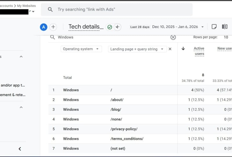
on the Plus button, and we can either go by clicking here or I can easily filter. So if I remember that the
dimension name is landing page, in this case, it's called
Landing page and query string. If I will click on this
one and wait for a second, I will see which pages are the most popular
one when it comes to the traffic coming
from organic search. So yeah, this is it. It's a great
breakdown showing us the first insights by which pages are the
most popular ones. And if you're, for
example, a blogging page or purely the
content generation, you can see which is the
most popular content from specifically
the organic search. So potentially you can basically create more of that
content or play around with it with additional
articles if they are for some reason interesting
for your users. Oh, yes, that was
primarily about, showing you how to use the primary and secondary dimension in combination. Pretty
cool technique.
13. User attributes: All right, so there's
another section ahead of us. We already mastered
to know from where our users and sessions are coming from in
the acquisition tab. We also mastered in
understanding what do they do? Which pages do they see, what events and actions
are our users performing? And now we're going to
understand who our users are or at least to help us
understand who our users are. All the information
are grouped under the user tab and
another two sub taps, user attributes and tech. Don't get confused
or mismatched by the tech because there's pretty cool information
shown there. But let's go first to
the user attributes. I'm going to instantly skip the overview since
we know that it's just the high level view of what is then shown below that. Let's jump into
demographic details. Again, I'm minimizing this
step to see a bit more. And what is there? I believe that demographic is pretty self
explanatory as well. But we have here
information from which countries are the most
users coming from, which itself is very
interesting information. So I was multiple times surprised when I was
browsing various GA accounts from which countries
the users are coming from and I was surprised
in a positive way of not expecting that some product or some issue is popular among the country where I just
wouldn't expect that. Again, this is the data that is automatically
available for you, no extra implementation
is needed. There are a bunch
of other dimensions available as well when it
comes to demographics data, which is the region as well. So you can go from
country to region. If you wait for a second,
you will see that it's the breakdown in
case of United States, to the states like California, Ohio, New York, and so on. And again, the technique of the primary and secondary
dimension applies here as well. So if you for some reason, interested in seeing
from which country and region the most users
are coming from, feel free to do so.
You already know. And what I'm particularly
interested in always when I'm doing the analysis in understanding who the users are, is to understand what's their language in which they
are browsing my website. And what does it mean? The language is basically
taken from your browser setup. So in my case, for example, as I'm using the Google Chrome
as a browser in English, this is what the
English would be. So it helps you to
understand in which languages your users are
browsing your website, which, as such is quite
interesting information, especially if you never thought, for example, to
going abroad or to which language potentially
like translate your website. This is pretty cool
information to know. So this is something
that I use very often as well to
understand the age. So our majority of
your users young guys, you know, are they more
of like the older ones? You will definitely
see the unknown here, which basically
means that user is not showing the data for
the people who are younger than 18 or does
not show the data for the users who just decided not to provide
this data to Google. If you're asking from
where Google is taking this data, it's
purely behavioral, meaning that Google is
estimating based on your searches that you type into the Google
search engine, based on the ads on
which you're clicking, Google is estimating this one. And I can ensure that it's
pretty pretty accurate. So once there's 18 to 24, there's 95% chance
or like 95% of the users are correctly in the correct bucket
when it comes to the age. So you can really
trust this one. And even though you see
here pretty large unknown, what is more important for
you is to look on the shares. So this will be pretty
much like correct if you just look on the shares of the ones that
are correctly attributed. So again, critical information, knowing how old your users
are and as well gender. So knowing is more
males or females, in case of the Google
merchandise store, I would assume that more
of the users are males, which is also confirmed here. So if I would just compare
11.5 thousand to seven case with two thirds of
the users are males. Again, important
information, you know, just genders might have a
different habit when browsing. It can be interesting
information if you have sort of the content or the E shop or whatever you do more like towards one gender, which is completely legit
and can be the case. So this helps you to
understand what's the ratio. So as I said, pretty
cool information about the users that Google is
providing us for free, and then there is another
one which is called Tech. If I will click
there and load it, even though as I said,
it's called Tech, there's cool information there. First of all, the main
dimension here is browser, which allows you to know
from which browsers, of course, your users are
viewing your website. But what is more
important is to help you to understand if you shouldn't optimize a particular browser or to optimize your website towards the particular browser. For example, if you
see the metric which is called for the first time
as we show in this course, engagement rate is
basically showing you how engaging the
session was when it comes to the
particular browser. What engagement rate is
is defined exactly here, so you can read it. But it's basically showing
you the higher the number, the more engaged
the session was. So when we compare here, for example, among the
browsers, we can see. Okay, so Firefox
is the one that is having the highest
engagement rate. And for example,
Android, the lowest one, which might pointing us to the point that maybe
in the Android be the experience might
not be probably as good, so we should focus on this one. Anyhow, this is
then the analysis and interpretation of the data. Right now, we're
showing the options of what we are capable to see. If I would switch from
browser to my favorite one, Di Mangone which is
called device category, it's showing you what's the traffic distribution among the main device category types, which is mobile,
desktop and tablet. Tablet is quite
usually very low, but what is important
to know is what's the distribution of the traffic between mobile and desktop. Even though majority of us
hopefully know that the way the users consume our content and website is on
the mobile devices, which in this case is
approximately 60% of active users. I know that there are
some parts of the world where the traffic coming on the mobile devices is over 80%, meaning that the desktop
either never existed there or was already abandoned as a device type to
browse the website. So why is that important? Just try to experience your website the way your
users are experiencing that. I can imagine that if you're working in
the online business, still the majority
of the experience you do as a user is
on the desktops, but it can be very distorted from the reality of your users. And anytime you try
to do something, just check whether the majority of your users are
not on the mobile, so you should try to experience the website also on the mobile. So this gives you, again,
the insight that, hey, might be like 80% of my traffic coming from
the mobile devices. And again, bunch of the further breakdowns are available here. So, for example, if I would want to use the
secondary dimension, there will be definitely
like the exact device model, which can be like iPhone 16, Samsung Galaxy 20,
whatever the model is. So a bunch of the
data that Google is providing us without the need of any other additional
measurement development. Pretty cool things
here available, helping us to understand, as I said, who our users are. Cool section, go through
it, play with it, use secondary dimension, and
learn who your users are.
14. Key events and key event rate: This is the last and the
bonus lecture in this course. I want to explain
you the concept of key event and key event rate, which will change
the view on pretty much every report that
we are showing so far. You already know that everything that is being measured
to GA is called event. The concept is a bit
more enhanced when it comes to marking some of
the events as key event. In general, key event
is something that we expect users to do on the
website as the desired action. It can be anything. When it comes to the
lead generation website, it's of course, like
letting us lead. If it's the ecommerce website, it's about purchasing something. If it's purely the
content page, event, the key event might
be, for example, consuming or viewing
more than five pages. So you probably now get
where I'm heading to. So this is the most
desired action we expect our users to do. And, of course,
any activity that we do and any data
breakdown that we followingly do should be
compared towards that key event. So first of all, the quick
view of where to set it up. If you're already measuring some events and you want to mark some of them
as the key events, you need to go to admin section, so just a second until the
interface is being loaded, and you need to scroll down
to the event part here. So here we are. Again, waiting a second or
two until it is being shown. And here we already see which events are marked
as the key events. So in the case of Google
Merchandise store, there are three events. It's like adding
products to card. It's a purchase, which is automatically marked
as key event, and then view item, which is showing the product detail page. Then there are another
events available, and if you decide so, you can mark some of
these as the key event. I can't do it here, of course, because I don't have
administrator permissions in the Google merchandise store, but to show you how it looks, if I will go to my GA, I'm in the exact same
section of the admin, and if I will go to the
recent events, for example, here's the scroll event
that we explored a bit, I have here the option
to mark as key event. And from that moment on, my reports will be enhanced by the volume of the key event
and then the key event rate. And let me show you
what I mean by this and why is it super
important and sort of like the holy grail of the measurement and
digital analytics as such. If I will go now back to the
Google merchandise store GA, and let me go, for example, to one of the reports
that we were showing, and it's the simple traffic
acquisition report. Before it loads, just to remind you that this is the
ecommerce website, meaning the desired action
is to purchase something. So if I will now go to the traffic acquisition
report we are familiar with, and again, I will minimize this left tap,
wait for a second. Up until now, we were mainly looking on the sessions volume, for example, the
engagement rate, which is the higher the number, the better or like the
average engagement time. If we scroll to the right, we will see that part, which is event count. We are familiar with
this one, right? We were playing with
the scroll event. But then there are
two more columns. The first one is key events and then session key event
rate. What is that? I can look from
the events that I marked that are marked as the
key event to filter them. And if I will click now here on the purchase, which as I said, in the case of the
Ecommerce website is the desired action, so it should be
marked as key event. I now see that volume of the
key events, which is, again, the absolute number,
so not telling me much or difficult to analyze. But the magic will happen
once I will change it here. So I will start to look on
the session key event rate. What it is basically
dividing the volume of the purchases here by
the volume of sessions. Why is it important?
I think that you already know because
it shows me what is the most effective traffic source from the one that I have when it comes to comparing it to the most desired
action on the website, which in this case is purchase. So as we can see the average session key event rate is 1.37, but we can see quite
huge differences when it comes to the breakdown
on the traffic channels. So we can see that
the direct traffic is not slightly
below the average. We can see that something that
is called unassigned here, but whatever the traffic source is is pretty poorly performing. And on the other hand,
when we look on the email, we can see, Wow, 4.33. So 3.5 times better
than the average. So that seems at
the first glance, that this is the best performing traffic source
that I have when it comes to showing what's the most effective and
efficient traffic source. So I believe now that
you get the point of why key events
are important and the key event rate because right now you can go to pretty
much any report that we were showing and
you can easily compare the primary dimension towards
the most effective one, and this is the metric that
we'll show you this one. Just to show you where
everywhere you can find it, you can connect it with any
traffic source dimension. If we will go to the engagement, we can also look on the
lending page report. And if we scroll to
the very right one, we can again see which sessions that are starting
or originating with particular lending page are the most effective
one when it comes to the desired action or the
key event as we call it. So again, I will do
the same thing here. Filter only purchase, and then the session key event
rate will be calculated. So we can see, okay, the
homepage is not as good when it comes to the session key
event rate because it's only 1.04 comparing to
the average 1.37. But again, we see here that this particular page is bringing
very effective traffic. The line number six, this product Android Googler
figurine, blah, blah, blah, is even more
effective one, right? So 5.61. And again, as I said, from now on, you can see this metric in pretty much
any report that you go to. So let's go, for example, to demographic details, right? The data about from where our users are in
terms of countries, regions, age, gender,
whatever there is. So again, if I will scroll
down to the right one, I can do exactly
the same thing and compare what's the conversion
rate between the countries. So I believe you now have the very good glimpse
and the details of why key event is important and the key event rate as a relative comparison among any dimension towards
the desired action. So that was it. That was about
how to use the interface. And now we know for
which every tap is good for when looking for particular information from
where our users came from, what did they do
and who they are. So yeah, that was it.
Hope you enjoyed it.
15. OUTRO: Congratulations. You made it. In just 1 hour, I
believe you now feel pretty confident in
using GA interface. If you're serious
about Google Analytics and you want to understand
it much deeper, then feel free to join my
ultimate Google Analytics course while you will learn how to customize
the measurement, how to build the custom reports, and to really become
an expert where the course is based on
50 practical examples. Feel free to join in, and I'm looking forward
to see you there.
 Pavel Brecik, Web Analytics Evangelist