Transcripts
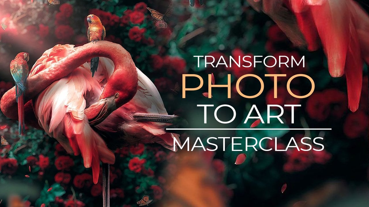
1. Introduction : [MUSIC] Hi guys, welcome to futuristic imaging. Photoshopping your pictures into abstract art. I'm Wan-ru LIn. A multimedia artist specializing in experimental arts, video art, graphic design and photography. I'm the founder of the Art studio RuRuBomb. I've exhibited my artwork in London, Taipei, and around the world. The artwork you see now is made from pictures taken on my iPhone. With Photoshop you can also turn normal pictures into abstract art. The course is designed for students of all levels. You do not need to have prior experience in Photoshop. If you are already familiar with Photoshop, the courses would bring your Photoshop skills to the next level. In this course, I will familiarize you with important Photoshop skills including: marquee select tools, layers panel, color adjustments, and everything in between. The course consists of the following sessions: Color in computer language and digital image, how to strengthen picturing skills, how to read image from an artistic point of view, and how to implement ideas into practice. By the end of the class, you will know how to create your own abstract art for individual or business purpose. All you need to prepare is a digital photo that could be potentially turned into artwork in Photoshop. So lets get started. [MUSIC]
2. Overview of the Course: Thank you so much for enrolling the course. In this course you're going to learn how to turn your digital imaging to plenty of abstract artwork, just with the Photoshop. Let's talk about how I came up with this idea to make the course. It actually came from one of my ongoing project which is about the light. Also one of my method to doing the artwork is by telling a story through different digital images. Now I'm so happy that I can be here to share this experience with you to know how I discovered the methods and how I manage to turn those digital image into the art gallery. You probably will ask me like, "Is that very difficult for me because first that is experimental art, second, that is an abstract art and it's so far away from me." Actually, this course is for all those students so I don't think you need to be afraid. Let's have a look to the overview. I organized the course into four sections. In the first two sections there is stretch pixels and there is dive into colors. I will help you build up a solid knowledge about basic Photoshop skills. The first sections consists of the following lectures, computer knowledge of pixels and colors, how to stretch pixels, and how to select pictures. In the second section, we will focus on colors, you will learn essential Photoshop skills to experiment with colors. Once we finished the first two sections, you will be able to create a futuristic image of your own. The third section, Let's Stop and Think, is the most important part of the course. I will teach you how to get your pictures stand out. Now is to final, the fourth section, Let's Mock Up. We will place your art work in different contacts in order to test its potential for individual or business use. In order to start your course you need to open your Photoshop and download the course materials. The course materials include a class outline to guide you through the course and some photos and files to help you with assignments. So are you ready for a journey? Next video we're going to talk about assignment and I'll see you in a lesson.
3. Your Course Assignment: Hi, we're going to talk about your assignment. By the end of the course, you will be able to create these kind of futuristic images from the iPhone photo which I took from the Scotland, and I need you to put them together onto a card. In this video, I'm going to tell you how to make these cards. I prepared some template for you. One is vertical, the other is horizontal. You don't necessarily need to use them as your final your assignment result, but if you don't want to make something new then you can directly use the template and follow my steps. I need to find a person who is very important for you, find out a picture between you and this person. Use the course skills that you just learned, practice as much as you can, and once you're confident enough, you make some futuristic images as the background, print out or just send as a digital file. Let's open up Photoshop to create a new file and go to photo, choose landscape six by four. You also can choose bigger. You needs to do assignment, horizontal first. We choose this icon which is horizontal, and here you do 180 and rest. You can choose background color so normally I choose transparent then hits "Create". Now you have your file and I need you to go to the picture that we chose miles in your futuristic image course. You drag it onto the layer and resize until you are satisfied then you hit "Okay". You also can test so which part is your favorites. You can go to your Scotland whisky and drag it onto this pattern, resize a bit. How I would do is I will make it small, so this is a picture that you represented to you and the person that you are going to give then. What I will do is I will create a layer and I will randomly pick up a square, and give the color, choose the bucket and change the color. That has changed something red, and that's make another one by duplicate it and turned it a bit. Let's make a different color. So make black, here's the bucket, drag it. Now, you have two layers which is the color and what you can do is you also can change the background color. For example, now I don't really like the red then I will choose maybe blue, and maybe your fingers scientists too smooth so you link the two layers and do some transform and so you have periods. You either kept pray out like these and write done by yourself, for example, I will hit the type tool onto here. It will generate the layer directly. What I will choose is here, you can choose the type of color so I will choose something a bit lighter, and then you can direct to hit on here. Let's say here and say what do you want to say, and we've finished this one. I think this is a horizontal. If you want to make a vertical you can do like new. Let's go to photo six by four then you choose the vertical 180 and the same transparent then you hits "Okay" creates a file is vertical. Remove the picture that we just made and resize a bit within the center. I like to fill it, that's okay. Once you fill this we want to do something like paranoids picture which is easy. You just drop the Scotland whisky here onto your layer, resize a bit. Unlike their paranoia is you only have a certain size, now you can make whatever size you want. What I will do is to make it smaller, I make it center. That's okay. Create a layer beneath the picture so that once you make a square it will be under the picture, and paranoia is wide say jet packed. Now, you can make the size because nobody paranoid is like seeing on two side and bigger button size a bit so you hit "Okay" and deselect. Here, you can make some words so type things here. I would change a typo to black so It's like you do sound mark pen so we were in Scotland, resize a bit. We made it that. You want to have a real feeling of your paranoia. It's like at tage on the color with no dimension. What I would do is I go to this white layer and double-click, and I would drop to layer shadow so the first layer I would do to something a bit closer and the second shadow I would do something a bit spread. For example, here is a bit closer so at distance I make smoother and the spread is not to much. Always a second layer, I will make the spread a bit bigger and distances a bit wider. Here is a blend modes so you can choose whichever you want. If you think this is too much, you don't want to do any shadow frames for which this is not our main purpose to this course then you just go directly to look templates and download it, I already make the lights for you. All you need to do is change the color of the blues. Once you finish the assignments, please upload to the project gallery so we can all have a look then I can give you some comment. Next video, we're going to talk about how to stretch the pixels.
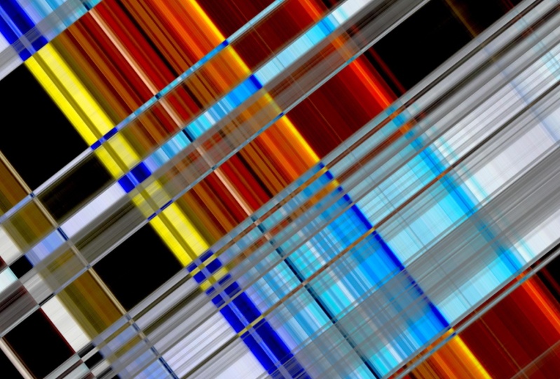
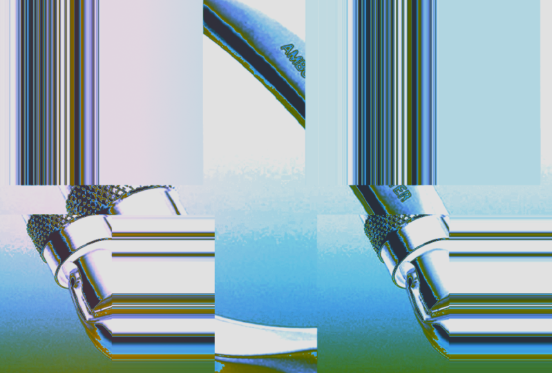
4. Let's Stretch the Pixels: We are going to stretch the pixels with marquee select tools. Before we start the course, I want you to go to a course material, download a picture for me, the picture named Scotland whisky. Now we open the picture from Photoshop. As you can see, the picture actually is being locked. If the picture being locked you actually can't do anything onto the picture. Let's unlock the picture by one click and give it a name. After you do this, we duplicate layer, lock the original layer, close your eyes, keep the copy layer. The things I'm doing now is because I want to do everything on to copy layer so that if anything wrong with the copy layer, I can easily just delete it and I still kept the original one. Now we do it again. Duplicate, lock, close the eyes, we do everything onto this copy layer. Marquee select tool actually has three types, rectangular, elliptical and single row and column. I'm going to show you how actually Photoshop doing with marquee select tool by zooming the picture until you can see the pixel box. Now we look at this single column marquee tool, actually, single means, one pixel. Single column marquee tool means Photoshop will choose one single box with a column. Single row means Photoshop will choose one pixel with a row. You will ask: what the Photoshop will going to do with the rectangular and marquee tool? It select everything, you select. Now we go back to the original size of the picture by clicking Command + "zero". Because I think for me this vision still very big so I can do Command + "-". Now we need to learn how to stretch the pixel. To stretch a pixel you need single row and single column. By doing this, you put the single column tools onto everywhere of your picture and you choose your final destination, you click the move tool, "long press Shift", choose arrive there, make sure your arrow is two sides, drag right and drag left. Now you've got the pixel completely being stretched. Because I want to do other things so I cancel the selection. Now let's try the single row, the same as the single column you can choose whatever you want. Press the Move Tool, long press Shift button, make sure the arrow is two sides, drag up, drag down. I'm not going to keep this because I'm going to show you something else. Now you will ask, what actually is the rectangular marquee tool do? The situation is, probably, you don't always want to select a whole row, you don't always wanting to select the whole column. Now this is the situation rectangular marquee select tool is going to do to your picture. You probably only just want few bottles of the area is being selected. Use the rectangular marquee select tool. You select a particular area, do onto your mouse with right-click. You will see here is a layer via copy, which means when you click it, you will generate a new layer. This new layer contains the area that you select from previous layer. As you can see, your previous layer picture has not been cut. That also means whatever you do onto this new layer is totally irrelevant. to the previous layer. Now how to do the stretch pixel, single row or a single column. Let's show single column. Here is the thing you also need to understand is you only can put your marquee select tool onto an area with the colour pixel. For example, if I put the marquee select tool here, which is a transparent area, there is no colour in the pixel. If I try to stretch, Photoshop would tell me, could not transform the selected pixel. Because this is transparent, there's no colour. Hit okay. Now we go to the area with the colour. Do the move, long press shift, make sure the arrow is two sides, right layer, drag to the right and drag to the left. Here we are. You know how to stretch the pixel. Lets go to the next course is about how to select an image.
5. How to Select Your Pictures: We are going to talk about how to select image. In this video and next video, we are going to learn two things. First, you will be able to use the color bar to define the picture you choose, whether it contains enough variety of colors or not. Second, you will be able to create this kind of color sheet to help you confirm that you have the right choice. Also, at the same time, create a database for your future creations. I need you to find File_video 4 and open Perfect 04, Difficult03, and Group of 7 Colors Bar for me. Once you open the file, I need you to drop this bar onto the picture. Zoom in a bit and put in the center. Hit okay. I need you to do the same things onto the other picture. Once you finish all of these, you back to whiskey bottle. This seven colors bar is actually based on my personal experience. If I can find at least four color groups from this picture, then I will consider this picture is easy to use if you want to create some futuristic image. Whereas, the picture like this, I only can find white, blue, then I will consider this picture is a bit difficult. I also provide some course material which is called image for practice. Inside, I separate into Difficult to use and Perfect to use. You can find out those image and with the color bar to do as your practice. Next video, we're going to talk about how to make a color sheet.
6. How to Create Colour Sheet: In this video, we are going to talk about how to make the color sheets. This is the color sheets and we are going to use Marquee Select tools to make loose stripes. As you remember, in a Video 3, we talk about how to use the Marquee Select tool to stretch a pixel, we actually use a single row on single column. Now, we are going to make this sheets by opening this whiskey image. That duplicate two times. As usual, we need to look the Choice. Yes. We can now have two, one for column and the other for the row and let's turn on the row first. We in the end need to make something like this. We need to zoom out and place the tool here, make sure layer is right, double arrow, stretch and you click to the stripes, press long Shift, drag to the right, let go. Let's do it again. We choose here, we press Move Tool, long press Shift, Double Arrow, right layer, drag. We do quickly to some so that you will be able to see how we are going to mark. Now, we have the stripes and for the row it will be totally the same. I only do one times for you. We make it smaller, we put in the middle and we choose the single row and choose one row for yourself, stretch a bit and put down. I think now you already know how to make the stripe. Then I want to show you how to read the image and your stripe. First, you need to make sure the stripe that you like. For example, I like the three and five. I will say this picture is okay, and then you can go to see a row. In a row I think is even better. I like a lot except for three, I don't really like and I also provides these row number for you in the course material you can easily to find. Also I provides the how to select your image guides for you. After this course, you can practice and check these guides to help you understand more about how to select your image in this course. Let's go back. You don't have to worry about if you cannot get both column and row, for example, if I only can get something from the row, then I will say okay, that is perfect because in a row I already can get 5. You don't need to really care about you don't have everything. Let's go to the difficult one. Why will say this is so difficult? Actually, the reason why it's difficult is because no matter from the column or a row, you get something very grooming. I would like to say for this gloomy stripes for the beginner is very difficult to use. It doesn't mean you are not going to have the colorful one because as you can see now, this is something that I creates from this. Here is the color sheets. Next video we're going to talk about the magic blend.
7. The Magic Blend: We are going to do the magic blend. In this video, you are going to learn two things. First, you need to know how to use the color sheet to make pictures as your basic photo. Second, we'll use these two basic photos to do the magic blend. I need you to find two file for me. First, there's a Scotland whisky, and the other one in the file video 6, whiskey color sheet. We need to use this color sheet to find two color stripes. These two color stripes, each of them will turn into the basic photo. Let's go to the row first, I think 1 and 2 is my favorite so far. Let's go to a column, I guess 3 and 5 could be. Now I need to make a decision to limit into two. I would choose maybe 1 and 2 from the row, and I will just don't choose anything from the column. It's totally fine, you don't need to limit yourself, say, you necessary need to choose one from row, one from column. Now we know one and two are the stripes that we are looking for and both of them will turn into basic photo. I need you to go to the magnifier, place the magnifier between one and two and drag it. You need to drag until you can recognize where is the row coming from. Just remember the big things, you don't have to be precisely. For example, I know 1 will cross a bit higher than rows tags, and 2 will cross the word, this red words, and above those glass words. Once you already roughly know where are the rows, then I need you go back to the Scotland whiskey. Duplicate BG layer for two times. Change the name to CS01 and CS02. After you've done this, remember to turn off the BG layer and lock it. Go to CS number 1, choose the marquee tool, place on the right place above the tag and stretch the pixel and hit "Okay". After you stretch the pixel, I need you duplicate this layer and turn off the eyes. Now, we go to a CS02 and we're going to do exactly the same. Place the marquee tool to the right place, stretch to pixel and hit "Okay", duplicate and turn off the eyes. Now we need to take a little bit time to organize. Turn on CS2 copy, and CS1 copy, you drag it onto the BG layer and hit "Shift". Choose two layers and choose the file, group it. Change the name to backup basic photo and lock it. Turn off the eyes. The reason why I do this is, I want you always have a backup. Even though after you editing a lot, you still can come back to find your original basic photo. How to blend? Go to a top layer, and this is the blending mode. Drag down the sheet, roll over. Here has a lot of effects that you can choose, lets choose "Subtract". Once you are sure this is your blending mode, now we can try some of them. For example, you can zoom in your picture a bit to see what sort of things you will get, or you can zoom out and duplicate, and move, or you can zoom in and turn to fit the size, or you can switch the CS01 on top and change the blending mode for it. What also can do, we can merge the layers. Now you'll hit the "Shift", choose both layer, right mouse click, merge layers, and change their name, duplicate, zoom in a bit, hit "Okay". Let's do some quick blend. Let's say I like differentiate, you turn a bit and see what things will happen. Here is the magic blend. Next video, we're going to talk about colors.
8. Let's Dive into Colours: We're going to do the colour adjustments onto the picture in this video. First, I need you go to Window and make sure the adjustments is being take. Then we come to this panel. As you can see, there are 16 functions in this panel. In this video, we're not going to talk all of them. Instead, we only covers seven functions. You also can find adjustment under the layers panel. You just need to click the icon and you will see the whole list. Now, we are going to talk about what is the seven functions are. First, we will cover with hue and saturation, levels, and bright and contrasts. After that, we will talk a bit about solid color gradients and in the end, we will do some black and whites and invert. I myself prefer to do the color adjustment through clicking the icon and directly go to the name. If you are already familiar with Photoshop and you have your preference to do onto here, which is fine because they are the same, let's start with the hue and saturation first. Click here and choose Hue and Saturation. Once you choose Hue and Saturation, that means you want to change all the color from current picture to something else. Let's have a look the panel set preset as default and you see master. Master means you are going to change all of the colors from this picture to something else. Master means all of the color. By changing all of your color, you need to scroll the hue bar to a place that you feel comfortable. That say, if you're comfortable with right now, then I stop. Saturation is, once you stop from here, then how much you want to put in the picture? You can decrease. They it can be a black and white. You increase, then is will become very rich colorful. It depends on what you want. For example, I want to stay here, lightness is how much black and white you want to put onto picture. If I want a bit brighter, I can put. The thing is, I will suggest you do just a little bit because if you do too much, it will become completely black and white. If you only want to change a little group of color, for example, I want to change a little bit blue into something, one thing you really need to make sure is the color you are going to change is based on your original picture. For example, I choose blue that I want to substitute to something else. Then I choose blue here and scroll the bar until I feel comfortable with. That's said, I liked the red instead, so I stay here. But I suddenly found I also don't like the green, so let's find the green. But it actually not going to change my green part. It change something else. It's because for the hue and saturation, it will only do onto your original picture, so you need to first close the eyes of the hue and saturation and makes sure which part is the part that you feel annoyed. For example, you don't like here, so the original color is yellow green. Then you need to turn on the hue and saturation and choose yellow. Then you will make it to something else. That is a hue and saturation. Let's talk about level. The moment you put the level onto your picture, you actually ask Photoshop to adjust the amount of R, G, and B onto your picture. Let's have a look the panel In here you can see R, G, and B on RGB. If you click "RGB" under this situation, you adjust the combination of R, G, and B, so you adjust these three colors together. As a result, you will see it'll be brighter or it'll be darker because R, G, and B being adjust together. Whereas if you go to red, you actually is add red onto a picture so that your picture become reddish. Whereas if you stay here, you already added the red, but you also change a green. It doesn't mean It will automatically become greenish. It will depend on how much red you increase to this picture. I would say if you put a level onto your picture, you're actually adjust a balance of R, G, and B. Now this is the level. Let's talk about bright and contrast. I always doing bright and contrast in the end. For example, I'm happy with the results right now and I found is probably a bit too bright, so I will adjust these. Or I think the contrast is not that strong enough, then I will adjust the contrast. Let's talk about solid color and gradient. It actually work in the same way, just different types of color. Let's start with solid color first. you can randomly choose any kind of color from this bar. Let say I like something orange, red. After that, I would do the blend. With the gradient, you can click here and there are a lot of preset from Photoshop. you can randomly choose one, so let's say, I like pesto. The black box is the one you can change your opacity and the box with color is the one you can change color or you can add colors. By double-click, you can choose whatever you want. For example, I don't want too solid, I want to build transparent into solid, then I click here and change the transparent. Then you can see it's become like what you want. Then we hit "Okay" and do the blend. Here is the solid color and gradient. Now we are in our final two black and white and invert. In this video, I'll show you how it will affect to your picture. We will talk a bit more later in next video. Go to black and white, then you will see the bar here. You can adjust different bar and it will give you different shades of gray. Here comes to our final function, which is invert. When you invert an image, the Photoshop will change the value of each pixel into the inverse value. For example, if your original picture let's say has a black, the value is 255. Then when you invert your image, the 255 will change to zero, so does other colours It's will follow this 256 steps colour values scale to do a conversion. Next video, we're going to do the futuristic image from beginning to end.
9. Futuristic Imaging Part 1: We are going to do Futuristic imaging from beginning to the end. Previously we used the color sheet to choose two of our favorite stripes, and we did a lot of demonstration. However, in this video we are going to do something very different. We will choose none of them. Instead, we will use column 1 as our basic photo. What I want to say in this video is even you have a striped that you never thought about before, it can be something amazing. But the premise is you need to familiar with all the skills first. Let's open the file. Video 8 demo-practice. I already helped you to name it so you don't have to do any thing right now. Just follow me now, place your column onto the right place and choose a layer to stretch. As we agree, now I'm going to do black and white first. Tune the bar a bit. Ideally you just make the details still can be seen not too white or too black. See that's okay and then merge it. Once you finished merge, check your picture. Every time you do one effect check your picture and think what else you can imagine from this picture. For example, now I see two black stripe, I feel like to put something in between. What I would do is duplicate and I want to do some vertical let's go to "Edit" ->"Transform", go to "rotate". You can choose one, I choose this. I want put in-between the two black stripes. I've transformed a bit to see its size. Puts into here. I want to put exactly the center. Which means I want it in-between these two stripes and a feeling a bit balanced and even so I do a bit free transform to stretch up a bit. To make myself feel that is in a balance way. You don't need to be precisely, but you need to feel good. Now we do blend. I will choose lighten and let's have a look of how it feels. For me, it feels like four windows and I want to choose one of these window to make it a bit darker and outside feel a bit brighter. I want this feeling is there is a light get into here and stop by the pillar so that here is a bit darker, there's no lights get in and outside have this kind of light bump into building's feeling In order to do that, I need to make colours. Instead of doing the colour in adjustment. I wanted to do another way. I want to create a new layer. I want to use the bucket to put the gradient tool. I choose a gradient tool and as I said, I want here a bit darker, here a bit brighter. I go to a preset, as you can see i've already chose. I go to legend gradient. I know inside there is one I'm really interested into. I guess it will be this one. It fulfil what I want is a bit darker and it is a bit brighter, but I want to have a bit darker. It's about half of the picture. Of case this is not enough and because I want outside is lighter so I don't think this can make it. What I can do is switch the bucket. Let's make the purple here and make orange here. When the light hits here, here should be brighter, and outside should be a bit darker. I will switch these buckets as wall. I make the oranges a bit out and here the yellow is a bit more so it can fulfil my imagination. Let's hit okay. Here, the gradient you can choose different. Like this is a bit linear that's not what I want. This is center, also not. This is "devide" with a very strong light, also not what I want, so I will directly choose this one. This one is diamond, a bit like what I can imagine. But the problem is you see the darker area here is not. When you blend, you can see it. It's not what I want. I want something darker is reach this there. We can go back to gradient, and we make the blue bit more let's moved the purple. This tiny thing, this diamond things you can adjust the amount. I don't want too much on the blue for now should be alright. Also, here I don't want it so solid, I want it a bit transparent so let's change opacity here to 75 and hit Okay. I guess it should be all right now, so lets hit Okay and let's do the blend. I would do differentiate and see how it works. Let's see how hue and saturation can be. Here bit, yes. I don't want the corners too reach so I will tune a little bit saturation of it. Not so rich. Now I think is okay. What I will do is level because I've found that blue is too much, so just make it a bit less. It should be balance and the green as well a bit less. Still don't really happy with the the blue ... Go to a red, I think now I'm happy so I will choose to save. Create a file, name it futuristic whiskey and JPEG. Now I given a name as W 01, and let's save. So we produce the first picture right now, next video we are going to produce two more. I see you next video.
10. Futuristic Imaging Part 2: We are going to do two more pictures. I need you to do duplicate this from last video, and group one of them give the name as back up w01. The other one, you keep that w01 copy. Once you finish this, I need you to turn off the eyes. We are going to merge these layers, and put onto a top, delete the group. Now I need you to see this picture. What I'm seeing now is, I really like this box. Inside this box I think there is a potential to become a pattern. I don't want to lose this chance, but at the same time, I don't want exactly the same like this. What I can do is I zoom in a bit, I turn it a bit, and I want to have a certain angle, and make it fill the transparent parts, and hit Okay. What I can say now is I want this one a bit top, so I turn it a bit. Once you get this picture, I found there's too much outside of this frame. Use the Rectangular Marquee tool. Square your area, and go to image crop. In this video, I'm going to show you two things combined with other skills. The first, I will stretch a pixel again, and second, do the invert. When you want to do a stretch pixel, you just render choose a place that you feel comfortable with. You don't need to make the colour sheets. let's stretched a pixel again, and its okay. Once you stretch a pixel, I need you to duplicate. It's my hobby that I always would turn a bit to see how the blend work. I think Color Burn is quite cool. Once I'm sure I will resize like this. Let's have a look the picture, how do you feel? I feel like here has something like forest, and there is some bonfire. I will keep my imagination from the beginning to the end, because I already think like this. I want to zoom in a bit to see how it can be. My way of thinking will always change while I am doing the work. For example, now I don't think that is the branch anymore. What I will do is will save the image. If I need to give you any tips, I will say save as much as you can. That is my experience. Let's save w02 choose futuristic whisky as hit Yes. Before cause we do some free transforms I found I can do something like this. I kind have a feeling that I want to duplicate this and I want to do some flip. Somehow I see the house. Next video, I will tell you, why I keep seeing the crazy things. I think now looks good, and it make me feel something is like that. What I'm a little bit struggling here is I don't like here is to complicate. What you can do is just delete it. I want to delete a bit, but not too much, probably up to here I delete it, and here I think to delete a little bit here. That is not like completed dark. Now I fill Okay. I will save. w03, to futuristic. Here comes to the final I already organized layer a bit, and we are going to use this picture again, turn off the eyes, and we do free transform. This time we do a little bit crazier, like this, and hit Okay. Again, we need to cut through redundant part, crop, and deselect. This time we will do Layer via copy. I have this imagination about the house. I want to make it happen. Once you do a layer via copy, turn off your eyes, and duplicate because I want to do flip. You move the duplicate one to the right. I want you to do flip. This is my imagination but I feel like to go to the other way around. It's a bit like the ceiling of the house. Not exactly the same but It's like a very tall building, and you're standing the first floor and you look up, you can see different window. Normally It's not like colorful, it's just blue sky, but we are in Photoshop. Resize a bit to make it look like this. I think that's something I quite like. We stay like these, and It's become our w04. Before we save as w04 I want to do invert. Because the color, I want to see the potential. As you can see, once you get the invert, it immediately become another world its a bit like some game. I want you to emerge these two layers. What I'll do now is do a bit level, to change the portion of the blue. Now there's a lot of blue. Then i will do Hue, and saturation. You will see I do a lot of the same things. I hope that I demonstrates three pictures that will be easier to understand. I want to see the potential of how the color can be? How those color can be done. I found this is quite cool. I guess I will leave like this a bit brighter, a bit richer, and brighter darker. I think now I'm happy with then I hit file save as w04, Jpeg, futuristic img Yes. Great. From whisky Bottle to these free isn't that amazing. Next video we're going to talk about Stop, and Think.
11. Let's Stop and Think: We are going to talk about stop and think. I personally have a theory which is iceberg theory. I believe Ps skill is the tip of the iceberg and the rest is your true skill. Oh, why is true skill? If you remember, when we do the futuristic image last video, I talk a lot of ambiguous words like, "Oh, look at that, is like a window." I think here, should be in the dark and outside looks like a bonfire. I want to choose the color, is like a bit like a sunshine, or is a bit like yellow, orange. Oh, I think this reminds me a lot about the New York Subway. So I guess here is the train pass by and there's platform. You must be thinking, "My God, she's crazy." No, I'm not crazy. I really see it and I want it visualised. So this is the crucial part you will ask the question, "how do I implement my idea into the artwork?" There is no shortcuts that I can teach you. The only way you can help yourself to implement the idea into your art work is by seeing other artist. So how are they already did into their artwork? I think this is not a new idea, that people telling you, but this is true. So for example, you need to create one file which is highly related to your interest. Your interest in music, your interest in film, Your interest in the panting, your interest in everything. You categorize them and you know what you like. The other file, I'm going to teach you how to do it. So inside, there are artist names, artwork and how they make it, what is their definition? So you are going to create these two files, I call this is your database. You need this data base so that you can see something. So where can I immediately find the artwork as my database? I want to introduce this website for you. It's from Tate. They have these art in the collections thing. So you can hit discover art in the collection. Here has plenty of art. So what I am going to introduce is, you can type a name. So for example, today you've finished a course, you know we are doing the abstract art. So you can type abstract art. Then inside, you can immediately see different type of abstract art and you start to pick up whichever you're interested in for, to make your database. That is the first thing, the second thing in Tate is, they have a lot of this art terms and I find it very useful, so for example, we just type abstract art. So we go to A and you can find abstract art. An artists that you're interested into with the art work. So for example, today we are doing something, is really related to this type, then I will mark down the name of the work and the name of the artist. So for example, I will copy and paste to see what is his work is, go to the image, quick look if you like his work, then you can do a deeper research. I hope this is useful for you and there's no shortcut to build up this database things, the only way you can do is just start from today, you create it.
12. Let's Mock-up : We are going to talk about how to use your futuristic images. There are different ways to think about your futuristic images. You can think as a pattern, as a background. If you run Instagram business, you can think as a highlight logo or simply just a pure artwork at home. Let's say you want to choose the first option to turn some part of your artwork into futuristic image. Take this as an example, this is my self portrait. I want to change the hair. If I want to do that, I choose the Magic Wand and choose the right layer, then choose the area that I want to change, mouse-click right and chose the layer via copy. Now I got the hair being select. The second step you are going to the picture that we just made. You can drag it onto the layer. You resize a bit, it's okay. The way you can do is, now your press option between two layers, hit. Then my hair change the color. What you can do now is you can move around your picture to see how it looks like. For example, I want to move like this. I feel okay. It's a bit like my hair. so turn on and my hair changed. You can go to internet, type mockup, afterwards you type the product. For example, I want to do web page, then you will find plenty of the sites they are doing this template where you will see, once you click their websites, you're going to see this kind of template. You can randomly choose one which is suit for you. Once you've got the file, you will see a lot of layers in the layers panel. All you need to do is spot on the place you want to change and check where is it on the layers panel. Once you've found the location, you go to the picture that you wish to put on and drag into the file. Normally the picture your drag in will directly apply onto the layer you just chose. All you need to do is hit the option and collect in between the layers. Today you get your mockup and you can adjust. I will also show you orders mockup but not in detail, just let you see how it will look like. Here is the background that you can use. You also can't do the same to the Instagram mockup and also at home, here is the mockup. Next video we are going to talk about final thought.
13. Final Thought: Hi, I think this is the end of the journey. You made it, congratulations. We covered from how to stretch a pixel and select your image. Then we did a lot of blends and colours and database mock-up. If there is one thing that I want you to take away from this class, it definitely is seeing you produce plenty of futuristic images. Please don't forget to upload to a project gallery, and leave the review for me if you liked the class. If you want to follow me, go to my profile and if you post online, tag here. I think this is everything, and thank you again. I see you next time.
 Wan-Ru Lin, Artist & Founder @rurubombltd