Transcripts
1. Fundamentals of Background Art for Animation_SKILLSHARE: Hi there, welcome to the fundamentals of
background art for animation. A complete guide
on how to create professional-looking artwork for an animated movie or a TV show. This class is also
a complete guide on the exact job spec of a background artist in
an animation studio. My name is Siobhan. I'm a top
teacher here on Skillshare, and I have over 15
years experience working as a background artist in the animation
industry in Dublin. I've made this class
to help you if you are already a
digital illustrator, but you feel that you're missing some fundamental building
blocks in your artwork. Or you want to be
able to build up your portfolio and show
it to animation studios. I've also made sure
that this class is perfect for
beginners who want to dive into the world of
digital art and start their journey towards becoming a professional
background artist. Today, you're going
to learn exactly what it's like to
work in the industry. You'll learn the exact job
spec of a background artist what you'll be doing
every day in the studio, as well as what's expected
of you in terms of your workflow and the
art that you produce. You will also learn the core
principles of good design. I'm going to teach
you the concepts that are used in film production, and these concepts will
form your framework for background art
in order to ensure that you make art that supports the story as well as art
that's beautiful to look at. After that, I'm
going to teach you the exact skill set that
you need to develop. You will learn how to
do visual research. You'll learn what
drawing skills to focus on and what painting
skills to focus on. Digital art can be
extremely broad, but by focusing on
the right skill set, you're going to be
able to build up your portfolio really quickly. Together, we're going to look at the four main pitfalls that
every beginner falls into, so that you can avoid
these common mistakes and create more
professional looking art. In the final section
of the class, we're going to put all of
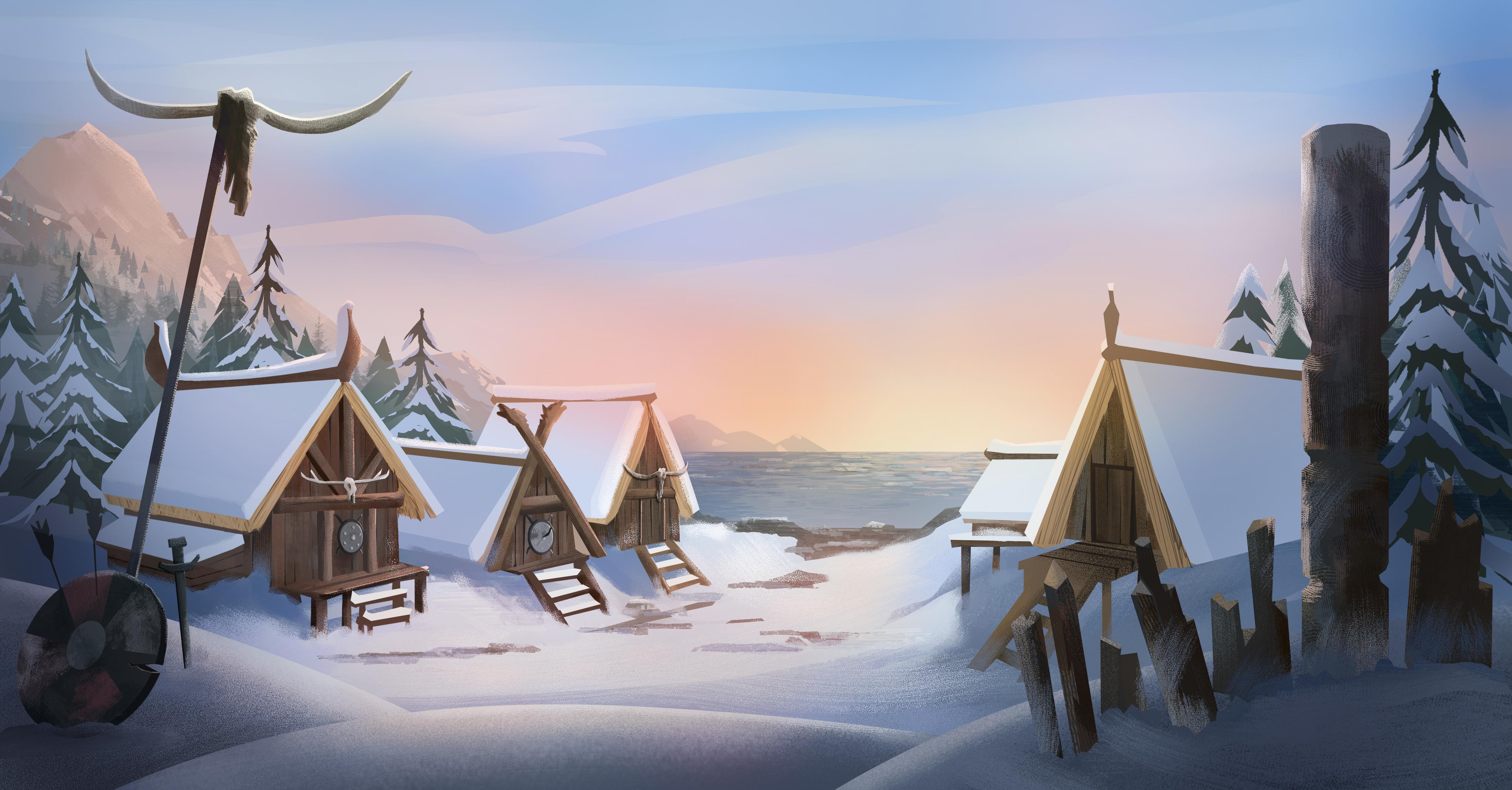
this knowledge together and work on one major class project. You're going to get to
draw the layout as well as paint-up the final background
for this Viking Village. Not only will this be a huge
portfolio piece for you, it's going to be something
that you can show to clients and to studios. Because this background
demonstrates every important aspect and skill that you need in
order to get hired. My goal in this class is not only to help you step-by-step throughout the
process of learning this unique and
valued skill set. But I also want to ensure that through sharing my own
professional experience, you can feel confident moving forward in your art
career and taking the next steps towards becoming a professional background
artist for animation.
2. Introduction: In this introduction I'm going to explain how the
class is structured, how to approach each section, and I also want to explain the brush pack
that I've left for you. The first section
of this class is all about the tools of the trade and by the actual job spec of a working background artist. I'm going to explain
what you'll be doing in the studio and
I'll break down the key design principles
that you need to work with in order to
create professional art. I'm going to explain
specifically the difference between illustration
and background art. I'll explain common terms
like background artist, concept artist,
environment designer, layout artists so that there's
no confusion and you know exactly what you'll be doing in the studio when
you do get hired. Then in the second section, I want to explain the core skill set of a background artist. This might not be
what you expect. I brought it back down to
the absolute core skills that you need to work on
and you need to develop. We'll cut away all of the fluff, we'll get super clear on
the main things that you need to focus on in order
to improve quickly. Then in the final section, we'll take all of this
knowledge and put it to use on one major
background painting. Now, don't worry if
this seems a bit overwhelming and
detailed and complex. I'm going to walk
you step-by-step throughout the entire process. In this class, we do a
layout drawing first, but you're more than welcome
when it comes to use my own layout drawing if you just want to
practice painting. I'm fully aware that not all background painters are interested in
layout drawings. That's completely
fine if you decide to focus on just
color and paint. But I would encourage
you to watch the drawing videos
so that you know the process and so that you're aware of the
steps when it comes to working in a professional
studio setting. If you are able to do both the drawing and
the digital painting, then you're going to have two stand out pieces
for your portfolio. This is going to demonstrate to studios that you
can draw anything and that you have a really
clear understanding of the entire
production process. Throughout the painting process, I'm going to be using a
number of texture brushes. If you've taken any of my other background
design classes, it's likely that you'll have most of these brushes already. But I've left the specific
brushes that I use in this class into a
pack of its own. What you can do is go over to the projects and resources
tab on the desktop, download the file there, then you want to
just drag that file over to your Photoshop
icon and release it. When you open up the
brushes panel then, you'll see that folder added
at the bottom of the stack. Then when you finished
your project, be sure to post it in
the project section. I'll be really happy to give you feedback or answer any
questions that you have. Now, just a note, I've left my final painting
purposely empty of stuff because I want you to have a go and adding
more things in. At the very end of this class, I'm going to give you
a challenge to add more Viking paraphernalia
into your background. You could put in the long boat
in the harbor for example or a broken down wagon or
a pile of broken weapons, anything that you think
this background needs. I'd love to see
your interpretation of the brief and to see
what you come up with.
3. The Tools of a Background Artist: In this lesson, I'm
going to explain the tools that
you'll need both for this class and for any work that you will be
doing as a background artist. The main tools that I
want to highlight are your software and hardware
tools, and the brushes. Personally, I'm going
to be working in Adobe Photoshop for this class. But you can use any digital
painting app that you like, and you can follow
along with me. Since we're going to be
focusing on specific skills and approaches that you need to develop as a background artist. The software doesn't
matter hugely, as long as you can
apply those techniques to the specific app
that you're working in. The reason that I
choose Photoshop over something like
Procreate or any other app, specifically for this
class in particular, is because Adobe Photoshop
is the industry standard. If you want to show your work
to a prospective studio, and land a job as a
background artist, it's going to be grace to be
able to demonstrate to them that you can use professional-grade
software like Photoshop. Background art for
professional animation studios is nearly always
done in Photoshop. The main reason, apart
from the fact that it's a very robust program, it can create massive file sizes with little to no issues. But the main reason beyond that is that within
any given background, you actually need to be
able to work with multiple, if not tens of
multiples of layers. That's really where I think Photoshop is ahead of
the curve in terms of its ability to dynamically
handle so many layers. In animation, not only do all of these layers
become necessary, in order to create
complex paintings, but very often some of
the elements within the background will need
to be animated themselves, and for that reason they need
to be on separate layers. If you are committed
to learning the art and craft of background design, then I highly encourage
you to try out Photoshop. You don't have to buy it. You can have a test it for a while for a couple of weeks
and see if you like it. The other tool that you'll need and this one you
can't really get around is having a
drawing tablet and a pen. If you're on the iPad, you'll need an Apple pencil. But if you're on a
laptop or a desktop, then you can get a
cheap drawing tablet. But again, I might encourage
you to invest in a decent, good quality one like a Wacom. My setup is very, very simple. I use a Wacom Intuos Pro. It's nothing fancy. I've had this now for years
and it just has never, ever let me down,
and it's great. I highly recommend it. Then the last tool
that I want to highlight is your brush pack. Now, it's been said many, many times that you should
be able to paint something complex with the simple
default Photoshop brushes. But let's be honest, you do want to have an
extensive selection of texture brushes in order to create a wide range of
textures really quickly. For this class, I have left a couple of brush packs
for you to download, and to experiment with and use in your own class project, and in your work going forward. But I also want
you to be able to know where to find brushes and where you can
start building up your own library of brushes. My go-to marketplace to find awesome brush packs is Gumroad. I recommend that you buy your brush packs from
artists over there. Another place you can also
check out is ArtStation. Definitely do your research, invest in brush packs that
you think you will use, and just know that
there are tons of resources out there for you. You don't have to be
limited to what you have within Photoshop or within the app that
you're working in. I don't want you to feel
that that's restricting you. In the next lesson,
I'm going to give you a brief overview of my
own Photoshop workspace, and how you can set yours
up to look just like mine.
4. Overview of the Workspace: In this lesson, I'm
going to go over my specific Photoshop workspace, how I set it up so
that you can match your workspace to mine if you're following me in
Photoshop yourself. I'm going to go ahead and
open up my Photoshop. Once it's loaded, the default
welcome screen opens up. I'm going to go up
here to New File and just click on that
just to get started. I'm going to change these to, let's go with just a
regular Canvas size 1920 by 1080 is pretty much
standard default screen size. If you wanted to put them in, you could type in
the numbers up here. The only other one that you might want to change
is RGB color. Just make sure that
it is on RGB and not CMYK or grayscale
or anything like that. RGB color is the color profile
for any screen artwork. Let's work in RGB. Click "Create", and then this is how my
Photoshop is set up. I wanted to point out that
if you come up here to this tiny little icon up
here and click on this, this layout is saved as
Siobhan's workspace. Let's say you open up and you're on something that looks
a little bit like this. Let me close this. Maybe yours even look
something like this. Essentially, you're
going to have all of your drawing,
painting, manipulation, editing tools on the left-hand
side of your screen. On the right you'll
have a load of panels. My personal preference when
I'm creating artwork like background designs for animation is to have as much screen
space as possible. The first thing that
I do is I tend to collapse these menus
back into the side. All of these icons are smaller. However, I will
grab something like layers and I'm going to just
click and drag that out. This I will make sure
is quite visible. I'm going to drag it until I see this blue line along
the right-hand side, and then I will release. Now that's going to be on
its own doc if you like. The other panel that I like to have open is my color panel. Since it's not here, and this is a good
example of what to do. If you see that something
that you want is not already nested
into the right, you can just come up to
Window and find it from here, from this drop-down menu. Here's color. I'm going
to click on that, and it opens up as
a floating window. Again, I'm going to
click and drag it. This time I'm going to nest it up at the
top above layers. I've now got layers
and I've got my color. Those really are the two
most important windows that I need to be able to
access throughout the process. Now, just be aware that your color window might
not look the same as mine. That's not a
problem. Yours might very well look like this. Or sometimes it can
display like this. All it is really is just simply a way of viewing
the color spectrum. I like personally
to look at it in this color wheel
because it gives me a really good quick
understanding of where my color
is and also where the saturation of that color or the brightness or
darkness of that color is. This top slider here where
it says H, that's the hue. Essentially, you can
drag it along and you'll notice this little cursor
going around the wheel. Let's say you wanted
a green, that's fine. Down on this slider, you can set the saturation, so you can have it completely desaturated or very
highly saturated green. On this slider here
where it says B, you can adjust the brightness. Essentially, it can
be all the way down to the darkest version,
which is black. You can drag it up to the
lightest version of that hue. Then over on the
right-hand side, these are your brushes, your drawing tools,
and eraser tools. As we move through the class, and we'll go
step-by-step through the entire process of both
drawing and painting, I will explain every step that we do and I'll explain all of the tools that are used. But I just want you
to be aware that the main tools that
we're going to work with are the brush tool. If you click on that or hit B on your keyboard, the
brush will come up. Up here, you can set the size
or the shape of the brush, different parameters like that. You can also come
up here and affect the opacity of the brush
that you're using. You can affect the flow. I generally don't ever change
the flow of the brush, but I will often drag the
opacity of my brush down just because it can help with painting to give some
nice buildup effects. You can also, when you're
in the brush mode, just right-click anywhere on the Canvas with the
brush selected, and that'll give you
a very quick access to your brush menu. Later on I'll be talking about the brushes that
I've left for you. I've got a bunch of landscape brushes and some
painting brushes, break it, or painting brushes that
I'll leave for you to download and you can experiment with them and try out
different ones and see which ones are going to give you the effects that
you're looking for. When you're painting
and you're blending or mixing colors on
the go as you can see, if the opacity is down low, you can paint over color and create a brand new
color essentially. One of the workflows that
I really like to use is while I'm working
with the brush, I can hold down Option
or Alt on your keyboard. That is a toggled between whatever tool you're
using and the eyedropper. If I'm in the brush mode
and I hit Option or Alt, I can quickly select the new color on my canvas
and paint with that, and that provides
really nice blending. Another tool that
I want to point out and just make
sure that you know, can identify where it
is on your keyboard. Well, two other tools, but the one is the
pen tool down here. Just hit P on your keyboard and that should bring
up the pen tool. The way to work with the
pen tool is literally to click and drag at
these vector points. Once you click onto any
space on your Canvas, that creates a vector point. If you click and drag
at the same time, you can create handles. Those handles can
be moved to affect the shape of the curve
that you're drawing. If you jack over here, there's a white swatch
under my swatches, and that's why this shape looks like there's
nothing in it, but it's actually
filled with white. To change the color of that, just double-click onto
the icon of the layer and choose new color from your color picker. Click "Okay". The other tool that we
will work with a lot for painting is the lasso tool. Up here, you can click and
hold on to this icon and you'll see that
there's the lasso tool in three different types. There's the regular lasso, the polygon lasso,
and magnetic lasso. I never really use
the magnetic one. I just worked between the
regular lasso and the polygon. But I will be explaining in more detail how to work
with these when we get into another section in a
later section in the class. Let me know if you have
any questions about how to set up your own
Photoshop workspace. When you're ready, I'll see
you in the next lesson.
5. Using the Painting and Drawing Tools: In this lesson, I want
to go over some of the specific tools that I'll
use throughout this course and just give you a
brief overview at the beginning so that you know what to expect when
you get to use them, but I will be explaining
step-by-step as I go, each of the tools
throughout the drawing and painting process later on. But you might want to bookmark this lesson and refer back to it if one of the tools
that you work with doesn't look quite
the same as mine. The main drawing
and painting tools that I use are the Lasso tool, the Pen tool, the Brush tool, and the Bucket tool. One other tool that I'd like to highlight is the Eyedropper
or color selection tool. Let's run through
each of them now. The Lasso tool, which is L on
your keyboard, is up here. If you hit "L", you'll see that it
becomes selected. Just go over, click and
hold down on the tool, and you'll see there are
three different types, regular, polygon, and magnetic. The regular Lasso allows
you to draw freehand, drawing curves and it's almost like drawing
with a pencil or a pen. What happens is that you get a selection based on
what you've just drawn. You can either fill
that selection, hit "G" on your keyboard to bring up the Bucket
tool and that will fill with whatever color is in the foreground of your
Swatches over here. But you can also use this to make interesting
painting effects. If I hit "B" instead on
my keyboard and bring up the Brush tool and choose
one of my painting brushes, you'll see that it does offer a unique way to paint
and create shapes. The polygon Lasso will draw
a shape from point to point, so you have to click
down on the Canvas and that creates the points and then you can close it
up when you're finished. Then your selection is active and you can go with that in the exact
same way as before. You can use the Brush tool or the paint Bucket tool,
whichever you want. Now, there is a way to combine both the polygon and the regular Lasso
when you're drawing. It's very handy and
it's something that I use a lot if I'm
drawing a complex shape that needs or requires both a straight line as well
as a curved line and you'll see me using this a lot in the later stages of my
background painting. But I wanted to show
you how to do that now, so let me just
create a new layer. Hit "L" on my keyboard
and right now I'm in the Polygon mode
of the Lasso tool. I'm going to start clicking out a shape and I'm getting
my nice straight lines. But if at this stage I wanted
to make a curved line, what I'm going to do is
hold down Option or Alt on your keyboard and start to
draw a curved line like that. I'm going to release
Option or Alt and then I'm back into
the straight line. Pressing down Alt or Option
to get that nice curve. Essentially holding
down Option or Alt allows you to toggle between the regular Lasso
and the Polygon Lasso. Let's see. Will also work if
we're in the regular Lasso. I'm drawing curved line
and now I want to go for a straight line and
I want to hold down Option or Alt on your keyboard. That's the Lasso tool. It's very useful to
draw and paint with and the other tool that
I use to draw and paint is the Pen tool. I'm going to hit "P"
on my keyboard and that'll select it right there. If you click and hold
down onto it as well, you can see that there are
different kinds of Pen tools, much in the same way there
are different Lasso tools. I generally stick to just
the regular Pen tool. It's a wonderful tool. You can click onto
your Canvas to create these vector points
and then click and drag to create these handles. Once you've got these
handles created, you can affect them by
holding down Option or Alt on your keyboard and then you can drag your vector points around. Once you've created the
shape and you want to actually go back in and change
some of the vector points, click on the shape itself. You'll see that the
shape's now active and then hold down Command or
Control on your keyboard. That will bring up the
sub selection tool and then if you
click on the points, you're able to edit
them directly, grab them, move the handles
around if you need to. So that's the Pen tool. Now, the one thing
that I do want to mention about the Pen tool is that you need to make sure your parameters
are the same as mine. Come up to the top here. Along the top here are the properties of each
tool that you select. I always have mine set to shape, not path or pixels. The other thing then is make
sure your fill is active, but your stroke is not active. I never draw with the Pen
tool with a stroke on, so always come down
here and make sure that that box is clicked so that
the stroke is not active. Now, the Bucket tool is fairly easy, very
straightforward. It's just G on your
keyboard and it essentially fills
the entire space or the entire selection. The Brush tool, so if
you click on "Dash "or hit "B" on your keyboard,
the brush will come up. Up here you can set the size
or the shape of the brush, different parameters like that. You can also come up here and affect the opacity of the brush that you're using and
you can affect the flow. I generally don't ever change
the flow of the brush, but I will often drag the opacity of my
brush down because it can help with painting to give some nice build-up effects. You can also, when you're
in the brush mode, just right-click anywhere on
the Canvas with the brush selected and that will give you a very quick access
to your brush menu. When you're painting
and you're blending or mixing colors on the
go, as you can see, if the opacity is down low, you can paint over a color and create a brand new
color essentially. One of the workflows that
I really like to use is while I'm working
with the brush, I can hold down Option
or Alt on your keyboard. That is a toggle between whatever tool you're
using and the Eyedropper. If I'm in the brush mode
and I hit Option or Alt, can quickly select
the new color on my Canvas and paint with that and that provides
really nice blending. Let me know if you have any
questions about how to set up your own Photoshop workspace
and when you're ready, I'll see you in the next lesson.
6. The Job Spec of the Background Artist: In this lesson, I want
to give you an idea of what exactly your
job will look like when you do get hired by an animation studio and become a working background artist. On a day-to-day basis, a background artist
is not necessarily creating big environments
and digital paintings. It's really more likely
that you'll be painting backgrounds based on
a given environment. You're still creating
new artwork but your paintings will be
based on existing work. Essentially there is a
separation of duties between something
like a concept artist or an art director, a layout artist, and
a background painter. The art director is usually going to be the artist
who comes up with the overall look of
the show and that's someone who will be painting
the main key locations. Key locations are the
really big paintings that determine the color scheme, the mood, and atmosphere. They're usually the
wide-angle shots of each of the locations
where the story takes place. On some productions, not all of them but
on some productions, a different person called a layout artist
might be called upon to draw up detailed line work
of these important scenes. However, on most shows, the background artist might be called upon to both draw up a shot or a scene in line
and also to paint it. Your skill set definitely
needs to be able to cover clean line work as well as glorious color
in your painting. Let's say on a show, you've got something
like 10 key locations that have already
been determined, they've been painted up
by the art director, and you also have a
locked storyboard that was completed in
pre-production and which shows exactly in every shot where the characters
are and things like that. That storyboard will
also give an indication, not always exact, mostly just an indication of what the background
is going to be. What happens then
is that you'll be assigned each scene
as indicated in the storyboard shot by shot
and you'll have to make backgrounds for
every scene based on the art direction and based
on the key locations. For example, in this shot here, this is a key location of the pirate cabin
on board the ship, but in the storyboard, there may be a shot, say, of this corner. You'll need to be able to
visualize it from that angle, make a line drawing of it, show it to the director, get it approved,
and then paint it up using the colors and the assets that are already created in
this main painting. As a background artist, you'll also need to be able
to quickly make changes and revisions to your work and that's a key
part of the job. In the workflow, it will usually go
something like this. You take one day to
paint up a background. You will then send that background off to the
art director to approve it. You mark it as done on the call sheet and then you
come in the next day and you check the call sheet to see if that background has been
reviewed and if it has, what are the notes? There might be some
notes like move the table to the left because the captain has to have
more room to walk in, or you might get
a note that says this background
doesn't hook up to the previous one
because it's from the wrong angle and then
you'll have to change that. Your revisions aren't
really ever going to be that huge, I would say, but you do need to be
able to quickly turn those revisions around and move on to the next background. When you have major revisions, you need to save that
file out as a VO2, place it back in the
production folder, and never save over or
delete your version 1 because they may need to go
back in and use that again. Once that's all done,
you can have a break, have tea or coffee, and then you can start on the
new background for the day, which will be waiting for
you in your to do folder and that will be based on the next panel in
the storyboard. That's a very brief overview of the job spec of a
background artist and I hope that demystifies or clarifies certain
aspects to the job. Essentially, when you're starting out as a
background artist, you are working with predetermined paintings,
predetermined concepts. You are never really creating
completely from scratch, but in your portfolio, you do need to demonstrate
to a production house or production studio that you can draw something from scratch, you can make conceptual
art and you can visualize and create a brand new background
based on just an idea. That's hopefully
what we're going to achieve in this course together as we move through making the background
of the Viking Village. But before we get to drawing and painting
the Viking Village, I'm going to go over some of the very key principles that you should
always have in mind. When you're ready, I'll see
you in the next lesson.
7. The Principles of Staging and Framing: In this section,
I'm going to cover the most important concepts and principles that you
need to know about in making background
art for animation. These principles are
really not often discussed as a
cohesive framework. You hear about one or two
of these from time to time, or you might come across
one here, another there. But I really think that it's crucial to see each of
these principles as literally your framework for understanding how to create
good background art. You can think of these in the exact same way that
you might think about the 12 principles of animation
if you're an animator. I'm going to cover the three
most important principles. The first and the most
important principle that you need to
be aware of when you're creating background art is the principle of staging. Alongside that,
I'm also going to add the principle of framing. I'm going to treat both of these as first principle, basically. Staging and framing is first on the list
because your job as a background artist
is to provide a scene or setting
for the characters. Your job really isn't to
make a nice illustration. An illustration
is very different to background art for animation. Essentially, your
job is to create a stage for the
action to take place. In that sense, your work
has to be designed in such a way as to give
space for the characters, that's staging and to point or direct the viewers eye to where those characters
are, that's framing. Staging is literally the idea that your background is a stage. You want to give space for the characters to move
around if they have to. You need to always know where those characters
are in any given scene. To do that, you will either be drawing from a storyboard panel, so you will know, or you will
be told by the director. Remember background art is art that's already
in production. It's not concept art, it's painting that is
actually going to be used in conjunction
with animation. If you know that the characters walk on screen and
stand in the middle, don't draw or paint elements right in the
middle of the scene, no matter how much you
think that it would really work and be really nice
to have them there. Keep the space clear and open for characters. Then framing. Again, framing means how you show the audience what it
is you want them to see. The simplest way to do that, if you're painting an
establishing shot or a wide shot or like a
wide angle of a scene, is to use objects around the edges of your
frame that literally frame the central focal point or the point of interest
wherever that may be. Another way though, if you're creating a
different a shot, not necessarily an
establishing shots, you can also use something
called leading lines. This is where items within the background are
aligned so that they're pointing in a
specific direction. They create lines that are almost imperceptible
to the audience. They're not obvious, but
they work powerfully to draw the eye towards that area of the screen that
you want to show.
8. The Principle of Composition: Next up we have composition, the principle of
the rule of thirds. Now the rule of
thirds is so simple, but I want to give you some
alternative ideas about it, or at least give you something
else to think about. There's no doubt in
my mind that you already know what the
rule of thirds is. It's just constantly mentioned as the way to set
up your drawing. But if you don't know
what it is, simply push. It's a way of
dividing up the frame or screen into equal thirds that really just
allows us to make a composition based on these
distinct parts of the frame. Having your focal point or your point of interest in one of these sections or on one of
these intersections that say, that can usually create an image that's pleasing or
interesting to look at, rather than just centering things statically in the middle. Now, the rule of thirds works. It does make a good composition. Don't get me wrong, I always check my work
against the rule of thirds. However, when
you're working with a storyboard panel or
a suggested thumbnail, as a background artist,
more often than not, your composition is
already determined. As we already discussed with regard to staging and framing, your first priority is to
make space for the action. When you hear about the rule
of thirds and you're told always place your points of
interest on these points, remember that that's
not always going to be applicable to the work
of a background artist. I wanted to explain in this lesson that
the rule of thirds or the magic circle
or the Fibonacci, whatever, can create a
pleasing image to look at. But as a background artist, you're not there to create a
pleasing image in a vacuum. You're telling or helping
to tell a much larger story of which this one shot or this one scene is
only a small piece. Yes, as a concept artist
or an illustrator, it's a very good
guideline to follow. But as I said already, we're working in production
or creating production art, so we need to be really
mindful about where this fits in and what's required
in terms of the animation. Your first decision in
terms of composing the shot always you need to decide what's the story point
of this shot or the scene. Sometimes placing your
focal point in the center is actually more important
to the story point. As a very broad rule of
thumb or guideline here, a centrally composed shot can sometimes be read as
being more organized, it can imply tradition, stability, the status quo, whereas a composition
that favors just one side or other of the screen
implies a dynamic scene, a sense of conflict even, or a sense of journey
and excitement. Remember that in
composing your art, you want to support
the story points. You can artfully do
that using framing to point the viewer's eye
towards the action and following the composition
that's set up in the storyboard that prioritizes
where that action is.
9. Creating the Illusion of Depth: The third principle
that I want to cover here is the illusion of depths. This is really a vital principle for the background artist. To me, it's even more important
than the rule of thirds. You need to always be constantly thinking
about how you can create an illusion of depth in your work for
one simple reason. The illusion of depth is what's
going to help your viewer feel that they can step into the world that
you are creating. That's a hugely important
aspect of animation. In an animated world, anything is possible and your audience wants to
believe that it's real and that they can almost step into and experience this other world. There are many ways to create
the illusion of depth, such as drawing
strong perspective, which we will cover
in the next section. But you can also create depth by overlapping elements
within your background. When you do this, it immediately feels like there's
depth because the eye reads these overlaps as literally taking up
space and volume. That creates space
behind each one. Another very powerful way to create depth is to
indicate scale. Scale means how big or
small something is. In the background, you can have things that obviously
are getting smaller in the distance according to the
rules of perspective, where something that's
closer to the viewer is much larger than something
that's further away. Remember that one of
the easiest ways, or the clearest ways
of ways to establish perspective scale is
to use the same item. Just make sure that
you have one close to the viewer and then one
further away that is smaller. The eye is going to read the two things and know
immediately the one that's smaller is
much further away and that will create
a sense of depth. I also wanted to mention that there's one thing that
will always allow the audience's eye to
immediately understand the scale that you're trying to establish within
your background. There's one thing that
if you put it into your digital painting or
into your background, it will immediately show
us how tall things are. That one thing is a
person or a figure. Because we are people ourselves, we immediately can
read and understand scale in relation to a human
figure within a scene. It's that simple. You can see the
difference between a small figure versus
really big figure. But as a background artist, you are not really dealing
with characters that much. You don't always have
characters in your shots. Unlike a concept artist
in background art, we can't really always put it in a traveling stick salesman. Then what else can we do? Well, another option is to
just imply human activity or show something that
you know is easily recognizable as something
that a human would use. Something as simple
as a doorway, or even a vehicle, a bicycle, or
something like that. If you put things like that
into your background art, the viewer will understand
that size because it relates to the size
of a human figure. Therefore, scale can be
established almost immediately.
10. The Key Skill Set of a Background Artist: The three skills of
a background artist are visual research,
drawing and painting. If you can do visual research, collect images and
recall details based on your references, if you can draw structure, believable, 3D solid structure, if you can work
creatively with color, then that's all
you really need to be a digital artist or
a background artist. All of the rest, the style, the textures, the concepts, these are all techniques that you can add
on and build upon. But these three aspects form
the underlying absolute key, most important foundational
skills that you need to develop in order
to be a background artist. Now, throughout the
rest of the course, we're going to explore
and develop your drawing, your painting, and I'm
going to coach you along the way in how to practice
these two skills. But in this lesson, I want to talk about
visual research. Firstly, a word on visual research versus
drawing from imagination. The great artist, Kim Jung Gi, who sadly
passed away recently, but in one of the last
interviews that he gave, he was asked what are the main pieces of advice that he has
for beginner artists. His very first point was that it's so
important to collect visual reference
and to add that to your experience of
real-world objects, places, and people. If you see someone drawing
from their imagination, you must know that they're skilled at being
able to recall what they've researched
or what they've experienced is what
you're seeing. Is not imagination is not just pulled out of
absolutely nowhere, it's all about their ability
to recall an experience. Visual research is really the first and foremost skill
that you need to develop. Here are some tips for how
to do visual research. The first one is
obviously to start from where you are and literally
take in your surroundings. Try to be visually
aware and interested in the objects and places that you're seeing on a daily basis. Just looking at things
is a powerful way to increase your skill
level very fast. Remind yourself to
notice the light around you at different
times of the day. Notice or look at the
structure of things and how they occupy space. If you can, start to draw
these things from life. Start a sketchbook practice if you haven't got one already and try to draw from
life as much as you can. It's not always possible, but if you can manage
to draw from life, it's going to be one
of the fastest ways that you will improve
your drawing overall. If you're good at
capturing images, then you can start to make
a habit of taking photos of things that you see and collect them in a
dedicated folder. When it comes to
drawing and painting specific backgrounds or
specific art pieces, then obviously the
next step is to do research online for the object or the place that
you are drawing. For example, for this project, I went ahead and typed
in Viking Village into Google and based on all of the images
that Google spat out, I started to make a mood board, which is literally
just a collection of images that I liked, images that resonated
with what I had in mind about
what I wanted to do, and also images that I just found interesting
to look at myself. A mood board doesn't have to be specific or doesn't have
to be overly specific, it can be just a
collection of images that you like the colors
that you see. Pinterest is great for
collecting images. My recommendation is make
a mood board like this, then study it for a while just by looking and
noticing the things that stand out or the
things that you might not even have noticed
in an image at first. Then when you're ready
to start drawing, put this mood board away and try to draw based on
what you remember. Let your recall takeover and try to draw something new
based on how you remember it. That's the way I approach visual research for
any project at all. I tried to not look too much at other concept artists
finished artwork, although I do have
to mention a website like ArtStation is
an amazing resource for artists and you can
get so much inspiration from looking at
other artist's work. But try to resist
finding artwork that you think is so awesome
that you want to just replicate or duplicate. Try to just allow yourself to be inspired by what
you see there. Do your research on the actual physical objects and things that you're
trying to draw. Then put all of that research away and try to start
drawing from your memory. In the next section, we're
going to move into drawing. I'm going to talk
a little bit about foundational
fundamental skills that background artists need to
know about for drawing. I'm specifically going
to mention some of the really major pitfalls
that I see a lot of beginner artists falling into
when it comes to drawing. When you're ready, meet
me in the next lesson.
11. Core Drawing Skills - Confident Lines: We've covered the job spec
of a background artist. We looked at the key principles for creating background art, and I've talked about the
skill that you need to develop our visual research
and visual memory. All of these topics
should hopefully start to form a really
strong basis for your work and help you to gain confidence in the next steps
that you're going to take. Those next steps are developing your drawing
and your painting skills. In this section of the class, we're going to start
the class project. I want to show you
step-by-step how to draw a complex
layout like this. Having this line drawing in your portfolio is a
really important piece. It'll demonstrate to studios that you can draw
anything and that you have a good understanding of the foundational skills
that are so important. I want to show you exactly how
to do a drawing like this. But along the way, I
also want to point out some common mistakes that I see beginner artists make
in their drawing, and show you what they
are so that you know how to improve on them
in your own work. Before we dive in
to this drawing, I want to give you
some drawing drills that I want you to work on. If you do these drawing
drills regularly, you'll be amazed at how quickly your drawing
will improve. I'm going to hop
over to Photoshop. I've made a new Canvas here. This is really just going to
be for these drawing drills, but I will make a new layer
above the background layer. For the brush size, I'm just going with one of the default Photoshop
brushes here, just this hard round brush. The pixel size is about
12 for this Canvas, and I've also made sure that
the opacity is up to 100. These drills are
going to help you to improve the confidence
of your line. Having confident, strong line
work is really important. All you have to do for these
drills is fill a page, do a series of straight
lines going from left to right or even right to left, and just continue
doing it until you feel that you can
draw pretty much a straight even line in
one sweeping motion. You can also go diagonally. You'll notice I'm not stopping
or starting in the middle. I'm not going like dash. It's really one sweeping motion. I'm trying to keep my arm
as steady as possible. I'm not drawing from
my wrist or my hand. I'm really almost drawing. It's like I'm drawing
from my shoulder. Like this, so when
you've done all of that, I want you to do another drill, and this one is
pretty much the same. But what you're going to
do is make a series of dots on your Canvas like this. Another series of
dots over here. Then I'm going to use
a different color just for the sake of it, and I'll make a new layer, and this drill is
all about control. You want to be able to
draw a straight line from one point to the other. It doesn't matter which.
Let's just pick this one. But the idea is that you
start here and you end there, so this one is not so easy. But you've got to try and it's actually very
tricky to do this. I'm not getting
any of these rice. Oh, there we go, nearly. Here we go. I suppose if you
draw slow enough, you can. But the point is to try and
draw fast and have control. If you wanted to, there is a way that you can
rotate your Canvas. If you feel that you
are comfortable only drawing in one direction,
like personally, I seem to be able to do make quite a nice even line if I go from the bottom left
to the top right. If that's the same for you, and you want to draw,
going the other way. You can hit R on your keyboard and rotate
your Canvas around. Even have it at a bit of
an angle and that might help you as well. Give that one a go for sure. Another one, fill the
page with circles. I'm going to try to draw perfect circles quickly. Don't go too slowly. It's much easier
if you go slower, but then you'll see that the line becomes
much more wobbly. Try to be fluid, fast and confident
with your line. The last drawing drill
is training yourself to draw over the same pathway. Let's say, if you
draw a box like this, and then you come
back and try and draw over the line again. This is a really good
exercise to do as well.
12. Drawing Perspective: The next vital skill
that you need to develop for drawing is
perspective drawing. This is the first major pitfall that I see beginners falling into and the greatest
challenge that people starting out with
background design in particular, the greatest challenge
that they run into. In this lesson, I
want to show you how you can get really
good at perspective. It is incredibly
simple and you might even avoid this
exercise because like the drawing drills that we
did in the previous lesson for confident lines it seems too simple to have any effect but I guarantee you that if you
draw boxes and cubes, you will ramp up your ability to draw in perspective
really quickly. You will then be able to
develop it further into much more complex
three-point perspective or extreme perspectives. Let's go through the main basic points that
you need to know. First up, one-point perspective. Start with a horizontal line across your canvas like this. Now, this line is called
the horizon line but it's effectively your eye-line
or the camera's eye-line. Anywhere on this line, you can draw a dot and this dot is called
the vanishing point. Now, the vanishing point is the direction that
you're looking in. From this point, simply draw radiating lines
going straight out. Hold on Shift on your keyboard as you
do this and you'll be able to draw a straight line and then once you've done that, draw parallel lines to that main horizon line
or eye-line like this. Now, you've got a
perspective grid. On top of this grid,
you can start to draw boxes and cubes
following these lines. You can follow them exactly or approximately, doesn't
really matter. This isn't a technical
drawing course. I wouldn't get too rigid
about it so long as you are consistently following
the direction of the grid lines underneath. As I said, we're not making architectural or
engineering drawings, we're making art, so you can draw free-hand and you can be a little
bit loose with this. If you do that, I think
it will help you to be more instinctive as you draw
in the long run anyway. That's one perspective. Essentially one-point
means that we are looking at the front of these
boxes that are facing us. Let's look at
two-point perspective. Again, draw a horizon line
through the middle of your canvas and this time place
two dots along this line. Now you've got two
vanishing points, hence the term
two-point perspective. Again, draw radiating lines
from each of these dots. If you're having trouble
to draw a straight line, tap your pen at one point, say on the vanishing point, hold on Shift and tap it at the end point and that'll
give you a straight line. Now once you've
finished drawing all of your radiating lines
from each of these dots, you actually don't need
to draw parallel lines because these intersecting lines are essentially your grid. Now start to draw cubes
and boxes on top of this just like you did for
one-point perspective. You can immediately
see that what we're looking at here is not
the front side of the box but we're actually
seeing both sides at an angle and so that's what characterizes
two-point perspective. This really simple
exercise for one-point and two-point
perspective, like I said, it is going to develop
your ability to draw perspective in any sense. Get to work with these
simple exercises. Practice drawing cubes and boxes on one-point and
two-point grids. I think it's really important
to fully master both of these simple perspective
drawings before moving on to complex
three-point perspective or extreme angles. I really encourage
you to spend time working on these basic
principles first.
13. Drawing Rough: As I explained in
the earlier lesson on the job description
of a background artist. When you're working on the job, you will nearly always have a guide or a sticky
location to work from, if not a storyboard
panel so you won't necessarily be starting
a drawing from complete scratch
unless of course you're part of a
pre-production team and you're working on a concept art piece or you're developing
the project. Having said that for the
project in this class, I want this to be for a piece that you can
have in your portfolio. I want to show you how
to start a drawing from the very beginning and
how to bring that all the way through to a
completed finished painting. This is the way I
usually approach a drawing process like this. Having done all of my visual research and
having created a mood board, studied it, I now have an idea of the overall
composition in my mind. This part is really important. Before you start your drawing, you should try to
visualize your shot or scene and be really clear
about how you want it to look, even if that is going to change as you progress
through the painting. Just starting out, having
like an image in your mind. Try to train yourself to be
thinking visually like that. The first step then in the entire process is to just
make a really rough sketch. Over here in the layer stack, I'm going to create a new layer above this locked
background layer. I don't want to draw on that, and then I'm going to
choose a dark color. Black is fine, and just a
very simple round brush. Now you can use the
default Photoshop brush or a small texture brush if you prefer to have it look
more like a pencil, it doesn't matter for
this rough sketch. Then I like to always draw
a frame on my page just to start out and this helps me to compose the
initial sketch, and it also feels like a good way to start
because something is on the blank
white page already. So that's what I do. Feel free to do that. Then starting on the left, I'm really just sketching
out some simple shapes. I want a shape for
the house or a cabin. I'm going to draw one
behind this one and I'm keeping it really
blocky and very simple. If I were to make a really
rough thumbnail to show you what it is I'm
visualizing in my mind, this is more or less
like I'm seeing. I'm thinking about houses here. Maybe some mountains
in the background, and an open middle ground, and also some
foreground elements just to frame the scene. I feel that these cabins or these houses might have steps
going down to the ground, or at least they're
raised up a bit on some ground and they've got these very iconic-looking
Viking roofs with details. But for now, I'm not
going to go into super minute details at all. I just want to just
block it out really. Back here, there could
be a boat in the harbor. I know the C is going
to be back there. It might be nice to have one of those iconic Viking boats. This is how I'm going to work
through the sketch idea. And at any point, if you want to change
up your line work, instead of erasing it
out and starting over, just use your selection tool. Hit L on the keyboard, select part of your line work. Once it's selected, then
you can hit V and move it around and then hit Command or Control D to de-select
and go back to drawing. Over here on the right, there's going to be
more of these houses, maybe one closer to us. It's going to be bigger. I don't want to have this
maybe having steps going down. I want the roof to have a
bit of strong and I think, and then now I'll add in just an indication
of the foreground, like the ground is
rising up here. We're going to be
looking down on this scene or on this village. Now at this point, I've
selected the drawing using Command T and that brings
up the free transform tool. I'm just moving it around to see if there's a better
composition really, or if I need to change the angle that we're
looking down on us. Sometimes it's hard to
move the line drawing around by just using V
or the Selection tool. I often use the free
transform tool to move lines, since that selects
the whole thing and it's much easier to move. Another good tip to mention
at this point is to flip your canvas horizontally to see your drawing in
a mirrored version. That can really help to identify those
compositional errors that your eye might not pick up on because it's used
to seeing one way. If you flip it over, they stand out, really in the early stages, it helps you to balance
out your drawing. Well, that's looking okay. I think I'm going to
sketch in and indicate the background here,
mountains and forests. That is very simple, a few lines just to indicate those background
elements and they fill up the space really nicely. Just going to work
over this again, still very rough and loose and this really is the very
first step in my process. Now, I wanted to say there are many ways to
start a painting. You can block in with
grayscale values. You can start
painting with colors. You don't even have to
do an actual drawing. This is not to say that this is the only way to start
your background. But I did want to
focus on drawing skills in the section
of the course. Because I think it's really important to
understand how to draw the underlying structure of any background and to start out with a
rough line drawing. We are going to refine
this drawing a few times just to get it to
be a finished layout. But it's going to make
it much easier if we start the whole
process like this. Keep your initial rough
sketch very simple. Don't over-complicate
things just yet. I know that I want
to have lots of Viking paraphernalia on
the roofs, on the doors. I want shields and
things like that, but I'm in no way going to
start drawing them now. This is a really simple
start and you can get much more complex
step-by-step as you go along.
14. How to Check Perspective: In this lesson, I want
to show you how you can check your perspective on
a rough drawing like this. This is my preferred
way of working. The reason behind
this is simple. If I were to have
started out with a very structured
perspective grid and try to draw
the scene that I'm working on or that I'm
visualizing my mind on top of that grid or according
to that perspective, I would be restricting myself a lot in terms
of just letting the composition come
through and get generating ideas for
the final piece. I want to be able to approach this background from
a more natural, instinctive or intuitive
approach rather than trying to start out very rigid and strict about
things like perspective. I find that when you start out
drawing perspective first, it really tightens up the composition and it stops you from being a little
bit more imaginative. That's the way I would do it. I like to start intuitively and then add structure and
perspective on top of that. What I'm going to do, I'll make a new layer on top
of the rough layer. I know already that
what I'm dealing with here is two-point
perspective. I can see that I'm going to
have two vanishing points on either side of this drawing and a horizon line that's
somewhere in the middle. I'm going to choose
a red color for my grid lines and start
to draw them out. Now the important thing to note about two-point perspective
is that it's nearly always preferable to have
your vanishing points way outside of your
Canvas or your frame. If both of the
vanishing points are inside the frame or
inside the drawing, it really tends to warp the drawing because
it's way too tight. What I'm doing here is I'm
going to hit C on my keyboard. That brings up the crop tool. I'm going to drag the
size of this crop out. Now I have a much longer
Canvas drawing in the middle, and I got loads of room on either side for
vanishing points. Next, I'm going to follow
the general lines that are established in the drawing like this building
on the left here, follow those lines that have
already been mapped out. Now to draw a straight
diagonal line in Photoshop, you need to tap on
your starting point, hold down the Shift
key on your keyboard and tap on the end
point of your line. This works best with a very round hard brush one
of the default brushes. It tends to not really work that well with a texture
brush because of the tapering effect that you
have on texture brushes, makes the line
imperceptible sometimes. What I often do is just simply draw a dead straight
horizontal line, which seems to appear
much stronger. Then I'll hit Command or
Control T and simply use the free transform
tool to rotate that line to the exact
angle that I want. Then I can draw a straight
horizontal line through here. That's my horizon line. Now I'm just going to
complete the diagonals to the second vanishing
point following on from this main house, this is like my basic
unit for the perspective. As you can see, I'm
being careful to match diagonal lines up with the left side of
the drawing first. I think choose one thing in
your drawing that you know is going to be that basic unit
that you can measure against. You'll find that you can easily change the rest of the
drawing to match rather than trying to make your perspective fit
everything all at once. In other words, I'm getting my perspective as close as
possible to the drawing. But I know that for example
these buildings on the right, they're going to have to be
adjusted in the next phase. But that's great, that's fine. That's what this
process is all about. What I'm doing here is just
mapping the grid on top of the rough drawing so that in the next iteration
or the next pass, I can make a cleaned
up version that's going to be matching
these lines. Once you've got your
simple grid established, you can hit C on
your keyboard again and crop your drawing back
into the original size.
15. Developing the Rough Sketch: The next step in this process is to develop this concept or this rough idea a little
bit further now that we've got a more established
perspective grid. What I'm going to
do is lower down the opacity on both my rough
drawing layer and the grid. Just click on the layer, bring the opacity down and
then make sure to click this padlock icon to lock the layer so that you don't end up drawing on it by mistake. Then I'm going to make
a new layer above it. But I want this
layer to be below the grid and I'm going to
lock that grid layer as well. Now it can start to get a
little bit more interesting. I am going to basically draw over this entire
drawing again. Still very rough
and loose though. However, I'm going
to give myself a little bit of leeway
now to start adding in details and to refine some of the things that
I want to develop. Just to note, this is not
going to be the final part. I'm still going to
have to go over this drawing maybe
a third time again. But in this part, I
want to really develop the sketch into something a
little bit more concrete. Because I've got
something to work on, it's actually a
very easy process. I'm just tracing over this
really rough drawing. Plus because I have
the perspective lines, I know I can follow
them and I can be sure that the drawing is going to start to become more structured. At this stage, I'm still
drawing from memory. I'm not making any exact
references yet per se. I just want to reiterate
what I've been saying a lot, that is that this is
still an intuitive and a free form
approach to drawing. I find that to be
a lot more fun, a lot more interesting way of
creating backgrounds rather than right out of
the gate having to be precise and detailed. You can be a lot more
imaginative this way. Now you can see if I turn
off the rough layer, how much better this is
starting to look already. I've got the three houses here. They're much more defined, much more clearly expressed, and they're starting to
look like actual houses. I'm going to go ahead with
the boat in the background. But I've decided, I'm not really sure about
these elements. I might not paint it up
in the final iteration, but I'm going to draw
this in any way. It could be an option for later on if I decide that it's
necessary to have it. I'm going to leave it in
if you want to add it in. If you're going to use
this line drawing, let's say for your
final background then let's see what
you can come up with. Now, onto the right-hand
side, remember, this is the side
that doesn't have the correct perspective going
on in the rough drawing. That's totally okay. What I'm going to do is work
with what's here and adapt this to the grid lines to
be more correct, let's say. Now, for the foreground area, I want to have the ground rise up in the very
foreground plane here. I want to frame the scene. I'm going to put in
on the side a big, I'm thinking like a pole or
a structure of some kind, one of those monolithic
looking things. I'm not sure what this is
going to be actually just yet, but I need something that's going to balance out the
rest of the composition, something very tall and
imposing over here. I'm also going to stick
in some fence posts. Again, these are
going to work great as leading lines within
the composition. They're going to be pointing
inwards towards the center. I don't have to be very
specific about them yet. Just put in some shapes. Over on this side, I did want to be specific. I want to have a
skull on a post. Again, this notion of a very tall structure to
give that sense of scale. I'm going to draw the post straight up
and down first and then transform it with
the transform tool and move it into place. Then up here, for now, I'll just draw a vague
shape for a skull, an animals skull
with long horns. That looks good.
Then at the base, let's put in a shield, maybe some broken weapons, a sword or something, some arrows,
something like that. Well, this is looking
really good now. I feel that we're
pretty much almost at that last stage for
our layout drawing. I'm really happy with this. I'm happy how it turned out. I can tell you right now that all of the hard work it's done. The hard work is really
always in how you compose your shot and how you
get down on the page, what you've got in your mind. After that, it's just a matter of filling stuff
in and being patient and committed to quite a long and laborious
process sometimes. But this early initial stage
is the most important stage. If you've gotten this
far on your own drawing, well-done, it's a good chunk
of the work completed. Even though this is still rough, our foundation for
the background is here in this initial sketch. All I really need to do is make one more pass
at this drawing and go at it with
a more clean line. That's what I'm going to explain how to do
in the next video. When you're ready, join me
in the next lesson and we'll develop this towards a
finished layout drawing.
16. Drawing Structure Part 1: In this lesson, I want to go
over something that for me has been a bit of
a standout issue with a lot of beginner
background artists, a lot of beginner
digital painters, and that is how they approach or draw a structure in their work. This is a really good
place in the process to explain how to think
about drawing structure. Because it really is the one standard thing that's going to make
your drawing either look successful or not look successful and I'll explain exactly what I mean
in this lesson. The first thing that
I want to do, though, is just tidy up my
layers a little bit. I've got things on
different layers, which is fine because
it actually gives me the leeway or the
freedom to maybe move things around if I need to. I've got my foreground
drawing on a different layer. So I think this is
starting to look okay. What I can do now is group
all of these layers together. Select them all by holding
down Shift and then Command or Control G to
put them into a group. Then what you can do is
just double-click on the name of dash and type in. Let's type in rough drawing. You can also lower
the opacity of the entire group
down, which is handy. Now, what I want to point
out is if I hop over to my reference
or my mood board, I want to talk a little bit
about how to really look for the structure in your work that's going to give that impression of realism. When you're drawing
something as simple as the roof of a
building, for example, what a lot of beginners
do is simply just draw the outside shape. I want to encourage
you to start to think about the things being in 3D. If you look at this
image over here, there's this outside plane, but there's also an underneath
side to it and there's even an area underneath that with these pillars
and posts back there. Instead of just drawing a
straightforward A frame, start to think about
the edges of things and the 3D structure and
if you can draw that, then your drawing is going
to have much more solidity. It's going to look a lot more real and a lot more believable. If we go back to my drawing, you'll see I haven't got that
in this drawing, really. I've just indicated a
triangular shape for the roof, but now I want to
come in and actually define the shape of
that triangular roof. If I start up here at the top, let's say with the
top of the roof here, I'm going to make sure that I'm drawing this with
a sense of structure. There might be this plane
here that we can see. But there's also a 3D aspect to this that I'm
going to indicate. That is really going to
give it the solid structure that I'm looking for
in my line work. When I was starting out as
a beginner as soon as I realized this one
factor in my drawing, everything just
improved so much. This I think along
with that thing I was talking about of
having confident line work those are the two things that if you're a beginner and
you want to improve as an artist or improve as an illustrator focus on getting confident
and strong line work and focus on drawing your 3D objects as
clearly as you can really give expression to the object as it is in
space, as you would see it. I really hope this makes sense. It's hard to explain
and hopefully you're seeing what I mean in this drawing as I
worked through it. You can see I'm not
actually even being very precise at all, but I'm still drawing
very rough and loose. But I am starting to
really think about how these things are
looking in a 3D sense. Even on this roof if I think at this stage it's
going to be a straw roof, I'm still going to try and
indicate the fact that it has a specific 3D quality to it. So down here, I'm going
to indicate the bottom of the entire roof so that
it feels very solid. It feels like a
thick straw roof. At this stage, I'm going
to keep going again. Here I want these pieces
of timber that are going to be framing my doorway or framing the
front of the house. I want to make sure that these
look like they're solid, look like they have dimension and they're
not just two flat lines. In other words, if I draw
it out here like this, you can see that's
just a flash shape. Whereas if I draw the side of it like this and give it a bit of perspective immediately, it's something that has that dimension that
I'm talking about. You can put texture
on if you want but I think this is
much more important, is just drawing a little bit
of structure in your work. It does take time and it
might seem a bit laborious and I'm going to redo this
drawing once more after this. You do need to have a bit of
patience with the process. But I think if you're
in this course with me, then you love background
art, you love drawing, and you're going to
enjoy doing this anyway. I also wanted to
just make the point that be careful with
your line weight. As you can see here, I've just
drawn in these pillars on my house and the line is very heavy and I
don't like that. I think you should
be a little bit careful about your line weight because if your line is
heavy and thick like this, it's going to really
detract from the drawing overall and you
don't really want to have very thick
lines on your layout, especially if there's an
area with a lot of detail. The way I'm keeping
my line work light is I'm not really putting a huge amount of pressure on
my tablet with my stylus. You can actually
vary the pressure of your pen and that varies
the line weight a lot. I'm trying to keep it
quite light and not pressing down too heavily
on my Wacom tablet. I'm going to turn
off the rough layer and you can see how
this house has come together so much like it's nearly completely
finished, I would say. That is just one one pass
after the very rough drawing. I'm going to continue
to draw the structure. I'm going to continue to focus
on making sure that I've got three-dimensionality
in my drawing. I'm going to step-by-step methodically move through the
whole rest of the drawing. I'll see you in the next video.
17. Drawing Structure Part 2: Welcome back. In this lesson, I'm going to continue my cleaned up version
of my layout or at least maybe I think this
might be the last part. It seems to be
coming along fine. As you can see, I'm now working on the
front of this house. I just want to finish
off the steps. Again, talking about that three-dimensionality
that we were talking about in the
previous lesson. I'm making sure that these
planks have structure and they feel like they're
not just lines on the page, they actually feel
very 3D and solid. I'm starting to put
it in tiny details now of this to make sure
that it reads properly. That's a support
underneath the planks. Posts underneath the
stair is supporting the platform in
front of the door. Underneath here at the
ground level is coming down. This is going to be
all snow anyways, so I don't need to get
many details in there, but now I want to
draw the steps. The way I approach
drawing steps, which can be tricky, especially in something like
a two-point perspective, I always tend to think about the top plain of the step first. What I'll do is draw out the
rectangle for the top of the step and then draw the
sides of it down like this. Now, I'll just draw
in a few posts at the back there that are going to be supporting
these steps. Then I'll draw my second one. You can see if I turn off the rough drawing,
it looks fine. It's probably not, from an
engineering perspective, the most [LAUGHTER]
stable of steps, but I think for this drawing, that works really well. At least, as I said, it looks like it's
a solid structure. Now, in this second
house back here, I have in mind quite
a complex shape for the two posts that
are supporting the roof. I want them to be
in the shape of a carved dog or wolf
or hound of some kind. If I draw it in a
regular side on view, just to show you what I mean, it's going to look a
little bit like this. Drawing it roughly out
like this is helping me to visualize the shape of it. This is going to
be the wolf's head and the jaws open like this. The idea is that this is a very roughly hewn
wooden turrity, or I don't know what
you would call it, a gargoyle type of a thing, but I still want it
to read clearly. It's going to look like that, but it's going to be
angled up and [LAUGHTER] it's going to be in
two-point perspective, which sounds really
difficult to do, but I think it's
going to be easy. That works. It's going to read as a wolf's head that's been
carved into a plank of wood. Put it that way. [LAUGHTER] I'm trying to think in terms of blocks that are built
on top of each other. If you can visualize that, it goes a long way to
helping you draw it. Then I'll just fly through
the rest of the house. You don't have to watch me do it step-by-step,
I don't think. Then this is going to be
my straw roof coming down. This roof goes all the
way to the ground. Just to vary up the
shape of the houses, a good tip is to try
and have contrast and variance in your designs
so it's not all the same. Each house is
slightly different. That's going to make your
drawing or make your layout or your background look very interesting and
visually pleasing. Here are the steps. Again, I'm changing up the
steps for this one. I don't want it to be the exact same as the previous house, but I'm approaching it
in the exact same way. Draw each of the
steps by drawing the top plane first and then giving it that structure
for the sides.
18. Drawing Organic Shapes: Moving on. In this background, it's more of the same. As I said, it's a quite a process to move
through a drawing like this. But you're just tracing
things over and adding those smaller
details as you go. It can be a fun process. You can just sort on music
and listen to music while you work and just
take your time. What I would say throughout this process is don't rush it. If you feel that you're rushing
it you may start to make mistakes or you may
start to skip over things and also
take some breaks. I mean, you can get really tired really quickly doing
work like this. I certainly got really tired by the end of this process and I could see that by the time I got to the last house or the last part of the
drawing I was starting to leave things out and starting to take
shortcuts in the process. Take breaks as often as you can. This layout drawing shouldn't
take you days and days. It'll just give it the
time that it needs. It depends on your
own speed of course. But make sure that you
take breaks and that you can move through
it step by step. At this stage it is
coming together. I feel like at the very least, definitely the composition is
finished or the composition is completely resolved,
it's completely working. I'm really happy about that. I think that the details are starting to work
very, very nicely. I was a bit worried that
this drawing might be too detailed and difficult to figure out like in
terms of scale. But I think, no, I think it is starting
to be cohesive. I just wanted to mention
when it comes to, after all of this detailed structural and let's say
architectural style drawing, when it comes to
drawing something like organic shapes you can be a lot more freer and a lot
more stylized if you like, especially on a
background like this. For example trees
in the background. I'm literally just drawing
in these triangular shapes. That's all you need to do to indicate like an entire forest. Same with the mountain, I'm not going to do
anything detailed. I'm just literally drawing
in these shapes like this. If this were any other kind of a background with a
forest that was slightly different I would
just make sure that the trees stayed as
loose and organic as possible because it's going to contrast very nicely and work really well with all of the structures that are in place in the middle
to foreground. Again, that comes back to
this principle of having contrast in your backgrounds
or in your designs. If the focus of your painting is kind of man made structures, then try to balance
that out with some very loosely free
form organic shapes. That's the end of that. I think we're nearly at the
very end of this process. All I'm going to do next
is work on the foreground. I'm going to talk
in the next video about the importance between separating out the planes of your background
into a foreground, mid-ground, and the background. When you're ready meet
me in the next lesson.
19. Draw FG, MG. BG: In this lesson, I'm
going to work on the foreground elements
of this painting. I want to explain how
you should try to keep three distinct planes in
your background very clear. Those different planes or sections of your painting
are the foreground, the midground, and then
the fore background. If I go back into
my rough drawing, you can see that I started
in the rough phase already making the
foreground elements on a separate layer. I'm going to now spend some
time to work over these. While I do that, I'm just
going to explain why you put foreground elements like
this on a separate layer. The main reason is
that in animation, it's likely that
you want to have these structure
or these elements to be above the characters. In other words, if a
character is in this scene, they may possibly need to walk on screen from
left to right, and you don't want
them to be walking over your foreground elements. You keep all of these
foreground elements on a new layer or on
a separate layer, so that when it goes to the editing phase or
the compositing phase, the editor could then take
that layer and place it above the animation and still have the animation itself be above the background layer,
if that makes sense. That's why it's really good to always put your
foreground elements on their own separate
distinct layer or even in their own group. You'll see by the time we
get to the painting phase, we're going to have layers upon layers but at least
it'll be grouped out, and at the end of the day, you can simply flak in
that group into one layer. Another thing that
is often done in animation is if this is
an establishing shot, it's very common to have what's called a camera move
on a shot like this. There might be a
really small zoom into the scene or a shock in. The way that that's done
in animation is to have these foreground elements zoom up at a different rate
to the background. It gives the effect that the camera is moving
into the scene. Again, that can only be achieved if your foreground elements
are on a separate layer. Then behind the
foreground is going to be what's called
your midground, and that's the ground
plane, that's the houses. That's where the main action of the animation is going
to be taking place. Behind that is a section of your painting that we
will call the background. That's basically just the sky. In this case the
mountain range possibly. I think the forest
and this would probably be included
in the mid ground, so in that case, it would just be the
sky in the background. Again, that can
be manipulated in post or manipulated in
the compositing phase, if it's separate and
distinct from the rest of the layers in the
overall background. Again, all of this
is going to be clear as mud by the time we get to the actual painting phase and when we start
to create layers, it'll all make sense then. But right now, even
in the drawing phase, I wanted to make sure that
you can start to understand your entire background in terms of these three
distinct planes, your foreground, your
midground, and your background. I'm finishing up here. I'm not 100% sure what this totem pole type of
structure is on the right here. It's a little bit like one
of those vague elements that I sometimes put in when I've got a an idea of
what this should be, but I'm not 100% sure. At this stage, I'll just
keep going with this. I know I need to have a big
tall element on the right here to balance out the scale and to really frame
this entire scene. It may or may not
have all of this detailing by the time
we get to painting, but I think that
looks good for now.
20. How to Start the Painting Process: In this lesson,
we're going to move into painting and adding color. What I'm going to
do is I think I can get rid of this
rough drawing. I'm just going to delete
that group altogether. This is my final drawing. I'm going to bring the opacity down on that layer and
I'm going to lock it. Then I'm going to create
a new layer above this, because the first
thing that I want to do is choose some colors. If you've been in my other
background painting courses, then you'll know that I like to focus on a limited palette. What I've got here are
just a few colors that I think are going to work for the image that I have in mind. I'm going to keep them on a separate layer and use
them as my starting point. Now these colors may
change as I move through. But one of the
reasons why it's so important to limit yourself to [LAUGHTER] a small
number of colors at the beginning is because A, it takes away the overwhelm. It takes away that feeling
of where do you start. B, it helps you to relate your color choices
to an existing scheme, which will mean that you'll have a more cohesive look overall. In other words, you're not
randomly choosing colors. It's just really helpful. It's also a very efficient way
of moving through what can be quite long and
laborious process. The first thing that I want to do is put down a sky color. I'm going to grab
my Marquee tool, making sure it's the square
or rectangular marquee and just click out an area. The next thing I'm
going to do is I want to create some shapes
for the foreground area. I'm going to do that
with the Pen tool. You can hit "P"
on your keyboard, click and drag out your points. As you can see, when I do that, I've got this really
big black line go up here to where it says, Fill, change that to
the color that I want. Where it says Stroke,
make sure that it's turned off like that. That will ensure that
I just have the color filled in here and
not any outline. I'm going to make three big
round shapes at the frontier. I might just ever so slightly
vary up the tone with a hue to ensure that they
look distinct and separate. The third one there. Again, double-click into the icon and just change
the color if you want to. Change any color of
your vector shape. Above my sky layer, I'm now going to use
my Polygon Lasso tool, and I'm going to just start to trace out this ground plane. There's what looks like rocks
at the background there. The rest just comes
down here like this. I've got a new layer
above my sky layer, and I'll just fill
it with that color. I've got my sky, my ground plane, and my three
shapes in the foreground. For the next section or the
next phase of this painting, I want to block in flat colors. It's really important to get your blocks of colors down before you start
adding textures, because that's the basis
for your painting. It's going to be a matter
of just going in diligently tracing over each of the main
shapes in the background. Those are going to be
the houses on the left, the houses on the right, the foreground elements, the
forest, and the mountains. We're going to take
it step-by-step. What I tend to do is
use the Lasso tool, but if you want, you can also
use the Pen tool as well. Then just start to carve
out the overall silhouette. I'm not going into details or I'm not trying to draw
anything else in here. I'm just carving out
a basic silhouette of the house because I want to
fill that with a flat color. I'm now going to choose a
dark brown color and fill it. Now for the top
element of this house, because there's
big curves on it, I want to use the Pen tool. It's a lot easier to
make curved shapes with the Pen tool plus using the pen, it automatically fills
the colors for you. It's up to you if you
want to continue to work with the Pen tool
throughout the process. I tend to use both the
Pen and the Lasso tool. But for shapes like this, for curved shapes where you
want it to be quite precise, then definitely
use the Pen tool. That looks good. If you wanted
to go in and change it, you can tweak these
vector points. Just hold down Option or
Alt on your keyboard. Select the vector point and
move it about if you need to. I'm going to right-click
on that and then come down to where it says
rasterize layer. Now that's rasterize and then I'll merge it down
to my house layer. That's now all on one layer. I'm going to double-click
into the name of the layer and call
this left house 1. Then I'm going to move
on to the next one. What you can do is create a few shapes and
then merge them together. I think that's easier
on this house, especially with these
complex shapes. I think it's easier to
do them one at a time. I'm going to just trace out
this carved wolf's head [LAUGHTER] with the Pen tool and then I can merge it
back down when I need to. As I mentioned, this
process can be very time consuming and a little
bit laborious [LAUGHTER], and maybe even a
little bit tedious. But I think it's very
necessary to go through this. I don't know if there's that many shortcuts or if you even
need to rush this process. It's all part of the painting
at the end of the day. All of this work is going to create a very rich
looking background. Just keep going with it and take it step-by-step
as I keep saying, take lots of breaks. Make sure that you
don't get tired of this too quickly or too easily. There's not much to
point out in terms of technique or tips at this stage. All I'm doing is making
sure that my colors stay in a cohesive
register and that they are slightly differentiated between each of the
structures because I don't want each of these
houses to be the exact same. That's the only thing
I'm doing is really just varying the colors
ever so slightly. I'm making a lot of use of
the Pen tool because it's handy that the color is already set while you're
creating the shape. I'm just following
the under-drawing as closely as possible
and tracing it out. If you can get through all
of that, then that's great. I've got all the houses done. Now that they're all
on their own layers, and their own distinct shapes, I can even move them around if I need to and change
up the composition.
21. Flat Colours for Complex Shapes: In this lesson, I'm
going to finalize the flat colors for
the composition. I want to move through
the foreground elements, as well as the mountains
in the background. Again, continuing the process
and using the pen tool as much as possible and then rasterizing or
converting that layer from a vector shape into a
normal painting layer. The reason that I do
that is just to ensure that I can paint on
that layer later on. You can't actually paint
directly onto a vector layer so I always like
to right-click and convert it to a
rasterized layer. In the foreground here, when it comes to creating
the shape for this shield, I want to show you how I would
approach it and that is to grab the Elliptical
Marquee Tool, which is the second one down, hold Shift on your
keyboard and that allows you to create a perfect circle. Then on a new layer, I'm going to fill
that with a color, hit Command or
Control T to skew it. Let me move it into
place and then I can manipulate the edges. I'm holding down Option
or Alt on your keyboard, now I want to actually
duplicate the layer. If you click onto the layer
where that shape is and hit Command or Control plus J on your keyboard that will
duplicate the layer. Now I've got two of
the exact same shapes, if you click into the little
thumbnail icon of the layer, it will select that the entire shape and click
into there like that, maybe a bit darker. My top layer is this gray color but if I click
on the underneath layer, I'm going to nudge that
layer out and you can see that's like a very
quick and easy way to make around 3D shape. With my lasso tool, I'm going to come
in and like drawing this again but just
using the Lasso tool. I'm going to draw it out and then I'm going to hit Backspace, which deletes that color and
that's from the top layer. Then I'm going to go to
the underneath layer and carve out like another ***** or another
chunk that's missing and then with the Lasso tool, I'm going to start to
draw out the skull. Now the way that you can
work with the Lasso tool is while you're in
the polygon lasso, if you hold down Option
or Alt on your keyboard, you can toggle between that
and the regular lasso, which means you can make
straight lines as well as curved lines and it's a
really handy workflow. I'm doing that to just trace
out the shape and then just I'm going to fill that with a color and
then for the horns, I'm going to switch
over to the pen tool and make sure that
I get those curves. These little items, again, going to use the Lasso tool and trace them out
and I don't need to do anything too complicated
that can be quite stylized. Moving on to the right side, I had initially thought these
were going to be a fence but I think I'm going
to leave them as just generic stakes
in the ground, like stakes of timber
or something like dash and fill all of them
with the same color. Now what I'm going to do is try and tidy up my layers
before I go any further. I'm going to group that
layer and I'm going to name this right OL and you can see I've named the left
side, left OL. OL means, it's an
animation term, it means overlay and it's
the term that's used for items that are going to essentially be overlaid
on top of the animation. Remember how I mentioned
in the previous video, when you're keeping
your foreground distinct from your mid
ground and your background, that's going to
help the animators or give the freedom
for the animators to have characters walking behind
these foreground elements. What I'm also doing here is once I've got
everything grouped, I'm actually going to
separate them out into these three distinct sections. This is a very good and very
common practice as well, I'm going to make one large
group for the foreground, the midground, and the background and then
within each of those folders or sub folders
that contain layers.
22. Testing Snow Textures: Believe it or not, we have
finished our flat colors. We've got to the end of
that part of the process, and I will admit to that
does take a bit of time, and a bit of patience
to get through it. But it's done now, and the next phase of the project can get
a lot more exciting, and interesting when we start to add textures and details. I wanted to show
you how to adjust the values on your composition
at this early stage. But before I do that, I've decided to add in
some snow on the ground, because I think I
just want to start to test out how this is going to look with
some texture brushes. I'm sure you're probably a little bit tired of
the flat color phase. I thought let's just dive in and add some
snow on the ground and play around
with some textures just to do almost
like a test run, and see how we get on with that. On a new layer, I'm going to dive into some of
these texture brushes. This is really a
chance to experiment, there's no hard and fast
rule about what brush to use for what texture
you want to create. It really is up to you, so play around with
these brushes, and start to experiment,
and get comfortable. Try and understand what each of the texture
brushes can offer. I'm literally just painting in with maybe one or two
of these texture brushes, just to get this feeling of
snow. I think it's working. In the foreground, what
I'm going to do is make sure that I create
layers above the shapes. That way I can change up either the underlying color
of the shapes or I can change up the color or value
of the texture itself. It's always good to try and
keep your texture separate, to the underlying shape. Eventually, you'll figure out, a brush that you really like, and a brush that works for you. That looks good. I think this is going to
look really nice, once all of the
textures are added, I'm very happy to see this. In the next lesson, let's talk about values, and how to ensure that your painting is going to read really strong and
clear in terms of values. When you're ready, I'll see
you in the next lesson.
23. Adjusting Values and Adding Sky: If I were to pinpoint
or highlight two of the main areas where I see
beginners struggling with, it would be in the areas of value and in the
areas of textures. You can have a really nicely
composed composition, you can have a lot of detail and a really strong
sense of story, but if the values are wrong and they don't quite
work well together, it can really let
that composition or let that background
painting down. The other area of textures, I'm going to explain a bit
more when we get into it. But in this lesson, I wanted to show you how
to adjust your values, how to make sure that your
values read very clearly. Values refers to the contrast
within your painting. Elements within the
foreground have higher contrast and elements in the background will
have less contrast. Sometimes it does depend on the specific lighting setup
that you've got going on, but that's a really
good guideline. Here's a really handy, a very quick way to adjust
the values in your painting. If you select a layer and
hit Command or Control U, it brings up this dialogue box, this hue saturation dialogue. From here, these sliders
are very useful. If you drag the saturation
slider for example, you can adjust the saturation, you can drag the lightness or brightness of
the layer as well. It's a really quick and easy
way to adjust the values. I'm going to make
this much darker. That looks better. All these elements in
the front should be a little bit darker
so I'm dragging the slider down on all
of them just to make them sit in the background
and be much more dramatic. It's much easier to
change the value than it is to change the
hue in my opinion, so I would make sure
that the base color, you're happy enough with
dash and then just work with lightness and saturation. The sky needs to
be a much lighter. But what I'm going to do now is create a
new layer above it. This is a big soft round brush, one of the default Photoshop brushes and I'm just going to add in this very light tone
across the bottom of the sky. That's great, that's
giving you that sense of gradient on the sky. I can even maybe darken
it up along the top. But even that slight
adjustment has made a huge difference to
the painting overall. It's immediately given
it a sense of depth. Staying with the sky, I think I'm going to
add another layer, give it a bit of a glow
because I want the sun to be rising here and have this be like a dawn sky with a beautiful sunrise glowing
just over the horizon, so I'm going to give
a hint of dash. This is all done with a very soft round brush
and very lightly. You don't have to be too heavy
handed with this effect. You can just really just
give a very subtle touch. In fact, this is one of
those cases where less is more so I might even just leave it at that
and not do anymore. I like the way the clouds look. One thing I might do like I
did with the forest though, is stylize the
clouds a little bit, grab the Lasso tool and just draw a very simple
shape like this. Then with the brush tool, and we're just going to brush on the very edge of my selection. If I do select, you can
see that that creates a nice stylized edge to it. I'm literally just
brushing on the edge just to give it that
definition in the sky. We are now ready for the final phase of this
background painting, which is going to be
the texture phase. When you're ready, meet me in the next lesson
and we're going to dive into how to apply actual, realistic-looking
textures to things like these timber cabins
and things like dash.
24. Painting Light and Shadow: In this lesson, what I
want to do is change up the snow on the ground
before going any further. That was a bit of an
experiment to see how my textures are going
to work and I'm happy enough with that
but I don't think that the snow layer is
working as a snow layer. I'm going to delete it. I want to draw a
shape out again, in quite a stylized way, the same way that I did the clouds and the
previous lesson. Command or Control
shift into that layer. I'm going to create a
new layer underneath and then in here I can
start to paint my snow. I'm going to create shadows
using the lasso tool and just carving up shadows underneath
with a soft round brush. I'll make sure that I'm painting nice soft color underneath
into those selections. Then I can do the
same on this side. Once I've got everything
on one layer, I'm now going to switch over to my texture brush and I liked
that round bristle brush. I'm going to grab
that and just pay, break up the edges here ever so slightly to make it
look a little bit more painterly and not so
I want to make sure that those edges aren't
really hard and defined. The next thing is, I have now decided
that I'm going to add snow onto the roof
of these houses. I want to use the pen
tool again to do this. I want to follow the shape of the house or follow the
shape of the roof underneath and make sure give
it that feeling that it's very obvious or
it's a very iconic look in an animation like I
say Klaus if you've seen that movie where
the snow on the roof of these real very
stylized sections of snow. Almost. Now that it's starting to look very different, I really love the
snow and the roofs. I think this is a
much better idea than having them just be straw roof. It's looking really good. Like I said about
structure in detail. I don't want the snow to be
just flat like a flash sheet. I want it to have dimension. What I'm going to
do is rasterize the layer and then go in with my Lasso tool and
select the edge of it. This is the edge that
I want to have, us, facing the light a little bit
and then I'm going to hit Command or Control+M
on my keyboard, and that brings up
the curves editor. This is a fabulous tool to use. If you want to quickly change the value or
the change the color, you can use the hue
saturation slider. This is just another one. Just push this curve
up and you'll see on my painting that the
selection goes much lighter. Let me just run
through the rest of the pieces of snow and give them that little bit of
extra depth and extra dimension and
that works amazing, that has a fantastic effect and it's so simple,
so quick to do.
25. Finalizing the Forest: In this lesson, I wanted to
point out the difference between using something
like a stamped brush for, let's say the forest versus
drawing trees individually. I'm going to make a layer
at the bottom here, and I'm just going to pull up the relevant brush that
I wanted to show you. It's in your landscape
brushes and it's called Spruce Forest and you
can immediately see that the brush itself is a
picture of a bunch of trees. You would be tempted to make your entire forest out of this. But what I wanted to point out
is that for the most part, we're going for quite
a stylized image and something like this kind of a stamped brush where it really is a silhouette of an
actual picture of a tree. It's going to stand out
hugely if you just use that, for what you can do is use something like this
in conjunction with your stylization and I would recommend using this as
a background to give the feeling of a forest receding off towards
that far away mountain and you can
create that with literally two types
of your stylus. You've created a whole forest. I also decided that my forest
needs a lot more variation. It's a bit flat and
bland and uninteresting. I'm going to go for a
third type of tree. I'm going to draw it out with my lasso tool just like this. Select this. Let me pull it
out into the front here. You can see it much better. This is going to
contrast hugely with the existing trees
by having it be much more skinnier with
these distinct branches, it's really going to stand out compared to the other trees. I want to add snow
onto this tree. Essentially, with
the lasso tool, I'm going to draw, what I would imagine is, build-up of snow on
each of these branches. I'm doing it on the
same layer as the tree itself so I don't have
to use a clipping mask. It'll just fill to
the edge of the tree of the existing
drawing underneath.
26. Painting Textures Part 1: Looking at this piece now, I know that there is going to be a lot of work that will be needed to create the timbre
texture on the houses. I'm going to show you my method
of making these textures, which is essentially to hand paint each
one rather than to just blanketly use a brush
texture over everything. It's a little bit more detailed and a bit
more time-consuming, but it will have a much
richer effect this way. What I'm going to do is, first of all, in my layer stack, I want to highlight
the layer that my base color is on so that I know that
I don't paint on it. To do that, you just
right-click and add a color to that layer. Then I'm going to
aim as much as I can to paint my textures
on top of this. The reason I do this is in case it doesn't work
out or in case I want to change my textures or even change the
base color later on. I'm following the drawing
since I think the drawing is clear and it's probably going
to be a very good guide. Essentially, the
process is this: I will make a selection
with the Lasso tool, grab a texture brush, and then paint over with
a slightly varied tone. Something slightly different
to the base color, maybe a little bit darker
or a little bit lighter. Now a couple of points to
note throughout this process. First, it will take some experimentation to find
the right texture brush. Personally, I started out trying a few different
texture brushes and then I settled by the
end of the process on just two specific brushes, the wood grain and
the round bristle. The other point that I
want to make throughout this process is that you can go ahead and make your selections for each of these timber
planks all at once, but the texture
might not look like it's on the individual
planks if you do that. What I want to try
and achieve is to make them look like
they are separate, distinct planks of wood. So if you find that
you're painting your textures on and it
just looks a bit monotone, try to do the planks one by one. At times, you can also
change up the color. You don't always
have to be working in browns, for example, you can add in a highlight or contrasting color just here and there that will
really make it pop. Then the next step, once I've made the
individual planks, I want to add in really
thin strips of dark color. This element is called, or the technical term
is an occlusion shadow. An occlusion shadow is where
two edges of an object mesh. I want to put that
in, it's really important to have that element. For that, I'm just going to use the paint bucket tool and
tap into the selection. Great. Now I'm going to use the exact same method to add the beams that go across
this wooden base. I've got this long
support beam here that I want to
indicate it's rounded. Adding in this texture, I'm also considering the
fall of light along the top. Since it's protruding
out of the rest of the house at the front I
want it to catch the light. I'm adding in lighter
color along the top and a little bit of a darker
color along the bottom. On the top section of the house these beams
also need to have that same sense of dimension since they are on
top of the base. I'm going to make sure to
give that consideration, make the darker shadow of
be on the left to make them look like they're sturdy and weighty and sticking
out from the house. That's the front of the
house, more or less done. If I zoom out, you can
immediately see the effect. It does take a bit of time and a bit of patience but
it's really worth it, and you can have a realistic, or at least a believable
looking structure, from just really a
simple process of selecting with the Lasso tool and adding texture
with a texture brush. The last point that
I do want to make in this lesson before
moving on to the next one, is that when you get
down to the base of the house where the
structure meets the ground, and this can be applied to any building that
you're painting, always give some thought to how those structures or
buildings meet the ground, what the edges are,
or the transition. In other words, I
don't want to have just the house floating
on top of the snow. I'm going to paint in some marks to indicate
that rough transition and paint some snow
coming up onto the base and that's going
to just look a lot better. In the next lesson,
I will continue on with painting
up these textures. When you're ready,
meet me there.
27. Painting Textures Part 2: Since all the houses are
in the same material, i.e, they're all wooden
timber structures. You guessed it, it's the exact same process
all the way around. I just want to point out
again that you don't have to be too heavy-handed with
these textures by the way. That's why I have a base
of flat color underneath. Because you want to
have the texture be a little bit subtle
and have it sitting on top of the base
color and have that base color come
through slightly. The textures really only need
to be indicated lightly. Too much of it is going
to start to look jarring. That's also why it's
a good idea to have just two or three
brushes that you use and not have loads of varying textures on the
one surface material, in this case, the timber houses. Having said that though, throughout the
painting as a whole, you do want to be careful, or mindful, I should say, about adding varying or
different types of textures. Don't paint the exact
same texture or use the exact same brush
on absolutely everything. It's really nice to have a
cohesive and overall look. But try to to about
how you can have areas within your painting that
have different textures. If you do use the same
brush, for example, at the very least change up
your brush strokes as you move from the foreground
back to the mid-ground, and even back to the
very far background. Make your brush marks
smaller as you move away and make the brush size smaller as you move
through the painting. This painting is grayish because the snow actually really
adds that contrast between the very detailed
wooden structures with a lot of very
specific small textures, a contrast with the soft
white snow on the roof. I really liked that variation. The same can be said for the
trees in the background. Keeping them flat and stylized really works to
add that visual contrast, and that's something
that you really want to have in any painting. I've seen this a lot
in beginners' work where you got a really
nice composition, everything's working great, but the brushstrokes and
the textures are the exact same throughout
the entire painting. It makes things very, very flat. With that in mind, when I
start on the straw texture, I'm actually going to
switch it up completely, and I'm going to now draw in just very simple lines with a hard round brush
and that's it. I could go and find a
texture brush for straw, but I feel that
this effect stands out a lot better because
it's so simpler. Against the timber
it really works, and against the snow it's nice. It's realistic and
it's very quick and easy to just hand draw these
few lines to indicate it.
28. Painting Details to Add Richness: In this lesson, I'm going
to add the house shields onto the houses and start to add a little bit more detail. To make a shield, I'm going to click and drag out
a perfect circle, make it a dark color, and then use the
free transform tool to skew it and move
it into place. Then on top of that, I will duplicate the layer. I've now got two
layers the same. I'm going to scale this
one down and I want to make this one slightly
lusher color, so it gives it that
sense that it's got like a metal part on top. Then I'll merge these two layers together by just selecting them, right-click and
choose Merge Layers. To add the details, again, I'm going to opt to just
paint them in by hand. I'm not going to go into overkill with the
details on this shield. Because this shield is
actually going to be so small when you zoom out, you won't really see any small
details that you work on. I'm just going to quickly add in these beveled bits
here and there to make it look shield like. Underneath the shield,
I'll add in a cross, maybe there's some armor underneath or two
swords crossed. Now the last detail on this house is going
to be the skull, and I'll draw it out
with the Lasso tool. Then I'll do my usual procedure, add in some flat color and use a small round brush to
just mark in some details. Just to repeat myself again, this is going to be
seen from far away so no massive details here. If you put into many details, they won't really
read very well. Now all of these elements
that you start to add on, on top of your design or
on top of your painting, you can easily duplicate them
and use them throughout, you don't have to draw
everything from scratch, you don't have to redo each and every
element individually. But I just want to make
two comments about that, if you are duplicating elements. The first is make sure that you keep
your layers organized. If you duplicate, for example, the shield from one house to
place it onto another one, then make sure that you drag
that layer in your stack over to the other house
or put it in that group. It's going to make life
a lot easier later on. If you keep everything
organized as you go, instead of having a load of layers and they're not
really grouped together. Then the second point to make is when you do duplicate something, just be sure to change up the duplicated element
ever so slightly. Add something small to it or
delete something out of it, rotate it or flip it. Just make sure that you make some small change
so it doesn't stand out as being the exact same. If two things are the exact
same in your painting, they will stand out. It'll be quite obvious. Just make any small change that you like and
that'll work perfectly.
29. Painting the Foreground Elements: Painting the foreground
elements now is really the second last phase
of this entire process. Once I've painted up these
foreground elements, the last phase is just a matter
of adding final touches. This really is starting to come together as a background
and it's looking great. I'm excited to get through these foreground elements
and finish up this painting. I can now start to be a little bit more detailed and
a little bit more varied here in the foreground
because these elements are so close to the
viewer that you want to actually bring out
some of those details. For example, I think I want to add a slight bit of color here. Nothing jarring, but
really something that's going to give
a bit of contrast. So maybe adding this pinkish or reddish
tone on the shield. That might work really well. There's so much blue, so many cool colors throughout the entire painting that
here in the foreground, this one slight touch
might work really well. I will be adding a little
bit more saturation into the sky in the final
touches phase. That's in the next
lesson, but for now, I just want to keep colors
and hues quite subtle. For small details
like the sword, I'm going to use again, a small round brush and
just very basically adding the handle and give it that dimension that I was talking about that
three-dimensionality. If you want to
emphasize the sword or you can go ahead and
put a lot more details in. For me. I actually
want the sword here just to be more of a
silhouette than anything else. Now the skull is an
opportunity to paint a lovely hint of
highlight around the edges so that it
looks like it's catching the light because it's
so high up and so tall. That's going to be really nice. Seems like it would be catching the sunlight as the sun
comes up over the horizon. I'll keep the back
of the skull in a very dark color because
that's going to be in shadow. Over on the right-hand side, now these posts can also have a hint of light on the tops. They're just catching
the light a little bit. Again, these are
silhouetted random shapes. They are going to
work very well, as I said previously, for creating leading lines that point into the composition, into the focal area
in the middle, but that's all they don't
have to be overly detailed. It's just to give
that impression of posts sticking up
out of the snow. On the pillar, I'm going
to imagine that it's facing the light on this side and I'll add in a
lighter color like that. This is going to be
a wooden structure. I'm using the exact same
techniques and process that I did on the houses using the same selection and
texture brush process. The only thing to note
here is that I'm using a clipping mask with
the texture and that is just simply allowing
me to be able to paint outside of the edge
and have it not show up because it's clipped
to the shape underneath. Now the last detail is to add a layer above these
elements and on that layer, I want to make it look like the snow is building
up at the base. Again, this is what I was
saying about with the houses. You want to be mindful about how things are sitting on
the ground and how you can indicate that
by roughening up the edges around the
base of these items. That's it. I think
this looks amazing. I can't believe we're here. We're nearly at the end of
this very long process. This is very exciting to see. Let's get into the last
lesson and let's finish off this painting with
the final touches and give it that
final rendered look.
30. The Final Pass: As I've been saying all along, using subtle textures
and varying up your marks is much more
effective than using over-the-top heavy-handed
textures and using the same brush stroke all the way throughout
your painting. I want you to think about
that for this last step. I'm going to go ahead
now and just add a hint of light
throughout this painting. But I want to be really
subtle about this. I'm going to add a
sunrise glow in the back. But it has to be quite a
light touch, nothing heavy. What I'm going to do
is add a new layer, and then with a very
simple default brush, the big soft round brush, I'm going to add the
slightest touch of color. Literally that's all, I want to add more. I would love to go a bit
wild with this sunrise sky, but I'm not going to do that. I'm going to rein it in
and just leave it at that. I think that's enough. Next up, I'm going to
select the shape of the mountain and I want to add some random textures and also give it a bit more
of that soft glow color. What this is doing
is it's giving that all important
atmospheric perspective. What I mean by that
is that the idea or the concept that things which are further away have more air or more sky
in-between them, in-between you and
them and so they have much less contrast
and much less saturation. My very last touch
now is going to be just one sweep of texture
across the middle ground, just like that and I
think I am going to step back for the moment and just
leave this painting now. I think that's it. I'm going to actually let you continue
with this if you like. I would love to see your final
painting and I'd love to see if you add any more
elements from here on out. I mean, you could go
ahead and add in the boat that we did in the
layout drawing. You can put that in
and paint it up, or you could even add
in extra weapons, maybe something like
a wagon or a cart. There's a lot of
things that you could still add in and I'd love to now hand it over to you and see what you can
come up with them, what you can paint
based on all of the steps and the process
that we've covered so far. When you're ready, please post your finished work into
the project section or the Q&A section so that we can all be inspired
by your vision. I really hope that you
learned a lot in this class. I want to thank you for
taking this journey with me. I'm honored to offer you my
perspective really on things. I really sincerely
hope that this helps you in your art career
and that one day soon, you can show your portfolio to an animation studio and get
hired as a background artist. That will be amazing. Please stay in touch with me, send me a message and let
me know how you get on and always know that I'm here to answer any questions
that you have. Thanks again for
being here and thanks for your contribution
to this class. I will look out for you
in the project section and I hope to see you in
the next class as well.
 Siobhan Twomey, Artist, Illustrator, Instructor