Transcripts
1. Welcome To The Class!: Hello, everyone. My
name is Will Elliston, and today we're going to capture the spectacular beauty of
fireworks in watercolor. This class is all
about embracing the vibrant colors and dynamic movements that make
watercolors so mesmerizing. We'll delve into techniques
that allow us to replicate the burst of colours and the shimmering effects that
light up the night sky, including the use of
marking fluid to preserve the paper's brightness and enhance the luminosity
of our fireworks. I've been a professional
artist for many years, exploring lots of different
subjects from wildlife and portraits to cityscapes
and countryside scenes. I've always been entranced by the possibilities of watercolor. But when I started,
I had no idea where to begin or
how to improve. I didn't know what
supplies I needed, how to create the
effects I wanted, or which colors to mix. Now I've taken part in many
worldwide exhibitions, been featured in magazines, and been lucky enough
to win awards from well respected
organizations such as the International
Watercolor Society, the Masters of
Watercolor Alliance, Windsor and Newton, and the SAA. Watercolor can be overwhelming
for those starting out, which is why my goal
is to help you feel relaxed and enjoy this medium
in a step by step manner. Today, I'll be guiding you
through a complete painting, demonstrating a variety
of techniques and explaining how I use all
my supplies and materials. Whether you're just starting out or already have some experience, you'll be able to
follow along at your own pace and improve
your watercolor skills. If this class is too challenging
or too easy for you, I have a variety of classes available at different
skill levels. I like to start off with a free expressive
approach with no fear of making mistakes as we create exciting textures
for the underlayer. As the painting progresses, we'll add more details to bring it to life and
make it stand out. I strive to simplify
complex subjects into easier shapes that
encourage playfulness. Throughout this class, I'll be sharing plenty
of tips and tricks. I'll show you how to turn
mistakes into opportunities, taking the stress out of
painting in order to have fun. I'll also provide you with
my watercolor mixing charts, which are an invaluable tool when it comes to choosing
and mixing colors. If you have any questions, you can post them in the
discussion thread down below. I'll be sure to read and
respond to everything you post. Don't forget to follow
me on Skillshare by clicking the Follow
button at the top. This means you'll be the
first to know when I launch a new class
or post giveaways. You can also follow me on Instagram at Will Elliston
to see my latest works. So go grab your watercolors
and let's light up our canvass with some
sparkling fireworks.
2. Your Project: Thank you so much
for joining me in what will be a very
exciting class. We'll be exploring some of the most unique aspects of watercolor in creating
these fireworks. We'll cover how to use wet on wet techniques to mimic
the flowing trails of light and how to splatter and blend colors to create
that explosive effect. Crucial part of this process
will be using masking fluid. We'll use it strategically to keep areas of the
paper untouched, allowing the pure
light of the paper to shine through and create
those bold bursts of light. Our goal is to translate the awe inspiring spectacle of a firework display
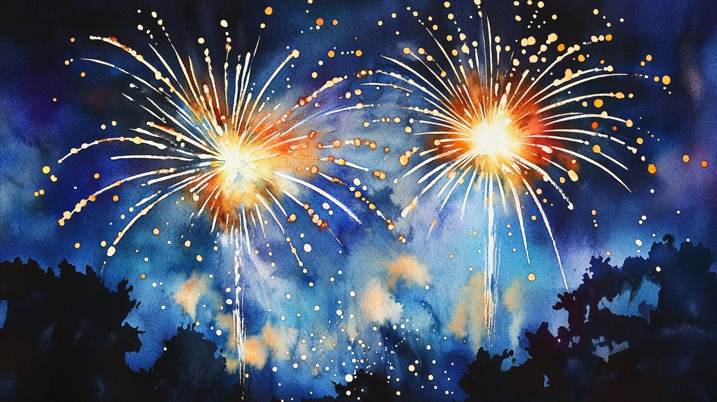
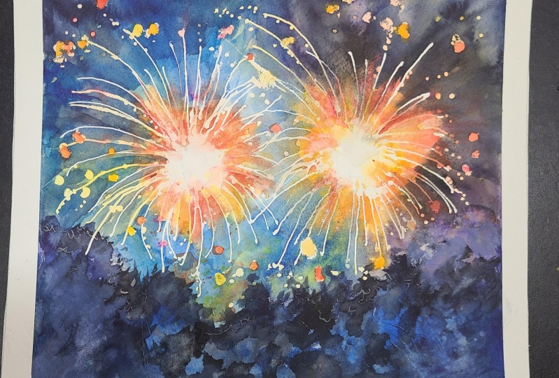
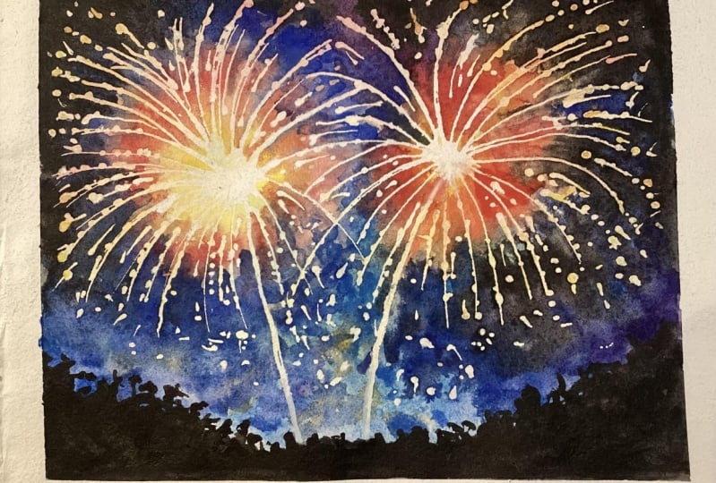
onto our canvas. In the resource section, I've added a high
resolution image of my finished painting
to help guide you. You're welcome to
follow my painting exactly or experiment with
your own composition. As we're going to be focusing on the painting aspect
of watercolor, I've provided templates
you can use to help transfer or trace the
sketch before you paint. It's fine to trace when using it as a guide for
learning how to paint. It's important to
have the underdrawing correct so that you can relax and have fun learning the
watercolor medium itself. Whichever direction
you take this class, it would be great
to see your results and the paintings you
create through it. I love giving my
students feedback, so please take a photo
afterwards and share it in the student project gallery under the Project
and resource tab. I'm always intrigued to
see how many students have different approaches and how they progress with each class. I'd love to hear
about your process and what you learned
along the way, or if you had any difficulties. I strongly recommend
that you take a look at each other's work in the
student project gallery. It's so inspiring to see
each other's work and extremely comforting to get the support of your
fellow students. So don't forget to like and
comment on each other's work.
3. Materials & Supplies: Before we get started with
the sketch and painting, let's go over all the materials and supplies you'll
need to paint along. Having the right materials can greatly impact the
outcome of your artwork. So I'll go over all the supplies I use for
this class and beyond. They're very useful to have at your disposal and will make it easier for you
to follow along. Let's start with the
paints themselves. And like most of the materials
we'll be using today, it's a lot to do
with preference. I have 12 stable colours in my palette that I
fill up from tubes. They are cadmium
yellow, yellow ochre, burnt sienna, cadmium
red, Alizarin crimson, Opramarne blue, cobalt blue,
serlean blue, lavender, purple, viridian, black, and
at the end of the painting, I often use white gouache
for tiny highlights. I don't use any
particular brand, these colors you can
get from any brand, although I personally
use Daniel Smith, Windsor and Newton,
or Holbein paints. So let's move on to brushes. The brush I use the most is
a synthetic round brush like this Escoda Purl brush
or this Van Gogh brush. They're very versatile because
not only can you use them for detailed work
with their fine tip, but as they can hold
a lot of water, they are good for
washers as well. They're also quite affordable, so I have quite a few
in different sizes. Next are the mop brushes. Mop brushes are good for
broad brush strokes, filling in large areas and creating smooth
transitions or washes. They also have a nice tip that can be used for smaller details. But for really small details, highlights or anything
that needs more precision, I use a synthetic
size zero brush. All brands have them,
and they're super cheap. Another useful brush to have is a Chinese calligraphy brush. They tend to have long bristles
and a very pointy tip. They're perfect
for adding texture or creating dynamic
lines in your paintings. You can even fan them
out like this to achieve fur or feather
textures as well. And that's it for
brushes. Onto paper. The better quality
of your paper, the easier it will be to paint. Cheap paper qwinkles easily
and is very unforgiving, not allowing you to
rework mistakes. It's harder to create
appealing effects and apply useful techniques
like rubbing away pigment. Good quality paper, however, such as cotton based paper, not only allows you to rework
mistakes multiple times, but because the pigment
reacts much better on it, the chances of
mistakes are a lot lower and you'll be more likely to create
better paintings. I use arches paper because that's what's available
in my local art shop. A water spray is
absolutely essential. By using this, it
gives you more time to paint the areas you
want before it dries. It also allows you to
reactivate the paint if you want to add a smooth
line or remove some paint. I also have an old rag or t shirt which I use
to clean my brush. Cleaning off the paint
before dipping it in the water will make the
water last a lot longer. It's always useful to
have a tissue at hand whilst painting to
lift off excess paint. Also, you never know when an unwanted splash or drip might occur that needs
wiping away quickly. I also have a water dropper
to keep the paints wet. When you paint, it's
important to have them a similar consistency to what
they're like in the tubes. This way, it's easier to
pick up sufficient pigment. A hair dryer is useful
to have for speeding up the drying time and controlling the
dampness of the paper. And lastly, masking tape. And this, of course, is just to hold the paper down still onto the surface to stop it sliding
around whilst painting. Also, if you plan on
painting to the edge, we'll allow you to create a
very crisp, clean border. When it comes to using
the masking fluid, you can explore and experiment with what works best for you. You can apply it onto the paper and use the end of
the brush to spread it out, but we'll get onto
that in the class. Let's get on with the drawing.
4. How to Sketch It Out: So this drawing is very
open for interpretation. It's quite abstract and
it's nice, fluid exercise. So I'm just going to show
you my way of doing it. But you don't
necessarily have to follow exactly the same way. In fact, the more you try and follow me exact the
more the spirit of the watercolor will actually get lost because you're
trying to force it rather than allowing it to be natural and bring out
its magical qualities. I'm going to start by being two circles where I want
my fireworks to be. You can choose where
you want yours to be. Wanting them slightly
overlapping. I'm using a very light
pressure on that because I don't want this lead to show up on the end
of the painting. I'm just purely doing it as a
visual idea of where I want my things to be my elements,
my fireworks as well. Another circle in
the middle where the core of the
firework will be. Now I'm going to start to
put a bit of a tree line. And like I said, it can be
very open for interpretation. Start off by mapping out where
you want the trees to be, and then you can go back and make that line
even more organic. Ironically, the more you try and make them look like trees, the less they'll end
up looking like them. They'll look too forced. And as trees are
organic and natural, they can't be thought out. They have to be quite random. So I'm not really thinking at
all while doing this other than trying to force a sense of randomness into these marks. A few gaps in some of the
trees here at the top, maybe a few here too. Then going to the center
of these circles, I'm going to bring them down to the tree line. And I can start. A bit like dandelions, I can
start adding a few lines. Again, keeping very
light with the lead. I start off quite straight, and then at the end, I
had a bit of a curve. Were connecting to
the other side. It's not like a clock face. We're not having straight
lines all the way out. We're adding a bit of a curve. And, of course,
we're going to use masking fluid or white gouache
to paint over these lines. Now, you don't need to
draw every single one. It's just to get an idea of
how you want it to look. 'cause we're we're painting in a rather different way today, rather than painting
dark on light, we're painting dark around and
creating the light source. So it's as simple as that. Now, before you
start the painting, if you are drawing
this to yourself, you can just use a rubber. I use a putty rubber
because there's no residue. And you can score around
carefully rubbing out the circles we
originally painted. Trying not to rub too
much of those lines So we've rubbed
away those circles. But we can still see the general direction of where the fireworks are coming out, and
that's what we want. So let's stick it to the painting board and get
ready to start painting.
5. Light Underlayer: So once you're happy with your drawing and we have it
all taped down on our board, the first thing that
we're going to do is pre wet the center of
the fireworks here. So I'm just using a medium brush and using pure water just
to soak the paper a bit, get the water absorbed into there so that when
we add the colors, we'll really blend out all
the smooth transitions. So I'm starting
with the left one, and you can choose
whatever color you want. I'm starting with
opera pink right here, and this is where you can really have fun exploring
different colors. This is an underlayer.
So you can see how light or dark
I'm applying this color. It's fairly light at the moment, because this is just underlayer, and we'll be adding
masking fluid on top of this so I don't want
it to be too dark, and now I'm adding cadmium red. You can see it's very diluted. So when I tap my brush, this pigment just falls off into that wet paper. Now
a bit of yellow. You see how I didn't mix
the yellow with the pink. I'm thinking of the
color wheel a bit here. Pink is a cooler red and yellow is on the
warm side of red. So it's transitioning a
bit of color temperature. And I'm making sure the center of the fireworks very light. I'm not adding much
color there at all, because that's, of course, the brightest part
of the firework. You'll also notice
how I've rubbed out almost all the lines. There's still an indication of where I want the lines to be, but I've made sure that it's
very light because, again, I don't want those
lines to appear at the end On the top left corner, you can see I've
extended the wash and filtered it out or rather
made it very light. It's light warmth a
hint of warmth in the top left hand
corner as I work along. Now, from above,
directly looking above, it's difficult to see
how wet the paper is. So when I actually
come to paint it, I tilt my head every
now and again just to see how much shimmer and reflection wetness on
my paper there is. And that helps me. It gives me an idea of how wet
it is so I know how the pigment will blend or stay still when
it's on the paper. There's a lot of freedom
in this process, not only with the
colored choices, but also the blending. It doesn't really matter
if there's hard edges. I'm trying to
achieve a soft edge because it is wet on
wet we're painting, and I still want to have
control over the pigment. I don't want it to be muddy. So I'm still aware of
complimentary colors. I'm not going to add blue on top of this orange at this stage. But what I mean by freedom is that we're going to come over this painting with almost
pure black later on. So we don't need clean, super refined
textures underneath. We just need exciting colors.
6. Right Side Underlayer: So now moving on to
the right hand side, I'm going to use a
bit of yellow ochre, starting with the yellow this
side and using pure water, just like the other side to make sure there's no hard lines so that it all
blends out smoothly. And you can use the same colors as the other side or
you can experiment. You can think of your favorite color fireworks and try and experiment
with those colors. Maybe they're orange, red, pink, green, maybe purple. I'm going to hold off from using blue because I'm going to
use blue at the night sky, and the blue won't contrast so well when it comes to
using the masking fluid. And also blue is the complimentary color to orange and all the warm colors. So if I add blue now, it'll just go gray and
muddy and it won't look warm and vibrant watercolor
like fireworks do. Seeing some pure red here, and you see how, of course, that red on top of the
yellow makes orange. Again, trying to avoid
painting the center. I'm being quite heavy with
this yellow pigment now. Much darker and deeper
than the other side, the left hand side, really
dropping it in there. So you can experiment with the thickness of your
pigment here, too. It's a real good exercise
in exploring medium. We're not trying
to paint a super refined, detailed image here. It's a fun image, certainly. It's a striking image because
we're using expression. And it's important aspect of painting,
creating expression. And when we learn how to create expression in
techniques like this, then we can then use this expression to convey what we want to convey in
more complex paintings. It's almost like we have to have a strong foundation and understanding before
we can build on top of that and create
complex structures. And now I'm trying to connect the left hand side
and the right hand side. I think I do want to add
some pink on this side. So I'm just going to
take some of that. I keep my pink in
the same pan as my Alizarin crimson because Alizarin crimson is
a cool red as well. And I don't have much of it. It's quite a potent color. You only need a tiny bit for it to show up
quite strongly. So I have a little bit of it squirted in my
bottom palette there. I don't use it enough for
it to take over a full pan. So I try to limit the
amount of colors I have. Although I get
excited when I go to an art shop and see all
those different paint tubes, I realize that it's almost
sort of distraction because like you may have seen in my limited color palette classes like the candle on
the color theory, you can convey a motion with very limited
amount of colors, three colors you can
achieve a whole spectrum. And that's the core
of understanding. So if you can't do a nice captivating painting
with just three colors, then looking at a shop and
buying hundreds of colors, it's going to make it even
more complicated, really, because the core understanding
of color theory can help you achieve exciting
paintings wherever you use three colors
or hundreds of colors.
7. Finishing The Underlayer: So now I'm working from the bottom
connecting it to the top, this yellow kind
of glow because, of course, fireworks
have this white center, this core, and it bursts
out in a full circle. So for the sparkles
that go directly down, I have to add a bit of a
background glow to that. But I'm not going to make
it as vibrant as the pink, and the yellow is at the top. Another reason I'm
not going to go so deep or intense with the color at the bottom is because when it comes to
painting the background sky, at the top of the
painting, I'm going to have it quite dark, almost black and not much color. So there'll be a nice contrast between light and dark up there. But as the sky transitions
to the bottom, I'm going to have to make
the sky a bit lighter like a midnight blue
because we've got a tree section at the bottom. And if it's pure black, then of course, we
won't see the trees. There won't be enough
contrast there, so we have to lighten
up the sky at the bottom to create
that contrast between the black trees and
the midnight sky. So I'm experimenting
with a bit of green. I pre wet the paper
again and it's adding a bit of
turquoise green in there or viridian green. If you don't have turquoise, you can mix your own using viridian green and
Cyrillan blue. Blending it out in
the middle there. I'm quite happy using green at the bottom here
because like I said, we're going to use blue
for the background, and green is on the same side
as the color wheel as blue, so there won't be a dramatic clashing contrast when it comes to painting
that background later. So I'm just going to finish blending it all out so there's no hard edges and then use a hair dryer to make sure
it's completely dry.
8. Applying The Masking Fluid: So we're going to start putting
on the masking fluid now. I'm going to use this
little container here. It's useful because it has this little squirty
dropper at the top. But the most important
thing to remember is to use old
brushes like these. Don't want to use good ones like that with a nice little tip because the good brushes will be not exactly ruined,
but they will be damaged. These old ones that you
don't really care about are the better choice because
once masking fluid dries, you can't wet it again and it
just sticks into the brush. I'm going to use brushes that basically already lost
their tip and I don't care about so depending how you
have your masking fluid, you might have to
use a chopstick or a toothpick or directly
the brush to help you. I'm going to use my
container because I can just squeeze it out like
this from the center, roughly using my pencil
lines as a guide. You have to be quite
confident and fast. The ends of the
strokes will have more pigment than the middles. You can see it's quite
thin in the middle. And if you make a mistake, the best thing to do is wait until it's completely
dry or use a hair dryer. If you try and rub it out
while it's wet like this, it will get very sticky and get ingrained to the
paper and basically make it impossible to work off. I'm just going to use the masking fluid that's already on the
paper with my brush here and just fill
in the center with a pure paint and then
do a strong vertical, almost dry brush mark, but with masking fluid. To ground it basically. Bringing all the little
sparkles into the center. This is a whole exercise
in and of itself because you're having
to use your brush work, your hand and arm
to create curves, confident curls in all
different directions. Now, I'm keeping my paper at this angle so that it's easier to record and
for you to see it all. But you can move it around
like this. I think I have to. I have to continue on this because it's
just too difficult, especially as I'm using my right hand to get
those left curls. It's just too tricky, so
I have to move the paper around I'm trying to look at the pencil lines, but also the pigment
that I've already put down because remember, this masking fluid is going
to do what it says it does. It's going to protect
what'sever beneath it. So where we've got pink
and red and yellow, we want to make sure we've got some nice vibrant areas saved
and preserved underneath. You can take your time
with this because it's easier to take
your time and think about where you're going to
put these lines than to make mistakes and having to dry it
and redo it and rub it out. So have a little bit of patience with where
you're going to put these
9. Masking Fluid Splats: Now I'm going to create some
splats using this tube, so I'm just going to lightly
squeeze it, angle it down, and then tap on it, and it
should fall down to create some random splatters that
preserve the background. Now, I bought this tube separate
from the masking fluid. The masking fluid, I think,
is Windsor and Newton, and I put it into this tube. You can use any masking fluid, whether it's Daniel Smith
or any other brand. And this tube, I
think I just got from a general convenience
store, and I just reuse it. But if you don't have that,
you can use the brush or a cocktail, stick, Tuff pick. And you can also when it comes to painting the
fireworks themselves, you can put a nice big
blob in the center and use a brush or stick to just drag it out to the outside
from the inside out. Some things in watercolor
take a long time, and they're barely noticeable. And then there's some things that are very quick
but have a big effect. So like this, I'm taking my
time every now and again, just taking a step back
to look to make sure I'm not overdoing it because it's easy to be
over enthusiastic. It's very fun to add splats, but it's hard to
go back on them. At least with this masking
fluid, it's not permanent. We can dry it and rub
it off if we need to. But I'm trying to get a good
even distribution of splats in the center between the two
fireworks around the edge. And now I'm using the edge
of my brush just to tap some of these splats to create
a few smaller ones nearby. Not only does this help increase the range or
size of these splats, but also these flats are quite thick and take ages to dry. So by using these
flats to create a few more strands or smaller splats helps
it dry it faster. You can see how I've closed my palette because I
don't want anything. I don't want any masking fluid
getting inside my paints. Next to my palette, you can see a little metallic pin or
it looks a bit like a pin, but it's cocktail stick size. I actually got that stick well before I painted
with watercolor. It was when I was exploring
all types of art, and it came along
with a sculpture kit. So it's a sculpting tool, actually, that metallic pin, but I find it very useful for watercolor painting
funnily enough because I can use it to scrape away at pigment during the process and also
with masking fluid. But the brush is treating
me well at the moment. This thin brush
already has a point, so I'm not too concerned. It's always a good idea to
have some water on hand, because as this
masking fluid dries, the brush gets
stiffer and stiffer, so dipping it in the water stops it from being
completely ruined. Again, take a look back, see if there's any areas
that you've overlooked. Maybe there's a cluster of splats that are uneven
or too distracting. You've got to imagine
this inverted. At the moment, the masking fluid is darker than the paper, but actually it's
these lines that will appear white and light later when we paint
black over them.
10. Continuing The Masking Fluid: I'm still not completely
happy with how some of these strands or
these little streams of flowers coming
from the center look, so I'm just going to use that
small brush again to add a few more controlled lines in the middle where
there's a few gaps, making a bit more even. And now I think we
can start drying it. So I'm going to get
the hair dryer. And this masking fluid, depending on how thick
it is on your paper, can take a very
long time to dry, even if it's dry to the touch. So the good thing about
most masking fluids, at least this one, is
that when it dries, it's completely see through. So if it's still opaque, it means it's not dry enough. So you can see now after it's
dry how transparent it is. It's still dark. But it's not light and
creamy like before. I'm just now rubbing
out or peeling away some mistakes,
some uneven strands. Of course, when we
look at fireworks, they all evenly dispersed
from the middle, and some of these are just a bit too either close together
or they're overlapping. I don't really want those
splats in the center, either. It might feel a
bit tedious after a while working on a painting without even
using paint at the moment. But we're thinking
in the future, like most of watercolor, we have to think of
the whole process backwards, basically. Begin with the end in mind. One of the many things I
love about watercolor is how there's so many
beautiful similarities between the medium
and life itself. For example, this
concept of beginning of the end in mind is not only
a useful concept to live by, because when we have a clear vision of where we want to go, our actions and decisions
flow with more purpose. But in watercolor,
it's also critical because it shapes how we
approach the whole painting. As we know, watercolor is
fluid and unpredictable, much like life itself as well. And it requires a
delicate balance between intention and surrender. So if we don't consider the
final outcome of a painting, it's easy to get lost in the middle and making choices that feel good in the moment, but don't actually lead
to a cohesive result. We're using this time
and the painting to visualize the
finished painting, and by visualizing it, we can obviously plan better our washes, preserve
key highlights, and also choose
harmonious colors that will ultimately create the mood and the
story we want to tell because in every good
painting, there's a story. There's a message in there. A simple as this painting is or at least the
concept of it. This scene of
fireworks, for example, the vision is all about energy and light against the darkness. So knowing this from the
start helps us prioritize what matters by preserving the paper for those
bursts of light, laying down bold darks
for the contrast, and letting the paint
run free to mimic the chaos of the sparkles
flying through the air. So each brush
becomes intentional, and even if the result feels
loose and spontaneous, there's direction in so it's a good opportunity
to allow ourselves to dream about how we want
the final piece to feel. It's movement, it's glow. It's emotion. But of course, we have to
stay flexible enough to adapt as watercolor leads us into new unexpected
directions.
11. Cleaning Up The Masking Fluid: So we added the
splatters straight from the container to achieve
a kind of organic, random feeling because we can never really achieve random
ourselves like nature does, because our minds instinctively look for patterns and order, even when we try
to be spontaneous. But with watercolor
and splatters, the medium itself introduces
an organic unpredictability. That's what we want
in every painting. But I'm now using the back of a brush to add a bit more control
to that chaos. So I'm now thinking about areas that I do
want some splats, and I'm adding these splats
at the end of the strand. So I'm following the
direction and where these little sparkles are coming from the center
of the firework, I'm adding these dots in the
direction of those lines. Imagining the lines
going forward. I'm even going over some
of the lines as well in this circular dot like form. I always get so
excited when using masking fluid because
there's something so satisfying about
preserving the whites in such a clean way and then waiting for the
results at the end. You know, we're creating
a secret foundation here, something that's hidden
throughout the painting, but it will actually
become one of the most striking parts of
the painting at the end, like planting seeds for a
little surprise reveal. When we paint with
masking fluid, we're painting negative space. Usually, when painting
negative space, we have to do a lot
of precision with the brush painting
the subject inverted. But this masking fluid
almost re inverts it back to normal again so
we can actually paint what we want
negatively painted. That makes sense.
Also notice how I haven't added any of
these splats onto the trees because I'm implying that these fireworks are happening behind the trees. And they also look a
bit similar to stars. So of course, it wouldn't make sense to have the stars
in front of the trees. And now I'm going to
get the hair dryer, like we did before and fully completely dry it off to the touch until it's
all transparent. And then we can start
painting on top.
12. Starting The Left Firework: So just like we did with the
underlayer at the beginning, I'm just going to pre wet the middle of the
fireworks with pure water. This is so we have nice soft
transitions, no hard lines. Do it on both sides and give it enough time so that the water really
soaks into the paper. Because I'm adding
a lot of water, but I don't want the paper
to be glistening wet. I just want it to
absorb the water. In fact, I might get a tissue
and just dab out some of the excess water
now that I've given it a few seconds to
fully absorb in there. Starting off very light, just dabbing in
some pure yellow. Not touching the center. Remember, I want to keep the
center white and bright. So yellow will always be the first color
that I transition. Then we can add a
bit of yellow ochre. We're going to add a bit
of burnt sienna here. And you can see the kind of consistency
of my pigments here. If your pigment is very
hard in your palette, you might have to scrub
it with a brush a bit to make sure you've picked
up enough pigment. I like burnt sienna because
it's a bit like orange, but it's not overly vibrant. It has warmth to it. Now I can start building
outwards and creating that nice transition from the white center to
the colorful edges. And you've got to be aware
that this masking fluid, as it's protecting
the white paper, it cuts off the
different sections, so you got to make sure
that you're brushing in between each line
of masking fluid. Introducing some red
there, some cadmium red. This red mixed with the
yellow makes a lovely orange, and I am keeping it
nice and spontaneous. You see some areas
are a bit yellower, some areas are a bit redder. And now I'm adding pure water to these edges just to again, make sure there's no hard edges. The main focus is to make sure we keep pure white
in the center.
13. Merging The Sky: And now we can start
adding the blue. Now we've extended the water. We can add this blue. And the key here is
not to overdo it. Once you've laid
it in, just allow the water to mix the
two pigments together. If you scrub it with a
brush too many times, it'll just gray
itself out because blue and orange are
complimentary colors, and they make gray together. If well mixed, it
will look gray. But if you just in
one go in one stroke, cover it, and then extend it, then the pigment won't be mixed together as severely
and it won't look as gray. They'll land on top of each other rather than
mixed together. And even with the
masking fluid there, you can see how that shape of the firework
is coming through. And I'm using cobot blue, but I've also, I can see
used cerrillan blue. You can experiment with
your own blues here. There's loads of beautiful
blues you can mix. That's what I'm doing
here. I'm using a bit of serian some turquois as well. So strokes get a bit closer
to the core, some bits not. Now I can introduce
a bit of black. Because this black, even though it's quite
weak at the moment, and it might make a
grayish kind of color, that gray will really contrast with the vibrancy and
boost the vibrancy. So it's just a special placement of gray every now and then. Really helps vibrancy. It's a nice thing to remember. Now I'm adding
quite strong black, but it's starting to dry. So I've got this little
squirty water thing, and I'm just misting it all over because we're going to
paint a large area here, and again, I'm trying
to avoid hard edges. So just giving a subtle misting of water spray helps
everything combine. Now, I'm introducing some purple into this mix up at the top. Blending that in. So fireworks, obviously, being a fire has a lot of
warm colors in there. And now we're using cool colors in the sky to contrast that. And because we did
that underlayer of pink, yellow, and brown, when we paint cool colors
on top of that wash, then there's a nice contrast, even if it's very subtle. The blue, dark pigment goes
over that top and you can see If you look very carefully, you can see the
warmth beneath it, but it's not obvious, and it's that subtlety, which creates a nice feeling. So now we're starting
on the right side, adding that nice orange swirl and connecting it to the sky. We need to make sure that
middle is nice and soft. But I don't want there to be
pure orange in the middle, so I'm just getting
a bit of yellow on my brush and incorporating that a few splats of yellow to make it a
bit more interesting, so it's not so flat and then using a clean
brush in the middle, like the other side
to soften the edges.
14. The Right Firework: On this side, I've decided
to be a bit bolder, so I'm going to
fill up my brush. As you can see, I'm
using a larger brush because it can pick
up lots more pigment. And I'm going to reactivate those sides and then get lots of cobalt blue and
serlean blue on my brush and just swirl it in there
and touch that wetness so that once it's touched because the wetness connects everywhere, it'll
blend together. Has this space like night sky. Some areas, the background creeping in and some areas not. And as I talked
about previously, when doing the underlayer, we want the sky to be lighter at the bottom
than it is at the top. So you can see we've got
some dark colors at the top, and at the bottom, it's
noticeably lighter. But we still don't
want it too light. We've got some masking
fluid at the bottom there, so we do need some contrast when we remove that
masking fluid. Corporating some
purple in there. Of course, the more water
we add to the paper, the more the pigment
will move around. If there isn't a lot of water, then the pigment will
stay where it is. It's not about the
amount of pigment, it's about the amount of water. Going to start incorporating
some turquoise green, some viridian green
into this background. Even though that's not a color you usually associate
with the night sky, is just such a beautiful color that I want to add
some in there. We're being expressive here, and that's what I
want to express. Now, as it's starting to dry, it's getting a lot lighter.
I want it to be bolder. I want there to be a
nice rich contrast here, so I'm adding pure black
in this top right corner. Like I was saying before, with the use of water and
the movement of the pigment, when it's very wet, we have
less control of the pigment, but we can, of course, choose how much water
we want on the paper. And that's how we manipulate it by our choice of how much
water we have on the paper, how dry it is, how wet it is. If we want more control, then we obviously have
to wait for it to dry a bit or we don't add as much
water in the first place. At the moment, it's very wet, so I can be quite
bold here and I can anticipate
with some accuracy that it's going to blend out. I don't know where
exactly it will blend out because it's not in my hands, but we can manipulate it, and that's where the
magic comes from. Adding a few dots of
vibrant red there.
15. The Sky: When working on a wash
like this where there's such a large area of wet paint, it's inevitable that some areas are going to dry
faster than others, and there's going
to be unevenness, and that's going to create
different textures. Now, the good thing
about this exercise is that it doesn't
really matter. We can have as many
textures as we want, and it adds to the
excitement of the painting. But it's in doing these
exercises that we can experiment how to deal with this
unevenness when it comes to paintings that we
want more control with. You can see at the top here, I'm trying to blend
out this blue because it's much drier at the
top than at the bottom. So I'm trying to absorb
some water and add water in other areas to
assist the blending of it because it's not
wet enough to blend. The pigments not moving. Y. As we all know, orange is the
complimentary color of blue and the
background is blue. I'm creating this
orange mix here, very diluted and wet and I'm just letting it fall
off my brush into there and it's going to blend out and it's going to
create a bit of interest. Is again, one of those details that you wouldn't
notice on first look, but it influences the
feeling of the painting. So I'm going to allow
it to blend out for a few seconds
without agitating it or overworking it just to
see how it looks by itself. And I'm starting to think
maybe it's a bit too strong, so I'm going to pick up some
pure water from my brush and just drop it on there to
help dilute it a bit. And because the background
is already 80% dry, adding this pure
strong drops of water on there it's going
to create hard edges. It's going to create some
interesting textures. I'm in fact, go to suck out
some of that water with my brush and drop it
onto my sponge there. I found having a sponge
is quite useful to clean your brush without having to contaminate the water bucket. I also have a towel
off screen as well. So we've got an influence of lots of different
colors here. We've got red, purple, green, yellow, blue, of course. They're all mixing and merging together in
various degrees, and each color brings
its own energy. And it's the contrast
and interaction between them that creates
the real excitement. Just like fireworks
themselves, really, each burst is
beautiful on its own, but when they explode
together in the sky, they really create
something truly magical, and that's what I'm trying
to aim for in this painting. I'm excited to see
what colours you use to create your
own firework display. Seeing the vibrancy,
the movement, and just the thrill of
color working in harmony.
16. Tree Underlayer: So of course, we can add
more water when we want to. It starts to dry or
use the water spray. But generally, as the
paper starts to dry, we get closer and closer
to the finished piece, or at least that
layer of painting can always go over and do a
second layer on top of that. Like we still need to paint
the trees after this dries. But generally, as the paper
starts to dry on a wash, the magic of watercolor
begins to shift. At the beginning,
when it's very wet, it's very expressive
and out of control, and we can only influence it. But as we start to gather
more and more control and the paint no longer flows as freely and the edges
become more defined, this is the perfect time
to create soft transitions and more subtle textures
because we have more control, and we can edit the
composition a bit more. We can add darker areas or take away dark areas and make them lighter like I'm
doing now on the right. If you keep adding
water at this stage, you risk blooms or hard edges where you
might not want them. And the drier the paper gets,
the bigger the risk is. So if that's the effect that
you're trying to avoid, that's what you've got
to be careful with. But also sometimes you may
want to create that effect. But if you embrace the timing, you can capture a
beautiful balance between controlled marks and soft well, natural softness,
natural transitions without having to painstakingly
brush each gradient, you can use the natural
transition of water. Like now, you can see these
edges are holding their form, but they've got a nice
soft edge to them. The shapes are there, but
they don't have a hard edge, and this is the perfect time to add these kind of details, especially with these trees here where we can make
it quite dynamic. We can have nice soft
edges in the distance, and then we can come back later with hard
edges on top of that. The moisture on the paper still allows for a bit of diffusion, but it's controlled enough
to maintain structure. And as we know, in watercolor,
timing is everything. So we're at different stages of the drying process
offer different things, and we can try and find a balance between
flow and precision. When it comes to
painting these trees, think of them as silhouettes rather than detailed objects. The focus here isn't on the individual
branches or leaves, but on capturing
the overall shape and almost the character
of the tree line. You can use bold, confident brushstrokes
to suggest the mass of the foliage and allow the edges to remain
loose and organic. And this creates a sense of
natural texture and movement. I found that I was overthinking the details there and it
was looking too contrived. So I've just gone over
with a brush just to basically wash it off, make the details a bit
broader rather than so fine. Now I've completely dried
it with a hair dryer. So it's all dry to the
touch and I can go over it again with a darker pigment.
17. More Trees: Since these trees are
in the foreground, they actually help
frame the scene. They ground the composition, and they provide contrast against the vibrant
sky and the fireworks. So I'm trying to
repaint this again and I'm trying not
to overthink it. I'm constantly
reminding myself it's suggestion and not precision,
that's the key here. If you start thinking
about precision, then the magic gets lost. You still have to
add a variety of thin lines and broad strokes to keep the trees
dynamic and interesting. The thin lines can suggest
finer branches or twigs, while the broader brushes help build up the mass and the
weight of the foliage. And this combination creates
contrast and variation, making the shapes feel more
natural and full of life. So remember, it's the balance between these different marks that brings texture and depth. Try to let your brush move
freely whichever you're painting and embrace
any irregularities, because they add to the
organic feeling of the scene. And you can see how on the left, we have nice, bold, hard edges. And as we get closer
to the middle, the edges soften and the colors blend more
gently into the background, creating a sense of depth and atmospheric
perspective into the scene. I'm trying to not
overthink my brush work. I'm trying to almost distract myself by focusing on the
rhythm of the painting, letting go of each stroke and be more intuitive and fluid. This approach helps to keep the work lively and spontaneous. It captures the essence
of the subject without getting bogged down
by perfectionism. By allowing myself
to be more guided by feeling than
meticulous planning, I find that the results are often more expressive
and impactful. It's about trusting the process, embracing the unpredictability
of watercolor, and allowing the medium to sometimes almost
lead the dance. It's not only about
enhancing the artistic flow, but it also elevates the pressure of having to
create something perfect. It fosters a more authentic, enjoyable painting experience
at the end of the day. Now you can see I've painted a blue layer underneath
of lighter color, and now I'm going over with
darker pigment over as well. And this layering adds to the depth and three
dimensionality of it as well.
18. Refining The Trees: These trees, of course, aren't the focal point. They're not the thing
that's meant to draw the viewers
attention straightaway. Instead, they serve as a
backdrop and subtly framing the main subject and adding depth and context
to the composition. By keeping them a
bit more subdued, we allow the focal points of the fireworks to stand out even more and guide the viewer's eye naturally through the painting. So that's another reason why we don't want
to overwork them. But of course, it's natural to feel the tendency to add
more and more detail. You have to make sure
that your pigment is strong enough when using dark pigments specifically
because when they're wet, they look much darker
than when they're dry. This is, of course,
very deceiving, especially for beginners, as the paint lightens up
significantly once it's set. So to compensate, you
may need to apply a slightly darker or more saturated mix
than you think you need to ensure that the
final tones are just as dark and have depth
once it's fully dry. Actually, it's a similar
thing with white gouache, white watercolor, but it's
the other way around. When it's wet, it looks
much lighter than it is, and then when it dries, it looks much darker than
it was and less opaque. So I'm going back and forth with these trees because
in some areas, I'm overworking it and I have to keep it
looking more organic. It is deceivingly difficult and quite a delicate job to
try and convey nature. I want to create some
gaps in these trees, so I'm just using
my lavender here, which is a very opaic color. To mark out some
gaps in the trees. And it's pretty much the same
colour as the background. So it tricks the
viewer into thinking. I've left these areas out where, in fact, I am, of course,
painting them in, mixing some viridian and some white to make it a bit lighter. Then I'll even go above the trees here and blend
it out with my finger. So there's lots
of going back and forth to try and
find that balance, that sweet spot where the trees appear
natural and unforced. And this process of adjustment is very typical
in watercolor painting, where you might add layers
and then lift some off or soften edges to
reduce overworked areas. Keeping the trees organic obviously helps them blend
seamlessly into the scene. And that's what
we're aiming for. We don't want to
create obvious marks. And by that I mean is
you don't want to have areas that are an
obvious struggle. Everything should
look comfortable, even if it wasn't actually
comfortable to paint. And this illusion of effortlessness is key to creating a peace that
flows naturally.
19. Removing The Masking Fluid: I'm using palette knife just to scrape some lines back into that gouache we
just painted that looked like branch is connecting the foliage
to the rest of the tree. Now we've reached an
important part in this painting where we're about to take off
the masking fluid. But before we do that,
we have to make sure that we don't need it anymore because once
we take it off, it's completely done and
there's no going back, so I'm just going to completely dry the
painting because, of course, we're going to be rubbing away with quite a lot of pressure, and you really have to make sure the paint
is completely dry. If you remove it too early, you can smudge the painting
or even tear the paper. And it ruins all
those crisp edges we worked so hard to preserve. So once we're certain the
paint has dried thoroughly, we can gently peel off the
masking fluid and reveal these untouched
areas beneath that will add just another layer
of depth and contrast. And it's so satisfying
just peeling in a way. Luckily, most of it
sticks together. So once you get ahold
of a single piece and start to pull it
gently, it all connects. Everything that's
connected to it will come off with with it. But there's quite a
lot of splatters, as well, and some bits are
more stubborn than others. But as long as your
hands are dry and the papers dry and
there's no water around, it would still maintain
those nice hard edges. And it's so lovely to see this white center that we
preserved in the middle of the fireworks and how those nice streaks are
coming straight out of them. There will of course be loads of residue and
bits on the paper, which is perfectly normal.
It's bound to happen. So you can pick up
your board and maybe move the painting away close to a bin so that you don't get out on the
surface or the floor. You can also use a dry
brush as well to clean it or even a rubber to
pick up the little bits. If some areas are more
stubborn than others, you can use the side of a knife. If you're very careful, maybe some tweezers can help
provide a bit more control. And that can help prevent
the tearing of paper. If you're using the
side of a knife, it might be a bit
sharp and fluff up the paper a bit and actually get rid of some of the pigment. It's so nice to see all
those vibrant colors being revealed underneath. And this moment of removing
the fluid is always magical. That bold contrast between
the preserved white and the rich saturated colors around that dark blue and black
really makes the image pop. It's like I said, it's the opposite of the way we usually think
about painting by having the main focal point
dark on a light background. This is a dark background with a light foreground, really.
20. Softening Edges: So now we've just about got
rid of all the masking fluid. There's still a few
finishing touches we can do to bring this
painting to completion. There's some hard lines
that we can soften up, especially around the center. But I'm still taking my time to feel around for
any masking fluid because some of it just it's
hard. You can't see it. So you got to feel
your way through it, and you have to keep on
rubbing away to feel it because that's the only way you feel the different
texture of it. So I'm going to pick up my old brush and
using clean water, I'm just going to
agitate the edges in the center to create a nice smooth transition because the masking fluid
obviously has a hard edge, and we couldn't control that
when adding the pigment. So we're just going to have
to blend it out ourselves. Watercolor is such an
interesting medium in which you can either directly blend the pigments yourself
like we're doing here, or like we were doing before, allow the watercolor
to do it itself. When you blend the
colors manually, you have the exact control and the nuances of transitions, and it's more like acrylic or oil painting because we're doing everything
by ourselves. And we can create
specific effects and details within the painting. But on the other hand,
the magic of watercolor, I think, comes from allowing the watercolor to blend
naturally on the paper. Of course, the whole painting can't really be done that way. But it's those elements that
bring in the beautiful, unexpected interactions
between hues, the soft organic edges, the gradients that are
unique to this medium. And this blending
is part of what makes watercolor so
captivating and enjoyable. It adds a layer of
surprise and spontaneity. So while we're carrying on
with these finishing touches, we're going to add some white guash into some of these areas, extending that line that comes from the trees and
connects to the fireworks. To give it a sense
of a grounding sense to ground and connect
the elements together. Then what else we're going to do is some of these splatters
are a bit too white, so I'm just going to go
back into some of them with yellow or orange
and maybe some red. Whatever colour you like, it's whatever fits your color scheme. If you've used purple, you can use purple. Mainly warm colors
will look good here. Technically, this
painting can be done without masking fluid. You could use guash. But I think it's exciting experiment exercise
to practice masking fluid. It's a very unique thing. You don't really use masking
fluid in any other medium.
21. Finishing Touches: So the majority of these
dots I'm using yellow because that's a nice
classic light color. Most light to yellow. And most fireworks, I guess, are not necessarily yellow, but they have we associate
light with yellow. When we think of the
sun, we use yellow. So most of them I keep yellow. But then I might start
integrating some red in there. And the most vibrant red I have in my palette is Caban red. And you can see that red quite strongly coming through
on the right firework. So I'm getting a tiny
bit on my brush, maybe even a bit of opera
pink in there as well. Now, you have to be careful with opera pink because it's
not very light fast. And what that means is if
you have your painting framed and it sees daylight
or even artificial light, over a matter of time,
maybe a few years, that vibrancy will
disappear from the pigment because it doesn't stand the test of time
Opera Pink, unfortunately. So it depends what you
use the painting for. If it's in a sketchbook,
then that's fine. I'll be safe because it's
hidden from the light. Or if it's stored in a drawer or something,
that'll be fine. When you buy tubes of paint, there's little symbols on it, and that tells you how light fast or how perennial
the pigment is. But really, at the
end of the day, these classes and lessons
are for learning. So we're not necessarily
painting these to be displayed. It's about letting
go and exploring and being brave and
making mistakes and not thinking about whether other people will judge
them badly or not. But of course, it's very
nice to paint paintings for people when I was
practicing as a student, I remember just giving away
paintings just because I was practicing so many and did so many of them,
and it's always nice. I was looking at the
student gallery, and often a lot of my students
do paintings for people, and I think they must
be highly appreciated. And now comes the most satisfying part
of the whole painting. And that is taking off the masking tape to
reveal those nice, clean and fresh borderlines. This moment is always a
highlight for me as it frames the artwork
beautifully and gives it a finished professional look. Remember to remove
the tape slowly and carefully to ensure that
the paper remains intact, and the sharp edges
really stand out. It'd be awful if you created
a tear in the paper. Luckily, with this cotton based
paper, it's quite strong, but I know some other kinds
of paper tear quite quickly. So, of course, this masking
tape has lots of paint on. So when you reveal this
nice clean border, it just makes it look like a finished artwork,
and that's what it is.
22. Final Thoughts: Well, the paintings done
and congratulations on completing this class on painting fireworks
with watercolor. I hope this class has ignited your creativity
and enhanced your skills in capturing the fleeting beauty of these
spectacular fireworks. We've tackled some
unique techniques today, including the strategic
use of masking fluid to enhance the vividness of your watercolors
against the dark sky. Remember, watercolor painting is not just about technical skills, but also about expressing your creativity and
personal style. I encourage you to continue
exploring, experimenting, and pushing your
boundaries to create your own unique
watercolor masterpieces. As we come to the
end of this class, I hope you feel
more confident and comfortable with your
watercolor painting abilities. Practice is key when it comes
to improving your skills, so keep on painting
and experimenting. I want to express my gratitude for each and every one of you. Your passion for
watercolor painting is so inspiring and I'm honored
to be your teacher. If you would like feedback on your painting, I'd
love to give it. So please share your painting in the student projects
gallery down below, and I'll be sure to respond. If you prefer, you can
share it on Instagram, tagging me at Will Elliston, as I would love to see it. Skillshare also loves
seeing my students work, so tag them as well
at Skill Share. After putting so
much effort into it, why not share your creation? If you have any questions
or comments about today's class or want any specific advice
related to watercolor, please reach out to me in
the discussion section. You can also let me
know about any subject, wildlife or scene you'd
like me to do a class on. If you found this class useful, I'd really appreciate
getting your feedback on it. Reading your reviews
fills my heart with joy and helps me create the best
experience for my students. Lastly, please click
the follow button Utop so you can follow
me on skill share. This means that you'll be
the first to know when I launch a new class
or post giveaways. So keep practicing what
you've learned and remember to explore all different
types of color combinations. I hope you enjoy the class, and I look forward to seeing you next time, Happy Painting.
 Will Elliston, Award-Winning Watercolour Artist