Transcripts
1. Introduction: You don't need magic to turn
a blank canvas into art. In this class, you'll
learn how to use the work of your favorite
artists for reference, you'll mix, match, and
copy their styles to come up with your own
unique illustration. We'll break this process
up into several parts. Super rough sketch,
a detailed drawing, and then your final line art. We'll also get into
adding colors, shadows, and highlights, a background, and some fun tricks
with lighting. This is an intermediate
Procreate course, so you'll need an iPad and Apple Pencil and some basic
knowledge of Procreate. I also encourage you to have
references to draw from so that the final piece
reflects the art that you like. So choose something to draw, chooses value on a diet. And we'll get started.
2. The Class Project: You'll get the most
out of this class if you know what style
you want to aim for, that means gathering
some reference photos from your favorite artists. I also think it'll make the
journey more rewarding if you draw something or someone that you'll want to
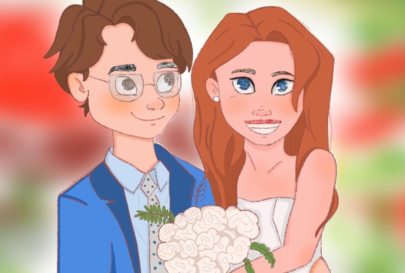
share with others, I'll be illustrating a
wedding photo for our friend. Maybe you have a friend whose portrait
you'd like to draw. Once you've got some
idea of where you want to go start watching, you can draw alongside
me after finishing each video or by pausing
if you need more time, I would definitely need more time if you're comfortable
sharing your project, I'd be really happy to see it
and also provide feedback. And that's something that
you're interested in. That's it for the setup. Let's start drawing.
3. The Rough Sketch: Let's jump right to it. For my references, I use an app called Viz
wrath indefinitely. Don't need this, but
it's just a nice way to display all the
photos in one place. Here I have the photo that I'll be using as
my main reference. That's the couple
that I'll be drawing. And I also have photos of, um, of artists that
I really like. And I'm going to try to copy the elements that I
liked from different artists. So I might like the
way one artist, straws hair, another
artist draws smile. These two here are by Sara Faber and I think
they're really gorgeous. I really loved the way that
she draws Harris specially. This one here is
by Bobo and ANOVA. And I just love the angular style and
these are by Bev Johnson. I picked a few
artists that I like. I, I picked a few photos
that I think will help me with drawing
my final piece. Now I'm going to go
into Procreate and I'm going to create canvas. I'm creating this 1600 pixels by 2 thousand pixels size
because I think that's a good typical poster size. And it's also big enough that the resolution will
be decently good. And now that I have my canvas, I want my references
to me easily visible. So the way I do that is I drag this ref into the
Procreate window. And then that will create a split screen that
I can adjust the size of. Here, I can zoom into any particular photo
that I want to focus on or I can keep it down
and look at everything. Since the main
photo that I'll be looking at is the couple photo, I'll probably zoom into that one and get started on
drawing the bride. That first mark on Page is
often the hardest to make. But don't worry, especially
with digital media, you can erase it so easily. So just go for it. I'm using the pencil soft
grain brush by Sara Faber. You have to be a member for
Patreon to get access to it. But there are lots of equivalent
brushes in procreate, especially the pencil
brushes in general. But then for this
stage, it doesn't really matter what
brush you use. Actually helps when the brushes grainy or less detailed
just so that you don't get too caught up in
the details because the first pass is just to
get the general shapes down. And then once that's done, you can go over and add details. Here. I'm trying to
get the jawline, just write the jawline is
important to get right, because especially with
front-facing portrait, you want to be symmetrical
as much as you can be. In order to help you do that, It's often nice to draw these horizontal
lines to check to see that things happen on both
sides at the same level. Things can get really
crooked looking if you're not drawing things on the
same horizontal lines. So for example, the
eyes, the jaw line, the eyebrows will start speeding things up
in the recording. And I'll just jump in to give
tips and tricks as we go. You can see I'm adding that
same horizontal line for the top of the eyes and one
for the bottom of the eyes. It's nice to see how big the eyes will be
before you draw them. And the horizontal line really helps and is really especially
important for the eyes. I use these vertical
lines here to get a sense of where
the eyes will start. And that also helps not to accidentally draw them too
close together, too far apart. For the shape of the eye. I'm heavily relying
on Sarah favors work. I think her eye shapes
are always really cute. And so that's part of the beauty of having
references around, is you can just try and
copy as well as you can, the shapes that you see
in your references. For the eyebrows, I like
drawing this vertical line up because it helps me know
when to start the eyebrow. And it also just helps you
keep things on the same level. I don't know if you notice here, but I've drawn my
right eyebrow too low and I clearly
can't tell yet. But once I flip the canvas, which is something
we'll do pretty soon and it's good to
do very regularly. I'll be able to tell
him I'll fix it. The ears generally go from the top of the eyes to
the bottom of the nose. But It's all just a
stylistic choice. If you prefer them
rounder, you can do so. If you prefer them
higher up or lower up, that's totally fine to Bobo the artists I
mentioned earlier, she draws her nose a bit, her ears a bit lower down, and I think it
looks really cute. So just try out
different things and see what you like and make sure
to check your references. That's what they're there
for is to help guide you. Here you can see I'm starting
to draw the mouth and I'm pretty much copying
it from bows drawing. And I really liked
that kind of smile. I think it's cute and I think it might go well
with my character. So that's what I'm doing. I'm just darkening up some of
the lines so that I have a little bit more of an idea
of what it will look like. These still aren't the
final lines for sure. Now I'm going to flip the canvas and I can definitely tell
that something is off. So in order to fix it, I'm going to go into
my select tool. I'm going to move
the mouse around, just try out different
things, see what I like. I'm going to try to make
things a bit more symmetrical. It's often harder to see
than you would think. To help. I'm turning on this reference. I can see the canvas from a
bit farther away and that helps me see the mistakes
a little more clearly. What I typically do
is flip the canvas, try and fix it a little bit. Flip it again, see
what's looking better, what's not looking better? And just keep trying
until I really start to feel like when the
canvas is flipped, nothing odd jumps out at me. The liquefied tool is one of my favorite tools to
use when I'm sketching. There are a few values
to choose from, but I always use
push and just helps me move things around
and very minimally, and it often makes a
huge difference. Here. See, you can see that I've
adjusted the eyebrows not be on the same horizontal line. Definitely a lot
better than it was before and It's
helping me adjust the jaw here to look
a little less bumpy. It often creates some nice
curves around the cheek area. Now that I've made
those adjustments, I'm going to flip my
canvas again and see what looks different and what needs
to be adjusted some more. I'm going to start
in on the hair. And since I know
that I liked the way Sara Faber draws her hair, I'm going to zoom in on
that photo and going to start just lightly
sketching out the shapes. The girl in my reference
has straight hair, whereas the girl and Sara Faber
is drawing has wavy hair. And I'm going to adjust
for this slightly later because I do want the, the final image to
match my reference, but it does help me
start with this base. I've started to
draw the shoulders here and I want to make sure that my shoulders do
align to one another. So that's kind of what I'm
doing now is making sure that there is a straight line that can go from one
shoulder to another. I decided to draw my final image more cropped
in on my reference. I just think it's nicer when, when it's that half body view. These are all the
decisions you get to make when you're
drawing something. Now that I'm done
my rough sketch, I'm going to erase my
guidelines so that I have a bit of a clearer view
of what it looks like. Then I'll start in on the group. Same thing with the
groom's starting off with a circle only this time I'm going to do a three-quarter
view just because I do want to heavily rely on
that Sara Faber reference. And it'll be easier this way. And I think it's pretty cute when the groom is looking
at the bride all lovey w. So that's kinda
my plan for this. Another creative decision
I just get to make. If you're drawing multiple
characters in the same scene, this is a nice
little trick to do. Obviously they have
similar sized heads, so I can just test here that his head isn't much
bigger or smaller or wider, a thinner than her head. You can see I'm using those
horizontal lines to make sure that his eyes are
on the same plane. For this three-quarter
view perspective, his eyes should be
the same height, but his eye that's farther away will just
be a bit more squished. Definitely, it doesn't
look too nice yet, but it's totally fine. This is just to help us get where the features
are going to be, what the proportions are, and will be able to draw over everything with more detail
and more care later. Flip check time. It doesn't look so bad, but just adjusting
some angle's going to draw a little bit more here, even though I don't see any
major mistakes that way my eye gets a bit more used to this view and then
flipping it again, I might see something different. I didn't like that first nose, so just going to try
another one here. This is really the
time to experiment with the big feature changes. Trying a completely
different nodes, completely different eye shape, completely different
smile or position. The positions of the
features to just moving them around and seeing how
that changes the face. It looks completely different
when your nose is just a centimeter closer to your
mouth then it is to your eyes. And when your eyebrows
are up high or download, it just completely changes the face way more than
you would expect it to. Here. I want to see what
it looked like when his eyes are not as tall because he looks a bit like
an old man slash baby here. And so just checking to see what that kind of change
will do to the way that I perceive his face
and onto the hair. I think the way Sarah
has drawn her hair is a really cute way to
draw this kind of haircut. So I'm pretty much
going to follow it exactly or just doing my best. It's totally fine to try and
mimic the artists you like. It helps you grow and it's, it's also fine as
long as you're not tracing it and definitely
give them credit. And also here in this
photo I'm taking bits and pieces from
different artists and that makes it a
completely new work of art. We're pretty much done
with the first sketch. It doesn't look too good
right now, but that's okay. We'll come back in
the next video and we'll start refining
our features. We'll start adding more
details and getting more clear idea of what the final illustration
will actually look like. This is a time-consuming
portion of the art process. Coloring is often a lot faster. It's really valuable to put time into making sure that you
get your sketch right, into getting decent
perspective sizes and getting features to be in the correct place and
the correct features to evoke the kinds of emotions
that you'd like to evoke.
4. The Detailed Sketch: Back and ready to
start going over our first sketch will reduce
the opacity of the layer. First Walmart into
them together. Okay, time to go over our
sketch on a new layer. Let's reduce the opacity so
that it's barely visible and create a new layer where
we'll draw our next image. I'm changing the color to
be slightly different. That's just something
I like to do to help me to distinguish between the layer that's with the reduced opacity and the
current layer I'm working on. I want the features
now to be a bit more indicative of what
the final piece will look like with
regards to the features. So here I've zoomed
into serif favors photo to really have a clear look at the kinds of shapes
that she's using. And I'm going to
try to mimic them. You can see the eyes
are in drying now, are slightly different from the ones that were there before. I'm trying out
different things and seeing if this new shape will have better
on my character. Eyebrows, I'm keeping
fairly similar. I think they look fine. I usually try at
least two or three different variations
for the nose. It's obviously a bit
of a complex shape and it really has an impact on
how the character looks. It's worth going
over it a couple of times and trying
to get it right. Try not to stay too loyalty
your initial sketch, this is a time to experiment. You can see here I'm checking what it'll look like if
the nose is a bit shorter. And here I reduce the
opacity just a bit more because I want to be able to see my new drawing as a
separate drawing. If I squint my eyes a little
bit, by that, I mean, I want to see what
it looks like as a standalone because
the sketch underneath we'll get rid of after this stage and we
won't go back to it. So the drawing really shouldn't rely on the Sketch
beneath it to look good. I copied this mouth
from bows drawing, but she didn't have lips
for her characters. I'm adding one though,
because in my reference, the girl has quite a
defined cupid's bow. And I want to capture it here, because this isn't realism. It's the small things that
help capture likeness. I've drawn the right
side of my job too widely and that's an
easy mistake to fix, especially at this stage. I'm just going to select
this and move it a bit closer and then
clean up the lines. Every once in awhile
I tried to zoom out and look at the drawing from a different perspective because it helps me notice
things that are off, notice things that are
uneven or unappealing. Since my next sketch will
be the final sketch. This is the one where I really want to nail down the details. I want to draw every line that essentially will be
in my final line art. We haven't left the flipping
behind in the first stage. It's going to come across with us all the way to
the last stage. Starting to look a bit
better, more symmetrical. And when I flip it, I still see the
same general face. Even though it's not
strictly necessary. I colored in the pupils and here the upper lip
because it's helping me see more clearly what the final piece will
look like without this, it just looks significantly different and I feel like
I can't tell as well. It started to veer away
from my reference and, or at least my Sarah
favorite reference. And I'm trying to get it a bit more similar to the straight
hair in my main rapids. Bringing in the Liquify tool
and this stage as well. Notice that her forearm
doesn't live long enough. So I'm going to try to
correct that by moving her elbow to be farther away and then adjusting
the arm as well. Now, I'll hide the lower layer and I'll be able to see what this sketch looks like
standing on its own two feet, and what changes
and easily made. Now, I didn't add any of the flower details into my initial sketch because
it's a bit unnecessary. But now I'm starting to do that. I think she's
looking pretty good. So I'm going to turn on my underlayer sketch again and start working on the Grimm. Well, jump right into it. Same deal as before, trying to go over, add details, change features. Basically, this is the most creative and
difficult part of the process. It's also the part where you
need to most heavily rely on your eye for what looks
good and what looks bad, what looks a little
off the proportions. You need to be really
cautious not to just follow the drawing beneath, but to try and improve it, to try and fix things, make them better and make
them more interesting. Another quick size
check here to make sure their heads are
approximately the same size. I'm basically done,
but I'm really hesitant to move
on from this stage because really this is where things start to get cemented and
it gets a little more difficult to change things. Especially because
with Procreate, if you use the liquify tool or you stretch or
expand something, the pixels get less defined. Because these marks aren't going to appear in
my final drawing. I'd really rather make all of those kinds of transformations
at this stage. Before my line art, I'm adding some glasses. That's an easy win
for like this. This is something
that I didn't do till pretty late in the game, but I think it really
helps with the drawing. I made her mouth a bit smaller and I think it
looks a lot better. Just pointing that out to
get the point across that. It's really nice to
just keep trying to change a few things
here and there when you're in this stage because
you might surprise yourself by how much you like the final result if
you just keep at it.
5. The Line Art: Now we're moving on to
the line art layer. So everything we draw here will actually be in our
final illustration. So we want to use a nice pencil. We want the lines
to be clear and we don't want it to look
scraggly or rough. I'm going to use the pencil
grainy brush by Sara Faber. But there are brushes that
come with procreate that have this grainy texture to it. Wet brush you use here really depends on what styles you like. You can look at your artists
that you've selected for your references and say what
their outlines look like. Some artists don't even
have outlines rarely, so it all depends. You might've noticed that I'm
adding lines and then very quickly removing them by tapping with two
fingers to undo. That's because in this stage I really want the
lines to be crisp. It's worth going over
again if I feel that the lines haven't done
justice to my drawing. After all the time we've
put into the sketch, it worth to make sure
that the lines are going over it as
clearly as possible. It might have noticed she's leaning her
head up against Tony. That was something I changed
after I stopped filming. Just kept looking at it. And I thought, and
I want them to look like they're even more
and love and closer. And that's just what
came into my head. Going over some of the lines and adding more weight to them, especially in places
where lines intersect, I add a bit awake
because it helps give the image a
bit more dynamism. Like before. I want
to check to see that this new layers can stand
on its own two feet. And if I turn off
the sketch layer, it still looks good
enough on its own. This is my first time flipping
it a bit late in the game. But as you can see,
things like alright, because I mostly stayed directly over top my
already existing sketch. I just made the
lines more clear and maybe emitted a few lines
that weren't necessarily. That's basically it. This is our final line art. And then next we'll
get into coloring.
6. BaseColours: In this video, we're
going to be adding base colors to our illustration. Actually find this
the most boring part of the process
because basically, we're just trying to
make sure we define all of the colors on separate layers so that
we can edit them easily. You can see I'm importing my reference image so that I can choose colors directly
from it if I want. I'm going to be using a brush called Lucky Day
to do my outlines, but you really can use a ton of different
brushes out there. It doesn't make that
much of a difference for the coloring as it
does for the outlines. But yeah, this process
is really just about defining the boundaries
of our layers. So let's get into it. I have a bunch of layers here of kind of duplicated
drawings as I go through. I like to make copies in case I irreversibly
mess something up. So I'm just going to put them all into a folder and hide them. Then I'm going to create a
new group for my line art right now and my color layer. And I'm going to
set the line art to multiply and reduce the
opacity a little bit. This way, as I add
color underneath it, I'll very clearly still be able to see the
lines over top. And now I'm just going
to do that is go over, try to make sure that
I'm drawing coloring inside the lines. Very boring. And I'll start with making an initial outline of
my entire drawing. You can totally change
this color later. It's not a big deal
what you choose here. Usually, I just pick
something completely random. And you don't have to do this. You don't have to start
with a silhouette. You can directly start adding in colors where they're
supposed to go, for example, a separate
hair color layer, a separate skin color layer. But I like having
the silhouette, too, right at the onset because it gives me just another
gut check to see, well, does my
silhouette look nice? Because a nice
silhouette does make a big difference to how
your drawing looks. The color fill dropping only
works in enclosed spaces, so I have to make sure
everything is closed. If there was even a tiny gap, the color would just
go all over the layer. And when I drop the color fill, if I hold and drag to the right, it does decrease that threshold, so there could be
a tiny, tiny gap, but either way, it's just nice to get
everything closed up. I'll add the rest of the
colors in as clipping masks. I prefer using clipping
masks because it's nice to have a boundary that
you can't cross. Basically, how a clipping
mask works is if you have a clipping mask over top
of this silhouette layer, only the pixels that are in the silhouette layer will be
affected or will show up. That means that if I add a
layer over top for the hair, I'll only be able to draw within the hair pixels that
are already colored. I can add a clipping
mask like this, and then I'll get drawing. I'm starting to fill out the bride's hair,
and you can see, I don't have to be very
careful with the color on the left side because
it is a clipping mask. You might have noticed I
tried to use the color block, and it actually covered
the whole layer, and I'm lowering the opacity here just to check if there
were any lines that I missed, and clearly I missed one here. But also, because
it's a clipping mask, it still works as
a proper layer, so the boundaries
aren't closed on the side of the clipping mask
where I didn't add lines. So I will have to add those in. And while I was adding hair, I noticed that my
coloring went a little beyond the outlines here, so I'm going to erase that
back on the silhouette layer. Now onto the groom's hair. I usually color the eyebrows
as part of the hair layer, and because I have this
outline over them, they turn out much darker than the rest of the hair,
which I think looks nice. And I realize I didn't color her eyebrows as part
of the hair layer, so I'm going back
to do that now. Was kind of fun as just a
silhouette with no line art. Details like the eyes
and the eye color, I don't really have to do as
part of a clipping mask just because there's really no way for me to accidentally draw outside of it outside
of the silhouette, so that I can just
do a regular layer. I'm actually going to
draw their eyes on the same layer because I expect their eyes will
be the same color, regardless of if I change
that color or not. That's what different
layers help with is it's really easy and quick to change the color
of a whole layer, and that's why I try to keep every color on its own layer. And I'm making a new layer
for the teeth because they might be a different color than the eyes for whatever reason. And I'm looking on my eyes, and I'm thinking they're looking a little bit too yellowy. So I'm going into
my adjustments, and here I can adjust the brightness specifically
on this one layer. I'm being a bit
inefficient here. I'm clearly trying to avoid the leaves that are going
over top of her dress. But instead of doing that, I really should have just
colored everything with the dresses color and then drawn the leaves in a
layer above that layer. So they would have
gone over top anyways. And here I just kind of gave myself more
work than I needed. And even it's hard
to get it perfect. So I left a little bit of the silhouette color behind the leaves when I started
coloring the leaves. So I had to go back and fix it. There are definitely many ways
to speed up this process, and hopefully some of
these tricks help. Here you can see
now for his suit, I want to select the color of the jacket from my reference. And so that's what I've done. Normally, the way you
select that color you bring up the eyedropper with the shortcut is by just
clicking and holding down. But I've configured my
settings a bit differently. If you go into your preferences, you can adjust your
gesture controls, and that's what I've done. Even though his jacket
is just one color, I made the choice to make the collar darker 'cause I
thought it would look nicer. Okay. Once you have the color dropper selected, you can drag it around
and try and get the exact right pixel color because especially
from a photograph, you can see that the
pixels really change dramatically, one
next to the other. So you often can't just
blindly click into the shape. You have to really check to see that you're
getting the right pixel. And here for his time doing exactly what I should
have done with her dress, which is not worry about
the plant and just paste the color over top and assume that I will
draw the plant later. And now it's easy
peasy to go over the plant where there
is a different color. And what's nice
is the in between parts are all have
the correct color, so I don't have to worry
about accidentally leaving some of the
silhouette color there. Mm. I don't want to draw a
separate layer for their skin, but since they're
on the same layer, I'm going to just select the
areas where the bride is, and then I'm going to adjust the colors just for
that selection. So you can see he's staying the same color and her skin
color is being adjusted. And I'm doing that using the hue saturation and
brightness adjustments. I use that quite a bit. It's a great way to just try
and see what needs changing. Sometimes it's hard
to know whether your art needs to be lighter, whether it needs to be more saturated or whether it
needs a different hue. Using the actual colors that
we'll use is a bit more creative than just getting the outlines, right,
of the shape. So I enjoy that
part quite a bit. And it can be hard to
choose the right colors, especially with skin
colors just because such a tiny little
difference in hue, saturation or
brightness will make such a huge difference in
how the skin color looks. And here I'm, again, cleaning up some of
that outside lines that I really shouldn't
have colored in. It helps to make the background dark so that I can see it
a bit more clearly now. My camera got a bit
overexposed now here, but I'm doing the same
thing for him is adjusting the saturation and
the brightness and trying to get a color
that I think looks better. And with that, we are done the base colors and
onto more fun things.
7. The Shadows and Highlights: I would say adding in, although color details like
shadows and highlights is probably my favorite part
of the drawing process. I'm going to create a new
layer and choose a color that's a little
darker than her skin. I add shadows and all the places where you would expect
there to be shadows. You can look at your
references for help with this. And also just think of where the light
sources coming from. If it's coming from top-left, then the bottom-right would
have the most shadow. If it's coming from
the bottom right then the top left, What happened? Well Shadow, IT can see
I'm changing this to a multiply layer and reducing the opacity to see
what it looks like. I'm then adding in more
color under the nose, probably in the ear, maybe under the eyebrows, etc. I think already it
just looks so much cuter with that
added bit of shadow. It makes such a big difference. I also tried to add shadow
where any two objects collide. So for example, her arm
is touching her dress, so there'll be a little cast
shadow from her dress onto her arm and a little shadow
from her arm onto her dress. But since this color we're
using for our skin shadows, we would just use a different color for the dress shadows. And it'll looks
like I'm thinking that the light sources
coming from the top-left. So her bottom right-hand
would be quite dark. Even though he's got a
different skin color. I decided to use the same
shadow layer for him. I just assumed that
I'll probably be okay with them having
the same shadow color. That's it for the skin
shadow and look so much nicer now makes a
really huge difference. So definitely don't
skip this step. Now I want to change the color
of her lips and I'm gonna do that by going onto the
line art layer in alpha. Lock it by dragging
with two fingers to the right and choosing a different color and drawing
over top of the layer. So what alpha locking does means that when I
draw right now, the pixels with only
the pixels that already are on this
layer will be affected. So you can see if I draw
outside of the lip, I won't actually color anything. I'm doing the same thing
for her eye color. You may have thought
that's a bit too light. She's looking a little
like a vampire. So I'm going to see if adding a pupil will make a
difference. Well, look nicer. Really an experimental time. Generally I like the eyelashes
to be as dark as possible, so I'm going over those
lines and making them black. On a new layer. I'm adding some
shadows for the eyes. Generally, the shadow to run up to about halfway
across the eye. So quite a big shadow, but I think it looks nice. There's just no
pressure to choose the right color for
this from the start. As you can see, I just
picked a random color and I'm going to adjust the
hue and see what looks nice, what matches her eyes. I added a clipping mask for the flowers and set
it to multiply. And now i'll, I'll just go
over and add some shadows. Elapse. Hearing decided not to
do a separate layer, but to just add some of the
shadows on his jacket on the same layer as
his color because I think the shadows will be
the same color as the color, color as the color. Adding a multiplication
layer just for his shirt and going to add
some of the shadows there. Now for the Thai details, you can see that I'm
zooming in and out of the photo to look
at my reference. And that's not
actually something I needed to do. There is. Another trick I'll
show you later to show you how you
can avoid doing this. I decided that the outline
alone was a little too grainy and didn't
fill enough of her eyes. So I created the layer just for her eyes
and colored that. You might have noticed
here I added a layer above the outlines and that's because I want to add
the eye highlights. And those shouldn't be
disturbed by anything. They shouldn't be top dog. I struggled a little bit
with drawing those in the correct position
because you want them to be on the same
horizontal line and have the same angle because you would just assume that
that's how it works. As you may have heard, the eyes are in the
windows to the soul. So it's important
to get them right. I think that when you get
your eyes really well then the rest of the picture
comes together a lot better. Here I'm going on my shadows
layer and I kind of feel that their noses or
maybe a bit too dark. And so what I'm doing
is I'm selecting their noses
specifically and I can click Add to do
multiple selections. And then I'm going to put
them on a separate layer. I can drag down with three
fingers and do cut and paste, and then they'll appear
on a separate layer. And I can adjust their opacity independently of the
rest of the shadows. Now I'm going to create a new layer and use
it for highlights. So I'm going to select the area on top of her
nose where I think there wouldn't be especially more
amount of light shining. And so I'll select it. And now that it's
selected, if I draw, the pixels would only go inside the selected area,
which is nice. Of course that color
is way too bright, so I'm going to
reduce the opacity and it'll blend
better with her skin, but still look break. I'm going to add a little triangle for his nose without doing a selection because I think I can
Be careful enough here. So I want to add
shadows to her hair, but since her hair is
already a clipping mask, I can't do a clipping
mask for it. So what I'm going to
do is select the hair, select the whole layer, and then create a new
layer and start drawing. And what's really cool is it only lets me draw it
inside of the selection. So it's essentially the same
thing as a clipping mask. I think those shadows
are a bit too dark, so I'll adjust the opacity. Now. I'll do the same
thing for his hair and I'll select it and then
create a new layer. And on that I'll draw some
highlights or low legs. I usually add a little
cast shadow from the lips. Anything that protrudes really should have a bit
of a cast shadow. I don't have one for the nose because I don't love
the way it looks, but I can probably add one
here and it wouldn't be on notice for him that I didn't add a layer for his eyes and so they're a little too grainy for my liking. So that's what I'm doing here. I looked at a
little more closely at my reference and looked at some other photos
of the group. And it turns out his eyes are more grayish green then brown. So I'm gonna make that
adjustment realized. I totally skipped adding
details to these flowers. And so what I'm gonna do
is the other trick that I said that I could
have used with the tie is I'm going to turn on the reference and going
to make it the canvas. And then I can zoom in to
the flowers or the TI, whatever it is that I want to, since it's the
references on my campus. I don't have a plan here
really for how to draw them, but I just started adding
shadows and making squigglies. And eventually I think it
turned out looking pretty nice. Playing around with
the color adjustments really helped here, just trying to find
something that would look harmonious with
the rest of the illustration. Here I tried out a
little noise adjustment. And that makes the
drawing look grainy. So this is just for the flowers, but actually decided against it because I do think it would call a little too much attention to itself if nothing
else is grainy. And that way, So I
went back on it. And what you can do is when you're adding
these adjustments, if you just tap your finger, you saw that menu pop up. You can reverse so
you can cancel and you can view a
preview of what it looked like before
your adjustment. This particular highlighter,
low light or whatever, is probably my favorite. And so I take a soft
brush and I go around and just very lightly add in highlights wherever
I think they might be. And I can play around
with the colors. I can, um, I can play around with how much
or how little and this is. All should be done in a
clipping mask so that it doesn't go outside
of the boundaries. Here. I didn't do that. And later you'll see me adjust
it to be a clipping mask. I do think these
details feel like they add a lot of
dimension to the jobs. Here you can see I checked
to see if everything looks okay without the background, but as you can see, I didn't draw those adjustments
on a clipping mask. So now I'm going to move them
to be a clipping mask and that little shoulder highlight
will won't look so bad. I didn't fix that
right away though. First, I added in some
cast shadows on the dress. Has I probably should
have done earlier. Some cast shadows from
the plants as well. Okay. Now, it's in the correct
spot as a clipping mask. So the shoulder looks realize the E-ring here
is a nice focal points, so I want to make it
as bright as possible. Adding a bit of
highlights to it. Our eyes do get drawn to places with the
highest contrast. So if I have
something especially bright on something a
bit dark like the hair, it will call attention to it. So I think that's
a nice place to draw attention to right
in-between their faces. That's pretty much it for
our lovely bride and groom. Now we'll move on
to the background.
8. The Background: I don't actually want
the background to be too detailed because if
they're too many details, it will draw attention away
from the bride and groom. And I want them to be the
focal point of all this. So instead what I'm going to do is make a pretty colorful
but very blurry background. I've taken my reference
and stretch it to fit approximately what my
Canvas looks like here. You can see them in
the real background. And honestly, I think this
looks pretty in some cases, maybe I would even keep
this if I were to clean up a little bit so that
the actual couple behind when poke through. But I decided this time to
draw my own background. And so what I'm gonna
do is I'm going to really heavily
based my background on the colors that
are already there. And on the new layer
you can see I'm very scraggly drawing over top is definitely it doesn't
have to be precise. I just basically want the
shapes to be similar ish. And I'm going to keep doing
that for different colors. And in the end we'll
add a blur effect to it to make it look more like
the background that we have. For them. This definitely doesn't
look too good yet, but now we'll add a gradient
blur to our background. Looks a little bit better, but definitely not as
bright as I want it to be. So what that tells me, maybe we'll try and duplicate it and see what it
looks like when we have duplicated
layer moved around, it's okay, still
not bright enough. So I'll merge those
two layers together. And then I think
I'll trying again, it's getting a bit brighter, but maybe a little too, little too static because the colors aren't blending
as nicely as I want. What I think I'll do is
just have another layer. I'm just going to throw that out and add more color to it. This time I'm using a
bigger painterly brush and that's just making
things go a little quicker. This time instead
of a Gaussian blur, I'm going to add a motion blur, which I think it's pretty cool. And I really liked the way
that this is starting to look. I'm going to add a bit of a gradient
Gaussian blur as well. Starting to look really nice. I think they are definitely
the focal point. And the background still has pretty colors and his
bright and I really liked the whites and how they make
them feel a little lit up. That's basically it
for the background. It was super quick and easy, but I think it
looks really nice.
9. The Fun Stuff: Finishing touches. This is definitely a spot that's hard for me
to step away from. Sometimes I overdo
it in this part. But now hopefully overall, I think it does make the
illustrations better. Here I'm going to add a
little stray flyaway hairs. I like the way that
looks on here. It makes it look a bit
more lively and realistic. I'm going to add some super bright,
totally white highlights. Use these sparingly and because they can't
get out of control. I added one to the lip here and dispel it was it was too bright, so I adjusted it to be a
little more pink than white. Now I'm adding a secondary
highlight to the eye. Very small. I'm not even sure
that this adjustment makes any difference, but I like the way it looks. I'm going to start playing
around with lighting now. So I'm going to merge my
background into a single layer. And here I'm just
checking to see what it looks like without
the white background, but I think I definitely
need the white background. What I'm doing right
now is I want to have only my couple visible and then I'm going
to click Copy All. And what that does is copy
all of the visible layers. And then I'm going to paste it. And now you can see
that I can unselect my entire group with all the separate color layers and I'll just move
that out of the way. And instead I'm going
to be working on a new duplicated flattened
out version of my cup. So that means that if I
add any changes to it, it'll be added as a whole to the entire image as
opposed to individually. You can see I've created
a new layer here, and I'm going to pick a
bright orangey yellow color. And I'm going to drop
it on the entire layer. Then I'm going to set
the layer to overlay. And what that does is it looks like the sun is
shining brightly, but it's a bit too much when
it's on the whole layer, it makes everything
a little washed out. And so what I'll do is
I'll take my eraser. I'll set the eraser pencil to be a soft brush and then erase just part of
the overlay layer. And that'll make it look
like the sun is shining from a specific location onto. It can sometimes take a few, stick at the correct
proportions of a race versus keep for
this kind of layer. But I think it worked out on
the first try here for me. I liked the way that
the light shines on her and it also gets
his face a little bit. But generally you can also see their skin color and everything without without the
light shining on it. Usually after doing
something like this, I would check and
uncheck the layer just to see is this change
worth keeping around? And I think for this
specific layer, it is totally worth keeping. This was something that I've
only started doing recently, but especially with
the effect of having a light shining on
our characters. I really started to like
adding in a middle of a white background line to the characters as
though the sun is so bright there that it's
just a bright white. I think it makes
them stand out a bit more and it looks kind of cool. You can see I just did that on a separate layer behind
my illustration. And you can see him just
playing around trying to get the exact right amount of light shining with my overlay layer. Now I'm going to start
playing around with color adjustments on the couple. So I'm going to duplicate this layer because I
might not like what I change and I'm going
to go into curves. I feel that they do a nice, they always give
me a nice surprise when I slowly move things around and try and see what looks good
while it looks bad, I'm usually, I end up making at least a couple of adjustments with the
colors in the end. Some people might not an, a, you definitely have more control over what the end result
will look like if you don't. But I find that the computers usually better at picking
the colors that I am, better at harmonizing them
and making them more bright and saturated in
an appealing way. Color balance, Let's use specifically correct
different colors. So here you can see from
changing that red cyan value, mostly only the time the flowers are getting
affected by that. I often don't use that
one because it kind of throws things a bit
out of balance. Here you can see the
before and the after, what it looks like
with the overlay, without the overlay, with the adjustments, without
the adjustments. There's absolutely no shame and spending a ton of time
with color adjustments and then deciding that you
don't actually need any in throwing out the new version. Now I'm going to do
some color adjustments on my background. I already think it
looks quite nice, but maybe just a few
adjustments to make it brighter or whatever, just see what I liked. I think that looks pretty great. One thing I forgot to do is add some warm shadows and
highlights onto the plants. And so even though now my couple is just
a flat one layer, I'm just going to create a
new layer and go over top of it and add in
some final tweaks. Because it's totally okay. It's not going to
mess up with the rest of the drawing and I
can always remove it. Okay. I really think it's done. I loved the way it turned out. I think it's very
bright and pretty, and they look in love and happy. And it's everything you'd want a wedding portrait to look like. So I hope you enjoyed this. I hope your art is what you want it to be and please do share them with their lesson.
10. Final Thoughts: I love the way my illustration
turned out and I hope you loved yours to please share
your art and write the class. I'd also really appreciate
any feedback you may have if you want to find out when I have new classes available
on Skillshare, give my profile
of follow and you can also follow me on Instagram. Thanks for coming along. I hope you enjoyed it
and I'll see you soon.
 Mary Briskin, Let’s Learn