Transcripts
1. Intro: If you get frustrated easily
at the very beginning of your work or you feel like
you lack inspiration, this class is for you. Hi, my name is [inaudible] I'm self-taught creator
based in London. I like to create a
digital illustrations in hand-drawn style. For me, working on a random sketch is
always an advantage, because you never know
how it turns out. Throughout this
class, you'll learn some fun ways to
create sketches and move them into another level by refining and applying
multiple layers. You'll gather some inspiration
with various methods, create rough sketches, and finalize on by
refining and coloring. Whether you are a beginner or an expert artist who
needs to give a break, this class might help you to shape or change
your perspective. I'll be using my iPad
Pro with Procreate, but you are free to use
any medium you like as the given if still be
applicable. Let's start.
2. Class Overview & Project: The reason I picked this topic for my class
is because I know how it can be annoying
then you feel unmotivated, but you feel like you
have to drop something. I used the feel
that way and I even gave huge breaks to drawing
because of that feeling. But then I figured that I had given up too easily
before trying to change my perspective or distract myself from the stress. Here I am to share the
ways that works for me. Throughout the class, we'll go through some
essential formation, some exercises, and
our final projects. In the first part we will
talk about block layering, how sunlight is important. Then we look into some ways
of getting inspiration, ways of sketching, and creating our
own color tablets. As a second part, we will do two
different exercises to prepare ourselves for
our final projects. We'll get our
references by using the given tips in
the previous part and draw some sketches. The first exercise will be
drawing some sketches by getting inspiration from
random shapes like clouds, texture of a ball, and such. The second form,
you'll be drawing rough sketches within
a specific team. As our final projects we'll pick some of the
rough sketches from the exercise file and
define them by applying new layers over and over
until you're happy with it. Then we will do some
color exploration before we apply the final
colors and details. I encourage you to follow the same steps and share
your progress under final work to the
projects and resources section so you can be
inspiration for everyone. I will be also happy to
see and comment on them.
3. About Layering: As our first lesson, we are going to talk
about what layering is, and why it is important. At its simplest layering
is a process done for purposes such as giving
a color transition, applying lights, shadows,
or some effects. It's a widely used method in most traditional and
digital painting. However, it varies according to the artist's
style and choice. The way of applying
layers differs depending on the medium
used by the artist, especially in some
traditional methods. Layering can be challenging
as you need to wait, sweat, apply a new layer till the
previous one gets dry, which might of course extend the time you spend
on the painting. However, for digital artists, it is more advantageous
as it gives the flexibility to work
on each separately. Besides, in some programs like Adobe Photoshop
or Procreate, you can create some
additional layer effects or other useful features
which can be quite handy. In digital painting, keeping different layers
always helps you as you can easily edit or delete
an announced process. I always keep my
sketch base color, main colors, shades, lights, and texture on different layers. It is beneficial to plan them depending on your
illustration style. Here is an example of a
simple sketch and how it looks different by applying different
layers over and over. As a result, layering is the building block
of your artwork and makes the whole process easier for you as you
can control them. Now let's continue to the next lesson to see the
ways of getting inspiration.
4. Gathering Inspiration: When I first started drawing, the first thing that I
realized was that getting inspiration had to somehow
become a part of my life. I started to look
around more and I was sketching the ones
I found interesting. Sometimes someone's hairstyle, outfit or the way they sit
can be an inspiration. I suggest you to keep a
small sketchbook with you so you can get the
real-life inspirations. What I also do is to take
some photos if there is a beautiful scene or
an interesting object that I can use in my
picture drawings. If I don't know what to draw, I like to look around and
find some random shapes. For example, if
you like to cloud gaze or if you see
shapes on some textures, you can use them as a
reference for your drawings. Searching through online
platforms is of course another convenient option
to gather inspiration. Especially if you already
have an idea and you need some references about
this specific topic, it's very useful to have
a look at Pinterest, Google Images or any
photo websites but be careful about copyrights when
you use photo references. It's always safer to use the images from
royalty-free websites. Now let's go to the next lesson
and talk about sketching.
5. Sketching: As you know sketching is a kind
of quick drawn human, so when you're sketching
don't be a perfectionist. It might look weird
or ugly but remember that it's just a seed of an idea or just a
quick recording. You never know how it turns
out if you work on it, so I don't suggest
using an eraser. Let your mistakes stay there bad you can see them and learn. If you turn to erase your mistakes on the
sketching phase too much, consider using a pen
instead of a pencil. Besides learning
from your mistakes, it is also very
motivating to see the very first sketch of
your finished artwork. With this way, you can
always remember that it is too soon to call any
sketch ugly or useless. If you are planning to create
a detailed illustration, first I suggest you to
divide the main elements of your illustration and
practice them separately. For example, let's
say we are going to draw an Italian
style illustration. The first thing we do, is to look for references. How are the clothes? How is the hair style? What are the accessories? You can search the references and start to practice
by sketching. Once you feel you have
done your practice enough, you can implement these elements to your main illustration. You can create works or collect the images in a file
to use them later. In the next lesson, we'll focus on how to create
a color palette.
6. Choosing a Color Palette: Color is the language
that artists speak. Choosing the right color
palette for illustration plays an important role to look more interesting and you woke some
feelings for the audience. The emotion of coloring
books can be personal, but we know that colors also
have universal meaning. The classic color view contains three colors: primary colors, secondary colors,
and tertiary colors. By mixing the primary colors, you'll get secondary colors. If you mix the secondary colors
with the primary colors, you get the tertiary colors. Colors that are
close to each other on the wheel are
called analogous. Colors across from each other
are known as complementary. The distance between the colors shows how much they contrast. We can also split the
color view into two, warm colors and cool colors. Warm colors tend to be
more playful or active, but can also evoke feelings
of danger or anger. Cool colors tend to
be passive colors and associated with feelings of
calmness, but also sense. In painting, hue, saturation, and value are common
terms related to color. Hue is the origin of
the color we see and saturation is how
dominant a hue is. The lightness or darkness of a color is called
a color's value, which consists of
tints and tones. To create a new palette, simply click on the color box
on the upper right corner, the plus icon, and create
a new color palette. Then you can manually pick the colors from the
view or pick a color and check its analogous
or complimentary colors and add them to your palette. Another way you can create a palette is importing a photo. It will detect the
colors and create a color palette for
you automatically. Another option is to
import a photo to your cameras and pick
the colors manually. If you are using Adobe
Photoshop or Illustrator, you can use Adobe Color website, which is very useful. It's a website where you can explore other color libraries, create your own palette, or upload the visual
and gather the colors. If you log in with your
Creative Cloud account, your color palettes will automatically be imported
to your libraries, which you can
directly use through the other programs afterwards. Now let's move to our exercise part to
practice what we learned.
7. Working on Random Shapes: [MUSIC] As our first exercise, I'm going to show
you how to create sketches by using random shapes. As I mentioned earlier, I use this method
when I feel stuck in drawing to have some
fun and refresh myself. For now, I will use
online references, but you can go out and look
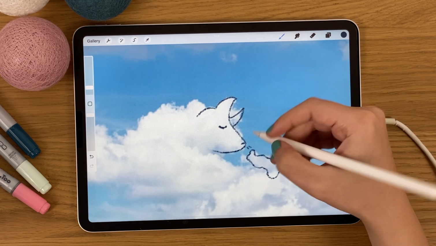
for some real life examples. Let's start with clouds. I'm looking for some clouds
that I can't draw on them. For example, this
one has a potential. I already can see
some shapes in it. Now, I'll continue and
download the one I can use. As another option,
you can look for some wall textures
like this one here. It has random layers, so we can maybe do
some sketching on it. As I click on my references, I'm ready to start sketching. First of all, I'm going to go to Actions and click on
"Insert a Photo" option. Here you can see all my
references I collected. I'll start with the cloud photo. Let's resize the photo
and fit it to the screen. You can see that the inserted
photo is on Layer 1. I'm going to create a new layer, which is very important
because we will need only the sketch
layer afterwards. I pick a dark color, so I can see whether I draw. I'm going to use
6B pencil brush. We will be sure that we are on Layer 2 and now we can start. By sketching, you don't have to be 100 percent
precise with texture. Just use the help
of the texture as a base of your idea and
take it from there. Also, as I mentioned
on sketching lesson, don't be perfectionist, just enjoy the drawing. Once we are done with reference, you can use select tool
to reorganize them. Continue to do the
same thing with your other reference files
as much as you like. Now, I'm going to delete the photos and merge the sketch
layers by pinching them. In this phase, you
may want to create another layer and refine your
sketches a little bit more. I'm going to use one of these sketches to create
a basic illustration, which will be our first project. I am going to refine them. Remember that you can repeat this process as
much as you like. Now it is ready for
the next phase. [MUSIC]
8. Sketching from a Reference: In this exercise I'm going to show you how to create sketches
from a reference. As our second project we
will illustrate a bit soon. I'm going to start with
gathering inspiration through some websites and make a list of some objects I can use
in my illustration. Once I am done
listing I'm going to start to do some
sketches to practice. While you're sketching
it is very useful to divide the screen into two
to look at your reference. To do that you can simply hold your browser icon and
drag it to the side. Usually I look at
the reference for the first sketch and then do a second one without looking. If you are familiar with an object
and practice them before, you can just try to sketch
down without the reference. When I'm sketching I
always try to start from geometrical shapes and
then add other details. If the element is too
complex you may want to spend more time and draw more sketches until
you feel confident. You can also try different angles and poses. In this phase your sketches may be different
according to your style. You may want to choose
less lines or details. Once you practice the
elements of your illustration separately you can start
to plan your scene.
9. A Random Sketch to Illustration: [MUSIC] Let's start
our first project by creating our canvas. The size of your canvas limits the maximum number of
layers you can use. Before you start your drawing, you can check this information
by clicking actions, canvas tab and
canvas information. Here on the layer section, you can see the maximum number
of layers you can create. Now, I'm going to go
to sketch file that I created during our
first exercise. I'm holding the
layer of the sketch. I'm going back opening my
new canvas and importing. Let's resize and center it
and create a new layer. [MUSIC] I'm going to choose monoline brush
for this phase. Now I decrease the opacity of the first sketch and start
redrawing on Layer 2. [MUSIC] I will duplicate this sketch as a
backup and hide it. [MUSIC] Now, I will
make four copies of it. To duplicate the sketch
you can either go to the select tool and select three fingers down
and choose duplicate. [MUSIC] Or you can simply duplicate it by
swiping the layer left. After positioning them, I'm going to match
them by pinching. You did this to make
a color exploration before going on our
final coloring phase. I will drag and drop the colors to create some
alternatives here. to fill the shape
with the color, the shape should be
completely close. I am fixing this now
and start filling. [MUSIC] What I want is here to have a good contrast
between the skin, the hair and the headphones. To see it better, I will
create another layer, fill them with a gray color, and change the layer
effect into color mode. [MUSIC] For example, you can
see here below on the left, the skin and the hair color
are so close to each other, which makes it less interesting. [MUSIC] You can play with the colors until you think the contrast
is good enough. [MUSIC] Once you decide
your final colors, go to Share section and
export it as an image. You can of course, create a new palette and
add your colors, especially if there is many
colors in your illustration. But this is also another option. Now, let's go back to the
gallery and create new canvas. I'm going to choose
the same size and direct my sketch
to the new canvas. [MUSIC] I'll choose my 6B
pencil brush again and start to create my final
sketch before coloring. [MUSIC] To use the color so I decided I'm going
to go to Actions, Canvas, and click on reference, select the image tab here, and import the color
exploration file. By holding your finger, you can easily pick the
colors from the reference. Now, I'm copying the sketch
as a backup again and hide, creating a new layer and moving it to below
the sketch layer. As a style of choice, I prefer to color my illustrations similar
to current style. [MUSIC] I will pick a lighter color as a base and
create another layer above. Choose Clipping Mask option, which helps me to stay in
the previous layer space. Now I'll pick my actual
color and paint it. I will repeat this process for the hair and the headphones. [MUSIC] As I finish the base coloring, now I'm going to
add other details. Finally, I will add
shadows and lights. To add shadows, you can create a new layer and choose
multiply effects. Click Clipping Mask and start adding shadows
with the same color. You can arrange the
opacity level of the shadow if you'd like
to get a softer effect. [MUSIC] Of course it is better to plan
a light source and adding shadows and
lights accordingly. To add lights, you can
create a new layer, choose overlay, and
click the mask. Now, I'm going to do the same thing for
my other elements. [MUSIC] You can see the sketch and
the final version together. With this project, I
try to explain how to transform a random shape
into an illustration. As we created every detail
on separate layers, we can easily change or delete the unwanted
parts later on. I hope you had fun. Now let's continue
to our next project, which is a little bit
more complex than this.
10. Sketching a Witch Room in 2 Point Perspective: On the exercise space, we have prepared ourselves
for our final project, [BACKGROUND] which
is illustrating [inaudible].To plan
our illustration, let's start with a very
rough sketch of our room. I am planning to create a
two-point perspective room and trying to imagine
the main elements and their placement first. I will start with the cauldron, which I want it to be an
Ikea for my illustration. It will be closer than the other elements of the
room to create a depth. Now I am planning other elements from bigger ones to small ones. [BACKGROUND] In my illustration, I will not do all
the [inaudible], but I [inaudible]
objects and atmosphere will give enough clues
that it's very strong. [BACKGROUND]If you are not satisfied
with your rough sketch, you can create several
different options on this face. [BACKGROUND] Now I am going to actions and
click on "Drawing guide". Here you can see there are
different types of guides. I will use perspective. To create my two-point
perspective, I tap on screen to create a perspective point and edit it till it looks like
my rough sketch plan, and I will add my second point. [BACKGROUND] If you turn Assisted Drawing on here, it will help you to create your lines according
to the perspective. [BACKGROUND] Now I will start to place my
elements once again, but this time it is set to the perspective drawing, right? [BACKGROUND] After we finish all
the elements that should be drawn according
to the perspective, we can continue to
add other details. [BACKGROUND] We have finished the base of
our rough sketch, now let's continue to add
some details to that.
11. Adding Details: [MUSIC] At this space, we will add our details. I pick a different
color to not be confused by the previous lines. As you can see, I'm still
on the assisted layer. I'm creating the base of some objects like books
or [inaudible] this way. Now I'm adding a new layer
which is not assisted anymore and start to add
my objects one by one. Remember our list, I'm checking the list and
trying to distribute them now. You may notice that I make
little changes on some places. That's very normal as we are still on the rough
sketching phase. I'm also trying to place the vertical and
horizontal objects in a balanced way to be sure that my insertion is not boring. While you are
adding the objects, try to imagine the angle that
you are looking to them, and use the previous
slides as a guide. Also, I'm adding the
other details I saw while I was searching about
witchcraft to the frames. As I'm happy with
my rough sketch, I'm going to merge my sketches
by pinching the layers, and creating a new layer. I will decrease the opacity
of the rough sketch now, turn drawing guide off, and start to refine my sketch. If you have a different
illustration style, or use a different medium, your sketching might look a
lot different than this one. I always enjoy seeing different results of
styles or mediums. You can draw this in your style and share
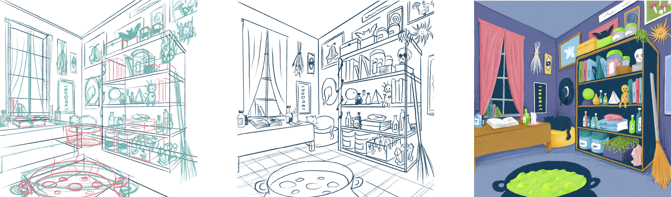
the result here. Download the sketching part now. Here, you can see the difference between the rough sketch
and the refined one. Now let's start working on
some color alternatives. [MUSIC]
12. Color Exploration: [MUSIC] As we did on our first project, we will do some color
exploration again. To do that, we are going to drag our refined sketch and import it to the new
canvas by dropping. As always I duplicate this
sketch as a backup and hide, and I'm resizing my layer. I'll again create
four alternatives. I created my first
palette in advance, and now I'm going to
pick a soft brush to be able to fill the
areas I draw like this. Let's create a new layer, move it below the sketch, and choose our base color. I'm going to start with
drawing a square and fill it and then the walls. I will use a dark color
for the cauldron and a vibrant green for the portion to create
a good contrast. I will distribute the
colors in a balanced way. If you use a dark color, it might be difficult
to see the sketch. To solve that problem, I'm going to go to
my sketch layer and change its mode from
normal to daylight. Let's be sure that we are on the coloring layer
again and continue. I will distribute the
rest of the colors and move on to my next
color alternative. You can go to sketch layer again and change
it back to normal. I'm going to group
to sketch and the color layers and name it as one. Now I will duplicate the
group and name it as 2. Let's hide the group
1 to have more space. This time I'm planning to
create a warmer color palette. Let's create a new
layer just for the pallete and start to
pick the colors we can use. Once I'm ready I'm changing the colors simply
by drag and drop. If you face a problem
of filling the object, try to hold your pen
and move it right or left to set it's threshold
before you release it. Let's speed up the process and complete our all
four alternatives. When you are happy with
your color alternatives, you can go to Share and they
export the file as an image. [MUSIC]
13. Coloring an Finalizing: [MUSIC] As a final
step of our project, we are going to apply
our final choice of colors and finalize it
by adding the details. Let's start with moving our
sketch to a new Canvas again. I'll go to Actions and
click on Reference to open our color exploration
image as a reference, I chose the purple one
for my illustration. Now I'm going to
decrease the opacity of my sketch and start to
paint on a new layer. You should move your layers below the sketch layer, again. I'll start with creating new
layers for each element, but then I will match the ones
I think they are finished. Here, I am going to pick my 6B pencil brush again
and start to paint. As I did on the first project, I'm painting the object with a lighter color as a
base and then creating a new layer by choosing clipping mask and paint
it with its final color. Again, it's a style of choice. You can use another brush or
color it in a different way. It's all up to you. Keeping the layers
organized is very important for that kind
of complex illustrations. Try to keep the
elements as group and rename them as you can
find it easily later on. [MUSIC] As I'm creating new
layers over an old, I'm noticing that I have
reached the limit of layers so I'm merging the base
colors and final course. [MUSIC] To add shadows or lights, create a new layer on top
with clipping mask and choose the multiply effect for shadow and overlay
effect for lights. [MUSIC] Now I'll continue to color all my elements and add
shadows and lights to them. [MUSIC] As the final step, I'm going to add
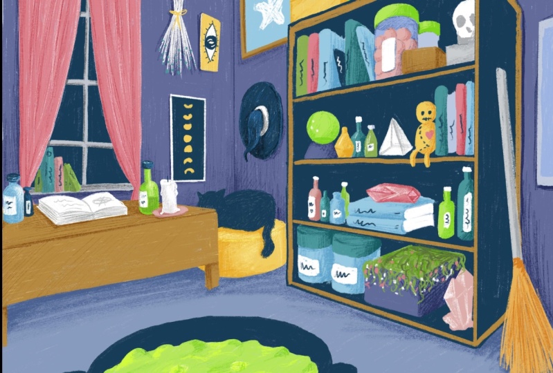
some details like cartilage off the
books, text on labels. Here we are. We finally
finish our illustration.
14. Conclusion: Thanks for joining me. I tried to explain
the importance of patience and gave some tips
to boost your creativity. I hope you had fun. If you followed along with the exercises and
the project with me, please do not forget to share your progress and your result in the Projects and
Resources section to be an inspiration
for everyone. You can also follow
me here and on social media @tinyspaceworks to be updated about my work
and my future classes. See you next time. Goodbye.
 Elcin Ustun, Illustrator