Transcripts
1. Introduction: Hi, I'm Priscilla
an Illustrator, surface pattern designer,
and skill share top teacher. I'm the owner of
Cardwell and Inc, where I specialize in iPad
based digital design. In this class, we're
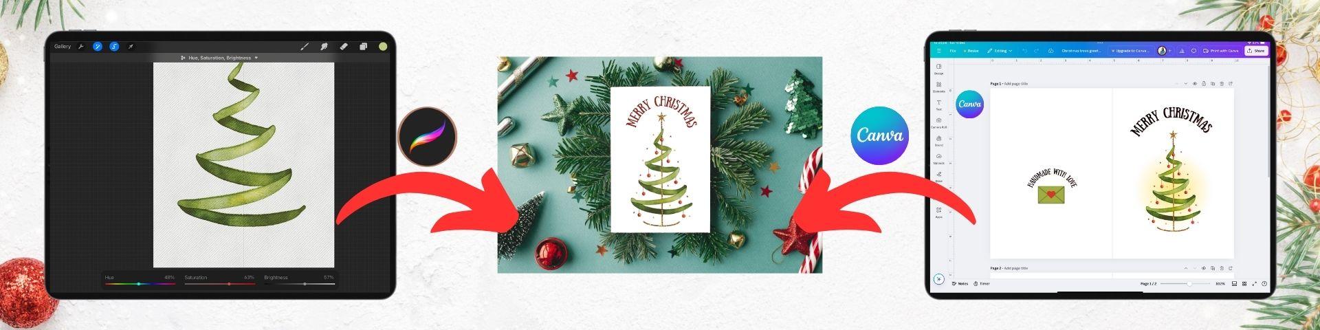
diving into one of my favorite holiday projects, creating beautiful
personalized Christmas cards using the Procreate app and
the free version of Canva. I will guide you step
by step to create stunning watercolor motifs
in Procreate and then show you how to transform them into printed greeting cards or animated posts to share with
your friends and family. So whether you are a seasoned digital artist or a beginner, this class is designed
to make using these apps easy and enjoyable. If you're already comfortable
with these tools, you will pick up workflow tips to speed up your design process. In this class, you're
going to learn how to create three digital
watercolor motifs. Get an in depth look at using Procreate Selection Tool and save selections to
simplify your workflow. Remove backgrounds from your watercolor
motifs effortlessly for clean professional designs that can be placed
on any background. And finally, how to
navigate Canva to design a folded greeting card or an
animated social media post. All you will need to take
this class is an iPad, a pressure sensitive stylus. I'll be using the Apple
Pencil, the Procreate app, and the free version of Canva, whether on the app
or the website. In the class resources, I've also included my custom Procreate
watercolor brush set, a procreate Canvas,
color palette, and a curated Pinterest and
splash board for inspiration so that you are
using the same tools that I'm using every
step of the way. So if you are ready to learn some new techniques and create some festive greeting cards, grab your iPad, and I
will see you in class.
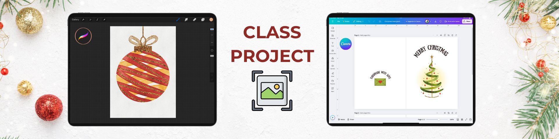
2. Class Project: B. Before you start on the
Lessons in class project, be sure to download
the provided resources from the resource
and project section. This will be on the web version, not the mobile app. Download them to
your file storage, and once they've
been downloaded, you can import them into Procreate as we progress
through the course. Now, for that class project, we're going to keep
it really simple. Take a screenshot of one of your motifs in
Procreate or one of your card designs created in Canva and upload it to
the project section. You can do this at anytime
during the course. If you play around with a
different color palette or make a variation on one of the designs, I would
love to see it. All right, enough talking,
let's get started. Meet me in the next lesson
where I'll walk you through the canvas setup in Procreate
for our Christmas motifs.
3. Setting Up The Canvas: In this lesson, we are going to begin with the Canvas setup. If you have opened your
Procreate file in the app, it will turn up in
your app gallery. Tapping will open the document. Once you are in the
Procreate interface, on the top left, you can tap on the
wrench icon to see the Actions menu and then tap the Canvas tab to
see the Canvas settings. At the bottom of this menu,
select Canvas information. In the dimensions
tab on the left, I've created this document as
a five by seven inch card, which is the normal size for the front of
a greeting card. It is 400 DPI or dots per inch, so you have a bit
more flexibility with your design resolution as 300 is the industry standard
for printing documents. If you head down to
the color profile, it is in CMYK, which is cyan magenta, yellow and black, and it's the color profile
for physical printers. Using this setting will
ensure that your colors are closest to the colors that will print on
your color printer. RGB, red, green, blue is generally used for digital
artwork on screens. CMYK colors may look
a bit less vibrant, but will be the closest to
what your printer will show. Tapping done will return
you to the Canvas menu. In this menu, scroll down to the drawing guide and tap
to activate the toggle. Underneath, you'll see the text that says Edit Drawing Guide, and tapping will
open a new page. We're going to
select the text to D grid and set our opacity to a point where
you can see the grid lines, but they are not going
to be overpowering. The other settings you
can see at the bottom of my screen and assisted
drawing is also turned off. At the top, tapping any color in the color line will allow you to adjust the color
of your grid. Then if you tap done
at the top right, it will take you back
to the main view. Next, let's tap on the
preferences tab so that your tools are set
up the same as mine and we can achieve
the same effects. I've activated the
right hand interface, so my size and
opacity sliders for my brushes are on the right
hand side of my screen. Dynamic brush scaling
is also activated, which is absolutely
essential for the watercolor brushes to
work properly as we paint. My brush cursor is active, so you can see where my
cursor is on the screen. In pressure and smoothing, I have my stabilization
at 6.9 and I've increased my pressure curve so that
I do not have to press too hard on my screen
for my pressure stroke, as the watercolor brushes we are using will be
pressure sensitive, and that is all
for the settings. Next on the top right hand side, head to your color disc and
tap to open the color menu. At the bottom right, you'll find the palette section,
tap to open, and then scroll through the list until you locate your
Christmas color palette. Tap the three dots on
the right hand side and you can select
set it as default. This means that when you head back to your color disc view, this palette will be at the
bottom for easy access. Next, tap the brush icon
to open your brush menu, select your Christmas
watercolor brush set that you imported from the class resources and select the textured
watercolor brush. Tapping will
activate it in blue. This is a pressure
sensitive brush. When you create a stroke, a light touch will give
a thinner stroke and more pressure will give you a thicker stroke if you
are using an Apple pencil. Try a few strokes on your canvas going from light
pressure to heavy pressure, and then back to light
pressure to test this out. Keep going until you
become a bit more familiar with the pressure required to achieve the stroke
that you want. Reducing the size of
the brush will also reduce the width size of the stroke when
pressure is applied. You can adjust the brush size using the slider and then try the different sizes
on your screen a few times until you find a setting
that feels comfortable. Now is a good time to refresh
the gestures and procreate. A two finger tap on
your screen will undo a stroke and a three finger
tap will redo a stroke. You can also do this with the arrows at the
bottom of the sliders. To remove all the strokes on
a layer at the same time, a three finger circle on the
screen will erase them all. Finally, a three finger
swipe down on the screen will bring up a quick menu that will allow you to
access the cut, copy and paste functions easily, and tapping the X will
remove this menu. Okay, so on the right hand side, tap the icon with
the two squares to open your layers menu. At the top, you have your
watercolor texture which is locked so that you don't
move it as you paint, and the layers for painting
are Christmas cards below it. At the bottom, you
have two guide layers, a triangle and a circle that will help us
structure our motifs. To begin with, we're
going to activate the triangle layer by tapping the square
until we see the tick, and then tap on a painting layer until
it's blue to activate it. That's it for this
lesson. Join me in the next lesson to start on
our first Christmas motif.
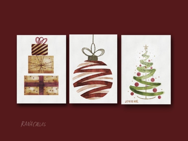
4. The Present Stack Pt 1: In this lesson, we
are going to create a minimal Christmas card featuring a stack
of three presents. This will also get us
familiar with some of the tools in the
selection menu in Procreate. In our Layers panel, we have our triangle guide activated at the bottom and a
new painting layer that should be selected in blue. We're going to use the
selection menu to create save selections of
all the presents in our present stack
first and save them, and then we will add watercolor and details to our artwork. The left hand side, head
over to the ribbon icon, which is our selection
menu and tap to open. In the menu at the
bottom of your screen, select the rectangle
shape and make sure that the ad icon is also
highlighted in blue. Then take your stylus and use the guide to draw out a
watercolor rectangle, about one square within the base of the triangle
for our first present. Going to use the two D guide
to make it symmetrical on both sides and take it up to a height of about
eight squares. Remember, you can always use the two finger tap
on your screen to undo if it's not quite where you want it placed
and try again. Now in the bottom menu, tap the heart icon that
says save and load and then use the plus to save
the area of your selection. Next, we're going to add another selection area so that we can create a ribbon
around this box. In our bottom menu, this time, tap the minus icon labeled
remove until it is blue. Now we're going to use the rectangle tool
to cut out the areas where a ribbon would wrap around the present vertically
and horizontally. Horizontally, I'm going
to cut out I think the fourth and fifth box to make it symmetrical
and then the center two boxes vertically using my two d grid to remove this area from our
existing selection. Take your time and
do it carefully. Once you're done, head over to the save and load icon
in the bottom menu and use the plus to add this new selection to
our saved selections. We're going to create one more save selection for this present. In the bottom menu, tap
on the text invert until only the area outside
of the ribbon is selected without
those lines across it. Then we're going to head
back to our save and load and also add this area
to our saved selections. Now we can tap on the second selection in our
list with the ribbon cut out and we're going to add the second and third
present box to the stack. In the bottom menu,
make sure that the rectangle tool is
active and also the ad. We're going to leave
a little bit of negative space between the
boxes for visual interest. I'm going to use my triangle and two D grid to position
my second present, about two squares narrower and about half a square
above the first present. I'll make the height
about 6.5 squares and use my grid to make sure that it is symmetrical on both sides
of my triangle frame. Again, if at any point
you want to redo, just use that two fingertap. For my last present box,
I'm going to do the same. I'll move about two
boxes in to maintain that triangular shape and
then half a box left for the negative space between the two presents and a total
height of about 6.5 boxes. I'll use my triangle frame to make sure that
it's symmetrical on both sides and that is
our selections complete. Now we can head down to the save and load icon and
save this selection too, and we are ready to paint head to the right
to the layers menu, and at the bottom, your
triangle guide layer can be unticked. Then with this
selection still active, on the top right
of the interface, we can head to our brush menu. In our Christmas brush set, select the watercolor
textured brush and set the size at large, because we're going
to use it to fill the entire area
of our selection. I just want to
pause here to bring a pretty awesome update
to your attention. You can set brush sizes for different brushes by
tapping on the slider. Then in the preview
that comes up, tapping on the plus to save that brush size to
procreates memory. You'll then see a blue line
to show that it has set, and now anytime you
want to go back to that size selection, it's saved. These selections are also brush specific and if you ever
want to delete them, you just tap and press
the minus to remove it. Okay, so moving on on the top
right in our color studio, I'm going to select a brown paper color from the palettes. I love the look of brown paper wrapped Christmas presents, but feel free to choose
whatever color you prefer. Now we can paint
our selected area of the presents and try
and do this without taking your stylus
off the screen and cover the entire
selected area. Once that is done, we're
going to add a bit of visual interest by
creating some shadows on the left and the bottom of the present boxes as if the light source is coming
from the right hand side. We're going to
create a stroke on the left and a stroke on
the bottom of each box. Then to blend them out, head up to our brush menu and select the watery
Paul blender brush and use this to blend
the colors together by just going over the hard
edges of your stroke. Feel free to adjust
the slider if you need to to make it
smaller or larger. Once that's done, we are going to create a little highlight on the right hand
side by heading to our brush set again and
selecting the bleed brush. In the color studio
on the right, select a white color
from our color palette. Use your slider to decrease
the size and paint on top of the areas on the right to add a little
highlight in white. You can always undo
with two fingers or adjust your pasity if you
don't want it as bright. That is the base colors for
our presence completed. Join me in the next
lesson to create the details on the wrapping
paper of our presents.
5. The Present Stack Pt 2: In this lesson, we are going to add the details to
our present stack. In your selection menu, make sure that your present stack selection
is still active. If it is not, just tap
on your selection menu, head to the save and load and
tap that selection again. Next head to your
Layers panel and select a new painting layer to create the details for
our first present. In the brush menu,
we're going to select the seven star brush
from our brush set, and in the color studio, we're going to
select a red color. Using your slider,
set your size at about 5% so your stars
are not too large. Then in the selection area, use the stamp brush to place star stamps all over
the wrapping paper. They do not have to be perfect, the more organic, the better. Loosely layer them over
all of the four parts of the bottom present box and
remember that you can always undo with a two finger tap if you want to reposition them. We will come back to the ribbon area on this
present a little bit later. For our second present, we're going to
create a dot pattern of red and white spots
on the brown paper. In your layers menu, use the plus symbol
at the top to create a new layer with a
normal blend mode. This is so that the
white will be visible and doesn't just blend
into the watercolor. In your brush menu, select
the solid circle brush. Select red for the color and then randomly put dots
across your selection area. Just leave a bit of space so that they look
randomly scattered. Remember that you can always use a two finger tap to undo
if you want to try again. Once you're happy, head back to the color studio and select a white color and use your
stamp brush to distribute some white dots in between the red dots on the brown paper. It adds really
beautiful contrast. Once you're happy
with the placement, we're going to take
it one step further and add some string
detail onto this present. Head back to the brush menu and select the
monoline brush and place it on a small setting
at about 2% using the slider. In the color menu, set
the color back onto red, and in our layers panel, we can select a new
painting layer. Loosely create a line around the middle of the
present horizontally. Pause and hold your
stylus on the screen, and this will activate the
quick shape menu at the top. If you tap line in this menu, it will allow you
to adjust the nodes of this line until you are
happy with its placement. I'm going to create about
three lines horizontally and three lines vertically
criss crossing each other. A reminder as we do this that quick shape works
not just for lines, but also for polygons, for rectangles, for triangles, circles, and so you can use it when you are wanting to
create shapes as well. All right. Once you are happy with the placement
of your lines, we can create a free
hand decorative bow in the center of the present with a few strings hanging down and that is the detail for
our second present done. Finally, our top present. This, we're going to create thick diagonal
lines as a detail. Use your slider on
the right to increase the size of your
monoline brush to about 16% then take your time
and for each line you draw, hold your stylus on the screen
if you want to activate the quick shape menu at the
top to adjust your lines. Remember, you can always
do the two finger tap on your screen to undo a stroke
if you're doing it freehand. Continue with your lines
until you're happy with their position
to finish up, we're going to create a
ribbon bow on the top of this last box and
then go back and add that ribbon detail around
our first present. Head to the top left to the selection menu icon and long press to reactivate
the bottom menu, tap on the text invert until
you see the areas around the boxes clear without those gray diagonal lines to indicate that they
have been selected. The right in your brush menu, select the watercolor
textured brush and in the color studio, a red color from our palette. In our layers panel, select
a new painting layer. Now we can start to create
the bow with loose strokes, starting with light pressure at the present to heavy
pressure to show the ribbon loops and then back to light pressure connecting
it back to the box. We're going to repeat this with overlapping strokes to
create a decorative bow. Just keep going with
that same light, heavy light pressure
all the way around. Now to complete the ribbon
on our first present. In the layers panel, select
a new painting layer, and then we are going to fill in the ribbon area on
the first present. Don't worry about going
out of the edges a bit because a handy little hack will deal with that in a moment. I'm going to go over my ribbon twice just to make it
a little bit darker. Now to deal with that
overlap on our edges, long press on the selection
menu to reactivate it, and then in our
save and load area, select that first selection of the entire present
box that we saved. In the bottom menu,
select invert until the area around that first box does not have the great lines. Then in the top menu, tap on the arrow icon to
activate the transform menu. We're going to use
our stylus to take the selection area and just move it off the
canvas to delete it, and now you should have the
perfect ribbon leftover. Isn't that fantastic?
Deselect your selections menu and on the right
in the layers panel, create a new layer
in our brush menu, select your monoline
brush and a black color. And just create a line at the
base of the bottom present to create the illusion of the ground and the
presence resting on it. That's our design complete. At the top, tap the wrench
icon and deactivate your drawing guide to take a look without that two D grid. In your layers panel, select all your layers by swiping to the right
until they are blue. And then in the top menu, tap on the text that says
group to group the layers. Next, tap this group
and in the side menu, select rename and name
it Christmas presents. Swipe to the left on this
group and select duplicate to make a copy and then deselect the bottom group by unticking
the box on the right. I always like to save a
layered group as a backup. Next, we're going to tap on the top group and this
time in the side menu, select flatten and make it
a single flattened layer. So this is a really
simple design, but you can apply the
techniques to create a host of different color palettes,
details and arrangements. I also love the versatility of this design because you can
use it as a festive card, but also as a birthday
or celebration card. That's all for this lesson. Take some time to be creative and have a play with the
skills you've learned. You can always check
out the Pinterest board that is linked in the
class resources to get some inspiration
and then join me in the next lesson to
create our next design.
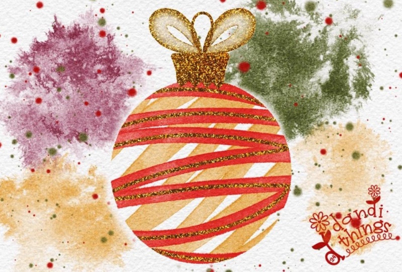
6. The Christmas Ornament: In this lesson, we are going to create a watercolor
Christmas ornament. In the las panel, untick the flattened Christmas
present design, and at the bottom of the layer, tick to turn on the circle frame and tap on the layer until
it is active in blue. At the top left, we can
use our wrench icon to reactivate in our Canvas
the two D drawing guide. Next, we can tap the ribbon icon to activate
our selection menu. At the bottom, make sure
automatic selection is chosen and the ad function should
also be activated in blue. Now we're going
to tap our stylus outside of the circle
frame until it is blue, and then in our
save and load menu, we're going to add the
selection to our saved areas. Next, in the bottom menu, we're going to select the
text invert and again, save this selection in
our save and load menu. Now we are ready to paint. Head to the top to
the layers panel and scroll down and untick the circle frame and tap to activate a new painting
layer in blue. In our brush menu,
we're going to select our textured
watercolor brush, and in our color studio, we're going to select
an orange red color. We're going to
create a few strokes using this brush to give the impression of
a ribbon wrapping around a transparent
glass ornament. Reduce the size of
the brush if you want a bit more control
over the strokes and I'm going to
keep them at a bit of a diagonal and
fairly organic. I think I really would like
this layer a bit darker. I'm going to open the
layers panel and swipe to the left and select
duplicate on the layer. Now I can pinch the two layers together to flatten
them into one. On the top left, I'm going
to tap the magic wand icon, which is the
adjustments menu and then tap on the hue
saturation and brightness. A new menu will open at the bottom and we're
going to use this to intensify the saturation
of our red color. I'm going to raise it
till mid to high 60s. Just to note here, you can
also use the hue slider on the left to adjust the color of your
ornament quite easily, have a play if you would like your ornament to be
a different color. But for now, I'm
going to leave mine on 50% and keep it on red. With the adjustments
we have made, we've lost our selection area, but because we have it saved, simply tap to reactivate
the selection menu. In the save and
load at the bottom, we can choose our
selection again. On the right in the layers menu, we're going to select
a new painting layer and this time in
our color studio, we're going to select the golden yellow color
from our palette. On this new layer,
we are going to do the same stroke style with our
textured watercolor brush, but on the opposite diagonal, as if we are looking
through the ornament and the back of the
ribbon has a gold color. It's okay to leave a bit
of negative space as well. This really adds to
the loose aesthetic. Now to deal with those
areas of overlap. Undo the selection menu by tapping and then in
your layers menu, find the red ribbon layer. Tap to activate it in blue. Then on the left, we're
going to re select the selection menu and make sure it's still on
automatic selection, and we're going
to tap outside of the ribbon until it's blue and drag our stylus on our
screen to increase the threshold until any
white edges are gone. You can move back and forth until you find the
spot you want. Then in the bottom menu, we're going to invert
our selection. This will select the
areas of red that will overlap on the gold color. I'll just explain why I do this instead of just
selecting the ribbon. Because the watercolor
brush is semi transparent. If you just select the ribbon, it will only cut out a
semi transparent portion. If we invert the selection, it will cut out the
whole opaque block where the overlap happens
on the yellow ribbon. Now we can head to
the Layers panel and tap the yellow ribbon layer
to activate it in blue. Then tap on the left
on the arrow icon to activate the transform menu and just like we did
with our last motif, move the selection off the canvas area to
delete the overlap. That way, the two colors
won't affect each other. We're going to finish with
adding a few gold accents to the ribbon and a gold top
and string to our ornament. In your class resources, there's a link to my
unsplash collection of royalty free images
and textures. Tap the glitter texture. And tap the arrow at the
bottom right to download it to your camera once it is in
your images on your iPad, we can head back to
the Procreate cavas and the wrench icon. Tap the AdTab and
then insert a photo. Select the image from
your cameral and once inserted with the
watercolor texture overlay, it can look a bit dark. I like to head to
the top left to the adjustments menu and then select hue saturation
and brightness. At the bottom, I'm
going to increase the brightness and
the saturation. I generally leave
the hue by itself, but you can adjust
it if you want to increase the
intensity of the gold. Tapping your screen while this menu is open
will allow you to see the before and after
adjustments by tapping preview, and then you can choose whether
to apply or reset them. I'm going to apply,
and this is going to reset all your sliders
at the bottom to 50%. Tap on the layers
menu on the right and select the
gold ribbon layer. At the top of the menu, tap the plus icon to create
a new layer above it, but below the glitter layer. Then tap on the
gold glitter layer and in the side menu,
select clipping mask. It seems that the glitter
layer has disappeared, but rather the clipping mask
is going to allow us to see the gold texture on any mark that we make in that
empty layer below. Tap on that empty layer and before we begin
to make marks, I want to make sure that
the gold strokes that we are creating are limited to
the area of the ornament. So on the top left in
our selection menu, in our save selections, select the circle
of the ornament again until it is
highlighted in blue. Now, in our brush
menu on the right, select your monoline brush
and pick a small brush size about 10% and start to add a few gold lines across
the red ribbon strokes. Keep your strokes
to approximately the center of the ribbon, but they can still be
loose and organic. Once you're happy,
we're going to create the top of our ornament. Head to our selection menu
and tap to activate it. This time, we're going to
go to our save and load and we are going to select
the area around the ornament. Now on the top right
in our brush menu, select the monoline brush at a low setting and we're going
to trace out the area of about six squares and hold our stylus on the screen to activate
the quick shape tool. Then we can tap at the
top to activate the nodes to adjust them and make
sure they are symmetrical. Then we can use our monoline
brush to fill in the rest of the ornament top
and it will reveal all the gold from our glitter
layer in those areas. Once that is done, tap on the canvas to
set the selection. Next, we're going to create a small ellipse in the
center at the top of the ornament and hold it until it activates the
quick shape Ellipse tool. We can then tap at the top and adjust and position
the nodes as we feel and center them on
the top of the ornament. Okay, tap on the canvas
again to set the selection, and finally, we are
going to create a line for the string of the ornament
to the top of the card. In our brush menu,
we're going to select the textured watercolor
brush and create two ribbon loops at the
top of the ornament. This brush adds a
really delicate, transparent ribbon aesthetic to the gold that I really love. Head back to the left to the selection menu and in
the Save and load menu, activate the selection of
the ornament this time, we're going to fill
in the jagged rim of the gold at the top. And that is our
second design done. Head to the wrench
icon and deactivate your drawing guide and take a look at your
finished painting. Like we did in the last lesson, head to your layers
panel and select all the layers by swiping to the right until they are blue, and then select group at the top to place
them into one group. We're going to tap on the new
group and in the side menu, rename the group ornament. Swipe to the left
on the group and select duplicate to copy the group and untick the
bottom group on the right, and then tap the top group, and in the sign menu, select flatten to make
it a single layer. That's it for this lesson. Join me in the next lesson to
complete our final design.
7. The Christmas Tree Pt 1: In this lesson, we
are going to create a simple Christmas tree
card in a minimalist style. In the layers panel, unlock the flattened Christmas
ornament design, scroll down and tick the triangle frame
layer on the right, and tap to activate a new
painting layer in blue. On the top left, use
the wrench icon and the Canvas tab to reactivate the two D
drawing guide layer. On the right in
the color studio, select green from the color palette and in the brush menu, scroll down and select the textured watercolor brush and set the brush size
using the slider. Mine is about 25%. Use the triangle as a guide
and starting at the point, we're going to create a ribbon like stroke down the
frame from left to right, like a watercolor
Christmas tree ribbon. Try and create a consistent
pressure with your stroke without leaving your
canvas and weave about eight strokes all
the way down the triangle. It's okay if it takes a couple of tries to get it
how you want it, but try to make sure that
the stroke starts and ends on the same side
of the triangle guide. Otherwise, it can look a
bit lopsided visually. Once you're done, head back
to the layers panel and duplicate the layer
by swiping to the left and
selecting duplicate. Pinch the layers together into one layer and then
at the bottom, we can disable our
triangle guide. Now we can add a few
details to our tree to make sure that we don't
go outside of the lines, we're going to go
to the top left and tap the ribbon icon to
activate the selection menu. At the bottom menu, choose automatic selection
and the ad function should be activated in blue. Tap your stylus outside of the stroke you have
placed until it turns blue and you can scroll right on the canvas to increase
the selection threshold. Then use the save and load menu to save this area
to our selections. At the bottom, select invert to select the area of your
brush stroke in blue, and then in the
save and load menu, save this area to our
saved selections. Now we can head back to the Layers panel and select
a new painting layer. We're going to keep
our brush settings and add shading to the tree to give it a three
dimensional look. Use your brush to go over every second downward
stroke on a diagonal. And we're going to create our strokes carefully as
we move down the tree, just darkening those areas
that you see on the screen. Take your time and go slowly. Then to tidy up the edges, head to your eraser tool on the top right and select the
small watercolor edge brush. Zoom in and you can use
this to to tidy the edges. Then in the layers panel, scroll down and swipe on
this layer to duplicate it, and then we can pinch the layers together to form
one darker layer. Just below it, untick the first Christmas ribbon layer so that we can see our
layer we're working on and we can use
our eraser tool to tidy up any stray marks
that we see on our canvas. With this layer still
active in our layers menu, we're going to head
to the left and tap to activate our
selection menu. Make sure automatic selection
is active and then tap outside of our
strokes to activate the area in blue at the bottom, tap invert and in the Save and load menu,
save the selection. Now we're going to create
some highlights on our tree. On the right in
the layers panel, scroll down and tap to activate the original
ribbon layer. I want to add highlights
in the areas of the ribbon that look like
they are closest to us. On the left, deselect and
reselect the selection menu. This time at the bottom, we're going to be
activating free hand. Then with your stylus, we're going to draw a
free hand ellipse on the center to the right
of the ribbon areas. You can zoom into
your canvas as you do this and with each selection, make sure you tap the gray
circle to enclose it. We're going to work
our way down the tree, creating these ellipses on all of the lighter areas
of the ribbon. Once you're done at the bottom, tap feather and increase the
slider to about 12% to blur the watercolor edges of
our selection so that we don't have harsh lines where we make our
color adjustments. Next, head up to the adjustments menu at the top and tap to open, and then select the hue
saturation and brightness menu. Using the sliders at the
bottom of the screen, increase the brightness
to about 57%, adjust the hue towards
yellow to about 47, and increase the
saturation to about 62%. And as a result of
brightening the center, this is going to make
it look like there is light bouncing off the ribbon coming from the right hand side. We're going to repeat
this technique with the other
painted shadow layer. In your layers
panel on the right, tap to select the
layer in blue and then using the selection menu and
our freehand selection tool, we can zoom in and create ellipses on each of the
darkened ribbon layers. Each time, make sure to tap the gray circle to
close the selection. Once you're done at the bottom, tap feather and feather out the selection to about
12% to blow the edges, and then at the top left, activate the adjustments menu and the hue saturation
and brightness sliders. Again, we're going to increase the brightness to about 63%, the hue to about 48, and the saturation to about 62% to give a
slightly golden highlight. Now we can tap on our Canvas and in the pop up
menu, select apply. Deselect our selection menu and then on the right in
our layers panel, scroll down and swipe to
the right to make sure that all of our painted layers for our tree are
highlighted in blue. Then head to the
arrow at the top left and tap to activate
the transform menu. At the bottom,
make sure you have your snapping panel
activated to assist in resizing while still ensuring our Christmas tree
is centered on the canvas. At the bottom menu,
we're going to select uniform to maintain
our aspect ratio, and then use our stylus to
adjust the nodes to make sure the tree is smaller
and centered on the canvas. Keep moving it until you
see the yellow line cross hairs in the canvas to
show it is in the middle. Finally, head to the right to our layers panel
and scroll down to the original painted
Christmas tree layer and tap to highlighted in blue. And then head to
your selection menu. Make sure that
automatic selection is selected and tap outside of the area of the
Christmas tree. Because we resized it, we have to create a new save
selection for our tree. Tap invert and then in
your save and load menu, add this new selection
to our saved selections. While we're here, we can delete the other selections for the
tree that we no longer need, and that's it for this lesson. Join me in the
next lesson to add a gold stand and Christmas
tree ornaments to our tree.
8. The Christmas Tree Pt 2: In this lesson, we are going
to create our gold stand, the star at the top, and the ornaments for
our Christmas tree. At the top left, head to the
wrench icon and tap to open. Select the Ad tab
and then insert a photo to place our gold glitter texture we
used in the previous lesson. Use the green node to
rotate the texture and resize and center
it on your canvas. We can also make
this layer a bit brighter by heading to
the adjustments menu, tapping hue, saturation
and brightness. Then at the bottom menu, increase the brightness
to about 61%. The saturation to about
56% and the hue to 51%. That will let us see the
glitter more effectively. On the right in
the layers panel, tap the painted watercolor
layer with the shadows and then use the plus icon at the top to create a
new layer above it. Then tap on the
glitter layer and select the text from the side menu that
says clipping mask. Now we can select
our empty layer beneath it and tap until
it's active and blue. In our brush menu at the top, select your monoline brush
and then using the slider, set the size to about 6%. We're going to use
our Tu Di grid to help us draw a line
down the center of our Christmas tree
and hold until the quick shape for
our line activates. Then tap line from the quick shape menu at the
top and use the nodes in our TD guide to adjust
the line until it's centered on the canvas in
the middle of our tree. Now, although this stand
overlaps the ribbon, we will fix that later. Next, we're going
to create an arc on either side of our stand. Plan to have an equal number of boxes on each side
of three or four. You can zoom in and
then draw the line as a single arc and then
hold your stylus on the screen until the
quick shape activates. Then you can tap it and make
adjustments to the nodes. Remember, you can always use
a two finger undo to try again if you don't feel like the arc is
positioned properly. Once you're happy, we're going
to add a star at the top. On the right, activate the brush menu and
this time in the list, select our star brush. We're going to use it to
create a stamp on our screen, which does not have to
be on top of the stand. Then on the left, head to the selection menu
and activate it. In the bottom menu, select the free hand selection tool
and then use your stylus to draw a circle
around the star and then tap the gray circle
to close the selection. Next at the top, activate our transform menu and
in the bottom menu, ensure snapping is on, but magnetics is off, and then use your stylus to move your star until it is centered
at the top of your stand. Now to deal with the
overlap of the ribbon, deactivate your transform menu and then reactivate
your selection menu. At the bottom, head
to the save and load and select our area of the
Christmas tree that we saved. Now we can head back to the
right to our layers panel and tap on our clipped layer
underneath the glitter. At the top, tap on the eraser tool and select
the monoline brush. Adjust the size on your slider and use your stylus
to erase the glitter from all the areas
where the ribbon is lighter. One by one. Because we have our selection, our erasing will be limited
to the area of the ribbon. Work your way down
until you get to the bottom and this will now give the impression that the ribbon is wrapped
around the stand. Now we can tap the selection
menu to deactivate it and we're going to create some Christmas
ornaments for our tree. In the layers panel
on the right, activate a new
painting layer above the glitter layer and then
in your color palette, select a pink color
for the ornaments. In the brush menu, select the solid circle brush and use the slider on the right
to set it at about 5%. We're just going to tap to
create little circles to represent where the ornaments
are coming off the tree. Just think about the
placement and try to have the ornaments
balanced as you move down the tree and also below the ribbon so that we
can attach lines later. On the top left, activate
the selection menu, and at the bottom, choose
automatic selection. Tap on your Canvas to select
outside of the ornaments, and then at the bottom, tap on invert to select
the ornament areas. Then we can use the
save and load menu to add this area to our
saved selections. Head to the right
to the layers panel and select a new layer
above the ornaments. In your brush menu, select the
textured watercolor brush, and then in your color studio a red color from the
color palette. We're going to use
our brush to create a simple curved shadow stroke on the left hand side
of each ornament one by one as we move down the tree. Because our selection is there, the stroke will not go
outside of the circles. Once that's done on the left, select the adjustments menu and this time select
Gaussian Blur. Place your stylus on the screen and slide
it to the right until the top text shows 5%
of blur being applied. Next, we're going to add a little highlight
to our ornaments. On the right hand side,
open the layers menu and create a new layer using
the plus icon at the top. On this new layer, tap on
the N on the right to open the Blend Mode menu and
select the add Blend Mode. This blend mode is going to add a real luminance as if light is bouncing
off those ornaments. Next, we're going to head to the brush menu and
we're going to select the flare brush and use our slider to set it
at approximately 4%. In the color studio, select a golden yellow color
from the color palette, and we're going to tap on the right hand side of each
of our ornaments one by one to create highlights as if the light is hitting
them from the right. Now we can head to
our adjustments menu on the left, and again, select Gaussian Blur and drag your stylus on the screen to blur that highlight to about 5%. Long press on the selection menu to reactivate the bottom menu. Then select Invert to
select the areas around our ornament and add this to the save and load
selection menu. Now that we've set
our selection, head over to the layers
panel and select a new painting layer to create lines connecting the
ornaments to the tree. In your brush menu, select a small watercolor edge brush and set the size to about 10%. In the color studio, select
the brown paper color and then begin drawing lines connecting the
ornaments to the tree. They will not go into the area of the ornaments
as you do this, and we can cut out any overlap with the Christmas
tree in a moment. You're done, long press
on the selection menu again and at the bottom in
the Save and load menu, we're going to select the
area of our Christmas tree. At the top, tap to activate
our transform menu, and then we can use
our stylus to move the selection off the
canvas to delete it. Now you can deselect the
transform and selections. On the right in the layers, select a new layer, and in the brush menu, select one of the star stamp brushes. In your color studio, select a red color and make a few
stamps around your tree. I do like to mix the colors up. Next head back to
the color studio and select a golden yellow from the color palette and create a few more stars
for some visual interest. Finally, on the right
in the layers panel, you can select all
of your layers by swiping to the right
until they are blue, and then selecting
group at the top, then tap on your group and
rename it Christmas tree. Swipe to the left to duplicate your group and then
untick the bottom group. Tap on the top group, and in the side menu, select flatten so that all
your motifs are in one layer, and that is our final
design completed. I hope the process of creating these designs has given you a better understanding of how
to use the selection menu, the transform menu, and the quick shape tools to
simplify your workflow. Join me in the next
lesson to talk through the option of adding
text to your motifs and exporting them as PNG files to place in a
card template for printing.
9. Exporting Your Motifs as PNG files: In this lesson, we are going to talk through adding
text and exporting your designs as PNG files
for use as card motifs. We'll use the Christmas
tree as an example, but the process will apply
to all of our motifs. First, tap on the wrench icon at the top left and ensure
that in your Canvas tab, your two D drawing
guide is disabled. Then head to the right to our layers panel and at the top, I'm going to untick to disable the watercolor
texture stack, and you can see that
we lose a lot of the depth of color in
our painted motif. For now, I'll just
reactivate it. We're going to create a single
flattened layer to capture that rich texture on our motif without needing that
watercolor texture stack. To do this, head to the left to the wrench icon and tap and
then select the Ad tab. Scroll down to the text, copy Canvas and tap to make a copy of our Christmas tree
with the watercolor texture. Then on the right in
the layers panel, scroll to the top and tap on your watercolor texture stack
to activate it in blue. Then with three fingers wipe down on your screen to activate the cut and paste
menu, select paste. Now in your layers panel, you'll see that you have
a single layer with your motif with that rich
texture on the one layer. Now we can cut out our
Christmas tree motif from the watercolor texture so that we just have our painted motif with a
transparent background. Untick this top layer so that the other layers are
visible below it and scroll down in the layers panel to our
original Christmas tree group. Tap until that group
is active in blue, and then use the plus symbol at the top of the menu to create a new layer between your group and the flattened initial motif. Then tap on the flattened
layer to activate it in blue. On the left, head over to the selection menu and
tap to activate it. At the bottom, make sure automatic and the
ad function are on and then use your stylus to tap the canvas outside
the motif to select it, as well as any areas within
that Christmas tree ribbon to ensure that all of
those inner areas are also included in
the selection in blue. Once that's done, you can
also slide your stylus on your screen towards the right to increase the
selection threshold. If you see any white
edges on the tips of your watercolor motif and
want to cleaner selection. If you go too far, just
slide your stylus to the left until you're
happy with the threshold. At the bottom menu, select invert to select the motif now, and then we can head back to the right to
our color studio. I'm going to select
a white color from our palette just so we
can see this clearly. Then in our layers panel, tap to activate
the blank layer in between the group and
our motif in blue. Tap it again to open the side menu and select
the text fill layer. This will fill your
selection area and make it completely opaque in
the shape of our tree. Now we're going to
use this to cut out the motif from our top layer. Tap to open the side menu
again and this time choose the text select and this will
select the area one more time, and then scroll all
the way to the top to our flattened tree
and texture layer at the top of our layer stack. Tap to select it in blue, and then on your screen, swipe three fingers down
and tap cut and paste in the menu and you should have a perfectly cut out
Christmas tree motif. We can swipe to the
left on the layer below and select
the text delete. Then we can long press on the tick on the right
of our cutout motif to isolate it and turn all the other layers in
our layer stack off. Finally, scroll to the bottom of the layers panel to the
background layer and untick it and you
can now see what your motif looks like with
a transparent background. To export on the left, tap the wrench icon
and this time, select the Share tab. Scroll down and select PNG, which will save it with the
transparent background to your camole that's
it for this lesson. Take some time to go through
the lesson and apply the same techniques to
turn the other two motifs into PNG files and then join
me in the next lesson to use the free version of Canva to create a greeting card
out of our motifs.
10. Greeting Card and E-greeting in Canva: H In this lesson, I'm going to give
you an overview of how to use Canva to create a physical and
digital greeting card that you can send to
your family and friends. The first thing to do is head to a web browser and type in Canva. You can also download
Canva on your iPad as a standalone app
and use it that way. If you've never
used Canva before, once you open the
website or open the app, you'll be given a few
options on how to sign up. Select a sign in
method that suits you. Once you've signed
in, you will have access to the
dashboard in Canva. I'm on the iPad app, but the layout is almost
identical on the desktop. To create a design in Canva, you have a few options. You can use the search
bar at the top, or tap one of the options
under the banner or the purple sign on the left for a more comprehensive list
to create a custom size. We are going to use
the search bar at the top to create a
Christmas card design, type in folded card portrait. Ten by 7 " and a host of premade camera templates will be generated that you can modify. In the free version, any of the templates, fonts or elements that
we come across with a yellow crown on
the bottom right are pro features that
must be paid for. But any of the ones without
them are free templates, so we're only going
to use those. I'm going to keep it simple and select the create blank option. This layout is ten by 7 ", when it's folded, it will
be five by seven inch. Which was the size we created in our template in Procreate. This will open your
design in a new window, which is the editor
view of Canva. This will have a
new interface and new tools for you to be
able to edit your designs. At the top, we're going to
first rename our design, tap and type in Christmas tree greeting
with your keyboard. This means that
when we export it, it will be easy to
find in our files. On the left, there
are three lines in the corner that will open up a sidebar and this
will allow you to head back to the
initial landing page. By tapping home and give you a list of recent
designs on the left. Tapping the X will
collapse this side bar. Because this is a
folded greeting card, the page on the left is the back and the page on the
right is the front. The next thing we want
to do is set up guides so we know that our motifs
are centered on the card. On the top left, head
to the text that says files and tap to open. Scroll down and select settings, and then we're going to tap the text that says add guides. This will bring a new
menu up that allows us to be more selective with
placing precise guides. On the right, we're
going to select custom settings and create four columns with
no gap or margin. Then we're going to tap
Add guides and this will add and lock the guides
at the center of our card and at the
middle of each half of the folded card so that we can snap our motifs to these areas. Now to insert RPNGFle. On the left tool bar, select
the icon that says uploads. At the top, tap upload files and then photo library and navigate to where your
PNG image is saved. Tap to select and in the top
right corner, select Add, you can do this with all
three of your motifs to add them to your personal
Canva element library. Once they're loaded,
you will see them in your uploaded files in the
area below the images tab. Then you need to tap to
insert it into your design. Once it's in, use your finger, mouse or stylus to tap on your motif and move it
to the front page on the right hand side
until it snaps to the center where the cross
hairs are going to align. Note that whenever you move your motif or any
element in Canva, you will see a contextual Tobar appear at the top to give
you options for editing it. One of these is the
border feature. If you do not want text on
your card, but just a motif, you can tap the variable
lines to select a border and then use the
menu to select the weight, the style, and the size. You can also use the color wheel to select a different color from your color menu that
appears from the left. Canva will even
select colors from your existing motif so that you can make your
design more cohesive. Lastly, with borders, you
now have the option to round the corners as well
in that contextual menu. For now, I'm going to head
back and make it no border. Another note here on the iPad, you can use two fingers on
the screen to resize by pinching in or expanding
or at the bottom, using the slider to increase
or decrease your view size. Next to add our text, tap and move your Christmas
tree motif down a bit to create some space to add some text to the
card at the top. On the left tool bar,
find the option that says text and select the
option to add a heading. This will insert a dummy text into your design
that you can edit. I'm going to use my keyboard
to type Merry Christmas. And then press Enter. Then I'm just going
to tap to move my text into position
above my motif. You can also use the
corners of the bounding box to resize your text just
like your Christmas tree. Tapping the text will give you that arrow icon to tap
and move the text or a rotate option and
a contextual menu to edit your text will appear at the top when it is active. The first edit we're going to
make is to change our text by tapping the canvas
sands to alter it. This will open up a font
library on the left and you can refine your selection
by tapping the search bar. I'm going to
streamline my search by tapping on
handwriting first and then adding to my
search bar the term Sunday because I want to select the free text that
looks a bit festive. Once you find it in the list, you can tap on it and this will automatically change your text. Then you can tap the
X to close the menu. At the top in the
contextual menu, you can also adjust the size of the font by tapping
on the numbers. Tapping the A will let you
adjust the color of your font, which will open a color menu. I'm actually going to select the deep green color
from our tree. If you tap on the effects in the contextual
menu at the top, you can add different styles
to your text like a shadow, and you can also adjust
features of the effects using the sliders below and even
the color of the shadow. I'm going to show
you how this works. Tap on the color and a
color menu will pop up. I want to select the color of
the ornament specifically. I'm going to select the
plus icon with the rainbow. Then in the menu that opens the color dropper on
the bottom right. A circle is going to
appear on your canvas and then you can move
it using your stylus, finger or pencil to select
the color of the ornament. Then right at the bottom of
your screen on the right, you can tap done and this will
change your shadow color. If you want a deeper
tone on the left, just move the circle in the
gradient to adjust the color and then you can tap on your effects menu to
close this window. While we're here, an effect
that I really enjoy is the curve feature right at the bottom to curve the
text around your motif. Just this simple action just makes it a little
bit more cohesive. I think I'm going to leave
things here for the text. Finally, for a bit
of visual interest, you can head to the left
and tap our elements tab. In the search bar at the top, we're going to type blur circle into the search bar and enter. Then select the
graphics tab below and scroll down until you see an orange blur with no
yellow crown on it, and tap to insert it
into your design. Move it and center it
in front of your tree. In the contextual
menu at the top, you can tap on the color
and change the color to a yellow in that side menu. Again, back to the
contextual menu. Go all the way to the right and tap on the text
that says position, which will bring up a
new menu on the left. You can use the
position menu to move objects backwards and
forwards or align them. So if we tap backwards, it will place our gradient behind the Christmas tree,
which is what we want. Alternatively, in the
layers tab in this menu, you can get a visual
thumbnail of your objects and your design and you can just manually select and move
a layer up and down. This is really useful
if you have a lot of elements that are
on the same page. Finally, we're going to
reduce the opacity using the transparency icon in the contextual menu
and reduce it so that we just have a bit of
a golden glow and you can increase or decrease the size of this element with the
bounding box two. That's our front
design completed. Remember that the
background layer for your card can also be edited. You can tap and
adjust the color in the contextual menu and make
it any color you choose, like black for a bit of drama. But for now, I'm going to use the undo arrows at the top
left to go back to white. You may want to keep it minimal if you are printing at home, but otherwise, feel free to select any color that you like. Now for the back page, generally on a greeting
card, you have a logo. For this card, we're
going to keep it really simple with
a few elements. On the left, tap to
select the elements tab, and at the top, type in the text envelope
and press Enter. Then in the graphics tab, scroll down about
three rows and select a free envelope without that
yellow crown and insert it. Use the transform
arrow icon to position it and in the contextual
menu at the top, tap the second color to
adjust it to your liking. I'm going to choose
a pale green. Resize and center your
envelope until you are happy. Head up to the top search bar in the elements again and tap
X to clear our selection. This time we're going to
tap in the text heart. In the shapes tab that comes up, select the heart icon and insert it and position it on the
envelope like a seal. Then in the contextual menu, we can select a new color. I'm going to select
rust red for my heart. Finally, we can head to our Christmas tree
and tap the text. In the menu right above
the text on the right, tap the two sheet
icon to duplicate it. Then I'm going to
move this text over the envelope just so that we don't have to create a new text. It will keep all of the
settings that we had before. Then double tap to
select all of your text, and we're going to
replace the text with the words
handmade with love. Use the handles on the
bounding box to position it on the envelope and snap
it to our center guide. One final note, if
you want to add a standard interior message
for several card copies, you can always use the ad
page at the bottom to add a new page and then use your text function to add text for the interior
of the card. You can also do this with
the menu at the top of the page that comes up
on the right hand side. When you export, you can
print the card double sided, but just make sure to add the
text on the right side for the interior so that it's in the right
position when you fold. You can always go to the Design
tab on the left hand side and see examples of folded
cards to get some inspiration. Finally, to export. To download your design, head to the top right and
tap Share to export it. Tap Save as at the bottom left and then at the
top in file type, tap on the text, which will open up a new menu of options. Select PDF print
or PDF standard. Now you can also choose whether you want
to flatten the PDF so that all your motifs are on one layer or leave them
editable separately. You can add crop marks
and bleed and then tap the purple tab to download
it to your file storage. From there, you can
print double sided to your printer if you have
two pages or single sided, if you have only one and cut and fold using your
crop and bleed marks, and that is your card complete. You can then tap on
the three lines at the top and go home to the main home screen
and your card will be saved in your recent
designs at the bottom. Now if you are wanting to send your Christmas card as a
digital design on social media, you can select an
Instagram post square and create a blank copy. In the editor on the side menu, this time select projects and this will bring up
your recent designs. Tap on the Christmas card
and all of your elements and motifs that
you've just created will be imported into
this new design. Now you can delete what
you don't need by tapping each element and in the menu right above them
selecting the trash can. Then tap on your main motif and in the three dots
in the immediate menu, scroll down and select the
text, select multiple. Then you can select two
elements just by tapping the Christmas tree and the text and then right at
the top, tap done. This will now give you
an option to group them and we can move the Christmas tree and the text together in a group
to the center. Snap it to the center guide, and then this time
you can resize your motif to whatever
size you want, and then you can tap on the
gradient for this exercise, we're just going to delete it. Finally, you can add
the background color of your choice for a bit of visual interest because this
is being sent digitally. We're going to go into
our color options and then we're going to
select a gradient for this one to make it
a bit interesting. I just want to say
that in the color tab, you can actually adjust your gradient colors to pick
whatever colors you choose. In the contextual menu
at the top of your card, we are also going to add
a simple page animation. Tap the text animate
and then this is going to open up a menu on
the left hand side, which will give you some
automated animations. For this card, I'm
going to select a simple page animation which is brief and just like that, you have re used your
handmade elements in two different ways. This is also a great workaround for the free version because you don't have the option of automatically
resizing your design, which is a pro feature. Just like before to Export, you can use the Share
tab and save as. The default is an MP
four video when you have an animation that you can download to your
camera roll to share. Well, that's it for this class. I want you to take
some time and have a play with the new features
that we've gone through in this class and then
apply those skills to your other two motifs and make two other greeting
cards that you can print out or two other seasonal
greetings that you can send to family and friends on social media this
holiday season. I really hope this class has inspired you to creatively use Procreate and Canva together more effectively in
your creative workflow. Join me in the next
lesson for ways to apply your new skills
and closing thoughts.
11. Final Thoughts: Thank you so much for
joining me in this class. I have really enjoyed walking
you through my workflow for creating festive
watercolor greeting cards using Procreate and Canva. Don't forget to
take a screenshot of one of your designs to upload to the class project
section of this class. Seeing your projects really
does energize and inspire me. If you're on social media, tag me at Cardwell and Ink and I'll share your
work in my stories. The skills you've learned in
this class don't stop here. You can use these
same techniques to design greeting cards for any occasion or even start a side hustle selling digital cards on print
on demand platforms. If you enjoyed this class, be sure to check out my other procreate classes
here on Skill Share. I have classes on creating
beautiful leaves, wreaths and floral
arrangements that pair perfectly with the
skills you've just learned. If you have some time,
please leave a review. Your feedback helps me to improve and helps other
students discover the class. Thanks again for joining me. I hope this class has
sparked new ideas and creativity for
your holiday season. Keep creating, keep
experimenting, and I'll see you
in my next class.
 CardwellandInk Design, B.Sc, B.A, M.Teach