Transcripts
1. 1 Intro: Hi. I'm Priscilla,
an Illustrator, surface pattern designer,
and Skillshare top teacher. I love helping creatives bring their ideas to life using
iPad based design apps. In this class, we're
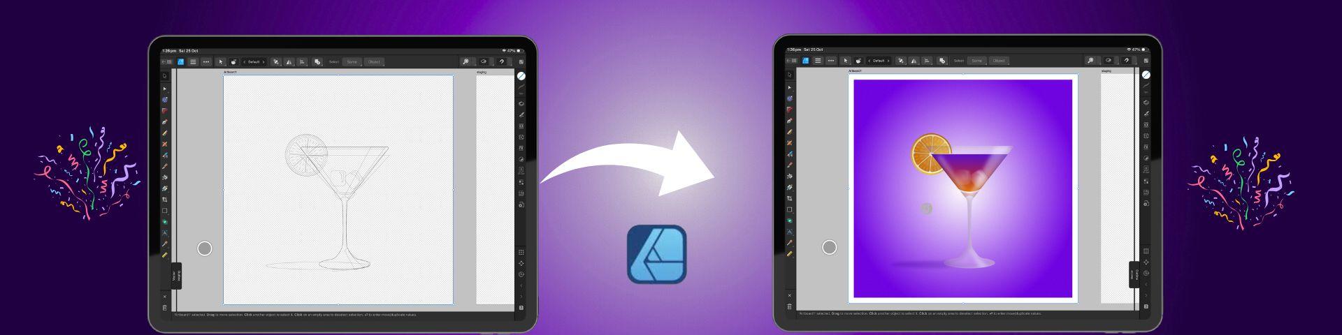
going to create a vector based
cocktail illustration entirely in Affinity Designer
V Version two on the iPad. This lesson is the perfect
follow up to my first mastering Affinity
Designer beginner class here on Skillshare. We'll build on those foundational
tools and apply them to a more advanced project
that combines shapes, gradients, reflections,
and transparency. I will guide you
step by step through creating the illustration
complete with glass, multicolor drink, ice,
and an orange slice. This class is designed to help you become more confident with the tools in the app while
creating something fun, fresh, and festive on your iPad. By the end of this
class, you'll have a polished design that
you can export for print. To help you follow
along seamlessly, I've included a sketch and
color palette with the class so you can use the
same tools that I'm using every step of the way. All you'll need is your iPad, Affinity Designer V
two, and your stylus. Join me in class and
we will get started in the next lesson by accessing
your class resources.
2. Class Project: For your class project, you'll be creating your very own vector cocktail illustration in Affinity Designer V two. Once you finish your design, take a screenshot and export
your artwork as a JPEG. Then you can upload
it to the class project section just
below this video. Sharing your work helps inspire other students and helps
grow our creative community. You can find your
class resources linked just below this video, and these include
a cocktail outline sketch to use as a guide or a tracing reference and a swatch palette with the
colors used in the class. You'll need to access these from the web version
of Skillshare and simply tap each file to download and then save
them to your file storage. From there, you can
easily import them into Affinity Designer and I will walk you
through the process. All right, enough talking. Let's get started on the next
lesson with an overview of the gallery and key settings
in Affinity Designer.
3. Document Setup and Importing Our Sketch: In this lesson, we
are going to create a new document in Affinity
Designer for our Illustration. When you open your
Affinity Designer app, it will open to
your gallery view. On the left hand toolbar, select new and
then New document. A new menu will appear offering options for
pre made templates on the left hand side that use common dimensions
for print and media. On the right hand
side, you can set your own custom dimensions
for the document. For hours, I'm first going to make sure my document
units are in pixels, and then I'm going
to set the size by tapping the number to
activate the grid. And I'm going to set the
dimensions to 2000 pixels. By 2000 pixels. And I'm going to select 300 DPI, which is the default for
print ready applications. We can leave the color
format as it is, and I'm going to toggle on Create Artboard and
transparent background. We can now select Okay at the bottom to create
a new document. When it opens at the top
toolbar on the left, you'll see an arrow
that will take you back to your gallery view. You'll notice that your new
document is called Untitled, and we're going to tap the
three lines at the top, select Save As, and then
label our document. Once you're done, save
it to your files, which is a really
important step because Affinity does not automatically
save your document. While we're here, I'm
going to activate another important setting
that will keep us organized. At the bottom left of the
tubar, select settings. And in the user
interface section, scroll down and toggle on ask for name when creating
layers or groups. Then at the bottom,
we can tap done, and now we can go back and
select our save document. Once it's open, head up to the top menu with
the three lines, tap it and select place
to import our sketch. In the pop up menu, select files if you've saved
it at a file location. But if you've saved it to
your photos, select photos. Once you've selected
your file, choose Add, and the image will appear on the right hand side of the interface in
Affinity Designer. You can then use your finger or stylus and drag the image
onto your artboard, releasing it when
it is full size. At the top right, make sure your snapping magnet
is activated, and then this will help
you to use the move tool, which is the arrow
at the top left to align your sketch
in the center. Next, we can head to
our Layer Studio on the right toolbar with the
layered icon and tap to open. We're going to create
a vector layer to build our illustration. Head to the top of
the layers panel, tap the plus icon and select
vector layer from the menu. Because we have enabled
this in the settings, a pop up box will appear, allowing me to name this layer, and I'm going to
name it cocktail. In the layers Studio, we're going to tap this new
layer until it turns blue and then hold and drag it with our stylus just below
our sketch layer. Now we can tap our sketch layer, and at the top of this menu, tap the text that says normal, and a menu will open up of blend modes that
you can adjust with. We're going to set the blend
mode to multiply so that we can see our sketch on
top of our vectors. And then on the left, lower the opacity either
by scrolling down on the opacity numbers or tapping
to open the input grid. Next, we're going to tap
our sketch layer again and swipe to the left with our stylus and select
lock to lock the layer. This ensures that it
won't move while we work, and that's it for this lesson. Join me in the
next one to import our color palette and create a gradient background
for our illustration.
4. Creating The Gradient Background: In this lesson, we are going to create our background
for our poster. First, I just want to deselect the sketch for a moment
in our Layers panel. Just tap the circle on the
right to deactivate it, and then head to the
left tool bar to the shapes menu and tap and tap again to open
the fall Shape list. At the top, we're going to
select the rectangle tool. We already have our
snapping tool active, which will help us align, and we're going to
use our stylus to drag to draw a rectangle
across the artboard. On the left tool bar,
we're going to tap the move tool at
the top and adjust the sides until the
rectangle snaps into place at the corners
of the outboard. While we're here,
we're also going to import our color palette
for the illustration. Head to the color
Studio on the right. That's the circle icon, and this is where we select
our colors for our project. The fill and stroke options are the top the filled circle is going to represent the fill
color of the vector shape, and the open circle is going to represent the outline
or the stroke color. To pick a color, choose a color family from
the outer ring, and then a specific shade
from the inner triangle. You can tap either the fill
or the stroke to activate it, and then select a color. To swap the colors between them, you can slide your stylus across from one
side to the other. Okay, now let's set
our background color. At the bottom of
the color palette, tap the text that says swatches to open
the Swatches panel. At the top of this menu, tap the three lines and
select Import palette. You'll have the option to choose an application
palette which can be accessed from any document in Affinity Designer or
a document palette, which is only available
within the current document. Select application and
navigate to where you save your palette from the class
resources and import it. This palette will now be the default view when
you open the color menu. You can always return to the
color picker at any time by tapping the arrow and the
swatches text at the top. So back to our palette
through the Swatches text, select the dark purple
color as the fill. And at the top of
the color menu, I'm going to swipe up
to remove the stroke. Then I'm going to tap the field circle to
activate the fill again. On our left toolbar, we're going to scroll down
and select the gradient tool. In the top toolbar, a
new contextual menu related to this
tool will appear, and this is the
same with most of the tools on the left toolbar. You'll find more menu
options for each at the top. For the gradient tool, scroll using the arrows and
select elliptical gradient. You can also tap the text to
open the menu to select it. Set the central node
in the middle of the artboard until
it snaps into place. With this node selected, go to the color panel
and choose white from our swatches and make sure that the nodes on the outside still have
the dark purple color. Now we can adjust the
length of the gradient. In the top menu, tap the aspect
ratio lock to unlock it, and this allows you to adjust the size of the
gradient independently. Once you're happy
with the placement, head back to the layers panel and tap to activate
that background layer. Swipe to the left and rename
this layer background. We're going to swipe to
the left again and tap lock to prevent it from moving while we work on the rest
of the illustration. And that's it for this lesson. Join me in the next one to set up the shapes for
our glass layer.
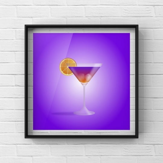
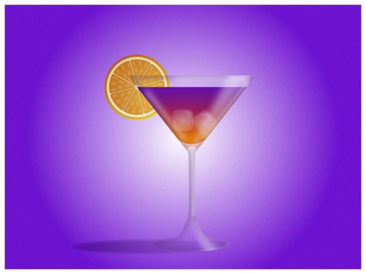
5. Creating The Cocktail Glass: Bing. In this lesson, we are going to create the main shapes for
our cocktail glass. To start, head to the right toolbar and tap
to open the layers menu, tap the circle on the right of the sketch layer to activate it, and this will guide the
creation of our glass. Tap the background layer and
drag it to the bottom of our layers so that the
sketch layer is on top. Tap to activate
the sketch layer, and at the very
top of this menu, double tap on the
opacity numbers to restore the opacity to 100%, making the sketch more visible
against the background. Next, tap to activate
the cocktail layer so we can start creating the
shapes for our glass. On the left hand tool bar, go to the Shape tool, tap twice, and select the triangle shape from
the extended menu. Tap and drag your stylus on the artboard to create
the shape and then use the handle to
rotate it so that you don't create a
new triangle shape. You can always place a
finger on the screen as you rotate to ensure the angle is perfectly aligned when using the node tool or when
using the move tool. The triangle will have the
same gradient color as the background as Affinity remembers your color selections. So head to the color studio
on the right, and at the top, tap on the fill
circle and select white from the palette
to see it more clearly. On the left toolbar, select the move tool and use it to position the triangle
on top of the class. You can also adjust the nodes on the sides to align the
triangle on top of the sketch. Next in the left tool bar, we're going to go back
to our Shape tool, double tap and
select a rectangle. Use your stylus
to draw it out on your artboard to an
approximate size, and then use the move tool
to adjust it and position it at the base of the glass aligned with the
stem in the sketch. The snapping should be visible on your screen to
help you do this. Back to our Shape
tool and this time, select a triangle shape again. Draw your stylus out to
create a new triangle and activate the move tool and place it at the
base of the stem. You can adjust and position it so that it is aligned
on top of the sketch. Finally, back to our Shape tool. We're going to select
the ellipse tool this time for the
base of the glass. Once it is in position, use the move tool to align it with the sketch and with
the other shapes above it. So those are shapes complete. Next, we're going to
create an artboard, which will act as a
staging area for creating our vectors that we will add
to our illustration later. So head to the top tool bar
and the three line menu, tap to open and select
the text artboards. Pinch with two fingers to
zoom out and then drag your stylus on the screen
to create another artboard. On the bottom right tool bar, we're going to open a new
menu, the Transform menu. You can use this
to manually adjust the size of any shapes
that are selected. So in the dimension
section at the top, we're going to adjust the
size of this new artboard to 2000 by 2000 pixels. Now we're going to
duplicate some of our shapes and move them
to the staging area. So with a move tool activated, you can do this in several ways. First, with our large triangle, place two fingers on the screen, and then use your stylus
to drag the shape, and it will actually drag a duplicate to the new artboard. This is my personal favorite. For our small triangle, the second way is to activate
the command controller. Then swipe to the
right and lock it, and then we can tap and drag the new shape
with our stylus. For our rectangle,
the third way is to select it and then tap
the three dot menu in the top tool bar and
select duplicate and then move that duplicate to the new artboard
with our stylus. And finally, for the ellipse, the fourth way is to swipe
down with three fingers on your screen to activate the quick menu and
then select duplicate. You can tap outside of
the menu to close it, and then you can move that
shape to the staging artboard. Okay, so in our Layers panel
in the right tool bar, we can now find
this new artboard, and you'll notice that the
shapes that we've moved have been transferred to
that artboard's layers. We're going to swipe left on this artboard and select rename, and we're going to
call it staging so that we don't confuse it
with our main artboard. While we're here, we're going
to go down to Artboard one, and we want to combine all of these shapes that we've
created into one silhouette. So under artboard one, we're going to swipe
right to select each shape layer until it
is highlighted in blue. And then on the left tool bar, we're going to activate
the Shape Builder tool. A contextual menu for this
will appear at the top, and we're going to
select the plus icon from this menu to add
our shapes together. Now we can use our
stylus to draw a line through all the shapes
that we want to combine, and they will merge into a single shape for
our cocktail glass. Next on the left tool bar, we're going to select
the corner tool. We're going to use
this to smooth out some of the sharp edges. So draw a rectangular marquee around the two nodes
at the bottom, where the ellipse
met the triangle. One selected in blue, tap one of the nodes
and pull it back to round the corner until it
aligns with the sketch. This will apply to both sides since they're selected together. Repeat this process with the two nodes at the top of the glass to
slightly round them, giving the illusion of
a rounded glass edge. Then at the top of the stem, we're going to repeat
the process on the sharp notes there
and round them out. Finally, head back to
the left tool bar, and this time, we're going
to select the node tool. Draw rectangular marquee around the two remaining sharp nodes at the base of the glass stem, and using the contextual
menu at the top, we're going to convert
them from sharp to smooth nodes by tapping
the rounded node symbol. And that is our glass done. Now we're going to create
two copies of this shape. So swipe down with
three fingers to activate the quick menu
and select duplicate, and then we're going
to repeat again for that second copy so that we have three copies of
this glass shape. Now to organize our layers, head to the right toolbar
and open our layers menu. Select the middle glass layer, swipe left and choose rename and name this curve
glass shape holder. Next, swipe to the
left on the top layer and rename this
layer glass shadow. Finally, select the
bottom glass shape, swipe to the left, and rename
it glass background layer. We can inactivate
the sketch layer and the top two glass
layers for this next part, so we can see what we
are doing clearly. And we're going to select the glass background
layer until it's active in blue and then head to the top of the layers menu
and set the opacity for this layer at 25%
using the input grid. Then in the color studio, we're going to swipe up
to remove the stroke, and this is going to give us a translucent look to our glass. Next, back to our layers, tap the circle on the right to reactivate the
glass shape holder, and then tap to make sure
it's selected in blue. On the right toolbar
in the color Studio, we're going to remove
the stroke and the fill by swiping up on the open and
close circles at the top. Finally, back to
the layers menu, and we're going to select
the glass shadow layer. We're going to reactivate it and make sure it's selected in blue, and then head to the
color Studio and tap on the filled circle at the top and swipe up to remove the fill, but keep the stroke. Then we are going to select the MV gray color from our
swatches for the stroke. And then on the right toolbar
just below the color menu, select the stroke Studio. We're going to
increase the stroke to about 17% by tapping on the numbers and inputting
the numbers in the grid. And then we're going to blow the stroke to create a shadow. Head to the right toolbar
and open the FX Studio. In the list at the bottom, select Gaussian blur
and turn on the toggle. A slider will appear on
the left of your screen, tap on the numbers
at the top and input 22 pixels into the grid. On the right toolbar,
go to the layers menu, hold and drag this
shadow layer down and to the right over the text in
the glass shape holder layer. This will mask the
shadow within the shape, creating that subtle shadow
look on the inside of your glass without
a visible stroke as though it shaded it in. In the layers panel,
we can reactivate the sketch layer by tapping
the circle on the right, and that's it for this lesson. Join me in the next lesson to create our drink
inside the glass.
6. Creating Our Drink: In this lesson, we are going to create the liquid
of the cocktail. So make sure the move tool on the left toolbar
is activated, and then head over to
the staging artboard and select the large triangle. We're now going to drag
this shape back over our main artboard and
place it on top of our glass and use the snapping to align it
perfectly on top of the glass. Once it's positioned,
we can head to the right toolbar to our
layers panel and tap to open. In the layers menu, first, activate the sketch layer by tapping on the
circle on the right, and this will guide
our illustration. Next, find the triangle
layer and select it. And we're going to use
our MV tool to drag this into our glass shape holder by pulling the layer on
top and to the right. We're going to make
sure that in the list, it's above the shadow layer, and at the top of the menu, we're going to change
our blend mode by tapping to multiply. This will allow us
to see the shadow on the sides of the
glass in the liquid. Next, tap on the
triangle shape layer to activate it in blue, swipe left and select
rename and rename it drink. Next, on the left toolbar, activate the move tool, and we're going to use
this to adjust the top of the triangle and bring it down to the line of the
drink in the sketch. Then on the left toolbar, select the corner tool. And we're going to
use this to round the bottom node of the
triangle by triking it up. And I want you to
pull it slightly above the curve in the
sketch within the glass. Now to add a bit of
color to our liquid. With a triangle still selected, head to the left toolbar, and this time we're
using the gradient tool. Drag your stylus across the
triangle from the bottom of the liquid to
the top and then select the nodes and align them in the center of the glass until the
snapping aligns them. Place the bottom node
at the bottom of the liquid and the top node
at the top of the liquid. Now to set the colors. We're going to activate
the bottom node and then on the right toolbar
in the color Studio, we're going to select
the golden orange from our swatches for the
base of the liquid. Next, tap the top node, and in our swatches, select the deep blue violet
for the top of our liquid. And finally, we're
going to tap in the center of the
gradient line to create a new node and select the reddish pink
from our swatches for the middle of the cocktail. Once you create a
gradient like this, you might want to save
it in your swatches. So to do this, select
your move tool, and now you will
see your gradient as the fill in your color menu. In the color Studio, head
up to the three lines on the top right and select Add
current fill to palette. And that's how you
save your gradients. You can use them just like
any other color film now. Alright, so we're going to
create a little reflection of the liquid at the bottom of the cocktail glass
just above the stem. We'll create the shape in the staging artboard
first and then drag it over to our main artboard and
place it in our glass. So head to the Shape tool, tap twice, and then select
the crescent shape. Draw the crescent shape out
on the staging artboard, activate the move tool
and rotate it with one finger on the screen
until it is facing upwards. Next, we are going to head
back to the Shape tool, tap twice, and select
an ellipse shape. We're going to drag out a small circle and
place a finger on the screen as we do this to snap it into
a perfect circle. Activate the move tool and then place it over the
base of the crescent. On the right toolbar
in the layers panel, swipe right to select both shapes and then
on the left toolbar, we're going to activate
our Shape Builder tool. This time, in the
contextual menu at the top, we're going to select the
minus sign and then drag our stylus across
the circle shape to cut it out of the crescent. This forms the shape of our liquid reflection at
the base of the glass. Select the move tool, then on the right tool
bar in the color studio, ensure that the
stroke is removed. Then on the left toolbar, we're going to tap the
gradient tool and set the color mainly on light orange by adjusting
the nodes of the gradient. On the right in the layers menu, we're going to head to the top and reduce the
opacity on this layer to about 30% and set the
blend mode to multiply. Now we can reactivate
our move tool, select our shape, and
drag it to artboard one. Position it over the stem below the Trink and align
loosely with the sketch. You may need to turn snapping on and off as you align this. And once you are happy, head to the right toolbar
to the layers menu, and drag this layer
down and across the text of the
glass shape holder to place it within the shape. Ensure your snapping is
reactivated before you continue. So next, we're going to add some ice cubes to our cocktail. And we want to do this
inside the drink layer. So in the layers panel,
select the glass shape. And in the top toolbar, select the three dot menu. And at the bottom of this menu, we're going to select
the text inside. Then head to the left tool
bar to the Shape tool, tap twice and select
the rounded rectangle. We're going to draw out a
small rounded rectangle shape within our drink. In our color menu on the right, we're going to select a
white fill and no stroke. And now to create the
illusion of melting ice, we're going to use the
transparency tool. On the left toolbar, select the gradient tool
and then tap it. And in the menu that opens, select the transparency tool. Draw your stylus across the
rectangle from the center. And at the top menu, we're
going to select elliptical and make sure that the black node is in the
center of the ice cube, and the white nodes
are on the outside. Now, adjust the nodes
so that it looks like the ice is melting
from the outside in. Once you're happy
with the shapes like the no Tool and in the top menu, we're going to select
the triangle icon, which is the convert to curves. This will change it
from a rigid shape and allow us to use the no tool to adjust it and make
it more irregular. Next, we want to add a bit of a highlight to our ice cubes. So first, we need to determine where the light is coming from. For this illustration, I'm going to make our light
source come from the right, so I'm going to
add a highlight to the right hand side
of the ice cube. To do this head to the
Shape tool and select the crescent shape and draw a crescent on
the right hand side. In the color menu, ensure
that there is no stroke, and then select the no tool. And in our top menu, we're going to do the same thing and convert it to curves. This will allow us to use
that no tool to adjust the shape and help it to fit the contours
of our ice cube. Then on the right
in the FX Studio, select Gaussian blur
to blur the shape. Now that we've
created the highlight on the right in
the layers panel, we can highlight this layer, and at the top, we can reduce
the opacity if we need to. And then we're going to drag this shape into the
shape of the ice cube. So over the ice cube
layer and to the right, and now that we've
created one ice cube, we're going to duplicate
the shape by swiping with three fingers down on our
screen and selecting duplicate. Now we can use the move tool to adjust the position
of this new ice cube. And as we adjust it, remember that we can also adjust the position
of the highlight in the Layers panel so that we still maintain that the light is on the
right hand side. Once you're done, use your
move tool to select each of the ice cubes and adjust
the opacity as you feel. I want to make my ice cube
on the right hand side a bit more visible than the one on the left that
is in the shadow. And that's it for this lesson. So join me in the
next lesson to create our citrus fruit on the
side of our cocktail glass.
7. Creating the Citrus Fruit: In this lesson, we
are going to create the citrus root for
our cocktail glass. We're going to do this
on the staging artboard and then move it over
to our main artboard. The first thing
we're going to do is to go to the left to bar, select the Shape tool, and tap twice to select
the Ellipse tool. We're going to use
our stylus to drag on our screen and create
a circle shape. Place one finger on
the screen as you do this so that it will
make a perfect circle. On the right tool bar
in the color Studio, we're going to select
the orange gradient fill from our swatches and
remove the stroke. This was made with the
gradient tool and save the way we did our gradient from our
drink in the last lesson. The only difference
is, if we head back to the color wheel by tapping on the left
arrow at the top, the noise slider has been increased to give it
a bit of texture. Now we can head back to our
swatches at the bottom. On the left tool bar, we're going to select the move tool, and in the top contextual menu, select the Transform icon and tap flip horizontal to ensure that the light in the gradient is coming
from the right hand side. Then we can swipe
with three fingers on the screen to activate the quick menu and tap duplicate
to duplicate the shape. Use the node on the right corner to reduce the size of this duplicate and place
one finger on the screen as you do this to
maintain that aspect ratio. Then select your
move tool and use it to center this circle in the
middle of the larger circle. On the right tool bar,
select the color studio, and we're going to use the light beige
gradient for the fill. Then in the top toolbar, select the transform
icon, and again, flip the gradient horizontally so that the light is coming
from the right hand side. Next, we're going to
make our orange slices. So head to the left toolbar
and select the Shape tool. Tap twice and select the
CG tool from this list. Then draw your stylus
across the screen to create the shape and place a finger on the screen to maintain
the aspect ratio. Then select the move tool and
place this in the center of our circle and resize it as you feel using your
finger if you need to. On the right toolbar, select the color Studio
and select fill, and then the orange
gradient without the noise so we can
see the shape clearly. On the left toolbar,
select the no tool. At the top in the
contextual menu, we're going to select
the teeth number. Tab and input eight to
create eight sections. In our cog shape,
select the red node in the center circle and
reduce the size a little. Then select the red node on the outside border of
the cog and draw it down to meet the center circle until the border disappears, and then you'll have eight
individual sections. Then select the
other red node on the outside and drag it
around to widen the sections. Next on the left toolbar, let's select the corner tool, and we're going to draw a
rectangular marquee around all the shapes until all the
nodes are selected in blue. Then select one of the nodes attached to the red line
and pull it around. And this is going
to round all of the top corners so the slices look more
like a cut orange. Select the move tool again
and then at the top, select the three dot menu. And in the middle
row, we're going to select separate curves. And the curves
will separate into individual sections
of the orange. And we can see this if we look
over to the Layers panel. It's no longer one single shape. With this shape still selected, at the top menu, select
the transform tool, and we're going to
flip the pieces horizontally to maintain that
light source on the right. On the left tool bar, head
to the gradient tool, and then at the top
contextual menu, select elliptical from
the list and place the light node at the top right hand side where
the light is coming from. On the right to a
while, we're going to select the FX Studio. In the left, select
outer shadow. And while it is selected
and tockled on, move your stylus on the screen to pull the shadow
towards the bottom left. Then with the top
slider on the left, you can adjust the opacity of the shadow to make it a
bit lighter at about 17%. Set the offset at about six, and in the top menu, set the shadow color
to a dark brown. In the layers panel
on our right toolbar, swipe right on all of
the section curves, and at the top of the panel, select the folder icon, and then the text group, and in the pop up,
name the group slices. Next, we're going to create
highlights on top of these slices to make
the orange look a bit juicier and
more realistic. So on the left toolbar, tap the X at the bottom
to deselect the slices, and then we're going to
select the pencil tool. In the contextual
menu at the top, we're going to set
the clothes to close off and on the right toolbar
in the color Studio, select a white
stroke and no fill. I'll zoom in and
we're going to draw a short stroke on one
of the orange slices. Then on the right, select the stroke Studio and tap to set the stroke width
at 12 using the grid. At the bottom in the
pressure window, we're going to drag
the node on the right down so that we taper the stroke to look
more like a teardrop. Then head to the FX Studio, select Gaussian blur and set the blur using the grid
at approximately 4.2. Then select the move tool, and we're going to make a
few copies of this shape. Place two fingers on the screen and then drag out the new shape, and we're going to create
a row of three at the top, two underneath, and one close
to the point of the slice. After each duplicate, we're
going to use the handles on the shape to then position it pointing towards the
center of the orange. Take your time until you have them positioned
in the way that you want. And once we've created
our first six shapes, we're going to head to the right tool bar to
the layers menu and then swipe right on each curve until they
are highlighted in blue. And at the top, we're
going to select the folder icon and
the text group. And we're going to name
this group slice highlight. Now we can duplicate this entire group and position
a group on each slice. We're going to use the two
finger gesture as we do this. And then after each duplicate, we're going to
position each group one at a time on each slice. Feel free to pause the
video as you do this as I'm going to speed my
time lapse up as I do mine. Once we're finished, head
back to the Layers panel, select the folder at the top, and in the pop up menu, call this orange highlight. Then at the top of the panel, set the opacity to 25% by
inputting into the grid. And finally, we're going to place all of our orange shapes into a holder shape
like we did with our glass so that we
can move them together. So head to the left toolbar
and select the Shape tool, tap twice, and this time,
select the Pie tool. And we're going to draw a pie
shape and place a finger on the screen to set
the aspect ratio right above our orange. Then we're going to select
the move tool and adjust the shape until it fits
exactly over our orange shape. On the right in
the layers panel, we're going to select all
the parts of our orange by swiping to the right until they're
highlighted in blue. Then we're going to drag these
layers over the text and to the right of the
pie shape layer to mask them within it. Once that's done, you can
select the move tool, and we're going
to drag the shape over to our main artboard, over to the cocktail and place it over the edge of the glass. We want it to come around
the liquid in our cocktail. And then we're going to select
the no tool and use it to adjust the pie shape until
it sits perfectly around it. This is why the shape is
so useful as a holder. It allows you to
non destructively slice your orange into
whatever size you want. On the right in
our layers panel, select your pie layer, and we're going to
drag it all the way down below the glass
background layer, so it looks like the
glass is on top of it. Then we're going to
set the blend mode of the glass background
layer to hard light, and that is it for this lesson. Join me in the next
lesson to create some light reflections
on our glass.
8. Creating Reflections and Shadows: In this lesson, we
are going to add highlights and reflections
to our cocktail glass. To start at the
bottom left, press X, to deselect all the
objects on the canvas, and then at the
top right toolbar, head to our Stroke Studio. Scroll down to the
pressure curve, tap on one of the nodes twice, and then select reset pressure. Now we're ready to begin. The light is coming from the right hand side of our glass, so we're going to focus our
reflections on that side. Head to the right toolbar and
open up our color studio, and we're going to
select white as our fill color and no stroke. Then on the left toolbar, select the shape
tool, tap twice, and select the trapezoid
shape from the list. Use your stylus to draw out the trapezoid on
top of your glass, and then on the left, select the move tool, and use this to rotate the
shape so that the larger side is at the top and
the smaller section is at the base of the
reflected liquid. Make it narrow and
try and rotate it parallel with the right
hand side of the glass. Next, we're going to head back to our Shape tool
and activate it, and then draw another trapezoid
at the base of the glass. We're going to use
our stylus to draw it out and then select
the move tool and position it at the
base of the glass on the right hand side for the
reflection at the bottom. We are going to convert
these shapes to curves now so that we can manipulate
them a bit more easily. On the right toolbar, open up your layers
panel and scroll down and select both of these
shapes until they're in blue. Then on the left toolbar, select the no tool. In the contextual menu
at the top toolbar, select the triangle icon and convert these
shapes to curves. In the layers panel
on the right, select the top shape and
then start to manipulate it so that it is parallel
to the side of the glass. It's okay if it extends
beyond the glass because we'll be placing it within the glass shape
holder in a moment. Next, we're going to select the bottom trapezoid and adjust the sides of the shape to curve in line with the
base of the glass. Once you're happy
with the position, on the right toolbar,
we're going to select both layers again, and then at the
top of this panel, we're going to reduce
the opacity to about 40% using the input grid. Next to the opacity slider, set the blend mode to screen, and then on the right toolbar, select the FX Studio, scroll down and activate Gaussian blur at the
bottom to toggle it on. Set the slider on the left to about 15 pixels using the
grid input at the top. And now we can head
to the right to the layers menu and swipe to make sure that the two layers are
still selected, and we're going
to drag them over the text and to the right of the glass shape holder to
mask them within the shape. And now we can continue with
a few more reflections. First, deselect all shapes
using the X at the bottom. Then on the left toolbar, select the Pen tool. Once it's active, head to the
contextual menu and scroll backwards using the arrows
until you get the line option. This setting will
stop every line after we create two nodes. On the right toolbar, open the color Studio, deselect our fill, and we're going to set
the stroke to white. Then just below in
the stroke Studio, we're going to adjust
our stroke size to 13 using the grid input. On the right toolbar,
open the layers menu, and we're going to select the
glass shape holder layer. And then in the top toolbar, select the three top menu and
the text at the bottom that says inside so that we can place these highlights
within the shape. Now we can begin
drawing our lines. Use your stylus to
draw your first line just inside the top
rim of the glass. Then draw the second line on the right hand side of the glass parallel
to the trapezoid. Draw the third line
as a rim light just inside the shadow of
the glass on the left, and the fourth line within
the stem of the glass. Once this is done, select the move tool on
the left toolbar, and then on the right toolbar, open the layers menu, highlight all of these layers by swiping to the right
until they're blue, and then select the FX Studio. At the bottom, select Gaussian
blur and toggle it on. And on the slider on the left, we're going to set our
blur to about 20 pixels. Then on the right toolbar
in our Layers panel, deselect all the
other highlights and select the
highlight in the stem. We're going to deselect
the snapping at the top right and then
adjust the line so that it's placed on the right
hand side of the stem of the glass because that's the side the light
is coming from. And then we can
reactivate snapping. Keeping in line with
our light source, we're going to
create a highlight at the base of the glass. Deselect all other
shapes with the X at the bottom toolbar and
select the Pen tool. We want to make sure our
setting is still online, and then we are going to place our first node at the bottom of the reflection
at the base of the stem, and the second
node at the bottom left hand side of the glass
just outside the base. Then we can adjust and
select the node tool, and we're going to use this to bend the curve around the rim. You can tap to add more nodes on the line for flexibility
if you choose. And once it's placed
and in position, head to the right toolbar
and open the layer Studio. Set the opacity at
the top to 60%, and then we can go
to our FX Studio, toggle on our Gaussian
blur and set the blur on the slider to about 15, I think, using the grid. On the left toolbar,
select the move tool, and in the layers
panel on the right, make sure this layer is selected and pull it down into
the glass shape holder. Finally, we're going to od a drop shadow to the
base of the glass. Deselect all shapes using the X on the bottom
left toolbar. And then on the right toolbar, we're going to open
our color Studio. Set the fill color
to deep purple from our swatches and
remove the stroke. Then on the left tool bar, select the Shape tool, tap twice, and select an
ellipse tool from the list. Use your stylus to draw out the ellipse shape at
the base of the glass, and then activate the
move tool to adjust it and extend it until it's
past where our orange is. We can adjust the thickness
of the ellipse as needed, and then on the right toolbar, open the layers
panel at the top, set the opacity to 60%
using the grid input. Then open the FX Studio. Activate the gaussian
blow and set the slider on the left to
ten pixels using the grid. Finally, to make this less prominent at the
base of the glass, on the left toolbar,
select the gradient tool, tap twice, and select
the transparency tool. On the top toolbar, set
the transparency to linear with a black
node on the left and the white node on the right
so that the shadow becomes gradually more
transparent towards the right side of the base. Adjust the gradient
as needed until the shadow is visible just
after the edge of the base. And then on the right
in the layers panel, drag this shadow layer just above the glass
background layer. And we're also going to
reduce the opacity a little further to about 36%. And that is it for this lesson. Join me in the
next lesson to add a few finishing touches
and export our image.
9. Background Frame & Exporting: In this lesson,
we're going to add a frame to our illustration, as well as a bit of texture
and then export our image. To start off with, head to the right toolbar to
the layers panel, and we're going to
scroll to the bottom and tap on the background layer
to activate it in blue. Then in our color studio
on the top right, you'll notice that
our background has the gradient but no stroke. So in order to frame our image, we're going to tap on the stroke and select the color white. Then just below in
the Stroke Studio, we're going to tap
on the numbers above the slider and set
the thickness of the stroke at 100 pixels
using the grid input. Next, we're going to head
back to our color Studio. This time we're going to select
the gradient fill color, and then we're going
to head back from our color studio to the
swatches and the color wheel. Just below this is
the slider for noise, and we're going to tap
on the number above the slider to activate the
grid and set it on 7%, just to add a bit of
texture to the background. Tap Okay, and then we can tap again to close
the color Studio. Before we export our image, I want to save this
cocktail as an asset. So on the right toolbar, we're first going to
select the layers panel, and in the list, select Artboard one, which contains the whole vector
with the background. In order to save an asset, you do have to have it
as a grouped layer. Once you have this highlighted, head to the assets icon
on the right toolbar. And in the subcategory, tap the three line menu and
add asset from selection. And this will add
all of the vectors, which means that you
only need to tap on an asset to insert it
into a new project. Okay, so now we can
export our image, head to the top tool bar to the three line menu and select the text
export from the list. Our menu will open up, and on the right hand side, in the section that says area, we're going to tap the
text whole document, and instead select artboard
one from the list. Next to adjust those dimensions using the number grid to
whatever size you choose. The beauty of creating vector illustrations is that they are infinitely scalable without
any loss of resolution. So you can have them as
large as you choose, but I'm going to keep mine
at 2000 by 2000 pixels. You can also tap the file
name and rename your project. And then at the top of the menu, you can pick the format that you would like
your artwork to be in. I'm going to export
my line as a JPEG, but you also have the
option of exporting it as a range of file types. EPS and SVG will save it in a vector format so
that you can still manipulate those shapes
and color palettes in another vector based program
or on another device, and the rest of those files will save them
as raster based images. Once you're finished, you can preview your image
on the bottom right. And if you are happy, close
and press share on the bottom left to export your image to your file storage
for printing. Cancel will then return
you back to your Canvas, and that is it for our
cocktail creation. Join me in the next lesson for our final thoughts and
uses of your illustration.
10. Final Thoughts and Class Project: Bye. Thank you so much for
joining me in this lesson. I hope you are leaving with a stronger understanding of how to work with semi
transparent objects like a cocktail glass
and feeling more confident using
Affinity Designer version two on your iPad. I would love to see
what you create, whether it's your own take on the class project or a
completely original design. You can submit your
project by taking a screenshot and uploading it to the class project section. Experiment with
different glass styles, colors or typography. The more personal your design, the more unique it will be. You can turn your new
asset into a poster, a celebration card, or a
cocktail recipe for a friend. Sharing your projects
inspires me and encourages other students to
explore vector Illustration. If you post on social media, tag me at Cardwell
and Ink so that I can see your work and
share it in my stories. If you've enjoyed this class,
please leave a review. It helps others find the course and gives me feedback
for future lessons. Keep an eye out for a project based Skillshare membership
giveaway coming soon, and don't forget to
follow my profile to stay updated on new classes,
tips, and giveaways. Thanks again for joining
and happy creating.
 CardwellandInk Design, B.Sc, B.A, M.Teach