Transcripts
1. Welcome to Free Expressionism!: Hi there, I'm Christopher Clark and welcome to my
Painting course, free Expressionism Painting
like you just don't care. Flowers addition, because yea, Flowers, they're super fund. They're bright and colorful
and pretty and they don't judge you and they
don't care how they come out. They're pretty no
matter what you do. Because really you're
painting yourself on the canvas, not the Flowers. And maybe you are
a flower deep down inside. Maybe we all are. This course is
really about letting go of all your inhibitions
and worries and fears about painting
because you're just having FUN and no one's watching you and
no one's going to see this work when
you're finished. That's all those
things have very important to purge
all your fears and inhibitions and really get your creative stuff
flowing if you're having a block or if you just love having FUN with paint being are really don't know how. Or if you're not even an artist
and you just want to play and want the excuse to just have FUN and not have a strict, rigorous Painting
course with technique and all those
really hard things. Anyway, let's run through
the pieces we're going to do together because
they're all going a little 20-minute studies. The first one we're doing
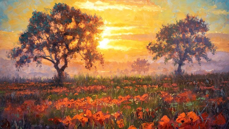
is FUN sunflowers scene. Just some funds, sunflowers, that bright blue sky with
some FUN dark purple, the green shadows and stuff. That's a good time than
we're doing a poppy scene. In the video, I do
two versions of this, so sneak preview wherever you get to see both
versions of that. One of them I loved
less than the other. So I'll let you decide
which one's which. So beautiful poppy field. Because who doesn't love
bright red poppies. And then we're gonna do
these lovely white Daisies with some warm golden
light cast on them. That's super fund with some dark purple
shadows and stuff. Then last one we're
doing together is these beautiful purple
and red daisies. And all these are done with a very cheap materials,
very cheap paint, cheap brushes, whatever
tools you want to use, whatever tools you want to
invent or experiment with. It's all about playing and
experimenting and trying out stuff that you might be not sure about trying on
a more serious piece. Or you're trying out of techniques that you've
never tried before, never thought of when you
don't have any inhibitions. Used to be surprised at the
stuff that will come out. And I'm doing these
unfairly large. Not like, you know, this is
probably bigger than what you you can try
doing smaller ones. Did you Quick little things? Spent five-minutes on each
one or maybe you'll do, maybe someday you'll do
great big ones that are just like super huge
and splashy and fund. But I hope this will
give you a start on how to process
that kinda stuff. Very free and very spontaneous
and also very cathartic, honestly just filling
in paint and I don't care and take that
and you smash, smash and whatever
you want to do. It's really, it's very playful and you're allowed to do
that even as an adult. With that, we'll
get to the easel and we'll get started painting. So see you back
there in a second.
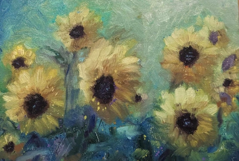
2. Sunflowers: Here we are at the easel
or the very simple setup. I've got a glass palette
because I like it, cleans up very nicely and I can scrape stuff
with a palette knife. I just got chrome
yellow paper on a pad. This is drawing paper. It's 14 by 17. But you can use
any size you want. Literally doesn't matter. And I've got just
cheap old chip brushes from the hardware store. And I've got some, I like flat shapes, but they're just like
synthetic brushes, like super cheap stuff. This is, this kind
of exercise is not about nice materials
or anything. Just regular, I'm
using acrylic paint. So for this exercise, it dries much faster and it just lets us work
really quickly. I've got all the colors here. Yellows, orange, brown, reds, purples, blues greens
arranged in Oregon. On the outside of my palette. Super-simple. Nothing
fancy at all. Whatever colors you
use doesn't matter. What kind of paint
use doesn't matter. This is about just having FUN and not really
worrying about anything. So with that lets, I'm seeing just blue and green because this is a bright
daytime Painting. I got a couple of
little things of water over here. Dip it in there. Let me, let's get some
nice bright font dislike, throw some, some paint
on the surface here. We're using paper so that we
can just do a whole bunch of these and not spend money
on expensive canvases. This isn't about nice materials. This is about playing and
expressing and just having FUN. And maybe you can do this as a study for a painting
you're gonna do later. That's entirely possible. Maybe I want way more green down here because there's
all these leaves and stuff. I just keep throwing the
brush and the water. This is like a
two-inch chip brush, totally cheapo, whatever
I like to dislike. Hit it with whatever's
left on there. Sometimes it make sure
you're in a place, you can make a mess.
I always like to go. Purple is great for, for plant shadows when
there's greenery, purple is a great
plant shadow color. And do nice big, try that out. Just have FUN like
smack the paper and smush it and do whatever
you want, do weird stuff. I got a piece of
plastic over there. I'll use later, like
like paper towels, different, you know, I've got
a couple of palette knives. It doesn't matter. You're
just having FUN. Let's see. I'm going to indicate
where some of those floss sunflowers
are gonna be. Let's just hit it with some. Lets see if there's one here. We need more paint than that. I got some some nice
dark blue sunlight to hit this a couple of
times. That's alright. There's sort of like, hey, there's some splotches, like squint your
eyes and look at it. I do that a lot with my
oil painting classes. Squint your eyes and look. You can see that's a big
pile, orange right there. He's gently, gently
close your eyes. I'm not measuring anything. This is really just to have FUN. I see big piles of yellow. I'm not even worried about
making it look like a flower. Maybe there's some
other ones in here buried just a little bit. It doesn't look like
it's not a flower yet. It's just a pile of color. We'll make it look pretty like we'll make it look
like something maybe later. And even if it doesn't,
it's still fine. I'm just enjoying myself. Like it's just kinda funders to fling paint and not really care. I don't really care
what it looks like. I can get it wet and
it a little bit. It's kinda FUN. I can take a little more like
a bristle brush with a stiffer brush is
really good for this. I can just dip it in with
a bunch of water on it. And take, I have
a palette knife. I can dislike, smack it with the palette and you
can use your finger, but it makes an
extra super mass. So this just saves your finger and I got a bunch
of paint on here. I can throw it on there. I could smash it around. This is your chance to play and experiment with some
different techniques. And yeah, I get some, I get some orange
down here because there's a few flowers
down there, Haydn out. Let's see what we can do. Really just seeing,
I'm just trying to get maybe there's some bright I'm just like really piling on a big
pile of color there. I'm not worried about those like bright yellow
little rims where the light with a sunlight is transparently you
shining through. That's kinda FUN. Maybe I'll
start to indicate those. Could all this
juicy yellow paint. Again, what exact
colors you using? It doesn't matter what
color is my using. I don't know. Which is the yellow. Doesn't matter right now I can take this and sort of distributed a little
bit, make some phon. I'm using both hands
just to be quicker, but also then I can
attack it both ways. And it's dripping and
it's like, Hey, great, It's let the paint, let the paint have a good time. It's you and the paint. Those are the two people
that the two entities. Whatever. Painting this picture, little guy back there somewhere. I'm just having FUN. Let's see. Maybe I don't know, maybe I can start
indicating some of where those I'll wash the brush off. Where the dark whatever
the seed centers are. You sure what you call
them? I don't one black. I'm just going to hit
some some purples. When a role in smush,
purples, browns. I typically don't paint
with black paint a lot, even in my oil paints because I like to
make my own darks. One there. Actually, I'm not
sure if I liked that one. That's okay. See, I can
always just do that. Whoops, it's gone. This is Acrylic which
does dry decently fast, but we're working
so fast right now that it won't really have a chance to dry with
what we're doing with it. Maybe there's a couple here
and as they get further away, maybe they're a little lighter. Maybe there's a dark one. Maybe I'll do some darker. I'm just using the same brush. I don't know. Is
that a stem? Sure. Just grabbed some of this green. There's some leaves. Maybe I can use
my palette knife. Palette knife is great to make some super sharp crisp
things or you can smush it. Let's take a little tiny
trowel soon as you can use it like that and really
push the paint around. And maybe that's a leaf. Look at that. Sunflowers
got some crazy leaves. Maybe there's a leaf that's
coming up or a stem, rather, this painting is all
kind of zooming this way. It's kinda FUN. This
gathering, whatever is here. Maybe I want some
darker in the corner. I like the corners and the
edges of my paintings dark. It kinda brings a little
vignette quality to it. I can get this wet and a
little more paint this way. Little more afflicted if an equity just
filling it on there. Hey, look, I can add some
leafy textures. I doing that. It's Fun. Maybe i'm, I'm gonna take some white, mix it in and make some actual purple like
nice colored purple. Like not dark per called
purple but a little lighter. Adds a little character. It's kind of vaguely
looking like some abstract is sunflowers and it this way it doesn't
matter what it looks like. It's more about that
you're having FUN and you're just flinging paint on
there and see what happens. We're not trying to
impress anybody. Don't even show
these to anybody. Do 100 of these and
don't show them to anyone and just keep
them for yourself. And you'll be surprised at how keeping it
to yourself and not showing anyone can
really uninhibited you. It can really let you loose. And like, I don't care
what it looks like because no one's ever
going to see this. Don't post it on social media. You could show your
friends if you want to, but plan on doing it,
not showing anyone. Really. No one. Say to yourself, like, no one's
going to see this. Who cares what it looks like. I'm actually adding some petals. I like the light shining
through the left of these. It's like that makes
it translucent. There's some over here. And I'm using this
big fat guy here. I love flat brushes because
even you have a giant brush. I can do tiny little strokes. I can do thin ones or thick
ones, whatever I want. Is got a paper towel
somewhere over here buried. I sort of need a dark yellow. Dark yellow is basically green For I want maybe some of these
that's a little too dark. Some of these shadowy areas. Is there some shadowy
little sunflowers here? I'm leaving those strokes,
I'm just letting them happen. There's like four colors
of paint on this brush. I'm just kinda letting those, those strokes happen
and that's really FUN. You get to just see all
the beautiful things that paint can do and
you just let it alone. Let it have a good time. Maybe it's a little
more orange in here. I'm not trying to get it
to look like the picture, using the picture
as an inspiration. And I'm kinda like if I see a little bit of color,
I'm running with it. But I'm not trying to like
measure things and get it to look just like
the photograph. That's a reference.
It's just an idea. It's not to be used literally. It's just a starting place for you to see how
far you can take it. You would do this
with any painting, your references, just
that it's a reference. You're not replicating it. You're just referencing it
as a place to start from. What people want to see
is your interpretation. They don't want to see
you paint a photograph. They want to see. They want
to see you as an artist. What can you show me that
I've never seen before? I've seen a picture of
sunflowers way big, big whoop. I've never seen the way you
paint some flowers before. Like that's exciting to me. And that's what you're,
your viewers want. You're telling a story. Not just painting some
picture that I copied. I'm telling you a story. Tell me, you're telling me your version of
these sunflowers. What do they look like to you? That's far more
interesting to me than copying some picture. You know. Do I like
this? Yeah, that's fine. You don't wanna do.
I'm going to take my, where's my bristle brush here? And I'm gonna get some
more yellow on there. Where's my palette knife? We need some more
of this yellow. Sometimes I'll lay the
painting on the floor flat and do this
so the paint lands more flat right now
it's like going down and I maybe don't
want that necessarily. Right now. It's okay.
But sometimes I'll laid on the floor and do this, put a drop cloth
down or whatever. So I get a little derbies. If I don't want them,
I can just take a paper towel and dab mount and it pushes things around
anyway, it's kinda FUN. Picks up some paint
and moves it. Dates like maybe grab some
over here and move it around. This pickup. I'm just
using the paper towel now. Pick up whatever
paint leftover here. Let's phon yeah,
that's looking great. I think, right? I
don't know. Who cares. Maybe I want some, some of these leaves have some
lighter sides to them. When I mix some paint. A lighter, lighter,
yellowish green, maybe it's not that light. And maybe a little wider net. Maybe some of these have yeah, that's what we needed. We needed some
variation in those. Leaves me behind. This one. You can see the paint
is still quite wet. I'm putting a lot
of it on there so it's thick and wet and I can still blend. I'm going getting
surprising amount of blending considering
this as Acrylic. There's a lot of paint moving around and smashing together which Acrylic paintings
are known for being. Everything is dry and you
recorded is layering, layering dry paint
on top of dry paint. Well, in this case, where
we're actually blending wet. Okay, I've got a few minutes. I try to keep these
videos at 20 min. I am going to slow down and I like this yellow
that I'm out of. My, my darker, more intense yellow put a
little more on that. I can slow down if I'm getting to a place
where it's like, Oh, I want to refine this shape
a little bit. That's Fun. Maybe let's see about
this 11 stroke at a time. Can bloom. Just pick
up some more paint. This is just pure yellow. I'm not using any
mediums with this. I'm just using water
to soften things up. I don't have any medium. Not to say you can't use any, use whatever you want is
just not at the moment. Maybe a little more orange. It's like right by the center, there's some FUN
orange happening. I think I was missing that. I don't know if there's like, I don't want to using the
back of the brush now. I don't want to dig
too hard and make a hole in the paper
because this isn't like super-strong paper is
cheap, old drawing paper. Like I bought a pad of it for a few bucks.
They're not expensive. That's cool. Maybe I've
got a little bit of those. Some little specks. Have you all pick up
whatever color I got here, makes it a little
speck ease on there. And this one could
be just about done. Maybe I want some white clouds. This is something that
normally I would do first, but it was a
last-minute decision. So here you go. I'm just hitting it with
some pure white in-between. Normally you don't
paint in-between. You do the sky first and you build your way up from there. But this was a last-minute
decision. So why not? Look at that now I got
some FUN clouds and that really changes the value range. Got some really nice
bright values in there now, That's fine. Missing anything. I don't know. I got a minute or so. It's hard to say. I could
just keep doing this forever. Of this pickup, whatever I
got still on the palette. Smush it a little bit here. Some make a couple indications
of another one there. And do this, tear it off
and try another one. Maybe it'll be better and
better every time you do it. And maybe you'll
decide what colors work for your sunflowers
and which ones don't. If you decide to do a more detailed version of this later, you'll have done it four or five times and he manual does
whizzed right through it. No surprises because
you've done it before. You paint on the nice
expensive canvas. Crank out a few of these and just have FUN with it
and see what happens. You'd be surprised
at what you'll discover before you start to do the real version or whatever, or this could be at
just for funding. So we'll call it we'll
call that one done. I'll clean up and we'll get a new page and we'll start in the next
one in a second.
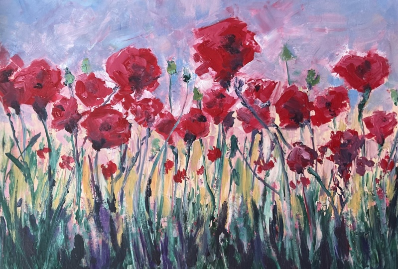
3. Poppies: Alright, we're gonna do
something FUN on this one. Beautiful red poppies scene who doesn't like
red poppies, right? I'm gonna, I'm gonna
take a chance here. I'm going to coat the
whole thing. Red. Super-quick. I'm going to
paint not the poppies. That makes any sense at all. Maybe it will in a second. I'm going to paint
the negative space around the poppies just for Fun. I don't know an experiment. These are all fine experiments. Don't be afraid to do weird stuff on these because
this is your chance. When no one cares. I don't care. I'm not
going having FUN. This is some cheap
piece of paper, cheap paint, cheap brushes. Let's see what to start with. Let's, let's do
some palette knife. I literally just pick the tool. And I'm going to
start with some pink. I probably need a lot
more value than that. And I'm going to
find where those are and paint around them. Yeah, this is a
interesting experiment, adding a little bit,
a little bit of pink. They're a little Alizarin. The paint is still decently wet. We'll see if this palette
knife is fast enough. Maybe I'll hit it with
a brush afterward to I'm estimating where
those are on the page. I'm not really measuring. It could be way off. I probably am, but that's okay. This is just an idea. You can take more time
to do this if you want, or you can try to
plow through it. You can time yourself. Like I've mentioned, I
tried to do these videos in 20 min because that's the length of a video that works well for these streaming ideas. These online painting
course is 20-minute videos. It's a nice little snippet
that people can, can digest. So I tried to keep
them to that length. So that helps me edit like, Oh, I've only got a few minutes. I better just edit this and
think less than paint more. That's what you're
doing right now. There's that there's plenty of other times where you will, the opposite, you'll,
you'll really think and ponder,
what am I doing? But for this
exercise, we're word. We need to not care and
we need to dislike, have FUN, and really
not pay attention. This is, I don't know, some sort of darkish
greenish, something. I need to fill this. I'm starting to using
green and brown. This is this distant pile of green underneath our
a little poppies. They're this is one of those like flat palette knives like this is actually a
Bob Ross palette knife. I just like his stuff. You don't have to get
his version though. Maybe we're starting to. Not that I'm doing
the stems yet, but I'm just going to grab some of the wet
paint and yank it up. Because why not? I want this vertical. I gotta be careful. I don't want to cut a
hole in this paper. If I was doing a
canvas or wood panel, I could really
push a lot harder. I don't want to cut
this paper through. So you could do a piece of
cardboard. I've painted on. I painted on the cover for the notebook that when I
finished the notebook, I just painted the cover and turn it into a landscape
that was beautiful. Like a sun, some sunset,
cloudy, things great. There we go. Now what
if I actually hit this? Let's do this palette
knife instead. Let's take some just juicy. Here's one that's super dark. Well, this will be the base. The base has or a little dark. Maybe it will do that. Right
where the where they meet. And I am smearing it around. I'm going to borrow
some of that paint. Use it over here. Maybe I use a little
too much Alizarin. Oh no, oops. Happy little accidents,
right? Right, Bob. Happy little accidents.
That's right. You never know what
you're gonna get. Bob likes to comment. He's always hanging out
with me and my studio. And there's one there. Now I'm just going
to grab some red, just some juicy red I think poppies were just made for palette knife painting. Then maybe I'll have to
fill in a little more of this sky around them. It's alright. Kinda attacking them from both sides,
negative space. The painted a pain to the
space around the poppies. Now I'm painting the poppies. It's a zero chance to play and having a little experiment, you're allowed to play. It's very, very healthy
to play actually, it's good for your
mental health. As adults, we
forget how to play, or we think we're to grown-up or good for
it or something. We tell ourselves,
childish and silly. And then we just become sad people because we don't
know how to play anymore. It's very important that
you don't forget that. Let's take another brush. I think this needs to
be a little lighter, but back here, I'm going to
push that little lighter. Just got some white. Maybe down here is
sort of gets yellow is it's sunset area. And it's picking up some of
that green from those stems. That's alright, maybe their
stems and the distance, I don't want to smoosh over
this whole thing. I like it. I don't want to beat down these great
brushstrokes that I made. I just need, I need a little
more light in the sky. So that's what I'm
doing. I hope it works. Don't know. I think I needed those poppies to jump
out a little bit more. Versus the the sky needed to be a little
darker. I'm sorry. The sky needed to be a
little lighter in order to allow the poppies
to stand out more. Stop and take a look in a mirror to put a
mirror behind you. Or I've got my monitor here. I can look over at my monitor. What does this look like?
It's very helpful actually. Maybe these stems a
little more definition. I got my trusty flat. I don't want them to wobbly. I liked that there's
sort of thin and spindly near there's a
whole bunch of them. The paper is buckling a
little bit underneath my all the water and stuff that's in
here, so that's okay. There's lots of little little
things happening here. Marks that I've made through the paint with different tools. Red that's still left poking through the
from the beginning. I don't want to forget
to go at some angles. You don't want
them to go all up. Or maybe you do. I don't know. I'm just playing here.
Some of these have little little seed pods on them or something.
It's kinda FUN. Little detail. Connect
some of those, yeah, those little
seed pods or PFK-1. And if with this
big thick brush, I just do a couple of strokes. And there's a little seed pod. Has that look,
That's looking Fun. Yeah, I think, I hope maybe I want a little more definition. It's got their abstract. But they're definitely, you
can tell what they are. Hope. If not, who cares, this is really we don't care. We're just having FUN, we're
just filling in paint. We just wanted to see
what will happen. Maybe I'll put, maybe I want to define one of
these a little better. Maybe this one's
a little bigger. Maybe this one needs
to be some of these. Maybe it needs to be
defined a little better. Running out of red. I've
got more over here, but I like to have enough
to finish my piece. Don't be afraid to
use some nice bits of color on your,
on your palette. Don't be miserly with your pain. This is still very wet. I can really smush and blend some of
these colors together. It does dry super quick
though. That's looking Fun. Let's look at it. I've
got a few minutes. Can I tried to keep
these at 20 min? And do do 100 of these if you don't like the way it came
out, try another one. Maybe this going in reverse
wasn't the best idea. Maybe I could have defined
them better if I had painted sort of a gradient of yellow to pink and then added the Flowers
afterward. I don't know Maybe you've discovered
some really cool way to paint poppies that
you've never done before. That looks really cool. If I don't like the
way this came out. It's 15 or 20 min of a very, very educational experience
and totally worth it to me. I feel like I want to add
a little more red here, maybe another one
here and pick it up. Some of that green. There are some that are
like in the distance. I if I don't like the shape
of something like that, I want to separate those. You can just play and you can
refine things a little bit. If I like, I can let this dry and then glaze over it
with some other colors. If I'm thinking it needs a
little more definition still, without disturbing any of
the brushstrokes I've made. It's a little drier now. That is, I'll hand
it to Acrylic. It dries super fast and you can go over it with layers and
layers very, very quickly. I'm also by out of white. Let's get some more that
keep your paints handy. Yeah, this is coming
out really good. And I'm just having FUN. So again, it doesn't
matter how good it looks. That's a really
terrible way to up to measure this exercise.
It is just FUN. We don't care right now. If we cared, we would
never get anything done. We'd be so stagnant. This is to break you out
of that, that caring, that over worrying
and the inhibitions and so that you can just be free and throw color down
and you'll get more fluid and adept at it and
it'll be more intuitive. And you, when it
does finally count, boy, you will be so
much more prepared. I'm just taking a little bit of this fund gold color and
this is decently dry. I'm not pushing too hard. But when you've done
this a couple of hundred times and blown through
a several pads of paper. You will be amazed at how much more fluid and
confident you'll be. When you wanna do the one
that counts that you want to show the world or sell or
give to someone whatever. You've done this so many times, it just comes out of you. And boy, is so much FUN
when you are confident with your brushwork and with
your color choices. I'm gonna do that again
and add a little purple. And I get some paint on me yet. Hello. All my shirts
have paint on them. Mark of an artist. I just wanted this
a little darker. I love all this
stuff happened here, so I don't want to
cover it up entirely. By this. Wanted to add a
little more dark in there. No really, not really any leaves on these just little tiny stems. Maybe I can do more
little tiny stems. I've got a little
tiny brush here. What happens is yeah, this works. A little tiny brush.
Sprinklers just came on. Don't mind them. I wish I had a poppy
field outside that was getting watered right
now and that would be fine. Maybe I'll do a
couple of more of these little seed pods I can do like this. Maybe. Different different brushstroke
for some variations. Yeah, that's good.
I needed a little more that different
variety of texture. And then maybe some
of that or like a little lighter and the distance. You see how quick
this comes together. When you're just playing. And don't think too hard. This isn't about, this
isn't the time to think. This is the time to
just experiment. Let's see, do I like the pink? I feel like the pink
up here is competing. Maybe I wanted a
little more blue. I think I wanted, I wanted
it a little less red. The pink itself is
competing with my poppies. I'm going to throw
some, just some water and a little bit of
white and some blue here. Not a ton of paint. I just wanted to see if I can maybe tone down that
red a little bit. The red and the sky is competing with the
rest of my poppies. So I'm glad I noticed
that now while it's just a silly little paint
flanger of a painting. Before I've been spending
hours and hours on it. I'm like, Oh, you know
what? I hate that color. So now I've I've tried it out. And if I really didn't like him, I go that was a bad idea. That's okay. It only I
only spent 20 min on this. I could do another one.
That actually helps. I think that helps to bring
out my poppies a little bit. Yeah, that's fine. And even if I'm doing oil later, this is a good guide. This is just a good study. And man, it's fine. This is just a
really good Release. Get, get the day out. So if one little poppy field, I think we can call
that one finished. Soon as you step away and
look at it and go have a cup of coffee or walk
around the block or something and see if anything
needs to change. And we'll indicate
I'm one or two more in the distance there. Because there are sort of
like going away from us. Yeah, that's fine. That
helps me. There's one there. And at this point I'm not
looking at the picture anymore. I'm like, What does it what
does my Painting need? So yeah, we can call that one done Littlefield,
the poppies. Who doesn't love bright
red poppies as PFK-1. So cool, we'll clean up
again and we'll come back and we'll do another
Flower Painting. Alright?
4. Poppies version 2: That's going to test 12. Okay, This is the
video to take two. This is the second
version of the poppies. Okay, we're gonna do a
little something FUN here. I'm going to try to take
to, on these poppies. I didn't really love
how that came out. Doing the reverse sort
of painting around them. So I'm gonna do a little more
straightforward approach it and see if I
liked that better. I'm just so you guys can see that that happens and that's
why this stage is important. I'm gonna try going in with
all actually paint the sky. First. We'll do a little more straightforward
how I might actually do it. I'm just sort of
inventing this right now. I don't know what color this. I don't know. This
great little sunset Easy thing is happening here. I did like how the by
going a little more blue. I'll do that in a second here. On this very top level of the sky brought the
poppies out a little bit. So I learned that
and I liked it. So I'm going to try
that this time. Just whatever I got left. Throw it in there. Yeah. Maybe I'll do a
little little purple. Maybe that's a little too much. Letting my brush strokes
really come through there. Yeah, that might actually help. I forgot to turn this
light off. There we go. Sorry about that. Now you won't get the glare on the
paper. That's much better. Yeah, a little more
straightforward there. And let's go ahead
and add some of this dark green in the yeah, I'm going to hit that. Just mix some font
and color here and bring it up one
stroke at a time. Those are some really FUN. Then I can smush some of them. Maybe as they get
up there a little, they fade into this yellow, orangey color a little bit. Maybe this is a good time
for my hunger plastic. This is literally a piece of plastic that I've saved off
a package or something. I can just use it to
help me smush paint around back-and-forth
and they'll scratch the surface
a little bit. I don't want to tear this
paper because it's just paper. Again, if I was using wood
panel or canvas or something, and I'm going to
continue this up a little higher even span. I want a little darker still
in a very, very foreground. So we'll mix a little
bit of purple Enos. I know in the picture it
doesn't have purple in it, but I'm not trying to
reproduce the picture. I'm trying to make my own version and my
own interpretation. I remember I'm
telling my own story. These poppies look like, that
is looking nice already. I liked that a lot. I'm just dipping the plastic and
a little bit of water. And like middle cut through
some of the paint that hasn't dried yet. A couple. Some of them, some
of the little stems and some of the rhythms of these plants sort of
flow at an angle. They don't always go, just
go straight up and down. They're very organic and all kinds of stuff
happening. That's fine. But that aside. And let's see if I can, I'll try adding some poppies
with just a brush like this. Let's do a little
more conventional. So maybe I care a little
bit about this one. I know we're Painting
like you just don't care. Maybe in this case, I
do care a tiny bit. So I didn't love how those
other ones came out. So I'm going to still do a FUN expressionists
version of these, but just a little more
precision and focus. The other one was
a good experiment. And I did learn a lot I'm glad. I'm glad it only
took me like 20 min. I can try out
something different. Here. Maybe I could get some some watery ***** on the
brush and let her have it. Just for PFK-1. If I don't like some of those, I can dab them out with a
paper towel little bit. Who knows? Nice. Then maybe some of these really close ones. I did like the palette
knife approach. Let me try that, but I'm
going to try to be a little more a little more precise. There's one. Here's another one. I'm just literally
taken some red. Whatever the brightest
red you've got, give me the strongest
thing you got. And here's this juicy
one right here. There's one over here to here. And I can depart from the, from the reference if I decide I want another one somewhere else. Let's, let's do some of
these STEMI, stems here. I'm going to use this guy again. Let's get some sort of greenish something
for these stems. Let's say I do want something
a little more precise. Again, the papers
buckling a little bit. That's okay. We can handle it. I want maybe some of
these stems will overlap. There are a lot of them going every which way.
This one comes in. Maybe I want I'm going
to add a little bit. Make it a little closer to the distance sky color so
that it looked further away. That is looking a
little more control, a little more crisp. Not Chris, it's not looking, Chris, it's looking crisp. I can do some of
those seed pods. I have a smaller brush for that. I think that worked better. So maybe the super
mega abstract version of this was a little, a little too much, was it wasn't as strong
as I was hoping. Maybe for some of these, I can get a little precise
and some of them not. When I do that at
flings back at me. I gotta be careful. I don't want it to be too perfect and trying too hard
and too obvious. I don't mind it if it's like
some of these are a little wacky and brushstroke.
It's fine. We can decide which
one we like better. Which version of this
painting we like the best. Lets, lets hit these
with a little dark. This paint, this red paint
is still really wet. I'm trying to do this in as
few strokes as possible. Let me get it there
where it's darkest at the base and push it out. And leave some of those
Fun little moments. When the paint breaks. Maybe we can see
down into this one. Let's see, maybe this one I can see just a little side again. I use a little bit lighter
version of that for some of these here. Nice. Maybe we need some more
sorted as Poppy shapes. I'm going to scoop up
whatever crap I got here. Maybe there's more
just in the distance. Let's see if we can. Yeah, this is looking nice. I'm gonna do a little
more my splatter East bladder because I like it and maybe this could you use a little more sense
of abstraction? I don't want it to
crisp necessarily. I don't know. Yeah, it's
got some motion to it now. Maybe we'll add a little second, let this dry and add a
little more vignette coming in from the sides. I do that just a tad. That's a little dark. A little too much paint. The paint is dry so I'm dry
brushing over it by doing some FUN directional
stroke his stuff here. And it's grabbing
some of that paint from the poppies and
pulling it a little bit. That's fine. I'm
switching hands. I'd like to just the direction
of the stroke that it makes with this hand. In this direction. Maybe in the future.
If I did this, if it did it a third time, I won't do it for this class, but if you did, they
go Well maybe I'll do that vignette to start with me. I liked that, that vignette
quality earlier on. Maybe we could hit some light poking through
some of these places. Right at the bottom of
our are sunset sky. Maybe that needs a
little bit of that. This is all an experiment. You try out what you like. Try out what you think
my, it looks good. And it might not. Like I had to say
I'm liking this one a lot better
than my first one. The first one was a study. I tried out some
things I didn't love. It was okay. This is better. If I was gonna do a
proper nice painting. I'm glad I spent 20
min on that before doing it for 3 h socks. And that's what these are for. And it also was
just really fine. I totally admit it
was a good time just filling and paint that reverse sort of idea of painting the whole thing red and then painting a sky around the poppy. That was a cool idea. I don't know, I just
thought of it well, just for a minute before I
started painting. I'm Mike. That might work for
another another. I'll keep it in my mind. It might work for
something else. Just because it
didn't work here. Doesn't mean I won't
ever try it again. This is definitely, I
think, a stronger Painting. I could use some more stems. I think having some go and
other directions is helpful. Some more of those seed
pod things here and there. Yeah, I think that this painting is a little more
intentional feeling. And that's what maybe it needed. The other one felt a
little two random. That puppy has no seat
and it has no stem once. Okay. So sort of a poppy
fantasy. Anything can happen. Maybe there's some of
these seed pods in the foreground that
never quite made it. There are sort of
slumped over who didn't do a stem that comes off of them to maybe i'll, I'll, you know, you could
try a different one that's way more
abstract than this. And it could look great. I think doing a tiny bit more precision has helped
this attempt. I liked this one
better. Just looks a little more crisp,
little more strong. This is dripping down like that. I don't know. Sometimes I might, I might not care,
but in this case, It's taking away from my shape. I like the shape
of that poppies, so I'm going to
clean that up a tad. Yeah. Yeah, I definitely like
this a lot better. So hey, I wouldn't call the
first one a mistake at all. It was a great
learning experience. And I learned a few things that I applied to this painting. And I might try it again
in another future. Peace. Sign a mistake at all. Don't beat yourself up if it
doesn't go the way you want. Because clearly
it happens to me, to, yea, happens everybody. You do something
like I tried that and I saw that differently
in my mind somehow. And then when I did it, it was like that
happens to everybody. So just go with it, do a study like this, and try that weird
idea when it's just cheap painting
on a cheap piece of paper and you spend
20 min on it. That way you're not
worrying about it. You can just have FUN with it. However comes out. If it comes
out great, like, Oh good. I'm going to explore that again and now's the chance to get these ideas
out and try them out. When it's a much more free,
carefree, whatever situation. Definitely good
exercise for this. I'm trying to now I've just sort of I got a couple minutes. I'm staring. Excuse
Anything else I want to do to it? I like it. If I were to let it
dry, I could add some blurriness and here, I mean, I could do a little
bit just with some splatters. I want a clean brush
because I want this to be actually nice and golden. I don't want there was like
purple on it or something. Again, I can do
this on the floor. I could lay this
down on the floor. So the splatters would go more straight right down
onto the paper. Right now they're falling down. If I don't necessarily
want that, I could just take
it off the easel and lay it on the floor. If you're doing
this a whole ton, I would recommend a respirator. So you're not inhaling like
little particles of paint. I'm doing this just
for a few minutes. So not a big deal,
but especially when we're using oil paint
and solvents and stuff, I definitely have a respirator
that I where I'm not breathing in little particle
particulars of paint. But that is adding a little bit. It's phon yeah, I like it. Maybe I can take a paper
towel and dab some of those little specks
that I didn't want. In general, that's looking great. I liked this
one a lot better. So thank you for joining me for part two of poppies
came out much better. And I hope you try them
both. Maybe yours will. The diverse version
that paint around the red like I tried, maybe
yours will be better. Just an idea. Try it out. Try it out in the future,
painting, whatever. So just a thought, anyway, this one's better. Yeah, we're done. Now.
We'll definitely come back for Painting number three, Cool.
5. White Daisies: Alright, we've got a little
more soft, glowy, nice. Highlight these warm colors. I'm going to start with some, some of these warm, earthy tones here. I liked them. This one's got a lot
of flowers in it, so I hope I can get
all these in there. I have to move fast. I suppose I could
do two parts of it, but that would defeat the
purpose of this exercise. Maybe I think it's going to turn to a little purply
on the edges here. I'm gonna do that vignette
and now I just love that. Again using my big old
giant two-inch chip brush is one of my favorite brushes, especially for this
level of stuff. Alright, I'm gonna start
hitting some of those darks. I'm going to find
the negative spaces around some of those flowers. I like the arrangement here, so I'm going to try
to stick to it up. For the most part.
I dig it. Dig it. You know, maybe there's
even some green in here. Nice big fat brushstrokes. I'm not too worried,
I'm literally just finding dark, dark space. I am painting around. I guess I'm kinda
doing a little bit of like what I did with the
poppies the first time. I'm painting around them. And then I'm going to paint them in the space that I've made. We'll see hopefully it'll
work better this time. Because it's a cool idea. And I've done similar
things before. It looks, it felt right for that one didn't quite work
out. But that's okay. It'll work better on
this sort of technique. I am doing this squint a
lot. I like to do this. This is where you
dislike gently relax your eyes and you just sort of almost like you're
going to fall asleep. Look at your subject and
that will make it up here a lot less convoluted. And it'll get rid of a lot of the details
that you don't really need. That's helpful. And a lot of ways to see it as a simpler
version of what you're looking at because there's
so much going on here. You need to simplify it. Maybe we're getting
a little more precise for some of these. Instead of a little
paint clingy, Maybe I'm getting a little more deliberate and that's okay. I'm still being loose and i'm I'm not agonizing
over every petal. I'm still kind of
just seeing large, big shapes and really lay
in some FUN paint down. And it's gonna be this
FUN abstract sort of journey around this thing. And maybe it'll make
more sense when I finally lay in some of the dark centers of
some of these flowers. And then those bright, bright highlights
around the edges. I think this kind of thing, you can agonize over everything. And that could be one approach, simplifying them into much
larger abstract shapes. This is how I would paint this
anyway as a more involved, complicated, precise
oil painting. I think we're taking
that approach this time. Now I'm hitting more of
the super mega darks. Once that first layer dried. And I don't have any black. I love making my own darks with whatever colors
I've got. Humic here. You can make flavors of
black with purple and green. And whatever Brown you're using. Boy, you can get so
many great flavors Of black black paint is helpful sometimes to I
don't discount it at all. It is a great mixing color. You can get some colors that
you can't get any other way. As even some pink
and some of these, some of these spots, it's pretty grab a
little bit of alizarin. They're dancing
around the painting, filling in some of those areas. Maybe I'll use a smaller, now use this little
bristle brush guy. Maybe I'll actually find
some of these centers now. I'm just tapping them in. Just tap it in. Tap, tap, tap rule. I'm dating myself if
you know a movie that's from yeah, Let me, some of these centers now are a little more apparent. Modify. I like style of brush, I'm gonna use another, this is this acromial
bristle brush, the ones that are just crap. I don't throw them
away. I saved them. Because sometimes you need
a crap torn up brush. Because let's face it, using Acrylic paint destroys brushes, right? We all know that. So I save my destroyed brushes and I use them for
Acrylic Painting. I'm adding some of these
really great juicy son. Some highlights here where the sun is really hitting
these, these petals hard. It's great. I notice I'm using the overhand grip
on this paint brush. You could do this also. I find I'm have more versatility by just
turning the brush over, putting it, putting
my hand on top. And I can do so much more
versatile stuff with it. And I can use the flat
end of the brush. I can still use
the tip if I want. It is a really fast
way to really get some mobility and
different angles and stuff out of
your brush for sure. I can tell if I was doing
this as an oil painting. I can get a lot more
glowy blurs out of this. Acrylic is great for
this exercise where I'm just throwing in some paint and some color and
seeing what happens. It dries very quickly and
what end up doing, of course, I'm layering dried layers of
paint on top of each other, then I'm not really getting
any blending stuff. Like I would if I was using oil. I can get a lot. He's
beautiful blend glow is I'm all about
the glowing lows. But this is fine for this. And if that's, if you
can get it to work to your advantage with this
quality of paint layering, then yeah, go for it. That's looking nice. I'm using the using the paint to help tell the story
of these petals. I'm, I'm implying the petals, but I'm not really
painting every single one. I am definitely letting, letting the paint tell a
lot of that story for me. I'm taking advantage
of the texture of the paint to imply a lot of detail without me
necessarily painting it. Again, maybe if this one I'm
being a little more precise, little less paint flinging and
a little more like, oh no, I actually want these
shapes to look precise. And that's okay. Every,
every paintings, different groups.
That's my light one. That's looking really lovely. I'm gonna go back and
hit it even darker. For I'm just gonna go
like solid purple, green I can use this to carve in the other direction
some of my shapes. I guess what this is
turning into is less of like an abstract
version of this and more like a study for what
I might wanna do if I was actually going to paint
this more thoroughly. Let's alright. So again, maybe for this one
I am carrying a little bit. You can not care as
much as you'd like. This one seems to want to be
cared about a little more. I think just like
those poppies did. I needed I needed
to be a little more loving to how I I implied them. So it's yeah, it's looking nice. Because you use a little more
this sort of blue color. Are some of these. This white in shadow
becomes blue. Maybe there's one
down here that I haven't done yet. Yeah. But you start to see like something that you
think is white, is certainly white until it gets in shadow and then
it turns a different color. That's called local color would be what,
what the thing is. In nice bright light. But in shadow, it
becomes something else. And it's up to you to
figure out what that is. Maybe there's one more little
speck of a center there. Yeah, this is looking
really great. I got a few minutes left. Yeah, this is, this
is becoming a study, less of an abstract. I mean, I can splatter
some stuff if you want. I like where it's going. A quick study. Maybe I want some of
this nice dark to, maybe hit some of these
inside's a little bit quicker, a little heavier. This is my, it was
one of these brushes that I cut with a pair of scissors or something to
like make it even thinner. And now it's thin in
bristly and pokey and I get all kinds of Fun
little textures out of it. It's great. You can create your own brushes. As my teacher, he had a
thick Russian accent. Would say, you can
give it here cut. That was rather endearing
via deem Zan Guinean was one of my first teachers, brilliant impressionist artist. There's a little flower here. Then I've been ignoring
poor little guy down there. Didn't get no love. Nobody knows me. Well. Here we go. I gave them a little love.
Now. He's joined the party. Yeah. Yeah. She did with me. Good. We're going places. It is is about coming to a place where I'm
running out of things to do at this at this
quick gestural level. This is like a
gestural version of this painting.
We'll call it that. I can add some, some of this just to live in
and up a little bit. Because it's FUN. Know how I like fund. If it's too much, I can take a paper
towel and I can smash away some of those
splatter East bladders that I didn't like. But they're still there halfway. Just add a little
bit of life to it. A little bit of movement. Maybe what this painting needs. I liked some of those pink
colors. Let's do that. Let's do a subtle, a subtle pink Another kind of flower in there. I don't really know
much about Flowers. I can paint them. I couldn't tell you what species
these are or anything. Share some of you who are
like your head and your hand, those are, of course, these
are these species we at it. So thank you for keeping that to yourselves
and laughing at me. And the privacy of your on home. So yeah, just some just
some subtle pinks. Some other Flowers in there. Kinda like that.
Well, this is lovely. And a quick more of
a gesture study. Really loose and not agonizing over every single
petal and everything. Just really think
about big shapes and just getting blocks
of color out there. Starting with this golden, glowy gold, this nice
sepia tone colors. I could just see those
inside those Flowers and then find the big shapes, Chevron the darks down there, bringing the lights out. And nice, nice study. Nice very gestural abstract
study of this piece. I cared a little bit. I didn't, I didn't
just not care. I cared a little and it was nice and it was
still fine and I didn't I wasn't overthinking
it or overworking it. And I think again, this one just needed a
little more attention. Sometimes they do. Sometimes your your
abstract thing can work for certain scenarios,
but not all of them. That's okay. Sometimes you just got to slow down and be
a little more precise. I'm hitting this with a
little bit of paper towel. Just finding some areas that needed a little
more crunch genius, I don't know. Subtle will cool. This came out great. I was actually wondering how he's
going to pull this one off. I'm like, wow, this
is a complicated. This is a tough piece to, to just slam together in 20
min, but it came out good. So we'll awesome. We'll clean up again
and we'll come back for one more final flower piece. I'm always like the last few
seconds, what can I get in? And needed to separate that
or something like that shape. Look at it in a mirror
and you'll start to notice stuff that you
hadn't noticed before. I'm looking at it in my monitor, my screen here and I
can see things like, Oh, I needed to change
that. And let's try that. I could play with it all day and I'm going to stop before I do. Okay. See you back
here in a few minutes.
6. Purple daisies: For all you purple
flower lovers, we've got some FUN
purple daisies. These will be interesting. I'm going to actually, I'm seeing a hazy green
color to start off with. On this one. I can fill in some nice
flower colors later. But I always like again to start off with a whole
surface of something. I would never, ever just like, well, here's a
purple flower on us. White surface that's
boring as ****. So I I always give it a good good ones over with
something to start with. Maybe I'll do a little more. I want the purple to stand out. So maybe my typical go-to
way like dark purple, purply greens, maybe I won't. I'll do it more of a brown
or something. Try that. I don't know. Then maybe maybe in here I'll start to do
some purple illness. I think I'm gonna kinda, yeah, here's maybe something
similar to the last one. I'm painting around some of
these shapes. Don't know. Smashing happening,
a lot of smashing. So maybe the purple is
like in the bouquet. The darks are in here,
and that's cool. There we go. It's a
good place to start. Yeah, boy, this this dollar
chip rush really earns its, earns his living, man, I swear. Okay, I'll do a continue that
purple a little further. Yeah, that's looking. Then
here we go. I love this part. Can get a little more
harder you're filling. It. Depends on how
much how much paint is actually on the brush. If there's hardly anything left, really got our but he just really recently
dipped it in some stuff. You just gotta give it a
little bit of a flake. It doesn't need much. It takes my piece of plastic, my trusty free tool that I saved some things from the garbage because
it's really handy. Maybe I'm going to start
adding in some of these, these lovely blue I
like the blue ones. There's one there. And there's one here. And there's a wider one here. I'm definitely going
to need to go make some make the darks darker. I'm just put in some
color where there's, where there is color. There's Flowers there. Here there'll be Flowers. And I can, maybe these might want to be
more precise also. We'll see there's one here. Just a blob. There's a nice juicy
dark line there. I didn't see that one yet. Painting is really a
lot of observation. Yeah, there's some
dexterity and stuff, but it's more observation
than anything else. You have to really learn
how to see things. You have to unlearn
what you think you know about something and learn
to see it differently. There's no, there's
no Flowers On area. There's just blobs
of beautiful color. That's great. Maybe I'll do this brush for there's
some great pink ones. There's one here. And There's one here. And then there's something
much darker ones here that actually
might be a little more. In the red. A couple back here,
hiding and shadows. There's a few float around. And maybe the further ones are way make them look
like they're blurred. I can blur them
out a little bit. That's fine. This isn't the
distance to just blurt out. I love this, This
duo, duo wielding. And there are actually a couple legit like rich
purple ones here. Really, we're running
the gambit on all the purples. Very cool. Let's, I'm gonna go in with a little more chiseled brush and just hit some of these
darks a little more. Maybe I can actually
like define some of these petals by coming in the opposite
direction with the dark. You know. It's kinda FUN
painting around it. There's some weird little blossoms or what
do you call Mike little buds that
we'll get later. For now. I'm just filling in. I'm painting around the flowers. I just need it to be darker to get those
to really stand out. And now it's like I'm painting the negative space
around these flowers. I'm painting the part
that's not a flower. And we'll see, maybe, I'll, maybe I'll
keep my darks here. Maybe I don't, maybe
I'll leave this sort of a lighter green and
I kinda like it. I'm just playing around with it. Because if it doesn't
come out Good, I don't care. I'll
do another one. We've already seen
me do that once. I don't mind. I'm not hurt. My feelings aren't crushed. I got to revisit the poppies
again, that was PFK-1. So if it doesn't come out
good, You do another one. No big whoop. Have that dark
fade out a little more. Let's, let's maybe add
some of those centers. Those are some interesting, an interesting
cool yellow color. I'm using my weird
little haircut at brush. Sometimes the center of
course isn't, right? It's not like
concentric circles. We're drawing a
satellite dish shape. And as you, as you turn it, the center is actually going to move to one side of the other. So remember that
when you're doing your the shape of your flower, if you're trying to
get more precise. I mean, you can see I'm not super being precise with this. I am smashing it on there with the big weird
brush that I mutilated. But just little things
to keep in mind. Almost like there's a
whole bunch of them. There's this guy here. There's one there. I sort of several indications of other Flowers and the distance
that when we don't see. Yeah, so I am paying a
little more antigen. That's looking nice.
Let's take it. Presses are flying
everywhere and let's, let's hit my one of these
sort of bristle brushes. This one is a little lighter. Getting hit with a little
more sun, I guess. To scoop it out, whatever
blue I got here. I'm moving pretty fast on this. But I'm really just
trying to be gestural. I'm I'm trying to be not terribly worried
about what I'm doing. Just let the the
thoughts come out. And whatever feels like, let it be intuitive That's a better way
of explaining it. Let the process just happen. Without scrutinizing
yourself too much. If you see a weird color
like I think that's green. Yeah, go ahead and grab some
green and shove it in there. Maybe there is some greenback
here that I'm missing. Yeah. What did that
that actually adds a lot a little more water. It's kind of a soft green. There's these
little little buds. Maybe I do want
some darker greens. And some of these places. Yeah, there we go. Look at that. This little brushes, wonderful. How it gets these great
scratchy strokes. Or I can stop and be more precise and get some
sort of details. But it's just got this
organic quality to it. That makes some really FUN, gestural, scratchy
sort of stuff happen. I love it. Let's take these other same bristle
brush and maybe I can define too much paint without getting super refined
with a tiny little brush. Let's see if I can indicate
some individual petals here. See I can be gestural and a
tiny bit precise. And still. Let the painting
breathe a little bit. Yeah, that's looking nice. Just glanced over and
my little monitor. Do dad I think I just killed my center. This one. Bring it back. Bring it back. Bring it back. He's bring it back. There's
no such thing as the mistake. Me, I like that
better actual ICU. That's a nice bright yellow
that I wasn't expecting. It looks nice. Let's do some stuff with some of these darker purple
action things going on. Oh, you know what, I forgot entirely is the center
of this flower. This purple guy, I need
something. There we go. Supposed to be around. Ish.
Yeah, that's looking nice. Maybe. A little bit more, a light, not one. And then here we get some dark. Again, this is a gestural
version of this painting. I'm really just like letting myself go of I see a spot
that needs something. I'll hit it. I don't even necessarily wash
the brush every time. Let's, let's get some
nice really intense blues on some of those. Some of these main
event flower is here. Need something a little heavier
to make them stand out. Sometimes it's several layers. You get a little more, you can get a
little more precise with each layer if you want. The first layers can really just be slapped down anything. As you go a little further, you get a little more
precise if you want. And then of course, we
can have a little FUN. Let's have some FUN. Some water, some blue
in some splatter. Oh my God. I have no idea what's happening
here, but it's fine. Maybe get a couple of those, couple of those diktat
and that, and that Where's my other one of those? I lost my brush.
Got only a couple of minutes left on this one. Maybe I'll do a little
bit of that stuff. For some of these stems that is looking lovely. Maybe some of those yellows
are now a little too much. It's okay, I'll smush them out because we're just
playing around here. So it's okay if something
isn't, something isn't perfect. But that's quite lovely. I can hit some darks,
a little darker. Maybe I do want some. Yeah, those purple is yeah. I'm getting close to
my my 20 min here. So this is another FUN little gestural version
of this painting. Just to exploring,
if I wanted to, I did a green which kind of gave it are kind of a somber look. The lights in here look
kinda cool and mellow. Maybe if I wanted to try
something a little more lively, I might do another one
and have it be pinks or do the whole thing blew like and paint
around it like I tried, you know, those poppies. Maybe these these centers
could be a little more, little more lively, little
more bright yellow. That's helping. Not all of them. Maybe there's the ones that
are like facing upward. And we'll leave the other ones. Maybe they're sort of
curling down into the duct. Is that bit of dispatch. Okay. Yeah. Indicates that
some some petals by sort of cutting in
where they separate. And there it looks like a petal, like I really haven't painted much detail this at all,
but it looks like it. I'm all about implying detail. And there's just
so much abstract piles of paint everywhere. It's really freeing just
to put it in a blob of color and paint around
it and see what happens. You know, don't,
don't think too hard, just paint and it's get all your good All your
day's activities out onto your canvas
and leave it there or paper or whatever crummy
surface you're painting on. Anyway. This one's about done. So cool, thanks for, for joining me for another FUN session of this
abstract expressionism. And hope you guys
had FUN painting. And we'll come back in a second for a little recap, you know. Yeah. As I continue to paint
and continue to noodles. So anyway, yeah, so you
guys back here in a second?
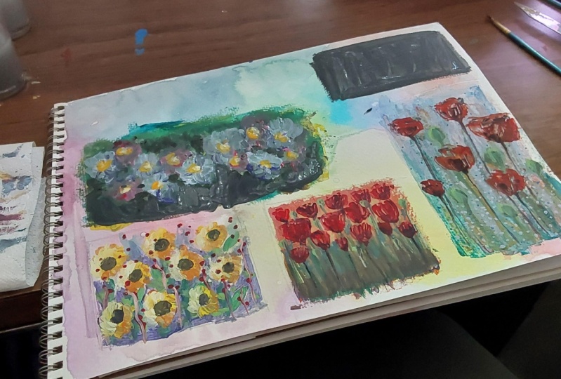
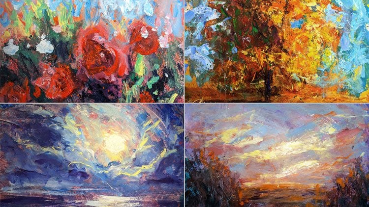
7. Summary: That was a really FUN
painting session for a little 20-minute studies of
some FUN beautiful flowers. Let's run through all the
ones that we just did. We started with this great
little sunflower piece. Everyone loves
sunflowers. I do anyway. I love the colors. I loved the way the light
zinc is through the pedals. There's all kinds of yellows and oranges in the
flowers themselves. But then like the
greens and the blue sky and a lot of FUN things
happening there. Looking at some of the
paint splatters here, they almost look like
little bees flying around. Just kinda FUN. Yeah,
really spontaneous, scratchy, slinky,
letting it all out. The flowers are very
non-judgmental subjects. They'll never get angry that you didn't
paint them, right? This is really a
FUN place to play, do whatever you wanna do. I love painting flowers because, because they're very
bright and phon, and happy and very
forgiving subjects. This next one, this is the
one that I tried to takes on. This was the first one which I decided I do actually
like this one, but for different reasons. It is a little more steeply
and broken with the paint, which is actually kinda cool. Didn't like it at
first and I did a second version just so
you can see that like, hey, I did a different approach. This is the one where I tried
to paint the negative space around the flowers
first. And then I left. I did the whole surface read and then painted
in everything around the red and left
that space for the flowers, which was a Fun Approach. I might actually try that and a different painting,
a different context. I liked the idea. I wanted to try different
version of this. And I'm glad Dix was a very
different approach to it. This was a little more
straightforward version where I went ahead and just actually painted in some gradations
of color first, and then painted
the poppies on top. Just like you might
do a normal subject. I did that back to front. The farthest away things. You approach, the closer things as you get closer
into the landscape. So that was a different
version of that. In a different quality to
the flowers are more crisp. The colors are a
little more even, but there's less red and pink distributed around it.
So different version. So this exercises like, Hey, let's do a quick little
study less than 20 min to see which
path I want to take. If I was gonna do this
as a serious painting, maybe a larger painting. I'd like to know that
what path I'm going to follow before I'm hours into the piece and I don't
like where it's going. So these are fairly large. These are 14 by 17. You can do much
smaller versions of these and of the same effect of discovery and experimentation
and trial by error. Do a smaller one and might
only take five-minutes, then do like four
or five of them. You might discover some
really cool techniques. You never would have tried
if you were only doing the finished serious painting first. Here's the third one. We did just some beautiful
like white Daisies, more like a cool, warm light shining on him. I loved the purple background. Cool contrast. This was
a funny way just to see those Flowers as
one big block of shape and all those darks
as one big block of shape. You can fill in some
details later once you've ironed out where
everything's going. But I really find a way to
experiment in those shadows. I added some purples and greens, blues and touches of red and pink and all
kinds of Fun stuff. If I didn't like it,
I would do I try it again just like the
poppies. You saw me. Not make a mistake, but not necessarily love
where I was going. So that's okay. That's,
that's what this is for. To really try things out
and see where it goes. I liked painting the
shadows, painting white. Things in shadow means
you get to explore different kinds of blues and greens and purples and stuff, which was PFK-1, pfk-1 one. Then lastly, something
a little more blue, if you like, blue flowers, purple flowers, some
sort of purple, blue daisies, which was Fun. Again, lots of
PFK-1, deep purple, green shadows with some more. The light blues and the light, and all those little
hello centers sort of poking
around everywhere. Really. Just Flowers are just such a
celebration of color, I guess by their very nature, they're a celebration
of springtime and the world coming
back to life. Maybe this can be you
coming back to life with your painting or with
your Art, or emotionally. You're just letting
yourself be free and uninhibited and
allowing yourself to play and whatever you come out with on the paper
or the canvas or whatever will be
beautiful because it's just your soul
wanting to be colorful. And it's FUN to do that. And to not show these to
anybody, to just have FUN. And you don't have the judgment. Or you have to worry
about how many likes you get or whatever comments. And it is just so much so freeing to not necessarily
show these to anyone. Really important part
of the exercise. You can if you want to. Of course I'm breaking that
because I'm instructing. But man, it really is great
when no one's going to see. It's just my own private
little Art Journal. That's just me and
my conversation. And you can do whatever you want and it's really freeing
and really FUN. You'll probably learn
some great techniques that you can use later in
a more serious painting. You can, your process will flow so much
better as you get more confident with color and the less worry you have
in less inhibitions. As an artist in
general or in life, I don't know, will only work for four more
serious pieces later. So you have to say to yourself, just like I said, kinda became a mantra like the painting is going
to turn out just fine. Just like your life, right? Very, very meta, very, very function way,
all those things. So anyway, I hope
you had a good time. We do a lot more of
these, do 100 of them, do a couple of day
and see what happens. Do any pictures you
can find or you have, or go to the park or wherever. Painting have FUN and
see what happens. Find all pieces of
cardboard to paint on. Don't use expensive things, use cheap stuff that
you don't care about. That'll be so much easier and
more FUN to just let it go. So happy Painting, do
a whole bunch more. And I really appreciate you
joining me for my class. Free Expressionism, Painting
like you just don't care. The Flowers addition
because yea Flowers, right? They Flowers. So I'm Christopher Clark and happy painting, and
I'll see you next time.
 Christopher Clark, Professional fine artist and instructor