Transcripts
1. Intro: Hey, welcome to my
frame of Crash course. My name is Jeremy Mia, and I've been designing brands and websites for ten years. I want to show you
how you can use it to create your own
portfolio website. And if you're a
designer that wants to get started into
doing development, then this is a great
course for you because I'm going to show you all
the basics, the foundations, and show you how
to add animations, use typography styles. Basically, everything
you need to know to create websites not
only for yourself, but also for clients. This specific class, it'll
be a short class creating a portfolio website that you can share say to clients where we'll have your
portfolio pieces. It'll be a simple one
page landing page, and then we'll have a project
page that we'll create. And I'm going to break
down the whole steps. I'm going to give
you my shortcuts, my plugins that I love to use, and give you some
other resources and websites that I love to
go to for inspiration. I'm going to show you
how to make the website responsive so it
works for mobile. So yeah, if you're a designer or a
developer that wants to learn framer or neo platform
without knowing any code, then this is going to be
a great case for you. Enroll in the class today, and let's get stuck into
creating some awesome website.
2. Framer Foundations: So for the first lesson, I
want to share the basics and foundations of Framer
and how to get started. So I use Framer on my desktop. If you're on Mac OS, you can download it on there or you
can use it in the browser. I like to have it
down in my doc, so I use it on my desktop. And here is the back end
workspace, they call it. So it has all your projects
in this workspace. Can rename your
workspace if you go to the top you can see that
you're in my workspaces. So you can also add a workspace. Maybe it's a separate workspace for maybe clients or maybe you have a team member that uses a separate workspace.
You can add a workspace. You can also create a folder. So maybe you have
certain projects. So for example, I put
clients 2024 here, and I've got some client
websites in here that I've made. I've got another folder for free templates that
I download from, you know, websites
or the Framer store, and then you've also got
the archive as well. So if you delete something,
it will go into here. Left hand side, you
also got your account, so you can change your profile. You got the workspace
settings session. If you click on settings,
you can invite members. You can look at
your plans as well. As you can see, you
got permissions, and you got fonts, and you can see the
workspace name. You can actually change
that right there, you can even upload
image as well. So what I'm going to do is
go to the top right corner. Click New Project.
Now, when you do that, you can see at the
top, you've got tabs. So it's very similar to
Figma or say Illustrator, you've got different
tabs, and you can just cycle through
them just like. Now, this is your main
canvas or your main, you know, work pad, workspace. On the left hand side,
you've got menus. So you've got pages, sections. You've also got the
CMS collections. You've got other elements
like countdowns, tickers, and beds, forms, icons, interactive things as
well, which is cool. And then once you
go to the top left, you have the menu you know, file Edit view tool. You know, go through that
and check the things out. You've also got lay
so you've got frames, rows, columns, grids,
images, videos, you've also got texts,
you've got CMS as well, and you've got plug
ins built into framer. Up the top, you've
got your page name. So I can call this portfolio one and it'll change the name and you can see I'm
on the free plan. If you click on that, I'll
take it to the plans. And then on the right hand side, you've got who is viewing it. So obviously, I'm viewing it, you can invite someone and give them just
access to certain, you know, things as in
collections or just the design. Maybe you want to limit what the client sees, for example, you can copy the project link and send it to a
friend or a client, and they can copy
the exact design and it'll put it in their
workspace, which is cool. And that's a great way
to transfer sites. That's what I do when I'm
handing off client projects. You've got localization there. If you click on this world icon, you've got some
more site settings, so more of the sort of
SEO, as you can see here. And just the general you've got the favicons and
password protection, custom code as well that you can put in for
this specific site. You've got the analytics
or the top right as well. Obviously, this site we haven't done anything as analytics. You've also got the
preview button, so you can play things,
and then you've got the published button as well when we're done
with the design. Now, when we click on our
main site design here, the main page, the home page. We've got pages,
layers, and assets. If you press Alt one, two, and three, it'll rotate between those menus,
as you can see. We've got pages,
layers and assets. If you want to make a new page, you just click the Plus button. You can create a new
page, a CMS page, which will add an automatic
collection for you, just as a placeholder
that you can edit. You can add a folder as well, and you can put pages
within folders, which is a nice feature. If you go to layers, you
can see all your layers. So your stacks, your shapes, your elements, whatever you've
got on the site design, it will be in the Layers panel. Then in assets, you've got
components, styles and code. Styles are similar to Figma, how you've got textiles, color styles, et cetera, same as in Adobe Illustrator. It's like having swatches or graphic styles. It's similar. It's just, most of it is colors, typography and stuff like that. Then you've got
components as well. So you can create
components which are just set elements
that you create, for example, if it's a Navbar
it'll be on every page. It just makes it a lot easier, makes it more seamless
because if you make a change, it's going to affect where
all that component is. Also, when I click on the page, you'll have your design or your style tools on
the right hand side. So you've got layout,
you've got effects, style, so we can
change the color, as you can see, we got code
overrides and export as well, so you can export PNGs
and JPEGs, which is cool. Then we've got the
break points as well. So that's all the
basics for this lesson. In the next lesson,
we're going to create this design that I
made in Illustrator. I'm going to show you
how to make this and this simple landing page as
well for a project portfolio.
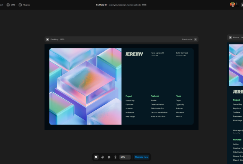
3. Creating Styles: In this lesson, we're
going to start working on the portfolio homepage and creating that main hero section. First off, I've got my
design in Adobe Illustrator, so this is what I've
created, and I've created a 1920 pixel design. And any of the text and
things I can edit in framer, I don't have to have
a perfect design. And the cool thing about framer is that it feels like
you're working in a design tool like Figma or Illustrator because the design
tools are very similar, and it just has a
simple UI to use. So I'm going to click
on this top bar, and you can see it
says Desktop 1,200. This is the desktop breakpoint. Now, breakpoints
are basically when the browser size hits a certain resolution,
the design will change. So when you shrink
the breakpoint to say 450 pixels for
a mobile phone, the design is going to change into probably a
single column design. So you can have
multiple breakpoints. You can see you can press the plus button
and you can create a phone or a tablet
breakpoint, as you can see. But for now, I'm just going to delete that because
I don't need it. I'm going to click on it
and go to the top right, and we can get to the
breakpoint section. I'm going to change the
whip to 19, 20 pixels, and then the height,
we can maybe let me go 1080 because I think
that's what the height was. Now we've got this desktop. Obviously, you click and you can drag out the height as well. One of the first
things I'll do is create styles just to
save myself some time. The one I'm using for
this is fig tree, and also I've got some assets. I've got a logo and some of these images that I've
already downloaded. And then we've got
this color here. I'm going to copy the color, go to my assets
and go to styles. Now, within styles you can addit specific styles for
headings, paragraphs. You've got link styles, block quotes, colors and CMS. I'm going to do a
new color style, and I'm going to copy the
hex code from Illustrator, and we're going to call this B black or something and create, and it's going to automatically create a folder, which is cool. And then I'm just going
to go ahead and copy the hex codes from here and
make these other colors. So I've gone ahead
and you can see I've created each individual color. You can always come back to
these styles and change it and it'll change the global
styles for everything. So so I have multiple designs in my website with
that green color, and I change the green
color to the red. It's going to affect all of those objects that have
that style applied to it. We're going to do
the same for text. I'm going to go text,
and I'm going to go for heading one. And for heading one,
I'm going to do this. So fig tree bold. So I got my heading here and let's see fig tree.
They've got it beautiful. So I'm going to select that and we want to change
the weight to bold. You can change to italic. You've got color, transform it. I like to typically
like capitalize. You got decorations,
align tools, stroke, balance, and
variables open type. You've probably
seen these tools, like in Figma, so it
should be familiar to you. We've got the H one, and
then I'm going to go with a paragraph
and with this one, fig tree medium for body
and we want to go medium. You can also write, click on the styles and
duplicate or rename it. Same as for the colors. You can do it for the colors as well, just to save some time. So we've got the body copy 23. So let's go down to the size, and we want to change
this to say, 23. And for the heading size, this was around double that. So change your size to 80. Oh, I'll make another body
copy. We can call it list. So for this list, I think
it's the same size. Okay, we're using the same one. This one, bold 20. No, for these bold. So we're going to
go subheadings. Fig tree, we'll go semi bold. And you can even add
the color to it, green, and this time, we can get like 26, and I can drag and drop to move these up to
make it more clean. So I've got my styles there, so that should save me some time. The other thing I like to do
is drag all my images from my folders and bring
them into Framer. So in Illustrator, usually
I just export them. I press Control Shift OT E, it'll take you to assets, as you can see,
and you can export all the assets at once. I can select the logo, right click and click Cc for
Export as a single asset, and you can see I
can bring it into here and then export as JP, PNG, PDF or SVG or even
a web P, which is cool. So Illustrator has a
good feature in Figma. You can do a similar
thing. You just export when you select an image. Left click the images and just drag and drop them
in just like this. Just keep in mind,
as you can see, there's limits on the
upload to 5 megabytes. So you will have to
update your site or reduce the image sizes. Typically, I'll use
something like topaz labs to reduce the size. So you can see I've
got these images. A quick plug in that I like
to use is called tidy. So you can see tidy up. I'm
going to click on this. And if you have a
lot of icons or a lot of objects or shapes or something, you
can tidy it up. So you can see
this plug in here. You can change it to
a grid horizontal. You change position,
make the gap, maybe I don't 25 or something,
and then click tidy up, and you can see it will
put all those images in a nice horizontal form or if
you don't want horizontal, you can do a grid,
as you can see, and it'll just easily
change that up. So it just makes
it a bit neater. That's a cool plugin
you can use, which is
4. Designing Home Page: Well, so I'm going to go
ahead and start creating the design that we
have right here. Click on it, the main design, go down to my fill style
and click on the colors, as you can see that. I'm
going to go to layout. And what I want to do is I want to create a frame,
as you can see that. So I compress F and then just drag that and we can
see we have a frame. And then the top right,
have my align tool so I can center that to make
sure it's centered. And then you can actually
round off the corner as you can see, it's got
a little white thing. Same is an illustrated Figma. You can just round
it like that. Or if you go to the right
side in your styles, where it says radius. You can see I can
change it there, or I can only round off
certain corners if I want. Just round it or maybe
around 30 pixels. And then I'm going to change the color to that color there. So we've got the base
of our design here. Now, within this, I'm going
to go to my layers panel, you can see you got the desktop and then
we've got the frame. What we can do is add a stack. So you can right
click or we can use the shortcut Control Enter to add a stack, or
you can add a frame. So a stack is basically
like a flexbox. You can manipulate it
to create columns, and it's better for a liger. It's the same thing
as auto layout, but in web terms, it uses obviously HML and
Flexbox to do that. So I'm going to add a
stack within the frame. As you can see, you can
also drag and drop, frames and stacks
within each other. And within this stack, I'm going to make
it into a grid. You can do a grid with two
columns and just one row. So on the right hand side, go
to the layout side and you can just switch between
grid as you can see. And then what I'm going to do is I'm going to drag
my main image here. I'm going to drag it just
like that inside that stack, and it's already added that into that column which is
what we're going to do, I'm going to add the logo. I'm going to go drag the logo. As you can see, we
can scale it down by dragging this like that. The main thing is
that you want to put things within
stack so it's neat, so I'm going to press Control
Enter to add a stack. This logo is in a stack now we can do is change
the position. So on the top right, we can adjust the position. Whatever object
is in that stack, it's going to
inside of that box. In this case, we've
got two columns. So within this
column on the side, it's going to move within that. So I'm going to move the
stack, as you can see, we can put it in the center
or we can put it on the side, and we want to make sure
that it's on relative. So it relates to
the parent grid. So whatever adjustments that
we make to the outside grid, it's going to
adjust the logo and the images inside this
column or the stack. Got the logo. Now
what I want to do I want to add these
little key element E. So I'm going to you
can press T for the type full to add some text. You press T and then
left click and type, it should add it in there. And I'm going to
make the text white because you can't
see it right now. I'm just going to drag
it inside the stack. Make sure in your
layers that you see, it's inside the
stack as we can see, and what you want to do is bring the logo on
the left side there. What I'm willing to do is we can duplicate
that text as well, so we're going to get this text. I'm going to go to
Illustrator and just copy and paste this because all this
text is inside a stack. Similar to Figma, how
it's an order layout, I can literally just
adjust the padding and see I can just drag that, and it's going to
adjust that padding. Do like 80 size.
I'm going to double click on the logo
to scale that down. And what I'm going to
do is add some padding. So go to the right hand side, click on layout,
and we got padding. I'm going to add
padding on the top, so I want to click on the you can see next to the
got these two squares. One allows us to only adjust the size of either
top bottom left or right. So in this case,
I'm going to do top 50 pixels. It's a bit too much. Maybe I'll do 25,
which is great. So now we've got this
stack, which is cool, distribution of each text. So if you do start, it's going to bring
it to the left, if you do center or center it, or we can do space between or space around or space evenly. The play around how you want
to do it, in this case, I'm just going to
leave it on center, and then I'm going to play around with this gap like this. So you can see the spacing. Double click into
the text to edit it. So make sure that you
edit the text. All right. And what I'm going to do
is go down to styles, the textiles, as you can see, and I've got my saved heading. I've got the
heading, subheading, and the body copy,
as you can see. So for this I'm going
to do the body, and I need to
adjust the leading. So I can actually
adjust the style. If you go next in the textiles, put your mouse over it and you'll see the
edit button there. I'm going to click
on that, and what we can do is adjust the letter. So I'll make the letter zero, so it's not adjusting
the kerning. Then the line
spacing or leading, if you're a graphic designer, you can see we can adjust
the line like that. I got this text, but it doesn't look exactly how we want to. So I need to go ahead. I'm going to go
back to the styles, and I'm going to
change the color, so we're on the
right color here. And what if I wanted
to just customize this text here, make
it a bit smaller? So what we can do is I can make another style on the fly by clicking new style in the textyles on the right hand side, and we can say paragraph and we can say body
small, click Edit. If you double click,
you should be able to rename it as we can see. I'll call it BoliSmall, click Edit and then
we'll make it smaller. Maybe 18 and instead of medium, we'll go regular, maybe
make it 16 like that. We've got this
specific text with body Small and this
text with body. So within that same text box, we've got two different
styles working. So it's really easy to do
that boom as you can see. So once we've got our
main section here, I'm going to add some
three more stacks. So in the main stack
here, we've got the logo. We've got the project,
and let's connect. So in this one,
I'm going to go to by Layers and press
Control Enter. To create another stack, and I want to do the
same for the other two text blocks as well. Now within this stack, I'm
just going to go ahead and drop some text in here. And what I want to do is make this stack vertical direction. And I'm going to bring that
to the top, just like that. Cool. Now we can see we can play around with
the gap as well. But first, we need to
change this stack here. So for the height, I'm
going to change it to fill, and it should fill
up this whole space in this side of the main stack. So now what I'm
going to do as well, I'm going to select this stack. Sorry, I want to
align to the top, and I'm also just going to add some padding from
the top 50 pixels, and from the left, we'll
go 50 pixels just like. What I'm going to do is now if I add a gap, as you can see, I'm just dragging from the
little purple divider there. Now we can see this text is going down and we have
this nice column here. I'm going to align
to the left, so the right side in
the layout panel, you can click align to the left. So this text should
go to the left of the box or the
left of the stack. Now I'm going to
change the style of this text to the subheading. One of the cool things, you
can click on a stack in the Layers panel and you
can also copy the style. You can copy the CSS,
the effects, et cetera. So you can copy everything and paste it into another stack. So if I paste it here, you can see it's duplicated that same effect
that I've already styled in that other stack, and I'll do it for the
other one as well. So paste will go paste style. There is a shortcakey
control OV. And let me just go ahead and
paste that text in there. And now you can see
we've got this effect. You can also drag
like this and you can see you don't have to do it in the layers panel,
do that. So, cool. Now we got the three columns, and it should all be aligned. Obviously, this has
the logo in it, so the alignment will
be a little bit off. So what we can do is we can make another stack or another box, and we can define and I'm just going to
align that to the box. It should be a line now. So now what I want to do is
for the projects, I want to make it have a pop up where when you put
your mouse over it, it will show a bit
of the project, and when you click it as a link, it will take you
to the project P. So I'm going to turn this
into another stack here. So control it Enter. And you can see the alignment
brings it into the center. Just go to distribute
and distribute it, change it to start, so then it starts at the
start of the stack. Let me just copy this. And make this sorry, make it a vertical, and then we can align
that to the left. And this text, I'm
going to change it to the normal body style. And for this one,
I'm going to call it sensor pages as one
of my projects. Now, what I can actually
do is in the layers, you can see, it's just a text. But what we can do now is
we can make it a link. So I'm going to go to
the top right corner and click the plus link, and we can put it into a page. Because you don't have
that page, I'm going to go
5. Interactions and Effects: This slide, I'm going to
quickly show you how to add some hover interactions
and animation to the site to make
it look smooth. But we've got that. Now
what I want to do is I want to add a overlay effect. So I'm going to go to overlays, and I'm going to
click on relative, you can see, it's a popover.
I'm going to click on that. And what you can do
is on this overlay, I'm going to go to
the right hand side, and I want to turn
it into an image. So I'm going to click
on the fill button, instead of the fill, you
can obviously do gradients. You can do some
cool stuff there, but I'm going to click on image. And then I'm going
to find that my project image like
this, which is cool. We've got the rounded corners on there and what we
can actually do. Now if I just quickly test it, you can see this text when
I put my mouse over it, it's going to have that
image pop up, which is cool. Also, this text, because the text link doesn't have a style, I'm going
to click on the Link. Go to the top in
the link section, click on Edit, the link style
and we can change this. So I want to go we
could make it green. I'm just going to stick
with the light color as well because that's
the text color we want. We don't want any underscore because I think it looks tacky. On Hova though, we
can make it green and I think that's it. If I press Play, you can see
that's what it looks like. Cool. The text is changed, and then I can always
go back and edit it and then transition,
make it ease in and out. Let's go back. Very smooth. Boom. Cool. We can also
add a Hover effect. If you go in the Effects panel, click click Left click on
it. You will see Hover. I can click Hover,
and what we can actually do is you
can change the scale, you can change the opacity. It's really up to you
what you want to do. You can rotate it, you can skew it as well. If you want. So you can play
around with any of those. You can offset it.
You can add a shadow, and you can also
change the easing. So instead of spring, I like to have it on ease, and then you can
play around with these bars to make
it a bit smoother. You can change the delay,
whatever you want, really. I'm going to maybe make a
rotation of, say, minus two. And now if I press
the preview button and I put my mouse over here, you can see it does
a little rotation. It does the Ha glow effect, and then it also has
the image popping up. So then when I click on
this, it's going to go to my portfolio page,
as you can see. Obviously, I haven't
styled it yet, but that's how you will do that. And then now all we got to
do is just duplicate this, so we can call this, you
know, keystone scalable. So you can have
some other projects that I'll have to
put into the CMS. Now, the cool thing
with Framer is you can actually stack effects
on top of each other, so I can add another effect. You can add loops, drags, press. You know, you can do a
whole bunch of things. I'm going to go back
to the overlay, and I want to click
on the overlay, and you can see we can actually change the position of it. So I can actually move it around and also rotate If I put
a mouse on the corner, we can rotate so maybe you
want it to look like that. If I go preview it, now
I put my mouse over it, you can see, it's got it
looks different than before. It comes out on
the side, whereas these ones just pop out below. So that's how you customize
the look of that pop in. And then, obviously, the overlay actually has an
appear effect on it, so you can see the effect
on appear it fades in, or it can scale in you know, we can change the
opacity, rotate it. I want to change the spring to easing and we can customize it ease in
and out or back in. But I just ease in
and out is fine. L it's smooth and it works. Ease in out. Cool. So let
me just go back to play. You can see. You can see how it sort of
slowly zooms in a bit, like it has this scale effect. Looks It is a little
bit slow for me. So what we can do is make
the time zero point. Let's go 2 seconds, and then I'll do the same
for the exit as well. Okay, so that one's 0.2 as
well. So let's go back. So it's a bit faster.
Super cool. Love that. So you can have different
alas to all of them. Hey, all you got to do is just go into each of these overlays
and just change the image. And then once again, you can
always just copy the effect. So if I go to copy effects, right click on the other one, and then I'll go to
the other overlay, right click on that, and
we want to paste effects. So it'll copy the same effects, so I don't have to go ahead and do the easing thing again. So, boom, boom and boom. So you can see it's
a little bit buggy. Obviously, on the
published site, it wouldn't be as buggy. Boom, boom. These ones
don't have the hover. That Ha got to add. Cool. And that's how you add
that little effect. It just adds those little
details to your website. Adding animations, little interactions can
make a big, big difference. Now all you've got
to do is just copy this text or these stacks
into the other columns, and then you can just
customize it the way you want. So we've done some little
tiny interactions. What about adding some
animations to the overall frame? What we can actually do, I'm going to select the main frame. And I'm going to go
down to effects, and I want to go on a PR. So on a P, you can
do on a P on scroll, layer in view or
section in view. So if you're scrolling
through and it comes in view, something will
happen, and action or trigger will take place. We want to you can
see it can fade. I can slide. I'm going to do sliding from bottom just
to show you the effect. And I want to do some easing, but maybe let's accentuate that curve a little bit
more like that. And the time will
do maybe 3 seconds. And then I'm going
to press play. So now you can see it loads in, it's a little bit fast so
let's just slow it down a tad. We'll get back to the easing, and we'll go 0.5 seconds. You can also add a little delay, so if I add 1 second delay. So the time is how long
the animation runs for, like how long it takes for
animation to complete. And then delay is a delay before the animation
or effect starts. So now if we go back to preview, you can see it's a lot slower, but the whole thing slides
up from the bottom. A pretty simple effect, but it just makes
it a lot cooler. And then we can go ahead and add effects to any of the stacks. So I can select the
stack, go to effect, and we can do a P again. And I'm going to copy
the frame effect. So remember, right click
Copy and copy effects. And then I'm just going to
add them to the stacks, so we can go paste effects. I'm going to go paste
effects and paste effects. Now when we play, boom, you
can see they all pop up. But what I want to do is add a little delay on the stacks, so then go a bit slower. So I'm going to go
to the transition. That one can have a two
second delay, this one, maybe 3 seconds, as you can see, it's a different and this
one maybe 4 seconds. I'm going to click prey.
And just like that, it's really easy boom, boom
and boom. Cool. Love that. It looks great. They're fine. So we can add something
to the image as well, and we'll go to
customize all this. So I'm going to
update all this text, and then we're going to work on just finalizing that portfolio.
6. CMS Collections: The pages and click plus. And what we want to do is we
want to make a new CMS page. I'm going to click Add sample, and it should start
creating the CMS. And this is where
we're going to put all our portfolio projects in. So when we just add
the data into the CMS, we'll auto fill a page up
with that new project. So I'm going to click
on this one, and we can see all the
details on this right. You got title, the slug, which is part of the URL, the date, the image, the
categories, and the content. We can obviously edit
this CMS collection. Edit the fields by
going to the top. There's a button,
a little arrow. Click that and we can
actually change these fields, as you can see, to
make it required. You can change the placeholder. You can make it a text area. So you can adjust all these
different categories. You can also click this
little plus button up the top and you
can add fields. So it can be plain text, it could be a gallery, a
toggle, a number, file. You can reference other
articles as well. But I don't want to
go too in depth. For now, I'm going to click
on getting started and we'll call this sense pay. I'm going to click on this image here and we'll change the image. Changes texts,
also. I'm going to get rid of this text and then making it to the site. So I have a click publish on the right hanside that's fine. And so now we've got a CMS, and I'm going to
double click on the left collection and
call it portfolio. Category as well. We don't
need to worry about. I can just go ahead
and delete this. Because it's being
used in some of this, it's not going to
delete for now, but we can just leave that. Now if I just go back,
you can see this is what the portfolio blog
page actually looks like. So we can call it portfolio. Right? So this is a CMS page. And as you can see,
when you click on the page, this is
what it would like. So we need to customize the design and make
it look like this. But I'm going to go
back to the home page. Now, what we want to do, I'm going to go
back to the link, and we can put the link to
the portfolio and the slug. I'll go to the CensAP
As you can see, you click on this
slug and it'll go to any of the portfolio pieces that you've created
in that collection. So I can click on the
CensAP one, which is cool. What I want to do is, well, you can see the text is cut off. What we can do is
add a min height. So I'm going to go Min Max. It says here. Click
on this button. We're going to click
on the minimum height. The minimum height should
be at least 25 pixels. So that's the minimum
this textbox can go, and that's how you
prevent issues when things scale for example, if you go onto mobile,
you make sure that it's readable so it stays at that
size, the minimum size. If you do maximum size, it'll have a limit
on how big the text or image inside that
stat can scale.
7. Portfolio Page Design: In this lesson, we're
going to be creating our project landing page using the CMS
features in Framer. So we've got our home page,
just what it's looking like. Now, we're going to
go to the portfolio. So if you click on the
main portfolio page, this is the CMS collection. So you can see the text here. It's just the normal blog, but we're not trying
to create a blog, we just want portfolio pages. So I'm going to click
on portfolio two. See the icon will be like this stack of
coins type of thing. That's the CMS collection. But this page is the Sensei
pay, and up the top left, you can see in the page
section, up the top, you can see it says CenseP if I click on this link
and click Keystone, it will switch to the
other CMS collection. So to access the CMS, you want to go to
the top menu next to text and plug in, you
want to click CMS. And we've got two entries here. We've got Sensei Pay project
and then the Keystone one. And we can add some more. Fw, we'll just keep
the two projects. I'm going to go back,
and once we make a change to the design
of page in the CMS, it's going to apply to
the same design and the same layer on all the
other new projects we add. I'm going to go in here
and start to design. So I might need to
make some new styles. I'll create a new style. This H one is dark, so I'll go a H one, but
I'll call it H one white. And then for this one, I'll
change the color like that. The other ones, we can
use the other styles. But we need to make
the design like this. I'm going to go
to the home page, and I actually can
copy the frame. So I'm gonna go to my layers.
I'm gonna copy this frame. So I'm just going
to grab this stack and bring it inside the frame. So we've got that base frame
layer, as you can see. So if you want to edit the text before we
update the layout, you can double click
and it'll take you to the CMS collection open
on the right side bar, and we can customize
the text here. Um, and if you press Inside, you can see it will update that. Obviously, the main thing
it's best to just update inside the CMS instead of
doing it on the page directly, and then it'll affect
those changes, so you can change the
images, et cetera. I'm just going to
adjust this stack, and I'm going to drag it just using the boxes,
keeping it really simple. And so now we've got that image hitting the top of
the design there, and we don't want the
bottom to be rounded. So for this image, I'm going to go to
radius and click on the four little lines and only round the top left
and the top right. So I think it's
around 25, I think. So because it's already inside the frame we don't
even need to round it. You can see that and this bottom is a bit flat, which is great. Now what I'm going to do is
we don't even need this text. I can just delete
that, as you can see. And then now this paragraph
is the leading is too much, so I'll have to go new style, body body medium, and we'll
just select the light color. Going to bump the size up. Let's go 20 letter
zero and line spacing. We'll go maybe zero, 1.4. Paragraph, we can leave that. And now I can also delete this portfolio. I
don't want that in there. And then now what we want to do is we want to put this content
inside this stack here. And then this stack, we want to select the stack and
the line to the left. We're going to also
align the text on the title and then
the date as well. So we go down the text
and click on a line, and that should align
everything to the left there. We can see there's a stack down the bottom here if you want to, for example, if we
click this button here, we'll take you to the next
project, as you can see. So they've already
given us that. For now, I'm just going to Um, I just want to put the
opacity down for that, leave it there for now, or
we could just delete it. Now what I want to do
is just drag this box, and now we have that
thing on the side. We have to make a new stack
for the title and the date. And we're going to
change to space between. So it's going to create this gap between this and the date. And we're going to align
this layout to the bottom. And now you can see this
is on the bottom here, and then we want to
change the grow. Instead of auto height, we
can change it to auto width, and it's sitting on the right side of that box
now or that stack, sorry. So we got the date. I
believe the date was big, so illustrate I see
the size is 44. I'll just get rid of the styles there and then we're
going to customize. Let's just go 40
and light color. I'm going to move on
to the second section of our portfolio page. Now, what I'm going to do first is I'm going to select
the hero stack, Control C, and Control
Vita paste it. Then I'm going to make
a new stack pressing Control Shift Control
Alt and Enter. And I'm going to drag
that here section into the stack, as well. And this stack, we're going to make sure that it's vertical, and then the gap we can do 25 pixels, so there's
a space between. And obviously, you can adjust
the gap to make it bigger. I'm going to rename the
second stack to gallery, and I'm just going to get rid of the text here because
we don't need what I'm going to do is go to my
CMS and go to Edit Fields. Now what I've done here is
I've added two galleries, so you can press the plus
button and you can add a gallery or just simple images. Now the reason why I'm
adding two galleries is because when you go
and add a gallery, you can't do the two columns. You can't span the image
across two columns. That's why I'm doing
two galleries. All you're going to do is
just upload your images. So you just choose
the image and upload that and so I've
got these two here, and then Gallery
two will be here. But if you want to
rename the field, just go to the fields
and rename it here. See what gallery two say
two coals for two columns. And then I'm going to go
back to our stack here. And I'm going to go to the top right and
click Add content. So all the fields you
created in that CMS, we've got the image gallery
one and Gallery two, as you can see, and then
the other sections. So I'm going to
go ahead and drag in the gallery into this stack. And you can see it's already bringing up those images from our CMS because we've already uploaded into our
collection here. So it's just extracting the
images from that collection. We've got this. Now on
the right hand side, you can see it's two columns. You can see I can change it to one column or two
columns like this, but you can't have
multiple rows. It just doesn't
work at the moment. As you can see, you
can do auto fixed. You can do a fixed width
as well for, you know, the advanced layout, but it just doesn't
give you that option. So what I usually do is I'll have the two
columns for this. And because our design
has two columns and then a one column spans across the two need to have
the two galleries. But in the future, they'll
probably update it. I'm going to go to
Add Content again, and I'm going to drag
in the column two, just under that other
one, as you can see, and bring it below. I'm just going to put
it within. I'm going to select the top stack
and make it vertical. I'm going to just
expand the main frame, as you can see, and then
we've got the design there. And obviously, I can
go to the gallery, and you can see you can
see we've got one column. And then I can go to the
image and I can change it to fit or stretch it or tile it. Obviously, usually fill works, and I just need to change the height to I
got to unlock it, and we want to make sure you can see the height is
a custom height. So I just want to change
this, as you can see. I just wanted to
fill to about there. Now, what we can do if we
go to the CMS and say, you know, we update other
images, like, let's, for example, if you
change these images, then it will reload and upload them inside
here, as you can see. I'm also going to
decrease the gap here to 25 pixels and the gap on
the main frame as well, so then we've got all the space looking like this, the CMS. Now if we go to another
page like Keystone, you can see similar
thing as well. And if you go to
another page, you can see if you don't have
anything in the CMS, it's not going to load properly. So if I go back to CMS, go to scalable, just remember to make sure you
upload your images. Now, for example, if we only add one image into that
gallery and I go back, you can see it's only going
to fill that one space, that one column because we
don't have the other images. So make sure that when you set a certain limit that you
upload the right amount, so it fits within the space
you're designing for. Now if I just go
back, now you can see it's populating
that space now. And that's how you create this gallery section with the CMS.
8. Footer Section Design: And I can literally
just copy this stack, and it should paste below. Cool. Got my logo in here. Sweet. I want to add a button, so I'm going to just
create a new stack, and it's better just to make
a button by using a stack. You can use the pre
built button section, but it's not the best when you want to customize something. So I'm going to call
this button book core in my layers panel. And then we can go to fill
and change it to a gradient. And then for this,
I'm going to click on the dot and then this one can met the light. So then
it'll be like this. And this button, the width, we're going to make
it around 200 pixels, and then 100 like this radius for rounding the
corners will be 20. Press the type tool, book call, and we want to we can
just go like 25 pixels. Change it to the dark
color and change it fig tree and go medium. Maybe let's go semi bold
and can round it off, and that's how
it's looking like. Whoops. Adjust a
button like that. Cool. So I got this button, and Now, what I want to do is change
the direction to horizontal. I want to bring it
inside this stack here. So this one horizontal. The main stack can be vertical. This one will be horizontal.
Get rid of that stack. There was some elements in
there that were messing it up. I we're going to
check your layers because some things are
going to be messed up. From here, line to the bottom, put maybe 50 pixel
at the bottom, left, we have 50. And right, we'll have 50. So we've just added
padding inside this stack. As you can see, I can make this maybe a bit smaller. Cool. So we've created this bit here. Obviously, the padding is not
exactly, but that's fine. And then we can just
add I'll stack. So I'll just go back
to home the home page, and I can just copy one
of these stacks here, paste it inside the
main stack like this. Super cool. And I want to make sure I have
the same padding as well. So I believe it was 50. We can scale this down. We can also adjust the
width will be fixed. So we'll go, about this. Then I'll put that
inside another stack. That stack will be horizontal. Then we can paste some hoops, paste in those three stacks, and then select the main stack that I just put
these three stacks, and we want to change the distribution to the start
to bring it to the left. And then now we've got that. And yeah, so we've
got the footer. Now I want to press play. I've got some of the text
stuffed up. That's fine. But we've got our page
now, and then the button, what we want to do is
click the link up the top, and then, you know, this can go to macaw link
or homepage or whatever. So it can go to the
homepage, for example. And we can add animations
like we did before. You can see added links here. This one goes to Instagram, and this one goes to my cow when I click those
little text links. So you can literally make link out of text, anything really. After you complete your
footer, I'm going to show you how to
create a component. A component is a fast way
to create reoccurring, objects, buttons, things you use on a more than once basis. So you can template
things. That's when you should create a component. So for example, I'm going to
select my main footer stack. You can right click on it
and create a component. The shortcut is also Control Old K. But we want to click
Create component, and we want to just
call main footer or something simple that
you can remember it as. And now we have a
component here. We've also got this variant, which is the phone
variant, as you can see, and a variant is just
a secondary component where you can switch
to in case of say, an example on a phone,
it'll be a different size. So maybe you want to create
a different version, or maybe you want to
have a dark mode. So if I click on this
component, I can go down here. And I can create a Ha Ha
or a pressed version. So you can see on the
name it will say Ha, and maybe some will have
low opacity or something. And we can also customize
and create more variants. So if you go to the right, you can see you can
create another variant. So this variant can maybe have, just the logo by itself. And we can call
this variant three or we could we can rename
it something else. We can call it
variant three, logo. The phone variant, this
would be great for a phone. What we want to do is we
want to scale it down. Let's maybe go say 450 pixels. Is is obviously small, just go 550 for now just
to show an example. What we want to do, we just
want to scale everything down and we might have to
change the stack to vertical, change the alignment, and
then create the spacing, change the gap a little bit. And we should have
something like this. I can also change padding. I can decrease the size. I think actually we're
aligning middle like this. And then for these ones, because these are
three separate stacks, we want to go votical and then
we want to increase that, but let's just increase
the overall size. So we're going to do this. Then we're going to
bring this down. And then if you notice
things are broken, for example, like this
stack should be aligned. So I'll just make sure
that this stack is a line. So I'm going to
change it to fill. So the size will fill the width space, as
you can see like this. And I also want to make sure that I'm going to
select a stack in this variant and then just
increase the gap like this. Cool. And so now we've
got this phone variant. We've got a duplicate. I'm
just going to delete that. So I'm going to double
click on the title and call it Phone. Now we've got the
desktop primary, we've got phone, and then
we've got this other one. So now, if I go to
the portfolio page, and let's go to the
phone section here, you can see this one is
using the desktop variant. If you go to the right
hand side, you can see a component will be
highlighted purple, and you can see I can
go here and select the phone variant and it
should be using that one. So you've got that variant. So for example, if I go to the desktop and
choose this variant, it's going to do this
one with just the logo, and if I do the phone one, it's going to do the phone one. And obviously, right now, it's not scaling properly. So I just need to make sure
that that's working properly. So I can always go back
to edit the variant and making sure you can see that everything
is set to fixed. So I'm just going to
put it all to fit. That should be relative,
relative, relative, and then this one
should be fill and fill as well. Okay, cool. So now if I just go back, yeah, it should be working properly. And I just decrease
the size of that logo, and you can see it updates. Everywhere where that component is, it's going to update it. It's easier to
change if variants, and I recommend
creating variants. Then if you want to access
them, you go to assets, then you got the
components here, as you can see, say, for example, the main footer, and there's a download
button here as well that Freema
automatically has, and you just drag and
drop it in like this, you can put it anywhere even on the homepage or
wherever you want. If you want to chuck
it in there somewhere, we can do that, as well.
9. Responsive Design for Mobile: X. Quick lesson, I'm going to show
you how to make your site responsive.
We have our homepage. Now. What we can do, I'm going to add a
breakpoint and we're just going to do the
basic phone 390. Now, you can see right now it's not the way we would
like to have it. The text is going off the page. So what we have to do is change the direction of the
stack to vertical, so then it's stacking one by one like this instead
of stacking horizontal. What I'll do is go to the
layers, and keep in mind, whatever change you make
on the phone breakpoint or the tablet breakpoint will not affect the
desktop breakpoint. So that's why I always start with desktop and
then do phone later. Because there will be
different changes. And typically, when you
make a change on desktop, it will cascade down automatically
to tablet and phone. I'm going to select
the main stack, and we're going to
change it to vertical. So you can see that it's
all flipped around. You can also move
the phone as well. You can move it down on the
side, so we can move that. You can hold alt
and shift as well, and it will duplicate, which
is another cool trick. Go to adjust the frame, bring that in, as you can see. Then I need to change the
other stacks, as well. So this stack needs
to go vertical. Uh there's ones are already
vertical and this one, text wrapper vertical, and I'm just going to
increase the size. The overall frame, I'm going
to have to this frame, I'm going to have to
scale that up like this. All that image
fits that section. If you want to adjust the phone, I'll go maybe 450, make
it a bit bigger, change
10. Publishing Your Website: Now in this section,
I'm going to show you how to do the SEO and also publish your website so you can get it up and
running in the world. So once you're done with that, you can go to the homepage
or portfolio page, and you can click Settings. And in the settings,
you can see you want to adjust this
before publishing, just so the SEO in Google
and whatever browser, people are using
that the SEO titles and details are
going to be correct. So we can say
Mirror's portfolio, and the URL, we can leave that because it's
connected to the CMS. Want to show pages in search
engines, we'll tick that on. This is the preview on
how it will look like in whatever search
engine people are using, then you want
a social preview. 1,200 by 30 pixel. What I'll usually do is
just go into Illustrator, make an artboard, 1,200 by 630, for example, I can just
check like an image. Whatever I want, really. You
can make any kind of image. I'll just save that just so
you can see the settings. Saving it as a JPEG 100%. 90% quality is fine. Just save that. And there you go. Just make
that in 2 seconds. So whenever you share
that link on socials, it's going to load this image. So you know how people get
the image when you upload it. And that's basically it.
Then I'll click Save. And then just make sure you
do that for every page. So home page as well. You want to change your
OL, once that's done, what you can do is Framer
will give you a free domain. As you can see, this is
the URL, what would be. Obviously, you can change it. Here, let's just
say Jeremy Mirror, design for now and press Enter, and then the website
will be this. So the custom domain, obviously, if you want to update a domain,
then you got to buy one. I usually use Go Daddy. Or name cheap. So
you've got name cheap. Cheap domains is probably
two great sites. So yeah, you got
name cheap here. Got cheap do names you can
search and Go Daddy, as well. Got domains that you can buy for like 20 bucks,
depending on the name. I'm going to do is go to the
top right, click Publish, and you can see we
updated it 23 hours ago, and there's been six changes. So I can see the changes here. As you can see, I'll just give you a rough breakdown,
give you all that. What you can do
before publishing, if you click on the 23 hours, I'll take you to
this staging page. You can see before
publishing it live, you want to just
check everything before it goes fully live. So you can see that it's
staged there optimized. And this is the latest version. Obviously, you have to upgrade to actual paid site plan
before you can do that. Publish ClickUdate and the
website's been updated. I can click Open Link, and as you can see, here's the website we created,
which is super cool. So I'm going to
click on Sense pay, it should open up to
that project page. Cool. And there we have it,
and that's how you do it. Obviously we can fix
that and whatever, but we're going to do that. Then obviously, you'll
get the framer badge at the bottom of the site, as you can see, that's how
you publish your website.
11. Designing with Plugins: If you go to the top
left, you can see there's a plug ins menu. You want to click
on that. And you already have some recent
ones you have used here. You've got some
featured ones here, some of the popular ones. And you can also click Bows
to go to the Framer website, and I'll show you all
the current plugins. They've actually got 130, which is insane.
They've got icons. They've got, you know,
AI stuff, images, like plenty of
different plugins, which I think is really great. You can even inject ecommerce
things like frameship. And I'm going to go plugin
and I want to search Lumi And once you get a plug
in you'll get like a window. You can move it around
on your canvas. And for this one, it's basically free images, but they do have a pro plan. But, for example, I can
left click on an image. So in my layers, I've
selected this cube image, and maybe I want
a different one. I can click on Lumi, and it should inject
that image right there. Obviously, there's a wordmark because I don't have
the pro version, but it's a really simple way to add images into your canvas. Just like that. So you
can see my images, it's injected that
image in there. Loom is great because
it's got illustrations. It's got three D, it's got
a bunch of cool stuff. We can even select tools and effects and go down
to Duotone and we can select our own color theme
duotones, as you can see. Maybe we want this blue with this flamingo or
something like that. That looks pretty
cool. So that's one plug in I love using. You've also got other ones
that you can play around with. So I recommend, you know, looking at some of the plug
ins you want to play with. For example, you've got this
one DIA which is very fun. So maybe I'll have
my profile image, and I want to add
the differ effect. I'm going to click
on DIA and I'll create this unique sort
of pattern effect, which, differs the image, so we can insert image.
And then we have it. We get like this
pixel distortion, dithering effect,
which is really cool. And we can obviously
customize the pixelation. So it's different pixel
effects, basically. I can change the brightness. You can play around with
quantization, resolution. We're going to bump
it up a little bit. So that's a fun little plug in, as well that I like playing
around with if I want to get, like, a weird effect. Phosphi is a really
great one as well. So if you want some
really great icons, I love using phosphide just
to get some quick icons in. So you can just left
click and it will drop it in or you
can click and drag, and then you can
select it, go to your fill and change the
color, as you can see. So maybe you want, you know, green color or whatever.
They've got heaps. They've got fills,
they've got duo tone, as you can see, and then
we just changed the color. So it's completely free. So it's just awesome smack bang, get some quick ideas out there. You've got light
version as well. And you can scale
it and rotate them. Play around with some
of the plug ins. I'll tell you if it's free or if it's paid. So
keep that in mind. There's plenty of free
plug ins in here. Give it a go and start
creating some fun things.
12. Outro: Much for taking the class.
I really appreciate it. I hope you've learned
everything you need to start creating
framer websites and hopefully gives you
some more confidence in just jumping in and just
creating stuff, you know? Like, I haven't created
too many projects, but the more you create, even just playing
around with templates, it's a great way to practice and just get used to creating. For the class project,
I want you to create something similar to what we did for the portfolio. You can follow along
exactly how I did or create something
similar with your vibe, make it your own personal style. So the main objective
is to just create a one page landing page with some of your
portfolio pieces. It could just be student work or fake projects.
That's totally fine. And then upload that into the Skillshare class and I'll give you feedback
as soon as I can. And if you do have
other portfolio pieces and you want
some feedback, I'd love to give some
feedback on that. Just put your link in the
discussions or the chat. If you want to learn
other things like brand identity or Logo Design, I've got over 30
courses on Skillshare. I've got 30 other classes on Skillshare that you can take. And if you want some
other resources, you can go to my website
jeremymor.com or watch some of my tutorials on YouTube, you can
subscribe there. Thanks so much, and
I'll see you next time.
 Jeremy Mura, Brand and Web Designer