Transcripts
1. Class Introduction: Are you struggling to bring
color into your photography? Or maybe you want to create
photos that are fun and colorful but
look effortless, and non-distracting?
Understanding color theory can help
with all of that. Whether it's a personal project, a work for a client, or photographing your
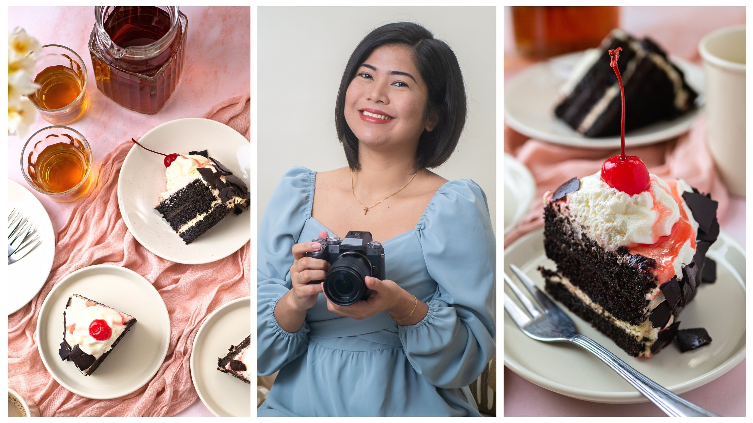
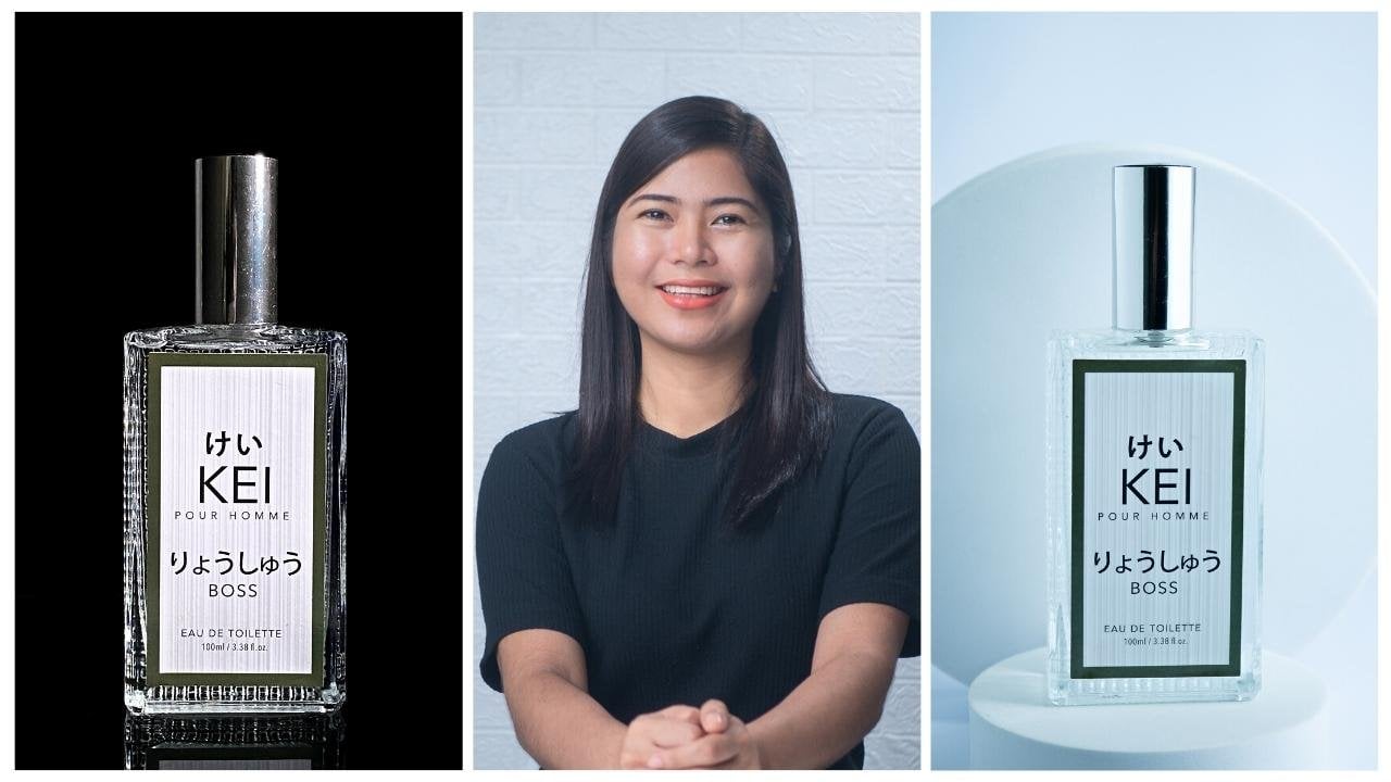
very own products, and recipes, this class can help you get started with color. Hello and welcome. My name is Rose. I am a food, and
product photographer. Most of my work is dedicated to helping small businesses
increase sales, and online presence
through scroll-stopping food and product photos. I also do workshops for online sellers who want
to DIY their photoshoots, and just last year
I had the honor and privilege to become one
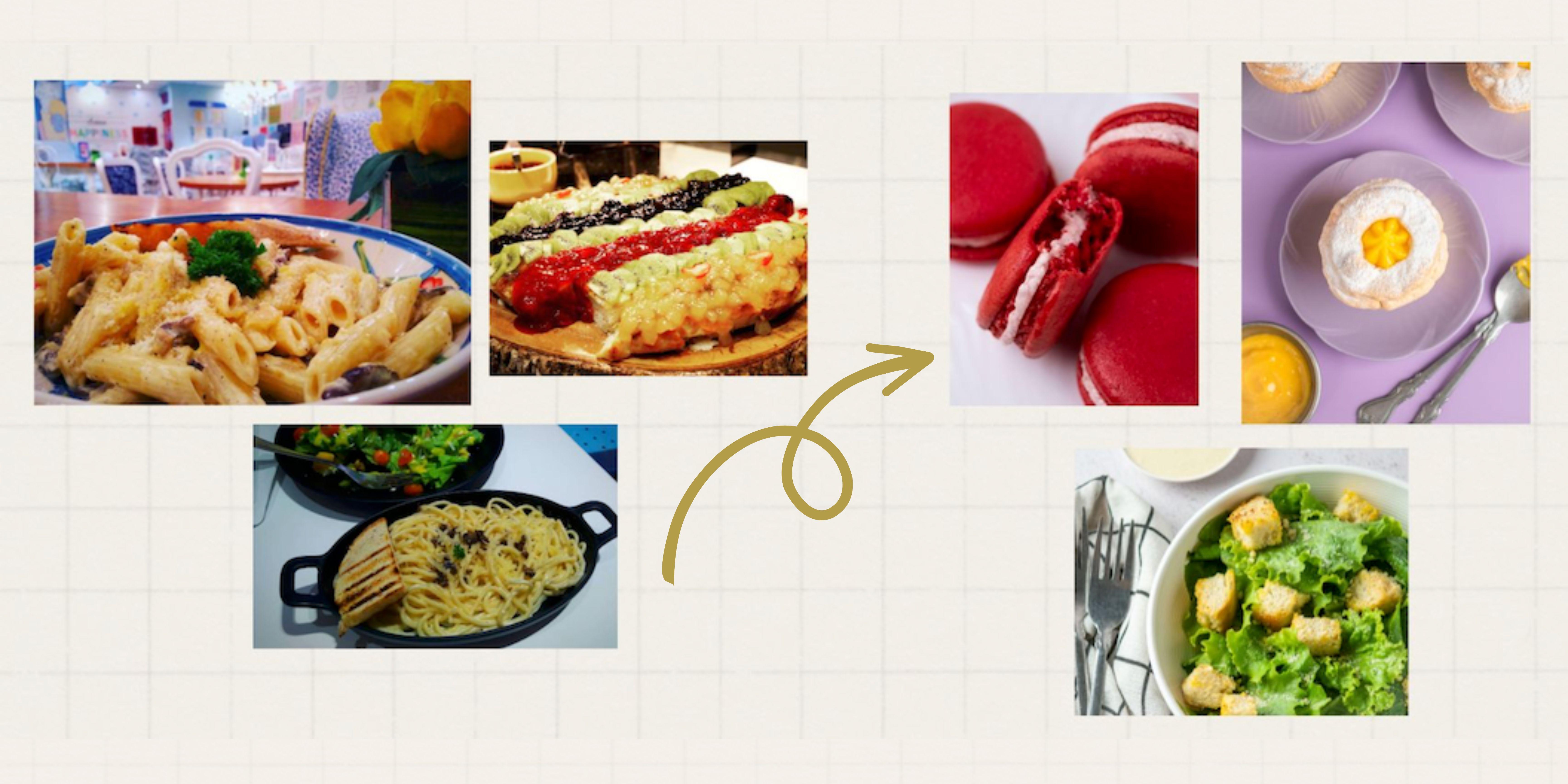
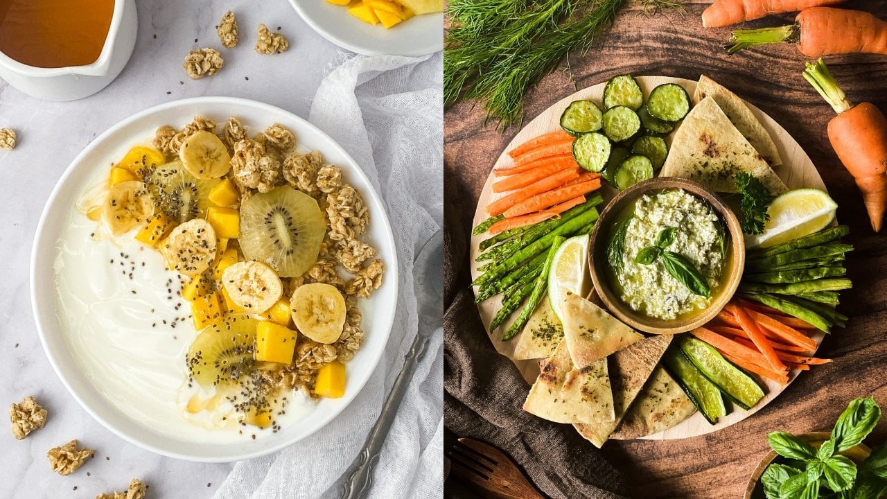
of Skillshare's top teachers. These are images from
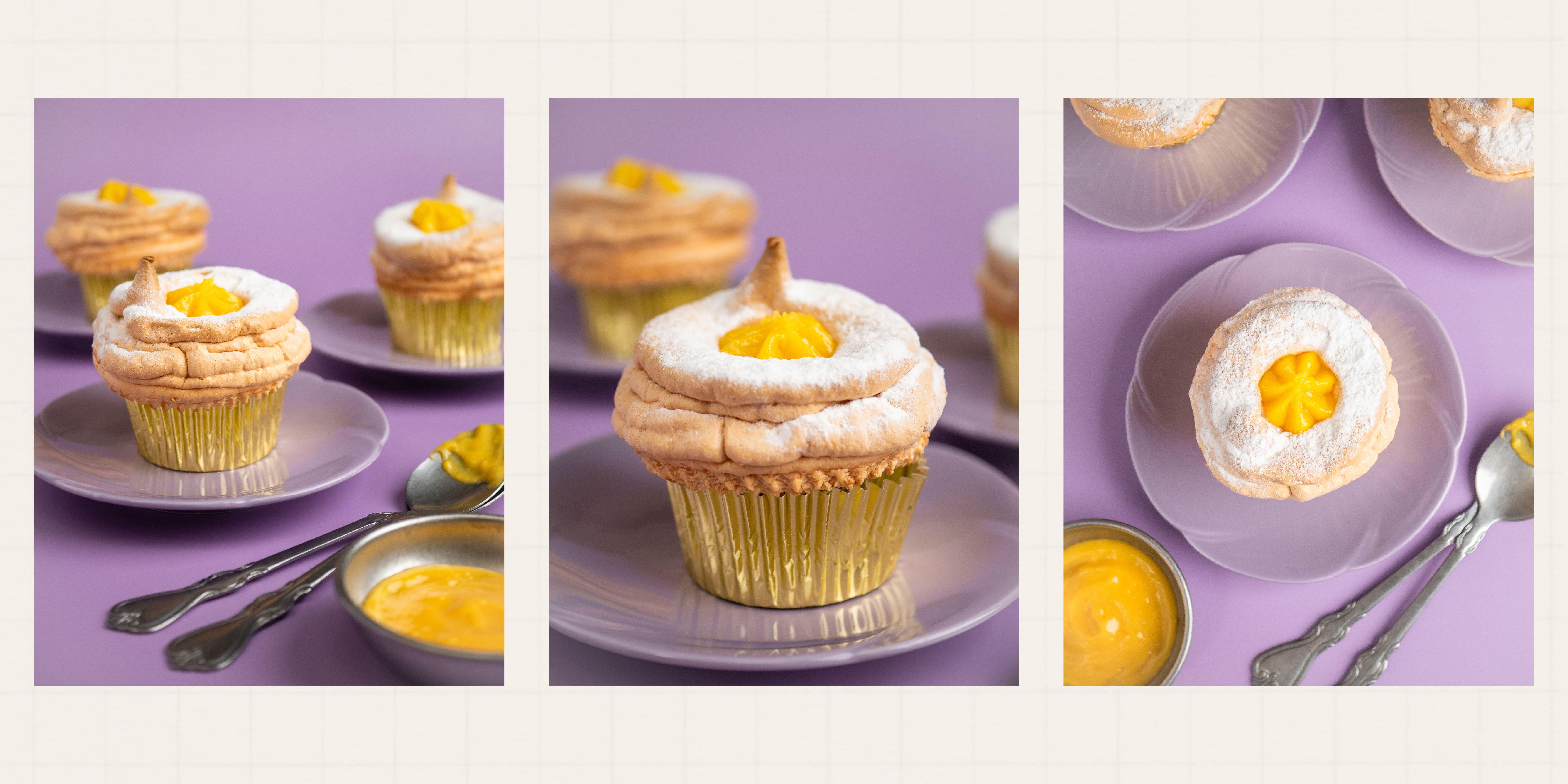
when a first attempted to create a colorful
composition five years ago. These are photos from my
recent photoshoots after I use color theory to effectively bring color into my photography. One of my struggles when I
was just starting out as a photographer was creating
colorful photos with impact. I thought throwing as
many colorful elements as possible to my scene is
the genius way to do it. But I had to learn
the hard way that, unintentionally
combining colors can result in messy, and
distracting images. This cringey mistake fueled my desire to know
more, and study color. It took me years to really
understand color theory, and practically use
it in my photography. That is what I will be sharing
with you in this class. We will start with why color theory is important
in photography? Then we will move on
to the color wheel, which is at the heart of color theory and my most favorite tool in
planning compositions, as well as choosing
backgrounds, and props. Then we will explore
basic color schemes to help you get started in
creating color harmony, and contrast in your images. I really wanted this
class to be practical, and useful so in
the second half, I will show you how I will
use color in planning, in crafting a story, in sourcing props,
and in post-processing. Almost all my classes have
photoshoot demos, and this class is
no exception. I will be photographing
a food at a product to create both color
harmony and contrast. They say learning
color theory is like learning a new language. By the end of this class, my hope is for you to have a better understanding
of color theory, and be able to practically use this powerful tool to
create images with impact. This class is perfect for
beginner photographers, small business
owners who want to DIY product photoshoots,
for bloggers, social media influencers,
and absolutely anyone who wants to learn more about color in food, and product
photography. You can either use
your smartphone, DSLR, or any camera
to join this class. Now, if you're ready,
let's get started!
2. Class Project: First of all, I'm so
glad you're here. I will do my best to make
it worthwhile for you and for you to really get the
most out of this class. However, that involves
your active participation. In order for you to get the
most out of this class, you need to see and capture the vivid color in
the world around you. With that said, I
strongly recommend that you participate in
the class project. Don't worry, I will do my
best to take you through the process step-by-step so you can be more intentional and confident in adding
color to your images. The things that you will
be needing are a subject, it could be a food or a product, it could be from your recipe, your client's product, or
your very own product. Of course, you need a camera. It can be a smartphone, mirrorless, or DSLR camera. You will also need a
source of lighting. It could be sunlight from
your door or your window, or it could be any type
of artificial lighting. You will also be needing a flat surface to
set up your scene. It could be a table, a chair, or the floor. Finally, you will be needing
backgrounds and props depending on the color scheme
that you will be following. Optionals are light modifiers
and an editing software. Now, the fun part. To participate in
the class project, you just need to
use color theory to either create
harmony or contrast. You can also do both. Don't worry, I will also
be doing the project and I will be sharing my entire
workflow throughout the class. It's like I'm holding
your hand in the process. I also included a PDF guide
that you can print and guide you through creating
your class project. As a bonus, I also included a printable color wheel
that will serve as your main tool when following color theory in
creating your photos. You can find it under
projects and resources. Once you're done with
your photo or photos, you just need to click
on "Create Project", put the project title, upload as many
photos as you want, including your process
in creating your photos, then choose your
most favorite photo to be the cover image. After all of that, you just need to click
"Submit" so we can all see it in the
project gallery. Feel free to check out your fellow students work
too and give it some love. I'm super excited to
see how you can make those photos pop using
the power of color. Have lots of fun and see
you in the next lesson.
3. Why Color Theory is Important in Photography?: In my previous classes, I talked about color
theory in relation to so many topics
like composition, storytelling, styling,
and selecting props. But what is color theory anyway? Color theory in visual arts is the body of
practical guidance for color mixing and the visual effects of a
specific color combination. To simplify, there are two main ways to use
color in photography. Number 1, to create contrast, and number 2, to create harmony. Contrast is based on difference, while harmony is
based on likeness. I like creating contrast to help my photos pop and
really grab attention. On the other hand, creating
harmony helps in creating homey and inviting photos that are easy on the viewer's eyes. In the following lesson, we will dig deep into different colors and their
relationship with each other. In the meantime, let's
answer the question, why is all this important in food and product photography? Because color theory
can help us not only determine which
colors look good together, it can also help us
deliver a message, evoke different emotions, and
create compelling photos. Colors are a powerful
storytelling device. It is like the
voice of our image. Color in our images
gives clues to our viewers and is often what first catches their attention. For example, this colorful photo of the strawberry
shake looks sweet and fun compared to this
strawberry shake where the background is neutral. Same thing with this product. Photographing it this way does
not look as interesting as the one that looks like it's a part of a summer collection. Here's another example. These are photos of
the same subject, but just changing the color
of the background and props, change the overall
look and vibe. The first photo looks
light and delicate. The light background
and props added freshness and a sense
of space to the image. The second photo feels heavier, but also intimate,
mysterious, but also elegant. The third image looks
sweet, fun, and vivid. For me, this image excites the
eye and is full of energy. Now, none of these
three photos are wrong. They're all interesting, but each creates a
different feeling. Color theory can be a huge topic and can get
overwhelming at first. But I hope that I was able to pique your curiosity
and you are more excited to dig deeper
and really make it part of your
photography toolbox. Now, to fully understand
color theory, we need to master
the color wheel, which is the topic of our
next lesson. See you there.
4. The Color Wheel: Ever since I applied the color theory in my food
and product photography, I've always had a color wheel, May it be an app on my phone, my laptop, or a physical one. I make sure I always have a color wheel within reach
whenever I am planning, and listing background and
props for my next photoshoot. I love how Brian Peterson
said it in his book, Understanding Color
in Photography, "Much like the steering
wheel of a car, the color wheel can direct you toward countless
successful adventures. But if you don't pay
close attention, you can just as easily
experience costly accidents." The color wheel is an
ordered arrangement of 12 colors that helps show their relationships
to one another. It is based around the
three primary colors, red, blue, and yellow. When these colors are mixed, we create secondary colors, green, violet, and orange. Mixing primary and
secondary colors then leads to tertiary colors, such as red-violet, blue-green, yellow-orange, and so on. The colors on the
color wheel are also referred to as hues. Red is a hue, blue is a hue, green is a hue, red-violet is a hue. Basically, all the
colors that you see on the color wheel
are called hues. But what about white and black? This is where tints, tones, and shades come in. If you mix white with any hue on the color wheel
you are tinting it. Tints are also referred
to as pastels. They are lighter, less intense, and less saturated than hues. On the other hand, if you
mix black with any hue, you are shading it. Shades are richer, darker, and more intense than hues. Lastly, a tone is
created when you add both white and black to a hue. So gray mixed with the hue. If you want to lighten
a hue or a color, you simply add white to tint it. If you want to darken a hue, you shade it by adding black. But wait, this is easy
to do in painting. How do we do it in photography? There are many ways. A common way is in
post-processing by editing, it could either be in
Lightroom or Photoshop. Another way is in your camera, you can tint a hue by overexposing it by
one or two stops, for example, in this photo, my shutter speed is at
200 or 1/200 of a second. Notice how just by
adjusting my setting one-stop added a tint or
whites to this purple scene, same way with shading
or adding black. This time, I will be
underexposing it one stop. Observe how this process added a bit of black to my photo. Now, why is all this important? Learning more about color and their relationship
with one another can help you understand how
they affect one another. You can use this to
evoke emotion through your photos and take your
viewers on a journey. Gone are the days when we just
throw colorful props into our scene and saturate all the
colors in post-processing, hoping that it will work. From now on, we
will practice using the color wheel to help us
create harmony in our photos. Craft a story,
deliver a message, and make our viewers feel something when they
see our photos. To show you how we
can practically use the color wheel in
our photo shoots, we will explore
three color schemes in the next lesson.
See you there.
5. Color Schemes: Different colors have different
meanings in our life. You may not realize it, but our life has been at
some point impacted by color from the clothes we buy to the advertisements and
products we respond to. Color impacts our
decision-making process, our appetite, our fashion sense, and even our sense of smell. Sometimes color combinations
will just feel right, and sometimes it doesn't. This is when the color
wheel comes in handy. There are a few theories for achieving harmonious
color combinations, and we can use the color
wheel to find them. These color combinations are
also called color schemes. There's a lot of colors schemes, but in this class
we will focus on the three most popular
and basic ones to help you get started. The first one is called
complimentary color scheme. These colors are opposite each
other on the color wheel. Complimentary colors, like many happy couples fulfill the saying
"opposites attract" What makes them the opposite
is that they do not contain any of the
other color in them. For example blue and orange
are complimentary colors. Blue contains no orange
in it, and vice versa. Red and green are
complimentary colors. No red is found in
green and vice versa. The same is true for
violet and yellow. If you want to add contrast
and energy to your work, then I recommend using complimentary colors when
crafting your images. Complimentary colors
are also called "image poppers" because using them can result in compositions with colors
that leap off the page. Next is the analogous
color scheme. If the complimentary
colors are happy couples whose personalities
contrast with and complement each other, analogous colors
fulfill the saying "the apple doesn't fall
far from the tree." Analogous colors are very
much like those apples, each members sharing
many qualities with its parents on either side. These colors sit next to one
another on the color wheel, for example red,
orange, and pink. If complimentary colors create
contrast in your image, analogous colors create
harmony and likeness. For example in this photo, I used the analogous colors in choosing the background and props to make my image feel
more harmonious and homey. Last but not the least, is the monochromatic
color scheme. Remember tints and shades
from the previous lesson? Instead of mixing
two or more colors, this color scheme
consists of tints and shades of one
color, for example, a of range of oranges
varying from light to dark, a range of blues, reds, and yellows. For me, monochromatic images are easier to compose and
it's easy on the eye. If you find yourself
struggling with complimentary or the analogous colors
to match your subject, what you can do is use the
color of your subject and repeat the same color across different elements
in your scene, like the background and props. This is the easiest
way to achieve rhythm and harmony
in your frame. If you like to create
images with a subtle, delicate and soothing effect, then the monochromatic
color scheme might be your favorite. There are other color
combinations that you can find and explore
in the color wheel, but the three color schemes that I shared are a good
starting point. This is why I always
have a color wheel handy when planning for photo shoots. I can use it to find a color
scheme whenever I am stuck. Remember, these color schemes are just a guide
and starting point. Don't ever let this
limit or hinder you from creating your
product and food stories. My top tip is to pause and
take a moment everyday to notice color and appreciate
how it makes you feel. Nature has the best
color combinations. So take advantage of your
morning and afternoon walks to look for inspirations. Use your very own experience with color to
create your photos. This is the best and
fastest way for you to master color in
your photography. Speaking of products
and food stories, in the next lesson, we will explore how
we can use color in crafting a story. See you there.
6. Using Color to Craft a Story: The best and most
practical way to use color theory is
for storytelling. Color is a great storyteller. It plays on our emotions
and perceptions. Some colors can make us feel energetic while others
have a calming effect. For example, red is passionate
and full of excitement. Yellow is cheerful,
vibrant, and bright. Green is forever young. Blue is considered the most
stable and reliable color, as well as the sincerest. Orange is energetic and warm. Purple is luxurious,
exotic and feminine. Pink is sweet and romantic. White is minimal,
pure and simple. Black is bold, sophisticated,
and mysterious. It is like every color
has a personality. We can use it in
our compositions especially in storytelling. For example, here's a photo of my Filipino-style spaghetti. Not sure if the
Italians will approve, but in the Philippines, our spaghetti is sweet. We add sugar in the recipe, sometimes, lots of it. The kids love it. I love it. Now, how can I tell
my viewers that my spaghetti is sweet
through my photos? Going back to color psychology, each color has a personality right? Pink is sweet and romantic, so I thought of using pink
props and backgrounds to tell the story of my
Filipino-style spaghetti. Without literally adding
sugar to my props, I feel that my pink
background and props really supported the story I was
trying to tell in my photos. To show the difference here is my other spaghetti photos using different colored
props and backgrounds. Same subject but
different feelings. Here's another example. In contrast to the
fun and sweet feeling brought by the pink
spaghetti photos, this photo of the pancake
gives an opposite feeling. Black is mysterious, serious,
elegant, and sophisticated. I thought it's a
perfect way to add contrast to this pancake shot. When you think of pancakes, you think of mornings, breakfast, fun, sweets,
fruits and syrups. The common way to
photograph pancake is either on a light or
colorful background, which I did too before. In this image though, I wanted to share a
different feeling. I wanted to take
pancakes seriously. I wanted to add a bit
of drama and mystery. I wanted my viewers to have questions in their minds like, who is this pancake
being served to? I hope those examples
make sense but the point is that every
color has meaning. Think about the last
time you filled out a form on a website
and miss the field. Do you remember getting
an error message in red? On the contrary, if you need
to re-enter a password for verification and you enter
everything correctly, a green message signals
you to proceed. Red and green are not the only colors speed
psychological power. The color wheel can
also be divided into warm and cool colors. People associate
cooler colors like blue and green with
peace and calm. Warm colors like red
and orange are more energetic and associated
with passion. So the next time that
you want to highlight a story or evoke an emotion to your viewers or target customers and don't know where to start, try revisiting the
meaning for each and every color and
use it as a tool. Now, it's time to
get our hands dirty. In the following lessons, I will show you how
I will be using color theory, the color wheel, and color schemes to plan
my photo shoot demo, as well as in choosing props, in styling, and in
post-processing. See you there.
7. Using Color in Planning: For my class project, I will be creating
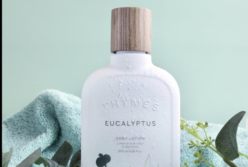
harmony by photographing this body spray using the
analogous colors scheme. To create contrast, I
will be photographing this fluffy Brazo de
Mercedes cupcakes using the complimentary
color scheme. I had to learn the hard way that planning is a crucial
part of a photoshoot so I never skip this
part of my workflow. Let's start with the body spray. It says, welcome summer so I wanted to create a
fun and vibrant scene. My go-to place for
inspiration when doing photoshoots is Pinterest. I just typed summer
products styling and here are some great
photo inspirations. For this product, I will be following the
analogous color schemes. It could either be yellow, green and blue, or
orange, yellow and green. The product looks yellow-orange so I might follow the orange, yellow, and green color
combination in my styling. I am just listing things that
I need for the photoshoot. I already have a
green background so that's covered. I might use foam blocks as well
for this photoshoot. I will paint my foam
blocks yellow or green. I love the pineapple that's
printed on this product, and I like adding fruits
to my product styling so I'm thinking of adding a
pineapple as props as well. That is my simple plan
for my first subject. Next, for the Brazo
de Mercedes cupcakes. To create contrast,
I am thinking of purple props and backgrounds to complement our
yellow dessert. As a routine, I tried checking
Pinterest for inspiration. Nothing really stood out. I also checked Instagram. I just searched for
#BrazodeMercedes. I didn't see what
I was looking for. But a trip to a surplus shop
really made me excited. I saw these cute bread plates from a surplus shop
on the way home. The first thing that
came to my mind is the Brazo de Mercedes cupcakes that I am planning
to photograph. Good thing, I have
a purple background to match the purple bread plate. I will be just adding cutlery and other dessert related props to complete my
scene. That is it. If you'll notice, throughout the process, I
am writing everything down. I believe that our
mind is best used for producing creative ideas, and not for storing information. I recommend that you
do the same thing. My top tip is to have a notebook for all
your creative ideas. May be a plan for
your next photoshoot, ideas from your afternoon walks, exciting color combinations and styling that you
can't wait to try. Do yourself and your mind a
favor and write it all down. Now, it's time to prep and
shoot our food and product. See you in the next lesson.
8. Demo: Using Color Theory to Create Harmony: For our photo shoot demos, we will be creating
different looks and vibe. For the body spray, I followed the analogous color
scheme to create harmony. I ended up using the
colors orange and green to combine with the yellow and
here is the final result. In the end, I tried to play with the hard light to really
give that summer vibe. Because I followed the
analogous color scheme, I feel that my scene still felt harmonious even with the
punchy highlights and shadows. Now for the process, you saw how I planned for this photo shoot and where
I got my inspiration. After planning, my next
step is to source props. First thing I do is to check my current prop collection
to make sure that I don't upset my
husband by buying a new set of props,
just kidding. My husband is very supportive, but I want to make sure I maximize the things
that I already have and if I can re-purpose
props, the better. For example, I was able to re-purpose these
white foam blocks by painting it with the color
that I need for my scene, which is pastel green. I have a pineapple, as supporting props, then our body spray. For the first background, I am using a double-sided
waterproof background that I got online. The other side has
a darker shade and this side has a tinted
or a lighter shade. I will be using the lighter one. For our second background, I will be maximizing
the part with more greens and stay
away from the blues. It looks like it's
going to fall so I need tape to support our
surface background. Next, for our styling, I will start simple. Just one prop and the product. Then the reflector to bounce
light back to our subject. Then I will be adjusting my tripod for me
to frame my shot. Next is to set up my camera. Since I have the camera on a tripod and I am not
shooting handheld, I can set my shutter
speed lower. I set it to 80. I always aim for a lower ISO to avoid noise in my photos, so I am setting the ISO to 250. I'm happy with my settings, so let me take a test shot. I'm happy with our shot, so let's start
adding more props. It's okay, but I feel
something is missing. I wanted for our scene to really give that summer feeling. I will remove the first layer of my light diffuser so we
can get a harder life. It's as if we're getting
bright sunlight. Then adjusting my tripod
and camera to frame my shot. Adjusting the position
of the product as well. Then making sure our
subject is in focus. Then take a shot. It
looks a bit overexposed, so I will be adjusting the
ISO and bring it back to 200. Then take another shot. I'm still not satisfied
with our hard light. I will be removing
all the diffusion from my artificial light. I am wearing sunglasses because my eyes are a bit
sensitive to light. I'm also adjusting the
height of my light or my light stand to really create that summer noon sun vibe. I am using the white
side of my reflector, this time to sharpen
the side shadows. Now that's perfect for me. This is the look that
I was aiming for. Since we have hard light, it's our chance to play
with the shadows. As you can see, hard light can
cast hard shadows, so let's use that to our advantage and make our
image more interesting. Good thing I bought an extra
pineapple just in case. I used the leaves or the
crown to create this effect. That is it for our Welcome
Summer body spray product using the analogous
color scheme. In the next demo, I will be sharing how
I created contrast to photograph dessert using the complimentary color
scheme. See you there.
9. Demo: Using Color Theory to Create Contrast: In the previous demo, I used the analogous
color scheme to create harmony in my photos. Now, I will be using the complementary color
scheme to create contrast. Again, complementary are colors that sit opposite
on the color wheel. For this demo, I
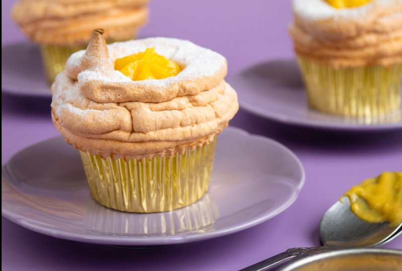
complimented these yellow, yummy and fluffy Brazo
de Mercedes cupcakes with purple props
and background. The color purple
made the yellow pop, but also added to the luxurious feel of the
gold cupcake paper case. Here's my process in creating these fun and playful images. First is my background. Again, I am using a
double-sided background, but this time I am
using my purple one. Then these purple bread plates. I also added these
retro sauce dish with Brazo de Mercedes filling
to add to the yellows. Cutlery to match the sauce dish and our fluffy and yellow
Brazo de Mercedes. I am using my t-stand again
to support my background. Then arranging everything before I put the food into the scene. Just adding a
pattern and texture to the Brazo de
Mercedes filling. I am keeping the filling on the desert spoon to
add to the story. Then the star of the scene. Nice and careful. Then the reflector to
soften my side shadows. The middle one is our
main subject. A top tip, When photographing
multiple food or products, always choose a focal
point or one that you want to stand out
and be the subject. I am just making final
adjustments and making sure that our Brazo
de Mercedes cupcakes, look appetizing and inviting. I want a bright scene and
my background blurry, so I will set my aperture to
the widest and brightness, which is 2.8 for this lens. Since I am shooting handheld, I will set my shutter speed
to 200 and finally adjust my ISO to compensate and
get a balanced exposure. Let me take a test shot. I'm happy with the settings, but I want to make changes
on the arrangement of our main subject and
the supporting props. I am not very happy with how the filling look on
the main cupcake, so I'm just trying
to troubleshoot and see if I can
make it look better. As you can see, I continue to arrange my scene
as I take photos. You can do the same thing too. Your goal is to capture a balanced looking image that
tells your food stories. That includes taking photos
from different angles. For example, I wanted to try a top view or overhead shots, so I needed a chair for that. Here is the result. I still don't have the image
that I was aiming for, so I will try a
couple more shots. This is the one that
I was hoping for. Let me just get
one last close-up shot and we're done. Food is trickier to
photograph compared to products because their
appearance can change over time. As you can see, I had to continuously
troubleshoot and make changes to improve the
appearance of the filling. I had to move the bread plate
around because some parts of the cupcake were starting
to show some melted sugar. If you notice too, I did not have much
props in my scene. It is always better to start simple and build
up versus having a cluttered and busy scene and end up torn which
prop to remove. Just remember that everything in your scene has to have
meaning or purpose. Everything should contribute to the story you are
trying to tell. In the next lesson, I will show you how I will
enhance the colors in my images in post-processing.
See you there.
10. Photo Editing to Enhance Color Harmony: Last but not the least, one of the best ways
to practically apply color theory in photography
is in post-processing. I always say in my
classes that editing is a crucial part of the
creation process. Yes, we want to get
our compositions and our colors right
straight out of camera. But editing is a
great opportunity for us to polish our photos. With the use of color theory, we can enhance the colors
to make our subjects pop and make our photos
even more eye-catching. For example, here's a before and after editing of these
yummy cream puffs. After a bit of editing, the subtle blue really complimented the
orange cream puffs. Remember, blue and orange
are complementary colors. I utilize that to really
make my subject pop. I edit most of my photos using
Adobe Lightroom Classic. I will quickly show you my process for
polishing my photos, but focus more on
enhancing the colors. Let's start with the
Welcome Summer Body Spray. Here's the before
and after editing. As you can see, it's
not heavily edited, but the edited version looks
more punchy and colorful. The white balance and exposure look correct and more balanced. My editing process is the
same for most of my images. Crop, correct the exposure, correct the white balance, polish with clarity
and sharpness, edit the colors and
reduce the noise. For this image, I
wanted to crop it for social media so I
can choose from one by one or four by five. I like the portrait
look of four by five, so I'll use that crop. For my exposure, I usually add brightness to my scene by using these sliders. Plus 60 on exposure, I want all my images
to be contrasty, so I add plus 10
for the contrast. I want more details
and less highlights, so I can set it to negative 30. I love the hard shadows
created by our hard light, so I can enhance that
by adding more shadows. In Lightroom, you move
your slider to the left if you want more shadows, and to the right if you
want to remove the shadows. In my case, negative
10 looks okay. For my white balance, I can use this selector tool and point it to a neutral color. This looks perfect for me. If you don't have
a neutral color to point the drop tool to, you can also adjust
the temperature. For example, in my case, I can manually set it from
4,800 Kelvin to 4,600. Moving on to clarity, just a bit so plus 10, then a bit of vibrance as well
to make it more colorful, so plus 10 as well. I don't use saturation
very much because it saturates all the
colors on my scene, and I am a bit
meticulous with that, so I prefer to adjust the saturation of
each color myself. I also like playing around with the tone curve to add more
contrast in the mid-tones. If you will notice, I don't get
crazy with these sliders. I want to make it look
as subtle as possible. Now, this is where I play
around and enhance the colors. This is the HSL slider. HSL stands for hue, saturation, and luminance. You remember hue in
the color lesson. Next, saturation refers to the intensity of
color in an image. Luminance is the
brightness of the color. For our Welcome
Summer Body Spray, I wanted to remove
all the blues to be consistent with our
analogous color scheme. I can go to hue and move this slider for blue
and make it more green. I can also do the same for aqua because it still
has the blue hue. I'm also adjusting
the green hue to be on the yellow side
instead of blue. Next, for the saturation, I wanted to saturate
our analogous colors, which are orange, yellow, and green, but not equally. Plus 20 for our subjects
color, which is yellow, then plus 10 for our
supporting greens, and plus five for
our orange accents. On the contrary, I
want to make sure I desaturate the blues and aquas. Here's our before and after. Now, just making
final adjustment with sharpening and noise reduction. Lightroom has a new
feature where you can reduce noise with
artificial intelligence. I can either do that
or do it manually. I tried it before and the
AI does a pretty good job, so I'll do that. It will just take its time
and create a new copy. From here, I can just copy
the Develop Settings from this photo and paste it to the rest of the
body spray photos. That is it. Again, here is the before and after. I took all of my photos
using the RAW format. My final step is to export it to the JPEG format so I can
share it with the world. In the next lesson, I will show you how I will
use photo editing to enhance the colors in our Brazo
de Mercedes cupcakes. See you there.
11. Photo Editing to Enhance Contrast: For the food photos, my goal is to create contrast
and make our image pop. This is the before
and after editing. Enhancing the purple background
and props helped for our Brazo de Mercedes
cupcakes, to really pop. Not a huge difference,
but for me, the result is worth the
additional step of editing. Now for the process,
it's the same. I start with a crop. So same, four by five
for social media. Then adjusting the
framing and angle. For the exposure, I feel that this image will benefit
from the added brightness. So plus 40, same routine with
contrast plus 10, removing the highlights to get more details,
so negative 50. I'm quite happy with the
shadows, the whites, and the blacks of
the overall image. So I'm not touching those. For my white balance, I use the selector tool again and pointed it
to the powdered sugar. I'm happy with the
white balance. So moving on to
clarity and vibrance. Plus 10 and 30 this
time plus 20 on vibrance because I
feel that this photo needed that overall vibrance. Then a bit of playing
around with the tone curve, just the highlights, lights, and shadows this time. Now for the colors
or the HSL sliders, I will start with hue. I noticed that the background and props look a bit magenta. Our yellow here is complementary to a more blue-violet hue. So we can make changes here to achieve that color combination. So I'm just adjusting the purple to be on the
blue-violet hue. Then trying to remove
the magenta hue. And finally adding
a bit of blue. For this saturation and to
make our image really pop, I will be saturating
the yellow and purple. Plus 30 for our
yellow main subject and plus 15 for our
supporting purples. Final touches on sharpness
and noise reduction. And here's our before and after. I just copy the same
settings to the rest of the Brazo de Mercedes
cupcakes photos. Then export to JPEG like what I did with the Welcome
Summer Body Spray. So I can now share
it with the world. And that is it for my
photo editing demo and workflow of using color theory in my food and
product photography. I hope you experienced
a lot of aha moments throughout the class
and you are more inspired to do the
class project. In the next lesson, I will be sharing my final
tips to really maximize color theory in our
photography. See you there.
12. Final Tips: You have reached the final
lesson for this class. You have seen how I used color theory to plan
for my photo shoots, to craft a story, to choose props, to style my scene, and in
post-processing. Now, here are my
final three tips to help you master color theory. Final tip Number 1, keep the colors in proportion. 60-30-10 is a rule for color proportion that is frequently followed
by designers. This is especially helpful if we are working
with three colors. This is not a strict rule that
we need to follow though, but it is a great guide
and starting point. I like to use Bryan
Peterson's book on understanding
color as a reference again, he said that you can let one of the three
colors dominate with the other two as mere
accents because when three vibrant colors are
composed in equal measure, it can be like listening to the screams of hungry triplets, not a fun experience. The next time
you're working with three main colors in your scene, let one dominate the
next color to support, and a third color as accent. Next tip Number 2, know that your camera
sees differently. Unfortunately, our camera's
light meter has been built to believe that
the world is colorless. It has been programmed to interpret all reflected light in the world as if it
were always reflecting off of a neutral gray surface. Our cameras don't see
those energetic reds, joyful yellows, and cool blues. That is why in the tints
and shades lesson, I showed you that adding
one-stop added whites to the scene while underexposing one-stop added
blacks to the scene. Just remember that your
camera's goal is to turn white and black tones
into tones of gray. Same with bright
yellow and dark blues. My advice is to always
take a test shot so you can adjust your camera
settings accordingly. But if all else fails
during your photo shoot, you can correct exposure
mistakes in post-processing. Just remember that
underexposed or dark images are easier to correct
than overexposed images. Also, your camera sees bright
colors similar to whites, and dark colors
similar to blacks. If you are shooting
white subjects and scenes with bright colors, my top tip is to set the shutter to stay
open for at least one stop longer or set the
aperture one-stop larger. When shooting black
or dark subjects, set the shutter speed
one-stop faster, or set the aperture
one-stop smaller. Now, final tip Number 3. Train your eyes to see color. You can start by looking
at your favorite images. Take note of the colors and
how they make you feel. Understanding and
applying colors starts with thoughtful
observation. Take some time to stop and
look at what's around you. You will never run out of inspiration for your
color palettes. Be curious and hungry. Find colors that make
you feel something, then think about what food
or product would work for that color and create
a story around it. You can also get crafty and use colored papers to discover
color combinations, anything to help
you be in tune with the quality of colors and
how they make you feel. Create images that make you
and other people smile. Images that evoke emotion
and tell a story. That is it for my
final color tips. Thank you so much for
sticking around and for choosing this class to learn
more about color theory. I slightly touched on lighting composition,
camera settings, and styling, but I have in-depth classes
about those topics, so make sure to check them out. I also have food
photography classes coming up about composition, lighting, and styling so make sure to hit the
follow button above so you will be the first
to know when I publish new classes and do giveaways. Don't forget to share
your work through the class project
gallery by clicking the "Create Project" under
Projects & Resources. If you are sharing your
photos on Instagram, please feel free to
tag me and Skillshare. My handle is @rosellenene. I hope you had fun and
found this class valuable. But either way, please leave
a review so you can help me and your fellow students in deciding if this is
the class for them. You can do this by
going to Reviews, then click on Leave Review, then just answer this short
and sweet questionnaire and finally submit. Don't underestimate leaving a
review because I personally read all of them and really positive ones
make my heart flutter. That is it for me
and this class. Thank you again, and
I hope to see you in my other classes. Bye.
 Rose Nene, Photographer & Videographer