Transcripts
1. Introduction: Hi, everyone, and welcome
to flow and Rhythm. Abstract watercolor
with simple shapes. I'm Denise Love, an artist
who loves exploring texture, color, and creative
play in the studio. I'm so excited you're here. In this class,
we'll create loose, expressive abstract watercolor
pages that are freeing, imperfect, and full of
beautiful watercolor movement. We'll begin with a few warm
up exercises to explore brushstrokes and water control and color blending and
simple mark making. Then we'll create
several fun pieces where I share tips for
choosing harmonious palettes, leaving intentional white space, and adding subtle
marks that bring your pages to life without
overwhelming them. This is a relaxed, process focused class that's
all about embracing the unexpected and enjoying the beautiful things
watercolor does on its own. So gather your supplies
and let's get started.
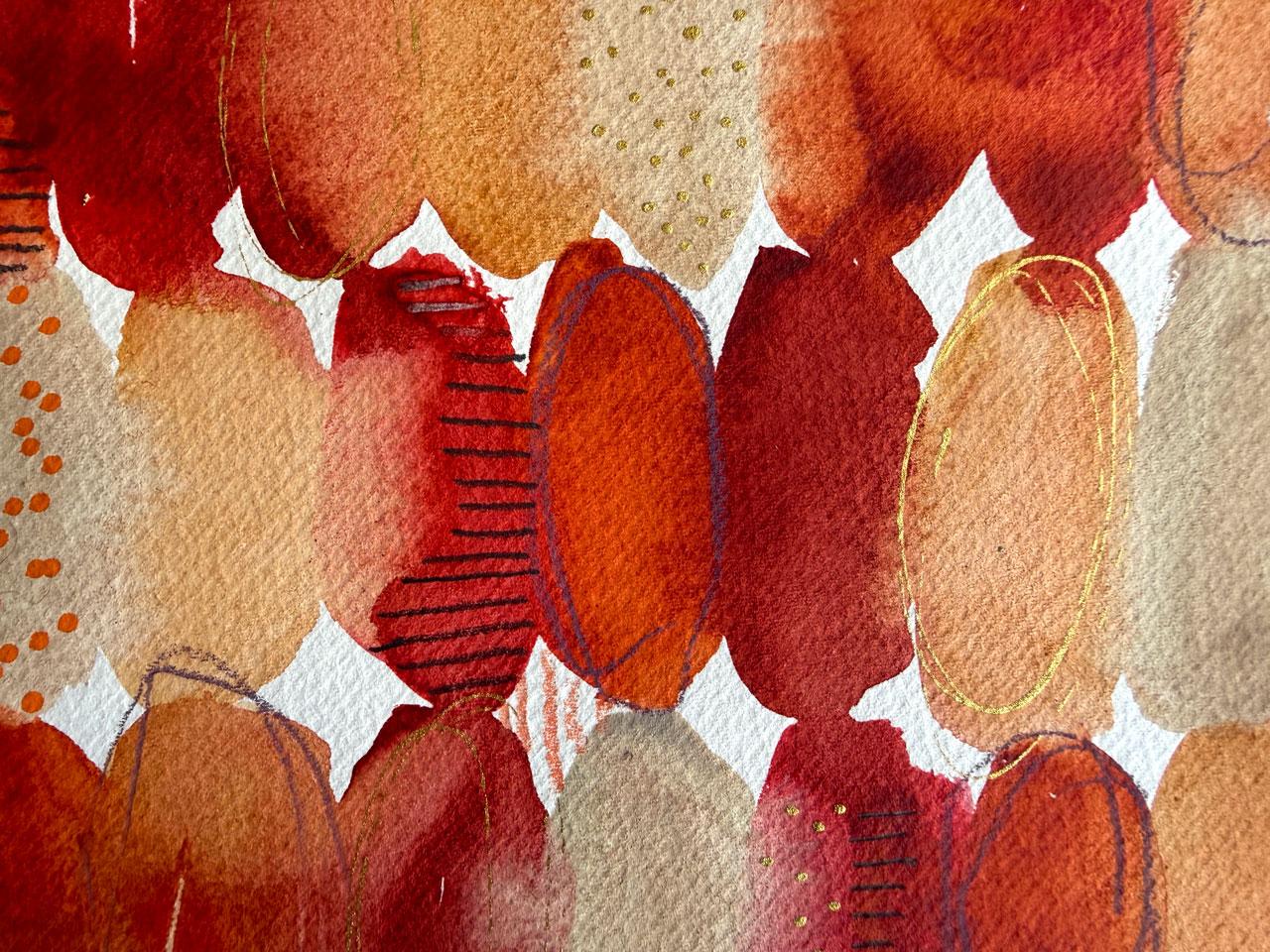
2. Class Project: Your class project,
I want you to create at least one loose
abstract watercolor page using stripes or ovals, flowing color, and
simple mark making. Begin by choosing
a limited palette of three to five colors. And once the watercolor
is completely dry, add a few restrained
details with a gelpen, pencil, colored pencils or
metallic paint your choice. Most importantly, let
the page stay loose. Uneven strokes, blooms, gaps, and surprising color mixes
are part of the process. Share your finished page
in the Project Gallery, along with a few words
about your color palettes, the marks you chose,
and any happy accidents you
especially enjoyed.
3. Supplies: Let's talk about the supplies that I'll be using in class. That is not to say that you need to use anything at
all that I'm using. This class is very much a
class of use what you've got and experiment with
your watercolors and mark making tools
that you've already got. We're going to do color
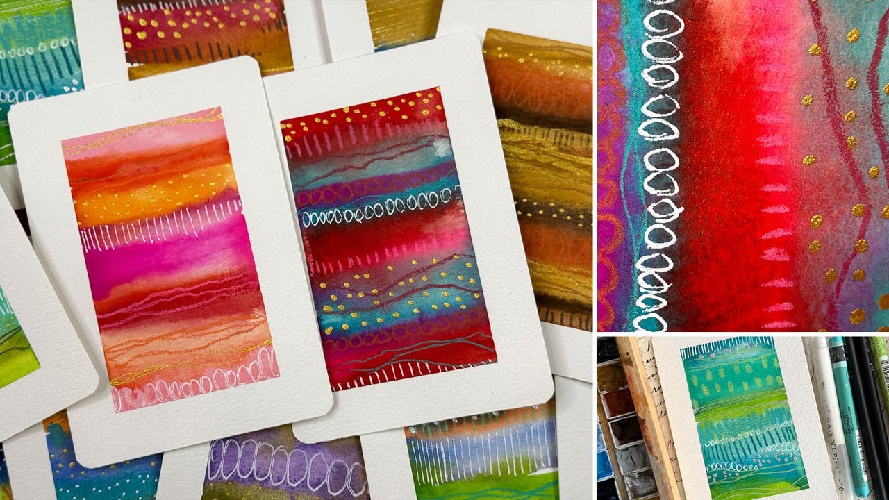
palette projects like this and do paper tests that are going to help us determine what
our favorite papers are. And after doing some of these paper tests where I've tested all the different
watercolors on different paper. Well, this is the same
watercolor on different paper to see how every paper reacts differently. That's
really eye opening. I've never actually taken all
the different papers that I own in my paper stash and
did this little exercise. Man, hugely helpful.
Once we did that, then we tested the
favorite paper with the different watercolors
that we were considering. That's coming up in
class because of that, I have decided that I'm
going to do Daniel Smith on probably two projects from some color palette
testing that I did, and maybe the
KuratakiGanzi Tambi 48 piece set on something
that we've done. I've got the Ganzi Tambis
a big set. I love those. They're fun and they're
very versatile and they're just delightful and they're very much in between
a watercolor and a gouache. They're not a
transparent watercolor like the Western watercolors. They're a little more opaque, which is what I love about them. So people
don't love that. I love it. Um, and then my
Daniel Smith watercolors, I have put those into a little art tool
kit travel pallets. So these were, you know, watercolors and tubes that I have put into a little
palette for easy use. I love that. Then another little travel
watercolor palette option is these wood pallets
that I got off Amazon. I love this wood pallet for the different watercolors
and guashes also. The whole bind gouache is another one of the palettes that I really loved in our
color palette sampling. So I'm going to be using the
gouache the artist colors. This is a specific palette that I just built out
of colors that I liked, and I'm going to be using
some Daniel Smith colors and some kurtoki colors. You don't have to have
anything that I have. This is all about
experimenting with your supplies and your tools
and mark making things. That's why we do these
color palette samplings. So you can be like, Oh,
this is what I like. So that's what I'm
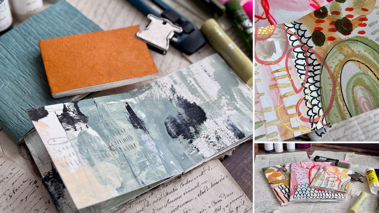
doing. Okay. So for mark making on these, I have decided this started off in my artbok so in the art book, I kept them really lovely and minimal and just
letting the colors and the texture be the star of
the show on these pieces. That's what I would like to
do with my projects in class. You are welcome to do
a lot more mark making and change things up or do no mark making and just let the watercolor do their thing, but I kept my mark making
lovely and minimal. This sketchbook, the
perfect sketchbook by Etcher is what inspired me to do this class because
it's the perfect sketchbook. Has the fabriano
artistico paper in it, which I have decided is my very favorite because of
this sketchbook. I've ordered some pads of that. I'm going to make a few
handmade art journals because these have
20 sheets per pad. I liked that it
had so many sheets in there and I liked this color. I also comes in a bright white. Once you decide what
paper that you love, then you're ready to hop
into some of these projects. This book is what helped me
decide what paper I love and the projects that I
wanted to explore further. If you don't want to
work on a single sheet of paper in class, I'm going to work on
single sheets of paper. But if you don't want to
work on a single sheet of paper and you want to have, say, an art journal or something so that you
don't have to worry about, what do I do with this?
You've made a lovely book. Find a favorite journal that
you can work in instead. I have thoroughly
enjoyed painting in the journals and filling
several of these up, and that's how I got around to. Oh, my gosh, I love these and
this paper. I love these. So definitely look around
and see what you got there. Markmking wise, I am
going to be using a variety of supplies and at the same time keeping it
a little more simple. I like a graphite pencil, so I'll be using either
my black wing or maybe a 14 B fiber castle
graphite mat pencil. I just like graphite. The
graphite one is more black, whereas the black wing
is more of a charcoal. True pencil color,
but it's very bold. They're very soft and very bold. I also like the paska
pens for art making. I also like the
zig postermenGld, which is my favorite
gold by Kurataki, which I also have that
gold in a fine line bottle and gold that I like the most
is my KuratakiGld Mica ink. Couple different options there. Kurtoki makes this zig Postermin pen and sometimes it's in
stock, sometimes it's not. I got it on Blick and
it's got a chisel tip, which actually was disappointed at first because I was
like, I want the bullet. But chisel tip is
super versatil. You can get several
different kinds of marks with a chisel tip. You can do it on the
edge and get a dot. You can do it on the wider
edge and get a wide line, the thinner edge, and
get a thinner line, and it is just lovely a really good color
and a lovely shine. I really do like this
one for my gold. But I also like the
panda fly gold. Panda fly gel pens,
gold, silver, white. That might be some
mark making that I do. Then I actually wrote
on all my papers what I was using and these
what I had used. I like the Stetler
pigment liner pens. That's what I've been using
to write with in class. Other mark making
that I like to do, I really like this
fabric Castle black edition set of pencils.
They're very bold. They're like my 14 Bs, but they are colored.
I really love that. The other alternative
that's also just as lovely and bold are
these polychroms. If we have, say, for instance, one of the black edition
that I can draw out, and I think these are
good for black paper, but I'm not doing
it on black paper. I want bold marks there on my work that I'm doing on my
mixed media, you can see, both of these have a very
almost identical boldness, intensity, line size depending on how hard you're
pressing down, the polychromas
are very buttery. I like that about those, but I'd say they're
basically identical. So if you've got a little
bit of one or the other, that's my favorite
pencils for mark making. Then Hole Buying artist tape is my very favorite
art tape now. You can use blue painters tape. You can use, really, the blue painters tape and this tape here
are my favorites. These you get at
the paint store. I've used this for
a very long time. But recently,
Holbein has come out with some artist's tape that are a little bit lighter weight. They're like a
washi tape weight, and they have just been amazing. When I did my paper test, I actually taped the
Holbein artist tape on every single paper type, and I only had one that the tape wanted to
tear the paper. Out of all of the
ones that I tested, I only had one that
I just I don't know. I would definitely be the one I wouldn't want to
use because let me tell you, I like when my tape comes off and it only
did a little bit. So it wasn't even like it was a whole lot that it did.
Oh, it was this one. This Magnani 1404 Italia CP, and it's 100% cotton. This is the only paper that the tape almost wanted to tear. All of these other
ones were amazing. The blue painter's tape probably would have wanted
to tear half of these. It's a little more sticky.
But I'll usually use my little heat gun
and heat the tape up and I can get it off without
having that problem. But I like that
when a tape comes off without all
the extra effort. This one for me
has been amazing. For all the papers
that I test out, it did excellent
except this one, I wanted to tear a little bit. Just thought that was
a fun little FYI. Hawaiian artist tape. I used the three quarter, and I think this
is three eighths. It's a tad bigger than a
quarter of an inch in class. You don't have to use
tape at all if you don't want because some of the different things
that we're doing, you could just fill in the
different spaces in pencil. You could draw out
a little border Um, and get the same look, or you can just free hand it and just get
something similar. You don't have to do it the
exact way I'm doing it. I'm just giving you choices
and showing you fun stuff. In class, I'm going to be using a couple of paint
brushes for sure, the Princeton square wash half inch and three quarter
inch. I like those. They hold a lot of water, and they have just been fantastic. I leave these brushes sitting
in the water sometimes. I absolutely abuse my paint
brushes and these hold up amazing for how hard
I am on paint brushes. I also on the projects where we have large organic
or oval shapes, I'll either be using
a half inch oba wash or a number ten
Princeton Neptune round. So just to give you some
options there on brushes. Then because of
our paper test and my inspired art journal
pieces that I did. I'm going to be working on
the Fabriano artistico paper, which for me is a huge change. I normally am always working on the HanomoPaper because that's been my favorite
for a long time. And now that I have a
large stash of paper. No, I might change my mind and think, This is my favorite. So I'm like, Oh, no.
This is a good one. My other go to that I've used quite a
bit is the Bao hong. But in these paper tests, I want you to look pretty close at how each of these does and
test each of your papers, and you might find a favorite that's different
than my favorite. That's why we do these. I actually weirdly enough, really liked the Canson
Excel paper also, which is a student
grade wood pulp paper. So I liked what it did
on these projects. So in the paper test video, we will talk about each
of the papers that I tried and what I liked
and didn't like about it, and then I want you to
test your papers or if you see one that you
like that you want to try. I did lots of choices. So yes, in class. I'm going to be doing
the artistico paper, and I actually got
this gigantic pad. For it's got 20 sheets in it, and it was about $54, I think. But I got it because I'm
going to make one of my other art journals
with the open spine. Like I made, these are
all the Honamu paper, and it made this size, and this would be slightly bigger with my new
favorite paper. And so that's why
I got the big pad. I'm going to make some
handmade journals. And it takes for this, I
usually use 12 sheets of paper. So I could easily get
definitely one book out of here and if you did this and you could do
ten sheets of paper, you could do that
if you wanted to. But I like this
traditional white color. For class, I have cut
some of these in half to use this as my project paper, and then the rest of this pad, I'm going to be turning
into a lovely book. So there you go. That is
what I'm using in class. Again, you don't have to use anything at all
that I'm using. It's all about
experimenting with some of your supplies and
doing the projects that we're doing without really getting hemmed into
exactly what I'm using. But yeah, I think the
Holbein Artist one, the Ganzi Tambi,
the Daniel Smith. I think that is the direction I'm leaning for my projects, so I can't wait to see
what you're making. So let's get started.
I'll see you in class.
4. Watercolor Paper Testing: I thought it would be fun to start off by doing
some paper tests. I was inspired by making
YouTube videos and stuff for this class and the different things that
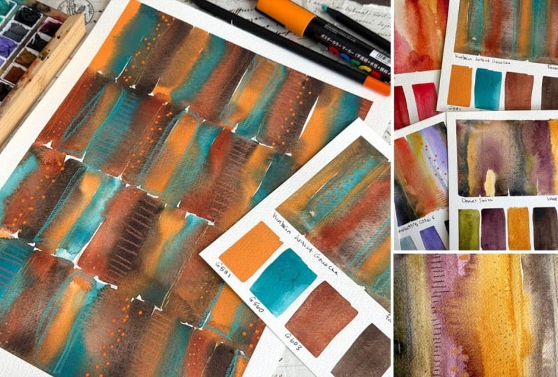
we'll be making in class. I started out with me making lovely mini stripe paintings, which led to me making mini stripe paintings for the mini stripe
painting class here. These are all building
on each other. Doing stripe paintings like this led to lovely mini stripe
paintings like that. I do like to work on
cotton watercolor paper, but I do have a
couple of varieties that I've tested out here. I just wanted to tell
where this started. This is on the Hnomule
hundred percent cotton paper that I've done in
these books here, which is one of the pads
that I've got in here. But I've also done
that in the wash. This one was the Shen hon gosh. And this one was the
whole bin guash. And then this one deep,
deep light watercolor. You can see I started building and that's
on the Hnomule paper. Then I went to these perfect
sketchbook by EcherT is the Fabriano aristico
paper I found on one of these pages where it was embossed on the page,
so I figured out the paper. I've done a ton more playing
with the whole bin gouache and different stripe ones in here and there
have been several. It must be this other book here. Again, perfect sketch
book by Etcher. This is the KitakiGanza
TambiPaints, which is what I did
my paper samples on. Again, this one has the
fabriano aristoco paper in it. And the last few paintings
that I did on this fabriano, I loved so much so
that I was totally inspired to come and play and experiment with
these further. I love this fabriano
aristico paper, and so I have ordered
a pad of that paper. I believe this is
the natural white instead of the bright white. That's where I started experimenting and growing and figuring out what do I like? Then I thought, what would
be fun is to do some more experimenting on different
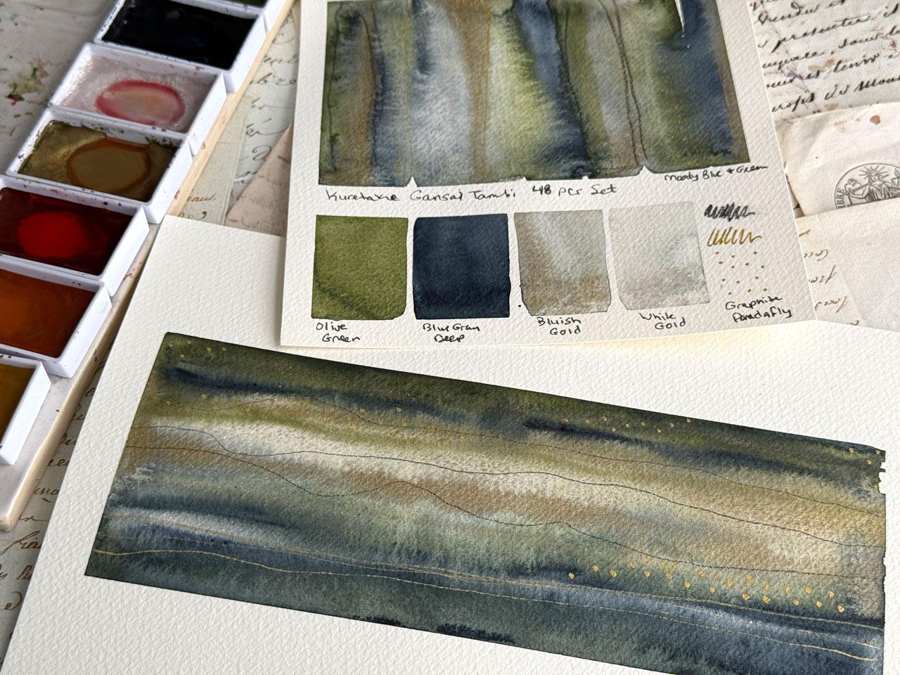
papers and just see if I use those same green. I used this olive green, and I used this blue gray
deep and white gold, which has a little bit of that blue color contaminating it. But it's the white gold
and the bluish gold. That's what I did for
all these samples, and I decided on the katakis
because I liked them in that art book that we
were just looking at. That's the four colors
that I was testing. In the next video, what
I want to do is test out different watercolors and
see what else could I like? Or do I just want
to do this whole, you know, projects and stuff that I'm doing in
class in the Kurataki. I went through my paper stash and I pulled out all of
these different papers. These are bigger pads, and then I had some smaller pads that came in some art boxes. I thought I would
paint them all with the exact same painting so that I could definitely be like, Oh, I like this
better than that, or this soaked into the paper
too much or what have you. This one is the
Snelia 100% cotton. This is a lovely paper to
work on for work that we do. I do like this painting. I'm going to say we like that one. I'm going
to put it over here. It's got the metallic that
shines really beautifully, the colors separated
really beautifully. It didn't soak into
the paper so much that I thought that it
desaturated everything. I like that one. This one
is the 12 64 Fabriano. This is not 100% cotton. This is a mixed paper
and if it's 100% cotton, they brag about that and it will be right
there on the cover. This doesn't even
say 25% cotton, so I don't know. I'm going to assume that
there's no cotton in it. We'll assume this
is a wood pulp one. I could be incorrect, but it doesn't tell me that it's cotton on here and they
brag about it if it is. We'll say this is
probably a wood pulp one. But look what it did. All of those paints
sat on the top really dramatically compared
to where it soaked in. So depending on what kind of work you're trying to create, look how different
those two watercolors reacted to the technique
that I applied them to. This one's a much finer look, then this one, this
one's a much heavier, chunkier thing set on top. It's very almost heavy handed looking compared to
this really fine one. So very interesting. I do still like it, though. So this in the like pile. This one was, uh
MgNini 1404 italia. This is 100% cotton, 140 pounds. This is a paper that you
can get in big pads. This came in one of
my sketch boxes. But I do actually
really like that. It's really dreamy, gave
me an atmospheric look. The metallics really
show up well on it. I do really like the
Magnini 1404 paper. If you compare that
to say the snelia, it's actually more bold and
dramatic than the senilia. I think I like that
better than the sanela. We'll put that over
here and we'll set the senilia over here. Then I've got the fluid 100
cold press watercolor paper. This is 100% cotton also. This one is a little more dramatic and heavy
handed, very similar. I feel like to that one, which was the magnini paper. Those two, I feel like
are very similar. I like the way both of those
reacted to the paints. This one is the
Hanomu paper and it is a rough in the texture
instead of cold press. And this one doesn't say cotton. I don't think this is one of
the cotton ones and I did not like the texture at all. It has almost a
grid texture to it, and a lot of rough
watercolor papers have more of a sand
papery rough feel. This one has an
actual grid texture on it. Did not like that at all. This paper is the studio
paper by Fabriano. I have decided in using all
my stash because I've been using the HnomulePaper as my favorite for a
very long time. I like the Canson Heritage, but I can't find that
in the pads anymore. I've just really never even explored the fibriano
all that much, but I did have a
pad of paper of it. It's 25% cotton. So, the higher the
cotton content, usually, the more
expensive the paper is, and the wood pulp papers
are usually more like a student grade and
are less expensive, but 25% cotton on this fabriano. And I actually really,
really liked it. I played with this page a little bit more
just experimenting. The paint does seem to sit on
the top, a little heavier. Which for this technique
I actually really liked it even sat on
the top, for instance, compared to those
and produced more of a shine than
the other papers. These left at more of a matte finish so the
paper didn't feel shiny. This is more of a shine
on that paper and it feels Was that a cold press? Because it's smoother. It could be at this
is a hot press. That's a nice difference
in the hot press versus the cold press. But I did actually
really like this one, and I'm not traditionally
a hot press person. Okay, this one here, is the Windsor and Newton
watercolor pad, 25% cotton. So it's a blend. It was actually very textured, and it did okay, but I did not like the underlying texture
that leaves almost, again, a grid, and this one
is considered coal press. I did not like the coal
press texture on this piece. So we're going to
say that's a no. This one is the Saunders
Waterford paper. It is cold press, and it does not say cotton. Does it say cotton anywhere? I'm not seeing that
it says cotton. I'm going to assume that,
oh here we go, 100% cotton. So it is cotton. They hid that. Usually they would
put that real big on the front unless
Oh yeah, they did. That's just a different
look than the rest. But I will say, I felt like the watercolors just
sink right down into that paper and gave me a much more watered
down watercolor look, which was for these, just not the look that I
was going for or I prefer. I do want it to be a lovely, stronger almost
between a watercolor and a gouache kind of
look with that pigment. I didn't want it to be so
washed out and kind of bl. So I would say, on the Sanders, that's a no. This was the most
interesting experiment because out of all the
things that I have done, all the classes that
I've made and such, I've never actually
just taken one set of colors and tested all my
papers out to be like, Yes, I like this and
no, I don't like that. Okay, so here's the
fluid 100 again, which I actually
did this 12 times. Okay. I didn't realize
I did it twice, but it does look different
on the two that I did, it could be a difference in
water that I put on there. It could be a difference in the size and just going bigger. I did like this a little more and probably had
more water in that. Overall, I did like this,
but I didn't love this. Even though I said yes in the yes column,
when it got bigger, it was like, so maybe we'll move that to it's
iffy but no column. This paper that I
did is the arches. And I like arches, I thought. And apparently, I've used
all my arches paper. So I had one pad of paper that I found at the bottom
of my paper stash. Calpress, 100% cotton. It is a nicer artist
cotton paper. And I did like the way
it gave me my paint and texture and the blending and the depth of color
that we retained. I'm going to say
yes on the arches. I don't think that's the paper
I'm going to use in class, but yes, I did like that, and it just gave
me a little more blending even than some
of these other ones. I like it when it blends. I like it when it
does the blooms and color and stuff like that, but also like it when
we retain some of that fun depth and it doesn't totally disappear
with the depth. I like it, but I
don't think that's the paper that I'm
going to use today. Okay, so this one
Fabriano cold press. This is the 25% cotton pad. And I got to tell you, this one has a weird texture again on it. So even though I like
some of the fabriano, apparently, I don't
like all the fabrianos. And I do not like the
underlying texture that remains from this paper because I feel like the
texture takes over. I like it when you
add texture yourself and you can be real strategic
about where you put it. I do not like it
when the texture is the paper and it's everywhere
and it's kind of like, and overwhelming to the piece. I did not like that.
So that's a note. This one was a surprise. This is the Canson XL. This is probably
the one paper that most people would have
really good easy access to. It's sold at every art store and craft store out there
that sells art supplies, and surprisingly
enough, I liked it. This is the Canson XL, it's a wood pulp paper,
it's not cotton, CalPress, but do this. When I did this one on here, I did actually like the way
that our piece turned out. I liked that we
retained our metallics. I like that we had some
strong color separations, I didn't sink into the paper
and become very desaturated. If you want to try something
that is going to work out fairly okay in these
different techniques and stuff, this one I liked. That was a good job. Canson ex. Okay, this one's Canson, Moulin de Roy, 100%
cotton, cold press. I have this pad, but I hadn't used it that much, and it warped to the
point that we had a big dip of color that then sat in the
middle of our piece. And so while I like
some of the areas, I did not like the warpage and what it did as the
paper was drying, so I'm going to
give this one a no. But it was okay. The
color blends okay. It keeps its depth. I do see the metallics in there, but I did not like
the strategic warping that made this big
splotch in the middle. It's the only one that did that. This paper here is
the Canson Heritage, which I cannot find anymore. I think there's still
big sheets out there, but I can't find the pads, and so I don't know what
they did, but it went away. But I tried it anyway because it was my favorite for a long time. But it was not my absolute
favorite in this test. Everything blended beautifully. I did retain the metallics. I didn't have as much strength in the separation as
I might have liked. It was okay. I wouldn't say that it was my
favorite, but it was okay. And you may have completely
different opinions on all of these than I did. Which is why I'm showing
all of them to you, so you can be like,
Oh, I like that one. Okay, so this is a
new paper to me. This is the huh, Wailua
cotton topped paper. And it was 30 sheets
coal press paper for less than a lot of
the other papers cost. So it is nice and economical. What they have done is cotton
top and not cotton bottom. So the paper is just
cotton on the top. And I don't know how
they did that and how that would be any more or less expensive in the
producing of the paper, but they've somehow sandwiched
cotton to go on the top. But I will tell you
now that I've used it, it's okay, but it's
not my favorite. Everything kind of sunk down
into it in a dull fashion. The metallics didn't
stay very metalliy. The blooming was okay but not that great to the
point that I was like, this might be for me a
good mixed media paper, but it would not be one
where I focused heavily, for instance, on
something like this with lovely watercolors expecting
one result and getting this. I'm going to say no on that one. And then we're getting
to the bottom. I've got the Bao
Hong Academy paper, which on the Bao hong, I think that's also
considered the Medn company. One of them bought the other and they're the same company. This is 100% watercolor paper. This is 20 sheets
of paper for less than what I'd normally spend
per say, Hana mule paper. It is a good economical option. This is my favorite one, which might be considered
the student grade rather even than the artist
grade, but I like this one. But for this project,
I did not love it. So my metallics
disappeared completely. The blending was okay. The blooms were kind of not really blooming and
blending the way I wanted. So this is a good one that I use for mixed media projects, but probably isn't the best for the techniques that
I'm wanting to do. So it was so so. Okay. Last paper, and it's usually
one of my favorite to use because it's a Hnomule
100% cotton paper. I like the texture
on it normally. I can get a pit of 12 sheets, normally runs anywhere from $17 to $22 on Amazon
when I'm looking. I usually buy this
when it's on sale. And I've made all
of my lovely books out of this paper
that I've been using. So, I mean, I really love
this paper for the most part. Was it my favorite
for this project? It is in those books, I
inspired this set of classes, this class that we're doing. But is it my favorite
out of all of these? I do retain the metallics. I do like the way the color
still retains some depth. It doesn't have
excessive warping, which I usually
appreciate quite a bit. It did blend into the paper
and desaturate a tiny bit. I didn't sit as heavy
on top as this one. This one's almost heavy handed. This one it's kind of a
mix. It's not my favorite. I got to tell you, I
really loved this one, this Magnini 114 oh four, and I really liked what
this Fabriano 12 64 did. I really loved what's in this book. Let me
get the right one. This one, the Fabriano
AristocoPaper. This is what inspired this. I have ordered
this pad of paper. So when this pad
of paper comes in, I might use the
Fabriano aristico pad of paper for class because it retains this
is the same colors, by the way that inspired
all these others. It retains the metallic look. I like the way it blooms and
did the different ways that the watercolor moved together totally inspired
me for this class. I'm going to say this Fabriano aristoco artist
grade fabriano paper is my favorite because
it inspired all of this. That's probably the paper
I'm going to use in class if that pad of paper comes
in in the next day or so. But I thought it would
be interesting to see all the different ones and what we liked
and didn't like, and then we will continue
creating and go from there. If you wanted a good
student grade paper, all of these, I did like the
anson one, Canson Excel. I did like the way that
took our colors and gave us strong color and
texture and separations. I did like that a lot. I liked the Fabriano hot
press paper weirdly enough. Even though I don't normally use hot press and I don't
normally love hot press. I did like that a ton. That's my choices. That's
our paper testing. I want you to either pick one of these papers and go for it
if you have no paper at all or I want you to take all your papers that you've played
with and do this test, pick two colors and two
metallics or three colors and a metallic or whatever it is
that you decide to test out, whatever brand or a
color pallet and do this test on all your papers
and see what does it do? Why do you like it? This
is the perfect chance to really look at each
one and say what you like or don't like because it
becomes obvious with one of these like this one
with the texture on it. I looked at that
and I was like, I have a lot of people to
look at things and say, why does mine look
different than yours? A lot of that is the
paper that you're using. Some of it's water
consistency, maybe the brush, but it comes down to look
how different all of the papers react to what we did. It comes down to paper
differences, probably. So I want you to decide out all the ones
that I showed you. Was there something
you liked that I didn't or something that I loved and you didn't just look at these and
think, oh, I like that. I'm going to do that paper
or test all your papers and decide what you like
and why you like it and then use that paper. I
like this one a lot. I almost need to
get a bigger pad of this Magnini one because
I did like that a ton. Now we have choices. Pick a paper, do your own
paper test, pick some colors, and then tell me what it is that you liked or didn't like about your
different pieces. This was super interesting. It's a thing that I have
never actually done before. Now I can go back. I can
cut all of these out. Even the ones I put
on the bigger pad, I can cut these out,
label it with the paper. Now I got a really
nice reference on the different papers that I
have in my own paper stash. Hope you enjoy giving this a test out and I'll
see you back in class.
5. Color Palette Exploration: Do some paint testing
in this video. And what I want to do is take whatever favorite paper it is after you've done
your paper tests, and I want to now test out
the different kinds of paints that we have to decide
what we end up liking. Because I was very inspired
by the perfect sketchbook by Etcher I found in this book the paper they're using because at the
very edge of these, some of the pages have the brand embossed into it
and I actually found it. These are future videos that
are coming up on YouTube, so you may or may not be able to find them on
my channel right now. But right here, it's embossed
right in to the edge of the paper, Fabriano Artistico. Is that what it says, Artistico? Yes, Artistico. So the artistico, which is embedded right
there on the bottom of that page is the paper
in these books and I was so inspired by this paper, working in these books and
by the painting that I did when I got to this part in the second book
that I thought, I want to work on
this paper probably. But then we did the paper test
we tested all the papers. I had those books
as my paper test, and I had all the other
papers that are in my stash. Watch that video
if you skipped it. I thought because I
like that artistico, I'm going to say
aristico it's got ten. The artistico paper, that's
the traditional white color, so it's not the bright white, it is the traditional
white that I liked. I bought a big pad of
it because this is a 12 inch by 18
inch and it came. Yesterday. As I was
filming that other one. I thought what I want to
do comes with 20 sheets. I want to make some of my
handmade books with this paper. These are made. The
other ones I've made are made with
the Hnomil paper, which has been my favorite paper for a couple of years now. But now that I've used
this fabriano one, this might be my new favorite. I absolutely loved it. It was a joy to work on. I still like the other one,
but I thought I want to make one of these handmade
books in this paper. I ordered the bigger pad, I could have ordered
the sheets and then had the edges torn. Like they've done in these because this is the big
sheets that they've cut down and then sewn into a book so you got the
torn edge on the edge, which is nice. I
could have done that. But older the pad because I
just wanted to experiment. This 12 inch by 18 inch, if I make a book, obviously, that'll be a nine by 12, which would be lovely. I cut these pages out
a couple of pages. And for class, I've decided it's the paper
I'm going to use. I've taken a couple of
sheets out and I've cut this is a full sheet, and I have cut some of
these into six by sixes, cut, cut, and then cut down the middle and
you get six by six. I am doing color palette
tests on the six by six. Then I've cut some
of them in half and that's what I'm going to
paint my projects on. When we get to those.
I've already been playing and experimenting with all the different
paints that I have, and that's what I
want you to do. If you have one
kind of paint, then do all your color palettes on these sheets in one kind
of paint. That's one choice. If you've got a bunch
of paint like I do, and I like watercolors
and guashes, then I want you to
take one piece of paper per whatever kind
of paint that you've got. This needs to be a
watercolor or gouache. It's not really a in my mind, a technique that I would
do in the acrylic, but you could
certainly experiment. But I've already done
the kurtokiGanzi Tambi paints and what
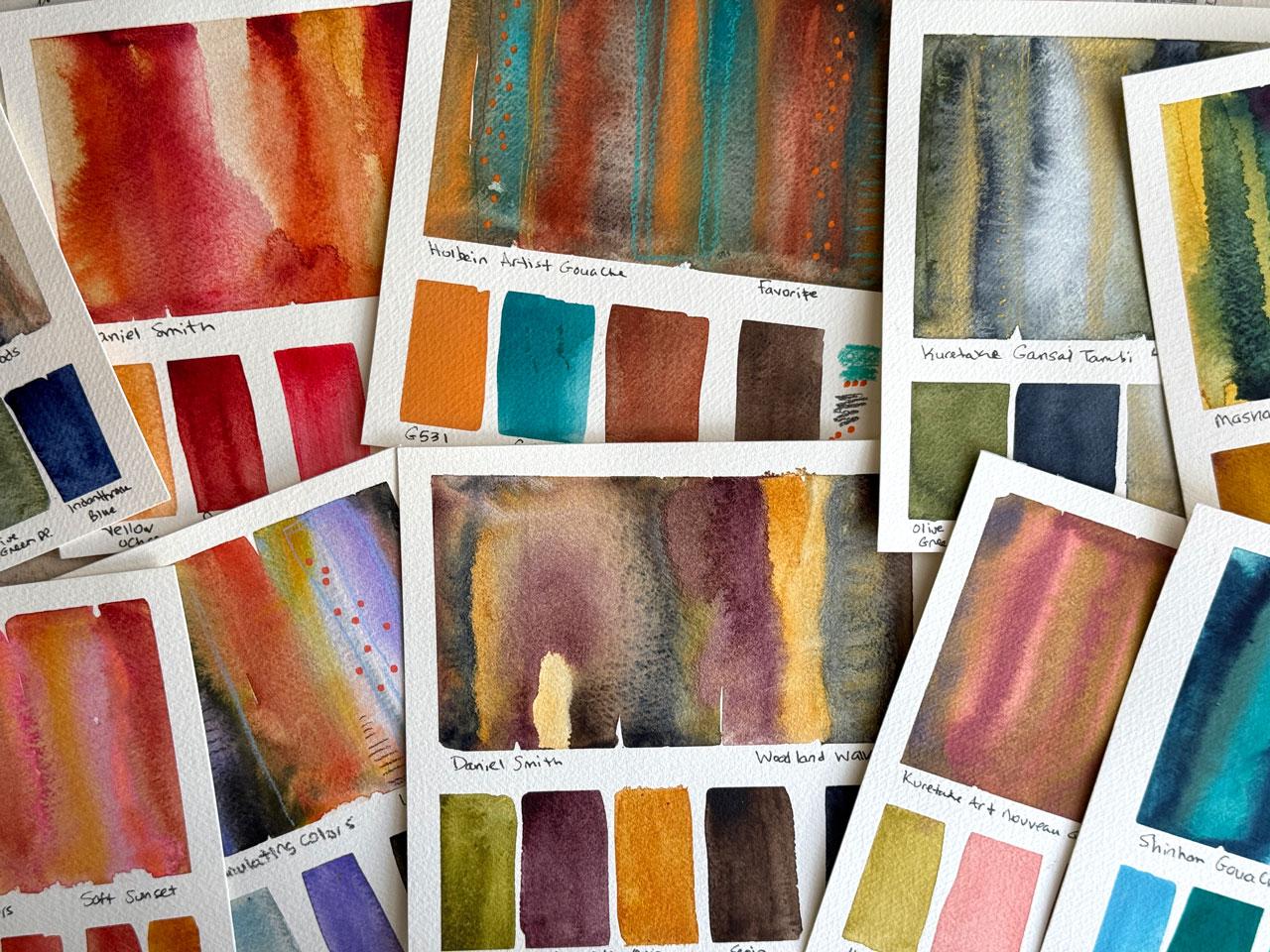
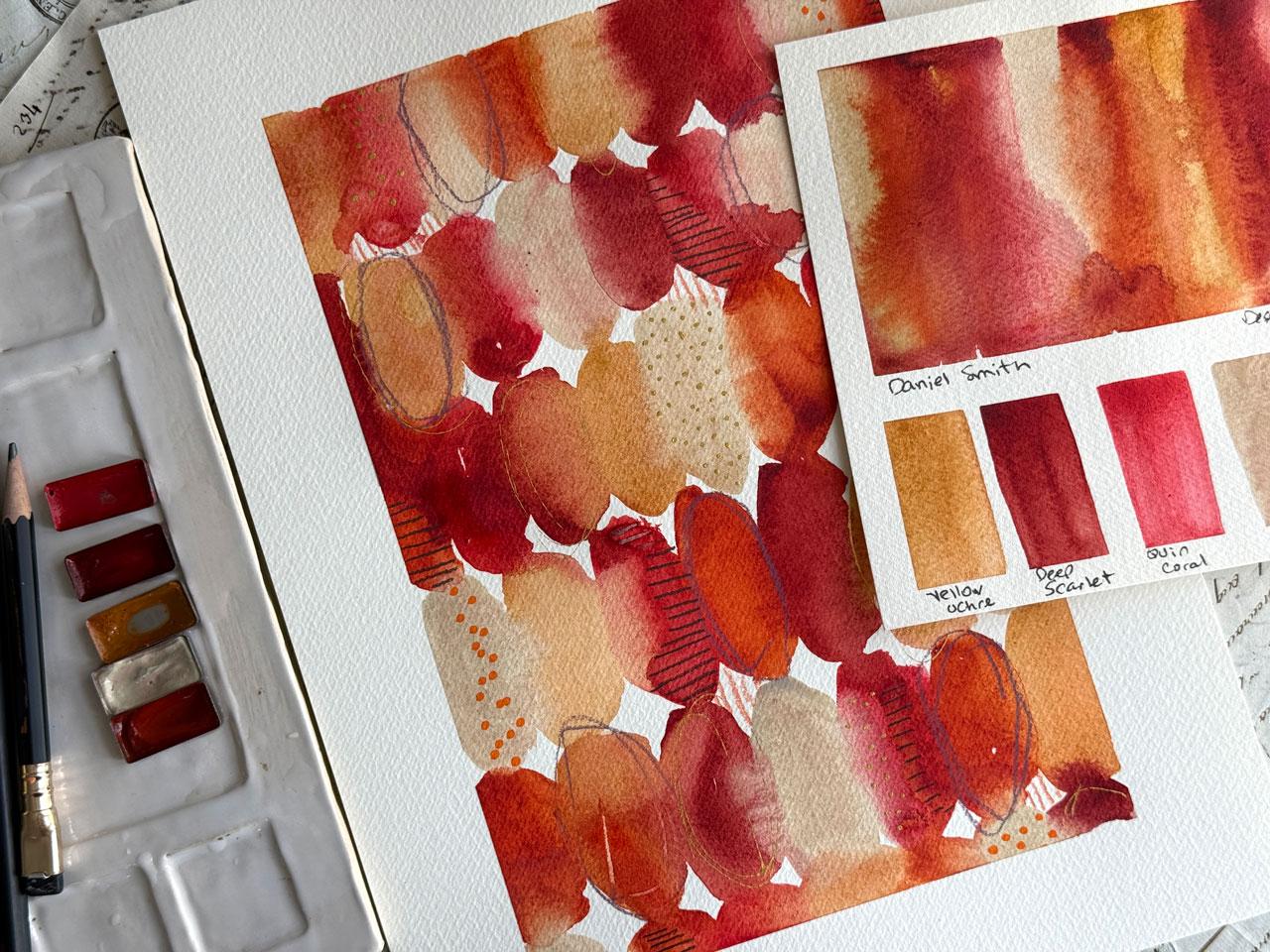
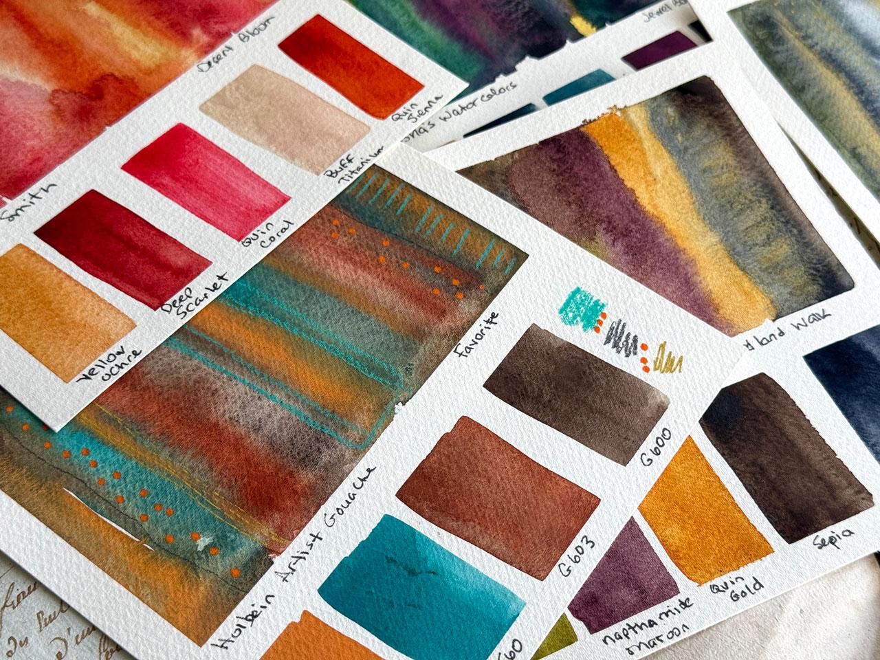
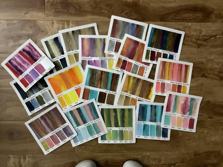
I did was I painted a whole section up
top of the colors swishing together so I could see how are they going to mix? How are they going to bloom? How are they going to blend? What's that going
to look like for me when I get that in
a piece like this? Then below that, I
put the colors that I was using and I wrote
the colors down. Possibly if you have space, some of these I do have spades
and some of them I didn't. I put in what mark making
tools that I wanted. This is a super good
reference if you have something like I've done where I've done the
paintings and I loved them. This would be a really
nice reference for me later to go back and
look at and be like, what did I use when
I painted that? Well, now I have a whole
reference sheet of what I used. That would be fantastic to
do if you painted some, especially an art
journal like this and you wanted to keep a record of it without writing
in the journal. This is a really
nice way to do that. These are the Ganzi Tambi
on the artistico paper. In the natural, that more natural white,
not the bright white. I did one of those
because I liked it. Then I tested out my whole
bine granulating watercolors. What I did too, I'm calling this one
moody blue and green. And then this one
is soft sunset. I have come up with
some color pallets to go along with these to give
you maybe some direction. I'll give you a PDF of
these color palettes. But I have decided here, this one, let's see. This one here is my
Mashas watercolors. Look at how rich those are. So I wrote what it was and then the colors
I used just below, and then I've called
it jewel box. In the jewel box little color
set that I came up with, I have picked five colors that are closest
to these colors. Not every brand is going
to have every color, and I don't expect you to
match those colors exactly. I don't match the colors
exactly on purpose. And when I use color
palette cards, I don't generally
match those colors exact either because I
like color palette cards. I've got my own color palette
cards that I've made. From my own photography.
A while back. Then my goal when
I do things like these is not to match these
exactly to the paint, it's to set myself on a
direction and get creative and inspired in a color palette just getting as close as I can. I already like these, and
I use the color cubes, those color palettes in a
ton of things that I do. I'm already very inclined
to use color palettes in almost all my work because
I love them and it helps me focus in on the art and not get stuck
at the beginning with, well, what colors do I use? That's the color cube
by Sara Renee Clark, if you've not seen those, even though I use
them for everything. But this is a way that you can make your own
color palette cards and direct yourself in your art for a color
way, what paper? What paint kind of thing. I've also done the
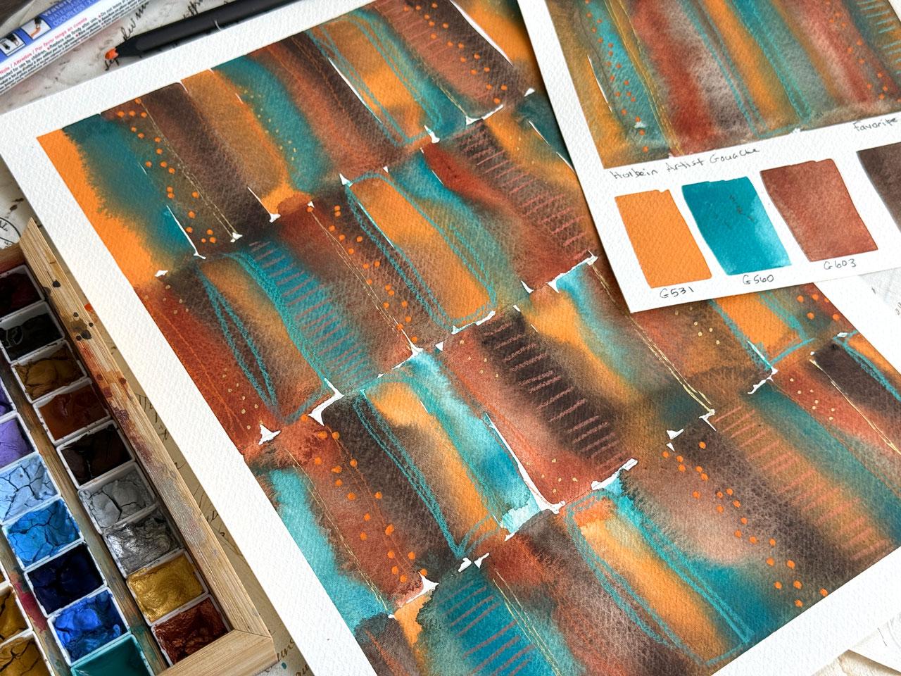
whole by an artist Wah. I've called this a
favorite one because in one of these
books that I did, this is a favorite color way. So if you paint something
and you're like, Wow, that's amazing. It wasn't a favorite, I don't
think when I painted it. I liked it, but I don't
know that I loved it, but man, every time I
look at this, I love it. And so I thought, This is a favorite color
palette so I'm going to pull the Holbein artistquh which is what I
painted in this book. Those are also
randomly popping up on YouTube from now
into 2027, probably. But that was a favorite
color palette. I thought I want to
make a record of that and maybe do a
big one of those. I'm actually considering
this as one of my big projects because look
how good those colors are. I listed the colors and
I also had enough room to put some mark making
ideas on the edge too. So you can use these anyway
that you get inspired. This is the A Gallo
colors and I use the Winter woods color palette and listed the
colors just below. I thought what we would
do is make a few of these with some paints that
I haven't already done. I've got the Shen hon gouache and I've got my
Daniel Smith paints. I thought, Okay, let's go
ahead and do these two and then we can get started on painting in our
projects and stuff. I'm feeling like for
the Shin hon gouache, maybe I want to do we've
got here's some of the ones I came up with already woodland walk, desert bloom, Lavender fields, and I've
just a suggestion of colors and a feeling of what that color palette feels
like to me like ocean mist, cool, fresh, peaceful, and you have Cerlem blue,
turquoise, cobalt blue, sea green, and pains gray, that would be a color palette of a pretty different blues. If I were going to do this one, I would look in my
Shinhan gouache. It doesn't matter if I
have these exact colors. Every brand might
call the paints something different or
it might have a number. But I would think
in my mind, Okay, what blues do I think
would come close to those, and that's what I would choose. So we might as well
do Ocean Miss. Let's do Ocean Mist, and I will we're
looking for some blues. Pull a little color pallete card off since it's upside
down. There we go. Yeah. I'm thinking Cerlem
blue is a really bright blue, so we could be over here. Turquoise is in
that family there. Oh 80 oh 75, cobalt blue is
maybe one oh seven, sea green, maybe like oh 71
or oh 78 right in there. Then Panes gray, maybe
that really dark one down there, number one oh three. That's what I'm
thinking. Somewhere in these right here and this. So we're going to call that
one the ocean missed one. I'm just going to wet
some of these down. Maybe this oh 80, maybe this oh 75, maybe that oh 78, maybe that one oh three, I might put another
one in there. What do we think? Maybe that
bright blue right there. Let's do that one, the Oh 68. Okay, is what it is. That's what we're going to call Ocean mist. And so I'm going to get my paint brush that I've
been using for all of these, which is my half inch
Princeton Neptune brush, and I'm going to saturate
that and paint stripes. I'm working on a
dry piece of paper. You can work on dry paper, you can work on damp paper, you can work on wet paper. Now, the wetter the paper, the more they're going to
merge and do other things. The reason I wanted
to start on dry paper is because this brush
holds a lot of water, and I want it to blend with each color
as I come up to it. So a ton of water
and then touching each side and letting
them blend and plow. Then you can decide
more water or less water as you do
these little test pieces, which will then make you more comfortable with your paints when you get to
the larger pieces because we've already
done some paper testing and now we're doing
some paint testing a real good exercise
with something like this is to do a little
piece of paper. Let me grab a piece here. I did this on one of the samples that we did
with the paper testing. But a real good test here,
this is just a random one. I don't know which one this is, but we could do wet
paint next to wet paint. Next to wet paint and see how that blends and do it on whatever your
preferred paper is, and then I could do
that on damp paper, and then I could do
it on wet paper. If I did it on damp paper, how would those same colors blend? Let's just take a look. Depending on whatever
paper you end up using, it's going to work a
little different for you than it might do on mine, but it's basically what
it's going to be doing. Then you can decide,
do you want to work on wet paper rather
than dry paper? I choose to work on dry
paper because I like it. Look at the difference that
you'll get with dry paper, a little bit damp and wet paper. It's a big difference
in the way those paints are going to run
and blend and dry. Let's set that to the side so that I'm not
putting my hand in it, and I wasn't done with this, but I got sidetracked
on a thought. After I do all that, I'm going to come back in
and run some other color up here just to see how
does that add to it? How does it blend? How
does it change stuff? Do I like what it did? How is it going to bloom and do
some fun mixing for us. Because I've got
enough water on there, I should get some
pretty spreads and blooms in places that maybe I didn't get enough spread and
blooms I was applying color. It's just all about a little bit of play and experimenting. Then once I've got it
where I'm like, Okay, we need to let that
dry. It's going on. I take tissue, and if I've
got any super amount of build up because I
use a lot of water to do this kind of technique, I will put the tissue at the edge and let that
soak up giant puddles. And then that will not take
the paint off of the paper, but it will soak up the
giant puddle of water. So I'm not putting
it directly on it. I am soaking it
right at the edge and letting it just
pull into the tissue. That's why I like tissue better
than maybe paper toiles. You could try paper
toiles, but I've always thought tissue really
worked the best. Then that just let me
pull those puddles off of there so that it's not going to take
forever to dry and we're not going to have
a big clump at the edge. Then what I do is I've
just got it taped off. I've taped this off with the
whole buying artist tape. Three quarter inch and the
one that's three eighth inch, it's a little bigger
than a quarter inch. I just taped it around
the edges and I taped off a skinny bottom because I
want to keep it separate. Then you could tape off the
stripes too if you wanted to. But I just found that it
actually works just fine with the square brush
just to come back and lay the color with the square brush
and it works great. You can make them
whiter, skinnier, you can be more
exact or less exact. I'm not real exact. I am
just like, it's good enough. If you have four colors, you might have enough room
to sample out mark making stuff like I did on
the orange one here. I only had four colors that I used and I had one where
I can mark make stuff. You can make the skinnier
and have a mark make thing. You can get creative with
how you're going to do that. Then I actually want
to let that dry. I get confused if I move
on to the next one. Before I've actually
finished that one, I'm just not re organized
mentally to be able to be like, Oh, yeah, this is what I used. I'll just forget.
Let's let this one dry and I'll be right
back. All right. We're almost dry. There's a tiny bit
that's left, not dry. I do try to let these
dry on their own so that we get the color blending and stuff that
we're going to get. Then I'll just pull
that Holbein tape off and you can see now
I've got just clean edges. I'm using the Stadler
four pigment liner in Stetler pigment fine liner. I like those. This
worked out good. This is the halo 0.5 size. What I've done is once I've
painted and got the look, maybe some of them you can do mark making on if
you're really trying to suss out what you want in that collection,
which is what I did on here. But some of them I
just had the colors to give me ideas for the colors. You can do that anyway that
really tickles your fancy. If I've got more colors, it just might be the colors until I get to the mark making. And then I actually did a
color pilot with these, which was ocean mist, then I want to go back
and identify the colors. Now later, I wonder
what did I use there? Now I have it listed and I can see did it
blend? Did it flow? Did it give me interesting mixes as the colors did their things. Did it wash out? Did
it stay vibrant? How did that work on the picticular paper
that I've decided on? That's how I made all of these. And so I'm using these to
test out color to, you know, test out the color palettes, but also to test out
the different paints. And so now that
we've done that one, we can do Daniel Smith and see what might we like
with the Daniel Smith. And these gouache and
some of those other ones, I took the tube and just
put them into a palette. If you're doing the guash and they dry out, it doesn't matter. It just squirt it
down. It works great. I do put my guash in a palette. Wood palette I got off Amazon. It's a watercolor wood pallet. I've got Daniel Smith's, we could either do another
favorite one or we could pick a color palette then I
do like metallics a lot, so we could, let's see. Let's see. I want
to do something. We've got Lavender fields. We've got desert bloom. Let's do desert blooms.
We've got a yellow ochre. With these, I'm more
likely to have the colors, what they're called
just because of Daniel Smith has the
most common colors. So yellow ochre. I do
actually have that. So I'm going to pull these out. Oh good I wrote it on the
bottom so I don't get them out. Water. Yellow ochre. Do I got transparent red oxide? Let's see. These I put
into these pallets also. These are the Artist
Toolkit pallets from the Artist Toolkit website. I don't have exactly
what it's calling for. If I know what a yellow
oxide looks like, I'm feeling like
because I'm doing a desert bloom, look
at this color here. Let's do that color.
That's this one here. We're going to call
that one deep scarlet. Yes, I like that color. See, that's what
I'm saying. I just don't try to get exactly exact. I'm good with close enough. Then we've got something
called Cornacrodon rose We've got quin coral, quinfuchia, deep scarlet, maybe
we would pull that coral. Quinqudone coral. Let's see. Which is this one.
That's, little bit brighter. Let's just do it. That's glued itself in. They're magnetized, but
once the paint gets wet, you may or may not
get that back out. There we go. Got the coral. Then what other color is on our burnt sienna
and buff titanium? I know I got buff titanium.
I think that's right here. Then burnt sienna, which
is a lovely ocean one. I know I got quinacridone Ciena. Let's see. That's this one here. Yeah. Let's do
that. Close enough? I think that's that one.
That's what we're doing. That's the colors that we're
doing in the Daniel Smith. Now after we have
picked our colors, we've got as close
as we could get. It's not like we have to
do exact on anything. My goal is to set myself
in a direction and be inspired by that direction and then just see
what we can get. Now we've got these. I'll go ahead and activate them. I could have stuff
this over here, maybe even we can see
them better, huh? Then we're going to
let that soak in. And I've got dirty water, so maybe I'll grab
a clean water. Keep a couple of
waters on my desk, and then we're going
to just get started. And just see what
does Daniel Smith do? Again, these are super
wet. I've got a wet brush. I've got wet paint
because I mean, super wet where I've activated. Oh, that's bright.
Oh, look at that. I'm getting excited
because look at how that ran it is super wet. I could brush more water off my brush if I thought,
oh, that's too much. I could activate the paint a
little bit less than I did. I mean, I really soaked it in. If I'm wanting them to be a little more defined rather
than running together. This is just about you experimenting and discovering
what can you get? If you mix these and you use more water
or you use less water, what are you going
to end up with? Then once I've got
them mixed like that. Then I actually come back and if I've not added
enough color in there, or I want to see what happens
if I add more color on top, then I go back and add and
just see what extra I can get, or more tricks I can get it to do because I like it
when they're tricky. I like my tricky watercolors. Yeah, it's just a fun way to play and experiment
and get the color to move out further and just see what else
it's going to do. That's a pretty cool palette
now that we came up with it. I don't want you to get
hung up on the names of the colors that I've specified on some of these
color palettes for you. I'm just trying to
give you a direction. You could Google
those color names if you're not sure
what color that is and just get a visual of it on the
computer and be like, oh, okay, let me get close. That would be the
easiest thing to do. That's a little bit
contaminated, but I don't mind. Look at that color.
What? That is amazing. That color is amazing. Is that the quinacridone coral? Holy moly. Okay, I'm
liking the Daniel Smith. I don't pull these out
as much 'cause I get so excited with all
the other brands, but, man, the Daniel Smith ones. Yummy yummy. Okay. So this will help me to get excited about what we could do
for our bigger projects. So really, you can't do too many of this little
project here. Do 100 of them, do two of them, do however many you
feel inspired to do. I wanted to do enough to test out different watercolors and different stuff that I have. Then I will photograph these and put these
in a PDF for you. So let's kind of take a look right here
while we're letting that dry some about
how they did. So this was the dry one.
This was the damp one, and this was the wet one. So the wet one, you
just kind of lose all definition of
what that really was. The damp one, yeah, that
might work out okay for us. I still like working
with dry paper and a lot of water because
I keep more pigment here rather than them really overwatering out and getting too much separation
in the pigment. That is kind of why
I go for dry paper, put it on there and keep the pigment as
strong as possible. But it's interesting to
just give that a play. Let me let this dry and I'll
be right back. All right. That's mostly dry. Dry enough for me to take the tape
off and at least list out what we got
here. Look at that. I do feel like this
one might be one of my projects because Holy cow is this gorgeous. These
are Daniel Smith. And I was inspired
by color palette. Let's call this
the desert bloom. Then we'll list out each color. I got yellow ochre. And let me tell you
that yellow ochre and that quinacridone Sienna and this right here,
this buff titanium. Holy mole. The way those
blend and flow and then that little surprise of that brightness and then
that deep this color plot. Crazy, good. Crazy, good. Okay. I definitely feel
like I'm narrowing down for myself what I want to
do for my projects. I feel two favorites
right there. And then I'll keep
um going from there. What I want you to do for this project is exactly
what we just did. Tape you off a little piece and you don't even
have to tape it. You could just take a
pencil if you wanted to and draw a box and some
little boxes down there. You could be even more organic
about it than I am and just do a stripy set up
here and the list below it, you don't have to tape it off. But these I want to use over and over. I want to keep these. I want to use these. I could even laminate these because I laminate my color cards with self laminating sheets
that I get off of Amazon. These right here, these self laminating sheets, man,
they're fantastic. You just peel the stuff,
you tape the front, you pate the back, and
then this is what it does. I love it. I might even laminate these to be like,
I'm going to use these again. Or you could varnish
it or you could put a layer of coal wax on here if you just
wanted to protect it, but keep the paper
using it or you could just keep them like they are giving you
some ideas here. Yeah, I feel like this could be two of my
projects right here. But I'm going to go
ahead and continue testing out a few more
of my own watercolors. If you only have one watercolor and that's the one you want to use and you have your paper picked and that's
what you want to use, then I want you to do the
different color palettes on your favorite paper in
the different color ways. You could do all Daniel
Smith in a set of blues and a set of oranges
and a set of orange and blue. You could do all these
in the same paint. I wanted to see how each
paint reacts to this paper. And this paper, too, I
discovered working in those books stays wet longer. Like, I feel like you
have more working time. It doesn't just
immediately suck in and dry super fast, which is, I think what really gives
it the time to do all of that blending and flowing and that luscious stuff
that it's doing. I mean, it's amazing. Yeah, I feel like I might have
a Holbein gouache painting Daniel Smith right up there with the favorites,
the Shen hon gouache. I always like the
Shen hon gouache, but now that I've done these, I feel like these two are just so luscious Holbein
and Daniel Smith. Then I've got a Gallo, and those are really
pretty and blendy. I haven't used the
A gallo nearly as much that's a newer
watercolor for me. Mash's watercolors always a
complete favorite for me. I love how they
granulate and they blend and they're super
pigmented, just like a gouache. The Hb granulating
watercolors are real fun, and I did a whole series of mini paintings with it
and really loved it. I particularly love this
section right here. Look what I done did with
that bright pink coming out. And then the KotokiGanzi Tambi that's a complete favorite set. I did a whole book in this. I loved it. That's what
inspired this class. But I thought for the class, I wanted to change it up and experiment and
do some other things. So I feel like that could be it. I'm going to continue on in
my color palettes and test a few more paints out and a few more color palettes and
I want you to do the same. I want you to test out
each color palette that I've either
given you or that are your favorite or that you were inspired to create
by the color wheel. I want you to just decide
how you're going to do that, I want you to come up with a
whole collection of these. Then from those, we're going to pull what we're going to do
our bigger projects from. Get experimenting
and I'm going to do a few more and I'll
see you back in class.
6. Mark Making Ideas: Talk about some mark
making for our pieces. So in my mind, I want these pieces to have a little more
minimal mark making. I want the mark making
to enhance what's there, but not really compete with whatever it is
that we've painted. And so I have a couple
of classes where we focus on mark making if you need some ideas about what kind
of marks that could be. This is the watercolor mark
making library class where we put some paint on our paper, and then we just do lovely marks in as many different ideas
as we can come up with, and then you would save this and maybe hang it up on your wall anytime that
you're looking at thinking, Oh, I'm stuck on some marks. What could I do that's
different or what have you? You could refer back to
something like this and be like, Oh, okay, I've got some ideas. And these are such a
wonderful resource, and then you can
make a pretty end. Get some ideas if you're
stuck for mark making, and you don't know what to do with your different pieces
after you paint them, this is a great option. I've also done mark making ideas in the Rolling
Stones class, so you can check that out. And then also some
master studies. This is on Gustav Clemt and so another one from the
watercolor mark making class. I mean, there's tons and tons of ideas and such that
we come up with in some of these other
classes that you could check out if you're getting
hung up on the marks. Another resource that
I really like are um, these books here by
Kate Rebecca Leach and I got these off Amazon. One of them creative
abstract Mix Media, one of them is creative
abstract watercolor, and they're just
lovely for ideas and projects and different mark making so that if you're stuck and you don't even know where to get started, this is such a good resource for the type of watercolor and projects
that I enjoy doing. This might be a nice resource for you to check out for that. So when we're looking
at our pieces, I'm just going to set
these right here. Say, for instance, this is
one of our pieces right here. I thought maybe we would
look at it and think, what might we do with
something like that? Now I'm thinking this would
lend itself to some gold, maybe I like my
gold pandafly pin, maybe it lends itself
well to some white. I might do that. If I were
looking at something with more of the blues and greens in it, I might think, that lends
itself well to silver. I also like anything graphite, then black is always
a nice option. If you've got any of
these fine line pins, that would be a nice option. That's the direction my mind goes as I look at a
ticular color way. Then as I'm looking at the piece here, now I'm thinking, Okay, where can I add some
subtle marks and just extra interest
into the piece that's not going to take away from what
I've already done. I don't want to
cover everything. I don't want it to
be so super busy. I do particularly love
to have a pencil marks, and so the Blackwing pencil
is one of my favorite. Then my other favorite is a 14 B pit graphite
matte pencil. This is more black and this
one is more pencil colored. Then I also like
the bold pencils. The bold colored pencils. This is the fabricastle
black edition, and I also like the polychromas
for the their boldness, those two are almost identical
in how bold they are. So it's just two
different choices for what you might
consider for mark making. Then I would look
at it and I think, what are some of
my favorite marks? What is this feeling like? I like lines that make a ladder. I might just look at
this and fill in and let each color be my
start stop point so that there's
not a question of, okay, here's the
mark I want to make, but where do I
stop and start it? I let the color tell me where
to stop and start that. That adds to the interest too, because now I'm following those color lines
and we're making it interesting in a way that follows what the
piece is already doing. So look at that. It just elevated it without
overwhelming it. That's my goal on some of these. Then I might look at
it and say, Okay, do I want any more of
this ladder look where it's long vertical lines
like that? Yes, yes, yes. Oh, my gosh, totally made
me happy right there. Then I might think,
do I want to pick a a color pencil and add
in some marks somehow. What would that mark
be? It could be a dot. It could be, yeah. Oh, my gosh, totally
just thought of this one.s little google scrap
piece of paper out. I like dots and I
like paint dots, PascaPen is a
favorite dot for me. Again, I'm looking at this
and I'm thinking, Okay, where could I put this that it could give me a
little bit of impact? I tend to just naturally gravitate
towards compositions that puts vocal elements to the left or the right,
not in the center. I take that from all the
years that I did art and all the years that I did photography because when
you're doing photography, my natural stance on that was I got orange poka
dots on my hand. I'm glad I didn't smear
that. Be careful what paint. Anyway, with photography, normally you would
point at something and then I would shift it to the left or to the right
or slightly up or down and work more like the rule of thirds where I'm
shifting my subject to a little bit to the left or right of the center to
make it more interesting. I think that way with different mark making
things that I'm doing also. I don't necessarily want to put it bull's eye right
in the center. It's the least interesting
spot that could be. I'm off centering
the different things that I want to do and create. And that's how I think about
where I want to put those. For this piece, that right there could be
enough mark making. It doesn't have to
be overwhelming. It doesn't have to
be the whole piece. It doesn't have to be
every stripe of color. It's enough to add
interest. That's my goal. We could say, that one's good. This one, we actually
added some of those mark makings
as we were drawing, so I added in some
extra definition to the stripes
that I had painted that then blurred in together. Added in some definition
of colored pencil and then a few dots and a
few lines. There we go. Then if I had enough space, that could actually be
part of your color card. I love that. Did we do anymore? I don't remember if we mark make on anymore already or not. Oh, yeah, we did mark
make on this one. Again, I added some
definition in pencil and some gold lines and a
little bit of some gold dots, something so subtle that maybe
when you're standing by, you don't even
realize it's there, but when you get close, you're like, look at these
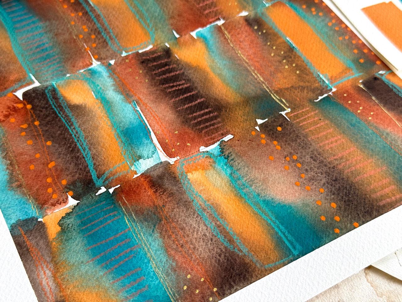
extra details in here. That's how I enjoy. Again, this one here, I added some lovely extra
details in blue. This is one of my
favorite color palettes that I've done recently, and then I added some lines. I've got a little bit
of graphite lines in here and I've got some dots. Apparently, I like
the orange dots. Another choice on what
you might consider. You might look at
these and think, not my style, I'm going to do
it the way I want to do it. And that's what I want
you to do. I want you to do whatever it is that you feel inspired to do as you're painting
your pieces. I was just wanting
to maybe give you a few ideas that you could
consider for the mark making, and this is the mark making that I'm going to be doing in class. All right, so let's get started.
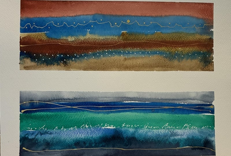
7. Painting An Abstract Atmospheric Landscape: First project, I so loved these different
landscapes that we were paper testing that I
thought that this would be a fun one to do a
larger landscape. I could either do a couple.
Oh, that would be fun. We could either do
a couple. Let's do this. Oh, let's do it. Taping this with the
Holbein artist tape. But now that I've thought
of a different idea, I might tape it down the
middle and do two landscapes. I'm not being exact.
Doesn't have to be perfect. I should have cut it up now
that I thought of that. You know what? Let's save this piece of paper. This is why I taped
these down on artboards. This is a wood artist
artboard that you can get from the **** Blick
or any art store, just a it's just a panel. But, man, they're
super convenient, 'cause now we've taped that
down our next project, but I think since
I've decided to do two landscapes or even we could do three,
but I'm thinking two. Um, These are 12 by 18 papers that I cut in half. They're basically
what 12 by nine. And so we cut the uh that into six inch pieces that would
give us half. Is that nine? Let's see. Yeah, nine. These are basically six by nine. If you've got smaller paper, six by nine or
something like that, it would be the same size. And now we're going to do two landscapes because
I was thinking as, I like the long skinny
look that we have on those pieces that
we paper tested on. I feel like that's
what I want on this and then I could tape off a border that's the
right size depending on how I just did that
one in the middle. I mean, I almost even want
them skinnier than that. What we could do, this is what making art for me is all about playing
and looking at it, and being inspired and going, Wait, what if I
did this or wait? What if I did that? Actually
have a wider tape that I did not mention in
the supply video, but it's the whole
buying an artist's tape. It's an inch and a
half, and I could actually do a big skinny in here now that I've
thought about that. I just do a tiny bit of
wasting of the tape, but I feel like my idea
of having a really wide, skinny one would be super cool. It is awful wide, but I
still think it's super cool. So I'm going to do one
wide one like that, and maybe one a
little less wide with just a little extra
piece of tape down, and then we'd be
able to be like, we like this or we
don't like that. One of them is going to be probably an inch at
the top and bottom, whereas this one is
inch and a half. I just like to
experiment and play. It's just about having some fun. Because I liked those
pieces so much, I am going to do one in the
white gold, bluish gold. I like the olive green and the blue gray
deep in the kurataki. But I could do a second one
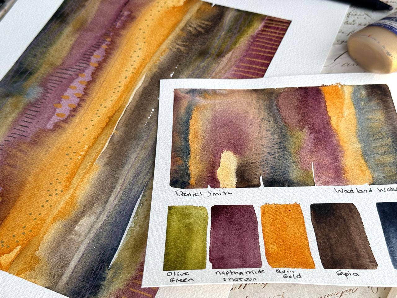
to be like, I love this too. I'm thinking maroon
and burnt sienna. Totally thinking maroon
and burnt sienna, so. That is these two right here. I actually could do Maron
burnt sienna yellow ochre. Let's do that. Oh,
my gosh. Okay. And then with the golds. Okay, so I feel like that's my two pieces that we
are going to paint. And I have some little
Daniel Smith colors pulled off over here
because that's what my little palettes are for Daniel Smith that we're going to be using in a minute
on the next projects. So, trying to once I
decided I loved them, I kind of kept them out and
hoarded them out there. Okay. There we go. There we go. Pretty excited. Oh, my gosh. Okay, it's gonna be a good paint day.
I'm feeling good already. Alright, I'm just
going to wet these down really good because
I want them ready. I want them saturated. And these are a little bigger, so I'm kind of feeling
like I need to go with the bigger square
wash 'cause I'm basically doing the stripes and then we'll come back
and do some mark making. I'm just looking to have abstract watercolor
landscape stuff. That's where we're going.
That's what I'm thinking. That's where my mind is. I like that there's more
colors in this set. I'm thinking more colors
for the whiter one, less colors for
the skinnier one. If you did this and you thought, that border at the
top and bottom was too much, you
could trim that off. You don't have to leave things
the size that you made it. I'm thinking on this one. I'm going to start
with the blue. It's a lot of water in
the brush on purpose. I want it to be saturated. I want them to blend and flow and do some
interesting tricks. So I am mostly trying
to do one swipe, but it's wider and so it's all about getting
your footing here. If you just do one swipe, you're going to have
way more color on the side you started on and so you might mix it up and
start on the other side. Because we're going
to come back in too and throw some
other color in. It doesn't have to just be that. Now, what I want to do is
the edge of the brush, pick up whatever
color I'm thinking, and then come back in and throw some more color in
here while we've got it so wet and juicy. And just see what does that do? Because that's what
I loved about these, how they blended and flowed
and what the color did and how cool it was as they
bloomed off into each other. That's my favorite part of
this whole process here. I'm going to throw
other little layers in there and just
see what we get. It's not supposed to
be an exact landscape. You could use a landscape
picture as your inspiration. And then I like a tissue,
not a paper towel, a tissue for grabbing the extra water and I just tap it at the very edge
and let it soak into the tissue
because I don't want great big puddles creating weird divots and then
gathering in that divot, or it just being
all on the edge. I do want to soak
up a little bit of the puddles that we've created because I do use a lot of water. Don't be afraid to really
get that water in there. Then if you create a
spot that you're like, oh, little dry spot, just add a little
more paint there. There you go. Look at that. That's weird. Now
that I see that, now that I say that
I've actually got a whole dry spot right there. Let's throw a gold in there. I don't really want
a gigantic spot. I do like sometimes having a little bit of the paper show through
between some of the layers, but I don't want a
great big obvious spot where we just missed
any paint at all. I do like the
little bitty lines. Oh, those are doing
some fun stuff. And I want to do most of
this while it's still wet enough to spread
and do some fun tricks. I like tricks. So just a bit of play and fun. I want to resist with
the kiataki adding too much water extra later because it
will bloom those out and desaturate
this water color. I've noticed. So I kept
adding more color, but not water by itself. Alright, so now I want
to do this other one. Let me scoop these
right here and I'll have those three
ready. Let's do it. Again, it's just layering
those on there with a lot of water and watching
the crazy blooming and look at that one. It just ran. That's
my favorite part. I like to swish color around. We're going to call
that's an actual thing. I just like to swish
the color around. I don't mind some white spots. I just don't want great
big giant white spots. If you like white in between, do some of that because we can mart make and fill those in. It's not like it's going
to be empty forever. Look at that. Oh my gosh. We got a great big puddle over here that I'm
actually going to dive into and let's let
it do something fun there. Then I'm going to come back
in and add some other stuff. Look at that. Oh my
gosh, look at that. I do like the metallics. They do fun stuff,
and I enjoy them. So if you don't like
them, don't use them. But I like them and
I just have fun playing with a little bit of extra shine that
we can get on there. And this bluish gold one, it flakes off into the
gold not staying solid, some of the paints
are pretty solid. This flakes off into other stuff that
makes it interesting, which I really like
how it does that. It's just a fun
observation and I like it. Now I'm just adding
some extra in here. If it's too much, you
could go back with a layer with some
water if you're like, that didn't spread like
I wanted or that did something weird because I have noticed if it
spreads too much, it sinks in and desaturates
in a weird way. And but sometimes you might not be getting
that contrast and loveliness that you want. Maybe you want it
to blend in and desaturate slightly in some
areas. That's so pretty. We're going to let this dry. I could have done even
bigger swatches of color. This is all about
experimenting and play and just
seeing what can you create with these
colors and maybe do a dozen of these trying different little techniques
in there just to see how would each one that you
do be slightly different? I'm just picking up the
big puddles at the edges. Preferably without it really interfering with the
stripe it's coming off of. Yeah. Okay. Let's let this
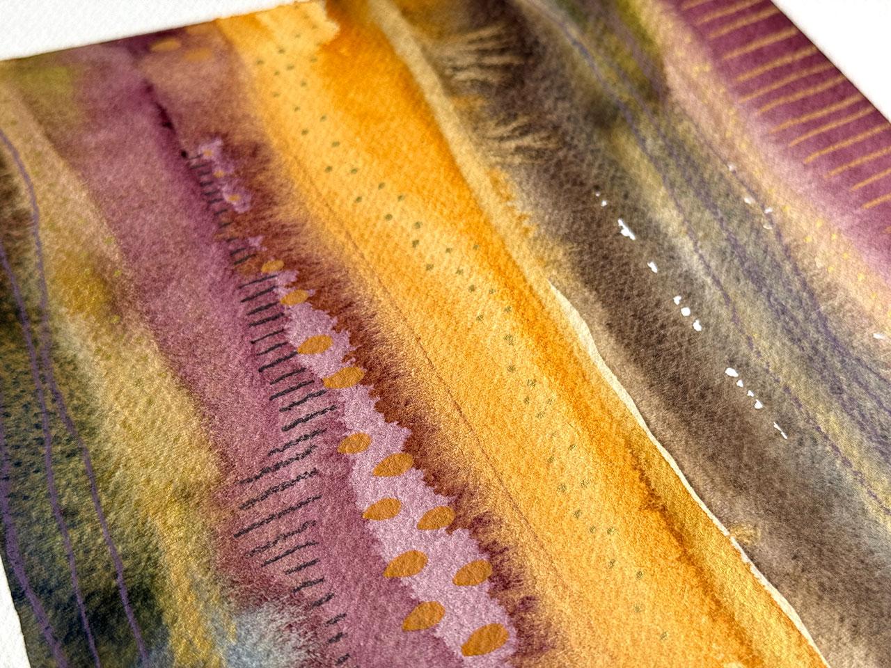
dry and I'll be right back. All right, we're mostly dry here and these are
just so lovely. I realize that's probably
the color way that I used in my book
that I was showing you this page here with
the lovely stripes. It's probably those colors
that I used in there. What I did here too that
I really liked is I had a surprise pop of
that Tiffany blue. So now that I'm looking at that, I'm almost thinking
I might do that. I had a little bit of pencil
and a little bit of gold, and that really made that
whole layout for me. For this one, I might even
duplicate that a tiny bit. It was this lovely posca pen. Color. It's just called P green. But yeah, it was
interesting just to see that little surprise of a color blue is the
opposite of orange, so I could have done it
on the orange stripe, but I feel like I like
this orientation, this part of the horizon,
that part right there. I remember I'm not making a true landscape that looks
like a sunset or whatever. I was simply going in the it's a horizon vertical
line painting. That just very naturally
gives you the implication of it being a sunset or at the
ocean or something like that. They just lend themselves
to that kind of feel, even though that's
not what we're exactly duplicating.
I like that. I think maybe just even
a tiny bit right there, so it's not off that by itself. So I'm just thinking just like a lovely set of
some work making. Maybe I'll do this
zig poster man gold because I want some
real thin lines. That's another thing
I like to do with this chisel tip is on the edge, you can very lightly get some fine lines if you're
touching the paper very soft. So yeah, I feel like it's
asking for a few of those. Then I had a lovely blue pencil. I think that was probably in these black editions
that I was using. I might just sharpen
that up a tiny bit. I could either come in
with some type of line because I want to keep it very minimal to what
we're already doing, or I could have, that's
exactly what I use. This one, 741. Or I could do some marks like
what I do with the pencil, I could come back in with my pencil now that I thought of that just a little
bit if I wanted to. Um I kind of like it
like it is, though. Hm. But we can have some very fine, just a little tiny bit. I just like a little
bit of interest without it being super dominant a lot of times we might do
when we're doing mark making on our
mixed media pieces. When I say we, I mean me. Talking about this we, but just something
subtle. I want subtle. I want it to be, what is that element in there without
it being overwhelming. I might just pick a
few spots that have some color separations that are natural that I can
stop and start on. Oh, I love that one. Okay, I feel like that's
where I'm going there. Then on this one, I could add
in some of the lovely gold. I just like some lovely thin
thin lines that are like, what is that bit of
sparkle in there? And we could also do
some lovely dots on the edge or with whatever
you decided to go with, and we could start and stop the dots the way we just
did with those lines on the other piece so that it's
very subtle but interesting. You know, when I was doing those little tests there
with that gold, another shape because
we did the dots. We did the thin line,
we did the thick line. But we could have done
longer dash kind things. Yeah, chisel tip is
super versatile. Oh, I like that. Okay, good I need some
other something in there. It could either be a
little bit of graphite, which I make sure you do the
graphite. Oh, I like that. Very. And I twisted the
pencil and held it way far back to have less
control on purpose. Yeah. Check out that.
Go pretty these are. C, I feel like for
today's project, I'm there, so I'm going to peel the tape and see where we got. And then, you know, once you
peel the tape sometimes, that's a moment to re
evaluate what you did. Is it enough? Is it not enough? If it's got the tape on it and you don't have to use tape, you could just be
a no tape person, but I like tape.
So I tape stuff. Um, if you did some of this
though and you thought, Is it done? I can't really tell? Maybe you need to
peel tape so you can visualize the
complete piece. I love having edges, though. That's why I like the tape. It kind of gives my piece of paper a finished look, and
then I can really tell. Some people like to go edge to edge and paint all
the way to the edges. If that's you, go for it. Everybody just has
their own little things that make the painting
experience good. Look at those. Oh, my gosh. Okay. So I do like that size. You can see that gold
in there, that shimmer. I like that pop of blue. And I think I could paint with these two colors and
those two metallics every single day
and still whatever the result was.
Those are super fun. I want you to do yours. I want you to pick two
different color ways in a wide, skinny long application
and just see what interesting landscape ish abstracts you might be creating and I will
see you back in class.
8. Tall Stripe Painting: Project, I'm going to
do a big tall stripe and come back to my inspiration pieces again because I like this
big tall wide stripes, very similar in the same
technique that we did for the abstract landscapes. But in this one,
I do want to have some type of maybe
vertical line mark making in there and just seeing a different color way and a different paint type and just see what we can get because
I love this right here. So that's my inspiration
for this next project, and I think I want to do it
in some really cool colors. And so I'm really inspired by the Woodland Walk color palette that we created with
the Daniel Smith. I have still got
those colors out here because I loved them. I might just activate them real quick. We've got olive green. A napthamd maroon,
quinacridone gold, sepia and Pains gray, and then we will decide on mark making after we get
our paint down. This is my inspiration
for this piece. I might just set it over here to the side and I'm going
to use the wide tape, the Holbein artist
tape, use the wide one. I want to have a
big wide border. I'm just feeling it. I'm feeling wide borders today, apparently. Just go with whatever
inspires you. You could do a double row
of the skinnier tape. If you've got the
painter's tape, do a double row of that. You can do a skinny border. You can do no border, ride whatever that
inspiration is. You don't have to do it
anyway that I'm doing it. I'm just giving you
some ideas and writing whatever inspires
me as I show up. This is a piece of that 12 by 18 piece
of paper cut in half, so that we end up with nine
by 12 as the total size. If I had been using
a pad of paper, it would have been
exactly that size. If you can get bigger
pieces of paper, like that big pad
that I bought to make some more handmade
art journals out of. The bigger paper size is cheaper generally
than the smaller paper, and then you can
just cut it into whatever sizes you need. I'm going to use my three
quarter inch square wash brush. I want bigger I
want bigger lines. I could even go. Do I have
a bigger brush than that? I could go bigger if
I had a bigger brush. I think the three quarter might be the biggest one I have. So you can go as
wide as you want. I do have a wider brush, but I don't know
how much water that would hold, is it even white? It is a little bit whiter.
It's very stiff though. It's more like an acrylic
brush. I don't like that. Got that at I don't know, Michael's Blick or somewhere. Alright. So filling tall lines, and you can make them as skinny
or as thick as you want. And so I might even if I wanted some little
bit whiter lines, I might come back and
add an extra set of, you know, make it extra
wide as I'm going. And there's no exact formula for how I'm laying
the color down other than just
picking and going. Look at that color. It just totally ran over there. That's exactly what I love. Okay. This one's definitely a very vibrant set of colors versus some of
the other ones that I have that are more
neutrally and look at that. That was weird. That one actually made a line between the maroon
and the yellow. That was very interesting. And the brown really runs over. It's just fun to observe
and play and be like, look what that did
kind of thing. As you're going, I just
like those observations. And then I'm going
to come back and do some others in here
because I want to. No reason other than you want to just to see if we can
get having some fun. Too, it's a good
way too to shore up a color if you do an
extra layer of that color. If you're thinking
you didn't get enough of that color
in your piece, it's a good way or it's too light or whatever
you want it to be really thick in some areas
and then in other areas. Come back and lay that
extra layer down. Oh, I would like
some gold in there. Maybe I should get
some gold out. Get that Kurataki gold back out. And I'm sure there's
probably Daniel Smith gold, but I'm kind of
thinking this gold. Ooh, or, you know what I
could do? Oh, I could. I could do the let's
get this puddle. I'm thinking out loud. Hang on. But I could do the Kurataki
ink while it's wet. Let's see what this
does while it's wet. Huh. When I could actually come
back with a wet brush and really get that in even further, I could also put some of
that ink out and use that as a watercolor rather than get
the kerataki colors out. Just experimenting here, just
playing and just seeing? What if I did this or
what if I did that? I did use a lot of water, so this paper will divot warp it'll warp and
give you divots. I don't really want
to divot in there. Okay, that's super
fun. Super fun. Feel like I need to
let that dry or we could even add some more water or we could add some texture. I don't know, I'm kind of
enjoying it like it is though. So I feel like I
need to let that dry and then we'll come back
and mark make on top. So I will be right back. One thing I noticed about
this paper, especially, and I've mentioned
it a couple of times since I started using it, just recently and in
that book was this paper really keeps wet
medium wet longer, or at least I feel like it does. It might not be
for other people, but I feel like the wet
medium does stay wet longer. I let it sit and mush
and do its thing, and then I did hit it
with the heat gun just because I felt like it needed
a little help, speeding up. But yeah, I feel like this one, I feel like it
just takes longer. I'm just looking at
my colors here in my pencils and seeing I almost want a bright
something with that. Over here. I feel like it needs
maybe if we stripe it, would it be nice and vivid? Now what I'm going to do
is look at the stripes. I don't want it to be so
outstanding that I'm like, that's too much, but
I do want there to be some interesting
spots and areas. And I want whatever
that is that I add on there like
this one right here. I want it to contrast
a little on there, which is why I like having the black edition pencils or the polychroms because
they do both have a very similar
boldness and they work amazing on all the mixed
media stuff that I like to do where I start off
a lot of times with gouache or water color and then top that with other stuff. I do that because I like
the opacity differences that gives you as
the bottom layer versus the layers
you put on top. That's just my own preference. You just have to look at things and be like, oh, I like this. This is why I like
this, you're only going to figure that out by
making a bunch of art. I like that. Now I want
that bright color. Like, what is this color?
Let's see. It's more orange. I want it more yellow. I
want to be yellow, yellow. I don't know.
That's not quite it either. Maybe it's this. Nope. If you've got any
other acrylic markers, feel free to pull those out too. There's nothing limiting
you to whatever it is that we started out with. Um, I'm just going to look. Even though I didn't mention
this in the supply video, I'm gonna look at
my Aartix markers. I like the Artix one because they have this lovely brush tip. But I just want to
see if they've got a color that I'm
kind of wanting. Like, I kind of
wanted this color, but where I can do it like a teardrop. I think
that might work. Kind of feeling like
a tear drop in here. Oh, like what if we did like. Right there, coming
off that yellow. Just as a fun little Like what
is that? Kind of surprise. I want these to be little
spots of delight rather than big spots of what was that? Good choice. If you've got
any other random supplies, don't be afraid to pull those
out and just go for it. Now I'm thinking that I want some graphite in
here because I like it. Do I want it as lines? Or do I want to do some
more colored pencil? Now, your choices are just
like, look at this color. Look at that color. These
are the black edition again. This is number 729
and this was 726. I'm feeling like this could be some fun little line right over here coming off of
this color here. Just as a little tiny bit
of delightful pop, totally. Totally. Look at that. I mean, once you
get that in there, it's just a little loveliness. I like it. I mean,
I like it so much. I'm almost wondering, should we do a tiny bit of that over here? If you do one or two lines, you're like, Okay, that was
enough or that was too much. I mean, you can stop. You don't have to
have it overwhelming. I'm just like,
oveliness. I like that. I feel like maybe
we need some gold. I'm going to go ahead
and pull out that postermn and maybe
some gold dots, and then we might be there. Like I said, I wanted it to be interesting but not
super overwhelming. So it's a chance to play
with your mark making and the different things that
you enjoy putting in your art without it being like, super vivid and in your face. It's just very lovely adds to the texture
and the pattern. That's what I'm feeling lately. Sometimes I'm feeling
like everything in the kitchen sink and as
much as I can get in there. Sometimes I'm thinking,
oh, look at this. Let's be subtle and step
back a little bit with our mark making and stuff and just see what can we create? I like vacilating between the differences. I
like that a lot. I'm almost feeling
like a little gold here in the gold that we've
already got going over here. So it's more of a texture on the same color ish
kind of thing. So it's not going to stand out, but it is a texture in there. Yes, I like that, actually. A little bit of ummans kind
of hiding in there for us. Yeah, so this paper man, it stays wet way
longer than I feel like my other papers do and that could just be
my own imagination, but I feel like it stays
wet a long time. All right. That's looking like
some yumminess there. Look at all that in there. We've got a little
bit in each stripe. I could come back and add maybe a tiny bit of something
in this stripe. I feel like it needs a little
tiny bit of something. I'm thinking a little
bit of graphite. Just maybe a ladder
but not all the way. I did that one, but maybe
strategically starting right here and just writing just that little
color separated area. If you have the pencils like the polychromas or
the black edition, you could do these lines with a charcoal gray and it looked like a charcoal pencil,
I mean, a pencil, but this is my favorite
pencil and for some reason, I have just gotten to where
I like a little bit of graphite in my work. Once you discover something
that you're like, man, I really like that. Just do it. Just ride that loveliness
into each of your pieces. It'll make your pieces
identifiable to you and the things that
you chose and loved. That was it. Oh my
gosh. Look at that. Okay. I feel like I'm there. I feel like I'm there
for this piece. This little color pallet
was called Woodland Walk, but I almost feel like this
one should have been called the little jewel box because it looks like a little jewel. It's so lovely. And, man, look how beautifully
that tape just pulls right off and the clean edge that
you get with very, very little effort because
I don't even think to really press that down sometimes and I still
end up with clean edges. It's definitely turned into
my very favorite tape. Um, this year. Look at that. I do have one spot that's not as
straight, as I said that. Look at how beautiful
that piece is. I hope you have fun giving us a tryout, big vertical stripes. Lovely mark making,
but still not taking away from the
overall stripe from afar. But when you come in, you see all these lovely
little details that we added. That's what I wanted
in these pieces, and we definitely hit
that with this one. Hope you enjoy painting
with the colors or giving this a tryout with whatever colors that
you're interested in, and I'll see you guys
in the next project.
9. Loose Rows Stripes Painting: This project, I want to do something a little different and I want to use this Holbein
artist gouache palette, which is one of my favorite
paintings that I've done in one of the art journals
that we looked at earlier. I'm thinking I want to do
vertical rows of stripes. Let's just look at
our inspiration here. In this manner right here
and I loved it so much. I did it in this color way
and now I want to do it in, which I really think
might have been basically these colors with a
little extra gold in there. But this time, I want
to do this color way. So the whole bin arter squash, and I've got in those, I've got the G 531, 560, six oh three and 600, and then some mark making. So the orange and a lovely blue in this
uh Holbein artist. In this Faber Castle
black edition, I've got this lovely blue. I'm going to go ahead
and pull those out. I've also got some gold. I'm going to pull that
postermn pin back out. You can also do the
pen to fly gold. I'd look good.
That's my thoughts. This color way directly
inspired by this, and I want it to be
lines of stripes. What I'm going to do is take a pencil and very
lightly mark off. This was a nine by
12 piece that I have separated into it
was a bigger piece. I cut down to the two. This is the one I taped down earlier and said, we'll
come back to this. Basically, it's 11 ", so it's two and three
quarters inches is the size of our stripe, but I'm just going
to mark off a line. I like having a T square
because now I can basically force it along the
edge of that paper and get a line without
a whole lot of effort. I love having a little T square. I did drafting in college. Even though I probably I
am a terrible drafter now, I do have a love for T squares. So I'm just very lightly
going to mark that. I can then later go and erase it if it's
super obvious, maybe. But once we paint
on top of that, you probably won't even see it. I'm going to use my a half inch Princeton Neptune square wash. Because this is squash, those dry up pretty heavy. They dry a lot in here, and what I have done is
wet them down first. I've already got this
orange and this teal and this rust color and that
brown. That's my four colors. And so Wash dries
and gets really caky unless tube colors
or what's in here, unless you mix a little
bit of glycerin in with each little square that
keeps it wet or not wet, but at least not cracking
as much as this is. But it doesn't matter
if it's cracking. It's still just add water to
it and you're ready to go. Basically, what I want to do is put these all super side
by side, super wet, within this stripe and then just alternate
that I wanted to run and smear and do fun things and just see what
we get when we're done. We could start from this line
and go up if we wanted to, and I'm just going to continue layering those next
to each other, just like this and
then letting them do their magic and then just falling in love
with whatever we get. That's why I think this
half inch square brush makes do something
like this easier because it's a blunt
tip so you have a good start stop
point for these. They don't have to
be perfect, nothing. I like the imperfection
that we get from this, which is why I like
the color to run and I don't mind some white
areas in between them and you can mix up how you're laying the color down and not have the
same order of color. Then we're going to mark
bake on top of this. This is not going to be the final final part
until we've marked make, we're just going to do
this on all three rows. Wherever we stopped, we might just start with
a different stripe. If I've got let's
start with this one. I don't want them to be
the same on every row. I want them to offset
from each other, I might go in the same
order but start off with a different color so that
they offset the way I want. It doesn't have to
be perfect where it starts and stops either, but I do want it
mostly within its row. That's my thinking there because then they can bleed up
and down if they want, but I don't want to really overshoot that with my
paint if I can avoid it. I love these colors.
Oh, my gosh. The paintings that I
did with this weren't my favorite the
day I painted it. But then every other
time that I've looked at that page or the pieces
that I photographed, man, I have fell
in love with them. Like it's become my
favorite color way there the way those
blend and flow and do the pretty contrast with the orange and the blue
because orange and blue is opposites there
on the color wheel, which means they contrast
really beautifully. I don't necessarily want them to mix into each other
too much because then the complimentary colors, they turn into mud if they
mix too hard into each other. But look at these.
These are sitting and mixing a little but
not operly mixing, so we're not ending up
with a bunch of mud. We might get a little mud, but not enough to worry about. Then too, if you've
got too much water and you're getting
lakes and stuff, then take your tissue. Because I got lots of
water going on these. Take your tissue and you can
soak a little of that up. I do want it to do some moving, but I don't
necessarily want it to all completely get together. I started with the orange
and I started with that. This one I think I'm going
to start with the blue. I'm going to go
in the same order but start with a
different color. This is one stripe removed from each other, but still works. So the exact same color isn't sitting right
on top of each other. Basically, is my goal. And then I might start the
last one with a brown. So each row started with a different complete
color. I like that. I like that. I like it. I'm actually getting less color here as I'm getting along, so let's throw some
more color on there. I actually don't want
this color right there, so I'm just going
to take a tissue and wipe it a little bit. I don't have to get
rid of it because I'm going right on top of
that with another color, but I don't want it to be a big gigantic spot of the one color. Minded being in there,
but I didn't want it to be mostly that. It's the pops of blue
that really grab me. I love that pop of
that lovely blue. So I think what I'm
going to do is pull out this one while I'm thinking
about it because I definitely think that lovely
blue needs to be in there. Again, at this point,
I'm not worrying about the swishes of color. This paper does warp a lot, but I'm putting a lot
of water on it too, so I'm just not overly
worried about it. You could tilt it if you're trying to get some of that up. I'm not going to do that,
but it is very warpy paper, but it's a lot of water
and it's a big size, so it is going to do
what it's going to do. Okay. See blue. Got this lovely one here. That's what I like about
it. That's exactly why I like this technique. I like that it's
doing all of that. You can have a dryer brush and have lines that
are I don't know, not as swishy swishy, but that's what I like about it. I'm going to just tilt
and grab a little water. Not a whole lot, but
a little bit of it. Got a little rainbow
going at the bottom. What I'm going to have to
do now is let that dry. I will be right back. All right. We're almost dry. This
paper takes forever to dry. I was thinking on
my original piece that I liked bringing in more definition with
this blue pencil. I think that's what
I'm going to do. Not around all of the oranges, but I do like how of
the oranges that pulls that pop of color around it
as you're kind of doing this. So it doesn't have to be
around every single one, but enough that it's cool and interesting.
Paper's still wet. That's what I'm saying
about this paper. It takes forever to dry. You can tell when your pencil is not making its mark,
it's still wet. You can tell when your pencil
is not making its mark, it's still a little bit wet. There we go. Yeah, but it's
enough to pull that blue around to some other stuff
here too that I really like. Oop, I broke it. That's the only
drawback to these. They're so soft that
they break super easy. And I feel like with
the polychroms I do not have the lids. It's really smooth and buttery, but doesn't break as easy. And I press down really hard. So I tend to just tear
these up a little bit. Okay, I like that. It was
enough just to offset. I like offsetting the there. I love that actually. Okay, then I want some lovely orange posca dots and I wanted those on when
we were sampling here. I liked it on the
blue, but I also liked it on this
reddish brown color. That's why these are so amazing. They're your area to experiment
and play and be like, oh, what colors are going to really pop off that really nice. I do see myself doing more of
those really in the future, adding that to part of my work
practice because that has been super handy in
creating the larger pieces. So sometimes you think, why did I think of
this years ago? Why did I think of
that years ago? You know all about
color palettes. If you followed me for
any length of time, you know how much I love them, and those make for the most delightful little
finished piece that you can then continue to use and also it's your little sampler piece. Yeah, it was genius. Okay,
look at that. I like it. Two, one, two,
one. Look at that. We even offset that. Okay. Cool. I'm going
to put some gold in. I want some gold lines, again, adding some structure
back without it really being like super structured. It's just giving you
the implication of, Oh, there was a line
there, but it's in gold. Yeah, yeah, yeah, yeah. I like it. Okay,
good, good, good. Pat yourself on
the back when you do things that you like
and be like, Good job. All about some positive self
talk as you're creating. And I do it more and more
and more now because it just feels good to create
and then be like, Good job. I love it. I'm trying to
offset them, so I'm just visually looking
at it, thinking, Okay, where is that not
lining up on top of the other one that I can
make it then offset. There we go. Good one. I feel like I need something right in
here a little bit, maybe. Then I feel like
we could be close. This is not a project that's
meant to take a long time. It's one of those fun things that let's get some
more pencils out. Just one of those fun things that you're like,
Oh, this was fun. And just enjoy. So
I got this orange. Let me just get a
little bit more of a goodness I broke that tip
off in one I was using. I just needed a long tip. There we go. There we go.
Okay, now I'm feeling it. I got all kinds of random
SharpenersT viper Castle one has turned into one
of my favorite. So I'm feeling like
with this orange, do we want, like a
little strip of stripe? I think I might, because,
ooh, you know what? I did that over here
in the blue. Mm. So I do like that little bit
of a stripy detail on there. But do we want to do it maybe in the orange or do we want
to do it in the blue? I'm kind of feeling
like in the orange. Doesn't have to
be a whole bunch, just like here and there,
an extra fun little detail. It can be on top
of various colors. It doesn't have to be all
on top of the same color. Just something to add
a little fun in there. Do I like it? Yes.
Okay. I do like that. I like that we're doing
it on different colors. I really like it on
top of that brown. I do like it on the blue, but it really is a good
pop on the brown. It is kind of fun to mix it up, though, every row, have
it on a different color. Come on. Okay, I feel like
I need maybe a little more, so I'll just add a little extra. Okay, I think I'll put a
little extra over here. I feel like I need
something right in here, so maybe I'll do it
again right here. Oh, know what else we could do? We could do some little
extra vertical stripes. I couldn't do that in the blue. Well, I've got the
blue squares, though. Uh, like just extra little
lines up and down. Mm. Like, maybe even in
the brighter orange, maybe. Okay, that's fine. I do like that extra little. It gives you a tiny bit more of the structure
without it being perfect. I don't like perfect lines. That's why I hold my
pencil way back here. If you want something perfect, you should hold it way up here and be very tight
and controlled. I like to hold it
way back here and be not tight and not controlled. Just the way I like making art, do whatever makes you feel good. Okay, I'm liking all that. Oh, feeling good.
I'm feeling good. Just kind of looking around
now. Is there anything else? Maybe a few little gold dots? I mean, we got a few
little gold lines. Maybe we want a few
little gold dots. Not a whole bunch. I don't want it to be like the orange ones. I just wanted to be a little a little something
here and there, little breath of fresh air,
little metallic, delight. Oh, that's what I needed. I think that was a
great choice. Good job. Good job. All right. Yeah, I love it right here. Then I feel like
I could be there. This is about just play,
color contrasting, giving some interest
to the different rows, and then having something
delightful when you're done. This is the project too, where you could do
a great big one and if you didn't love
the great big one, you could cut out little samples
out of the inside of it. That would be super
cool. I think I'm there. Let's peel some tape,
see what we got. You could do a different
one of these every day and spend 30 minutes to an
hour just playing with different color ways
and different mark making tools and seeing
what you got and just having fun pushing color around because let me tell
you, that's what I want to do. I want to push color around. I don't want to make
something identifiable or something specific. I just want to watch the color
play and blending flow and see what else I can put on there and we can always
move it to this way. Because we made the
stripes an equidistance, by marking them off, it
looks good either way. Wanted it this way,
but either way, it looks good. All right. I hope you're fun playing with this project and experimenting with one of your collar
ways that you came up with, and I will see you
back in class.
10. Wonky Ovals Painting: This project, I've been playing
with my colors over here. I think I'm going to do this
desert bloom color palette that we made in
our palette video. These are Daniel Smith colors. I've got yellow
ochre, deep scarlet, quinacridone coral, buff
titanium, and cudacridon sienna. I thought it'd be fun
to experiment with large ovly shapes that merge
and blend into each other. I'm using my very fat
holebn artist tape and I don't think I intended to use the fatter
one on all the projects, but that's just where my inspiration led me as
I sat down to create. And so if you've got
a specific thing that you're like, oh,
I want to do this. All of those instincts
because you end up with a better paint day than if you force something
that you were like, not totally inspired by that. And so I like this inch and a half whole body artist tape. I think in the supply video, I showed you the
two thinner ones, but you can you can do a thinner tape and double
layer it if you wanted to and have a double layer of tape if you got some painter's tape or something like that. Sometimes I like
real wide borders, sometimes I might like no border and sometimes
I want a thin border. It's just whatever
you want to do there. For this project, actually the ten inch round
Princeton Neptune or the half inch ovwash
Princeton Neptune. That's two brushes
that'll give you some different but
interesting I think results. Just pull a sample piece of paper over here and
we'll take a look at it. The oval wash, for me, might be a little bit
less controlled maybe. That's a good way to say that. Was the round brush you might have a
little more control of or it might be one that maybe more people have than
the overwash and my goal here is to make lovely
little ovals and let the ovals touch
each other and the color run and blend and
do some fun things. Whatever brush you've
got, I wouldn't use the square one with
this unless you wanted to do long squares. You could do that, which
that's the stripy ones, but maybe less
stripy, but squary. You could just experiment which whatever way
you want to go. Let's use the round one because that's the
one I got right here. And I might start in the center so that it looks centered, even though we're looking
for weird and wonky. We might still want it centered in the piece so that when
we're done, it looks uniform. I just might take each color and move out from the middle
while we're still super wet. I'm working super wet brush. These brushes hold
a lot of water, and then I've already
wet these down, so they're super wet this paper, is really good for your media staying wet longer,
I have discovered. So, this is the play today. These colors are
just crazy, amazing. I'm so excited with how vivid and vibrant
those dry there. Yeah. When I sat
down to paint today, I was like, Oh, this
is the good one. Starting with that,
I might start with this one and you can do
bigger ovals than I'm doing. You could do smaller
ovals than I'm doing. I just did that one. You
could do less water. I'm not sure that you
could do more water because I don't know,
that's pretty watery. But I do want to give it
the maximum amount of time for these to blend and
flow and do funky things. Yeah, that is my
direction today. I don't want the same
color touching each other. At least one off on the different stripes there
is what I'm thinking. Doesn't have to have
the same number of ovals though if you get more ovals on one layer than you do the next.
Not a big deal. I don't worry about it.
I just keep on going. They can go off the page
and they don't have to be perfect straight
like this way either unless you want
to draw some lines to keep yourself in line. Let's see. I want to start. Then I
just stay in the center, but I was trying to
visually get it centered, but I could come out from the edge and play with the
different colors that way. You don't have to
start in the middle. It doesn't really matter if your ovals are perfect or not. I like wonky, so I might end
up with something pretty wonky and that's totally up to what you're
wanting to create. If you want more perfect
ovals, go for it. No right or wrong in your
piece. It's your piece. Then if you have a side
that's not a street, well, you could run into it with
the paint on the other side and pull that
unevenness back out. Because apparently, in
my painting of this, if I'm on this side, I get nice and even and
this side I get wonky. I could adjust the
paint brush as I'm going a little more than I am. But I don't want to. I'm
good with wonky wonky. This paper stays
wet a long time, so it is a good one for
something like this. If you're really
wanting the color to have time to move around, this is a
good paper for that. This is a good one. Let's just keep on adding color until we have filled the
whole page with ovals. We may have some areas where we have a lot
of white space. You could come back up here
and attach them if you want, but we can fill those in with marks also don't get hung up on my ovals don't all touch or there's a lot of white space or what have you. Don't get hung up on that. I do try to at least
touch the edges on the top and the bottom and
the sides because I want them to move around and do the blending that you can get if you just touch it because
then it'll run into there. That's what I want. Then if you get to
the end and you're like, I got an inch left. That's okay. That
can keep on going. Another little layer
there is what is fine. Because I don't want a
super big layer at the end. I'll just have another
little layer there. Like it just kept on
going and it's fine. Again, I'm just trying
to vary up the colors. I don't want the same
color touching each other. Oh, no, that's the same.
Let's put that down here. See, you can just go right along the bottom like it
just kept on going. Which if you really
wanted to get it even, you could start it in the
middle and then start it in the middle and then
worked your way out that way. I don't really carry the way. I'm just having
fun. I'm enjoying the way colors move
and blend and not getting hung up on any
type of perfection. But if this is a serious
piece and you're like, I love this technique
and you wanted to really spend some good time
on it, you certainly could. You could be way more exact. I like wonky, uneven. I got two colors beside themselves. I didn't
mean to do that. I didn't even notice I did it.
So I think what I will do. I mean, we can leave that there and mark make on top of it. Conflicted. Maybe we should
make that more yellow. Let's do that. Let's make that one more yellow. There we go. We are going to let this dry and let all of this do
what's going to do. If I've got any big
gigantic puddles, I don't want the puddle to stay. I might just take
a tissue and at the very edge of that puddle, I'm going to let the tissue
soak up that water so that I don't have any giant divots going like I've got
right over here. I could force that over to the edge and
just soak that up. You can move this around too and let the watercolor
move and do some stuff and just see what does that give us too,
because that could be fun. Move that around and let those watercolors
spread back out if you've got any areas where the watercolor is
gathering. Look at that. Look at that right
there. That's super fun. Let's let this dry and
then I will be right back. All right, we're mostly
dry to share with you in the perfect sketchbook by Etcher which has
this paper in it, this was my inspiration,
just to show you see, these are a little bit
longer, skinnier ovals. I had some metallics
that I used in here. Oh, I told her you should
have used a metallic. Wow. But just to give you
a second example there, that was what inspired
this project. I enjoy doing stuff like this where it's very organic,
you're playing with color. You're not trying to
get anywhere specific, but you're having some fun. Yeah, that's where
I was coming from. I actually did like this
lovely purply color. I'm feeling like maybe maybe I could start
doing some art making. I want to know on these, I consider contrast and
I consider what would be a fun addition and
maybe I want to come back in here and as still a
tiny bit wet in some spots, but maybe I want to
come back and add some definition that implies
the shape I was painting, even though maybe by the
time you get to this point, you've lost the story of
the shape, not on purpose. Well, yeah, it is on purpose. I want to have that shape. Kind of disappear at this point. I'm doing that on purpose. I want it to be fun wonky stuff. I like that. I could
do some gold in here. I might just get out
that same zig posteran which sometimes it's
available on Blick and sometimes it's not or we can use our fine line applicator with
keratokiGld mica ink in it. Yeah, let's just
do that. Well, I do like the little pen though. Pen is just convenient. The fine line
applicator is probably the most accessible way to
do something like this. I like I do tag those on my favorites page and
get it Blick or Amazon. I like to get it started
and the way you have the most control of
this is to hold it practically on its side parallel there to the paper
and not squeeze very much. I like to get it started, and then you can do lines, you can do dots and the higher up that you
are with holding it, the more ink comes out and really becomes
very uncontrollable. You're going to have
the most control, holding it on its side and then being very
careful as you go. That is my fun little
tips there for the gold, almost completely on its side, touching the paper very lightly. This was a good choice. I'm just having some fun here, nothing specific, and then
we could do some dots. The smaller the dot
is if you're holding it on its side with
light pressure. That's the way
you're going to get the most control out
of these bottles. And as with the
other pieces, too, my goal on this is not to
if you got anything wet, it'll spread right into it. Spread that with my finger. I don't know if I
meant to do that. It's going to be a weird shape that we just created there. What do we want to
do there? I hate that it's got water still wet. Don't mess it up like that. Okay, so I'm feeling
like now I need to do something that's going to make me feel
better about that. Ooh, let's pick an orange. Look what we can do. Okay, so if you do
something like that, and I got to be careful,
that inks still wet. I don't want to smear my hand across it now that we did that, but if you do something
like that, consider some kind of fun mark making. Can I just be like,
look at that. Something else is
wet. All right, so if you've got wet
stuff, get out your hand. Stick. This is what I
use for my hand stick. I can hold it up off the paper. My hand can rest on
it without resting on the piece of paper itself. They make these that you
can get at the art store, but they're very expensive
and this is just a paint stir stick for a five gallon bucket of paint from the paint store. And even though I do have I
think it's called a ball, the round thing, it's
like two feet long. It's longer than this,
and it's just too big. This is the perfect size. This is basically 18 ". It's about a foot and a half. If you just had a little foot and a half
piece of something, it's perfect for this
size piece of art, hold it up just a little bit, and now your hand
is up off the art, and this is not touching
the art either, so it's not rubbing
on the art itself. Um but yeah, maybe
come back through there a few little lines in between the white
spaces. How about that? That is the way to maybe hide something that
you did in between. I don't want it to necessarily
completely cover it. You can still see
it's there, but now it's blended a little better. I do like some graphite. I got my pencil. Again, I'm just adding lovely texture and design
in here that's minimal. It's not overwhelming. I don't want there to be so
much going on here that it's like everything in
the kitchen sink like I do sometimes
because we know I do that. But I do want some
fun stuff in here. Really, if yours is a
different goal than me, ride that wave of inspiration. It doesn't matter.
You don't have to create the same thing I do. You don't have to have your
piece of art be minimal. I was just in that mood lately. The next time I create these, I might want a different pattern in every single oval and I might want it to be very maximalist instead
of minimalist. Having some fun. And
so I might go right over this one here and make
that kind of blend in. That's still a big wet spot, but at least it's now
a texture on top of it. Oh, I like it. Don't forget the ones that are at the bottom, at the edge. I don't want to have some
decoration and then nothing. I want to spread that
between the whole thing. Okay, I'm feeling
pretty good about that. Little tiny bit of
shine here and there. We could add some
more if we wanted to, but I'm feeling good about that. Just need to take one
little final look. Is there anything else
that we want to add? Do we like where we've got it? I do want mine to be not
overwhelming with marks, so I feel pretty good about
where I've got it sitting. Yeah. Yeah. Um, maybe I've
neglected, like an edge. Like, maybe I want a little something there
and something there. What do we think about that?
Not something overwhelming. I just want something
a tiny bit. Ooh, let's pick like a Perfect. Perfect. Okay. Feeling good about the orange. Let's do that. It doesn't have to be
like the whole thing, but it does need to be
in more than one place. Ooh. 'cause I felt like I neglected the whole
little section there. Am I feeling good now? I
think I'm feeling good now. Okay. And sometimes, too, you need to peel the tape so you can look at it and evaluate. But I feel like I want the color to be the
dominant thing here. That's the first thing
that you notice. And then the marks to be
like, oh, what is that? Kind feel. Okay. Feel like I'm there. Feel like we made it. Let's peel some tape. This
is why I like this tape. It's so beautiful. Um, with the edges, it leaves you a
beautifully clean, crisp edge with
very little effort. It peels and with
these cotton papers, I've just had such
good luck with how beautiful it appeals.
Look at that. Oh, my gosh. Super pretty. Alright. This is a fun project. I like painting
just random shapes, watching the color
bloom and merge, the color palette be
something interesting, especially the way it
did on this piece here. That right there
is a piece of art. This is definitely something I'm going to take
forward with me. This has been so
eye opening just to colors blending
and the colors listed below and the different
options that you could have considered with mine, I did the different
kinds of paints. Now I can see how each paint reacts with whatever my favorite
paper was that I picked. This has just been the
coolest set of experiments. This will be handy just to keep some eight by eight Sorry, six by six pieces of watercolor paper cut up
and set to the side. Anytime you're
wanting to play with color or try a new
color palette, just create one of these and label it and set it to the
side and just have it. Then eventually, you'll have a gigantic collection
of color palettes and things using your own paints and paper to give you cool options to then
pull from and work from. Because this super fun. Hope you enjoyed giving
this project a tryout. I can't wait to
see some of these, and I'll see you back in class.
11. Final Thoughts: Congratulations on
completing this class. I hope these projects have shown you just how much beauty can come from the simplest of shapes with a few
loose brushstrokes, a limited color palette, and some thoughtful mark making, you've created an
abstract page that's full of movement and texture
and personality. One of the things
I love most about this technique is no two
pages will ever be the same. Every change in color, every amount of water and every brushstroke creates
something different and unique. These unexpected blooms
and soft blends, the little imperfections,
they're all part of what makes
your work your own. I encourage you to
keep experimenting. Try different color palettes, change the direction
of your shapes, work on different paper sizes, or explore new
mark making tools. The possibilities
are endless and each page is an opportunity
to discover something new. Thank you so much for
painting with me. I hope you've enjoyed the
process as much as I have and I look forward to creating with you again in another class.