Transcripts
1. Intro: Hi, and welcome.
My name is Anna. I'm an illustrator and graphic
designer based in Berlin. I love exploring this space
between analog and digital. And in this class, I'm excited to guide you through one of my favorite
creative processes. In this class, you'll
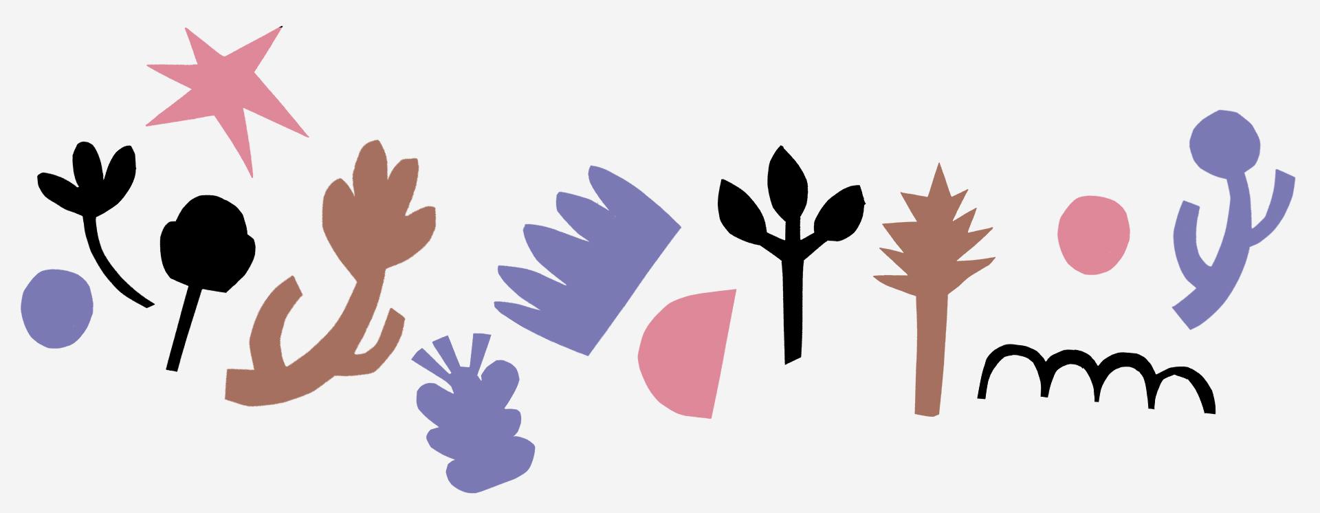
learn how to create your own library of bold
stylized plural shapes, starting from real flowers and ending with a ready
to use digital set. We'll begin with quick sketches, move into playful
paper cut outs, and then bring everything
into a program. Procreate or Photoshop. Along the way, you'll
sharpen your eye for form experiment with abstraction and discover new
creative directions. We'll also use the
scamper method, a fun, flexible tool for
generating lots of shape variations and
pushing ideas further. Just a quick note.
This class does assume you have some basic experience
using digital tools. I want to explain
every software step in detail just to keep the focus
on the creative process. But if you are familiar with
layers and basic editing, you'll be just fine. So let's dive in
and start creating.
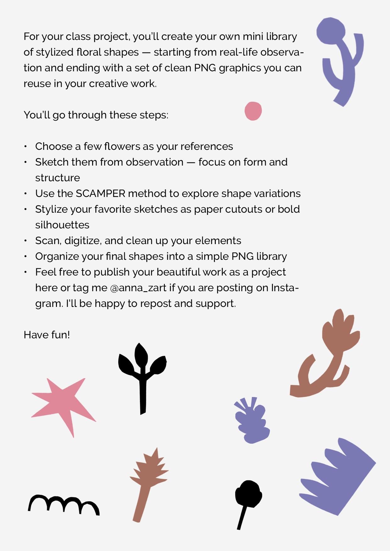
2. Your Class Project: In this class,
you'll be creating your own mini collection
of stylized floral shapes. But more than that, this is
your creative space to play, explore, and try out different ideas
without any pressure. We'll start by looking at real flowers and sketching them. Then using a method
called scamper, we'll take those
sketches and push them in lots of
different directions, changing, combining, simplifying, and
exaggerating shapes. You'll try out different
tools and techniques from paper cut outs
to digital effects, and you'll end up with a set of original graphic elements
that feel fresh and personal. No two collections
will look the same. And that's exactly the point. At the end of the process, you'll have your very
own PNG library, a little toolbox of shapes
you can use in posters, patterns or anything
else you want. You can even take it
further and create a simple design with
your elements like a sticker set or a small print. This is a creative playground, so enjoy the process
and make it your own.
3. Materials You'll Need : Let's go over what you'll
need for this class. Don't worry. It's
all pretty simple. First, you'll need
something to draw on like a sketchbook or a few
loose sheets of paper. Just pick what
feels comfortable. Then you'll need a pencil for
sketching and something to cut with like a craft
knife or scalpel. A dark marker or felt
tip can be helpful, too, but it's optional. Same goes for a small
pair of scissors. They're nice to have,
but not a mask. We'll also be using
colored paper. I recommend gray or black. This is what we'll use to cut out our stylized shapes later. But if you prefer not to cut, you can draw silhouettes
with a marker instead. If you are cutting,
you'll want to have some glue ready to fix your
shapes onto a clean sheet. That way, they are
ready to scan. To move things into digital, you'll need a scanner or just a scanning
app on your phone. Either one works fine. And for editing, you'll need a program Procreate on iPad or Photoshop on a computer or any app that lets you
work with layers. That's it. Super simple tools for a hands on and
creative project. Let's get started.
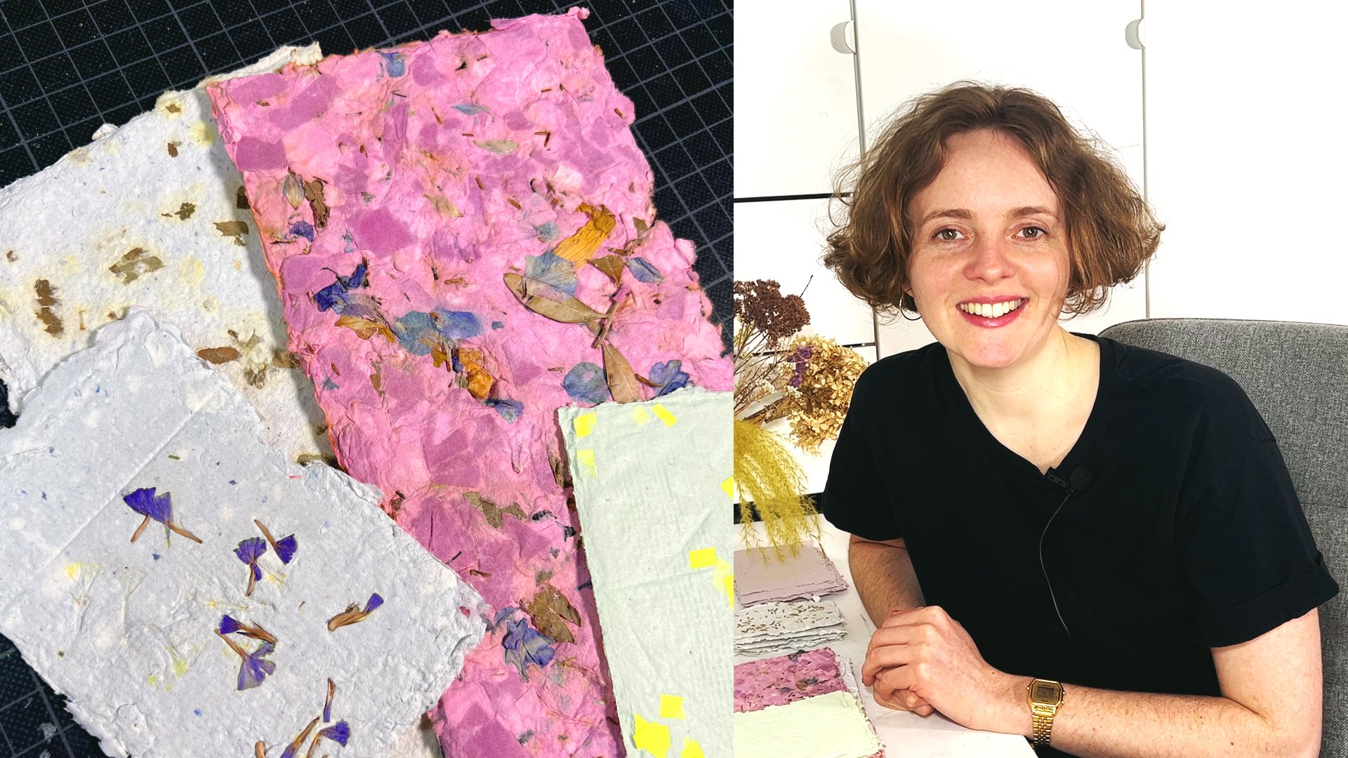
4. Finding the References: For this class, you'll also need some flowers as references. Dried flowers are ideal, but fresh flowers,
potted plants, or even artificial
ones can work too. In a paint, you can use
flower photographs, but working with three D
objects is definitely better. Why? Because this course is
all about exploring form. When you have a real
flower in front of you, you can observe it from
different angles, rotate it, flip it upside down, and see how light
interacts with it. That's something flat
images simply can't offer. Three dimensional references let you study a flower
structure more deeply, the way its parts are connected, how the silhouette
changes depending on your viewpoint and which
shapes repeat across species. All of this will give
you more material for sketches and more freedom when you start stylizing later on. Plus, working with
real flowers is simply a more inspiring
and sensory experience. It slows you down,
draws you into the brtus and lets you
observe with care, which is exactly the kind of mindset we want to
bring into this class.
5. Analyzing & Sketching Flowers: Let's take a closer look at the flowers you've
gathered for this class. You can use dried flowers, fresh flowers, or
even potted ones. If you don't have any on
hand, photos will work too, but working with real
three D objects is best because it lets you see
different angles and shapes. The idea here is to
really observe the forms. Don't worry about doing
perfect botanical drawings. We're just sketching to
better understand structure, rhythm, and the
relationship between parts. You can sketch the
whole flower or just focus on parts like
petals or steams. Start by sketching what you see the way the flower curves, its silhouette and any
details that stand out. Try drawing it from
different angles. Then flip it over, rotate it, and draw it again. You're building a visual library of shapes you can use later. It's a great exercise in observation and also
a bit meditative. You can draw with country lines or play
with shading and texture, and if something doesn't turn out perfectly,
it's totally fine. Even failed sketches can lead to great stylized
elements later on. Try breaking the flower
down into basic shapes. Can you see circles,
triangles, or ovals? Simplifying early on makes
it easier to stylize later. Once you've filled a page with these sketchy explorations, you'll be ready to move
on to the next step, stylization using
this camper method.
6. Meet the SCAMPER Method: Now that we're getting
ready to build our own library of
floral inspired shapes, I want to introduce you to a really fun and
helpful creative tool. It's called the scamper method. Scamper is basically a
list of Bmpts that help you change remix and transform
your ideas in new ways. It's simple, flexible, and
perfect for when you're working with sketches and want to explore
more possibilities. Each letter in the word scamper stands for a different
kind of action. S is substitute. Swap one part for
something else like replacing petals with leaves or changing the
shape of the stem. C is for combine. Mix elements together. Maybe two flower types or different details
from your sketches. A is adapt. Change the shape to fit
in you style or purpose. M is modify, make parts bigger, smaller or adjust
the proportions. P for put to another use. Imagine using the shape in
a totally different way like turning a petal
into a wing or a spoon. E stands for eliminate. Take something away, simplify, reduce details, clean it up. And R for rearrange, flip, rotate or reorganize parts
to create something fresh. What's great about scamper is that it's not just
about changing shapes. It actually helps train
your creative thinking. Once you learn how it works, you can apply it to
any kind of projects, pattern, logos, illustrations,
even product design. We'll go through each scamper
step together and use it to generate tons of shape variations based
on your sketches. And the best part, there is no right or wrong here. It's all about trying things
out, seeing what happens, and finding new directions
you wouldn't of otherwise. So grab your pencil, take your sketches, and let's start experimenting
with scamper. I'm really excited
to see what kind of unexpected and awesome
ideas come out of this.
7. Exploring Variations with SCAMPER: Now that you know
what scamper is, let's put it into practice. I've prepared some
fresh sheets of paper, and I like to keep
my original sketches nearby so I can reference
them easily while working. You can do the same either sketch next to your
original drawings or take a photo of them and have it open or your phone or tablet. To help me stay focused, I like to write the word
scamper on the top of the page. It reminds me of the seven creative actions
we'll be exploring. So the first one is substitute. Substitute means
replacing one part of your drawing with
something else. You can start with any
element from your sketches, choose whatever feels easiest
or most fun to explore. This step isn't about
doing it right. It's just a guide to help you generate ideas and get
your creativity flowing. The more options you
come up with the better. For example, I'll take
this flower and start by changing how the
bloom is arranged. Then I'll experiment with
the shape, maybe using oval, circles, rounded rectangles
or small separate parts. I'll fill up the page with different takes on
just this one idea. I usually dedicate at least
one page per scamper prompt, but do what feels good for you. If you want a challenge, set a goal like fitting a bigger page or
sketching 20 variations. So will look similar,
and that's okay. Try to turn off
your inner critic. This is all about exploring. And if one idea feels down, move on to another. You can always simplify your starting shapes if
they feel too complex, and don't be afraid to redraw or adjust anything as you go. You'll notice the more you
work with one element, the more you understand it, and the more confident
you'll feel experimenting. That's why I love doing this
part by hand on paper first. Your posture pressure
and movements naturally add variations and
personality to each drawing. For instance, after
playing with the petals, I might try changing
the stem shape. And remember, you
don't have to apply every scamper step
to every flower. Just go with what inspires you. Now let's combine it's
the second prompt. You can mix parts from
different flowers or even invent new
elements to blend in. Try swapping stems and
blooms between flowers, maybe a thick stem from one sketch and tiny
flower from another, or mix petals with leaves
or leaves with stems. Nothing has to make
sense botanically. We're creating shapes,
not literal flowers. For example, I'm combining two bloom shapes
to make a new one. You can combine three
or four if you like. Use lines or filled in
areas or try Azing frames, symbols, or abstract shapes to build something
completely new. There are no rules here. Just keep going and
enjoy the process. Mm hmm. The third one is adapt. This one might feel a
bit abstract at first. Try asking yourself, what if I adapted this flower to a
different style or context? For example, how
would this look in a minimalist or modern style? Try abstracting your sketch, simplifying lines or reducing it to its most basic shapes. Can also pretend you're
drawing like a child. Hold your pencil awkwardly. Use your non dominant
hand or even draw with your whole arm or with
your eyes closed. Let it feel a bit
clumsy and free. It helps you break habits
and find fresh forms. Another idea, change the speed. What happens if you draw the
same thing super quickly? You might get bold
expressive results you wouldn't have planned. Now one of my favorite prompts modify because here,
anything is possible. Think about changing the size, shape, symmetry or a
number of elements. Try exaggerating one part
like making a huge stem and a tiny bloom or making
everything completely symmetrical or
completely off balance. Patterns are great
to modify too. You can change how
they're arranged, add more parts or simplify everything down
to just a few strokes. Even the most basic shapes can become powerful
when modified. These twigs are how your personal style
really starts to show up. The next one is P, put to another use. This prompt invites
you to imagine how a shape could be
used in a new way. For example, maybe you take one of your elements
and repeat it into a pattern or maybe
it reminds you of something else like a
fork, brush or a star. Try sketching it again with
that new idea in mind. It doesn't have to be literal, just explore the possibilities. What if you used it as a frame or background
element in layout? Simple forms can turn into very interesting symbols
when seen from a new angle. Now eliminate. Let's try taking things away. Look at your more detailed
sketches and ask, What can I remove to make the shape stronger
or more graphic? Try removing petals,
stamps, or inner parts. Sometimes the most reduced
version is the boldest. Even if shape becomes
super minimal, that might be exactly
what it needs. And as always, feel free to combine this with
modifying or adapting. This whole process is fluid mix and match,
however you like. The next one is rearrange, and it's the last one. This is all about changing the order or structure
of the elaments. Flip the flower upside down, move the bloom to the side, turn the petals into a spiral
or arrange them like rays. Try unexpectedly outs
and see what happens. You'll often discover new forms just by moving parts around. This whole scamper process is about giving your
ideas a room to grow. You'll end up with a
wide variety of forms. So you love, some
that surprise you, and some that might inspire
whole new projects. Now, let's keep going. The next step is choosing the
best ideas to take forward.
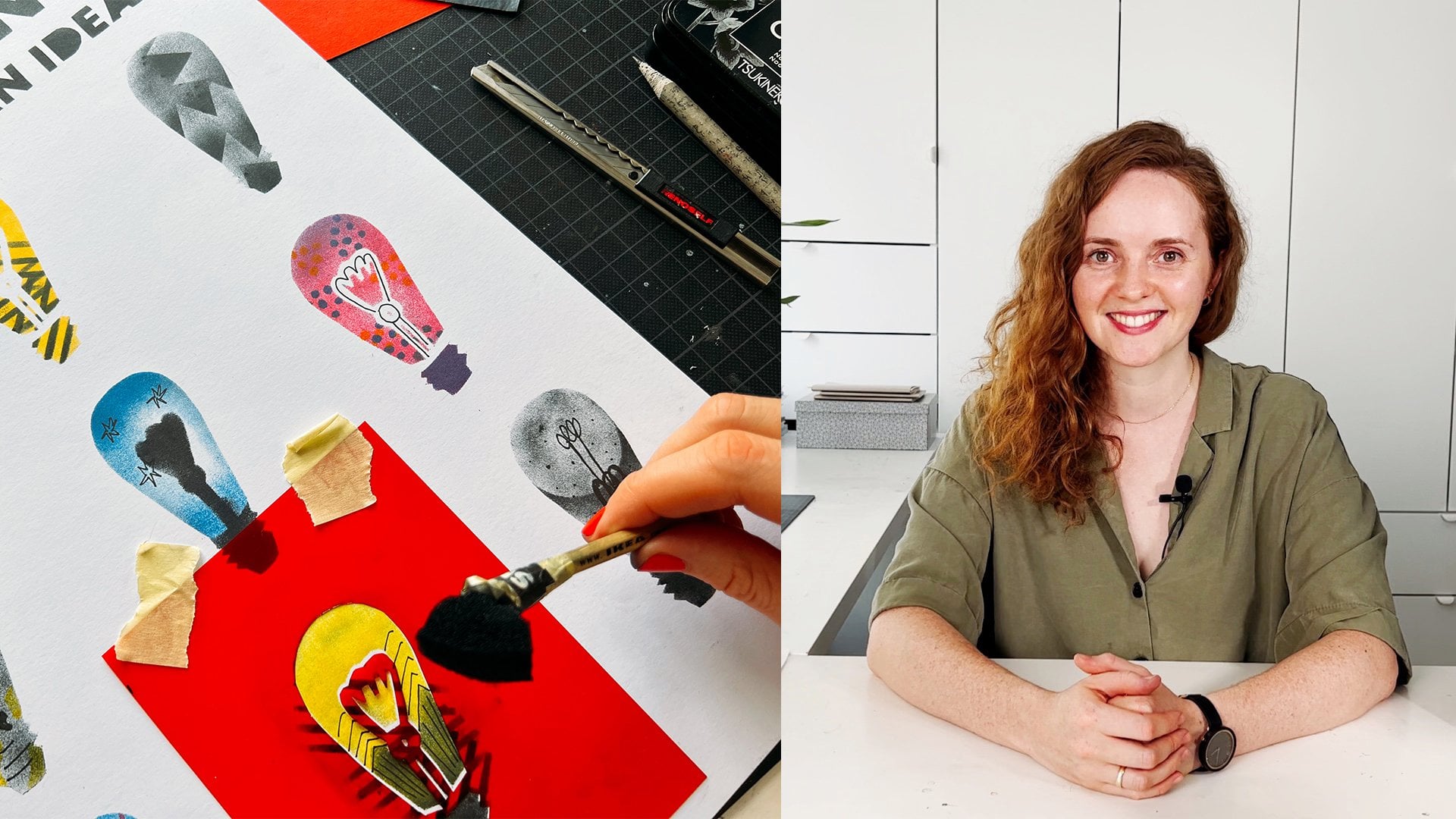
8. Cutting & Gluing Silhouettes: At this stage, we now have a collection of unique
and interesting shapes, and I'm sure you have even more. It's almost time to move
on to the next phase, selecting some of these
shapes and preparing them for stylization
and digitization. But before we get to do that, I want to show you
an extra step, a new iteration
of your elements. This will make
digitizing easier, and it's also a great way to refine your shapes
so they are clearer, bolder and more graphic. These kinds of forms are
not only visual striking, but also super practical
for use in layouts, posters or any illustrative
or design work. Here's what you need
gray or black paper, a craft knife or scalpel, blue, and a pencil. In this step, we'll transfer some of our sketched
shapes onto paper, cut them out, and arrange them on a white
sheet for scanning. This naturally simplifies and stylizes the elements
even further. And honestly, it's a meditative, satisfying and very tactile
part of the process. Once you've chosen a few
of your favorite shapes, the ones that feel most
successful or promising, we'll transfer them
to gray paper. As you do this, feel free
to make adjustments. This is another
chance to stylize weak proportions and make
the shapes more cohesive. It's all part of the process. One thing to think about
here is connectivity. If a shape in your sketch is
made up of separate parts, you'll need to join them into one form so it can be cut out. This gives you another
creative opportunity. How can you connect pieces
in a way that feels right? You could absolutely use
this camper method again at this stage if you want to explore even more variations. But small intuitive changes
are just as valuable. For example, I sometimes
modify silhouettes slightly to improve balance or
simplify tricky details. I recommend cutting
your silhouettes from gray or black paper and placing them on a light background to
scan or photograph later. If cutting isn't your thing, you can also draw silhouettes
with a dark marker. Let me show you what I
mean using a marker. In this sketch, the
thin lines between petals will disappear once
we focus only on the salute, and that's exactly what we want. It makes the shape
more graphic and bold. Your personal style, the way you handle shapes and salutes, will come through beautifully here since we're
still working analog. And here are a few cutting tips. A sharp knife makes
all the difference. It gives you clean cuts
with minimal pressure. Always try to cut away from your body,
including your fingers. If you need to reposition
your hand or paper, take your time and stay mindful. It's easy to get lost in
the flow and forget safety. Cutting with a knife
or scalpel gives your shapes a bold,
confident edge. Scissors can work, too, but they often soften round corners more
than you might want. Use whatever feels most
comfortable for you. As you work, notice, which shapes excite
you the most. Some will feel like they're just waiting to become
something bigger. I'm especially drawn to very simple elements that I can push toward abstract forms. Follow your instincts and
make what feels right. It's also totally fine if your new shapes no longer resemble your original sketches. Those early drawings
were just a springboard. Now, we're moving into
the new territory. Some forms might
still feel floral, others might become
something entirely new. That's what makes
your shape library versatile and useful for
lots of different projects. You also notice that I don't use every
single shape I drew. I focus on the ones
that feel strongest and I keep tweaking them if something doesn't
feel quite right. You can also build
entirely new forms by combining parts of
different sketches. Once you have a new
arrangement you like, just cut it out as
one silhouette. Feel free to scale
things up too, especially if some of your
sketches are very small. Just remember, lines need to be thick enough to cut cleanly. This stage is all about refining and preparing your shapes
for the next steps. Once everything is cut, I arrange my shapes on
a white sheet of paper, leaving space between each one. The composition doesn't
need to be perfect. Simple rules work just fine. But I personally like
to look for balance and harmony as I place each
element. And that's it. These sheets will
be scanned and used for our next step going digital. So let's see what
shapes come to life.
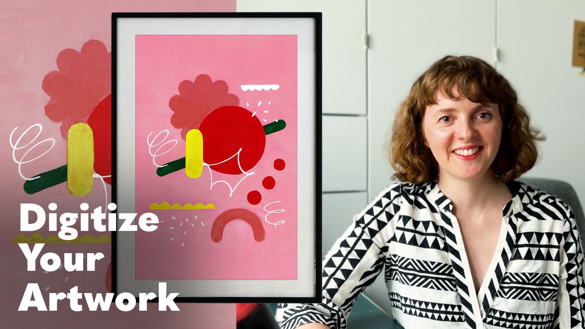
9. Digitizing & Cleaning Shapes: Before we jump into editing, let's quickly talk about
how to scan your work. There are a few simple options. Use a scanning app
on your phone. This is what I do
most of the time. There are lots of
free apps available, so try a few and see which
one works best for you. Mobile scanning is quick, easy, and perfect if you don't have a traditional scanner nearby. The second option is to
use a traditional scanner. If you want really clean
high resolution scans, this is a great option. You can adjust the settings
and get perfect results, especially if you plan to
print your work later. If you want to dive deeper into scanning and
cleaning up artwork, you can also check out my
other class scan edit perfect, how to digitize your artwork. I cover the whole process
there step by step. Once your shapes are scanned and safe to your device
or photo library, we'll bring them into
a graphic program. I'll be using Procreate, but you can follow along with whatever software you're
most comfortable with. I start by opening the scan from my photo library and
choosing share to Procreate. That imports the image
right into the app. Next, we want all the shapes
to look clean and bold. No shadows, no smudges, just solid black elements. To do that, I go to
adjustments curves. I grab the bottom left handle and pull it
toward the middle. This makes the darkest parts
of the image even darker. If you pull it up, it
lightens the image, but we want deep black, so I keep it low. Then I move the top right
handle a little to the left. This helps fade out any extra brightness or
shadow in the background. Just don't go too far. Otherwise, the shapes
might lose their edges. So try to find a good balance. If your scan is already clean, you might not need
to adjust much. But I like to make sure
everything looks really clear. Once that's done, I go
to the selection tool, choose automatic,
and start tapping on the shapes I want to
separate from the background. Then I swipe down with three fingers and
chews cut and paste. Now, those shapes are on the new layer and the
background is separate. If I turn off the background, you can see they're floating
on a transparent canvas. Perfect. If some shapes
didn't turn out clean, I just go back a few steps
and adjust the curves again. You can always redo it. This part is all about
trial and error. Once everything looks good, I go through the shapes
again using select, cut and paste, and place
each one on its own layer. I turn off layers as I
go so I can keep track. When all the shapes are
on separate layers, I create a new square canvas around 20 by 20 centimeters and drag in the
shapes I want to use. You can scale them up to
feel the space better. Just don't stretch
them too much and procreate to keep
the edges crisp. Now your shapes are clean, separated, and
ready for editing.
10. Editing & Effects in Procreate: Now that we've
separated our elements, we can start
experimenting with them. First, I always
make a duplicate of the shape I want to edit or
even several duplicates, so I don't lose the original. We'll be experimenting on the
copy and not the original. That way, if
something goes wrong or we want to try
something else later, we still have a clean
version to go back to. Whether you're working in
Procreate or Photoshop, this principle is the same. Let's start by exploring some of built in effects
in Procreate. I tap on adjustments, and here I see
different categories, color saturation
brightness, blur effects, distortions and
stylized effects. Let's try the noise
effect first. I increase the amount, and you'll see it adds a bit
of texture to the shape. You can play with
the size, sharpness, the scale, try
different combinations and see what looks good to you. When I'm happy, I tap off
adjustments and the effect is applied. Let's do another one. This time, glitch. This adds digital looking artifacts
like the image is breaking. Depending on your settings, the results can vary a lot. I love how it brings contrast. It feels like a clash
between something organic and natural and something
digital and broken. It's a really
interesting effect. I'll make another one, copy, place it on top, and try a stronger
glitch effect. Again, experiment. You can't keep it subtle or
go full chaotic glitch mode. Either way, it adds a new layer of expression
to your shape. Next, let's look at half tone. It breaks the shape
into dots or lines. It's subtle but graphic. Try different styles inside the half tone settings to find one that fits your project. And one more
chromatic aberration. This one gives your shape a
split color or doubled look. It almost feels like a soft shadow or a
three D lens effect. Very cool, especially if
you want your shapes to feel like they're moving
or vibrating slightly. And there's already
so many options, and we haven't even
used brushes yet. Besides using effects, you
can also go deeper into styling your shapes
using brushes and blend modes. Let
me show you how. First, make a copy of the
shape you're about to work on. Then tap on the layer
and choose Alpha lock. This locks the shape so that whatever you draw stays
inside the silhouette. It's really useful if
you want to add texture, color, or shading without
going outside the edges. You can pick any
brush you like and start experimenting
right inside the shape. Now I can create a new
layer and add something on top of the original beyond
the silhouette itself. If I like the result, I can simply merge
both layers together. Let me show you another
non extracted way to work. I tap on the layer,
choose select, and create a new layer. This allows me to draw
inside the Silhouette again, but this time on
the separate layer. With this method, I can create multiple silhouettes
in different colors and offset them slightly. M. I really love this effect. It reminds me of working
with stencils in analog art. Here's another similar approach. I start the same
way by selecting the shape and
creating a new layer. On one layer, I use a
dancer texture brush, and on the other I
draw more freely. Then I play around
with blend modes to see which combination creates the most interesting result. Since each layer is separate, I can move them around or
transform them independently, and that often leads to
even more exciting effects. You can also get really
cool results by simply duplicating your silhouette and flipping it horizontally
or vertically. Try shifting the copy a
little, merging them, skating them down,
duplicating again, and flipping that new shape too. This can lead to some very fun
and unexpected variations. And of course, you can
continue drawing inside these new forms or experiment
with color combinations. You'll start noticing your own favorite
technique as you go. Follow your curiosity. In the next step, we'll export our shapes and turn
them into a library. I'll also show you a
few simple ways you can start using these
shapes in your own work. So see you in the next lesson.
11. Creating Your PNG Library : Once you've created a set of
elements you're happy with, you can turn them into
a proper PNG library. This way, each shape will be saved separately on a
transparent background, and you can reuse them
anytime in future projects. First, make sure all the layers with your chosen
elements are visible, including the original versions if you want to include them too. Important, if you want your PNGs to have a
transparent background, make sure to turn off the background layer
before exporting. Then go to Actions, Share layers, and choose PNG
files. This will export. Each visible layer as
an individual image. Once you tap to Export, Procreate will start saving each element one by
one, and that's it. Your shapes are now saved
as individual PNGs. If you check your photo
library or files, you'll see them all there. Some of them might
not be visible right away if they're black on
the black background, don't worry. They're there. Try placing them into a document with different
background to see them better. I will show you what it
looks like a bit later, and now I can send
all my PNGs to my computer and create a folder to organize
them however I like. For example, I might keep all the colorful elements in
one folder and the simpler, more minimal shapes in another. And to wrap up, here are
a couple quick examples. I created a simple poster and
dragged in some of my PNGs. Since it has a
transparent background, it's super easy to lay
it on top of anything, even a bright color or a photo. For me, these shapes are not just a flexible creative tool. They are also a source
of inspiration. Sometimes I'll just open the
folder and redraw some of them for a different project or combine a few to
create something new. Your shape library will
be totally unique. No one else will have
the exact same one. And the best part is you can
always keep adding to it. It's a great way to
keep your creativity flowing and enjoy the
process as you grow.
12. Final Thoughts: That's it. I hope you enjoyed the class and that it gave you some fresh inspiration and practical tools for
your creative process. We started with
something simple, observing real flowers and through stylization,
experimentation, and digital
processing, we turned those observations into a
unique set of graphic elements. In other words, we met the
goals we set at the beginning, developing a personal
shape language, experimenting with styles and learning how to move
smoothly between sketching, crafting, and digital editing. I hope this class gave you a chance to stretch
your creativity, build confidence in your process and practice a wide range of visual skills all within a playful and
approachable format. I'd love to see what
you've created. If you feel like sharing, post your favorite elements or your final PNGs in
the project section. Or tank me if you're
sharing on social media. Thanks again for being here, and I'll see you in
the next class. Bye.
 Anna Zaretskaya, Illustration and graphic design