Transcripts
1. Intro: How can you effectively
digitize your artwork? How can you clean up dust or fix inaccuracies in
your analog work? What scanner settings to use if you want to
print your work later? How can you edit your
work so it looks amazing and professional on social media or in a portfolio? I will answer all
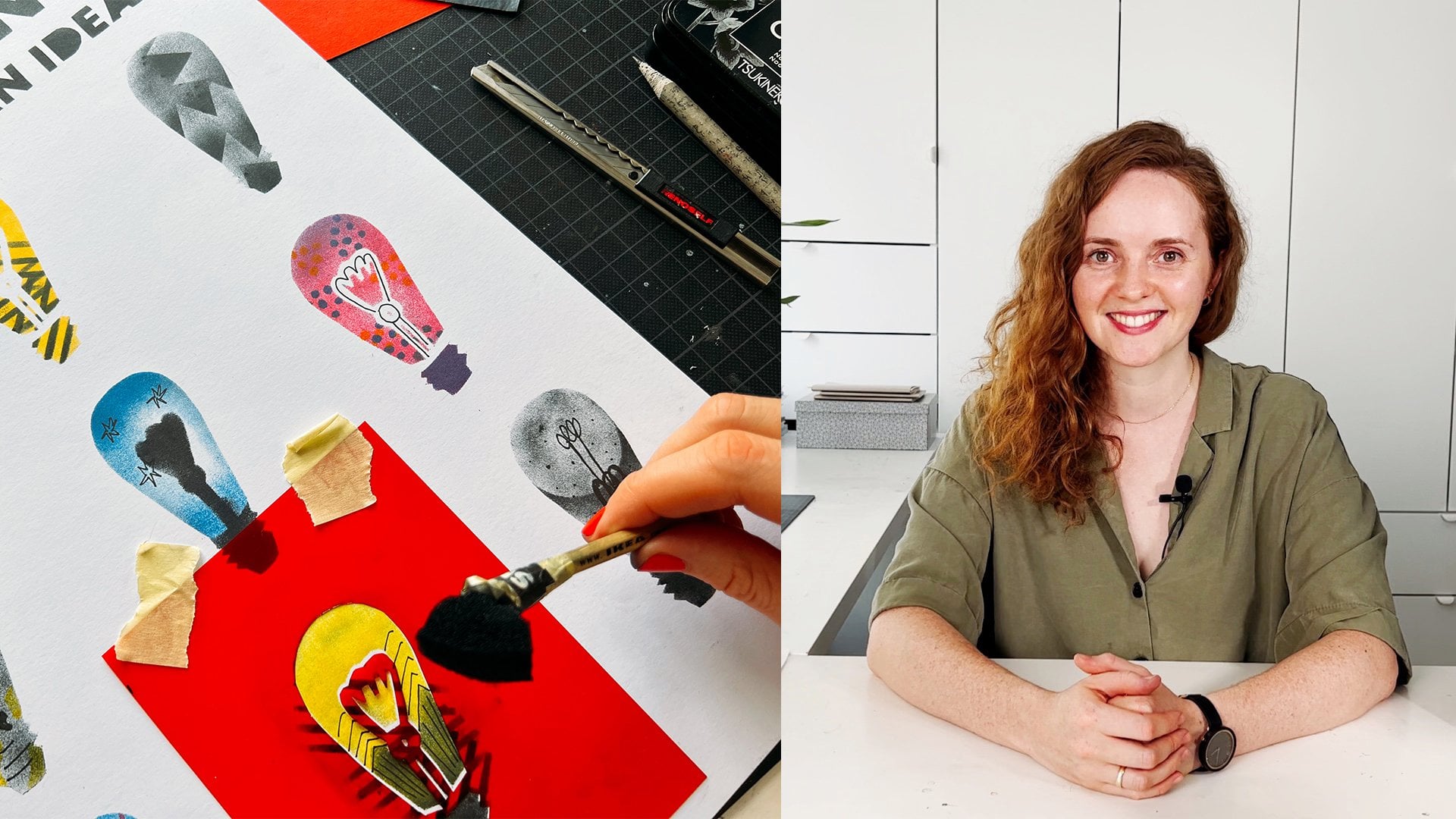
these questions in my Scan edit Perfect. How to digitize your artwork? Hello. I'm Anne Taka. I'm an illustrator
graphic designer and teacher based in Berlin. I've been on my creative
journey for over ten years, always experimenting with both analog and
digital materials and often mixing them together. In today's world, having
an online presence is super important for artists,
designers, and illustrators. It's a fantastic
and necessary way to show of your
work to the world. But it's crucial to do it right. If you're new to digitization or have only limited experience, this course will teach you how to scan your analog
work correctly. You will learn different ways
to edit works created in various techniques like
watercolor pencil or acrylic. I will explain what
adjustment players and masks in photoshop are. Plus, I will show
you some simple, but very effective
photoshop tools that will help you digitize
your work professionally. And quickly, at the end, I will show you how
to use a mockup to let your work look absolutely
amazing in a context. So if you are excited
to learn all this, I'm thrilled to welcome
you to my course. Let's get started.
2. Class Project: M. Hi and welcome to my course on
digitizing your artwork. I'm so excited that
you've decided to join. Let me start by explaining what the course project
will be about. I think many of you have already guessed
it. That's right. The project is your digitized
and edited artwork. But let's make it a
bit more interesting. At the end of the course, there will be a
bonus lesson where I will show you how
to use mockups. I suggest you place your
work in a mockup you like and show the world
your before and after. Like this or like that. I'd really love to see
your projects here on skill share and
also on social media. Take me on Instagram, and I will share your
work on my profile. For this course, you
will need scanner, photoshop and your
art supplies if you want to prepare some works specifically
for the class. So see you in the next lesson.
3. First Steps: To understand the basic
principles of digitizing images, we will need a
simple printer that allows us to change
settings during scanning. I personally use this
multi functional device, which I e for its ability to scan and print larger formats. But the principles are the
same for the most of devices. While digitizing, I categorize
my work into four types. Black and white, colored,
transparent, and opaque. Different artistic
techniques can fall into these categories. Black and white are usually monochromatic graphic
works made with ink, pen, marker, liner, and similar. Colred ones are those
with more than one color, which can be done
with acrylic, gage, watercolor, colored pencils, various markers, and even oil. Transparent works are those where the paper shows
through the material. Primarily watercolor,
possibly alcohol markers, or even pencil or ink, depending on how
they were applied. Opaque ones are usually works made with covering
materials like acrylic, gage, oil, pastel,
acrylic markers. There could be numerous
examples of materials. After this course,
you will be able to determine which settings and processing suit your work best.
4. Clean Before Scan: All right. If you have
prepared your artwork, we can move straight
to scanning. But first, there's an
often overlooked step. That's thoroughly cleaning off the glass surface
of your scanner. This glass can
have fingerprints, strench dust or tiny spots
from previous pictures, which can make extra work
for you editing later. To avoid this,
take a soft cloth, preferably microfiber like
the ones used to clean glasses or monitors
and wipe the surface. You can also use a bit of
glasses cleaning fluid. I also use sometimes
a flashlight to check for any missed spots. If it's particularly
important to avoid dust on your artwork, you might even want to get a special air blower to blow
off dust before every scan. Now you can place your artwork as indicated on the scanner. There's often an arrow or
document symbol to guide you. Some scanners even recognize the paper orientation
themselves. Now our artwork
is ready to scan. And now let's move on to a very important
step of scanning. Let's look at the settings that are important to consider. So see you in the next lesson.
5. Settings For Scanning: Hi again, everyone, and
welcome to this lesson, where we will take a closer look at the scanning
process and settings. I will be using image capture, which comes with every make box. But if you have a different
program, no worries, you'll be able to find
similar settings, maybe just in a different order. You can also start
the scanning process directly from photoshop
by going to file, then import, and then
images from device. This will open the
scanning program you have installed in my case, the same image capture. When we open the program, we see various settings. Let's start from the beginning. My image is currently
in preview mode, simply placed on
the scanner glass. If we look at our settings
panel and go to the bottom, we will see preview button. Pressing this button, we'll scan the image at
a low resolution, allowing us to check
if everything's okay. If our artwork is
positioned correctly and if there are any unwanted
spots or scratches. By default, my program
is set to scan using the flat bed option because we are scanning
from the glass. Some scanners have an option to feed sheets through
automatically, but that's more for documents. The next setting is kind, which refers to the
method of scanning? You can choose from text, black and white,
and color scanning. Here's the difference. If
you choose text setting. Look, you can already see
that the image has changed. Why does it look like this? In this case, the scanner
will erase all colors, only recognizing
black and white. All gray tones
will be split into black and white based
on their intensity. In this case, the
device decided that pink color was dark enough
to translate into black. Next setting would
be black and white. In this case, even
color originals will be scanned in
black and white, but with shades of gray, which is great for checking
contrast, for example. The last one is color. Here, the scanner reads
all colors in the image, which is, of course, optimal for color images. Next up is the resolution, a crucial setting that determines the quality
and size of your image. Measured in DPI, dots per
inch or PPI, pixels per inch. Resolution is the number of dots in a square
inch of your image. The higher the DPI, the more detailed and
clear the image is. Remember what happens
if you zoom in a photo, you see tiny rectangles. Those are pixels or dots. Different purposes require
different resolutions. For digital use like
websites or social media. Less than 300 DPI
is already fine. For printing like
posters or merchandise, you should scan
at least 300 DPI. I always recommend scanning
images at a high resolution. You can always reduce the resolution later
without losing quality, but you can't increase it. It's also important
to remember that resolution is inversely
proportional to size. That means that if I enlarge
the image during processing, the resolution
decreases, and if I reduce the image size,
the resolution increases. Here's an example. If
I scan a four image at 300 DPI and then double
the size to A three, the resolution becomes 150 DPI. Conversely, if I reduce
the image to size A five, which is a half of A four, the resolution becomes 600 DPI. So if you plan to enlarge
your work for future use, always scan it at a
higher resolution. To scan this image, I'm using a high resolution
that's possible of my scanner at 600 DPI. In case I decide to enlarge
it for printing later. The next step is size. In my program, I can choose
the size of the scan. You can set the original
size from a list or use a custom size if your
artwork is non standard. In this case, my
artwork is larger than a four, which
standard format, and I can just move the frame and scan
only the middle part, but I would like to
scan the whole work. So I will keep the check
mark on use custom size. Also, I have here the
rotation angle option, and it helps fine tune the
scan area if you want to. But if you don't have this
option, it's totally okay. You don't really
need it. Now, choose where to save your scanned file. I recommend creating
a special folder for your project or scans. It makes finding
them much easier. For now, I just choose to
scan to my desktop and name the files with the current date for
easy sorting later. The next step is the format. The format depends on the
purpose of your scan. For documents, PDF is just fine. For photos to share with
family, JPG works nice, for optimal quality, choose TF, which preserves more
information of the image. Some programs allow image
correction during scanning. You can experiment with contrast
and saturation settings to see the effects immediately. But I prefer to edit my
work in photoshop directly because it's more flexible
and I have more tools. Once everything is set, press the scan button, and let's scan now our images one by one
with necessary settings. I've categorized my scanned
works and we'll show you why. In my examples, I used two to three different materials meeting the criteria
we discussed, black and white, color,
transparent, and opaque. So now I have a work
that is black and white, made with opaque materials. The second work is
also black and white, but made with
transparent materials, and it has texture. Next one is color and opaque made with ash and some markers. And the last one I made is
also color but made with transparent materials like
watercolor and color pencils. So I have this fine transitions
and paper structure. For each category,
I will explain the specifics of editing
and photoshop and show you tools that
you can use depending on which kind of work
have you scanned. So now let's move on
to the next lesson.
6. Scan Bigger Artworks: In this part of the course, I'll show you how
to scan a piece of art work that's larger
than your scanner. I'll be scanning an
A three sized work. It's 297 by hundred
20 millimeters on a scanner that's
half the size, which is typical for
standard office. Many of you might have this
kind of scanner at home. Using this example,
I'll demonstrate how to scan your artwork
in sections and then use Photoshop magic to merge these sections
into one complete piece. The final result
will look clean, neat and have good resolution. Here is how the
entire artwork looks. To put it together, you'll need to scan it in three parts. Not just two, as
you might think. Technically, yes, A four
is half of a three, but to give photoshop enough information to merge
these pieces seamlessly, you'll need to scan
it in three sections. So I scan the bottom
part, then the top part, and additionally,
the middle section that overlaps both
the top and bottom. This overlap is very important. Next, I open Photoshop, go to file automate photo merge. I leave the layout option in automatic mode and select files. I scan by clicking on browse. I find my files and
select all three at once. After clicking open, they
appear in the file list. The settings remain
at their default, but it's crucial to
make sure that the box next to blend image
together is checked. I always recommend checking out the other settings as well just to be aware of
the options available. For example, you
can automatically fill in any gaps
that might appear. But for now, I'll leave
everything as it is, and you'll see the result
with the basic settings. Now you can notice that Photoshop automatically
processes the images, and in the end, we have three layers. All parts are seamlessly
woven together. The image is
currently horizontal, but I can easily
rotate it by going to image image rotation,
90 degrees clockwise. If you zoom in and
take a closer look, you won't be able to tell that it's made up
of three sections. All watercolor transitions,
pencil textures, and geometric details
are perfectly preserved. We can see transparent
strips along the edges, but we can easily remove those using tools
like the crop tool, for example, which
I'll talk about later. Alternatively, you could
choose content feel transparent areas that we
saw before in the settings. That would automatically
feel in those areas. For now, I'll just
save this image as a ti so I can continue
editing it later. And of course, I'm waiting
for you in the next class.
7. Learning About Color Modes: So now we scanned our artworks, and now we will compare
the differences between them and talk a
bit about color settings. I think this is very
important topic because when I'm teaching at the art
school, where I'm teaching, I often notice that
the most people are struggling with this
topic at the beginning. So let me. Let's see, the first piece we scanned
was black and white image. If we zoom in real close, which I do using the
hot keys command plus, you always see hot keys
on the screen below. If I zoom in really close, I can check what color
mode my image is in. Right now, I see pixels. Those same dots that
make up any ster image. Here I see that all the pixels
are black, white or gray. There's no color anywhere. You can also always
check the color settings by going to image mode. Here you'll see color settings, and if there's no color
information in the file, you'll see a check
mark at gray scale. You can see the same word
in the document title. Now let's compare this
picture to the next one. If I zoom in a lot
on this image, I'll choose the darkest
place in the picture. In this black color. We see a lot of different
colors that make up black, blues, greens, reds,
and even yellows. This means the image was scanned in color mode and retains
this information. Meanwhile, I can translate this image into black and white, but not other way around. I can translate the file itself
into another color mode, such as GB or C YK. This way, I can then draw
in color in this file. If I now go back to
gray scale mode, I won't be able to add color. Only shades of gray. Please note that if you want to switch from one color
mode to another, Photoshop will always warn you that changing the color mode might alter the appearance of the layers and will
offer to flatten them. Choose don't flatten if you want to keep working
with separate layers. Otherwise, all layers
will merge into one, which is very inconvenient
in most cases. How might the mode change
the appearance of the work? In short, some colors
might become dull. I'll explain why this
happens a bit later. Let me remind you that if you are creating
something for print, it's worth choosing CMYK. But if your work is
intended only for digital media for
screens like for social net works
websites or apps, then you need RGB. Now let's look at
the other files? How they got scanned. We'll move on to editing
in the next lesson. So this file is in RGB mode. It was scanned
automatically like this. If I now move to gray
mode, look what happened. All color information is erase. The program even
reports this when you change the mode. Okay. Let's look at the next image. This one is also
currently in GB. In my experience, some
bright or neon colors lose their intensity when scanned and can even completely change
becoming flat and pale. The scanner lamp
is very bright to evenly illuminate the
entire surface of paper, which can affect
color production. This work was done using
watercolor and colored pencil. So it's transparent, and you can see the texture
of the paper, as well as the pencil straws
and watercolor effects. I want to keep all the
effects while editing. And on this work, the brush structure and strokes
are also clearly visible. Here, I will try
to minimize it to get a maximum uniform surface. Using this color
picture as an example, let's compare what will
happen with the color, if I translate the
file from RGB to CMYK. Please pay attention to
the sharp change in color. This is how the
work looked in RGB, and this is what
it looks in CMYK. Now I'll explain
why this happens. Let's look at this scheme. The circle itself
that we see here. This is the visible
color spectrum. The range that is
perceived by our eye. It may vary slightly
between different people, but in most cases, we distinguish quite a loyalty
of colors with the eye. The field outlined by the yellow line is what
can be displayed in GB. That's what almost
any modern monitor or similar screens are
capable of reproducing. The blue line in the
middle is the range of CNY K. This is what we can
get when printing. Here it is clearly seen that the colors are more
dull and flat. That's why if I go back to my work and compare
both options, we clearly see that in C YK, all colors look more dull. This should be
considered in the work. If you plan to print your works, I advise you to
translate them into sm k in time so that you can see all the colors and edit them so you don't get unpleasant
surprises later.
8. Editing a Black and White Opaque Image: Let's start with editing
the first image. It's black and white. It's looking pretty good already because it
has a high contrast. First off, I used
opaque material, so I already get
a high contrast, and there are no
smooth textures. And secondly, I scanned the image in black
and white setting, so I don't have to get read
of any unnecessary colors. One thing to pay attention
to while editing images is how well
it's been scanned. Do I need to crop the format? Are there any weird
stripes on the sides? Did the paper shift
while scanning? If the paper is light, it can easily move when
you close the scanner lid. For example, I can
see that I have such a stripe that
I don't need here. I need to get rid of it. Moreover, I want to
point out that I didn't clean the glass
of my printer very well. Now on the scanned work, we can see spots that apparently remained on the
glass from previous scanning. I decided not to scan again, but to show you on this example how you can get rid
of such mistakes. If we look at other
scanned works, I will unfortunately see
this black dots everywhere. In this work, I'll
edit the format. In my opinion, the easiest
and fastest way to edit the format or rotate the image
is to use the crop tool. We can select it on the toolbar or by pressing C
on the keyboard. Now we see a frame
that can be moved. I'll zoom in on the image a bit. I usually zoom in with the
command plus k combination. Then by pressing the space bar, I can move around my
workspace very easily. I zoomed in a bit on the
image to be more accurate. Now, I just decrease this
frame as much as I need to. I always advise to look closely at all
sides of the image. When everything is ready, you can press enter and
the frame will disappear, cropping the format as we need. Our picture now
looks much neater. After we've dealt
with the format, let's decide what to do with those black dots that appeared
here during scanning. There are several ways
to get rid of them. The easiest way to do
this is if we have an opaque background without any texture. Like
in this example. Just a white background. I'm not planning to cut it out. In this case, you can even take a brush tool and choose
the background color, white color in this case. Don't forget to create
a new layer, please. I always advise to not change
the original image and to create copies or new
layers for all changes. This way, if
anything goes wrong, you can always delete necessary layer and return
to a more suitable version. So let's go back to the brush. Right clicking on the workspace, I can call up it settings. Also, brush settings
are available here in the upper control panel. I can make the brush a bit bigger variety
hardness and shape. In this case, I
need a simple brush with fairly hard edges. Now, I'll work with this
brush on a new layer and mask all unnecessary
dots that bother me. Or you can get rid of
pencil traces this way. I'll repeat again, this
option works only for absolutely smooth surfaces
without any structure. What to do with
structural surfaces, we will find out on the examples
of the following images. Now our image looks clean. Let's compare how
it looked before. Next to the layer name, you can turn off
and on the icon. So we see the original
version of the picture. We looked at the simplest
version of image editing. Another way to get
rid of dirt in the image is to use
the clown stamp tool, which is S button
on the keyboard. I can use it on a new layer. It needs to be used on the same layer because this
tool takes a sample or probe from the
correct surface and applies it to the
place we're editing. It replaces it. For such a purpose, I always highly recommend you to make copies of
the original layer. After that, you can turn off the bottom layer by
clicking on the ei symbol. Now you can work
with the copies, so you won't be taking risks, and if something goes wrong, you can always delete
the ruined layer. Let's pay attention to
how this tool works. Firstly, I press
the option or Out key on the keyboard and click
first on a clean place. Then click again on the place
that needs to be edited, but not holding option
or Out key anymore. This way, I take a probe from a clean space and apply
it to the dirty one. When you apply the stamp, you can notice a plus
sign next to the brush. It shows where the probe is
taken from at the moment. So this tool takes pixels from one place and paste
them into another. You can also adjust the size
and hardness of the tool, like it was with the brush. Well, I've got another edited
version of this work ready. In this lesson, you
became familiar with two ways to edit a simple black and white,
contrasting image. We can compare the
before and after versions by clicking on
the symbol in our layers. These tools are
very easy to use. With their help, you can
quickly achieve the result. When we've finished editing, we can save the image
in any required format. To do this, we select file
and then save a copy. First, choose where
to save the image. In the drop down menu, you'll see a list of formats. So if we want to continue
working on this file later and need to
keep all the layers, we should choose the PST format. This is Photoshop
standard format. If you're completely
done with editing and need to save the
image for social media, a website, or to send it
to someone for reviewing, you can choose GBG. This will make the file
much lighter and smaller, but you won't be able to edit
individual layers anymore. You can also save the
file in P and G format, which maintains
image quality and is useful if the image has
a transparent background. If you want to kip
the layers but need a smaller file than
PSG, you can choose TI. It also allows for
saving layers, but it's easier to view on different computers
without opening photoshop. Choose the format that suits you best and I'll see you
in the next lesson.
9. Editing a Black and White Transparent Image: In this lesson, let's look at the following
piece of work. It's a black and white piece created using more
transparent materials. The structure and
tching are visible, and it was scanned
with color settings. Let's see how it's different
from the previous work. Apart from the
presence of colors, there's a clear need to
work on the contrast. Currently, the blacks
or shadows are not as deep or as contrasting
as they might be. So after we've determined
the format using crop tool, we can move on to editing
the black dust spots. We don't have any
structure here either. So we can use the same tools. We got familiar with in
the previous lesson. To avoid such work, let me remind you
how important it is to wipe the scanner
glass before scanning. Now we will increase
the contrast in this work as it las ad. I suggest using an
adjustment layer for this. Please find the circle
symbol divided in half. It is in the area with your
layers right on the bottom. Here, you will find
different processing tools. To add contrast to the work, I usually use levels. Click on levels in the list. You will see a window with the settings for this function. We see different sliders here. The darkest one on the
left is for shadows. The darkest shades in our image. The middle gray slider is
for mid tones in the image, and correspondingly, the bright, right one is for light. The lower sliders also
respond to lighting, but for the whole image. In this case, we need to make the dark tones darker and the
light ones a bit lighter. This will add the necessary
contrast to our work. I always start by slightly
increasing the amount of light in the image and try to strengthen the
dark tones a bit. I try to make small changes
and see if they are enough. How much you change
the strength of the tones depends on
your work and your goal. Try different options and assess which one
suits your work more. Also, if there's
structure in your work, make sure that it doesn't disappear after
manipulating the levels. The structure of
the paper is also conveyed through the relation
of shadows and light. I think I'll stick
with this version. It seems to me that it best meets my expectations
for this work. Here you can clearly see all
the strokes and texture, and it was important to me. Also, you can notice that
some dirt has disappeared, thanks to this processing. This happened because I added
light to the light tones. It's important not to overdo
it with adding light. The structure may
completely disappear. Let's compare the results again
before and after editing. It's clear that the word now looks much
cleaner and neater. It can now be easily used for fther projects,
for instance, in mockups or on a website
or on social media. So now, when our
work is cleaned from unnecessary elements and dots, I want to show you on this example how you can get
rid of the white background. Let's say we want to place this picture on another
background, some colored one. At the same time, it's
important for me to keep all the shrugs and
smooth transitions. For this purpose, I need to completely get rid of
the white background. Make it so that the background
is completely transparent. There are several
ways to do this. I will show you the
ones I use very often. First of all, I create
a copy of the layer. Now I want to completely select all the white color so that
I can delete it later. So I go to the selection
menu color range. Here, I use the eye dropper and click on the color
that needs to be selected. At this stage, we see the
stings for this function. If you have a check symbol in the box under the
picture for selection, then everything that will be selected will be shown in black. If I move the slider, I see how much color and its
shades will be selected. In the drop down
window at the top, you can select the color
that should be highlighted. You can also select only
light midtones and shadows. In the case of this image, I need to select the maximum
amount of white color. For this purpose, I move the slider all the
way to the right. The selection is ready. We see marching s
that I call them. So everything worked. Now I can just press
the delete button and everything that was selected
will simply be deleted. This is quite an
invasive method, but since we made a copy, we don't lose anything and can always return
to the original. As soon as the
background is deleted, we can remove the selection. Select D select or command
D on the keyboard. This is the result that we have. To check if everything
has been removed, you can create a new layer under the picture and feel
it with any color. To do this, I choose a color, then the paint bucket tool and
click it on the new layer. Now you can evaluate the work. It seems to me that I
deleted too much structure. The hatching became
poorly visible. Now I will do all the
same again and this time, we'll not move the
slider to the end. Now let's compare both options. In the second version, the structure was
preserved much better. So the easiest way to remove
the background is to select the background color using the color selection tool
and simply delete it. So Another method to get rid of the background color
is to work with masks. When we create a mask, we don't destroy
the image itself, but rather hide its part under the mask and can
always return it back. Let's see how this can be done. The first steps
will be the same. I'm looking on the layer. I go to the selection,
color range, select the color I need, select the range here
and click on, Okay. Now I have all the
white color space selected that I want
to get you rid of. Now I need to, while staying
in any selection tool, for example, in this one, rectangular selection, click the right mouse button and click on Select and verse. This way, now I have black
surfaces selected, not white. The next step, I have to find a mask symbol at the
bottom of the layers area. It's a rectangle with a circle
inside, and click on it. Look how the major addens. A mask appeared here and it hit everything that
was not selected. Therefore, it was important
to invert our selection. Everything that was not selected is hidden
now under the mask, and everything that
was selected remain. Now if I want to clarify
something in this section, then I can click on
the mask symbol, select black and white colors on the tool panel or
D on the keyboard. And now you can take a
brush while I use white, I can return something
from under the mask. And if I take black, then I can hide parts
of the image again. Brush parameters can also
be changed as convenient. I can, for example, completely
remove this element, but it will not be erased. It will just be hidden. I can take the white brush
again and return it. But please notice
that in this way, I will return it along with the background since it's
also hidden under the mask. Therefore, when it comes to such thin lines or structures, working with a mask may
not always be optimal. However, modern versions of Photoshop have features that can help us in this situation. Look, we can view the
properties of the mask. If your properties
panel is closed, you can open it by going to the window menu and
selecting properties. While the mask is selected, you'll see a frame around it. Please compare now the
layer itself is selected, and we can see its properties, but now I've selected
the mask again. Now we can click on
Select and Mask. This opens a new
window with settings. Here you can find
various brushes, including the refined
edge brush tool, which we'll be using. Let's look at the
settings on the right. If I now remove
the masks opacity, you can see the layer with
or without the background. Now I apply the brush and after the program
analyzes the image, only the outline
we need remains. If the result isn't quite right, you can tweak the settings. They depend a lot on your image. So try experimenting
on your own. This will help you to get better at erstging the settings. When everything is ready, I press okay and here's the version of the
image without the background. Now I can place the image on
any color background I need. And it's time to save this file. I save a copy of the file
and choose the PG format, which allows the background
to stain transparent, and the image size
won't be too large. The PST format also preserves
the transparent background, but because it saves
all the layers, it will be significantly larger. This is how the file
looks in PNG format. Everything I process and the transparent
background are here. Now you can confidently
use the file further. And I look forward to seeing
you in the next lesson to show how to edit a color file
made with Opaque materials.
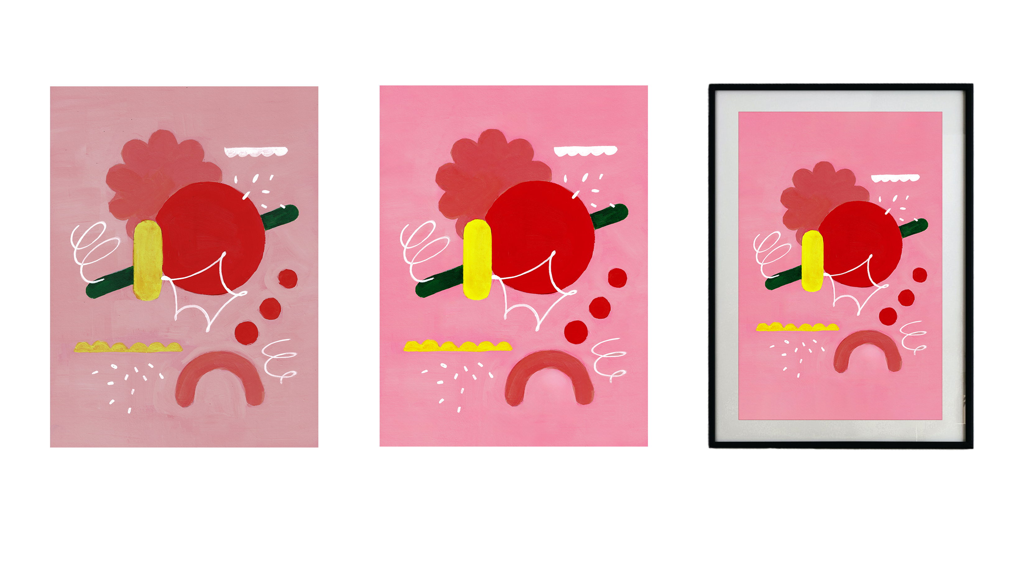
10. Editing a Colored Opaque Image: So here we are in this lesson, and I want to show
you how to edit a colorful piece made
with pac materials. If you look at the file name, you'll see it's in EGB mode. So I'm going to edit
this image to use it on my for social media or
even as a phone wallpaper. First, I am to remove any unwounded dirt left from scanning and adjust
the format slightly. I also want to work on the background texture
because it's currently too loud with unwounded
stripes and brush strobes. Additionally, I plan to clean up areas where the paint bled over the edges and fix spots where the paint
application was poor. I also plan to make a
small color correction to make the colors
warmer and brighter, especially in the background. Let's start with the format. This tool doesn't
just crop the edges, I can also rotate the canvas. You can align it using
horizontal and vertical lines. If you need to crop just a bit, you might have to zoom in a lot. Now it's time to clean up
all the dirt and spots. The image is colorful, and I still want to look
like an analog work. I want to calm the
background texture a bit, but not remove it entirely. For this, I can use either the clone stamp tool or a healing brush tool.
L et's compare them. With the Clone Stamp tool
as in previous lessons, I take a sample and apply it to the area
I want to add it. It looks good at first glance, but if you look closer, you can sometimes
see a circular mark. Adding a bit of softness
to the brush edges helps. But it's hard to
completely avoid the marks or
repetitive patterns. For textured works,
I prefer using the spot healing brush tool
or the healing brush tool. The clone stamp tool,
copies, image parts, and masks imperfections, while healing brush tool
also optimizes the edited spot based
on the surroundings. Let's see what happens. It's not even noticeable
that the area was edited. I can experiment with
the settings to find what works best for
the particular piece. With the spot
healing brush tool, I don't even need
to take a sample. The tool analyzes the image and edit it just when I click. The brush settings are also crucial and are selected
based on the task. Try this tools and find the
best solution for your tasks. The remove tool is an E based and can even
remove larger objects, you select a brush slightly larger than the element
that you want to remove. Run it over and it
disappears without a ras. This works even on uneven backgrounds and is
great for larger elements. Please note that for this tool, the brush size is adjusted
only in the top control panel. With one of these tools, you can always achieve
the optimal result. I'll refine some
areas on my image now and try to remove this rough
brush max that I don't like. By switching tools, I achieve
the best result for myself. Each has its specifics, and the more you use
them in various works, the better you understand
when and how to apply them. Now I like how the image looks. Next, I'd like to
add more warm colors and make them more
harmonious with each other. If I try to use color selection, it won't work very
good in this case because there are elements
of very similar colors. To isolate just the
pink background, I'll use the
relatively new tool. It's object selection tool. If the tool doesn't recognize all the elements
I want to select, I'll use the Quick
Selection tool as well, which is suitable for
well defined areas. To add new selection parts to an existing selection,
I press shift. And click on the element. To remove something
from selection, I'll press the alt
or option key. Now all elements on the pink
background are selected. Next, I need to invert the selection to isolate
just the background, not the objects on it. Write leak and choose s inverse. Now only the background
is selected. At this stage, I can
do anything with it like filling it with color. But then it's no longer
looks like an analog work. But I still want to edit
the background color a bit. I go to layers and create a new adjustment layer,
specifically selective color. In the properties of this tool, I can adjust colors separately. For example, I choose
the red color. Remember, thanks
to the selection, I'm only editing the background. The elements themselves
won't change now. If I choose red, I see the
components of this color. They are con, magenta,
yellow, and black. With sliders, I can
add or remove a shade. Notice then I remove
con from red, it becomes more pink and warm and adding it back makes it
more green or even gray. See how much change
occurs when I add magenta because red initially
contains a lot of magenta. So by using this
slider, I enhance it. Removing it completely turns the background almost yellow, adding or removing black makes the red shades
lighter or darker. I like this cooler version
of the background. It adds more contrast within the background and
the picture elements. The same can be done
for other colors. The changes are most noticeable in the
most abundant color. Also, you can work with lights, shadows, and mid tones. The result depends on
the tone of the image. If this picture were
converted to black and white, the background would be gray. So when I change the mid tones, they change the most. Now when I found the
suitable option, let's compare the edited
image with the original. Now it's more
vibrant and bright. In principle, you can edit any element in the
picture like this. The next step is to edit the elements where the
paint was poorly applied. I use the object
selection tool again. Now I create a new
layer, and on it, I will paint other the space
with an ordinary brush. However, I'll reduce its
opacity and increase its size. Using the eye dropper, I take the color I need from the image and paint
within the selection. So now we can see this
color much better. Also, let's pay attention
to blending modes. Choosing the right
one can help maintain the brush texture
and enhance the s. Now I'll do the same with the other yellow elements and
then with the white ones. Well, now I like the image. If desired, you can still
experiment with settings, for example, with
levels and saturation. Now if we compare the original
with the edited version, we see a clear difference. The picture was quite pale with a lot of dirt
and irregularities. Now it's more vibrant, bright, and smooth while still
maintaining an analog style. The next lesson will be about transparent
colored picture. So see you there.
11. Editing a Colored Transparent Image: The latest image I scan
is also a colored one, made with transparent materials like watercolor and
colored pencils. In this image, we'll revisit some tools
we've already used. I'll also show you how to
preserve the texture of the paper and soft watercolor
transitions editing. As usual, the first thing I did was make a
copy of the layer. The first thing that
catch my eye in this work besides black dots are
shadows of the paper. This can happen if the scanner lit wasn't pressed down well. If the paper is very dense
and has water waves, or if you're scanning something with bulky elements
like a collage, you can wait down
the scanner lit with books or hold it
down with your hand. Additionally, I
would like to make the yellow color in
this work warmer, and the other colors
more saturated. So they stand out
against the background. At the same time, it's
very important here to preserve the structure
of the paper itself. So it's clear that it's
water color on paper, and also that here is
a structure of pencil. First and foremost, I'll create a new adjustment layer levels. I'll adjust the
contrast with it. This will help get
rid of shadows. The frame I left around the motive is the lightest
color in the picture. I'm using the slider
to enhance the light. As a result, the whole image has become a little brighter. I will also minimally make
the midtones a bit lighter. Almost all the shadow is gone. But the texture of the paper is still noticeable, which is good. Now it's time to remove
all the artifacts. And since the texture
is important here, I'm using tools from the
healing brush category. It also helps to choose
the right brush size. To make changes unnoticeable, choose a brush slightly larger
than what you're removing. So I've removed the
Roths mistakes. Now I'll edit the color. Again, I choose selective color, and I only choose yellow. This time, I'll be
editing the entire image. Look how dramatically
the picture changes. I'm adding more
yellow and reducing the amount of other colors
like magenta and Con. This makes it warmer
and more pleasant. I do the same with blue shades to make them more saturated. In this case, I'm adding ion and slightly
reducing magenta, so the color is greener
rather than purple, and I'll experiment a
little with red color. Okay. Now I think I like
the editing result. Please take a note. This work is now in C YK mode. As you can see, you can achieve quite saturated
colors here too. Okay, I think it looks great, all textures and beautiful watercolor
transitions are preserved. Of course, you can
continue editing, but that depends on your work and the goal
you want to achieve. Now, you have the basic
tools to reach the goal.
12. Using Mockups: So in this bonus lesson, I'm going to show you a great
way to present your work, whether it's to clients or on your website or social media. We're going to use
mockups for this. There are various
ways to use them, and you can find who
websites dedicated to mobs. I want to show you a fairly
classic and simple method. I will download a mockup and
we will use Photoshop again. Let's start by downloading
a suitable mockup. I like websites like
Mockup World or unblest, but there are many others choose the ones
you like the best. Of course, if you
need mockup for commercial projects,
you should buy them. People put a lot of time
into creating mockups, but for praxs or personal use, you can always find
good free options. So in this case,
I'd like to see how one of my pictures would
look in an interview. I'll search for integer,
choose the option. I like best. I see
something with color similar to
one of my works. Here we see a minimalistic
stylish interger. My work will fit well into it. I'll be able to insert
my work into this frame. The mockup description
will give you information about
its size and format. Sometimes they are mockups
for other programs, but we need one for photoshop, so look for PSD format. Now we can download it
and open it in Photoshop. First and foremost,
look at the layers. Here I see the picture itself and the layer where
we can put our image. The special mocker player is what's called a smart object, which you can edit very
flexibly and non destructively. Smart objects are
often used in mockups, so the whole picture
doesn't have to be edited. You change only a mocker player, which you can identify by a
small symbol in the corner. It's an image symbol with a small rectangle in the corner. Now I can double click on it, which opens a new file where
I will place my image. Anything I do inside
this document, the Smart object, will then appear in the frame
in the main document. But first, all changes
must be saved. For example, what I just drew, now, I press command S, go back to the main document, and you can see my drawing
has appeared in the frame. Now I will delete this example and I can place my
illustration here. I'd like to put
this bright picture that I worked on earlier. I'll just drag it inside
the open document, press enter to confirm
save the image. Now let's see what we got. We see the following problem. The format of my illustration
does not fit this mock up. In this example, I want to show you how to solve
a problem like this, at least with images with
a uniform background. To do this, let's
do the following. My picture was imported as
a smart object as well. But in this case,
it's not needed. I can right click on
it and sorize layer. Now it's just a regular
layer in Photoshop. And now, right in this file, we will extend the background. For this, I will use the
generative fill tool. I take the selection tool, rectangular Mark tool, select
the unfiled space with it. Now I choose edit
content aware fiel. This is also an AI based tool. By clicking on it, I've opened an additional
window with its set of tools. Right away, we see a warning or rather a tip from the
program about what to do. Here, you need to select the sampling brush tool
and highlight the area based on which the empty place will be filled.
Let's look closer. I take the sampling
brush tool, here it is, and now I use it not
in the space itself. I don't draw with it, but I show the program where it should take the example to
feel the empty area from. If we now look at the result, we can see that the top part of the picture is
now also filled, and it looks great. There are no sharp transitions
or stripes, no any traces. I do the same for the
lower part of the image. It's better to choose a space closer to
the selected area. Otherwise, some
distortions may occur. For example, if you take a sample from the
top of the image, the space will be
filled incorrectly. Apparently, the top of the picture is
significantly darker. Well, now the rest. Well, I confirm and
di select and save this file with command S. This is how it now
looks inside the mockup. Now, if necessary, I can
still make some changes. For example, I would like to slightly reduce the
contrast of the picture itself in the mockup so that it fits more naturally
into the environment. I choose the adjustment
layer again. Now, I pay attention
to changes that occur in the entire picture, but I need to change only
the image in the frame. So I choose the layer, right click on it, and
select the option, create a clipping mask. After that, you will
see a small arrow down. This means that now
this layer only applies to the layer
it is pointing to, to the layer below. Now I change only
the picture itself. So I'm happy with the result, and now this image can be
posted on social media or on web page or
added to portfolio. So people can understand what you offer or how
to use your work. Again, I want to
remind you that it is always important
to pay attention to the license of the mockup. Everything you find on the Internet is
protected by copyright. Always carefully look at the conditions under which you can use a
particular product, whether it's a font
photo or mockup. Well, I'm very glad that
we've come this far together and that the skills will be useful to you
during your work. You guys are just
great for doing it, for giving time and attention to digitizing
of your artwork.
13. Final Words: Congratulations on reaching
the end of the course. I'm thrilled to have shared
this journey with you, and I hope you've gained
valuable skills and insights. Let's recap what we've
learned and how you can continue to apply these
techniques to your work. Now you know how to scan your
analog artworks properly, ensuring they are high quality
and ready for any use. You also learned how to adjust scanner settings to maintain
the quality of your artwork, making sure colors and
details are preserved. We covered tools like the
spot healing brush tool or the healing brush tool to remove dirt and imperfections, keeping your work
looking presti. Using tools like selective
color and levels, you can enhance your artwork so it stands out on social media or in your
professional portfolio. We also explore techniques
to keep the texture of your paper and soft transitions in your watercolor
and pencil works. From the corrupt tool to object selection and color
range selection, you've become familiar with essential photoshop tools that make editing efficient
and effective. You also learned what are
adjustment layers and masks. These non destructive
editing techniques allow you to make changes while
preserving the original image, giving you flexibility
and control. And in the bonus lesson, you learned how to use mock ups to present your
artwork professionally. I'd really love to see
your finished project. Share them here on Skillshare
and on social media. Just take me on Instagram, and I will be happy to feature
your work on my profile. And of course, the
more you practice, the techniques, the more
confident you'll become. Experiment with
different materials and tools to see what
works best for you. I also prepared a
working sheet for you that you can find
in the downloads. There you can find all the tools I showed you during the class. You can open it every time
you forgot something. Thank you very much for
joining me in this course. I hope you feel inspired
and equipped to continue digitizing your artwork with confidence and creativity. Keep creating, keep
experimenting, and most importantly,
have fun with it. And if you are interested
in my other classes, you can always find
them in my profile. So see you around and goodbye.
 Anna Zaretskaya, Illustration and graphic design