Transcripts
1. Introduction to Class: Welcome to the photography style chorus where I'll help you find your own unique photography style to help you stand out from the crowd. My name is Phil webinar and I'm so excited to have you here. I think that it's a common problem for newer photographers to really figure out what style they want or just what does photo style even mean? So that's what we're going to cover in this class. And it's going to be a fun one. It's going to be quick and easy. Lots of practical activities that you can do yourself. So that by the end of the course, you really should already have a better style, whether that's for an online portfolio or an Instagram account or wherever you want to display your photography. The problem we're trying to solve is why do I look at other photographers and think their photos look so much better than mine, even when I am on Instagram, I'm scrolling, feed and click on a photographer is profile. And I see their photos and it looks just epic. And you can tell that some photographers, they just stand out their photos, they look even if they're of different things, different subjects. They have a specific style that they have perfected and mastered and that's what helps them stand out and get more followers, get more gigs, just be a more successful photographer. Now at the end of the day, more like smoke, more followers is not necessarily what the goal is. I think it is for a lot of people watching this course, but for you it might just be wanting to feel like, you know what you're doing. Like you have your own unique style. And so we're going to walk through and help you do that in this class. The way that we do that and the solution is to truly take time to practice and curate photography that you'd like to be known for and share with the world. It's a conscious effort to actually pick and choose which photos you want to share. And it doesn't mean that you have to stick to one type of photo or one type of photography. But perhaps for posting online sharing on an Instagram account, you do have to be a little bit more conscious and choosy with what types of photos you are posting. In this class, we're going to be looking at a lot of examples to see what this actually looks like in the real world. And also practicing with a set of photos to see how we all come up with different photos styles based off of our own preferences. As I mentioned earlier, I'm super excited to have you on this journey. And by the end of this class, I truly hope that you have found a way to create more of a unique style for yourself. And most importantly, just be more confident and happy with the photos that you probably already are taking, will see you in the next lesson.
2. What is Photography Style? And Why is it Important?: The first thing we want to do is define what is photography style so that we have better understanding for how to achieve that. So for me, the definition of style is, It's, it's hard to define. Its you're looking at these photos and you're seeing some sort of similarity. And it could be a similarity and a few things that I've categorized subject matter. So subject can be a good style, start to have a style. So that could be portrait, that could be animal photography, food photography, et cetera. Beyond subject matter, it so much more with how you take the photo composition, composing images in a similar way. Lighting, what type of lighting are you drawn to? Contrast and color. What type of contrast you have in your image? What types of colors do you like to capture? And then also editing. Do you edit your photos a specific way to have a specific contrasts, to have specific colors, or to saturate certain colors, or did this desaturated certain colors? All of this combined creates a unique style that you can call your own. Why is having a photography style important? One is to improve your craft if you are consciously focused on one type of photography or one, we'll call it style. You're going to improve the actual work itself rather than jumping from one thing to the other. Number two is to stand out from the crowd. Now this isn't going to happen with just one photo. It's a portfolio of photos where you see a photographer and you see that photo after photo. It has this style and it helps them stand out from the crowd and gives you, the third is gives you a reason to follow that photographer. And so if you could come up with your own style and use that style across the photos that you share online. You will more likely grow as a photographer and grow your following and because you are matching the expectations that someone has for following you. So if I'm a portrait photographer and I'm posting all kinds of black and white portraits, for example. And maybe their street style photo portraits. So it's on the street portraits of people always in black and white and people come and see my photo than they like that and then they follow me. But then I start sprinkling in landscape photos or selfies or whatever it is, food photos. It's going to give those people following me more of a reason to stop following me. Now that's not necessarily to say that you have to be stuck in one box, but it's true that if you are posting photos with a similar style, that the followers that you do get will be like more likely to stay as followers because they're getting what they fall due for. If that makes sense. A quick word of warning though, about this one is that I don't want you to feel like you have to limit yourself creatively as a photographer by putting yourself in a box and only you taking photos. One specific way. I also want you to understand that start having a specific stock and help. But it can also hurt you personally. When I see a photographer, sometimes I follows people and I'm like, wow, this is a great photo. But then I see there next post. I see there next post and then expos and hence like their photos all kinda look the same. And maybe it's just the subject matter or maybe it's just the colors that they're using and enhancing. But sometimes when people are to focus on a specific aspect of style, it makes all of their photos look the same and can be kind of boring. So there's this balance that we have to find between posting photos in one specific way so that we match our followers expectations. But then also not wanting to feel like we are in a tiny cage and unable to grow as a creative. So now that we've set the definitions, the rules of the road, we're going to move forward and really dive into each specific way that people come up with a photography style, looking at lots of examples and having fun. So let's move on to the next lesson.
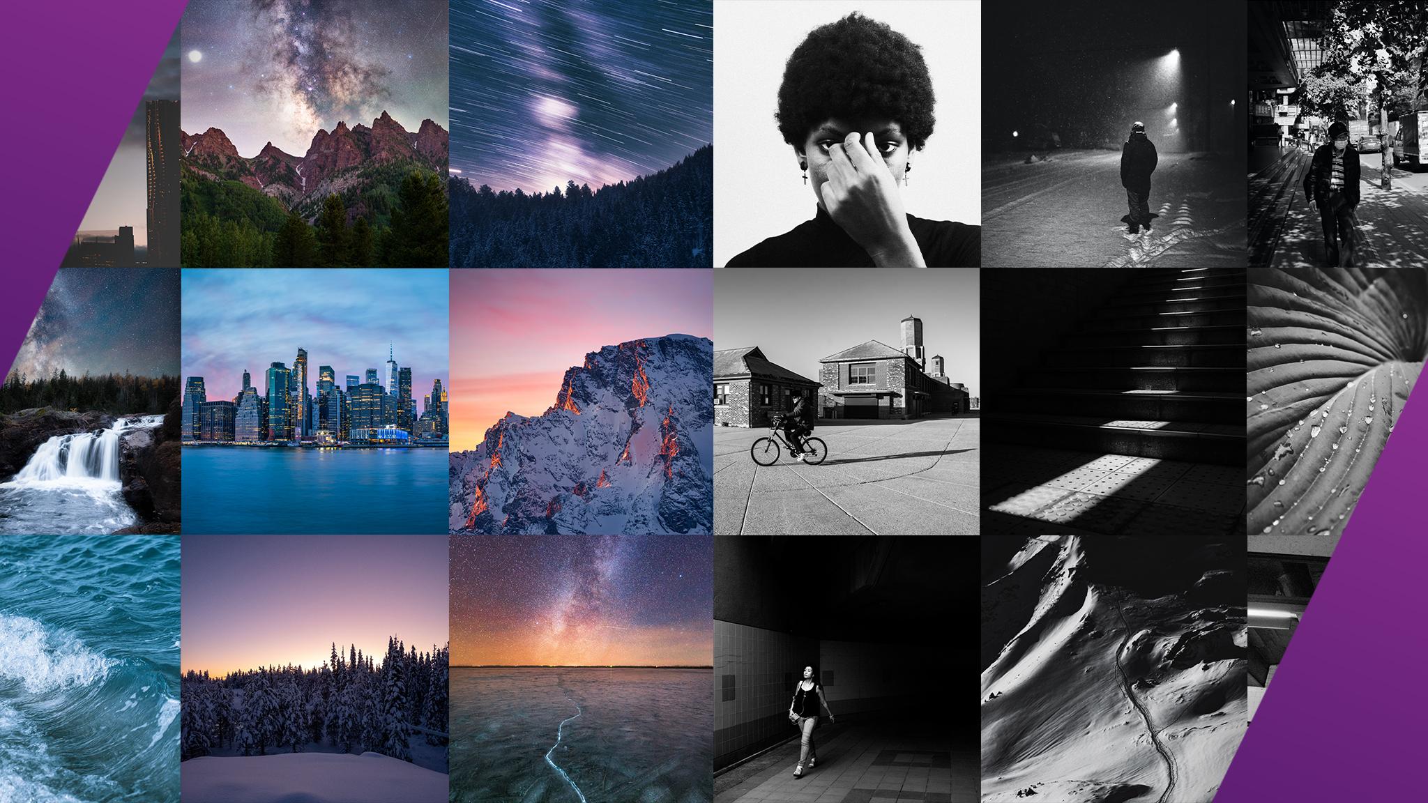
3. Style Analysis: Subject Matter: In this video, I'm helping you figure out what type of photo style you want. And in this lesson we're going to be looking at style by subject matter. So this is what we're taking our photos of. So it's portraits of people, it's portraits of pets. It's food photography, It's street photography or macro photography of tiny figurines or electronics. It could be ocean photography or even more specific, just photos of waves. In this lesson, we're going to be looking at these photographers. So I encourage you to pause this video and find these photographers on Instagram if you want to go through and scroll through their feed. Because at this time and place I'm looking at what photos they've shared online, but by the time you're watching this, I'm sure there they will have posted a lot more. And so I'll be bringing up all these photographers will be looking at them and talking about why in terms of photography style, they have chosen a specific subject matter and that has really given them a unique style. In doing this, I tried to pick group of photographers that have large followings and then some don't have such large followings. So hopefully inspires you and help you know that you don't need a massive following to be successful or to have a unique style. And also, that also means that having a great unique style doesn't mean you're automatically going to blow up on Instagram. I know we're focused on Instagram in this class is looking at photographers, but photography is more than Instagram. I want you to feel like you're proud of what you're shooting and when you look at the photos that you've taken in the past, you feel that you have your own style. So let's get to it though. So I'm going to be going through them in likely the order that they were on that list. Maybe back. Jumping around a little bit by here is rinses. And so for all photographers on here, if I mispronounce your name, I apologize. But automatically you can see in terms of subject matter, portraits, portraits is what this photographer does. And they're sort of on the street style portraits. As you scroll through though, you start to see that there are some other sort of a street style photos, architectural photos. But in, in, in most of the photos there's a person and it has a very similar style. We're going to get into the specifics of other ways that this photographer has a style later on. But you can tell there's no glossing over the fact that. Most of them are in black and white. And again, it's street style photography, street style portraits. And that's what sets this photographer apart. Frederick Thunberg. Here's another one. This is like some jumping does something completely different. Architecture, simplistic architectural photos. So again, it's hard for me not, not jump into the compositional style and elements, the colors, the things that make him a specific or have a unique style by here for his photos are buildings. Very simplistic approach. There is creative editing to it as well. So it's not just a natural photo, it looks like lots of them are composites of multiple images. But just in terms of subject matter, buildings and architecture. Jordan doth, here's another portrait photographer. So going back to subject matter of portraits, here's a completely different style and a different approach. So here it looks like he's more of a wedding photographer or for couples photography, for maternity photographer. And so lots of photos of couples and a completely different style. So very much more staged in the sense that it's not just finding random people on the street to take photos of. By he is posing these couples, He's choosing the location. You can also see the lighting style, the colors, lots of warm tones. This is what makes him have his own unique style. Samy Garcia. So this is our wave example. A mentioned this before. Sammy takes photos of waves. So he has a very unique perspective through his photography. It's one that a lot of other photographers don't get to see or capture. And so this is an example of, you know, I'm not here. Look, I hope you're not looking at these photos thing. Well, I need an underwater photo camera case to be a good photographer, to have a style. But obviously with this with Sammy, he does need that specific tool to be able to capture these images. And you can see mostly of just simple waves. There was one, looks like families healthy maybe sprinkled in there. But if you're following this page and you're into waves, your expectations are matched. Every time Sammy post a new photo. He's grown to 58 thousand followers right now. Marad Osman, I chose him for very interesting. Approach that he takes. So in terms of subject matter, most of this is I'm not sure if it's his partner, his wife, but this lady and he has this similar style is similar composition technique as well. But the subject matter is her traveling, so her in these different locations. A lot of it is highly edited. Some of it's composited. You can tell a lot of it is that unique composited image. But just another example of a different type of subject. 3.8 million followers. Incredible. Bed. Lu bass. Here's a food photographer with a very unique style. So her photos, and we're going to look at another food photographer in just a second. But here you can see that her photos have similar colors and tones to them the way that she lays them out or are all similar. But in terms of subject matter, its food, and it's mostly deserts and it's mostly making me hungry. And you can tell though just the layout. So a lot of top flat, flat lay kind of style photography, lots of repetition in her photos. So it's not just like one item, but she creates these textures with all of her items layered on top of each other. Oh my gosh, there's cheese plate. I think that's what I'm going to have for lunch. But let's look at hers and then compare her to the next photographer. We have bail Lu bass compared to yoga of cooking. So here you have similar in terms of it's the same subject. And she's doing deserts, but her style is different, the colors, she uses it Different. She focuses more on one single item in a lot of her photos, even though there's some where it's it's a lot of items. It's the way that she takes the photo is different. So see this one for example. While there's lots of little cookies here, there's one or two that are in-focus. And that's different than like this one is more like batches photo that she had taken where it's top-down photo of everything and it creates this unique texture. But Yoga of cooking, again, see these are more like one stack of pancakes. Now that's cool. Or one full cake. So very interesting, almost kind of similar in some ways, but you can still tell that there's some differences. And I would like you to answer, what are the differences that you see? For me, it's not only the way she takes the photos, but the colors are just slightly different as well. Here's Bryan shoot Mott. He has a unique approach to photography. He does just sort of this day in the life type of photography, black and white. And this is a good example of where it's not just a subject matter is not just one specific thing you're taking a photo of. It's not just portraits, it's not just food. Here. He has photos of people, of wildlife, of architecture, of landscapes, but it's all within this. One genre was just like kind of street style photography, documentary style photography is probably a better way to put it. And then on top of that, black and white, the way he edits his black and white photo is not completely contrasty and little bit of a flat, flat or look. And so this is a great example of how subject matter is not just one type of thing. The next three are all sort of landscape photographers. And this is again focused on landscape. This is their subject, but they have a unique perspective. They have a unique style of composing their images and the colors they use and capture. So in this first one, you can see that lots of wintry landscapes and that's what this photographer has access to. Using super wide angle lenses. You can see though when it's not snowy, these are the landscapes you're getting. Lots of mountainous regions. So this is what is available to them to photograph. Beautiful photos. But still even across the winter to non winter photos, you can see a similar use of colors and things as well that go beyond just the subject matter. Here is beca, Detroit based photographer. Also landscape, also mountains, but very different in her style. Colors are different, compositions are different. I would say that it's a little bit more of a simple, not simple but minimalist approach to her, her photography and her photos. And you can even see, and this is something that's cool with these photos, is that in with Instagram, as you can see the progression. So there's nothing wrong with all of these photos down here. But as you scroll up, you can start to see that even becca is starting to figure out her own style over time. So let's go through here. I think just in her last like nine or so pose, you can really start to see a certain style in terms of the way She's composing the images and the colors. They alleys. These ones look a little bit more similar to me than the ones down below. And then lastly, let's get to Nick crazier, another landscape photographer, more mountains as well. And so this is this is hard. This is when you're sitting there, you're saying, saying to yourself, Well, I want to be a landscape photographer, but I don't have access to those amazing mountains. And so maybe that means you do landscapes of something else or you do have to travel to get these photos if that's what you really, really want to do. But of course it's easier to, to be a landscape photographer like this when you have access to these beautiful landscapes. What I love about Nick, his subject is this mountain. Right here. This mountain he, Mount Terror Inaki, I'm assuming, is in New Zealand where he's based. That is the subject matter for a lot of his photos. And you can just see it show up time and time again in his photos. He is almost obsessed in a good way as a photographer. I just pop this up, waking up at 345 am to get this shot. And that's what it takes to be a great photographer. And you can see that through his photography. And similarly, you can see different changes in style of editing, in just the colors and things that do add up to a unique photography style. It's also a good example of you don't have to stick to one thing. Maybe in one moment you feel like editing your photos the specific way with a specific tones are colors. But for this photographer, for Nick, having a similar subject matter, still, it creates a sort of style rather than just if he was going to just pop in some black and white street photography portraits, it would be completely different. And I don't mean to say that that's wrong and that you can't do that. I guess what I'm saying is that if you're trying to find a style, they're trying to perfect or master a style for yourself and come up with your own unique style. You do have to curate your photos to match that style. And it's just not going to work if you're jumping around in all kinds of different styles. All right, So hopefully this look at these amazing photographers and the subjects that they choose helps you understand that subject matter plays a role in coming up with your style. But it's not the only thing. And everything else we're going to cover in future lessons is really added up to create a unique style.
4. Style Analysis: Composition+: In this video, I'm helping you come up with your own unique photography style. And this one we're specifically looking at style by composition and what that means. I call this composition plus because there are elements of photography that go beyond just how we compose or frame in image that we'll be covering in this lesson. But with composition, we're talking about styles like negative space, using lines and shapes in your images, having balance or symmetry or specific type of balance and symmetry and your images shooting premise specific perspective or angle, always shooting with a specific type of lens. Always shooting with a specific type of depth of field. All of these things are what I'll call composition plus, and it's really how we use our camera and lens to capture a specific style. So in this lesson, we're going to be looking at all of these photographers on Instagram. So again, I think you should pause this lesson right now. Open up these profiles and we'll be scrolling through some of them in this lesson, but you can scroll through more of their photos and see how each of these photographers uses composition as a stylistic element of their photography. Let's start with Jonas photography. And this is a perfect example of someone who deserves more followers and more appreciation for his amazing photos. So you'll instantly notice what gives him a style. So as I scroll through here, before I kind of explain it myself, I think it's kinda obvious. I want you to just think about what makes his photos different. Think the obvious thing is they're black and white. But in terms of composition, what compositional style as he typically using or implementing. Here are three really good examples of negative space. Very minimalistic photography, where you have a single subject, the background, the other elements of the photo are not distracting. I think a lot of these are just natural photos with some editing, I'm sure, but they're not composite. Some of them are composites. But a photo like this here is completely natural photo that you might see out in nature, out on your walk. But he composes it in a way where the subject of the photo is very small. The background is not distracting. So negative space, same here with this one. Even with a dark background, the subject, she is positioned in the bottom of the frame using a lot of negative space. And even when the background, it has a little bit more to it like this one for example, you still see some other elements compared to his other photography. This one, it's still very minimalistic. So I think compositionally negative space is what. Makes Jonas stand out and have a style. Let's look at another photographer who had also does very minimalistic photos, but different, a different type of subject. So same idea. Let's just scroll through a few of these photos. A single tree, a single bench, and other tree with one subject. But in general, very minimalistic, very much a use of negative space. The subject matter is completely different. The editing, the colors are completely different. But for this photographer, I would say both the colors give them a style, but also the composition. A more minimalistic negative space, a lot of centering look where the subject is on a lot of these photos here. The subject or the main focus of the photo here, in the very bottom, bottom center, we're using these leading lines, but still bottom center, the street is the first thing that your eye goes to. Again here, bottom center. Bottom center. Sort of bottom center. You might say, oh well the northern lights there are maybe the main focus, but I would say that a lot of pupils, the, your eye will tend to naturally go down to the bottom because that's what's in focus. And so you can see compositionally, he might not even be making that much of a conscious choice to say, Oh, I'm going to frame everything in that bottom center of the frame. But it's something that he's naturally drawn to. His eye is naturally drawn to leading lines. So another compositional technique that he uses very well, leading lines coming from right in the frame to the lower part of the frame, to the center of the frame for a lot of these photos as well. You in this one, there's sort of leading line of the reflection of the water. All right, Man, this is fun. I hope you're having a good time. Legalities photos. It's just fun to look at beautiful photography. Alex, Alexis, Qufu. Another sort of similar content or subject matter, but also a different vibe, a different style, but very similar compositionally, negative space, leading lines coming up from the bottom of the frame. Very minimalistic. I think overall, if you with all of the photographs, we see not all of them, but many of them. Something that really does make these photographers stand out, at least to me, is the cleanliness, the minimalistic miss of the photos. Now that that's what you have to do, I think it's about making your subjects stand out from the background and composing a shot so that the, the, there aren't as many distractions. So we're going to move forward because this is a little bit similar to the other examples. Let's look at another example, Nathan, Nathan Lee, Alan, 100 and 33000. This is a cool and he uses a lot of framing, framing within the frame. So that means this is. Very on-point example of that. We have the subject and the background within the cave. So that's creating a frame. Here we have these trees framing the Half Dome in Yosemite, I believe that's Half Dome in the background. Also with leading lines. You're combining different techniques to get a good photo. But I think in general framing, so these lines, all of these lines framing the subject and the background. Again, trees framing the tree in the background that wasn't so apparent in the other photos. Lots of centering us hub jags. I think that's a very common style nowadays. Here. Frame within a frame another one's perfect example. And now not all of them match that. And that's okay. He's framing a single subject in the middle of a frame. That's a common element, common theme for his photos. A single road, a single street going off into the distance with a landscape and the bottom third of the photograph. Another common element. Here's another example of framing within a frame. That's a beautiful one. Symmetry. And here's just a general one. But still, again, these, the landscape frames, this, this subject in his photo. Lots of other things going on that gives him style with his colors, the way he edits them, punches up the colors for sure. But compositionally, I would say for him, leading lines in framing within the frame is something that he has, has done really well. All right, let's look at Ashraf Hominidae. So Ashraf 18.77 followers. So here's something not as minimal. Lots of different things going on, lots of leading lines. This is a master of leading lines. So when we're talking about leading lines, where the lines within the frame that are drawing your eye to a different part of the picture. It's something that happens naturally in, It's something that as a photographer you might consciously think about, might not consciously think about. Sometimes I'm out there, I take a photo and I realized later on, wow, look at how the bridge and the parts of the bridge perfectly lead our line to these birds. Not, you know, this is kind of a chance photo, but it's something that as you grow as a photographer, you start to develop this sense. And you say this is, you know, you take a picture this way and it's natural to take those photos where the lines are leading your eye to the subject. Here's another perfect example. All the lines within the frame within the natural environment, within these architectural environments. Here's another one leading line down here. Maybe saying Phil, he really doing that on purpose. And just like I'm saying, not necessarily on purpose, but visually, he likes lines, he likes. The intersections of lines, the combinations of lines in his photos. And that's really what makes his photography stand out compositionally. And then beyond that, the style of colors and edits, very muted, dull colors, lots of blacks, grays, desaturated colors. Another example, leading lines. Great. Alright, so hopefully that makes sense to you. All right, Next one, Nicholas, Jared. Nicholas has a definite style in terms of things like color. The way he he edits his photos, the color palette that he likes to shoot. But he also has a very distinct way of shooting and composing his images. A lot of rule of thirds. Here's a perfect example. Rule of thirds. If you break the image down into thirds with two lines across horizontally and vertically, you put your subject at the intersections of those thirds. And that's where our eyes are often naturally drawn. Here's another one, bottom right corner. And other sort of use of the rule of thirds is placing horizon lines on that bottom third line or that top third line. Again here, bottom third line with these rocks. And then the to the woman and the girl here are on that third intersection. Also very minimalistic. So minimalistic. Here's breaking the rule of thirds with the girls just right in the middle of the frame. But these lines, so lots of lines as well. Lots of lines, not necessarily leading lines, but lines cutting through the image. So here's another good example of that. Lines cutting through the image using light and shadows, playing around with angles as well. So I think for him though the thing that stands out to me compositionally is still actually that minimalistic approach and also the use of the rule of thirds, very clean photos. Here's sightseeing. Stan, spin borders. Sorry again for all my pronunciations, mispronunciation. Landscape photographer and landscape photographer to me it means big, wide open spaces. And that's why he is capturing so compositionally. He's using a wide lens, a wide lens or a telephoto lens, but from a distance to capture big wide scenes, a lot of aerial photography as well. Some frames within the frame 2. These are two great examples of the framing within the frame. This one as well. Very cool shot right here, these trees, the Milky Way, framing our subject. And lots of aerial too. So there's again a lot of other things that go into the style with the color and everything. But compositionally, I would say the wide lens is what he's, he's using. He, he's not, You don't see any sort of tight close macro photos, right? This one's like a pretty tight image, but still notches his style with other elements like color. And the way he edits it. By in general, just wide open spaces and frames within the frame. Next we have Adam senatorial, another nature wildlife photographer. What to me sets him apart from our last photographer is a different style of framing his subjects as well as the color palette that he chooses. But you can see here some tighter images, a lot of textures that he captures. So compositionally, maybe not anything different than what we've seen before, other than it's a little bit tighter. And the way that he frames up his subject is in a way where you're capturing textures of images is not a single subject. We look at these, of course, there's like the clouds and the sun, you could maybe argue, are the subject. In this one here it's more of those abstract composition. This is an aerial photo abstractly captured of the earth. Lots of textures that you capture there, but also with his other photos as well. So subject, there's not really a single subject here. He's framing up his composition to create this sort of texture of trees. A lot of top down aerial photos as well. Here's another one. Yeah, maybe there's like a subject way off into the distance. But compared to our other photographers, we've seen mostly just capturing the textures and the shape of the landscape. Here's another one. Shapes and textures. Shapes and textures. Very cool stuff though. All right, pump go delish, delish, kale or Arabic. Here's another not minimalistic photographer, I would say. So. She's not using a ton of negative space in these photos. So still a single subject perhaps or framing within a frame with this house and in the midst of these trees, here's this single-subject which you could argue the trees kind of create negative space, but a lot more distracting or distracting sounds bad, but a lot more going on in the rest of the space. Then, for example, that first photographer yellowness that we looked at. Even the way she, yeah, so you see lots of trees and these which create the sort of the, the texture of the image. So I think for her, you could argue too, that the Trees itself and the framing with trees is something that she often does. Lots of her photos have these trees framing the borders of our image. Even this one, not trees, but the lights sort of act in the same way as that element. That creates a natural border for her images. Abu eight, AKA heat. Oh, no gotta. Aki is a wonderful photographer using frames within a frame. So here some great examples, all the leading lines, but really creating this frame around our single subject. Here is a very poignant example of that. She's obviously looking for these sort of frames within a frame when she's out photographing. Here's another example. Here's another example as well. Lots of friends within a frame. And then beyond that, you have the black and white element. The contrast that she has with the different tones. Fact that she's a street photographer, of course, all of these go into her style. But compositionally, I would say that frames within a frame and leading lines are the main things that she is focusing on. You in here, you can see frames, this bathtub framing her model. And the other one, these lights framing her model. And these are shot on iPhone. Did you see that this is shot on the iPhone? Lines, lots of lines as well. Cutting through, cutting across. Now one thing I, I always want is when this is a real, That's why as like, why would you have a color image when the rest of your photos are black and white? This is what I mean, we need a curie air photos. Not minimalistic though. Lots of stuff going on in these photos, lots of different elements going on. And we've got Sharon radish, very minimalistic. So compared to the last photographer, super minimalistic, she's taking elements, PR, people, simple chair, fruit. And she's composing them with blank backgrounds, very minimal lighting, natural lighting. And she's not really using the traditional rule of thirds. She's breaking the rule of thirds in a lot of her photos like this, for example, this subject is sort of like right in the middle bottom part of the frame, which breaks that rule of third. And it's a perfect example of why these are just not hard set rules. They're just suggestions or guides to try to help beginners, to try to get a little bit more creative and see what's naturally do, what might naturally look nice. But compositionally, I would say that she's breaking these rules. And it makes us look twice and makes us think twice about these images and try to like make, makes her, our brains work a little bit harder to understand what is actually going on. Obviously subject matter, the way that she's editing, the way that she has the White frame on alleys on Instagram so that she has the full aspect ratio of your photos is also something that gives her a specific style. But compositionally, I would say the minimalistic style is what sets her apart. Demasio, ruthlessly. Big time photographer, 379 thousand followers, lines, lots of leading lines, lots of patterns, repetitions, symmetry that you see going on here. So I'd say that's what's really dominating his photographs. The symmetry, the mirroring of elements that is going on. Here's a perfect example of all these lines and then the mirroring coming out from the center of the frame itself. Here's another one, very well balanced image. Lots of symmetrical stuff going on here, top, bottom left, right. Even if it's not perfect, some symmetry like the other one. Here's another example of just the repetition, the repeating patterns that he is capturing in his photos. Mirroring or a here symmetry. Definitely looking out for those things when he's shooting another example of that. And so of course there's things that break this. There's times that you want to break this. You go out, you're traveling, you're doing something different. You want to use frames within a frame. That's okay. In general, if you're composing your images in a similar way or you're editing them with similar colors, similar vibe, It's going to still look. It's your photo, but then you see like this one for example. And it's like, wow, this is for sure a demos photo. Because of the crazy lines and shapes and mirroring and symmetry that's going on. The colors, the lights that he captures as well. So this was a pretty deep dive analyzing these photos and these photographers, I hope this helps you understand what we mean by composition though. And just like with subjects, it's a combination of all of these different elements that give you, or these photographers their specific style. But as you can see, you can have someone who's using symmetry or two people using symmetry, but the way they edit their photos or the subjects they're capturing makes it them completely different and have their own unique style. So moving on, we're going to look at lighting and color in the next set of photographers. But hopefully by now you have a better sense of the types of photography that you're interested in or that perhaps you're already shooting.
5. Style Analysis: Lighting and Color: In this video, I'm helping you come up with your own unique photography style. Looking at inspiration. In this one, we're going to find style through lighting and color. So what does lighting and color mean in terms of style? Perhaps your photos are dark and moody, or maybe your photos or area and break. Maybe you tend to photograph cooler colors or maybe you're always photographing with warmer colors are at golden hour. Or maybe you take out the colors completely in your shooting in black and white. Now there's some things with lighting and color that you can change in editing and come up with a style through editing. But in this lesson, we're really focused on what you're actually capturing with your camera to the photographers we're going to be looking at are here on the screen. So I encourage you to pause right now and open up a bunch of tabs on Instagram and search for these happened, these handles. And we'll be looking at how they use lighting and color to really hone their own unique photo style. Alright, this is going to be real fun looking at these photographer is it should be a little bit quicker than the last lesson. Because I think color comes across and is much more apparent than necessarily compositional style. So our first photographer is Tom beware, my Fuji. If you didn't or couldn't tell, I am a Fuji fan, I shoot Fuji, So I follow a lot of Fuji photographers Tom as a great way of capturing silhouettes with backlit scenes, whether that's naturally lit with sunsets and sunrises, but also with the lights from shops or whatever. It is. Very contrasty buried, sort of dark, moody images and has, uses certain tints that can come through editing or in camera profiles. But I would say that his color and lighting style is silhouettes. And then also sort of these pops of color and funky color that you see in a lot of his latest work. All right, Our next, Jonas raw SQL is another Fuji photographer. So in terms of lighting, he also has a lot of contrast and a lot of interesting combinations of of light and color. So here he went through a long Basie actually deleted a lot of these photos, but he was doing a lot of photos like this where it was very contrast to you with very, a lot of pops of color and light here and there. But even without those ones that are so apparent, you can still see sort of the style of color he's looking for pops of color like this. Or this that stand out from the background, contrasting colors like the yellows against the blues right there. Here's another example of that. Oranges and the blues looking for those contrasted colors with the, with the, with the blacks, black and white. So you can still see that it's his style of the contrast and the silhouette Ting of a lot of his images. Right here. Again, with these ones, he's looking for light, he's looking for colors that pop out like this one right there. Another good example of using light to really showcase your subject in an interesting way. That's a silhouette like this one or here. So I'd say that Jonas is a master at finding light, elements of light that really become a part of his photography and his story. Here's another completely different style, Molina. You can see right off the bat. What's going on. These, She's finding these compositions where compositionally it's very minimalistic, very negative, lots of negative space. Bad the same time, you've got these big bold colors and nice soft color palette. So sort of these pastel type palettes, I believe a lot of these, if not most of them are all just natural natural photos. They're not like composites where she's just adding a fake background. Maybe she's playing with the tin things in back, in editing and post-production. But you can definitely see that color plays a big role in her photographs. And you think about some of the photos, photographers from the last lesson where it's these big landscapes. And this is something where this is simply a pipe strapped against a wall. And she is good enough at Harvard to understand that within the set of her photos, this is something that's going to be interesting. If one of those other photographers whose taking the landscape, Mount Everest with the Milky Way galaxy in the background type photos post something like this. It's going to throw their followers off. But her, when she's posting images just like this, where it's just these like super basic textures, walls and things very flat. So compositionally she's looking flat at, at her subjects. There's not a lot of angled things in her photos. So yeah, definitely a good use of color here. Boris. Photo gallery. Here's a great use of the natural pops of color, very vibrant colors in the images. So taking the elements that within your photo, whether it's the green fields or the blue skies and really making them pop. Boosting that saturation, boosting those colors. So it's not just cool blues, not just warm greens and reds. It's just that style. And maybe it's the style of editing combined with the colors of the actual photos. But definitely you can tell like the colors and he likes to capture. John Robbins Show, Here's a completely different type of colors capture in different way that lighting is captured. So he's doing a lot of long exposures, night photos, looking at the stars, looking at waterfalls with a long exposure. And he really is using natural light to just create these beautiful images. That's an interesting one. That's like, no, this is not what I would say his style is. I'd say this is a great example of what his style is. Natural, natural light captured in a long exposure using warm colors, dark, dark, dark photos kinda darker, not necessarily moody, but darker images. It's not bright and airy. I would say it's a little bit warm and darker. You can just look at this F6 and you can just see that the colors are all very similar. Lots of magenta, lots of blue, sort of purple. John, John needs more followers. 474, go follow John. Honda's Becker. This is like a completely different, a completely opposite sort of color palette that he's using. Very desaturated, lots of just graze, desaturated blues, desaturated greens and browns. It's not just in the way that he's capturing them, but also in the way that he's editing them as well. He's not There's while there's of course some photos where you can tell it's shot at sunset or golden hour, that light is not necessarily lead the, the main player in the photo. You can tell that a lot of it is very flat, flatly LET so maybe it's because it's a cloudy sky because that's where he lives and that's what the lighting is like. Often, cloudy skies is disperse all the light. But I think in terms of color, It's very, very, this is, I would say moodier, right? Not bright and airy. Lots of Greys, Blues. What's hop over to something a little bit more saturated, a little bit more bright, a little bit more airy. Look at this fun color palette that John Paul Douglas is capturing. So similar to the lady who was our second photographer. In terms of sort of the color palette, the bright colors, subject matter though is different. Lots of blues, lots of yellows. And this is just stuff that you can tell is just found around his home. So a perfect example of, again, where a single photo might not make sense. A single photo like this might not feel that special, but emits all of his photos with all the colors that he uses. Here's another one, just this cone in the back of the truck. Most people would walk by them, not think twice to photograph it. But in all of his photos here, it makes sense. And you can definitely tell the color palette is something he uses a cross. All of his images, finding green in the background with the green on the truck. Read on the truck red and the reflection. Blue, blue, yellow, yellow. You see what he's doing there. Green, green. Finding, oftentimes finding one color to photograph or one with something that, that contrasts with it. Yellow and green, blues and greens. Cool, Very cool. I late in R, so I'm going back and forth between light, bright and saturated and not so bright and saturated. So here is a sort of darker, moodier photographer. You can see the color palette is browns, grays. I would say warmish, but it's not like a happy, bright warm. It's more of a moodier, darker, warm color palette. Maybe little cool. I guess. We'll have a debate is as cool or is this dark? It's definitely d, saturated. All right, Next we have Eva Macedon. So contrast this with the John robe, a show for photos where he had sort of the long exposures and compare it to her where her colors, some of the images that she's capturing are somewhat similar in terms of the night sky, long exposures, but the palate is completely different. Brights, pinks, pastels, light colors, a little bit overexposed and some of these images or at least brighter, then the others. And even if it's a dark photo, it's not necessarily a dark moody color palette. Lots of natural light using the sunlight, using obviously the northern lights here, which is like a light source. Bray, soft color palette. It's very beautiful. Lot of backlit subjects. So let's just go through the six photos. You can see backlit subject, backlit subject the mountains, backlit trees. Backlit, dear. This is backlit too. Backlit. 10 backlit flowers, so lots of backlit stuff. Compare that to the last photographer where everything was lit forward from the top. All right, pinks. You want pinks? Romney, eight, pinks, highlights, purples, bright yellow, green. That is this color palette. A lot has to do with the subject matter. Cherry blossoms, trees, flowers. But still you can tell bright colors across all of his photos. Very cool. And then here we're seeing Sharon radish again. So Sharon, he's on composition. I wanted to bring her photos back because she has a very unique sort of color palette. Sti saturated. The tint is a little bit off though. Things aren't completely natural, you can tell that whites aren't perfectly white. She adds sort of like a green tint to some of her photos. Green bluish tone. You can tell that here, the background, if this was perfectly white balance, the background should be white unless it's like a green tinted wall. But I don't I doubt that. But she likes the green tint. You can tell because some of the elements in her photos have that sort of darker turquoise aspect to it. Lots of desaturation, lots of simplistic colors, flat lighting though she does these product photos that are much, very much naturally lit, not highly stylized with the lighting. So lots of cool stuff you see here. Just jumped, jumping back to the beware, my Fuji profile, you can see the range of uses of color and lighting in your images. It just another thing to start to think about as you hear it, your photos, as you become aware of what you like, what you don't like. Wendy, like FODI photographing, are there certain colors that you're drawn to? Do you like bright, airy browns and reds do like darker blues and grays. It's up to you at the end of the day. And as always, there's a combination of all of these elements that give you your own unique style.
6. Style Analysis: Photo Editing: In this video, I'm helping you come up with your own unique photography style. We're looking at some inspiration for how you can come up with a style through editing. So everything that we've talked about so far in this class is more with what you're taking the photo of and how you're capturing that photo. A lot can be done post in post-production to come up with a style. I don't think it's everything and I I think it's hard to I can't just take random photos and edit them in a similar way and say I have a specific style. I think it goes beyond that, but it can get you quite a ways towards having your own unique style. So with editing, it could be the way that you edit your colors at a certain tint to your highlights or your darks or things like that that gives your photos all a similar look with contrast and tones. It's how contrast to your images are. Do you have a lot of contrast? You have dark, darks and bright brights. Or do you tend to edit your photos with more of a flatter, brighter look? Is there a specific aspect ratio you're always editing in? Are you always doing super wide panoramas? Are you always doing squares are vertical. This can help give you a style to, and then lastly, we don't cover this too in depth, but there's the whole more creative style of editing. Composite images combine images and doing more effects and stylized edits that can give you a specific style. And we're going to be looking at some fun examples of that too. So in this lesson, these are the photographers we're going to be checking out on Instagram. So as always, encourage you to pause this video now, open up a bunch of Instagram tabs search for these photographers so that you can scroll through their feed and see for yourself what their portfolio looks like. And while these photographers have a unique editing style that we'll be looking at, we'll also be analyzing the other aspects of their photography and why it gives them a unique style as well. Looking at the subject matter, looking at their compositions and how that gives them a style and of course, lighting and color to all of it combined to give them a unique style. So the first photographer we're going to look at is Brian month, year. He has a definite style of editing and across the photographers we look at in this lesson, you'll see a lot of things that might pertain to the past lessons like colors or the compositions used, or the subject matter that gives them a style. But we'll be focusing on the editing itself. So Brian, his color palette is this turquoise and blue sort of combo. That is a split tone sort of effect, where the highlights get sorted. Generally this, this warm magenta ish and then the darks get a little bit cooler. So you can see just across all of his photos that it has the similar color palette in this comes through editing. You can tell that this is not how things look. Naturally if you were standing here, Let's look at some of them are a little bit harder to tell. But if you're looking at a standing here at this lighthouse, you know, this is not what it looks like to the naked, natural human eye. Same here, the sky generally I would doubt it looks exactly like this, but he's using some filters or a preset that he's built out to give it that Brian linear, magenta and bluish purple, red, orange feel. Does that make sense? Did I just list all the colors that rainbow? So a good example. He, you know what, HM, that I see. Look at the Instagram colors. That is what he's doing. It's the Instagram colors. Is totally is he not using the Instagram colors in his photos? I swear a I'm having an epiphany right now as I record this class, he is using the Instagram colors. I've gotta find out a way to talk to this guy Brian, see if that's what he's going for. All right. Let's run through some more just so you can see. Okay, Nolan Nolan know Maria has a great specific thing that he's doing. I'm just going to scroll for a few seconds and see what was you let me know what you're looking at. Well, on the left you see the sort of a similar color palettes. And Brian, you have the magenta is the purples, the oranges. And then on the right you have to sort of blue cams. And depending on the day, you might see this magenta column in the center, which really looks cool. Because you can, you can tell his, his feed just has a great balance to it. But editing wise, he is editing his photos to have these colors. Now, a lot of this comes natural as well, but I would bet money that not all of these photos have these colors in it. There's probably some of these photos like this. It might look they might have like a blue tint or a blue background. But and I'm not saying that one specifically, but I think he is using some filters to make it look that way. And now you can see further back, he wasn't following that sort of structure, but just an interesting way of using editing to make his photos have that specific color palette and then posting them on a specific day to have that sort of pattern across his Instagram feed. Very cool makes me want to go to the beach. I neuron Patel. Much different color palette. But editing wise, you can see very contrasty, very dark, very moody. You can see a lot in the lighting too as well, like what, what they're going for with using light itself. But in terms of editing, very dark, moody edit, lots of Brown's desaturating to try to get that feel. So a lot different than the other the other profile we just saw. Take breaks in my queue. Lee, if he has a similar style of editing as I would say Brian money year in and subject matter, but the color palette he uses is different. So it's oranges and blues compared to that sort of magenta, purple. And I guess like, I don't know, the pink and the orangeish that Brian used. So here it's much more of the oranges and the blues that is his color palette, but he's very much saturating those over saturating those to compare it to what is naturally in the image and not that, that's necessarily a bad thing. These are, these are nice images, but you can tell that it's oversaturated compared to what this would look like naturally. So that's his editing style, bringing out those oranges, bringing out those blues. Thirsty. Let's hop to something completely different. Editing his photos to look dark, dull, blue. This is definitely your cool moody photography. Adding a blue tint to his photos. Decreasing the highlights, bringing it down, bringing down the exposure. Super moody photos. And I mean, compared to some of the other photographers we've seen in this class so far is just so different. It's a completely different style but for him and it works. All right, Julio, Julio Robert. So he has a style of editing that's very different than the photographer to photographers ago, which was very high contrast, sat over saturating the oranges and the blues. Julia on the opposite side, HE D saturates as images a little bit. They're not as contrast to, you can tell that the, the blacks are lifted there, brighten up. So it's a little bit flatter of an image. The greens are desaturated. Maybe the tint is changed a little bit as well to give it that. It's very much like a deep, deep dark green, a little bit of a turquoise easy in there as well. And so you can tell that the editing of the photos has helped create his style. The color, the contrast, the tone. Exposures really emphasize with the editing. Let's jump back to another style packed hog or a fee pack, dagger page hash pack here, That's good. So much more higher contrast, higher saturation of the different colors. Not blue movie but pops of color, pops of blue, high saturation that you get here in these photos. And then Ellie purchase takes it to a completely creative level. Just completely playing around with the hues and the tense of the photographs. Obviously not natural, not trying to be natural and just being completely psychedelic, creative with her colors, with her editing. Obviously, you can tell her style though, right from her feed, just like this. Let's look at a couple of photographers that do portraits, family portraits. You can see Ben gamma ringer, Bingham. Bingham. So he has a very, I would say natural color palette. I'd say that a lot of the other photographers that I just showed you, they are editing their colors to look a specific style, a specific way that's not actually natural. Here the colors are very natural. Very natural. I think editing wise though what stands out is the contrast. Very contrasty images, dark, darks, light lights. Color palette is sort of these browns, warm colors, warm tones. And that comes across maybe in the editing and maybe also in the colors people are wearing, the locations they're shooting by. In terms of the editing, I was saying the contrast is what gives him a style. You can tell that the contrast is pretty much the same across the board for all of his photos. Ali and Andre, these are actually friends of mine. They shot some photos of my family recently. And so you can see another photographer that uses mostly natural colors in their images. I'd say a little bit warmer, a little bit more of those like warm brown tones. Not as contrasty, but still darker. So it's not like these bright, super bright overexposed images. Sort of not underexposed, but just like on the lower end of the spectrum. Lots of browns, warm colors, warm tones. Here's my friend, here's my best friend Krishna or net shout out to Christian. Christian grace, love you guys. So you can tell these two photographers, they just have their unique style and it comes across in editing. I think if Allie and Andrea edited the other photographers photos with their presets or with their style, however they do it, I'm sure they're using presets to make it fast. The photos might look like this, might look closer to how there's there's look. Because the way that they shot them was actually pretty similar. And then here Let's look at one last photographer. Let's talk about creative editing. So this is something that's completely different than what we've seen before. She's using photoshop composites, giving her a specific style. So this is something that you might not be interested in, but I just wanted to show it to you as a method for someone to give their photos a specific style. Magical. You can also tell the color palette. She uses. These rich dark blues, dark colors, very D SAT, not desaturated but underexposed sort of scenes. But these beautiful composites, these Yeah, very cool stuff that she's doing. And as you see more of her images, you could probably start to see you well, that's an ANA mic naughty photo. The way that she edits it, the way she composes it, the color she's using, the way she lights it. Very cool. So that is photo editing and how it can help you come up with a different style. I don't want you to mistake this for being able to just slap on Presets and making all of your photos have the same color palette, the same type of exposure, making your darks blue and your highlights read, more read or warm. That can help, but I hope that you work towards it yourself. Maybe create your own presets and not just try to steal someone else's look and call it your own because it's just not going to work that way. And at the end of the day, I think you'll get tired of that more than if you come up with your own style. Awesome, Have a great day and we'll see you in another lesson.
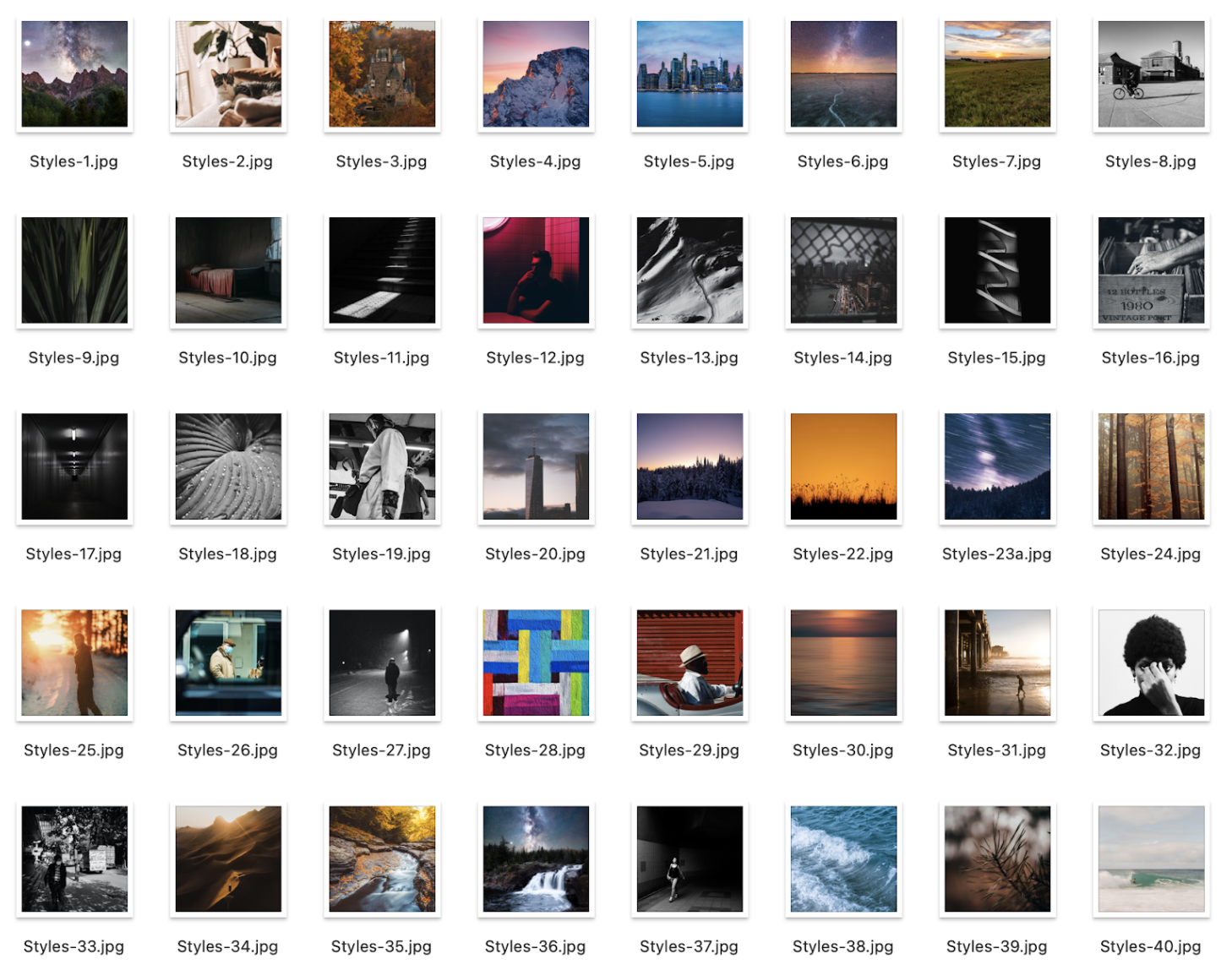
7. Activity: Introduction: Welcome to our style activity. We're going to practice creating a photography style now that we have a better understanding about what a style is, what makes a unique style, we're going to practice it. So in the downloadable resources of the course, there is a folder that you have to unzip and it has a bunch of images. These are all images that I have taken from unsplash.com, a great resource for free photography. I've downloaded and assortment that you can here see here on the page. And what we're going to do is actually organize them into different styles. So go ahead and download that project file, unzip the file, open it up, and I'll meet you in the next lesson where I'll walk through doing it myself with you.
8. Activity: Practice: All right, So here we are in the practice lesson. I'm on a Mac, so this is going to look different if you're on a PC, Linux computer. I've opened up my Finder and open up this folder with the practice photos. And if you're on a Mac, you should be able to view the photos like this and a gallery mode. And if you're on a PC, I think there's an option to view it like this as well. You can increase or decrease the size of the images if you want to look at them closely. But I actually find that looking at them in sort of a smaller icon view will help us see and move the images around. So the point of this activity is to create separate buckets with nine photos each. And so we're basically these are random photographers, but there's 42 photos. And so what I want you to do is create four separate buckets with nine photos and there's gonna be some leftover because they might or might not fit depending on what you think. But there should be some similarities in terms of colors, contrast, lighting, subject, all of those things to create four separate styles. So what I mean by that is let's just start moving them around. And the first thing that sticks out in my mind are these black and white street photography style photos. So we have that one, this one, and this one see how the contrast, the elements are kind of similar, this one. So just based off of the iconography or not icon on your view, but the thumbnail view of this, these images, I'm just going to start moving these around, something like this. And initially just take as many as I think, go with this style. I might have to cut them down on my app to move around because now I have 6, 7, 8, 9, 10, 11. So I have more than enough for a black and white sort of street photography style. Now let's see what is another sort of style that you see. The next one that I see is maybe sort of this purple landscape. So these landscapes with these purple colors, that might be a good style. So what I'm gonna do is just move all these down just a little bit and then just move these up. Now I hope there if you use Photoshop or if you use another sort of photo editing application, you might be able to move them around. Otherwise, you can just create different folders on your computer and put them in different buckets. All right, so I think you get the point and I don't want to just do all the work for you. But as you can see now we have seven photos. We're going to have to find a couple more that might go in this bucket that go with this sort of style that we're coming up with. So what I want you to do is actually create the different, the four different styles and then take a screenshot of the photos. And I'll show you in the next video where I show you my bucket's how I did it and share it with us in the class. And I want to see how similarly we're rethinking. Did you think of some completely different style based off of something else, whether that's compositional technique and editing technique or whatever. I think I gave you guys a headstart with these two easy ones with this sort of landscape. And then the black and white. But I want you to get creative, try to get creative. So I'll see you in the next lesson, where hopefully by then you've already created your four buckets and taken screenshots of it to upload to the class and share with me. And yeah, we'll see you in the next lesson.
9. Activity: Recap: I'm going to go through the different buckets that I created are for photographers with these photos. So the first one is one that you saw landscape, moody colors. So here I figured these images all went together. This one here sort of stands out with the orange or the warmer colors compared to the other ones. But I felt like overall, it all kinda felt like it went together. Even these a couple of these other images do have some oranges in them. So overall, I think this looks pretty good as a bucket. The next one was this black and white street photographer image. So here you can see some of the pictures that I pulled early on. This was sort of a simpler style to see. I even laid it out kinda neat with the center column being the architectural sort of street photography views of buildings and lights and shadows. And the other ones are portraits of people. So I thought that was pretty easy. The next ones were a little bit difficult. So the next one is warm colors and contrasts. So I found a number of images that I felt had this warm colors. Brighter feeling wasn't as dark and moody and a lot of good contrast too. So lots of sort of dark blacks and browns contrasted with the highlights, the yellows, the whites. And I thought these went together pretty well. And then the last one, this was the toughest one, was this muted textures bucket. I found a lot of these photos went together because it created a nice texture. It was more abstract than some of the other photos. The two that I think were the hardest to fit into this bucket. We're this one right here, this gag driving in the car and then the surfer down here. Because I don't think initially you would think that this would go as a texture. But then I looked at the picture of the car. I realized that background that read whatever that is, a garage door or part of a wall. It is a nice texture. And then same with the ocean wave. It kind of creates this nice atmosphere texture with the foam and the white water over the wave going on. So I think these altogether did pretty good together. It's not perfect, but I think it did pretty, pretty well. I hope you had fun with this activity and make sure that you post your screenshots to the course and so that we can see them, so that other students can see them and check out what kind of buckets that you come up with. Did we all come up with the same Was there something about your background as a photographer that drew you to specific photos to create a specific bucket. I'm excited to check them out. Thanks a lot and we'll see you in the next lesson.
10. Create Your Style Step 1: Choose a Style: Welcome to this new section of the course. So far we've learned about what makes up a photography style. Now it's time to put it into practice. So what we're going to do is go through specific steps to help you understand your style, chooses style, curate your photos, and then practice making your style even better with editing. And we're going to be using me as a getting pig. So step number one is to choose a style that you want. So the first thing I think you should do is look through your own portfolio, whether this is your Instagram account or your photos on your computer, start going through them. See what is common. Do you have a specific subject matter that you'd like to capture? Is there a way that you like to capture it with lighting color, or is there a way that you'd like to edit your photos? Start to analyze and understand based off of what we've learned so far. What are the things that come up, come together to make your style? And you might be sitting there thinking, Well, I just have no clue. I I just take pictures of random things. I just edit them however I feel on that moment. But I think by now if you look through your photos again with the knowledge we have from this class, you'll start to see things that have more similarities than before. The next step is to look at what photographers you gravitate to. Are you on Instagram? Are you following other photographers are the things that you're drawn to. For example, some of these example photographers that we shared in the class, the darker, moodier ones, the food photographers. These are types of photography that me, I'm personally not that into, so I don't follow that type of photography on Instagram and it's not really the style of photography that I would like to do. Others. The big landscapes, beautiful places, travel, photography. Well, I really like that type of photography. I understand that's going to be hard for me right now because where I live, where I am at my in my life journey, it's just not the kind of photography I'm going to be able to do. But there are some photographers that do more street style urban suburban photography that I am drawn to. And we'll look at that in just a second at my Instagram. And then it's time to actually make that conscious style choice or a combination of things. And it's not written in stone. You don't have to stick to this. But I think as a photographer trying to improve your craft, it's important to understand it, make that decision and move forward, practice that style. So let's head over to my Instagram to analyze what my style is and see what photographers I'm drawn to so that we can together see where I'm going to continue my journey as a photographer. And I'm actually relatively new to try and to really curate my own style, just like you, I'm kind of on this journey with you. So let's go through some of my recent posts from the past several months and see if you can help me determine what is my style. So I'm just going to scroll through a couple of my recent posts and okay, let's stop. These are all pretty good places to stop, but let's let's stop here for a second. So what is it about these photos that you think goes together or is common between them? I think the first thing that I am drawn to as a photographer are little details. So not necessarily wide-open landscapes because that's not what I have access to, but little, little details of things, of flowers, of textures and somewhat minimalistic for photo photography with negative space. I don't like very busy images. And I really, really like capturing interesting light and shadow. You can see in this one right here, this is a light bulb. And you can tell I'm making a conscious decision. What is the front image if I'm posting a carousel, multiple images, and which one's going to show up first? So this one here, the sand dunes, even this one right here with these shadows, the shadows on this wall. I'm really trying to capture the light and the shadow, the natural sort of silhouettes, even with these palm trees. Here, I found this really interesting, the shadow with the architecture. But these are tight detail images. And I think for me that's what I like taking photos out. This is another one. I love the colors, the soft textures that you get in a photo like this. And so for me, if I were personally to pinpoint what my style is for most of my photography, I would say detail, minimalistic photos with pops of color. So I'm not folk, I don't have one color vibe that I'm going with. I don't have an editing style that has a specific tint to my colors, but I think I do boost colors, boost the saturation a little bit. Here's one, here's like a different example. This is a detailed macro shot. I love my 80 millimeter macro lens. Here's another great set of photos. You see that I combine a lot of personal family photos with this, but still I like the sort of macro detail shots, sort of abstract, lots of textures, very shallow depth of field. That's another thing I would say that I like really helping people focus on one part of an image. But even as I go through these images, I see that some of those images aren't following that style. And I think that's okay. That's okay. You don't have to feel like you have to be perfect and have this one style across your entire portfolio or your Instagram page or whatever it is. But it's good to be aware of that. And I think moving forward as a post, more photos as I tried to find my own style app to be consciously aware of the type of photo that I am posting. All right, so now we're going to do something fun now that we've kind of understood what my style is, we're going to choose what photo to post next. So on my Instagram account, I've got it up on my phone right now. I have a couple saved post or drafts that I've been working on. So here you see them. And if you were me, which one of these photos goes along best with the photos that you see on the screen. There's a couple that I think are a little bit style different. Like for example, this photo right here of this aerial shot. This was for a photography challenge for our community. I don't think it goes well with the style that I'm going for. So let's see, again, let's go back to drafts. I think the one that stands out to me most is either this black and white leaf or this succulent right here. I think that the natural light looks really good. I haven't posted a picture of a flower in a while. I've posted some trees and stuff like that, but I think this one's pretty good. Let's just go back one sec. I'm saving this photo of this be for later because I think that one looks pretty good. And then in terms of the other ones, I think this photo looks pretty good too. And pull the colors go pretty well. But I think for the vibe I'm going for right now, I'm going to post that succulent. So I've already pre-written this out when I'm putting my kids down for a nap or things like that, holding them for a nap. I'm on my phone, I'm drafting some Instagram posts for future use, so I've got to all ready to go. So let's go ahead and share. All right. So here we go. Here we have our photo, it's posted. If we refresh our page on the computer, we should see what that looks like. And now we look at our last nine. And I think in terms of the style, the subject matter, the colors at all as it goes with a lot of my other photos. I already see some photos though that I don't think go as well. And that's the next step to curate your photos. So I'll see you in the next lesson where we're going to actually be going through some of my photos and removing them from my Instagram page.
11. Create Your Style Step 2: Curate Your Photos: Step number two is to curate your photos so now that you have a good sense of what your style is or what style you want to achieve. It's important to curate your photos. This means going through past photos, whether that's on your portfolio or Instagram, and taking out ones that don't go so well with that vibe or that style. And then also moving forward, picking and choosing photos that go along with your style. So we're gonna do both. But first let's go and look at my Instagram feed again. And we're going to see what photos don't go as well and actually remove them live right now in this class. All right, so back on at Phil Webinar, and let's look at these last nine photos that I've hosted, which is the one that to you doesn't go with the rest as much. I think to me, I'm trying to wrestle between 21 is this photo of this basketball hoop. I think the black and white, the style. It's just not really what my other photos are alike. This is again for a photography challenge for our community. And I'm starting to realize that the photos that I do for our challenges, for our community, it might not go so well within my own photography feed. So I'll either have to post them just as stories or something like that. The other one is this one is a little bit tough because this was I can tell it was shot it's an archive photo was shot with a different camera. I tried to make the colors look a little bit more similar to my other photos with sort of a vintage vibe. But I would say that one of those two has to go. I'm a little bit more attached to this one because it has a nice story. I've been writing a lot of story and using archive photos, so I don't want to get rid of that one. For this set of nine, I'm going to get rid of this, this basketball hoop. And you don't have to completely delete it. If you're on your Instagram page, you can just hold down, press and hold and archive it. So I know you can't really see that, but if you press and hold an image, there's a button that says Archive. So we're going to just archive that. And now let's refresh this page. All right, so I think that automatically actually starts to look a lot better. Let's just scroll down and see again if there's some more photos that don't go. God, it's tough because I think this wildlife photo doesn't go as well with the other styles of photos, but I just love that image, so I'm going to leave that one there. All right, here is where we start to get into a little bit of trouble. So I know some of the photographers that we followed, they have a subject that they photograph a lot. And that's okay. But there's something about on my feed having these two images back to back with this train depot that's in our hometown. That just bugs me as don't like having both of them. The question is, which one do I keep and which one do I remove? My God, this is so hard because this is one of my favorite photos that I've ever taken. But I feel like it just doesn't go Gosh, wouldn't be so bad of me to not. Take one out, even though I think I said, we're going to skip that one. That's a little tough. Okay. This photo for sure has to go. This was an ask me anything post. I typically don't post photos of myself. I think it kinda just doesn't go. This one is a different one. I think even though it's a picture of myself, the colors, the way that I was composes a little bit more interesting. And we're going to keep that one, but this one right here, we're going to remove that. Let's archive that one. We're cutting and cutting things down. Alright, so let's refresh now we're scrolling down. I think getting rid of that one looks, looks pretty good. And we'll scroll on down some of these. Some of these are a little iffy, but I'm going to leave them bread. I think I'm going to remove this bright one because I have this bread one up here, which I think looks a little bit better. And I have a completely separate Instagram account for bread. So we're gonna go ahead and archive this bread photo. Let me know in whether it's on Instagram or in the community or wherever on the course page. If there's photos you think I should remove from my feet. I'm sure that by the time you're watching this, there's going to be more photos. This is top two because this is a photo of my son Felix. And I obviously love this photo so much. And I'm just not going to get rid of it, but it just doesn't really go with this style photography that I'm going for with my other photos. And I think as we go four more down, I see more of those photos. More and more. But yeah. Okay. Like this for sure has to go. This is when I hit 2 million students in my courses. But just the style with a text that is not part of my style photography. So I'm going to archive that one. All right, so hopefully you're getting the point of how you can go through your past Instagram feed or your portfolio and really choose what photos you want to represent you. Well now let's go on my computer and see what photos my I have that I want to post next. All right. So I've actually put together a folder of a lot of my old photos. I went through my entire archive and I put together this group of photos that are favorite photos from my past and each week and posting one or two of these, really telling a story about what was happening. A lot of them are from past travels and things like that. Some of them though I can tell, just don't go with my style that I'm going for. So I might either not post those or I'll choose another photo as the cover image so that when you're going through my feed, you see that 1 first and then you can see the others through the, the carousel. So I think scrolling down all the way to the bottom, I see a couple that I already love. I think something like this, this, these sort of nature shots would really go well in my feed. This one right here too. So it's a landscape but with lighting, the contrast I think goes pretty well. Something like this one's a little bit tough because this is shot in Joshua Tree. I really like this photo, but I don't know if it really goes well with my feed, so I might not do that one. These ones for sure I'm going to mark as green. Green means go. Green means ready to post. Some of them you can see are marked red. I've already posted those ones or scheduled those out to post. Here's one. This is like a perfect example of a photo that I really like. What is this photo even it's through, it looks like some sort of stained glass window. Lots of texture, minimalistic. There's a group of three guys swimming. This is actually in Lake Geneva or locked lemon in Switzerland, looking outside the chateaux Xiang castle. And I think I just love this photo, the minimalistic style so that one's already scheduled to post. And I agree with my past assessment for wanting to post that. These are some fun photos, but I don't know when I'm going to post those. Those might just go on stories. Things like this are also nice, but I might pose this as a story or something else. Use a different image as a cover image later on. Here's some sort of abstract textures from, I believe this is the San Diego at Pacific Beach, the Crystal Pier. And this is something that I feel like I would take a photo of today even though this was shot in 2009. So these for sure make up some sort of post. Go to posts. We're going to mark that as green, this one and another sort of abstract leave super shallow depth of field, which I love. And with the rest of these, I'm just going to have to figure and decide. Do I really want to post these? Do I post them just as stories? Do I post? Choose one image that works best for the cover image? And that's what this process is. I hope that by seeing how I'm curating my own photos, it's going to help you generate your own photos. All right, we'll see you in the next lesson, which is about editing and taking and using editing to improve your style.
12. Create Your Style Step 3: Improve Style with Editing: The next step is to improve your style with editing. And the question I have is really can I improve my own style with editing? Or at the very least, make my photos look similar. Whether that's photos taking with different cameras at different times of different subjects. Can we make them all look like they are my style. So this is going to be fun because it's practice time. I've included three photos in the downloadable resources of this class for you to practice with. And I want to see what can you come up with your own unique style? Can you take your style and apply them to my photos? And more importantly for myself, I'm trying to figure out how I can take these photos which are from different cameras. And you'll see them here. We have a couple aerials or an aerial landscape and then non landscape photo, all for my hometown. But you can see that with different cameras taken at different times of day in different locations, they look different. So through editing, can we make them all look similar? So I'm going to be using Adobe Lightroom to edit these photos. You can edit them however you want. They are raw full resolution files. So you should have full editing bandwidth to edit how you please. So here you can see that the colors are very different and these two are shot with my Fuji Camera at sunset or golden hour, and this one's shot with a DJI drone. So the first question I have, and I want to do a little experiment is can I just slap on a preset and make them all look good? So that's what people who sell presets tell us and we'll see if that's true or not. So I have a number of free presets that I've found and downloaded online. So let's just find one. So if you're in the Develop tab and you go over here, you can open up your presets. Now this is not a full editing tutorial. This is specific to this style course. So if you are confused, if I'm going too fast, I highly encourage you to check out my Lightroom classes. So let's just take this random one lips of wine. All right, so let's just go through quickly apply this preset to these other photos. And as we look through them, work slightly for this preset, but the colors don't match. And that's something that I would definitely want to play around with. I think because of the colors don't match. Specifically if you use look at these two photos, it doesn't necessarily look like it's one style. It looks like you've slapped on a preset that's adjusted things like the shadows and the tones. But it doesn't really match colors. So what I'm gonna do is I'm going to reset these photos. Let's do try another one. I think, like maybe black and white. We'll look a little bit better. So let's go up to the presets up here. These are already in Lightroom, so you should have these. So let's just take this black and white punch and apply it to all. And I think with the black and white punch, you get a more similar uniform vibe. Now I could do things like adding maybe a little bit of a vignette to this photo. And that might make it look a little bit similar, more similar to this one. So we're getting there and so black and white can look a little bit better. But if we're not going to use presets or if you want to use your own custom style, how are we going to match these photos? So the first decision is to decide which photo do we want to try to match. I really like the colors that are in this photo. The exposure is off on this photo. So I'm just gonna do a quick adjustment for shadows. Bring up the shadows, bring back down the blacks to bring back that contrast. This is super quick, super basic. So don't worry about that. And for this photo, same thing, we're going to bring up our shadows, quiet a bit. We're going to actually bring up our overall exposure, but then bring back down our highlights so we don't lose those details in the sky and the shadow. All right, So general exposure, flash exposure looks pretty good, but the colors aren't good. So how can we take the colors of this photo and apply them to this photo to make it look more similar. Well, one thing we can do is we can have opened up a reference photo. So if we're editing this photo and we press this little button down here, and then drag this photo up here. We now have this reference photo. So what's different about this photo than this one? Lots of things. So I think the overall saturation is a little bit desaturated. So we're getting a little bit closer. But then you've got this magenta and orange up in the sky. And when I see that, I think of split toning. Split toning allows us to edit the queue and the colors of the shadows versus the highlights separately. So to do that, we can choose highlights and click this little box. And if I drag this little eyedropper around, you can see what's happening. It's applying color to the highlights. So I think the highlights need some sort of warm, maybe yellow, something like this. We can play around with this. Let's just see and don't worry about it looking a little extreme right now we're going to change that. So we've added some orange to the highlights and then to the shadows, maybe more so some of this magenta, blue, something like that. So again, the colors are completely whack, but we can dial back how powerful that is with this saturation adjustments. So if we drop down the saturation, you can kind of play around with which one looks right. So now we're getting more similar colors. And you can go around and you can play with this for hours. We can even go into our HSL panel, which allows us to edit specific colors. So in this one over here, I can see that there's really not much green going on. So we might just take our saturation for our greens, drop them down. Even maybe for our yellows drop them down. Our blue is a little bit of a different blue in this image. So let's go to hue. And I'm going to actually take this eyedropper and click in the blue sky and then drag up or down. So I'm not looking at the saturation, I'm looking at the color, trying to match the color. So this is two teal, something like something like that looks a little bit good, but I might desaturate it just a little bit. So again, go to saturation. I still have my eyedropper. I'm going to click in the sky and desaturated just a little bit. So now our colors are starting to look a little bit better. There's things you can go in and do to add a little bit of warmth. Maybe four, make it look a little bit warmer, Something like that. Now our colors are looking a little bit better. So if we're happy with our colors and we want to apply what we've done here to our next image. What we can do is copy that. So Command C to bring up our different Copy Settings and we're going to choose, let's choose split toning. Just split toning to see what that looks like. And then we paste it and boom, we have these color, this color profile that has been applied and it automatically makes things look a little bit better. It's not perfect, but it's a little bit better. So I would go in and edit these photos more. This is not really the style I would go for. But if we were trying to match the colors and create a Unix uniform style, this is something that you could do. Now say we're happy with the color treatment for these photos. What do we do for our next photoshoot? How can we make this super easy on us? You can actually create your very own preset and Lightroom. And I think in other editing applications you probably can too. So look, use Google if you need to. But in Lightroom it's super easy. Once you've made adjustments to a photo, you just go to the presets panel, click Plus, click Create Preset. We're going to call this fillStyle. And then you choose which settings you want to copy. So maybe you have a specific type of tone curve that you like. Maybe you have some other, you know, a vignette that you always add to your photo or type of crop. Even you can add those things here actually crop, I don't think you're going to add to a preset. But for us we're just going to use split toning, going to click Create, Create. And now under User Presets, we have fillStyle. So say we reset this one. Now the exposure got changed, but we can just apply fillStyle and it applies those color effects to this photo now. And then you can just go in and make your other adjustments as you see fit. But it gives you that very unique style, similar to what we saw in the editing analysis of style, we looked at a lot of photographers and saw that their photos have similar colors, similar vibes, and that's what this is there desaturating specific colors using the HSL panel. They're adding some sort of split toning. And now you know, so I think we've realized that editing can help. It's not going to be perfect. And like I said, this is not a perfect photo. I would make some additional adjustments to it to try to get it to match more. I think even just been yet because there is some natural vignetting going on with the photo, the lens that I use for these photos. But yes, editing can't help. I would love to see what you come up with these three photos. So feel free to edit them. Come up with your own unique style, apply your current style to the photos and post them to the course or post them to Instagram and tag me at Phil Webinar. I would love to check it out. Thanks so much and we'll see you in another lesson.
13. Thank You: Thank you so much for taking this class. By now, I hope that you have a good sense of what a photography style is. And you've followed a step by step process or know the step-by-step process it takes to really figure out and perfect your own style. Now I say perfect, but it's going to be a long journey.
14. Bonus: Free Lightroom Presets: Welcome to this new section
on Lightroom presets. This is a bonus
section that we've added to the course
since the launch of it. Because we love giving
things to our students and making these courses and
your photography better, more fun, easier,
and more affordable. So what better way than to give you some amazing
Lightroom presets? If you've never used
presets before, perfect, We have a lesson coming up on how to install and use them. And then I'll walk through
the different packs that we add to the
course over time and share ideas for when and why you would use those
certain types of presets. Will be adding one new
pack of presets to the course every month until
we have 12 full packs, ranging from black
and white style to bold colors and
contrast, HDR nature, soft pastels, vintage
vibe, street grunge, all kinds of fun packs that you'll be able to use
for your own photos. I just wanted to explain
what this section is. It might not be
applicable to you if you don't use Lightroom or if you
don't want to use presets. But regardless, we hope
that these bonuses are a nice gift for you and a special thank you for
taking our courses. Thanks so much.
15. How to Install Lightroom Presets: In this tutorial, I'll
show you how to install Lightroom presets into the
Lightroom Desktop app, both classic and the
regular CC version, as well as the
Lightroom mobile app. If you don't have a
desktop computer, just skip ahead to the
timestamps which I've included below to the app you're
looking to install. Thanks a lot. Enjoy. From the library
page or module, go to the develop module. On the left you'll see
your presets panel. You might have to drop it
down to see if you have any presets installed
already or if there are the ones
that are already installed when you
load Lightroom, click the Plus drop-down,
click Import Presets. Then if you're downloading any
of ours from Video School, click the desktop folder. It will have all
of the XMP files. Select all of those
files and click Import. They will import into a folder, which we will see here. And now we have all
of these presets. To use them, you just open up a photo in the developed module and then hover over to get a preview of
what it looks like. And then when you find
one that you like, click on it and
you will see that the preset has automatically
applied different settings. Sometimes depending
on the photo, you'll need to make
some adjustments like exposure or contrast
adjustments, things like that to make it
look good for your photo. And the beauty of
these presets is that it's a non-destructive
way to edit. So you could always go
back, reset things. You can adjust any
specific setting. You'll notice that some of
these presets in this pack are italicized and that's
when there's an option. Usually it's a color profile
that we might have selected when creating the preset that
will work for a RAW photo, but it's not a setting
that works for a JPEG compressed photo. That's totally fine though these presets will still
work and they will still look fairly similar to what it would look
like on a raw photo. But that's why some of
these are italicized. And for any other presets
that you download, you can rename these groups or renamed the individual
presets if you want, just by right-clicking the group or the preset itself
and choosing Rename. All right, That's how
you download, install, and use presets in
Lightroom classic. Cheers. Here's how to install and use
presets in Adobe Lightroom. This is the Cloud-based
apps on my desktop. From here you go to the
Edit tab, click on Presets, click on the drop-down
menu right here, the three dots and
choose Import Presets. Now if you've downloaded one of our video school preset packs, you should unzip that pack. You'll see two folders in it, one for desktop and
one for mobile. Still use the desktop option if you're using Adobe Lightroom, select all of the files. These are XMP files
and click Import. Once they've imported, you
will now have this new pack. You can click this drop-down
to see all of them. Then you can hover over the presets to see
what they look like. Click on one of them and you can see that they've adjusted some of the settings as
we've created these presets. Now, depending on your photo, you might need to make
some adjustments. Typically things like exposure. Your overall exposure
might be the one that you want to adjust. But we've tried to
make these work for fairly any photo that
is well exposed. That being said, this is a non-destructive
way of editing, which is great because
you can always undo this. You can always adjust individual settings until you get your light it
to your liking. You can also right-click the group or any of
the presets to rename them in case there's
ones that you really like and you want to
give a special name too, or things like that. The other cool thing about importing presets via
the Lightroom app on your desktop is if you use the mobile version and it's tied to your same Adobe account, these presets are
automatically going to load in your Adobe Lightroom app on your mobile device
once it sinks. This is the quickest and
easiest way to do that. We'll have another
video if you don't use the Adobe Lightroom
Desktop app and you want to download and
install presets on your phone. But it is quite a bit
more work than just this. Here's how you install presets on the Lightroom mobile app. Here I have a photo open on the Lightroom mobile
app under presets, I have this video
school flatMap pack automatically applied. So I can just click on any of these presets and then
will automatically apply. Okay, so now let's go
ahead and I'm going to actually delete this pack
from Lightroom Mobile. And then I'm going
to show you how to manually create presets. If you don't use
the desktop app. Now you can see I've
deleted the folder. The way it works in Lightroom. The mobile app is a
little bit different. You can't just this time
install XML files as presets. The process is actually creating a preset
from another photo. What we've done is
created photos that have all the settings
applied that will copy them from and
create the presets. The first thing you'll need
to do is download the folder. You can do this on your phone. If you have a desktop, you can download the folder, unzip it, and then send
the files to your phone. However you do it, You need this mobile folder
of files on your phone. If you download the zip file, typically it's just clicking that zip file and your phone
will be able to unzip it. You'll see these two folders. And then just know that you'll
be using the mobile photo. Back in Lightroom. The best way to do this
is to stay organized. The first thing
we're going to do is actually create a new album. Create new album. We'll call this. For now. We'll just call
it VS flat matte. Click. Okay. Now click on that folder. We're going to add
photos to it now. So click this bottom button in the bottom right to add photos. We're going to
choose from files. And then on your
files you're going to find that mobile folder. Open that up, and to
select all of these files, click the three dots in the top. Click the Select button, and then go ahead and
select all of the files. Each of our packs contains
about ten presets. Then click Open. These will populate into your
album that we just created. And you can see a preview
of what these photos are. Presets will look like. Now one thing I noticed is that the order of these photos is not always correct in terms of the order that we've
named our presets. To view them in order, it's very helpful to click the top three buttons
in the top right. Click sort by filename. And then the view options. If you don't have photo info on already and show overlays, click Show overlays
and make sure the photo info is highlighted. Now they are in the
order of the filename. The way that we've created them, which we try to order them in a more logical sense like all the black and white
presets for this pack, for example, are at the end. So the next step is
to go individually. Open the photo, select the
first photo, for example. What we're going to do
is basically create a preset from this photo. Click the three buttons
in the top again. Click Create preset. Under User Presets, we're going to create
a new preset group. Click, Create New Preset group. We'll call this VS flat matte or whatever you want to call it. Click the check mark. That's going to be, we're
going to put these under a group now and then just
create a name for it. You can name it
whatever you want. You can follow our
naming conventions, flatMap one, and then
click the check mark. Alright, so now let's
go back and find a different photo from our
library to practice this on. You would have to
repeat this for all of the photos in that folder. But now let's just
open up another photo. Here's a photo of my kids. We can go to the presets
button down here. And now we have this
VS flatMap album or folder of presets
that we've created. Click on that, and
we have flatMap one. Here's an example of
where we would have to adjust the exposure
of this preset. So click the check mark. Now because this is
non-destructive editing, we can go in here and we can edit any of these
other settings. So that's how you
install and use presets using the
Lightroom mobile app. Like I said in the beginning, it's much easier
to do this using the Lightroom app on a desktop. But at least there is an option. So just a reminder, you'd have to go through
each photo again. Go back to our albums. We're going to go
to VS flat mat, open up the second one, and from there, do
the same thing. Three dots. Choose
Create Preset. And then from there you'll
see under Preset group, now we have the VS flatMap group that we could add this under. Alright, that's it. I hope you enjoyed this tutorial and I hope you enjoyed the presets that
we share with you. Cheers.
16. Preset Pack 1: Flat Matte Style: In this video, I'll show
you the flat matte pack of presets and I'll
walk through how I would use these on
a number of photos. So if you haven't gone
through and install them yet, go ahead and do that all the editing in Adobe
Lightroom Classic. But the same techniques apply if you're using the cloud
or mobile versions. Here you can see that I have this package installed
and I can go through and hover over
each individual preset. In this pack there are 11, there's four black and white
and seven color versions. And what is flatMap? What were we trying to do
in creating these presets? That flat matte
look is where you bring up the
shadows, the blacks. And so you don't
really have a ton of contrast in the photo. It is exactly what we call a
flat profile of flat look. But all of these presets
are very different. So let me just highlight, hover over and you
can see this is a big bold bright photo. This was from wide key, key from several years
ago when I was there. You can see that as
I hover through, it, adds that little
flat matte look. But the colors change. And not all of these presets are going to look great on
all of your photos. I find when I'm using presets that when I download
a pack from someone, I might find one or two
that I really like. And that's the beauty of using presets so
that you can kind of come up with your own style or while take a style
from someone else. But that being said, you can always edit
all of the settings. So for example, this first FlatMap does not look good for this
particular photo, and we'll try to find a
photo where it looks better. But I'm really digging some
of these other ones like 234, five, that gives us kind
of like a vintage vibe. Now when I apply this,
if I click on it, you'll see that all of our settings over
here have changed. We've gone through
and changed a lot of different things for all of
these different presets. Not just your basic exposure and white balance and
that kind of stuff, but down into our color, especially in our HSL panel, you'll see that we've adjusted
things like hue saturation and luminance of
different colors for all of these
different presets. And depending on the preset, some of these other settings as well, including color grading. It might be something that we chew use for creating
that preset. So you can always go
in here and change it. For example, if we like
the basic look of this, but maybe we want to warm it
back up just a little bit. Go ahead, change the
temperature slider. This photo is relatively
exposed well for the situation, but there are times when
you slap on a preset, for example, this
one which I don't think looks great for
this photo at all. It's desaturating
a lot of colors except for this bright
pink floating right there. But that being said,
it's just dark. That's the problem
with this preset for this particular photo. Maybe increasing the
overall exposure makes it look a
little bit better. That's actually a
pretty cool look right there, I would say, when you're going through
using these presets, make sure that you know, you can make adjustments. Of course, that's going to
change the look of the preset. So if you're trying to come
up with one specific style, you want to stick relatively to the colors and the saturation
and the HSL adjustments. But basic exposure
and things like that, those are sliders that
you might need to adjust. All right, so let's
go to another photo. Let's just go to a
completely random photo. Here's a photo. This
is not a photo I took, this is just a free
photo I found online. So here's an example
of where flatMap one actually looks pretty good
for this particular photo. As a lot of drama, I might brighten it
up still just a bit. But it looks pretty good. Now if I hover over
these other ones, you can see again just the
style that this is going for. I'm betting that
some of these flat matte black and white presets Looks pretty
cool for this photo. So if I click on this one, notice how our exposure was the same as our previous edit. Just in case that doesn't
look good for you. You might want to just
go through and reset your edit down here before
you add another preset. Depending on how
they're created, sometimes they are layered
on top of each other. And if there's not a setting
that's been adjusted for the new preset that
you're trying to apply, your previous adjustments
might still stay here. I like these black and
white ones for this lion. Let's go to another photo. Let's go to this one. This is my lovely newborn LWCF when
she was born. Flatmap. Here's a great example of flat mat one looking
really cool. I love the style of
this for this photo. Some of these other ones,
maybe like four or 56, the one that looked better for that Hawaii photo. Not so great. Here's just a typical standard
photo downtown San Diego where I live. And it's got sort of a
quaint little downtown. This photo itself, not
terribly great photo, but it kind of shows what
the downtown looks like. But I think these flatMap styles might look pretty
good for this photo. Some of them have a vintage
sort of film type film vibe, especially with the colors. And this might be example where some of these are
just a little bit bright. So we might need to
bring it back down our overall exposure to get
it to a decent exposure. That's pretty much
what this pack is. I hope you enjoy it. You can download it
in the lessons are on the course page here and install it if you
haven't done so already. And make sure you
refer to the video on installing it so
that you know which files too use
because we have both the mobile and the
desktop version files. Thanks so much. I hope you enjoy
this flatmap pack. And if you use these
presets in any of your photos and you post them
anywhere like on Instagram. Please tag us in your photos. I'm at Phil Webinar and find us at video school online as well. Thanks so much and I can't wait to see what
you do with them. Cheers.
17. Preset Pack 2: Street Grunge Style: Hey there, this is a new video school preset pack for Lightroom called
Street grunge style. Let me just walk through a
couple of these presets, talk a little bit about them, applying them to
some sample photos. And you can of course, find all the files
in the downloads of the course to
play along with. Here you can see we
just made some fun grungy style photos
playing a lot with color. Gardeners, dot presets,
that is playing a lot with colors to make your street
style photography pop. Now of course, with
all of these packs, you can mix and
match some of them. We call it street grunge, but maybe it's
gonna look good for a portrait that
you're looking for. This one is a kind of cool, vintage retro vibe going on. And as you can see with
all of our presets, there might be some
that worked for our particular photo
and some that don't. For example, some of
these street grunge ten is a crazy Edit. Click it to apply and you
can see that the colors completely desaturated except
for some of those yellows, a little bit of the greens that might work for some photos, but it doesn't really
work for this one. Now, maybe for this one we
bring up some of the shadows, we bring up some of the whites. So it's not completely
crazy with that backdrop. There's some other edits
that we can make as well to make this look
potentially better. But that being said, play around with them. Here's a cool shot that
I'm playing around with. Another example might be, let's go find another
street photo. So basic street photo. Apply one of these presets
and it gives it a nice five. This one brightens things up, highlights the
reds, lots of sort of desaturated tones
and then some reds. This one a little bit of
a greenish tint to it. This one was that retro vibe brings back some of
that, those blues. Another one that's sort
of a bit contrast year, but again brings out those reds. This one brings out
some blues as well. And here's that crazy one,
this one, total crazy style. Maybe what you're looking for. I think for this one, when we're not looking at the skies, it looks a little bit better. Sort of looks like a POC
delivery, apocalyptic scene. Perhaps. That's one more example. And then let's just look
at one last example. Let's just apply
this to a portrait. So here's the standard
portrait, basic edit. Even the street grunge
portrait presets can have some nice looks like
for this one I love five, I love three, warms it up. Some of them D saturate the skin tones a little bit too
much for my liking. But it might be
something you, yeah, ten does not work for portrait, but it's something that you
could play around with. I hope you enjoy the street
grunge Style presets. And as always, if
you're using them or any of our presets
tag us on Instagram, let us know and we would
love to share your work. Thanks so much.
18. Preset Pack 3: Bold Contrasy : Here is the bold contrast
and colors preset pack. I'm so excited about this one. We've got ten presets that are going to make your colors pop, make that contrast,
contrast ear. And really make a
lot of your photos just pop with a
little bit of extra. Here. I'm just going through
some of these presets on this great photo of
Yosemite Valley. And you can see the
different styles we play around with the colors. So some bringing out
more of the green, some bringing out
more than read, some bringing out the blues, some giving the different colors a little bit of a
tint or a change of hue to play around with it and give it a
little bit of style. I love just the number one. This is sort of the go-to. If you're just have a great
nature wildlife shot, just want to make it pop. These are also going to work for other types of photos as well. So say we have this standard
portrait right here. I think the flat matte look, looks pretty cool and we have that preset pack
for the flat mat. But some bold contrast
is also a cool look. And sometimes if you think, okay, this looks pretty cool. It's sort of a grungy, looks sort of too contrasty, but maybe we want to dial
it down a little bit. And of course, some of
these aren't going to work for certain portraits. Skin tones are very
difficult to work with, and you don't want
to play around with the colors too much. So that's where you can dial
back and adjust the sliders. This is a great starting point, but it's a little
bit too bright. The highlights are too bright. Maybe we're going
to just bring down the saturation just overall, you can play with all
the individuals sliders. It's a starting point. It's not a one-click fixed
for every single photo. I would say these
pack definitely is more for the nature shots. Here is a sunset
shot, raw, unedited. I shot this down in insipidus, California, Carlsbad, actually. You can see that it just
makes the sunset pop. That one gives it a
little bit of a pink hue. So very cool preset pack. And again, a starting
point, say here, a little bit like the colors, maybe it's still a
little bit too dark. So let's just bring
everything up. Let's bring up our shadows. Maybe bring up our black point so we can see a little
bit more information. Still, if you're using this
preset and you're trying to get a cohesive vibe
across multiple photos, use that preset as
a starting point. If you're making just manual
adjustments to the exposure, your photos are still going
to have a very similar vibe. And that's looking
pretty darn good. So this is the bold contrast
colors preset pack. If you're in the class, you can download it from the resources of the
class or of this lesson wherever you find
those resources on where you're
taking this class, enjoy if you're using
them and you like them. Let us know togas on Instagram, we'd love to check out your
photos and share your work. Thank you so much and we will
see you in another video.
19. Preset Pack 4: Light & Airy: Here is another video School
Lightroom preset pack. This is called light and airy. And I'm just going to
sort of shuffle through some examples of what
these presets look like. Give you some advice on how to apply them to
different photos. Light and airy. This
is meant to make your photos bright,
bright and light. Have that area vibe. Sort of like a bohemian
style that you see a lot starting out with
a photo similar to this one that I shot up in
carpentry area, california. It's already a bright photo and you can see there's
just a variety of different ways that we
created warmth, coolness. Some of them we brought
up the highlights, some of them we made it
a little bit flatter, brought up the blacks
and the darks. Here's another example. So here's a photo of, let's see, here's another photo of me and my daughter with her
little tiger hoodie. This one already
died, bright light. And it just sort of
adds to that vibe. Newborn photography, some food photography,
maybe like baking. This is a great example of where this type of style might help. With that. Let's go to the newborn shot
that I have as an example. Here you can see it. A lot of those sort of
like oranges, red tones. Really great for skin tones, softening some of
those skin tones with some of these give them a little bit of a
warmer tone, but some warm. A little bit of greenish, a little bit of magenta
ish, some yellow. Lots of different
styles for you. Here's another example. Let's take this
portrait right here, this family portrait, already a bright photo and it's
just going to enhancer it, enhance it and saturate
some colors desaturated, others sometimes for portraits depending on the skin
tone, it's not gonna work. Air set every seven. This looks great
for this sort of gray enhances that yellow
warmth of the sun. It's just going to depend. Now for darker photos, let's take just one of these
darker photos, for example. Let's go with one like
Here's a landscape photo. Let's see how it applies. It's not going to necessarily
make it that bright, airy, Bohemian style, but it might work for you for these photos. I don't think that
this is the best pack for nature and landscape Though. I think it's better
for portrait, newborn. Interior, perhaps
like real estate. But I'll leave it up to you
to play around with it. So this is the light
and airy pack. You'll see it in the
resources of the lesson or the course wherever you
download those resources. And I hope you enjoy it. If you do, please use them, please tag me at
Phil Webinar and our video school profile on Instagram or wherever you're sharing these photos so
we can check it out. Share your work as well. Thank you so much and enjoy.
20. Preset Pack 5: Vintage Vibes: Welcome to another free
Lightroom preset pack that we're giving out
with this course. I'm so excited to announce
the vintage vibes pack. The vintage vibes pack is
one that sort of emulates different old film stocks
and gives that sort of retro feel for portraits
and for pictures of people. It's a super fun and exciting pack that
I'm excited to share. As you can see, I'm
just running through some different examples
of what this looks like. It has ten presets. You can use it with any
version of Lightroom. Of course, all of
the information for how to install them
has been given previously in the course and
you can download them in the lesson resources or
in the course resources. Wherever you download
resources for this class. It's a great pack
if you're doing like sort of classic
vintage stuff. If you find a cool
street shot like this, of this old train depot that we have in our hometown
of Sandy, Ms. California. It gives a very cool
vintage vibe and all of these presets are
completely customizable. So you liked the
colors in this one, but maybe those highlights
are a little bit too bright. Let's bring down the
overall saturation a bit. And you bring down those whites, bring up those shadows. Everything completely
customizable after the fact, that's what makes these
presets so awesome. Here's a cool picture
of this clock tower and little clock,
not related towers. Big clock. As you can see, some look a little
bit teal and orange. Some have a little bit
more magenta, some, some deep blues, all
kinds of styles here. This is a fun one. I hope
you enjoy this pack. If you do, let us know. Let us know if you're
using these presets for your photos wherever
you're posting them. And if you haven't done so, take a chance to leave
a review for the class. No matter what the
rating is, good, bad. We love hearing from you. And we just enjoy making
these presets for you, giving out more bonuses to try to make this
course even better. Much love and joy the pack. And we'll see you
in another one. Cheers.
21. Preset Pack 6: Desaturated Colors: Phil here with Video School. Thank you so much for watching this lesson of the
class where we are announcing in launching the desaturated
colors preset pack. This is a pact that might
not be for everyone, but I think it's a
pretty cool style. So desaturated colors. What are we doing with each
of these different presets? We're basically
dropping the saturation sometimes a little
bit in just one area. Like for example,
this one desaturated for it D saturates the blues. Then in some were just
going crazy with it. Like some of these 78910
are pretty intense. Nine d saturates
everything but the blues. And so it's not
always going to look good for all of your photos. You just got to play
around with it and find the one that's
right for you. If you are in the class, you can download these
from the resources of the lesson or of the course
wherever you find those, those downloads, let
me find another one. So here's an example. Even with people, it's
kind of a cool style. Drops the saturation. Some are more
contrast than others. Some have a little
bit of warmth, some are a little bit cooler. Lots of Brown's
desaturation going on. And so for this example, desaturated ten works in that
other of the Eiffel Tower. It didn't work so much. For this photo, for example, this is a bright neon, lots of colors here. And you might be like Phil, why would I want
to desaturate it? Well, maybe you want a D
saturate some of the colors. Maybe it's just a style
you're going for. For number four, this one looks
pretty good for this one. I like that one a lot. Let's see what
some of these more intense ones look like for this pack gives completely
different hues. You can see, look
at that blue sign. Maybe you don't
want to see that. Maybe you're going
for this style. So this is a very fun pack, not going to be for everyone. I completely understand
night photography. This is a pact that might
work really well for night photography
because there's not a lot of colors that
you're seeing perhaps. And so it's really just playing with the
tones and things. The overall exposure to the
different parts of exposure that is going to give your
photo a good or bad style, whatever you think
about this pack. So if you have downloaded this, if you are using it, let us know what you think. Tag us on Instagram at fill
up near App Video School. And also if you haven't done so, hit that Review
button on the course. We love hearing reviews from our students no
matter what you think, good, bad, beautiful, ugly, whatever it is,
We appreciate it. Thank you so much and
enjoy this preset pack.
22. Preset Pack 7: HDR Nature Pop: Phil here with another
Lightroom preset pack, HDR, nature pop. I'm going to run through
some examples of what this might
look like for you. But basically, it is just
making those colors bold. It's making the
overall exposure of your photos just
relatively not flat, but just make everything
exposed pretty well. And so this is a good example of a photo where you can slap on this HDR nature preset pack
and get some nice, cool. Looks like number ten
is to an extreme. Maybe that's why
you're going for, if that's too much Dalit back with one of
these previous ones, eight is sort of a softer
version of number ten. And they have different
hues and tones. Some of them D
saturate, some colors, some of them do you say
out traits, others, some are a little bit cooler, some are a little bit warmer. This is going to work great for those nature shots for
wildlife where you're really just trying to take a photo that doesn't have
a ton of color in it. Maybe it's a raw
photo like this, the sunset and ban
at a little bit of life to it with this pack. Obviously, not all of
these are going to work. This magenta sunset
doesn't look great to me, but maybe that's
going to work for another photo of yours. This number ten, go crazy with it if you want to be
just psychedelic, That's where you're at. Number ten. Let's find
one more example. While I talk to you, here's a good example, not a nature shot neccessarily
nature architecture, but this is a pack or a preset pack that might actually look
pretty good for this. Photo. Sharpens things, makes
things super contrasty. And I kinda dig it. That's
a pretty good 110 or nine. That is, I'm actually
really dig in it. That's almost better than
the edit that I did of this photo that took me like
several, several hours. Let's look at this peacock
bringing out those colors. Hdr, look the cool blue one. That's gonna be one. If you use number
four, let me know. You'll get a prize. Hit me up on his crime
and let me know when you when you use HDR in nature, preset number four, that
one's pretty unique. Eight's pretty good,
brings out those greens, those blues, lots of cool stuff so you can download it
if you're in the class. Obviously you're
watching this video. You can download it from
the lesson or resources of wherever you're
downloading on the course. And all I asked for an
exchange is good vibes. And if you have time, leave a review and a
rating for the class, good, bad, whatever
doesn't matter to me. I just like hearing
your thoughts. Tag is on Instagram if
you're using these, Alright, Enjoy this pack. Make your nature photos. Wow. And we'll see you
in another video. Cheers.
23. Preset Pack 8: Black & White Presets: Phil here with another
Lightroom preset pack. I'm really stoked
about this one because I love black and
white photography. And here you can
see some examples of what this pack might look like using my sister's cute pup, maple for this example. So you can see a
variety of styles. Some like 67 are super
flat, super flat look. Others are more contrast. Makes your brights
brighter, darks darker, but just a completely
different range of looks, all in black and white. So if you'd like black
and white photography, this is a great pack
for you as always, you can download this
pack from the course, from the lesson or from
the course wherever you do downloads and enjoy it. If you use this pack
and you like it, make sure if you're posting
on Instagram to tag us. We'd love to get
those tags so I can share your work with the world. That's part of learning and growing as a
photographer nowadays at Phil Webinar and at the
video school page as well. We'd love to share your work. And if you haven't done so,
leave a review for the class. Those help us encourage us to make more freebies like
this to add to the class. Now it doesn't matter if you
do a good or bad review. I take all of them,
so thank you so much. I hope you enjoy
this pack and we will see you in
another video. Bye.
24. Preset Pack 8: Tropical Teals & Oranges: Hey, there, here is
another preset pack, the tropical vibe,
Orange and Teal pack. This is all for that
specific sort of orange and teal vibe or
style that you see a lot of, not only in photography, but also in filmmaking, where you're making
your greens a little bit more teal or your blues
a little bit more teal. And then also pushing those yellows and
reds into the orange. And so here, as I run through, you can see some examples
of what this looks like. This number three looks
really cool for this photo. Lots of greens are
golds and tails. They're going on some a little bit more contrasty than others. You can find these presets in the downloads of this course, and so check those out. You get it for free as
a member of our course. And we're just so excited to
be able to provide presets like this that might help you
speed up your photography, give you some inspiration. I know Preset, we are always fans of presets
because I don't think it's a great way to say that
you're a good photographer by slapping a preset
on your photos. But I do know that there's a
time and place for presets, and that's why we're going
through creating presets for you to give
you those options. If you're using these presets, let me find the photo. This one, it's really, I think better for
the nature scapes. It doesn't look great on
portraits of people because I think it just makes skin tones a little
bit funky sometimes, but like this one, it's
generally a good shot. This is in Y key, key, but the colors don't give off that tropical vibe
that you might want. So slopping on one
of these presets, it makes that sky and the ocean a little bit
more of that blue or that teal that you
might be going for him. So I think that's
where this works best. You can see this example of
the photo of me and my wife and our twins way back
several years ago. It's crazy when we
went to Hawaii. It looks a little
bit of funky. Now. Some of them might look a
little bit better than others, but I think in general that the colors for skin tones
doesn't look great. But for ocean shots
where like this, where you're just trying
to give it more of that tropical flair might
be the perfect option. Alright, thank you so much
for watching this video. If you're using these presets, make sure you tag
us on Instagram and also leave a
review for the class. We'd love to see what you
think about the class, even if it's a bad review, whatever, we just like
hearing your thoughts. Cheers, thanks so much and we'll see you
in another video.
 Phil Ebiner, Video | Photo | Design