Transcripts
1. Class Introduction: Okay, I want you to
imagine something. Imagine if you could shoot absolutely anything
that you wanted, whether it be cars, landscapes,
street photography, still life, travel
photography, whatever it is, and still have all
of those photos match into a cohesive
visual look. Believe it or not, this
is entirely possible, and it all comes down to style. Your style is your identity
as a photographer. It's the thing that
ties all of your images together to tell
one cohesive story, and it's what makes you
stand out as a photographer. It's also one of
the more difficult photography concepts to grasp. That is until you've
watched the scores. Hey, guys, my name
is Sean Dalton. I'm a travel photographer and YouTube were based
in Bali Indonesia. And over the last ten years, I've dedicated a
lot of my energy to really honing in my
style and getting to the point where I can shoot
absolutely whatever I want and still have it fit into my unique
photography style. Honestly, it's been a
lot of trial and error, but I've taken
everything that I've known about finding
your photography style, and I've put it together here in this course for you today. And we're going to be covering everything
that you need to know to find your own
unique photography style. We're going to start
off with a few core concepts about style that will really
lay the groundwork for you to build
your style upon. After that, we're
going to move on to my four part framework for finding your own unique
photography style. And this is something that I've developed over the
last ten years, learning how style
is created and what actually constitutes
style in photography. I'm also going to drop a
bunch of tips throughout this course so make sure you stay tuned from start to top. So if you're a photographer and you feel like your work is just a little bit all over the
place in your lacking style, this course was designed
to help you hone that in and create your own signature
style that you've got. We have a lot to get into, guys. I'm super stoked
that you're here, so let's jump into
the first lesson now.
2. What is style in photography?: I want to start this
course off with talking about what
style actually is. Like, what is style in the
context of photography? Because if we can't truly understand style and the
components of style, then how are we going to
create our own style? There's many ways that
you can define style, but this is how I define it in the context of photography. Style is the consistent use of a visual or a thematic
element in your photos. Could be a number of things. This could be a consistent use of a specific type
of subject matter. So maybe you're
shooting cars and all of your photos are of cars. That could be one
sort of a style, but it can also be
things like lighting. Maybe you like to shoot
in very dramatic lighting and you consistently shoot
in this type of light. Well, that can be
a visual element that gns true across your
entire body of work, making it your style as well. Also be consistently using a very specific color
palette in your work. Maybe you're really drawn
to more pastel colors or maybe you like to
shoot in black and white. That can be a defining
feature of your style. But it can also be in the form of more technical
settings as well. For example, if you're
shooting all of your photos at 50 millimeter, that will create a
visual consistency across your entire body of work, and that can be part of your
style more times than not, it's not just one of these things that
defines your style. It's a combination
of all of them. It's the way you
use color, light, subject matter and how
all of these factors come together to tell the
story of that photograph. And ultimately, if you
boil down style enough, it all comes down to this
core idea of story and the consistent story that you're telling across
your entire body of work. Throughout the rest of this
course, I'm going to be talking about these visual
elements quite a bit, but I'm also going to always be tying them back into story. And when we take
a look at some of these other photographers who
have a very defined style, I will break down some of the common consistent
visual elements that they use in their photos, but I'm also going
to talk a lot about the story that
those photographers are telling with their image, which ultimately is the most important feature
of their style. Now, I think it's also
important to note that not everything has
to be consistent. You don't always have to
use the same composition. You don't always have to use the same subject matter, lighting, or colors in your long as
your photos are telling that consistent story across your entire body of work,
then that's your style. And when I look at my
style, for example, where I can shoot any type of subject matter but still
have it fit into that style, well, that's because I'm staying consistent with my compositions. I'm staying consistent
with the use of lighting in my images
and color in my images. And the story of those images
are all similar as well, and that allows me to
shoot anything that I want and still maintain
that consistent style. So while you don't have to
stay consistent with all of the visual elements across
your entire body of work, the more that you do
consistently use, the easier it will be to tell that consistent story
in those photos. I hope that makes sense. That's my general
definition of style. I think this is a really
important way to look at it. Yes, it's all of the visual
elements in your photograph, things like lighting,
composition, subject matter,
color, but it's also the story that those photos
are telling, as well. Now, to get your brain
going a little bit, I want to do a little exercise. I want you to find three of your favorite photos that you've ever taken in your entire. I want you to put
those in front of you, and I want you to ask yourself three questions
about those photos. Number one, what
visual choices stand out to you across all of these images? Is
it the lighting? Is it the color? Is it
the subject matter? When you look at those images, what's the first thing that speaks to you in those photos? Next, I want you
to ask yourself, what emotions do
those photos convey? Do those photos
make you feel sad? Do they make you feel happy? Maybe one makes you feel happy. The other one makes
you feel sad. Do they feel sophisticated? Do they feel basic, whatever comes to your write
those things down as well. And lastly, are there any
patterns between these images? Are there any visual
elements that you've used consistently across
all of these photos? Were you shooting
in similar light? You know, are the colors similar or the composition similar? Make note of this as well. Looking at our photos
deeper like this is integral in us
finding our style. And I think it's
important not just in the beginning before we set out on this quest to find our unique
photography style, but also continuously
throughout this process, every time you go out and shoot, it's taking a few
of those images, looking for consistencies
between them, and asking yourself how
those images make you feel and the things that really
stand out in those images. If you can continuously
do this over time, your style is going
to naturally emerge. But I want to spend a
little bit more time on this idea of
reading an image. So in the next lesson,
I want to break down some photographers with
very established styles. I want to walk you guys through the things that I'm seeing in those images and also the story that those images
are telling as well. So let's move on to that lesson.
3. Learning to Read an Image: Ki alluded to in the last video, learning how to read
an image is incredibly important for us in finding
our own unique style. And in this lesson, I
want to take a look at some photographers who
have a very defined style, break down some of the
visual elements that ring true across their
entire body of work, and also talk about the story that their images
are telling as well. And this lesson is not
only important for learning how to look at an image deeper and learning how
to read that image, but it's also incredibly
important for us to determine what we actually like in a photo when we're
finding our style, one of the most important
things for us to know is what actually
looks good to us. What are the things that we
like to see in a photograph? So I love this exercise, and I highly recommend you
guys try this out as well. But with that set, the first
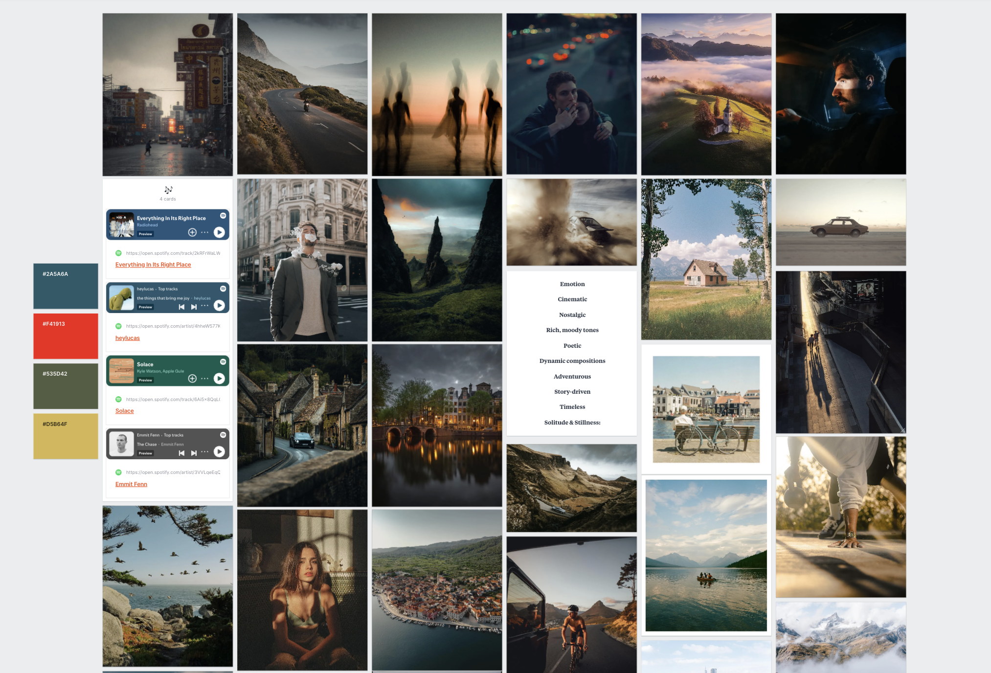
photographer I want to look at is this photographer
named Billy Dee, and Billy is an
incredible photographer. He's one of my favorites, and he shoots these really poetic, kind of dark and moody
and timeless images, a lot in New York City, street photography
in New York City, but he also goes around
the world, and he shoots. He's shot in India.
He's shot all over, and his photos just all tell this really consistent story of life in the big
city, you know, and life moving past
you and kind of all of these little moments that you see on an
everyday basis that, you know, most people
might overlook, but he sees the beauty in it, and he sees that it's
an important moment in time that people can
look back on in ten, 20, 30 years and say, what an interesting
time to be alive. And that's the first
thing that I see when I see Billy Dee's images. But if you take a closer look at these photos,
they're quite moody. He uses a lot of
really dark colors like in this images here, there's all these silhouettes of these figures of walking
throughout the frame, and it creates a sense of
mystery in this photo. I find that with a
lot of his images, they can be quite mysterious. Here's another good
example of that. But they're also just
documenting everyday life. If I go back to this image
here with this couple, it's just a romantic moment. There's so much story
in photos like this and Billy really is just a
master of story in his work. Um, I really love
the use of kind of muted colors that kind of bring the energy down a little
bit in the photos. So the colors aren't distracting
you from these scenes. He's letting the scenes
speak for themselves, and he's really
emphasizing light and composition to really get
those stories across. His compositions
are quite complex. That's one of the first
things I noticed. He uses a lot of
different elements. For example, in this photo, we have both of these
people here perfectly framing the sky in the back doing something
absolutely insane. This photo really epitomizes New York for me because I always see people like
that in New York. Um, I love that
one. Also, here's a good example of composition
where he's using depth. He has someone in
the foreground with a cigarette that creates a lot of interest in
the foreground. He has somebody in the midground
playing an instrument. Then, of course, you can see the Empire State
Building in the back. Just naturally guiding
your eyes back. There's interest at every
level of the composition. So he uses these really kind
of complex compositions to tell more meaningful stories. And you'll also notice he shoots a lot with wide angle lenses
to allow him to do that. If he shot this
at 50 millimeter, he wouldn't be able to fit all of these people in
the frame here. So he does like shooting with kind of wider
focal lengths. Here's another good example. There's just so much going
on in the composition. And he also uses a
lot of juxtaposition. So he uses things like
mirrors to kind of show reflections and other parts of the image like we see here, also here with the eye
and the man in the car, both are kind of
making eye contact, just kind of tying
everything together. And also, here's
another good example of composition where
everyone's kind of laid out in the frame. It just kind of makes you think, What are these people doing? You know, what's going
on in their lives? But I really do like to look at Billy's work
kind of as a whole, because while each image does tell this really powerful story, when you kind of zoom out and you look at all the
images together, you instantly see this theme of, you know, people living their everyday life
in New York City, and I really love his use of
kind of darker exposures, muted colors, you know, very high contrast, and also just very busy compositions
that all kind of work together to tell the story that he's telling in these photos. So if you guys haven't
checked out Billy, I highly recommend doing his
work is absolutely stunning, especially his work from
New York City in Winter. That's my all time favorite. These images here, just
such a mysterious, timeless, epic vibe in these photos and quite
abstract, as well. So Billy Dee is definitely
one of my favorites. The next photographer
I want to look at is actually a
good friend of mine, and that is Finn Matson. He's a German
photographer based here in Bali and his
style couldn't be more different from Billy's
style and also the style of some of the other
photographers we're going to take a look at here pretty soon. But the way I would define
Finn's style is grunge. It's got a ton of texture. There's a ton of depth
to these images. He really pushes hard on certain colors and
pulls other colors out, so a lot of his images have a very monochromatic
color scheme to them, and they all have
this really kind of classic grungy vintage vibe to them looks so, so cool. Finn is a massive inspiration
to me, such a creative guy. And, you know, like I said,
looking at these images, they almost feel
alternative in a way. You know, because he's pushing the creative agenda
so hard and so far, he's really taking things
to the next level, and he's sacrificing
certain elements in his photos to really just emphasize the story that
these images are telling. So he might be sacrificing
image quality, for example, because he's adding
so much grain and texture to these photos, but it's okay because they all kind of tell
this cohesive story. So let's take a look at a
few of these images here. These portraits here he
shoots a lot of portraits, and he likes to add, like I said, a lot of texture to them. I feel like that's a
really defining feature of his style is the texture
that he adds to them. Also the very film like colors, he does shoot a lot
of film, but he also shoots a lot
of digital as well. So you'll see they
just look classic and timeless and he just lets certain colors really
speak for themselves. These are some other
good examples here. Also, the subject
matter you see here, it's just very alternative. Like, there's a couch on the beach and a dude just
chilling in the couch. It's super cool and creative. And I feel like that's a big
part of Finn's style there. I'd also say his compositions
are extremely dynamic. So it's never just, you know, this is what you see
in front of you. It's How can I play with
composition to add a sense of urgency or a sense of
energy to the photos. For example, here,
he did the shoot in LA with a porch and this guy on the back
of a skateboard using slower shutter speeds
to really kind of emphasize the dynamic energy. And he's also kind of
tilting the camera a little bit to add a bit of
chaos into the photos. And, you know, looking
back at his images, I'd say there is a lot of kind
of chaos in these images. This one here, once again, he's kind of using
motion blur to express this mood of kind of just a vibe kind of
abstract day on the beach, smoking a cigarette and also
heavy use of color as well. And if you get back into some
of his other photos here, just the mood is just so
strong in all of these photos. I think if I had to boil it
all down into one thing, I would say Finn is
a master of mood. He's a master of
expressing this kind of solemn, almost lonely, reflective vibe in his
images that he does across this entire body of and I personally just find it so incredibly beautiful
and thoughtful. So Finn is definitely one of
my favorite photographers. I highly recommend you
guys check him out. His use of lighting,
his use of colors, use of texture, composition, and subject matter all fit together to tell this really cohesive
story in his images, and I'm a big fan
of Finn Matson. Now, the next photographer
I want to look at is also a
photography YouTuber, and I am personally in love with his work. He's a
good friend of mine. This is James Popsis, and his style could not
be more different than the last two photographers
that we looked at. The first thing I notice about James photos is
they're very clean. Really likes to keep his
compositions nice and clean and also very
balanced, as well. So as you can see, everything just feels perfectly weighted. If there's something on the
right side of the frame, there's something
on the left side of the frame that balances it out. As you can see here
in this photo, that's a good example of that. In this photo, as well, we have all these different
lines kind of converging on the main subject, which is the lighthouse, but there's secondary subjects as well that kind of balance
out the composition as well. So just a master of composition, and also, a lot of his compositions are
quite simple, as well. So he really wants
the composition to show you exactly what you want to look at in those images. Here's a good example
of that. We have a post on the right, we
have a person on the left. There's really nothing
else to look at. He also uses exposure to blow out certain parts of his image, like we see here in the sky. So those parts of
the image aren't distracting us from the
most important thing, which are the subject, the pole and the person
in this photograph here. Same thing we have here. We have a really balanced composition with the subjects in the
middle of the frame. We have a midground
in the houses, and we have a background
in the back, as well. But you know exactly what you're supposed to look at when
you look at James Espado. And if you compare this to
someone like Billy Dee, where there's so much going
on in the composition, this is so much simpler
and easier to look at. It doesn't mean one is
better than the other. These are just two
very different styles of photography here. One of the things I also
notice about James' images is he uses kind of these really
bright, soft pastel colors. He doesn't crush his blacks. His blacks are quite soft. His shadows are quite soft, and he really likes
almost a brighter image. And he also uses
very balanced colors as well that almost look more realistic than you'd
see in a lot of other photographers knows when to emphasize certain colors, and he also knows when to tone
down certain colors to let the composition or the
subject really speak for itself in those photos. And all of these
themes ring true across James's
entire body of work. I can click on any
of these images, and you will see all of these things that
I'm talking about here balanced composition,
solid use of color. Kind of a brighter arier
look to the images. And he also shoots everything in landscape
orientation, as well. I don't know if you could
see that, but all of his images are shot in
landscape because for him, that's the best way that
he feels he can describe a specific place is
by shooting it in landscape and keeping
those compositions really nice and consistent. James really is one of my
favorite photographers, and he's really a
master of what he does. But kind of going back to
this idea of story, though, I realize I didn't really
talk about the story that he's telling these images. James does an amazing job
of kind of talking about the relationship between man
made objects and nature. Almost all of James'
images are shot outside, and they almost
all have some sort of a man made element
to them, as well. So it's kind of this
intersection between nature and man made objects that
really define James's style. And when you bridge that
the subject matter, and also you bridge his
more stylistic elements, like the use of exposure, color, composition, those
all really come together to tell a very cohesive
style in James' photos. And out of all the photographers that I've looked at today, I think James has the
most consistent style, and he's been shooting
like this for years, and James is the
type of photographer where if I see one
of his images, I immediately know
that James took that photo because
that's how consistent he is with stylistic elements and with subject matter and
story in all of his images. Last photographer I want
to look at is actually me. I want to show you
guys my photos. I want to break down some of the themes that are
common throughout my photography and
talk to you guys about my intentions with
my photography, because ultimately
your intentions with your photography really
do dictate your style. We're going to talk about
that a little bit later on in this course, as well. But my style really has changed so much
throughout the years. And one of the things
that you'll find on this journey of finding your photography style
is it's going to change. Your preferences are
going to change. You might be into
something one year, and then the next
year, you might be into something
completely different. But if you're true to yourself and you're
chasing what you want, your style will
naturally kind of evolve it will all
still kind of fit together because there'll
be a natural gradient between the shifts
in your style. So for me, for the longest time, I was really drawn to these
really dark and moody and almost lonely
looking images with really dramatic light and
really bold colors as well. So a good example of this are these photos
here that I shot that all kind of emphasize this really dramatic light that I found
throughout the world. I am just naturally really
drawn to very dramatic light, and all of these images utilize super strong light and very bold and vivid
colors as well. I really do like to chase a more monochromatic
color scheme, so letting one color really
speak for itself and dominate that image to maximize the emotion associated
with that specific color. These are all really
good examples of that. And this is photography that
I still choose to pursue. But with that said, I'm also really drawn to these
kind of more vibe, timeless, almost film like
scenes in major cities. So, for example, I was just
shooting in San Francisco, and I'm really inspired by a lot of these film
photographers that shoot in San Francisco and other major
cities around the US. So that was a big
part of my intention during that trip was to capture photos that are kind of
similar to that vibe. And these are
photos that I shot. And while they are extremely different from the photos that I just showed you with the really strong dramatic
light in the landscapes, kind of epic landscapes with one single
person in the middle, they still kind of have a
similar vibe because I'm still really drawn to these
kind of darker exposures, these bold colors and really emphasizing
complimentary colors. So warm and cool tones within one image. This
is a good example. We have a lot of warmth
in the shadows here. We have a lot of deep
blues in the sky. This is another good
example of that. And once again, another
good example of that, as well, and also still into
the dark and moody vibe. And later on that day
when I was shooting, it got really dark and moody, and I was frothing because
this is what I love to shoot. So even though I'm shooting something
completely different, and my inspiration is something completely
different as well, because I'm being inspired
by film photographers, it still kind of
has the same vibe. Throughout that style. So I'm really drawn to
bold, vivid colors. I'm really drawn to very
balanced compositions. I like when everything
is nice and balanced and I use different compositional
elements to achieve that. For example, here,
I used the light in the scene to kind of balance out the
scene a little bit. Here's another good example. I felt that the energy
was kind of leaving the frame too much up on the top right hand corner here
with these leading lines. So I used a foreground
element to kind of pull the energy back down to
the bottom of that frame. Balance out that
composition a little bit, so it wasn't so unweighted,
if that makes sense. Once again, bold colors
in these images as well, something I'm
always pursuing and also just very
interesting use of light. I'm always looking for
dramatic light in my images, and these images definitely
tell that story. Same goes for a lot
of these photos here. These are some photos that
are shot in Moro Bay. And once again, just
really utilizing light and color in
these images here. Almost in pursuit
of kind of telling this reflective story of
my time in California, and that's ultimately what
I want to do I want to tell a story about a place in the way that I specifically remember it. And these photos
are a good example of how I personally
remember Moro Bay. That is kind of my
take on my style. And honestly, I'd
be really curious to hear what you guys
think of my style. Maybe you interpret it in a
completely different way. This is how I interpret it. This is how I see the world. And, you know, I've gotten to the point now where
when I'm out shooting, I'm not thinking
about these things. These aren't things that are
at the forefront of my mind. They've just become
so ingrained into who I am as a photographer
and as an artist, that it's just automatic.
It's subconscious. So I shoot compositions
that look good to me, and because I trust
myself creatively, they all kind of fit this
really cohesive style. And I think that's
the ultimate point that we want to get to
as photographers, right? Going to be very cerebral about finding your
style at first, especially in a course
like this where we're really actively trying
to track it down. But over time, you're going
to start to subconsciously prefer certain things
in your photos, and you're just going to
naturally shoot those photos, and you won't have to
try for your style. It's just going
to be there. So I hope this lesson was
helpful for you guys. I wanted to do just kind of a raw breakdown of
photos because I think a big part of reading photos is very
kind of instinctive. You know, you could sit and break things down objectively, but I think it's also
really important to take a look at it subjectively
and in the moment and just talk about the way those photos are
making you feel and the things that jump out to you like we did in
that style lesson. This process of reading
an image really is an integral part in us
finding our own unique style. But with that said,
I want to jump into more concrete lessons on
finding your own unique style. And I've built a framework
that I think you guys can really benefit from in
finding your unique style. So let's talk about
that framework.
4. The 4 Step Process to Finding Your Photography Style: So now that we've covered some more foundational
lessons on style, we talked about what style is. And we also talked
about how to read a style when we're looking
at another photographer. Now it's time to jump
into the four framework for finding your own
unique photography style. And I like to call
this the four Ps, purpose, preferences,
process, and progression. And I'm going to
explain to you guys what all of these things mean. First up is purpose. And I think before
we do anything, we need to first define what our purpose is with
photography because this will really help you understand
what you actually want to shoot and what you
actually want to pursue with your photography. Really answers the
question as to why you take photos
to begin with. And this really is the
most foundational piece of you finding your own
unique photography style. Next up is preferences. So what are you actually
drawn to in a photograph? Do you like specific
types of light? Do you like to use a certain
type of composition? Do you like certain
colors in your images? What are your actual preferences when it comes to
looking at images? And a lot of this comes with consuming an image and
really paying attention and reading those images to identify the things about
those images that you actually like instead
of just looking at it at face value and saying,
Oh, I like this photo. Diving a little bit
deeper and saying, Okay, why do you
like this photo? What are the specific things
that you like about it? And that's why that last
lesson on learning how to read an image is so crucial
to this process. Next up is the process, so how you actually
create those photos. It's the technical and
the creative methods that you use to
create those images. And this very much is a learning phase because while you might know
what you like in a you might not know
how to actually get that look in your photo. So we're going to be talking
a lot about that when we get to the process section
of this course, as well. It's very much a
learning experience, and I'm going to show you
guys how to learn to capture the specific visual elements that you want to
see in your photos. And lastly, is progression. So how your style
evolves over time. Taking a deeper
look at your work and recognizing patterns
within that work and then refining your body of work over time to create
that specific style. And like I said before, this is really a never
ending phase because your style is always going
to evolve as a photographer. There's not a start
and an endpoint. It's an ongoing process. So we're going to
talk a lot about that in the progression section
of discourse, as well. So that is the four part
framework that we're going to be focusing on for
the rest of this course. So let's jump into
that first lesson now where I'm going
to ask you guys some pretty tough questions about your purpose
in photography.
5. Step One: Defining Your Purpose with Photography: Like I said before, the
first step in you finding your style is identifying
your actual purpose with photography in the first place because your style is ultimately a reflection of you and your inner beliefs and the
way that you see the world. And I absolutely love this
quote by Hans Hoffman, who was an abstract
expressionist painter in the 19th and 20th century. I think he really sums this idea up perfectly with this quote. He goes on to say, A work of art is a world
in and of itself, reflecting senses and emotions
of the artist's world. So, in other words, art is not just a picture or a photo or something
that looks beautiful. Rather, it's almost a self contained universe that
carries with it that artist's life experiences and just how they actually
view the world. Every photo that
you take carries your own unique
perspective on life, whether you're
aware of it or not. And if you can
consciously tap into that and translate
that into your work, your style will naturally become unique because
you are unique. No one else in the
world is exactly like your world view is unique. And I know this might
sound fluffy and maybe a little bit
too philosophical, but I promise you
that it's true, because if you take
a look at my work, for example, especially
earlier on in 2020, 2021, I was really struggling with depression
during that period. I was stuck here in Bali. There was no one
here, and I just felt lonely and isolated, and I feel like those themes were really translated
into my work. Even though I was completely
unconscious to it, these themes definitely
rag true into my photos. And now, as I've grown so much as an artist and as a person and I can consciously tap
into the way that I'm feeling and the way
that I view the world, I can translate that much
better into my own work. So with that concept in mind, I want you to take a second to ask yourself these
few questions here, and I want you to
write out as much of a detailed response as you
can to these questions. First one is what
emotions do you want people to feel when they
look at your photos? And this really does
kind of tell us the overall story
and the overall vibe that we want to tell
with our images. This is the foundation
of story in photography. Do you want to capture
images that make people feel happy or joy? Do you want to capture
images that make people feel a little
bit melancholy? You want to capture something
that's epic and you want to embody this idea of
wonder and exploration. What are the emotions
that you want people to feel when they
look at your photos? You're having a hard time with this and you're
not really sure, I think another way to
ask this question is, what feelings do you
resonate with most when it comes to movies,
film, or music? Because if you ask
yourself this question, that will kind of identify
the feelings that you want to express or the stories
that you want to express in your own photos. The second question that
you should ask yourself is what subjects pull you
in without any effort? So if you had a camera
right now and you can shoot absolutely
anything in the world, what would you point
that camera at? What do you want to shoot? What are you most inspired
by with photography, and it could be anything.
It could be landscapes. It could be street photography, maybe you really want
to shoot portraits, maybe you want to pursue more
documentary photography. Write this down because
this gives us a ton of clarity as to what we
actually want to shoot. I know you don't necessarily
need to shoot the same type of subject matter to have a consistent style
like me, for example, but I know a lot of
photographers really are drawn to shooting
one specific thing, and having subject matter
g true throughout all of your images is probably
the easiest way to have a consistent style. It's not necessary, but it's definitely one of
the easier ways to do it. So write down your
answer to this question. Next up is, what kind of light colors or moods
are you most drawn to? What do you feel most comfortable with when
you look at a photo? Maybe you're really
drawn to really dramatic warm sunsets like me, or maybe you're drawn
to photos at Blue hour, and you like this really
soft and kind of vibe, moody look in your images, or maybe you like photos
that were taken in the middle of the
day and they're just really bright and airy and open. And the same goes for colors. Are you more into
kind of muted tone down colors or are you into very vibrant and loud
colors that kind of dominate the scene
and kind of take over that photograph
a little bit. Our preferences for light
and color are often a direct reflection
of our personalities. So this is a really
important question for us to ask because it does give us a really
solid foundation for the style that
we want to pursue. Especially when you look at
my work, for example, yes, I'm shooting a ton of
different subject matters, my use of light and color and exposure are all very
similar in my images. And I think that's
probably one of the most defining
features of my style. And for the last question, and perhaps the most important
question that you should ask yourself is what drew you to photography
in the first place? Why did you pick up a camera? What are your intentions
with photography? Did you start photography
to document your life? Did you do it to
capture something beautiful as a way of
creative expression? Did you do it to capture
photos of a hobby or something that you're
really interested in and you wanted to document
that process? Whatever it is, write
this down as well. Asking yourself this
question can really reveal your true motivations
with photography, and it gives you a lot of
clarity as to what you actually want to pursue
with your photos. And if you take your
answer to this question and you combine it
with question three, which is your light and color
preferences, question two, which is what you
actually want to shoot in the subject matter
that you're drawn to. And question one,
which is focused on the emotions that you want
to tell with your story, this already gives you such a solid blueprint for the style that
you want to pursue. I really do love this exercise. I think it's crucial
for us to kind of look inward a little think about our actual intentions
with photography because ultimately,
like I said before, your style is a direct
reflection of you, and I think it's always
important for us to start with ourselves first before we
start looking outward. So with that said, let's move on to the next lesson
of this course. We're going to talk
about preferences, and we're going to build a
super detailed mood board that has all of the photos that we love the most.
Let's jump into that.
6. Step Two: Solidifying Your Preferences (Class Project): Guys. So in the last lesson, that was very much
an inward practice, right, searching
for our purpose, asking ourselves why we got into photography in the
first place to give us a little bit more clarity on the direction that
we might want to go. But the second step is
to look outward, right, and try to find some images that we just think are
absolutely stunning. And I talked a little
bit about this in learning how to
read image video, but it's incredibly important for us to consume good work, work that inspires us. And this is not just in
the form of photography. Photography is the
main one because that's the medium that
we're practicing, but this could be in
the form of film. It could be in the
form of music, and it can be in other
art forms as well. And one of the things
that I've found throughout my career
is the more that I consume good work and I pay attention to that work and
I look deeper at that work, certain stylistic elements
from those images that I love most slowly start to show
up in my work as well. So in this video, I
want you guys to create a super detailed
moodboard with all of the photos that inspire most. And I'm going to show you
guys mine here right now. This is what I call
my vision vault. This is where I put all of the photos that
massively inspire me, and I have them
all in one place. And I've slowly built this, over the course of
the last few years. Sometimes I'll go in and
I'll change images out. But this is always
at my fingertips here that I can just go
in, look at these images, kind of break them down,
and remind myself, this is the direction
that I want to go in as a photographer. I built this using
an app called Milne. You guys can sign up.
It's completely free. I'll put a link in
the description of this course so you
guys can check it out and try it
out for yourself. But one of the reasons why
I love it is because it's a blank canvas and you can do absolutely whatever
you want to it. So you can put photos in here. You could put text in here. You can put music in here, and you can also do things
like color schemes as well. You have all these
different things on the side here that
you can drag in. You could leave a comment. It's just a very kind
of interactive canvas, which is great for
creative people like us. Like we like to have everything kind of laid out in front of us. And for me, this is what I want to see when I look at my mood. Um so taking a look at
some of these images here, I think you'll notice
a few themes here. Once again, we see that kind
of dark and moody vibe. That's something I've
always been interested in. A lot of cars, a lot of kind of vintage looking photos because I am massively inspired by film. Then you'll also see a color focus in a lot
of these images. This image here with
the deep blues and then the complimentary
colors in the sand there. That's something I'm
really interested in. I like to see a little bit
of dynamic shots as well. So you see the slow motion
shutter speed shots here with the porch
and this car here. And then once again,
just these kind of poetic thoughtful scenes like we see up here in
these top two photos, just super cool images
that make you look twice and make you think about that
image a little bit more. And while all of these
images, you know, they might not all
have the same style, they all kind of fit the
vibe that I'm after, which is capturing
this kind of solemn, interesting, nostalgic,
poetic vibe in my images. And that's why I have
all these images but I want you guys to create a
vision vault just like this, using photos that
you find online. And when you're
doing this exercise, I don't want you
to overthink it. If you see an image that looks good, put it into
your mood board. We're not going to
break this down yet. We're going to just put photos in there that we
think that we like, and then we'll go in
and kind of read them a little bit more and think about
why we like those things. Now, I'm going to show
you quickly how to do that using meal note. The easiest way is
there's something called a Meline web clipper and you install it using
Google Chrome. And when you find an
image online that you like and you want to
add to your moodboard, all you have to do is go
in and click that image. So, for example, this is
my photo on Instagram, and then something
in the top hand left corner will pop
up and says, save. You click Save there. And then this little thing will pop
up on the corner here, and then you can directly save it to your vision vault there. So I'm going to click
Save there, hit Save. I can go back to Meline here, and then boom, we have
the image right here, and then I can just easy drag and drop it into my mood board, move it around wherever I want. You can click on it. You
can hide the caption, so it doesn't say
Instagram down there, and then I can just easily
drag it right down there. So that's a really
easy way to do it. You can also really easily just drag and drop
photos in here as well. So, for example, I have a few
photos here on my desktop. I can just select
those and drag and drop them into my
moodboard here, and then those will just
show up right there, and I can just drag them
over here, move them down. So I love Milan note because
it allows you to look at, you know, all your
inspiration in one place. It's beautiful, and they also have an app as well,
which is great. But like I said, also the music. And then if you guys did
want to add something like these color schemes here,
you can easily do that. All you have to do is
click on the color. Click color up here on the
left, click the dropper, and then you can go over any part of your
image and kind of select some of the colors in those photos. So I
think that's pretty cool. It's just another
visual element that kind of gives us some sort
of inspiration there. But one of the things
that I really like to do, and I recommend you doing
this as well is writing out themes that you notice from all the photos in
your moodboard. So these are some of the
common themes that I found with some of the
photos that I have here. Emotion, cinematic, nostalgic,
rich, moody tones, poetic, dynamic compositions,
adventurous, story driven, timeless, and solitude
and stillness. And if you're looking at
this and you're like, I have no idea what
these themes are, one of the things
that can really help you here is to
take a screenshot of your mood board and
then send that to hat ChiPT and say,
Hey, ChachiPT, help me out with identifying
some of the common themes or some of the common
emotions that you're finding with this
group of photos, and then you can look at those, find what matches best, and
then put that in a text box. And that last point where you're really breaking
down all the images and selecting themes is probably
the most important part of this process because
you're looking at all of these photos and then you're
putting it out into words, and that gives you a
lot of clarity for the direction that you want
to go in as a photographer. And once you've done that, once you've selected those themes, I think it's really
important to take a closer look at those
images and ask yourself, why do I love them so much? And you can add that
into the textbox here. You can create another one, or you can create
something like a note. You can drag it over
and you can say, I love the dark and moody
atmosphere. Of this image. You can drag that there,
and then you can create a line and and put an
arrow between these two that'll make it
nice and easy for you to understand kind of what you were talking about for
which specific photo. So it really is just
a creative canvas, and that's why I think
I love it so much. You can do whatever
you want with it. You can put notes anywhere. You can drag things around, and I'm just a huge fan of it, and it's completely
free, like I said. So once you do develop your
base of your mood board, take a closer look
at those photos. Ask yourself why you like them so much because
this is where we're really starting to understand what we want to see in a photo. What are the common stylistic
elements or what is the common story amongst all of these photos that you want
to translate into your work? If you can really lock
in your preferences with your moodboard and know exactly what type of look that you want, whether it be a darker exposure, maybe you want bold colors, maybe you want
dynamic compositions, maybe you want
simple compositions. Whatever it is,
the mood board is your opportunity to get a
ton of clarity on that, because if you don't
have clarity on that, then it's going to be
really difficult for you to know which direction
to actually go in when you're out
shooting and the creative decisions that you're going to make while you're out shooting. So I cannot hammer
in the importance of a mood board enough. This is one of the most
important pieces for me in finding my unique creative
style over the years, it's something that
I still reference, and it's something that I'm constantly iterating, as well. And I'm excited to kind of go in and redo this a little bit. I think there's some
photos that I can add. I think there's some photos
that I can subtract. And one thing you'll notice is I have some of my own
photos in here, photos that I'm proud
of that reflect the direction that I want
to go in as a photographer. I have these two here
from California that I shot last year that
I just think are so beautiful, so interesting. And that's definitely
the direction that I want to go in as
a photographer. Now, I want you
guys to try this, and I actually want to see
your mood boards as well. This is the class
project for this course. So go in, whether
it's using Milne, you can do this on
Instagram and take a screenshot, whatever it is, create a moodboard
and post that in the class project
section in this course, because I really want to see what you guys
are coming up with. So if there's one activity you're going to do
in this course, please do this one
because it really is the foundation for us to
build our style upon. If we don't know what
we like to see in a photo how are we going to create a style
in the first place? But now that we have a
mood board in place, let's move on to the next lesson and talk about how we can translate some of these
themes from our mood board, the things that we love and
want to see in our photo, how we can translate
those things into our own work when
we're outshooting.
7. Step Three: Nailing the Process: Far in this course,
we've done a lot of reflection. We've
looked inward. We've asked ourselves why
we got into photography in the first place in hopes to get a little bit of clarity in the direction
that we want to go. And we also looked outward, and we found some images
that massively inspired us. We put those into our moodboard, and that is also going to
give us a ton of clarity on the direction that
we want to go with our specific photography style. But none of that really helps us with putting those
things into practice. So in this lesson, I
want to talk about how we can take some of
those themes and some of those stylistic
elements that we know that we love in a photo and translate that into our going to preface this
lesson by saying, This is very much a
learning process. Unless you're a very
seasoned photographer and you've been shooting
for a long time, you might not
necessarily know how to get that specific
look in your photo. And I'm telling you right
now that is totally okay, because if you're
not going out and trying and experimenting
and making mistakes, then you're not going to grow as a photographer
in the first place. By the end of this
lesson, by the end of your next shoot or the next
few shoots after that, you might not have
your style locked in, and that's totally okay. But if you follow the guidelines that I lay
forward in this lesson, I promise you you are setting
yourself up for success, and you're going to establish your own unique
photography style in time if you're
doing these things. Now, one of the things that
we did in the last lesson was we took a look at all
those images on the moodboard, and we pulled out common themes
from all of those images. And those themes are both visual stylistic things that
we saw on the photo, such as darker exposure, dynamic compositions, simple compositions,
vibrant colors. And we also found
some common themes in the story of those images. Now the best way to translate these stylistic elements
that we found in our mood board that
we really resonate with is to go out and shoot. But there's a few
activities that I like to do to kind of simplify
this process a little bit. In your mood board,
you might have found that you like darker exposures. You might have found that
you like vivid colors, and maybe you like
simple compositions. Well, I think it's really
important to break those down and focus on one thing each
day while you're shooting. So maybe you have ten
themes that you notice in your mood just select one and
go out and focus on that. Putting creative constraints on yourself like this
really simplifies the process of you
trying to incorporate these stylistic elements
into your own photos. If you go out and you have all of these themes
on your mind, a list of things that you want to translate
into your work, it's going to be next to
impossible to do all of that. But if you break it down one by one and you dedicate a day of shooting to a single one of those themes that you
found in your mood board, that simplification is
going to make it so much easier for you to translate
those things into your. You might be taking a look at your mood board here
and thinking, Shawn, I have 20 different themes here and some of them
are quite abstract. I don't know how
I can practically put these things
into a photograph. That's why I think you
should be focusing on some of the more
tangible things. If I had to give you a
guideline to follow, I would focus on all of the stylistic elements
of photography. Those would be composition,
lighting, subject matter. Color. Because once again, those four stylistic elements of photography all work together to tell the story in a photo. And if you can nail all of those stylistic elements across
your entire body of work, a natural story will
emerge in your photos, and I can guarantee you that your photos will match the
look of your mood board. So let's break this down a
little bit more and look at some concrete examples for
how you guys can do this. And starting off
with composition, if you were looking at your
mood board and you noticed some common themes and the
compositions of those photos, for example, maybe one
of the things that you noticed is they're quite dynamic and they're
quite interesting. They use a lot of leading lines in those photos that
are kind of guiding your eyes back
through the frame or maybe they're really
good at depth, and they're showing several
subjects at different depths throughout the frame that help tell the story in
the composition, or maybe they're also kind
of abstract and messy. These are all
things that you can pick up on with composition. And once you identify
those commonalities in the compositions
of those photos, go out for a single day and only shoot with
composition on your mind. And this basically means you're completely ignoring lighting, you're ignoring subject
matter, you're ignoring color, you're ignoring
everything else except for composition to the
point where you can take a photo that might not even be beautiful be a random bench on the side of the
road for all I care. It doesn't matter as
long as you're thinking deeply about the
composition of that photo. Another good example
here is lighting. A lot of the time, it can
be quite difficult for us to focus on lighting
because there's so much color. There's so many things
happening in the scene. So one of the best ways
to focus on light is to set your camera in black and white and shoot in black
and white for a day, because when you're shooting
in black and white, all you see is light, and all you see are tones. So that's a really great way
to kind of eliminate all of the other distracting
elements from a photograph and focus 100% on the
light in your one of the things that you
might get hung up on here is trying to pull out all
of these common themes. Maybe you did the activity
in the Moodboard lesson, but you still feel like you're having a hard time
finding commonalities. Then don't look at your
entire mood board. Just look at one photo. Take a look at one photo
that you absolutely love that massively inspires
you and break it down. What time of day was
that photo taken out? What are some of the colors
that you see in that image? What's the composition like? What was the focal length they shot once you've broken
down that photo, then take that and go out
and try to mimic that photo. For some of you, this might be an easier activity
because you can just focus on one thing and you can really pull apart
every little aspect of that image and try
to figure out how to capture a photo that's
very similar to it. And regardless of which
approach you take, you might not always
have the knowledge to get that look that you're after, and that's why I
always recommend just digging a
little bit deeper. If there's a
photographer you are massively inspired by
and you love their work. Go to their Instagram, look
at their story highlights, try to figure out how they
shot these photos and the creative
techniques that they used to capture
that specific look. You can learn a lot from a
photographer's Instagram. You can often see
behind the scenes, sometimes they have
educational reels that will give you a bit of a glimpse
into their creative process. So you might not have all
the answers right away. You might not know how to
get that specific look. But like I said before, this is a learning experience. And if you do a little
bit of research, you ask some other photographers how they think this
photo was shot, then eventually, I promise you you will nail
that look as well. Really do think it is incredibly important for us to
simplify this process. Don't look at your mood
board and go out and try to capture all of these
themes in one day. Break it down day by day, spend one day focusing
on composition. Spend one day focusing on light, spend a day focusing on subject matter and spend
a day focusing on color. And if you do this
multiple times, you are going to
train your brain to prefer certain things
in your images. And then when you go
out and shoot and you're not thinking
about these things, they're naturally going
to show up cannot hammer in how much of an important process
this is for us. We learn so much when we put creative constraints on
ourself as photographers, and I know personally
that I have grown a lot going out with one lens and focusing on just one single
thing for that day. Those themes start to translate
themselves into my work, and my style has
become the way it is because I've put
creative constraints on myself in the past. Like I said before, this is
very much a learning process. You're not going to be
able to finish this course and just have your
style right away. You actually have to
go out and shoot, and I really hope
that this lesson gives you a little
bit of clarity on the actual process
that you can follow to finding your own unique style. You're not going to get better. You're not going to
find your style if you don't go out
and shoot and make mistakes and try to mimic things that you
love in other photos. That's where the most
important learning takes place during your career. And I know, for me, when I was first starting out
and I was shooting, I was trying to copy
other photographers because that's the
look that I wanted, and I was trying to get
similar lighting scenarios. I was shooting with
similar lenses in an effort to get the same I learned so much early on doing those things
as a photographer. But I really hope this lesson
was helpful for you guys. I absolutely love this activity, but it's not the end
of the road for us. There's another very important
step that we need to follow when we're in pursuit of our own unique
photography style. So let's talk about that now.
8. Step Four: Progression: Guys, well, we have made it to the last step in finding your
unique photography style, and I like to call this
step the progression step. Now, the thing
about style is it's an ever evolving process,
and it never really ends. And you're going to go through
this progression where your style kind of slowly
evolves over time. And I think one of the
best things that we can do is frequently
take a look back at the work that we've recently
shot and kind of gauge where we're at and make
sure that we're going in the direction
that we want to go. If you've followed all
the steps in this course, and you're going out and
you're actively shooting and you're trying to get better and you're learning new things, the best thing you can do
is do the same activity that we did in the style
lesson of this course. So I want you to
choose 20 photos that you shot over the last 30 days. Now, now all of these photos have to be like your
favorite photos. I would say choose some of your favorite photos that you
shot over the last month, but also choose some photos that aren't your
favorites as well. Once you have those
photos in front of you, ask yourself those
same three questions. The first one is
what visual choices stand out to you
in those photos? Is it the light? Is it the
color? Is it the composition? Is it the subject
matter? What do you like about those images? What are the stylistic
choices that you specifically like
about those images? Second question
is, what emotions do those photos convey, right? Coming back to that idea of how do those photos
make you feel. And lastly, are there
any patterns that you notice between
all of these images? And these patterns can be in
the form of a visual style, like the way the
photos actually look, but they can also be related
to story as well and kind of some of the overarching themes that you might notice in
this collection of photos. Once you've answered
these questions, I want you to ask yourself, Okay, what worked
over the past month? What have I done really
well this month? And also, where have
I fallen short? What didn't work in
some of these images? If we look back at the original definition of style, right? It's the consistent use of specific stylistic elements that we use across our
entire body of work. And the keyword here
is consistency. If you take the time to truly review your images and
notice what you did really well and
then consistently keep doing those things
out into the future, your style is going to very
quickly naturally emerge the reason why I like
this activity so much is because we can
repeat it month after month every
month throughout the course of our entire
photography career. And you can go and you can look back at older
images and say, Wow, this is where
I was at the time. It's really interesting
to see where I am now and the progression that I've
had to get to this point. So, for example, maybe all of your favorite images over that past month were
shot at sunset. Well, that tells you
right there that maybe you should be shooting
at Sunset more, or maybe all of your
favorite photos from the last month were shot
on a 50 millimeter lens. Well, double down and start
using that 50 millimeter lens more because it's
very clear that you really vibe with
that specific focal. One of the things you'll
notice throughout this course is I'm
continuously having you guys look at your images at a deeper level and
continuously evaluate them. And this is because,
like I said earlier, if you're truly looking
at an image and you're evaluating that image and
you're looking deeper at it, you're going to make
both a conscious and a subconscious note of what
you like in those images, and then the next time
you go out and shoot, it's going to be
instinctive for you. Even if you're not specifically
chasing a certain look, your brain will
start to default and seek that look out
automatically. And that is really
the point that you want to be in with style. It's where you're not even
thinking about style anymore because you've
trained your brain so much to know what looks good, to know what you want
to have in your image and every time you
go out and shoot, that's exactly what
you shoot for. So you might not think that this activity is
all that practical, but I can promise you
that this activity is just as important
as the activity of actually going out and shooting and learning how
to get a specific look. And this is an activity that
we can repeat every month. So choose a day at the
end of every month, at the beginning of every
month, whatever it is, and start consistently reviewing your work not only to
track your progression, but to make sure you're headed
in the right direction. With that said, I
did want to add on another practical lesson
to the end of this course, and that is all about
editing, right? A huge part of the
creative process for us as photographers is
the editing process. Now, I'm not going
to give you guys a super detailed breakdown
on how to use light room, but I will show you a few hacks that can make it easier for us to have a more consistent look across our entire body of work. So let's move on to
that lesson now.
9. The Importance of Editing: So far in this course,
we've talked a lot about the stylistic elements
of photography, things like lighting, color, composition, subject
matter, and how when we keep all of these
stylistic elements consistent throughout our work, our style will naturally emerge. But one thing we haven't talked about is the editing phase. And this phase is incredibly important for us
because it allows us to really shape and manipulate our images to make sure
they match even better. We can adjust the lighting
to make sure it matches. We can adjust the
composition through and we can also adjust the color
in that image as well. Now, of course, there's
going to be things that you can't change
about the image. The shooting phase is
very, very important. But there is a lot that we
can do in the editing phase. So in this video, I want to jump on the computer
and show you guys a few different
hacks that you can use to make sure that your
work is more consistent. So let's jump on the
computer and I'll show you guys how to for this course, I am using ight room Classic. Now, there's 1 million different editing softwares out there. Generally speaking,
Lightroom Classic is one of the more popular ones. It's used by many
different photographers. And if you guys aren't
familiar with Light room, I would highly recommend
checking it out. They do have a normal
version of Lightroom, and then they have
Lightroom Classic. Lightroom Classic is a slightly more robust
editing software. I'm not going to talk about
the differences too much, but I would recommend classic. But if you guys do
want to edit on Lightroom or any other software, you can still follow
along super easily. Now, the first tip
I have for having a more consistent editing style is to use Lightroom presets. Now, lightroom presets
are basically like fancy editing filters that
you can apply to your photo, and then you can make
changes to make sure it matches that photo now, to show you guys this, I have four different images here
shot in four different places. This is in Japan. Let me reset that edit there. This was shot in Japan. This was shot on the Coast in California. And I guess these
ones were shot on the coast in California as well, but they're all kind of
very different images. This one's shot in owight and these ones are
shot at sunset, and this one was shot in
the middle of the day on an overcast day. So one of the beauties of presets is when we
apply a preset, it really adds kind
of a foundation to our image that we can go ahead and make changes to after that. Now, I have a bunch of
different presets here. There's a ton of different
presets that you can download online.
Many of them are free. Light room gives you a bunch of free presets as well that
you can experiment with. But I have a bunch of packs
that I sell on my website, and I also have a
free preset pack that you guys can actually go and download on my website as well. I will put a on the screen, and I'll also put a link in the description
of this course. And I will use these to show you guys how using
one preset across multiple images will
allow us to keep somewhat of a consistent
look across those photos. Now, I'm going to start off with this photo here in Japan. This is my free preset pack, and I have six presets in here, and I'm just going to kind
of go through each one. So this is clean minimal. This is crisp
colors. You can see lots of vibrant colors in
this one. I really like that. We have dark and moody, really vibe, super dark. We have nostalgic film. Oh
I love the way that looks. We have portrait mood,
and we have warm portrai, which I also really like. I'm going to go ahead
and apply warm portra. I think warm portra
just looks really good. It looks super warm and vibe,
and I like how soft it is. It kind of looks like film,
which is why I created this preset was to make
it look like film. But we're not done here, right? One of the things
that I like to do after I apply a preset is to go down the list
and think about all the things in that image. We have lighting, we have color, we have composition, and
we have subject matter. Now, obviously, we can't
change the subject matter in this photo unless we want to remove someone
from the image, but we're not going
to do that today. So I'm going to
go ahead and crop that image to a four by five, which is best for Instagram.
Leave that there. And it's also dark, which I really like, but it might be a
little bit too dark, so I'm going to raise the
exposure a little bit, maybe raise the
shadows a little bit, and then I'm going to reduce
that clarity but minus five. Honestly, this photo
looks good already. Like, this is kind
of a one and done, but this isn't really
a good example for presets because presets
aren't always one and done, and you need to
make some changes. So let's move on to
the next photo here. I will apply that same preset. And you can see this
looks really cool. But if I go back here, we're
losing so much of that blue. Now, I really do love
warmth in my images, but I also want those natural colors to come
through, as well. So one of the things I'm going
to do here is immediately come up here to the white
balance adjustment, and I'm going to lower
that down to make sure that we have some of that
blue sky coming through. I'm also going to increase
the exposure a little bit. I'm also going to come
down here to saturation, and I'm going to ramp that up. Unfortunately, it's doing some weird things to these reds, so I'm actually
going to undo that. And then I'm going to come
down here to the HSL sliders, and I'm going to
increase the orange and the yellow because
we have a lot of oranges and yellows
here in this image, and I'm also going
to increase the blue so that blue sky will
really come out there. And already, I think that
looks a lot more interesting. Let's go back up here,
maybe increase the vibrant, see what that does. That's
a little bit too much. So maybe we come back up to
the temperature adjustment, raise that up a little bit, and then I'm going to crop
this by four by five, straighten it out, so the
bottles nice and straight. And there's the before,
there's the after. I think we can play around
with this image a little more, spending a little
bit more time on really dialing in those colors. And one of the things
that I'm doing when I'm editing is I'm spending
a lot of time on color. Color is such a massive part of the creative process for
us as photographers, and I really like to manipulate
the colors in my images. And there's a few different
ways that you can do that. Obviously, in the basic
adjustments here, you have the vibrance and the saturation and
the temperature, which does so much
to your image. But if you want to do
a little bit more, you can come down here
to the color mixer where you can adjust the hue, which is the actual
hue of that color. Can adjust the saturation, which is how pure that color is, the saturation of
that color, and then we can also
adjust the luminance, which is the brightness
of that color. Now, I think the
luminance values look pretty good for
all these colors. I think the hues
look really nice. Maybe if we want to adjust
the blue in the sky, we could by dragging that
blue hue slider a little bit, but I think it looks
pretty good, to be honest. The last way that we
can edit color is with the color grading panel. And
I really like to do this. And with the color
grading panel, we can essentially add colors into certain tonal
ranges of our images. So, for example, we
have the midtones, we have the shadows, and
we have the highlights. If I drag this up, you can see it's putting a lot of warmth into those shadows. Same thing for the
highlights here. If I drag this up,
it's putting kind of a light blue into the sky there, which I think looks really nice. But generally speaking, I
think this image looks good. I just do want more of that
warmth to come through. So raise that warmth
up a little bit, maybe come back here to the
blue and raise that up again. And I you might be
thinking, Sean, when you first
opened this image, you reduced the temperature. You made it more cool, and now you're undoing that and
you're making it warm again. Well, the editing process
is very iterative. You're going to be
messing around, kind of playing around to get
the look that you want. You're never going to
go in and just make an adjustment and know that it's going to be
right right away. You have to experiment, you
have to try things out, and eventually you will land on a look that
looks good to you. And to me, I think this
looks pretty good. Let's move on to the
next image here, and this is another photo that I shot on the California coast. I absolutely love this
photo. It's so cool. I was freaking out when I shot this photo because it was just
such a cool thing to see. So I'm going to go ahead
and apply that same preset, the warm portrait preset. Honestly, this
looks pretty good. I'm going to start
off with a crop here. Make sure we get our
composition right. I want to make sure we get those birds in the top there as well. Alright, I think that
looks pretty good. Maybe bring that back out. Okay. So we have a
really good base here, but I want to start off
with lighting first. It is a little bit dark, so I'm going to raise that
exposure a little bit here. Maybe bring the highlights
down, the hair. I really want to kind of
maintain that soft film look. And then temperature wise,
I think we're good here. I am going to come down here and maybe play around with
a contrast a little bit, maybe increase some
contrast there, really make those birds pop. And now that's really bringing
out the blues in the sky, so I'm going to come back
up here to the temperature and I'm actually going to
make that warmer again. I really kind of
want that nostalgic, warm feeling in this image. And already this
image looks so good. One thing I would like to do here is looking at these plants. I might want to try and pull those colors apart a little bit because we do have some
green and some gold here, and I think it might
be nice to kind of pull them apart
and really let those green shine and those gold shine it'll just
look really good. So I'm going to come down
to the hue slider here. I'm going to go down to
the orange because this is definitely orange and
probably yellow, as well. And I'm going to adjust that. And I think maybe a little
bit towards the orange side, and then coming down to yellow, maybe just a hair towards
the green side there, and then coming
towards the green, maybe just a hair towards
the green side there. Actually, I'm going
to leave that there. I think this looks pretty good. Honestly, there's the
before, there's the after. I definitely matches those first two images that we had as well. But one thing I would
like to do, as well, these images are
quite dark and moody, so I'm going to
go ahead and come here to the selective
adjustments. I'm going to create
a linear gradient, and then I'm going
to drag that over the bottom part of our image. And why this is so
great is because it allows us to edit one
specific part of our photo. I absolutely love the selective adjustments
in light room. And then I'm going
to go ahead and just drag that exposure
down to really add just a little bit more mood to this image, a
little bit more vibe. I think that looks pretty cool. Last thing I want to do is maybe play around with those
blues a little bit. So come here to the HSL, go to blue and maybe drag that maybe a little
bit towards the left, just a little tiny bit. And, boom, I think that
looks pretty good. There's a before,
there's the after. And last but
certainly not least, this photo was
shot at Blue hour. Absolutely love this
photo, but we have a lot of really interesting
colors in this photo that I want to bring out
that are not showing up here in the raw photo. So I'm going to apply the
warm portrait preset. And I think this
looks really good, but it's pushing this
image a little bit too far to the point where we're not getting that
blue in the sky. I remember shooting
this and thinking, Wow, that blue sky
is so beautiful. I want to make that blue pop with kind of the gold
reflection on this car here. So I'm going to
go ahead and crop this image to a four by five. That looks pretty good. There's actually a
dog in the window, as well. You can see him there. Zoomed in super far,
but it was really cute. So, the first thing
I'm gonna play around with here is
maybe the temperature. I'm gonna drag that
and make it more blue. But I feel like that's
kind of eliminating a lot of the warmth from
this image as well. So I'm going to undo that. Maybe try coming down here to the HSL sliders and maybe
just pumping the blue. I actually like
that a lot better. Just really saturating that
blue in the sky there, maybe the aqua, as well. And already, this looks so cool. We can also come down here to the contrast slider,
increase that contrast, make it super just dark and
vibe, really punchy, as well. That's kind of one of the
look that I'm going for here. And then maybe come down
to the vibrant slider and increase that as well. And just like that, I mean, the images night and day from what? That was like three adjustments. So here's the before,
here's the after. And there's so much more color. This is how I remember
it in the scene. And also, because we didn't
change all that much, we still have that base from that preset that we're using
across all of these images. So all of these photos
will match together. And if I come here
and go to RA here, we can compare some
of these images. I'll drag this one here.
More or less, it matches. If these were both on your feed, they would match together,
same with these images. So this is a really
good way to kind of keep a consistent look across your images is to use presets. And one of the beauties of it is once you're using a preset
across all of your images, you might start to make some
changes to those presets, and you might have like
three or four presets that are essentially the same with just
a few small changes that work in different
environments. For example, I have my
essentials preset collection, which you can get through
my light room master class, and this is the presets that I'm using in a
lot of my images, and I have a few
different variations. So I love the everyday
color preset, but I have slightly
different variations of that preset just to work across
a wider range of images. So when you're going
and you're editing your images and you
create a preset, you can create
several variations of that preset that will work
across a lot of your images. Now, real quick, I just want to change
something real quick. The sky is too purple, and I'm noticing that's driving
me a little bit crazy. So I'm going to come down
here to blue and drag that maybe towards
this way a little bit. Okay, now I want to show
you how to create a preset. So once you've got all your settings kind of dialed in here, all you have to do is come up
here to develop new preset, and then you can
create a preset. So I can name this
Cali Coast V one, for example, you can check all, and then you can save this
in whatever pack you want. I'm currently working on a film preset pack that is not released yet, but I
can save it there, or I can create a new
collection if I wanted to come up here and say
California presets. Boom, create that. There
we have the version one. And then if I wanted to
change a few things, for example, then I can go ahead and create another preset. Calicos V two. Boom. And now we have V one and V two. So presets really are
a fantastic way for us to kind of keep that consistent
look across our images. And like I said, if you guys do want to
download these presets, I'll put a link down
to the description, or you can click on
that link right there. But there is another
technique that I think takes this one very
big step further, and this is something
that I recommend all photographers do when they're trying to learn editing, and that is deconstructing
images from other photographers that
we really look up to. There's a few steps
to this process, so try your best to
follow along here, and I promise you guys will take something very valuable
from this lesson. Now, the first thing we're going to do is we're
going to go to Instagram or we're going
to go to our moodboard, and we're going to
find a photographer whose images that we
really look up to. We really like their
editing style. We just love those images, and we want to capture something
similar in our photos. So we're going to go ahead and I'm going
to show you guys, for example, this is
my Instagram page, and I'm going to
go ahead and find four images that I
just think look really cool and match the style that I want to go
for in my edits. So I'll go ahead and find
this one, love this image. I'm going to go ahead and right click and save that image. Image one, for example. And then I'm going
to do this with three other images that have an editing
style that I like. Now, ideally, all these images
are relatively similar. You don't include a photo
that was shot in the desert, a photo that was shot in
the Arctic, for example. You're not going
to be able to find trends between those photos, but just find four
images that you think represent that
photographer the best, and then we're going to
open up a software called Canva and put all those images together, and I'll show
you how to do that. Canva is fantastic because
it makes it easy for us to create a collage of
some of our favorite images. Now you can also do this with
so many other softwares. You can do this with Photoshop. You can do this with 1 million different applications as well. But I'm going to show you
how I created this one here. Now, I'm going to
go to Home here. I'm going to create
a new design. I'm going to go to
Instagram post here, and that's going
to open up a four by five aspect to ratio post. And then I'm going to come
over here to templates, and you're going to find a bunch of different templates here. There's so many different
templates that you can use. But one of the things
that I'm looking for is just photos, right? I just want to show three,
two, three, four photos. This is a good example if one of the photos that you
downloaded was landscape, and the other two were portrait. Here's another example of, you know, four portrait
orientation photos. But I want to keep
it nice and clean, and I'm going to come back
here and I'm going to select one because it just has four clean
photos. They look good. Now, I don't want
the borders here, so I'm going to go
ahead and go to spacing and just reduce that to zero, and then I'm going to drag that out so it fits the corners. Boom. Now what we can do
is we can go to uploads, and then we can
upload the files that we downloaded from our
favorite photographer. So I'm going to go ahead
and go to Downloads here. You can see I have Image one. I can download that.
But I actually have all of those images uploaded
here for you guys to see. And then all I have to
do is drag and drop the photo over the other photo, and it will replace
it, and then we can create a collage of some of our favorite images from
that specific photographer. Now, I already created one here, and these are four
images that I think represent my style really well, especially right now, we kind of have a
darker moodier look. We have a lot of warmth in those images. They're
kind of vibe. They're almost film like, but
they're definitely darker, which is just the vibe that
I like in my photography. Now, once you create your
little mood board here, what you're going to
do is go to Share. You're going to
download that, and I like to download it as a JPEG, make the size up a little bit, make the quality 100,
and then you're going to go ahead and click Download. And then you're going to
open Light room up again, and you're going to come
up here and go to File, Import photos and video
Then you can just go to your downloads folder and
simply drag and drop that into Lightroom and hit Import. And then that photo
will show up as an imported photo in Lightroom. And why this is so great
is because now we can put this up against an image that
we're currently editing, and we can try to copy all the different stylistic
elements in that photo. Now, the easiest way to do this is to create a collection. Now, I organize all of my
images via collections by year. You can see I have a bunch
of different collections here for different videos that I've done and
things like that. Once you have that
image, you can create a collection, drag
that in there. And as you can see, I have some photos here
that I'm going to edit, I already put these photos
into this collection. If you want to add a
photo into a collection, you simply drag and drop
it into the collection. It's super easy to use, and
this is my favorite way of organizing my images
here in Light room. But once we have this,
we're going to go ahead and click on the
image that we want to edit, and then we're going to go up
here to the Develop panel. We're going to
click down here on the RA and then simply drag and drop our reference photo next to the photo that
we're going to be editing. And now we have the images
that inspire us most sitting directly next to
the image that we want to edit in that same style. So this is such a great
activity for us to do. The first thing I'm
going to do is go ahead and crop this image. It's going to make you
leave this reference panel. That's okay. Come back to
that. Ben that looks good. Bring up that
reference panel again. And then I'm going to start off with removing some
of this dust here. I'm going to hit
Q on my keyboard, and I'm going to go to this little healing
tool and then just click on some of these
little dust spots here. Okay, I think that
looks pretty good. Now, there's a few different ways
that you can go about this. You can go ahead
and look through your collection of presets and see if anything kind of matches, you know, scrolling
down all the presets, and if one of them
kind of matches the look that you're
after, just use that. But I'm going to edit this from scratch to show
you guys how we can kind of deconstruct these
edits from start to finish. And the easiest way to
do this is to focus on all the different
stylistic elements in order, starting off with
lighting and making sure that the lighting in
our scene kind of matches our reference images here
and then moving on to color and then moving on to
detail and texture as well. Things like grain, for example, we should always
be looking out for those things in
our edits as well. Now, starting off
with light here, generally speaking, the light is very similar in these scenes. And if you noticed earlier on in this course that all
of your favorite images were shot at sunset, and you're shooting at sunset, you're already going to be so close to those colors because the colors at Sunset are just so dramatic
and interesting. So this already gives us such
a good starting point for the fact that this was
shot at sunset here, but I do think there
are some changes that we can make to the
lighting in this image. And when we're talking
about lighting, we're talking about
a few things. We're talking about exposure or the brightness of that image. We're talking about the
contrast or the differences between the bright and the
dark areas of that photo. And we're also talking about the black and the white point. So how soft are those
blacks and also how soft are those
whites and vice versa? Now, we're going to
start off with exposure. I'm going to bring
that up just a hair. Too much because I noticed that while these
are darker images, they're still well exposed. You can still see a
lot in those images, minus this kind of
bottom part here, in this photo and also the sides here in this photo.
Those are pretty dark. I'm going to bring that
exposure up a little bit. I also noticed that
the highlights are quite soft in these images, so I'm going to bring those
highlights down just to hair, maybe bring the shadows
up a little bit. And then I'm going
to leave the white and black points here for now. Instead, I'm going to come
down here to the tone curve, which gives us huge amounts of flexibility with editing
the tones in our image. So I'm going to go ahead and
hit Option on my keyboard, and then I'm going
to click three times on this tone curve here, and I'm going to create
a little S curve. So I'm going to come
down here to the shadow section of
the tone curve, drag that down a little bit. I'm going to leave
the mid tones there, and I'm going to bring
up the highlights here. And that's going
to add just a ton of contrast to our image that you can't really do
with the basic adjustments. It's just going to add a lot
more interest to that image. I'm going to come up
here to the top right, and I'm going to drag that down. And you can see that's
kind of softening out that white point up in the
sky there, the top right. And then we can also do
that with the bottom, and that's going to
soften out those blacks. But you need to be careful here because when I'm looking
at these blacks, they're not that soft,
maybe just a little bit. I'm going to bring blacks
up just a little tiny bit. I think that looks pretty good. Maybe bring the blacks up here, bring the whites down here,
just kind of moving around, trying to get
everything to match. And I think the light
is looking pretty good. But the colors
definitely do not match. You can see the blues here, definitely very different blues. So now we're going
to move on to color. And the thing that I
like to start with here is the temperature
slider here. We can raise that up
and make that more warm because a lot of these
images are quite warm here. I'm going to raise it
up just a little bit. I don't want to
do too much here. And then I'm going to come
down here to the HSL sliders, and I'm going to
kind of work through all of the main
colors in our image. Now, in this photo,
you can see we mainly have warm tones, like these warm rocks, which
are very orange and yellow. And then we also
have the blue sky. There's not really a whole
lot else going on here. So I'm going to start
off with orange, see what that does to the image. I can make it more red or
I can make it more yellow. It looks quite
unnatural each way. But looking at the
kind of orangish, yellowish goldish tones here, I think we can leave it maybe plus four, something like that. Actually, I'm going
to leave that there. Move on to yellow here. I think we can bring that down
maybe minus eight or so. I'm going to leave
the green, but I am going to come down
here to the blue, and I'm going to drag that
over to the left a little bit. I think that looks pretty good. The blue is a little bit strong. So I'm going to come
down here to saturation, and I'm going to desaturate
that blue a little bit. I think that looks pretty good. Maybe play around with
the orange as well. I don't want too much color. It's pretty bold already. Already, this is
looking so good. But one of the things I can tell when I look at these images are there's a little
bit more color depth, and you can do this using the
color grading panel here. Now, like I said before, the color grading panel
allows us to really add colors into certain
tonal ranges of our images, and I can see these kind of
have a warmer tint over them. So I'm going to come
down here to midtones. I'm going to start
off with that. And I'm going to experiment with adding a little bit of
warmth into those midtones. And already, that's
just adding a lot of color interest to this image, which I think looks really good. Maybe experiment with
the highlights as well, maybe adding a little bit of warmth into those
highlights as well. Oh, yeah, that just adds so much more color
depth into this photo. I think it looks so good. And then we're losing a
little bit too much blue, so I might come back in and readd some of that
blue in there. Boom, I think that
looks so nice already. And just like that, I mean, this really does match these
images almost perfectly. So I really like
the way this looks. But of course, I
think these images have a bit of grain as well.
So let me zoom in here. You can see we have a
bit of a grain here, kind of gives a little
bit of texture, a little bit of interest. So I'm going to come
down here to effects and maybe increase the grain by maybe 15, 16, and that's just going
to add a little bit more texture to this image, which a lot of these
images have texture, and texture is something
that I really like to add into my images. And, boom, you can see
this image just looks perfect next to
these other images, and it immediately
fits my style. And that's kind of
the power of putting your reference photos directly up against the photo that
you're currently editing. And looking at
another example photo here this is a photo
that I shot in Portugal. And you can already
see it kind of matches the style already, and this just goes to show
how important it is to really think about all these
things before you actually go out and shoot.
You know, this is my style. This is just what I see
when I'm out shooting. I look for these
singular subjects with strong light pouring
through the image, that warm, kind of golden light pouring through the image. This is just something that I am constantly searching
for while I'm shooting. But of course, the editing is where we kind of bring it all
together, right? So doing the same process
here, focusing on the light. Honestly, the light already
looks good in this image. I might just bring
the exposure up, bring the highlights
down a hair, and maybe warm it
up a little bit. And, I mean, immediately, this image kind of already fits the images that we have
in our reference board. So there's really not a whole lot that I
need to do to it. Maybe adjust the tone
curve a little bit. But I think you guys
get the point here. This is an activity that I think you should really try out. And I actually have been doing
this activity for years, and I made a video on
YouTube called How to Edit Like A photographer. I'll put a link down in
the description as well, where you guys can see me
doing this same process about four or five years
ago. It still works. Light room might look a
little bit different, but all the principles
still apply. And if you want to see more
examples of this activity, I highly recommend checking out. But I really hope that this video was
helpful for you guys. Editing really is such a huge part of the
creative process, and I wish that I
could sit here and teach you guys how to use light room from start to finish, but I do have a ton of free resources on
my YouTube channel, and also please go download
my free presets, as well. I think you guys
will love those. But that is all for
this video, guys. Let's move on to the
next and final lesson.
10. Remember this one thing.: Alright, guys, well,
we have made it to the end of this course. And before you go, I
want to leave you with a few thoughts that
I think you should definitely keep in
mind going forward. And the first one is style, like I said before, is an
ever evolving process. And by the end of
this course, you're not necessarily going to have your own unique style
right away, just like that. It's going to take
time. It's going to effort, and it's going
to take actually going out and shooting and
reviewing your images and consuming good
images as well from other photographers
that you really look up to and that you
want to learn from. If you're actively engaging with this process and with the creative process of photography, your style will naturally
develop over time, and it's also going to grow
and evolve beyond that, too, into things that you
might not even be able to anticipate at
this point in time. But circling back
to that idea of consuming good images and
consuming good art and just identifying photos that actually inspire us
earlier on in this course, we talked about the Moodboard. I think that's an amazing
way for us to kind of the images in front of us. But even if you're not
putting it in front of you, just consuming it and paying
attention to it will help you train your brain as to what actually looks
good in a photo. And there's so many
different places that we can gather
inspiration from. One of the places that
I like to do so is with books and actually have a few photography
books back here. The first one is from
a photographer who I absolutely love by
the name of Joe Howard, and he shoots a lot
of medium format and also 35 millimeter film, specifically in
the Mediterranean. Work just massively inspires me. And sometimes when
I'm not feeling all that inspired with my work, I'll just sit down
and take a look at some of the
photobooks that I have. Joe's is one of my favorites. But perhaps one of the most important things
that I've done in my photography career was
create my own photobook. And this is not for sale. This is just for me,
but it has a collection of all of my favorite
photos that I shot in 2021. It's kind of like my 2021
photography yearbook. And I've gone through,
and I've started creating these for
every year, as well. And this is just such a
fun and interesting way to look back in time and see
what your style was like that specific moment in time. Some of my favorite images
I ever shot were in 2021. But when I look at them now,
I see them and I'm like, Oh, you know, maybe I would have edited these photos differently. Maybe I would have gone about this composition in a
slightly different way. You know, whatever
it is, I absolutely love having these yearbooks. And if you guys really
want to grow your style and creatively engage with
the photography process, I cannot recommend doing
something like this enough. Maybe it's every year,
maybe it's every two years, whatever it is, I
love this activity, and I think you guys should
definitely try it out. Just one last tip
I wanted to leave you guys with before
this course closes out. And I just want to
say thank you so much for watching to
the end of this course. If you guys do want to
continue learning from me, I have a ton of free
photography content on my YouTube channel
about photography, editing, travel photography,
a little bit of everything. So I'll put a link in
the description of this course. You guys
can go check that out. And also, I have a ton of free things that you can
download on my website, as well. I'll put links to those As Ball. I have a free gear guide,
I have free presets. I have a Travel
photographers Toolkit. I have just a bunch of
different things that can help you on your photography journey. So definitely go check those once again, thank
you guys so much for watching until the
end of this course. I really hope to see you in
some of my other courses, and I will chat with
you again very soon.