Transcripts
1. Introduction: If you had an artist or
surface pattern designer, you may have found
yourself having to make the difficult decision of choosing a color palette for your next illustration,
painting or button. That is why I think it's
a good idea to spend some time developing your
video on color palette. A palette that you can go
back to time and time again. You don't have to feel
restricted to use just the colors you choose
during this class, of course. But it's a very
good idea to have a personal palette
for a few reasons. For example, it can
save you time when you're painting an old
planning, a new artwork. And it will make your
brand more recognizable and it will make your
collections more cohesive. Hi, I'm I'm an artist and surface pattern designer
based in science CCD, Italy. In this class, I will give you an overview of the
materials you need. Then I will talk a little
bit about color theory. Nobody, I'm not going to
go into too many details. I will just give you just
enough information for you to have a better
understanding of color and its behavior will show you the difference it makes to
the final column mixes, whether you use cool or warm primary colors
to start with. And I will show you how to find inspiration for
your color palette. Finally, how did you to create your personal
color palette? Of course. I will also
show you how to import your color palette into Adobe Illustrator and procreate if you'd like to work digitally, or if you want to use your
palette to create buttons. And as an extra bonus, have added a tips
lesson video where I showed you how to apply your
palette to create bookmarks. I haven't closed some
resources for you to download, which include a mood
board, templates, templates for your color
wheel and color palette, and also the bookmark templates to taste them try out your
newly found color palette. This class is for
intermediate students that have at least a basic
knowledge of color mixing, but can also be taken
by Avengers beginners. And as I will go through
the basics of color mixing. By the end of the class, you will need the tools that you need to create your
video and color palette and apply it to
your future artwork may be an illustration
or a repeat pattern. If you're ready,
let's get started.
2. Class Project: The project for this class is to create your very
own color palette. You can use
watercolors like I do, or you can use any other medium you
feel comfortable with, such as squash beings, colored pencils,
watercolors, if you like. You will add extra
brownie points. If you will create an
illustration or pattern. We do a new personal
color palette. I would love to see your chosen color palette and therefore you
create with it. So please post your work if you want in the
project section. If you post your
work on Instagram, please add the hashtag
Skillshare category empty. I will repost it. You can find a link
to the downloads in the description
and project section, but only on the Skillshare
website, not the app. Once you click on the link, you will need a password
to access the bait. And the basalt is. You can then download the files. Can't wait to see your
new color palette and the beautiful artwork
that you will create with it.
3. Materials - Colour: Hey there, I'm just
going to talk about the materials that we
will need for this class. Don't be worried you
don't need all this. This is just a
selection of things I just wanted to show
you where you can use, but you can really do the
class with three colors, yellow, red, and a blue, and that's all you need. But if you are like
me and you like to hold different materials, different watercolors and so on. Then I can show you
where you can use. Basically there are
different materials. You can use. Watercolors in half pans. Show you a bit better. So these are the colors. We're not all the
colors more here. But as I was saying, ordinary, the few colors if you want, I have accumulated
over the years. I have a lot of
colors and I have some colors in tubes as well. Because what I'd like to do, I've been doing that
for a while now. I actually buy the two. Then I will in squeeze the tubes into the empty bands and then they will solidify. And you can use that or
you can use a straight from the tube if you
need a lot more color. In one go, I paint mainly
botanical paintings. I don't need a lot of color. But if I do occasionally paint a landscape or
something like that, then the tubes are
quite useful for that. I have different mix. Mostly these are
Winsor and Newton because I loved the colors and I've been using
it for a long time. So most of these
I went to Newton. But then our sum,
the flesh tint. See if you can see this
one is from old alarm. And there's quite a nice
sort of pinkish color. It's this one here, which is quite good for
doing like peachy colors. Then I have a Buff Titanium, which is Daniel Smith, and answer yellow, which
is also done in Smith. Some other colors
here, a couple of colors which are from Schmidt, think, but the rest is
all Winsor and Newton. And then I've tried the
liquid watercolors. These are from E. Coli, will do that for you. So you can see these
lovely colors. They are quite bright though. If you'd like to do things
like in a sort of bright, bold type of way that these
colors are quite good. I usually dilute
them one-on-one. Same amount of this
color in water because these are quite concentrated. I don't know if I can open one. Can you see lush? The color is. You can try this if you
want, if you're awesome. And you can buy these
individually or incense, there's
different colors. Then I have also these ones
which are watercolor brushes. These are from Tombow. These ones here, they
have one side is like a brush type of firm, and the other side
is more like a pen. Let's see. So you can do details, lines, dots, and things
like that with this one. Lots of people use
these for lettering, which is a, It's quite
nice to use these ones. I suppose you have
a bit more control when you use these colors. I'm not good at lettering yet. I have experimentally
a little bit. But occasionally I
use these if I wanted to do some patterns,
some pattern design, and I wanted to try
out what it looks like before using a computer. Then I have here I
also wanted to show you these are called dot cards. These ones are
from Daniel Smith. And I've seen this from Winsor
and Newton now as well. What you can do is
you can buy these. They're not going
to spend effective. And you can actually
try the colors. So what I did was I didn't
tell them straight here. I made this grid. For each color. I pick up a little
bit of color and I just brushed the
color here in the grid. And then you can have an idea of what the kind of looks like. Some of these reds are just
beautiful in these ones. Of course, you can mix
most of these colors, not all of them maybe, but most of these were
just a few colors. So you don't need to buy 5000 colors or however
many they are. But you can if you want to. And this will give you an
idea of what the colors like. If they're gonna
leading, for example, some of them are sort of splitting and Gagnon
leading a little bit. And there are some shiny
colors here as well. Some metallics, which are quite
in fashion at the moment. Not so much for botanical
painting, I'm afraid, but I would like to try them actually for some
different illustrations. And I think this is
all about colors. If you want, you can use
colored pencils as well. Just wanted to mention
this last thing. You can, because this class is all about finding
your color palette. You can actually have a look
if you have colored pencils. I mean again, I have loads because I used to use
them quite a lot before and I would like to go
back to using the image again because they're
just beautiful. But you can just have a look. You can mix colors
would call offensive. You can mix for somebody
to use the yellow and red. You can mix an orange or
you can use them just as they are to find your
colors that you like. So if you want something like
this pink in your palette, you can just do a
color swatch and then you'll start as oppose. This covers the counterpart. Of course, you can use gouache if you prefer
instead of watercolor, which is similar to watercolor, but it's just an opaque. But you can use in a very
similar way to watercolor. Or you can use acrylics. If you've been fair. I said, I guess you
can mix the colors and make your find your
color palette. Then you can use even
royal color if you prefer. Of course, that will
take ages to dry, but if that's where you have to use and maybe you
paint with noise usually, then you can use oils. That is for the colors. Now, I will move on to
talk about brushes.
4. Materials - Brushes: Welcome back. In this lesson I'm going to
show you the brushes I have. I mean, again, don't be
worried about these. I have lots more, but you don't need to have
all these brushes. If you just starting out, you can just have two or three. But I wanted to show you
what choices are out there. I mean, there are
thousands of brushes and when you go into an art shop, you might feel a little
bit overwhelmed. I just wanted to give you a
little bit of an overview. I can't actually
tell you go out and buy such and such brush
because the brush you use is going to be really according to the technique
you like to use. If you'd like to use. If you'd like to do,
like a loose watercolor. Wanted to do landscapes
then big brushes. On the soft side, maybe better. If you wanted to do like
me, botanical painting, then it really love
to use these brushes, which are the Winsor
and Newton ones. They are a bit expensive,
but they're really good. And if you take care of them, they last a long time. And these are the
miniature series, whichever a short brush here which hold quite a
lot of water color. I do have some C7 which
are not miniature. This one actually
is a bit old now, but it's quite useful for certain techniques like dry
brushing and giving texture. So I'm not getting
rid of this just yet. Let us see the two
main categories. They are synthetic brushes
in the natural hair brushes, which these ones here
are natural hair. I have tried to find a synthetic brush which
I could use instead of this. Because for obvious reasons, I don't really like to use the natural hair ones
like animals to be used. But I haven't really found a good substitute
for these brushes. I tried to take care
of them as much as possible so I don't
buy too many. But there are some
synthetic ones nowadays which are quite soft. They're getting better.
The main difference is that some of the synthetic
ones are quite stiff. So there might be useful
if you wanted to do a little details or lines. For example. These are, as I said, the Winsor and Newton once. Then there are the
Rosa marine code. Let's see if I can show you. This is an English
family business. I think if I'm not mistaken, and the brushes are quite
good and the good thing is the good value for money, so they're not too expensive. But the last quite a long time and it's quite good
when you're starting out. If you don't want
to spend too much. These ones here, japanese, two gauges to arrive. Let's see these brushes. I can see if I find
the website for this and the other as a link
if you want to try them. Really lovely. Again, if you want
to do details. Let's see if I can
show you properly. There are a little bit stiff, but the old quite a lot of
water and the really nice for minute details for me
doing botanical painting. These are quite good. Some brushes from Billy Shoah, which is really lovely
botanical artist. She's incredibly talented. These a bit longer, they hold quite a little water and normally they keep
quite a good point. These are quite old brushes and I've been using them
for different techniques. You can find them
online on a website. One versus that I really
love is this one here, which is the eradicated. I mean, you can use any
sort of flat brush, synthetic one which
is quite stiff. But this one is really go back to this time
and time again. Someday she calls it the
Terminator, jokingly, but it's called the eradicated because if you make a mistake, then you can go, Let's see. Let's say you didn't
want this bit to go over here, for example. Then you wait. You just scratch that
and you will get rid of the unwanted color for small mistakes
is just fantastic. And to clean up around
the ages of your, let's say you have an
apolar or something or a petal to make
it nice and neat. This is great. Then ask some bigger
brushes here. One thing I wanted to mention
is if you want to buy brushes and the first
time that you buy them, going to have a look
in a shop personally because decides is
can be deceiving. This is a number ten. Number 12. But as you can see,
they're almost the same. To make the two different makes. This means that they can
actually be the same sites. Because according to
who makes the brushes, then you will have
a different sites. Basically, some of
these are very similar, although the different sites, it's the best thing
to do to go to a shop and actually look at them and see which one you like to buy and then you can buy
them online afterwards. Big, huge brush
here from the SAA. So if you wanted
to do landscape, as I say, I don't tend to
use flat brushes very much. If you'd like to use them. Go ahead and get some. But I really like to
use one of these. I think it's this one I shade. If I want to mix more color
instead of just a little bit, because this would pick up a little color on and you can mix quite a
big pool of color. And talking about
mixing, I use this one, which is also quite a
cheap brush for column mixing just to make sure that I don't
ruin my good brushes. Because when you pick up
the color for Columbia, especially if you have
this sort of Canada, the half pans or the pounds. Every time you pick up the
color and then you mix, you will ruin the brush
hairs of the brush. So it's very important
to have a brush, especially for color mixing. So this is for a smaller
amount of color. I use this brush to
pick up more color if I wanted to mix
bigger amount of color, but make sure you
have some old brush that you use just for that. I hope this has helped you. If you don't have any brushes, you're just starting
out as opposing sides. 246 will be enough
just to start with. And then you can build
your brush library. At the time. As I have done over the years, because some of these
brushes are really old, even though they look new
because I haven't used them as much, probably. This one porting, it's
been used quite a lot. I think that's all
about brushes. The next thing we will look at, it would be the punnets to
actually mix your colors.
5. Materials - Palettes: In this lesson, I'm
going to show you the palettes that you can use. If you are on a budget, you can use a plastic palette. I personally don't like to use this because as
you can see here, they tend to stay in. So you don't have nice white
background to work with. And also when you use water, they tend to make weird pools. Don't really like this. But again, as I was saying, if you are on a budget
and you just want to start out and see how you feel about
watercolor and all that. You can start with this. But as soon as you can, I would advise you to change to a ceramic palette,
which are different. You can find them in
different sizes and shapes. I have a few here. You can find these
which have the wells. And then a little
space where you can transfer some of the colors, or you can mix a
different color here. Or you can find these ones, which will this
little round whales and then a little
space in the middle. So as you can see, I didn't
clean this because I wanted to show you
the way I work. I mix the color in here. But then sometimes if I wanted to change this
color a little bit, and I've just some
of the scholar at different shade or mitigate, maybe make it darker and
pickup some from here, put it here and then add the other color
that I want to add. So these are quite
good or otherwise, use a palette like
this or like this one. And then I pick up the color and do the same
sort of thing here. But this gives me a
little bit more space. So as you can see here, I started with this color
and then change it a little bit and then add
some yellow orange here, and the same thing I did here. So the choice of the palate, again, is very personal. It depends on how
you like to work. For me doing botanical painting, I don't need a lot of color. So these are just perfect. If you wanted to do landscapes or portraits or other things
like bigger paintings, then you might want to
have bigger whales. So you might want to look
for a pallet with more space to have more color mixed. Another palette which was
a present from my uncle, who is botanical painter. These actually hear that made
for his own specification. Somebody like this
type of palette. But made with ceramic. It's a ceramic materials
are better for mixing, but you have more spaces. Basically. It's like
these together. If you have somewhere nearby, if you know someone
that could do this, you can have even your
own personalized palette. If you have your
own specific idea of how it would work for you. Very happy that he
gave me this palette because I really love using it. And you got lots of
spaces to use it. I think this covers
the palettes. There's not a lot to say. I mean, if you type
materials such as acrylics, then you will want
to stay wet palette. And for gouache, you can use
this table palette as well. Of course, if you are
colored pencil artists, then you don't have to worry
about palettes at all, which is great, nothing
to clean afterwards. Okay, So the next thing we're
gonna talk about is paper. See you in the next lesson.
6. Materials - Paper: In this lesson, we're
going to have a look at different types of papers. Again, all these I have
accumulated over the years. If you're going to pay for it or you didn't
have that much, you can just buy something
which is sort of mid-range, not too cheap, but
not too expensive. Somebody like this. Good. This in, on Amazon is cancelled. Not the best paper there. If you want to have
Sunday that stays, then I would advise you to
find another type of paper, but this one is actually not bad for experimenting and
playing with watercolor. It's cold press. Paper is 300 grams, which is very important. If you use watercolor, don't use or try not to use anything less than this
because it will buckle. It's best if you use
300 grams and more. I can show you an example. What it looks like. This. You can see this on the screen. Mode but not completely smooth. Then there are other papers. Arches for me is the best. I go back to this
time and time again. I just use this. If you want to do my
botanical paintings. It's a 100% cotton. It's just one of the best
papers in my opinion. Other people, of
course, might prefer a different purpose. You can find this
in various sizes. So it's at the bottom here, is the same paper as this, but just the bigger size. This one is smooth grain, setting it so hot pressed. And then I have another
one which is rough because I wanted to try
something different. This one. Let's see
if I can show you. It gives you a much
rougher surface and look. Paint in here. If you can see
it's quite a lot of tooth. While this one, the hot press
one, it's much smoother. If you can see here,
you can really see the tooth of the paper. Just to show you an example
of what I did awhile ago. This is quite smooth. If you want precision painting, then the smooth hot press
paper, what you want. The difference
basically is hot press, cold press and rough papers. So this is the smoothest one. The cold press can be
in sort of in-between. The RAF is quite, as you can see, quite textured. Then of course there
are different types of some Windsor and
Newton paper here. Not incredibly impressed,
but it's okay. It's all right for
playing around like this. This one again is quite smooth. So you're going to
have that texture. You can use it for loose
watercolor or more precise work. Some of these as well. For this one, I did
this for a pattern. It's quite all right. I don't have money
left of this one. Fabriano, artistically, loads. I heard lots about this. People are happy with it. People are not happy anymore. I think is a nice
paper is 100% cotton. Again, hot press because
I use this small, you can use it with colored
pencil or with watercolor. Then if you want to
use color pencil, one of the best papers is actually a smooth
paper like this. I mean, this is not the
only paper you can use, but some other factor to use arches quite a lot for
my color pencil as well. But this one is lovely. It's really smooth. And just as an example, something I did
quite a while ago, as you can see, it's very smooth so you can have sharp lines. For colored pencil, It's
a lovely paper to use. Very, very smooth. If you want, you can
actually search on the internet because some
companies will have parts, some pop-ups like this. This is for hadn't immune. I think. I don't know
if I say that right. But you can see this
one is 600 grams, so it's quite sturdy. And limit c doesn't
say it's hot pressed. There's two of them. Then there's 300 gram
sort of grain fin, so it's not hot pressed
but it's not too rough. Then there is a 300
gram hot pressed. As you can see, I've used
it to make little while. I don't know what you call this, but test practice to see
what the paper looks like, how it reacts with pencil, with watercolor and so on. All the details of the back. And you can do, you can find
sample packs on Jackson's, for example, or their own paper. And also Fabriano as well. There's lots of different ones. So you can try if you're not
sure which one to go for. I think the SAA,
which is in England, also offers some callbacks. One important thing, always keep some cheap, very cheap paper. I got this from WH
Smith's ages ago. We don't know, we're
still in England. And what I used this forest
just test my colors. Just do little swatches
because when I mix the color, I like to try it in a
little bit of scrap paper first to see if it's
actually what I had in mind. Almost finished one
more page list, but that's what I use it for. Trials. Testing colors is always
very, very useful. I mean, very often alike,
as you can see here. Cut it. I like to cut
the strip and then test the color and pull it close to my subject that I'm painting. Just to see to check that
the color is matching. I think that's all about paper. And in the next
lesson I'm going to just talk about a
few little bits and pieces that you need. And then we can start with the proper lessons and see
you in the next lesson.
7. Materials - Extras: Hello. In this lesson, I'm just going to show you a few more bits and pieces that you'll
need for the class. Again, you don't need
to have anything but just in case I show you, I have here, if you're using watercolor to just
didn't have to be fancy. As you can see, these
are very well used. It's an old jar
and our old glass, which I don't use for
drinking anymore. So there we go. And then some rags and
some a kitchen towel. These are perfect for getting
rid of excess water color. As you can see, I've been
using this quite a lot. Even if it's
watercolor actually it tends to stay in after
you do this for awhile. But it's just a soft cotton
rag and some kitchen paper. Even for a war
didn't spill edges. This is quite good
for an emergency. And then you will
need a color wheel. So there are different
sizes of this. You can find a bigger one. But this one will be, will be
enough just for you to see, basically to follow
along to what I say. You can download these from the internet if you
google color wheel. But it's nicer to have an actual one where you can
sort of interact with it. You can turn it and you can
just have it in your hand. Then of course you will
need pencils and an eraser. I have different types of
pencils here just to show you. This is a mechanical
one, rostering 0.5. There are smaller ones as well, but for this class is fine. I quite like these ones. Which at the moment
or Staedtler as well. This is a B. It's nice because in the new ones they are
actually the most. You can, probably, you
can't see this properly. But there's a little arrow and there's the different agonists. So BHB and so on. And you can just turn
it and you know, what sort of pencil is in there? You can have just a
normal plain pencil. I really liked the
fabric castle ones, but you can use whichever
you like to be or HB. Then this one is Tombow eraser, which is really good if
you want to get into small details because it's got this little tiny
like a pen eraser. I use that when I do
actually my botanical. During both for this
class, you won't need it. But if you like it, then Amazon, I think I found
this and you can buy it. They're normal plastic eraser. It will be just fine. I tend to cut this. This was one of these
places. I can't read it. That's it. One of these. And I cut them diagonally because that way it's easier to get into like that, into small spaces like this. It's also useful. As you can see here, I have a compositing is called
to make circles. You can make your own circle because we're going
to do a color wheel. But if you don't
want to do that, then I have added some downloads that you can
just download them print. And you can just put this under your paper on a light box
and you can just trace it. And there is a darker
version to do that. Or if you have a printer
that allows you to do that, you can probably
just about series. This is a very light gray. You can bring to this directly
on your watercolor paper. As I said, if your
printer allows it and then you don't
have to do anything else, you just print it and
you're ready to go. There's also this download here. Again, same thing. There's a darker version
and a lighter version. You can just print this
and we will need this to paint our color
palette in here. When we find our
favorite colors. You will need these as well. Or you can always draw your
own table in your paper. The way you like. It doesn't
have to be that way. It could be landscape, it
could be a different way. This is just for you to
make your life easier. You can use some washi tape if you want to add it to your, to your page as decoration. I like push tape and
I will tell you how to transfer your favorite
color palette in Procreate. So in that case, you will need an iPad and the procreate app. But that's totally optional. You don't have to have that. One last thing I
wanted to show you. One great thing to do
when you have new colors, when you get your
watercolors or, or even your pencils. Because I do that
for pencils as well, is to make color swatches. I showed you before. My palette. As you can see here, I
have this swatches here. This is very important to do
because this will show you what colors you have in here
and what they look like. Although these are not
just solid colors. But still, you will
have an idea if it's like a yellow going
towards orange, if it's a more sort of
lemony going towards green, you probably won't
be able to see a lot of difference
on the screen. But when you are to paint them, you can see the colors better. If you want to go
one step ahead. You can make these. Let me show you maybe whether
it's because these graded. So you can see the
solid color and then you can see what it
looks like when it's diluted. You don't have to
do this of course. But among kind of
nerd for color. And I love doing
these sort of things. And also I put here
information about the color. So this one is cadmium. It is for winter Newton. Thus the pigment names, so Pierre 108 is what
pigment they used. This little square here, it means that it's opaque. So this square with a diagonal
across it's semi-opaque. Then there should be one. Like this. This is transparent. So Permanent. Alizarin crimson is transparent. I have all the information
I need about the colors when when I'm using
them, I use this. Let me show you been finding
colors for this apple. You can use this
to have an idea of the starting color of your subject that
you want to paint. You can put these clothes. Of course, you will
need to mix this. But as a starting color, I can say, for
example, I don't know, Windsor red mixed with some blue might be good
for that color. So these are quite useful. If you have time, I
advise you to do it. I have one for each
of my colors as well, and the naturals,
blue and so on. I think we've covered
everything about materials. And we can move on
to the next lesson where I will talk a little
bit about color theory. I'm not going to
go too in depth, so don't be scared about that. Because color theory is
a huge subject and you will need a few classes
and not just the lesson. But I wanted to give you
enough information for you to go ahead with this
class comfortably. Okay, so see you in
the next lesson.
8. Colour Theory Part 1: Hello, Welcome back. In this lesson, we're going to start talking about
color theory. And as I mentioned, I'm not going to go
into huge details because it's a very big subject, but I will try to give you the basic information so that you can
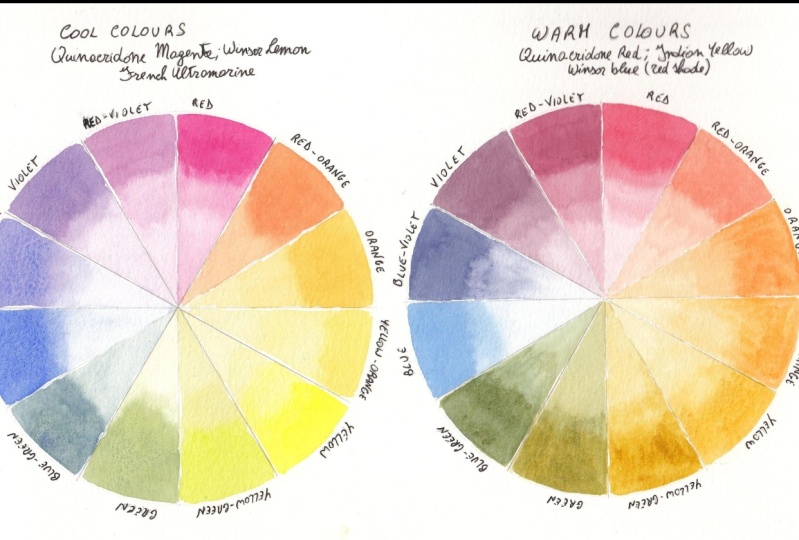
complete this class. This is the color wheel. There are many versions
of the color wheel, the bigger ones and
different ones, depending on what you
are interested on. But this is the one you
will find more often. You can find it easily
on an internet shop or online for a sample. And this shows you the colors
and the color harmonies, which we are going to talk
about a little bit later. The primary colors are
red, yellow, and blue. And then if we combine
two primaries, the red and yellow, we have orange, red and blue, we get violet and yellow
and blue we get green. Then if we combine one primary
and one secondary color, we get a tertiary color. So if we combine
red with orange, we get red orange. And if we mix, let me
move this a little bit. So if we mix yellow, which is a primary, with orange, which is a secondary, Let me put it a bit closer. We get the yellow, orange. That's how it works in theory. However, this is not how
it works in practice. Usually because
your primary colors then not actually
pure primaries. So when you ever read
is not just read, but a so-called color bias. So some reds tend toward orange and some reds
tend towards the violet. When you mix a red and a blue. To get a violet color, you have to be careful
which colors you are using. For example, I have added
this to your downloads. You can download it and
print it if you like. These are some of the Winsor and Newton colors
which have a color bias. So for example, the
cadmium Scarlet, it's red with a
tendency to orange, while the permanent
rose is a red with a tendency to a violet. And the blues. We have several in blue, which is a green-blue. It's called a tendency to green. And the pharyngeal homodyne
as a tendency to violence. If you want to have a very
vibrant violet color, then you need to mix these two, which is this
tendency to violet. This as a tendency to violet. When you mix them, you
have a nice violet. If you mix these two, whichever tendency to
orange into green, then you will have a sort
of muddy violet color, which you might want actually
because if you're painting, for example, landscapes,
then in the shadow areas, you might want that
sort of muddy kind of violet color because you don't want to do
the shadows black, of course, you want to have
that sort of violet color. It depends on what you
really want to do. But it's important that you
know this because if you mix colors just like that
without having no idea what you're doing and expect to our color and then
something else comes out, then you will be frustrated and you don't know
what's happening. So this theory of the color
bias has been studied and described really well by someone called
Michael Wilcox. I'm not sure if
you've heard of him, but he actually wrote this book, blue and yellow
don't make green, which explains what I've
been talking about. So this is his theory
and don't want to say I discovered
this because he did. And this book goes
over what I just said, but in loads more details and
there's lots of exercises. So if you are interested in finding out more
about color bias, you can buy this book. I think you should
find it on Amazon. There is also a Michael
Wilcox website. You can have a look there. Of course, you can always
experiment with your colors. If you only have
three primaries, get your three
primaries and mix them. I can show you actually in here. I have taken three primaries,
quinacridone, magenta, French determining
and Winsor lemon and mix them and all these colors or from these three
primaries, these ones as well. I just kept mixing and mixing
and finding new colors. And then I got
permanent rose, Winsor, blue-green shade of red
shade and quinacridone gold. And I mixed them and I
obtained these colors, which are a bit more subdued. And these colors are also
from these, from these three. As you can see, you can rich and quite a huge amount of colors with just
three primaries. If you have different primaries or if you just have three, mixed them and experiment
play with them. And you will see that you will find lots and
lots of colors. And you can make
some color swatches like these ones with
their own colors. And you can have it as a
record of your colors. In the next lesson, we're going to talk about
the color harmonies. See you in the next lesson.
9. Colour Theory Part 2: Hello, welcome back. We're going to talk about color
harmonies in this lesson. This is important because if you want to create a palette
that works well together, then you will need to know a little bit about
color harmonies. Again, huge subject, but
to start with you can, I have the foundations really? And then you can discover
more if you want. First of all, we can
divide the wheel into warm and cool colors. Normally the warm
colors are the reds, oranges up to the yellow. And the blue colors are the blues and greens
and the violet. Although there are some
warm violet as well, and there are some cooler reds. But generally speaking, this side is the warm side
and this side is the, is the cold side. The warm colors are associated with passion,
energy, excitement, while the cool colors
are more associated with a barn dance
piece, spirituality. And this can affect Delta
km of your illustration. For example, if you
make an illustration or a pattern during the class, I will show you two
different color wheels. One way made with warm colors and one
made with cool colors. And you will see the difference. These colors have cool colors
usually are a bit brighter, while the warm colors
a bit less bright, a bit more subdued. But it really depends on the message you want
to come across, which one you choose. So going back to the
color harmonies, we have, first of all, we have the
complimentary colors, which in the color wheel. So let me put it a bit closer. They are indicated
by this arrow, and so they are opposite each
other in the color wheel. So the complimentary
of red is green. If we turn it, complimentary of
yellow is violet. And complimentary colors are quite important because
sometimes you can use a little bit of the
complimentary color to darken your original color. A little bit of green. We'll darken the red. Not too much because
otherwise it would change your
color completely. But this is important. This type of scheme would
give you a strong contracts. It's better to use one
color more than the other. If you have a load of green, you can use some little
bits of red to give it a little bit of the
splash of color. Don't use it in the same amount or otherwise it might
look a bit uncomfortable. Your final composition. Then we are two triangles. These are the triads which are three colours equally
distant from each other. So this one for some, if we look at the
larger triangle, we have green,
orange, and violet. And the smaller one is green, red violet, and red orange. And then we have the
analogous color scheme, which is created by choosing three or four colors which are close to each other
on the color wheel. So for example, if we start the red-orange,
so there's 1234, these ones here, this one will be a analogous color scheme, and this is probably the safest color harmony to start with. You choose colors which are close to each other
in the color wheel. And then you use those for
your pattern or illustration. And I have some here, some colors here,
just to show you. There's also a
monochromatic skim. Don't know if you can
see this properly, which is the same color, only diluted as you use it. And then we have
analogous colors here. We started with a
blue-green and then blue, blue violet, violet,
and red violet. And then these are
just the colors used. The triad have a red, yellow and a yellow, orange, red, violet,
and blue-green. Or year we have the color,
so it's pharyngeal, thermohaline, scarlet
lake, and sap green. Then we have
complimentary colors. Whoops, we are after the red and green and orange and blue. And as you can see here, these are also red and green. It doesn't have to
be there bright red and the bright green, you can use different
shades and tints and so on. And you would have
a better effect. And then I have other here, which I study the double complimentary and
split complimentary. But I don't want to
confuse you with too many, too many schemes in
words and definitions. These ones are the ones
that I talked about. They're quite good
to start with, especially as I was
saying, the analogous. And it's actually quite good to add when you
do the analogous, your colors next to each
other and then splash of the next color next to them. You have your blues, and then a little
splash of red spectrum. So it makes it a bit
more interesting. Alright, so in the next lesson, we are going to
paint color wheel. We finally get our hands
dirty and hopefully not. Alright, I'll see you
in the next lesson.
10. The Colour Wheel: Hey, there. We finally
picking up our colors. We are going to
make a color wheel. Just to save time. I've made already a color
wheel with the warm colors. I'm going to make one
with cool colors. Warm colors I used
where Quinacridone, Red, Indian yellow and
Winsor blue, red shade. If you didn't have
Indian yellow, you can use another
yellow orange such as cadmium yellow pale, for example, or any other yellow with a tendency to orange
that you have available. You can see how
many colors you can get with just those
three colors. These are just obtained mixing
the red and the yellow, and then the yellow with orange and red with
orange and so on. So you can get quite a few colors as I
was showing you before. So I'm just going to do
this one with you now. I've drawn the circle
on some paper is the, let me see if I can show you. This was the Canson
paper, a query. This one here. It's quite
good for this sort of thing. Of course, if you want to do illustrations, video,
color palette, I would advise you to actually do some
swatches in the paper that you are going to use for your final work in my
CMA waste of paper, but it's not because every
time you change paper, you would get a
different effect. So this might be a bit
more muted in here. If you use another paper, you may have your colors a bit more brilliant or
the other way round. It's important that you try. You don't need to
do a color wheel. You can just cut a little
strip of paper and test your colors in the
paper that you're going to use at the end
for your final project? I have tried differently and I'm and I've regretted
that I didn't do that. Little tip for you.
Let's get started. I'm going to use for
the cool colors. I'm going to use quinacridone, magenta, Winsor, Lemon
and fringe ultramarine. Let me pick up some,
some of these. This one here. I will dilute the color a little
bit because you can't really pick up the color
from your palette and paint. It will be too sick. That's probably a bit
more. I have here too, just as I showed you
before, to just water. And one are going to use
to wash my brush and pick up clean water to
dilute my paints. Just scrap of paper to see the current density
in what color it is. So this one should be okay. Okay, so that's the red. Then I'm going to
pick up the yellow, Winsor lemon, this one here. Let's try the yellow. Should do. Then for the blue be
French ultramarine. This one here. I sort of know where my
colors are now because I've been using them for awhile and I have
my color chart. I'm going to put the blue here. All right. We can always
add more if we need to. If you have noticed here, I didn't clean this color here because this is
a black watercolor. I advise you not to use the black that you can
buy a ready-made, but to use your own black. And this was made by mixing
yellow, red, and blue. And it's just so
easy to get a black. And because this is the neutral
is quite, is almost gray. But it's great for painting. For example, white
objects, white flowers. You dilute it quite a lot, and then you use that
little side note there. I think I'm going to
use my number three, Winsor and Newton brush. It should be enough. We'll check. Just wait a little bit. I like to tilt my
page a little bit. I normally use one of those during tables
that tilt a little bit. But here, just for the
purpose of filming, I didn't want to do that in case the image is too distorted. But I'm going to lift it just slightly so the
paint will flow. And what I'm going to
do is just some delay that a graded wash. If you don't know or if you don't want to
do a grid, of course, you can always do full
strand on the top. And then they load to your
color a little bit and do the rest because it
will help you to see what the color looks
like when it's diluted, rather than just a solid color. Always, if you want
to have enough to going to apply this and
then to the graded wash. What I do is I just dip the
brush once or twice and then just put it on the
side of the jar like that. Then apply it. Just dip, dip in, squeeze as oppose a little bit. That's how I do a
quick good at Wash. Alright, so it doesn't
have to be perfect. It's just for us
to see the colors, really going to do the
rest of the colors now, the yellow and the blue. Alright, so just be
careful when you do this because if
you're not careful, you're gonna put your hand in the wet paint and
you might smudge it. Like sometimes I do. These are our priorities. Now what we need to do is to mix the primary is the red with a
yellow and make the orange. I'm just going to do that now.
11. The Colour Wheel Part 2: Going to pick up
some of the red. Make sure you have enough to do. The entire triangle is
not the end of the world. If you don't, it'll be nice. Because sometimes
it's very difficult to reproduce the
color perfectly. This one here actually
could be used for the red orange, which
is the one there. Because we need quite
a bit more yellow. I might just do this one. If you do this, just be
careful not to touch your previous color because
this is not quite dry yet. So it might run into each other. If you do. I tried to leave some spaces as well
in-between so I can delete, I can erase the pencil lines. Let's see, because theory
and practice are different. See if I can do this
without smudging anything. I keep adding yellow. I mean, normally you
would do the orange and then add red and yellow. But there's more than one way
to get to the same color. Sometimes I might need
more yellow in here. Now we have more of an orange. I think that's fine
for our orange. Then we would need
a yellow orange, which is just a little bit
more orange than this, might transfer some
of these here. This is why the paper
is quite useful. Yeah, I suppose this one should do not much more orange than this one just a little bit. But watercolor if you want, you cannot change your color by adding a wash at the
end when this is day, you can always add a slightly
more orange wash and it will change and it would
become a bit more orange. Then we can do maybe
the violet color. I'm going to mix the
red with some blue. I think that should do. That will be our violet. See, I don't want
to smudge anything. If you find you have
too much water, you just put your brush to your kitchen towel and
you will absorb some water. Because this happens, not
something that can be avoided. Sooner or later, you will
have too much water in your brush. This one here. Move this over. I don't know if you can see, but it's going to relate
to that a little bit. And that's because French
ultramarine tends to granulate. If you don't like this effect, then try not to use
french ultramarine. And if you do like the effect, then you know that
pharyngeal Tomlin is great because it degranulate. And also if you use infringer Germany and make
sure when he's in a mix that you mix your paint well
before using it next time. Because otherwise you
will have a separation. Your color won't look. Quite right. I think I'm going to mix the
blue and the yellow. So we leave that to
dry a little bit. Always add a little at a time. Because otherwise, you
might get too much of a color and then it's
difficult to go back. A little tiny bit more of blue, green. Alright. Now we can do maybe the
red violet because these are died the bit for that I will add
more red to the violet. I think that's good. Alright. Now, let me see which
one is more dry. I could do the blue-violet. I need to mix a bit more
violet and then add more blue, so make it a bit more blue. That's more or less the
violet we had before. Now add more blue. I shouldn't pick up the
color where my good brush. But just for this one. Suppose we can go for this one. You can see how it's granulating
the French ultramarine. We have two colors left, the yellow green and blue-green. For the blue-green, can
add a bit more color. Here, this is our green. We'll add a bit more color
in here, a bit more blue. I always had it in the side. And if I realize it's too much, I won't mix it all. I mean, it might
not be too much, but I did it again. I use my good brush. I think is not enough blue. Good to change brush. Now, use the one I should
use to mix the colors. I think that's
quite a blue-green. Okay, whereas the blue-green, now we have to do
the yellow-green, might have to mix a green again. As you can see, it's a
good idea to have to, just because this is
getting quite muddy, dirty. So I use this water for
diluting and mixing. Thus the similar to the
green we had before. Now we need to add yellow
to the secondary green. The tertiary yellow green. Let's pick up a bit more yellow. Okay, I think we're
getting there. Last color. Here we are. Our two color wheels. As you can see, this
is actually a bit brighter in terms
of colors than, than this one because
the mixes with a cool colors normally
give brighter colors, while the mixes with the
warm colors give warmer, sort of more muted colors. Which again is up to you
which one you prefer. When this one's a day, you can take an eraser and get rid of the lines
of the pencil lines, or you can just leave
them is really up to you. Alright? And then you can do this sort of work with
different primaries. If you have another three, another red and the
blue and the yellow, you can try that as well. Or you can try play with these
colors once you have them. Mix. I don't know. More yellow and blue and red and
see what comes up. Eventually you will end up with browns and you will end
up with, with a black. Something like this one. Because the more you mix them, The more the dark
area will become. But it's a good idea
to always play with your colors to see what comes up and then keep
maybe a sketchbook or somewhere where you
can add your color. You can record which
color you used. This is very important. You won't forget the next time you want to have the color. You can go back to your
book and check and see how you made that
particular color. I have done something like
that here, for example, where I've played with
different yellows and blues. Sometimes oranges to
make different greens. So if I have a, a leaf, for example, that I want to paint, I can put the leaf next to this page and see
which green is closer. And then if it needs
adjusting a little bit, then I can just tweak it. But it's very good to do. As you can see,
I've done loads of green mixing and I have done
it for purples as well. It's a good exercise to do
when you are a little bit of spare time and it's
something that you will find useful in future. All right, so in the next
lesson we're going to talk about finding inspiration
for your own color palette. See you in the next lesson.
12. Finding Inspiration: In this lesson,
we're going to talk about finding inspiration
for your color palette. Now, since this is about finding your
favorite color palette, the best way to
find inspiration is by searching for images
that really speak to you. You can use magazine
as I have here. These are some Italian
flour magazines. You can use interior
decor magazines. Of course, you can
use Pinterest, which has a vast
amount of pictures. We're going to have a look
at Pinterest in a minute. And what I like to
do is either to have a board on Pinterest or
you can have a load board, mood board, or you can
even keep a scrapbook. And I'll show you what
I do in a minute. We don't damages,
they really love. I have included
with the downloads some templates you can open
with Adobe Illustrator, or you can even
print if you want. But these are quite good. Two, if you would like to
work in a digital way. And there are some restrictions on how to use them as well. It's quite simple really. You could use those if you like. And of course, once you have
field does mood boards, you can always have
them on your computer, on your iPad, or you can
print them and have them next to you when you
do your color palette. What I was saying is some just look through your
magazines or your Pinterest and look for images that really
sort of speak to you. For example, I really
love these colors, this rich green,
blue, and the pink. These are really lovely. Then let's see. There are lots of pictures of flowers with
different colors. And it's one more. This one here for
samples got loads of oranges and yellows and green, which look beautiful
together here as well. Then the image in the core
here is quite nice too. For example, here there's
a flower bouquet with the reds and pinks and
greens. That's lovely. Here's another one with
some really deep oranges. I loved this kind of colors
with the blue as well. I will know on your magazines
see where you find. And also there's a
couple of books. There's one on butterflies. It doesn't have to be
this particular book, but if you like the
colors of butterflies, I find that nature
is really one of the best inspiration sources of inspiration if you want
to look for colors. Because the way nature's, nature can put colors
together, known as somebody's. Butterflies are just beautiful. And somebody's ones here. There's lots of pictures here. And then some of them have been portray them on flowers as well. So the color of this
one, beautiful blues. Then there's this book which I really like to just
lift through and see. Just remind myself where
the images in here, because there are some
beautiful images here too. It's all about your creativity in waking up your creativity. Again, the themes, the
blues with the reds. I would advise you
to get this book and just look at it every now and
then when you feel stuck. And you feel, you don't really know how to jog your creativity. This is quite nice. This is from Philippa standard, this gold conscious creativity. Some other ones. And then I can show you, this is a scrapbook
sort of thing that I keep with lots of images that I find in
very different magazines. This home decor and there's sometimes even know cookery
or all sorts of magazines, sewing and the intellect to keep these four
colors for shapes, textures, and so on. I just keep this normal. Like a book for writing
is like a ruled. Let's see if I find
some speeches. So it's just the
normal rule book. If you do this on a sketchbook, you can even color with
your own colors as well. This page is not that
good for that reason. But as you can see, I just add all the
things that really Really sort of speak to me. There's lots and lots in
here because I've been keeping this for quite a while. It's nice. So every now and then just
lift through and it would give you that extra spark
that you need sometimes. Okay, So this is as far
as the analog methods. And then I'm going to show
you also Pinterest board. And we can now look at how to search and see
things on Pinterest. And I want to keep
a board in there. Alright, so here we are on Pinterest and I've
created this board. I made it a secret board. And I just kept all my
color inspiration in here. I mean, I don't have
many pictures really. I don't want to have too many. And I suppose you
could search for 1520 pitcher maximum because then you would just
start to be confused. I think 1015 to start with
is actually quite fine. Because I really
want you to look at what you really, really like. Don't just save any pitches
that you come across. The good thing is that when you open one of these pictures, you can have quite a few
more that are similar. So there's lots and
lots to, to look at. And of course you can search
for different things. So for a sample you can
search for ordinal sunset. Let's see what comes up. So you have beautiful
sunset pictures with different colors
that might inspire you. You can use butterflies. Then again, lots of colors, lots of pitchers who look at
this one, that's beautiful. And then you just save them
on your, on your board. Then what I do, since this is just for
your own personal use, I have actually saved these
pitches on my computer. So right-click and save image. Don't use them for
anything else, of course, but for this you can
use it because it's for your own moodboard and to
find your own color palette. That's fine. Then what I did was I
placed this pitchers in the Illustrator document
with a mood boards. So this is the one
I have added here. What you do there is a file which explains
how to use these. But basically, you
choose a picture. You can copy it or
cut it if you like. Then let's say I want
to put it in this one. Just put it down here. Actually. Send it backwards. You can right-click, arrange, send to back, or do Shift Control
and left bracket. Then with it selected, hold down the Shift key and select the square where
you want to put it. And then right-click
and make clipping mask. I know it's a
clipping mask and of course it was not centered. But to put it the way you like, you can just
double-click the picture and then you can just
move it the way you like. You can make it a bit smaller. For example, holding down the
Shift key makes it smaller. Then when you
double-click outside, you will have your picture
in there inside your frame. And let's do another one. Maybe I could put it
in the round one. So Shift Control Left
Bracket and then this one, click Make Clipping Mask. We can move it a little bit. You can make it a
little bit smaller. Then we click outside and
we have done in there. You can use these
frames if you like, or you can make your own
or you can just put them in a page and just do that. It doesn't really matter
the way you do it. It should be somewhere some way that it's most
comfortable for you. Send that to the back. This picture is not clear
made to fit properly, but it gives you an idea. This is the one I did. I modified the mood
board a little bit. So you can do that too. You can pick another
shape and put it in another mood board
you should prefer. These are the colors
I really like. And I really find
myself going back to every time I wanted to do something when my
own color palette. Once you're ready
with your images, you've downloaded the
print to the row, however you want to
use your images. Then we ready to make finally
how our own color palette. And we do that in
the next lesson. So a seal in the next lesson.
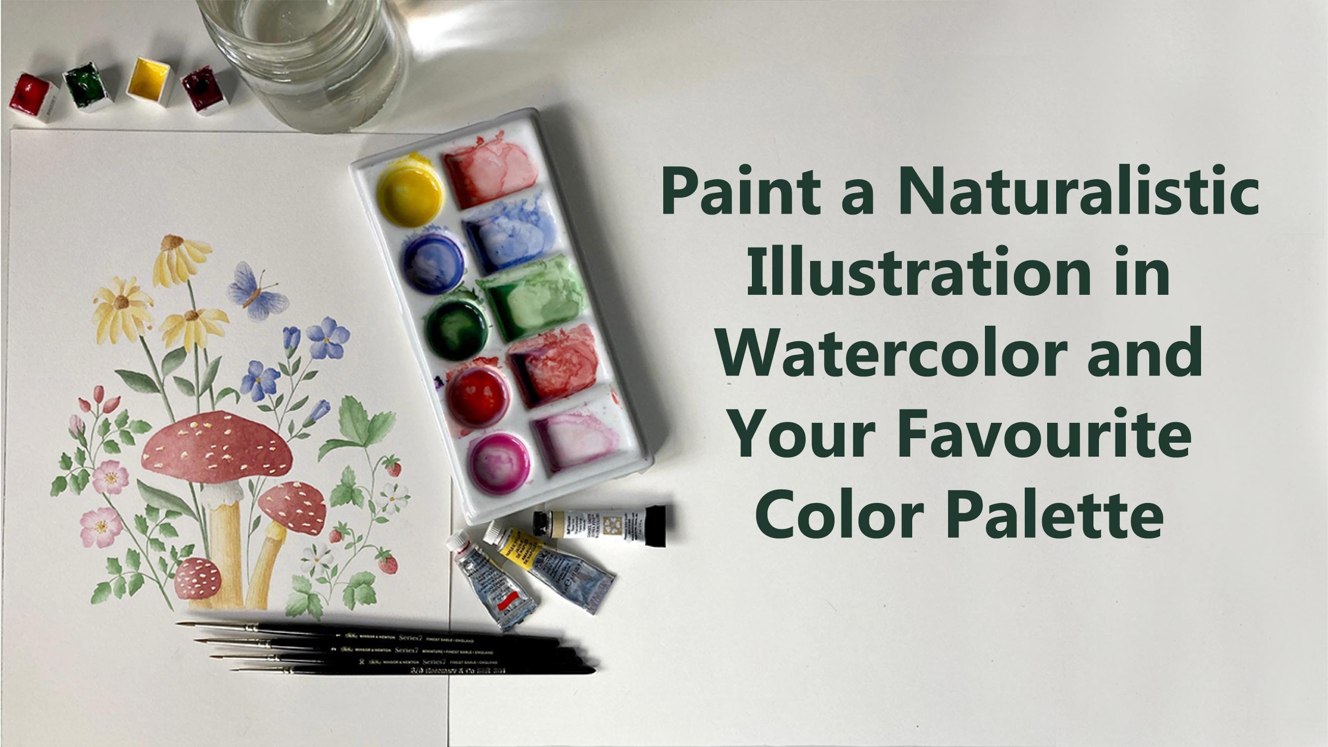
13. Let's Make the Colour Palette: Finally, we get to the fun part. We're going to find and mix the colors for our own
favorite color palette. Now because this is about finding your own
personal color palette, It's important that
you don't just copy what I'm doing exactly. Unless of course you really
loved the colors are mixing. But I advise you to look at your moodboard and find
the colors that really, you really love because that
will make it really yours. What you need to do now is to have somebody like this ready. Let's see if I can show you. I usually write it in
pencil and then with a pen, go over it at once. I'm sure that everything
is as a like it. Draw the grid here. A table. We're going to put the
colors underneath. I'm going to write
what colors I've used. Again, this is very important
for you to remember. And then go back and
see which colors you need to mix up the
color that you want. If you remember, I think
lost some downloadable. This is more or less the
same that I've drawn here. And you can print this with
a light margins here on now, directly on a sheet
of watercolor paper. Or you can print this and just
trace it with a light box. You can do your own
version of this. You can do it the other way, landscape instead of portrait. You can do little circles. You can do triangles that way. You're like, it's
your color palette. Choose whichever way
works best for you. I also have my usual scrap
paper here where I can just try the color before I put it on in the
final palette. Mixing brush. And
I'm going to use this number for
Winsor and Newton C7. Still the miniature, but I think it's a good size for this. And of course we
can always change the brush if it's too small. Okay, so now I'm going to
look at my mood board. I actually took a
picture of it and send it to my iPad so I can
I will look at it from here. This is just the same I showed you in the previous lesson. As you can see, there are
some colors that come back, different pitches, this
type of colors here. Then there are sort
of repeated down here more or less
than a quite similar. And here I think I'm going to mix somebody like this color. To do that. I'm going to use
some quinacridone, magenta. Then some Hooker's green. The green will desaturate
this very bright color. Always tried to add just
a little bit at a time. As you can see, it makes
it that God already. I'm going to add some Naples, yellow, not too far off and
add a little bit more green. Always add visually on the time. And I think with,
with the color. Then I'm just going to add
it to my first swatch. I didn't know a lot of color. It's always good practice
to make enough color. But I'm not going to go up to
the sides because I didn't leave any space between the squares or
rectangles in this case. I think that would do
just about enough. That's my first color. And what I'm going to do now is to write down the
colors I've used. And I normally use
the initials of the color QM for
quinacridone magenta, plus h g for Hooker's
green and Naples yellow. Which colors are used? If you want, you can
take a little bit of the color and just do a little little tiny swatch that you don't have
to, of course. But it's just the original
colors if you'd like to do it. So you have a record
of what you have used. The next color. I quite like a nice loops. And these green, so there
are some greens here, some lighter greens here. So the green is sending that. I'm also attracted to. I'm going to make
a nice dark green. And I'm going to use again the quinacridone magenta had
really loved this color. I'm gonna put it in here. Again, the hookers
green because I quite like how these
two colors interact. Color and then a little bit of French ultramarine. Actually. I quite like the skeletal. Sometimes you get
exactly happy accidents, but before you get to a color, you get a different color. This is something that
I noticed here in my Moodboard to somebody
like that for example, which is probably just
the derivation of this, but it's more going to violate, put it closer to the
camera around this color, or a violet color,
which I quite like. I think I might just add
this to my palette as well. This kind of going quite well with the first
Canada we did. In a composition illustration, for example, or in a pattern. These two colors will
go well together. They're made with
almost the same colors. We didn't put the
yellow in here. So that also helps to keep
a noun money when you use the same colors in different quantities to
mix different colors. Okay, let's see if
I can do the green. First of all, let's
write down these colors. Withdrawn, magenta, screen
plus fringe, ultramarine. And just notice, normally
I go towards that way. That will be number
seven and number two, I'm just going to
put a seven here. This is the first time I
do this sort of that way. That's why Let's try the
other mixed. Hookers. Green. This is quite a bright green. You don't want to
use it by itself. It's not something that
you will find in nature. Really. Going to add a
little bit of quin Magenta. I call it Queen foreshortening. Just to bring it
down a little bit. You can see it's
desaturated now. Don't know if I added too much. No, that's fine. Nice, rich green. Then I'll add a little
bit of Naples yellow. Just to make it a bit lighter. I'm going to put this
in the number two. This time. If you have noticed, I actually use the same
colors I used here. So hookers, green, quinacridone,
magenta, Naples, yellow. But I put more green. You get a totally
different color, but it goes really well with
the first color we made. Look at this. Pink and green. Really lovely. Alright, I'm going to keep working on the color
palette this way. I'm just going to have a look at the colors that I have in my mood board here. Then mix the colors that are similar and think are going
to mix maybe an orange. See some blues. I just speed up the process
a little bit for you. I just wanted to mentioned, to mention that this color here, which is quite nice, peachy color, mix it
with the buff, titanium, and flesh tint, which
are two colors, which are not from
Winsor and Newton. Buff titanium is from Daniel Smith and flesh
tint is from aldol. And but I do like this color and also views
buff titanium here as well. It's a bit of Bake, will make your colors opaque. And this is somebody you
have to keep in mind. If you only want to have a
mixed switches transparent, then you need to use all
the transparent colors. And I just wanted to mention
something and it says, well, if you doing this color palette for a sample pattern design, you don't need to, You
don't need to mix colors. You can always choose a color
even from color pencils. These are watches I was
maintaining a in another lesson. I did this at the beginning
when I got my colors. And basically for each color, I just did a little swatch. And these are quite good
when you call on my team because you can
just put your color next to whatever you're trying to match and see
which one is closer. As you can see
actually that color is quite close to
this watercolor. If you have colored lenses, you can pick 11
cutoff for a sample. Do like something like this. This Sunday color here. And I always write what
it is in the name. And then thus the one. And then you can just watch
your color on your paper. As if you use colored
pencil, normally, tool to color, to choose the
colors for your patterns, then you can do this way. And of course, you can
mix color pencils because you can add another color
on top of this one. Make a DACA Different, give it another hue. That's one. And there's one color
is really like, which is quite difficult to
obtain with colored pencil. Which is this sort of green Ear, which ad do I have in my board? It's sort of around that color, more or less this color. So I found it a bit difficult, but we've caught up
into this something that is already there. I can't find it again. I think it was this one. It's sort of
engineering 56 green. So these ones are the draws from a little container
for colored pencils. And it's really very useful. I wrote, I put some
transparent tape here and the numbers, although when I use them, they're not always go into
same as equity, same place. But more or less,
is there a 156? Is this one over here? They're good way to
store your pencils. And then you just
do your swatch. You can, I suppose
you can mix as well. Because if you're using this for illustrations or
not illustrations maybe but for patterns, for example, where you're not
going to do a final work, mixing the two that were the
colors in the color pencils. Then you can have a
color palette like this. Then in here, of course, we need to write down. Number ten was 56,
fabric castle. The other one was on June 84. If C4 public customer. And I'm just going
to finish this now. I'm going to carry on
with my color palette. The show you the
finished palette.
14. Colour Palette Part 2: This color here. I'm going to do right now. This is the same mix. The colors above. This one here, which is Naples, yellow, quinacridone,
magenta, and French. But I added some
cadmium yellow, pale. As you can see, it changes
the color quite a bit. That way, you can make some more colors
just by modifying, adding one more color
to your previous mix. This color here is basically
the same colors as this one. So hookers, green,
quinacridone, magenta, Naples, yellow, but they are
in different amounts. So you get a lighter green. So it's the same for this one. So as you can see, by
changing the amounts, you change your color. The best thing to find out how to do this column
mixes is really to try play with your colors
and see what you get. Of course, if you've
tried to keep in mind about mixing the cool
colors with a warm colors. Mixing just a cool with the cool and the warm air, the warm, you will have a better idea
of the sort of color will, that will come up because
sometimes you might get a muddy color if you mix
the wrong colors together. So for example,
I'm going to show you to have a nice violet. We mix red violet, which is the quinacridone
magenta. I love this color. Blue-violet, which is
the French ultramarine. We have a nice vibrant color. I'm just going to put
it here in my palette. It's a bit awkward
to paint like this, but I'm trying to show you
as best as I can on camera. Drone magenta and
French Ultramarine. And then I'm going to
mix violet with a red, the blue, which don't have
a tendency to violet. Let's see, we can
use for example, cerulean blue, cadmium Scarlet. And as you can see, let's see, I show you here. We don't really get a violet. We get this really awful color, which I'm not going
to put in my palette because it's not been a nice. That's what happens when
you mix the wrong colors. So not every blue and red, I'm going to give you a violet. And not every orange and red and yellow gonna
give you a nice orange. But again, you might
want a different color. But this one, I don't
think anyone will want. I'm going to wipe it off from my palette because
that's really horrible. Alright, let's
carry on with this. You don't have to do
the whole grid here. You don't have to
find all 24 colors. You can then D or 18 or
even 15. To start with. You can just play with
your colors in C. When you find somebody that
you like, you can add it. It's a good idea to start
with around at least 15, so you have a good choice. And I always try to add some
neutral colors as well, like this. Sunday colors. Maybe somebody like
this one or this one, because it gives you a good
balance on a color palette. Try to add some,
some bright colors, some darker colors, and
some neutrals as well. For example, I don't have
any colors tendon, red. I'm going to try and find
a red for this palette. That's quite a nice read. And it's not too bright. So use the Winsor red
and Hooker's green. And I will scan this and
add it to your downloads. So if you want, I
will do it nicely. If you want, you can have a
look at what colors are used. But of course, as I was saying, you should train and
make your own colors. Look at this one. I
really love this one. Sometimes this is nice for
a nice splash of color when you're doing a pattern
or illustration. And you want that little bit of something that
draws your eye. That was the Winsor, red, red, and hookers green. Alright, so here is
our finished palette. As you can see, we
have different colors. We have some lighter colors, like the pinks for a
sample, and some yellows. And we have darker colors
like these ones and blues. And then we have
the neutral Keras. So I think it's quite
a balanced palette. And then for those
of you who want to use your palette to
make pattern design, then I'm just going
to show you how to bring this palette into Adobe Illustrator and
then pick the colors. And of course, you
won't be exactly, exactly the same, but it
would be very similar. And you can use this as your signature palette
to make your buttons. And I'm just going to move
this a little bit closer. You can see the colors. Okay, so I will see you
in the next lesson.
15. Transfer Your Palette Into AI: Hello, welcome back. In this lesson, I'm
going to show you how to bring your color palette into Adobe Illustrator to make your digital color palette. I've opened illustrator
and I'm going to create a new document. I think I'm just gonna
do an A4. That's fine. Leave it like this. So create. Then going to place the color palette because
I've scanned it already. So everyone's scanner
is different. So I'm not going to show
you how to do that. I'm sure you know how
to use your scanner. So try to scan it as
a minimum of 300 DPI. Then we're just going to
place the image here. So control shift P, We're going to place it. Then we need to do is to
just create some squares. So I have 24 here. You can do some circles
as well if you want. I'm just going to
do little squares. Some delay that. Then I'm going to hold down the Alt
key and the Shift key. So I have them aligned
and make a Copy and then Control D to make more copies. And then these are six. So I'm just gonna make
a copy going down. So Alt and Shift then Control D. If you want, you can get rid of
the black outline. Actually, I think is a
good idea to do that. Let's see. I'm just going to give them a color at the moment so
we can see where they are. Now the only thing you need
to do is to select one, press the I on your keyboard
for the eyedropper tool, and then just pick the color. So more or less it will
be a very similar color. And then if you press Control, you can click and select another little square and
then release control. And he's gonna go back
to the eye dropper. So you don't have to back
and forth all the time. You can just press
the Control key, select a new square, and keep doing this. Let's see if I can get all
of them in the screen. Then this one, it's a bit variegated so you can choose
the corridor you like most. And then just keep going. Alright, so if some of these
colors look a bit too close, maybe these two are not too far off or
this one and this one, or this one, this one, then you can always change them. You can select the
color that you want. You can double-click. Maybe there was a bit too fast. You go on the swatches
in the field and double-click and then
you can change it a little bit to make it
darker or lighter. And then Okay. And it will change the color. Not too keen on this color, but just to show you how you can actually change your colors. So for example, this one, we can make it even lighter. There's a bit more contrast
between these two, the square and this square. So this is how you
manipulate your colors. And then when you're happy
with your color palette, you select all of them. And then you go to down
here to New Color Group. And then you can rename
this palette for a sample. And okay, and this is
your color palette. Then to save it so you
can find it again. You just, I like to get rid of these ones because
they just confused, meaning basically
the it looks untidy. I'm just going to click
and then hold down the Shift key and
click and then delete. Yes. I might just leave the
black and white just in case I want to use them. And then what I'll do is go to the swatch libraries
menu and save swatches. Then you can just save
it where it just opened. And you can give it a name. My palette. And save. Then if you want to
find this again, let's open a new document. You go to your swatch libraries, you go to user-defined
and my pilot. And there it is. If you click on the little folder there,
it will appear here. So again, you can get rid of the rest and you
have your palette. You can use it for
your patterns. And of course, as I was saying, you don't need to use all
of this is best if you use a maximum of
eight, maybe 12. But then you have
them here and you can use them as your work and then you can always get rid of
some of the colors. Alright, so this
is how you bring your colors into Illustrator. And in the next lesson, I'm going to show you how to do the same thing with procreate. So you can have your own
favorite color palette in Procreate as well. I'll see you in the next lesson.
16. Transfer Your Palette Into Procreate: In this lesson, I'm
going to show you how to transfer your color
palette into Procreate, if you'd like to use this up for your illustrations or buttons. First thing we need to do is
to create a new document. I'm just gonna do an A4. That will be enough. Then I'm going to
add the picture. I sent myself, the same file I used for the
Adobe Illustrator. Or you can just take a
picture of your palette. Go to the little wrench
button and insert a photo. And insert this one. We don't need all of
these underneath here. What I'm going to do is
to select it and move it down a bit to a big deleted. Then I create another layer. If you want, you can
do a layer for each of the colors that
you want to use, because that way you can always modify your color separately. Otherwise, if you want
to modify a color, for example, this tool, they came up quite similar. If you want to
modify one of these, you won't be able to do it if it's in the same
layer as the others. But if you put it
on his own layer, you can change it. Or you can first do all of
them in the same layer. And then if there is one or
two that you want to modify, you select them and paste
them in another layer. But basically it's very
simple to do this. You go to your colors
and you go to Palettes, and your add a new palette. And I'm going to rename it my palette. Then you just hold down your
finger and then click here. And you just do that. This would change. And you do that with
all of your colors. And that's it. And then if you
want to try them, you can just pick the
color That's a bit small. And just try them. And if you want to
change one of these, then you can select the
selection tool freehand. And let's say you wanted
to change this one. Then you do the
three-finger swipe and you cut and paste it. And this would be now in
his own separate layer. Then what you do is you go to the little magic wand and you go to hue,
saturation and brightness. If you picked layer. And
then you can change. As you can see, this
is changing color. You can have it brighter,
different color completely. Then you can change the
saturation as well. The brightness can make
it darker or lighter. That's how you bring
your color palette into. Procreate is not that difficult. And then you will have it here. You can set it as default. So when you go to your disk, it will be there and you can use it to make your patterns. For example, I know there is a, there are a lot of classes
on Skillshare on how to make your own pattern
directly in Procreate. I did one of those
classes as well. If you want to check it out. But there's lots of
excellent teachers as well that have
different classes. So if you want to try to make
your patterns in Procreate, That's quite fun to do as well.
17. Examples: In this video, I
just wanted to show you how to apply
your color palette. Mixed some of the colors
from my color palette. The top ones. Let's see. So it's number six,
Number 3241718, N2. So they might be
slightly different, but you can never mixes Exactly, exactly the same color
but these colors. And then on the bottom
row I have dark violet, which could be somebody like this color and this is
something in-between. And then I have
disadvantages number four, more or less, maybe
it's a bit darker, but that's the one. Then we have the same color
but with more fringe, ultramarine, just to
make it more ammonias. Then we have number 22. Then we have somebody
like number 11. But more bluish. I'm going to paint some. Could be, for example, bookmarks with some
geometrical shapes just to show you what it looks like when you
actually apply it. This pencil lines
are a bit dark. It was mostly for
filming purposes. But I'm going to make them
a bit lighter with this. But I'm not going
to make it too late because otherwise you
won't be able to see it. And of course, when
you do your shapes, make sure that you make your
pencil lines quite light. Otherwise, with watercolor,
you will be able to see it. Certainly color. And I'm
just going to do these. I'm going to speed up the video. All right, these are
just some examples. You can use your color palette. Quite two different palettes. So the first one is quite bright and it conveys
a list to me, some happiness and energy. And the other one,
it's not as bright, but it's still like
it because it gives me a sense of tranquility. This is what you can do for assemble
as an exercise to try out your color palette
and just play with your color and see how it looks. And I will include these templates with
your downloads as well. So you can, you can
download this if you like, and you can play with
it or you can make your own shapes or even
circles in a piece of paper. It doesn't have to be
particular shapes. All right, so I hope this has helped you seeing
these examples. And I hope you will have fun trying out your color palette.
18. Extra Tips: If you only want to have
mixed switches transparent, then you need to use all
the transparent in colors. And you can find
that information. Let me get one of
these which is bigger. This is permanent rose. At the back. You can find the information if the color is
transparent or not. This is the empty square, which means it's transparent. We have here is
semi-transparent. So the square root, just half the square is full. And then this is the opaque
with just the black square. Not all colors will have this, but if it doesn't
have this square, it will say somewhere
if it's opaque or not. These are the two I
was telling you about, the buff titanium
and the flesh tint. This one in my actually
not say that this opaque, but you can always do like a pencil line and then put your collar on top and
you will see if it's, if it's transparent or not. If you can still see
the pencil line or not. I just wanted to mention
something in us as well to have a different type of
swatches as well. The USA laminate it and I
just punched a hole in it. When it comes to color matching, you can sort of this
very clear on top. You can see how close
the current is, quite sort of matches
with that one. So these are quite
useful as well. You just have to do a
little, the little squares. Then do your coloring
and then laminate these. If you have a
eliminate or at home, or you can do it
from some places, I think they will do it for you. Little more tips there for you. One more little trick. You might know this already, but I just wanted
to show you just in case I use this when I
want to match a color. Sometimes it can be a little bit difficult to match a color, just looking at it. Just going to use this
little examples here. If you want to match
this pink for a sample, this color here darker, Let's put it closer
to the camera. You can put it next
to each other, but not very clear if
they are really matching. What this works out
better actually, if you have this printed, not on your iPad because you
might move it a little bit. But I use some. Where do you put the other one? Some black card. Just any black cards
that you can find. This, you can see the
credibility because I've been using them quite a lot, even with oil paints. And what you do
is you put one of them in the color that
you want to match. Let's put it around here. As you can see, this is moving. And then the other one
in the color that you are trying out like that. And this one looked pretty much the same like this when you look
at them like this. But if you put the
cut around them, this one is much later. You would have to make a
darker to match it to the one. That's basically what I do if I wanted to find a
color in and match it. Not sure if you have any
other colors you could do maybe this one here. And this one. This one is pretty
much not the same. And the screen here
looks a bit darker. Actually, but it's
not too far off. If I make this a little bit
darker, it will be the same. Just a little tip for
you if you didn't know. This really helps because
you isolate the color. And it's much easier to see if it is actually
matching or not. You can do that
with a live life, but with an object as well. I give my apple here,
which I still have. And you can sort of
put your black card, the color that you
want to match. So let's see if we find the spot where this
yellow here, for example. And then you mix your yellow. Then sort of the both
at the same time. This yellow is too dark. Much more yellow than
the one in the apple, but it's not too far off. So there's a lighter one here. This one might be better. It's a bit difficult
to see on camera, but when you try this yourself, you will see that they
would help you out a lot because you're really isolate w calendar you need and you won't be distracted by
everything else around it. Try it and let me know if you if you'd like to use
this little trick. Correct. Happy painting.
19. Final Thoughts: Thank you so much for
taking this class. I hope you have enjoyed making your personal
color palette, and I hope you have
found the grants useful. Your next step is to apply your new color palette to your work and possibly to
your branding as well. You could, for example, incorporate this palette
into your website covers. There's a book for you. Please remember to press the Follow button
here on Skillshare. So you will be notified straight away when they post new classes. And you can also check out
my profile for more classes. If you'd like to keep in touch. You can find me on
Instagram at category, or you can check out my website
category anti-R2 dot com. As always, if you
have any questions, don't hesitate to ask me in the discussion section and
then keep an eye on it. I promise. Thanks again
for taking the class. And I'm looking
forward to seeing you in the next class. Bye.
 Katia Galante, Botanical Artist and Illustrator