Transcripts
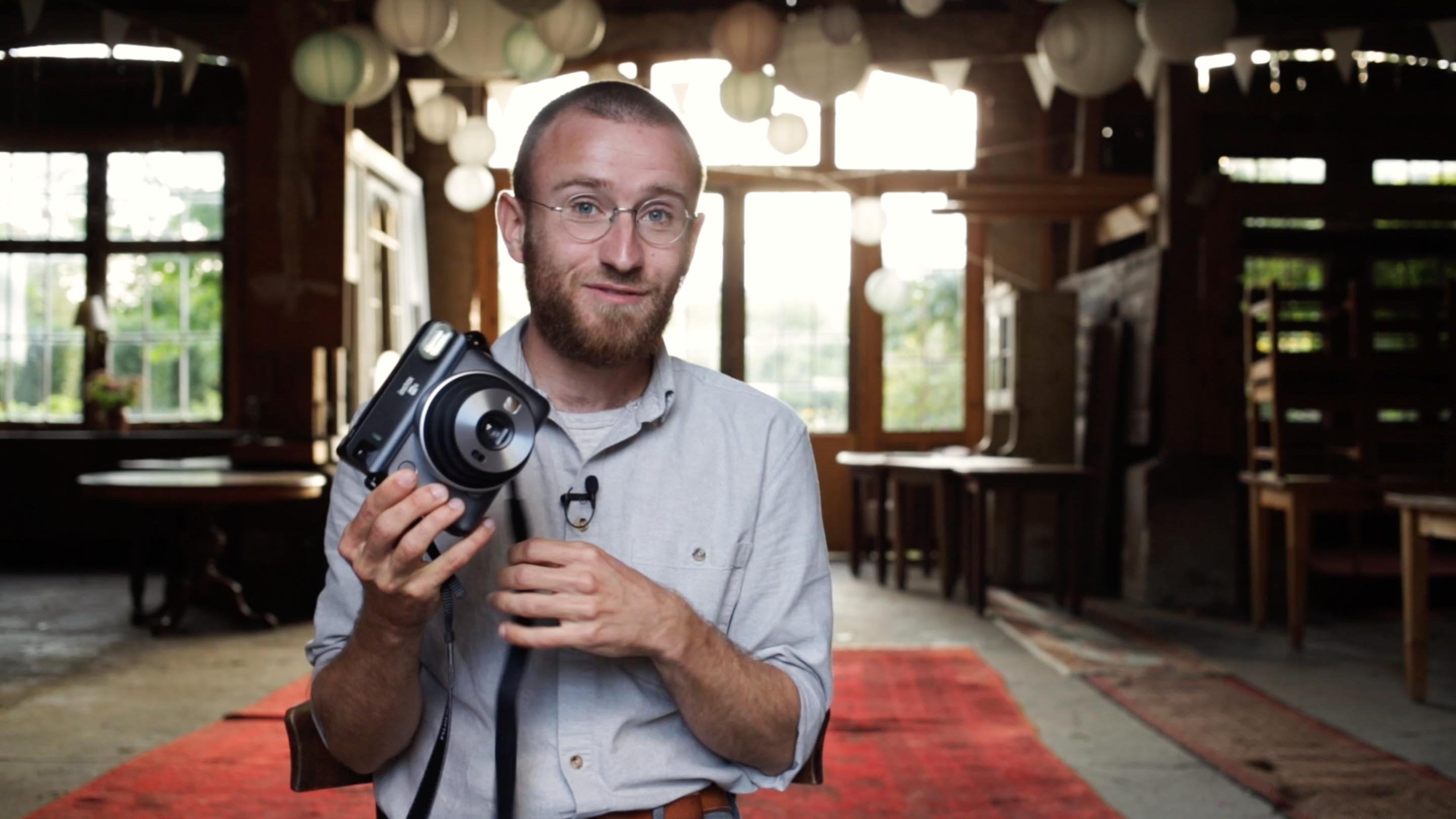
1. Intro: Scanning and editing analog photos: Hi, I'm Ken. For
the last ten years, I shot all of my free work on film and exposed
hundreds of roads. I scanned them with different
setups and had experience with different methods of
editing the photos afterwards. In this course, I want to
share with you my workflow. I want to show you
my camera scanning set up and help you
build your own. Then we're going to go and edit the photos together
in negative and in Photoshop to get the
highest quality results for whatever purpose you
need your photos for. There's a good chance that
there was a lot more in your photos than you are
taken out right now. And I want to help you find that potential and
bring it to the surface. Join my course. It's
going to be fun. There's going to
be a lot to learn. Let's go.
2. The three pillars of the analog post process: Hi, great to have you here. I'm excited to talk about the analog post
processing workflow. And there are three
major parts to this. The first one being scanning. There are different
kinds of scanners and I want to at
least briefly go into the different
kinds of options that there are and the
advantages and disadvantages. But not spend too
much time on this, because I want to talk about the future of
camera scanning. That really seems to
be camera scanning. Taking a digital photo of your analog negative
and then converting it. This is what we're going
to go into in depth. I'm going to show you my
camera scanning set up, show you how it works
and what you need, and there was a good chance
you may already have some of the components that are
needed to build one yourself. Yeah, you can bring this
to a crazy perfection. But yeah, I want
to encourage you to rather simple than not start at all because camera
scanning is a modular system. Once you get started, you can always exchange
certain parts of your set up. Yeah, just upgrade with time. That will be the first part. Second part is editing. Editing happens in two steps. One step is happening in a
software that is connected, sometimes directly
to the scanner or in the case of negative
b and the camera scanner. The first step that comes right after scanning
necessarily, or in my case specifically, it's what brings me to
the final image where I can we fine tune and
go into details. That would be Photoshop. We're going to go two steps, Negative lap and Photoshop, to get to photos that are
fine tuned and ready. The third part would
be organization. And it's something that is sadly often overlooked
until it's too late. Many people shot
film for 510 years, whatever, and then they
realize it's a total mess. And they have no idea where a specific negative is
that they suddenly need. Because they need to print it bigger and they only
have a ****** scan. Yeah. Go look for things, organization happens
on the computer, but it also happens with the actual negatives
in the folders. And you want those
two to be connected. Yeah, we're going to
talk about all of this and make sure that you get
a proper workflow set up. Now, we're going to start
with the scanning part.
3. Different kind of scanners: So let's talk about scanning, about different hardware, scanners about
different software. That they are generally
about the question of interpretation of
negatives to positives. Because that's
something that a lot of people are not really aware of. That this is something
that is always happening. There is not really a perfect representation of the negative into the positive. The positive is a
interpretation of the image that someone or some software is making, even
in the dark room. If the lab technician puts
the film into the enlarger, he or she is making choices
of how this image is looking. Enlarger, there are only three color balance wheels to turn. And they can adjust
the brightness, but there's no
changing of contrast. The film just is what it is. A choice has to be made. When it comes to col balance, there is interpretation
happening. The same goes for
scanners who scan the image and then there is a software that makes an
interpretation of that. Different softwares
make different ones. At this point, let me bring
up the Fuji Frontier scanner, which you might have heard of. If you bring your
films to a lab, there is a very good chance that the scans that you
may have ordered come back and that they have been made with a Fuji
Frontier scanner. Fuji did an amazing
job in baking, in good interpretation models. So to say that interpretate
your negative and give you a positive that is really good
looking from the get go. This is because these scanners were made for the everyday
customer who wants to bring their film with
their family photos or holiday photos to the lab and they just want beautiful
photos back. That's it. They don't want to edit them. They don't want to
exhibit them or anything. They just want
good ready photos. Yeah. Fuji being
great at color signs, they just did a very good job
of delivering that product. There was a time when film
was dying and labs were closing before the time
of the film renaissance. In between that time, labs were closing and
they sold scanners. And I happen to know someone
who bought one of those and put a lot of work into keeping this machine alive because
it's an old system, it's quite a hassle
to keep it alive. But yeah, it's a very simple
machine and it's not simple, but your input
with which you can do the interpretation,
they're very basic. You have six buttons to do color balance and two
buttons to do brightness. That's it. That's
pretty much what you would have been given as
dark room lab technician. That's what you can
do with negatives, that's what you can do at
the Fuji Frontier scanner. Just that the basic
interpretation that the scanner gives you from the get go is really,
really good already. Now when you use a consumer scanner or
let's say a scanner, that generally gives
you more possibilities to do interpretation yourself. This is when we get to scanners
like the Ps and Sirius. I personally owned 850, many years ago, I owned a scan. The software scanners come with a software made
by Epson or Cannon. These softwares are usually
not doing a very good job. We have to remind
ourselves here, there is a hardware
component which is the scanner and then there
is the software component. They work together
and sometimes they do a better job and sometimes
they do not. Such a good job. But for you, it's
important to know that it's not just the scanner
that scans the image, it's also the software that
does the interpretation. You as the person then tuning
that interpretation and choosing between
different film models that the software may offer you. Silver Fast is the software that I used with my Epson scanner. That I think is a
pretty good one. Yeah, If you buy a flat
scanner, Eps, and Cannon, whatever, stay away
from the software that those companies provide you and turn to something
like Silver Fast. It will give you
much better results. Then I also had a few
opportunities to work with a has blood flex tight scanner which is a virtual scanner. Not going too deep into that specifically is
let's just say it's a very high end machine but it's a dying system like the
Fuji Frontier scanners that nerds keep it alive
with more and more effort. The Hazlbatscanners
hardware can be repaired, but the software is
not supported anymore. The market for those systems is just not big enough anymore. Then one more thing I want to
mention is contact sheets. Let's put that in focus once, that's a contact sheet
from my archive. I'm mentioning this
because it's been a part of my workflow
for a long time. While I was using a
absent flatbed scanner, I got those contact
sheets from my lab. So that was the first time
that I was seeing my images. I love contact sheets. That is really fun and
it's a very beautiful way to experience your images
for the first time. To get this overview back
and see your journey that you went through while
taking those photos. And yeah, this was also an interpretation
of my lap technician and sometimes I got two sheets of the same film when
he did test stripes. And then he did his
entire sheet and he realized now is too
much red in there. And then he made me a second one and didn't throw
the first one away, but gave it to me as a bonus. That was a moment when I saw
he made an interpretation, he didn't like it, and
he made another one. Now that's what he's given me. Yeah. Then oftentimes not in
the case that you saw here, but oftentimes the very
different motives shot in different light
interpretation, that for, let's say Frame 101112 doesn't work for frames
one to nine, for example. Yeah, that's just as
a quick side note, we love contact sheets. I wanted to show them
at least once I have a section for contact sheets
on my website as well. Yes. I want to look at different photos with you
from different scanners just to put a little bit in perspective the things
that I just spoke about. We're looking at a photo of Andrea that I scanned
on different scanners. The first one that
you're seeing is the Fuji Frontier scanner. I did some adjustments. When I scanned, I did some color balance and some
brightness, I'm assuming. I don't remember specifically. But we can see that
this image straight from the scanner with a
little bit of settings that I did it, it could be ready as it is. It's looking back and
having comparison. I would say it could have
gone other directions also. But this is what I got. It's yeah, what I said before. Fuji is just saying, hey, look at your image is great, it's ready. This is what it is. Jumping to the next image or the same image that I scanned
on a hassel ban scanner. We can already see there is just much more detail
and information also. Yeah, in her skin. Just generally, I see this image is more
open to be taken in different directions versus
the Fuji Frontier image that was saying to
me, this is how I am. Take me, just post me
whatever print me, I'm ready. This Hasselblad skin, which is at this point
already free of dust, but it came with a lot of dust. Unfortunately, yeah, is much more open to go
with it different ways. It has of course, much more
resolution of co you're already seeing a version of it that in the moment
of scanning it, I made adjustments
in the software. Yeah, the third image
that we're seeing is from my Fuji FX
camera scanning set up. Again, we're seeing the version after I converted it
with negative lab pro. I intentionally left
space for it to be interpreted in more directions
later in Photoshop. We're going to get to
this topic later Of how far do I bring the negatives in negative lap then do
I leave for Photoshop? Yeah, but I'm showing you
these three to bring to your awareness how much
this interpretation part, how important it is. The hardware has a lot to do with resolution and sharpness, but the software has a lot
to do with how much room do you have to decide
the look of your image? I have to say the
camera scanning option is leaving a lot
of room for that. This isn't always a
good thing though. That's what we're going to
get to with the next image, I'm showing you a photo of Sana. This is the photo from the
Fuji Frontier scanner. Again, this is how it
came from the scanner. I might have done
a little bit of color balance and brightness, but this result I get very
quickly and it just looks like gorgeous immediately
specifically with that image. It's really impressive because
it was very overexposed. A difficult job just with one click basically bring
to the look that it has. Now the next one I'm showing you is from the camera scanning set up after I already converted
it with negative lapp. I already went from
the worst version that I got when I first
saw it, a negative lapp, to a version that I then want to bring into Photoshop
later in the course. We're actually going
to do that and we're going to edit this photo. Yeah, try to to make
it look better. But I'm showing you
this because in this example you can
see how tricky it can be to get a rather flat image that doesn't have so
much interpretation yet. And then you are being given the task to come up with a vision for how
this image could look. The Fuji frontier is
already giving you that. It's giving you the
image and it says, look, here I am, I'm amazing. That's your job. That can
sometimes be challenging. I think, especially for
beginners can be challenging. And it's a little
bit of a, yeah, a great thing about shooting
film, at least for me, is that the images
come with a character. And they say rather than
a flat digital file, the films say, look, I already have a character. I'm image shot on port 800
and this is what I look like. There is room to
play, like I said, interpretation but they already come with a base character. The camera scanning set
up is almost ten out. Again, this aspect of film
photography, not entirely, but it's leaving a big job of bringing that life and the character back has
given a lot of that to you. I have to say the new
version of a negative P has some great presets and that's a big step up to
bringing this back, but it's still a challenge. Later in the course,
we're going to take on the challenge of
editing this photo of Sana that came from the
camera scanning set up and try to bring
the life back into it. Yes, there is a lot
more like last year, I spent an entire day in a workshop that was
about camera scanning. And we did like a
three hour detour about scanning in
different scanners and methods and back and forth. And I don't want to bother
you with too much of that. Quite frankly, I'm not enough of a technical guy to know and to explain
all of these things. Yeah. What works for me and
what do I need to know to it. I wanted to at least Yeah. Talk a little bit about different scanners
and most important, bring your awareness to
the fact that there is always a hardware side
and a software side. There was an
interpretation job to do, which is on the software
and it's on you. Yeah, that interpretation job, we're going to do
later together in the scanning part.
In the editing part. For now, we're going to jump into the scanning part
and I'm going to show you my camera scanning set up and help you with the things you need to
know to build your own.
4. The camera scanning setup: This is my camera
scanning set up. I'm going to talk you
through it and help you build your own Yeah. Tell you what you
need to look out for things to avoid Eta. First thing you need
is a copystand. In this case, it's a
Kaiser copystand that I bought many years ago when I did my first round
of camera scanning. Yeah, you just need
something to mount your camera to so that it
can photograph top down. This can also be
something that is just mounted to the
side of the table. Camera scanning
accessories such as copy stands are getting more and more available because it's
getting more popular. Yeah. Companies
provide those things more and more easily. I feel I've had this
one for many years. It's been sitting in
the corner in the time that I have not been
camera scanning, but I got back to it
about half a year ago. Yeah. Since that
I'm using it again. The copystand, in my case, it came with this arm
which is not perfect. I wish the camera was actually just mounted to
the copystand and facing the other direction.
That's what I have. I'm using it while saying this. I want to encourage you
also to not go crazy about getting something because you saw it in someone's video, and this is why you think you
also need the same thing. Camera scanning is
a modular system. You're going to have
different components. It's very likely that
you're just going to have different
components than I have because someone's giving you a copy stand or the one that you find on ebay is just
a different one. That's for all the components
and that's perfectly fine. A modular system and that
means there is going to be some adjusting fiddling
things work on your side. That's part of the process
and that's the difference to just buying a flat bit scanner
that's ready and finished, and Epsom just says, here's
the thing, go with it. Yeah. But once you build your set up and
it's ready to go, it can be beautiful. But also, if it's not
perfect yet, it's also fine. The set up that I
used ten years ago, it was not as good as this one. Still, the results
were really good. Just to show you, this is
from my set up ten years ago where I just had this
little wooden thing that I put an ipad in. And then I bought this
advancer thing from the dark room age to days to put in my 35
millimeter film stripe, advance it through,
take a photo, it was sitting on here. I made sure it was
more properly leveled. Back then, um, results were the thing was just back then,
like ten years ago. The software side of things
just wasn't ready yet. There was no yeah, negative Lap pro or things
like this didn't exist yet. For black and white, it
was great for color. It was not I'm not a
color science guy, I let go of it again. However, back to this
copystand camera needs to be facing down. You need to have some kind of to mound that you can
adjust in all angles. It's good to have a
tripod ball, Yeah. But to have wheels
that you can turn on, then obviously you need
a camera, in my case, Fuji FX 50 R, which I bought about
two years ago. And then I didn't really fall in love with it as a
photography tool. And it was sitting
there for a while. I was thinking about
selling it again, but then went back to camera
scanning and therefore, it's just a great tool. But again, I don't want to
make you think that you need a crazy medium format camera
to do camera scanning. Whatever you have is
going to be fine. Back then, I used 52, uh, no, 310 years ago. Full frame camera that nowadays you can buy it used
for probably around 400, maybe up to 500 euros,
perfectly fine. Whatever you have is fine. Next one is a macro lens. In my case, I bought
an old Pentax lens. Needed to be big enough to
suit the medium format sensor. If you're using a full
frame or an APSC camera, you're going to
have more options. This one wasn't
really expensive, was 200, about 200 euros. And then I needed to buy an
adapter to fit it to the FX. Yeah, I got it off ebay. Obviously, the actual Fujilenses for this system are
crazy expensive. Way too much for me to buy it just to use it
for camera scanning. But these are perfectly fine. There's no need to
get a expensive. If you short on
money to get a lens, especially for camera scanning, you can give it a try
with extension tubes. That's a piece that
you would put in between your camera
and the lens. And it allows the lens, the camera and the lens to be closer to what you're
photographing. Aka macro lens on the cheap. I would recommend you though
to not use focal lengths lower than 50 millimeters
because you don't want the edges of your
negative to be distorted. Yeah, in this case an old pox 120 millimeter
for Colen does a great job. Next thing you need
is light source. Like I said, in the old days, I used an ipad that
maybe wasn't perfect, but it was fine as
well if you have a big phone that may do the job. Not perfect, but it's fine. This one wasn't even
so expensive though. It's a siniestl light, it cost me about 30 or 40 euros. It's good to have a light
source that is above C R I 95. I've seen really expensive ones. I don't know why this
one was really cheap. It's proper. It's fine. I taped it a little bit. There was another piece
inside with the taping. The film stage, is it called
that the film goes through? It fits better into
the light source. And then I also equipped
it with some knobs on the bottom to have it
be a bit more sticky. Yeah, that's it. I did have a V. This piece
is also by Voy. I did have a Valoy
advancer system, but I ran into problems with it. That again, something that's probably going to
happen to you as well. You are probably going
to run into some issue. Something not working,
stray light happening. There's many things. Yeah,
It's a modular system. It's not by a. In my case, I found that the advancer unit,
the light source, was too far away
from the negative because I'm like an
architecture guy, taken photos in bright daylight. But often I get myself into
tricky light situations. My negatives are sometimes
a bit difficult. Yeah, the advance came like the distance between
the light source and the negatives led to problems. Yeah, I got rid of it and I want to encourage you
to do that Also, just because some
company tells you, buy your thing and
you're ready to go, it doesn't mean that it's
actually ready to go in. Perfect. In your specific case? Yeah. Check hold of these things and find what works for you. Apart from this, I have some microfiber clots that
I wipe the film with. And I have them lying here
so that when the film comes out it doesn't scrub
on the surface. I have a little mirror that
we're going to get to later, why I have this a little
air blowing thing. I have some gloves anyways. Wash your hands before make sure that the room is
clean and clean. The surfaces, you're dealing
with your negatives. Make sure things are
clean. What else? I have two boxes, one here in the back
has some film in it still that I still need
to cut another box. The film is in that
we're going to scan. I can seal them on the top so
that dust doesn't come in. I get my films from the lab, put them in the box to
keep them free of dust. And I have to say,
surprisingly, well, I never had as few issues with dust as I'm having
with this set up. As long as I make sure that
I come home from the lab, put the films in a place
where dust doesn't reach it. Yes. And then I have
my phone back here, which I'm later going to
use to fire the shutter.
5. Camera Scanning: Let's get started. What we do first is switch
on the light source, and then this one has
different light colors. I'm choosing the
one for color film. Apparently that makes it better. I'm not so sure
whatever I'm doing it. Then we're going to
start scanning and I'm taking out the first film, closing the box again, I'm looking for number one and I'm making sure
that I can read the number. This is the way I want to
feed it in and then I wipe it once with the microfiber cloth. You can get those at O P.
They're going to give you one, maybe they want a
couple euros dollars wherever you live in the world. Then I feed in the film
into the 120 mask. There we go. Okay. Then I turn
my camera on and place it, place the image in the center. We want to put this mirror onto the film and then
we're going to see the lens in the mirror. And I want to focus
for the lens, therefore I'm actually closing
the F stop a bit more. Then with those three knobs, I want to adjust the position of the lens and make sure
that the center of the lens is in the center of my image so that the camera doesn't have
an angle like this, and the film has an
angle like this, that would give me a
stripe of sharpness. But then everything on
this side and everything on this side would fall off. I want to make sure that
it's in the center. Nice, then we're good to go. I usually check this after every film because things might change
somewhere in the set up. Next thing I want to do is put the lens on the
maximum aperture, in my case four. And I want to zoom in. I have focus peaking turned on. I'm obviously focusing
this manually. I'm looking for a point
where I can see the peaking well to make sure that
my image is sharp. Then I go down, in my case, that's three clicks,
I'm going down to eight because I want
more depth of field. Yeah, the lens is sharper
at eight than it is at 84. Yeah, 811. Check with your lens. I find that when you
are three stops, two to three stops away from the maximum
aperture of your lens. With all of the things that
I tested over the years, I find them to be
the sharpest there. But the differences
are so small. Yeah. Don't get crazy about
it. Do a little test. Just the same skin
with 45.68 11, 16, go to 22 or whatever. Just for fun, just
to see what changes. It's not going to
be a whole lot. But you should not use your
lens at maximum aperture. Yes, your exposure is
going to get longer, but you don't want to be at the maximum aperture because
the most likely going to run into some
vignetting problems and the Len is definitely not
sharpest when it's wide open. Then I have my first image
there ready to be scanned Now, because I'm using the Fuji
app, the Fuji camera, I'm using the old, in that case, Fuji app, which is a horrible app. But I'm using it to
fire the shutter. You can also use cable
release shutter. Or you can set a timer
to probably 10 seconds. I would advise If you do
not have an app or a cable. Yeah. Because there
is shaking happening. Like if I move on the floor or maybe I would
live in an apartment, people live below
me or above me, there are tiny shaking. One of them would be that I touch the camera and
I pressed the button. And I just want to avoid that by firing the
shutter externally. In my case, I'm doing
it with the app, the white balance
is set to auto. I actually check that with the support of
Sinistyl because they have colors for different
negatives in this light source. I asked them what should I
say my light balance to. They said, I'm going with that. The end of the day
we're shooting raw files to put them
into light room, into a negative, we're going to white balance
of the film border. Any I'm trying to
get it as close as possible to the right
white balance by setting it. But we're going to
change it anyways. Yes, there we go. The exposure compensation
is set to 0.6 overexposure. That's a recommendation by Aloy that I'm using
that I'm happy with. I also there tried other settings and see
checked how it works. I'm happy with that. O is 100. Yeah, and the time is
automatically this moment. It's a 30th of a second. That's about the
range where I'm at. Yes. Then I'm
obviously not doing this in light like
I'm doing it now. It doesn't have to be as
dark as in a dark room. But you shouldn't have light on. You shouldn't have
this light on. I'm usually just pulling the curtains and Yeah,
doing it in the dark. Yeah, what I do then I
have my film fed in. I have it the center
of the image. Yeah. Then I go to the app, and I still have a two second timer
that these 2 seconds, that's like, I'm
holding my breath. Yeah, I'm probably getting
a bit too crazy about this. But just for fun,
you can zoom into your image and just bounce
a little bit off the floor. And you will see
how shaky it is. It will need a second or
so to stabilize again, and then I push my film through and then at this point I can pull
it from the other side. I'm pulling the next
image to the center. I'm checking the focus once more just because it's
the second image and now the film is actually
fed through. I'm in the pulling stage now, and 23, I go back to eight
and then I do the same thing. Press the button and
it scans the image. It doesn't scan, it
takes a photo of it. This is how I go
through the film. I pull it all the way through, then I put it in this
in this other box. Once I have the image on
the computer and I've gone through them and I've made sure that
everything went well, that the focus didn't go off, that the level didn't go off, whatever could go wrong once, I'm like absolutely certain
that everything's fine, then I'm going to cut the films. Because the thing,
camera scanning is really great when you have an entire uncut roll of film and you can feed
it through Willy. Well, as soon as you cut it in my case into pieces
of three frames, it's going to be
more of an issue. Maybe not with the middle part, with the image in the center, but on the ends of
the stripes of three, they will hang through a
little bit because, yeah, it's perfect for having an uncut full film and it's really fast to
pull them through. Not so good for cut films. Then after each roll of film, I take one photo just
of the light source. I'm taking this thing off
without anything else, just the pure light source. I'm doing that for two reasons. One is, when I have the
images on the computer later, this gray image will separate
one film from the other. I'm always seeing where
does one film end, where does the next one start. The second is the possibility to do a flat field
correction afterwards. That if you're having issues with the light not
being perfectly even, the flat field correction can
be a tool to correct that. The thing is, it doesn't
always work and it's not a technique I want to rely on because I just
had the experience, it's not working
and I can't do it. But yeah, as a
separator for films, it's good to, if you have
an image that you really, really love and it
just doesn't work, then you also have this gray image that
you can then use to do a flat field correction
in case you need it. Yes, I am going to scan this film in the dark by myself so that we can work
with it on computer. Yeah. For now, that was the
camera scanning setup? Yeah. Like I said,
it's a modular system. When you get it right, it can be really
great, it can be fast. It's modular so if you get a new camera or
something in the future, you can exchange
parts of the set up. Yeah. Next thing
we're going to do is jump to the computer
and look at the photos that we just scanned and look at organization and probably most
fun editing of the photos.
6. Import and renaming: Here we are. I took
the photos that I took with my film scanning
camera of the SD card, and I put them manually
in scan folder 2023, which is the current year. Then I imported them
into light room, into my scan catalog. I like working with the
folder structure of my Mac. I don't like to organize
these things in light room. We'll get to more of
that organization later, but for now we are here
in the library mode. These are the six films that I scanned with three of them I already played a
little bit yesterday, converted them, warmed
up a little bit. Now I'm going to show
you how I'm doing this. We're going to select the first image of the
films that are unconverted. Go to the develop mode
up here on the right. I didn't do that develop
mode up on the right, This is our negative. Now what light room does by default is down
here on the right. Is it up here? It adds sharpening which
I don't want for now. It adds color and other noise reduction
which I want later, but I don't want to have
that before the conversion. I'm pulling that
down. First step, second step is either picking the white
balance tool here, or pressing W for white balance. And clicking on my film border. Now my image is white balanced. Now the second thing that I
want to do is cropping it. Therefore, I go up
here to the crop tool, because my images
are six by six, I am going to choose aspect
ratio of one by one. And then I'm moving the frame, I have to make it a
little bit smaller, moving it to match my
image with a little bit of border like this. Then I press Enter. Now I press Command, or on Windows Control C
for copying my settings. I'm going to do
the white balance for each image individually. But I want the sharpening and noise reduction
that I just took out. I want that setting
to be copied. I want the crop to be copied. We go copy, then we go
to the next image here. I just press the command
V to paste my settings. Now the frame is not
perfectly matching, I'm pressing R to do a little adjustment
here, press Enter. Go to the next one, press do my white
balance, Paste, press R, adjust the
frame, and Enter. I'm going to do this
with all of them now, and I'm going to speed up the video and then
we'll continue. That took about 4 minutes, maybe 5 minutes for three films. Now I'm going back to
the library for now, pressing shift, I'm
selecting all of these images that I
haven't converted yet. I turn them to the left once
so that all of them Yeah. Can be seen correctly. Then I jump into the first film. I am choosing all of
the images again, clicking on the first
image, pressing Shift, clicking on the last image
to have them all together. And then I open up with
Control Negative lab. Here I can choose my source. It was a digital camera,
the color module, leaving on basic
and pre saturation on default border buffer. To be safe, let's go
4% That should be enough to take out the
black frame that I left in. I'm using the new version of negative lab which has
this role analysis, which so far is given me the impression that
it's doing a good job. I'm clicking it and then I'm
converting the 12 negatives. Now, negative Lep is
reading the images and getting an impression of what the entire film is like, giving us an interpretation of what it thinks the
images should look like. For now, I'm just going to leave the standard settings as
they are and I apply. Then I am going into the images. Double clicking, I'm having a first look through my images. These are my aunt and my
uncle Star and Klaus. This first moment of seeing my images is always
a mixture of, yeah, there is a lot of
disappointment because as usual, not every image is one that
I really, really like. But every now and then, I find an image that I think
is really great, gets me really excited. This first impression is
quite an important one, like what speaks to me in
the very first moment. Honor that first impression
and remember it. That was my first
look at the images. It's usually a bit of a process. Now, I'm recording this with you and I'm
seeing the images the first time now that I'm
looking at them with you. Usually this maybe taking me a bit more time to go
back and forth and Yeah, where there is something special there you can see on these
two images for example. Yeah. How the interpretation can be different even though it seems clear that the light didn't change within
these two images. It's cloudy in both images. When I go to the
next one from here, there is sun involved
in this image. It's not surprising me that the colors appear different and because they do in reality. But we can see here that it's an interpretation.
It's a software. And it doesn't always
do a perfect job. Although I have to say negative, I'm really happy with
this software and especially the
version three with its presets that
we're going to get to later does a really good job. I'm going to give this rating right now by just pressing one, as my first impression may be that it's one that
I want to look into. Further as to this one, I think these weren't quite
there yet. Maybe this one. I think this is where I'm
going to leave it for now. But what I want to show you now is how I rename the
images and how I make sure that the names of the
analog files match the, the names of the
digital files match the information of the
analog files in the folder. Therefore, I'm still
in the library mode. I'm pressing to go
back to the overview. Then I'm taking all of these images that
I just converted. I pulled them over here
into a collection that I created is just for renaming. Then I go to the collection. I do that because only inside the collection I can change
the order of the images. And that is what I
want to do here now, because I know that
this last film, I shot it before,
this second film. I want to actually
take this as well. I want to pull it in
front of the other film. Therefore, I'm selecting all of the images and I'm
pulling them over here. Now I have the films in the order that I actually
photographed them. Maybe I'm a bit of a nerd here, but I'm trying to make order. Yeah, I'm trying to organize the images and the films in
the order that I took them. First, I took this film, I'm going to select this first one without the gray image, because unfortunately
in light room I cannot start a
renaming with zero, otherwise I would take
the gray image with me. Here, yeah, with six films
it's not so difficult. And here it was
pretty clear where one film started and
the other ended. With more films, sometimes it's not clear where one ended
and the other one started. For this whole process
that we did until now, it's just good to see
those separations. I selected this first film, then I go up here to library
and rename photos here. I chose custom
name and sequence. This is something that I've
been keeping for years. This is the format in which
which I name my films. First is my name and then
underscore the year. Underscore film and underscore
the number of the film. Yeah, then I'm renaming
this one is 53. Then you can see here below
light room is going to make another line between the 53 and the one which is the
start number I chose here. And then I'm just press okay, then these files have a proper name that
is going to match the name in the archive. I'm going to do this
with all of those. Library, this is 54, then rename and 55. Nice. Now I can delete
all of those photos. All of them. I can. Did all of these photos
from the collection. And I go back to where was it? My previous import
here on the left.
7. Conversion in Negative Lab Pro: I would say it's a
good idea to work with those two images that
we had in the beginning because it's also good
for us to see how we can match two images that are obviously taken in
the same light, but it's interpreted
differently by the software. Or maybe I adjusted the
settings on my camera. That's also possible, and
therefore they look different. Let's say I want to edit
those and match the colors. I go into the developed mode and open negative lab Pro again. Negative lab pro now gives me, up here in the new version, it gives me presets, which I have to say. I use the Dak port, which is the film that
I shot these photos on. It's pretty amazing. I have to say, I just want to go ahead for now
and apply that. We can see that it changed
some settings here. I like that it's changing
the settings and I can see the changes that it did to the image so that
I can go into it. As you know, with other presets, you often like something changes underneath but you're not really seeing what changed here. Yeah, I can see the changes. And then adjust them to what
I think the image should be. I want it to be brighter. I find that the pose, it makes them a little
dark in the first place. But that's a easy, quick fix here on the exposure. What I like doing, what I
would suggest to you is to just go through and play with the settings
and see what they do. And get an impression of what happens if I gave it
a lot of contrast. What happens if I take out a lot of contrast where
it is a middle ground, where I think I want
to start off on. Now, in my philosophy
when it comes to this process of editing analog
photos in negative Lep, I want to start to give
the image direction. I don't want it to be
an absolute flat image, but I also don't want it
to be something that I export and say it's
ready as it is. Sometimes I do that if I just want to send
someone an image. And I know that the last 5% that I could
do better in Photoshop, it's something that
they don't see and it doesn't matter to them. Maybe I would do
that in negative lap and immediately export
it from light room. But usually I want to go
into Photoshop later, Therefore, give the
images a direction, but not have them
being something definite that I will not have so much
control over anymore. Because for example, if the
blacks down here minus ten, if I would say, I want them to be really
dark, just as an example. It's going to be more
difficult to pull certain areas up potentially
later in Photoshop, I maybe want to give
it the direction, but I don't want to really
fall off in the dark too much. Yeah, lab, lab glow and lab fade ones that I like
playing with a little bit. It's hard to say what
exactly they do, but let's just say it's
another possibility. It's another tool for interpretation that
I'm just being given. Sometimes it's quite powerful. Soft highs is not so
relevant in this image. You can almost not
see a difference. Soft glow almost never do. But also in this image
which is quite evenly lid, there's not so much
to do there here. I also like to at least
check out the doc, but I think that's a
bit too much for me. So I go up here to undo, but manually I want to bring it up and make it
a little bit warmer, Possibly a little more red. Hm, yeah, let's go
to six down here. I usually go between
nun and natural here. I can almost not see a difference here a
little bit. Let's go lab. Natural lab. I think I'll go
with lab from here. This one now says linear. I usually start
off with lab soft, but as soon as you go
and use the preset, then it automatically
sets this to linear. If I'm not using the presets, usually I'm going to labs again. If I would go to standard, I would immediately have an
image that is to be ready. Yeah, but takes away the opportunity to do
more in Photoshop. I would rather want
this to be flat. I'm treating whatever I'm
exporting here from light room, from negative lap
as a master file, which then I can work with
from Photoshop later. For now, I would
leave this as it is. Let's do copy all of these
settings for now and reset. Just to see that this
is where we came from. I'm pasting the settings, I just copied, this
is where we ended up. Let's apply this for now. Now we go to our
second image and open negative control and
paste those settings here we can already see
this is a little brighter. For now, I'm just
going to apply this. I am going to choose, I'm going to press C
for the compare view. Now I have the image
that I first edited on the right and the second
image on the left. And now I'm going to open
up negative lab pro again, then put it in the middle. This is where I can try to match those two images to the
exposure down a little bit. Bringing up the temperature, I think this could have
a little more contrast. Yeah, maybe the left image does have a little bit more sun. Actually, I can see
up here in the tree, it looks like there was
a bit more sun involved. Anyways, I'm trying
to match those two and make them look similar. I think this is, I'm
going to apply this. This is something
that is very close, it's close to each other. I could put them next to each other and the difference
wouldn't look too much. But yeah, we're later
going to go into Photoshop and take
a step further. But now let me pick an image from the films that I
scanned with you right now. But one that was a little
more tricky to work with, that was this one. I'm going out of the
compare view and going back to just working
on that image. This is what I did with
negative P yesterday. I'm going to open it again. I'm going to reset
that image with you. This is what I got. I'm going to go with you through the process again of bringing it to a point where I think
I can be happy with it. Therefore, again, I'm
choosing the Dak port preset, which again, that's
a big step up. Shout out to negative P. Good, good work. Like these presets? Yeah, very good. And that's what other
software do as well. I think that was a
really big step up here. Let's see. As you can see
this jumped to linear again. Now I want to try to
bring this image to a point where I'm liking it and from which I want to
bring it into Photoshop. Again, I'm doing what
I said to you before. I'm playing with the sliders. I'm already seeing, okay,
the whites probably. This is going to
have an effect on this area and maybe a
little bit on her shirt. I'm knowing this before
I click it, But anyways, I'm playing with it and
I'm pulling it up and down and I'm seeing where
would the journey go? Don't just want to
edit by numbers. I want to. How does it feel to look at the image the way that it would look if I pulled
the blacks down? How much of it do I want
to do in light room? And how much do I want to save up to do it later in Photoshop? Because maybe I have
more control over, okay, I don't want the Blacks to be this far down, everywhere. But let's say I just
wanted to happen up in this area and then I
can do that separately, which I cannot do in negative lap the blacks
to fall off too much. Yeah, let's just leave
it at zero here. You can see well
what the lab glow, what these interpretation
options like, what a powerful
thing this can be. I think in this case I don't
want to do too much with it. It's a tiny bit of fade. Let's try Kodak White balance. Again, that's a bit too much. I think the ultra neutral
was pretty good here. Let's check this one. Wow, that pops out her
eyes and the mattress. A lot more to go to. None In a bit of a
greenish tone but quite impressive by the way. Crystal, this one I see
these options of front. This doesn't say frontier. I think in the
previous versions lab used to say frontier. From my experience, when
you choose Crystal, this is a lot closer to what a Fuji frontier would give you. I work with the frontier
with hundreds of films. This is more what a
frontier would give you. Anyway. I don't want to go
to the frontier, maybe. Yeah, I really liked how
this was popping out. The colors, I may adjust
them in Photoshop, they have a bit of
a green tint now. For now, these ones, I don't know why this is on two, because I reset everything
in the beginning. These ones, sometimes I touch
them a little bit here. Do the color balance?
Only in the mids, only in the highs,
only in the shadows. Let's just to show you
already, this is what it does. It only or mostly in the shadows adjusts this
specific color balance. But this is something I much
prefer doing in Photoshop. Let's try soft highs that
would have an effect here. In this case, it just
changes the color really. In a good way though, there is a good way to deal with like
peaking highs in Photoshop. I'm going to show you this
later in Photoshop, Soft lows. No, I think maybe let's check if I can pull out a
bit more of the Reds. Ever. So Slight. Yeah, I think this is how
I would be happy with it to take a photo shop. Again, I'm doing
copying everything. Just to show you,
this is where we came from and this is where we went. I press supply. Now let's
go to the developing tab. And then I want to show you this doesn't have
color noise really. We can pull the slider a
little bit because apparently, I didn't take this
out yesterday. Let's look at Yeah, sharpening and color noise. The sharpening as you could see, we started when it was, I think, 25 when we came in. This is a bit too much for me. I don't like to do too much
sharpening at this point. I want to bring in a little bit for me that's usually ten. That's just to give
it a base sharpness into the master file that
I'm going to create. I don't want it to be
somewhere here which maybe let's jump out
would look good in, in the entirety of the image. But I don't want to go
this far at this point. I just want to bring it to ten. Give it a tiny little
bit. Let's see. I think a bit more
radius would be good. Let's do 1.5 The radius
depends on what's good here, depends on the size
of the sensor. Also that you're
photographing these things, just play with it, play with it, and see how does it
look when it's close. How does it look when
you're out here? I would say don't overdo it. The next thing is the
color noise reduction. First I want to detail noise
reduction and smoothness. Definitely. I want
this to be out. But the color, when we went
into the image just said, oh, it looks like it doesn't
have any color noise, not knowing that it actually had forgotten to pull it out
before the conversion. Now let's pull it down 25-0 Now we can
already see up here, I think it's quite visible. You can see up
here how there is, yeah, no color noise, which I don't like
at this point. Pulling the color noise
reduction slider up and you can see going 0-20
How much that did. Let's go back to zero.
Yeah, 25 roundabout here. Just for fun, let's
go all the way up. At some point it
gets too much in it, it destroys color
where it shouldn't. This is at 100 now, but I think down here, this is my standard
2025 roundabout there. I don't do the other. Noise reductions. Only color. Yeah, this also
shouldn't be there. Chromatic aberration and
profile corrections. I also always leave them off unless I specifically
have an image that has issues with light coming in on the sides of the image, which
sometimes happens. Which was also the
issue with the negative I mentioned
earlier that had problems because the
light source was too to the film stage and therefore it created these
light areas out here. Yeah, then I may be using this actually I can see up
here in the bottom right that there is a not sure what's going
on there and I'm going to it doesn't have
my specific Penta lens. Where is it? Pentax.
The first lens that comes up in the
list of Pentax lens, it's doing a good job. Sometimes try this. And you can see now
when I pull this slider down and then pull the
vignetting correction up, it does actually help to
correct this area up here, which is a weird, I can see some stripes here. It can actually fix
that pretty well. At least for the start again, something I would maybe
perfect in Photoshop. Sometimes I use this lens
correction down here. Apart from this color noise
reduction, I usually do. I give it a little bit
of sharpening ten, that's it, Nothing else
here in light room. This is how I would export this image so that I can
bring it into Photoshop. And we're going
to do that now by going up to file and export. Here. I want to bring it
to a specific folder. In my case, I have
one folder in image. In my main image folder in which I put everything that comes
from different software. Something that comes
from capture one. It still says
silver fast because this is what I used
to scan with before. What's coming from negative lap, Wherever I need to
export images from, it always goes into this folder. Then from there I can bring it to wherever it needs to be. This photo is
specifically useful in Photoshop later and we're
going to get this later. Down here we have the name of the image which
has the correct name, which is matching the analog
negative in my folder. I want this to be Tiff because this is going
to be my master file. I want it to be in the Adobe RGB color space because that's
better for editing. But whatever I upload on
the Internet, whatever, I will need to convert
it to SRGB later, no compression, 16
bit color depth. When I export something
with these settings, I'm going to have a huge file which has a lot of
depth to work with. This is what I want, I
don't want to resize it 300 resolution
pixel per inch. This is how we export it.
8. Photoshop Part 1: Now we're jumping to
my folder structure. This is my folder 2023. It has a raw folder, that is digital photos, that's my non
commissioned work folder. I have private photos 2023. I have scans in which the
scans are that we've seen. These are all my scans room
things, some screenshots. Then I have Master Tif files, I have Photoshop files. Now, I'm going to
open another tab, go to Images, and go to this folder that I
talked about before. He apparently I had
another image selected. I'm going to delete
this. I don't want that. This is the photo that
we edited before. Now, I'm going to
drag it over here to the master Ti
folder. Here it is. This is my master Tip folder. These photos, I haven't
edited them yet. All of the photos in here, they already have a
Photoshop file so that I can see that these are ones that I still
need to work with, and these already
have been edited. Now I'm going to pull this image to Photoshop. Here we go. I'm going to change to my
graphic tablet to give you a bit less clicking
noise in Photoshop. I want to show you my way of working with images that is non. Destructive. I like working with Photoshop for
different reasons. One is that I trust that Photoshop will read the file in the same way in the future because I had experiences with changing light
room versions and then another version reads
the same settings in a different way
than the previous one. I also like to not make myself dependent on the organizational
structure of one software, because if I change
software in the future, then I want my
organization to be on the level of the
operating system Macos. In my case, obviously, I will still need Photoshop
to edit the files, but I want at least
the organization to be independent from Adobe. Let's click this away. What I want to do is create different layers on which
I can do my editing. Down here on this symbol can create these
adjustment layers. There are a few basic
ones that I always need. I created these and made
an action out of it. Every time I open a photo, I can just run this action of creating an adjustment
layer like this. Let me delete this one again. I've shown you how to do it, now I'm using my action, which is this one. When I play it, it creates
all of these layers. It's the same process, just in an action. It's quicker of pressing
here, choosing curves, pressing again, choosing levels, color balance, situation
selective color. And this layer I'm going
to show you later as well. Every time I go into Photoshop, I click this action once and I have all
these layers ready. These are my basic layers that I don't need
them all the time, but this is usually what I need. I have it. What I want to look at
first is color balance. What I'm doing, again, like I said before,
a negative lap. I like to move them around
and play with them and see what it does to my image. My editing is a rather
intuitive process. Is not something that I
look at the image and I'm already knowing this is how it should be and this
is what I should change. Of course, there are some
of these things sometimes that I clearly pop into my eye and I need to do
something about this. But generally, I
want to be open. To see how things can develop and we may
want to bring them. Yeah. Maybe, I don't know before
I do it, what I want, like it oftentimes happens in the process of going
through the image of going through the
adjustment layers and sliding things up and
down to see where I think things should be to
see what we've done here. We can now go here to
this adjustment layer and press the eye to
toggle it off and on. Again, that was a
very slight change, but I think especially
in her skin color, I feel this is now more
accurate with these ones. Let me just quickly show
you, if you don't know, this is a curve and it goes from the very
highs of the image, very bright areas,
to the very dark. And a basic contrast curve
would be something like this. But since we've done so much of that already
in negative lap, even this basic color
curve would be too much. I think at least regarding
the entire image, we may be wanting to use it only for parts
of the image later. We'll see. We'll see. For now, I'll pull
these points away again and set it back to zero. The next place that I want
to go to is selective color. This is a really powerful
one in which you can go into the
different color layers, red, yellow, green, an
cetera, et cetera, et cetera. And change the
specific color like the different channels
within this one color. Let's make it a little
n that's too big. Again, let's play with this. I think there is a lot happening
in the reds in her face. You can see here, I'm
only changing the reds. Nothing on the bed changes. It's only applying
these changes to, to the red color. I think again, that's too much. But I want a little
bit more yellows in there and a little bit more blacks. Yes, yellow is probably not going to do much to see
where there are yellows. For example, I could just go to the black slider and pull it up and down and see where
would the change be, like where actually where Photoshop saying
here is yellow here. I'm actually working
with something. Again, a playing process, Okay. Now, ions and blue, that's probably going to
do a lot to this area of the bed and to the
white parts as well. I think we can see. This is where it's really asking me like where do
you want this image to go? Do you want it to
be rather flat like this with the color
or do you want to go into this extreme direction
depending on your image. Certain color channels
are going to bring more or less change to your image and
are going to be more or less
powerful, let's say. Yeah, I think, I wanted to, I want it to be rather blue. Yeah, I think this is
where I would bring it. Blues also has a lot
of effect on the bed. I'm just playing
along with you now, I could fill this with. Blah blah about technicals. But to me, this is an intuition game that I'm now taking you on
this journey with me now. These three ones, those
are very powerful. Let's go to the whites, in
which now we only change things in areas that are
white or close to white. That's going to be
this nightstand here on the side and
her shirt probably. Let's again see what happens. We can also see that here
in the areas where there is more effect of the
sunlight coming in, there's quite a
lot changing here. This is the point where it's
not the case in this image, but with this tool, the whites within
the selective color, when you have very
overexposed areas and you're struggling to bring them down with the help of, let's say levels where, where you could pull
down this slider. Maybe it doesn't bring
you all the way to your overexposed area looking the way you would want it to. This selective color white panel is where you can save a lot. We're going to work with
another image later where we're going to be battling with
this a bit more than here. But yeah, you can
see how I'm only adjusting the yellow or blue within the white
or very bright areas. Just this one slider
has a lot of effect on how my image looks. Let's give it a plus 56
as you can see here. Now I'm just moving
in the blacks and this is a way I'm going
over extreme on purpose. This is another way
of editing contrast, but only in a very specific
range in the image. It's a different contrast
to the one that we've seen before in the curve
where we just go. This is a contrast, it's a
specific contrast here in the selective color
that we are now adjusting within
this white panel. Within the selective
color neutral, That's the powerful one. As soon as you move sliders
here just a little bit, it has a huge effect on the
entire look of the image. Okay, we go to blacks, and this is now going to
have an effect on this area, specifically on this area, and on this one down here, but also generally
on darker areas, is not exclusively the Blacks. In this Blacks panel, you have a power over
the overall look of your images of what you see when you buy
presets or whatever. This can be done just here in
the selective color black, like you may be buying a preset
that says faded Polaroid. And it's basically just pulling
down this slider by 15, 16 in this black panel here. You can play a lot
and you have a lot of influence on the
look of your image. Yeah, those are very powerful. Be very gentle with them. It's very easy to overdo these things and get carried away how it suddenly
looks a lot different. I would suggest be
careful with it. Yeah, As you see, I only
did tiny adjustments here. Now, let's down here, toggle off this selective color. This is what we've done now
within the selective color. I don't know about you,
but I couldn't look at this image beforehand and
look at it and be like, oh, I want it to be. Therefore, I need to
specifically move this slider to the plus four to
get there to me. That's an intuitive
process that I've just gone through with you
to get from here to there. I didn't know before that
the image should be here, but now that I'm
seeing it before, after I'm like, yeah, of course, also when I saw the
image and negative before. Let's go up here to our history and go back
to how we opened it. When I saw the
image coming out of negative or inside negative lap, I already was very
happy with it. I was like, oh, this
looks really good. Um, but somewhere back in my head I know
with 10 minutes of Photoshopping I can
get to this with this. I'm happy as it is. I don't want to do
anything more here. I want to jump to another
image with you that we've seen before and get a bit more into
this dodge and burn layer. And generally, luck on an image that's a bit more difficult to work with than the one
that we've seen here.
9. Photoshop Part 2: This is the image of Sana
that we've seen before. This is the scan that
I did with my F F. This has been a really
difficult negative, it was really overexposed. There were a set of three or
four images on that film, for some reason were
massively overexposed. I must have accidentally done something there
on the camera. Now with you, I want to try to make this image,
make it beautiful, and bring out the
potential that it has that is quite difficult in that
one to get to in negative. I have done quite a little bit of already brought
it to this point, which yeah, is a more
difficult starting point. I'm going again to my actions, and this is the German word
for adjustment layers. I play the action again. I have all my adjustment layers. Actually, let me show
you this one now. I'm going to delete
it here and show you later how we created
and what we use it for. Let's first go to the
curves generally. For now, pull them
down a little bit. I can see here how I'm getting problems
with this area here. I think this is
where it gets really tricky with these
skin tones here. The levels where you
can see there is not any information in these areas. But if I pull them up and do
it as Photoshop wants me to, or let's say to have
a complete histogram, it makes it quite difficult. It works for a lot of
areas like down here, but on her face, quite tricky. I want to show you
something here about this. Let's bring this up. Maybe not all the way, but just up to here. Now, I selectively want to not have these adjustments
here on her face, you can see here in the adjustment layer
that the layer is white. Now what I want to
do is go over here to the left and
choose the brush. You can see here,
it's set to black. Up here you can see
the opacity 38. Let's put it to 30, 31. Now what I want to do is paint black onto this white
adjustment layer. And what it does is it
takes the adjustment away only in this area where I paint by 31% because that's the opacity of
black that I chose. I'll go a little bit closer. Let's do another one,
especially up here. The last one commands
that was a bit too much. I think maybe also
the second one. It looks it falling
a bit into a gray. Yeah, let's just do this one. That was just our
first adjustment. You can see down here now on the levels layer that there
is a little bit of gray dark. This is where I took away the adjustment by a
little bit on the face. So just to be complete, in the opacity of
the layer up here, I can bring the opacity
of the entire layer down. That's 052 and that's 100%
Let's leave it at 100. But yeah, we have a little bit less of that on the
face. Actually. Let's also go to the hand, because that also looks very problematic down a little bit. Okay, now I continue going
to the color balance. I'm changing things
now that have effects on the
entirety of the image. I can do the same thing here, of course, and say, oh, I only want these changes
to be here in this area. I can do a color
balance adjustment and then take the
brush with black, and just paint black over the areas where I
don't want the changes. I can also, with
this bucket tool, make the entire layer black
and then take a white pen. And brush in where I
want the changes to be. Anyways, let's go back to the color balance
in the dark now. Again, I'm just playing. I'm seeing here, for example, that I might really like
this on the green leaves, but on her face, it
absolutely doesn't work. Maybe we'll go into this later and change
something only on the greens. But we're going to check the selective color
before and see if we can, through this tool, only do
something within the greens. Now the highlights. Okay. I'm considering to bring down the whole image
in brightness a little bit. Yes, I went back to
the levels and I'm just using the center
slider only bring it down a little bit
because some of that may also happen in the process of going through the
selective color. I don't want to do
too much of it here, but let's go to selective
color and check the reds, which is going to have a
lot of effect on her skin. You can see like this will
get problematic too much, but in the right dose, yeah, this yellow would bring
some life into her face. This has quite an effect
on the skin structure. You can see here that
we're in the yellows. But this has quite
an effect on the, on the green leaves as well. This is why I said
before, always check. Don't just say, well, it's yellow, it's going to
just touch the yellows. It does sometimes have
an effect on areas that you in the first place may
not consider a yellow. Now we're in the greens and
that's interesting to see. And that's a lot of, yeah, that changes the overall look of the image a lot because it
just takes in a lot of, a lot of space in the image. Okay. Now I'm seeing more
and more that her face. It's a bit problematic. It somehow, it's weird, white. I don't know. It doesn't
quite match the rest, the rest of the image. Check the blues, that would
probably have an effect on your eye. Yes, it does. Oops. Okay. First I want to go to the whites. I want to see what I
can do about her face. Here's what I said before. You can see how the color changes in the
whites in her face. And how that is another way of dealing
with over exposure, By just pulling the exposure down or saying this
is too bright. But by changing the color
within this brightness, especially you can see here, the yellow did a lot. That was zero yellow. That is bringing the yellow
up and that is changing a lot in the appearance
of her face. Shouldn't touch
too much of that. All right, That's a big
step up from before just using this white panel. In the selective color panel, let's go to neutrals
and black as well. No, I don't think. I should do too much here. And the Blacks. Wow. And again, you can
see this has a lot of, this has a very
immediate effect on the overall impression
of the image. Look, Yeah, we went a little bit too far with those. Okay. Again, when we toggle off
selective color, you can see, especially in the
face that did a lot. Okay, now let's create this gray layer that
you've seen before. We do that by going up
here to layers, new layer. We call it D and B
for dodge and burn. Because this is what I'm
creating this layer for. Change the mode to soft light. Fill it with mutual
gray. There we go. It doesn't do anything to
the image at this point, but what I can do with it is then go over
here to the left. And I can either hold it down and choose between
dodge and burn, but I want to stay on
the burn tool for now. These words come from the dark room where you would
dodge and burn manually. Let me do this. A little
bigger to eight? Yeah. Okay. Hardness, very soft edge here. Now I can on this
layer burn this image. That means in the
dark room to put more light on the positive print and therefore making it darker. I'm now creating a little
bit of a vignette here, very gently here, you can see I'm only doing
the highlights right now. It's most effective
on the mediums. And then you can change
the strength of that. Also up here in the
exposure panel. Let me see if it's a good idea to use that
on her face as well. Maybe not so much. Maybe a little less good on 11. Now you can see here that
also the layer changed. You can see where I made things darker when I switch
it on and off. You can see that I created a very soft vignette and
not one that is equal, like, that's the thing about it. You can either do a
vignette or you can say, well, this area is too bright. Let's say I want the hand
to be darker just for fun. And I'll just make it darker. Go to the highlights and not
necessarily what I want now, but let's just say I want that. Yeah. Then I could specifically go in areas and
make them darker, but that was a bit
too much I'm going to go before I did the
hand to go back here. Okay. Okay, Let's see if I
want to go back to the curves. Oops, I want to touch the point. I'm still not
entirely happy with her with her face, I would say. Or with the red, with the
red tones in our face. Let me also go to
the saturation and see what it does
if I can up here. If I only pull down the reds, that's a minus eight. That's a little bit, let's
just leave it in minus six. But then for example, let's say I want the lips to stay red. I don't want them to
have less saturation. I go on the left to the
brush again. Choose black. Because the layer is white, then go to opacity 100. In this case because the changes were small and I'm
certain that I want to reverse the entirety of the situation
setting on the lips, I go back here and bring
the red back in again. You can see here also the white on the teeth doesn't look great. I don't want to
get too deep into the nitty gritty and bore
you with my perfectionism, bringing things to 100% yes, but this would be the
process with a negative. That's a bit more difficult
from the beginning. This is how it came
out of a negative. How it got into a negative lap, it looked even worse. This is where we brought
it to a little noted, this was just a test image. I didn't do the dusting
here, but you can of course, this tool here on the
left spot healing brush, needs to be done
on the background, get a bit smaller, and of
course take these things away. Yeah, that's a lot of work. Now, this is an old
negative from 2018. It's been in the photo
for a lot of time and it has more dirt and
dust and stuff on it. You can also see something
I mentioned before in the scanning that the negative is hanging through up here. It's not a straight line. Yeah, that's because the film is not in one piece anymore. Yeah, it's hanging through
a little bit which also has an effect on the sharpness here. You can see it's not
perfectly sharp, but yeah, it was sharper. The camera doesn't know, the camera cannot focus everything from this
area on the side where the film is on
the perfect height to the middle where it's
hanging through and the side where it's on
the perfect height. Again, this is why there
is blur coming in, by the way, sharpening. Let me show you
how you can create another layer to sharpen, which you can then
change also later. Anyways, all of what
we've done so far is non. Destructive. It
is never touching the underlying image that is
on the bottom of our layers. All of these layers can be
switched off separately. They do not have any destructive effect on
our main image on the base. What I can also do
is select them all, press command G and
make a group out of it, and then toggle on and
off the entire group. Anyways, what I wanted to show you is going to the
background, again, dragging it down here
to the and creating a background copy this
new layer that we have. We can now go up here to Layers and go to Smart Object and
convert to Smart Object. Now on this smart
object we can go to Filter, sharpen unsharp mask. And now we have our unsharp
mask setting up here where this is going to be hard
to save because the scan, as I said, is not well sharp because
it's hanging through. But let's just say we
want to do these things. Not necessarily
what I would want, but let's just say this
is what we want to do. And we press okay,
then we have our sharpening happening only
on this background layer. Which again we can
toggle on and off. We don't see the effect
when we're far away, but we see it when we're close. We can see the effect here. What we can do is we can go
into Unchop Mask down here. Double click it, and the
dialogue comes up again. We can change that
setting later. Let's say we want to convert this image once to make
a post on Instagram where it's like 1050 pixel wide versus we want to send
it to a magazine. They want to print it in
15 by 15 centimeters. And then we want to
make a fine art print of 50 by 50 centimeters. And they all need
different sharpening. When we have our
master Photoshop file, we can always go back into
this Unsharp mask and change things afterwards depending on what we're converting
this image for. Yeah, that's about a round trip of what I do in Photoshop. Let's just do one thing. We're not going to do it here now because they're
different images. But we can up here on window workspace,
arrange two vertical. We can have two
images side by side. We can then now on this
image on the left. And I can change things here
on my image on the left and see how it compares to
my image on the right. Of course in this
case makes no sense, but if we want to
match images that should go together or are
they are from the same scene, let's say we can do
that in this view. Yeah, but for now I'm going to bring these two together again.
10. Saving files: Yeah, then we're
just going to do a little bit of saving things. One thing I do, again, I have an action for
this written here, PSD 2023, which brings the file right into the right place
with the right settings. I would now just save as leave the color profile Adobe RGB
and change it to Photoshop. And then go to my Photoshop
PSD files folder. And just save it in here. This has a different name now. It's just a test image, it's not the actual
file of that image. I'm not going to do it here now. But just to say what
I do a Photoshop, Adobe RGB, bigger color space, But what I want to show you now is how to convert it to
a Pec that I can use, let's say on the Internet. Or generally, screens like Adobe RGB is a better
work space to work in. But as soon as you give it
to other people who Yeah, see it on their
screen or you want to upload it to Instagram
or whatever. You need to do a few things. First thing is you need to go to layer and flatten the image. The order in which you
do these things that I'm doing now is not important. I'm just doing them one
by one. That's one thing. You want the layers to be gone because a JP file cannot have layers and you
need to get rid of them. Second thing is that
you want to go to image mode and go to eight
bit instead of 16 bit. 16 bit is what you
want to work with because it gives you
more color depth and you can do more changes, but a J Pec needs to be in
eight bit, you do that. Then you also go to edit, convert to profile,
you convert it to SRGB from Adobe RGB
that it was in. If you don't do these things, the newer version of Photoshop, they're not going to let you
save the image as a J Pec, but they're not telling you why it doesn't let you do that. You need to do these steps. It needs to be eight bit, it be one layer. It can of course be Adobe GB. But yeah, for sending
it to other people, use it on the web, this
is what you want to do. Then I go to file save. As all of these things
that I'm doing now, again, I have them
written as an action. I don't have to do this
thing every time then. I'm just going to my
folder that I mentioned before that I bring
all my images to. Now. I can go here, change it to Jpeg has the SRGB. I can save it and it's
going to ask me how, how big I want the file to be. It's still in the
full resolution. It's a pretty big
file at this point. Of course, if I
wanted to send it to someone or upload
it to the Internet, I would make it smaller
for my website. I'm using 2000 pixels and
then I'm trying to have it somewhere 500 kilobyte. Maximum Internet speeds
are getting better. Yeah, I don't feel so
comfortable also putting two megabyte file on
my website anyway. This is what we do. Yeah,
Then we jump to the finder. Then we have our PSD folder in which I have all the files of this year that I considered
good enough to make a Tiff file and then bring them into
Photoshop and edit them. All of these photos are here. This is my base From this point. With this file, I
can do anything. I can even go back to the original master tiff
with this Photoshop file. This is all I need, the
master and the scan folders. At some point, I'm
going to take them off my computer and put them
in the archive because I know everything that I
considered relevant and that I considered worth working with in the future is in my PSD folder. Yes, this is my
organization workflow. Yeah. More importantly
actually my workflow of working in light
room, negative lab, bringing things to photo shop, and in Photoshop
bringing things from how we got them out of negative b to what I would consider
the final image. Yeah, this is it. Now I'm going to
show you my face again. See you in the studio.
11. Organization of Negativs and Outro: After we've gone through so
many steps with our films, it's now time to cut them
into pieces, label them, and make sure that the digital scanned files
that we have have their analog
counterpart stored and organized in a way that we can find a specific
negative in the future. If we need to, what we
need is the gloves. Again, labels. I've got a red pen, a blue pen, my scissors there. What are they called?
Sleeves to put the films in. I have these ones now, if you're doing contact sheets, you would need clear ones. But if it's just
for storing them, these are fine and
our planet is going to be thankful for
us using those. What we're going to do
is put on the gloves, take out one of our films from the box that
we've seen before. Of course the films are
now, they're now in a mess. Like they're not in this
box in a specific order. And I'm going to
show you how we're going to get those organized. I put the sleeve in front of me that the films
are going to get into, in my case, 66 negatives. I'm going to cut them into
pieces of three images. Can you see that?
Yes, three images. I lay them on the sleeve
where they're going to come in with a
35 millimeter film. They tend to roll more. They're not as straight
as these medium format. I would probably not put them down but just cut the piece. This one's a bit
too long and then immediately put it
into the sleeve. Otherwise, yeah, it's
going to just get a bit of a mess then I put them inside. It is a bit easier to do with
the medium format films. I feel one more what a lot of people
do is then just having this thing and putting it somewhere
and yeah, whatever. I'm just keep working
with my stuff, but it's just a little
tiny step from here to make sure that you have order in your negative folders. Therefore, I'm going
to take the labels, I'm going to check
what's on my film. I just hold them up
against the light, and then because I've seen
the positives already, I've already been
working with them. I can immediately see which
is the film that I'm on. Then I'm going to go on my
computer into light room, into the grid overview. Then I'm going to look for the film that I have just seen. It, is it It's the one
with the this one again. They're separated by the gray
images that we took before. It's very clear to see. This is where one film ends and this is where
the next one starts. I'm just clicking on the
first image of this film. On the bottom in the left, I can see the number of my film. It's 2023 and the film that
I've just cut is number 35. What I do is I write 23
first number for the year, then the number of the film, 35. Then I'll take my
blue pen and I write, what is it, 160. I write the name of the film. This is not necessarily
necessary, but I like doing it. What I also like
doing is writing the name of the camera in this case H 500 M, short for has about 500 M, which in my case,
pretty obvious. I only have this camera
that shot 66 medium format. But when it comes to
over the years I've shot with Bk Kennon and Nono. It's just nice to know which camera did I shoot
this film with because there's
obviously no indication on the film that tells me that, sorry for the fly that's
flying around here. I didn't want to kill it
and it likes the light. Whatever I write when I took
this photo on the top right, then I write a little
note on the bottom right. What is on this
film, in this case? Alina Portas. I hope this thing can focus now. Yes, there you see it. Yeah, this label. I just take it off and stick it onto the bottom On the sleep, then this is what it looks like. Now this is in a folder and I don't even have to
turn the entire page. I can just sneak
into it and I can already see the
number on the bottom. When in four years
time or whatever, for some reason or let's
say 24 years time, I'm looking for a specific
negative on a specific film. Obviously, I have a
lot of folders by now. On the outside of
the folder, it says, this is my negative
folder number 12 and it contains
all the films from, let's say 213-22-3207 I
know it's in this folder. And then I can open
the folder and you look on the bottom right
of each of these pages, then I can find
the negative that I'm looking for
very, very quickly. Of course, I often come
back with like 2030, sometimes 50 films at once. I just put this on the pile. This is my current pile. Yeah, I have the numbers here so I can organize
them pretty quickly. Put them in the folder,
my negative folder. Specifically, this last
part of writing this label, giving the film the number which the process we already
started in light room, but also doing this on
the actual negatives. It's so helpful and it
takes such a short time, but it's helpful for you to
find what you're looking for. In many years time, I study photography,
lived with photographers. I know how people look for photos and don't find them because they just
always throw them there. And like whatever,
don't care about it. Do care about it, your
future self will. Thank you. That's it for organizing
the negatives in folders. That's it for our
analog post process. Everything that I do after I get my films back from the lab. Yeah, I hope you
found that helpful. I hope that it gave
you inspiration and I hope that you gained some knowledge in how
to edit your photos and hopefully inspired you
to organize them as well. Yeah, I hope you
enjoyed. Of course. I would appreciate if you would leave a positive review for my course here
on Skill chair. If you have any questions, post them in the comments below. If there's any photo material
that you want to show us, you can also post them in
the project section below. Yeah, I appreciate
having you here. There are other courses
around here that I made. If you want to learn
more about photography, may that be analog or digital? Paying attention to
light taking portrays. Yeah, there's a lot to discover if you want to talk
about your own work and get a second set of
eyes and talk about where things could go for you and we may be
a next step for you. You can get in touch
about this as well. You can also find all my
social things in my website. Yeah, and that's it
from me for today. Have a good rest of
your day. Bye bye.
 Ken Buslay