Transcripts
1. Intro: Um, Hey, welcome to yet another awesome
Figma class with me, Ken. As always, I'm glad
to have you here. Now, in this class,
we're going to design a full sneaker landing
page in Figma, and I'll walk you through
the process step by step, just like I would on
a real world project. Now, as I've mentioned,
my name is Ken, and I'm a web designer
and educator, and my goal with this
class is to show you not just how to
make things look good, but how to think
like a designer, how to structure a web page, how to build out sections, and how to create
something that feels polished and modern
from top to bottom. We'll start with
the hero section and then move through
the categories, promos, trending
products, sign ups, even a mini Instagram
feed until we've built a full landing page that's clean and ready to be
added to your portfolio. This landing page layout will
also be your class project. It'll be a great
chance to practice a real world figma workflow, show off your style, and walk away with
a finished piece you can share or build on. You can even add
your own twist and creativity to the landing
page to make it unique. With that said, are you ready to get started? Because I am. Let's dive right in.
2. Class Project Demo: So I want to show
you a quick demo of what we're going to be
building throughout the class. This is going to be
your class project. By the time we
finish this class, you're going to end up
with something like this. So I'm just going to scroll, you can see we have
a nice hero section with two call to action buttons. We have a featured
products section, featured categories,
and the user can click and go to that category. I forgot to label
these categories. I just duplicated them
from the first one. But don't worry. We have an
ultimate discount section. You can get the deal with
this call to action. We have a popular hot
and trending kicks. This is supposed
to be view more, so they can view more. They can be redirected to the page with more hot
and trending kicks. There's a brief
introduction to our story, and I can click to
go and Read Me. Have a sign mailing
list sign up form here. If your fans, your
customers want to stay in the loop on what's
happening at your shop, they can sign up here. Then we have Instagram feed. People wearing shoes bought
from your shop can tag the shop on Instagram or be featured on the
shop's Instagram feed. And we have a nice
footer we're hiring because this shop is hiring
sales representatives. There's another
reminder to sign up. So as you can see, this
is a nice, simple, but robust landing page, a modern landing page. And by the time we
finish working on this, you will have gained
the skills to rebuild whatever landing
page you want with IgMA. Because my goal with
this class is to show you a usable workflow, showing you the different
tools and features you will be working
with most of the time. So with that said, I think it's time to move on to the actual designing
of the landing page. So I'll see you in
the next lesson.
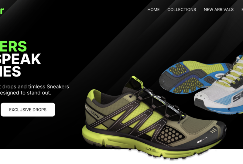
3. Hero Section: So here I am inside
my dashboard. You should be
somewhere like this, and you should have at least
one team automatically created for you here after
creating your account. So I have one default team here and it's called
Ken the Dons Team. So now, inside Ken
the Don's Team, I have just one
default team project. If I want any more projects, I have to pay I have to
upgrade to the paid plan. But one project is more
than enough per team. Now, inside our project, we can create three
design files. So I'm going to click
this plus sign. And that's going to open up a brand new design file,
which is untitled. I'm going to call it a
Sneak store landing page. Enter or just click
anywhere outside. And now here we are. So the first thing
I want to create is a frame or what I like
to call a screen. So if I select this
tool down here, and if it's not visible, just click this
dropdown and select it from the drop down.
Select frame. Automatically you will see different templates we
can start with here. And because we're
designing for desktop, I'm going to open the
desktop templates, and I'm going to select
the desktop preset, which is 14 40 by 1024, and that's our frame
size or my screen size. Now, let's switch to our
preview very quickly. We want to create this header. We have this logo here. Then we have the search
bar and our nerve bar. Let's see how to create that. Let's start with the logo. So I'm going to switch
back to our artwork, and I'm going to
select the text too. Click anywhere inside the frame. By doing that, the text layer is automatically going to
be added to the frame, the desktop frame
we added earlier, and that's what you see in here. As you can see, each
element is a layer. The text is a layer and
the frame is a layer. The text is inside the frame. So I'm going to type
kick and select outside. I'm just going to drag these while this
is still selected, I'm going to go to the font
size here and make it. Let's increase it
to maybe that size. Let's also change this to black
font weight, inter black. And I want to select
this and go to the fill color and give it a grayish color,
just like that. Let's make this kick white, go to Phil, select white. So let's go ahead and
add the background image to at least be able
to see the logo. So I'm going to hit Control
Shift K to import an image. And I have an assets
folder prepared for you. This Assets folder is going to be available below
this video player. So just download it if
you want to follow along, it will have all these images. Here's the background I used. Now I'm going to select
the corner there and drag up to that spot, let go, select it, dr click and send to back. There we go. I'm
going to hold down Alt and drag this and to
avoid moving up and down, I'll hold down shift
to constrain it to just that straight line and I'm going to
place it right there. I'm going to change
this to 16. Size 16. Let's change it back to regular, and I'm going to give it color. Let me just call
it home for now. Or what do we have here? Or we have shop
collections, new arrivals. So hold down Control and
scroll with a mouse wheel. Shop let me just resize that. In fact, what I need to do is, if it's a paragraph
textbook like that, you can switch to auto With to automatically convert
it into a single line text. And now I can hold down
out and shift to move in a straight line Collections. What do we have here? New
arrivals, blog profile. Profile. What do we have here. Profile, then we have
that card basket. We're going to see how
to add that basket. But for now, let me hold on
Control and zoom out with a mouse wheel and
now space them out. Hold down Shift to select
multiple and push these two. Hold down Shift to select that. I think they're well
evenly spaced out. And now I'm going to double
click this image so I can be able to resize just the sides. Like that. I can push it in this direction or
I can pull it like that because I want to have
a black area for the text. Double click that,
and there we go. So now, Control Shift K
to import another image. And I think the shoe we
used for that section was, let me see, we have that
pair and that shoe. So we have this. So with that, I'm just going to click and drag then I'm going to Alt and drag let
me drag it here. Then hold down shift to select both of them, and
let's put them there. Now, select this and
double click it so we can come to upload from
computer to replace it. We have that pair
of skirt snickers. And now, as you can see, it's cut off on the side. So I'm going to drag
just like that and make sure we don't pull it too far and cut the upper side. So I'm going to pull
the upper one as well. I think that's a good size. Hold down shift to resize
it maybe up to that spot. There we go. So next, let's go ahead and add
sneakers that speak volumes. So I'm going to select this, hold down out and
drag downwards, holding down shift to
move in a straight line. That speak volumes. Let's increase that size, maybe up to that spot, drag and pull that. Let's reduce the line height. Just like that. Next,
discover the freshest. I have this text
somewhere. Let me see. Let me just paste it here. So I'm going to
select the text two. Then click and drag right
here and paste it in there. Now, this is too big. I want it to be size 16. So size 16. It's not black. It should be regular, and it should have a
line height of 22. No, 24. Let me just expand that. Pull it upwards, change
this to a comma. Let's also create the button. These two buttons, collection
and exclusive drops. So I'm going to
switch back here, hold down Control and zoom
in with a mouse wheel. I'm going to switch from
image to rectangle tool and I'm going to drag
and draw a box there. And I'm going to
select the text too and just click anywhere here. What does it say here? Collection. Collections. Hold down shift to select the No, first of all, let's
style the one button. So I'm going to select this, and I want to give
it this color here. So I'm going to hit
I on the keyboard. I to pick the eye dropper tool, and I'm going to select a
pixel that I like like that. And now this is our color. I want to change the color
of this to the background, so I'll hit I and now I'll sample a pixel from the
background, just like that. Select this. I want to
give it both corner radius of ten. Just like that. Now, select this, hold
down shift, select this, hold down Alt and
Shift and drag. Then I'll select
this, select that, and change it to
this white color. This should say exclusive drops. Exclusive drops. Now, in fact, I want to change this alignment to align center because we always wanted to
align from the center, and I'll hold down
Shift and select this background button and go to alignment and align
it to the center. This is already
aligned to the center. If I hold down Shift
and select both, then go here, it won't
move. So there we go. So I think, okay, all we have to do now is select this and this and
maybe push them around, maybe up to that spot,
but select this. Hold down shift, select
that corner and drag it. There we go. Select
this, hold down shift. Drag and select these two
to select the alternate. If you want to select this, you can either select this, then hold down Shift and
go selecting each element, or you can select this
and then hold down Shift and then select that area. It will deselect the
background you had selected and select what else you
pass your mouse over. So with that, I can
push this upwards just slightly, and there we go. Let's go ahead and
preview our artwork. Lik aside, there we go. So that's our hero section, and I'm happy with what we have. Now, you will notice
here there is some misalignment
on the nerve bar. The logo seems to
be aligned lower than the main nerve bar
than the menu items. So let's go back here,
select the logo, select all these text, align everything vertically to the center, just like that. Everything will be aligned
straight vertically. Now, let's push them
upwards like that. Now, when we have this, if I expand this a little bit, there is this alignment of
the text within the text box. If we align it to the middle, it will be pushed to the
middle of this text box. And that really helps sometimes. You might sometimes want it to be in that position,
and you will see later. So there we go. I can switch
this to fixed height. Where is it? Auto
width, just like that. Going back here,
it's auto adjusted. Click here too. There we go. So that's how to create
our hero section. In the next lesson,
let's see how to create the featured
categories section. Yeah, let's see how
to create this. I'll see you shortly.
Don't go anywhere.
4. Featured Categories Section: Now it's time to create the
featured categories section. So let's switch back
to our figma editor. Going back in here, I'm just
going to scroll downwards. Now, you will notice we
don't have enough space. So I'm going to hold
down Control and then select the frame. Hold on control and scroll
outwards to zoom out. Then I'm going to select the lower part and just
drag it to create room. Hold on control and
zoom in. There we go. So I'm just going to hold
on out and drag this. And I'm going to
change the fill color. As you can see, it's mixed because there is white and gray. So I can change the color
by clicking the plus sign, and I want to select this
black just like that. Let me make sure it's
in the middle of the frame. What do we have here. Let me copy this text from
this other side. Copy that. Going to drag this
change this to size 16, make it regular and
alignment to the center. I'll select this and do
the same alignment center. But for this, I'm
going to double click and paste my text here. I've just copied
it from elsewhere. You will have to type that. And now with this selected, I'm going to align it to the center of the
frame, just like that. This is already aligned. We have slick and fresh, so I'll select this and
I'll drag leak and fresh. And this says
featured categories. Featured categories.
There we go. So now, this is obstructing us. So I'm going to select
all these things up here and hit the left bracket to send it to the back or just right leak and send to back. So that now this is in
front of this image. Select that and
change the color. We already have this gray, and I'm going to reduce
that to size maybe 24. Yeah, I think size 24 is okay. For the letter spacing,
I'll give it 5%. Push it downwards, just
slightly like that. Maybe even select the three
of them and push them down. Up to that spot. Going back in here, we need to create
something like this. Now, as you can see, I
had tried to experiment with this design as opposed
to these other designs. These were the first designs. Then I was trying
out some ideas, but I didn't replicate that. But let's go ahead
and create this type. So I'll select this rectangle
tool and drag holding down shift to make sure it's a square and maybe
leave it right there. Hold down control, and
zoom with a mouse wheel, middle mouse wheel, hold down middle mouse wheel
to pan like that. And I'm going to select this, give it a border radius of 20. Select it copy, paste. We now have two copies. The other copy is
on top of this. So I'm going to select
it and hold down Shift Out to resize
it proportionately. Shift out maybe up to that spot, and I'll give it maybe
slightly darker gray. So I'll drag this to a dark No, let's make it
lighter. No, darker. Yeah. Let's give it a corner radius that's half
of the outer corner radius. So ten to make it look
more uniform like that. And now I want to drag
this upwards slightly. Then I'll drag this. Then I'll just drag this and
position it somewhere there. Now I'll select this and hold
down Shift and select this. Control G to group
them into one thing. And if I select, I can align them all to be aligned to the center
in relation to each other. So just like that.
Now, I'm just going to hold down out and drag this. And what does they say
sustainable kicks. Sustainable kicks. I'm going to place
it right there. I'll hit the right bracket
to bring it to the front. It's aligned to the center. But now I want to select
hold down Shift to select that and align the text
to the center of that. Select the Control Shift G to ungroup them so that
you select this and this and align everything align the text to
the center of that. Now, I'll select this
and reduce the No, let me keep it at that size. Hold down control and
mouse will drag out. Now I'm going to out drag this, hold down shift to make it
smaller or scale it down, put it right here,
right bracket. And there we go.
Now, as you can see, it doesn't have a drop shadow, but in the reference, I had
added some drop shadow. So I'll go to effect. If I select effect, it will automatically
add a drop shadow. There are other effects, but the default is drop
shadow. Others are here. So I think the default drop shadow
settings are okay for me. So I'll just select the image, then select this box
that's holding it and align the image
to the center. Just like that. Now,
I think I'm going to make this slightly darker. Yeah, and copy that. Code, copy, select this. Go here, double click Paste. Make this white. Select
that and out shift drag. Then Control D to repeat
what you've just done. Control D again. I think
that's a good size. I'm going to out shift D, out shift and drag once
again, and there we go. So we have a nice featured
categories section. So now all we have to
do is double click each image and replace
it with different shoe. So let's say this and you
will have to resize it. So I'm going to
hold down to drag this holding down shift out
to make it much smaller. And then I'm going
to drag that and that drag the sides to make sure all the sides
of the shoes are visible. Yeah, that's okay. Select this and this and align
it to the center. Double click this, select this. Now I'm going to fast
forward this part, and I'll see you once
we've done this. So go ahead and do
this. So double click that. That's already fitting. And there we have it. So I've just finished
updating them. Now, of course,
you're going to have to rename these categories. Let me see what are the names. It seems I just
duplicated the thing and forgot to give it
the categories. But let's see. We have performance sneakers. Now, it seems that's too big. So let's make this
font, maybe size 14. So size 14. Yeah, performance
snakers limited editions and sustainable kicks. Let me just put
that right there. Oh, no, let's add this. Alright, so you can have
other categories here. I'm just going to leave
that there or you can just remove that and just leave
those four categories you had. I think I'm going to
select this and make this by holding down out and shift and
dragging the corner. I want to make it slightly wider than the text here and
then push it upwards. Then let's preview the changes. Let's first of all, look at
what we have in the original. In my original, I think I
liked the colors better than these colors we
have here are too dark. So I think I'm just going to make these just
slightly lighter. Let's go to the field. And yeah, just like that, but now let's turn
the text black. So going back here
and choose black. Or you can just get rid of that. Let me see what will happen
if we get rid of that. No, in fact, I think
the problem is with the background rectangles,
they're too dark. So let's make them lighter. Then let's make Bs
lighter as well. Right there. So I think
I like that better. Now, if we go back here, it will automatically
update itself, and now there's our featured
categories section. We need to add a button, just like here, view more. So all we have to do
is come back here, select this and this, then I drag Control
G to group it, and then let's make sure we align it to the
center like that. Now, control Shift G to ungroup it so you can
select the background, go right here and let's
give it that black color. Let's select the font and
give it a white color. Select that and let's
push it upwards, holding down shift to
move in a straight line. Go back here, and there is our featured categories section. So I think that's a
good spot to end this. In the next lesson, let's
have a look at how to create this discount section, which I'm already sure you probably already
know how to do it, but I'll see you shortly.
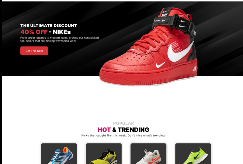
5. Discount Section: Now it's time to create the
discount section right here. So let's switch
back to our editor. So I'm going to scroll No, let's go back to the
editor right here. So holding down Control and zooming out
with a mouse wheel, I'm just going to out drag this and put it
somewhere there so that the spacing
between the button and here is almost the same as the spacing between
here and here. Now, I'm just going
to eyeball it. I think that's a nice spot. I'm going to double click this. Now, if I want to resize
the height of this image, I can just do this
because it's going to resize it proportionately. So if I want to resize the height of this image
without moving the sides, all I have to do is
double click this. When this appears,
it means now I can edit the box holding the image. So I can hold the lower
side and pull it upwards. So let's say somewhere there, double click or just close this. And now I'm just going to
select one of these shoes, maybe this out and drag, then hold down shift and out to resize it
proportionately from all sides. Then I'm just going
to reposition that, double click it so
we can replace it. So I think I used
I think this is the shoe I picked,
double click that. And because we're in this state, we can drag the sides without
affecting other sides. All right. Double click
outside. Select it. Hold down Shift and resize it from this side,
holding down Shift. 50% of. So I'm just going
to grab these three, Alt drag and drop them here. While they're still selected, I'm going to first of all, go to the fill color plus, and let's give it
this white color. Now, let's see if
one of them has a different color, the
ultimate discount. So I'm going to select that
the ultimate discount. So it seems we need to make this smaller.
I want it smaller. So holding down shift
to select slick, I want all these
tiny headings above the main headings to
be the same size. For the headings, I want them
all to be the same size. For the text, body text, I want them all to
be the same size. So let's resize this and
this to size maybe 18. Yeah. Then holding down shift, let's just push them
all down closer. And now I don't want
them to be black. I want them to be regular. Now, in fact, let's
just make them bold. Now, selecting this and
this and this upper one, let's change the
alignment to left. And while they're
still selected, let's go to alignment align left to align them all
in one straight line. And I want to align them to the hero section
buttons and content, as you can see that
red highlight. Then let me just
push them upwards. I'm going to select this text
and rescale it like this. Yeah, that spot. Then I'm
going to select this button. It drag right bracket to
make sure it's in the front. Selecting it, then eye on the keyboard to pick
the eye dropper to. I want to select
light green pixel. Now, I know we've not kept to the same color
scheme up here, and typically our
brand maintains the color scheme all
through to the end. But sometimes you will
find in some websites, they're mixing colors
in different parts. The website is very colorful. And so what we want to make
sure is we don't want to mix this green color here. If I select I and sample that, if I give this button
this green color, this green is clashing
with this other green. And when you're
scrolling as a customer, when you're on this section, it's better for the color
scheme to be consistent. So that's why I'm
selecting this. Then I and choosing a
green that's nearby. And then select this, then I select the background
to sample the background. Now that's a nice
color scheme for this particular section when someone is scrolling downwards. So I think that's a
nice spot to end this. Let me see if we've forgotten
anything. Get this deal. I'm not going to
change this text, but I'm going to select it
and give it a 24 line height. Get this deal. And now let's switch here to our
website and see what we have. So if I'm scrolling downwards
and I get to this spot, we have our discount section. So just one tiny thing I
want to do, as you can see, the spacing here is not the
same as the spacing here. First of all, let me hold down shift and
select everything. Now, selecting this,
then hold down Shift and drag to select this and
deselect the background. Control G to group them, then hold down shift to
select the background and align the text body to the center in relation
to the background. 50% of salmons,
let's go back here. Control Shift G to ungroup them. Then 50% of shoes
called Slomons. So I'm going to
select that text. Go right here to the fill color and select the green color. Going back here, there is our
ultimate discount section.
6. Trending Section: Now let's go ahead and create this hot and trending
kicks section. Now, I'm just going to
switch back to our artwork, where is my editor right here. And before we go too far, I want to zoom in on
this pretty quickly. And I want to adjust the
slightly just going here. In fact, let me just
give them this color. So I'll press I on the keyboard. Now they have that color, but I want to make
them medium bold. So go to the font weight, semi bold, no medium. And I also want to increase
the letter spacing to 5%. I think they look much
better like that. But of course, now
they've collapsed to the next line because they can't fit in the current boxes. So I'll hold down Alt to
resize from both sides. If you don't hold down Alt, it will resize from one side,
the side you're holding. At resizes it from the center. So I want to pull
that, select this, hold down out and pull
that to the side, out, and pull that. I think now they look
more presentable. Now, the reason I made that
update was, first of all, I wanted it to look better,
but at the same time, as you can see in
our reference here, the trending section
looks pretty similar to the featured
categories section. So let's go ahead and
switch back here, and I want to select
these scroll slightly, then hold down out and drag, then hold down shift to avoid moving to the
left and right. So shift out and
drop it right there. Then let go of shift and out. Zoom out slightly,
and I want to push it downwards because I want
to make sure the spacing here is pretty similar
to the spacing here. So I think that's a nice spot. And now you will notice
here we don't have that tiny box down there. Okay. I'm just going to eyeball it up to
that spot right there. In fact, let me just
delete these three. And I'm going to select
these two and make sure that the inner one is
aligned to the center of the outer one by
clicking that and that. Now I'm going to select this
inner background, go here. Do we have a dark gray? It says I'm offline. Alright, so make
that not too dark, not black, dark gray
because this is black. So I'm going to select
this text and go here, give it that white color. Select the snaker and hold
down shift and select the inner one and align it vertically to the
center like that. In fact, let's push it
upwards just a little bit. Now, I think that's
looking good. So selecting it, I can
hold down out and shift. Let's give it that
spacing of 22. Here, 22, Shift D. I
think that's good. So I'll double click that and replace it with the
trending shoes. What's trending here? Let's say this one is trending. Double click that.
This is also trending. I'll have to adjust
this like that, but now it seems bigger
than the others. So I'll hold down out and shift, selecting this as well. Hold on out and shift to
scale it proportionately. Then let's double click this. In fact, what a coincidence. They all seem to be facing
the same direction. So why don't we
complete that look. I think this is a good one. Before we choose that,
we have another one. I think that's a good candidate, so I'll double click that. And now, there we go. So these are the hot
and trending kicks. So double click that. Just say hot and trending instead
of hot and trending kicks. Popular up here. Popular. These are the fastest
selling kicks in the store. I'm just going to
leave that like that because this is
not a real website, but you would type a
description in there. And let's see, read more. No, this should
not be read more. This should be get deal, so buy. So I forgot to edit this button, but now here we can edit it. View more just like that. So I think we're going
to stop that there. Before we go, let's have a quick look at
what we have now. So just start scrolling. And there is what we have. Let's wait for it to load. Alright, now, let's have
a quick look at what we have here,
scrolling downwards. I think this is not balanced. I think we need to
push it down slightly. This spacing here is smaller
than this spacing here. Yeah, somewhere there.
Clicking outside here, it will automatically update. Now it's well positioned, scrolling downwards, our discount and now our
trending hot end trending. So I think this is a
good spot to end this. In the next lesson, let's
go ahead and create our so story. See you shortly.
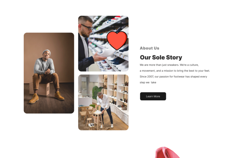
7. About Us Section: Now let's go ahead and
create the About us section. So switching back to our editor, where is our editor, right here. So scrolling downwards. I want to select this. By the way, I think we did
not balance it properly here, so I'm just going
to push it upward, slightly up to so
scrolling downwards, I'm just going to select these three out drag
to duplicate them. And of course, I'm going
to switch the alignment to left and align them to
the left like that. So I'm going to select the paragraph text and
drag it like that, and I'm going to select this, select these three, drag and
put them somewhere here. Alt select and drag this. Hold down Alt Shift to expand that because we want to
add to add these images. In fact, I'm going
to double click this to be able to edit the
box itself, just like that. I'm going to click that to
upload from select this dude. I'm going to give it
20 corner radius. Then we have these
two. So Alt drag that double click it
to be able to edit it. Now, of course, hold down Alt, like we learned to resize
it from two directions. So I think that's a nice part. We want to make it
almost squared. Upload from here. I'm just going to
select this dude. Then I'll drag this. I think the spacing here
was 22. Now it's 21. I'm just going to double
click this upload from computer and select that image. Now, going back in here, we have about us our soul story. So And then the story here. I'm going to select this and
give it a line height of 24. In fact, this is I think 36. I had given it 36. And let me just grab that
text, paste it in there. Now, let me expand the
box, just like that. Select the button, and
let's align it right there. Then let's say read more. And in fact, I think we
should have for the button, select the button text and that. Let's give it a
letter spacing of 5%, and let's make it medium. We want the text to
be more pronounced. I'll select the button
background here. Hold on out to resize it from both sides, up to that spot. Think these two are okay. Now, selecting these three
Control G to group them, select these three to
group them. Control G. Then select these two groups and align them vertically
in line like that. Now, this distance is too small, so pushing them
downwards like that. I think that's a nice
spot to leave them. Select Control
Shift G to ungroup, select this Control
Shift G to ungroup. Now, I'm going to select these three and
remove the effects. As you can see, they have
a drop shadow because we duplicated this and it had
a drop shadow from up here. So we want to remove this effect of a drop
shadow like that. So let's have a quick
look at what we have on our landing page. Scrolling down, there
is our preview. I like what we have so far. In the next lesson,
let's go ahead and create this newsletter sign up or mailing list
sign up section. So I'll see you shortly.
8. Mailing List Signup: Welcome back. So
now it's time to create this mailing
list sign up section. So switching to our editor. Here we are. Now, let's quickly switch back
to our reference. As you can see, we have a form, first name, email address, and sign up, but these
others remain similar. So I want to pick these three. So I'm going to select that. Then drag while holding down Shift to select
the alternate. So it's going to deselect the background and
select what's in front. Then I'm going to Alt drag let go out and now
hold down shift. Just like that. I'm
going to drag and select all that and go to
fill plus here, and I'm going to give
it that black color. Here it says never
miss a drop again. Again, this is lace up for
perks or lace up to get perks. Let me grab that text very
quickly. Paste that in there. So I'm just going to out drag
while holding down shift to duplicate and then Control D to repeat that move
that I just made. Select these two. Then
let's increase the width. While they're still
selected, go here, and let's give them
maybe this background. No, that's, that
light background. I think that's a nice form. We can give this a black color. So I'll just select
this go here, select the text, give
it that white color. This should be sign up. This should be email address. This can be Oh, no, this can be email address, and this can be first name. Selecting the two, I've noticed
the alignment is center, so let's align to the left, and let's also align them
to the left like that. Then let's also change
the field color to a light gray so that they're not too
pronounced inside the field. Now, I think I should push
them closer like that. I think that's a better
way to present them. I'll drag this and I want
to select these three, group them, then
select that group and the image so we can
align them like that. Now, double click this upload from computer. What
do we have here? We have this fire issue, but, of course, that was me just playing
around with ideas. You can use whatever
image you want. Let me see. What
about this red? No? What about that black shoe? Use an image that represents maybe giveaways or discounts or something interesting that
represents this section. I don't like the
contrast in this shoe, so let's replace that with
let's go with these two shoes. Yeah, let's put
them right there. But now I want to
select them like that, and holding down shift, drag them downwards
in a straight line. I want to make sure we give them enough spacing like that. We can reduce the
size of these shoes. So I think that's a
good spot to end this. We don't have to make
it too complicated. Right now, all you're
doing is learning the intricacies of Figma. So going back to
our preview, now, if we scroll down, we have
a sign up form right here. Yeah. So let's go back
to our reference. In the next lesson,
let's now see how to create this
Instagram section. We will first have to create an Instagram card before we
duplicate it all through. I'll see you shortly.
9. Instagram Posts Section: Time to create this
Instagram section. As you can see, we have
four Instagram cards, and all we have to do is
create just one for now. So let's see how to do that. Switching to our editor. I'm going to scroll down here. And as you can see,
we can just copy that and then I'll drag
and put it right here. And what it says is
Instagram pasted in there. You can tag us on kick
verse and get featured. If you're wearing our kicks, you can tag us if you
post it on Instagram. So let's create our card. I'm just going to
select this and Shift Control Shift
G to ungroup it. And I'm going to select
this and out drag downwards or just out drag
and put it right here. I'm going to pull this
maybe up to that spot. I'm just trying to get something that has those dimensions. So we have a user. We have a user name follow. Let's just go ahead
and type that quickly. Here's a name here. Let me out drag this text. And then we bracket to
bring it to the front. I'm just going to use this as the Instagram post that
someone used posted. I'm going to align it
to the left like that. Then I'm also going to
reduce the size to maybe 12, maybe 14 line height of 18. No, maybe let's say 22. Push it upwards just slightly. What else do we have here? We have these icons. 12 K likes. So let's just out drag this I'm just trying to type
all the text necessary. I'm going to select this button. Select the bottom edge, hold down out to
resize it like that. Then hold down this side
and resize it like that. Zooming in, as you can see
the corner radius is too big. I'm going to give it maybe
three just like that. Then I want to change it to a border like that
instead of a feel. So because it has a feel
and no border already, I can do Shift X to switch. Whatever is the field color will be switched to be
the stroke color, and the stroke value will be switched to
be the field value. We have no stroke, so the
feel will become none, and the stroke will
have the fill color. So shift X to reverse them. The text is white, so I'm going to select that and give it. Let's say that gray color. Select this, go to the stroke color and give
it that gray color as well. This is follow. Hold down
shift to decrease the size. Now, this is let me just
reduce the size to nine, align it to the
middle like that. And let's make it medium. Then let's also give
it a spacing of 6%. Hold down shift to select this
and align them like that. Now, you will notice here we
have a few icons we need. So let's look for a
user icon, heart chat. So going back in here, I'm
going to type flat icon. Just like that because
we want to download icons from here, Hart. All right, so I'm
going to select this plain red. Let
me select this. Then I'm going to make sure
you make sure you signed in. And then now let's say 64, that's the right size we want for our purpose,
going back in here. Because it's downloaded,
I can drag it from here, hot, and drop it in here. Hold down shift right there. Going back in here and
selecting another heart, maybe this size 64 as well, free download.
Going back in here. Still downloading. Alright,
let's drop it in there. Hold down Shift and
rescale it like that. I want to move left,
just like that. Switching back to our reference 12 K likes, chat and send. This is a nice chat bubble. Proceed to download.
There we go. So I'm just going to drag
this dotted menu up here. Hold down shift to scale
it down proportionately, and let's drop it there. Let's also drag this
slightly like that. Then Control D to repeat. Double click this, then replace it with let's go
to the downloads. That's supposed to be the chart. I think send that's chart. Send. All right. So I'm going to drag this all the way to
the end like that. Double click it. Upload from
computer, and let's upload. Alright, we didn't download the bookmark. I'll go with this. Size 64, free download. Now, let's replace
it with a bookmark. Now, selecting all of them, I'm going to align them.
They're already aligned. Out drag this, then we bracket
to bring it to the front, hold down out and shift to scale it to scale
it proportionately. Then let's place it right there. Corner radius of five. Double click inside and drag
this maybe up to that spot. In fact, we're supposed to
make this much smaller. Select this control. That's control C to copy, control V to paste. And now let's select
the one we've pasted, holding down Shift
end out to make it smaller up to the point where it's in
alignment with this. Then let's drag it upwards like that and downwards like that. And let's give it a slightly
darker gray like that. Can give this an
effect of drop shadow. I'll drag this to the left. Then we can also have a user. I'll go with this user. Download 64, free download. Let's go back in here. Let's drag this user. There we go. So we have
our Now, of course, it's not a perfect
Instagram post, but we have something
we can use right here. So selecting that hold down shift to resize it
proportionately. I want to make it
slightly smaller, maybe up to that spot. Now for the text,
you're going to have to resize accordingly. For the follow, hold down
Alt to size from both sides. And then they use a name. Now selecting this, I can out shift drag and Control
D to repeat that. And I think we're going
to go with those three. On our reference, I had four, and the text and everything
seemed much smaller. But remember, like I said, what we're doing is trying to understand how to work with
the tools available in Figma. We're not trying to
create something perfect. We're trying to teach you
how to use these tools. Once you know how
to use the tools, you can spend as
much time as you want perfecting the design. So I think this is a
good sport to end this. We're almost done.
In the next lesson, let's go ahead and
work on the footer. So I'll see you shortly.
Don't go anywhere.
10. Footer Section: Almost done. It's time
to work on the footer. So going back in our artwork, here we are just going
to scroll downwards, and let me zoom
out a little bit. Well, first of all, I've noticed we duplicated these three, but we did not align them to the center in relation
to the frame. So selecting them,
Control G to group them, and then align them as one item. Control Shift G to ungroup them. You can also leave them
grouped if you want. I can grab the logo from up there or I can just recreate it. Kick Vs. Let's give
it this color. Going to give it this green. No, that green is not good. I'm going to give it this
other green up here, this. So I think this was it. Yeah, I think that's a
good place to start. Control, select to select this frame and then
drag to resize it. Click outside. I have all the photoctent
right here on the side, so I'm just going
to copy paste it. So let me just grab
this text here. At drag. Let's put that
right there. A line left. We can carpi, I want
to double it in size. We can also give it a height of 28 and space it out just
slightly like that. Going back here, let's
create those two lines. So I'll select the Pen tool. Click anywhere here and
then start drawing. When we have that red highlight, it means we're moving
in a straight line. So I'll just click anywhere
there, then escape, escape again, click Escape
again to escape from the pent. It drag that. I'm just going
to put it somewhere there. Then I'll select this. It drag. Then I'll select I'll
double click it. Then I'll select this and
hold down shift to move in a straight line to
reduce the size. Then I'll rotate it. I'll hold down shift to snap
and once it's vertical, I can put it right here. I think it's still too tall. So I can just go back to here
the dimensions and reduce this then selecting it, I can push it down maybe
up to that spot for now. So I'll drag this. In fact, undo, I'll
out drag all these. And now I'll come here. I have a column called Shop. This is going to be size 20. This is going to be size 16. So these are links
for this column. I'm going to expand
that and pull this push this down
maybe up to that spot. I want these to be
spaced out more, so I'll go to line height
and make them 36 like that. Then I'll select these two. At shift drag, then
Control D twice. The second column for me
is products by categories. So I'll just select
these two and out drag. Go to select these two
and push them leftwards. Going to select this and
align it to the center. Hold down shift to select
it together with that and align it to the
center like that. Next, let's go ahead and create this button
and this part. So we're just going to drag
these two out drag like that. I'm going to put
them right there. And I think this button, we missed this button
because remember, we styled the other buttons. They had 5% letter
spacing like that, and we made them medium. So this we're hiring
can be this color. So let's give it that color. Going back to our reference, we also have that form. Select this, Control C to copy, then Control V to paste. You've pasted it in place. Now holding down Shift and t we're resizing
it from all sides. I want it up to maybe that size, and I want to drag it all
the way to maybe that spot. Let me change the color
so you can see it. Give it this color. So now let's give it a
half border radius. Half of what is the
outer border radius. Then selecting these two, I'll align them to
the center like that. Push this so that the border around it is
almost the same in size. So pulling that, we can
now give this a text like submit Select those two
and align them like that. Sign up or submit. Let me make it black like that. Hold down, select these two. Push that like that. What else do we have here? We have the Google
Play and Appstore. Now, these are
things you will have to Google and download. Google Play buttons. Images. Uh, let me see.
Let's pick this one. So these guys have really
hidden this button, but I finally found
it. Here it is. There we go. So
going back in here, I'm just going to drag
and drop it here. So I'm just going to scale it down holding down Shift and out. I'm going to just align
them somewhere there. Let's go back in here to flat
icons and download YouTube. I think I already had
these icons downloaded, but for you, you're
going to have to download them. I just
want to save time. So if I go to Control Shift K, I think I have those icons
here in my downloads folder. So linked in all the way to X. I'm just going to
draw them here. There we go, select all
of them, align them. Now, some of them
are much bigger. So hold down Alt to resize that. Hold down out. Hold on. Now we're roughly the
same size, spacing. Select these three. Or I can just
simply select this. Let me just select that.
Hold down and resize it. Let's go back to our reference. Yeah, we need to put them there. Zoom in, then Alt
drag Control D twice. Then I'll double click
this Go back here. Double click YouTube, select
this, double click it, upload from image, Instagram, and double click
so we can add X. These are too big. I still want to make them much smaller. And this is I want to
make this slightly taller and select everything and align it
vertically like that. Select these three,
pull them down. I want to align them
to this site map. Now, I want to select this
and reduce the height. I think now that's a good size. One more thing remaining. Before we finish this section, we have some text here. Now, if I pull this, it's going to be aligned to the left. Let's align to the right. And here we say, sign
up for early access. Double click that,
paste that in there. Make it faint. Don't make
it too dark like this. Let me just push this down
slightly, delete these. And I think now we're
getting somewhere. So now if we go to our
reference website here, let's start from the very
top and see what we have. So scrolling downwards,
our featured categories, we have our discount section, our hot end trending. They can click and view more. They can go to read our story. They can sign up to
our mailing list. They can help us grow by tagging us and showcasing shoes
they bought from us, and we share that
on our platform. Let me select these. There we go. So I think this
is a nice spot to end this. We've been able to create a landing page all the way
from the top to the bottom. Now the next thing
we're going to be doing is organizing and cleaning up our file because if
we're working in a team or if we want to come back later to work
on the project, we want to have
something organized. How do we clean things up? Let's do that in the next
lesson. See you shortly.
11. Cleaning Up: Now it's time to clean
up our design file. So going back to our
artwork, where is it? Yeah, here we are. Let's
start from the very top. So when I say
organizing, I mean, let's group various things and name them to be able to
find them very easily. For example, here we have the
logo and the nerve items. And now I want to
select these items, so I'm going to select kickers and all the menu
items and do that. Select all those
and then Control G. Now, when you control G, they will be grouped. Remember, anytime you add
anything to your frame, it's put under that
frame under the frame. So everything we've added to this frame is still under it. So remember, we added a
frame called desktop. And so, in fact, I'll just
double click it and call it sneaker store. Landing page. As you can see, the name
has changed up here. So that's the name of
this landing page. And now, inside
the landing page, we have various things that have whatever names they came with
even when we imported them. For example, this Google image. So we want to rename items here. So remember, we've selected
these items and grouped them. So now they are group one. Let's call them header. And let's hide them. Let's select this image, background image. Here it is. Double click it and call
it Hero image and hide it. Okay, before we hide it,
I'll select the background, then hold down Shift and drag
and select to select these. Control G. I'll call them
Hero section text block. Then I'll select these
two images Control G. Hero section images. I'm going to hide that, then hide the hero
section images, then hide the hero
image background. Let me call it the
hero image background. So now everything up
there is labeled. I'm just going to select this and Control G. Now it's grouped. Featured categories. Then let's hide it. Collapse it. Let's select this
ultimate discount. Control G. Ultimate discount section, let's hide it. Hot and trending Control G. Section, let's hide it. About us Control G. Finally, the footer, Control G footer section. Collapse, hide it,
and collapse it. Let's go on and start unhiding everything
from the very top. So the hero background
image hero text block on, hero background image
on select this, hold down Control, select
the hero image background, and let's put them up there. In fact, I'll select these two, Control G and call them the
hero section collapse that. So now the hero
section is visible. Hero section images. Where are they hero
section images should also be inside
the hero section group. So drag and drop it in there. So now we have the hero
section background, textblock and images. Let's unhide them. Let's also take the header and drop it
inside the hero section. It's supposed to be at the top, and let's unhide it. Let's unhide the photo section, which should be at the bottom. Instagram section is supposed to be right next right there. About us is supposed to be
yeah, right after trending. Ultimate discount,
mailing list sign up is what is supposed
to come after about us. Now, let's unhide. Oh, the ultimate discount
comes after featured. So now let's start
doing that featured. There we go. Ultimate
discount. There we go. Hot end trending. Mailing list, Instagram, and the photo. There we go. So one more
look at our preview. Alright, so clicking. And now let's start scrolling to see what
we've accomplished. Nice. There we go. So now you have a nice landing page you can add to your portfolio.
You never know. These might be the
designs you're going to show to your potential employer. So we're going to be doing
this from time to time. I'm going to be publishing
classes on how to design landing pages and other parts of our website or web
page with Figma. Now, as we finalize, I have a few final thoughts
I want to share with you, so I'll see you in the next
lesson. Don't go anywhere.
12. Final Thoughts: I just want to say a big thank you for joining
me in this class. I really hope it gave you
a solid sense of how to approach real world UI design
projects inside Pigma, not just the what, but the how and why behind each
section we built. And now it's your turn. For your class project, go ahead and design your own version of the landing
page we walked through. It could be a sneaker store, a clothing brand, or even
something different. Just make it something
unique, make it your own. When you're done, be sure to
share your work by uploading it to the projects and resources tab below this video player. It's a great way for you to
show what you've created, get some feedback, and maybe even inspire others
in the class. And if you found
this class helpful, one of the best ways for
you to support the work I do is by leaving
a quick review. Just head to the
review tab below this video player and
drop a few thoughts. It only takes a few minutes, and it helps a lot of
students discover my classes. So go ahead and
drop your review. Once again, I want to
say a big Thank you for hanging out with me from the beginning
to the very end, and I can't wait to see
you in the next class. Till next time, stay
creative. Peace.
 Ken Mbesa, Web Designer | 3D Artist