Transcripts
1. Intro: And welcome back
to another awesome Wordpress and elemental
class with me, Ken. This one is special because I'm going to
show you how to build your own production ready e commerce website with WordPress, Elementor WooCommerce, and other free tools
or other free plugins. So no paid plugins,
no coding required. And if this is your
first time seeing me, as I've mentioned,
my name is Ken, and I'm a graphic designer and web designer with more
than ten years of experience using
different design tools, including WordPress. Now, I also dabble as a web design and web
development instructor on Skillshare and
my YouTube channel. For the last five years, I've been teaching thousands of students like you how to build amazing websites
using WordPress and its most popular Drag and
Drop builder Elementor. Elementor is an amazing drag and drop
website builder that allows you to build any
type of website you can imagine without
any coding skills. And in this class,
I'm going to show you how to use Elementor to build an amazing online
store that you can be proud of an online store you can showcase
to your friends. And if you want an online store, you can launch immediately
after the class. But who is this class for? This class is designed for Wordpress beginners who
want to quickly build an online store while also learning how to use the
various free tools, plugins available in the
Wordpress ecosystem. You're just a hobbyist beginning your journey in WordPress
or an entrepreneur or an aspiring web designer
who wants to learn how to use Wordpress to build any type of websites
going forward. This class is going to lay the perfect foundation you need to become a
Wordpress expert. And so as you can see, this is a practical project based class. And so by the end, you're
going to end up with a Wordpress website you can launch immediately and
start generating revenue. And so does this sound like the class you've
been looking for? If it is, what are
we wasting time for? Let's go ahead and look at the website you're going to be building throughout the class. Let's do that in the next
lesson. I'll see you short.
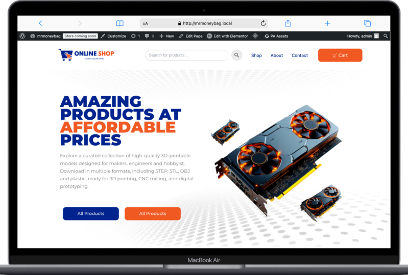
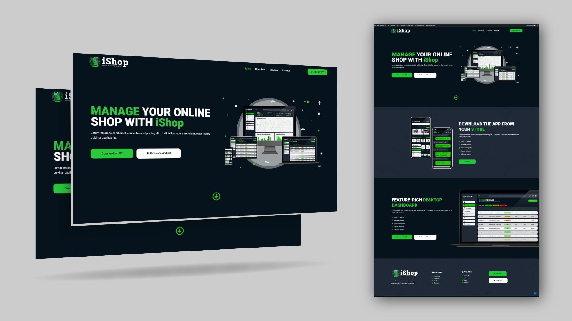
2. Class Project: So now let's have a look
at the class project, the website you're going to
build throughout the class. So here we are on this
fictional landing page. As you can see, we have
this multicolor text. We're going to see how to
do that using custom CSS. As you can see, we have
this nice hero section with the text block and
the hero image and the nice background image. Scrolling down, we have this
icon needs to be animated. If I reload this page,
let me just reload it. Just like that.
Scrolling downwards, we have that featured section. Scrolling downwards. We'll come back to the
products to view them shortly. But here we have a nice
call to action section. You can put any type of
image you want here, and it's features or key points and then a
call to action button. Then we have this other
call to action button. I just use dummy text all over. This is not a real website. This is the website I built
as I was recording the class. So you're looking at what
you will end up with. Here is a nice simple photo with some Lorem Ipsum text and some links to the various pages and a mailing list sign up form. And right here, we can
come and select a product, for example, this GPU. Let me just open
that. There we go. So now, this is the
single product page, and we can read all
the details about it. These are the key points, key features of this GPU, and the more
detailed description of the product right here. Then below here, we
have a related product. And other related products. We'll see how to do all this. Going back here,
you can go ahead and pay with papal immediately, or if you want to
continue shopping, you can continue shopping
before paying with paper. But let's say we're
ready to pay, let's say add to card, and now our product has
been added to the card. Let me view the card. It has several products I had added as a way to
test the website. But now let's say
you're ready to pay or you can remove certain
products you don't want to buy. And that has been removed
and you can undo. Then we can proceed to checkout. Right here, the customer needs
to fill in their details, including shipping
and everything, and here is a summary of
how much they're supposed to pay, about 3.8 million. They have the option
to pay through paypal. They can pay through
debit or credit cards. They can pay using Apple
pay or Google Pay. And before they can
make any payments, they have to agree to the
terms and conditions. There's also another
check I try to pay if I try to
complete payment, I'll be given these alerts
here to remind me that I need to fill in all these details before I can be allowed to make payment. That's a good way to check that the person has provided the
details you need from them. And now we can go to the
shop page. I had opened it. Here we go. You can just
click the Shop page. And now here are all
the products listed. And if I search for maybe GPU, we have this Ajax search that searches for the product without refreshing the page. We can also hit
Enter to be taken to the search results page
containing all GPUs, and we can select
the GPU we want. So as you can see, this is a complete website that's
ready to accept payment. The customer can
actually make payment to this website because we're
already connected to PayPal. If I make payment to
this website right now, the money will go to
my PayPal account. So this is the project you're going to work on
throughout the class, and by the time we finish, you will have a website that's
ready to go live online. So I hope this got you excited because I am very excited to
show you how to build it. So without wasting
any more time, let's go ahead and learn
about wbpressHsting, because every website
needs a web host. But what is a web host?
3. WordPress Web Hosting: Now, in order for you to build a Webpress website
you can launch, you will need web hosting
and a domain name. But you might be
wondering what's web hosting and
what's a domain name? To help you with that, I
prepared a short explainer. So here we go. Now, every website you
visit is stored somewhere online on a server that's always available
to the Internet. That's why you're able
to access a website that's in the
Netherlands or the US or Mexico because it's stored on a server that is always
connected to the Internet. So that means every
time you click a link that leads you
to a specific website, for example, free Peek,
let's say, freepek.com. What the browser did was it sent a request for this
specific page, and this specific page can be accessed through this
address or this URL. And so when it sent the request, that request was
received by the server that's storing the
free peak website, and the free peak website is
made up of many webpages. But because this webpage is represented by this
specific domain name, that server will return a response with the
page you requested. So that server is what a
web host provides you with. Your web host provides you
with storage space for your website and makes sure that your website is available to anyone who wants to visit it. Now, the other thing you
will need is a domain name. Freepik.com is a domain name, and this specific domain
name is unique to freepik. So no one else can have
this same freepik.com. The same way, no one else
can have your phone number. Your phone number is unique and it's used to reach
just you, no one else. So your website needs to
have a unique domain name, and people will use that domain name to
access your website. So now, going back in here,
I'm at wordpress.org. This is the official
website of Wordpress. This is where you can
download Wordpress. If you want to develop
your website offline, you can install
WordPress in your system and work without the Internet
and build your website. But what we're interested
in is the hosting page. Wordpress has a list of
recommended web hosts, and I recommend you take a
moment and read this page. As you can see, they have three main
recommended web hosts, Blue Host. Dreamhst
and wordpress.com. But this doesn't mean these are the only web hosts that you can use for your
Wordpress website. There are other web hosts
who are just as good, if not better than these three. So these are just
Wordpress recommendations. But you will find out
here by reading this that there are
hundreds of thousands of web hosts out there, the vast majority of which meet the Wordpress
minimum requirements. Wordpress decided to just
make your work easier and decided to give you the top three that
they recommend. Now personally, I
have used Bluehost and long time ago when I
started using Wordpress, I tried wordpress.com,
and you should not confuse wordpress.com
with wordpress.org. Wordpress.org is the
platform that is run by the Wordpress Foundation because remember Wordpress
is opensource, and wordpress.org exists to
provide you with remember with the Wordpress download and everything you need
to know about Wordpress. But now, when it
comes to hosting, there is a dedicated service called wordpress.com.
Let me just open it. This is a platform
that provides you with tools and hosting to
build your website. It's like weeks. If you've seen weeks, you know that when you're building
a website on Weeks, you don't need to think
about where to get hosting because they host
the website for you. They just give you
the tools to start building your
website immediately. Of course, it has its
limitations the same way Wix has its limitations when
you compare it to installing Wordpress
yourself on a server. When you install WordPress
on a server somewhere, you have more control to do many more things
that you don't have control over when you're using a hosted service
like wordpress.com. But of course, it's a nice place you can try out if you want. Now, at a personal level, I use NameCip especially when
I'm just experimenting with some ideas before I
commit to buying a dedicated web hosting
for that specific idea. And there you have it. So now that you understand
what a web host is, what they do, and
why you need them, go ahead and grab
web hosting and the domain name because
you're going to need that before you can move on
to the next step where we're going to install web
press through the C panel. I'll see you shortly.
4. Install WordPress: So now that you've bought your web hosting and
the domain name, it's time to install WordPress. And to install WordPress, you will need to login
to your C panel. And the fastest way to log into your C panel is to go through
your web host account. As you can see, I'm right here on the name chip login account. So I'll just go ahead and input my details and then sign in. For security purposes,
I'm going to be asked for a security code. I'm using an authenticator app. Yeah. Let's go. There we go. So now, I'll go directly
to hosting list. And I'll find my
web hosting here. As you can see, I have go to C panel that will redirect
me to the C panel. And if you chose to go with a shared hosting
service like me, your C panel will look
something similar to this. It might not be identical, but most of the things here
will be on your C panel. And what we're looking for is the Softacul apps
installer section. As you can see, under it, we have Wpress and other CMSs. So I'll go to Worpress. And now, if I scroll
down here I will find all the installations
of Wordpress I have. As you can see, the only
installation I have at the moment is our
reference website. As you can see, this is Mr.
Moneybags.net, and that's it. So we can install a new instance of Wordpress to
build a new website. So I'll say install now, and you will be met
with this form that you have to fill and
then install WordPress. So let's go ahead
and get started by selecting our protocol here. I like going with HDTPsw dot. Maybe I'll go with VFX pod. And if I click outside, it will check if I have an SSL certificate
on that domain name. As you can see, it's all good. If you don't have
an SSL certificate, this will show you an error. I will tell you no SSL
certificate was found, and SSL certificates are
usually free nowadays. So ask your web host to provide you with your free
SSL certificate. Then the website URL will be www.vfxpod.com
and slashNTELS. If you add any name
here, your homepage, this homepage will have an
extra folder, like folder. And you don't want
that. You just want your home page to be
your base domain name. So don't add anything here. Next, let's give
our website a name. I'll give it the
name online store. Buy anything from us. Yeah, let me just go with this. And these are the credentials
you will use to login to your Wordpress
website in case you logo and you don't want to
login through the C panel. Next, we have some plugins you can pre install with
your Wordpress website, but you don't have to install
these because there are better alternatives that you can install from within the
WordPress plugin directory. So let's leave those out. We can go to Advanced Options, and here we can decide to
keep a backup of our website. But I don't usually keep
this because I never use it. I use a plugin within
WordPress to create my backups and download the
backups or send them to my Google Drive
automatically every week. So I'll show you how to do that. Don't worry. All right. Here you can decide if you
want your Wordpress to upgrade automatically when there is a new version of WordPress, or you can choose to upgrade
to minor versions only, I will just leave
that at its default. So make sure you keep these
credentials somewhere. So I'll just open
up my text notepad. I can copy this
and put it there, then copy the password,
Enter, right there. You already know
your admin email, so you can put it right there. So once we do that, we can go and say
install WordPress. Don't leave this page until it's done. And there we have it. Congratulations.
You've just installed WordPress for the first time,
if that's your first time. And now we have two
URLs right here. This is your homepage.
So if I right click and open it in a new tab, as you can see, here's
the domain name, yours will of course be the
domain name you bought. And now here's what we have. This is just the basic
WordPress theme. And if I go back here, we
also have an Admin URL. This will take us to the
admin area of our website. So I click that as you can see, it says dashboard, online store. The name of our
website, online store. And here we are. So we've
just installed Wordpress. Congratulations.
This is a huge step for you if this is your
first time using Wordpress. Now, in the next lesson, let's see how to install
a WordPress theme. I'll see you shortly.
5. Install a Theme: So now that we've
installed WordPress, it's time to install
a Wordpress theme. Let's go ahead and install my
favorite theme of all time, and its name is Astra. So I'll go to appearance themes and you will notice
because in 2025, the active theme is 2025. Last year, the active theme, anytime you installed
WordPress was 2024, and the previous year,
of course, 2023. Now, I'm going to say
Add new because you don't want to use these
default WordPress themes. And now, as you can see, we
have this theme called Astra. So I'll go ahead
and install Astro, and I'll go ahead and
activate it. There we go. As you can see here, they're
telling us we can get started with their
starter templates, but I'm just going
to dismiss this. Now it's the active theme. I'm going to select the
2023 theme and delete it. Select the 2024 theme
and delete it as well. And now I will leave
2025 installed, but not the active theme. This will be the backup theme in case this theme breaks
for any reason. Our website will still have structure because it will
have a fallback theme. So it's always advisable to have a fallback theme installed. So now Astra is
the active theme, and now we're ready to
start building our website. But because we're going to use a elementor to
build a website, in the next lesson,
let's see how to install a elementor.
I'll see you shortly.
6. Install Elementor Plugin: So now it's time for you to install your first
WordPress plugin. Let's go ahead and
install element. So I'll go to plugins. In fact, let me just
click plugins to go to the already installed
plugins because Wordpress comes with these two pre installed plugins always. So I'll just select both of them by checking this
uppermost checkbox. Click that and then say
delete, apply, Enter. We don't need those, so I
can go and say Add New. And now we're taking to the
Wordpress Plug in directory. Now, this is just pulling from the actual Wordpress
plug in directory. If I write link and
open Link in New tab. As you can see, we're
taking to wordpress.org, and we're taken to
the Plugins page. We also have the theme page, pattern page blocks
and all that. This is where Wordpress
lists more than 59,000 free plugins
you can install. So now, going back in here, Wordpress pulls
all those plugins and brings them in
here to allow you to install them with
one click instead of going here and downloading. So if I click that,
as you can see, I have to download from here and go back
here and upload it. Instead of that, I can
just install directly. So let's search for Elementor. Elementor website
builder. Here we go. More than 10 million active
installations by Elementor, so I'll say install now. And as I always keep telling
my students, as you can see, there are many other elementor related plugins developed by third party developers
who do not work with or work at Elementor. These are third party
companies that create plug ins that add more features to the free
version of Elementor. They allow you to
get more features, more elements you can use
on your website for free. So let me say activate. And, of course, we will see
how to use some of them. I'll say activate. And now elementor is activated. Sometime back, there
was a wizard that always came up whenever you install a elementor
for the first time. I don't know why
it's not come up. Just in case it comes up, you just go through that wizard. So now that you've
installed elementor, as you can see, we have these
templates and a lamenter. These were not here
before we installed a lamenter because they
are elementor menu items. They allow you to
make settings and tweak whatever you want within a lamenter to make
it work for you. But I don't ever
change these settings. I just go on to
build my websites. Now that we have
Elementor installed, it's listed as the only plugin installed because remember, we've deleted the other two. We're going to
install more plugins here as we build our website, and that's how to install
a WordPress plugin. So in the next lesson, let's have a look at the
elementor user interface because I want to get you up
to speed on how to navigate the elemental editor. So I'll see you shortly.
7. Elementor User Interface: It's time to look at the
elementor user interface. And to do that, let's
navigate to the pages. These are all our web pages. So as you can see, when
we installed Worps, it came with two sample pages, a draft, privacy policy, and a sample page. We can use this page to
look at the element editor. So I'll say edit. And don't worry. Right now we're just looking at the editor. Don't worry about how to create
a web page and all that. I'll show you how to do that. Let me just close this
down. What is this? Let's also close that and
that. Ed, here we are. So this is a little bit
different from what we had in my previous course,
in my previous class. It's still the same
user interface. In the previous class, we
didn't have this wizard here, which looks like to do list of the things we can
get done very quickly, but we're not going to do
that because we're going to do all these things manually. So let me close that. Alright,
so that's a checklist. You can access it from here. Got it. Now, the first thing you will notice is
this structure. Previously, it was
called the navigator. Now it's called the structure, and it just gives
you an overview of the structure of the page. So if we have a lot of
content here and we just want to have a bird's
eye view of the page, this will help us see everything
that exists on the page. And it's also good
to help us to get to specific parts of the
page very quickly. Example, if I right
click this and duplicate it a couple
of times duplicate, as you can see, it's
also duplicating here in the structure in real time,
right click Duplicate. And now I can expand this. Okay, let's expand the first
one to show what's inside. So we have the container, which is the pink container. We have the text editor, which is a different element. Now, if I select the container, this changes to Edit container. If I select text editor, this changes to
edit text editor. In other words,
whatever element you have actively selected
here on the page, its settings will
appear here and you can go and tweak
all those settings. So if I select this third one, I think, as you can
see in the structure, we have the third
container selected. Same case applies to whatever
is inside text editor. It selects the text editor, and here we can tweak
the settings of the specific element that
is currently selected here. So now for almost every editor, except a few exceptions, you will always have
these three tabs. There's the content
tab, the style tab, and the advanced
tab. Every element. So if I select a container instead of a text
editor element, container, as you can see, it also has three tabs. But now here's the layout
tab instead of content tab. Here in the content tab, this is where we add whatever
content we want to add. For example, what type of content does a text
editor expect? It's text. So here we can
add whatever text we want. We want exactly. And as we type, it happens here in real
time, as you can see. Now, if I want to add
a different element, not a text editor, all I need to do is click this ad element button and I can add different
types of elements. So let me now delete all these. Let me just write
click and delete or simply go hover over any
of them and delete that. Now we're left with
this single one. Let me select the
text editor element, and also let me delete that I'll right click
this and delete it. Now we only have the container. If you want to add
anything to the container, we can click this plus
or this add element. So let me just click this. It'll reveal all the
elements available to us. Now, if I collapse, layout basic all these panels, you will notice they are panels containing
different types of elements that we can drag and drop in here to
design our website. But some of them are in the
pro version of elementor, so we can't use them. If it's not usable, it has this small lock
on the top right. If it's usable, if it's
free, will not have that. So we already saw
the text editor. Now, if I collapse the basic, we can look at layout. As you can see, we have
container and grid. I prefer working with containers,
and you will see why. We'll be using containers
throughout the class. So if I drag and drop a
container here into this box, it goes right below
the first container. And if I hit Control I, I can bring up the structure to see the current structure. If I expand this, it has nothing inside because we've not
put anything inside. So let me delete that. We can work with this one
alone because it's also empty. Now, since we're going
to work with containers, don't worry, I'll explain how containers work, but
let me collapse that. Now, let's see how to
add another element. You already saw the text editor. If I drop it in there, you
can add your text here. If you want to change the
color or the style appearance, now that's when you
go to the style. For example, we don't
want it on the left. We want it in the middle. So I'll select center alignment, and now it's aligned
to the center. These are basic text
editor requirements that every text
editor should have. If we go to the advance, Oh, we can also
change the color. So right now it's gray.
We can change it to red. So if we go to advance, that's where we will
get settings such as margin, layout settings. So if I collapse layout, we have many groups of settings. With the layout, we get
margins and padding and align the element
itself and order and size. All these things, we will
see how to use them. Going back in here to
add another element, let's add an image element. What type of content does an image element
expect an image? So under the content tab, we will be expecting an
image instead of text. So select the image element and the changes to edit image. Now we can select an
image from our library. We can go to the media library if we have already
uploaded images, or if we don't have, we
can go to upload images and select files
from our computer. So I'll double click that as an example. And now there we go. So it's already pre
selected, I'll say select. And now the image shows up here. And we can go on to style it. We can give it a maximum
width of maybe 100%. We can give it a height of
100% instead of 500 pixels. We can increase the
width manually. Now that we've set
the maximum width, it goes up to 100% and many other things that
we will see how to do. So quick recap. Now if I collapse all these
others, as you can see, we also have this general
tab that provides general elements we can
add like a testimonial. And as we add all those
elements, remember, because we're adding them
inside this container, they are all under the container in the
structure if I collapse that. But now if I add
another container, by adding let me
just collapse that. To add another container here, we can go to PAS and
layout and go back here. Then we can choose Flexbox. And I love using
Flexbox structures. So we're not going to use grids, we're going to
work with Flexbox. And these are just premade
structures to help you quickly set up maybe a double
column section or a single column section, a four section section,
and that kind of stuff. So currently, what we have here is this type or is this
type of structure. If I select this
double structure, as you can see, we have
two divisions inside here. If I select this one, as you can see, this
side is longer. So it's just premade structures to help us quickly
build our website. So if I want to add
a container in here, I can just drag and
drop it in there, and now it's a container
inside another container. And I can add an
element like let's say, link in bio minimalist,
and there we go. So that's an entire element
we can edit and change. So basically, that's
how to add elements. The next thing I
want us to look at is what are these settings? So if we want to exit
to the dashboard, we can exit to Wordpress but there are other settings here
that are very important. You remember when I wanted
to duplicate the container, I had to let me just click here. I had to right click
and duplicate. Those are two steps
to do one thing. If I want to duplicate
this container, I have to right click
it and duplicate it, and it will appear below here. Let me just delete that. If I want to delete, I have
to right click and delete. But if I come here, I can say user preferences, show quick edit options. That means if I now hover
over any of these elements, I will have quick
shortcuts to some of the most common things you want to do with an element
like duplicate it. So if I come here and click that, automatically,
it's duplicated. If I come here and
do that again, that's just one click
to do a duplication. The editing handles or edit
options are very crucial. Make sure you have
them activated. These others, you can also look at the history of
the things you've done, and you can go back in time. You can go back to a point in time when the website
looked a certain way. For example, let's say you've
made mistakes and you want to remove the things to undo some of the
things you've done. You can go back to say the
time we added the image, and this is how the image element looked
when we added it. We can also go back to the very beginning and this
is what we had. And we can also go back
to editing started, and this is what we
had when we began. So you can jump quickly to any point in your
editing session. But once you close Elementor and come back,
you won't find this. This is just for this
editing session. Next, let's have a look at this. These are page
settings which we will set inside WordPress
admin dashboard, so we will not set them here. If we want to preview our page, we just first of all,
we need to publish it. And we can click here
to preview the changes. And this is how the page looks, and this is our content. So if we make changes
here, let's say, let's duplicate this
right duplicate. Now we have to. If I publish it, you will notice this will
automatically load, reload. And now we have
those two sentences. We can also save
this as a template, whatever we have on the page. We can save as a template
and give it a name. So we will look at how to do all those
things as time goes. I think right now you know everything you need to know
about the user interface. When we get to editing the website to be responsive on different
devices like a tablet, we will be able to do
that using these tools. So for now, those
are the settings you need to understand
in order to be able to use the
elemental user interface and navigate as you
build your page. So in the next lesson, let's now build our homepage, and we'll start with the nerve
bar. I'll see you shortly.
8. Install ElementsKit Plugin: So now you have a rough overview of the elemental user interface. It's time to get started
with the actual building of the homepage and we'll
start with the nerve bar. So I want to exit to the
WordPress admin area. I also want to close this down. And in fact, I'm going
to separate this. I'm going to leave it
as its own window. Now, let me just shift here. And let me exit. Let me just leave because this is not a page we're
going to keep. In fact, I'll
select all of them, move to trash and apply. So now we don't
have any web pages. In order for us to create ano, we will need to use another
elemental related plugin called elements kit Light. So let's go ahead
and install it. Plugins, add new. And if I type
elementor, here we are. It has more than 1 million
installations by Xpeed Studio. Elements kit elementor
add ons and templates. Install, activate, and now
we have elements kit light. So once we install it, it will also show up here. And what we need to do is go
to the header and footer. And now we need to go
through this setup wizard. So to begin with, let's choose Advanced here. And by choosing Advanced here, it just means more elements
will be available to us in the front end while
we're editing our pages. So, for example, if you
look at these widgets here, I think this will be activated
once we click Advanced. As you can see, now
it's going to be automatically available
to us in the front end. Remember the editor,
we were dragging elements to the
page from the left. These elements will
be available to us. When we selected Advanced, several of these
elements that were not originally
checked got checked. And now let's move
on to the next step. Here you can provide them with your email so they can send you offers and
discounts and all that. But I will just click Next. Next step, you can share
nonsensitive diagnostic data. So I'll click Next step. Next, Save changes.
And there we go. So now we can go to
header and Potter. And this is where we will build our header, AKA, our Navbar. So we'll do that in the next lesson. I'll
see you shortly.
9. Understanding Containers: So now we're ready to
start building the header. And remember, we went to
elements kit header and footer. I'll just go ahead and say
Add new, and I'll say header. Yeah, the type is header. When we're building the photo, we will also come
here and say Photo, but right now it's the header, and we want it to be available displayed on the entire site. If you want to have conditions on which
page to display it, you will have to use
the pro version, but this is enough for me. Then we want it to be active. Now, we can just
save changes and then come back and
say edit content, or we can just say edit content and go directly to the
front end to edit it. But I just want to
say this first. To show you that it
gets listed here. And now if I say edit, we'll get the same pop up
and I can say edit content will be redirected to
the front end where we can now build our header. And here we are. So now, I thought before we start
actually building the header, I should explain how
containers work. Then we'll see how to build the header in the next lesson. So very quickly, I want to start from scratch without
any containers here. So we have a blank slate. Now if I select that, we're going to have Flexbox, and I want to start with
this direction column. And by direction, we mean, as you can see under layout, we have direction here. The container can have
a horizontal layout or a vertical layout or a reverse row layout or
reverse column layout. What that means is whatever
content is inside here, whatever content we have
inside the container will be arranged heading in the
direction we've selected here. So if, for example, now that we have
the container here, if I go to add and
add a heading, as you can see, the heading
is inside the container. If I go back in here once
again and add, let's say, a button, go back
in here and add, let's say, for
example, right now, let's go with those two. If I select the container, which is where we're
supposed to set the direction of
the content inside, currently, every element
is arranged vertically. So if we add another
element like an image, it'll be put right below the
lowest element in the group. If I go back in here, that's a direction of vertical. But if I want things to run from the left to the
right, I'll select this. And now, as you can see, we have the heading, the
button, and the image. And this is very powerful
because that's what is going to allow us to
achieve this goal, as you can see,
imagine here we have two columns one, two. Those are two columns, a column for an image and a
column for the text block. So this container
here that's holding the text block is
actually vertical. But the container that's holding the text block and the
image is horizontal. I hope you understand
that point. So now switching back
to our example here. What we have inside this
container are just elements. These are not containers.
These are elements. This is a text a
heading element. This is a button element, and this is an image element. If we want to have a complex
container system like this, we need to use containers
within containers. So let's remove
everything in here. I'll just select that
and delete that delete. Now we're left with a
container once again. If I go here to plus, I can add a container in there. Now, as you can see, it's a
container inside a container. With this container, we can
also set the direction. But before we get to the
direction, we can say, let's put another
container inside because assuming
this container here, is the container that's
holding everything here. It should be divided into two, so we can add two
more containers, one. Now, if we duplicate this, let me just go back in here, user preferences and say
show quick edit options. Now, if I duplicate this in a container, let
me collapse this. We have two containers inside this container that's
inside this container. But these two containers are stacked on top of each
other as you can see one, two, but we want them to
be side by side, one, two. So we select a container that's holding those
two, which is this, or we can go here
and select this and change the direction
here to say one, two, so it's horizontal. Remember, this container
is inside this container. Now we can make
this 100% in width. Alright, let's not get
ahead of ourselves. So as you can see,
inside these containers, now we can add a heading. For example, that heading, can go back here and
add an editor and go back in here and add a button when that
pink line appears. Then in here, we can
add an image element. And now, if I
publish and preview, we have a side by side
container layout. So that was just a
quick introduction to containers so you can see the power of using them when laying
out your pages. It gives you a lot
of flexibility to come up with very
complex designs. So I think we're going
to end this lesson here. We don't want to
make it too long. In the next lesson, let's now start putting these
containers to actual use. So I'll see you shortly.
10. Add a Logo: So now that you
understand containers, it's time to build our header. And the first thing
we want to do is add our website logo. So let me just close
this, go back in here. Remember, we were
editing our header, and that's why it
says header up here. So I just want to go ahead and delete everything so we
can start from scratch. Now, I want to navigate to
our sample website here, so we can look at the structure
we're trying to achieve. We have a logo here, we
have the search bar, we have the menu items, and we have a card button. But we're going to start
with a direction container. So going back in here, let's select Flexbox
and select this. So with that, this
is not a container. This is just to show us where the content will be contained
within this container. There won't be any content here. But we need to add a container. So I'll go in here and say container and add
it right there. Now, as you can see on
our reference website, we have this gap here
on the right and left, which means there is a container holding just the nu bar content, and it's not 100% in width. And this is what I
mean. So currently we have this outer container
that's holding everything. I want us to make
it 100% in width. Not 1,000 enter. So now it's 100% in width, the outer pink container. And because we've not yet set the width of the
inner container, it's also occupying
all the space available in the container
that's holding it. So what we can do is select the inner
container and say we want it to occupy only 80%
of the outer container. But now notice it's
aligned to the left. So we can come here. We can select the
outer container. Currently what's selected
is the inner container. So I'll select the
outer container, and this is another cool
thing about structure. It allows you to
select something if you're unable to
select it on the page. Now I've selected
the outer container, and now with that selected, I can come here to align
items to the center. When I click that, look at this, look at the inner container. If I select center, we've aligned everything
that's contained inside this outer
container to the center. Let's publish that. And now let's switch back to
our reference image. Remember, we said we have
a column for the logo. We have one for the search bar, and we can make these
separate for now. So let's create three containers
inside this container. So I'll say add. Then I'll drag a
container in there. And to make things easy for us, I won't have to go back and
copy another container. I can just duplicate this twice, one, two, and now they're
stacked on top of each other. So we'll select the one
that's holding all of them. If it's difficult for
you to select it, just use the structure. And now we want to arrange all these in a
horizontal manner. So I'll go here direction, and now we have three
containers. Let me publish that. So now, it goes without
saying that in here, we will put an image element, so I'll drag an image element, and I'll go to choose
the image I want to use. We had uploaded only one image, so I'll go to upload
files, select files. And as always with
all my classes, I will provide this Assets
folder that contains all the images you can use as sample products to follow
along in this class. I prepared them to be
very light in KBs, they're not even MB in size. And that's another thing
you need to keep in mind. Keep your images as light as possible to allow your
website to load first. So as you can see, we have a logo here that I prepared
for you as a sample. I'll double click that logo. And remember, I've
said you will find that Assets folder
below this video. Just look for the link
below the video player. Now it's already loaded. I'll say select.
And there we go. Our logo is added. Now, notice we have the
logo is small here, so we can drag. We can hover over here and when that double sided arrow appears, we can drag that or we can manually enter
the size we want. So I want to
manually enter that. I'll select the container
that's holding the logo, and I'll make it 20%
of the width of this. This container that's
containing the three of them, 20% will be occupied
by the logo. Maybe 30% can be occupied
by the menu items, the nerve bar and the button, and then the search bar. Maybe we can make this 40%. Now, let's leave it at 30. So this can occupy 50. I'll select that and say 50, so that it's 50, 30, 20 to make 100% of
this container. And remember, this
container is occupying 80% of the outermost container. So that's how to add your logo. In the next lesson, let's see
how to add your nerve menu. This nav menu. So I'll see you shortly.
11. Add a Nav Menu: So now it's time to
add the nerve menu. So how do we do that? Let's go back to our work area. There we go. Let me just
publish this before we move on, and let's preview the changes. So that's what we
have right now. So remember we
installed elements kit. So if I come here
and type nerve, you will notice we have
elements kit nerve menu, and we also have nerve menu. This is available
with element of Pro. But one thing about
elemental related add ons like elements kit
is they give us these extra free
elements that we would have otherwise had
to pay for to access. So I'll drag the
elements kit nerve menu, and I'll drop it in there. And now when we drop it, it's still the active element. That's why it says Edit
elements kit nerve menu because that's the element. And now the first option
here is select menu. So we need to select a menu to display because in
essence, this is a menu. And to display a menu, we need to first create it
inside Wordpress, admin area. So before we go far,
let me say publish. I'll come here and I want
to exit to Wordpress, but instead of
leaving this editor, I want to write link and
open Link in New tab, and then I'll take this new
tab and go to the admin area. This is still intact. So going back to the admin area, let's say appearance menus. So here we are. We can
create our menu below. So let me just close
this notification. As you can see, we
can add menu items, and menu items can be pages. They can be posts like a
blog post, like articles. They can be custom links. We can just use direct link, product categories or categories of other types of content. But we want pages
as our menu items, which means we need to
create a few pages. So going to pages, instead of closing this place, I'll just go to pages, right link on Ad
new and Open Link in New Tab. Here we go. So now we can give
this page a name. Let's say contact.
As you can see, that's the page we have here. We're not trying to
create many pages here. This is to show you how
to build an online shop. Once you learn how to build the homepage or this
single contact page, you can build an A us page, a privacy policy page, terms of service page, you can create all
those types of pages. So right now let's create
this contact page. We're not trying to change
any settings here for now. We just want to publish it. So I'll go ahead
and publish that. And now, going back in here, remember, we never
left this place. If I refresh or
reload this page, we have the contact page here, but it's grade out. We can't use it. That's because
we need to create a menu. Let's give it a
name. Let me just give it the name my menu. And then let's make it the
primary menu and create menu. Look at this area. Now it's active because we have a menu
that we can add items to. Contact, add to menu. It's added to the menu. Save menu. There we go. So now, let me just close this because we're done with it. If I go back here, remember we had this open
and we had published it. If I reload the page, if I select the
nerve element again, the elements kit nerve
menu and come here, remember, we've created
a menu called My Menu. My Menu. So now we've
selected it, as you can see, it's showing the
menu items it has, and that's just one page. So horizontal menu
position, let's say, write to switch the
side. Let me close that. Now it's positioned
on the right side. Publish. Let's
preview the changes. There we go. So here's
our contact page. Going back in here, we
can create more pages. Let me go back in
here. Let's just create a few more pages. Hover over this, then
right click Add New. Or instead of hovering
and right clicking, you can just hover and press
the middle mouse button. It will open up in a new tab. So let's create two pages. Let me just call this home. Publish, publish, published. And let's call this
about publish, publish. Close that, and that. And now let's reload this page. And let's add the home
and about to menu. Let me take them home and
put it right there and about just to make sure we arrange them
correctly, save menu. And now going back to the front, all I need to do is click
Preview Changes once again. It will reload this page
with the new changes. We can also just right click and reload this page so we can see the new menu items in our editor as well.
So there we go. The next thing I
want to do as we finalize here is
change the colors. Let's go with these shop colors. Now, you will notice up
here, I have this tool, this chrome extension
called RGB Color Picker. I can select that.
You can install it. It's free. Then I
can say pick color. And if I hover over this, I can pick a color of
a pixel. Here we go. I select that carpet, select this nerve menu. And then because it's
the active element, I'll go to style, menu
wrapper collapse, menu item because
these are menu items. As you can see under menu
item style, item text color, it's currently
black, and on hover, it's gray, and that's why it's turning gray when we hover. Hover, we want it
to be that color. So now, when I hover, it's the same brand
color as our brand logo. And when the page is active, it's supposed to
also be that color. If I publish, preview
the changes, now, if I hover over any of these menu items,
they're changing color. And if the active page
is the About page, if I select about
as you can see, this is the A page, and it's active, so it's orange. So that's how to
create the nerve menu. In the next lesson,
let's see how to add a favicon,
because currently, as you can see, we only have this generic icon placeholder. If you look at Name
chips favicon, they have the logo. So how do we add that? Let's see how to do that. In the next lesson.
See you shortly.
12. Add a Favicon: Now it's time to add a
fabricon to our website. There are two ways
to get to the place where you can set the fabcon. One way is to go to appearance, customize and we'll be taken to the front end editor of
the theme, which is Astra. This is where you set
the Astra settings. Another way to get here is if I am in the
front end already, I can just go to customize. So we'll be taken
to the same place. So now closing that down, I'll go back to here because we already had this and we'll go to site identity,
select site icon. So there are different ways
to get to the same place. So I'll go to the Assets folder, and I had already created
a favicon for you. And I'm thinking I should
have done the reverse of this color because
this blue is dark. It should have been
white and the line blue. But no problem. Let's go
with it. There we go. So select And now, as you can see, we've
set it as the site icon. Now, let me see if I can select a different one because
I'm not liking this. Let me see if I can find Let me just use this shoe as
our fabricon for now. But the most important thing is for you to understand
how to add the favicon. So I'll select that shoe as the favicon because it's brighter and say select.
Now, watch this. Now, as you can see,
it's bright enough to be seen publish. Now, when you're in
the elemental editor, even if you refresh the page, the fabricon will not be visible because
you're in the edit mode. But if you preview, you're not in edit mode, the fabricon will show up because this is an
actual preview page. So that's how to set a fabricon for your
WordPress website. The next lesson,
let's see how to tell WordPress which page is our homepage because when
people click this logo, this logo, it's supposed to
take us to this homepage, the base homepage, in
fact, I forgot to do that. If while it's selected, I'll go to Link and say custom URL and
paste our base URL. This will be yourbsRL your website.com and say
publish this will reload. I'll just go there. And now, if I hover over it, you
can see it's clickable. If I click it, it
should take us home. This is the page that's
currently set as the homepage, but this is not our homepage. This is a grid of blog posts or articles that
would have been listed here. So how do we set the homepage? Let's see that in
the next lesson.
13. Set Home Page: So now it's time to set our homepage as the
homepage because right now, if I go to Home, remember, this is
a page we created. If you look at the URL, it will be our domain.com slash HOME because that's
a page we created. Remember, pages. We have a homepage, but we want the settings to be if the
user goes to this page, it should not have this slash anything. So how do we set that? Going back in here, I'll
go to Settings reading. And now, your homepage
displays a static page, and the static page is home. Save changes. And now, going back to the front page, and now if I select home, as you can see now,
if anybody finds vifxpd.com anywhere as
a link and clicks it, they'll be taken to
this page specifically, which is vifxpt.com
ordmain.com, the root domain. Now, of course, starting
from the next lesson, we're going to actually
start building it. And remember, we
had a hero section, we'll start with
the hero section. So that's how to make
a specific page, the homepage because
we can set any of these pages as the homepage. And another thing I need us
to do right now as we work on the website is to discourage search engines from
indexing this site. That simply means
search engines like Google and Bing will not
send out their spiders to crawl and index this website because it's
under construction because search engines
typically send out small bits of code all over
the Internet to look for any new websites in order
to index and organize the website within
their database and be able to serve it
in search results. But we're not ready for
Google and Ben to know that our website exists because that's going to affect
our SEO right now. So we want to discourage search engines from
indexing our site. That tells Google spiders
and Google automated robots, Hey, don't even look at
this website for now. Don't even have a look
at this website for now. Don't save any of
its pages to show to people when they search for something similar to
what we're doing. Just leave this website for now. Once we are done with
building the website, we will come check this. So save changes. Awesome. So now that we
have set our homepage, it's time to start building it. And of course, we will start
with the hero section. This is our homepage.
If I switch to our sample or
reference website, this is the hero section. So let's see how to create
something like this. I'll see you shortly.
14. Hero Text Block: So now it's time to create the hero section and we'll
start with the text block. So switching back
to our website, right now, we can just
click Edit with Elementor. What we can do is
go to Edit Page because currently it's
not an elementor page. It's just a Wordpress
Astra page. We can click Edit
with Elementor, and now that will make
it an elementor page. But before we do that,
we can come here. We need to come here and change the template to
element full width. We want it to be
a full width page because notice this now, these are Worpes settings. We also need to go inside
the Astra settings. Remember, our theme is Astra. So in here, container layout, I'll go with full width. Don't change any of these
because they apply only when the layout is either
set to narrow or normal, narrow or normal, but
we've selected full width. So ignore that. Expand this. We don't want a sidebar, so no side bar. Ignore this because
it only applies when the layout is set to normal
we've selected no side bar. Disable elements. This will allow us to disable
some of the elements we saw when this page was still
a WordPress Astra page, not an elemental page. Let me show you an example before we make it
an elemental page. I'll just leave that there
and go back here pages. If I select View, I can we link and
open Link in New Tab. Now we have this A and
this Astra footer. Going back in here, we can
disable that the header, which is this and the
footer, which is this. Let's also remove the
banner area. Then save. Now, those are the
settings for the homepage. If I edit this page, I just want to show
you what we just did going back in here
and disable elements. If we disable the
header and save that and view the page,
it won't wait. What's happening
here? Disable header, disable banner area. Let's also do that. Let's see. Oh, we need to first of all, make it element of full width, but before we change
it, let's preview it. All right, yeah. So
it's taking effect. We've disabled the
banner area, the header. And now, as you can see,
we still have the footer. If we come here and say
disable footer and save that and preview the
changes once again. Now, it's all gone, ready to be made into
an elemental page, but it's not yet
an elemental page because we've not edited
it with elemental, but that's the At page. Close all the about
page instances. Now, going back in here, I hope you understand what
we were doing with this. Now that it's saved, we can turn it into
an elemental page. And here we are. So now, remember we created the
header or the nerve bar on a separate editor in a different part using
elements kit light. So now it's not editable. We can't edit it here. But what we can do is add a flexbox so we can start
creating the hero section. That's all we need anyway. So let me add this
direction container. And as usual, I want to add another container
inside of it. And remember what we
did with the header. I want to make this
have 100% width. So with percentage, 100 and
now it's occupying 100%, and the inner container should occupy 80% of that
outer container. It's on the left, so let's go back to the outer container and align everything inside
of it in the center. That will mean our content will also occupy the same space as the header in width.
Let's publish that. And as usual, now let's also add another container inside. And duplicate it. Now we have two. Now let's pick the outer one and
change the direction, and now we have a double
column hero section. In here, we can add our image, hero image, and we
can go on to select. Oh, wait, yeah, we can go on
to select the hero image. This was supposed to
be a separate lesson. So let me let me undo that. Let me just come here
and add the text block. So a heading let's
go back in here, add a text editor, drop it right below there, and let's go down here
and add a button. Publish that. Let's preview the changes, and
that's what we have. So the first thing we need
to do is select the text. And of course, you're going
to type your own text here, but I'm going to copy
what I have here. So free three D models. Copy that. While
this is selected, I'll paste it in here. Don't paste text
directly in here. While it's possible,
it's going to come with any preformating it had from
wherever you copied it. So you might not want
the preformating it had from the
place you copied it. So do that. Delete that. So you want
to paste it in here, and that will allow you to apply new styling as you see fit. So I will leave that there. I'll select this. I
just went to JAGPT and asked ChaGPT to
come up with some text. This was a different website. That's why you see it
having digital files. I was creating a digital
download website. But we're working on a
physical product website. I'll select this text, double click that and
paste that in there. Now it's not showing
because if I select it, now you will see the
change take effect. I don't know what's
the glitch there, but if I publish it, refresh that, I can select this, go to style, editing
style, typography, we can change this to Montserrat,
which is what I love. And we can change the weight to 900 black, which is very thick. Then we can also increase
the size to our liking, maybe up to that spot. And I want this to be to
read something like By amazing products at
affordable prices. Or just amazing products at affordable prices and
go back to style. Typography, we can
reduce the line height. Maybe up to that spot, we can click outside, select text color, make
it black like that. You can also select this and change the style
like typography. Let's also make it Montserrat. Montserrat. If I
select this button, I can change the text, all products all products. And we can change the
background color, but I want to use
the brand colors. So I'll go to my color
picker here and pick color, select the blue pixels, copied, select this, go to style,
button, background type. Color. And I'll
paste that in there, and now it takes the color
of our brand. Very nice. Now, I like my buttons with more padding on the
left and right, so I'll break this padding, give it a left padding of 50, right padding of 50. Let's say 15 here. And here 15. And I also like to give it a border radius
that's round, so 50. Or we can just leave
it at maybe ten. Ten is okay, and
I'll preview that. There we go. We can
also make this color. I'll select this blue,
copy, Control C, while this is
selected, select this, go to style, text color paste. Yeah, let's make it that blue. Now, you might be wondering, how did I make this red? I used what we call CSS. I wanted to show you
how to do that later. We will have a section
on CSS, custom CSS, but we can add it right here just so we have
something that looks good. Amazing products at or
affordable. Affordable. Now, if you want to make
the word affordable, a different color, we can use an HTML element called span. So I'll have these two brackets, then type span inside lowercase. Span. And then at the end, I will have another span. But this time before
the word span, it needs to have a
slash, then span. That tells elementor
and Wordpress, Hey, I want to do something
with this specific text. It's like a selector. It's like you're selecting it's like selecting this specific
word and telling Wordpress, I want to do something with this bit of text
that I've selected. So if we go to the
first span bracket and say style equals, we can use double quotes. Then the aspect of the text
we want to change is color. We can change other
things apart from color, but we want to change
the color for now. So I'll give it a column. In a space, then I'll
select this color. I'll go to my color
pick color and let me go to the copied. And if I come here
after the column, paste it in there, now
it will take this color. So we're telling Wordpress
and element, Hey, I want to do something
with this text that is surrounded by the span element,
as simple as that. And what is it we want to do? We want to set a specific color. So we set it by giving
it a style which is equal to the color we
want publish there. So that's all about the
text block for now. We might come back
later to refine it. We'll come back to different
parts to refine it, but that's what we have. Let's preview the changes, and I'm loving it. There we go. So in the next lesson, let's see how to work on these buttons because as you
can see, I have two buttons. I'll see you shortly.
15. Hero Buttons: So now it's time to add two
buttons to our hero section. So how did I achieve that? As you can already guess, this is a container that's
holding the two of them, and it's a horizontal
direction container. So going back inside our work, right now, we have just
a single button element. So if I go here, container, drop the container in there, I can select this and
drop it in there. And now I can duplicate it, select the container
that's holding them. And then change to horizontal. With this selected, in fact, yeah, with this selected,
I can go to style, color, and let's go to the
color picker here, pick color. F 15 a 24, paste it in there. There we go. Publish. Now, there are many more things you
can do with a button. For example, if we say on Hover, we can give it an animation. So hover animation, we
can say I love Bob. Bob. That just makes it seem
to be floating in the air. This one doesn't have any. So if I select that,
go to hover effects, I can make it Bob as well. Publish. So that's all for now. When working with buttons, you can play around with
all these other settings, which are straightforward,
can play around with all these other settings
and see what they do. So let me just publish that and preview the changes,
and there we go. In the next lesson, let's see
how to add the hero image. I'll see you shortly.
16. Hero Image: So now it's time to add
the hero section image. Let's go back to our editor. And as we had done earlier, now let's drag the
image in there. And let's go select our
image from the computer. So I'll go to Upload Files, and we'll go to our folder, and this is the hero section
image I had selected. Select. And there we go. If I publish and preview the changes, you will
notice something. So if I switch to our
reference website, you will notice
these are properly aligned vertically so that this block is somewhere in the middle of
the height of this. But on our website, this appears to be elevated to the top. So to align it to the middle, we go in here and select the container that's
holding the text block. Want to select the container
holding the text block. And down here, justify content, let's say, center vertically. Publish that. And now
this will reload. And now that's what we have. But now, of course, you
might be wondering, what about this background? Because this is adding some nice touch to the hero section to not
make it look too plain. Right now, it's too plain. So people like it
plain like this, so you can leave it like that. But I'm going to
provide you with the hero section
background image. So that's how to add
the hero section image. I thought we had a few
more things to edit there. That's why I wanted it to
be a lesson on its own, but I don't think we need to
make any changes for now. So in the next lesson, let's see how to add this background image.
I'll see you shortly.
17. Hero Background Image: So now let's see how to add this hero section
background image. So switching back to our editor, I'll come here and select the entire container that's
holding the hero section. So selecting that, if
you can select it, go to control I and select
the outermost container. Next, let's go to style,
background, select Classic, and this is where we can
choose whatever image we want to choose,
upload files, select. Let's go to our folder. I had prepared this image here. If I right click it and open it, it's opened up in a new
tab in my other window. As you can see, it's feathered. I used an online
software to feather it just to make sure it
doesn't have those hard edges. So if I double click
it and say select, as you can see, it's been added, but there is one problem. You can't see the bottom part. So first of all, let's
close this plugin because it's a paid plug in that
elementor wants you to buy. Close that resolution full, position center center,
just like that. Attachment let's say we want it fixed so that when we scroll, it remains static right there. So fixed. Repeat, no repeat. We don't want it to repeat. And for the display size, we want it as cover. Publish that. And now if we preview the changes,
there we go. So now you will
notice here we have this space and it's
not looking so good. So we're going to work
on that, don't worry, but the most important thing was for you to know
how to add that. Select this main
container, go to Advanced, increase the bottom padding
to maybe 20, maybe 50. And then here 50 publish that. And now, if we
preview the changes, yeah, now it's starting
to take shape. So basically, that's how to
add the background image. And just in case
you're wondering how I'm able to edit these images. And in fact, I had pulled
up what I used to edit. This is where I
created the logo, and I'm just using freepiek. On FreePk, you can go here
and say ecommerce logo, and under filters,
you can come and say editable online and check this open with the
online editor. And if you select, for example, this, you can say edit. It will open up the
free peek editor, and you can change
this to your shop, and then you have a logo, then you can export it. You can export it as a
PNG without background. But I covered how to edit images with free online tools in a comprehensive class I published some time ago. You
can go and check it out. It's a very nice,
comprehensive course where you don't have to spend
money to edit your images. In the next lesson,
let's now get started with the body section. I'll see you shortly.
18. Refine The Header: So now it's time to
start working on the body section.
Let me just go here. We want to start working
on the body section, and we want to start
with this icon. But before we do that,
I feel like we need to sort out the top area here
because it looks ugly for now. So we can go to edit this header by hovering over this
and saying, header. That will take us to the
elements kit header editor, where we created this. So I still have this
homepage intact, but now we've
switched the header here just so we can
edit it very quickly. And here we are. So the first
thing I want to do is break all padding on almost
all the containers here. So I'll select this
large container here and go to Advanced. I'll break the padding there, and as you can see, everything
has moved slightly. That's because anytime you
add an element or container, it comes with some
predefined padding. And so we just want
to remove that to reduce the space it's
occupying. Let me close that. Next, I'll select this container
that's holding the logo. But as you can
see, because we've broken the default padding, now it's the same height
as the out container, so I can't select it alone. So Control I and
now expand this. I want this container here. All right. So I'll also
break the padding on that. I want to do the same
on this. And that. Next, I want to select
the text advanced, and I want to break the margin so I can edit individual cells. And I want to reduce the
bottom margin up to maybe 35, negative 35 and the top margin by the same amount, negative 35. There we go. For now I want to remove this. Let's remove that. I'll show you why because that's where we're going
to have the search bar, and we're going to add the search bar several
lessons later. So I'm going to
select this because this was 20% of the width, this can occupy 80% and be
pushed to the end like that. And now, while this is still
selected, the container, we need to arrange the items inside of it in the
center like that. And I think we have
something better. Let's preview the changes. And now, if I go
to the homepage, at least now there's not
too much space there. So now, in fact, we forgot to add the button at the end here, so I'm just going to
go to Plus button. I can add a button by dragging it and
styling it all over, or I can go here and
select maybe this, select it, rightly
copy, go here. Select the nerve item and paste. It will paste it
below the nerve item. Then I'll select the
container that's holding them and change the
direction like that. And now the items have now because we've
changed the direction, we can't change the alignment
justification here, we can change the alignment to put the items in the center. But here we want to put them on the end to justify
them to the end. This can be the cut. And we can change
the icon to card. Can choose any card
you want here. Maybe this, insert. No. Let me change that. I prefer maybe this. Insert, publish. Now, if we preview the
changes, there we go. So now if I say online
shop, there we go. I think it's a much better
looking header than before. So I think we should not
make this lesson too long. This was a lesson
where we were supposed to start working on
the body section, but we had to do that. So let's end it here. And in the next lesson,
let's start by adding that icon section.
See you shortly.
19. Icon Section: So let's go ahead
and add this icon. So going back in
here, first of all, I want to control Shift R. That's hard refreshing.
Yeah, so here we are. I just wanted the changes
we made to the head to take effect here even
in the homepage editor. So now that we're done
with this for now, I'm just going to close it
and close that preview. This is also another
head editor. Close that, some cleanup. Let me close Otacul. All right. So now let's go
ahead and say let's add a direction section as well. Plus. Then I'll Inside
basic, we have icon. So I'll just drop
the icon there. I'll select inside
to choose the icon, maybe an arrow pointing down. Yeah, maybe this. Insert,
something like that. Style. Let's go to
change the color. Can make it black. Make it any color you want. We can increase the size. We can rotate it, but I
don't want to rotate it. Let me make it 25, 25, 25. That's a nice black that I like. On Hover, we can
make it this color. So I'll select this, go
to style, Control C copy, select this on hover
or maybe before hover, we can make it that color. And on hover, it can be 25, 25, 25, black or maybe this blue. Publish that and if we
preview it, there we go. But let's push it downwards
a little bit or upwards. Yeah, let's push it
upwards a little bit. So I'll go to margin and reduce the margin top, maybe to 30. And then I want to
collapse layout and expand motion effects to give it an animation when
it's coming in, bounce up, bounce in up like
that, publish, preview. Just like that. That's
a nice way to grab someone's attention to show
them, Hey, start scrolling. Let's push it down a little
bit, so expand layout. Let's make this
maybe negative 20. Publish. Let's see that. Or maybe let's even push
it away from there. So let's just make it 30. Put it outside the hero section. Yeah, so let's put
it right there. And that's how to add
your icon to your work. In the next lesson, let's
see how to add this fixed. Yeah, let's see how to add
this section because we're going to add these
featured products after we install Woo Comer, so we can't do this right now. So let's see how to do this in the next lesson.
Don't go anywhere.
20. CTA Section: So let's see how to
create this CtA section. CtA means call to action. You have a nice header, a description, some key points, and a call to action. And now let's go back to our
editor, going back here. So we're putting it down here, so I'll say add. And in fact, instead
of recreating it, why don't we use one of the most awesome
features of Elementor. It allows you to not
repeat yourself, so you can duplicate a
section by clicking that. And now, of course,
I want to put it right below this icon section, so I can just drag it
and place it below that. Exactly, just like that. And now, what I want to do
is change, first of all, select the container itself, go to style, remove
the background image. Next, I'll drag this
container to the end. If you're unable to do that, as you can see, now it's
not really working. You can just go to control I. Let me collapse that
and that and that. This is the container
we're talking about, as you can see, by
going here in here, we have two containers. I can drag this and
put it below there. So now we've placed it after the image just to
make them alternate. Now, select this going here
to replace it with a sneaker. So let's replace it with
a different product. Let's say this bike open. Now you should put creative
images there if this is a real website
you're building as an ecommerce store,
just like that. And now we can while the
image is still selected, I'll go to style. Let's see. Can we change the border
radius 20 like that? Let me change this section. Explore our premium sneakers. So explore our premium
Inside the span, we have affordable, so I'll
change that to super bikes, and let's remove
prices at the end. I can reduce the size typography maybe up to that spot publish. So here we are. I just want to get rid of
one of the buttons. And let's call this Shop Bikes. That's a call to action. So now we can also add
an icon list here. So I'll say plus icon. Icon list. Let's drop it
right below that description. And as you can see,
it's an icon list. And I'm going to change
this to item number one, premium quality collapse that Fastest bike ever or bikes affordable prices. So there we go.
We have the list. As you can see, the
font is different, and that's because
it's not Montserrat. So I'll go to text, typography change
this to Montserrat. Montserrat. There we go. Now, you
will notice the buttons are not pretty aligned
with the rest of the text, and that's because,
as I mentioned, every container has default
padding all around. So if I select the container, go to Advance and break that now there is no default
padding and it looks good. Select this to reduce
the bottom margin. Break that to edit
the bottom cell, and select this to increase
the bottom margin. Now, another thing
we can do while this is selected
is go back here, icon and change the color to
I want to select this color. Control C, go back
here, select it. Icon paste it there. And on hover, I want
it to be this blue. So select this style. This blue, copy, select
this style icon, hover. Paste. So as we hove over it, it changes color like that. Let's preview the
changes. And here we are. I'm liking it. So that's
how to add that section. Of course, you can play around with the line height,
as you can see, they're almost touching, but I like the
lines pretty close. I like the line height. Alright, that's a good size. Yeah. So in the next lesson, let's see how to create this fixed background section right below this.
I'll see you shortly.
21. Fixed Background Section: So now it's time to create
this fixed background section. So let's see how to do that pretty quickly.
Should be very easy. So switching back to our
editor, here we are. I'm just going to duplicate
that right below it, and I'm going to get
rid of this container. Now we're left with
just one container. I'll select this and delete
because we don't need it. As you can see, here we
just have a heading, a description, and
a call to action. So first of all, selecting this, going to style, put that in the middle,
align it to the center, this style, align
it to the center, Shop bike button. Center. Alright, let's select the
container itself and justified. Avoid using containers
unnecessarily. So we can just drag
this button and put it right there in the middle
and remove the container. You don't need a container
to put that there. But if we select this container that's
holding everything, we can go to style, background. Now let's select an image here. Which one are we
going to select? Let's say these guys
we're selling tools, bikes, cars, toys, three
D printable stuff. Now, we've set the
background as the image, but we also want to set the background color
as black. Wait. No, we're supposed to set
the background overlay. Background type, select that, select color and give
it black, pitch black. But now we want to
increase the intensity of that overlay, make it darker. We also want to go
back to background. Make it center center fixed. No repeat. Make sure it's fixed. That's why we're able to scroll and leave it right where it is. I want to change this to white. And notice if we change
it to white text color. The orange still
remains because that's set by this span code here. I'll also select this button. In fact, I want to use
that orange color, so I'll select this Control C, select this, color paste that. On hover, I want it to be
white and the text black. Normal, the text should
just be white like that. And I also want to increase the padding on this
outer container. Advanced, break that
for the bottom, let's give it 50
and for the top 50. Select the text, give
it a white color as well, and publish. Now, this spacing is too small, so I'll select the container, margin top maybe 100 or 150. Oh, that's 1,500. All right, so publish that. And let's preview the
changes. Then there we go. So that's how to add the
fixed background section. In the next lesson, let's see
how to create the footer. We're going to see how to
create this a little bit later. Oh, no, in the next lesson, let's see how to
create this section. So I'll see you shortly.
22. Create the Footer: So why don't we go ahead
and create the footer. So without wasting time, let's switch to our
editor right here. And as usual, remember, the same way we build the header separately
from the body, we're going to build the footer
separately from the body. So let's go back in here. Now, in fact, we're done
with the homepage for now. So just going to
exit to WordPress. Make sure it's published. You've published
all your changes, and let's exit completely. And now, you know the drill. We go to elements
kit, header footer. Add New template, footer,
select footer here. And let's go directly
to Edit Content. It will automatically save it here in the admin dashboard. Alright, so here we are. So I'll go to Flexbox, select that, add another
container inside. I want with 100%. And for this, we
want it to be 80%. Now, for this outer one, we can align it to the center. In here, we can add a container. Duplicate it thrice,
select this one, change the direction here, and now we have a place we
can put our logo image, select the logo in the
media library, select that. We can add a text
editor right below it. Style. Now, one thing I forgot
to mention is how to set global fonts so that
you don't have to keep editing phones when
you add a text editor. And you do that by going to
site settings, global fonts. Primary font, let's
make that monster rat. Click Outside
secondary Montserrat. You can choose whichever
font you want. Click outside text. Montserrat. Select outside
and accent, also, same thing. Save changes back to editor. Now, as you can see,
automatically it's Montserrat, and we did not change that. And if I add a new text editor, it will come in as Montserrat. So that's that. Next thing we want to do
is add a heading here. Let's drop a heading here
and let's make it age three. Let's say useful links. And right below it, we
can add a container. That has two elements
inside of it. Icon list. Let's drop an icon list
there and duplicate it, and we select the container, we can make it a double column. And we can also space these two. We can put space
in between them. That means push this
to the very end, space between like
that or let's say space around space around. But I don't like that
this is misaligned. So space between like that. Now, you will notice this is
aligned way above the logo. We can select the
container itself, go to advanced padding
top, let's say 30. Let's say 40. Select
that style, typography. Let's make it 900 or maybe 800. Let's click outside. I
want to change the color to 25 25, 25. 25 25, 25, or maybe this blue. I don't like that black for now. So pick color, select
that, go here. Now, as you can see, we have
these two here, publish. If I go back here
before as this saves, I want to come and say, edit with Elementor because
what I want to do is copy the styling we put on the
other icon list earlier. If I scroll downwards and
select this, right leak copy, can come here and select
this right leak paste style, select right leak, paste style. And now all we have to do is
change what each item says. Maybe home because
these are links. We can call this shop at we can select this
maybe privacy policy. Terms of use. And
maybe Cookie policy. Maybe Cookie policy. Yeah, just like that. Publish. Now, you will notice here these
two are too close. In fact, I want to make this
slightly wider than this. So I'll put this or maybe
let's leave it there. But for this, because
it's the one that's going to hold the signup form, let's make it 50% or maybe 40%. Let's make this 30%. And let's make these
30% to make 100. We can select this and increase the spacing between
the three containers, the gaps 30 publish. I feel like selecting
this container and going to advanced, margin left. Let's increase the margin
on the left like that. In here, we can
say join us today. Then we can have a
short description here. Oh, wait. Where is
that join us today? I want to duplicate this, drop it there and
say Join us today. So this is where we're going
to put a email mail chimp. For now, we're going to use
this as the placeholder, the male chimp form. Just like that, we can style it. For best discounts, offers, and latest latest news from us or just and
offers and offers. So now, if I select the form, we can go to styling
and change the colors. We can give it whatever
color we want. So let me select this blue. Copy, Control C, go
back here, paste. What is this? Well,
that's typography. We want the button.
Background type. Yes, paste that. Now, that's blue, or we
can make it this orange, make it whichever color
you want, say publish. We can also say
social media, icons. Let's drop the social media
icons there and align them maybe on this
side, publish. And I don't like that
these two are misaligned. So I'll select this
right click copy, so we can copy the styling. We applied here, right
click paste style. So now, Alright, it's also
copied the width of 30%. We wanted it to be 40, but now it has that
top margin like this. Publish. Let's
preview the changes. I like it, but this
spacing is too much. Let's go back here
and select this. Margin bottom reduce. Publish, preview the
changes. There we go. So now, this isn't a link yet. So selecting it,
link custom URL. Let's copy our homepage. And publish. Preview
the changes. And now, if you
select this or click this and scroll all
the way to the bottom, we have our folder. Now, one thing we need
to add the margin here. So selecting this, we're
going to advanced margin top. Let's give it 100 or 150. Publish this will
reload. Go home. Let's scroll to the bottom. Now we have a nice even spacing. So that's how to create a photo from scratch
without using templates. This was rushed, but at least you understand
the concept because it's the same as building the
header or the hero section. You just need to know how
to work with containers. And now that we're
done with a photo, in the next lesson,
let's see how to make the entire
page responsive. In other words, let's
make it look beautiful on other devices apart from the PC because right now
it looks good on desktop. About tablets? What
about smartphones? So if someone is browsing
on their smartphone. Let's see how to
do that shortly.
23. Responsive Header: So let's see how
to make this page responsive on different devices. But first of all,
let's see how it looks by default on
different devices. So hit Control Shift
I on your keyboard. Wait, Control Shift
E on your keyboard. That will bring up the console. And now we have different
tools here we can use to just work
on this website. You'll notice here we have
this Tgal device toolbar. Let's click that.
That will bring up some simulators for
different devices. As you can see from
this drop down menu, we have different device sizes. So if I say iPhone 14 Max, that's how the website looks
by default on an iPhone 14. Let's scroll all the
way to the bottom. It doesn't look so bad, but it can be improved. Let's see how it
looks on a tablet. Let's say iPad Pro. That's how it looks on an iPad. I think it looks
good on an iPad, but the header
doesn't look so good. So why don't we start
with the header? So I'll close that,
hover over that, and then header so we can
edit it. And here we are. So the first thing I like doing is switching
to tablet mode. First of all, let
me just be very explicit about this 100%. Control I, I want this one
that's holding everything. So 90%, not pixels,
percent. About 98%. Yeah, I like that. 98% is right. So now let's select the logo
container and make it 20%. And this other one
80%. Not pixels. Let's publish that. And
now you will notice the changes we had set
or the settings we had set on desktop mode are
still in effect here, and that's why this still has the margin from
the desktop mode. So if I select it, All right. I just want to select the elements kit
element. Close that. G here. As you can see, it has those margin settings
we set on the desktop mode. We want to break
that publish that. Let's review the changes. Now Control Shift I to switch to tablet mode
and I like how it looks. It looks good already,
and now you will notice here when we
click the burger menu, we need a logo here.
Let's go back in here. Click that. As you can see, we can go to content, mobile menu settings,
mobile menu logo. Let's add our logo as usual. And now the logo is showing
up on the mobile menu, but it's too wide. I want it to be slightly narrow. So while it's still selected, I'll go to style. Mobile menu. Wait, yeah, menu wrapper
with let's say percentage, and I want it somewhere
right before that togo icon collapses,
somewhere there. Publish that. If I close that and let's switch
to mobile mode. So that's what it looks
like in mobile mode. Now, I don't think it
looks good like that. It looks too convoluted, too many things on the header. So what I like doing
sometimes, not always, when I have something
extra like this button, I like creating a separate
mobile menu or mobile header. So switching back here, I can duplicate this. And now, this will only show
up on tablet and desktop, but we will also have a
separate one for mobile. So we do that by selecting the container that's
holding the entire header, go to advanced, collapse
layout, responsive. We want to hide this
on tablet and desktop. It will only show up on mobile. That means it's the only header that will show up on mobile. And if I go to this other one, we want to hide it on mobile because it should show up
on desktop and tablet. So going into advanced
collapse layout, responsive, hide on
mobile, publish that. Now, if I switch to mobile, you will notice this will
be grade out like this, and this will become
active. Now it's grade out. This is the active one. And
now I just want to get rid of that button because I
don't like it there. And I want to give
this button container 50% of the width and
this other one 50%, so they're side by side. So selecting this, make sure
it's the logo container. Let's give it 50% like that. Let's select this other one. Let's give it 50%. As you can see, because
of the padding and margin on the out containers, we need to make it narrower. So let me just go
down to maybe 44%. Actually 40%. And now I'll select this container that's holding those
two containers, and let's see, space between. Yeah, so we can push everything apart and put space
in between them. Publish that. And now
this has reloaded. So now, as you can see,
this is the mobile header. But I mean, this is
the tablet header. And if we switch to mobile, maybe iPhone or
Samsung Galaxy S 20, ultra, as you can see, we are using the other header. I love that. Now, I think
we need to make this maybe 60% reduce the width
of the outer container. Let's set it at 98%. Publish because I want to push this burger icon
inwards a little bit. Yeah, just like
that. Let's make it 96%. Just like that. I love that. Now, if I
click the Burger icon. Alright, so the
logo is hidden up here because on the mobile menu, this togo button has
collapsed downwards. So let's rectify that. That's the same thing
here if I click this, as you can see. So on mobile, we want the width to be wider,
just like that. Publish that and let's
come here. I'll reload. Now if we click that, yeah,
so now it's looking good. Now, this is the
Wordpress editor menu. It's the man's this same header here with all these settings. So don't worry about that. There is that togo button, and the logo is behind there. So basically, that's how to make the header responsive
on different devices. In the next lesson,
let's see how to make the rest of the
page responsive. Don't go too far. In fact, grab a glass of
water and come back.
24. Responsive Header Update: We have a responsive header. It's time to make the rest
of the page responsive. But before we do that, I just
remember we did not cover how to edit this menu,
this mobile menu. So as you can see, first of all, the hovering effects
are all good, but what if you want to change the color of this togo button. And also, what if you want to change the color of
this burger menu? So, select the menu element. So it says Edit elements
kit nerve menu. While inside style, let's
go to Hamburger menu. Hamburger icon color. That's these lines that
are inside the button. Right now, they have that color. When we hover, we want
them to turn white. So on hover,
hamburger icon color. White. So on hover,
now it's white. If you want to change
the background, here's where you change it. For example, let's say, I want to make it this
color, this orange color. Let me pick this
color pick color. Let's choose an orange
pixel there. Select that. Now, if we go to background, color, paste that in there. If I hover over this,
it's now that color. And it seems to
have a blue border. So does it have a border? None. Yeah, just like that. But then again, you don't hover your finger on
your mobile phone. So that doesn't make sense. But anyway, that's how
to manage your colors. Next, if I click it now, by clicking it, it's
changed color to blue. Is there an active state? Let me publish that and
see what's popping. Preview the changes. All right. So when you click that, yeah, so now it's looking good. When it's active, it's orange. Now, that's the burger menu. But when we click this, this
is called the togo icon. So there's the Hamburger
togo and there is a closed togo. That's
what we're talking about. Hamburger icon color. In normal circumstances, we can leave it at that color. But on Hover, of course, there is no hover state
in mobile phones, but I just want to
change to that orange. Alright, that's the Oh, yeah. Sorry, that's the icon. We also have the background. Paste that. All right. And then for the border type, none. Just like that. Publish that. And now
I want to refresh or reload this page as well for everything we've done to also
be visible in our editor, not just the final product here. So now it's taking effect, and that's what I wanted
to show you for now. So now we can go on to exit. In fact, I can just
close that and then exit there and there. And if I come here, just
click that so we can start editing the page
itself. Here we go. So now we've switched
to the page itself, Control Shift I Now, you notice we've not done those updates on the
tablet and desktop menu, but at least you understand
how to edit the menu colors, the burger menu colors. So that's an assignment. Go on and do the same here. I wanted you to just
understand how to do it.
25. Responsive Page: So now, first of
all, let's go to the homepage. All right. So now let's edit
with Elementor. There we go. So switch
to tablet mode. On tablet mode, let's also select this and
be very explicit. Right now it has the
desktop setting of 100%, but I like being very
explicit about my values. Here, it's also
using the default. So let me make this 96%. Yeah, I love that publish. But I just remembered, I don't like putting them side by side
when it's on tablet. I like making each
of these 100% and switching them to
to a stack mode. So now that this
is 96% in width, I can make this 100%
in width as well. And this 100%. And now, if I go to this outer container
and switch direction, this is 100%, and this is 100%. So now all I need to
do is select this, go to style, align
that to the center, go here, style, align
it to the center, select this container, align everything to
the center like that. Publish. Now we can reverse
this or leave it like that. Some people prefer the
image before the text. And so the way to
achieve that to put the image before the text
is to simply reverse. Now it's heading downwards. Everything in the container
is going downwards. We can say, no, let's reverse
the order, just like that. But like I said, I want
it to be like that. And I can reduce the size of this heading typography reduce that to maybe that
size, publish. Then I'll scroll downwards. I like where that is, but we can make it
maybe also 96%. Let me reduce the
size of that heading. And the line height
up to that point. You can also do the same. If you want the images, if you want each of
these containers to occupy 100%, you can do that. I'll do something different. I'll select this and
reverse this, put it there. I will leave that
exactly where it is, but I can make this smaller, just like that, publish
Let's preview the changes. Now shift I, Control Shift I, and let's switch
to these devices. Let's have a look
at it on iPad Pro. So that's how it looks on iPad
Pro, scrolling downwards. Yeah, I think it looks good. Now it's time to work on
the responsive potter. So basically, I know we've
not done a perfect job. There is still room
for improvement, but, of course, this is just
to show you how to do it. It's up to you to
make it look awesome. But even if that's the case, let me make this
slightly bigger. I don't like how it
looks. Select that. Typography. Let's
increase the size up to maybe that point. And if we switch to our tablet, I think it'll look much better. But now let's increase
the line height. Alright, so let's publish that and let's
preview the changes. I think now it's
looking awesome. So I'll see you in
the next glass as we work on a responsive
footer. See you shortly.
26. Responsive Footer: A now it's time to
work on the footer. Let's make it responsive. Going back here. Now one
thing you will notice is we've not worked on making
this responsive on mobile, and that's because you will use the same principles we've
used on the tablet. For example, for this heading, we need to go in here and make it smaller. I think that's nice. Just the way it looks
is already nice. We can take this and align it to the
center and the style. Do the same for this one. Or we can know
because we want to leave this list
aligned to the left, let's just leave everything
aligned to the left. Now, one thing I can
do here is select the container holding
the text box advanced. And let's not break this link. Let's just add a padding
of 20 on all sides. We're just adding some room, some allowance on the sides. So you can do the same
for this, select this. Advanced 20 evenly all round. So just go ahead and finish this because now we want
to go to the photo. I'll publish this. Or, let me
just do this very quickly. Let me just do it fast
forward this part, 20, and there we go. Publish. All right,
switching to that phone. It's looking awesome. So now let's switch
to the footer. In fact, so now let's just
switch to this preview. Go to homepage. Edit Footer. In fact, we could
have done the same here just by exiting this, closing that down,
and going here, footer. But anyway, don't worry. So let's close down
all these others. Selecting the footer,
switching to tablet mode, of course, let's be explicit
about this being 100%. The same case applies here. 96%, and I will allow that. Should I allow that padding, default padding because I feel like there is too
much space here. Let's just view it in the
front end instead of guessing. Control Shift I,
and let's switch to tablet mode. IPad pro. And now I want us to
go to the homepage so we can see the alignment. This
is what I'm talking about. This space is not as
big as the photo space, so we need to
remove the padding. On that, this is what
has more content. We can make it wider. So width 40, let's say 50, about 50. What about 60? Or another thing we can do
is what we did earlier. We can make this 100% in width. 100% Control I to bring
up the structure. Let's select the
container that's holding these three containers, go back in here, and I want the direction to
be downwards like that. We can select the logo
and go to set the width, maybe up to that point, select this style,
align to the center. Let's make this occupy 100% Now, it has that you remember we
set some margin on desktop, so let's break that. And remember, this
is tablet mode. So whatever changes
we are making here are only affecting
tablet mode, not desktop. And then let's put this. We can put this in the center. You can make this 50%. Select this and align everything
to the center like that. We can remove the top
margin top padding zero. Select this. Let's select this
right leak copy. Select this right
leak paste style. Just like that. Select this. Does it have some bottom margin? No, what about this? I think, did we set a gap for this for the main container
that's holding them? Yeah, I think we set 30, let's say ten or zero because I don't want
too much spacing there. But for this, we can push it
down a little bit, advanced, margin top 30 publish. There we go. So as you can see, the
most important thing for you to learn is how to use these tools to make whatever
layout you have in mind. And you can borrow
inspiration by searching for online shop templates
or website templates, and just copy a
design that you like. As long as you know
how to use the tools, you can make any type of
website. So I'll close that. No, instead of closing it, control let's have
a look at it now. Control Shift E. If
we go to the bottom, that's how our photo looks. I'm satisfied with
it. Go ahead and keep playing around with the settings to see what you
can come up with. I can just copy this text. Let's go to content. Copy yeah, maybe we can have something like that because
I don't like the way this line looks.
Control Shift eye. Yeah, something of that sort. So that's how to make
the footer responsive. We're almost done with
the elemental pages because when we're
working with Woo Cameras, we will not be using Elementor. But in the next lesson, let's see how to work with Wordpress forms as we
build the contact page. Remember, we have a
contact page if I can switch to our reference website. Yeah, so this is
our contact page. If you're going to have
a WordPress website, you must understand how
to use Wordpress forms, allowing people to get in touch with you or sign
up to your mailing list. When they fill their details
here and send message, they should come to your inbox. So how do you do that?
Let's see how to do that, starting from the next lesson.
27. Updating the Footer: I noticed some
discrepancy right here. If I scroll to the bottom
and I'm in the homepage, the footer looks awesome. If I go to the A page, which we created just randomly, now there is a problem here. So I don't know what
exactly is happening, but let's see if we
can troubleshoot. So let's go to Footer. Now, one thing we can do is open this incognito mode just
to see what it looks like. Control Shift N, and
I'll type vfxpod.com. Paste it in there and
scrolling to the bottom, if I change to the contact page. I think this element has some issues because I don't know why it's
happening like that. Why is it showing up like
this on the homepage, but not working on
these other pages. So let's see, list Yeah, we can use page list. In fact, this is what we
should have used long time ago because these are links
to specific web pages. So let me just drop
that there. Ad item. Let's call this home. We can now search for the
page home by typing in there. And there we go. We can also add another item. Let's call it shop. But now for the
shop, we're going to have to install Woocomers first. So let's seeach other page
we have about and contact. So about about and here about. If a page doesn't exist, it won't show up if
you type a name here. So let's say products
and type here products, it won't show up because we don't have a product page yet. But because you have
a contact page, we can put that there contact. So let's change this to contact. And now it says contact. Now, let's remove that
and drag this in there. Then let's remove this. It's just not working. Home. Now, I'm just
going to duplicate that, but for you, you're going
to use the pages you need. Now, I'm also going to
select this container. Space evenly. Let's just
look at what we have here. All right, we can just increase the gap between the two instead of putting them too far apart. So let's say 40 or 60, 60. Yeah. I like it like that. And now you will notice
the color is blue, and that's because this
is the global color set by Astra, the theme. So we're going to have to go to the customized area
to change this color. So I'll say publish. We have to change this
to other pages you have. Maybe privacy policy. What pages do we
have, by the way? If I can just quickly
go back to pages. We just have three. Let's
add a few more pages. One, two, three,
Privacy publish. I'll go here and say terms
of use, publish and cookies. Publish. You can include
as many pages as you want. But now let me
close all of them. Refresh. Now we have
all those pages. So going back in
here, selecting this, we can call this privacy
and in here type privacy. Privacy. Select that terms of use. Terms. And finally, Cookies. Cookie. There we go. Perfect. Publish. And now,
because this is smaller, I think we can make this wider. So selecting that, let's
make it maybe 40% and reduce this to 20% publish. Preview. And I think it looks better. Now, like I mentioned,
we need to go to customize because these are links Astra sets automatic
colors for all links, gives them a global color
because, as I mentioned, a theme is what determines the appearance of your website, gives all the default settings. It's up to you to go and
change them. So here we are. If we go to global colors, inks, we can change this to our brand colors or we can
select maybe that color. There we go, but it's not
changing. I don't know why. Uh, let's change
the accent color. Now, this is a limiting factor because what if I want to hover? If I'm hovering
over one of them, I wanted it to change
color, but I can't. But that's not a big deal. As long as this
changes to a hand, someone knows they can click. Now, closing that, there we go. So going home, let's test
it on the other pages. So that's what it
looks like there. About page. That's what it
looks like. Contact page. Awesome. It's looking good. So now, as I mentioned, in the next lesson, starting from the next lesson, let's start building
our Wocomers store. We're going to create products. Then we're going to
create the product page. We're going to connect to
PayPal and allow people to make payments to your website so you can deliver
the goods to them. By the time we
finish, this website is going to be ready to
start receiving money. Let's see how to do
that. Next lesson.
28. Create a Contact Form: Eh, welcome back. So
now it's time for you to learn how to work
with Wordpress forms. Now, let me switch to
the reference website. As you can see here
on the contact page, we have a form that requires the user to enter their name, email address, and
their message. If they have a question, or they want to give us some feedback, they can do so using this form. So how do you create
a Wordpress form? That's the biggest
question. To do that, we will need a form plugin. Let's switch back
to our website. Here we are I'm
inside the dashboard. So I'll go to plug ins, Add New. Now, if I type form, you will notice we have several foam plugins available to us. But the one we want is called Forminator Forms by WPMU Dev. For me, this is the
best foam plugin ever. It provides you with
several free features that you would otherwise have to pay to have if you're
using other foam plugins. All right, so let's go
ahead and install it, and I'll go ahead
and activate it. And immediately, you will
see it show up here. So if I just click it'll take us to the
plug in dashboard, the dashboard of forminator. And as you can see
here, we can go ahead and create a foam or a poll. If you want to hold
polls on your website, you can collect users
opinions for free. So I'll go ahead and create and we'll be presented
with these templates that we can start with. But I want us to use a blank form so we can
build it from scratch. Let's say this is the
contact page. So contact. Contact form. Let me
just contact form, create. And here we are. So now here is where we're
supposed to enter our fields, and we can do that by
clicking insert fields. These are the different types of fields we can add to our form. So I'll say I want a name field. I also want an email field
and a text area field. If I switch back here, this is a name field, email, and a text area
field. Insert field. And as you can see
now, we have one, two, three, and this is the button. This is added automatically. All you have to do is change
what it does or says. So before we do anything else, I want you to click Preview. This is how our form
looks currently. So let's see if we can
update it slightly. So I'll first of all, publish it And the moment we publish it, we're given this short code. This is what we will
have to paste in the front end on our contact
page to display the fam. So let me close that. If I go to pages
and wink Open Link in New Tab and go
here to the tab, we have the contact page. So I'll say edit It's not
yet an elemental page. So first of all, remember, let's go to the template and change it to
elementor full width. Let's also go to
the Astra settings. Let's give it a full
width, collapse that, expand sidebar, no sidebar, collapse that, and let's
disable these fields. Save that. And now we can go on to edit with Elementor.
And here we go. So it's a blank page, but we have our
footer and header.
29. Build the Contact Page: So switching back
here as you can see, we have the contactors.
Let me just copy that. Now here, of course, let me add that plus. Let's put the heading there. Let me paste that in there. Let me also grab this text copy. Plus, no. Let's go here to
plus text editor. And let's drop that in there. So they're both inside
this container, but we don't have a container that's supposed to hold them. So I forgot that. So let's add a container. It's inside the outer container, so we can drag this
and drop it in there and this in there. So now, as usual, select this. Let's make it 100%
of the screen. Then let's take this
and make it 80%. Then go back here and
align it to the center. Wait, right there. Alright, so selecting this align to the center, style,
aligned center. Selecting this, let's go
back to style typography. Let's make it 900. I like it very huge. So increase the size
maybe up to that 0.50. And of course, the colors
Let's give it this blue. You can give it any color
you want. So pick color. Pick one of those pixels,
copied, select this. Go in here, paste there. Now I can also pick this color. Go back to this contact. We can add that span. Span span. Going back in here. Style equals color paste that color there. Publish. So let me now grab this copy. Content, paste it in there, select it to add those details. Publish. There we go. Now,
as you can see, this is not as wide
as what we have here. So we can select this and increase the
padding on the sides, maybe padding on the left, 50, padding on the right, 50 or maybe 150, and here 15250, 250, or let's say 200. Just play around with the
values until you're satisfied. This is 2,500. Sorry
about that. Publish.
30. Display The Contact Form: So now, remember, we are
here inside forminator. We've just created our form, and when we created the form, we were given a short code, but that pop up disappeared. So to access the short code, just go up here and
copy short code. Yeah. So going back in here, we can select and
add a new section. Or we can duplicate this,
just duplicate that. And let's delete
everything in here. Let's remove the
padding we applied, or let's just leave it there because we actually want
it to have that padding. But in order to paste
the short code, we need to look for the
short code element. So short code, drop it there. Then let's paste the short
code we just copied from here. Paste it in here, and the
form will appear here. So publish Preview.
And there we have it. Now, like I said, we actually need more padding on the sides. So we need to increase
this to maybe 300 or 400. Now, let's say 300
by 300 publish. Now, if we view this,
Alright, I like that width. So form our contact page is actually starting
to take shape. If we scroll, here is our photo. What's wrong with this?
Refresh. Alright, we'll be back to work on
this. Don't worry.
31. Style The Contact Form: So now we need to style this a little bit because
as you can see here, I have some thick gray borders. This is occupying
the entire width. So how do we achieve this?
Going back in here and going back to formulator, the
formulator settings. Now that our fields are added, let's go to appearance by clicking this or down
here appearance. So appearance, we can
choose to go with this. This is what I chose for
the reference website, but let me go with this for now. And we want to
change the colors. Let's use custom colors. For the submit button, I want us to use this color. So going back in
here, selecting this, we want to grab this color
code, go back in here. Background color, that and Oh, wait, we paste it in here, and text color should be white. So if we preview it, so
that's what we have. Now, remember, we've selected the appearance without borders. So we need to give the
input and text area fields some background color. So background color can
give it a very faint gray, maybe up to that point
if I preview it, Yeah, you can see it. I don't know if you
can see it, but you can make it
darker if you want, or use ones with border or just choose
a border color here. Let's say this color, preview. I don't know why
it's not showing up. Et's choose a dark a different
color just to preview it. Alright, we can't set a
border color because we've selected this without the
border. So let's select this. Now, if we go back here
and preview it, right. Yeah, now the color
is taking effect, but we want the color
to be a faint gray. So You can manually
enter F 9f9f9 in here. Let's preview the changes. I like that. On Ha, the border color
should just remain like that. When it's focused,
the border color can now be this darker gray.
This is what I mean. Let me show you. On Ha, nothing changes, but
when it's active, it has that border color. Update that. And now, if we go to
the contact editor, select the short code
element and apply, we will apply the changes
we've made in the back end. There we go. So as you can see the colors
have taken effect, and now we can preview to update the preview. There we go. I love what we have, but
these corners are too sharp. I love my corners looking
slightly rounded like that. So let's go back in here. And before we go too far, I want to go back to the fields. In here, we can change these placeholder
texts, all these. So here, Mr. Moneybags apply can come here
to the email and say me at their.com, apply text. Start typing. Apply. Update, preview. There we go. So the
placeholder has been updated. And if you want to
change its color, you can go to appearance, go back to the colors
and input and text area. Let's see. Placeholder.
So there's color and there's
the text color. So placeholder is this text, but the text color is
when you start typing. So those are two
different types of text. So you can set the color here. You can say the placeholder
should be that faint gray. Let's see what it looks like. Like that. Or you
can make it darker. Maybe that like that. Then for the text color, you can set something
dark or maybe that. Preview. If I start typing, it's very visible. Update that. And now, to make those
other edits to add a rounded corner and make this button occupy
the entire width, we will need to use custom CSS.
32. Forminator Custom CSS: So let's go back in here and scrolling downwards
to the bottom, we will have a field
for custom CSS, enable that, and now we have
a field to enter some code. And formulator thought
ahead and even provide us with some selectors
we might want to use, for example, to
affect the text area, we can select this selector. And whatever we put inside
these two brackets will apply to the text area element. So I want to say border
radius of five pixels. If I preview that, now you will notice the text area has
that rounded corner, but the inputs, these
are input fields. This is a text area field. So let's also do the same
for the input fields. So put the mouse cars there
and Enter, then input. Enter. We can copy
this Paste it there. Preview. And now
it's also rounded. I mean, right now, I think it's too faded
because we should have made at least the borders or the placeholder
text more visible. So let me just
update that before we move on and go back
here to the colors. I think the border color
can be darker, that dark. I think now it
looks much better. Can make it slightly faint. Preview. Yeah. All right. Now, you will notice we don't have a
selector for the button, but for all the
years that I've used formator the selector
for the button. Submit button is always
formulator following their convention
button submit Enter, formator button, submit. So I'll just copy that,
paste it in there. Enter. First of all, let's preview the changes there. And now, as you can
see, it's also rounded. But now we can say
width 100%, wait. With 100% preview. There we go. Looks much better now. Update. It's updated, saved. Going back in here, select the short code
element and apply. And now, if we preview
the changes, there we go. Our form is now looking awesome.
33. Responsive Contact Page: All right. So now,
why don't we go ahead and make it responsive
very quickly. So going back to this page, let's make this page responsive. Switching to tablet mode. As you can see, the padding we had on desktop mode
is still applied. So selecting this advanced, we want to make this break that. Just leave that there
exactly the way it is. Selecting this as well. Let's break that.
And there we go. Nothing more publish. So if we view this, then Control Shift I, that's how it looks
on an iPad pro. If we switch to a mobile
device like that, we can add some
padding on the side, so switching to mobile, selecting this, we
can say break that. Then on the left, 20
on the right, 20. The same case applies to this. Break that 2020.
Let's select this. We can reduce the font to
make it one line, publish. Here we go. So now it looks
awesome on a mobile phone. Yeah. So that's how to create a Wordpress
form using forminator. As I mentioned,
formator is one of my overall favorite
Wordpress plug ins. And when it comes
to creating forms, formuator is my favorite form
plug in, hands down period. In the next lesson,
let's start setting up our WooCommers shop because now what we have is the homepage
and the contact page. We now want to set up the shop. How do we do that? Let's see how to do that in
the next lesson.
34. Set Up WooCommerce: So now it's time to set up
Woo Comers on our website. So let's go to plugins, Add New Noll type WooComers. And here it is with more than 8 million active installations, so I'll install NL. And let's go ahead
and activate it. So it will open up a setup wizard that we will
go through step by step. So here we are. If you want
to share anonymous data, you can leave this on to help
them improve their plugin. You can skip this guided
setup and do it on your own in the dashboard or go
on with this setup wizard. Now, let's go ahead and
skip this guided setup. Country where you're going to where is your
business located? So select your country. I'm in Kenya, so
I'll type Kenya. Wait, can I go back? Alright, we don't need that guided setup because so I'm in
Kenya, go to my store. Now, the reason I've skipped
the guided setup is to help you understand how to set up WooComas in the dashboard. This is where you can
continue the setup. We would have gone
through these same steps. So the first option here
is to customize our store. And so if I click that, we're going to be
taken to a page. You don't need to
do this because I just want to show
you something. We're going to use this
customizer a little bit later to build our
checkout pages, our cart page, and all that. I just wanted to show you
what the first step involves. And you have the option to
choose templates that were pre made by the Wocomer team
or design your own theme. And that's what we're
going to do later. So going back, as you can see, the second step is
to create a product, and that's what
we're going to do in the next lesson. I'll
see you shortly.
35. Create A WooCommerce Product: So now it's time to create
our first Wocomers product. As you can see, that's
the second step here. Now, I can click
this and be taken to the place where we're going
to create a new product, but I want us to do it the way you're going to
create the rest of the products because
this is part of the wizard and we don't
want to follow the wizard. I want to show you how to create a product when this
wizard is gone. So products, let's
go to all products. First of all, to see
what we have here. And now we don't have a product. So let's say create product.
Let's give it a name. You can go through this
tour if you want, but, of course, I'm taking you on a tour practically, so you
don't need to do that. Now I want to switch to our
reference website here and go to the shop and open up
one of the products here. Let's say this impact drill. And I want us to create
something like this. So as you can see, the first thing we
need is a name. So let's just give it
this impact drill name. So I'll just copy that.
Of course, for you, you're going to type the name, the real product
you want to sell. And now, this short
description here, I like making this
a bullet point of the key features
of this product, bullet points and nothing else. This is what we call
short description. And then this is the
long description. So now I want to copy
the long description, which for you is something
you're going to type, but I'm just copying
this to save time. So rightly copy.
Switching back here, product description,
that's where you place that long description. And now, if we scroll down here, we have the product
short description. That's where we put
that short description. I'll copy that and
paste it in here. Now, we have all the text editing common text editing
tools you might need. So if you're typing
this yourself, you will want to use this
bulleted list element. So all you have to do is enter type new feature,
Enter and all that. Just make sure you
activate that. All right, so do that. We can also now provide
the product data. This is a simple product. It can also be a
grouped product. It can be an affiliate
product and all that. It's a product on our
website that we're selling. It's not a virtual product. It's not a digital download. If it was downloadable, you would select Virtual
and downloadable. Virtual means maybe
an online course. Downloadable, of course, is a file people can
download after paying. You can also set the currency. We're going to see how
to change currency. Right now, it sets
to Kenya shillings because I've selected
my location as Kenya. But you can change this
into any currency. I'm going to put what's that? A drill. Yeah, maybe
6,000 shillings. On discount, 5,500 shillings. Let me see what else we need
for now because there are certain things that
I want us to cover in a different separate lesson. We can also set the inventory track stock
quantity for this product. So every time a customer buys the product and
it's a physical product, you know that your stock is now less by one. In your store. So the website will
keep track for you. You can change the stock
starter sold individually. Some of these things
are things you can find out more about when you're
learning more about Wocomers. What we're interested in
right now is creating the product and understanding the workflow on how to create
products and sell them. You can learn more about
WooComers by watching tutorials. So now let's go to shipping. I'm going to skip
shipping because we're not going to cover
shipping right now. Let's go to linked products.
We're going to look at that. Don't worry.
Attributes advanced. Let's skip all that. The next thing we want to
do is add a product image. So I'll select
product image here. And it's the impact drill. So let's go to the
Assets folder. This is the drill,
open set product. And now let's
publish it for now. So we can preview the changes. And now congratulations. You've created your
first product. Now, if you look at it,
it's uncategorized. It's an impact drill. Here is a breadcrumb. It's just a path to show where exactly in your website
this is located. Then we have our
short description, then the long description. And if customers
have left reviews, you'll be able to see them here. Customers will be able
to see reviews here. So as you can see, this is a simple product page. If I switch to this,
you will notice we also have category tools, tags, and the brand
here is inko. And we have this
you may also like, and this is a different drill. But if someone is
looking for this drill, they might be
interested in this. And we also have a
related product, which is a set of wrenches, which is because they all fall under the same
category of tools. How do we do that?
Let's see that in the next lesson. See shortly.
36. Product Taxonomies: So now it's time to
learn how to add these categories and
tags and the brand. And these are called taxonomies
in the Wordpress world. Taxonomies simply
help you organize your content because
your products might fall in
different categories. And within those categories, there might be
subcategories of products. So that way, customers
are able to find whatever they're
looking for much faster. So how do we do that? Let's switch to our website. And I know, of
course, we don't have the paper button
on our products, and we're going to do that in the next lesson when we're
adding the payment system. So going back here
to the editor, as you can see down here, we have our product right now is in the category
called uncategorized. This is the default
category in WordPress, and you can never delete
this category because when you delete other categories and products had been assigned
to those categories, but you've deleted
them by default, those products will now be placed in the
uncategorized category. So you can't delete the
uncategorized category. Now, while you're
creating a product, you can quickly put it in a different category
by clicking ADNw. So this falls under
the category tools. So let's say tools and Enter. So now let's uncheck
categorized and update that. Let's preview the changes. And now, as you can see,
the category is tools. Going back in here, we
can also give it a tag. Now, this is a drill. So under tools, we can have
a subcategory called drills. Tags are simply labels to show subcategories
within a category. So let's say, yeah, drills. And you can add several
tags to a product because not only
is this a drill, it's also an impact drill. There's a non impact drill and there's an impact drill,
but they are all drills. So you can also
say impact drills. So if I go here to update, and preview the changes. Now, as you can see,
our product has tags called drills
and impact drills. If it's not an impact drill, we don't assign
the impact drills label or tag to it. I
hope you're getting this. Now, not only is it a drill, but it's a drill made
by a specific brand. Maybe a customer is looking
for a specific brand. We also have that
option in here. Woo Comer stout ahead and said, Let's provide people with
everything they need to make their online store
robust and powerful. So let's add a new brand. Let's say Milwaukee and Enter. And now I'm going
to update that, and let's review the changes. There we go. So the brand
is meal work. I love this. So now, going back in here, if we look at the left
side on the menu, as you can see, we have
categories, tags, and brands. So you can create more tags and categories and
brands beforehand, even before creating
your products. So let's see how to do that
because that's very helpful, the ability to create your brands and all these
other taxonomies beforehand. So I'll create I'll go to
categories because we've updated this. Close this. Now, as you can see, we have
two categories because we have the original
and categorized and the tools category
we've created. Remember I told you
you can't delete this. As you can see, when
I hover over this, it has a delete option, but this doesn't have
that option option. Now, let's create
more categories. Let's say motorbikes. Let's say computers, everything to do with computers, vehicles. I think that's enough.
Just like we've done here, we can also go to brands
and add a few brands. We're going to be selling let's say Milwaukee First tool. What else? Total. These are different brands and
Video because you're going to be selling
GPUs as well. Let's say Intel. We don't sell GPUs from Intel
alone, NVDA alone, AMD. Go money, we're selling clothes
as well, designer wear. So we have all these brands. We can also add tags, but I like adding tags when
I'm actually actively editing a specific product
because that's when I can think about what
tag I want to give it. But of course, you can type whatever tags you
can think of here. So with that, if I go
to add a new product, once again, I can let
me just switch here. And yeah, let's
create this wrench. And here we go. So
premium wrench set. Copy that. For you, you're going to type the
name of your product. I just used the same text. Pasted it everywhere
because it's just a placeholder
for you. Paste that. Let's also take
the key features. Paste them in here as the
summary. Let's give it a price. This is a premium rang set, so I'll give it maybe
3,500 shillings. It's on offer for
2,900 shillings. And now, if we look at
our categories down here, you will notice
all the categories we created are available. This is a wrench set. We can place it under tools. For the product tags. Now, this is what I
meant when I said I like placing tags when I'm
editing a product. This is wrenches. Enter that. For the brand, let's say
it's made by Milwaukee. Let's set a product image. Let's go to our system and get the premium range set
set product image. There we go. Let's publish it. The moment you save this, it will have this permalink. We will talk about
primer links later because this is very
important for SEO. But this is going to be the
URL that people will see up here on the
address bar publish. Let's review the changes. And here we are. And people can click this to view it
in its full glory. And as you can see, category tools, tag
wrenches, brand Milwaukee. And if we go down
here, automatically, any product in that category
will be listed here, but we will have a limit of
only four related products. If we had three more
products on the tools, they would be here
just like this. Let me show you here. Here we have two
related products in the reference website. So as you can see, this is a very robust system
to sell your products and allow people to find whatever they're looking
for very quickly, a beautiful online store. Now, I think that's where
we're going to reach for now because the
next thing I want us to look at is how to connect your WooCommerce store to paper so you can
accept payments. We said, by the time
we finish this class, you must be able to sell
your products in real life. This is not a demo website. This is a real ecommerce store. I'll see you shortly.
37. WooCommerce PayPal Integration: I so welcome back. Now it's time to add a payment system to
our WordPress website. In other words, it's time to integrate paper with Woo comers. But before we go there, you will notice here in
my reference website, let me just switch here. If I go to let me
go to the shop, and open up this
toy tractor here. Alright, I thought this
had let me go back here. Not that. Let's go
to this original. Alright, I wanted
to show you how to get rid of this just in case you're selling a
digital product. You can get rid of this
because you can't sell two copies of a digital product. So this doesn't make sense. So let me switch back here. We have the same thing here. So we can come back to
the product itself. This is where we were editing
the premium rent set, and we can say
sold individually. In other words, limit purchases
to one item per order. Update that, preview
the changes. And now you just have ad
to card, nothing else. Because if it's a
digital product, maybe it's a downloadable
product, you can remove that. But this is not about
selling digital products. This is generally how to
set up a Wocomers shop. So one more thing, of course, my reference website has these rounded corners which
make the image look awesome, the products here and
even in the shop, the products have
these rounded corners which make it look awesome. But on the website we have
right now, they're very sharp. I'm going to show you
how to change that. Now going back in here, in order to integrate
Woo commers with paper, we need to add a
plugin created by WooCommers to
integrate with paper. Add New. Plug ins add new. I will type WooCommers
once again, Enter. And here's the plug in WokersPapal payments.
Install that now. And let's activate it. So here it is,
WokmersPapal settings. Let's go to settings. And now here we have this option to activate
paypal payment. So click that. We're
selling physical goods. If you're selling virtual
goods, this is what you check. Physical goods, continue. Available with
additional application. Yeah, let's go here. Select this because
it will allow us to accept debit and credit
cards on our website. Then connect to papal. This will open up a window to allow you to log into
your PayPal account. As you can see, I have a payal tab here that
was already open, but let me just login. Provide your email and say next. Then login. I want to enter my Security code
for security purposes. I'm using an authenticator app. Stay safe. Let's see if
it's going to connect. If your paypal Alright,
you're all set. You're linked to Woocmers and ready to take payments
on your site. Return to WooCommers. So now, congratulations. Now your WooComers is connected
to your paypal account, and anytime anyone buys
anything from your shop, the money will be sent directly
to your paypal account. So let's go to payment methods. And just have a look at it. So you can also
activate this if you want to accept credit
and debit cards. But before we do that,
let's go back here and reload this page and see if we're going to get now here
we are, pay with PayPal. And if someone clicks, this will open up. All right, something went wrong. I think it's because
it's trying to log into my own payal account, which is not possible. But then again,
going back in here, we can activate credit and
debit card payments and save that completed,
going back in here, if I refresh the page, if we say add to card, Okay, it had already
been added to the card when we
clicked Pay with paper. So no problem because
it cannot complete payment without first adding
the product to the card. But now, if we go to view
the card, as you can see, our product is listed here, and we have the option
to proceed to check out. If someone wants to buy
more of this product, we've limited how many
of these people can buy. Let's go back to
let's just go back. Because we've not
set a shop page yet, we have to manually look
for different products. I want to add this to the card. And that's what should happen when you've not yet added
a product to your card. It has been added to your card. Now, if we go to View
Card, as you can see, because this has no limit
to how many you can buy, you can add two, and this
will be multiplied by two if we update the card to 11,000. There we go. And now if
we proceed to checkout, the customer should
fill in these details. The ones in red are mandatory, including their
shipping location. And we've also provided
them with these options. They can use debit
or credit cards. If they select this, the button will change to that. And if they try to pay,
they will first of all, be given this notification
to fill in these details. So I think we've covered just about everything
I wanted us to cover. Now, if we go here, when we selected this,
this button showed up. But if we come here, we can add a description for what we want when people select this box. So let's see. Can also use your
debit or credit cards. Click the button below. Save changes. Save that. And now, if we go here and refresh the page,
let's see what we get. Here we are. You can also use
your debit or credit card. Click the button below. Exactly. I think basically that's how to set
up your payments. Of course, there are
many more options in here on what you need to do. Let's see. WooComers settings. Let's go to settings. Alright, if we go
to under General, I don't really want us to
dwell too much on this part because there are so
many settings here that they would make
this lesson too long. But as long as you've connected
your wcmers to paper, and you're displaying
your products, and you're able to add
products to your cart, and people are able
to go to the cart and pay that's all you
need to get started. Then you can watch more tutorials understanding
what all these settings do. But let's see if we can find something extra to change,
like the currency. Remember, we were to change
currency, I'll say USD.
38. WooCommerce Settings: All right, you can set where the commas and points are set. You can set your
coupon discounts. You can enable tax
rates and calculations. You can enable locations where you sell or where you're
not going to ship. You can set all these things that I think are pretty obvious. Let me save changes. We're just rushing through. We're just aming through.
Let's go to the products. I think here we have a few more important things
to talk about. We have a few things
we can look at here. Redirect to the card page
after successful addition. That means anytime
someone clicks, let's go back to I know the shop page
should be slash SHOP. If I enter that.
Yeah, we're going to see how to add this
shop to the menu. But if I add a product
to card, remember, these are already
added to the card, so I can't add it. I'm going to get
an error message. Like that. But when you
add a product to the card, perhaps you want to add
more products to the card. You don't want to
be redirected to the cart page as soon as you add
just one product to the card page to the card. So don't enable this. Uh, let's see. What else? You can set your weight units
and enable product reviews? Yes. Reviews can only be
left by verified owners. I want only people
who have bought and used my product
to leave reviews. And show verified owner label on whatever review
a customer leaves, show that this is
a verified owner, someone who bought the product. Enable star rating. Star ratings should be
required, not optional. Before someone can
leave a review, they have to give a star rating. I think those are very
good important settings. Here, when we
installed WooComers, it automatically created
a page called Shop Shop. And that's how I knew it's
going the shop page is Shop. So make sure that's
what is selected here. Let's go to If you're selling
downloadable products, this is where you should go. Inventory. Let's see that. Another thing I want us
to keep in mind here is, let's go back to
general Enable Ajax add to card buttons on archives. When we say Ajax enable
Ajax add to card, we mean when we add to card, do not refresh this entire page. Just add to card and let the
person continue shopping. So if I click Add to Cart, we'll just get a tiny messenger, Add to Cart tick.
It's been added. That's what we mean by enable
Ajax Add to Cart buttons. If I disable that, save changes, and go
back to the shop. Let's go to the cart page, which I haven't added
the link of here. Let's go to the cart. Now, let me remove
that from the cart. And let's now go back
to the shop page. I think it was the wrench. If we add to cart, it's reloaded the
entire shop page. So that's what we were avoiding. So, there we go. Save that. Shipping payments, we were inside payments. What's inside Advanced? You can set all the
emails customers will get automatically when they buy a product, you
can edit them. But as I mentioned,
we don't want to make this lesson too long. Now you have a solid foundation in creating a WooComers
product and adding all the taxonomies
and descriptions related products and also integrating paper
with WooComers. Now, one final thing I want
us to look at is Inside here, you can also, as I mentioned, when you're viewing a
product, for example, this range, it has
related products. Those are products that
share the same taxonomy. But you can also recommend
certain products yourself. You do that manually when
you're editing a product, so you could come
here and say linked products and search
for a product. Let's say what products
do we have here? Now I'm going to use
the products we've created because it's an example, Impact, start typing
Impact drill. So you might want to upsell. So maybe this is a more
expensive type of GPU, so you can upsell
it when someone is viewing the product page
of this cheaper GPU. So update that. And now if we preview the changes
and scroll downwards, Now, the assumption
here is this is a more expensive type of
the same product here, because you're upselling, I hope you understand
that analogy. Now with that, I want
to say congratulations. You now have a shop that
can accept payments. You can now start
selling your products. In the next lesson,
let's see how to work inside the shop page. Yeah, let's talk
about the shop page. I'll see you shortly.
39. Shop Page: I want us to talk
about the shop page. So if I can switch to
shop, here we are. Now, one thing you will
notice is if I scroll down, we have this foot right here. So we can start
by removing this. But before we do that,
let's close down all these other things. I also want to close PayPal. So let's go back
to the dashboard. Let me close that as well. Going back to the dashboard,
let's go to pages. And as I mentioned, when we installed Woo comers, it auto generated some pages for us that are relevant
like the card page, the checkout page, my
account page, the shop page. So let's go to the
shop page and edit. Now, if we go here to
the Astro settings, disable elements, let's
disable these and say save. Now if we view the page, we should have viewed
it. There we go. Astra footer is gone because
we have our own footer. Now, I feel like I should add a few more products
here because I want this page to be a
little bit longer. So I might fast forward this part as I create
a few more products, I suggest you do the same, then I'll be back shortly. So I'm fast
forwarding this part. So I've just finished creating
these extra products, so let me just close
them down now. And now, if I refresh
the shop page, now we have several products. Now we can go to customize. And now that will take us to the front end Astra settings. As I mentioned, when
you click Customize, you're taken to the
Astro settings. And Astro will be
intelligent enough to automatically go to the settings of the specific page
you're viewing. So right now because
you're on the shop page, it's taken us to
the place where we can edit the shop layout. So we can change to
this design one. And now it looks
slightly different. It's not such a huge difference. All right. You can also limit how many
products you want per page. So now we have eight. If we had 13 products, we would automatically get
what we call pagination. So let me show you on
this original site here. If we switch to the shop page, because I have more than
12 products on my page, we can move on to page two. And view more products in there. As many pages as Wo Camers
needs to show your products. So you can limit how many
products you show per page. What else do we need to look at? Show products, show categories, show these are settings you
can play around with later. As long as you have a shop that's displaying your products, that's all you need for now. What else is the sidebar layout? No, our page doesn't
have a sidebar, so that's not relevant to us. Products title area. I don't know what that is, and I think that's an assignment
you can work on yourself. Let's just switch it on
to see what it brings up. I think it adds
that. I don't see what other changes it adds. I like it like this. So now, you will notice we can also
change the colors here. So first of all, let me
click Publish to save whatever changes we
made, then go back. We can also go to the
single product page to edit it if we switch there and
maybe open up this product. And you will notice some
of these settings here. These container layout and container style sidebar layout are the same settings
we set here. So if we go to products, let's open up this toy taxi cab. Those same settings are down
here, container layout, but I don't touch
this because I love the way the page looks
without touching it. So let's look at what I
have on my products here. I took some time to really hone in on what I
wanted it to look like. So that's what we have.
This is custom CSS. I'm going to show
you how to do that, but in a later lesson. So going back to our shop page, can we go back there
without leaving the editor? No, so customize. I think we've covered everything
I wanted us to cover on the shop page. Except one thing. I remember the colors. So going back to global, let's go to global colors. This is where you can change the general colors
of your pages, the pages you've not
edited with element. This is not an elemental page. So, for example, let's
see what accent changes, links. That does not change. What about the accent? All right, so there we go. Now, we want to use this color. So I'll pick the color picker, pick color and go snatch a
pixel there, copy that color. Let's paste it in there. Now, this will have
our website color. Let's change the links. Let's give that white. Alright, this is so limiting. That's why we need custom CSS, because now as you can see, these buttons, I
can't see anywhere to change the color of
this button text. Wait. Are you telling me I can't change
the button colors? Let's go back. Alright, so
here we are the buttons. Can we change the text color? Yes. We want it to
be white like that. Alright, we can set
the background color. Can we change that background
color from here? Oh, right. So those others were
the general colors, but now we're very specific about what element
we're going to set. In the other place,
we were setting the general theme color. But here, we're very specific about the element, the button. Border color, we don't need to mess around
with the border color. But now I want us to use that
same color I had selected here just to maintain
brand consistency. Background color.
Paste it in there. On Hova, you can give
it this blue color. So pick colour. Blue pixel. So background color on
Hover should be that blue, like that. Brand consistency. Alright, so let me close that. And now I think we're
done with the shop page. One more thing before we go. Let's also add it to the header.
We keep forgetting that. So if I go to this place, hover over that and header. In fact, we don't even
need to go there. So let me just stop
that and go back. But in here, let's go to appearance menus because we need to add it as a menu item. Shop, add to menu. And now let's drag
it right after about or I usually keep my about pages at the
foot, not the headers. But anyway, let's
just leave it there. Some people prefer it
staying at the top. So if we come back here
and right link reload, now we have the shop page, and because it's the active
page, it's this color. And in fact, I feel like
these colors should be consistent with
a brand color. Now, this is a very
basic website. You have all the time in the world to make it
look exactly the way you want it to. Menu item. Let's go to item text color. Pick color. I want this blue. Copy that, paste it in there, publish. Preview the changes. Now it's looking like that. Let's go to the shop page. And something I forgot is
to remove the homepage. Remove and save. Come
here, reload the page. And by now, it's rather obvious when you want
to go to the homepage, you just click the logo. So if we click the logo, we'll be taken to the homepage. Now, since we've
created our products, remember I mentioned in an earlier lesson
that we would add featured products
to our homepage to allow people to quickly
see the featured product. So how do we do
that? Let's see that in the next lesson. See short.
40. Home Page Featured Products: As we mentioned in
a previous lesson, we want to see how to add this featured products
section to our landing page. So switching to our
editor right here, we're supposed to add it
right below this arrow. So I'll edit with
Elementor so we can edit the page.
And here we go. So I just want to duplicate this so now we have an extra container right
below. Delete that. And let's add a container to
hold the featured products. As usual, let's
make this 100% in with and let's make
the inner container, 80% of the space. Then let's go back
to the outer one and put it in the middle. Now, if you want to display
grid of Wu comers products, if we go here to plus and say, Wu, you will notice these
are not free elements. We cannot drag and place them right here. But
that's not a problem. If we switch to a page I
had opened in advance, Woo Camers provides us
with short codes to display our products in different ways and
display the cart, the checkout page, all these. Remember when we wanted to
display the contact page, if I switch to the
contact page here, we used the short
code that forminator provided us with to display the form we created
in the back end. Can do the same here with
Woo comers products. So here, let's say
product category. I'm looking for
featured products. I can't see featured products. Let's just say products. Going back here, I'll select
this and say short code, so we can add a short code
element and drop it there. Then I'll paste that there. And here we are. Now, we have too many
products displayed. So in here, I can
create a space and say, limit equals, let's say, four. And now it will
only show a limit of four products. Publish that. Now the problem with
this element is that it doesn't provide
us with a way to edit these elements unless
I missed something here. It doesn't provide a way
to edit these products. Let's see what I have in
my reference website. That's what that looks like
on my reference website, but this is what this
looks like on our website. First of all, let me select the container here and
create some space, bottom margin of 100 publish and now if we
preview the changes, scrolling downwards,
there we go. Alright. So now I didn't want the buttons
looking this wide. And yeah, so this
is what I wanted. But I think we can make this. I think I used 60% on
the other website. To make sure it doesn't
occupy too much space here. Yeah, something like this,
something more compact. And I'm not liking this
hover effect here, so we will have to
change this in here. Let's go to global buttons. Text color on Hover
should also be white. That means if I hover, it remains white.
Publish those changes. And let's leave this place. And now, there we go. Let's create some space here. I'm not liking that top margin. So top margin of let's
say 100 publish. And now let's preview the
changes. There we go. Oh, we need to add
some heading there. So if I duplicate that
drag it up there. Come here and duplicate
that, drag it there. And yeah, let's delete this. And I want to style it
and put it in the center. Take this center,
select it content. Let me say featured products. I think there is a short
code for featured products. I don't know why product
category short codes. I don't know why I can't find
one short code for that. Let's see if it indeed exists. Let me just say
featured underscore. Featured underscore products. No, WooComers doesn't
provide that, but you can create a category
called featured products. And show that category. So product category. All right. I finally cracked it. I'll finally been able to construct the product
category I want. So you're going to use
product underscore category, then specify the
category number, then how many products
you want to show. So going back in here, all you need to do is go to categories and open
a specific category. For example, right now, I've
opened tools, so tools, say, edit, and
once you say that, look at your address
bar and look at the category and tag ID, which is 18 for me for
the tools category only. So going back in here, so category 18 and then
limit them to four. But remember, we only have
two tools that we created. I don't think I placed
the other products in the other drill in
the tools category. I don't even have another drill. So we have only two drills. But if, for example,
I quick edit this and change the
category to tools. Tools as well and update that. Then also change this
futuristic e bike category to tools, update that. Now we have four products
in the tools category. If I go back in here and apply this to apply any changes
we've made in the back end, now we should have four
products in that category. Even if we had ten because we've already specified
we want a limit of four, we're only going
to see four here. Publish. There was some
intense troubleshooting now at least I've learned how to construct my own product
category short codes. I'm very glad I had
that challenge, and you've also seen me
troubleshoot this in real time. So now, here we go. I love this, man. I'm feeling this.
These products are too expensive, but no problem. Set the right pricing. Next, final thing quick
tip I want to show you is, if you go to the shop, and open No, let's not
open a product. Okay, let's just open it, and
let's add it to the card. I think we had already added it. There we go. So let's
go to the card. So obviously, I wanted
to show you that you can obviously also edit this page
by going to the customizer, you'll be automatically
redirected to the customizer. All right, so you can
change card button text, can say, add to the
basket or something, then enable cross sales. I've not played along with that. You can also go if we go
to proceed to checkout, now, you can also remove some of the fields you
don't need here, so going to checkout. Company name is optional. Address line two can be hidden. No need to show the
address line two. You can also hide
the company name. If you don't want to
see if you don't want the customer to show
the company name, Phone field is required, maybe. It can be optional or hidden. Highlight required
fields with an asterisk. There you go. You can link to your privacy policy
page. I'll select that. You can link to
your terms of use. And now this will allow
the customers to read and accept your
terms and conditions here before buying
from your company. So close that. And there we go. So I think that's enough. For now, at least we've updated our homepage with
whatever category we want. Now remember, if you want a different category called
featured featured products, you'll go to categories and
say featured products, Enter. And now here we are,
and you need to assign this category to
various products that you want to make
the featured products. And then, of course, now if we edit these
featured products, as you can see, it's
ID is number 45. So if you go here
to the front end, the category here
will be category 45. So I hope you understand how to play around with
the short codes now. So so for now, I'll see you in the next
lesson when we'll be talking about adding this
search bar at the top, because we want
people to be able to search for GPUs or something. As you can see, we have this automatic
search Ajax search. And if I hit Enter, we'll be able to go and view search results
that only have GPU. So how do we do
that? Let's see how to add that in the next lesson.
41. WooCommerce Product Search: Now we want to work
on this search bar. Let me switch back to our
editor or to our website, and let me just preview
and go to the front end. To add a search bar, we need to use a very nice
plugin called Ivory search. So let's go to
plug ins, Add New. And in here, I'm going
to search for ivory. And here we are Vinod
Dalvivory search. So install that and
let's activate it. Let's skip this. And here
we are, Ivor research. Let's go to the settings. And by default, we're given
several search forms. And the one we want is Ajax
search form for Wocmers. So as you can already guess, we already have this short code we can use to display
it in the front end. So I'll copy that
Control C. Let me close. Wait, we're exactly
where we want to be. So open up the header editor. So let me close that. Obviously, you just go
here ho over this and then header So let me close
that anyway. What is this? Close that. And now here we are. Remember, originally
we had three columns. I mean, we had three containers, but I deleted one and mentioned we would later
come back and add it. So I'll duplicate that. So now we have three, and I'll delete everything
from inside here. Then I'll add a short code. And then drop that
short code right there, as you can see the short
code we just borrowed here. So while this is still selected, I'm going to go into
Advanced width. Let's give it a custom width of maybe 80% and publish that
and preview the changes. So that's what it looks
like at the moment. And I like it, by the way, but we did not explicitly say what width they
should occupy. So let's make it maybe 40%. This is 20, if I'm not wrong, 40 plus 20, 60, so this should be 40%. Let's publish and see what
we have switching here. Alright, no difference. See if we can make this 30%
publish and see what we have. All right. Control eye to select the container that's holding
them this container, and we want to make sure
these are evenly spaced out space between,
just like that. Publish that space
between each container. And now I think it's
properly positioned. I love where it is. So going to the
homepage, there we go. So, now we can search
for a product. Let's say we have
premium wrench. So let's just search for wrench. It will automatically do
a search and show us. This is what we mean by Ajax. Remember, I told you doing what you expect it to do without
reloading the page. So it's doing the search
without reloading this page to allow us to see if this is what
we're looking for. Alright, let me
search for GPU, GPU. Yes, if there are
several products by the name or that have the
name you're searching for, it'll show the
search results page. But if there is only
one product that exists that has the name
you're searching for, it'll show that
product only directly. It'll go to the
single product page. So if I search for tractor, because we don't have any
other tractor on the website, it'll just take us to the only product by
the name Tractor. But because we have
more than one GPU, if I search for GPU, it'll show us the
search results page so we can choose the specific
GPU we want to choose. So basically, that's how to add a more robust and powerful
search functionality to your WooComers website to allow customers to get whatever
they want to find. Let's see. I'm really
liking this search. What else did we add? A bike. I like this Ajax. See that gives you
all the descriptions, and you can decide whether this is what you want in advance. So that's a very good thing. Because we only have one bike, will be taken to the only
page that has the bike on it. And remember we changed
the categories. So yeah, I think that's an awesome place
to end this lesson. In the next lesson,
let's now see how to use custom CSS to add some rounded corners all
around the product images. And remember, if we go back
to our reference website, this search bar has
some rounded corners and the icon here
looks much better. I think we can improve this. Some people like it with sharp corners like this,
you can leave it at that. But let's see how to do
that in the next lesson.
42. Single Product Thumbnail Rounded Corners: I so now let's see how to use custom CSS to change
the styling of the different elements
that we can't edit with the plugins
we used to create them. Woo Commerce doesn't
provide us with a way to edit its own product images
and give it rounded corners. Ivory search does not give
us the ability to do this. Oh, wait. If I go to Design, does it give us that
option, by the way? Design. If I say search
form customizer, it will open up the
customizer as you can see, these are the three
options we have. This is the loader, as you saw here when it's automatically
searching for something. So as you can see,
it doesn't have a place to set how
rounded the corners are. You can change what this
says, search for products. Yeah, search for products. And let's add an extra dot
here to make it an ellipse. And you can also
decide to remove this icon if you want to, which I think is very cool. But before we do that,
I just wanted to show you how I achieved this
goal using custom CSS. So now let's publish that. And now, going to the front end, I know we're already here, and if I go back up to this
point, we're already here. But remember, to get there,
you just go to customize. And it will open
up the same place because what we want is
this additional CSS. This is where we can
add additional CSS. Go back and back,
additional CSS. We can add CSS here
the same way we added it contact form. If I go to edit, when we went to appearance, we went to custom CSS and added some custom CSS to affect how the form looks
in the front end. So we can do the same
for anything else here. So now, to select this image, we will need to use
Control Shift I to open up the console, and I want to move out
of responsive design. And when I select
this inspector, I can hover over
different HTML elements, including the image. And if I select it, it will provide us with
the image selector. This is the image selector, and we can test what effect
our CSS code will have on it by adding it
here to its CSS. So if I say border
radius of five pixels. Now it has five
pixels. What about 20? Because that's what I want.
That's how it will look. So all I have to do is
copy this selector. Right link copy. This has no effect
on your website. That's just for testing
while you're working. But when you reload this
page without the console, the changes you had made
here will not take effect. So now going in here and pasting that selector and
adding our brackets, I can say border radius. Is now, let me just remove
this border radius that we used for testing so you can see the actual code that
will take effect, 20 pixels. Now, there we go. Finish with a semiclon,
publish that. Now, if I close the console, and let me just right click and open this link in
a new tab and open this. Now we've gone to the shop page, but if I open any product here, I will have those
rounded corners. We set it on this
specific bike product, but it's applying
to every product. Alright, the next
thing I want us to do is look at the shop page. This is very funny
because in this lesson, I wanted us to look
at how to make the search bar have
rounded corners, but we've ended up doing what I was planning for
the next lesson. Let's do both of them now.
43. Search Bar Rounded Corners: So going back here
to our editor, Control Shift I to
open up the console. We can do the same select this inspector and
select the search bar. There we go. Here
is its selector. If I go there and say border radius, tab 20 pixels. As you can see, it's
changed in real time. I can also do the
same for the icon, select the green area. And now this is the
icon, as you can see, I'll select the entire
selector like that, rightly Copy let's
paste it in there, and I forgot to do
the same for this. But anyway, no problem.
Border radius. Let me copy that
and paste it there. As you can see,
it's taking effect, but we've not done the
same for this right here. So selecting this and
going back in here. Here we are. This is it. Copy. Let's remove this
because it's not helping us. So now it's back to normal. But now if I go here and
paste that the brackets, border radius of
20, there we go. So now it has that
rounded corner. But now we can add
a margin left tab, colon, margin left on this icon. We want to add a margin to
push it aside a little bit. So let's say ten pe cells. As you can see, we've moved
it by ten pixels. Semi colon. Can we move this margin right tab five px All right, it's not having an
effect, but no problem. Let's close that publish it. And now if I close that
down, no need to close it, but now if I reload this, so now that's what
it looks like. Finally, let's do the shop page.
44. Shop Page Thumbnail Rounded Corners: So going back in here
and selecting the shop because we've already
published the changes. Now Control Shift I. Let's also now select the inspector and
select this image. As you can see, this
is the selector. Rightly copy Let's
paste it in there. Brackets, curly brackets. Copy that. Let's
place that in there. Now they have that
nice rounded corner. So publish those changes. Let's close this inspector. And now, if I go here and
refresh the page, All right. Hard refresh. I just Control RD, but now Control Shift R. Alright, I don't know
what's happening. Let me just go to the homepage. Scrolling downwards. Why hasn't this taken effect? I think we need a
caching plugin, but Control Shift R once again. Go to the shop page. It might make me install
a caching plug in, and I was planning to
show you how to use a caching plugin in
the next lesson. But now, what if I go
to add new plug in? All right. Let's go back in here.
Control Shift E. Hard refresh right here on this page to see if the
changes have taken effect. If they take effect
on this page, then it'll mean probably
we have a caching problem. In other words, the
browser has already stored the browser saves a copy of each page so that when someone
navigates to that page, they can quickly be served without having to reload
that page from the server. And so we're getting served the page that had
these sharp corners, even though we've made
changes to that page. So this is the page
that's on the server, but this is the page that's saved by cookies on our browser. And that's why we keep seeing
this even when we refresh. Control our Control
Shift R to hard refresh. Now, let's try a
caching plug in. So in here, I'll go to light speed cache
and install that. And let's activate it. Alright, now, hover over
this and purge all. Alright, so we've purged all. So if I write link and
open Link in New tab and go to the homepage,
let's see what we have. Exactly. Now the changes have
taken effect because we've gotten rid of the local cache that was stored in the browser. So if we go to the shop page, now everything has that
nice rounded corner. I love this troubleshooting
exercise because you will face a lot of problems and issues while
working on your websites, and you will need to be able to troubleshoot and find
out what the problem is. So I'm glad you were able to
see me struggle with this. And that marks the end of
building your website. Now you have a fully
functional WordPress website, ecommerce store, and you can sell your products to
anyone around the world. But of course, there are many
more things you will keep learning as you build your website and
make it more robust. Now, in the next lessons, which are bonus lessons, you're going to learn a few of the most important
things to make your website much better, much more powerful,
much more reliable. We're talking about security. We're talking about perm link. So we're talking about
one of the things I was supposed to cover in the
bonus lessons is caching. You've just learned
about caching. So in the bonus lessons, let's equip you with
even more tips and tricks to make you
into a WordPress Guru. I'll see you shortly.
45. Website Caching: So now let's look
at additional tips and tricks to make
you a Wordpress Guru. But of course, these are
just basic tips and tricks. You will still need to dig
deeper into Wordpress to understand how to use the
different plugins available. Remember, we have more
than 59,000 free plugins on the Wordpress WordPress
plugin directory. That means even today, I'm learning new things about Wordpress and so should you. But now one of the tips, as I mentioned is caching. And now, if we go back
to the dashboard, let me close all these
other parts down. So let's go to Add new. And I'll type Cache, Enter. So as you can see, we have
several caching plugins. Many of them are very popular. And as you can see, light
speed is one of them, and we already added it. So you can add any of
these others if you want. WP Optimize is
also very awesome, but we have to choose one. We don't need to
have two of them. And anytime you make
changes to your website, just come and say purge all. That's all I ever do when I'm working on my Wbress website. I don't go inside to change
all these other settings, but you can go to YouTube and look for a
tutorial on how to maximize on all
these other settings to optimize your
website even further. But as I mentioned,
when you make changes, and in the front end, things are not behaving the way they're supposed to be behaving. You can purge all, and most likely the changes will take effect
if they had been caused by the locally
saved version of the page that's misbehaving. That will delete all the
cache stored on your browser, all the pages stored
on your browser and reload the page that has the
new changes from the server. That's number one. I want to end this lesson right here
because in the next lesson, I want us to talk
about perma links. I'll see you shortly.
46. Permalinks: Let's talk about perma links. I want to go and maybe
open up this product. All right, so it says
product impact drill. But now permalinks mainly
apply to Wordpress posts. Articles articles are one
type of post in Wordpress. So let me go back in here
and create a new post. Maybe, let's say,
yeah add new post. And as I mentioned, one example
of a post is an article, a news article 0R a blog post. So how to shop online. Maybe this is a blog post you're writing for
your visitors. So I'm going to publish
that. There we go. So if I view the post, if you look at this 200503 2029, how to shop online, this is the URL for
this specific post. Let me just go back here into the dashboard and go
to settings Permalink. There are different ways to display the URL of what
you're looking at. As you can see, here we
have Impact product. We have our domain,
product impact drill. This is very SEO friendly. When Google or Bing spiders are crawling the Internet
for new content, they also look at how the URL is structured for
the different products, different pages, different
every single part of your WordPress
website that has a link. The Google bots will look at
the structure of the URL, and they will give lower marks to certain URLs because of
how they are structured. So you need to be very wary of how your URLs are structured, which is where perma
links come in. These are the different ways
to structure your posts. And as you can see,
we currently have this date and then the sample, and that's exactly
what we have here. The best SEO friendly
way to display your URLs is post
name. Simple as that. Save changes. Alright,
let's page all. Awesome. Now if I drag this and reload this page,
just reload it. Let's look at the URL. Alright, now, Let's
go back home, and let's go to post. How to shop online.
Let's say you view. So now, it's just your domain slash the name of the blog post. This URL is very SEO friendly, and it will receive
higher marks from search engines when they're
indexing your website. So make sure your prima
links are set to post name. And then save changes. I think we already
save the changes. Of course, these
are just tips and tricks I'm sharing
very shallowly. If you want more details, you can go and read
further about prima links. You can read about
website caching and everything else I'm
going to talk about. I think this is a nice
spot to end this. Next, let's talk about your Wordpress website
security. I'll see you shortly.
47. Website Security: I let's have a look at
WordPress security. Let's go to plug ins, Add New. This is what I love
about Wordpress. Anything you want to add to your Wordpress website is already created as a
plug in by someone. So you don't have to
pay someone extra money to add features to your website. So let's type security. We have several
security plugins. Many of them are very popular. You can choose any of them. I use really simple security. So I'll install that but you can use Wordfence
Security Jet PAC, which is owned by Automatic, which is the company that
created Woo coomers. Alright, let's go
ahead and activate it. Welcome to really
simple security. SSL, I checked if I have an SSL certificate and it's
detected it very good. Let's say activate. What is this? Yes, it will send a test email to confirm that the email is correctly
configured on my site. Let's allow RSS to send us notification, save and continue. Let's see this
vulnerability scan, email login mix instant. Let's allow it to
automatically set those up. If you want to add those
Cookie pop ups that ask you, do you agree to
the Cookie policy of this website,
blah, blah, blah? These are the plugins you
can automatically add. They're made by
the same company. So you can say install, but I'm not going
to install these because this for me is
just a dummy website. You can find out
more about this. They have tutorials
on how to do this. Install. And now we can finish. We don't need these pro
features from them. We might need them, but we don't have the money to
buy them for now. So SSL is now activated, and we have alert
about all the things that need to be done on your
website to make it secure. So let's see 31 enabled. This is something
you have to do about your HT access redirect. Now, these are some of
the things you can use Chat GPT or a YouTube
tutorial to learn. These are not things you
are going to dwell on. Your site uses elemental. This can require some of these
things are not pressing. They're not very urgent. We have detected
administrator roles where the login and display
names are the same. So what we need to do is
go to users, or users. Let me write link
Openink in New Tab. Let's go to the only
user that exists, which is you and
you're the Admin. And here you need to set
your nickname Mr. Moneybags, and now you can use that
as let's update profile. You're not supposed to display the name that was
assigned to you. The user name that
was assigned to you, this user name that Wordpress assigned to you
when you installed WordPress. Don't display it in public. It can be used to log into your admin area and destroy
your website or steal stuff. So set a nickname and use the nickname as the
public name in your post. So for example, if we go to a where is that
post we created? As you can see, the
post currently has my actual username,
the admin username. But now, if I reload this, now it says by Mr. Moneybags. People can't guess
that random user name I was given by WordPress. So you can go through a
few of these other things. I'm not going to
spend time setting up everything because
this is just to show you use really simple security for your security and
learn how to use. Every little bit
of alert here has more information from the
official website of the plugin. So go ahead and go through all these things and see how you can improve
your website, make it more secure. Use Chat GPT if you
don't understand things like HTCs and how to
sort this out, right? Alright. I think
this is a nice place to end this. In the next lesson. Let's see how to backup your website because
if anything happens to your website right now and you have to reinstall Wordpress, you might lose everything. But if you have a
backup stored somewhere in Google Drive or
on your machine, anything happens, you
will have a backup. Let's see how to do that in the next lesson.
See you shortly.
48. Backup Your Website: Let's talk about backing
up your website. So as usual, let's go
to plugins. Add New. So in here, let's
search for backup. So as you can see, we
have UdraftPlus and other awesome Wordpress
backup plugins. But I love updraft plus because it's very easy and
straightforward. So let's activate it. And now let's press
start here all settings. All right. So here
you're going to be taken on a tour of the plugin. This is what you click to make a backup, but let's go to next. Here you can choose
how many files you want to keep at any time. Here's where you can choose
where you want to send a copy of a backup
of your website. So you can connect to
your Google Drive. You can use these other
services. I rarely use this. I have one of my website
connected to Google Drive, and it automatically
sends a copy of a backup of my website of
that website to Google Drive. But you don't need to mess
with all these settings here. The only thing you
need to do is come here and click Backup
now. Nothing else. And then, as you can see, include your
database, it's going to be included and
include your files. That's posts, plugins,
products, everything. And if you want the backup
to only be deleted manually, you can click this, and
that means you will have to manually delete
that backup yourself. So let's backup now. It might take a moment. Ed here we are. Our
backup is ready. As you can see, we
back up our database, plug ins, themes,
uploads and others. And so what you need to do
is click each one of them, the database, download it to
your computer. It started. Download plugins. Download all the plug
ins you've installed. Let's download the themes, upload and others.
Give them a moment. So now download themes. There we go. Download
all uploads. In other words, if you uploaded any images
to your website, like product images,
and then others. And that means when you restore
this copy of the backup, your website will look
exactly like this. It will look exactly like this. So let me just show you
how to finalize this. So there we are. I'll just open up the Flex la. Here are my files from this backup here
all the way to here. I'll cut them, Control X, right click New folder, online store version
one point oh. Then paste all of them there.
I'll save those there. Now you can take this folder and put it somewhere maybe in your external hard
drive or somewhere in your hard drive
where they're safe. So now, if we go back inside
the online store, dashboard, and go to updraft if we want
to restore that website, I can just delete
this, delete that. So now we've
manually deleted it. That's okay. Let's refresh that. So as I mentioned, if
you happen to lose your website and now you have a brand new installation
of Wordpress, you can now come and upload
backup files, select, go to exactly where
you put those files, online store version that and then open and they
will be uploaded here. And once they're uploaded, they will have that
option to restore. You saw it earlier before I deleted the
backup that existed here. This, after it's uploaded, will look exactly like the
backup we've just deleted. So we're not going to wait
for this to finish uploading. You now understand how to back up your website
and why it's crucial. In the next lesson, let's make sure our emails are going out to users when they
take an action and to us when something
happens on our website, maybe security alerts
from the RSS plug in or form submissions, forminator form
submissions, ATC. Let's see how to do that in the next lesson.
See you shortly.
49. Email Deliverability: So now let's talk about email deliverability on your website. Because remember
when we went to RSS, where is RSS Security. And here we are. So let's see complete email
validation and enable notifications to make sure you will receive security warnings. So let's view this. Email validation, notifications
here, email validation. You're using a feature where email is an essential part
of the functionality. Please validate that you can
send emails on your server. So let's see dismiss
all notifications. No. We want to get
notifications, delete all data on
plugin deletion. Let's not change any of that, but let's send this to see
if we can send emails. All right, email validation, email sent, please
check your mail. Now go to your C panel. As you can see, I had
already opened my C panel and scroll all the way
to email accounts. One of the emails that was
automatically created for you when you were installing
Wordpress was by default, admin at your website.com. So the website we're
on here is VFXSpot. So this check email. And here we are. So I think this has been sent
today or has it? Please verify your email to use certain features or
really simple security. First of all, let's verify that. I don't see any
notifications here, which tells me is that the email verify your email. All right. So I think this
is the email they sent when we installed it. I think it's working properly, but we don't want to
second guess this. So we're going to install SMTP, but just wait a little bit. These are notifications of
things we need to get done. Remember, I told you really simple security is a
robust security system, and these are things you
will need to go through one by one to see how
you can sort them out. But now, let's go back in here
and say plugins, add new. We want to be sure
emails will be sent. So SMTP, this is a free plugin. WP mail SMTP by
WPForms installed now. Our emails were sent to
verify that it's working, but I just want to make sure
but this is just to be safe. Welcome to WP Mail SMTP setup. Let's just go back to dashboard. We don't need to go through the setup wizard because what
we want is to come here. These are just okay if you
leave them at the default. Online store, this
is the from name. When people receive your
email, your customers, it will read from online store or the brand name you gave your website,
online store. You can also change
it to your name. Ken. Force from name.
If other plugins have set a different from name, you can force the entire
website to use this from name. We need to check this to make sure even bounced
messages don't get lost. And now here to the mailer, we're going to use SMTP, and we're going to use
details from our web host. That's why we opened up this. This is the email we're using, so we'll go to manage it. And this is something
you can also ask your web host
to help you with. Now let's generate
a password here. So first of all, let me select the domain. Alright, it's already selected. Generate. Now, I'll pick
this password, copy it. I'll put it somewhere
on my notepad. I'll put it on a notepad
somewhere so I can grab it from there.
And that's all. So update email settings.
Now we've given this. Which one did we
use? It was VFXpod. So we've given this a password, which is very important. Connect devices. Let's
go to Connect Devices. We need these details. So going back in here, SMTP host will be this
the domain name you used. Let's put it right there.
We're going to use SSL because we have
an SSL certificate. This is 465 automatically. Then the SMTP user name here, the email we used, and the password is the password we've just
put on our notepad. So I'll paste that in there. And now I'll just
save the settings. All right. Now, with that, let's see if it's going to work if our emails
are actually working. Tools, I think under tools we
have send a test mail, yes. So let me send a test
mail to our Admin email. Success. Test email
was sent successfully. Please check your inbox to
make sure it was delivered. So now our emails are working. But there's one thing I
need you to keep in mind. We used formuator. So if we go to formulator to
look at our contact form, I want to show you how to edit the email behavior
of your forms. When the form is
submitted, what happens? So let's go to email
notifications.
50. Forminator Email Notifications: The email notifications we have. Now, this is the setting for this specific form,
this contact form. If you have another
form and another form, you have to go into each of the forms to set these settings. So email notifications,
if we open this, when the user submits the form, let's go to the front
end very quickly. Contact, let me
close these others. When the user fills
in their name, email address and
type something and sends the message,
what should happen? This email will be
sent out to the Admin because they submitted this
form to be sent to you. So it's labeled as Admin email. This is just a label for you. This is just a label for the dashboard to help you know
what email this is because the second email we're
going to send out is going to customer. Customer email. Subject, we can set
the subject to Now, okay, let me just close this because I don't want to
confuse you for now. So going back in here, we're going to create
the email that the user will receive when they
send you this form. But now let's work on what
you will see in your inbox. This is what you
will see. You will see you have a new
website form submission. All fields, this is
just a placeholder for all these three fields
and the details they hold, the values that were
entered by the user. You can also decide something
different, maybe enter. You can say if you
say insert forms, you can say you can be very specific name,
the name they shared. You can say the text. This is a text area details,
what they typed in here. And their IP address and all these other things,
but you don't need all those. But to summarize,
these all fields means all these three fields
and all the data they had. All right, thank you.
Get rid of that. This message was sent from site URL just means it's
going to show VF export, and I'll show you
exactly what I mean. Now, when we come
to the subject, we also have some
other placeholders, as you can see, name here means whatever name
they shared here. If they put Kennedy
like me, in your email, this subject is going to read new entry form submission ID, the ID of that form
for form name, the name you gave to
the form and we gave it the name contact form
as you can see here. So you need to have
descriptive names for each form you create. When we see contact form in
our email for contact form, we will know that was submitted
from the contact page. If we have another form on another page and it
has a different name, it will be that other form. You can also change
the recipients here. You can insert more recipients. You can give your
own personal email, maybe mice at protonmil.com. You will also receive a copy of the same email as
a notification. Now, for the user, it's
pretty much the same. This is what the
customer will receive. This is just a label for you to know what this condition is. But now what they will
see is the subject. This is the subject.
They will see this a copy of the form
you've submitted. And in here, you
can type whatever. Here are the details you submitted through the
contact form on our website. All right. Enter, can
just say all form fields. Thanks for reaching out to us. We will be in touch with you soon recipients. So here the person to receive is the email they submitted
in this field, email address, email address. So add that update. Now let me submit
this Ken Kyoko, let me provide that email
and then just a test email. Send message. Alright. And you can always go
to the custom colors in four Mintor to change this. Now, if we go back to our
email here and if I refresh, let's see if I receive,
we've been logged out. So going backwards, and if I open that email,
check email. Exactly. So first of all, this is the test email
we sent with SMTP. Congress, the email
was sent successfully, and now if we go to this form, you have a new website
form submission. Let's go back to our website, and these are all fields. If we go back in here, you have a new website form
submission, all fields. It will pull all the fields that were filled and show them here. This message was sent
from site URL. Site URRL. Let me check if I've received that same email in my inbox. As you can see, I've also
received from Online Store, I've received a copy of
the form you submitted. And if I go back here, close that customer email, a copy of the form
you submitted. If I open it, here
are the details you submitted through
the form on our website. Here are the details exactly
what we said all fields. Because we said send
it to the email that was inserted into the
email address field. So that's how to make sure your emails are being sent to the people
who must see them. This will also apply to all
your Wocomers transactions. When people make payments
or transactions fail, you will receive all
those notifications. I think this is a good
place to end this. Let me see where we're at
right now. Alright, yes. So we're now done with
email deliverability. Let's have a quick
talk about SEO. I'll see you shortly.
51. Search Engine Optimization: Let's talk about search
engine optimization. There are several things
we need to do to make our website visible to search engines like
Google and Bing. Right now, if you
launch your website, it will be invisible to
all those search engines. So let me just close
these other areas down. Let me close that
down. Update that. And one of the reasons we
will not be visible to search engines is something
we did deliberately. You will remember
a few lessons ago, we went to settings, reading, and we discouraged search engines from indexing our site because it was
under construction. Now we're ready to
launch our website. So first of all,
let's discourage No, let's encourage search engines
to index this website. There we go. Now,
as you can see, our store is still coming soon. So if we go to here, once we're ready to
launch the website, we can go live. So let's just go live. But before we go live,
you will have to, first of all, do all the SEO. I just want to show
you how to go live. I didn't want to forget that the store is
still coming soon. So once you do the SEO part, you can go live. So let me save changes, assuming my website is now
search engine optimized. Now, SEO is an entire
topic on its own, and it should be an
entire course on its own. And the good thing is, I already published a class about SEO, WordPress SEO for
complete beginners. I published it on Skillshare, where I also have other awesome Wordpress and
elemental courses. You can go and check
it out right now. It's an entire step by step course on how to
optimize your website, all the different
parts you need to look at and configure
to make sure you don't get lost in page 500
of Google search results. So without said, we're not going to go on
talking about SEO. Check out that course or
just go to YouTube and look for more SEO
courses or tutorials. I have a few final thoughts I want to share with you
in the next lesson, so let's wrap it up. See you shortly.
Don't go anywhere.
52. Final Thoughts: And that's a wrap. Congratulations. You now have a fully functional
ecommerce website built with Wordpress, elementor, WooCommers and other Wordpress
tools, free tools. I hope this class has given you the confidence to design and create and launch your own
ecommerce website in 2025. And if that was not your goal, I hope the class has given
you the confidence to become a better
Wordpress web designer. Now, what are the next steps? Well, first of all,
I would really love to see what you've
been able to build. Go to the Projects and
Resources tab right below this video player and click
the Submit Project button. You can grab a screenshot of your landing page,
your homepage, your shop page, or a
single product page and upload it right
here on Skillshare. Let other students see it, let your teacher see it, and let's celebrate
your success together. And as usual, if you loved and enjoyed this class
and found it beneficial, it would mean the world
to me if you could take less than a minute to leave a review and let me
know how it was. Help other potential students know if this class is
a good fit for them. Help me know if I'm making
an impact with my classes, or if I should
improve on anything. It will take you literally less than a minute go
down to the reviews tab right below
this video player and drop your review there, and I will really
appreciate that. Now, if you're planning on
launching your website, I highly recommend
learning about SEO. And as I mentioned,
I already have an entire course on WorpresSEO. So be sure to check
out my profile. Go down and look for a class by the name WorpresSEO
simplified for beginners, and I'm pretty sure
you're going to find it super helpful before you launch. Always, my name is Ken, and it's a pleasure to have had the opportunity to teach you
how to build this website, and I can't wait to see what
you will be able to create. Until next time, stay creative. See you soon.
 Ken Mbesa, Web Designer | 3D Artist