Transcripts
1. Trailer: Hey, my name is
Jeremy and welcome to my Figma sites
course where you'll create a no code website
in Figma without any code. I'm going to show you everything that it has to offer
right now and how you can build your own
portfolio website or even a basic client website. I'll be showing you
the whole process of the overall workspace, learning how to use the UI. I'm going to break down
how to add sections and use templates within
the FIGMA workspace. I'll also show my
process of designing a one page website where
we add some images. Play around with topography, creating components and also learning how to make the
website responsive and then finalizing the site and publishing it live to a
domain of your choosing. So this sounds like fun.
Enroll in the class today and start banging out websites
in Figma in no time.
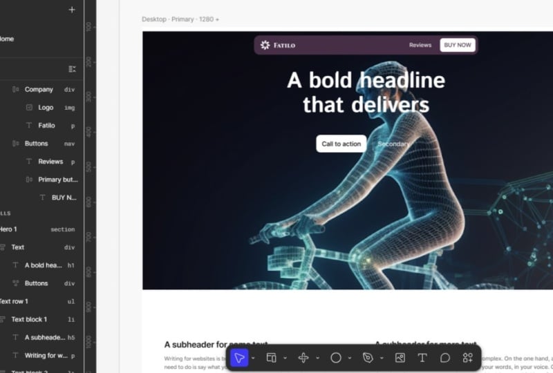
2. Figma Sites Workspace: First things first,
once you go into Figma, those who have Sigma four
will be pretty familiar. You can see now you've got
site and it says Beta. We can click on that and it'll
generate a site workspace. So Figma has a few
templates at the moment, there'll probably be a lot
more later down the track. People will probably
make templates. But for now, if you're
on the Explore tab, you can see simple templates made here, nothing too fancy. So you can start
off with something like this if you don't want
to build from scratch. I want to build from
scratch, you can learn the fundamentals of
creating Figma site. You can also click on the left if you want
a landing page, personal, or a portfolio. For now, I'm just going to go to explore and click
on Blank Site. Once you're in the workspace, you'll have your tools
down the bottom. You've got your toolbar
with everything you need. On the right hand side, you've
got the styles, export, arables and anything else to do with topography feels
just the usual, and then on the left,
you've got your layers. You'll notice right ahead, you've got the home page, and you can see it's
a gray frame and inside that you'll have your
desktop and your mobile. Now on the left hand side,
you have your web pages. So our homepage is the
current page we are using. If we do want to add a page,
you just go to the top left and click the plus next
to the webpage section. Currently have a homepage,
so I can left click on here and add a secondary page. I can double click on that and make an About page or a contact
page or whatever it is. If you don't want that
page, you can just click Delete once you select
it, and I'll get rid of it. You've also your page
settings with a little cog. If you put your mouse over
the homepage section, I'm going to click
on that and we have some basic SEO details here
like meta information, the page title, which is the main title
you see on Google. You've got language here and
also the social image here. When you share Link,
say on LinkedIn, it'll pop up with
that preview image so you can upload
an image there. You've also got domains here so we can connect
the domain later on, and then you've got general
site information here. So favicon, and you've
got custom cody if you want to embed widgets or
specific coded things. And that's basically it
for the site details. I'm going to press a
little arrow to go back, and now we are back in here. So what I'm going
to do now for now, I'm just going to get
rid of the mobile view, and I'm going to stick
with the desktop. What we can actually
do is start to drag and drop some sections
and elements inside. So I want to go to
the left hand side, and you want to go to insert. They've already got some
pre made page templates, which is kind of cool. So you've got some
templates here. You've also got navigation. So we got a NavbA. We've also got hero
sections, features, and embed so you can embed a YouTube video or a URL
link, which is pretty cool. You can also add
iris there as well. You can also search
things if you've got components, certain things. You've also got a new thing that they've created called M, and it uses AI coding. So you don't have to do
any code, but it will actually generate effects
for you, which is cool. If you want to change
the background color of our website, we can actually just go to
the field and change it to say black or whatever
color you want. Once you click on it, you
can also double click it and call it Homepage, right. But it's probably good to leave it on desktop and
keep this at the homepage. Bottom tool bar,
you've got your tools. You got webpage, which
is W frame for F, section is Shift S. You've also got the M
and the embed tools, which I'll show you
later, and then you got your basic shape tools,
image tool, text. Then you've got some other
tools that you can search for. That's the intro to
the fungal workspace. I'm going to show you how
to create some sections and design the first
layout and structure of
3. Design Desktop Version Layout: A. First, want to click the
little plus butt on the left, and I'm going to
go to navigation. And I'm going to
go ahead and drop this nice little Navbar here, and I'm going to drop
it right in there. It should automatically snap. Now, if we go to
the layers panel, we can see the layer is inside the desktop, as we can see. We've got the header,
we've got the menu, and then you've got all
these order layouts. So you've got the logo there and you've got the
buttons in order layout we zoom so it'd be
good to go through these layers yourself and
slice out what's in there. So we've got two buttons here, and then we've got a logo
here, which we can change. I'm going to go ahead
and add a hero section. Let's maybe let's
do this one here. Drag and drop that in. And boom, we've got that
cool hero section. We could have, it could be a dashboard or
something fun there. We got buttons and a headline. Now, let's also add
a feature section. Let's maybe go, should
we go with a Bento grid? Can't go wrong with a Bento. So throw that in there. We can also add maybe
another section. Let's go with testimonials. Maybe we'll put
some text in there. What some other
features we can add. We can also add a few cards. We can also just
delete a section, we can left click and delete. If we're not vibing or we don't need it, we can
always change it. That's totally fine.
Now, one thing I did notice there
is no Fuda tab, but they do have the Foota
in the navigation section, so you go down here and let's say we can do the
basic foota with, say, the three columns here. Let me just redrag that back in, Make sure that you see
the blue lines or it snapped in. Cool.
So we got that. I think I need to add a
call to action as well. So let me I don't know if
they have a CTA in here. But we can always
just add our own. I might just add that in there. This could be a
button. So we've got the basic layout of our
desktop landing page, and we're going to go ahead
and customize the design. I do have some brand images
and a logo and a brand that I've created that we will go ahead and add into the design. So I recommend creating
your own brief or using the brief that I supply and use that to create some mockups,
generate some images. You can use AI,
that's totally fine. Use whatever you're
comfortable with, and generate some nice images
and things that you can fill in all the information and the content on the website. You don't have to copy
exactly like I'm doing, but play around, add the
features and sections you want, and we're going to go
ahead and customize them.
4. Design: Text Styles and Navbard Pt.1: Part of the lesson,
we're going to be adding our images and design so we can start to finalize the overall visual look
of our website. Gone ahead and added my ace
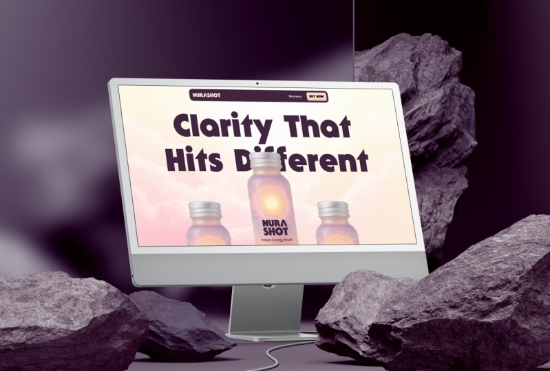
t. I've got some texts that I've created and created this
product called Neuroshot. It's an energy boost
where you can drink it. It's got caffeine
and magnesium and a whole bunch of things
that are just created, and I've got some
illustrations here. I got a background,
some icons and some testimonial portraits.
I want to add them in here. What we're going to do first is add our colors and our text. When we start to
create the website, we can update the whole design. I've gone ahead and created
some of our colors. You got the peach color here and the purple
that I've created. And when you click on, it's just a shape with
the color in it, you can go to feel on
the right hand side and click these four circles, and you can click the
little plus button and if you have say a new color, you can come in here
and call you know, peach or type whatever you
want and create a collection, so I can create that variable. And now you see it's created that color
into our variables. Now, if I go to variables at the top right, you
can click on it there. You can see now our color is added inside here and
you can see it's peach. I can come in here and right click and
duplicate variables, I can delete or clear
whatever I want. I just want to delete that because I've already
added them here. If you want to be extra tidy, you can go to the three dots
and create a collection and call this brand colors. And so now you've got
multiple collections here. So to add I want to add
color into that collection, we can do that, or you can just leave it in the default
collection there. Now, I'm going to go
to the hero section, and I'm going to press Control and left
click and that will help me click through something
that's inside of a group. You can see on the layers panel that if I just click in
the general area here, if I click on this here section, you can see we've got a
text inside auto layout. And you can see it's a vertical layout and we've
got text and then buttons. And if you want to quickly click on something without
having it selected, just press Control and hover
over that element and you'll find it and left click on to go inside that
group and select. Is just a bit faster. Now, what I want to do here is go to the typography section
and I want to type in BN I'm going to change
the font to B nectar. I believe that's the font
I was using for the brand, so I really like this one. And I'm just going to
adjust the letter spacing. Let's maybe go 2%.
Yeah, that's cool. And what we can do now is I'm going to add this
as a text style. I'm going to go
to the top right, see the four circles again. It says apply style. I'm
going to click that, and I'm going to click
the little plus button. And I'm going to
call this H one, and we can just
do H one heading. You can put a little
dash if you want to just make it more
readable, whatever you want, and we can actually show more options and you can customize the size and the lettuce paste
and all that stuff. If you want to have a different
break points for mobile, if you want a separate sizing, you would create a
textyle for mobile. Then when you scale it down, the size won't be messed up. For now, I'm just going to
leave this style here and create and so now we've got
now if I go to my fonts, let's say I want to
select this font here, I can go to the four dots again, and my style is right there. So I'll also create a style
for paragraph text as well. So for the paragraph text, I'm using fig tree. Oops. Fig tree, and
we're using medium. We can also probably
go for regular 16, maybe let's go for size 20. Letter spacing could be
0% and the line height, it's at 1:50, maybe we want
to bump it up or tarden it. I think we might tarden
it a little bit. We'll go 145. And so I'm going to save this, and we're going to call it body and create style, so now
I've got this style. But I also want to adjust
the color of this. So I'm going to use the
dark purple color at 50%. Let's go 75%. So we've got that purple color, which looking good, and
now it should be updated. Now if I go, let's
quickly test it, and there we have it
looking beautiful.
5. Design: Hero and Features Pt.2: Got the main styles, and now let's work on the Navbar before uploading any
of the other designs. So I'm going about Navbar, and what I want to
do is I want to make the Navbar stay in
place when I scroll. So currently, when I scroll, you can see the Navbar
doesn't come with us. I'm going to make it
into a fixed Navbar. So what you want to do
is select the Navbar, go to the top right
and click on position, and we want to
change it to fixed. Now, fixed, all it
means it fixes it to a specific part on the
canvas or on the browser. So if I make this fixed now, you can see it's gotten rid
of that back container. And now if I press
play on our scroll, you can see it's sticking
to the canvas on the top. I'm going to update some of the color so I'm going
to double click, make sure that we're selected on the menu and I'm going to change the fill to
the purple color. And then I'm going to go
ahead and bring in my logo. But I'm just going to quickly
make a white version. And I'm just going to
double click inside of here into the company. So I page that logo in and I'm just going to
scale this down, then make sure it's centered
with inside that block. And I'm just going
to put that logo inside order layout, make
sure it's all working. Sweep. Then what I'm going to do is we can
have a link here. We can maybe say
say maybe reviews, and we can say fine now. And I'm going to make the
button maybe like this. And I want to make it a gradient
just like a peaks color. So you've got two
on the stops there. You can adjust it if
you want. I think for now, this looks fine. And I actually want to change
the font to being a nectar. I'm going to select
the background, go down to, click on Image and click
Upload from computer, and I'm just going to locate my files and double click and it should load that
in, which is super cool. I'm going to go change
my text, my headline. I want to get rid of
the secondary button. Now what I want to do
is I'm going to drag my image here and
just drop it inside. I press Control set and select in the header and
paste the image here. We can make it really big. I'm going to change the
positioning to absolute, so we can drag it
anywhere inside this box. So in the hero order layout, when you make
something absolute, it means it can move
anywhere within that parent container
or that parent layout. So if I press play,
you can see it should be inside that
image, which is cool. And maybe I want to have it maybe overlapping
the text a little bit. I don't know,
something like that. And let's make this
headline like really big. You can use Control Shift and the full stop button
to make it really big. And I'm just going to go
ahead and press paste. Oops. And this one's
going to be the purple. Cool. And I'm going
to select it, and now I'm going to expand
the box the width is tight, so it's like a textbox. So we're just going to
make the width about 1056. That's fine. We can
always customize it. And maybe we can have
multiple bottles. Maybe we have, like, a
different flavor here on there. I'm going to copy and
paste the text in, and I'm going to have to
make some new styles, so I'm going to make
this style H two. You can also press Control to select and then
solding shift. You can select multiple objects. I'll select the headers. And I'm going to select the card, and I'm just going to change
the color of this fill, and I'm probably going to
go with this light color here. Drop a tool. You can select multiple objects and press I for the
Eyedropper tool, and I'm just going to
sample this color, and it makes it pretty
easy to do that. You want to have
multiple colors. One could be peach,
one could be 25%. I don't know, something
like that would be cool. I'm just going to go
in here and upload these images here. I just going to
drag that in there. I'm going to drag
the other image inside here and just delete the other one I'm going to go inside
here and go to the image on the layers panel
and just click the leap, and I'll drag the
other one in here. And we can scale it up, and you can see it's already
clipping the content, which is fits nicely in there. For the other ones, I'll have to make sure that it
fits a bit better. So we can scale this
a bit out like this. I'm going to go
click on the image, and I'm going to crop
it so we get rid of this top section press Enter. And I'm going to
select the card one, and I'm going to just
maybe scale this up. And I'm just going to scale
this whole container up as well so we can see
this image here. So we select the grid container. So we can see there's the
feature card section, and then the grid inside here. We just want to
scale this up a bit. I'm going to select the
back, and we're going to I can adjust the spacing. But let's increase
the overall size of this section so we have
more to play with. This one, we can
just scale that up.
6. Design: Benefits and Footer Pt.3: Have a victory now.
And for this one, I'm going to use victory. Victory. Victory bowl 24. Purple. I'm going to create H three heading and then I'm going to make these
H three, make that purple. I'm going to go and chuck that image in there and
delete the other ones. We've got this image.
I'm going to press Shift A to put
that into a frame, and I'm going to
center that frame. I'm just going to scale
that up like this. Now a cool thing
with Figma sites, you can actually use
AI to edit images. So I'm going to click
on image, got to feel. What I'm going to do is
click on Edit image, and it will pop up. Now I'm going to say
remove white background. You can see it's
obviously AI Beta, but I'm going to
press Control Enter and let's see if it's able to
get rid of the background. I removed it, but it has
this gray background, so I'm going to say I want
to say remove background, and I'm going to go ahead and
delete these images here. I'm going to drag my
images inside here, and then I'll just
scale this, same thing. You can just click on
the little AR icons at the bottom and click
Move background. Now, I'm going to copy and
paste the main her right inside here and
I'm going to bring it into the cards section. I'm going to go to the
top and make it Absolute. And now you can see it's not pushing any of
the cards out of the way because absolute ignores any elements within that box and allows you to
move it around. So then I can bring
it behind it and I can say, ingredients. We'll just drag it
a bit like this. And then that's a fun way
of creating that element, and then I can do maybe Oops. I'll select the text and maybe
change the field to 75%. Now I'm going to move on to
the next section to menials. I'm going to delete
some of them. I'm going to double
click inside of here and just select the cards
and can delete that. With the testimonials, I can copy and just select
and it can go pace to replace
Control Shift R. So I'm going to scale down all the dimensions of these images. So you can go to the right click on the Lock aspect ratio, and then I'm going to
type 50 for the width. I'll do fig tree. For this
one, I'll do regular. I'll do 15, I'll go 16170. 16 and fill color, 75%. I'll change fig tree and
put it on semi bold, and the color could be
the dark purple there. And there we go.
We've got some nice. What if I wanted to
change the border color? I'm just going to control and hold shift and click
and select the card, and you can see the stroke
is just a black stroke, but we can change
it to purple or get like this orange
light color there. I'm going to do
the peachy color. I think it looks nice.
Pop and paste the button. I'll paste that. By now button
in shop increase to size. Fold the foot up, we can play around with different
things here. You can just change the selection of colors
down the bottom. There we go. Something different
from the bottom there. I want to paste in the logo, so I'm going to select
the section down here in the foot up. But I want it outside
the container, and I'm going to change
this to absolute as well. And we can make it
look like that. I'm just going to
drag the icons here, and then I'm going
to left click and I just put it on the side. I'm gonna control, and then select inside here
and paste that in. And I'm going to make sure This text is I'm going to put this in another
order layout and change the order out to horizontal
then it becomes like that. Shift A and then Just make sure the gap is
the same as the other one. Change the layout.
Scale this down. When the design is complete. All we're going to do
in the next lesson is add some interactions
and fun hover effects.
7. Add interactions (logo slider, hover effects): So I'm going to show you how to add some smooth interactions and hover effects to make
your website come alive. First off, I'm going to
start with the Navbar, and I'm going to
go to the button. I'm gonna go to the top and I'm going to click Plus
next to the Link. This is going to add a link, and we can add Link. We can put a URL. So if
there's another page, we can link it to another page. So if I go to the top left,
click the Plus button, and let's just say, I want
to make this a product page. I can go back to my button. Press the drop down
and get a product. So now if I have my
mouse over it, click it, I'll go to the product page and the top left, you can
see what it looks like. Now, to make it
more interesting, what you want to do is click
on this end on the bottom, run at the top and click
on interaction next to the design tab and we can
see here interactions. It's got a hover
effect already on it. We can add multiple hover
effects if you want. But I can add
another interaction. So I'm going to click Plus and I'm going to
click Scroll two, and I'm going to
change the trigger. Right now it's on
while hovering. You can do while pressing,
mouse leave, mouse down. Except click while pressing. I want to scroll to
the quote section or the testimonial
section, for example. And so now you can see these
little interaction lines that show you where
it's going to. So it's going to go
down here. Now, if I go back and do the interaction,
it'll go to that. Click on text here, and one of the cool features is you can actually update
things with code. And what we can do is go
to the top right corner and click Make
Interactive with code. And so now what I can do is tell the AI to come up with
something interesting. So I can say make text wobble on HVA. AI
will be thinking. It's got a nice little
animation there on its thing. Now when we hover, you can see it wobbles, which
is pretty cool. Now if I want to
quickly test it, pull my mouse and you
can see it's hovering. Now the text is stuffed
up because it's Beta. They don't support custom
fonts. Edit the code as well. And let's just say we
don't want that effect, we can go and go
to the three dots and say restore original design, the top right, and I'll
get rid of that effect. So now it won't have
that effect anymore. So because the fonts
are not registering, what we can actually do is we can actually
outline the text. I'm going to double
click on this, right click and click Outline Stroke. And so now when you
preview if you've got a custom font that you're using, you can see it will outline
it and it should work. So you might have to do
that for everything, but let's go ahead and add
some more interactions. I'm going to press
the plus button and you've got a lot
of different effect. Let's say we want to
do a reveal effect, we can do a fade in, and
we'll leave the exit or none. We can do scale in, slide
in, whatever you want. Let's maybe slide
in from the bottom. Once the paid loads, it's going to slide
in and it gives you a little preview
which I really like. For these ones as well, we'll do the same thing. You can also right
click and remove interactions if you're
not vibing with it. So I'm going to go in
here interactions, reveal, and we'll
go slide in bottom. Page load, and let's preview, and you can see the designs
come up, which is super cool. Basically, the best thing
to do is just play around. So, you know, maybe I want to select one of
these cards or this grid, we can go interaction and we
can do a scroll parallax. That's maybe 50%
speed and you can scroll and you can see the
parallax effect there, but obviously, I don't
want that effect. Also do fun things like adding a clickable
playful interaction. For example, if I want
to have this image here, I can go interaction and I can go play and
make it draggable. And I can grab it, and we want to just make
sure that we can just drag it inside of the
parent container, which is this card. So I'm going to press
Play to test it out. And so if I pull a
mouse over this, I can drag it around now
like this, which is cool. So it's inside that container. But let's say we wanted
to just drag it anywhere. I can go back to the effect. I can update it, preview. And so now it should be
able to drag anywhere. And because it's
inside this container, it won't move, which
is pretty cool. You can see all
these icons you can drag now, which is
just a bit of fun. You can add as many
interactions as you want to make the
site a lot nicer. I'd suggest adding,
simple fade ins. So for this one, we can go
we can do a hover effect, and let's just say we
want to make it scale a bit bigger. Like one oh four. We can change the transition to easy in and out
or you can make it bouncy or quick or
whatever you want. So you can see that. If I
press play now and I hover, you can see it's got a cool
hover effect, which is fun. So play around with that.
Class. I'm going to make the website
responsive for mobile so that all is working properly.
8. Make Mobile Responsive: We will make the website fully responsive so it works
for tablet and mobile. So once you have with
your design, you got interactions and
everything's ready to go, what we can do delete that page, I'm going to click
the plus button and add a new breakpoint. Now, whatever change
you make on desktop, it will add those changes to
the tablet and then foam. So we can go to tablet
and we also want to add a mobile I always
recommend doing the design of desktop
first so it cascades down. You can see now, we can see I mentioned before
that if you can make a different size for the smaller breakpoints
that's why it's always good back to our
topography styles. I'm going to select on this.
And if you go to typography, we can click Edit Style and you want to add
some breakpoints. So on Tablet View, you can see we want to maybe
go to 35 and for mobile, we want to even
go maybe further. We'll go like 20. And it should
should adjust that. So now, if we click here, adjust it, but I think
because it's Beta, they still haven't
probably updated that. So I'm just going to change the size myself and
adjust this section. And I'm just going to
adjust these bottles. I'm going to put
an order layout, and I want to customize it like this. Actually, I'll keep on. I'm just going to customize that And for the other bottles, I'm actually going to hide
it, so I'll drop the opacity, so we can't see that anywhere. And obviously, it's not showing, but we want to see this
bottle here. Just go through. We'll check all the sizes, and if you want to add
some more padding, you can do that. I think it's fine for now. For these ingredients, we'll just move that
into the center there. I want to adjust this
and move this down. And everything else looks good. So it's just about managing the spacing and the sizing and make sure everything
works different sizes. Once it's out of Beta, I'm sure all these fixes
will be fixed. Bring this, this one. You can bring it
out. You can also adjust sizing on
the side as well. Okay, so you can see
the changes there. As it goes down, it's
different scaling. For this one, what
we want to do. We're just going to
reshape that textbox. M. I'm going to adjust
the sizing of this. And I think everything's looking good except these testimonials. I don't know what I
have to fix this. So I just re saved the images because I
had clipping masks because I created them in
Illustrator those issues. So I just re exported it as a So now if we drag the scale, we can see what it's doing. So if we scale it down, you can see what's happening
at different sizes. And would have to fix. You see how the Nav and the text different
sizes it should scale. So what I like to do is if it's like I want to
keep it a certain size, we can go to the right hand side and we can add a minimum width. And this minimum
width should be 612. So now if I press Play, you can see it should retain
and it should always be aligned to the center
So there we go. But once it hits, under the mobile view there's
always centered and minimum we can add a men
width could you 300, so it should be centered
there so you can see there. So that's one way
to fix that issue. And once you're ready to go, next lesson, I'll show you
how to publish your website.
9. Publish Your Website: Once you're happy with
it, and it's all good, you can go to the top
left, click on Publish. And Figmae will give
you a staging site. So if you don't connect
the domain, that's fine. I can literally just click Publish and it'll
connect me to that URL. If you have other issues,
it will tell you, you've got some
masks or whatever. And there is
accessibility and stuff, but I probably won't go into
too much detail into that. Once it's ready to go,
you literally just click the website and I
can scroll through. Everything seems to be
working on desktop view. And it's literally
live in the browser. That's literally how you
publish your website. Now, if you want to
connect a domain, you click Connect and go Connect and you want
to connect a website. I usually buy my domains at Go Daddy or you got Namecheap, and you just follow
the directions here. It's pretty simple.
10. Class Project and Resources: For taking this
short video class on how to quickly set up
a website Infigma now. You don't have to learn any
other third party tool. You can do everything
from design, logos, even designing and
building websites, Infigma which is pretty cool. I'm sure you go into the discussion and
class projects section, I will put in some extra
links to explain some things, give some more information,
give some useful resources, as well as a brief. If you don't have
a brief to create, you can create a
similar brand or product and just make a
one page landing page. The class, please leave
a review as well if you find this helpful so other
students can take the course.
 Jeremy Mura, Brand and Web Designer