Transcripts
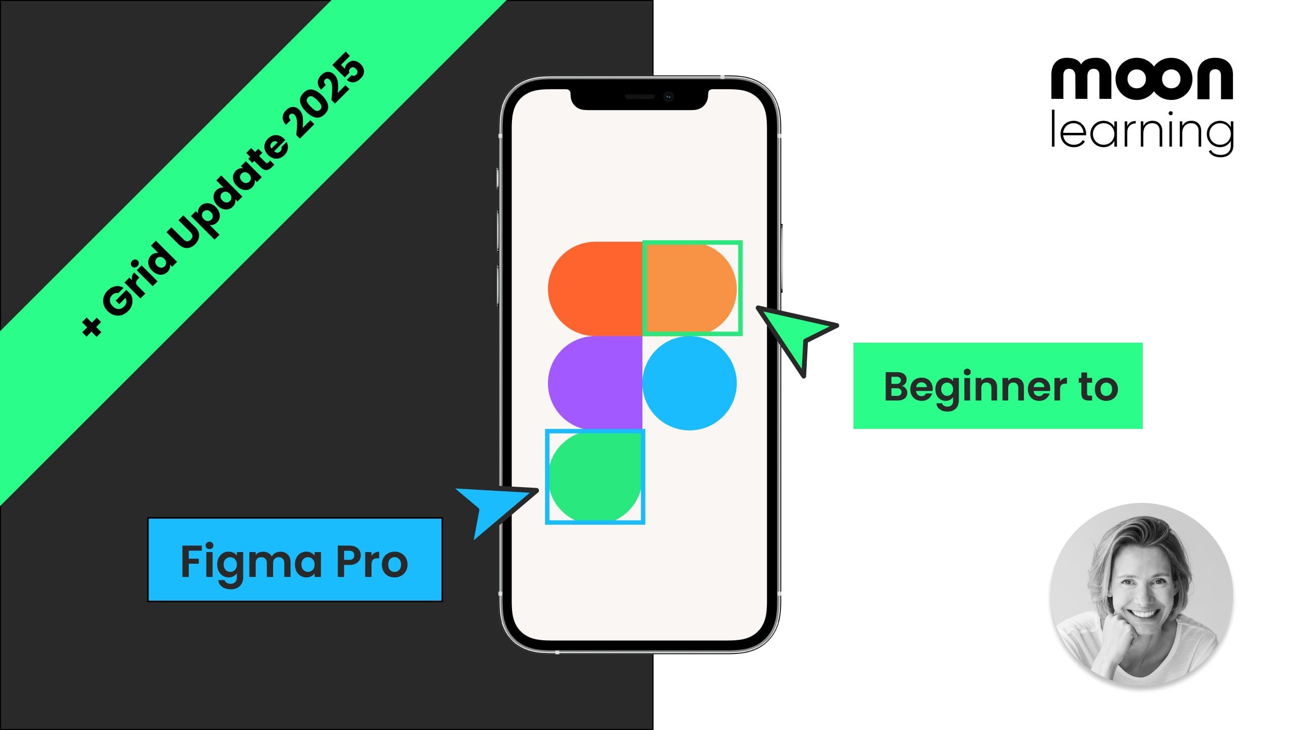
1. Figma Sites Intro: With Figma Sites, you
can design and publish your entire website
all from within Figma. No code, no dev, no
complicated stack. Just drag drop,
design, and go live. You can even set up
shared libraries, so your team uses
the same blocks, colors, and styles, keeping everything
consistent and on brand. In this course,
I'll guide you from basics to more advanced topics, all the way to
launching your site. We'll start from scratch using
the Figma prebuilt blocks. Perfect for beginners. I'll show you how to
connect subpages, add custom elements,
and bring your side to life with simple interactions as well as smooth animations. N. You'll learn how to build reusable elements like NafbAs and futers
using components. We'll embed videos
and maps and even create custom code blocks
with AI using Figma Make. Then we'll publish either with a free Figma URL or
your own domain. I'll show you how to
set it all up for accessibility and search
engine optimization. So your side is polished
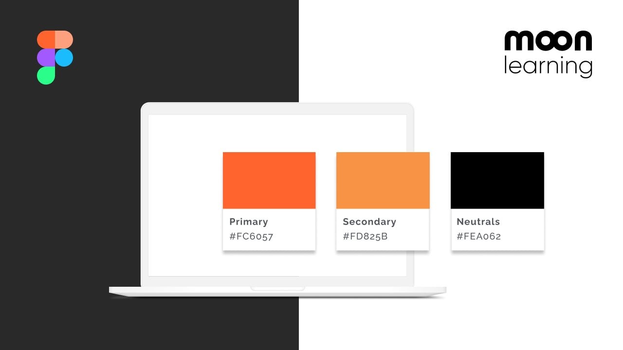
and ready to go live. Want to push it a step further, then I'll show you how to build your own design library
with flexible colors, typography, and
responsive blocks. You can reuse across
all your projects. Figma Sites is perfect
for portfolios, product launches, and personal
pages or small companies. A quick, easy way to get your idea online and focus
on your product again. This is a case by
moonlearning dot IO.
2. Course Material: To get your course material,
make sure that you jump to project and resources, and then you see a link called Downloads course
material. Click on it. You'll get to the Download page, and then here you'll
see the thumbnail of the course you're
currently taking. Simply click on Download. So there are two
files to download, so one that ends in dot site, that is the page where I show you everything that I'm building
during the course, you can just inspect it to your own liking
and play with it. You don't need it, but
it might be quite handy. And then the one up
here, this is in the later part of the course where we're going
to build our own library. So this is a library
that you can connect. You can already download
both of them now. So to access these files, you cannot simply double
click them to open. You need to import
them into FIGMA. And I'm going to run through the Figma interface in a
second in more detail. So if you're new to
this, then don't worry. We're going to cover
it in more detail. In general, you need to
go into your account, and then you need to go into your projects and then
select a project. And inside, you should find
some sort of import button. It keeps changing around
a little bit right now. If you go under Create, then you find your Import
button here and you can then simply import the
files that you downloaded. It doesn't matter if it's sites file or Figma
design files, you can store them all
in the same project.
3. BASICS: Figma file browser: The FIGMaFle browser.
Before we dive in, let's first have a look at
the Figma working structure. This is especially important
if you're new to Figma. When you open your account, it might look
something like this. There might be slight
differences, for example, if you're working in
a browser or also if you're working at another
version or an update, then sometimes things
move slightly around. However, in the core, you should find
the same elements. So what you need is you
need to find your team, and then inside of your team, you have something
called projects. You can have more than
one team in Figma, so you might be
invited to some teams. You might have some paid
teams for yourself, or you might have
some free teams. If you click on a little error, then you can see all your teams and you can swap
in between them. The team I'm in right now
is a professional team. In order to use Figma Sites
and libraries, for example, you do need a pro account or above at this moment of time. So inside of your team, you see the projects, and this term is a
little confusing. So that's a naming that from the very beginning of
Figma, and they kept it. So that means that these
are different projects. However, you could really use that for absolutely everything. See it as a layer of
organization, really. Now, you can see here
I have two projects, and what we want to do, we want to create a new one for this new project where we're going to build our
Sites page now. Right now on the app, we have the little plus project
button up here. And as I said, this keeps
on changing all the time. To be honest, I would expect
something around here, but we don't have a
plus button here. So let's click on here, click on Project, and now you
can just name your project. So I'm going to name
the Sites demo. And then it's ask you if you
want to invite other people. We don't need that for now, so just jump that you can
always invite later. And now you can see you
have your new projects. If we click on all projects, you can see that it
created the third one, and by the way, there is
a little star button. So this is really handy. You can see if you
star a project, then it's going to appear on the sideline so you
can access it quicker. Double click either
on here where you started or right on the project, and then you inside where
you can create files. So as you create a file, we use the same button and
you can see a change now. So if we click on plus or on the little
downward error here, you can see that
you have the choice between design files, FIG Jam, and so on. Now, we want to go
for a sits file. So click on this
and you're going to jump right into
your sides file. You're going to be asked if
you want to use templates. For now, let's click No. And if you want to jump
back to your overview, then click on the
little House button. Again, this might look a little different if you're
in the browser, and then you're back
on your main screen. And remember, you can access it by going into all
of your projects, finding the projects you're in, and then right inside,
you're going to see the file that you just created. You can rename your file
either from inside of here or right from over here by right clicking
it and click Rename.
4. BASICS: Sites interface overview: The Figma Sites interface. So this is what you see more or less when you're
opening your file. Now, let's zoom
out a little bit. You can use Command and
minus and Command and plus to Zoom or you can
simply use your mouse keys. So these are our canvases,
so this is our home, and you will always
start off with a home that's basically the homepage
that's later gonna open. And usually what it shows you will be a desktop
and a mobile. This could also
change over time. And I recommend that you click on little Plus button up here, and you also add a tablet. And actually, if you
hit Shift and two, then you get a really
nice full view of this. So before we dive in designing, let's have a look of what's
happening around here, like the options we
have in this view. So on the left hand side,
you have your layers panel. So that means you see everything that's going on on the canvas. So right now you can see
we have one web page. You can add more. We're
going to do that later. And you can see here the
home and then the details. So we have these
three breakpoints, and you can also
see what's on them. Right now, we have no content. Let's just add
anything randomly. So, for example, let's just add sort of just a circle here. And now you can see that this
was added to all of them. So this was added
to the desktop, the tablet and let's
say on the mobile, we could move it individually. And let's say we don't want
this element on the mobile, we just want it on the
desktop and the tablet. Now, if we hit delete, you can see that
this would just be hidden because this
is the same screen. So things would always
be present everywhere, but you can show and hide
them to your liking. If you take it off
on the desktop, then it's going to be taken
off on any other breakpoint. So later on, you're
going to find the publish button here as well. We're going to learn in detail
how to publish our page. It's super easy. Then over here, you have this one
where with Insert, you have blocks and
you have libraries. So blocks, this
is, like, sort of pre made elements by Figma. So let's just grab a hero. And if you drop it on
your desktop element, then you can see it's
already set up for all of your other screen sizes as well. So this is really handy, and you can, of course,
alter this to your liking. Also have libraries.
We're going to learn how to connect
our own libraries. So that's going to look like
these blocks over here, but we will just make our own, and I'll show you how to make
breakpoints and everything. Then over here,
you have a search, so you can search any element. Then we have our make. So this is really exciting. Here, we can add code elements. Again, I'm going to show you
all of these in details. Then here you already
get a preview Figma is bringing a CMS right now at
the moment of recording. This is still in progress, but I'm going to add this
as soon as it's ready. And then over here we
have some settings. So this is where you're
going to set like favicon and preview and
information about your page. Again, we're going to
run through all of this. So per default, always
have your file open. So at the bottom here, you have your tools, so you
can either like, let's just pick some text, so you can just add the
text here to your liking. And then as soon as
you grab an element, so this could be text or let's just add our circle here again. If you grab it, then on
the right hand side, you can see the property. So, for example, you could
change the text size, you could change the
font and all of that and colors and any property of whatever element
you grab over here. So the best way is just
to go through here. So you have different shapes. You have drawing tools, you have images, you have text. And you also here, you
can add new pages. Again, we're going to do
that separate and make. We're going to explore
that in a separate video. On the right hand side panel, you don't only have
the properties. Like right next to
the properties, you also see the interactions. So this is, like, you can add Ha effects,
connect pages. And again, we're
going to run through all of this in more detail.
5. BASICS: Create your first page: So let's start with setting up our first page with Pigmacytes. The easiest way to get started
and still have a lot of control over your layout
is probably to use blocks. Click on a little plus
sign and then you're going to see the preset Figma blocks. So there are preset pages, but we have better control over the layout if we're
using the actual blocks. You can see there's
navigation, heroes, features. Let's start with a navigation. Let's just take any navigation and then just drag it over and the important part
is you only need to drag it onto the
desktop version, and then it's going to create all the breakpoints
for you automatically. That's in baked into those blocks Let's actually turn this into little portfolio, so I'm going to go to heroes, and I'm just going to
drag over a hero section. And then from features, I'm going to add some text, something like this,
describing my skills, maybe a picture like
something about. And then what I also want in the very end is
some sort of footer, so that should be navigation. I'm just going to take this
very simple footer here. Now, what you can see is
they're not in the exact order. For example, I want the
foot to further down, so you can simply just drag it or you can also use your a keys, and then you can move
those whole blocks around to your liking. And notice how I just need
to change it in the desktop, and then all other
breakpoints will follow. Now, anything I would delete
in my desktop, for example, if I take rid of
that whole block that would happen to
all the breakpoints. But note one little thing. So let's say I'm here, I'm having these buttons, and so let's just
take the secondary. Let's say we're taking
the secondary off. Now, here you can see this is the desktop and have a look
what's happening here. If I take the secondary off, then this is going to
completely disappear. So this is where you
can really choose if an element should
disappear entirely. But you could also say,
I just want this button on my the main desktop version. But, for example, on my
tablet for whatever reason, I don't want this, if you
would then hit delete, then it would simply hide it. And that's totally fine,
just be aware of this. You could also hide
entire section. So let's say you don't want
this section on desktop, it would look in the
end like it's gone, but note how it will always
be here in your Layers panel. So before we alter the content, let's actually look what our page looks like
in a dynamic setup, so what it will look
like in the browser. There are different ways
that you can get a preview. You can either click
on this play button here or you have the
play button over here. With this little error,
you can choose if you want inline preview
or a whole page. So let's just click
it, and then you're going to get an own preview. And see it's really nice. There's some animation
already set in here. So you can resize it, then you can see the
different behavior, and you can also scroll
through this really nicely. If we go back here, what you can also
do is you can use the shortcut and you get
it if you forget it here. So shift in space. And if I press Shift and space, then I get this handy
in file preview, so it's a little nicer
to quickly work on this. When using the preset blocks, then Figma is really smart. And so if we click on
here, you can see that it already set up the so
called auto layout for you. So they added a vertical layout. You can see that we
see the full page. If you ever don't
see the full page, then you need to go here in the height and make sure
this is set to hug. And all our blocks
are already set up to something called fill the
container in the resizing. So to get started,
that is great. So everything is set up, and we're going to
take it from there. Just be aware that
later when we're adding elements or
you're changing things, we need to understand this layout section a little better to have full
control over our layout. But for our first
simple example, everything is working
the way we want it, so we can now add our content. And this is really quite simple. You just select the content on the desktop and then you
change it to your liking, and this will be reflected
on all breakpoints. So you can just go
bit by bit and then just add the text
to your liking. And for example, I want to
get rid of these buttons. Actually, I don't need them,
so let's get rid of this. Now, if we want to
add our images, then we can simply select
any frame or any shape, and then via the fill menu, you click on fill
upload from computer, and you can then
select any image. There is a bulk import
function in Figma, so you can press
Shift Command and K, and then you can
literally just select the images and then just
drop them wherever you want. The only problem right now is
that there is a little bug, so it doesn't add them to
the breakpoints currently. I hope this will be solved by
the time you're using this. For now, I'm just going
to do this manually. I'm just gonna speed
that up for you. Now if you want to shuffle the elements around a little bit, you can also do this
simply select the image, and then with the arrow key on your keyboard,
you can move them. Again, you can see that this
is reflected everywhere. I just went ahead in
the background and already updated all
of this text here. You can completely do
that to your liking. Another little thing
that you might actually want to do is it looks a
bit flat all in white. So you can just select
certain blocks and then just click on
the fill button in case you don't
see a fill color, and I'm just going to
give it a slight tint of a really light gray just
for a little bit of depth. And just like this, if we're
pressing our play button, you can see that
you have a really lovely and working
first web design ready in no time. And by the way, all of
these lovely pictures I'm using are from lomi.ai. You can find a lot of free
images as well as upgrade to a pro plan and get fantastic AI generated
images for your designs.
6. BASICS: Connect to subpages: So now let's add a sub page. So what I want to happen
is I want to click on one of these portfolio
images and then get some more information
on a separate page. So what I need to do is
I need to add that page, so we click on adding a webpage. You can also do it up here. And then what you get
is this sort of page. So we just have the desktop, but we need all the
same breakpoints. So what we're going
to do is we're going to click on the Plus button, and we're going to add a tablet, and we want to add a
mobile for fall control. You can rename the page. So I'm just going
to call this Cafe. I'm going to start
with my blocks again. And this time, what I want
is I want some features. So I want something that is sort of a lot of images
or something like this. So I'm going to drag
this over again, drop it on the desktop, and then it's going
to just duplicate it on all your breakpoints. And I also want a navigation, but I already
changed the text in this navigation here a little
bit for the contact me. So I'm going to use the same, so I'm just going to copy this, and I'm going to paste
it on the desktop, paste it down here, so I'm going to move it
with my a keys up, and now I have the same
navigation on all of them. And then maybe we
just want to add, I don't know, a little bit of text or something like this. So down here, you
can see there are some text fields. I'm not sure. I think this here will be right, so we can add some more
information if we wanted to. And, of course, our food term, going to use the same one here, and that copy just
fine at the bottom. So now before we jump
into the content, let's actually connect
it right away. So in the right hand
side property panel, you have design and
you have interactions. Click on interactions, and
now select the element. So, in this case, our picture
that you want to connect, you have to deep click until
you really got the picture, and then you see these
little bubbles appearing. Any bubble, just keep it down with your mouse
and then just connect it. And you're going to see
that it connects from all the different breakpoints.
That's pretty much it. Now, we want to connect back. So in this case, I would
love a breadcrumb, but there isn't one in my block, so I'm going to use here the
main logo to connect back. So this is maybe something
that later I'm going to fix. I'm going to connect
both of these here and I'm going to select this
and just connect back. Okay, so let's have a
look if that is working. So I'm going to use my
shortcut Shift and space bar. And so now you can see here this is working
really nicely. It's still responsive
and everything working. And so if we now
hover over this, we can see we can click it, and then we get to our new page. And if we click on the
logo, we Okay, great. All I'm going to
do now, I'm going to add my content here, jump back to design, and I'm actually going to speed that up in the
background for you. So let's just add the text. I already wrote
and I already add made up a little bit of subtext here as well, which
I'm going to copy. Again, remember, we always
just copy in desktop, and now we just need
to add our images. I'm just going to
speed that up a little bit for you here
in the background. And here we go, so we have
our page with subpages ready. Let's just play the whole thing so you can see lovely
all responsive. We jump to our subpage, which is also responsive, and we can always go back.
7. BASICS: Insert custom elements: So let's customize our design a little bit and add some of
our own elements to this. So you can see over here,
I have a large picture, which I want to add because if I have a look right
now and features, I don't really just get
one large hero image. So what I do is I'm just
going to drag this over. I'm going to drop it in here, and you can see
that I can add it, but it doesn't behave the way
that my preset blocks do. Now, if you want to add
customized elements, then you need to know a
little bit about layout. I'm just going to
show you the basics, but I highly
recommend that if you are not familiar with
Figma's auto layout feature, that you jump into one of
my other courses while I go through auto
layout Figma in depth. It's really a feature
that's very worth knowing. If you're just playing around
a little bit with sites, you might even get away with just a few tricks
that I show you. So first thing that
we need to do, if you select this
block, for example, you can see here
that in the width, it is set automatically to something called
fill the container. So that means it's going to take up all the available space. Right now, if we
select our image, this is not set up to
fill the container. You can see here in layout, if we drop this down, you can see that this
has a fixed width. So just jump to
fill the container. You can see also here
we have this one set, which means that we're keeping the aspect ratio of this image. Now you can see that this fills
the container everywhere. So don't do this. Let's just go back to
what we had previously. You might be tempted
to just resize this. But then what's
happened, it looks good in your stata view, but if you then have a preview, you can see that
this is actually not going to behave with
your design anymore. If you want a fixed
element, this is fine. Otherwise, make
sure that you set this to fill the container. Now we can customize
this a little further. You can see here that we
have a corner radius of 16, so we can just grab
our main image, and we could also set this
to a corner radius of 16. Now, I added another element. So this is a little bread
crumb because remember, it's a bit strange that I have to click on
the logo to go back. I want this to be more obvious
on how to navigate this. So the thing is, right now, this is only a frame
and I added some text. In Figma, every element
we have, and in blocks, they set this up for you should be set up in auto
layout to be working. Again, if you're total beginner, this might be overwhelming, and I highly recommend that you familiarize
with auto layout. I'm just going to show
you this quickly and assume that you understand a
little bit of auto layout. So I'm selecting this and I'm
going to hit Shift and A. So this created an auto layout, and you can see this
is happening here. So this is going
to this direction. I can see the distance here. I'm going to make this
multiple of eight, actually. I can add some
padding and so on. And now I'm also going to
create the outer frame. I'm going to select
this. And you can see here this is a frame, so I can also select this here, or I can press Shift and A. This is my shortcut, and then I'm creating
this auto layout. So now I'm just going
to pull this out. So this is the size of
my parent frame, 1,280. And I can now, for example, add some padding
here top and bottom. So I'm just going to
have the bottom one, 24, the top one, I think, 24, as well. And now the sides, I'm
actually going to check what's happening here
in my navigation. So my navigation
is telling me 64, so I'm going to use 64 for
left and right, as well. If this is a bit overwhelming
when you're new to Figma, you might also just get away with simple elements like this, just lay outing them and
putting them inside there. So what we're going to
do now, we're going to drag this over here, and I'm just going
to drop it on here. You can see it dropped
it everywhere. Again, see how it doesn't resize properly because what we have to do, just as with the others, we have to select the
entire element and then in the width set this to
fill the container. Now, there is a more
structural way to set this up, but right now we're just doing this a bit manually
for a one off. So you can see here that
we have different padding. So here we have a padding of 32. So I'm just going to do that on this element here as well. And then for the mobile, we have 24, and I'm also
going to set this up 24. So here you go. So what I don't like is
this huge distance here. Actually, one thing I
want to do is I want this nice little gray
background here as well. So I'm going to select this, you can click on the fill color. I'm going to take
this little pick. I'm just going to pick the background color
I have over here, so I have a nicer overview. So this is nice, but this is really large
here, this distance. So I can also alter
this here and I can just go down here a little bit and make this a little smaller. And if I wanted to, I can
also use this and maybe add a little bit here so I have more room if I want
this to be clicked. All I need to do
now is I'm going to select this home over here. I'm going to jump to
interaction again, and I'm just going to make sure that when I click on this, this is jumping back home. So let's try this out. So here we have our design. We go to the sub page. This is looking lovely. Let's see if our
image is resizing. Yes. And then if I click on
Home, I'm going back home.
8. BASICS: Adding links and mailto: Let's add some external
links to our design. So a mail link and connect our
social media, for example. So what we have here
is we have a button, so we want to click that
button and then open an email. And then down here, we
have some social media. So let's do both of that.
Let's start with our button. So I'm going to
select the button, and this really works
for any element. And then in the right
inside properties panel, you see something called Link. You see it in design and
also in interaction. Sometimes it moves a little bit. Click on the plus button, and then you get a
field to add a URL. You can also connect it to any sub page that you
created, for example. So if you have a page with a form that you want
people to fill out, right now, what we want,
we just want it to be clicked and then open an email. And you can do that with mailto. So you don't add a URL. You could add a
URL, for example, if you have an outside blog or something you want
to send people to, but we're going to use Mail two. Now you could open
this in a new tab. In this case, it
doesn't matter because it's going to open in
a new one anyways. So let's try this out. So
let's open our preview. Let's click on our button, and you can see that it
opened my email program, and it's sending it to the
email address that I gave. It's using the same
one here because this is my address
I'm using for demo, so you'd find the address of the user sending it
from in this field. When you're adding
something like this, just make sure
that you also have your email address
in the Foor or somewhere else in plain text. So anyone that does not have an email program installed on their device can still
find your contact details. A little side note, you can also extend mailto. So instead of just opening mail, what you can do is you
can add some info. So there are
different generators. You can, for example, use mailto linkgenerator.com or just
search for any other. So here you add the address
that you want to open, where the mail
should be sent to. You can add CC, BCC,
you can add a title. So, for example, you
know that this is a request coming from your
website when someone sends it. Then you can add a body, so you can add a preset email. This is super
handy, for example, you're having sort of a request that you want people
to be filled out, like, what's your budget? What's your company?
What's your position? Then you just click Generate, and it's going to give
you the mailto link or the HTML code. We need the mailto link as
we're working with Links. And then instead of
what we just had, I'm just going to change this and paste the
mail to I just copied. Let's now have a
look what happens. So if I click on Contact M, you can see that this
entire page here was added. So you can see that we
now have a subject, we have a CC, and we
have this as a body. So it's not necessary, but it might be quite handy. So now let's also connect
our social media. So down here in the Foota
I have my social media. So I'm going to use
LinkedIn as an example. So I'm going to select this
whole this whole frame here, so the one for the
LinkedIn frame. And then I'm going
to go the same way. I'm going to click on Linked, and now I'm going to add an
external link, actually. So here I'm just going to take the link for
my LinkedIn page, and I'm just going to
paste it into that field. So now if we're
going to preview, and we're clicking on this, it's going to open
my LinkedIn page.
9. BASICS: Components: Working with components. So component is a
big subject Figma. And again, if you're
very new to this, jump to my beginners course, and I have a section where I explain all of this
in a lot of detail. For now, I just want to show you some basic usage of
components with sites. So for example, here
we have our button, and we use that all
over the place, and also we have our navigation, and we have our Puta and we have also some behavior
baked in there, which we would now have to copy into all of these
buttons everywhere. So what we can do is we can
turn this into a component, and a component
basically means that you having like a mold that
you're then re using. So let's actually
take this button out of here and you can
see it copied all of them. I just need one. And this is called primary button.
That sounds great. And I'm simply going to
turn it into a component by clicking on the little
component sign over here. And so our component should always live outside
of our design, and we're going to organize it a little better
as well later on. But what I want to do
now, I just want to copy, and all of these copies
are called instances, and I'll put them
into my design. So I'm just going to
drag out an instance, hold down Alt and option. You can use copy and
paste, by the way. I just find that a
little more messy. So what I do, I hold
down Option or Alt, and then I get an
instance of this. And now what I'm going
to do is I'm going to get rid of this original button, and I'm just going
to replace it. With the button that I just
made. Let's just speak. If you can't manage to position it nicely here, use
your layers panel. We have a little
button group here, so I'm going to add it in there. Let me just position
it on the other side. So now I have the same button in my navigation that
I have over here. So if I change anything, for
example, this link behavior, or let's just randomly
change the color, you can see that
this is reflected everywhere in our design now. However, I am also using this navigation in
several places. So I use it here and
I use it over there. So I can also turn this
entire navigation with the nested incense of the
button into a component. So let's pull this out. And then I'm going
to do the same. I'm going to turn this
into a component. It's called header two.
Going to leave that now. And I now can
create an instance, and then I can replace this. So let's get rid
of this. And now I'm creating so I
already created one. I'm using this instance here, and I'm just going
to drag it in there. What however happened now
is that this instance, you can see I'm using
the same one over there, so I could manually change that. I could overwrite it, but that wouldn't be clean because
I would overwrite, and then I would lose every all the information
I put in here. So it gets a little unclean. But as you can see,
what originally happened already is that
when I pulled this out, you can see that it actually
gave me all of these three, or I could create them by hand. And now we can create something called a component
set with this. Let's actually
just give a bit of a background color so we
can work with it better. We can take that off later on. So you can see, I
already have all of these three versions
that I need, or you could set them up
by hand, for example, with a breadcrumb or just
anything that you adding here, you could also
manually set this up, but I'm going to use what
Figma already give me. And then what I'm going to do
is I'm going to turn all of those into a component. And now I'm just going to
change the naming a little bit. So I'm just going to
have all of them called header or actually going to
call all of them navigation. So now I'm going to
select all three, and then you can see over here, it's telling you
combine as variants. Click that and then
you're going to see a little purple outline that Figma is going
to turn around them. So what you see now, let's just pull out an
instance of this. And now you can see
I have the instance, but it's telling me
there's an error. It says there's a property but they're all named the same. So what we need to do
we select each of them, and then I'm going to call this one desktop. And
this is important. It's going to work
really nicely if you use desktop, tablet and mobile. Otherwise, properties Figma Design, you can
name them anything. But here we stick
to this naming. Then I take the tablet.
I call it tablet. And the mobile mobile. Now, it could also change
that property name. You don't have to. It
would work anyways, but I could call this
breakpoint. Okay, great. And now if I select
the instance, you can see that it now has in baaked all of these
different versions. And what I can do now, I'm
just going to get rid of this, and I'm going to
drag it on here, and it's now going to know
where to position which one. Simply by having used that name. This is something that Figma set up for you in
the background. And the great thing
is now I can just use that same navigation here, so I'm going to pull out an
instance and add it here. And now I also have
my navigation. And so anything that I
change now with the button, with the setup, let's say that we're turning around, like, the order of this say that we're selecting this button
and we're moving it, you can see that this would
be reflected everywhere, and now only in the desktop. So I can also make
conscious decisions like the padding or like the margins in these
different breakpoints. So in the background, all of these blocks
that you're seeing that so magically worked
across the breakpoints, like in the background in Figma, they're all set up in this way. This is why it works, which also means
that we can set up our entirely own block library, and we're going to do
that a little later on. For now, we're just going to
leave our components here. If you've worked
with Figma Design, then you will know that
usually you do not want your components on the
same page as your design. But right now, Figma
is not really giving us much options in this beta version that
I'm working with. What you can do to
add a little bit of organization is go down here, and here you find sections, or you can use Shift and S, and then you can draw
a section around here and you can simply
call this component. Also organize this further so you could have navigation
elements and so on. But later on I'm going to
show you a better way to set up a library and keeping all
of this nice and organized. If you just have a few bits
and bobs here and there, then this is just going to
be fine to get you started. And just to get the hang of it, let's actually do the
same with our navigation. I'm going to pull
this out. I'm going to place it on here right now. I'm going to give it a little
bit of background color. Again, you can take
this off later on if it bothers you just so
we see it better. Let's do this really quickly. There's actually also
a shortcut to do this. So what I am doing is I'm
selecting all of them. I could either create
components for each of them and then combine it
or you can use a shortcut. So there's a little arrow
next to your component sign, and then you can see
create component set from here. So you
can also use this. Again, it's going to tell you there's an error
with the naming, so we sort out the naming. I'm just going to speed
this up, but remember, it's desktop, tablet and mobile. And if you want,
you can click on the entire component name and
also rename the property, for example, to Breakpoint. And now we can simply
pull out an instance, and we're going to add
it again to our design. You can add it anywhere, and then remember, you can just move it with the arrow keys. I got stuck a little
bit. Apparently not. Let's add it to the end. And you can also copy it just
from any design to another, so we could just get rid
of it here and then copy this one back in Again, you have to make sure
you position it like in this little where it shows
you this little line, and then you can
move it further. And here you go. So now, anything you add
here, for example, you just need to add your
social media links once, or you can also change
this primary button. So just be careful
with one thing. I now have a general button, and I only use this
contact button, but you might use a button
for different things. In that case, you might have
to create a separate button. So where you have one button for contact button and then just a general button that
you link within the document, just be a bit mindful of that.
10. Check out my Figma Beginner Class for the Basics! : Now during this course,
I want to refer to a lot of FIGMA features
like components, also layout and variables. If you use T FIGMA, then this will be all
very natural to you. However, if you new to FIGMA, then this might be a
little overwhelming. I'll not cover these
concepts in this course. However, with your
Skillshare membership, you can jump into my
Figma beginners course. In Projects and resources, I added a direct link. You can just click on that. This will lead you
directly to this course. The course is 4 hours
long and it starts with all the basics which you might or might not
want to go through. If you only want to look
into certain concepts like components or
variables, for example, the difference between
variables and styles, something very important
for typography, then you can just jump
to these sections and explain all of that
from the beginning. Also or to layout,
as you can see here. If you want to go
the extra mile, then you can find more
things in this course, like how to prototype
with FIGMA, how to collaborate, and there's even a course project
for your portfolio. This is also by far, my most popular
course on Skillshare, and as you can see,
in the reviews, people have been
very happy about it. So jump in and learn
more about Figma.
11. BASICS: Fixed navigation: Let's set up a fixed
navigation bar. So in our design here,
we have a preview, we can see we have
a navigation bar, but if we scroll, it disappears. You might want this, but
probably in a lot of the cases, you just want this to stay right fixed at the top. So
this is really easy. All you need to do is
select your navigation, and this could be an
instance of a component. This could be from blocks. This could be
anything you design yourself. It doesn't matter. The important part is that
have a look that it's a direct child of
your main frame. So sometimes you might have by accident package
it inside of here. And this looks the same, but it might block that you
can set it to fix. So just make sure in your
layers panel that this is on its own level and then select it on the right
hand side in position. This used to be in interactions, right now they have
it in position, so it might slightly move. So look for something
called position or scroll and then choose
fixed behavior. So you're going to see
this little outline here. So that means it was taken
out of the standard behavior, so it doesn't go with the flow, which is also why your
content moved up? Because your content moves up when it said to auto layout. So let's just grab
this to understand it. So this is aligned
here at the top. So it's just going to
start from the very top. So if you want this
natural little gap, so for example, here,
you'll see it's very necessary.
Then have a look. So this is around 95 in
height, your navigation. You can see that here in
your height settings. And what you do is
just grab the desktop, so it's going to add
this to everything. And then in your auto
layout settings, you can see here the padding, and then you can just add this
padding again to the top. And this way, this is
just going to push down. You could also alter this a
little bit to your liking, and you might also see
solutions where this is actually using sort of
a fake background here. So sometimes people just make a little frame and put
it on the top of it. It also works, but I think
this is the cleaner solution. So let's have a
look and preview. And if we scroll through it, then that looks just fine. However, if we resize, note one thing how
this is jumping. So we need to go back and
fix one little detail. So select the header because
right now, remember, we always set all
of this to fill, and suddenly we don't have this available anymore because
fill the container. That is an auto layout setting. And because we took this out of auto layout and set it to fixed, we don't have the auto
layout rules anymore. But what we can use
is this up here. We can use the constraints. So in your constraint panel, look for something
called left and right. So that's just going
to keep it there. So right now, if we click
again on the preview, and we resize it now, you can see that now it is
keeping the distance nicely.
12. BASICS: Animation basics: Let's add some animations
to our design. So actually, if
we go to preview, we can see that these
little thumbnails, they're already
animated by themselves, and this is sort of
baked into that block. So let's go back and let's understand how that
actually works. So for animations, jump over
to the interactions panel. So right next to design,
you find interactions. We already added interaction. So that means when
we're going from one page to another or
to an external link. But if we select
elements on our canvas, then we get more
options in that menu. And for example, let's select this card group where we
already have something set, so it's nice little
circulating animation. And you can see
that this was set up here in interactions. So there is an animation that's built in and it's
called Marquee. I could just click on minus so I could take off
the interaction, and then I just have a
static picture here. For any element we select, we could add some interactions. Now, it's nice to add them
when they make sense, but rather use less than more. Please don't have these things where things are
flying in and out. It's always a potential
source of error, and it's always a bit confusing. So use it, but be
mindful about it. But let's give it a try.
So we have Herotex here, and then we have interactions. So let's click on the plus, and then we see our
preset interactions menu. So you can see here we have
things like scroll behavior, but the important part that we like for this is
actually this here. So for example, if I want this typography to
sort of be appearing, then what I could
use is this one. I could use that typewriter and then I could set the speed. I'm actually going
to leave that at moderate, and I could loop it. Actually, I don't want this,
and I have a little cursor. So let's have a look
what that looks like. And you can see that
this is really nice. So this is going to
start typing as soon as I click on it as soon as I
open this page, basically. Now, let's add a little bit more here and also
understand that it depends on the layer that I'm choosing on what is happening. So let's add another effect
because you can actually, even though we already
have the marquee effect, you can add more. So let's say we want a
bit of a hover effect. And it's actually grade out. And this is because I already
added a hover effect. So you can have
multiple effects, but not the same effect twice. So let me take this off so I
can show you from scratch, and I'm just going to
select this again. So now I have a hover effect, and you can see I have this
here and I can set it. So I'm going to set
this to 1.2 scale. So that means if
I hover over it, then it's going
to sort of, like, just pop up a little bit. So let's have a look and
note how I set this on the entire card group.
So let's have a look. So I can scroll, and as soon as I go over it, it goes bigger. So I might want this, but
I actually want to just hover over a card and just
have this on the single card. So make sure you
take it out of here. And now I select the card group. I hit Enter. This is a fast way to access
all the child elements. You could also just
select them one by one. And then what I do, I
add an interaction, and I add the hover effect,
and I do the same now, 1.2 or actually maybe 1.1
to keep it a little subtle. And let's have a look
now. So I'm playing this. And as I hover,
you can see I get this nice little
smooth hover effect. I might want to adjust the
distance a little bit, so I could now just select
this, jump back to design. And then here, I
actually have the gap, so I could widen
this gap a little bit and give it a little
more space to grow. Quite a nice one and very
subtle it's also reveal. So let's say we want to reveal these
elements as we scroll. I'm going to actually
leave this as it is. And then I'm going
to select these two. And so I'm going to add
interaction and reveal. And so as soon as it is in view, you can also do page load, but I'm going to do
as soon as I sort of scroll onto it, it's
going to fade in. So this is really subtle. Let's have a look.
So if I scroll, notice how this
slightly comes visible. So it's almost you
almost don't notice. Let me actually
give you this one. And instead of fading, let's say this one
comes from the left, and then let's have this
one come from the right. So we see it a little better. And now let's have
a look at it again. Let's use the full view. And you can see that it's
really slowly just slides in. You also have some
crazy ones here. Let's just select them
just for the fun of it. So here, for example,
if we go onto play, and then we have Drager Ball, and we just say you
can drag anywhere, and then you can see now we can just drag those elements around. Not sure how useful that is, but really just
play with them and see what might be
useful for you. Be mindful with animations, but use them where
they make sense.
13. BASICS: Embed maps and videos: Embeds. So one
part of our block. So if you click on a plus
button, you see the blocks, then right here at the end, I currently have the embeds. So I'm recording this
word still in beta, so it might be a little limited, and I hope that you see
better adaptability. But I just want to show you
what's possible for now. So we have right now three URL, YouTube, and Google Maps. So URL, if I add this, you can see that this is really only you can add a
URL or an HGML code. So the ones that
you're probably more interested in is
our YouTube one. So let's add this one
and a Google Maps one. So if you select them, you already see that they have fewer properties in
the Properties panel. But what you can do is you can't simply drop them right now, but you can copy them. And then, for example,
you can select this hero and you
can add it in here. So you could also sort
of have it inside of any of your other blocks
or layout as an element. So it might have fewer options, but you can still position
it relatively well. Now we want to add a video here and we want
to add a map here. So what we need if
we select this, you can see that up here, we need a URL or some HTML. So with YouTube, we can simply paste our YouTube URL in here. So I'm just going to
grab one from my videos. So this is on my
YouTube channel. So if you want to
use your own videos, you need to upload them on
your own channel first. We could also just embed
any other YouTube video. Find the Share button, and
then via the Share button, you simply copy the share link. And now we're just going to
paste it inside of here. And you can see now your
thumbnail is already here. You can choose whether
you want autoplay. You want full screen enable
so people can enlarge it. And right now, I
actually have to say there's one
little thing that I hope is going to be solved
soon that the thumbnail, the dimensions are not
correct for YouTube. So you can unclick
the aspect ratio log, and then you can
just, like, set it up to the right dimensions. You can also just get
them from YouTube. If you want, I'm just
going to do that manually for now,
so it looks fine. Here we have our map and you can see that we have a URL or some HGML we can get URL
or actually just a iframe. I'm going to do the same here. I'm going to jump
over to Google Maps. And so I just searched
for Berlin now, and so all I do is
I'm going to get the share location for Berlin. You can also add a specific
street with a house number, and I'm just going
to copy the link. Actually, no, I
want the embed map. So I click on Embed and you can see here
this is an iframe, and I'm going to
copy this iframe. So now let's jump back
to our Figma file, and I'm going to paste
that right in here. And now, if we click
on our preview, you can see that we
have this video, so we can play this here. Blogs and *** sizes. And you can also scroll down, and then you have
your map which you can use just as you
would Google Maps. So actually, in your
feature blocks, if you want to use that
map with an address, then you also find one here. So you can just
replace that block. So basically, you can
just use this one, and you could now simply add all that information
just as we did before. Actually, we should still
have it saved so you can see here if I now paste
this inside of here, and let's play this again. So you now see if you
scroll the block, you can add the information and you see the integrated map.
14. BASICS: Code layers with Figma Make: Figma Make and code layers. So there's a great feature
we haven't explored yet, and that is Figma Make, which brings code
inside of our page. And we can literally
create these little blocks with code. So there's currently
at this version, this is still the beta version, two places where you find it. So you find it over
here in the bar, and here you can see it
opens a complete page so you can also just create an
own page with Figma Make. What I want to show
you is this part here, where we use it as code layers. So you can see, it's in this little embed or make
field we currently have. So just click on it and it's
going to open the interface. And so you see this
little code layer here, and we can place
it on our design. And then we're getting this
window with the code layer. And now it's pretty
straightforward. So all you have to do
is it's an AI tool, and you're describing the idea
that you'd like to build. So this could
really be anything, and you can see it's
giving us some ideas here, like a gradient background,
a digital clock. So let's actually just go
for the digital clock, and then you can
see a prompt what it would look like,
so you can see here. Now, if we click on this button, it's going to generate
this code for us. So this might take
a while so I'm going to speed that up in
the background for you. And now you can see the
code layer was generated. Note how we can see our layer, so it was generated
for each breakpoint. Looks like this. It's giving
us some options that we can alter this sort of the
most important parameters. You can see your code here. And you can see also
usually side by side, and then you can have
your chat here so you can also tell it to
make any changes. But let's just use it for now. So if we close this,
we can see it in here, so we can move it around
and you can see, as usual, we probably have to set this up and auto layout and
position this a little bit. But we basically have
this little block here. So if we press Pu view, then you can see that
this is a working clock, which we can now just as any other element position here and integrate
into our design. So up here, you can see that
we can also edit the code, so you can jump in back here. And then what I really like
is this little part here, which is point and edit. So, for example, I can use this, and now I can point at
different areas in my design. So I can select this so I
could change the color here. So this is all sort
of design things, but you can also
talk about or have a chat with your code layer
and then tell it what to do. So let's try this out, and
let's try if it could give us an AM and PM version instead
of this sort of clock. And usually it's an AI tool, so you never really know
what's going to happen, so you might have to play
around a little bit. So again, this is going to take a little while
in the background. I'm going to speed
that up for you. So you can see it
changed this for us. Now let's try something else. So the page we're building
is for freelancer. So what I want to
do, I want to have this calculator so I can
add my prices there, and then people can calculate sort of a first
estimate of how much my services would be and
then reach out to me. So at this moment of
time, what I still like doing is I just describe in JGBT or Claude
what I like and then ask it to write a
proper prompt for me. So this just makes your
prompt a little clearer. So I gave it a vague idea. I want an estimate calculator for you I designers website. So potential customers
they can select from a basic standard
and premium price. And then I want something
for logo, typography, image done, and a landing page, and then they see the total. So I wanted to create a prompt, and then let's just
use that prompt. So usually, I'd work a little bit and customize
this first one, but I'm just going to
copy it like this, and now we're jumping over to
make and we paste it there. You don't have to do
that. You can also just write it in here
and then play with it. But I just find it gives
me better results. But again, there is
absolutely no need to pre factor the prompt if you just prefer
writing it yourself. So again, I'm going to speed this up in the
background for you. That looks quite nice, so let's close it, and let's have a look
on our proper page. I'm just going to as usual, set up the auto
layout. Hit Enter. You can really use
this like you use any other layers so
fill the container, and let's now see it in action. So we can see now we can
select any other price. Very lovely. And then down here, actually, we have to jump back because
we have to set this one, remember, to hug the content, so we see the full
one, it's not working. So just set the make layer
to hug content as well. And now you should
be able to see it. So let's go back. Now
we can scroll down. And then you can see,
as I'm changing this, this is automatically going
to update my content. So really, really lovely. And this is, of course, fully responsive right away. Now you can always go back. You can select the code layer, and you can jump back into Edit, and then you can make
any changes here.
15. PUBLISH: Publish your site: So let's publish your site, and this is really, really easy. So once you're happy, then
simply click on Publish. And then what's going to happen is Figma is
going to give you some random number or word, and then it's dot
figma dot SIDE, and that is a free URL
you can use for now. You can later connect
your custom domain, but for now, yes use this one. Then simply hit Publish. And once you see the update, you can simply
click on that link, and then you're going to
see your real website live. It's fully responsive, and you can always go back and simply update and push to
your life site. A
16. PUBLISH: SEO, favicon & social sharing: So our page looks fine, but there is some additional
information we should add, so a bit of information
about the page. Maybe we want a little favicon, that's thing in the header. So let's actually click
here on our settings, and then we can have
general settings, and we have domain settings. So here you can connect your domain and control it
further if you're doing this. But then in general,
you can also add some information
about the page. Have you a title, so
what's written in a tab. It's not the best title here, but we're going to
leave that for this. And then we have a
site description. So this is, for example,
if you copy it somewhere, they see it or search engines. So here you would want
to add a description. For example, this
is my portfolio. So what I'm going to
do, I'm just going to grab this first part here
and I'm going to add it. Actually, good idea
is if you're using Claude or ChachiBT to ask it, help you write these descriptions and
fill out all of this, and then you can tell it use
search engine optimization. Language. In my case,
this is English, so I'm going to leave
that Google Analytics. This is really handy. So if you want to
see who clicks, who's visiting your page, you don't see which
person, but you see from which
countries demographic, so you get a bit of an overview, then you can set up
an analytics account, and they're going to
give you this source of code and you can just copy it in there and it's
going to track it. Then you can exclude website
from search engine results. I'm going to keep it like this because this is
just a demo page. But obviously, if
this is your page, you definitely want to
have this unclicked, so you want to make sure that search engines can find you. Here we have a favicon, so little thing in the head and that little icon that you see, and then social sharing image. So let's set up those two. So favicon, 48 by 48 and
social sharing 1,200 by 630. So let's jump over and we can do that actually right here. So let's set up our favicon. So that was 48 by 48.
So we need a frame. You can either click here and just get
the frame or hit F, and then let's just draw
a frame and make sure the dimensions are 48 by 48. So that's going to
be quite small. So, yeah, so the favicon is that little header you later have up here in your website. There is, like,
this little icon. So I'm just going to randomly create something
with the colors from my page. So I'm going to speed
this up for you. So, yeah, this is just
some random idea I had, which I think goes
well with my design. I'm going to name this fabricon. So you could either export the favicon and then
import it again, or actually this is much easier. Simply jump over here and then go into your
favicon settings. And here you can see, we call it fabricon and you can
simply select it, and then this is
going to show up. So let me show you.
Let's publish again. And let's visit our page. And now you can see up here we have our little
favicon showing up. Actually, I am loving my favicon so much that I'm
just going to turn this into a logo without the background to not
have it as prominent. So let's move this up here. I'm actually going to turn
this into a component. And now I'm just
going to replace all of this with my new logo. Little tip, what you can
do to do it across all of your group is select it, and then up here, you
have a multi edit, so you can get rid
of all of that. And then we can select
this one as well. And now we're pulling out an
instance and we're adding that instance here
and that we have to do on each of
them by themselves. And I'm going to do the
same for my Futter. So I'm going to get
rid of this. I'm going to get rid of this one as well. And I'm just going
to add this here. Okay, great. So
here you can have a look because this
is components, this added my logo everywhere. So now that we have the
page that we want it, let's set up our preview image. So let me jump over here
and you can see it's 1,200 630, so I'm
going to do that. So I'm going to hit F and
draw a frame that size. So 1,200. Times 630. And then you can add anything
that you want as a preview. You can completely make
this up to your liking. I'm just going to
go the easy way, and I'm just going to copy
a preview of this up here. So there is a little
trick what you can do to copy this so you don't have to export and import, hit Shift Command and C, and this should
copy a PNG for you. So you're going to see a
little alert, copied as a PNG, then select the frame where you want to paste it and just hit Command and V. So just
a normal pasting. And now you're
going to have like a picture of whatever
you grabbed up here. Oh, the little problem
I had is this grabbed, like all of this, so
I don't want this. So what I'm going to do is I'm simply going to take
a screenshot for now. So let me grab that
from my computer. I'm just going to paste it here. And then this is my
little preview image. And again, you can completely customize this to your liking, so I'm just going to give
it a dark background. And I'm going to
call this preview. Jump back to your settings. And then, usually, you can just simply grab this from here. And so now anywhere
that you're going to share this on your socials,
this is going to show up. You can also add more code. So if you're familiar
with CSS here, you have the option
to add custom body, header, and head code, whatever you want
to add in here. But this is the basic
settings that you will need.
17. PUBLISH: Connect a custom domain: So let's connect
the custom domain. So you need to buy this domain
first with any provider. I bought mine with Go Dei, so I'm going to show
you this, but you can use any other
provider as well. So infigmasites, go to publish, and then you can
connect a domain. You're going to be in
setting, so you also see it here and click on
Connect Domain again, and then just type
in the domain that you bought with your
preferred provider. Once you've done
that, click Safe. At the bottom, you're now seeing the so called DNS settings. So we need to add them
with our provider. That sounds a bit tricky, but it's actually not that hard. Count where you
board your domain, and then you need to search
for the DNS settings. If you've ever trouble
locating this, then usually there
is some contact for customer support
that you can ask. So here you see
your DNS records, and we're just going to add
the ones that were told. So you don't need to
understand much about it. You just need to add a CName
record and a text record. And you can just copy the
info right from FIGMA. So now we go in here and
then you're going to find a button where
you can add a record. From the drop down, you have the type of record you can add. So here we're going to go for the Cname and then we're
simply going to paste the information that Figma gave us and now save it and
it's going to be added. And now you can see
we're actually getting an error that this
already exists. So we have to check here, and then we can see we already
have a C Name of that. And so basically
what a C name does is simply just points
to a direction. So we're going to change
that moon blocks that we had here by default for our new one. And then you might be asked to verify that you're
the actual owner. And then we're just going
to add our text record. In this case, this is just
a ownership verification. And so you can see
there are some already. So let's just add
ours in any case, and then we can deal
with any errors later. So I'm just going to assume you don't understand much
about DNS records. In that case, just
copy it in there, and then we're going to
check what's happening. So let's copy this one, as well. And then we're just going
to be asked probably to verify this
again if we say it. So go ahead and just verify
that you're the owner. And when we turn back to Figma, we can see that CNM is working, but there seems to be something
off with the DNS records. It could be a time delay.
Let's try this again. But instead of just waiting, I'm going to verify, and what I like doing is using
an LLM for that. So I have no idea
about these records. I'm just going to
take a screenshot about the ones that
show me an error, and I'm also going to take a screenshot of what
Figma gives me, and then I'm simply
going to drop this into the ALM of your liking. I'm using CGPT but you can
use any other ALM, as well. So I'm just going to drop those images inside of
my ALM in my case, JGBT. And then I'm just going
to ask it as I would with any client service
or developer around. So I'm telling you that
I'm trying to connect Pigma sites to my
Go Daddy domain, and you would add the
provider that you're using. And then I'm asking you to please have a look
because what I'm a bit confused about not
knowing about DNS records is, do I actually need
those two records? Do I need to delete anything? And I'm just going to ask it to give me a bit
of help with this. And stuff like this
works super well because this is literally
technical info. So it's telling me the C Name, as we already saw figma,
that's working fine. And then it's telling me
here there is a problem. So it is actually showing me that it's set to an hour.
So that's generally fine. I might be a little bit patient, and then what else
is it telling me? You do not need to
delete either of them, so both are fine,
and then to wait a little bit and to refresh. So I'm not very patient. So the only thing I'm just going to change because
everything else seems fine. I'm just going to change
this to half an hour, wait a little bit,
and then refresh. And my patient was rewarded. Now I can see everything
is connected, so we can click on
the actual link, and then we can now see
our full working site. So yes, everything
pretty straightforward. And if you have
problems, then use your LLMs. It works wonders. A little side notes.
This should be working, but sometimes you can
only access the page if you put WWW and
not just the name. So in that case, you
have to forward it. Excuse, this is in German, but you need to
find your forward, choose HTDPS and then you
need to forward to the WWW, and then it's always
going to work, whether they put the threeWs
or they just put the name. And then save it, and it
should now be working fine.
18. PUBLISH: Accessibility essentials: Accessibility settings.
So in this video, I'm going to give you
a little overview of the current accessibility
settings that we have in FICMa sites and probably
also evolve over time. Just be aware that
accessibility actually in a lot of countries is a legal requirement that
you need to fulfill, and there are different roles
for different countries. So it's your responsibility
to look that up by yourself and if in doubt, consult a lawyer
and make sure that you're aware of what
you need to deliver. So this is not legal
advice I'm giving you. I'm just running you through the settings that we
currently have available. So let's start with our text. So on each page, we usually have a main headline, and that is called
the so called H one. So the first headline. Now, select this headline, and you can see down here in the right hand side
property panel, you can see there is an
accessibility window. And because we
selected typography, we get the typography tags. Now, P, that is just
any standard copy text. So, for example, this one here, this should be set as a P. Let's have a look,
and that is correct. Now, this is our main headline, H one, so we want to
change that to our H one. Aware there is always
just one H one per page. You can have more
H two, H three, but there should
be just one H one. Now, note how I am personally not calling
my styles H one, H two, H three, and so on, which you will see a lot because of the reason which you're going to
see here right away. So I have a display headline, then I have other headlines.
So this is the style. This is my visual hierarchy. And this here, the tags, that is my hierarchy when someone with a screen
reader is reading this. So on our sub page, for example, I am not using this
display headline, but this is still an age one because this is still
the main headline. So I still want
to use this here. Just a little side note. There are different
approaches to this. I am a strong advocate of decoupling your CSS text
from your style names. So really think about how
someone would read this. So this will probably
be the main one. Then this would be
probably our age two, or maybe we have
a headline here. This could also be an age three. And just like this, I
would run through there. So these ones here are probably the least
important headlines, so I would turn them
into an age four. And here you can see you can
have multiple age fours, but you only have one age one. Then any copy text that is usually already set to P, and
we can just leave it there. Now, you might have noticed
that when you're publishing, there are errors shown. So if you have issues, Figma actually helps you
to solve them. So far, we ignored them,
but let's have a look because they should all be
solved on your final page. So here it is telling
us that let's actually start with
this one here. There's a missing label. So that means we have an image
that doesn't have a label. Let's click here, and then we're going to jump
to that image. And actually, we
would need to add that really to all our images. What we need to do is
whenever we use an image, then we need to add
name or a description, a so called Alt tag.
So we go on here. We click on Plus, and
then we have a label, and now we're going to
describe what we see on here. So anyone using a screen reader would now be able to understand
what's happening here, so in case that they
cannot see those images. And we really need to do
that for all of them. If you have a decorative image, then you can press
this little button. So sometimes you might just
have something in between which is like a background or
a placeholder or something. Then you can really
just click on here, and that will disable the Alt. But also here, for example, if you have your
profile picture, just make sure that you add an image and that you
write a description. So here where you
would write your name. And this really
needs to happen for all images that you're using. Another important part to add to your CSS via these settings
is the general structure. Again, for have better reading, and this is also
going to improve your search engine
optimization, by the way. So for example,
here, select this, and then in the text, you can see this section, this is already marked as a header. So we should have a header, and then we should also tell it that the Putter is the futer. So you can see, because this was stored probably as
a Putter block, this already picked
up, but otherwise, you should do this by hand. Let's actually run through
those main tags 1 second. So a div that is a
general container, so no semantic meaning. Then you have an article that's a self contained piece of content that could stand
alone, like, for example, a blog post, then
a site that means content related to
the main content like a sidebar or a note. Then we have a button,
quite obvious. So an interactive element that performs an
action while clicked. We have a figure, so
that's to use to wrap media like an image or chart
with an optional caption. Then we have the puta that defines the Puta
section of the page, so that's quite straightforward. Then we have our header that marks the top
section of the page, or the section usually
with titles or navigation. We have our main, so that represents the main
content of the page, excluding repeated elements
like nag bar or puta. And then we have
enough that contains the navigation links
for the side sections. And then we have
section, so that's semantically a group
section or content, like a chapter of the page. So for example, our
about part here, this could be a section. And then we have this
here as our header, and then we could go a little further and we could,
for example, say, actually, we could
tag this right up here in our component if
we're using component, if not just add it on the page. So this is our header. And then this here,
that would be our NAF. You can see this already set up. And then our button, this should be
registered as a button. And here you can see this, for example, didn't pick it up. So we can actually do that
right here on the button. Now if we select it in
here because it is nested, you can see that this
also picked it up. It's a good idea to set all of this up in your component if you're using them and for any other elements
right on your page. So accessibility is
much more than adding a little bit of color contrast and a little bit of
tags here and there. But you can already do quite
a good job as a designer. As said, this does
not take out that you need to familiarize with the general rules of your country, but there is quite
some great tools currently only in Figma
design and not in sites. I hope we see them in
sites plug in soon. So if you're in Figma design, then go to your plugins
via the actions panel. There are different ones.
There's one called ID. There's one called Stark, so I'm just going to show you Star also just Google for
accessibility plugins and try out different ones. And so this is
really great because this comes with a
contrast checker. So, for example, we could check that the text
colors we have, can we actually use them on
what different background? So, for example, this text, you could not be using on
this one, but you could, for example, be using this dark text color on
any of the light ones. So you see which one passes. There is more information. And there are other
subjects like typography, touch targets, vision. Again, you get all
text focus headings. So you have all of this inside of here to dive a
little bit deeper.
19. LIBRARY: Libraries intro: Setting up your
own sites library with colors, typography, hierarchy, and your
own component blocks. So how does this work? Well, basically,
what you can do is, as you've been
using Figma blocks, you can build your own blocks. So you can set up
an entire library. So that means you could set up your typography completely
to your liking, so what font you're using, how you want all of this to behave across
different breakpoints, and a general idea
of the hierarchy. So what sort of
dynamic you want here? The same for your colors, you can set up color variables, and you can then use them
across all of your designs, and you can easily update them. And you can set up
your own blocks, so they're fully
customizable components that are set up for
different breakpoints. You could set up blocks,
but you can also set up entire pages and create templates for any
figma sites page to consume. You can publish this
entire file as a library, and that means that
you can simply place it into your team, and then you can create any sits file or use any
existing sites file. And via the library button, you can simply access
this external library. You can now pull
in all the blocks that you created with
all the right settings. You can, of course, fully
customize this, add images, change text, and any
change you do in the library is going to be
reflected here as well. You can simply publish
it as you would do with any other site
you made in sites. And this way, you can create your fully responsive page
with your own components.
20. LIBRARY: Connecting a library: Let's import our Figma
moon Block file, turn it into a library, and connect it with Pigma sites. So the first thing you
need to do jump into your FIGMa account and
then into any team, but it needs to be a
professional team or above. I created a new project here.
I'm going to jump in here. And instead of creating
a new file, what I do, I use the same button,
but I go to Import. And by the way, in figma, the interface
changes quite a bit, so you might find this in a
slightly different place. The important part is that you use Import and
you're now going to import the FIGMA file which
you previously downloaded. This might just take a moment. It's quite a big file,
so give it some time. I'm going to speed this up here. So once you're done,
double click the file, and then inside of here, you can see all the
preset elements. So you're going to have colors, typography and some
elements already set up. Now, you don't need
to do anything. We can consume as it is, all of these elements
right insides. The only thing you
need to do is you turn this file into a library
so you can connect it. So jump to assets over here. So right next to file, you
see the little Assets tab, and here you see
the library symbol. Click on this symbol and
then click on Publish. Again, this might
take just a moment as this is a little larger, so I'm going to speed this
up in the background. Once this is done, let's
jump back to our team, and you can use an
existing sites file or I'm just going to
create a new one. So I click the button
again and I go to sites Important,
not a design file, but you need a FIGMA sites file, and we can jump this because we want to start from scratch. So let's zoom out a little bit, and you can see
that it's already going to give us the homepage, and there is a desktop
version and a mobile. But in the file that you have, we always have a version, everything, desktop,
tablet and mobile. So we want the same
in our side file. Simply click on a plus button, and then you see this one here. This is already set up in
exactly the same sizes, and we now have the exact
same setup as in our file. So now we want to
connect our library. So click on this
little button here. And then jump to libraries. There is blocks, but
you want libraries, and click Browse Team Libraries, and you should now
find your library, if not just search by name. Once you found it, I have two here because I have
this installed previously. So this is the one I just added. You will only see one. Just
click on Add to Files. And you can now see your
library over here in library. So even if you go out of here, this is where you
find it all the time. Now, click on it, and
then you're going to see three sections,
the building blocks. So this is all the
little blocks, hero navigation, or you
can also have designs. So here I made some
ready made designs for you or wireframes. If you jump back to the file, so the original file which
you turned into a library, then you can see here
if you go away from assets into files that
you have three pages. So the building
blocks, which you see per default, the wireframe. So this is where you
find all the wireframes and the designs. So this is an exact
mirror of this. And so all you need to do is you can either choose
the pre made blocks. So you simply
select one of them, and you only need to drag
it on the desktop version, and then it's going to set up the other breakpoints
for you as well. Or you can also use
the ready made pages, and the same here, simply choose any of them, place it only on the
desktop version, and it's going to set
up all the other ones for you automatically.
21. LIBRARY: Setting up custom pages: Let's set up our first
page and also add some basic auto layout settings because what was baked
into Figma blocks, you need to set up here by hand. So we have our page set up, but it's still a
bit off, because the thing is we can't
see the whole thing. And if we press on preview, so this is this button here or you can also use this
one, it's the same. Then what happens is
we do see the preview, but we can't scroll properly. And also, if we resize I don't know, it's just
a little off, right? It doesn't behave the
way we expect it to. So let's jump back.
And set this up. So this is a few auto layout
changes you need to do. And if you need to fix
my, that's the only part, that might be
slightly confusing. So just really follow me along here step by step,
and you should be fine. So grab the desktop. You only need to set
it on the desktop, and it's going to set
it for all the rest. So what we need to do is we
need to change this from a free flow to a vertical
layout. So let's do this. Now the next thing we
need to do is we need to align this to the
center and the top. And then make sure that all
of this is set to zero. So if you have some numbers
in here, change it to zero. In order to see the entire page, we want to set the height, not to a fixed value, but to hug the content. So that already
looks quite good. Let's have a little
look at the preview. So we can now scroll, but you still see that
when we're resizing, it's now in the center,
but we're still getting these little gaps we don't want because we want this
to be very fluid. So we need to do one
last little thing. So again, grab the desktop
part and then hit Enter, and it's going to grab
all the child elements, and you need to set them
to fill the container. So in dimensions, don't
take this one out. Just use a little error and then choose
fill the container. And so if we're
checking this again, then you can now see that now it is working really nicely. And we can now alter all
the content to our liking. So if you change the
text in the desktop, that's just going to
reflect on all other areas. You can also change the images, of course, simply
select the image, and then via the image fill, you can choose any other
image from your computer. Now the pages are
already set up for you. So maybe you do
want a little bit of a more flexible setup. You could also use the
different building blocks then. So let's create another page. So I'm going to go on
web page down here. I'm going to place
this right next to it, and I'm going to call this, for example, the
coffee shop page, and now I'm going to
do the same setup. So I'm going to add a tablet, I'm going to add a mobile phone. Now instead of the
ready made pages, I'm going to jump to
the building blocks, so I can see here
the same navigation. I'm just simply
going to put it on here and you can see that
it already adds the same. Now, we need to repeat the
setup that we had before, which is great, so you
can see that again. So let's select
our primary page, and then remember first step, we need a vertical setup. Then we need to center this. We need to make sure all
of this is set to zero, so it starts from the top. And we now want to set
this to hug the content, so we see exactly as
much as we have here. The resizing, the
filled container, we're going to do at the end, but we could also do it
individually with all of them. So you can just
select the element, and then you can turn this to fill the container
in order to resize. So let's add some more elements. Let's add maybe
just a little hero. Let's add that on here. And then if you don't have
it in the order you want, you can simply use your up
and down keys to change that. And also notice over here,
you have some options. So, for example, you
could hide the logo and the button group or
maybe just one button. And so I'm just going to
add some images as well. So let's have a
look at undercard. So what I can do is I can
just add this one here, then maybe a larger image. And if you have
something like this, let's add some
more text as well. Then what you might
want is you might want to add some spacing
in between these. So you could add this here, but this is going to add
spacing to everything, so I don't recommend this. So what I recommend is doing, if you select those two, and then you turn them into an auto layout
group, as well. Again, this might be just
a little bit more tricky. So what you do is
you hit Shift and A, and it's going to turn it
into an auto layout group. And now all you need to do, you can set the gap
inside of here now. And you could also
set some padding, for example, top and bottom. So for example,
now you would have a little gap in between here. And by the way, you can also
set a background color. If you wanted this, there are some preset colors here for you. So you can use those and you can set any background
color, for example. Now, if we want to
add images here, then we do that the
same as before. Simply click on
here and then use the fill image and you can upload images from
your computer. And again, also here, if you
want to change the order, then you can simply
select the element, and then with your
up and downkeys you can change this around, and also you can change any text here and it's going to
reflect across breakpoints. Now, if we have a look at
the preview of this page, you can see that it sits nicely, but again, we have
this weird jump. So remember, we have to
set everything to fill. So we have it set here already. So we could go through
each of these elements and then simply set them all
to fill the container, or you can use a little
trick, hit Enter, and now you have all
of them selected, and now set them to
fill the container. So let's have a
look again. And you can see that this
now resizes nicely. Ah, actually, have a look here. It jumps, and this is
because we group this, so we need to go inside of
this group and then just make sure that this is also set
to fill the container. So if we're now having a look, then now it should run smoothly, and we can see this
really nice behavior. Now, let's just
connect the pages. So in order to do that, you simply select the element
that you want to connect. I could have the
entire thumbnail or only the picture or maybe
only this link over here. It's up to you. Then go to interactions. And then all you need to
do is you're going to drag out a little interaction, and you can see it
pulls it out from all breakpoints
over here to cafe. And now, if we're
having a look at this, we can see our page here. We click on our Link, and it's going to
bring us to cafe. S's just make sure to add a
breadcrumb here to go back. You can always do that later. Let's jump back into
design, Navigation. Here we have our
little breadcrumb. Let's add that in here. Again, if you add a new element, make sure you said it
to fill the container, and we can now go back with
a link to our main page. Remember, you can change any
text, and just like this, you have a pretty
nice working website.
22. LIBRARY: Customising colour with variables: Customizing your colors. So let's learn a little
bit about how colors work in our library and
how we can customize them. So colors in Figma are generally set up in
something called variables. So in your library, and again, this might look a little
different once you look at it. This is the first version. However, the setup should
be quite the same. So you'll find an
overview of your colors. So this is the
current brand colors I am using in this library, and you find a
little screenshot, but you can't really
change anything there. If you select a color,
for example, this red, then in your fills menu, you can see that this is
brand forward slash primary. So here's a little clip so
I could detach this color. And this will be
sort of a pure color so I could see the hex code. But let's just go back
because what we want is whenever we use a color for
anything in our design, we want to use a variable. So via this menu, click on this little icon, and then you can
access the variables that I set up for you already. So what's really important if you're setting up
any elements is that everything on this element
is set up in a variable. We don't want to
see any hex code ever in your final design. So for example, let's
have a look at this one. And so if we select this, a good way to see if
you caught all of them is in your right hand
side property panels. Go to the bottom and you see something called
selection colors, and then you should see all of this using this
variables notation. So you don't want to
see anything like that, even if it's just
the background. The way that you can add colors is you select
the elements, and then in the film menu, you use the little icon here, and then you're going
to choose those. So I like separating
it into text colors, then brand colors, and then have some neutrals for
things like background. But there are very
different ways in which you can set that up, so feel free to experiment
with your own setup as well. You can always change them. So, for example, if you're
selecting this text here, then via this film menu, you can simply click on here, and then you could choose
any other color as well. Now, the place
where those colors live and where you
can edit them and add them and organize all of that
is in the variables panel. So click on your
background of your Canvas, and then on the right hand side, you can see something
called variables, and you can open this setting. If you don't see the
colors right away, make sure that via the
collection drop down, you choose the colors. And here you can see all the colors the way
I set them up. Again, you can
change those colors. For example, that's
actually for our primary, just change that to a purple, and then we could
also add variables. So just click on
the Plus button. You can add another
color variable. So you could just add any
variable to your liking, and then that's going
to show up in the menu. You might also note that I have a light mode and a
dark mode setup. So you can add modes by clicking on the little plus button here. So if we go back to our design, and now you can see that
all of this here changed. So all my buttons that were red, now the variable has changed. Because I'm using the
variable everywhere, I only need to change
it at this one place. So this is my single
source of truth. Now, we can also
see the dark mode. So you can select this here
over here or actually, let's select one of them. I think we would the best if you just pull
out an instance. So here we have an instance. And now what we can
do is over here, you find some sort
of little switch. And if you click on that switch, you then see your different
variables, collections, and for example, here the color, and I can change
this to dark mode. Now, it's best to just
leave everything on a default mode to the first
mode in your collection. So let's update this and
jump over to our design. So in order to see
the now design, click on the little Library
button when you see this little bubble here asking you to update and then publish the new library
with the changes. So let's jump over
to our design. And then you need to
go back until you see the thumbnail and
the little icon here. Click on it, and you can
now accept the updates. And now have a look what's
happening with this button, and you can see we now have
the new color we changed. Now, you can also
use your mode here, so you can just select
this entire section. And then over here, you have
the little switch again, and you can now switch
to the dark mode. And then you see everything
changing to dark mode. Note how this is still
in red because we never changed the color
actually in our dark mode. You can also access all of these colors inside
of your site. So for example, if
you're selecting this text and you just want
to make changes right here, then via your film menu,
if you click on it, you're going to see that it updated automatically all
of your color variables, so you can also access
them right inside of here.
23. LIBRARY: Responsive typography styles: So let's also have a look at our typography and how we
can use and customize this. So again, let's first
understand how this is set up. As usual, this is
the first version of this library might look
slightly different, but you generally going to use something called styles
and variables for this. The typography setup is, in general, a little
more complex. I recommend that if
you need to this set you stick a little bit
to the setup I gave you. I'm going to give you
a quick overview. But again, if you're
total beginner in Figma, this might be a little bit challenging, but
just stick with me. So what I made here, and this is something that I
like setting up. This is nothing that
comes with Figma is just an overview
of your design. So generally, I name the styles. So I have display,
headline L, M, and so on, and then I have some
body and buttons. And again, you can absolutely customize it to your liking. You can take stuff
away, add stuff just as you need it
for your design. Now what you see here,
this is a preview, and this preview is actually using something
called a style. So if I select this, then
you can see over here in the typography that this
is not called display. And here you can see just as
with color variables before, you can see the
different text styles. Now, if you click on
the Canvas background and you see a preview of
your styles over here, and for example, in the
display one I just showed you, we can open this, and then
we can alter the settings. Can also see that some stuff, I like using line hit
like this because I personally like using
a percentage here, but you can see that some
stuff is used as a variable. So if it's in this
little box here or this one here just says
font, so that is a variable. We also have a collection which we put into these textiles. Again, this is nothing
you have to do. You could literally just
take this one out and just type an 80 in here and
you'd have the same result. So if you're beginner, you
might want to do this. I'm just using a little bit
more of a sophisticated way, which means that if I go right
to the end of this line, I see a little variable symbol, and I now choose the size
from my variable setup. So let's have a look
what that looks like. And again, if you beginner, you might just want
to set this all up by hand and skip this one. So we have our collection,
go to typography. And here you can
see what I did is, we have the font, so I'm using pop ins here. So let's say you want to change the font on your
entire document, and it pulls in Google
Fonts automatically. You can just go to Google Fonts, the website, and then you can see all the different fonts. So you can then just
type in the name here. Let's say I want to change
all of this to Inter, then I would just have
to put that in here, and then all of my fonts
would change to Inter. So I don't have to go
one by one by one. So this is super, super handy. Now here you can see
the different sizes. So this is display on desktop, then headline L on desktop, and you can see that
I can individually change them for the
different modes. In this case, this is desktop, tablet and mobile
that I am using. Just to see it, let's make
this ridiculously large. Let's add this like a 100 so we can just
see that it works. So all I need to do I
need to change this here. And this is now, as you
can see, this is really large now, and this is Internw. So you can't really see it here, but if I would detach this and I would detach this
font here as well, then you can see that
this is now Inter. However, we want to
keep this intact. So you can see that all
I have to do is this, and now this is going
to be reflected across all my designs. So you can see here
we got a really, really big headline suddenly. And now, the way we
use this in here is just as I showed you
before with the preview. So, for example, this one, you can see that in
typography, I'm using display. If I would want another
one, I could just choose another
headline from here. And this is pulling
in the styles. So you will always
deal with the styles, and then the styles are
pulling in the variables. So now we're getting a tiny bit more complicated because what's happening here is we always
just use our general style, and then the style knows, let's just remind ourselves, the style knows which mode. So this is the default, so we always operate on a desktop. So somehow, if we're
going here on our tablet, we need to tell this style
that it's a tablet now. So what happens is we select this the little switch
that we have over here, you go to typography. I also made one up for spacing, but we're interested in typography now and
you need to tell it to be a tablet
because per default, what would happen, it
would look like this. And so we're just going
to tell it please use the tablet mode. So all the typography
tablet mode for this. And then you can see the
same here for the mobile. If we select this, you can see that everything is
set up for mobile. So again, if you need
to figment this might be a little bit overwhelming. So I would recommend to
stick to my setup for now. If you want to dive in deeper here, I recommend
that you really, really familiarize with topography styles
and variable first. If you're familiar
with FIGMA then this will make a lot
of sense to you. Now, if we want to use
this in our design, the usual, we just need
to update our library. So let's publish all
of these changes. Now, let's jump
over to our design, and let's update our library
and now have a look. This should become quite large. And also, we're
going to see Inter instead of pop ins
appearing here. And because everything is already baked into
the components, you don't need to
change much here. So you can see this is
automatically gonna pick this up, but you're going to see it
down here in appearance, that this is using
tablet and that this, for example, is using mobile. One last little thing that I might have forgotten
to point out. So I just went back here on my original settings is if
you want to add a style, so we saw how to add variables. So let's just remind ourselves if you want
another variable, you just click on
the Plus button, and this time you
don't use color, you just add another
number variable, and then you could just
define that to your liking. And if you want to
add another style, then what you could do is you
could define it over here, so you can click on Plus
and just add a text style. And then you get this window
and you can just set it up. But I actually find it easier
to create my own style. Let's say I want
another headline. I pull this out, I detach it, and then I would set this
up completely to my liking. Let's just just add anything like sort of
randomly that we would want. So I would detach everything, and then I would set
this up the way I want. And once I'm ready with this, I would go over here in my typography panel and
then add it from here. So I go to styles, and then
create these new styles. And you will then find that if you click
on the background, inside here, inside your styles. And I would then create another field and document
this in my overview. So this overview is
nothing compulsory. This is really just
something for you to remind yourself how all
of this is working.
24. LIBRARY: Responsive component blocks: Let me show you how to create components to use
them in figma sites, either to extend an
existing library or to set up your own. Little side note
before we dive in. If you want to build
your own libraries, then you really need to
understand Figmas features, so you cannot get away with
just guessing and trying out. If you want to do
this, you need to understand variables,
typography styles, and variables, components,
component properties, and very important
Figma auto layout. So follow along. It might still give
you a good overview if you know the basics of Figma. But if you're
serious about this, then please make sure that you jump into a sound beginners course and that you really understand those
principles to the core. So let's add a component to
our library to understand how this all works in the background and all
the settings around it. So when setting up components, then we also need a few building blocks that
feed into them. So I already set up my
colors in variables, and I have my typography styles. Let's just remind ourselves. Here you can see the
different typography styles. And then if we check
into variables, we have different collections. So I'm going to use
these color styles on my component,
which I will create. I have an additional
collection I made. This is not necessary, but it's quite handy
and you can even get more sophisticated
on this one. So, for example, I
have to screen size as a variable, so
this is a desktop, tablet and mobile,
and then I have some padding that would
change accordingly. Again, you can absolutely
set this up to your liking. And remember, I also have my typography sizes
set up in such a way that this automatically pulls in the different sizes for
the different breakpoints. So in our component, this
is coming together now. So I'm going to add a gallery, and I'm going to place this
on my card group section. So what the sections actually do is that you have different ways that you can keep
stuff organized. So on one hand, in the
file, we have our pages. So we have our building blocks. Let me just give
you that overview. So this is this
page, and we have our wireframes and our designs. So this is how I set this up. You could set this up
completely different way. And then on my different
pages, I use sections. So you find sections down here. You have frames or
you have sections. You can also use the
shortcut Shift S. Whenever you place something on a different page or
different section, let's have a look
here in our library, you can see this is the library. So first, we see the
different pages. And then if we jump into
the building blocks, let me remind you, this
would be this page here. Then inside, we can see the different
sections we created. So here we have the card groups, which is where we're going
to add our new component, so it should show up here. This is really great
because what it also means is that
you can simply drag components from one
section to another to keep everything reorganized
or renamed nicely. So for now, let's zoom into this one and let's add
our own component. So what I'm going to do first, I'm going to press F, and
I'm going to draw a frame. And now I want
this frame size to be the size of my desktop. And I already set up
a variable for it. I could also just
type this in by hand, but I have a variable, so I'm just going to
go here dimensions, and you see screen size, and I'm going to use this one. I'm going to add a headline. I'm going to press T to type something and I'm just
going to name this headline. And then I'm going to
keep this quite simple. So I'm just going to
have a rectangle, and I'm just going to create
some rectangles here. And then later I want
them to sort of just just move literally like a little
moving gallery through this. Let's make them a little larger. And let's just add this here. So I'm keeping
this quite simple. And you can also investigate all the other examples
that I added here. For example, here you can see
this is like nested cards, so you can jump here and you can see where this card
was originally built. So you can really sort of nest
and go very sophisticated. But I'm just going to show
you a simple setup and then you can take it from there
and explore it further. We're going to
name this one, and I'm just going to
name this gallery, and now I'm going to
add some auto layout. And again, you will not
be able to get around auto layout anymore if you want to set up
your own components. So first of all, I'm
going to nest these. I'm going to select
them all. And you can see I have no
auto layout settings. I'm going to use the shortcut to create a frame around it, which is Shift A. It creates an auto layout frame around it, which
you can see here. I'm going to name the cards. And now we can see the
settings over here. This is horizontal.
We have a gap. Let's just make this
a multiple of eight, actually maybe a little larger. And then we're also going to add some padding left and right. So actually, if we have let's keep it at the 40 here for now, and then let's have
a 20 over here, and then that should
do the trick. Now we're going to add auto
layout for this whole thing. So I think I can get away with just
adding it to the parent. Let's just see. And
here it's the frames. I already see the menu, and now all I'm
going to do is I'm going to center all of this. So let's make sure this is
all centered. Okay, great. We could adjust the
gap and everything, but I'm just going to leave
it like this for now. And then I'm going
to pull out a copy, and now I want this
to be the desktop. And now, remember, I worked in such a way that I have
variables for spacing. Otherwise, you can
do this by hand. So I have desktop, I have tablet, so I can
just use those here. I haven't used these
spacing variables. And then with typography,
it's the same. So I have to make
sure, first of all, that I'm setting up
everything with variables. I'm just going to check this
now and then you should pull in the right typography size. And any changes. So first of all, just to show you over here, I'm using these padding, so I'm having padding left and right, so that would adapt. I really don't need
it in this setup, but I still have it in the
background in case I need it. So what I didn't do yet is I didn't check that everything is set up with stars
and variables. So the headline, it
automatically gave me a headline L,
so that is fine. And now I just need
to make sure that my colors that my colors
are also variables. So here I'm just going to take
this from the background. I think this should be
this one I don't need. This one, I'm going to turn
into images in a second. So this one is a text color. You could also just
pick it from over here. So you see it's a text color. And even the background is very important that your
background color, that this is also set
up in color variables. So actually, I'm
just going to delete this, and then I have it here. To have a copy, and you
can always check that all your selection
colors are variables. And I forgot about my
little images again, so let's just go
back here again. And now what I'm going
to do is I'm going to set this up as an image fill. So I have this out of the way, and anybody consuming
this component later on knows that this is the place where I expect them
to add images. Okay, so now we should be fine. Now, all we need to do we
have appearance over here, and because we're using
everything with variables, it's already all
the information is already stored in those
different collections. So now I'm doing spacing
and I'm going to tablet, and then I also want the
color that doesn't change. And then the typography, I also want this to be the tablet, so you can see
this is adjusting. And now we can do the
same for our mobile. So you see I have them open, and I'm going mobile,
and I'm going mobile. Don't need it on your desktop because it's the first mode. Sometimes I quite
like adding it just so everything is set
up the same way, but as it is the default mode,
usually you don't need it. And so what we can do now, we can now select all of these. And then with one click, I'm going with a little
dropdown, create components set. I quite like to
make this outline a little thicker,
so it's visible, and then I usually
just amplify it a little bit just for
my better overview. Okay, so let's
just pull one out. Actually, let's
pull those two out, and then we can see that just behaves the
way I expect it to. Now you can see that I
still have an error. So what I need to do is
I need to name them. And remember, our
naming is desktop, mobile and desktop,
tablet and mobile. So let's select this, and I'm just going to
rename all of them. And then I can also
select the entire group, and I can name this
breakpoint. Okay, great. Tablet, desktop, and
then you should see in the drop down our
mobile fantastic. Now, I can add one little thing, and again, this is a
little more advanced, but it's quite handy
because in appearance, you can add a
component property. And so you can click plus here, and then I can just say show headline, create the property. Going to add this here as well. So I'm just going to select it, and then it should see it. I can select it from here because I'm in the
same component set. And now if I'm selecting this, you can see over here later on, we can just choose if we want this component with
or without headline. So this is really nice later
when we're consuming it. Okay, so that looks good
so far. Let's test it. So what we're going
to do is we want to publish this library.
So let's update it. Let's jump into our design
file and then let's update. Let's receive those
updates. Okay, great. So now if we jump into the
section we placed it on, which was card groups, we should see our gallery, and you can see it's right here. And now we can simply drag this, and it should now populate all the different
breakpoints directly. Let's have a look, and
that works really well. So this only works because we use the naming
convention desktop, tablet and mobile,
so it knows what to do with it. Okay, great. So what we need to do now,
let's just preview this, and then we can see
that we need probably a few auto layout settings because they're not
transferred automatically. So everything inside, it keeps, but you need to tell it how this block should
sit inside of here. So we do our usual, we
select our pair and frame. That's already set up to
a vertical auto layout. Then we select this frame
we just added and we just make sure that this is
set to fill the container. So let's have a look what
this looks like now. And yeah, that looks great. That's the sort of
effect we want. Now, we want this
to be rotating, and right now we can only
do this in figma site, so we cannot add
this to our library. So we need to grab the element here and then jump
to interactions, add an interaction, and
add a marquee interaction. You can see this is the
sort of thing we want. You could change that, so
the speed, the direction, and everything, I'm
just going to leave it as it is for now. So
now let's have a look. That is the wrong side. Let's select this side here. Play, and that looks wonderful. And the important
part, actually, is that we have a little bit
of padding left and right. Otherwise, they would
stick together. Let me just show you this.
So what we did here, if you select this,
then you can see we have padding left
and right of this. Otherwise, they stick together,
so just be aware of that. Okay, so let's just
add some images. I'm just going to speed this up for you in the background. And so let's have a
look. That looks great. Let's make sure our
resizing works. But actually, it's giving
me this weird jump again. So sometimes when you add
an animation that happens, so you just need to go back in and just make sure this is set to fill the container or whatever way, actually
you want this to work. So let's try again. And now we're having a really
nice behavior, so you can also use
your presets up here. You want to change anything
about this component. So for example, let's say you want to have all of these
here actually with, like, rounded corners.
Let's select all of them. Little shortcut hit Enter, and then you're getting
all the child elements, and then we're just adding a
little bit of round corners. And then we're going to update. By the way, a little side note. If you're using nested elements, here we have it all
on one element. But here, for example, where
we have a nested card, let's just jump to this card. If you put a little under
stroke in the naming, then it's not gonna update the library
because we only want to give the full components
in our library later insight. So this is a way you can
hide those little side note. So let's publish this and
then once this is updated, we need to also jump over again. Let's make sure that this
is really updated, publish. Yes. Let's make sure
that we jump over here, and now we need to go back
all the way until we see our thumbnail and we're going to receive this and now have a look what happens to the corners. So update all, and you can see this directly
receives the update.
25. Learn more about Figma: Now during this course,
I want to refer to a lot of FIGMA features
like components, also layout and variables. If you use T FIGMA, then this will be all
very natural to you. However, if you new to FIGMA, then this might be a
little overwhelming. I'll not cover these
concepts in this course. However, with your
Skillshare membership, you can jump into my
Figma beginners course. In Projects and resources, I added a direct link. You can just click on that. This will lead you
directly to this course. The course is 4 hours
long and it starts with all the basics which you might or might not
want to go through. If you only want to look
into certain concepts like components or
variables, for example, the difference between
variables and styles, something very important
for typography, then you can just jump
to these sections and explain all of that
from the beginning. Also or to layout,
as you can see here. If you want to go
the extra mile, then you can find more
things in this course, like how to prototype
with FIGMA, how to collaborate, and there's even a course project
for your portfolio. This is also by far, my most popular
course on Skillshare, and as you can see,
in the reviews, people have been
very happy about it. So jump in and learn
more about Figma.
 Christine Vallaure, UI designer, speaker & educator