Transcripts
1. Introduction: Hi guys, My name is Peter
and welcome to the class. So coming straight
into the point, if you want to master
anything in life, it is really important to have your basics are
foundations clear. And that is exactly
what we are doing in this particular video by learning the
fundamentals of Figma. So in this class, we
are going to start from the bare minimum of
creating a Figma account. Then we want to explore
the interface of Pigma, where we go in-depth regarding the layer
section this week, my tools, the property panel, all with some relevant examples. Finally, we are going
to wrap up by confining all the knowledge that
we have gained by building a standing
landing page. So guys, by the end of
this particular class, you'll have a clear cut
idea regarding what is Figma and what is
the potential Figma. And there'll be
100% confident to build a basic
design using Figma. So this is a high-level overview of what this particular classes, and there's a lot more to this particular class in
the upcoming body was asking. So thanks a lot
for watching and I really hope to see you
guys in the next video.
2. Getting started with Figma: So guys, in this
video and see how we can get started with Figma. That is how we can create
an account on Figma. So this video is for
absolute beginners who do not have a
Figma account yet. So if you already
have an account, I can probably skip
this particular video. So in order to create an
account on Figma, again, go to the URL www dot
figment are cool, which is going to
directly take you to this particular
beautiful website. So this is a really informative and
well-constructed upside. I suggest you guys to have a look at this
particular website, can see what makes Figma unique. What are the different
features and lot more. So if you already
have an account, you can directly go to login and login using
your credentials. So if you don't have an account, you can click on Get
Started either again, enter an email, password, Create an Account,
verify the same, and you'll be good to go or
else to make things easier, you can directly
sign up with Google. So that's about are the
account creation part. So right now I'm going to login since I already have an account. So guys, right now we are in Figma dashboard and
as you can see, we have got a couple of projects that I've
been working on. You can also create a new
design file from here. And also you can import an existing file from
other tools as well. So right now we are
basically accessing Figma through their
web application and all other data is
basically stored in the Cloud and nothing is being taken onto the local
storage of your machine. So you can also get Figma
and desktop application. You can click on your
ad logo right here, and you can click on
get desktop app to download Figma on your
local machine as well. So this is the basic dashboard. So let us click on new design
file to create a new file. So guys, this is
figma has interphase. So don't worry if you don't
understand what things are, we will be basically
diving deep into each of the different sections are in depth in the
upcoming videos. So all I meant in
this particular video is if you're an
absolute beginner, I just wanted to guide you
to get started with Figma, create an account,
have a look at the dashboard and create
a fresh new project. So that's all about
this particular video. Thanks a lot for watching, and I'll see you guys
in the next video.
3. Figma interface overview: So guys, In this video,
I'm going to give you an interface
or view of Figma. So in the previous video, we created a fresh new project. And as you can see, the
user interface or Figma is pretty simple and also it is
really easy to understand. And then die in the face is mainly divided into four
different sections. Towards the left here you
can see the layer section. So whenever you add
an object or image, all these things could be
arranged in the form of layers, right here on the left section. In fact, you can see
the entire structure of your project by just looking
at the layer section. So that's about
the last section. And onto the top here you
can see the tool section. And Figma comparatively
has less number of tools. But all of these
tools are more than sufficient to basically
create any sort of design. And that's the beauty of Figma. Things are pretty simple, but you have got
sufficient amount of tools and resources to basically convert your
idea into a proper design. And on the bottom here
you can see the canvas. In short, this is a place where we basically
build the design. And towards the right
here you can see the settings section or
the property section. This is where we basically customize an object
individually. So this section is again divided into design, prototype
and inspect. But we will most probably stick with just the design section. So guys, this is basically a high level overview of
the individual Figma. In the upcoming videos, we are going to pick up
each section and we will dive deep into their
features while they, there's different
tips and tricks, best-practices and
all these things in the upcoming videos. So that's it for this video, and I'll see you guys
in the next video.
4. Figma Tools: So guys, in this video, let us take a look at the different tools
that stigma offers. Let us understand what they are and are the different
functionalities they offer. The first I can write here
in the tools section is basically the main menu which offers some basic
functional dislike that a fine lady view. The typical thing that we can
see in any sort of website. The next tool right
here is basically it will move to the move tool, as the name suggest, is basically used to move
things around and the canvas. So e.g. if I have a symbol structure right
here on the canvas, I can use the move tool to
move it around the canvas. So that's about the Move tool. And we also have caught
at this scale tool. So what is the
difference between the Move Tool, Scale Tool? We'll talk about other
difference or test in a second. So the next tool right here
is basically the frame to the Frame Tool is one of the most important tool
right here in Figma. So at the moment I
click on the frame dole towards the settings
section it again see a lot of them bleeds like that of
frame them blade for phone, tablet and desktop
or else you can also create a custom
sized frame right here. So we can see we have got a frame one right
here on the canvas. So iframe can be considered
as a separate document, on top of which will be
basically built our design on. So here I can click on this
coil in the four corner, any fall off the corner. And I'm going to click and
resize it and decide, say one. What was I going
to use the tools right here to alter the x and the y-axis are the width and the height right here from the settings
they can aspirate. So if I want a
predefined template, I can again select
the frame oils. I can use the shortcut F. And I can select any off for
the predefined template. And that will be
directly on my Canvas. So this is regarding
the frame tool. So whenever we are
into our design, we basically will
be designing it for a desktop or mobile, or tablet. In that case, these
are predefined. Templates are predefined
frames come in handy. So that is about
it, the frame tool. And we also have
got a slice two. So let me explain
the Slice tool with the help of an example.
So let me paste it. So here we have got a simple
little design over here. So I have already
selected a slice tool and I'm going to define this particular
section right here. I have basically used
this particular part of the design and they can basically see you in the
direction right here. And if I click on the Export and select Preview here
you can see that FIC mice are only going to export the area
that I have sliced. So if I change this slice, location it again t correspondingly
the preview changes. So if we want to export only particular
part of the design, that is where slides
to come in handy. I can define the area
that I want to export. And again, come here to click preview and exploit the
corresponding part. So that is regarding
the Slice tool. And now let's come to
the third on the list. That is the shapes. And I think more offers
shapes like rectangles, line, adult, ellipse, polygon, star, and a lot of
different things. And all of these are
self explanatory design I want selected and I can just drag them onto the
canvas and they are in. And whenever I basically
add an object, e.g. a. Rectangle here you can
see this Coyer edges, which is used to resize nodes or have got circles within it, which is basically used to do all of the radius,
that is a border-radius. I can move it inward or outward. Correspondingly,
it will basically increase or decrease the
radius of the border. So that's about that. And right here in
the third tool, we also have plays an image. So when I click on it, I basically asked to
select an image. When they select an image, another key, drag it over here. So whenever you size the means, the corresponding
image also gets correspondingly
resize to align it. So that's a cool thing. So when I change it, we can also see
the music getting altered to
correspondingly as well. So here again, I can change
the size of the image. Also, it's border-radius. And if I select the
image right here in the settings, again, I'll click on the image and do some basic color correction or some basic editing
for the media as well. I can also choose an image. I can replace the image. All these things can
be done here as well. So this is regarding
the Place Image tool. It can come in handy
when you're working with websites where you want
to change the majors, do some basic immediately thing. All these scenarios, the Place
Image tool comes in handy. Now, we haven't gotten to. The pen tool, as
the name suggests, is also pretty self-explanatory. It is basically used to basically create
some custom designs. You can do some design is that Sigma doesn't offer by
default using the pen tool. And we also have got the
bend tool which is used to, to kind of create a
curvature, sharper edges. Click on it and that's going
to create a curvature. And also we have got a
handle using which you can basically align the
angle for the bend. So if I click on
the circle again, it's going to revert back
to the previous structure. That is regarding the pen tool and the Pen tool right here. And we also have got
daddy paint bucket. So I can select an area
and assign a color to it. So that's all going
to the paint bucket. And other than the pen tool, we also have got the pencil
and as the name suggests, it helps some broad
things on the Canvas. Alright, And let
me just select it. And let's delete it. And
we also have got r d x2, which I can select
the text tool, click on a spot in the
Canvas and again indirect. So here I can select the text and right
here in the settings, I can customize a wall of
things regarding the text. I can change the text type. We have heard a lot of
different text types that phones that comes
pre-installed with Figma. And also I can add some
custom fonts as well. So I'm going to add in Poppins. Here, I can select the
different bold parameters. I'm going to put that extra
bold that again change the size of the texts as well. A lot of things can
be done right here. So here you can see we have our different
parameters, like x-axis, y-axis, the width, the height, all these things can
be altered as well. And also whenever, when we
come to write this like this, I can press Alt on my keyboard. In cases windows
are options in Mac, and that is going to change
the cursor to a slider. That, and I can slide
the value left or right to increase or
decrease the size. E.g. I. Can select the text and I come to the
size selector here, I'm going to press Option
key on my keyboard. And again drag right or left to increase or decrease
the size of the text. This is a symbol little shortcut that again
the Rumba so that it can alter these values
in a much faster manner. So that's regarding text. Now, let's take a look
at what's the difference between the Move
tool and scale tool, which we haven't discussed. So if I select the scale
to right here, again, basically scale the text and the text inside other content inside it also scales
along with it. But in the case of move tool, this is not going
to happen or lead the next area gets resized. Now the texts within it by one to increase the
text size along with that of its
borders or its area, I can use the scale tool. You can also see
that the default size also correspondingly
in Greece. So that is the difference between the Move
Tool, Scale tool. Here I have got daddy and tool, which is typically used
to move things around. And we also have got the resources Like wherein
you can access components, plug-ins and all those things. And we also have got the
comment too light here. So the common dual basically comes in more handy when you're
working in a team, especially with multiple people, you can add a comment, e.g. if you want a particular person, but change the
color of the text, you can click on the text. After selecting the common tool, I can simply add hard change, text color, and placenta. So here you can see my name
basically comes in here. So when another person logs onto this
particular same project, you can see my command
right here and respond to it and basically
resolve the comment as well. So yeah, that regarding
the common tool, so these are some of the
tools that Figma offers. So as you can see, these tools
are at our lesson number, but these are more
than sufficient to basically convert an
idea into a design. That is a pretty
basic overview of the different tools
that Figma offers. Then I hope that you guys have got a basic
understanding of the different tools and what are the different functionalities
that each tool does. So that's all for this
particular video, and I'll see you guys
in the next video.
5. Property Panel Overview: So guys, in this video, let us take a look at daddy
property section in Figma. So right away I want to
create a frame on the canvas. So for that I'm going
to use the shortcut that is to press on the
F key on the keyboard. And I'm going to drag in a simple little
frame Model Canvas. Alright? And I can also change the
color of the canvas so that you can distinguish between the canvas
and the frame itself. And after that, I'm going
to also add in an ellipse. So I can click on it
and add an ellipse. Or I can use the
shortcut that is 0. And let me draw an ellipse. So just a quick tip for you. As you can see right now, the ellipsis basically
being expanded, bought on the width
and the height. That is, it is kind of
a free flow object. So in order to get a
perfect ellipse or to basically change the height and the width simultaneously, I can press on the Shift
key on the keyboard. And if I drag it now, both the width and height
would basically be linked together and they
expand in the same proportion. So that's a small tip for you. And now I can use the
guiding lines to align this particular object and
the center of the frame. And let me also change
the color of the ellipse. Now we have got a small
little design on the canvas. So the moment I click on this particular ellipse right here on the property settings. I have heard a lot of settings
that I can change for this particular object
on the dog here you can see the different alignment
tools like align, left, align, center,
align right, align under the top
and all these things. So this can come in handy if you want to align a
particular object in a particular position
inside the three light. Now I haven't learned
it in back to center. And right below that
we have got our, our settings that can help us change the position
of the object. E.g. I. Can change
the position in terms of x-axis and y-axis. We can also manually
and values here. And here, I can increase or decrease the width as
well as the height. So right now, both the
width and height are linked together as you can see with this particular
constraint proportion. So if I uncheck it, the width and height
can be changed individually or they will be
having individual impact. As you can see right now. Here I can basically rotate the object. So since it is
basically an ellipse, since we have got a
different width and height. Right now you can see that there is actually some rotation happening here When we
also hover over them. You can see a small
dot right here. So that is the arc. So if I click on it, I can
basically specify an arc. Either again,
basically click and drag on it is I can provide
a value here as well. So this can come
in really handy, especially when we are
making pie charts and all. This can come in really handy. And we also got some
other tools that can help us create an accurate arc. So that is it, That is regarding the Arc tool. And right below that, we also have got constraints. So as you can see right now, the constraint is set to
top as well as the left. You can see a small line from the top as well
as on the left. So if I select the
frame and as I move from the right here you can see nothing
basically happens. But when I tried to move the frame from the
left here you can see that the object is
fixed towards top-left, that is top and left. However, I change the frame, the object will be fixed
on the top-left, e.g. if I select the object and if I change the
constraint to center, center, center and center. So you're going to
see, even if I change, the frame, will be fixed
or loose and lots of free. So that is regarding
constraints. So constraint basically
comes in really handy, especially in terms of
phi responsive web design when we want to specify how an object should be
placed, in what order. In that sort of scenarios constraints plays
a really important role. Either going to click
on this button, glycans and said constraint oils can click and basically set
the required constraint. That is regarding the
constraints section. So moving on, here, we haven't gotten
to fill section. So if you click on
the fill section, basically can change the
color of the object. I can basically
change from solid or do various other options we have for linear right here, where you can
specify the color of the linear gradient
that we want. We also, again anatomy it. Here also we have got some basic settings, are so awesome. Basic or image editing
tools as well. Yeah. A lot of different options are available right here as well. And here also we can specify the color in different
units like hex, RGB. There are multiple options to specify the record
color possible as well. And here you can specify
the opacity of the color. So here I can use
the old function to increase or decrease
the opacity as well. And I can earn higher
and higher as well. Right below that I have
got this stock option. So if I click on plus, a stroke will be added here, I can change the color
of the stroke, e.g. if I want some sort
of green stroke, I can add that here. I can specify where I
want the stroke instead, insights and data or outside. Here I can specify the
thickness of the stroke, can increase or decrease it. And also I can add multiple strokes by clicking
on the plus icon idea. And here if I click
on the three dots, I can basically are
selected stock style. If I wanted solid or dash. Or I can specify the dashed gap. I can specify the join. Whether I need it
to be sharps, mood. A lot of options are available right here in the
stock option as well. So that is all about
that is truck section. So let me just remove it. And right below it here we
have got the effect section. So I'm going to click
on the plus icon. And by default for the fall we'll be having the drop shadow. Right now. If we
take a closer look, we are having a slight
shadow right here. So if I click on this
particular icon right here, I'll be having more options
to customize the shadow. So again specify the x-axis. Again specify the y-axis, like an increase or
decrease the blood. And here I can also
specify the color. So either I can manually specify the color
I want audience. Here you can click on Now
this particular pen tool. Or you can also press the
keyboard shortcut, that is i. And you can see that now
we have got the pen tool. And here you can
go to innocent of color that you want and
get a pixel perfect color. So right now it has electrodes,
particular objects. So we are having the
same shot off of that subtle ministered
use it sold. So reduce sorting lists
to blur a little bit, increase x-axis as
well as y-axis. And also increases. But this awesome, so small
customizations that again, due to basically enhance
the shadows as well. We also have what other
options if you click on the dropdown arrow like
our inner shadow layer, blurred, background blur and different options and
again choose from. So that is regarding
the Effects section. And finally we have gotten
to the export section. So when we select it from here, and here again, specify
the size that is wanderings to x. So e.g. if your image or the
designing startIndex, if you select for
x, it's going to be comfort zone four times
that of the original size. So that is regarding the
site selection criteria. And here you can select all the format in which
you want to export. And he can also get
a small preview of how the design is
going to turn out too. And you can click on Export
and it will be downloaded. So thanks guys. That is basically all about
the interface of Figma. I hope that you guys got a basic idea
regarding wife things, high wild things to
use where things are, and an overall
idea that can help you to navigate their own
Figma in a comfortable manner. So that's it guys. And I'll see you guys
in the next video.
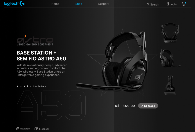
6. Designing a landing page: So guys, in the previous videos we have seen what Figma is. What are the different
tools surfing offers, where we can access them
and what do they do. But we haven't done any
practical stuff yet. So in this particular video, we are going to put
all the knowledge that we have gained
into practical use. My building, a landing
page just like this. So in this video,
we are going to build this particular
landing beach. So all the assets used in this particular video will be listed in the project
and resources section. You can access that from there. So whether we see any more time, let us get down to building
this particular project. So guys, I have already created
a fresh new project here. So the first step is to basically create
a frame for that. I'm going to press F shortcut on my keyboard to
select the frame tool. And I'm going to draw
a frame or my canvas. And after that I'm
going to go to the Properties
settings and I'm going to change the width
and the height. The width is going to be 2560 and the height is going to
be one-fourth for zero. So this is the size in which
we are going to work on. Alright. Let me align it
towards the center. And now let us select the frame and change its background color. So here I'm gonna come onto the field section
and let's select it. Here. I'll be using
a linear gradient. So I'm going to change
it from solid to linear. And let me also adjust
the handle here. Alright. Now let's select
the first handle, that is the handle of the left. And I'm going to change
the color to dark again, and I'll select
the right handle. And I'm going to
make it right here. And I'll increase the opacity to max or light and liberals,
or just a slider. Now we are having a linear
gradient background. And let me also make it a little bit more towards the right. Now it's looking fine. So now what I'm gonna do
is I'm going to basically add a rectangular object towards the right of
this particular free. So for that I'm going to
press Alt on my keyboard to select the rectangular tool. And I'm going to basically drawing a rectangle
by dollar here. Again, I will select
the rectangle and go to different
section here. And I want to change the
background by radial. And again, I want to
make it a bit more dark. Select the top most handle. I'm going to make
this one dark and the other one a bit light. Adjust the handle,
the position a bit. Alright. And we also make some
slight adjustments here. Let me get a bit more light. Now that is looking fine. So now we have made a radial gradient right here towards the right
section of the frame. And now it is time to
basically add in some images. Here. I already added
some images here. So to get these kind of images, it is pretty easy. There is actually an extension. So right now I'm in
a Logitech official. Repeat. So these are the images that we have made use of this particular video, but you can't
directly right-click and save them and use them, or it won't actually
work with sigma. So here we can
basically make use of an exhibition called as fat
can batched already meet. So if I select this
particular extension, I can select current app. That is, if I click on that, this extension is
going to now display all the images that are presented in this
particular webpage. So it can directly
click and download them in the PT PNG format. So this is a handy
tool that you can use in order to download
some high-quality images from official websites like this where the product images
are of high-quality. So that is a small tip for you. Now let us basically
add in are the majors to the canvas. That
is sort of frame. This is the main hero image. Place it right over here. Right? Notice also add these images towards the right
of the hero image. The background is kind of
looking at a lot lighter, so let me just make
it a bit more dark. And that's looking fine. I'm going to place
them right over here. So in order to decrease it. So now we have basically added the medius and our
group them together. So now if we take a look at our finished project here
you can see that we are having a beautiful ring
around this particular mouse. So now let's create
this particular effect. So for that, let
me zoom in a bit. And I'm going to put us all on my keyboard to
select the ellipse tool. And I'm going to draw an
ellipse just like this. Let me place it over here. Now I want to go to
the field section and I'll remove the fill from here. Now for that I want
to add in a stroke and I want to increase
the thickness to two. And I'm going to
select the color to be a grayish color right here. And I want to change
the background or the stroke type two linear. Let me make some slight
adjustments over here. Make it a little
bit more brighter. And I want to rotate it
like this and let this, or just its position
so that it looks good. So let's make some
slight adjustments. Let's make it a bit smaller. All right, That's
looking really good. Play around with the
linear gradient to make it a little
bit more realistic. Alright. So now we have
created our defect already mouse as well known,
That's looking really good. Now, we are done with this. Now let's also create all these
now bad links over there. I'm going to press T on my keyboard and
let me click here. So the first one over there is whole sort of
stepping over here. And I'm going to select
the default diapers in the want to change
the font size to 24. And also want to change the color of the phone
to this particular value. Now what I'm gonna do is
I can press and hold on the Alt key on the keyboard
and click and drag. And that's going to
make an exact copy of this particular text. And the next byte deletes shop business support. Right now let us be signal
range these links properly. So these guidelines are
really useful to place. These elements are in the correct position with
adequate or consistent spacing. Right? Now we have added the nav links. Let's also bring
it a bit higher. And another thing that I
do is I want to say that the shop and change
its color to white. So it's kinda like we are in
the short Beta right now. So the nav links are fine. Let's select it and move
a bit towards the right. And also let's create
another copy of it. Nima does suit. And let's
create another copy. The Windows logo. Here I have got two icons. Is copied and pasted
right over here. Right? Yes, they are looking
fine there as well. So let me also slightly
adjust their position. Alright, they are
looking for defined now. These are kind of
looking off a bit. They are not aligned
perfectly well. So let me just select them
and align them together. Looking pretty flat.
Nose also add the logo right over here. Product. And then also slightly bring
these towards the right. Now, they are
looking pretty fine. We have actually done the top navbar as well as a search login, as
well as the logo. And now it is time to
basically add in the text content right here
for that again. And then a plus B, going to type in
MX Master three. And then I'm selected
and I'm going to change the phone
case to uppercase. And also I'm going to
increase our font size 200. And also I want to change
the boldness to bold. And then sit right over here. Again, I want to click
on this particular text while pressing Alt, I'm
going to make a copy. Does a mix CD. So in order to use
the size to 30, I'm going to make a
deformed boldness to regular and I'm going to
increase its letter spacing. I'm going to place it right
over the main healthy. Alright, now, let's also add in this particular basic
description about the product. So again, even a plus one, the D key on the keyboard. And let's paste over here. Here. We have already inherited the style from
the previous project. So all we have done is change
the color of the text. Let's paste it right over here. Now what we need is
the review part. So for that one again, plus on the text
shortcut key that is T, and then type in
50 plus reviews. We also need to add some stars. So let me zoom in a bit from the shapes section or
select or the Star Tool. And I'm going to
add in this dark and they're gonna teams. It's good to 30 or Lockett. First of all, I
don't want to change the width to 35, right? And let's create some copy. So I'm going to push on hold for a couple of times to
make five of these does. Let's make some space here. And I wanna select the
last star and I'll make it a bit dark so that it highlights this particular
product does four-star rating. And let me just select them and group them together and
place it right over here. Now, let us create this particular pricing
section as well as the Add to Cart button. So the desired in
the price section, that is dollar 99.999 will increase the size to
put it right over here. Also let us add in that
rectangle right here. And I'm going to add in
a text that is to guard. Let me reduce its size. Then I want a team to this particular rectangles
color to a dark color. I want to change the
text color to white. We also decrease the depth. And also let us make
the edges rounded. Right? Now let's outline this
particular text perfectly towards the center of this
particular button so that I'm going to select both
of these and I'm going to select the align
vertical centers. And that's going
to perfectly align this particular text towards the center of this particular
rectangular element. And let me also
group them together. And let's place it
right over here. That's looking
pretty fine as well. So here you can see that
the background is kind of looking a bit blank or off. So that is why I added this
particular M makes kind of text overlay that fills the
emptiness of the background. So now let's add
that here as well. For that I'm going to add
in a text that is M max. And let us increase
the size to 200, or maybe even more than that. And let me place it
right over Here. I want to change
the bolus to bold. And I'm going to press on the opening square
bracket to bring it towards the back here. And I'll select the text and
remove the fill from here. And I want to add
in a stroke and stroke color is going to
be alert a bit bright. In Greece. The thickness to two. Let me reduce the opacity a bit. And that is going to perfectly make the background
a bit more rich. Let me select this and
bring these to the top. Let's bring it a bit
towards him down on it. Now, this is actually
looking pretty good. Here. I think this is
looking a bit bright. So that is again, that could be the depth. Again, I think the background
needs to be a bit more dark towards the right in. So let's bring it
with more dark. Now that's looking pretty fine. We have almost mimic the entire prototype
into our project. Here you can see
that we are having a differentiation between
the left and the right. For that, Let's
select the frame, go to the field section and
select the left-handed and slightly increase the
lightness of the color. And that's going to bring a differentiation right over here. So that's it guys. So this was a small
little tutorial or a practical example on how we can basically bring
a design to life. So I hope that you guys were able to learn something
from this particular video. So as I already said, all the resources
that are available or all the assets
that are available in the project and
resources section, you can access it from there. So that's it guys, thanks, lot of Y2 and I'll see you
guys in the next video.
7. Conclusion: That's it guys. You have come to the end of
the female fundamental glass. And this shows how passionate you are about the UI design. And I really hope that I was able to deliver
the value that we have been looking for it and please do share in
the review section, what do you guys think
about the class? So that's it guys, until
we meet again with another awesome
pigment or dorsal respiratory Johnson signing off.
 Peter Johnson, Software Engineer