Transcripts
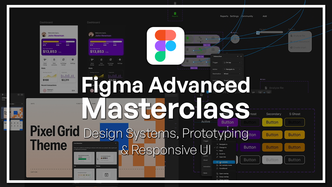
1. Welcome to the Figma Advanced Masterclass!: Welcome to the Figma
advanced master class. If you already know your way
around Figma and want to take your skills to a
truly professional level, then this is the
right course for you. Hi. My name is Ahmed, and I'll be your instructor
for this course. I'm a UIUX designer with more than four years of
experience working on real world, digital experiences
and products, such as websites and apps
across different industries, such as the tech industry, touristic industry, and more. Worked on several projects that did not only require a
good eye for design, but also efficient workflows, collaboration, and systems
that can grow within time. And that's exactly what I'm going to teach you
in this course. In this course, we're
going beyond basic design, and we'll be focusing on how advanced designers work
on real world projects. You'll learn how to build
scalable design systems, work with variables
and team libraries, as well as create
responsive layouts that work across
different screen size. Also get into advanced
prototyping techniques, such as creating
micro interactions, smooth animations and gestures. All of these things that are going to bring your
design to life. On top of that,
we'll be exploring modern Figma design
tools such as FIG Jam, Figma buzz, Figma slides, and much more helping you understand when to
use them and how you can use them to fit them into a more professional and
efficient workflow. By the end of this
class, you'll not only improve your
technical skills, but you'll also be improving
your thinking as a designer. You'll be able to work faster, more efficiently and
with more structure. So let's get started.
2. What Makes a Designer “Advanced” in Figma + Course Roadmap: Hello and welcome to the
Figma advanced course. Here you will be learning
all you need to know, to be able to wireframe
and prototype rapidly and professionally
just like a senior. Now, of course, for seniority, you need a couple of years of
experience of actual work. But through this course, you will be able
to learn and grasp the most complex concepts that we deal with when
we're designing on Figma. You'll be learning some
tips and tricks that only people who have a high level of experience
and knowledge on Figma know, and you will generally
grasp the difficult tools, the complex mechanisms
with which Figma works. Without further ado, let's take a look at what you will be
learning in this course. I have gathered all the
information about this course, a general overview
just so that you can understand what
you're getting into. I would advise you
to go ahead and take our FIGMA course the
base Figma course, not the advanced one in
case you haven't already. But if you feel like you have a good amount
of experience, you have worked
with Figma before, then this is the course for you. Otherwise, please
go ahead and try to grasp the most basic
elements first through the first course where we touch a little bit on these advanced features,
but not completely. But in this course, I will assume that you already
know the basic skills, you know how to create frames, how to create kind of
user flows and so on. So that's why in case
you're not fully there yet, you don't feel fully
fit as a designer, then maybe take a step back and try to learn the
basics and then come back here. But if you're saying,
Hey, you know what? I know this, and I
think I can do this. I know a couple of
stuff on Figma. I've used it before. I've
designed on it before. I am, you know, at a good level, I want to get better, then this
is the course for you. So the first chapter
that we're going to have is scalable design
systems and variables. Now in this chapter,
we're going to talk about three main things
or main features of Figma that are very
important and some of these features have been
released more recently. When I say recently, I mean
in the last four years or so. That is for a lot of
designers, pretty recent. The first thing we're
going to talk about is component architecture, which relates to creating
reusable elements, which we call components
that also have different instances
and variants. Then we're going to talk
about variables and modes, which is one of those more
recent features, I would say, with which you can create
variables, colors, texts, and so on that change or that can be changed
at some point. And we're going to talk
about team libraries and file organization, which is a very crucial part of working within
a team on Figma. So it has a lot of perks, and we're going to
talk about them. Now, within the second chapter, we're going to focus more on advanced layout and
responsiveness. Now, in case you don't know
what responsiveness is, it's basically designing
your apps or designing your products or
whatever they may be to fit different screens, including PC screens, tablet
screens, phone screens. So in the first lesson, we're going to talk
about we're going to have an auto layout deep dive. Auto layouts are this
amazing feature that mostly only Figma has that allows you to organize elements. We're going to talk
about that later, but you probably already
have an introduction to it. Then we're going to talk about constraints
and breakpoints and how you can use them to
make a design responsive. In the end, we're
going to have a real world responsive section build, which is basically an example, a walk through where I'm
going to show you how you can turn a design very
responsive design. Now in the third chapter, we are going to be talking about advanced prototyping
and micro interactions. Now, as someone who is
not a complete newbie, you probably have had some
encounters with prototyping. You know how there are different elements and how
you can prototype them. And what that basically
means is you can have an animation or you can
have a button do something. Maybe it will navigate you to another page or maybe it
will have hover effect. Micro interactions exactly that, but at a micro
level, just smaller. That's going to be the first lesson we're
going to talk about. Micro interactions, let's
start with the basic level. Then we're going to talk about scroll and gesture interactions. Quite basically, how do you scroll horizontally,
vertically, and so on, Because that also
needs to be set up on Figma. In the end, we're going to talk about Smart animate mastery. Smart animate is
this great feature that allows you to create smooth and butter smooth
and easy animations without having to do much, to be honest, it's quite easy. So from there, we'll move
to the last chapter. Which is modern Figma tools
for advanced designers. In case you did not
hear about this, Figma has its main part, which is the normal
design part that we usually talk about
and most designers use, but they've already
introduced a set of tools at hand that you can
use for other purposes. Now, these tools aren't completely different
from the design tool, but they're a little
more focused. Among these tools, we're going
to talk about Figma Jam. Which helps you teamwork and
brainstorm with your team. Then Figma buzz
for social media, creating posts and visuals for your social media on
the go without having to put too much
effort or getting stuck with a lot of
settings of design. Then Figma sites,
which allows you to design and publish websites
directly from Figma, Figma slides, which is
pretty self explanatory. It's basically
allows you to create slide shows just
like PowerPoint. Then Figma M, which is the special AI bifigMa which allows you to create
different solutions, prototypes, and
screens and even code. Lastly, after discussing each and every one of these tools separately and giving you a very general overview
and introduction to them, we're going to talk about
when these tools help us actually help us versus
when they distract us. Because you have
to keep in mind, these tools are great, but they're also focused. The whole idea is have
the same features or the same tools that you usually have when
it comes to design, but now they're focused for special purpose like
creating slides, which is going to come
with its limitations, and it's going to come
with its distraction. We're going to discuss
the best practices and my personal recommendations and my experience
with these tools. I don't want to
make this too long because I'm pretty sure you're eager to learn and you're
hungry for knowledge, so let's get started. Let's start learning, and we're going to start slowly and then we're going to
pick up some speed, so get ready, get
seated, and let's go. I'll see you in the next slide.
3. UX Theory: Hello and welcome to another
lesson of the Figma course. And this lesson today is
about introducing you to what user experience design is or to be more specific what UIUX is. But we're going to have a bit
more focus on the UX part. So let's go ahead. So first of all, let's
have a quick definition of what user experience is
supposed to refer to. User experience in general, can be defined as it is how a user interacts with and
experiences a product, system, or service, okay? It can be any of those things. And it includes a person's
perceptions of utility. Ease of use and efficiency. Now, if we want to
quickly break this down, it's basically
about interaction. That is a huge highlighted word. It's about the interaction and experience of a product,
a system, a service. And that's why I always say
kind of a digital experience. I always define these things. It could be a website,
it could be an app, it could be whatever, right? Because when you say physical,
it could be digital even. When you say a
product that could be anything is a product, right? It could be any type
of thing. It could be a mug, it could be a website. It could be, you know, a number that you
call and they give you some sort of service, right? And that's why the kind of encapsuling all
of these things. It could be a product
or a system or a service because there are
different categorizations, and it's about understanding how users interact with them. And it says that
it also includes their perceptions of utility, ease of fuse and efficiency. And these are also
quite big themes. Do they find it useful? This app or website or service? Is it easy to use
and is it efficient? As in, does it do what
it's supposed to do? These are all very
important questions. And now I'm going to
say, wait a minute. What's the difference
between user experience and user interface? And I have this
exact question as I was also learning and
getting into the field. I was asking myself, we
keep using these two words, and they always come together? Are they the same thing? We're just saying pencil or pen? You know, they're so close together that we're just
saying they're equivalent. No, not exactly. Okay? So let's highlight
the differences. So user experience is
more about the feel. It's about how a product or
an experience feels like, how someone experiences it. While, on the other hand, user interface is
more about the look. It's about how it
looks like the colors, the typography, the text, you know, the images, right? While user experience is more about how do the images
make you feel like? How does the text
make you feel like? Does the text convince you? Does it reassure you or
does it make you mad? You know, so it's about
the experience of it, the feel other point is user experience also handles
a lot of user research. It's about sitting down, talking to users, seeing
what they think, and trying to understand
their behaviors, and letting that guide the subsequent design,
the user interface. That's about guiding
our understanding. It's about getting actual
results from our users. While user interface is
more about design trends. So design trends is about what is out there?
What are people doing? What are the most loved
designs and shapes and colors? You know, every year, there's a new different
thing coming up. Sometimes we love gradients, and then another year,
gradients are not cool. You know, one time,
icons are amazing. Another day, you know, icons are maybe not that cool. And it's always about
these changing things, and it doesn't have to
change dramatically from uncool to cool
or vice versa, but it could be that
shapes have round corners, and then sometimes they
have sharp corners. There's all of these trends, and it's about following them. User experience is also more about psychological principles. So it's about how do users
perceive the shapes? You know, how do they
understand them? There should be
some psychological explanation of
what's going on in their brain when they see something and how
it makes them feel. While, on the other
hand, user interface is about design principles. User interface relies
on rules that we have that we established that
determine if design is good. But user experience wants to understand even if this design is good or bad, does it work? Does it evoke the emotions
that we want to evoke? Does it lead to understanding or people
understanding how to use it? Is it easy? Is it
enjoyable and so on? User experience is also a little bit more on
the theoretical side. That doesn't mean that
it's not involved with practice and with actual data, with actual implementation.
It definitely is. But in general, it feels
more about sitting down, doing some research,
talking to people, doing a lot of, you know,
paperwork, basically. And it's not actual paperwork, but it's more about
getting the facts, right, and then deciding
what to do with user interface is about
jumping in, you know, choosing the colors, choosing
the text, going ahead, making a prototype, making a sketch or
something like that. User experience involves a
lot of testing and iteration. It's about testing,
realizing that you're wrong, or that there are some aspects where you can improve things and then going back and changing them based
on the results. User interface involves a lot of interactivity and animation. So it highlights
that as the goal. It's also more about
the look, as we said. So it's about things looking
alive, looking good, being engaging,
being impressive. And that is one of the
main focuses this is a great picture to
summarize the difference between user interface
and user experience. So design is basically
just like this picture. You have a beautiful street or, you know, a road, a walkway, a walk path in this garden, in this park, and it's planned
very beautifully, right? And then the user experience is what people
actually do the users, the people who walk
there, who use the park find this road
to be the most efficient. That is evident by the
fact that the grass is no longer there because so
many people walked over it. And that shows you there is
a trend in user behavior. They're walking all over it, and design is about looking nice and looking great and planning
it in a beautiful way, but not necessarily in an
efficient or functional way. And the reason is because if
you wanted to follow this, you'd have to walk
all the way there, and then you can
go to the right. But meanwhile, this
is taking a shortcut. So user experience is about understanding what do
people actually do? It's not just about Hey,
we designed this for them. No, it's about do
they actually use it? Is it actually useful and so on. User experience is
about interactions. Think of it, you know, in
terms of these airpods or earbuds that are smart,
ask yourself the question. How to skip song? How do I skip a song? Well, if you're familiar
with these types of earbuds, usually
there's, you know, a button or you have
to tap them once or twice or maybe tap and
hold to skip a song. So user experience is about these tiny little interactions that you do with your technology to achieve things because earbuds in and of themselves
are amazing inventions, and there's a lot of work that
is put into how they look. But, you know, after
designing them, one of the things that come to mind first is, how
do I skip a song? I mean, I have my earbuds on. My phone is in my pants. I want to skip a
song without taking my so user experience is about thinking about all the types of interactions that you have
with your technology, with your digital experience, with your service,
with your product, whatever you want to call it, and thinking about how you can make it smoother,
better, easier. And second thing it's
also about expectations. So user experience
is about what do you expect when you see
a product like this? And here, for example, what
happens if you take one out? And again, if you've
ever had one, you'd know that if you take
one of your earbuds out, it would stop the music. This was quite smart because it understood that this is a need
that a lot of people have. They take an ear butt out,
someone talks to them. They want to answer them, and they want to continue a conversation or
something like that. They want to hear what
the other persons saying or any of the sort. And so, understanding
that this is coming from a need and this need
is to maybe stop the music. So handling the expectations. So the user, maybe
they don't know this, maybe they're not
understanding it, but this is basically accommodating their need
without even knowing user experience is about
the interactions that users have with the product and about handling
their expectations, making sure that the technology does what it's supposed to do. And another thing is emotions. So how does it make you feel? My first earbuds that I tried, I was incredibly, you
know, comfortable. I felt like a king.
I felt like finally got my hands on something that understood me
and I understood it. And it was going along with
all of my expectations. It was intuitive to use. It was doing
everything perfectly. And was simply so much better
than anything I ever had. And this is not an
advertisement, by the way, for any type of technology, but I'm just saying
it's about emotions. And it is often that you come across when you're building
a product or a service, people can get frustrated. They can get mad.
They can get sad. They have a range of emotions
because they're humans. And so user experience is about managing these emotions
and ensuring that you have as much as
possible that you have so many positive emotions
and very few negative ones. So that's the job of a product. It's about making you feel
like your needs are being met and the product is incredible
and great and amazing. So this is a good sum up of
what user experience is. And now moving on, let's
talk about why you design. So there are two main parts. There is a problem, and
there is a solution, right? In the world, in
the whole world, in whatever business
you want to do, there's usually a
problem and a solution. The problem, here's how
I might describe it. A product exists because there is a need or a
problem in the world. Think of any product
that you have. There is a problem or a need. You need to accomplish something and you need
something for it. You know, you have a car
because you want to cross very long distances with it because maybe you
had a horse before, but a car is faster. You had a bike before, you know, cheaper, but a car is faster. So it's solving a
problem and a need of reaching places at very convenient times
whenever you want, you don't have to wait
for a train or a bus. You can go whenever
you want, however you want, at the time
that you want it. And so it was solving
a need or a problem. And as you can see,
the second part, solution product solve problems. That's where their
true values lie. So understanding
that allows you to understand your
role as a designer. You are solving
people's problems. You're not just, you know, giving something nice to have. You're not saying, Hey,
look at this cool app. A lot of people download
apps because they're cool and because they add
something to their lives. But a lot of times, you know, the most successful apps are apps that you have a need for, apps that solve a problem
that you have, right? Think about it. You
might say, Hey, social media, you know,
I'm on social media. I'm on Instagram.
I'm on Facebook. It's not solving a problem. I have no problem. Well, yeah. I mean, there is a
problem. There is a need. The need is to
connect with people, to talk to them, to feel
connected to them, to see them. And because everyone is
already on these apps, you would feel like you're missing out if
you're not on them. So it is, in a way,
solving a problem. And as you can see on the right, this is the cover
from a book called The Design of Everyday Things. And it is written by
Don Norman person who was seen in general as, you know, kind of
like the forefather of UX design of the whole field. And it is because he wrote this book which
detailed in many ways the principles and
guidelines of UX design. And this was a very
insightful book. I would recommend you to
read it if you want to learn more about it.
It is a classic. It's not going to
give you tips about Figma or anything
because it's quite old, but it is going to make you
understand what UX design is, what it's all about,
and, you know, how you can use the
basic principles. And you'll notice, even
though the book is very old, but it handles the same needs and problems that we have today. In this book, he discussed
a very interesting concept, which is called Norman doors. And in this concept, which is very enlightening, he talked about how many
doors in the world, you probably notice the step. Are quite confusing. And that's
what he calls a bad door. If you look at
this picture here, you'll see two different doors. And the question is,
which door do I push? And which door do I pull, okay? And I'll give you a few
seconds to think about it. Done. That's enough
time for you. Basically, the left
one is that you pull, and the right one is
the door that you push. And you might ask me,
how did you know? And the answer very simply is because it's shown through
the handles, right? That's where the key lies. On the left, you have a handle that makes it easy
for you to hold it, put your grip around it
and pull it towards you, which is quite easy for
the pulling action. While on the right, you have
kind of not really a handle, and you can't really
hold it in that way. It's not easy to pull, but it's quite easy
to push, right? And so this is about
intuitive design. And that's what Don Norman
noticed is that in the world, he and many other people
tended to confuse doors. They go to a door that is supposed to be pushed and
they pull it or vice versa, it's supposed to be
pulled and they push it. And they think
that they're dumb. They think that they're doing
something wrong or that they're always confusing these doors, and
it's their fault. And he noted that, no, it's not your fault. It's the fault of the designer. Whoever went ahead and developed
and built this door and planned it the way that it is is the person who messed up
because of all things, a door should be the simplest. You know, we discovered this
a long, long, long time ago. We should have it
figured out by now. Shouldn't be that hard. But you notice, no, it is still hard. You don't know when
you come to a door, you don't know if you
push it, pull it, or if it opens on its own. There are sometimes indications, but a lot of times you're not really sure and
you have to go ahead, pull it, push it, try to see. And sometimes you
don't know, Does this need force, less force? Is it locked? Is it not locked? And so he discussed this
and through this story, through this example,
he talked about how good design shows itself. Good design is easy to
understand, is easy to explain. Doesn't need an
explanation, actually. It is self explanatory. Just like these doors,
when we design good doors, we are able to make the
handle so clear that people understand when it's
push and when it's pull. And that is the exact same thing that we have when
it comes to design. That brings us to a second point which is human centered design. And it is an approach to problem solving commonly used
in process product, service and system
design management and engineering
frameworks that develop solutions to problems
by involving the human perspective in all steps of the problem
solving process. It's a lot of words, I know, I know. Let's break it down. What is human centered design? It is people centered. It is designed for
people, for humans. And, you know, here it's
make products for robots. We're not making this for strange robots who
understand code. We're making it for humans. So make it easier
to understand for the humans who are your
users. So empathize. The second point is,
solve the right problem. A lot of people tend
when they're building, they tend to think
about the wrong things. No, make it easier
for your users. Focus on what they're trying to solve on their problems
and their needs. And there goes the saying, If it ain't broke,
don't fix it, right? Don't fix something that
doesn't need fixing. Focus on the real
problems and solve them. Then we have in the end iterate. Human Center Design asserts that the design
process is iterative, meaning that it is
a continuous cycle of designing and redesigning, thinking and rethinking, building and rebuilding.
It is never ending. There's never a perfect product, and it always
products or services they always need to be
reworked, improved, and so on. That is one of the pillars. So let me give you a few
examples of what makes good UX design and what
makes bad UX design. And so we're going to
ignore the UI part for now. We're going to ignore the look, even though both of
them look very similar. Now, which one would you prefer? Ketchup bottle on the
left or on the right. I hope most people said on the right because
that's right answer. And the reason is because
if you don't know, the left one is quite
hard to handle, the way that the bottle is
shaped and not only that, but the material of the bottle, the fact that it's glass, which is not squeezable. And the fact that the
bottle lid is from above makes it really hard to put the ketchup because you
have to open the bottle, flip it, and then start
aggressively, you know, shaking it so that have
a little bit of ketchup, and most of the time,
that leads to chaos. That is quite messy. But the one on the
right, self explanatory. It's made of plastic, so you can squeeze it, and
it's always tilted down. So always it should be
tilted down on the lid. And this way, the gravity
pulls the ketchup always down. And then we have these
dashboards of cars. Again, which one
do you prefer or which one do you think
has better UX design, the one on the left or the
one on the right, and why? Okay, let me answer you. It's the one on the left.
Let me tell you why. I'm not just saying this because this is my favorite or
anything like that. But if you think about it, the dashboards that we used to have or that we still have, but with older cars
are quite simplistic. I mean, not very. They might look overwhelming. Like, there's a
lot of buttons and a lot of shapes and icons. But as you can
see, first of all, they're shown with
simple numbers or icons that are supposedly
easy to understand. Maybe you'll need one day you'll go ahead and try
to understand them all. You'll test them, you'll press on them and understand
what they do. But there are buttons
that are there. They have a specific function. Some things you
turn to the right, some things you
turn to the left, some things you push,
some things you pull. There's all these different
interactions, right? When you're driving
and you want to switch something, you
want to press something. You know that when it
comes to air conditioning, you have to change the
temperature by turning the scale by turning the knob to the right
or left, right? So you'd know that this
no is for temperature. You wouldn't mix it with radio play button because that
is a button that you push. And so the way that
the dashboard was made was so ideal for people
who are driving, who are focused on the mission, the activity of
driving and don't have time to look
at the dashboard. Meanwhile, newer cars,
like the one on the right, they have a huge amazing. It's cool. It's nice. But it's quite distracting. It distracts you from the road. And what's more annoying about
that it has so many apps, so many features,
which causes you to, you know, to have to
look at all the options. There's no buttons
that are familiar. You don't know where
the buttons are. You don't know how
they feel like. You know, you can't just
put your hand there without looking to know exactly
what you're pressing on. You have to look at the screen, and you have to leave the app, go to another app, you know, connect it to Bluetooth, to connect it to your phone. And all of these things,
they take time and they take attention and
they put you in danger. So this is why it's
bad UX design. Now, very quickly, let's compare the ones on
the right and left. Which one these are both two different blogs or magazines or news
articles, news systems. The one on the left
is older, obviously. But what you can
see is the one on the left is much harder to read, and there's a lot
of reasons why. But it contains it has a
layout that has many pictures, different sizes,
different pictures, and they're very
hard to tell apart. You don't know what is an ad, what is a news article,
what is title, what is you don't know anything because
they have, you know, they all have the same kind
of titles, the same colors, and it's quite
confusing, and it's very filled with a
lot of information. I mean, how many articles
do you see there? 14, at least, 15, 16,
something like that. But looking on the
right, you see something a lot more organized.
First of all, you have All your different categories, US, world, business,
art, lifestyle. So you can choose from them. This is your menu, I believe. And then you have one
big article that is highlighted in the middle
middle, a little to the left. And then you have 28 Thanksgiving
recipes to the right. You have another article down. But you can tell
from the colors, from the shapes, from the
bold text what is a title? What is not a title? And you can see, for example, they say live in red, and it says 32 minutes ago. So it's very kind of
self explanatory. You understand,
Okay, this is live. This was 32 minutes ago. It's not too chaotic. There's some empty white space. So clearly, the right one is
a winner for many reasons, but it basically
is able to provide a much more comfortable
user experience for the eye to understand where
to click, what to click. You know, and the
one on the left, it looks like it's all
advertisements, to be honest. It looks it's not real links. It looks like they want
me to click something. Even the fact that
it's stock photos, half of them. This is an ad. This is fake. This
is not real wild. The one on the right
is able somehow with all the different
design elements to give you a better feeling, not the best feeling, but
a slightly better one. Now, coming to UIUX design, let me introduce you
to it a little bit to the process design thinking, which is the process of creating digital products
through UIUX design. It involves five main steps. Some people define it with other steps or different names. There are different kind
of schools of thought. But let us use these steps. The first step is empathizing. First step is understanding
who your users are, empathizing with them and
going ahead and, you know, trying to understand where
they're coming from, what their problems are, what
their needs are, and so on. The second step is defining. So this is about defining the problem that you're
trying to solve, defining the solutions, defining the assumptions
that you have. You know, what can help them? What do they need? Why
do they have a problem? What is the source of it, and what is the
solution and so on? And it's about defining
the direction in which you'll go as a company
or as a designer. What kind of solution are
you providing for them? Right? What is your
business model? What is a lot of the times
this is not only on you. You know, you're in a company. They already have
a business model. They already have a strategy. Your part is to
understand how you can best solve the
problems of the user. After we better
define the direction, we go ahead to ideation. That's when we
exchange thoughts, where we brainstorm, try to understand what our options are. I mean, what can we do? And you go ahead and you throw
around a couple of ideas. So the previous part, when
I said, provide a solution, you're not saying, we're going to do one,
two, three, four. You're just giving a
general direction. Maybe we should build an app to, you know, help people pay taxes. But you don't know how. You don't know how
the app would work. You don't know what
the scope of it is. You don't know, is it going to be an app or is it
going to be a device, or is it a service?
Maybe it's a service. You call someone and
you contact them. So it's about that,
and then you ide. That's when you actually put down some solid ideas
of what you want to do. And then you go
ahead and move on to the wireframing and
prototyping stage. And that's where your thoughts
to paper or to the screen, and you draw how it should look like when you actually
go ahead and draw it. How should the app
experience be like, or if it's a service, how
should the service work? How should we position ourselves in terms of marketing,
in terms of whatever. But again, all of these
ideas, nothing is finalized. Nothing is being done forever. It is through this
process that you get to a more final look, you know, by talking to your colleagues,
collaborating with them, by showing it to stakeholders, people who are invested. It could be your
bosses, it could be your investors, your clients, whoever it is, there's people who have an
interest in this. So you have to kind of through them and through your colleagues
and through your work, get to a more final version. In the beginning,
it's just a sketch. And then once you get
more confirmation, you start to finalize
it a little bit more. It becomes a proper
website design, and that's kind of more or less what this course is about. It's more about this
part, the prototyping. Now, of course,
we're going to talk about all the other parts. Prototyping and wire framing, these our focus points. And you are studying
a Figma course, not a UIUX design course. And then here, we have
testing. Now, testing. Not everyone does
it, to be honest, but testing is
about going ahead, showing your apps to
actual real users and seeing what they
think, getting feedback. And once you're
done with the step, that's when you
can iterate, okay? That's when you can iterate
and reiterate and so on, by going back to
empathize again. Find your goals,
redefine them, ideating, coming up with more
ideas, more features, more stories, more
sections, whatever it is. And then prototyping again
and again and again, fixing issues, fixing bugs. You know, you're not going
to do a perfect job. There's always going to
be things to work around. So always keep that in mind. In general, this is the process of creating with
design thinking. This is how as a UIOX designer, you can go from scratch, from empathizing to
the point of testing, prototyping, and
releasing your product. This can look very different depending on the team you're in, but more or less this is
how it should look like. I hope you learned a
thing or two about what UI UX design is all about. Now, in the upcoming lessons, we're going to talk
a bit more about UI, and more importantly, we're going to talk a lot
more about hands on lessons, practice lessons,
real life projects on what Figma is, how to use it. What are the tools, what are the systems, the
features, and so on. So thank you very
much for listening, and I'll see you in
the next lessons.
4. Component Architecture: Hello, and welcome
to another lesson of the advanced Figma course. Now, in this lesson,
we're going to discuss everything
about components. Now, if you haven't learned
about this just yet, I'm going to explain
it very easily and simply components are design elements that
we create on Figma that we are allowed to
use again and again. And we basically have
a relationship of a parent component and
a child component. It's basically an
element that we can copy and put it in
multiple instances. But there's always
the original version. And once you change
the original version, it can change all
the other instances. That means if you have a button and you decide later on to make the button yellow instead of green, just need
to do that once. You don't need to change the
button in every single page. That's just an
example and you're going to understand this
better as we go on. Speaking of buttons, let's take that as an example for now. Let's go ahead and create
a button very quickly. I'm just going to get the
text tool and I'm going to click once and I'm
going to write button. Now we have a text element. I'm going to make
it into a frame, so I'm going to
hold Shift and A. That basically makes it a
frame with an auto layout. So it already has
some values put in. We can change these values according to our
own preferences. Let's give it a fill. I'm
going to give it a fill. I'm going to make it some blue. Could also be purple?
No issue with that. Just need to make sure
that the text is legible, that you can read
the text if it's white or should it be
black, it's up to you. Now we can mess around with some of the values
in the beginning. We can make it a little the padding on the right
and left a little bit more and then make
it from up and down a little tighter, smaller. Then we can also make
it a bit more round. Ten or eight. It's
really up to us. This right now is a button. But usually, when
it comes to design, we'd like to have, as
I said, a component. So one original version that we can control or all the
other versions through. Here we have it
called frame one. You're going to go here and
click on Create component. Now this is supposedly
a component, and it's called frame one. We're just going
to call it button. And now that we have
this button, it's great. It's cool, but how does
this button look like with aHver effect or how does it
look like with an arrow, with an emoji with
a lot of things. We need different
variations of this button. The way that we could do this is we could create a variant. We click on here and we
come to this button here. It says add variant. Just by clicking on it,
you add another variant, basically another version
or a variation of it. This is in the original script. These are the originals, once you take this
button, I mean, this version of it, copy it, Control C, and
then you paste it. Now, this is a child component. You probably already know this if you're familiar with Figma. You can see this is a
hollowed out square here. That means this is basically
the child component. Then here we have
the main component. As you can see here, when
we change the color, the color is going
to change also here. But this is a second variance, so this is not connected to it. This is different. So this is basically
how it works. So you can have the
original button and it affects all
the other variations. You can have multiple copies, and they will all be changed. Okay? So now that we've got that written down, we
understand that. Let's go ahead and
keep doing our work. So we'd like to create
here a different variant. I'm not going to go into the
details of the prototyping, so I'm just going to
put that aside for now. But usually when we
have a hover effect, it's usually a little darker. Just making it super easy, you can add a 20%
or 30% black color, or you could make
it lighter as well. That's also a possibility. Alternatively, you could also just change the color from here. Sometimes you can get it more towards your
preference from these buttons because
it's easier to choose the exact
hue that you want. Maybe I could do this, maybe I could even make it
more towards blue. It could get a little bluer. That is totally up to me. Now that I've made
this hover variation, I can also create a
variation variant where we have pressed on it. We didn't only hover,
but we clicked on it. You can go ahead and create another variant or just
click on the plus here, and then we could make
this much darker even. As you can see, this is a
very simplistic version. We could add shadows,
we could add borders. It's totally up to you how
you want to stylize this. But I'm just making
different variants but keeping it simple
for your understanding. Another variant that we could
create is active button. So this is quite a usual one. So basically, this is to say that this button
is not working. So if you're dealing
with light mode, you would basically
keep this gray, just to show that
it's not working. So just to show you how
it would look like. I'm going to copy all of these, copy them, and I'm going
to paste them here. So this is basically
how it would look like, and you can see the gray one
looks gray out that looks inactive while this
one is filled with color and then this one is hovered on and this
one is pressed. So you can see the meanings
through the colors. And here, the legibility
is maybe not that important because you can't
choose this button anyway. But we can go ahead
and make this, for example, you
know, a darker gray. So it has a little bit
better readability and we could make the background
a little lighter too. Yeah, this looks more inactive. Now, just as a note, you can change the child component, so you
can say, You know what? I'm going to make
this a yellow, okay? And what happens
when you do this, when you change the
parent component, it's not going to
change anything. So basically you've
overwritten this property. You've decided that
this property, the color is now going to be disconnected from
the main component. And so now it's like
an legitimate child. It's not going to follow or continue
following the parent, going to go in its own way. So when it comes to the text, it's still going to follow it. When it comes to the padding, we can change the padding,
it's still following it. It's just the quality
that you change. So be careful. Make sure that
you're not changing qualities without knowing. Try to change them here
because as I said, this should be the
original text, the original work, and then
this should just follow it. Otherwise, you will have multiple variations
with different colors and that's going
to mess things up. Components are usually
used to keep order. They're used so that you can keep track of
what you're doing. You don't want to have 1 million
to colors of the button. No, you want to have
the originals and then they're used across your
design in different ways. I think so far it's clear, but we have to understand, okay, we have all
of these versions. We need to now understand what
if we want to expand them. Usually, you have
a primary button, and then from the
primary button, maybe you will have
a different color. Let's go ahead and do that. I'm going to copy all of
these, copy and paste them. I'm pasting them
within this area. That means they
are also variants. You can see variant
five, six, seven, eight. Now I'm going to
change the color. I'm going to say, You know
what? Some yellow is neat. But if we do yellow, then we have to do
black for the button. Nice. Let's see
how it looks like here and doesn't look too bad. Now this should follow suit. I'm going to choose this yellow. I'm going to make it and maybe take it a little
bit towards orange. That's the shading. As I said, it's up
to you. You can make it lighter,
you can make it. You can make it
whatever you want, it's up to you and I'm
going to make this black. Maybe you can change, make this a lot brighter and then make this
also brighter. Then here, I'm going to choose the same color make it even a
little darker, more orange. As I said, our work here for today in this lesson is not to
see the interaction, we're just figuring
out the component. Then here, maybe it could also be grade
out in the same way. It doesn't have to
be that special. We don't have to differentiate between these two.
It's up to us. But now we have an issue because this is
called variant eight, this is called variant seven, six, I don't know, they're
all over the place. We need to find a system
to basically name them. Understand them. So this is when it comes to organizing your component
because as you keep expanding, you have different variants and whatnot and you have
to keep track of them. Here's what I'm going to
do. I'm going to say, these are the primary buttons and these are the secondary. What you're going to
do is you're going to pick all of these, you're going to write for
property one, secondary. And then the property, you're going to say type. This is the type of button.
These are secondary. It's going to tell you
the properties and values of these variants
are conflicting. Change the applied values on this variant to resolve this. The issue is, all of these are secondary,
secondary, secondary. Figma doesn't understand
it saying, Hey, you can't have them
all be secondary, but we're going to
resolve that in a second. Now let's call all
of these primary. Primary. You see
this variable type is primary and all of
these are secondary. But there's also a difference. I mean, these are
the Hover states, and these are the
pressed states, and these are the
inactive states, and these are the active states. So how do we
differentiate these? Well, we can do it as follows. So what we can do is we can come here. I
mean, this is how I do it. There's probably
different ways to do it. I can go to the name. I will add a comma and I will write status. Active. And so this is
going to be active. Then I'm going to choose both of these and write, again, active. I'm going to choose these and
I'm going to write Hubbard, these and write press, and these, I'm going to
call them inactive. Okay. So now this notification goes away because FIMA
has figured out, we have got this under control, we understand the
differentiation, and you can see the names
are all different now. None of the names are
being repeated, right? And what's cool is when you come here to the child component, you can go ahead
and change them. You can change what
you want, whether it's active, hover,
pressed, inactive. You have access to all
of these variations, and you can choose them
from these drop down menu. Right? So this is how you can basically organize basically your components
within a variant. So this is basically how you can organize your variance
within a component. Now, there is more to it. As I mentioned, maybe
someone will come and say, Hey, I want to add,
you know, an arrow. That would be really nice,
but not all the time. Sometimes I want
to have an arrow. Sometimes I don't want
to have an arrow, right? Sometimes, you know, the
arrows on the right, sometimes on the
left. Let's see. Okay? So first of all, let's create a very simplistic arrow. So I just picked out
the line tool here, and I'm going to extend
the line and I can come here and say line arrow and on the other side, I'm
going to make it around. So it's very simplistic
and it fits right in. I'm going to cut this Control X, and I'm going to add this here. Pretty nice, right?
Well, let's undo that. I want to do it to all of these. What I'm going to do is I'm
going to pick all of them, and I'm going to
control the paste. Now it's pasted all over here. But it's a little bit of a mess. We need to figure this out.
We need to organize it. I'm just going to move
these away and I'm going to choose this arrow and this one
and this one and this one. I'm going to make them,
actually, not this one. I'm going to choose
this one, this one, this one, I'm going to make
them white just to match. Now, these, I'm going to give them the color of this
dark gray. There we go. All right. Now we can
also adjust other things. I mean, the distance between them could
be a little smaller, maybe four, and I think
that's good enough. But as we mentioned, we don't want that to happen
all the time. We don't want it to always have that little thing. What
can we do about it? We don't want it to
always have an arrow. Here's a neat little trick. Choose the arrow. We clicked
on the arrow right now. And then what we can
do about it is we can go ahead and click on this
little button, which says, apply variable property,
and then click on the plus and it's going to add a property called Show line two. I'm just going to
make it show error. Right now it's set as true, but I'm going to go
ahead and make it false. I'm going to create
the property. As you can see, now what
happened is there's no arrow. There's no arrow available here, but it is still
within the element. It's just that you have to toggle whether you want
it to be shown or not. I'll show you where it
is. It's right here. Now we have a toggle
called show arrow. When we click it, it's there. When we remove it,
it's not there. But we have an issue
because it's only available in this variant,
not the other ones. So what we can do about it is we can come here we can choose this and then we can add the variable here and you can see it it's already
in the properties. You can just click on it here. I'm going to rinse and repeat. I'm going to choose all
of the arrows here. And I'm going to give
them the same property. Click here, show arrow, false. Now all of these
have this toggle. You can add an arrow to them if you'd like, or you
can remove it. Now we're really customizing our buttons in a direction
that I really like. We can go a step further. What can we do? Well,
we can copy them, paste them all, put them here. But what we're going
to do is we're going to make ghost buttons. The ghost buttons are basically buttons that only have borders. We're going to copy this
hex code of this color, remove it, and it here, a stroke, rinse and repeat just do the same thing for the other variations
or it's up to you. You can adjust it as you want. Because this is the hover, it could be that it's a ghost button and then
when you hover on it, it becomes filled, and
then when you press on it, it becomes like that,
it's totally up to you, but we can change the
inactive version. So just like that. We're going to do
the same thing here, I'm going to copy this. Put the stroke here and
the same thing here. Copy the hex code,
put it in the stroke. Now we have what we
call ghost buttons and they have their own hover pressed and an active variant. What we're going to do is we're going to do a similar thing. So we're going to go ahead to the name and
we're going to click comma and then we're going
to say Ghost equals yes. We're going to
choose all of these here and all of these here. While holding Shift, you
can choose many I mean, many elements at the same time, and we're going
to say ghost yes, and we're going to choose
these and these and write no. Now, pay attention.
When you write no with a N or a O or something, it's going to show up
as a different value, make sure you write
it in the same way. Now when we come here,
you're going to see that ghost also became
a toggle button. You can toggle it on
or off on or off. On every little variant here, you can make them
ghost buttons or not. But you can see
our mistake here. We made this a ghost button, but the text is white. We have to fix this. The way
to do this is to come here, we can make this black. We can make the text black
or we can make it purple. Let's see now. There
we go. Just like that. Now we've learned how to
create not only one component, but many variants of
the same component. We learn how to make
hover versions. I mean, hover variants,
we learn how to make pressed variance
inactive variance. We learn how to make
ghost variants. If you pay attention, this
is somewhat like a table, and I can prove it to you. Basically, these are
the active versions. This might make it
easier for you. The active variants here we
have the hover, variance, and here we have the pressed
variance and here active. It basically is a table with columns and rows and we can
do the same thing here. Here we have primary, and then the next one
is primary ghost. I'm just going to write P ghost, and then secondary,
and then S ghost. And so on and so forth. You can keep creating many
different variables here to make sure that your buttons have different looks and
different aspects to them. This allows you when
you're designing, not to save up some time
instead of thinking, what color should this be? What type of prototype
interaction should I have? Should it be ghost or no ghost? Nope, you don't need to do that. You already have all the possible variants
within your design. I know this might
look like a lot, but it's actually not because
these are hover states, press states, and active
states, and so on. So it looks like it's a
lot, but it's not really. So keep that in mind. Now we have one more
thing to discuss. This thing is quite interesting. It's called nested components. Now nested components
are basically components within components.
How does that work? Well, let me clarify
a little bit. What we can do is we can say, you know, well, sometimes I'd like to have
an arrow, right? But other times I'd like
to have another element. Maybe it could be a
different thing instead of an arrow or it could
be an arrow to the right towards
up, towards down. It's up to me. It
could be an icon. It could be many
different things. So we'd like to add
some icons into here. How do we go about that? Well, we can go ahead and
search for some plugins. So there's already
a plugin called material symbols
provided by Google. So it helps us just
get their basic icons, and yeah, just
very simple stuff. So what we can do is we can
pick up a few of them here. I'm just going to
choose some of them. Maybe we could have a plus icon. Um, we could have a camera icon, and let's have an account icon. I know you can't see them because they have
different color. So I'm going to go ahead and make them a little bit smaller. Let's see how they
look like here. Yeah, I think that
is good enough. I'm going to go ahead and create A frame within their size. I'm going to give it a
color, maybe red for now. I'm going to make
this a component, and I'm going to
add this into it, make sure it's centered
vertically and horizontally. It's not very centered,
but that's okay. When you're dealing with
very small elements, it's hard to center them,
don't worry about that. We can create now
another variant of it. Instead of this plus,
I'm going to delete it. Instead of this plus, I'm
going to have this picture, this camera and we're going to add another and do
the same thing. Instead of the plus,
I'm going to delete it completely and then add this account icon and then add this one
here, paste it Bb. Now, I just needed the
red just so that I can see the color properly
and I can see the frame, but I don't need it
anymore, so I'm just going to remove the red color. Now we can call this icon or Glyph or whatever
you want to call it. Then we can bring this here. And add it to the button. Just like that, we have an
icon within the button. Now, I'd like to add it to
all of them all at once. I'm just going to copy it and I'm going to
choose all of them, and I'm going to paste it. Just as I do that, immediately
before I do anything, I'm going to go ahead
and choose from here. Apply property, not show arrow, it's going to be show icon. Show icon. For now, I'm going to leave it to
be true just for now. Then I can go ahead
and adjust it. Here, the button is black, so it should be black
and same thing here. All the buttons here are black, the icons should
follow the buttons. It's not a rule, but I think
it's a good thing to follow. Holding shift and
choosing all of them. Here I'm going to copy the code. So now that the colors
are all sorted out, even though the buttons
are out of place, I'm going to go ahead
and choose this plus and I'm going
to click over here, select matching layers,
and it's going to select all the pluses, all the icons all
over these variants. Then we have this show icon, we can see that it
is showing the icon. Now that I have them all chosen, I'm going to click on here, go to property, and I'm
going to make it false, it's not going to show
icon automatically. That means if I'd like, I can show an arrow or
I can show an icon. What's even cooler about what we did with this nested element, we put an element, an icon component within the button components.
Now I can choose this. I can choose this
here and I can go here and change the variant. I can make it a different icon. Here it could be upload image, here it could be log
in or create account. Here it could be bookmark. Now we have a lot of
icons that we can use or we can just delete
them or hide them. Now, one thing to know is one important thing is
we need to label these. When we come here, we can
say type and we can say, this is ad or plus. Here you can say camera, plus member or user. And bookmark. So now
it's much easier to tell which exact icon you're using when you're
going down this list. Especially if you
have a big library and you have a lot of icons, this comes in really handy because you can understand,
Okay, this is bookmark, this is user, instead
of having to click on it and see what is
variant number 27. Okay? So this is basically how it works with
these nested elements. So just to recap, we started with a button,
just one component, and then we made
different variants of it, so hover variant, pressed
variant, and inactive variant. From there, we made
secondary variant, and then we started learning
the naming conventions, so how to create
different properties. So we first started
with the type, so primary and secondary. And then we named all
the status types, so active hover
pressed and active. And then we also set
up the arrow property. So now we were able to set up a property and make it hid it in the beginning
or maybe unhide it. It's totally up to you
and you always will have the option to
toggle it on or off. But I like to keep it so
that in the beginning, you just have a button, nothing, no icons, no
errors, no nothing. You can add that later if you
want, but it's up to you. Then we learned how to
create nested components. So basically create
emojis as an example, emojis, icons, glyphs,
whatever you want, and you can add them
into your button, and then you can
toggle them on or off, and then you can change the
type of icon that you have. It is that simple. What's nice is if you have interactions
between these buttons, if this button actually has a hover effect, pressing effect, and you can set this
up, and this is something that we're going
to see in the next lessons, it will retain the
same properties. It will have the same emoji, the same icon because we set it up here so that it has an icon. So in the hover variation, it's also going to
have the same icon. In the pressed variation, it's going to have
the same icon. And so on and so forth. This is the simplest way to
explain how components work. But if you understand this, then you will be a master. You will be able to create components smoothly without
friction, without issues. But the most important
thing is that you pay attention to working in a clean way because
creating a design system, creating a design file on figma, however big or small it is, it can get chaotic very quickly. That's why it's always
important to in a clean way and clearly define your
properties, your buttons, because this is not only going
to help you as you design, it's also going to help the
developers who are going to take your design and
turn it into reality. So we're going to talk about components a little bit
more in the next lessons, but it will be more
in the background. So far, you should have all the knowledge that you
need to create components. Now there are a lot more
possibilities with these. You can create effects
that are you can create a lot of
different variants with different
variables and so on. So go ahead and try it out. I hope you learn something, and I'll see you in
the next lessons.
5. Variables & Modes: Hello and welcome
to another lesson of the advanced Figma course. In this lesson, we're
going to talk about variables, modes, and styles. Now, these are all
different concepts that we're going to talk about that you might
have heard about. They exist also in the
development world. So if you're coming from an engineering background or you know a little
bit about coding, then you've probably heard components or tokens
and variables, you understand how they
interact with each other. That's basically what
we're doing here today. To explain this very
simple variables are things that
they're not constants. They are changing. So it could be a number, it
could be a number. One time this number is ten, one times 20, one times 30. So just to give you an example, your age is a variable that
changes every year, right? So it can change every
year that at first, your age is one and
then two and then three until you're
in your 20s, 30s, it keeps changing with
you and it depends on other circumstances
such as time passing. The same thing here
applies in figma, it's a little bit different. So we have multiple
different variable types. The way to access them is to deselect everything and go
over here to variables. Click on here and you'll find that you have no variables
in your collection. Just go ahead and
click on Create. Then you're going to see there's these four different
types, color variables. So you can have a variable
that is a specific color. So you have purple
here, you have yellow, you have other color be
a number that changes, like we talked about age, for example, or it
could be a string. Strings could be a
text, for example, and Boolean is something a
little bit more advanced, so we're going to
keep that for later. Let's go ahead and start with
color as I think this is the most practical variable
that you can use on Figma, and it's also the
easiest to explain. First things first, this is a design that I did before
and it's just an example. It's not a real design
for a real app, but we can use it
for our purposes. First thing that you see here is there's a specific
color scheme. You have the color purple here. There's a lighter version, a darker version,
there's some gradients. There's yellow as well, and
there are these colors here. The most important color
here that we have is the primary color,
which is purple. You could name it primary,
you could name it purple. It's really up to you,
but I like to keep things the primary secondary, I'd like to call them that
just so that it's extra clear. We can go ahead
and select it from here and we can
choose this primary. Right now we have
that as a variable. We can go ahead and
create another one, you could call it primary light. So this is the lighter
version of this primary, and then we can choose it
here. We can choose this one. So now this is the primary
lighter version, okay? We can create a secondary. So secondary variable
is the yellow. Now here, you know, we're just picking it more
or less randomly, but we can pick this one, for example, that would
be more accurate. And we can also have
a darker version, secondary you know, it's basically depends on
what you're seeing here. Here I see there's a
darker version here, so I'm just going to click I and use the eye dropping
tool to select it. We can also do it like
this or we can make it here you can see primary
light, secondary dark. We can switch it
up, make it both primary, dark, secondary dark. It's up to you how
you want to do this. We can do it right now. This could be our primary and this is the
dark version of it. Now we've got this figured
out. We can do a lot more. We can do background, for example. That's a good one. Background where
you can just write BG and select the
background here. It's white, simple
enough, right? So now we have these variables. Now, how do we use these? Well, you have to connect the colors here
to these variables. The way to do this is
to select the element. Come here and instead of
choosing a normal fill, you're going to click on
these four little circles, then you're going to
choose the variable, which here it's primary
dark, just click on that. Now, an easier way to
do this is to select the whole frame and go into selection colors and then
you can pick them from here. You can see the
light purple here, it's the primary light. You can see this
white background. I'm just going to
click here on PG. There's also another one here, but this is 50%, pay
attention to that. You can't really add
50% to your variables, so you have to let
that as it is. We have a lot more.
Now gradients, you can't have
them as variables. It's quite sad because it
messes up with our system. What I'm going to do right
now is other than these, I'm going to change all of the
gradients or most of them, and I'm going to
make them normal colors just to make this
a little bit easier. I'm going to make this our secondary and I'm
going to make this our primary, picking things. You can see there's
black and there's this gray so I'm
just going to write. Gray, Black. This is absolute black. And I'm going to select
the frame again. I'm going to choose
black for this one. I'm going to turn
this also black. I mean, it's dark gray,
but I'll make it black. You can ask yourself, where is this located and you can press here and you can see these are of this color, for example. I don't I don't see okay,
these are the lines. We can make these
gray, I believe, but that's too gray, so I'm
going to create light gray. So as you can see,
it's a process. It's about understanding,
what colors do we have? What color do we need? And then, so here, there's
an understanding. So these are different
shades of gray, and now we can make
these light gray. Now, we'll select again, we'll go to the
selection colors, and you can see there
are a few left. I mean, we can make
this just gray. This also just gray. And these other ones, let's see what we
can do about them. I think some of these we
can just keep as they are. Yeah, we don't need
to change everything. Now we have all of these setup. What's really cool
about variables is that just like we talked
about components, having one parent component that controls all the
other child components. We have the same concept here. So what you can do here is
you can say, You know what? I decided to change
the whole scheme. Instead of purple, I
want to make it blue. You can go ahead
and make this blue, you have to make this
also darker blue, and then you can make
this orange if you want. Make this also orange. Just like that, we changed a lot of the colors here, okay? So the cards, we
let them be because these are cards and
they have gradients, which is hard to change. But everything else, the main
colors that we have here, the primary ones here
have been mostly changed. Other than this
one, because also this is a gradient, but I mean, we could also make this change
this or we don't have to. So I'm going to go ahead and just press Control Z and put everything
back to where it was. But this is just an example
to show you what you could do with these variables.
So that's really cool. So that's one thing
that you can do. Now, I'm going to show you what we can do with
other types of variables. I'm going to create
a number variable. I'm going to put it
down just to create a good separation between them. I don't want them to
be mixed together. When it comes to the number, this is a little bit
more interesting. With numbers, it's about values and you might ask,
what do I need that for? Well, one thing that
you could use is you could use it for
spacing, for example. If you notice most
of these are within auto layouts and Auto layouts
usually have spacing. You can see here there's 16. You can see here it's
24, here it's Auto. Here you have zero, but
between these, it's auto. Here it's seven, for example, so the thing is, I mean, here's seven,
here, it's 12. So we have a lot of
inconsistency here. This is zero, this is
seven, this is 12. So that's something that
we can try to eliminate. So we might say,
Okay, let's have the spacing between text and
elements to be eight, right? So I don't know, we can call it exactly that text element or
something like that, and we can call it eight, right? And then what we're going to
do is we're going to come here and we're going to
come to the spacing here. Sorry, this is not
zero, this is five. So instead of having it as five, we're going to
click on this arrow here and we're going to click Apply variable going to
choose text plus element. Now it's set up as eight, but not just as eight. This is an element, so
it's connected here. I'm just going to apply
this exact same thing here, apply variable and then choose the variable that we just
made. Apply variable. Ooh. Now we have it set it up. It's nice is if we
decide, wait a minute. This is especially important because when you have clients, clients always are
going to complain, they're going to have
their own comments, and they're going to say, Hey, the spacing here
doesn't look that great or maybe your design colleagues
or boss or whoever it is, they might say double that, make it double the spacing. All you have to
do is you come to your variables window here and you just need to
change that from here. You just click 16 and ban it's changed
all over the place. But then we'll
notice, oh, no, now, you can't tell is your cards
related to the element above or the one below because
it's right in the middle. Let's put it back, Control Z. Bam, it's put back
just like that. We can do this and repeat this a lot for a lot of
different things, okay? But you can say for spacing, we can use it for
a lot of things. But what's even cooler is
you can come over here. And you can choose this
adjustment or editing icon and you can come
here to the scope. Now in this scope,
you can choose where this variable
will be shown. Now, we meant for this to be used mainly for
gaps, auto layouts. It's not a text content, it's not a corner radius, it's not width and height,
it's none of these. So basically, we can just
untake this and then it's going to remove it in all properties and we're
just going to have it in. So when we come here
to another element, for example, let's see. I mean, stroke. So if we add a stroke here
and we can say, let's see what type of
variables do we have? We don't have any variables
created in this file, and that's exactly
what we wanted. We can add it here,
and then now we have it over here.
But we don't need to. Okay? So it's just
to understand that this text plus element
is only meant for gaps. We can go ahead and we can
remove the stroke here. We can create another one
and we can say radius. Corner radius for sorry, I just created a color variable. I'm just going to delete it. So we're going to
create a number one, and we're going to call it
corner radius or just radius. I'm going to see what kind
of radius do we have here? It's 16, here, it's 16. I'm just going to write 16. And I'm going to
choose all of these. I mean, ideally, when
you work in a clean way, you should have already done this as the first step, okay? So now we come here,
click on it and choose radius, bam, it's set up. If we choose to make it
have just sharp corners, we can just make
this zero and boom, now it's set up a
zero, as you can see. Just like that. I mean,
not all elements, but you get the idea. As we said before, we can check
the scope and we can make untick everything and say this
is only for corner radius. This is a pretty
cool feature that you can use for all
of these things. You can use it for
stroke, for text, for effect, for line height, for a lot of things. You don't have to
restrict it. You can keep it in all
supported properties, but then it's going
to be pretty messy. Okay, so that is what you can do with these number variables. And then we have
string variables. Now, string variables are
a little less useful, in my opinion, but maybe I'm
not using it to its maximum. So string variables are
basically variables that decide what text you have. So when you have text here, for example, you have
a number, right? You can click on here. And you can choose to have
it as a string value. The string value right
now is string value, but you can say this is $100 and that's going to change it. Now, this is good for
different purposes, but it's basically good
if you want to have the same number or the same text across
many different spots. Then instead of having to
change them again and again, you can just have them stay
in one place like that. This is it when it comes
to string variables. Now I'd like to go ahead and
explore what we call modes. Modes is another side
of this feature, an addition, an extension to this feature,
which is really cool. And basically, you see all of these variables that we
made. There's a table here. This is actually a table
that we can extend, and we have this column, but we can add another one, and that is what
is called a mode. So now we have two modes, mode one and mode two. Now, there's a lot of different
usages for this, right? But the main usage or one of the best usages that
I find is to create different modes or
different color schemes or day mode and daylight
mode or night mode, right? So we can say this is daylight. And this is night. We have these two modes now. What's cool is we can
see right in front of us how we can choose these different modes and
show them differently. I'm going to copy
this dashboard. I'm going to copy and paste it. I'm going to copy and
paste it right here. I'm going to come over here,
you see this appearance. You're going to click
Apply variable mode, Collection one, and I'm
going to click Night. Now let's get back to
our variable window. What we're going to do is we're going to change
the color scheme. We're going to reverse
some of these colors, especially the whites
and blacks and grays. We're going
to reverse them. All of the black should be now white and all the
white should be black. It doesn't have to
be completely black. It can be a little
dark gray ish. The reason why is because we have shadows that we'd
like to keep showing here. Then we can come here and say, for the light gray, it
has to be dark gray. Okay. Let's see.
You see it here. As long as it's visible, then it's fulfilled its purpose, and then this gray
should be more lightish. You can see this is the text. This text should be legible. Now we reverse these. You can see already
this looks pretty neat. It's working, but in some
places it's not here, for example, here, it's not working because the
black doesn't work. We can have multiple solutions. One way to resolve this is to make sure that this
white text stays white. Instead you can choose those instead of having it
connected to this BG, we can make it just
simply always white. That's one way to solve it. Another way to solve
it is to basically go ahead to this dark and basically, we're
going to reverse these. We're going to make this light and maybe even
lighter than that. Then we're going to
make this pretty dark but not too dark. Now you can see we
reverse these shades too. But it doesn't always
work that way. There's no one method
because now you might say, well, this is a completely
different purple from this. It doesn't have
the same identity. You might be right, and
so we can go ahead with our other solution of making
this just white manually. So this one doesn't
change with the modes. I just stays white. As a
general rule of thumb, when you change the daylight to dark to night
mode or dark mode, you want to do is you can make some of the colors
a little brighter. This purple doesn't look that great when it's still dark here. It's nice to make it a little bit brighter and same
thing with this one. You see? Now it
looks consistent. It doesn't look that weird, but we have actually
made these purples a lot lighter, there
is a purpose to that. There is a purpose
of visibility. Now, one thing that we could
do more is we can make these shadows a
little more intense because right now they're
mostly invisible. We don't see the
differentiation. One way to do this
is to basically choose these so you can see
there's a drop shadow here. So what we're going
to do is we're going to create a
variable and we're going to make a number variable
and call it shadow. It could be we're going to figure out what this
variable should be. So when we open the effect of the shadows here, we
have multiple things. We have blur, we have position, and we have spread. Now, let's see what
effects these have. We can make it spread more. We can blur it more, we can
make it have more distance, but we can't really change
the opacity, unfortunately. That's something that we can
change with these modes. So we'd either have to
choose one of these elements to connect it to the variable or we'd have to
just manually change this. It's more or less up to you. What I can do is,
as a workaround, we could also give them a
stroke and give it a variable, so you can say, Stroke. And here, the stroke in normal mode, I mean,
let's connect it. Let's give it stroke. Okay? It could be
very light gray. And then when it comes here,
it could be darkish gray. Now, this is generally a good
solution because it makes sure that the shadow
isn't that invisible. It makes it very visible that these are
specific elements, that these are cards or boxes. Then when you turn
it into dark mode, it's also still visible.
It's very visible. But instead of relying
just on shadows, which are harder to
see with dark mode, they rely more on these borders, and we can do the
same thing here. We can add a stroke
and just like that, now we have a stroke here and there and for these
buttons as well. So just going to add it here. And I'm gonna have
them there as well. All right, so now we have
two different modes, daylight mode and night
mode or dark mode. As you can see,
this is how you can use modes to your
advantage in a way where you can turn one simple design into
two different types, two different color schemes. It's pretty cool feature. Use it. I mean, if
you need it, use it. If you don't don't have to. But what's cool is you can
always mess around with this. You can always go ahead and change the
appearance from here. You can change
from this to that, or you can take it back. It's totally up to you. And let me show you one more trick. So you're going to go ahead, close this window and go
and create a section, create a big section. And then what we're
going to do is we're going to bring this
dashboard into it, and then we're going
to choose the section, come here to the appearance,
and make it night. And look what's going to happen when I remove
this out of here. It becomes day mode
or light mode, and then here it's dark mode. This is a pretty neat trick, and it's really
nice because once you finish all your
screens, all your designs, all you have to do is you can duplicate them and put them
in a section like this, and then you can
see exactly how it would look like in dark mode. So this is how you can use
variables to your advantage, like a master, like a pro. You can use color variables. You can use string variables. You can use also a
number of variables, and you can use
them for spacing. You can use them for colors, strings, anything
that you need really. They work like a charm. But there is always
that question. Why do I need variables? Well, I did explain on the one hand why you need it
because first of all, hey, you can change a lot of
things from one single place, one single window that
decides everything, right? The second reason is this obviously makes your
workflow easier, faster, and it makes it easier for you and cleaner to know
what you've done and what colors
you've chosen instead of having your colors
all over the place, this way, it's a little
bit better defined. But there's also the question, why shouldn't I just
use styles, right? If you're not
familiar with styles, we have it right here. Styles are a similar concept. That allow you to create
text styles, color styles. But on top of that,
you can also have effect styles and layout guides. Now, let me say this. I mean, variables are not
a replacement for styles. Just try to let that sink
in, try to understand that. It is not a replacement. I do think that in many places, variables are the
right thing to use, while in other ones,
styles are better to use. Okay, so let me explain
to you, first of all, if you don't know what variables
are and what styles are, we already explained
the variables, but let's learn what styles are. Now, styles are simpler ways
to use it to use variables. You can go ahead and choose a color and you just give
a color and you can say, this is purple, I'm going
to choose this as a style. You can give it a name. You can add a description if you'd like. But what's nice about
this is you can add multiple different
colors within a style. That's one thing
that variables can't do and on top of that, you can create a style
that is also a gradient. That's something that
variables can't do yet. So when we create a style
in the very similar way, we just click on
these four boxes, four circles, and we can see
these are all our variables, and then we also have
styles right here. So this is something that
is available to use, and it's used in a very
similar way to variables. So styles and variables
are very similar. But the difference lies in the fact that when
it comes to styles, you can't have different modes. So just like you
have variables here, you have your styles all here. So you can change
them from one place. If you change your
mind and say, Hey, I want to change
the color scheme, I want to make it blue. You can do that.
You can do that. And if we had the
style set up here, it would be reflected here. But the idea is, though, you can't have modes. You can't have demde,
dark mode, and so on. That's one thing, but it
does excel in other things. So when it comes to effects, you can add fully made effects. You can have drop shadow, you can have a
specific number to it, a specific opacity
or color even. All of these things are
things that you can set up. You can change it to
noise or layer blur, once you set it up
we didn't set it up, but let's add an effect now and we're going to
create it as a style. Now we can go ahead and
choose it from here. Effects. Now we
have drop shadow. We can make sure that all
our shadows, for example, are more or less consistent
within the design. Variables cannot do that. Keep that in mind. We have
all our styles here as well. You can see the color
styles, the effect styles, and what's even cooler
is the textiles. Now you might remember
I said, you know, the string variables are
more or less useless. At least I don't have a
solid use case for them, and I think most designers don't because a
lot of the times, you know, we're not dealing
with number variables a lot. We're not dealing
with text variables. We're dealing with colors
and shapes and stuff, and string variables aren't always helpful when
it comes to that. But here, what you
can do is you can set up these styles that
relate to the typography. So let's say we want to keep a consistent typography
within the design. So you can see here,
welcome back is regular. You know, it's a font
that is regular, and then this one
is bold and bigger, and then this is smaller, this is bold, this is much bigger, and so
on and so forth. So we have different styles. Maybe we even have
different fonts. So the way to do this is you can create a textile
and you can say, you know, I mean, let's
see what textile this is. This is inter um, 16, and this is Inter bold 24. So what we do is we go ahead and we create a
style and we say. We create a style and
we say this is Inter, it should be 16, and
it's regular, okay? We can choose even, you know, the line height and so on. And we can name it.
We can say this is regular or we can
say this is text. And this is quite important when you want to write
headings, right? So you're going to have
heading one, two, three, four, and here we have it. So we have 24, so we can go ahead and
create a style here. What's nice? I mean, you
don't have to do this. You can just come here, click on the four circles
and click on plus. You can just say, save all of these settings that I have here and just create a
style out of them. We can say H one.
This is our H one, and then we can come here
and say this is H two. Again, click on the four
circles on the plus H two, and this is our H three. All right, create the style. Then we can see all
of our textyles here. We have to connect them here. Here, this is connected. This isn't connected, we're just going to connect
it here to text. Then what we can
do is we can come here and we can
say, you know what? I decided to make H one
heading one so much bigger. I can write 36. Bam,
it gets bigger here. I might say, H two or H three, that's way too small. It's 12. Let's make it 16, you can
see this one has changed. I mean, ideally, we should
also set this up to be H three and all of
the other ones as well. You get the idea. Styles
are very similar to variables when it comes to changing things from
one central place, but styles have a
lot more control for a lot of different things, text styles, color
styles, effect style. While variables are still
a little bit limited. I mean, I remember when this
feature first came out, I think it was more
or less in Beta mode. So it wasn't very much
reliable or stable. Now it is, but as I said, it's still a little bit limited, so you need to pay
attention to that and see what you can work with it because I think variables
are cooler when it comes to color when it
comes to maybe strings, but styles are so much more superior when it
comes to textiles, when it comes to effect
styles because it saves you a lot of time and you can always go back and
say, you know what? This shadow doesn't look good. I don't need to go
ahead and change it from every single element. I can just do it with the press of a button. I
can change all of this. And yeah, ideally, you shouldn't have a shadow
called drum shadow. You should say button shadows, and then you can say big
shadows, card shadows. I don't know, just
different shadows for different elements or effects
that you want to show. And yeah, these are the main differences between
styles and variables. I hope that I've made
this understandable. So go ahead and try to
work with these effects, try to work with these
elements features, variables and styles, I mean. But to be honest, if you feel like your project doesn't have such a
huge scope and you don't need to have variables or styles, then you
don't have to use them. I mean, I would always
suggest working clean. So use styles if
you can if you have the time especially if your company has
the budget for it. But if you feel like
you don't creating very quick designs that don't have to be
super consistent, then sure, you don't need it. Try to measure your
priorities, understand them. Do we need to focus
on putting a lot of time into figuring
out the effect styles and creating a consistent style that repeats itself that
is actually consistent, or are we just trying to
do something quick and dirty and just not pay
attention to consistency? It's up to you. I
hope this makes sense for you and I'll see
you in the next lesson.
6. Team Libraries & File Organization: Welcome to another lesson of
the advanced Figma course. In this lesson, we're going
to talk about team files and publishing team files to have components across
different files and to share them
with your team. Let me explain what I mean. What we've done in
the past lessons, if you haven't looked into them, you can go and check them now. We basically created variables, we created components
with different variants, and we also created styles, and all of these are
different concepts. But all of them relate to
each other in a very nice way because an essential part of using them is
the consistency. So when you're working
on a specific project, let's say, right
now, we're create financial app just
like you see here, then we probably want to
create multiple files, or maybe within the same file, we'd like to have
the same components, the same styles, and so on. Basically, to recreate and maintain this consistency
across the Figma files, we'd like to be able
to bring them back. Now, the easiest
way to do that or the most straightforward
direct way would be to copy something
and paste it. So when you have
your buttons here, you can copy them and just paste them in the other documents. But that can get tiring. I mean, at first, it seems like the easiest, but it's not. What actually makes more
sense is to share them, to basically publish them
through your team library. The way to do this
is to go here, so you have two tabs here. You have your file and
you have your assets. Now, the file shows you the pages that you have as
well as the layers. Now you can collapse
these as well, so you can hide
them if you want. We're going to go to assets. The assets Sab shows you all the different
components, styles, variables that you have
or more easily said, it shows you all the
libraries that you have save. Now, you can see a couple of libraries that
I have here and it's because we've seen
them in the community page. I've seen them. They're publicly available, and I've added them. I can go ahead and
go into iPadOS 26, for example, there's UI kit, and this allowed
me to see all of the components that they
have within that kit. I can bring anything from here
to my current design file. I can say Face ID, let me get the Face ID, so I can insert and just like that, I have an instance of Face ID, which has different variants, for example, the authenticating
success, and whatnot. We can do the same thing that Apple does with their UIKits. The way to do this is to go ahead and click on this button. So choose your libraries, and what you're
going to see here is assets created in this file. So there's going to be assets that are limited to this file. These, again, are the
styles, variables, and components, and then you have libraries
added to this file. I can remove them
if they're being too much of a nuisance and I don't want to use
them, for example, I don't think I'm going to
use WatroS 26 or Vision OS, so I can just remove them from here or I can add them back. But then what you're going to
want to do in case you have already a set of components that you've created in this file
that you'd like to publish, you're going to go ahead
and click on Publish. So it's going to tell you
here I mean, right now, it's already published, but normally here it tells
you the changes, right? So it shows you what
have you added. So what we've added, I mean, before, it wasn't
really published. We've added our
variable collection, and it shows you here we
have 12 changed variables. Then we have the styles. So it shows you I
added textile H one, textile, H two style,
H three style. We had a style in
terms of styles, we added a gradient, we
added a drop shadow. We did most of these
in the last lesson. As we were talking about
styles and variables. As you can see,
there's the variables, the styles, and the components. Now, we've only created
two components so far, which are the button
and the icon. This gives you the
opportunity to remove any of these to
say, You know what? I don't want to share
the components because these components are
specific to this file. But I would like to share, for example, the collection one. I'd like to share
the variables in it, and you can see
what variables you have which ones are added
and which ones are not. I think all of them are added. You can see all of them here. Again, you can choose to deselect all and then you're not really
publishing anything, or you can add all of these. We're going to go ahead
and publish them. It says it's publishing library. It's going to take a while. Perfect. Now it's published. Here we open a new design file, and when we go to the libraries, we don't find our own library. So we're just going to go on add more libraries and
we're going to go to teams and you're going
to find within the teams, you're going to find
the freelance one. You can add it to this file
if it's not already added. Just like that clicking on it, you will access all the
components that are available. What's more is you can
also use the style. If we create any
type of object here, I can go ahead here and I'll see here all the
different libraries. Now, we didn't give a
name to our library, so maybe we should do
that, to be honest. If we just come here, we go
to the library and we can just change the name here
so we can say Finance app. And then here it
says Finance app. So when we add a style here, so we want to add a style. So it's going to say
it's Finance app. So you can see all of
our variables here, or color variables, as
well as our style here, which was just a gradient. So when we add text, we're just testing this out. So hello hello world. I can check the
typography and I will see my Finance app,
typography styles. Now, of course, I can see all of the other systems that I have added the UIs,
the libraries. But right now we
only need this one, the one that we
created ourselves. And just like that, we
created team library, and we published
it, and now we were able to use it in another file. It's as easy as that. But what's cooler is when we're getting to work here and
we decide, you know what? Let me create another component. I mean, let me make this
thing or maybe one of these, I'm going to make it
into a component, I just click on here and
I say, statistics, right? Then I can go right
here to my libraries. And then here it
says one change. It keeps track of the
changes that you do. One change because we
created a component. Let's create a new style,
let it be a color. We're just going to do this gray and we're just going to
create it without a name, so it's just put the hex code. Then now we check and
then it says two changes. You see it keeps track when we come to the variables
as the last example, we'll add a string variable. We're not going to put it in, we're just going
to write it there. And then now we'll check. Again, there's three changes. Now, you have to
manually accept or publish these changes in
order for them to go through. So I'm going to go ahead
to publish and I'm going to I'm choosing
all of them. I can choose and say,
Hey, you know what? No, I don't want
statistics to be taken. I don't want this
color to be taken. Not sure why or in what case, someone would decide for that. It's really up to you
on your own use cases. Maybe you'll decide that this shouldn't be
part of the system. This was something outside
of this whole design system. It was maybe by mistake. So you want you know, exclude it, that's up to you. You can see here all of the unchanged styles and variables are also listed here
just for your information. Then we can go ahead
and publish it. Now we have one new component, one new style, and
one new variable. Now let's check how quick that
is. While we're checking. Within 3 seconds,
it got updated. 3 seconds of me waiting here, it got updated and I can
bring this here just like that dragon drop
where I can click on it and I can see collection. I can see how it looks
like demo dark mode, and the same thing here, I can check all
of the instances. This is more like a preview
feature if you'd like to see, well, let me check it out. What can I do here? Then you can check out how it looks like, and then you can
insert the instance. But to be honest, I think this is a longer
way and it takes longer. I rather much prefer
to just drag, drop it, and then just
adjust it as I want. Make it secondary, active, however, whatever I want. This is basically how you can use team libraries
to your advantage, to publish your changes when you have changes done to
publish in the beginning. Then as you make
changes, you can publish it again or
publish these changes specifically you can use and reuse the steam library
across your files. Now, this is probably very reassuring for
a lot of people, a lot of designers
who like to work across different projects and they'd like to have
the same elements, whether it's belonging to the same brand identity or maybe it's specific
elements that you've designed that could work
in different projects. You don't have to
a button shouldn't always be super uniquely
designed and amazing. You can use it and reuse it. It's up to you know, depends on your workflow, depends on how you like to work. But this feature was more or less thought of in
terms of one project. You have one project
where you have, let's say, something
very much like UI kits. So it has to be a consistent
UI kit like IOS 26, and then you have one button
or in terms of buttons, you have these multiple buttons, so there's liquid glass,
there's normal buttons. And when you click on it, you'll see so many options. I mean, is it tinted
or is it not? Is it light mode, dark mode? It shows you is it
enabled or disabled? Yeah, and you can
choose the colors. It's very interesting
to see and look at. I mean, obviously, it's not
looking very great here, but I think once we place it, that would make a lot more sense what these settings
are really changing. I feel like this
feature of seeing it, previewing your button or your element is not
always working perfectly. So you should just go ahead drag and drop it and see
how it looks like, especially if it has a
background blur like this, it's nice to see how
it would look like. I mean, this is a glass effect. You can check out how it looks like with something
in the background, and we can check here the
different possibilities. Yeah, pretty nice. So just
to wrap up, in this lesson, we learned how to publish our
library, our team library. That means publishing
our variables, styles, and components. This allows us to
publish them in a file that is accessible
across different files, and we learned how to update this library by
updating the components. So as we work and change these components,
variable styles, then we can go ahead
and just update them and republish them
and we learned how to place these components into any other design project. Of course, it has
its limitations. I mean, you can't do it
in another account or in a completely different team unless it is
published and added. So for example, we can add the stuff from IOS because
it's publicly available. But if you were in a
completely different account, you would have to somehow
access this library, so it has to be shared somehow. But if you're within
the same account, you can just add it from here, add more libraries,
and you can find it from your team libraries
right over here. So I hope you learned
something useful and that you go ahead and use this
feature as you like, as long as it's helping
you achieve your goals as a team and making your work
flow a little bit better. Thank you very much, and I'll
see you in the next lesson.
7. Auto Layout Deep Dive: Hello, and welcome
to another lesson. In this lesson, we're going to talk about responsive design. More specifically,
we're going to talk about certain behaviors. These are the fixed hug and
fill settings or states. I'm not sure what
someone would call them. They're a little bit hard to define as well as
hard to understand. I think that a lot of designers unfortunately don't know
about this feature. They don't use it
a lot, but this is your first and most crucial step when it comes to
responsive design. Try to listen to
what I'm saying, try to take it in,
understand it, if you don't try
to listen again. I'm going to try to explain this lesson as
simply as possible, but feel free to
ask any questions if you don't
understand later on. This is something that
takes a long while to understand and it only
comes with practice. So first of all, let's discuss what responsive
design means. Responsive design
is what we call, you know, an app or
website or whatever it is, when you are able to stretch it out to the right and left, and, you know, it changes
itself accordingly. So to understand this, I mean, we can look at
this within Figma. So we have the side menu. You know, we can stretch
it to the right and left, and it maintains
the same elements. No elements are being
lost or deleted. But sometimes, you know,
if there's long text here, maybe it's going
to be cut short. That's not an issue. Similarly, we have
the same thing here. Certain elements they get
longer while other elements, they keep the same size, but some of them
are right aligned, some of them are left
aligned, and so on. We can even change the
whole size of this window. If we open Figma, we can
change the whole size Pigma, and it will still make sense. It will still show all the relevant
information that we need. That's exactly what
we're talking about. Responsive design
is the ability of a design to adapt to
different screen sizes, to different conditions that make it smaller, bigger, wider. Skinnier, whatever
you want to call it. In order to understand
this, first, we need to understand
this concept here, which is relating to
the auto layouts. We have here fixed hug and fill. What I'm referring to more
specifically is this button. We have buttons here.
They're the same component that we created
earlier in the course. Now, this is basically a frame
that has an auto layout, and this frame that
has an auto layout has a text element within it. Ignore the line, ignore
the icon, they're hidden. We just have a frame
that has an auto layout. It has a text element
inside of it. What we're going to do or
what I've already done is I've set the text element
here to be fixed. It has fixed width, and we can also give
it fixed height. Then here we have hug. Here it has hug for the width
and hug for the height. Now, just as a note, you're only able to do these settings when
you have an element. Doesn't matter if
it's a text element, it could be an object, it could be a shape
line or whatever it is, it has to be within a
frame with an auto layout. So if we create a text
here and we add some text, you can't make it hug or
fill. That's not available. But when we come to this text, we are able to choose
fixed width, hug or fill. These are the things
that I'm referring to. Then here, we have fill, and for the height,
we have a hug, which doesn't matter for now. I mean, we're just focusing
on the width most, okay. So what does this exactly mean? Well, fixed is quite
understandable. It basically means it has a fixed width and
a fixed height. So no matter what the
text inside of it is, it's not going to
change its dimensions. So let's test that out. So I'm going to say
here, subscribe now. So as you can see,
the box itself, the text box has not
changed its dimensions. What happens is the text
doesn't go straight, it goes down, it wraps, okay? And it goes outside of the box because of this
limitation, right? So this is a clear case of wrong or a wrong
match or a mismatch. You basically set
up the settings, the dimensions of this
button in a wrong way. So it's not behaving in a
way that is responsive or, you know, maybe not responsive, but in a way that is correct. Now, coming here, we have fill. So we have this
button with fill, and we're going to write
the same sentence here. We're going to write
subscribe now. Now, what you notice here, we have some different behavior, different outcome
from the fixed. Now here we told
it to have a fill. What this basically means, it says, fill the space
as much as you can. Extend yourself as much
as the frame allows you. Now, the frame doesn't
allow you very much. It's basically
limited. It's fixed. But meanwhile, the
height is hug. It's set up as hug. So that means hug means, you can extend as
much as you need. So because we wrote subscribe now and then the
frame is limited, so the text went down, but the box went down with it. The frame went and
wrapped it still. As you can see, these are the differences,
some of the differences. The way that the box
here is behaving, it's saying this is the text
box, it's not changing. The text is going to leave the text box because there's
nowhere for it to be, but we're not going
to change anything. The sizes are all
going to be the same. This is a very static way. It's dead. It doesn't
react in any way. This here is a little
bit better because while it didn't display the text as we would
like it to be displayed, it still went down and the
box went down with it. The size of the button
adjusted with the text. This is a little bit better. But I'd like you to notice what happens when I extend the box. As you can see, now, the box did take shape, the shape went ahead
and became normal. The text box went back
to its normal size. Meanwhile, when we extend this
one, nothing happens. Why? Because it has a fixed size. It's not going to
change no matter what. But here it's set up as filled. It says basically,
if there's space, I'm going to extend my legs. If there's no space,
I'm going to be cramped up in this place. That's
exactly what happens. It's cramped up, but here it has space,
so it's extending. That's what's
happening. Now, let's check on this button over here. Let's see what it does. We have the button
here set up as hug. What happens here would
be right subscribe now. It has the perfect
behavior because the text doesn't go down because buttons as
a rule of thumb, buttons shouldn't have
multiple lines, ideally, I shouldn't be subscribed and
then on the next line now, there shouldn't be
multiple rows or whatnot. You can see this button
goes along with it. The frame of the button
extends with it. This is one of the
differences that you have, and this relates not only to text objects
or text elements, but also all kinds of elements
have the same behavior. Recap. We have
fixed hug and fill. Fixed makes the text size stay exact same while Hug
extends with the text. But there is an issue with Hug is you can write for infinity. It is never going to go down. This could be an issue later on because what if you have
a very, very long element? It should go down at some point. But for this specific use case, we have here a button. You know, as a rule of thumb, your button shouldn't
be way too long. Okay? So that's not
an issue for this. While Phil, you know, Phil is smart because it recognizes the
limit of the frame. It doesn't go further
than the limit. So it's ideal but
not four buttons. So this is kind of just a recap. And what's nice is with the hug, you don't need to adjust
the frame, right? The frame is already being
adjusted on its own. So if you delete something,
it's going to be adjusted. Meanwhile, with the fill,
if you delete something, the frame doesn't follow, so you need to go ahead
and do it on your own, which may not be super
accurate and it's not great. You're making
everything two steps. This is one of the
main differences. You can practice this
and you can see, where the text box limits, not just about the general look, but look at the textbox
here, fixed here. It went along. I kept
tugging the elements. If it had more text, it hugged it, it contained it. Meanwhile, here,
it's filling it, but as long as the
frame has space. Look, even though the
text is up to here, the text element
is going beyond, it's going until the
end of the frame, and that's what fill means.
Fill up the whole space. If there's water, fill up the whole area with water
with whatever you want. That's what's happening here. Consider it think
of it in that term. If there's any space, if there's a bottle, it's
going to be filled. Now, let's move on and try
to create our own elements. I'd just like to remind you that this is not
so easy because you have the frame which also
has fixed or hug contents, and then you also have
the elements within it, which also have fixed
hug or fill options. This is not all that easy. But let's try to explain
it a little bit more. So here I have a card. So this card shows you a review, review name, last name, and review content,
the actual review. This is just an example of
how a review might look like. Now, let's copy this and
let's give it a name. It's called review, and we're going to put it in this
little frame here, ok? We're going to
make it bigger. And what we're
going to do now is, we'd like to test this
a little bit, right? So I'm going to write a name
here and this name should be Jonathan Simpson, Elder John. I don't know, I'm
just writing stuff. Then you're going
to notice, wait a minute, this is not fitting. I mean, it's leaving the frame. This is an issue because
we're having here multiple things to look at the anatomy, there
is a frame here. You can see it. This
is the main frame. Then there's a text element, and then there's another
frame with an auto layout. This frame has a circle, an ellipse, and a text element, and then you have
the review content, the main frame has an auto
layout with three elements, text, frame one,
and review content. Let's check out and try to
understand where's the issue. So the main issue that
here is happening is that this is
extending too much. So the way to fix it, we got to go and click on this element and see
what does it have? Well, it has hug. Hug contents is making it extend and keep going
and keep going. All right? Now, let's see what happens when
we give it fixed. Now, what happened with fixed is it somehow got a number 162, and this is because this is
the original number, okay? Because I mean, in the
frame here, it was 162. So it's basically going to alternate to its original size. Or here, you can see 162. What happens when we
put fill container? As you can see, it adapted to the frame
it's in and it said, I'm going to fill the container, but I'm not going
to go beyond it. Instead, I'm going to
go to a second line. Now it went over
to a second line. Now, let's go back
and keep it at a hug. Now, there is another
way we could solve this. I mean, if you think about
it, the issue is that the frame is not
containing these things. The frame maybe instead of
this text being smaller. I mean, we can't
make it any smaller. Maybe we'd like to make the
frame a little bit longer. That could also work.
But we shouldn't do it manually by moving it.
I'm going to go back. What we should do is maybe, I mean, let's see, fixed,
it's already fixed. We want it to be a
little more interactive. Either it should hug the
contents or fill the container. Well, let's make it
fill the container. Okay. So now you see what happened was this whole
frame is a container. It's a frame with
an auto layout, and it went ahead
and it's extended throughout the whole frame.
It took the whole space. But what results here is
that now we have a lot of empty white space that is perhaps not needed. So
how do you fix this? Well, let's put hug content. Well, hug content didn't
do anything, right? Well, is it hugging the content? Let's check. Review is
up until here. Okay? And there's padding on the
sides, just to let you know, there's 24, 24 from up and down, 24 from right and left. Okay, so review is
being contained. And then this text is
also being contained, nice, and we look here,
there's an issue here. Well, this text is not containing the elements inside of it, the
elements are ging out. Maybe we should also make
this have hug contents. Just like that, we fixed it. So hug contents means extend yourself as much as
the elements inside of you. So just to recap, if there's a long name, then you should adapt
to that long name and become longer yourself. You should you know, as a
frame, you should contain it. So when we do hug contents, it's going to
contain it, and then the frame outside of
it should also hug it. So when you have multiple
elements within each other, multiple layouts that are
nested within each other, you have to tell
them contain each other as in hug the
contents within you. So here we have a hug
and here we have a hug. You're hugging each other, okay? Then let's check these elements. Well, let's maybe
write a review here, I'm going to write. I really liked the movie. It was absolutely amazing and enjoyable, blah, blah, blah. So now you start getting
into some issues. You probably already noticed. I'm just walking you through the process of creating
an element and understanding how these
things relate to the element. Well, we have multiple issues. One issue is that if you
look at the element, it's not taking up
the whole area. The second issue is that it's extending beyond the
line, beyond the frame. Now, if you remember this
beyond the frame issue, we already solved
it with the name, the solution was to use the hug. The hug contents option. So now we already
have hug contents, but this is for the width. Now we have to use the
same thing for the height. Just like when we do that, immediately it solves the issue. It goes down. If we shorten this text,
it's going to go up. That makes the element a little
bit responsive with you. Now the overall or the highest frame has hug on both sides for
width and height. But we have another issue still, as we said, this is not
taking up the whole frame. How do we do that? Quite easy. Well, this is not solved by the hug option because Hug is going to keep
it on the same line. With text, when
it comes to text, it's just going to
stay on the same line. But this card doesn't look
really nice, being super long, especially if we
double the text here, it's just going to
extend to infinity. I'm just going to go
back, I'm going to undo. The solution instead of using fixed W or hug content is
to use fill container. So when you do fill
container, it says, fill the area that is here, that is empty, right? So if we do fixed, fixed is just going to stay the exact same, it's
not going to react. But when we do fill,
it's going to say no, only fill the area
that is available. And right now, this is the
only area that is available. So if we add it more text,
it's going to extend, and then it's going to take up the area that is available. You see what I'm talking about? So it's all about designing these elements in ways that
accommodate to their needs, understanding that, hey, maybe the name shouldn't
be put in two lines. I mean, no matter how
long your name is, it should somehow still extend. But understanding that, hey, your review shouldn't be long, super wide, but
maybe it should go down instead of going to the
right, it should go down. And this is basically the
whole use of these elements. So fixed is great, fixed width or height, but it's very rigid. It's static. It
doesn't change itself. That's why we use hug elements
and fill container to allow us to tell these elements how they should behave in relation
to each other. And just to let you know, there's also the
opportunity to do, fill container for
the height as well. This is also a possibility. So when you say fill
container for the height, what it does is, right now, it didn't do anything, but it's going to fill it up if
there is space for it. So if we extend this right here, for some reason, we extend it. We check the element and you see the textbox already
filled up the area. So took it and said,
Hey, this is mine. You know, I'm not going
to give it to anyone, okay? Now, let's go back. Let's undo that. So right
now, the card is not bad. I mean, it's not perfect. Let's set this up as fill. But it's not bad. It's
working for our purposes. If we make the name
shorter, I mean, Elder John, I don't
know what that is, it still looks
pretty good, right? So we made the
name shorter so we can read the review and
everything's perfect. Well, now let's play, let's go a step further and
play with some more elements. So what we can do is we can
copy this and paste it, so I'm copying this element. And just to let you
know, as I mentioned, I made this whole
frame an auto layout, but it is fixed width, so it's not going to
react to these, okay? And now we have
these two objects. So now we can do an
interesting thing, okay. So what this thing is, maybe you're looking at this
design and you're saying, well, you know, there's
some white space here. It's just empty. It's just sitting there. Why
don't we fill it? But if I add another review, it's going to be cut off. I don't want that. I
want them two reviews, and I want them to
take up the space. Well, there's one way to do it. So pick these, both of these elements and go ahead and instead of having them hug, so they're basically only
hugging their contents, they're only as wide as their
contents need them to be. We're going to say
fill container. What's going to happen here
is they're both going to try to fill up the space
as much as they can. The result that we have is that they're both
fighting for space. The general rule when
it comes to Figma is that when you
have two elements within an auto layout that are both set up to fill the space, what's going to happen
is they're going to take 50% and 50%. That's the general idea. If we go ahead and copy and paste this and then we
have three elements, now they're going to
take 30%, 30%, 30%. Of course, excluding the
spacing because there is spacing between them,
that's ten pixels. But now it looks a little bit wacky if you noticed
because now the name is too long and
because we set this up to fill the container,
but not really Hug the contents. It doesn't care about the
content inside of it, it just cares about
filling the container. This is an issue because, hey, we just learned
how to make things responsive and now
we're breaking them. Well, this is a natural part
of using these technologies. There is a solution to
it. One solution is, I'm going to choose
all of these elements. Instead of having this as hug, we can turn this into fill. Then we're going
to choose the text and also turn it into fill, then that's going to make the
text here have two lines. Then we're going to tell the
height also to hug because you see it's extending
beyond the frame. We're going to
tell the frame, no hug everything in
terms of height, and then it's going to take up the height and just like that, we have these taking
up proper space. I mean, now they're
not looking wacky, they're not leaving the frame, and they're well
within their frame. You can just keep it
as it is right now. Now the other solution basically is to choose these
and go over here. Now I'm going to teach you
a completely new thing, which is the minimum
and maximum. Okay, so for width and height, you always have
the option to add a minimum width or
a maximum width. Now, in this case, we
have three elements that are fighting for the space, and this is causing them to
be smaller than intended, maybe, maybe they
shouldn't be the small. This type. So what we can do is we can add
a minimum width. Right now we're at
220 around. Okay? So we can say, You know what? You are not allowed to
be smaller than 300. So now we're setting
the minimum width of all of them to be 300. As you can see now, it gets smaller up to 300
and then it stops. But the result is one
of them is hidden. Now, this has an easy fix. We will choose the frame that is containing all of these cards, and we're going to come here and choose this option
which is called drab. What this does is it takes all the elements that are not
fitting and puts them down. Now you have the elements
looking very responsive, filling up the
frame well enough, but without distorting
themselves. Look what happens when we
copy this and paste it, it arranges itself exactly
like the ones above perfectly. What about when we copy
and paste it again? It puts one right down, and I'll show you
how it looks like, and so on and so forth. It's the same principle. This is basically
how you can use this responsive
design and use more specifically the hug
contents option, the fill container option, and the minimum and maximum
options to make sure that these elements are
interacting properly with each other and they're
not getting distorted. Now, similarly, let's
go back a little bit. Let's delete this here. There is something
that we can do. I'm going to choose all of them. This thing is basically
when you think about it, you might say, a review
should never be this long. I mean, it could be long, it doesn't have to be 300, but it should never
be that long. The solution is to
basically go here and add a maximum width and
say, You know what? It should be between
300 the minimum and between and 400 the maximum. What happens here is
you see this review doesn't get longer than 400 and then when we
copy and paste it, it doesn't get smaller than 300. Watch what happens when I go ahead and extend
this whole frame. The cards get a little bit longer to 400 and
then they stop. Then just as I get a
little bit more space, they now have three
different columns. I do more, and then we have
four different columns. What about when it
makes it smaller? Do you see that? That is
exactly what I'm talking about. It's the whole idea
of responsiveness, the fact that the whole frame, as well as the
elements inside of it, are reacting to the size changes and it's looking so smooth. Obviously, it's not perfect, but you can see that
it's organizing itself in ways that
is responsive. It's like a live being. And it's not, you know, what usually people do, what a lot of designers
do, unfortunately, they go ahead and they create this and they get the review, and they put it here, and they copy and paste it,
and they put it here. And then they say,
oops, you know, it's not in the middle, so I'm going to move it in the middle. I'm going to put it here, and then I'm going to copy these, paste them, bring them down. And then I'm going
to copy all of them, paste them, bring them down. Oops, I'm just making sure that all the spaces are
perfectly aligned together. And what ends up happening is as soon as you make this longer, then you have to think,
what do I do now? Well, do I bring these here? Well, they kind of fit. But then what do
I do with these? How much longer should they be? Now, I have to figure
out this long, that long, completely longer. And then when they say, Oh, let's make it mobile version, and then they have to rethink the whole thing
from the beginning. This is an example of
bad design that is not responsive, bad
unresponsive design. Let's make it a
little bit bigger. Here is an example of good
ish, responsive design. You know. And just to, you know, this frame is not
a screen, it's not a page. This is probably just an
element within a page, okay? So I don't think that
this is the whole design. This does not look
like a whole design, but, you know, this is
basically how you do it. When it comes to
responsive design, it's making sure that
things are elastic and flexible and they
react to your touch. These are the basics of responsive design
using auto layouts. Now, there's a lot more to this. We took the example of
a review card and we took the example of a button. But it's a lot deeper
than that, okay? You need to just understand the three different main modes. You can either have fixed size that does not change, ever, or you can have hug, which only changes according
to what's inside of it. If there's text, then it
hugs the text inside of it. If there's elements,
design elements, objects, then it hugs these. But it's usually when
it comes to text, it doesn't go to a second line. It just keeps on
going and going. When it comes to
fill, it only says, I'm going to fill the container as much
as it's available. I'm not going to go beyond it, and I'm going to if
there's not enough space, I'll go to a second line, a third line, fourth line. That is basically the
whole idea of it. Once you understand that,
once you internalize it and comprehend
what it's about, then you can go ahead
and start creating your own good responsive design. Now, in the next lesson, we're going to talk
a little bit more about constraints
and breakpoints, which also relates to
responsive design. So Go ahead and try
to practice this, try to understand this
a little bit better. Then in the next
lesson, we're going to discuss this whole other
part of responsive design, which still very much relates
to what we talked about, but it's a little bit
further from auto layouts. It doesn't fully rely on them. I love auto layouts myself, and I think you should too,
because they're your friends. They help you and they do miracle there's the
thing that makes Figma special that makes it stand out among
the competition. That's why it's a
great tool to use. But as I said, in
the next lesson, we're going to talk a little bit about constraints
and breakpoints, if you don't know
what these are, and go ahead and watch it
in the next lesson. We're also going to have
an example showing you in real time how we
can make a web page or an app response
so here we just made a small little section
with these your view cards. But in the next
lessons, we're going to do it with an actual
design project, and it's just for practice. You know, when I say actual,
I'm saying realistic. I don't mean that it's a real project that's
going to be built, but just something for
us to take a look at.
8. Constraints & Breakpoints: Hello, and welcome
to another lesson of the Figma advanced course. In this lesson,
we're going to talk about breakpoints
and constraints. Now, in the last
lesson, we talked about responsive design and how we can achieve that through
auto layouts, through hug contents and fill
container type of settings, you haven't seen that,
go ahead and see it, but this is a continuation, although it's not exactly
about the same thing. We're still talking
about responsive design. Here we're getting
rid of auto layouts. I mean, we can use auto layouts, but this doesn't have to
be fully relying on it. We're using mainly for now, what we call constraints. Constraints are basically
ways in which we could communicate with Figma and set things up so that
without layouts, we can make sure
that designs are responsive and they are reacting
in some way or another. To the changes in
their environment, specifically to the changes of the frame or the screen size. As you can see
right now, I built an element here that
shows you a product, a matcha, a wonderful
blend of flavors, and you can order it now,
and there's a price. Take a minute to just analyze and
understand this element. It's just a completely isolated
element that I crafted up very quickly and doesn't
have perfect dimensions, but you get the idea. You understand where
this is going. Now what we're
going to try to do is we want to try to understand
what constraints are, first of all, and then by
understanding constraints, we're going to try
to understand how we can make this a
little more responsive, just to let you know,
responsiveness is never an attribute
that is absolute. It's not about being
responsive or not responsive, but there are levels to it. It's like a spectrum. There's really, really
good responsiveness or high response to it, and then there's
low responsiveness. You can't be fully perfect, but we try to be when it comes to actually
making products. We try to be, but sometimes we're very limited in terms of FIGMa and then we just
have to make sure that the developers
do their work right. Gmas very limited,
but with coding, with programming we can achieve much higher
responsiveness. What are constraints? When you click on any type of element in a frame that
doesn't have an auto layout, you're going to notice
these dotted lines. These are basically ropes
that hang your element. You can see a rope
from up and from left. These are your constraints. They're basically right here, you can hide them from here. Or you can open them
up and it shows you where to which side of this
frame is this element tied. What does that mean? Well, when we change the size,
nothing happens. But I'd like you to notice what happens when I change
the size from up. Do you see that? The element is going up with the upper side. But when I change it from
down, nothing happens. It's static. Similarly,
right and left, from the right, nothing
happens from the left, the element goes with it. That's what it's basically
happening is it's tied up and left and you can change
this by tying it down. Now it's tied to down and left. Now when I move it down, move the lower side, it's going to move along side. It's going to move with
it, similarly here. It's going now to move
with the right side. This is one main
thing that we can do. So just to give you an idea, I can copy this and put it here, and then I can say,
this should be tied to the top and to the left. This should be tied to
the top and to the right. Then what happens is
they're separated. Okay, so now it's extending
as much as we want, and this is staying to the
right, this thing to the left. But to be honest, what happens most of the time is when you make this
way too small, it's going to have
some overlap, right? So this is what
I'm talking about, this is not perfect because
without auto layouts, you can't achieve
full responsiveness. So this is kind of like half
with the solution, okay? And if you really want to do
a good responsive design, you should use both constraints and auto layouts to
your advantage, okay? So as I mentioned, what
happens here is you're just playing around with it and
it's going to the side, which is great, but it's not fully responsive. We can
do the same thing here. We can copy this pasted here and we can tie them
down to the bottom, let me just when
you click Control, it disables the constraints. You can size it up
without constraints. Without control,
it goes with it. You see what I'm talking about. Now we have on each side, there is an element and
it's going with them. But that is not a
perfect solution. A better solution would
be to put all of these, to put them in an auto layout. Then as you can see
now, there's a wrap, it's saying if there's
not enough space, then put it down, and then we have to set it
up in a responsive way. But let's go a step back and let's just remove all of these. Let's just delete these
and just work with one. Now there are different
constraint settings. We talked about left up down,
but there's also middle. You can either pick it
from here or from here. Now, there's the option
to do left and right. So what happens here, it's
tied from both sides. Okay. What you see now
is it tears apart or it extends the
element within it. But this is one of the
options. We can do center. Now, center, does it doesn't
extend the element itself, it doesn't stretch it out, but it just tries to
keep it at the center. Obviously, it's
not at the center. It's here, more in the
first third and it tries to make sure that it's
always in the first or between the first
and second thirds. That's another option
and then we have scale. Scale is more about
stretching it out. It's very similar
to left and right, and it basically says, as much as you take it,
it's going to stretch. If you make it smaller, it's going to also get tinier. We have the same settings
for up and down. Let me just set that up as left. Then we can also do scale. You can see it's scaling it. We can do top and bottom. It's also stretching it
out and we can do center. Centers trying to keep it in the same position more
or less in the center. Okay. So these are
just a few options. But as you notice, when
we're stretching it out, it's not really
stretching out properly. It's getting distorted. So we can try to
fix this problem. The way to go about this is to go within this element within this frame and click on
the objects inside of it. Now, this is not an auto layout. What we did here, these
were all auto layouts. Here, I wanted to teach you
more about constraints. Even this frame is not does
not have an auto layout. You see this button?
It's not toggled. What we're going to do
is we're going to choose this picture and
we're going to try to set it up the constraints for it because this
has a constraint, but the elements within
it have also constraints. Ask yourself, what
do you want to happen when we extend
this whole frame? Should the picture stay in the middle or should it extend? Well, I think it should extend. I would say scale.
Now, let's see. As you can see, the
picture is scaling. Now, we can't control the
focus of the picture, as you can see, it's centered. Obviously, when we
stretch it out, it's no longer going to be visible what type
of product this is. But let's ignore that for now. We can have better
pictures later. But for now, this
is good enough, we made this scale. What about top and bottom? When we move it,
should the picture also move with us or
should it stay the same? Well, I think if we
make it smaller, it should get smaller. How could we do
this? Well, let's try out scale and let's
see how it works. Okay, that's not too bad. Let's try out something else. What about center? Well, center makes it go
outside of the frame, which is not good we're
ignoring these other elements. Now, we're going to get to them. What about top and bottom?
It's all about trying. Now, I really like
top and bottom here. Here you can tell
the difference. The reason is, first of all, it leaves here an equal space. It doesn't make it smaller and it also doesn't make
the margins here smaller. So when we compare
it now with scale, this is how it would look like. As you can see, it
looks very similar, but first of all, this area
was completely now smaller, so there's no more
space for the text, and you can see the margins
here got also smaller, the dimensions here
are messed up. But let's go back
to top and bottom. We'll pick top and bottom here. And you can see the
margins from the top, left and right are
still the same and this area for
the text is intact. This is perfect. What did
we choose here for now? We chose scale for right and
left and for top and bottom, we chose top plus bottom. Perfect. Now let's get to these. Now, one thing that I know is this should be tied
to the bottom. This should always stay in the bottom and it should
not be stretched out, we're not going to do scale and we're not going to
do top and bottom. What we're going to
do is just bottom. Now let's test it out. Now, no matter how much
we mess with this, it's going to stay
in the bottom. What about when we stretch
it right and left? It's not stretching? Well,
we want it to stretch. That means we can do scale or we can do right and
left. Let's test it out. But one issue with scale
is as we scale it, you can see the spacing, the margins here are
getting also bigger, the same thing for the image. So we're going to
choose both of them and we're going to give
them left and right. Now when we scale them, the margins are left
intact. That's perfect. Now, let's figure out what we
can do with these as well. One thing that I know is these should be tied to the left. They shouldn't be exactly stretched out or maybe
they should. Let's see. Let's tie them to
the bottom for now. We can see these are
tied to the bottom, which is perfect, and I'll make this also tied to the bottom. These are the constraints,
and they're working perfectly when we're resizing
things in this direction. Up until here, then you can't
see the picture anymore. But up until here, it's
pretty good, I think. Any further than that, then
the whole thing is messed up. This the minimum, we can
set that as a minimum size, but as you can see,
you can extend it, make it much bigger, no issues. What about right and left? Well, there's no
issue with these, but maybe the five should
be tied to the right. We can do that. Just
by clicking right. Now, the price always
goes to the right, to the most right, and these stay on the left,
which makes sense. Well, up until here.
That's an issue. Unfortunately not solve this
without an auto layout, we do need an auto
layout for this. If we just go back,
what we can do here is we can put these
in an auto layout, and we can say left and right. Now they're going to
extend and you can see it stops right here and
then we can tell it Ap. Rap means as soon as it's too tight, the
price should go down. As you can see now
the price went down, but it's a little messed up because the settings
here are messed up. Here, it says auto, but
for the vertical spacing, it's 58, which makes no sense. So we'll do 16 or eight. But then the number is going to be obscured
by the button. So preferably, we should
also put the button, you know, I'm just
going to control Z, just going to go
back a little bit. So just to recap, we're going to make
this spacing eight, and we're going to make this
an auto layout with a two, and we're going to say left and right and tie
it to the bottom. Now, let's see what happens. We're going to make
it much wider, still works. About too small. Now it works, but now
the macha has an issue. Esfix we'll take the macha, we'll cut it, and we'll add it here and
we'll put it above. With the arrow buttons,
you can just take it down or up or just
with your mouse. I'm just going to
make the spacing between them smaller maybe four. Now let's see left
and right bottom. Test again, wider works. What about small. As you can see, it works, but it still hits the image, which is an issue. What about down works
perfectly. All right. So the last step to do is to
also get this whole thing, cut it and add it to this whole thing into
this auto layout. And then what we would do is we would, you
know, test it out. Let's just test it out. Now
it's not extending with us to the left and
right. What about down? It's also not extending. What we'll do here is we'll just click on it and we'll say, fill container for
right and left, let's just bring this
down here. Okay. So now we make it
wider. It works. Perfect. What about taking
it down? Doesn't work. Here what we'll do
is we'll also tell it to fill the container
in terms of height. Now right and left works
up and down doesn't work. The reason is we need to change the constraints and here
we'll say top and bottom. Let's see now. Perfect. These are not affected. All of these elements are not affected, but the picture gets bigger and readjusts the size
accordingly to the frame. I think this is a
pretty good solution. It's still limited,
when you get to here, but I think you should always
have a limit to your cards. I mean, they shouldn't be
smaller than a certain number. When you create your card,
you should understand that. But we can further optimize
this by making this fill. Okay? So we're kind of
recapping some lessons, you know, from the last
lesson that we had. And yeah, just using
both of these things, constraints and using auto
layouts to figure this out. Okay? Maybe it's
cheating, maybe it's not. But I think this is
the ideal solution. All right. So this
is one way to do it. And this is where constraints
can be very useful. It's the fact that you can
tell it how exactly to behave. And now, what we can do is we can also do constraints
for the whole frame. So if we make the
frame here, you know, like for example, a phone frame, and a phone frame is usually
around 300, let's say, around 390 93, 393 wide. We can do this. What we can do is we can adjust it
to be left and right. So this is for left and right, these are the
constraints, and for top and bottom, it's just
going to be the top. Now when we go from phone to tablet, this
is what will happen. It will basically
extend the card. This is one way to do it. Another way to do it as we did before is to copy and paste this and put it together
as an auto layout. We can even copy and
paste it further. This is how it would
look like on a phone. Then what we're going
to do is we're going to say this should
be horizontal. As you can see now,
it's horizontal, but it's messed up, but
we're going to say wrap. It's not wrapping,
it's not going down. The reason is because these are set up to fill
with no minimum. We're going to say no you
know, there should be a limit. As I told you, there
should be a limit. It should never be open ended. Oh, it can be as
small as it can. No. It has to have, for example, 200 as the smallest limit. See what happens now
when we call this here mobile and then I'm
going to copy and paste it. Then this is what
breakpoints are. We're going to say, Okay, this is how it would look
like on mobile. But then when we
get on the tablet, we're going to
extend the screen. Okay. Sorry, we're just going
to fix it messed it up. We're going to fix
the constraints. We're going to say
left and right. Now when we extend this, this is going to extend
with us, as you can see. This is being responsive. If you have a small phone,
it's going to look like this. This is the smallest it can. I can't go smaller than this. If you have a bigger phone,
it's going to look like this. If you have a tablet,
it's going to look like this, as you can see. Now you can see this is
iPad M and then this is a proper iPad landscape
mode, whatever it is. Now we achieved a very
similar effect to what we had in terms of
these auto layouts. We achieved it here and this is, for example, the tablet mode. These are breakpoints. This is what we
call breakpoints. Now we talked about constraints, breakpoints are defining
certain numbers where your design breaks
apart or not breaks apart, but breaks from mobile view and turns or transforms
into a tablet view. So what we did now was
good responsive design or good edge responsive design
because we set it up in a way for these elements
to snap into place. If we added more elements, if we added more
elements to this frame, they should also
snap into place. No matter how we resize this. But alternatively, we could
just say on the tablet, it should be this, on the
PC, it should be like that. Just to give you
an example, let's create a much wider version. Now I'm going to extend it and show how it should
look like for the PC. This is more like PC
size, Laptop size. But what you notice here is
this one is way too big. This is an error that we had. First of all, we didn't set
up a maximum for the size. So we can solve this by
going ahead and setting up maximum width for
all of these cards, or we can just
manually change it. We can say for these designs, only for the PC, I'm going to write here PC, only for the PC screen, these should have a minimum, not of 200, but of 300. And then they should
have a maximum of 500. When I add another one, I'm going to show
you how it looks like it should only have 500. As you can see now, the elements here are different from here. They have different minimums and they have
different maximums. This is what
breakpoints are about. It's about adjusting how
things would look like. Based on the screen size, right? As I said before, doing design that is fully, completely 100% responsive
is not possible. There's always
going to be issues. There's going to be
a screen that's way too small or way too big. I myself work. I have an ultra wide screen, which is way too wide. And so for most websites, they don't look exactly right, and that's completely
normal. That happens. Most of the time when you
open a website, it's shrunk. You have the screen is this big, and then the whole
website is only taking the middle part or
maybe the left part. And so this is a common thing because we can't
make sure you know, our design looks good on 100%, all of the devices, all
of the screen sizes. And so that's why we have
to have a compromise. This compromise is
called breakpoints. And in these breakpoints, we have the freedom to adjust things. We can say,
you know what? Instead of these, on
the phone, for example. Well, you can see on the PC, I can see up to
seven drinks, right? On the tablet, I can see, four drinks and two halves. On the mobile, I
can only see three. So then we can say, wait
a minute, wait a minute. Maybe on the mobile,
this shouldn't be a like scroll down
motion to view, maybe it should be a slider. Then what I do is I'd disable the wrap and I'd keep it like this as a slider so you can slide the elements
from right to left. A lot of apps do that and we're going to see
examples of that. Then what we can do is
you could see all of the drinks here and then we
can copy this, paste it, and then here you'd
have other drinks, maybe different types of
drinks or different color. Here you have your first option, you can scroll through them and I can show you how
it would look like. I'm just going to
set it up and I'm going to say
horizontal scrolling. And that's how it would
look like on the phone. This makes a lot of sense. Maybe the phone should
be a little longer. This makes a lot
of sense because you'd want to see
different categories and sometimes
scrolling horizontally shows you a lot more
just scrolling down. Instead of seeing
three big cards, maybe the cards should be small. Again, breakpoints give you
the freedom to adjust and tailor your content pending or based on the screen
size that you have. So here, you don't have to
use horizontal sliders. You already see a good amount in your screen, so
you don't need that. So that's something
to think about. So to recap what
we learned today, we learn about two
main concepts which are constraints and breakpoints. Constraints are
basically our way of tying up content in a frame to tell Figma which side of this frame this content
should be tied to, to the top or the
bottom or both, when we extend this screen, should the element, expand or should it stay tied
to the top or bottom? And similarly, right or left, and that's basically
the whole concept. This allows us to
communicate with Figma, to set things up so that
elements can be extended, stretched out, or moved
in the right ways. We also learned
about breakpoints, which allow us to create different screen sizes and to set up different looks
for each screen size. For the mobile, it has a
different look for tablet, different look, and
PC, a different one. Now, usually it's
just these three. You don't have to
go further and say big PC ultra wind monitor.
No, you don't need that. And most of the time,
you can also set it up so that you
can say everything smaller than this size
up to 393 or something, 393-530, that is all
going to be mobile. Just to clarify this
a little bit better. This is to say that
anything above 393 and lower than 530 in terms of width should be according
to this design. Then anything between 530, starting from 530 or
whatever number we set up, these numbers are just random. I just pick them out randomly. 530-1200, the screen will be
considered a tablet screen and it will follow this
exact design look. Then again, once it goes
from any screen that is 1274 or above should
follow these rules. So basically, this
has its limitations, but when we work
with auto layouts, we avoid a lot of
these limitations. My advice to you is to use both of Best Words use auto layouts, use constraints and
breakpoints to make the absolute best
design and not have any compromises when it
comes to responsiveness. Because we should try to achieve the maximum and the best amount of responsiveness
as much as we can, and then we can call it a day. But only working with
constraints is too limiting and only working with auto layouts is also still too limiting. So try to use both
of these things. Now, to give you an example, a last example what you
could do with constraints, it's a very special case of
what we usually work with. It doesn't have to
be done in this way, but this is one way
you could do it. Now, let's add a McPro 16
" screen right over here. Let's say we're
designing a website, this website will
usually have a Navbar. I'm creating a frame here and I'm going to give it a color, so maybe it should be green. Normally we would have a logo. But instead of a logo,
I'm just going to add this circle, this ellipse. This is right now our logo. Let's turn this into
an auto layout. This auto layout has
a frame inside of it, and this frame is our Navbar. Let's call it Navbar. It has our logo here. I'm going to call it logo. And then it has a
few menu items. I could say, it could say work
or artworks or something. You can make this 24. This is making a
very big Navbar. Then here it says Team Au us. And then we have contact. Then maybe we have a button. I'm going to copy paste this, make this auto layout with
shift and A and then give it a color and then I'm going
to choose this click I to use the eyedropper tool, pick the color
here, and then make this round with a
corner radius of eight or maybe 24 and then
I'm going to make this 16 and then I'm going to make it from up and down only eight. The button should say
book an appointment. I'm going to bring these here to the right. Let's
start to the left. Now we have this menu
right over here and we're going to check and we see
that the width of it is 1728. But what I'm going to do is I'm going to choose all of these, and I'm going to frame them. I'm going to frame
them, not auto layouts. Right now, we're trying not to work with auto layouts
as much as we can. First things first,
now we have a frame. That is called NAB
bar within it, let's call this essential
Navbar essential Navbar items. Then we have these points and we have this frame
which is our call to action CTA we're going to do is we're going
to set this up. We're going to choose these and we're going to go ahead
and click on this button. Once you choose many items
and you click on this button, this is going to equalize
the spaces between them. I'm going to choose all of them and make them
aligned to the right. Instead of aligning to the top, they're going to be
aligned to the center. And then I'm just going to put them at the utmost right of the frame so you can see
the frame is right here, and I'm just going to also center, put
them in the center. Now they're centered
in the frame. Similarly here, I'm going
to align it to the left. It's already aligned
and I'm going to make it in the center. So let's test it out. Now when we change the size
here, nothing's happening, but we have to change the size of the inner Navbar items frame. You can see it's working, and when we take
it to the right, it's working. All right. So now what we're going to
do is we're going to choose this essential Navbar
items and we're going to set up the
constraints of it. We're going to say
left and right, going left and right,
and we're going to say it's going to have
top and bottom as well. So now what happens is
when we extend this, it's going to come with them,
it's going to be centered. And when we extend
it to the right, it's going to go with that. But what we're going to do is right now it's set up as fill. The overall navbar
is set up as fill. Now consider that we have this MacBook Pro 16 inch screen. But what if it was
smaller? You see that? Now, we set up the
Navbar so that these items stay on the right and the logo stays on the left. And what if it's bigger? Well, it's still
going to look fine. I mean, it's going
to look a little bit empty from here, but
that's completely fine. But there is an issue
because first of all, once we get to the size, that's when you should
have a breakpoint. That's when you should
say when it gets to here, that's when it becomes tablet
mode or even phone mode. That's when we start considering the screen to be a
tablet instead of a PC. Then we can use a burger menu instead of
this horizontal navbar. But that's a lesson
for another time. But we have another issue is that when we extend it too far, let's say you have a
white screen like mine, then you have all
of these options on one side and the logo
on the other side, it looks a little bit messed up. How can we fix this? Well,
there is a way to fix this. The way to do that is to basically set up
the inner nap bar, the essential nab bar items and say that this should
have a maximum width. But the only way to
do this is if we make the Navbar itself
an auto layout. We have to use auto layouts. Once we do that, you're going to see here
some constraints, we can adjust these,
we can make the 16, 24, it's up to you. Then we're going to choose this right here,
the inner Navbar, the essential navbar items, and we're going to say add
maximum width of 1,400. Okay. Then we're going to set it up to
fill the container, and we're going to make
sure that the NAP bar, the complete frame is
centered in the middle. It was going to the left,
we just centered it. Now, watch what
happens when we extend it or watch what happens
when we make it smaller. Well, it's still adjusts properly up until
a certain point, which is what we had. Well, what did we
benefit from this? Why did we have to
use auto layout? Well, now when we make it
so much wider, it stops. As you can see, at
a certain point, it stopped growing and this
certain point is exactly 1,400 because that's the
maximum that we set up. Well, what's the whole fuss? Why did we do this?
Well, the main reason that you might do this is to make sure that if
someone had a bigger screen, that their experience is
not going to be stretched out to the most left because these
extremes are going to prevent the person from seeing
the navigation properly. Usually, as a rule of thumb, what you could do
is you could or you should set a maximum
so that everything, most of the content of the
page stays in the middle. I would even advise this
for most of the content. If you have a website or an app or program
or whatever it is, it shouldn't extend
to the maximums to the extremes unless the use case is something more professional. For example, Figma itself, when you have a wide screen, you are using the widescreen to have a bigger space
to work with. And then you can have these windows on
the left. It's fine. They don't need to be centered. What needs to be
centered is your work. But in such a case, you
have to think about it from a user experience
perspective. You have to think it
from the perspective of the users themselves. When it comes to a website, the navigation is one
of the essential parts. Content of your website. If there's a picture,
if there's a text, you want that text to
be visible and legible. They should be able to read it and experience the website. The best way to do it is to keep it more or
less in the middle, not completely stretched out.
Let me explain what I mean. When we get here, we make
this small for a tablet, and then we add some
text here and we say, I don't know, I'm
just going to use AI. Write 600 words about dolphins. Now I'm asking you to write something and it's writing
something very long. So I'm going to limit it to 300. Okay. Now it's done writing. Right now it's within
this auto layout. I'm going to make this
an auto layout in itself by clicking Shift and A just
to give it some padding. Now, let's say this is
text on your website. Now what you can do is you choose this frame and
it's already set to fill. Now when you extend this, the text extends with it,
which is pretty cool because now you have a lot
more room to read. Well, what if your
screen was really wide? This is extremely hard to
read because at this point, now you have to read
all the way from the left all the way there
and then go back again, and this is quite tiring. Most websites, they adjust for wider screens
by setting a limit. I'm not talking about
really, really wide screens. I mean, right here,
we have 2,600. But even 1,600, 1,800, 900, there are a lot
of screens like that, and this is still too much. The solution for is to choose this auto
layout and to give it a maximum of 1,400 or
1,200 or whatever you want, and you can keep it
aligned to the left or preferably middle to the top, middle, and then look
what happens now. No matter how big
your screen is, you're still going to find
the text in the middle, which is a little
bit easier to read. If you make it smaller, then there's not going to
be this white space, this blank space on
the right and left. It's going to adjust. This is how it would
look like on a tablet, still legible and there's no wasted space on the
right or left, and so on. This is basically how it works. Using constraints, using
to layouts to make your text legible and adjust
it for all types of screens. But as we mentioned,
as we talked, using breakpoints
is a great thing because it helps you
avoid these situations. You can't show how it
would look like on the phone because the
menu is all messed up, so you need a mobile menu. That's something you
should keep in mind. Having mobile menu allows you having a breakpoint
of a mobile version, a mobile view can
help you replace this Navbar instead of having
this overlapping mess here. But I just wanted to show
you guys how you can create a Navbar with auto layouts
as well as constraints. This is basically how it works, and just make sure that you
understand the maximums and minimums as well
as the constraints and breakpoints because
they really are useful. Now, of course, creating a design at a basic level
doesn't require that. But when you're creating, as
I said, responsive design, that's when you're working at a higher capacity
at a higher level. And yeah, go ahead, practice it on your
own and master it. Thank you very much
for listening. I hope that I did not make this way too complicated
for you guys. In the next lesson, I'm going to be working a little bit faster, assuming that you guys are a little bit more familiar
with the concepts by now. It's going to be a good
practice for you to understand how you
should be working like. Thank you very much
for listening, and I'll see you in
the next lesson.
9. Real-World Responsive Section Build: Hi there. In this lesson, we're going to take this design, which I found in
the community forms and it's publicly
available. Someone made it. Thank you, stranger. I'm going to go ahead and
try to make this into more or less a
responsive design using the concepts that we learned about the techniques and
concepts we've learned about, including auto layouts,
constraints, and breakpoints. We don't have a lot
of time. I'm going to try to do this very quickly. As you can already see, this
design is very much lacking. It is functioning
only with groups and no auto layouts or things like that whatsoever. You
can see that here. I mean, there is an
auto layout here, I believe, but, you know, it's just a button or something. So now, naturally, we would
start from the beginning. You know, we would start
with creating buttons that are consistent and everything like that. But I'm
not going to do that. I'm just going to work with
what I have just to show you a little glimpse of how
it could be looking like. I'm just going to copy and paste this just so that we can have an original version and then kind of like an
edited version, okay? So first things first, let's make this into flow
starting point, and I want to see
how it looks like. So I'd like to preview it and see how it looks like on
my screen. All right. So first things first, we're going to try to understand what is going on here
with this section. I can see there's
an image here with some text with this
image on top of it. Now, this is completely fine to use this kind of as a group, but these shouldn't be
a group whatsoever. So let's check it out. Now, we first see that
this is an image in the background and then there's an overlay on top of it,
and then there's this text. So first things first,
I'm going to start by recreating this roughly, and I'm going to try to
see how close I can get. So we got the width right, and this is almost right. So what I'm going to do
is try to see the radius. So here it's six. So I'm
going to get the image. Holding control,
I'll pick the fill, add it here, and then we
have this linear fill. I'm going to add it on top, but I'm going to make sure it's more or less similar,
something like that. Then I'm going to
take the text here. This seems to be,
is this a group? This is a group, so I'm
going to bring it here. And I'm going to make an auto layout by
holding Shift and A. Now instead of it being a group, it's an auto layout
with four spacing. Meanwhile, this is not an auto layout so
I'm going to turn it into an auto layout and then it's going to
look like this. I'm going to take the dimensions
again here and I'm going to make the proper and
also the width is 270. First things first, I'm
just going to make sure the image is not cropped,
it should be filled. Even if it doesn't
look one to one, fill makes sure that
the image is not going to be problematic
when it's resized. You see how this is looking. This is problematic. That's why we have to
use the filled option. When we use that, it
shouldn't have an issue. Then we're going to make sure the text is in the right place, so we're going to place it
down and we're going to make sure also the spacing,
the padding is proper. Here let's make it 16 by
16 and call it a day. Now we have the same dimensions. I'm going to turn this into a component and I'm going
to say article card. I'm going to replace it here and I'm going to
just paste it here. Then I'm going to
create another version right under it using this image. I'm just going to take
the fill, paste it here, remove the old fill,
put the picture here, and make this fill
again, not prop. Then we'll see, we'll
copy this text. The font here is different, so I'm just going
to replace this with monster rot on hole page. Okay. Sorry about that Montserrat, replace on Hole
page, select style. Should be medium replace. It doesn't look very similar, but it's okay. No issues. Then here it says today. I'm just going to delete
these and I'm going to bring these and put them in an
autolayou by holding shift in A. Then you see this today. It's within a group. I'm going to remove it from the group
and I'm going to add it here. The spacing here it's 23. We'll make it 24 just so that we can have
a proper number. Then we have this here. Now, we can choose to keep this more or less
as an image that is up to us because it is a bit and it's
extending to the left, which is a little bit
problematic for me. One thing we can do is we can have this right now
as an auto layout. So I'm just going to
click Shift and A. Instead of it being a group,
now it's an auto layout, and then we have,
this guy, and that, all of these things, I'm going
to make them into a frame, right click and then we're
going to say frame selection. What I'm going to do is
I'm going to make them. I'm going to lock the
aspect ratio here by clicking here so that
when we resize them, I mean, if we do, let's turn them from a frame, I'm going to remove
it by holding control backspace and I'm
going to make them a group with control gene. I'm going to lock
the aspect ratio so that when we resize them, they're basically not
getting distorted. Then what we can do is we can make the constraints
to the right, this one to the left, and
this one to the left, and then let's see how it looks like when the rear size it. It's not too bad, I
think, right? All right. Right now, it's not too bad. Now what we can do is we
can put these together in a auto layout,
hold Shift and A. Now, of course, it's
going to rearrange them a little bit differently, but now they are an auto layout. Now, let's figure out what's
going on with the menu. Here, this is a rectangle. First thing we're going to do is we're going to delete this. We do not have a rectangle
in the background. We just have a frame. Hold F, create a frame, and then this frame
is containing all of these three
elements within it. We're going to turn
this into auto layout. Just like that, it made sure the spacing and everything
is correct and proper. Then I'm going to hold
them and I'm going to create these into an
inner auto layout, if you remember what
I did last time. I'm going to say the maximum
width should be 1,400. We can make it even
smaller thousand 200 and we're going to set
it to fill the container. We're going to set this
also, I mean, right now, not yet, but we're going to
make it fill container later. We're going to give it a fill, we're going to make it white. If you notice the background
is a little off white. Let's check how it's
looking now. Okay. Nice. It doesn't look that different. I'm going to go ahead
this into a fixed menu. Because I like that. You can see now it's
coming down with us and it's going along. One thing I don't
like about this, this looks like a button, but usually it
should be a field. I'm just going to extend it
and make it left centered, and I'm going to make it a
little bit more readable. I'm going to make the text here, give it the same color, but make it a little darker. And maybe I can make the
background a little lighter. That looks more like it. Now, it doesn't look like
a button anymore, it looks like a field. Okay. I can also just
fill the container. Right now we can see
here there's 101. Intead of 101, I'm
going to make it Auto. What Auto does is it just
creates auto spacing. You see the sports news
is extending too much. I'm going to make
it hug content. Let me just replace
the font here. I'm just going to give
it a different font. All right. The issue is it's everything is
close up together, which is creating
an issue for me. So let's try to figure it out. Instead of Auto,
we can give it 24. Now let's see how it looks like. It looks a little bit better. We can even make it 36. This looks a little
more natural. A little more roomy. Now we have this section figured out. Here, what can we do?
Let's try to understand. Here, you have a rectangle
with football in it, which is already catastrophe. What I'm going to
do is I'm going to create a frame instead. The same color, and
I'm going to give it radius and I'm going to
add this football into it. Now we just replaced
this element here. We're going to do the same
thing for the other ones. Copy this, paste it, and I'm going to have
basketball instead. We can also make this an
autoayp this as well, and I'll just have the same length here and
I'll delete this and this. There we go. Place it here
and rinse and repeat. It doesn't have to be perfect. No, these are just
images so we can keep them as just images. That is completely fine. Okay? So what I'm going to do
is I'm going to instead of putting them right
next to each other, I'm going to put let
me first of all, just choose this whole group and I'm going
to collapse it. I'm going to remove the group, ungroup them by holding
control and backspace. Then I'm going to pick these and make them an auto layout, these, but then as an auto layout, fix the typo here.
It doesn't matter. Here, auto layout here. Here you see there's
also the same issue of there's an image
inside of this. We're just going to
extend the image, extend it and I'm going to
make it black under there, or I'm just going to I drop the color here
and give it six. Now this image doesn't
need this background. Then I'm going to
put these together. Now, ideally, the spacing
should be similar. Here it's 31, 30, 31. Let's just make all of
these 36. How about that? We'll put them together and we'll make this whole
thing an auto layout, I'm just going to make
sure that they're all coming to the edge. Almost. I see here there's some unnecessary
elements here. I'm going to choose
everything and then I'm going to deselect this auto layout. I deleted everything
behind them. Good. Here it says category
and then I'm going to make this an auto layout
and the spacing here is 16. Good. Let's remember that. Now, these I'm going
to make them wrap so that if I ever
make them smaller, they will wrap just like that. We can also set them up to fill. That's also something we can do. That is up to us. You
can see it's filled. But then if we do that,
we have to make sure that these are not cropped,
but they are filled. Now obviously, this is going to take a little bit away from the framing that whoever
did this did with it. But right now, we're going to have to take
that risk, no problem. I also need to do it here. All right. It doesn't
look too bad. But let's make sure
that there's a minimum. We say a minimum is 200. As soon as we make
them too small, they'll just collapse and
get under each other. I think that looks pretty
nice. Pretty neat. This is pretty nice
responsiveness. Here we're getting to
another hard part. We'll pick these
together and we'll make them an auto layout,
even spacing. I mean, we don't have
to do that. We can make these an auto
layout on their own. So this is four and then with
this, the spacing is 12. And then we'll make an
auto layout with this. The spacing is auto,
preferably shouldn't be. I mean, let's make it 16. So I'm going to take
this, coffee, paste it, make it component and say vertical or horizontal,
it's not a card. We have Article card,
Article horizontal, and then I'm going to delete this right over here, base this. Perfect. Then I'm going to copy it and I'm going to
take the text here. There's a lot of
different fonts here that they're using that I don't appreciate because it's taking a long time
to figure out. I'm just going to redo this
monster rot, semi bold. Okay. Okay. All right. So we
copied this, right? No, sorry, we didn't copy this. Copy this, paste it. Boom. We'll take the image by
holding control, paste it, remove it, copy paste, take the text
again, put it here, take this text, paste it here, take this text, base it here, and then we have
the image as well, take it, paste it, boom. Now, we'll delete
these two versions and we'll put these here. Okay. And now, what we're going to do
is we're going to choose these with the dividers and I'm going to make
them into an auto layout, and I'm going to make
them to the right. They're going to be
aligned to the right. So you can see the same
spacing that they had. Although we can make the
spacing, for example, we can technically make it fill the whole part like
this or just like that. I mean, I liked how
it was. No problem. And then we have
this image here. You have to think of everything
in terms of auto layouts. Is it aligned horizontally
or vertically? These are aligned vertically. This is aligned
vertically with them. You see this is eight,
but here it was 16, maybe you should
make it 16, right? Then you have these
aligned horizontally. But first, we need to make
this into an auto layout. We'll do this by
creating this visual. We will take the text. I mean, let's see what
this is, put it aside. Take the image, make
it six rounded radius, take this fill. It's at 60%. Make the 60%, remove
the white fill, and then we're going to take
this text and put it on top on top of this layout. We're going to make an auto
layout with shift and A. We're going to make
it 12 instead of 14. You can see this
text is too big, so I'm just going
to make it hug. It seems like let's
just change the text. Montserrat, bold, make it
extra bold or something. Okay. No problems. Now we'll take this category
thing we'll put it up. Now we'll take this and we'll make this whole
thing an auto layout. Now, Figma is
smart, the spacing, tries to make it
similar so that this is up and this is down,
but it does 358. Instead of that, we're
just going to say auto. Auto means no matter
how big it is, the cycling is going to be up and this is going to be down. I just noticed that the
image is stretching, so we'll make it fill again good and we will see what
else we can do. We'll make these values
proper 16 16 or 24, 24, and we'll delete
this whole mess here. Now, we'll bring this
to the spotlight. We will stretch it and we will delete this box and we will
create a frame instead of it. This frame is going to include
all of these elements, as you can see, and we're going to make
it an auto layout. We're going to have to
include this in it. We're going to put
this in the frame. There we go. We're going to make this whole
thing an auto layer, and then we're going
to extend it here. What we're going to do is
we're going to make both of these have fill container. They're going to share 50 50. That's what's going to happen. But we're going to
make sure there's padding to the right and left. Actually, let's not make padding because the image
doesn't need padding, but we made this into an
auto layer on its own, so we'll give this
its own padding up and down left and right, and then we'll make
the distance between them 24 or something. Okay. And we'll give this color, which is this color, I believe, and it has to have
corner radius of six. But you can see there's
a bit of spacing here. So we can do is we can tell this image to fill
the height as well. Now it's filling up the height so that there's no
spacing up and down. You can see this looks
pretty neat, pretty similar. I mean, here there's a
bit more spacing here. We can do that 36, 36. Now, I think it's
more similar and there's less spacing between the image and the other text. We can do it as eight. Or something like that. Okay? Good. All right.
Great. Now, what we're going to do is we're going to make sure that this
is also responsive. What happens when we make
it too small, this happens. This is not ideal. So what we're going to do is
we're going to create minimum values for these and we're going to say
once they reach 400, they have to collapse or they have to go
under each other, is what I mean, we click crap
to make sure that happens. So now let's check. Okay. Nice. But this part is not responsive at all, so
let's work on that. So we're going to click
these and make them fill, which they're already
set up to do. But what we notice is
some things don't work. So it may lay here at the component level,
and that is true. So here, there's nothing set up. So we're going to make both
the image and this text, this frame, both fill, so they're going
to share a 50 50, and then we're going
to come to the text, and it's already fill here, it's already fill here. Perfect. I think this
is pretty good enough. Let's see how it's
going to react now. So as you can see, it is
reacting a little bit. We have the issue of
the image distortion, we can fix that. And we have another issue
which is the fact that the text here is overlapping. The issue is hug
contents issue here. This is hugging contents, but there's something here
that's not hugging contents. What is it? It's these. They should fill in
terms of the width, they should fill the container, but they should have hug contents when it comes
to the content that it has. This option is not
available for some reason. So now we have to troubleshoot So let's try to understand this or why it's having an issue. So we're going to set
up this hug here. Let's see how it works now. It's still having an issue. Okay, so I think we made a mistake here because it
was a frame within a frame. I removed the lower frame, so now it's just this frame
and then these within it. Now let's check. It's still somehow
not available. Sometimes this happens because you're a little too focused
and you need to try to understand what
the issue is or where you messed up and that
can get a little bit tricky. Right now it's not
working at all, so we must have messed
up at some level. This has a fill.
This has a fill. These have a fill. There's
something going on. All right, so just to recap,
here you have a fill. Here you have a fill, and here
you have a fill container. When you go into these, they don't have fill anymore. That's where we are at. We're going to choose,
this is not an autolayout. That's where the
issue is. So these should have fill container, and this whole thing
should have hug. Let's check it now. Perfect.
That was the issue. At some level, we didn't
have an auto layout, but it should all be
regulated with auto layouts. Now we troubleshoot it Okay, we're still having the
text overlapping issue. We'll solve it by making
this Ha hub contents. Now we'll see, perfect,
it works perfectly. We just have to make
sure that this image is not cropped similarly here. Now, let's check it. Perfect. Now, I'm going to check the other parts
and see what we have. We have newsletter subscription. We have the stuff, cool, cool. So now let's try something
with constraints. I'm going to add
this to the left. Sorry, this to the right,
these to the left, top, bottom or I guess
here it's I guess bottom. This guy going to put
him to the bottom. We're going to put this to
the right, these to the left. Let's see how it looks
like. Yeah, it's not great. And we'll make this
right and left. So, this is not too
bad, as you can see. All right. But these
parts are a little bit, I mean, we don't have
time to do all of these, so let's do it all until here. Now the next step
that we're going to do is we're going to make sure all of these are included
within the same frame. I make this whole thing into
an auto layout and I put it right into these grid
lines, which are 1170. I'm not sure why these
grid lines were here, I'm going to make sure that
it's somewhat centered. I'm going to make sure
this is also centered. I'm going to make
it write a line so that these are line
to the right and then this image can go a little
bit to the left with no issues because it's not the
most important image here. I mean, it's just an image, and this is the text
that needs to be read. So now that we have
this figured out, we need to make sure that
it is actually responsive. So now we have this auto layout and
this as an auto layout, and we'll make now
the whole page an autolayou, the whole frame. So now this whole
thing is an autoayou. Let's see how it looks
like when we extend it, nothing happens because we need to make this
fill container, but we have to limit it. Fill container with
a maximum 1,200. Now let's see how it looks
like, nothing happens, but when we make it smaller,
it should readjust. Okay, it's not happening. Why? We need to make everything
into fill container. We need to adjust
it to make sure all the sections inside of it are filling
the container fully. All right. So now let's check. Okay. You can see things
are adjusting here. But this area is not great. Why? This area, I mean, it has frames,
some auto layouts, but it's not all
completely autolayouted. This is not an auto layout and it's not filling
the container. What we're going to do
here is we're going to make this here. This is a hero section, and we're going to make
this fill the container. So now we fit it into here and we're going to make
this also fill container. But as you can see, it's going
to take up too much space, so we'll give it
a maximum of 300. Even less 250, was
it? I don't know. Now let's check it again. Okay. So things are looking great, other things like this area
is not looking that great. What I would suggest
personally is to make this somehow into a frame. So we're going to make it
into a frame selection. I mean, it would be best to take this whole thing as an
image, to be honest. That's one very big thing to take it as an image because
that would help a lot. That's something that we can try doing. How do we do that? We can copy this, paste it here, and we'll take a screenshot
of it, just like that. We'll paste the screenshot. And then we'll delete this
whole image and we'll take this and add it as a background
to this hero section. We're going to make
this hero section into an auto layout
and we're going to add the fill and we're going
to make it a lot bigger. This section, it's fill, but we're going to
give it a maximum of 400 and we're going to extend
it a little bit like that. Just like that, we
have it as an image. Let's see how it looks like
when we make it smaller. So things up. We're going
to make it fill container. All right. Now, as you can see, the image is no longer readable. You can't read it anymore, but that's either
something that you have to live with or you can go ahead and maybe lock the aspect ratio so that
when you make it smaller, the image also gets smaller. That's something you can do. One thing I realized is that the background
isn't fully white. But here, I guess we
made it very white, so we can undo this we're just
going to take this color. All right, we can just ask Figma to remove the background. We'll let it do its thing? Okay. Now we'll check. Okay. Now one thing to make
sure that you also have this whole auto layout is taking the whole
body of the page, you should give it some
padding to the right and left. And when it comes to this, you should also give
it some padding to the right and left
24 or something. And then we'll extend
it a little bit. Sorry. I'm going to make this hug
contents from the height. You can see now how it looks
like when I'm resizing it. So you can see a lot
of these elements are looking very neat. This is how it would
look like on a phone, a very white phone or a tablet. But here we still
have some issues, which is the wrapping. We can also make this layout, fill fill container,
and give it a minimum of 400 and let's see
how it looks like now. But we need to make them wrap.
They're already wrapping. So this is 250. We'll make
this yeah 500 or something. So as you can see,
as it gets there, we'll give this am
minimum of 200. So as we get to this
point, just goes down. The issue is we gave
this a maximum, so now it can't extend
to the whole area. So that's an issue, and that's where break points
come into play. What we can do here is
I can remove these. I can copy this paste
it and I can say, copy paste it again, or let's just do
a mobile version. I'm going to do this. Then
I'm going to say 393, this is how an iPhone
should look like. First things first,
I'm going to adjust, make it 16 or I'm not
sure what to make it. I'll just adjust things
so that they look good. Let's remove this
out of the way. Great, great. This is all nice. But here, it's having an
issue because this text, I believe, has a
minimum or something. This has a minimum.
We're going to go ahead and make the minimum 300. You're going to see
what happens here. But we're going to
come here and say that this should wrap at some point and the
minimums should be, we're going to set a minimum, which is 200 maybe. Then you can see now it's
looking a lot better. All right. Now we'll go
up this place is a mess. So we're going to
say for mobile, only for mobile as
a breaking point, we're going to remove
the maximum here. We're going to click
on here and we're going to see the
minimum maximum. We're going to remove
the maximum so that this can extend to the max. And we're going to make the
padding of this whole area 16 instead of 24 just so that we can have more
screen real estate. And you can see thistx
here is a bit of a mess because it has a minimum, I believe, or maximum. So we're going to try
to figure this out. So what is the issue here? This has a minimum,
remove the minimum, and then it's going
to mess up like that. I'm going to say, I'm
going to try to fix it. Okay. Go back a little
bit uncharted territory. So we're going to say
we're going to try to resize it on our own
to remove the minimum. And we're going to say, okay, we're going to say these are
vertical, not horizontal. And then we're going to remove the aspect ratio here.
We're going to change this. And maybe we can go ahead and crop the image in this case
only. We'll make it smaller. We'll bring it like this. That's we'll bring it like this. That's basically it.
Then we're going to lock the aspecratio
against it just so that this guy doesn't
get distorted. Now what we're basically doing and we can change
the fonts by the way, I think we can change them, we can make them smaller or
bigger. However we want. You can see this
section looks pretty horrible in comparison
to what we had here. I mean, it looked
much nicer here. Here, it looks a bit horrible. So we can do is we can mess around with these
so that it's text, image, text, image, text, image, or what we could
do even is we can make this whole thing
into I'm not sure, kind we can make
it into a slider. Even though I'm not sure
how nice that would be. But, you have to ask yourself, what is the whole purpose
of these buttons? Are they clickable? Can you
do something with them or no? But yeah, I guess you could make these into something
that you can slide through a horizontal slider or something like that
if it's really needed. Yeah, so this is the
whole idea of making the land dink page in mobile form optimized
for mobile screens. This is what breakpoints are all about because as you saw, we couldn't make this perfectly. Even now, it's
still not perfect. Like the menu here, I just realized we need to
center it. I wasn't centered. This is sometimes you notice
these things much later, here you have to have instead of this type of menu, I'm
going to delete this. I'm going to delete. I'm
going to delete this. You just need to have three
lines for hamburger menu. It doesn't have to be perfect. I'll cut this, paste it here, and I'll make them auto. Now we have a
hamburger menu there. Here, we just need to
test out this thing. As you can see here, there's
an issue with the search. I mean, it's getting
completely obliterated here. Maybe we can have
a minimum for it. We can say, Hey,
100 as a minimum. When we make this smaller, it will reach this and
then it will disappear. That's a good
compromise, I would say. Instead of it being cut, it will just be disappeared
and so on and so forth, because we can't make these get on top of each
other or anything like that. That's not really
possible. But this is a very quick and dirty
demonstration of how you can turn a page into something a little
bit more responsive. It's not easy, but it's also not the hardest
thing in the world. It's not rocket science. So go ahead and try
this on your own. This page was a
challenge, to be honest, because it had a
lot of elements to the right and left
and up and down, and that can get
you into trouble. As you can see, we have to do everything with auto layouts. And I think working with auto
layouts is the cleanest. Constraints are nice, but
they're very limited. They put you in a
very tough spot. So that's why I tried to
avoid using them this time. I showed you how
you can use them for some elements
like these here, but it's very wonky, so I wouldn't really
recommend it. And that's how it's done. Thank you very much
for listening, and I'll see you in
the next lesson.
10. Microinteractions: So in this lesson, I'd like to talk about
micro interactions. Now, what we call
micro interactions is basically the small little
interactions that you have as you use or
navigate through a website or an app or whatever type of
digital experience, and you have very small
things that change. Maybe they change in
color and shape and size. Something happens and
these micro interactions, they tell you something, they communicate certain
types of information. Now, one of these
microinteractions that we use almost nowadays
on everything, to be honest, are hover effects. This is something that we
use usually with buttons. We use them with a
lot of elements, but most importantly buttons. Today we're going to practice doing that and try
to understand how microinteractions affect the user experience
and try to see how we can apply that with Figma
in the easiest way possible. Believe me, this is quite easy. So if you haven't done any
prototyping until now, this is going to be
something new to you. So if you don't know
what I mean, you have your design page here,
your design tab. So when you click
on any element, you can set it up design wise, and then you have your
prototype tab here where you can set up
the interactions, okay? So as you can see,
when I hover on interactions, it becomes white. I mean, it's a
little bit grayish. And when you hover on
it, it becomes white. And this is exactly what
I mean when I talk about micro interactions
because this tells me that Figma understands
what I'm hovering on. So when I click here,
something's going to happen, as you can see, something
already happened. Let's go ahead and try to create some micro interactions
using these buttons, these instances of
a component that we already had made before
in an earlier lesson. Now, first things
first, as I said, first, go to the
prototyping tab. Now, as you will realize, things look a little bit
different than normal. So when you choose any item, you're going to see these
little circles on each side. And when you approach them, they're going to be plus signs. This is also a
micro interaction. When you get to them, these are options for you
to click and hold, and then you can put an arrow
to any other instance here. You could also put
it to other frames. But right now for the
purposes of this lesson, which are hover
effects, we're going to put them to the hover state. Right? So once you do that, you immediately create an interaction that
you can see here. The interaction already has
a few fields already set up. Now, whenever you
create an interaction, it's going to be on
click on default. Then here, Figma understands that the action that we
want to do is change two, so we change the button
from this to this, and then it shows you change to. The type is primary, so change from
primary. Two primary. They're both primary, but this is what status?
This is the hover. So we're changing from this
to primary hover, not ghost. Then here, you have to understand this in these terms, you have your trigger here. What time does this animation
or interaction show up? How does it get triggered? Here, you can choose onclick. You could say drag
when you drag and, you know, hold, when you
hold something and drag it, and here you have while hovering while pressing, key or gamepad, so you can put some buttons here on your keyboard to set
them up as trigger. Mouse enter, mouse
leave, mouse down, mouse up or simply after a certain delay
after 10 seconds. Or ten milliseconds. So what we're going to do for our purposes is while hovering. We want to set it up so that
when you hover on this, it's going to change to. Again, the actions has
a lot of other options. You can make it navigate to. So if you want it that when
you press on this button, you will go to another page
that would be navigate to. You could go back, go
to the previous page, scroll to a certain element, open a certain link,
you can set a variable, set a variable
mode, conditional. Open overlay, swap
overlay, close overlay. These are things
that we're going to talk about a little bit later. But for now, we're
starting small and easy. Now we set up the action and now we have to set
up the animation. Now, the animation
is sometimes set up as default on whatever
you had it before. So if you've had it on instant,
it's going to be instant. In the beginning, it's
always set up as instant. But you also have
other main animations like dissolve and smart animate. Here we have a few options
grade out because you're not allowed to do it with
the change to action. But if you choose something
like navigate to, you get to have a
few more animation. If we do you know,
something here, you can see move in, so this
is a move in animation. You can think of it if you've worked with PowerPoint before. These are your
transitions, right? So how it would transition and how the
animate would look like. But let's take it
back to change too, and primary and the
status should be hover. So we have only these
options right now. Instant, let's try it out. So instant Basically means that was just a bug,
don't worry about it. It means that once we get on it, it immediately changes
to that color. Now, this is pretty nice
because it's very fast. It reacts very quickly, and it tells you, this is a button that you
can interact with. While this button is static, it shows no life, it shows no interactions, no animations. Instant is nice. What we
can do is also dissolve. Once you choose dissolve, you get to choose
certain curves. So if you're familiar a
little bit with animation, curves are how the
animation starts out. Does it start out?
Does it ease in? Is it starting very slowly
and then picking up speed, or is it starting
normally and then easing out as in it
slows down in the end. You can do ease in and out, so it slows down in
the beginning and then picks up speed and
then slows down in the end, or you could have a bounce back, you know, or you
could have it gentle. There's a lot of different options here
that you can explore, and then you can set
up the duration. Now, as default is set
up is 300 milliseconds. So let's see how
that looks like. So if you notice this is a lot smoother, you know,
it takes its time, which means that if you
hover very quickly, maybe it won't show up or it
won't finish the animation. But it's much smoother
and more elegant, to be honest, because it takes its own time, which
is pretty nice. So this is one that
I would recommend, and then we have the last
option is Smart Animate, which also has a
curve and duration. But Smart Animate,
what it does is it basically allows you to animate
different things, right? So to give you a better idea, let's say that we're going
to do, I'm not sure. We're going to add we're
going to add an icon to it. It's going to be a button and then it's going to
be having an icon. This is how let's change
this to hide the icon. And then now when
we hover on it, you're going to the size adjusts and then you get an
icon added to it. As you can see, this
shows you flexibility. It shows an
interesting animation. Now, of course, I
don't think this would be very productive
for a real button. You shouldn't just show
an animation randomly, but it's an interesting
thing to do because that's a nice way to see the
smart animate option. Well, let me show you the
difference with dissolve. So if you do dissolve,
what it does is simply it doesn't show you, it doesn't extend it
slowly and smoothly. What it does is it just fades this out and fades
the other button in. It's very unsmooth
and pretty annoying. But when you do the smart
animate option, sorry, smooth. But anyhow, I don't think this is something
that you should do, but there are some nice
hover effects that you could use some smart animate
animation with, to be honest. But for now, we don't need that. We can stick with Smart animate. Or we can do it as dissolved. They pretty much do the
same thing in this case. Now that we have this, we can do the same thing for these. And just to show you this is another way to do it
instead of holding these, which I think this
is the superior way because it's much more visual. What you can do instead
is you can just click on plus and then you
create an interaction, and then you say
trigger on click, and then you can do change to. Primary active ghost. This is primary
because it's purple, but it is ghost and then we want this to
go from here to here, which is hover ghost. P ghost as in primary ghost. Primary hover, ghost. Now you can see an arrow
just created itself, and then you can set it up as dissolve and then
we can copy this and paste it and make it into a ghost and then
see how that looks like. We made a mistake.
We didn't do hover. We said click. Let's see
how that looks like now. You click on it once and
then it gets colored. But that makes no sense.
So let's just remove it. I'm going to restart it. Okay. It seems there's
something messed up here, so I'll just reload
the whole tab. This happens sometimes. You're just going to
make sure that if it's not looking exactly like
what you have here, just reload it and
it will fix itself. You can see the hover effect
here and here as well. It's the same thing pretty much, and so that means it's working. Now we can do Smart animate to see if there's
any difference, not much really, but good. Nice. Now let's move
on to the next level. I'm going to come and hold the arrow again because I
find this makes more sense. I'm going to do the
pressed animation. Now it says on click, but we don't want onclick because onClick means
once you click it, it changes here and then
it never goes back. What you're going
to do instead is you're going to say
while pressing. When you're pressing,
it's going to get darker. And then it's going
to be primary pressed, no ghost. Good. It's going to do a
smile animate nice. But I'd like to make
this a little bit darker just to prove or show the difference in
a more pronounced way. Let's see how it looks like
now. I'm just going to click. I just going to
refresh. Restart. Okay. Now, there is a
mistake because it's not working and I'll tell
you what the mistake is. I made the animation or
the interaction here. But if you think about it,
when you hover on this, it's immediately
going to change to this state and this state
doesn't have any interaction. So what you're going to
do is you're going to hold this press interaction, hold Control C, copy
it and paste it here. Now you have the same
exact interaction. Now our cursor shows this hand with the
pointer finger showing out with the
index finger going up. That means it's clickable. While here it's not clickable. Here, there's a hover effect,
but it's not clickable. Here, there's a hover
effect and it's clickable. You see that I'm pressing
and when I'm pressing, it's getting really
dark, I mean, almost blackish, and that is to show that I
am clicking it. Right? This is basically
how you can do it. You can do the same thing here. So I can also do it for multiple I can do an interaction
for multiple buttons. I can shift, hold them both. And then now, as you can see, I'm extending out two arrows, and then I can say,
while pressing, done. Let's see now. Now, let's go ahead and try this out
with this other button. So just to recap, I'm going to hold it
here and say while hovering and then going
to choose both of them and point them to the pressed version and
say while pressing. Now, let's see. There's
a hover effect. Great. Once I press, it gets really dark. Now, what you can
do if you'd like, you can choose
these interactions and you can just for fun, make them 100 milliseconds
instead, three times faster. When you click, it
reacts much faster. I think that makes sense because a click is not something
that takes a long time. It happens instantaneously. Bam, bam, bam. I shouldn't take a
whole lot of time. You can even make it
instant if you want. You see that is just flashing. But I think it's always nice to have a very tiny duration. It makes it a little
bit smoother. So yeah, this is
basically how you can use the interactions to create these micro interactions
such as hover effects. Now, one thing that we could do that counts as a
micro interaction, but that isn't exactly
just buttons and hover effects is a
loading animation. So as I mentioned, we can
do a lot of hover effects, but you already have
seen how this works and you can understand how
it will work in other cases. But one thing we can do is, as I said, loading animations. There are a lot of different loading animations
that you could do, but something that
I'd like to show you. I mean, one method that I
find to be very regular, very default that works always
is to do it as follows. First things first, we're
going to create a circle. Hold shift while creating it, so that when you're creating it, it would maintain an aspect
ratio that is locked. Then it's not longer
or wider than it is, you know, the dimensions
are not messed up. Now, what we're going
to do is we're going to click on Stroke and we're going to give it a white stroke. Let's make it a
little bit smaller, just for size, so maybe
something like that. And we can make it gray, to be honest, a
little bit grayish. Now you're going to
copy and paste this. So now we have a second version and then copy and
paste it again, but remove the stroke and
give it a purple color. Now that we have
this purple color, we have three different circles. These are the same, and then we have the circle with
a purple color. Now, point once you
get on the circle, you'll find this
little circle here, which allows you
to cut the circle. You're going to go ahead
and do that and you're going to create maybe a quarter. Now we have 25% of a circle. And when we rotate this, it's going to rotate
within the circle, which is a nice effect and it's actually the effect
that we want to do. Then we're going to go
ahead and click on this and click on the circle with
the stroke under it. And we're going to go
ahead and go to mask. Once you do that, the stroke is going to mask this quarter of a circle and then it's going to give a look of a loading bar. All we need to do is
we need to basically rotate this to give the effect that there's
something loading. Now, of course, we
can also get on here and make the stroke
a little thicker. Let's give it four and let's go here and
give it four, okay? So now this is a
thick loading circle. But now the question is,
how do we animate this? So go ahead and put
them in a group, group them right click and group selection or just group G, sorry, just Control G, and then go ahead and make
them into a component. So we're going to write
loading animation. You're going to create
another variant. In this variant,
you're going to hold this mask group and then
you're going to rotate it 25%. Then you're going to
create another one, and you're going to rotate it to the other I mean,
a little bit more. As you can see, we're
rotating it here 90 degrees and then another 90 degrees
and then in the end, we're going to do
one last 90 degrees. So it's going to land
pretty much here. So this means these are
basically your key frames. So this is the first frame and then it's going
to move up to here and then going to come
here and rotate to here, and then it's going to go back. So these are the four main
frames that we have, okay? So you're going
to go ahead, hold this plus, bring it here. Instead of being on click, it's going to be after
delay and make the delay zero milliseconds
and it's going to default to one,
which is no issue. Then don't edit anything here, just make it smart
animate and linear. Now it should be
linearly moving, it's going to take
100 milliseconds, which is tenth of a second
to get from here to this. Now we can extend this and
do the exact same thing. After delay, zero, that's it. Rinse and repeat
after delay zero, and then we're going
to close this loop. We're going to bring
it back to the first one after delay, zero. Then let's test it out. We're going to put it here in the middle and see
how it looks like. Restart. Now as you can see, it's going very nicely. Now, if you'd like, what you
can do is you can set up the first animation to ease in and the last one
to be ease out. Let's see what type of effect
this is going to give. As you can see,
there's a nice effect where it's slowing down here. But I would recommend that for all of them that you come here, choose all of them and go to
the interactions and make it maybe 300 milliseconds
because this is way too fast, coming again, I'm going
to make them 200 or 300. This looks pretty
nice or you can just make it linear where
it doesn't stop at all. But I think this is pretty good. Now the question
is, how do we do it so that when we
press on a button, this shows up. It's a
very good question. Let's go ahead and
delete these buttons. Let's go ahead and delete these buttons and go create
a button here and say process or send invoice. Then
we're going to center it. We're going to
center this as well. But instead of this being here, we're going to take it out and we're going to start
working with overlays, which is something I'm
going to talk about a little bit more later. But what we'll do here is we'll
hold this and we'll bring it here and we'll tell
it when you click click, you're going to open overlay and it's
going to be centered, then you can choose
close wing clicking outside and make the
background tinted black, the animation is
dissolved, for example. Now let's see how it looks like. I press send invoice, and then we get this
loading animation. But let's just remove
this background thing. I'm going to restart,
click on here, and then you can see
this animation is going. Now it's processing. You
could do a step further. You could go ahead
and go a step further and you can basically make it in a way so that this animation is going
to stop after a while. The way to do this is go
ahead and create a frame. Remove the fill, add this
circle into it, center it, and then connect it
to the outside frame, then go to the frame and
add an interaction and say, after 4,000 milliseconds,
as in 4 seconds, you have to close the overlay. Now look what happens. We're just going to
open this frame, once I press on sind invoice, I'll get the animation
for 4 seconds and then it's gone. Just like that. So this is pretty neat
because this imitates the process of you actually sending an invoice or
having an animation, and these are the little
interactions that tell the user what is going on, what has happened, what
is going to happen. So once you do this,
you say send invoice, and then you get
this little circle. It's going, it's loading. And then ideally you
should right here, invoice has been sent
successfully, whatever. You know, so that's
the whole idea of it. This is how to create
a great a great set of micro interactions
that communicate effectively with the user
to give them feedback, to let them know you're
hovering on a button now. You click you're pressing
on a button now. You've got loading
animation now, which means that something
is being processed. This is basically how
you can go ahead and create a loading animation
in very simple way. Of course, as I
said, you can do it in much more complex
ways or cool ways, but this is something for you to go ahead and try out yourself. Thank you very much
for listening, and I'll see you in
the next lesson.
11. Scroll & Gesture Interactions + Smart Animate Mastery: Hello to another lesson of
the advanced Figma course. In this lesson, we're going to talk about multiple concepts, including overflow, scrolling, and gesture, animations
or interactions. These are all very different
concepts, I would say, but they're very much connected to each other in some way. They're all interconnected. It might seem like what does
this have to do with that? What does overflow have
to do with scrolling? But if you have a background
a little bit in programming, then you probably know
that these two terms are somewhat related. I want to clear up
the differences between these actions
while at the same time showing you how you
can go ahead and set up your own unique interactions. Now, we talked in other lessons
about micro interactions, which is the idea of having a very little effect that enhances your experience
in whatever small way. And the example that
we took was a button. So just to connect
us to that lesson, when you have a button
and it has a Her effect, it's a very simple thing and you don't absolutely need it. You can just remove it. You don't need to
have a Her effect. It's just more or less
an aesthetic thing that also has a functionality which shows the user,
this is clickable. This is something that
you can click on or that you can interact with
in some way or another. But this is more on
the micro scale. What we're going to
talk about today is a little bit more on the macro because it's not
just a thing about aesthetic, but it's more about how
you can interact with things to get more information
or to get somewhere. Let's do less talking and
more working and trying out. Let me show you what
I'm talking about. So I'm going to go ahead and open this just so that
we can test it out. Here we have multiple different
ways to have an overflow. I know right now you're not
sure what an overflow is. I'm going to explain it
to you quite easily. Overflow is actually very similar to the
idea of scrolling. Overflow is the idea that
when you have a frame, just like this one, there are items that are flowing over. As you can see right now, when
I go over the layers here, you can see that these cards, they extend down
out of the frame. Here we start to have an issue. Which is the fact that there is information
outside of the frame. The question is, how
do we get to it? The answer is through scrolling. This is actually all
about scrolling, the fact that you can
scroll vertically, horizontally or in
both directions. But the official term that Figma uses for this is overflow. I'm just going to
go ahead and set these up as flow points. We're going to have vertical, and then we're going to
have horizontal. And both. Let's go and try it out. Right now, it's already working. It's scrolling up and down. When we come to horizontal, as you can see, this is
what I'm talking about. It's the fact that something could scroll horizontally
right to left. And you can see, this is
not related to up and down. It's just right and left.
It's not up and down. Then here we have an example of a map that scrolls
in both directions. You probably have
seen any type of map application that
you use personally, and you can see it works
in the exact same way. You're just scrolling
in both directions. These are very, very
easy to set up. The way to do this is to
first of all, create a frame. Now, this frame should
preferably be an auto layout, but it doesn't have to be,
when you create a frame, you're going to go ahead
and here we have a frame. We have multiple items in it. So make sure that you have
items that leave the frame. If they don't leave them,
then it doesn't work. If you have this frame, I made it into an auto layout, as you can see, I added these items and I copied
pasted, pasted, pasted, pasted. This could be any type
of app that has lists, and I made sure that
it's overflowed. Once you have that, you're
going to go on the frame that is holding these
overflowing elements. You're going to go on prototype. Okay. Then you're
going to see here scroll behavior and under scroll behavior
will see overflow, and that's where you'll
go and click on Vertical. Now, normally, it's set
up as no scrolling. Let's see how that looks like. You can't really
scroll. I'm trying to scroll, it's not working, and then we'll go
back to vertical, and that's when it works. Okay. This is basically
how you can do it. And the same thing
you could do here. But what we did here is a
little bit more different. We didn't make the whole
frame an auto layout, but we created an auto
layout just for the part that needs to be scrolled
through that need to be slid. This part is the
one that I mean, and I made it into a frame. Now, this frame here is an auto layout with
multiple items. But again, what you
need to make sure is that the frame isn't
containing all of them. I could have made
it hug contents. But when you do that, it
gets a little difficult. It doesn't work or it
might work a little bit, but not exactly as you want it. What you do is you make it
smaller and preferably, you should make it as big as the area that it
should be seen in. Normally, this is the area
that should be seen in. Now, of course, you
see this part still, but the idea is this doesn't count because there's
padding from right and left. You can see here there
are these margins. And from the right as
well. This doesn't count. All that counts is here, this is basically
how you can do it. So if I wanted to
disassemble it, I'll just assemble it again. I'll copy this item. Let me remove this, for
example, out of the way. I'll copy this and I'm going to I'm going to remove the whole frame.
Now it's not a frame. I choose all of these elements
and then I hold Shift and A. I make them a frame with
an auto layout, directly. And then there's 15 basically is the
spacing between them. Instead of doing
anything, I'll go to prototype and I'll go to
scroll behavior overflow, and that's when I'll
go to horizontal. Okay. But we're not there yet. We're not there yet.
It's not working. You need to make it smaller. Again, as I said,
make it only show up, show the area that is
normally to be seen. And when you do that, it
works just like that. Super easy. That's basically
how you can do it. It's not a big deal.
Let's just go back to put it back to how
it was, and that's it. Now, coming to the last option, here we have, we have a frame. I didn't make this into
an autoau on purpose. So within this frame, you can see I added an image. This is just an
image. But you could create your own map that
is with a lot of details. It's going to take
a lot of time, but make sure that this
map is put into a group or a frame so that you can hold it all together just
like this image. And then what you're
going to do is you're just going to place this
image wherever you want. I just kept it in the
center and then go to the frame and then just
click on both directions. And that is it. This is how you can go ahead and create a map that scrolls
in both directions. Now let's move on to something else that
relates to scrolling, but isn't exactly
about scrolling. This is more or less
about positioning. Let's just call
that positioning. I brought here the exact same vertical scrolling
situation that we had. But what I did here, I
put these in a frame, all of these in a frame,
and I made this frame. I kept it as an auto layout, but I locked these in here. Now we have something
called positioning. There are multiple things that I'd like to tell you about. One of them, and this
is very important. Is what you call a Navbar. Now, these items, by the
way, just these elements, I got them from the
assets of material. This is Android
material design kit. I just got it from there. You can get it and it's
pretty responsive, works very well, just for
you to try things out. I'm going to hold this and bring it in to the auto layout. But I'm going to click on here, which basically ignores
the auto layout and freeze this item from the
auto layout and I bring it up and I put it here. Now that I put it here, this is basically what we
might call a nav bar. I mean, short for
navigation bar. This is the bar that allows you to switch between
different tabs. Now, normally, this
bar should stay there. Let's go and make this into
a flow and call it NAP bar. So now what you see though, is that it doesn't
stay there. Why? Because this is a scrollable
frame that we built here. This whole frame you
can scroll through. There is a fix to it and this
relates to the positioning. All that you need to do is
you need to go to prototype, go from design to prototype
and go to position. Instead of saying scroll with parent, which
is the default, go ahead and either pick
sticky or fixed, okay? So this is what you need to do. Right now we can't pick fixed, and the reason is because
we put that within a frame. So there's a frame
within the whole frame. What you need to do is we put a frame within a frame
so it's two nested. We're going to cut
this with Control X, and we're going
to paste it here. So make sure you don't put
it in another frame and then we'll come here and we
will be able to pick fixed. That means stay in place. Now let's test it out. As you can see, it stays in its place and you can switch
now between different parts. This is a really cool
feature that you might use. A lot of websites
use them on the top. You have your own menu, a lot of apps use them on the bottom. There's different
common standards. But all that you need to
know is that you can fix this in its place using
this positioning feature, but we have yet another feature. So I'm going to make
use of this label. These are categories, basically. I'm going to insert them here
and going to take them out. I want to insert them between these items, which
is hard to do. I'm just going to cut this with Control X and I'll paste it here I'm just going
to keep it outside. Now in this frame, we have this, these labels, and then we have these, okay? The reason I kept it outside is because I want
this to be sticky. What does sticky
mean? Let's see. Sticky basically is when you go ahead and choose the
positioning here sticky, which means stop at top edge. So that means this
item is not fixed, but once you come to it, it stays with you, okay? So as you notice, this
movement, it stays with you. A lot of apps use that,
especially if you're scrolling through
a list of things, and then you have
your filters here. For example, let's say
this is a music app, this would be, I don't know, like pop music or I don't know, this would be rock
and this would be metal and this
would be country. And whatever it is, you have these labels and
you're going down, and then you can
just pick from them. So they stay on top so
that when you go down, you can always pick from them. However, we have an issue here, and this is an issue
that you might run into. When we scroll here, we realize that all the other items are going on top of
our labels, right? This is messed up. Why? I mean, the label should
be on top, right? That's how it should be
like. That's how I know it. Well, that is true, but we can fix this
through different ways. First of all, go to your auto layout and make sure that your chips
are not transparent. If they don't have a fill,
then they're, of course, going to be transparent and you're going to
see through them. First thing we realize
they are transparent. So go ahead and
give them a color or just make sure that the
whole frame here has a color. I can see the whole
frame has a fill, so we don't need to give
each one of them a fill. This whole frame has
a fill of however, it's still being see through. The reason is it's
because it's showing up behind these
elements behind them. But at the same time, I mean, this is an auto layout. So if I move this down, then it's not going
to show up up. I want it to be up,
but at the same time, I want it to show up
in front of the text. Well, there is a
quick fix to this. You just go to the
whole frame that is containing these elements.
And then you come here. So within Autoayout you have this adjustment or
settings option. And then here you
will see Canvas stacking and it
says last on top. So that means the last items are considered on top
of the ones above them. So this is above this, and that's exactly the
problem that we're having. So we're just going
to go ahead and reverse it and make
it first on top. And just like that,
now the labels are on top of the I mean, these
elements, all of them. So now we have this fixed menu, and we have this sticky
menu or not exactly a menu, but these sticky banner or sticky labels
that we have on top. That is basically
how you can use different positioning behaviors
to your own advantage. This way, you can set
up your mobile app or your website to be
interactive a little bit. So in this sense,
it won't be boring, just you scrolling
through things, but it will also be able to show people elements and keep it with them fixed or sticky
if they need them, right so just keep in
mind just as a note, sometimes when you do this, you have some issues
like for example, here, we have the NAP bar showing
as if it's behind the text. But when we actually
go to the design, it shows to be quite normal. So sometimes with these
scrolling behavior with these positionings, you might see some difference
between your design, what you're doing here,
and the actual display. So just keep that in mind. It makes a little
hard to edit things because it looks
like something's wrong here, but there isn't. So just keep that in mind. Okay. Now there is one more thing that I'd like to
take you through, and that is actually
the idea of gestures. You probably have used an
app where it had gestures. I think most mobile phones
nowadays have gestures, and what I'm talking
about is the fact that when you scroll or you swipe your finger from the bottom of your
screen to the top, there's something that
happens and that thing is actually the fact that
you close your app. And when you scroll and
hold your finger above, you scroll like you swipe from the bottom and hold
just like this, you scroll from the bottom
and you keep it above. What happens is you usually see all the apps that are open
and so on and so forth. And when you scroll
swipe from up to down, you also see your control center or you see your WiFi
settings or whatever it is. So this is something
that you can also apply here. I'll
give you an example. Many apps have these
buttons where you can switch between different
tabs of your Nabbar. But some of them also
have the swiping motion, and this is something that
we can set into place. Here is how you can do it. What I'm going to do
now is I'm going to choose this horizontal page, and I'm going to bring
this one and this one, and I'm going to
bring them here. We're going to bring them
down and we're going to put them as our second tabs. So now that we want to pick
this nav bar, we just go up, we go to the frame
and open the layers, and we'll see in the fixed part, we'll see it says fixed
navigation bar and scrolls. These are the things
that actually scroll with you and you're going to see
all the other ones. But right now, we're just going
to go with the fix, okay? So this is the one that we want. And what we can do is
we're going to copy this and we're going to paste it here in
the horizontal one. We pasted it here, what
we're going to do is we're going to go ahead and
choose this middle label, and we're going to say selected, and we're going to remove
the selected from here. This is our tab in the middle. And then we're going
to repeat that. Copy this, paste it, make sure it's fixed, and then we're going to
choose the one on the right, make it selected. Okay. Now normally, preferably,
what you would do is you would basically
switch them up. So if I come here
and I choose these, I can switch it up. I can give it a different icon. I mean, here it's star. There's a lot of
different icons here. This one, let's say, is map. Let's see if they
have something about map or let's say
it's just search. Then I'll come here and
I'll choose search as well. And then here as well. For the second
one, I don't know, I'll just keep the
star, and for the first one, let me
choose something. I'll just have the play arrow. Then I'll do the
same thing here. I'll just take
play. Now, normally it would make sense
if you had this as a component so you don't have to go ahead and
change it each time. But anyway, now that
we have this done, what we're going to do is
we're going to set it up so that just on click, you
could scroll through them. And this is how a normal
button would be like. This is how we always did it. So the way that we would do this is we would choose
these, for example, and we'd bring them here and we'd say on click,
navigate to this. I mean, it could be instant
or it could be smart. So that's a nice way to do it. And we can choose
the middle one, this one, and this one, and then we could just bring
it to the middle frame. Then lastly, we could
choose these and lead them. Oops choose the wrong one. I'll choose this element, label, and label, and I'll
make them lead to here. Just hold the plus
and bring them here. Now they're going to navigate to it, you don't need to set it up. All is good. Now
let's test it out. I click on here, it goes there. Perfect. It's pretty neat because it is just making you go to
the tab that you need. Okay, so how do we fix this? Well, there is a clean fix. You see, we've connected
it here a lot. We've had interactions all over. So what you're going
to do is you're going to choose the drag
options that you need. So this is one. This is one. And these are drag options. That was not one. This is one. Now I think we've got them all. What you're going to do
is you're going to go ahead and go to your
drag animation. Instead of Smart Animate, you're going to
choose move in or Push. Push looks the nicest. I see now we haven't
picked all the drag ones. Let's do this one by
one. You're going to want to drag
from here to there. That means it should come
from the right to the left. Like this. And at the same time, there's the opposite
type of animation, from right to left, that
should be like this. Now let's test this
out on its own. Bam. Just like that, we can switch from the
right to the left. This is exactly the type of animation that
we'd like to have. But there's an issue.
I look at the Navbar. It's also switching
in a strange way. Well, the solution for that is to click on animate
matching layers. I'm going to choose
the other one as well. This ensures that if there's a matching layer
like this Navbar, that it wouldn't be affected. But instead, it would be
animated in a certain way. As you can see, that is
exactly how it works. It's really nice. Go
ahead and try it out. I also connected it with the Navbar, but you
don't actually need this. I'm just going to delete
this. You don't need that. Now let's go ahead and
see what we can do. We're going to choose
these as well. So this one from the
right to the left. That means the animation
should be like that, and now we'll choose
the opposite. Should be like this. What else do we
have? Anything else? Let's check it out. We forgot. We have to make sure that there's animate matching layers. That's the setting that we want and now let's test it out. It's hard with this one
because you have a map, you can't really scroll or do the gesture so that you have to be careful
when it comes to that. But let's see, I went
from here to here, and I went also to there. But as you can see,
there are some issues sometimes that come up because there's no background here. So it is having sometimes
some difficulties. And normally it
wouldn't have an issue, but because this is going to
the left, it has an issue. Now, the way to fix
this is to make sure that items
like for example, this frame has a white filling. When you scroll, it's not transparent, there's
nothing behind it. This makes sure there's no
issue and same thing here, we can make sure that all of
these, we can put them all. We can put them in a frame, and we can give them
some padding and whatnot and we can just make sure that they have
a white background. Now when we test it, yeah, I mean, it's still
problematic, right? So yeah, you have to watch out. I mean, because here
something else is happening. You know, this is something
to watch out for. You need to make sure
that you're ready for this sort of issues. Make sure that you try to
solve them in your own way. But as I said, this is a bit of
a buggy process. It doesn't always
work perfectly, and you have to make sure
you have to work on it. Like you can see here
with the Navbar, there's some issues going on, and that happens, but you
shouldn't accept that you should go ahead and try to
fix it one way or another. Maybe one solution
for that is to make the drag also work with
the Navbar itself. Holding the whole Navbar, I could give it a drag and I could make it go to
the left just like that. Let's see how it
works. So you see, with the Navbar
itself, I can do it. Be it makes sense. I
mean, I'm scrolling here. I'm looking through my map. I don't want to go
somewhere else. But if I go far enough,
it will scroll. If I go far to the
left, it will work. Apparently, not all the time. But yeah, yeah, make sure it works with the menu with the navbar
and then you're good to go. Yeah. But aside from these bugs, this is basically how you can do how you can use gestures
and not just with this, not just with navigation. There's a lot of different
animations that you can do. So go ahead, try them out, see how they work out for you. And that's what it's all
about working on Figma. It's about trying and experimenting and seeing
what works and what doesn't. In this lesson, we learned
about positioning. We learned about
overflow and scrolling, and now in the end, we learned
about gesture animations. I hope that you made
sense out of this and that you can go ahead and
practice on your own now. Thank you very much
for listening, and I'll see you in
the next lesson.
12. FigJam: Hello and welcome to another chapter of the
Advanced Figma course. In this chapter, we're
going to be exploring different types of services or tools that are provided
by Figma itself. A lot of the times, depending
on your subscription, these are tools that you
get alongside your package. But again, this really
varies depends on your subscription with
FIGMA and some of them may be also accessible within the free tier if you're a student or if you somehow are able to get
the free subscription. In this lesson, we're going to talk about Fig Jam right here. Now, you see there's design. This is the main product that they provide
or the main tool. Then we have Fig Jam,
slides, buzz, side, and M. So today we're going
to start with Fig Jam, and all you need
to do is just go over to this icon here
and just click on it. And just like that, it will
open up a FikJam window. Now, this might be a little
bit of a shock to you. It has been for me, O because
you're probably used to your screen being dark mode
if you haven't set it up and then suddenly this is
immediately just white. But this is basically the interface that
you get on Fike Jam. Let's start by saying
what is Fike Jam. Fig Jam is a tool to
jam with your friends, just like someone with jam
in a band or with musicians, they would just play music
in a way that is random, that might be chaotic, that's not structured or
practiced specifically, but in a way to create music together to come up with
something with the community, with the people
that you're with, and to get something beautiful. That's exactly what you're
supposed to do. As designers. Now, of course, you
can also work on this with other designers, with project managers,
with even engineers. This is pretty much
self explanatory. It's very simple in comparison to the
other part of FIGma. First, we have a marker here. This is where you can
just draw things, draw your ideas over here
and you can set it up. You can choose a highlighter, you can choose a washi tape and eraser and go ahead
and erase what you did. At the same time, I mean
this is a new feature, but here it's telling
you you know, you can use AI to
use this feature, go ahead and create certain
charts or whatever. But let's keep this
aside for now. Other than that, I mean,
we have multiple things. We have sticky notes.
This is pretty cool. When you're with the
team, you can go ahead and put an idea
and you can say, how or you can just say, this is an app for
elder people looking to connect online and you could just put that
there and move it, you can move it for
later or you can add other sticky
notes next to it. You have shapes, but a lot of the things are very rudimentary. It's very simple. You're not creating things that
are crazy looking. Now, obviously, you
can set things up, you can change specific colors, but you're not supposed to
think about it that deeply. This is supposed to be
very simple stuff just to come up with ideas and
brainstorm them with the team. You can also create
this type of chart, which is really nice because you can expand on
things and whatnot, create other branches,
which is really nice. You can add just normal text, ideas, or ideas for the website or whatever,
and I can just put it here. We also have sections. This is also very
similar to what we have in Figma design. We have tables, which
is pretty neat. You can go ahead
and create a table and choose how many
columns you on, how many rows, and
just write in it. It's just very self
explanatory, very easy. Just go ahead and try
it and jump into it. But the whole purpose
of this is to basically work with people and brainstorm with
them effectively. You can also have a stamp
with your own picture, which is nice
because you can say, This is my idea or
I approve this. Or even better, you
can just put a like. Then when someone comes over, they can see who
put this like, Oh, the person who approved
is Ahmed, so great. You can also use the
normal comment feature, and you also have some
of the AI features here, and then you also can have your widgets and you have other things like
stickers and whatnot. It's very similar to the
normal design section, but it's just has a
few more additions that make your life
a little bit easier. You also have some templates
here, which is pretty neat. Um, we can add one, for example. You can see these templates
just show you exactly, I mean, what you need. Showing yesterday today blockers action items and
it's the same thing, and for different team members, you could do this every day
to organize or not every day, but every two days or something to organize what
you're supposed to do, what you want to do or your
blockers and whatever. And here you have daily sync, good for receiving task reports, updates, blah, blah, blah. All of this is really nice.
So go ahead and try it. It's a nice way to not take everything so seriously
it's on figma, and not everything is just design and wireframing
and prototyping, but sometimes you're just
having a couple of ideas. You just want to put a few
sticky notes here and there. You might say, Oh, I'll take the red sticky note color
so you can differentiate, but I mean, it has
your name anyway. Yeah, that is basically
what Fake Jam is about. There's a few more
things that you can explore here, like timers, music, which are
pretty nice features that you can add
into your session. And as you're co working, if you guys are also
joining the conversation, you can talk with each other, play the music, or have a timer. So yeah, it's a
pretty neat feature. Thank you for
listening, and I'll see you in the next lesson.
13. Figma Buzz (Marketing Teams): So another tool that
Figma now has that is more or less recent
is called Figma Buzz. Go ahead and head over
to here and click on it, and then you'll open up
the Figma buzz file. And first thing, it's going to tell you to choose a template. Now, you can go ahead
and choose just go ahead and start your own
design from scratch. It really is completely up to you. But
let's check it out. What's nice is it tells
you you can start a blank asset and it gives
you some suggestions. Instagram, Facebook,
X, and so on. Before we go further, let me just take a step back and tell you what is Figma
buzz actually about? Figma Buzz is a tool that
is mostly thought of. The whole idea of it is to make social media management and social media design much easier. Because Figma realized
that a lot of people need to design
for social media. I mean, it's becoming
more and more popular, especially with
tools like Canva. A lot of people were using FIGMA as a design tool for many
things including social media. They thought, why not
make it official. But instead of just making
it the same complex tool, just like using Photoshop, Photoshop is pretty complicated if you're just doing
social media management. So they made it a lot
easier for designers and social media managers
to create and interact. So I'm going to explain it
to you in a little bit. So what you can do is, I mean, first of all,
just letting you know, you can copy your work from Figma design into
Figma Buzz and publish guided templates or you
can just copy and paste your work because
sometimes it's more comfortable to work
on Figma design. It has a lot more tools. But as I said, you
can start with a blank set and they give
you some templates already. I mean, not templates,
but formats. And then you have some
templates from Figma itself. And you have also
sorted by category. Ads, print. You can even have some
print stuff business. I find them really
neat, but to be honest, I am a little bit disappointed with the amount or the variety. I'm not sure how much they
expanded it right now, but for a long while
it was very lacking, especially because even until now you can see
this is not a lot. The thing is, I think they're mostly just
relying on their own work. I'm not sure if it's open to people right now,
it's just from Figma. It's very limiting.
But if you want, you can go ahead and choose a template and you
can just add it here. You have here text, image, text. Now just to introduce this
to you, there are two modes. There's the design mode, which is very much close
to the normal Figma mode. I mean, it has most
of the tools here. There are some differences, but it's very similar and
then you have your buzz mode. So buzz Mode is mainly for the social media managers,
for project managers, for people who maybe don't have a lot to do with
the design itself, but they're actually
editing the content. So someone who doesn't
have much to say about the layout or maybe doesn't care much
about the layout, but they care about
what's written here, which image comes here, or maybe how it's sorted
out, how it's organized. So as I mentioned, so here you can do a
lot of the things, but you can see the
layers are put down here, and then here you have
your different frames. And other than that, though, you have almost
the same controls here except you don't
have the prototyping tab. You can also see asset view, so just one asset or
you can see grid view. This allows you to
create, I mean, multiple versions,
rows and columns. And then what you can see is you can see,
for example, here, you have this and that
different designs, or you can see one
of them at a time, just like slides or
something like that. So let us close this for now the templates
and give back to this one. Now, most of the design stuff
we already talked about, let's go to the Figma buzz side. What's really interesting
here is it's very limited. It only offers you certain
things like color. You can choose any
color you want, but as you can see, it's not
the first option you get. You can choose the
borders and stuff, but it's very, very simplified
as if it's for babies. And this is not to say,
project managers or social media managers
are not all of that or they're not
that understanding, but it's just the fact that
they're on the go and they're not really caring so much
about the design sometimes. So that for them, it's much more
important to see how things work out together
and the content of it. So if they already have a template, they
can work with it. It doesn't need to be perfect. So the best workflow
here that I would suggest is that someone
designs the templates here, and then there's a social
media manager that goes ahead and uses the templates
within their design. As you can see,
it's very simple. And there are tools
here that they can use at their disposal. So they can add certain media that is also provided by FIGMa. They can add text. Now, this text, as you can see, there's a lot of basic text. They're trying to copy more
or less FIGMa with this idea. They can insert certain things like icons or
stickers and whatnot, and of course, there's plugins because there's
always plugins. You can go ahead and
explore them yourself. But what's really interesting, you can see all of these
are pretty much regular. What's really interesting
is the bulk create option. What's cool about this
is the fact that you can upload a spreadsheet
with a lot of info. It's a spreadsheet that says
the title should be this and then the description
should be this and then this should
be the small text. Then you could set this up for however many posts
that you want and you can have them all
created very simply, very easily, and immediately, just with Figma above. You don't have to
put in all the info manually just by
uploading the document. That is amazing because
a lot of people planned their content ahead and instead of having to go and put in each text copy
paste copy paste, they can just upload
the whole Excel sheet that they have, which
is pretty cool. And here you can
see this is also a much more simplified
version of what you see here. This is very visual, and
this is very text based. So this is for people who say, I don't want to touch this, I don't want to
break the layout, I don't want to
break the template. So you can just go ahead
and tell them, Okay, you don't need to
break it, change things from the text part. And it's also just
faster to do that. So you can say, Hello, Los Angeles, now let's make
that. Hello in New York. And then we're looking
for a Brista is it you? Sure that can stay.
And then new location. I don't know what.
And then you can also media and browse an image, choose this one or this
one and call it a day. Just like that, you
just change things. That's pretty much
how this tool works. They don't have a lot
going on with this tool, but that's exactly what makes it perfect
because it creates a great workflow between designers and social
media managers.
14. Figma Slides: So today, we're
going to talk about yet another great tool
provided by Figma. It's really seeming
like it's just a whole package coming
with the subscription, and it just keeps on giving. Today we're going to
talk about Figma slides, and the origin
story is quite nice because a lot of
people were using Figma basically as
a replacement or alternative to PowerPoint
for some reason because it was much easier
to design there and whatnot. And FIGMa realized that and took that opportunity and made their own section
for creating slides, which is pretty clever. When you go on Figma slides, you're going to see
again the same idea, just like we had it with other
services or other tools. You can start from scratch. You can start with
an outline that you did in your FIG jam,
which is super cool. I mean, this is
nice because it's drawing from your other
work, which is nice. Again, because you don't have
to do everything manually. Or you can make a template
and have it be reusable. You can also choose any of these templates
that you have here, which some of them are nice. You can go ahead and
just choose one. This one is pretty nice. Pixel grid theme, and you can choose which
ones you want to add. You can add new slides 1 by one, or you can add all
of them and see which one you want to keep and which ones you
want to get rid of. I'm just adding one by one. Again, they really
nailed it in terms of the simplicity and they also made a very similar
layout to PowerPoint. You can see here are
usually your notes, your presenter notes, so you can close this or you can open
up whenever you want. Then you have your slides here. You can also see them
as if they're frames, which is how a lot
of people used to design their slides before
this feature came out. Then you have a template style, so you can go on here, you can shuffle the colors
or change them. Remix them as you can see, which is pretty neat
because a lot of times you want to try
something different, but you don't know
exactly how to do that. Yeah, let's see if we can get
back to our original color. Not really original,
but it works and you can also adjust things
more in a closer way. So you can go directly to the colors and change them
in the way that you want. For example, I don't
like this blue. Could turn it into
a different blue. It's totally up to
me. Which is nice. Having that option
is pretty nice. But you can see
everything is simplified. Your background is single color. You might say, no,
I don't like that. Let's make it a gradient. What type of gradient?
Let me show you. I'll make a gradient on my own. Yeah, you can go ahead and do that and you can, of course, change your selection colors just like you would
do with Figma. Then you have some
of the tools here, some of them we
already know text, image, that's another thing, but it's just an
import function. You just click on it and choose the picture that
you want to add. Add a picture real quick. So I can just put it here. Now it's put into the text, which is pretty nice,
or I can bring it back. And then I can drag
it and put it here. Just very simple and intuitive. We can also create any types
of shapes that we want. We can use this feature here, which is live interaction. This feature allows you to
add pulls, stamps, alignment, things that make
your presentation interactive, just to show you, for example, how a
hole would look like, you can add an option here
and say, I don't know. You can say red or blue. It's not right blue. Then you can show
this to your audience and have them vote on it
and interact with it. Let me show you how
it would look like. Here we have no votes yet
and then people could choose red or blue
and then vote on it. What's interesting
about this feature is the way that it's thought of in this way is for
people to join your slides. You're not going ahead and just sharing your screen
to an audience, but you might be inviting people to join
your presentation. You just copy this here, and then you give it to someone
and they come and watch your presentation live as you are presenting it or
you can share it from here. But it doesn't have
to be like that. It's only meant to be
like that when you have interactive elements like this
one where people can vote. But yeah, you can see other
types of interactions, so people can put their stamps. People can put their alignment, put themselves, I
agree, I disagree. Let me show you
how it looks like. Strongly agree or
disagree so it can vote. But it doesn't seem to
be showing properly. Results hidden. So I
can say, You know what? I strongly agree or disagree. It's a very simple
feature, to be honest. It's just putting a
picture wherever I click. But it can add
some interactivity or you can add a prototype. Then you have the
comment section. You have your AI and plugins. And here you can
also add tables, code blocks, icons, a
lot of different things. Again, just like we
always got used to it, you can always get back
to your design mode, which gives you a
lot more control. I mean, this design panel, this side menu is very
much familiar for me. It's comfortable and
I know exactly what I'm clicking on and
what is happening. I can create complex things instead of just
choosing simple colors. I can create complex effects and just play
around with things. Why not? That's the
whole idea, I believe. That if you need it, then you always have this mode so you can
always get back to your design mode and create the design the way
that you want it. So this is pretty much
how the tool looks like. Go ahead and try it out for your next presentation and
let me know how it works. It's not exactly for everyone, but if you feel like this is something that you'd like,
then go ahead for it. Thank you for listening and I'll see you in the next lesson.
15. Figma Sites (Overview): Figma sites, you might
have heard of it. If you haven't,
then you need to. Although I believe
it's still in Beta, it's still not 100% properly developed.
It's not out there. But Figma sites is a tool that allows you to create a design from within Figma of a website and publish it all
from within Figma. As you can see
here, it says Beta, so design and publish your
website all figma Beta. This allows you to build a
website that is responsive, interactive, and
completely ready. It's pretty much amazing. Let's go ahead and test it out. Now, of course, you
have to know this is pretty much limited. We can go ahead and start with a template just to show you
what other people have made. Again, there's a
lot of limitations. But let's choose something
that looks hard to do. You know, not just
a regular page. I feel like this is an
interesting I mean, this is a pretty
interesting layout. I can click and see
how they've done it. It's not that complex,
but we can go ahead and preview this
website in the browser. Here is the website and
you can see it works. I mean, to be honest, I
feel like this is the best, not exactly the best website or example that we can look
at it's not that bad. I mean, image is not
that high quality, but maybe because
it's a FIGMa site or because it's just a test
website, it looks like that. But it's pretty amazing and revolutionary that you
are able to go ahead and design websites from
within Figma and have them posted and published with little to no programming skills. So we can choose another template now and
just take a look at it, something, again, that
is not so typical. But I don't know, this looks
pretty nice, pretty neat. Maybe you can go
with it. Yeah, let's just see what they've got here. Let's use this template. We're going to use the template and see how it looks like and see if we can even get it
published just to test it out. You can see here
today's ingredients, Swiss chard, bite me, daily dose of vegan, then you have a couple
of products here. Um, or items on the menu, they're still loading
the pictures. And you can see here, these
are the breaking points. We've already
talked about these, and this is basically how
you create a proper design, and you can see the
different breaking points here and they're writing down between which values
this screen would be showing. So this is 1280 pixels plus. This is 800-1279, and this is 1-799, which pretty interesting. Let's go and see how this
website would look like. Just like opening
the preview version, this basically allows us
to see how it looks like, and I can view it on the tablet, I can view it on a phone and I can try to interact
with the elements. I mean, this should be
more advanced than Figma because this is not
just simply you know, FIGMa, this is an
interactive website that should interact
with the users properly. Let's see. We're going
to the About me page, we're finding this guy. We're going to TikTok and it's actually taking
us to Tik Tok. So the links are
properly working. Nice. But what I'm confused
about is when you go to home, these look like they're
clickable. Okay. I opened it. It is clickable. I thought these were
also clickable, but they're not really.
I'm just going to go back. Okay. So let's see
Apple citrus salad. I think they only page or check out my
daily vegan recipes. Yeah, it says tomato
soup and then it's always basil Kali,
the best pasta. But I guess this is just an example because
it's just a template. But this is supposed to be
something that is publishable. Let's see what happens when we share this link or
when we publish it. You can click on
Publish and you can go ahead and give the site a title, and you can see also the
issues that you have here. In terms of auto layout, in terms of overflow and
in terms of accessibility. This really is the real deal. They're not there yet, but it's pretty neat
what they're doing. Yeah, you can see
how it looks like. We have a lot more
different options here. You're adding a web page, it's just a page
and then you can add to it tablet breakpoint, mobile breakpoint or custom one. This is from the beginning a lot different instead
of just frames. Then you have Sigma make which
we're going to talk about later and you have
embed, you have shapes, and then you have the normal pen and pencil tools, import, image Import, text, comment, and so on and so forth. A lot of things are similar you can find your layers here, just like you're
used to it, then your web pages, though,
you can find here. You can see we have
home about entry. These are the three main
pages that we have for now, but you can see the
interactions or the prototyping and you can see how they are connected
to each other. Now all of the buttons here, all of them connect
to this page, but normally they
should each have their own link destination. They should have
each their own page. But for now, that is pretty
much enough for a template. This is basically
how this tool works. To be honest, it's
a little bit more complex than the
normal design version. You're going to run into
some limitations and whatnot when you compare
it to the normal version, but you have to understand
that this is building you or publishing for you a
whole website on its own. If we go published, we can
actually get it published. That's one thing that
you can keep in mind. You just have to enter
a title, and for now, it's going to just use this URL, but I'm pretty sure you
can at some other point, go ahead and put your own URL. But yeah, pretty neat. Go ahead, try it out, and I think this is the future. I think this is going to be
the standard solution in a couple of years and everyone's going to be building websites directly using these
tools that have no code. Thank you very much
for listening, and I'll see you in
the next lesson.
16. Figma Make (Ideation Use Case): And now we come to Figma make. Figma make is Figmas
own AI of a sort. So it's not exactly that, and it might be a
little confusing, but it's going to walk
you through it and it tells you to
connect your tools, to add connectors to build with context from
your favorite apps. Just by clicking
here, you can go ahead and attach a design. So paste in a Figma frame or
an image to attach to it. You can go ahead to any of the frames that we have
had designed before. So like this one, I can copy
it and I can paste it here, just like that, it
gets added and paste. You have different modes here because it is based on Gemini and cloud and different
versions or models from them. You can also come here
and select a library when it comes to the design
and components and whatnot. Or you can start from an
example that is already made. But all that you need
to do in reality, just like any other AI is
to describe your idea, talk about it, talk about
what you want to make, and it could do
anything that you want. I know you still are not understanding he Is this
tool generating an image? Is it generating text free?
What's going on here? I mean, we have Chat GIT, we have Gemini, we have
a lot of other tools. What is this doing for me actually? I'll
tell you what it is. It is building you
something a little bit more interactive than everything you've had experience with. I put this and I'm going to say, build me an app dashboard for a crypto bank with credit cards
and analysis of spending, value, investments, et cetera. And summary of expenses. And yeah, I'm just saying that. Then I could say something. I'm not sure what it's
going to come up with because sometimes hard to expect their behaviors or the results to know what they're
going to come up with. So I'm just going to
say there should be an interactive option to switch
between different cards. So we're going to hit
that and then we're going to have our chat
here on the left, and then it's going to
start thinking and building our idea with code
using, I believe, JavaScript and other
scripts and whatnot, it's going to try to
build a prototype. This prototype is something
that we can go ahead and import back to
Figma to Figma design, or I think we can even
somehow use it in case you want to add it to the design to the actual website that
you have or the app. But I'm not sure how that goes, to be honest, that's
not my area at all. All right, so here we
have a result already. What's pretty amazing
about this, I mean, we've already fed it the
actual design that we have. But it went ahead and made a lot of the things interactive. I made its own choices. It changed the pictograms according to what it
thought was better. It changed the sizes and whatnot here of the elements here. You can see it played
with some things and I believe when
you restart this, it even added an animation, which is pretty amazing. So you can see the animation of how things are showing up and then you go down and you see if we compare
this side by side, mine looks like child's play. It looks like someone just was being random and this one
looks like an actual app, Bitcoin eerium or however it's pronounced and it's putting the numbers that
I don't know how much you've invested, your
investment portfolio, expense summary, and you can
see it went ahead and added a bar to display how much of a percentage
spent from this or that. But I mean, it just showed
the categories and then it showed the individual
transactions. I guess it stayed true
to my design here. But you can see here, look, it did exactly what
I told it to do. I should be able to switch
between different cards. I mean, it removed
our setup here, which I liked a
little bit better, where you could see
the card stacked up. What it did here is it made it a little bit more functional where you switch between
them, which is pretty cool. Let's see what happens.
Can I click on it? Can I interact with
it? Not really, but you can see it figured out the name Newman on this page and it just
kept John Newman. I just changed the dates. But funny enough,
this card is expired. I expires in 2024. This one is not yet expired. This one is already expired. So you can see, I mean, some things maybe
didn't think through or maybe it was just doing
an example from the past. And at the same time, there are things where I could ask myself, Okay, why did you change this? Why did you change this size
here or something like that? But nevertheless,
it's pretty cool because you have a
tool that just went ahead and understood what I wanted and it changed it
in the way that I wanted. Then I can ask it for
different things. Or you can see here it
says three warnings. You can see what
the warnings are. Width zero and height zero of charge should
be graded in zero. And this is connecting
connecting. I'm not sure. I think this is something that a programmer would
be much better able to estimate or understand and we can ask it to
just fix it for me. For now, I'm just
going to close it. We can go ahead and copy this design and
just paste it here. One thing I immediately
see it stopped being a mobile design
for some reason. I'm not sure why they did that, but that's an
interesting choice, and we can obviously
try to switch it up. As you can see, I mean, in a
lot of ways, I'm not sure. This is a very messy product, what they produced for us here. I mean, it's not like
the work of an artist. A lot of the things
are messed up and not working and I'm not sure. But it's something that
you can work with. I think this is a
really great basis. I mean, as you can
see, I'm having just a lot of things for
it to work properly. But I think, as I
said, it works as a great basis for
doing actual design. This is a good place to start
to see, what can I adjust? What can I change? I can say I already messed
up a few things, which is no problem. But I'm looking at it side by side and I'm
like, you know what? This is not bad at all. It went ahead, took my design. Some things are
not perfect here, I'm not sure why the spacing is like that, or
did we mess it up. It looks like we
messed it up somehow. Yeah. I don't know
how we messed it up, or maybe within by
copying, we messed it up. But some things I have to ask myself, why did it
do it like that? Does that make sense?
What is all that about? But yeah, a lot of other
things work pretty well. As I said, take this
as inspiration as a basis and go and
work ahead from there. I might even be a better
idea to not do this at all, add a basis from your own design and then
ask it to adjust it. Maybe it should be
the other way around. Now I'm going to say, make it so that when I click
on a credit card, see the statements total
amounts, statistics, and I can make
decisions like delete the card or report it's stolen and such typical things
with banking apps. Okay. So now, it seems like it
has added a second version. Let's see what happens now. I can see already
it is clickable. Now when I click on it, B, I immediately get this. I just realize I
can switch this. It's completely responsive, which is blowing
my mind right now. Um, you know, because
it's super cool that such a tool is
already responsive. It's not only building
your whole app, but it's making it
responsive as well, building in an animation, adding things you
didn't even ask for. It's telling you this
month how much you spent, adding I mean, I
asked for statistics, but it didn't define what type, it's saying your
current balance is this much and available
credit is that much. And you can freeze
or you can download. I'm not sure what
you're downloading here and what I mean, okay, I guess you
just can freeze. Statement downloaded. I mean, it's giving a notification
that something is downloaded. Then here it says
pending as well. You can report the card stolen. Look, it even built
a pop up for that. And you see, this is some pretty cool stuff.
You can delete the card. Oh, my God, and it
even deleted it. Like, I thought ahead to
go ahead and delete it. I mean, what would happen if
we deleted all the cards? Now I'm curious. Is it going
to have an empty state? Look, and now it says
no cards available. I thought of that case as well. This is what is completely mind blowing about this feature, and you can see a
lot of things or most things it didn't
really prototype, and you can see here this
is leaving the frame, which tells you this
tool is not perfect. But a lot of things
that it already is able to do are already they
don't need to be perfect. They're already
super impressive. But you have to keep in
mind, just to be honest, this is more or less based
on other people's designs. I believe that it feeds on people's data from when
they are designing. So when you and I are going and designing
on our own files, Figma is going to
use that somehow, or maybe it's using products
in public or whatever it is. But this AI has to feed on some people's data as
training datasets, so it's really you're feeding it this data and it's
throwing it back to you. The fact that if we reload this, the fact that it understands how you can manage
a card, I just told it, figure out make this interactive and it figured out all the things
that you can learn. You can see there
are some bugs here. This is round
corners and then you scroll and then it's
no longer round. So it's weird. But it figured out
a lot of things, but at the same time, it knows this because it's
seen other banking apps. It knows how they work, and so it's more
or less stealing these ideas and
remixing them for you. And yeah, you can see it set up these colors to fit the
colors that we already have. Again, it's great, but you just have to be
careful when you're trusting this because whatever it's giving you is
going to be something that has been done somewhere
at some point by someone. So keep that in mind. But again, this tool is great. Go ahead, try it out for a
lot of different things. This is just the
tip of the iceberg. There's a lot more things
that you can do with this, go ahead and try it on your own. Thank you for listening, and I'll see you in
the next lesson.
17. When These Tools Help vs Distract: So now that we've taken a
look at a lot or all of the tools that are currently
available within Figma, it is time for you to make
the decision and make the judgment and understand if these tools are in your favor, if they benefit you and help
you reach your goals and get your work done or if they come in your way and
distract you instead. This is something I
can't decide for you. But maybe I can give you an idea by telling
you my own experience. Now, I absolutely love and
cherish the design mode, and I think it's
totally brilliant, and it is at the core of Figma. I mean, it is the core product. From that or before that, we got Fig Jam Fi Jam is
also great for teamworking. It's great for brainstorming and a lot of these processes. But at the same time, if
you don't have a big team or you're not co
working that closely, you're not working
together in that way, then FikJam can
come in your way. Maybe instead of
doing the real work, you'll be stuck with
analysis paralysis. You'll just be writing
down ideas, putting them, categorizing them,
writing comments, and whatnot, and never
getting anything done. So it's a great tool. Go ahead and try it, but it
all depends on your use case. I personally only use it
on some projects where I feel like the teamworking
is very essential there, and there are people who are
enthusiastic and willing to participate and put
their ideas out there without spending
too much time. Then we have Figma slide, which is undoubtedly
a great tool. But I personally prefer using
something like PowerPoint. I know this might seem
conservative or traditional, but I really feel
like PowerPoint has proven itself in the
industry to be a leader, to be a trustable and
reliable product. And so, whatever happens, I know PowerPoint
has got my back and if my computer catches fire, and I know that if I go somewhere else to
someone else's computer, they probably have PowerPoint. I don't know if they have Figma. I mean, sure I can
go in Figma online, but I don't know
if their computer is going to be able
to run it properly. A lot of these
questions, they come to mind and that's why I just think PowerPoint is just the easy option,
the obvious option. But if you are
looking for something different and something that allows a little bit more
flexibility and change, then FIGMa slides is free. Then we have Figma Buzz, which I think is definitely one of the top
products of Figma. After design, maybe it's the second or third after FIG Jam. It is just great.
It is absolutely amazing for people who
are managing social media and who need a very
clear overview on what they're doing without
all of these complex tools. Then we have Figma
site, which is, again, I said it before and
I'll say now it is revolutionary and it just great. But to be honest,
the fact that it's still in Beta gives
me a lot of doubts. I think before you
go ahead and build a portfolio or a website
or a set of website, wait a little bit, because
we don't know where this is heading and we don't know how this is going to
work in the future. But I cannot deny that it
is an incredible feature. Then we have at the end, M. Figma make is a great AI tool, and I would darees
that it is even mind blowing and it differentiates itself from a lot
of the other tools, a lot of the other AIs, and the fact that
it is specific and focused on UIUX design
and prototyping. It's not just coming up
with text or images, but it's doing both and
it's coming up with frames, it's coming up with interactions and user flows and whatnot. But I would warn you against
it and say, be careful. Don't get replaced by it. Don't make yourself replaceable
when you overuse it. And remember that I'm pretty sure the sources that they're using are other
people's designs. When you go open
a design on Figma or maybe post a design
in the real world, Figma AI might have
gotten to that and might have used that and fed
on it as training data, which is a little bit messed up because this is your livelihood. This is your work and no one asks you for permission
and they go ahead and they just take your work
and create apps out of it. Ethics wise a little
bit suspicious, but other than that, the capability that it has
is absolutely insane. I think it is at some point necessary
for every UIUX designer to learn and use Pigma a regular way and in
a way that is effective. Yeah, this is my personal take, my personal review
of all these tools. If it were up to
me, I would say, go ahead and use all of them. Use them and see what works
and what doesn't just make sure that they don't distract you from doing the real work. If they help you brainstorm,
they help you present, they help you organize
your ideas or post publish your website with no code, then
absolutely amazing. I'm happy for you. But
if you feel like this is getting off road and you're getting out of
your way to do something, then don't do it. Focus on the real design. So, thank you very
much for listening, and I'll see you in
the next lesson.
18. Final Project: Responsive SaaS + Microinteractions: Hello and welcome
to another lesson of the advanced Figma course. In this lesson, we're going to work on a fictional
project of ours, sort of a practice, if you will. So in here, we have a
very simplistic prompt with a very simplistic
design system, not really a design system, but just a few elements to guide us in the
creation process, things that I did that I've
done just before this lesson. So here we have a
logo or an icon. Again, very simplistic, and this is for an app called
Istify and here are the colors. Now, don't be fooled, this is not Spotify, not related to it exactly, but has a very similar
name Spotify, in stify. The whole idea of this app or this software as a
service product is to basically help people get insights and analyze data,
a whole bunch of data. The whole use case
of this project is that a lot of times we
come across some data. We collect a lot of photos, we collect a lot of numbers
and information on people on whether it's for
research or for study or for then we don't
know what to do with it. I have absolutely no idea. Now, usually you can go to certain products on your
phone to do certain things. You can scan a document
with your phone. You can upload a document to the Cloud or
something like that. But what happens when you
don't know what to do with it? Nowadays, you just go directly to AI, artificial intelligence. Tell me what can I do with it? This is like an AI powered
app where it would help you understand what your data is and help you visualize it. It's like an AI prompt that is already input and it already has specific options. Let's get started
with designing it. So I'm going to be designing
the phone interface, so it's going to be like an app. And this is a software
as a service product. So think of Zoom,
think of Slack, think of Dropbox
or Google Drive. These are things
that are selling this software as a service. So this is a service that
we're providing people. So it's kind of like
a business model. So let's just add
an iPhone 17 frame. I'm going to try to keep the simplistic just
so that I don't make this five hour lesson because you can't
create an an hour, but we're going to try to do that for the main
page, at least. So first things first, I mean, you should have some
earlier wireframes, earlier drafts and sketches to understand what you want to do and how you
can best do it. But for now, we're
jumping into the process. We already have the logo here. So we can name this logo, and I'm just going to copy
and paste it here for now, and I'm going to
treat it with K, I can resize it and I
can put it here for now, I can also remove
the background. So it's just the
logo here. Okay. So this is our app. Now, I'm going to try to understand the navigation
or the first page, and let's go ahead with the navigation and try to understand how
that's going to be. I'm going to go ahead
and try to create a very apple navigation. So I'm going to give this 50 round corners and
I'm going to make it in a way where there's a whole
bar here in case you're not familiar with the new
Apple design language, and there's a button here. Okay but we're going
to try to keep them as small as
possible, not too big. I think this is good enough. Then I'm going to go ahead
and give them a fill. The fill can be a
little grayish. We can use this color specifically and we'll
give it a stroke. Now, I want to make this at glassy, give
it a glassy look. Watch what I'm going
to try to be doing. It's not that easy, but you can try to tell where I'm going. So when it comes to the stroke, I want it to be
somewhat like this. And then I'm gonna
give it a 50%. And I'm gonna copy
here. There we go. These are our buttons and I actually don't need
to create two versions. I can just create one of
them and go from there. But let's see what
we can do with them. First things first,
we're going to make we're going to add some transparency and give it a background blur
effect of ten maybe. Then I'm going to create a
square under them right here and I'll just resize it
and give the color blue, click I, put it in
the background, and now we can examine this
background blur effect. Just to make sure we really got it in the way that
we want it to be. Now I can say, Okay, this is a little bit better. I mean, because otherwise,
it's not very readable, so we have to find a way around
this, find a good value. You can either
increase the blur or we can make it less transparent.
It's really up to us. You can also alternatively
just use the glass effect. So it does pretty much what you want it to
do here in this case, and it's pretty neat. So let's just use
that for now since it's a new feature and
I want to try it out. And what's important is that you can see these even when
they're not I mean, there's nothing behind them, so you can see them and tell that these are separate
and that's something that we can sort of achieve currently with this which is giving a hint of
what's happening here. Now let's go ahead
with the buttons. Now, we can work with icons
and I'm just trying to understand what I want to add
here for this navigation. Othing that I want to
have absolutely, first, let's resize these and make sure that the font here is
Rubik is what I chose, so we can use Rubik
here, bold or not bold. Then let's just think about
what we want to add here. Me personally, I
think there should be a reports tab,
reports or analysis, and then there should be a
profile or settings tab, and then there should
be an ad tab here. Or create or analyze. I'm just going to make it
like a plus button here, and then I'll bring these
here towards the middle. And then we can have
a third button, and this third button could be something about the community
or something like that, to see what the community
is up to, right? So let's see how we
can figure this out. So now you can bring this here just to see
how it would look like. Let's see how it looks. Okay, we might need to
have it a little bit smaller and see how
that goes. Okay. So now, ideally, we
will have an icon here. I'm going to be using
awesome free icons. And what's nice with
these is that, you know, you can sometimes write the name of the icon
that you want to use, but you just have
to make sure it's solid and not regular. So for example, reports, I could write documents or something like that or paper or, you know, I can write we
can check what they have. You got to make sure that whatever thing you want to
get is actually called that. For example, here
you see, there's nothing called documents, but you need to make
sure it's free. You can go ahead and
filter it from here to free and then see what
you can come up with. Clipboard is pretty
good for reports, I think, so you
can just use that. You can use this
regular and solid. It depends on the availability. We're going to make this bigger. And then we're going to create an autolayout between these
by holding Shift and A. Now we have a button here. We're going to go ahead and
make that into a component, so we're going to
say Nav button. That's what we're
going to call it. Ideally what we should do about this though is
we should give it a little bit of padding
up and down, right? And then double clicking is
going to make the width hug. I mean, yeah, so
now it's hugging. And what we're going
to do is we're going to create a background, create a fill and give
it a round corner. Because this is going to be the button that
we have, right? So this is sort of the area that we want to have outlined. And what we can do is we can copy this and paste it here
and see how it looks like. We can change the color here and you can see
how it looks like. I mean, maybe you need a bit
more padding on both sides. And so you see, this is
the area that's picked. We don't have to
use it in this way, but this is just good to know. Yeah, so now we have
these and we can basically copy and
paste, copy and paste. Now we'll make this whole thing into an auto layout
just from here. Now it's an autolayout with
four pixels as spacing. Then we can change these here. We said settings and then
here we can write gears. Let's see if gears works. That didn't work. Gear or gears. But this is only available
when it's solid. We might just have to make
the whole thing solid. This is what happens
when you on a budget. But if you use the pro version, you can use the solid
and the pro ones. Then we have community. We're just going to write
community here and then we will have users maybe
that will work perfectly. Users. Now we have
these three buttons. Now, ideally, you shouldn't
have buttons that are so Differently shaped, I guess, it shouldn't be that one is so much bigger than
the other and whatnot. I mean, that does happen. You can live with it,
or what you can ideally do is make them all
have the same size. Let's just go ahead and make these 12 and make them a little smaller and then we'll see these and make them
also a little bit smaller. We'll make this whole
button a little. Let's switch things up. Okay. Then what we can do
instead of having it as hug, we can make it a fixed width. So this fixed width could be, I'm not sure 70 or
something like that. But the issue is, I mean, they already have
their own values now. So just go back. So go from hug and
then just write a number and you just have to edit them because they
all have their own sizes. So they're not just hugging, you just have to make it 60, 70. But as you realize the
issue here is, I mean, they get really badly shaped
when you do this method. So you have to make
sure they're as big as the biggest one,
which is this one. Let's see how wide this one is. So 89 we can just do
90 for all of them. Then it looks a
little bit better. Make sure everything is in the so even this text
should be centered, and then it looks a
little bit nicer. We're going to delete this and let's just test
out how this looks. I'm just going to remove
this or I can just have it be very gray and then
see how it looks like. Okay. It looks okay.
It looks better. Let's check it out with
the actual device frame. It's not too bad. We can take
it a little to the side. Yeah, that's not too bad. Make this into a component. Let's go ahead and
try to do this. We can have two
versions of this, or we can just hide this and create something like
a circle of the same size. We said this is 90 and 54, 90. And then you can give
it 50 round corners, and then we can make
it black with 10%, then we can take it and add it here and we're going to
ignore the auto layout, so it's going to be just
in the background here. What we're going to do
is we're going to create two different versions
of the Nav button. One of them is going to gray and the other one is
going to be fully colored. Let's see just how
that might look like. We're going to throw this
into the background, and then I'm going to choose this and see how it looks
like with variant two. Well, it doesn't
look very great. Let's just add it
here and see how it looks like on the real deal. It looks a little
bit better here, to be honest, not too bad. Okay. Now we can get to work. This is called rNvbr and we can add multiple
versions of it. I'm just going to keep adding. And then what I'm going to
do is I'm going to take this here and I'm going to give
this one, make it variant two. This one, make it variant
one and the same thing here, variant two, variant one, and then I'm going to take the background and bring it here. Okay. So now we have these
different versions, and I'm going to call
this one reports, this one settings, and
this one community. You can call the
whole property page. And so now we have
this Nabbar setup, and it looks very
much apple like. So this is pretty neat. And yeah, so now we have this. We're going to make
it work in a bit, but I'm thinking about
creating the other version, which is the plus button. I'm going to copy this and
I'm going to paste it here, and then I'm going to
delete two of them. I'm going to delete
the circle two, first thing I'm going to do is I'm just going to right click and go ahead and
detach this instance, then I'm going to write plus, so we can do a plus button or we can create our
own plus button. But what's most important is
that this has a 54 height, just like the
height of this one, it should be the same height. Actually, not this was 64, make sure this is 64.
Now this is centered. We can make it a little bit bigger and we can give
it the same color. Now again, there's no reason why this should take
up all this area, so now we just make
it hug and then we're going to call this ad button, copy, paste, bring it over here and we're going to make
this into an auto layout, both of put them in the middle center them,
and there we have it. Now we have these two buttons. They don't look perfect, but they look pretty
good, I would say. Now let's just add this into the background to see
how it would look like. This is how the
buttons look like. They're a little bit, but they interact
with the background. Now, I feel like this could
be a little bit smaller. But let's edit it from
the actual component. So I'm going to make
the 64 by 64 and make the auto layout in the middle
and I'm going to make this 24 just so that the icons look so
different from each other. This looks a little bit better, and then what we're going to do is we're going to start working on the actual layout here. When you go into reports, now normally you should have a few buttons that
say current reports, this reports, that
reports, whatever. Then at the same time, we should have an idea of what
we have on the main page. I mean, what do we have? Do you have an actual
report or not? What we can do is we
can do an empty state. Now, this is an empty state is basically when there's
nothing, you show this. What we can do is you don't, let's turn it into Rubik. You have no reports just yet. We can put this in the middle, 16, and then we can do an illustration
or add something here. I mean, we can do
something on our own a sad face or
something like that. Now, this is supposed
to guilt trip the users into
using your product. I can just copy the hex
code here, out of here. Copy paste. I'll
copy paste this. I'll make it like that. Then, it is preferred that you somehow keep an identity
to this whole thing. I'm going to group
these and then center these. I'll
remove the grouping. And what I can do, for example, is I can add a glasses because this is an app for
insights and whatnot. This could be showing that, hey, you know, we're all
a couple of nerds. This is a nice hint to it because it creates
some identities. It's not just a
generic empty state, but it shows what's going on. I'll choose these and I'll
make them the glasses. And I could also make these
a little thinner if we want. So you have no reports yet. This is our main page. So just saying that
there's no reports yet, but at the same time, we could create an auto layout here and we could give
it a bit of a color. We can choose this
again and make this 36 and then add
some text into it, make an auto layout. Now, the text, we could give
it the same color for now. And give us some padding. So eight by eight, or it could be 12 or
whatever we want. Then we could basically say recent reports or we can just have a
couple of categories. Create some spacing between them and We could have all
recent, whatever. I'm going to add a little more padding on the
right and left. 16 would actually
be a lot nicer. So this is for you to filter
through the whole thing, just to filter through
all the reports that you have in case you have any, but right
now we don't have any. So as I said, recent, all we could say visual or text or or
something like that, just to filter
through the reports. And yeah, we can also give
it a similar identity, give it the same
stroke or something. But, you have to at some
point also understand. I mean, which one is the Navbar. Right now, we're keeping it
like this just to show that this an element that
is not very important. This is supposed
to be highlighted, but this one shouldn't be so
I'll just keep it like that. This is our first page. We have our logo here. We could put it in
the middle as well. Or alternatively, what a
lot of apps do nowadays is they don't have the logo anywhere just to
save some space. This is something
that you could do, and I would advise you to do it. But yeah, that's something that you have to
decide on your own. Or you could alternatively just make it a
little bit smaller. So then we're going to
go ahead and create three different
versions and make sure that the pages
are aligned properly. We're going to prototype
them so that when you click on an item,
like for example, going to the component now, the original one, when you click on settings, it
should go to settings. When you click on Community, it should go to the
Community page, and when you click on Reports, it should go to the ports page. So I'm just kind of
linking them right now. And then after that, I'm also going to set it up so
that there is a drag motion. We've done this in an
earlier lesson so that when you drag or when
you swipe on the page, it can go ahead
from the first one to the second one to third one, just by swiping gesture. This one, you can do by creating a prototype or creating
an interaction, and this interaction
should be drag, not tap, drag, and then should not be smart animate,
it should be push. So it could be push it could be moved, it
could be pushed, but push is the smoothest
one and looks nice. I mean, it's the
one used the most, then you have to do it
from right to left. So you see the screen come
from the right to the left, and then you can
also reverse it when you're going from the
right to the left, you can make the screen
come from the left to the right. You get the idea. Now I'd like to create a
little bit of pop up menu. This is a menu that when
you click on the plus sign, it's going to tell you
a couple of actions. Here I'm taking inspiration
a little bit from Google Drive because Google
Drive has some options. It says scan document, upload file, create docs, create sheets, and so on. These are the options that
we're looking for here. Just as an example, what we
could do is analyze file, scan document, or create
chart or something like that. Let me get the icons for them, set them up properly, create some padding, and there we go. Now I'm going to prototype this so that when someone clicks on the plus button, it's on tap, it's going to open overlay and this overlay
is going to be manual, so I'm going to choose
it and it's going to be right above it, just like this. And it's going to close
when clicking outside. It's going to have a background
of black background 25%, and it's going to dissolve, but it's going to be very quick. It's going to be 100 milliseconds
or something like that. So now we've got this. Now let's see how it looks like. We're coming back at click, and this is how it looks like. Now, of course, we can
create an animation of this. It would be much
neater to do that. But let me show you how we
can do that very quickly. So add button, and
I'm going to call this pop up one and pop up two. Paste two. What I'm going to do here is
I'm going to make this smaller and I'm going to make it from up or from down, okay? So it's going to
open up just like this or maybe like this even, and then it's going to
continue to its full size. And how you do this is you
add the plus and you'll say, after delay and you'll
make the delay zero, which is going to be
one milliseconds, and you're going to say smart
animate and swap overlay. It's going to swap
from this overlay to this one using smart animate, and it's going to happen
in 300 or let's say 100 milliseconds and
reset components stay reset scroll
position and let's see. Now I'm going to test it out. Let me just make this into
a flow starting point. So I'm just going to delete this should not be a
flow starting point. And then you click on here, supposedly, and that's
how it happens. But I mean, it should be
going from down to up. This is the whole
idea. You creating a little animation that
gives you some options. Now, of course, we can add
some more spacing between the options just to make sure that people can click on
them if they'd like to. So make sure that is available, and then I'm going
to set this up so that it has a different
position now. Let's see. Okay, so you can
analyze file scan document. I can bring it a little bit
lower. And there we go. You can do these actions. You can switch these
pages, just like that, we have a product
that is taking shape. Now we just have to do
some quick settings, quick options here, I'm going to copy this element
here, paste it here. And I'm going to change
it up a little bit. I'm going to make it
so that this is 20, and this is also 20. Now the sizes are different and I'm going to
copy paste this. I'm going to add some more
spacing between them, maybe 16, and I'm going to make these into an auto layout. I'm going to make the spacing
between them to be 24, and I'll even add a line. So click L, hold Shift, and then you can make
a straight line, paste it here and make sure that it is
filling the container. You can also make
it very light gray, and then you can
extend the container, and you can see these are
also filling the container, and then I mean, I prefer to make this
into a component, so I'll call this item. Let's go a little bit
fancier with this one. I'm going to give
it some padding. And double click to
make it hug the height. Then let's see how
it looks like with, with a fill. This is
how it would look like. We can keep it like this. I mean, this is pretty
much square like, or we can follow
our rounded corners and make it tiny bit rounded. Then we can add a
state and we can make the hover state.
Sorry about that. Caps lock on. Then
with the Huber state, we would add a fill that
is black and that is 10%. This is when you click on it. Again, we can prototype
this and make it so that on tap or
while pressing, this is how it would look like. Copy this, paste it
here, delete these, and then just bring
the line between them, see how much the spacing is. It feels like it's too much. I'm going to make this
16 and then copy paste, copy paste, copy
paste, copy paste. These are your settings. I'm going to put
them in the middle, make sure there's some padding
on the right and left. I mean, we can extend it
and give it some padding, just 16 or something like that. These are our settings, and we can just write a big
text that saying settings. That's something that we can do. Then as you can see,
the space here is not the same as the space above. So we can do is we can
add and make it 16 padding from up and down just
to make sure all is equal. We can also create a line here
just to show that this is the title and then
everything else here is sort of you know, part you can copy
the color here, at it here and see if
that is clear enough. I would say it is.
But now let's make sure this is understandable
what type of setting, so we can say user preferences, and then write user here. Then we can say privacy,
terms and conditions. We can say profile, and I write handshake
and then here network, maybe or not sure. Okay. Subscription. So
let's just say coins. Or just subscription. How would subscription
look like? No, that's not helpful. So we can create an eye and
that's kind of like privacy. So copy this pase it here, and we can just throw the
terms and condition till the end, take the line with it. And for the other stuff, we can just figure something out. So user preferences, privacy, subscription, User profile. Public profile or
social profile. Let's bring this up here. I write profile. It's circle user. Circle user. So this one we can
change into to gears. We can make this bigger
just to make it more clear that these
are the settings, and we can give it
the same color. I mean, right now, dark
black is a little harsh, so you can give it this
and here we can also add the same text
here and say reports. Since here is more leaning to the left or
aligned to the left, you can also do that
here or we can keep it in the middle since
this is just a filter, it's totally up to you. Fully okay to do it like this, and then we can paste it
here and say community. H Now, as you can see, I'm not aligning this
perfectly right now, we're just working very roughly. Now, what can we do here? I mean, let me put
this back here. Instead of doing
this, we can do. Usually on social media, there is a for you
page and then there is a community page or page where it's actually
just following page, just showing you what
you're following instead of just showing
you the whole community. That's something that we can
also make use of totally. So we can keep it like this. So for you and following and one thing we didn't
make sure of is we can copy this here and bring it to this frame and then
resize it just to make sure it's
clear which option is currently chosen, right? So just center this. So basically, kind of like
that. And same thing here. We can make it. I mean, we can make it 5%
here so that it's not too strong and same
thing here, there we go. Now it's a little bit more understandable where you are
at and what you're doing. I'll pull this up a
little bit higher there, and then we have our community page where
we should be having posts and information from people what they're
talking about and so on. This is a very rudimentary
user interface just to let you
know this project is quite simplistic right now. I'm trying here to show
you how you can use these advanced
skills using FIGMa create a good experience on an app or website
or whatever it is. I just realized that all of these interactions we
made with these buttons, they should have not been smart
animate, but rather push. So, just make sure
you have that down. But you have to make sure
that from here to here, it's going to be
a specific push. So it's going to be this way. Yeah. Then to community, it's also going to
be in the same way. And so on and so forth. But here it's going
to be reversed. So you see and make sure they all have animate matching
layers picked on them. Pick them, hold Control Alt A, or you can just click
on here or here, and then you can click on all the matching
layers and then go here and make sure you have
animate matching layers. Same thing here. And here. This is manual labor. Now when we click on them, there's always going to
be the scrolling effect. You can see it's pretty smooth, pretty nice and we have this button again here that
tells us what we can do, analyze file, scan, document, create chart, or
whatever it may be. I'm not going to work so much on the community side because that is going to take us
in a different position. But I'd like to work more on
the main feature, the MVP, which is this basically
analyzing files, scanning documents,
creating charts. One thing that we can do. I can copy and paste this whole frame, copy it, paste it, I can bring it here,
delete everything from it. And then I'm going to make
it a little bit shorter. What I'm going to do is
I'm going to give it a little bit of rounded
corners just like that, but just above, not from below, and I'm going to add a
little bit of a bar here. This is basically a pop up that is going to pop from below. Just make this
three or something, make it a little bit gray, and then give us
some rounded ends. I add it here. Okay, perfect. This looks very iPhone like, and I'm going to call
this Analyze file. So when you click
on Analyze file, it's going to ask you
to share your file. Now for this, we need
to understand how it works when you want to share such a file and
how does it work? You click on Upload File. And when it comes to iPhones, it's going to go
ahead and open up a window showing your files. It's going to say
something like on my phone or on my iPhone. It's going to put it here,
and then it's going to put a few buttons for you here or maybe even show
you a few files. So let's go ahead and
write IOS file icon. Not shopping, but images. Once you find one that
you're happy with, you can copy that image and bring it all
the way to Figma. Then what I'm going to do
is I'm going to circle the area and tell
it to isolate it. Now we have this icon that
we wanted to use isolated. Now we can bring it here and show how it might look
like on an iPhone. I'm just going to write here downloads or something
or whatever it may be. Copy it and add something else. Maybe not iCloud, but maybe there's an X here
or something like that. You get the idea and then we're going to
go to Analyze File, hold it, and bring it all
the way to Analyze file. We're going to say
basically open overlay, we're going to say
bottom center. It's going to put it here
in the bottom center. And I mean, let's
see if it works. And we're going
to say background close when clicking outside, and it's going to move
in from down to up, and it's going to be
within 300 milliseconds. So let's see if that works. We click here and we
click on Analyze file. And just like that,
it opened it up. But we can't really I mean, you can see we can close it but what if we want to
basically pull it down, we can't can go to
the other page, but we can't pull it down. Now, the way to do this is
to basically hold this, give it an interaction, and this interaction
should be drag. Now, you can see if
we put drag here, we have an issue because
we have two drag options. I mean, it works, but we actually need to
switch one of them. This shouldn't go to
settings, as you can see, we shouldn't be able to click on this and then go to settings. But rather, what we want to happen is instead of navigating, we want to close the overlay. When you drag it down,
it should close it. Let's see if that
works just like that. It was just easy just like that. You pull it down, and
then you're like, no, no, no, I did not want
to analyze a file. Rather, I wanted to
scan a document. Now, a document could
also be the same thing, or what we can do
is we can create an iPhone 17 frame and we can
create a camera situation. The way that would work is it
would show two black bars. And then a white circle. We can make this bar
a little smaller. And then we can also bring
this X back up here. So, let's see. I mean, that could be the
scanned document option, and then we can go here. And we can show, like, how
a document looks like. Picture of a form on a table. Of a document. Okay, so now I found a
picture, which is quite funny. I mean, someone is
filing for bankruptcy, which is not always funny, but just a funny picture
for this use case. Someone's trying to
scan a document and it opens up their phone camera
and this is the first screen. I'm just going to keep the
overlays over here or the specific actions down here just to organize
them a little bit. I'm going to delete this
here. We don't need it. Then we're going to need to scan document and this one would basically open this up as
an overlay, I suppose. And it would be centered or you can say
bottom center as well, we can give it the same things and we can also make
it a tiny bit shorter. I actually let's see how
it looks like right now. When you click on it, it just opens up the camera or you
can close it from here. We didn't actually prototype
these interactions, close overlay, same thing here, but it shouldn't
be that high up. Or we can also have
this little bar here to show that you
can pull this down. Then we can give it
the same action here. We can just copy
the interaction, paste it here, and then as you can see, we
can pull it down. But that means we
also have to give it 36 rounded corners from up and down just so that
it looks smooth. You can also make
the whole frame a little bit smaller like this. This way, it doesn't take
up the whole screen, but rather you can scan it just like that and then
you can pull it down. But then it shows this part
which I don't very much like. I'm just going to keep
it as it was before. I think this looks pretty nice. It was focused. You could take a look at your documents
and scan them properly. What would be even
neater is if you got this pop up at first
and it basically said, this is how you can
scan your documents. A All right, so I very quickly prototype this and then
what I'm going to do is I'm going to put this outside and call this instruction or tutorial pop up and then I'll hold this frame,
create an interaction. This will be after
delay and it's going to be 100 seconds delay, and it's going to open
overlay and it's going to be centered and it's going to have the same
thing as background close when clicking outside. Instead of move in,
it's just going to be dissolve within
100 milliseconds. We're going to say when
you click on click. Let's get started, it's going
to basically close overlay. Then let's test it out now. You go on Scan document,
it opens this up. I should have a bit
more of a delay. And let's say this delay is 500 milliseconds.
Now let's repeat. Click Scan Document,
opens it up and it says, Take a picture to scan document, make sure your documents are in frame and the camera is focused. Let's get started, and
then you can go ahead and take a picture or you
can pull it down and say, You know what? I want
to create a chart. So what we have done so
far on this application, we have basically
created different tabs. We created this SAAS, which is software as a
service type of product. We created different pages for it with different settings. We thought about the user
flows in terms of reports, this is an app called stifi. We created a Navbar for it where you can navigate
through different tabs. You can also do different
actions with this plus button. We designed it with the kind of similar Apple system
design system and style, similar to the IOS
26 design system. You click on here, you
can analyze files, scan document or create chart. For analyzing a file, you get this prompt
to choose a file, and for scanning a document, you get the camera
app along with some instructions telling you to take a picture
to scan document. You can click on Let's Get
Started and get started, or you can close this whole
thing, and you're done. This is as easy as it can get. Now, as you noticed,
we didn't create that many elements because here the focus was more or
less on the navigation, on the user flows, and on the interesting actions. We have learned in previous lessons about
how we can create different auto layouts
and how we can create cards and interactions
and whatnot. But today's focus was
on micro interactions, big interactions and animations. And so, yeah, now, your job here or your
homework would be to go ahead and create
something similar, very quick, very easy, and try to practice through it, try to understand through
it how you can create these interesting but complex user flows and interactions. But try to go the
extra step because you would have more time
on your own to go ahead and create different cards
and think of how would someone want to interact in community like
this? And ct offy. What kind of community is there? What kind of cards
can I have there? People would just post
their interesting insights or interesting results. That would be pretty
cool to look at, to see what people are onto, not just you because most of the time you're scanning
your own documents, that is for your own sake and because it is your own
private documents. But in an app like this, you might be doing
things that are public. You might want to publish
your results and obviously, it's not a scientific
results type of situation,
19. Class Project: Design a Responsive SaaS Interface: Now it's time to put everything you've
learned to practice. For this class project, you're going to
design a software as a service interface using advanced Figma features and techniques such as components, auto layouts, variables,
and micro interactions. Start by creating a clean
and scalable design system that you can use
within your design. That means go ahead and pick the colors that
you're going to use, set up your variables
and styles, pick fonts, and all
the little details that you want to get just right. After you're done with go ahead and start by
creating your design. Create a screen.
You can start with a desktop screen or you can
start with a mobile screen. After you're done with creating and designing how it's
going to look like, make sure that it's
also responsive by using auto layout, by
using constraints, make sure that you can stretch it and show it on
different screen sizes, and it would still look good. As a little tip,
you can also use breakpoints to create
a different version, one for a desktop,
one for a tablet, and one for a phone. Now, bring your
design to life by using micro interactions
and animations using the Smart animate and advanced prototyping
features on Figma. Once you're done,
go ahead and export your project and upload it
to the project gallery. Feel free to add a little bit of description about your
design decisions, talk about your design
system and whatnot, just to clarify what you
did and why you did it. Now, remember, the
goal here is not only to design something that
looks good and beautiful, but to also design something
that looks real and functional just like a
production ready interface. This is your chance to showcase your advanced figma skills, so take your time and
have fun with it.
20. Congratulations! What’s Next?: Congratulations on
finishing the class. By now, you've learned
how to approach and use Figma like an
advanced designer from building scalable design systems and responsive
layouts to creating beautiful interactive
prototypes and using modern tools effectively. These are the exact
kind of skills that really make
a difference when you are working on
professional projects. And the key to mastering
all of this is practice, lots and lots of practice. So keep experimenting, keep trying different
things out and refining your workflows and applying these techniques
to your own projects. If you haven't already,
please go ahead and upload your design files
to the project gallery. I'd really love to see what
you guys came up with. And if you've
enjoyed this class, feel free to leave us a review. It really helps us to
get a little bit of feedback to create even
better content for you. Thank you very much for joining, and I'll see you in
the next course.
 Skillademia Academy, Creative Skills for the Future